Popup Messages: 12 Examples and Copywriting Tips


Summarize
“Sign up for free crab” sounds like a reward for leaving your email. The actual deal? Buy four pounds of Extra Large crab legs and get one pound of Large free. The purchase condition is there in the popup, but the headline alone gives a different first impression.
That's what makes a widget copy worth a closer look. Two popup messages can promote the same offer and leave shoppers with very different expectations. A few words can tell someone whether a discount applies to their order, where to find their code, or what they're signing up to receive.
We've picked apart 12 real popup messages to see what works, what could be clearer, and what we'd test. You'll also find nine ready-to-use templates and copywriting tips drawn from published research and Claspo's own benchmarks.
Looking for design inspiration, too? Our collection of website popup examples covers layouts, formats, and use cases.
TL;DR
Curiosity works best with a clear benefit. In Claspo's benchmarks, about 98% of the top 25% of gamified signup forms used curiosity hooks, and all explained what visitors could gain. It's a useful pattern to explore, though it doesn't prove what caused higher conversions.
Don't assume an extra step will help. In Lavender World's quiz test, starting with a relevant question achieved a 21.3% signup conversion rate, compared with 4.4% for a “Start Quiz” screen. Sometimes it's worth skipping the introduction and getting straight to the question.
Write for the situation. Someone browsing your store for the first time needs a different message than a shopper about to leave with products in their cart. The same goes for a reader who's halfway through a relevant article.
Test the copy against the actual campaign goal. Try changing a headline, CTA, or benefit description without redesigning the whole popup. More button clicks mean little if you're trying to collect completed signups.
What is a popup message?
Say you’re launching a collection. Your popup might send visitors to see the products. If you’re growing an email list, you’re asking them to subscribe. Those are different jobs for the copy.
That copy is your popup message: the text inside a marketing widget on a website. Decide what you want a visitor to do before you start writing. You’ll have a purpose for the message and a response to track once the campaign runs.
Popup message anatomy
The table below shows what information belongs in each part.
Element | What it needs to do | Useful pattern | Weak pattern |
Headline | Make the main offer recognizable before asking visitors to read further. | “Get 10% off your first order” | “Something special awaits” leaves the offer unnamed. |
Supporting copy | Add information that helps with the decision: what the subscription includes, how the offer works, or a relevant reassurance. | “Get weekly planting tips and early access to new varieties.” | “Enjoy amazing benefits and exclusive opportunities” gives little to judge. |
CTA | Describe what clicking will do. Check that the wording matches the next step in the flow. | “Send me the code” for a form that sends a code by email. | “Submit” on a discount signup form describes sending the form but leaves out what the visitor receives. |
Proof or offer details | Give evidence for a claim or state a condition that could affect someone’s decision. | “[Rating]/5 from [count] verified reviews”; “First orders over [amount].” | “Everyone loves us”; “Terms apply” with no explanation of a major restriction. |
Form labels and notes | Name the information being requested and explain anything the visitor may find unexpected. | “Email address”; “We’ll email your code after signup.” | “I want good stuff” as an email placeholder. Personality is welcome; the field still needs to say what goes in it. |
Consent | Explain which brand will send messages, through which channel, and what the visitor is agreeing to receive. | Separate, unticked choices: “Send me offers from [Brand] by email”; “I agree to receive marketing texts from [Brand].” | A preselected checkbox; “I agree to the Privacy Policy” used as permission to send marketing. |
Ask for email and SMS marketing consent separately. A phone number provided for a restock alert doesn’t also give permission for ongoing promotional texts. Adapt the wording and any required disclosures to the rules in your market.
12 popup message examples and ideas to test
The popup messages below give us different things to look at: how a brand explains its offer, answers a shopper’s question, or puts some personality into a few words. We’ve picked out a lesson from each example, along with a test you can adapt to your own campaign.
1. Reassure buyers before their first order

Why it works: buying glasses online means choosing frames before trying them on. Glasses Direct addresses that concern with “120-Day Free Returns,” giving shoppers a specific return window to consider alongside the price. “Qualified Opticians” speaks to another part of the decision: trusting the retailer with their eyewear. These are useful details for someone placing a first order, even though the popup itself only asks for an email.
What to test: move the return message next to the price so shoppers see both together. Compare signup rates with the current version, keeping the offer, form, and button the same.
2. Name the problems your customers recognize

Why it works: “Streaks” and “orange tones” could come straight from a customer describing a self-tanner they regretted buying. Custom Tan puts those complaints into its welcome offer, giving someone with that experience a reason to take a closer look. The wording is specific enough to picture the problem. “Disappointing tans,” at the end of the sentence, adds less.
What to test: look for broad phrases in your copy, such as “disappointing results.” Try removing them and keeping the specific problems your customers describe. Compare signups with the original version.
3. Explain how subscribers will receive the offer

Why it works: “With your next order” is an important detail in Waterdrop’s popup message. It tells shoppers when they can get the free 12-Pack. The note below the button fills in another part of the process: the code will arrive by email. Someone signing up has a clear place to look for it, without having to guess whether it will appear on the next screen.
What to test: if you send a reward code by email, try a CTA such as “Send me the code.” Compare it with a general signup button to see whether naming what subscribers will receive gets more signups.
4. Give subscribers a reason to keep reading

Why it works: the $10 discount applies to The Play Kits. For the emails that follow, Lovevery promises a specific subject: the child’s development. “Weekly” tells parents how often to expect them. This popup message also mentions new products and promotions, so shoppers can see what else they’re signing up for. There’s enough detail to decide whether the subscription will be useful after they’ve spent the discount.
What to test: use the same signup form and discount in both versions. In one, describe the emails as “news and offers”. In the other, name a useful topic and say how often you’ll send them. Compare which description gets more signups.
5. Keep your brand voice when you cut the copy

Why it works: Wimp gets through its newsletter pitch in six words. “New decafs” names the products subscribers will hear about; “Fun discounts” adds a reason to open the emails. “No bullsh*t” supplies the attitude. Each phrase earns its place, and the plain “Subscribe” button leaves the action easy to understand. The wording gives this popup message a recognizable voice without needing a separate greeting or introduction.
What to test: try shortening your newsletter description to two or three phrases. Keep the same topics and tone, with the form and CTA unchanged. Check whether the shorter version gets more signups.
6. Show that customers come back

Why it works: the word “repeat” matters in Sunmed’s claim of 1.5 million customers. It describes people who bought from the brand and returned, giving a new shopper more to consider than the size of the customer base. Sunmed then uses that milestone as the occasion for its signup discount. The offer has a stated reason, and “Claim My 15% Off” makes the benefit clear at the point of submission.
What to test: take the customer count you already show and replace it with a repeat-customer figure from your records. Run both headlines with the same discount and signup form, then check the signup rates.
7. Explain why you’re asking for preferences

Why it works: Mojo tells shoppers what their answers will be used for: recommendations on using the product and emails suited to their needs. That explanation sits right above the checkboxes. “I need better sleep” and “I need more energy” let people answer in terms of what they want help with. The extra question has a visible purpose for the person filling out the form.
What to test: add a line explaining how you’ll use the preferences your form collects. Test it against the same form without that explanation. Leave the answer options and signup offer alone, then compare completed signups.
8. Spell out what the offer includes

Why it works: Alaskan King Crab’s popup message specifies both sides of the deal: buy four pounds of Extra Large crab legs and receive one free pound of Large legs. The size difference matters. Without that detail, a shopper could expect the free portion to match the product they’re buying.
The next screen opens with “Sign up for free crab.” The purchase requirement appears below, but the headline alone could suggest that subscribing is enough to get the gift.

What to test: for a gift that requires a purchase, try including that requirement in your signup headline. Compare it with your current wording, leaving the gift, terms, and form unchanged.
9. Give wordplay a clear explanation

Why it works: “It’s The Suite Life” plays on the Penthouse collection name. The line below tells shoppers what has launched: ten new shades for autumn. “Old-money glamour” and “after-dark energy” add a sense of the looks those shades are meant for. The popup message has room for a theme because it also supplies the product news. “Shop the collection” names the next step.
What to test: write a short announcement that names what’s new. In a second version, add a phrase describing the style or mood of the products. Keep the headline and CTA unchanged. Compare click-through rates to see whether that extra description encourages more visitors to explore the collection.
10. Connect the holiday to your products

Why it works: “Find Your Tech Soulmate” borrows a familiar Valentine’s Day idea and adds one word that makes it relevant to Baseus: “tech”. The sale banner behind the popup establishes the occasion. The headline carries that theme into the game, while the supporting text names the prize visitors could receive. The seasonal reference has a clear connection to what the store sells.
What to test: take a familiar phrase associated with your campaign’s holiday and try adding a reference to your product category. Test the two headlines with the same rewards, form, and CTA to see which gets more signups.
11. Show when someone would use your service

Why it works: Parcelle gives its wine hotline a few everyday uses: choosing from a restaurant’s wine list or finding a bottle to go with food. A reader can picture needing that help. Naming a sommelier also tells them who will answer, while “just to gossip” makes getting in touch sound informal. The signup description is less clear: it brings together the hotline, a discount, and a newsletter, then asks for a phone number.
What to test: if your signup combines advice with promotional messages, test a short explanation of both beside the phone field. Keep the service and offer unchanged. Compare completed signups with your current description.
12. Show what people can do with your content

Why it works: ShipBob names two tasks readers could use its report for: cutting shipping costs and speeding up delivery. Those give someone running an ecommerce business a reason to want the data. The CTA identifies the report by year, so visitors know which edition they’ll get. “What’s working” is the broadest part of this popup message; the body supplies the useful specifics.
What to test: take one task your report helps readers with and put it in the headline. Test that against your current headline, offering the same resource with the same CTA. Compare signup rates.
Tips for writing better popup messages
There’s plenty to test in popup messages, from a single word to the decision you ask visitors to make first. We’ve drawn on published studies, Claspo benchmarks, and campaign results to explain which changes are worth trying — and what the evidence actually tells us.
Use words your audience recognizes
“Join our loyalty program” is easier to interpret than “Unlock an elevated rewards experience.”
For a 2024 study, researchers examined more than 30,000 news headline tests from The Washington Post and Upworthy. Readers more often chose familiar words and simpler phrasing. Follow-up testing found that people gave simpler headlines more attention and processed them more deeply. Professional writers, including journalists, didn’t show that pattern — a reminder that your audience may read differently from you.
Try familiar wording in your popup message. Ask someone outside your team to explain the offer and what they’d need to do.
After analyzing 700 magazine ads, another research team ran four experiments. All-caps headlines slowed reading and reduced readability in longer headlines. Capitalizing a key product attribute helped direct attention to it, though overall ad evaluations didn’t change.
Test a short emphasis such as “FREE SHIPPING” within a normally capitalized sentence.
Give curiosity enough context
“Your next skincare order comes with a surprise gift” gives shoppers more to go on than “We have a surprise for you.” The gift itself can remain a mystery.
A 2025 analysis of 8,977 headline experiments found that more concrete wording raised CTR for vague headlines but could lower it for already concrete ones. The data came from Upworthy’s 2013-2015 archive and measured article clicks, making this a hypothesis to test in popup copy.
For our Claspo benchmarks, we analyzed every popup published during the study’s three-year period — widgets with over 779 million impressions. We used a vision-trained LLM to examine more than 120 details of each widget, from its tone and incentives to how easy it was to understand. Then we went through the findings ourselves.
Looking at the top 25% of gamified signup forms, we found that about 98% used curiosity hooks. Every single one also made the benefit clear. We often saw these two things together, though the data doesn't tell us how much either contributed to conversions.
You can keep the exact prize a surprise. The signup requirement shouldn't be one, though. Tell visitors what kind of reward is up for grabs and what they need to do to enter.
Match the tone to the offer and audience
“Try your luck” makes sense on a prize wheel. It would sound pretty strange in a popup announcing a product update. There, readers want to know what's new. And if you're offering consultations, give people an idea of what they can actually ask about. For a content signup, use the voice readers already know from your articles or emails.
In our benchmarks, roughly 95% of the top 25% of gamified signup forms used a friendly, playful tone. Phrases such as “Spin to reveal” invite the interaction the visitor is about to try.
For products that suit particular preferences, you can also test wording that names who might want to skip them. A study published in 2025 examined this approach in eight experiments. It improved responses among target customers and worsened them among others. People perceived the products as more specialized and judged whether they fit their preferences.
For a dark-roast coffee, you might test “Prefer a light roast? You’ll want to skip this one”. Give the reader a real product trait to judge. “Not for everyone” alone leaves them guessing who it is for.
Use urgency when the offer has a deadline
Put the closing time in your flash-sale copy: “20% off until 8 p.m. today”. Then check the discount settings in your store — the sale price or code needs to expire at that time too. If your popup message on the website includes a countdown, its endpoint should match the offer’s deadline.
Games don’t always need that pressure. In our benchmarks, 61% of the top 25% of gamified signup forms had no urgency, and only 15% used countdowns. A game already gives visitors something to try and a reward to discover.
Add a deadline if visitors really lose the discount, gift, or chance to play after it passes. Try making that cutoff more prominent in one version of your popup, then compare results.
Test whether a microcommitment helps
A microcommitment asks for a small decision before a bigger action: agreeing to hear more, for example, or choosing to start a quiz. Test whether that decision helps visitors reach your campaign’s goal.
For example, NextAfter added a “No, I’m not interested” option beside the donation CTA on The Navigators’ fundraising popup. Donor conversion rose from 0.24% to 0.72%. Visitors had an explicit choice on the same screen.
On the other hand, Claspo customer Lavender World tried two openings for the same quiz and 10% offer. A screen with “Start Quiz” and “Thanks, I’ll skip” reached 4.4% signup conversion. Opening directly with a question about where customers planned to plant lavender reached 21.3% CR. Here, asking visitors to decide whether to begin performed worse than letting them answer a relevant question immediately.
For your popup, compare the small opening decision with a version that goes straight to the question or form. Measure the completed signup, purchase, etc. Plenty of clicks on “Yes” won’t help if visitors drop out before finishing.
Ready-to-use popup message templates
Choose the scenario that matches your goal, then swap in your offer's details. Keep in mind that timing is everything here — a free shipping deal works best when someone's already added items to their cart, just like an e-book offer makes the most sense on a related article.
Scenario | Headline | Supporting copy | CTA | Suggested display context |
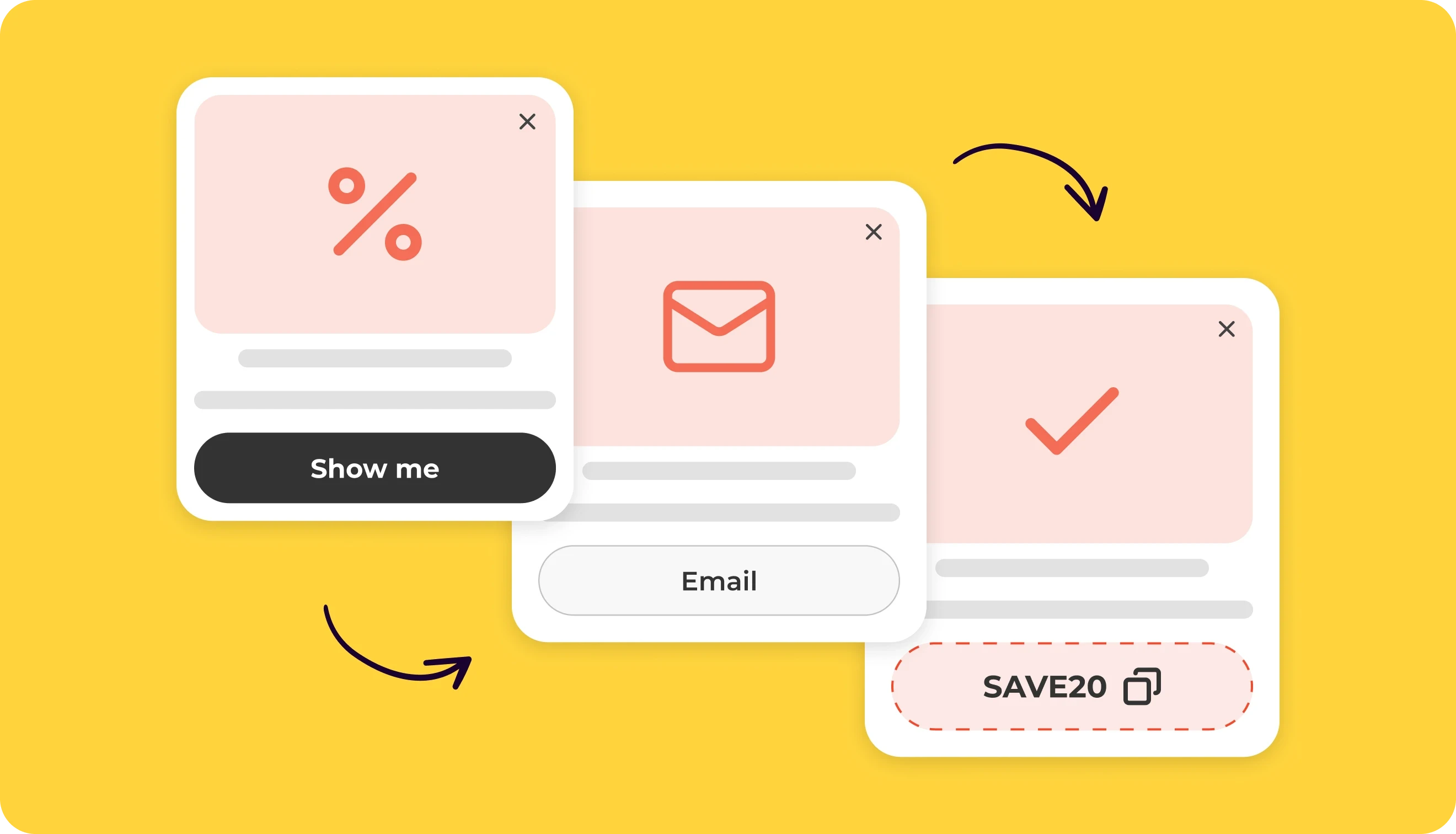
Welcome / first-order offer | Get [discount] off your first order | Sign up for new arrivals and offers from [Brand]. We’ll email your code. Minimum spend: [amount]. | Send me my code | New visitors browsing products. Exclude existing subscribers. |
Newsletter signup without a discount | Make your next cup better | Get [frequency] brewing tips, new coffee releases, and updates from [Brand]. | Send me brewing tips | After visitors read brewing advice or explore coffee products. Adapt the topic to something your emails regularly cover. |
Lead magnet | Get the [guide name] | Use the guide to [specific task]. It includes [checklist, worksheet, or other useful content]. Leave your email and we’ll send the download link. | Email me the guide | Articles or pages about the problem the guide helps readers work through. |
Free shipping threshold | Let us cover the shipping | Orders of [threshold] or more ship free to [region]. Add something you’ve had your eye on. | Keep shopping | Shoppers with a cart below the threshold who are still browsing products. |
Exit-intent cart recovery | A little help with your order | Use [code] for [discount] off [eligible products]. Minimum spend: [amount]. Your selections are in the cart. | Return to my cart | Exit intent on browsing pages when the cart contains eligible products. |
Limited-time offer | [Discount] off until [end date and time] | Use [code] on [eligible products]. Minimum spend: [amount]. | Shop the offer | Relevant product or category pages while the promotion is active. |
Product launch | Meet the new [collection name] | Explore [number] new [product type] made for [specific use]. Each comes with [concrete feature]. | Explore the collection | Pages related to the new products or their use, including visits from returning shoppers. |
Survey / feedback | Did you find what you needed? | Tell us what was missing or confusing. Your answer will help us improve the site. | Send feedback | After meaningful browsing or a completed task. This version suits a short form with space for an open answer. |
Gamified signup | See what your spin brings | Join our emails, then spin for a chance to win [reward options]. One spin per visit. | Let me spin | After product browsing. Use an email-first wheel with the stated participation limit configured. |
Customize the placeholder text so it fits your real offer:
Change “[specific task]” to a real action (such as calculating shipping costs).
Swap “[concrete feature]” for a clear product feature.
If the promo code appears right on the screen, don't tell visitors to check their inbox. Say where they'll actually find it. Keep the details that matter, such as minimum spend or expiration dates, and get rid of anything that doesn't help explain the offer. Add any legally required consent wording, too.
How to test popup copy
Say your popup offers a sizing guide. You want to know whether “Get the sizing guide” will bring in more subscribers than “Subscribe”. That's a copy test. Changing the headline and removing a form field at the same time would make the result harder to explain. You wouldn't know which change mattered.
Choose one primary metric that matches the campaign goal:
Email signup: completed subscriptions divided by widget views.
Product announcement: click-through rate to the featured products.
Sales promotion: purchases or revenue attributed to the campaign, where tracking allows.
You'll also need a guardrail metric. A promotion might bring in more orders while lowering average order value. More signups aren't always good news. Say the new version brings in more subscribers. Does that still count as an improvement if many of them unsubscribe after the first email? If your email platform lets you identify contacts from each test variant, check what happens to them after signup.
You could test whether the discount gets more attention in the headline than in the body copy. Or replace “Subscribe” with “Email me the guide.” Perhaps the popup simply has a sentence it doesn't need. Each is a separate experiment. Change the wording you're interested in, without touching the offer, form, or display rules. Otherwise, even a good result won't tell you much about the copy.
Give both versions traffic during the same dates. If the popup appeared only 150 times, three extra signups aren't convincing evidence. You need enough views and conversions to judge whether the difference is statistically meaningful. And keep the original wording with your test results. “Variant B won” isn't particularly useful a month later when nobody remembers what variant B actually said.
Create your popup message in Claspo
1. In your Claspo dashboard, click New widget and head to the Template library. Find a template that comes close to what you have in mind.

2. Replace the sample headline, offer details, and button text with your own.

Want to change the fonts or colors as well? Here's how to do it.
3. Take a look at the desktop and mobile previews.
Also check the Success, Reward, Existing, and Error pages if your widget has them. It's easy to miss leftover template text there.

4. Click Save to move to Audience & Triggering, where you can decide who should see your popup and when.

If you're collecting emails, connect your email marketing platform.

5. Test your copy. On the Widgets page, click the A/B icon next to your widget.

Select Compare different versions of this widget.

Click Add variant, change the text you want to test, and start the experiment.

Before you call the copy done
A popup can look great and still leave shoppers wondering whether a discount applies to their order or where the promised code will appear. That's a copy problem worth fixing.
Before publishing, read the popup message as someone who's never visited your store. Would they know exactly what they're getting? What happens after they click? And once the popup is live, let the test results tell you whether your wording needs another look.
Already have an offer in mind? Start with a Claspo popup template and spend your time on the message rather than building the layout from scratch.
FAQ
What should visitors see after submitting a popup form?
You sign up for 15% off and get a “Thank you!” screen. Fine, but where's the code? If it's coming by email, the next screen could say “Check your inbox for your 15% code”. If the code appears right there, make sure visitors can easily find and copy it.
And what about someone who's already subscribed? That's what the Existing page is for. You can acknowledge their previous signup instead of welcoming them to your list all over again.
How should a popup explain a submission error?
An error message needs to help people recover. For an invalid email address, point to the field that needs correcting. If the submission fails and you don't know why, don't make up a reason. “We couldn't submit your form. Please try again” is enough.
Should CTA buttons use “my” or “your”?
Both can sound natural, depending on who's speaking. “Send me the guide” puts the words in the visitor's mouth. “Get your guide” sounds like the brand addressing them.
There's no reason to assume one pronoun will always win. You can test both with the same offer and button placement.
How do you adapt popup copy for another language?
A literal translation can leave you with awkward CTAs or text that no longer fits the button. Check how the offer reads in the target language, especially any conditions, deadlines, and consent wording. Don't forget the confirmation and error messages.
In Claspo, you can add multiple language versions to the same popup and have visitors see the one that matches their language. Our step-by-step guide explains how to set it up.