15 Limited Time Offer Examples & Creation Guide


Summarize
A good limited-time offer gives shoppers a clear reason to act now — not “someday”, not “after checking five more tabs”, and definitely not after forgetting your store exists. The strongest limited time offer examples usually combine three things: a relevant incentive, a clear deadline, and the right moment in the customer journey.
Below, you’ll find 15 real limited time offer examples from e-commerce, SaaS, and event campaigns — each broken down by offer type, best use case, time limit, placement, and why it works.
We’ll also show how to choose the right limited-time offer for your goal and how to build an LTO pop-up in Claspo without turning your website into a flashing discount carnival. Urgency works best when it feels useful, timely, and honest — not like a fire alarm next to the “Add to Cart” button.
TL;DR: what makes a limited-time offer work?
A limited-time offer needs a real limit: a fixed end date, personal countdown, event window, short redemption period, or limited availability.
In Claspo’s e-commerce dataset of 7.4K widgets with 275M+ impressions, the strongest LTO pattern we found — timer + gamification + promo code + email — averaged 10.8% CR, with the top 10% reaching 26.2% CR.
A real limit does not always mean a timer. In the Man’s Set case, a short pre-order window and limited first batch helped sell 50% of the collection before the products were even in stock.
The offer type should match the job. Use free shipping to reduce checkout hesitation, gamification to collect leads without a hard sell, exit intent for cart recovery, and early access or preview events when the value is exclusivity.
The closer a shopper is to buying, the less “soft” your urgency can be. A first-time visitor may need a welcome perk; a cart visitor can handle a short countdown or last-chance code.
The best limited time offer examples in this guide use different limits: timers, fixed sale dates, prize pools, birthday windows, event deadlines, and subscriber-only access.
What is a limited-time offer?
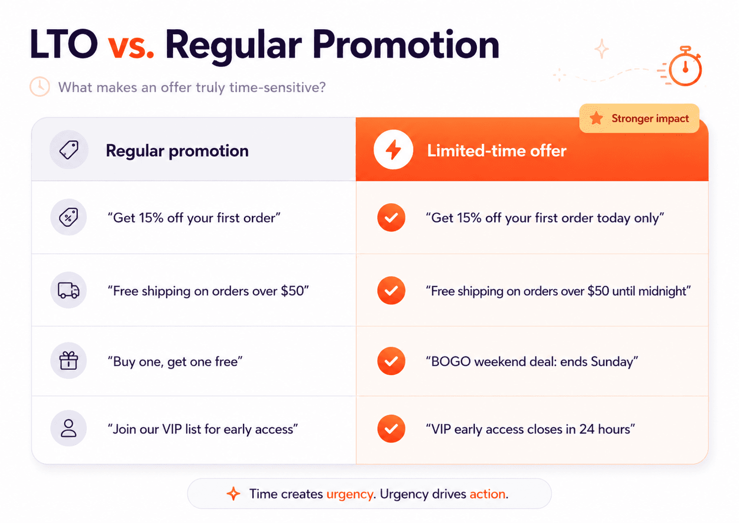
A limited-time offer is a promotion that gives shoppers a specific benefit for a clearly defined period. That benefit can be a discount, free shipping, a gift, a bundle, early access, or another reason to buy sooner rather than later.
A limited-time offer is not just a discount with the word “hurry” next to it. What makes it time-sensitive is a clear deadline or availability window. That deadline can be shown in several ways:
A fixed end date: “Ends Sunday” or “Valid until midnight.”
A personal countdown: “Your 15% discount expires in 20 minutes.”
A seasonal or event-based window: “Black Friday weekend only.”
A stock-based limit tied to time-sensitive demand: “Available while this batch lasts.”
A short redemption period: “Claim your gift in the next 24 hours.”
The timer, headline, and FOMO-style copy do not create the offer by themselves. They simply make the time limit easier to notice. If the deadline is vague, fake, or endlessly reset, the offer may look urgent — but it will not feel trustworthy.
The Claspo limited-time offer formula: value × deadline × moment
At Claspo, we look at limited-time offers through three practical questions:
Is the offer valuable enough to interrupt the shopper?
Is the deadline believable and easy to understand?
Is the widget shown at the moment when this offer makes sense?
If the answer to one of these is “not really”, the campaign may still get attention — but not necessarily the kind that leads to more sales.
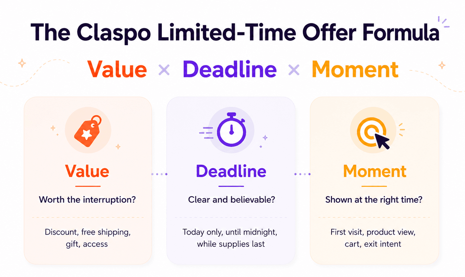
Value: make the interruption worth it
Every pop-up interrupts something: browsing, comparing products, reading details. So the offer has to earn that interruption. A strong LTO value usually does one of three things:
removes hesitation — free shipping, a small first-order discount;
adds a bonus — gift, sample, mystery perk;
creates access — early launch, VIP window, pre-order, limited batch.
The important part is clarity. Shoppers should understand the benefit in two or three seconds. If the pop-up makes them stop and decode the offer, the urgency loses its power.
Deadline: make the limit feel real
A deadline should not feel like a sticker placed on top of a normal promo. It should match the actual reason the offer is limited. For example:
A weekend sale has a natural campaign window.
A birthday offer has a personal redemption period.
A pre-order campaign can be limited by production planning.
A seasonal offer ends because the event ends.
A limited drop ends because the batch can sell out.
That connection matters. When the deadline feels tied to a real reason, the offer feels more credible. When it feels random, shoppers may ignore it — or worse, wait to see if the “last chance” offer comes back tomorrow.
Moment: match urgency to buying intent
This is where many LTOs either work beautifully or become annoying.
The same offer can feel helpful or pushy depending on when it appears. Think of the moment as the context that decides how much urgency is appropriate:
Low intent: use softer offers, such as welcome discounts, free shipping, or list-building perks.
Medium intent: use category- or product-based offers once the visitor has shown interest.
High intent: use stronger urgency for cart visitors, repeat product viewers, or exit-intent sessions.
Returning customers: use loyalty, VIP, birthday, or early access offers instead of treating them like strangers.
A good LTO does not shout at everyone equally. It reacts to what the shopper is doing.
What we learned from 7,4K e-commerce LTO popups
To understand how time-sensitive website popups perform in e-commerce, we looked at Claspo widgets used by e-commerce brands. The dataset included 7,4K widgets with more than 275 million impressions.
The first takeaway is simple: urgency works best when it is not working alone. Timers are useful, but they are not magic little conversion engines. A countdown can make the deadline visible; it cannot make a bad offer suddenly irresistible.
In our e-commerce dataset, email-focused popups averaged 5.99% CR, with the top 10% reaching 20% CR. Sales-focused widgets averaged 7.61% CTR, while the top 10% reached 69% CTR.
That is a big gap. And it usually comes down to more than the timer: the offer, the audience, the page, the trigger, and how clear the next step feels.
The pattern becomes more interesting when we look at how different urgency mechanics are combined.
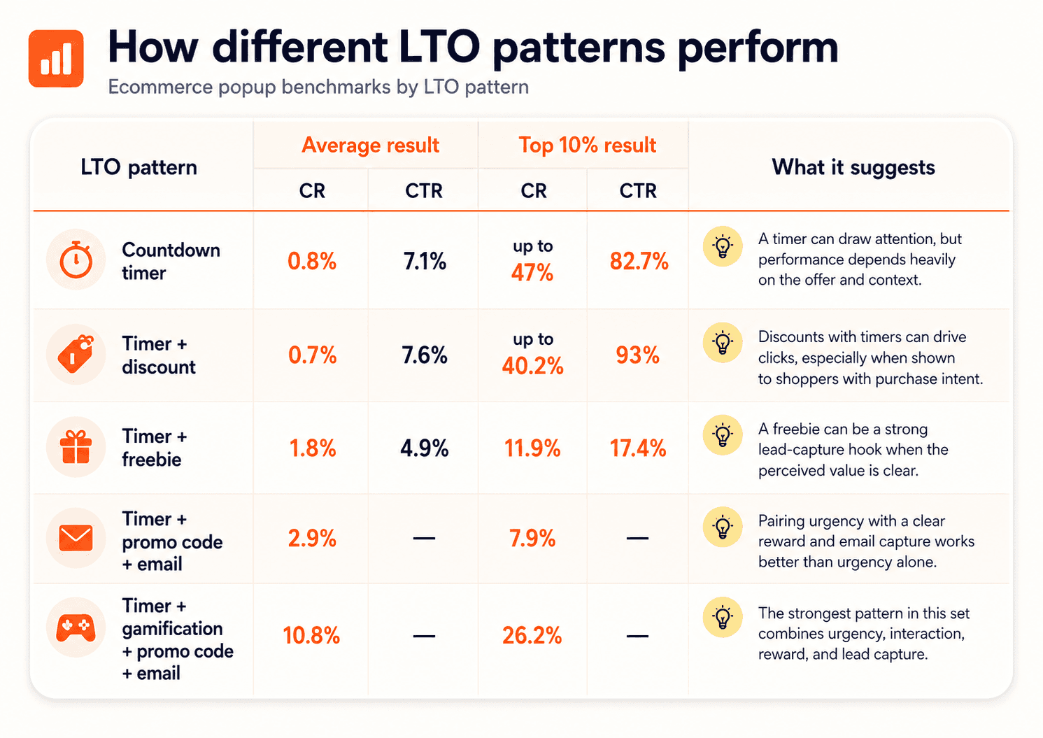
A timer can help shoppers notice the deadline. A discount can make the offer attractive. A form can turn the visit into a contact. A spin the wheel game can make the interaction feel lighter. But the full setup matters more than any single element.
And sometimes, the strongest “limited” part is not the timer at all — it is the business constraint behind the offer.
15 limited time offer examples you can recreate
Let’s get to the examples. You’ll see timers, fixed sale dates, limited prize pools, birthday codes, webinar deadlines, and a few offers that do not need a clock at all. Different formats, same question: does the shopper have a real reason to act now?
1. Free shipping with a fixed expiration date
This is one of the simplest limited time offer examples: free shipping, a minimum spend, a promo code, and a clear end date. No drama, no mystery — just a useful perk with a deadline.
Offer type: free shipping promo code.
Best for: visitors who are close to buying but do not love paying for delivery.
Time limit: fixed date and time.
Best placement: homepage, product pages, exit-intent pop-up.
Why it works: the offer tackles a very normal checkout objection: “Do I really want to pay for shipping?” The deadline gives people a reason to use the code now.
Claspo tip: keep long terms out of the widget. Add a short “Terms apply” line and link to the full conditions.
2. Treasure hunt discount with a 24-hour timer
Among playful limited time offer examples, this one has a smart order: play first, countdown second. The shopper finds the 15% code in the bag game and gets 24 hours to use it.
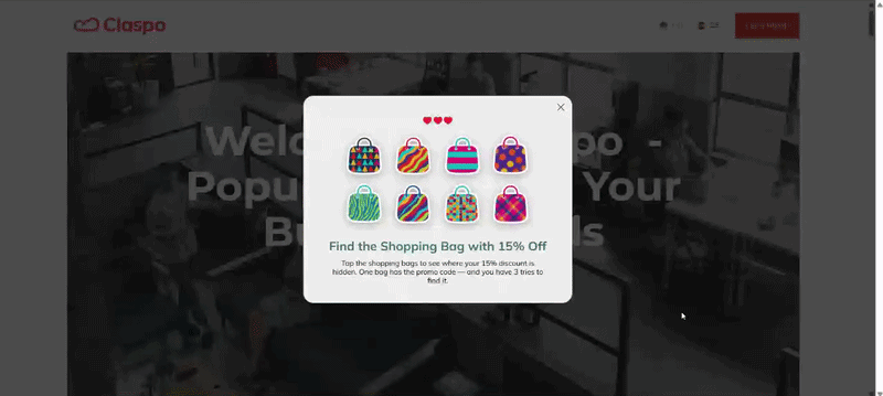
Offer type: gamified promo code.
Best for: visitors who would skip a regular discount pop-up but may try a quick game.
Time limit: 24 hours after the prize is found.
Best placement: homepage, product pages, seasonal campaigns.
Why it works: the reward feels earned. The timer simply tells shoppers, “nice, now don’t forget to use it”.
Claspo tip: start the countdown after the prize appears. The game should create engagement first; the timer should create action after.
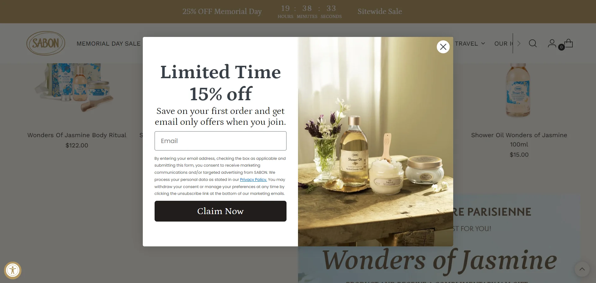
3. Email signup discount with a personal countdown
This is a classic signup deal: join the list and get 15% off your first order.
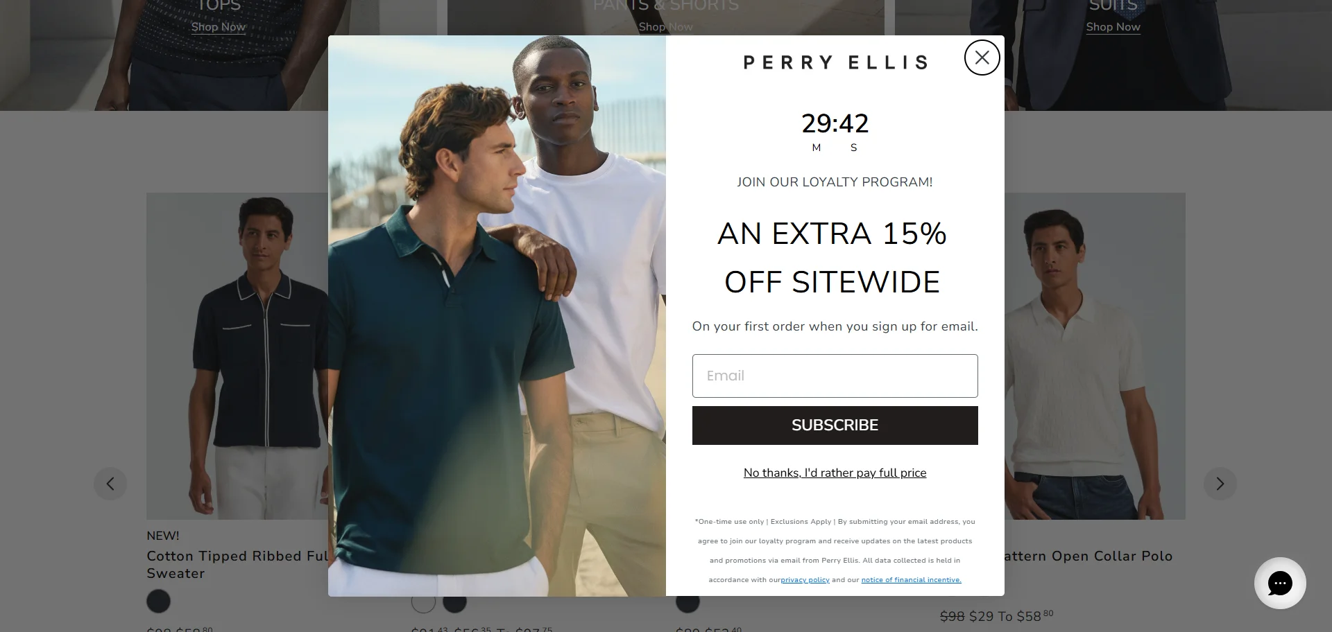
The useful twist is what happens after closing it: the offer does not vanish. A small teaser stays in the corner, so shoppers can keep browsing and come back to the code before the timer runs out.
Offer type: email-for-discount offer.
Best for: people who need a few minutes with the store before they decide to subscribe.
Time limit: personal countdown for each visitor.
Best placement: homepage, category pages, product pages.
Why it works: people do not always want to subscribe the second a pop-up appears. The teaser keeps the deal nearby without blocking the shopping session.
Claspo tip: use a Relative countdown timer to give each visitor their own time limit. Don’t show the offer to existing subscribers. After the close click, leave a small teaser in the corner.
4. Extra discount during a fixed sale period
This limited time offer example adds 10% off on top of an existing Hot Sale. There is no countdown inside the pop-up, but the sale window is clear: from May 25th to June 2nd. The offer feels tied to the event, not just thrown onto the page because “urgent” sounds nice.
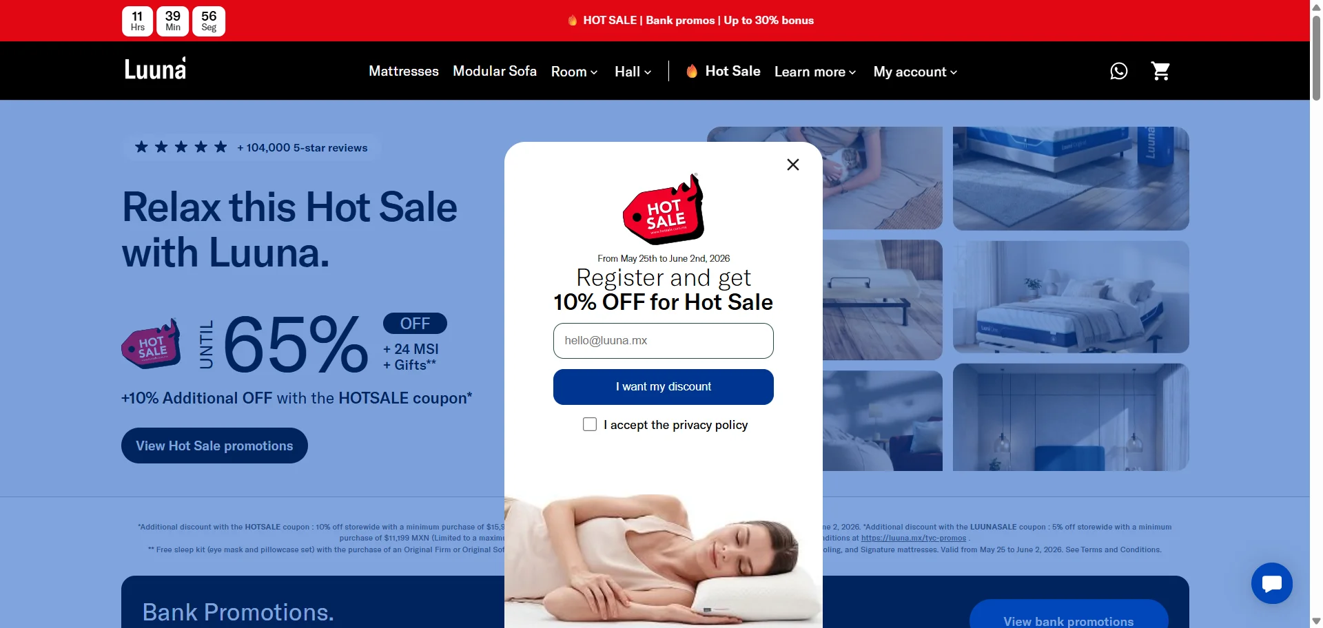
Offer type: extra discount for email signup.
Best for: sale visitors who are already comparing deals and may trade an email for a better price.
Time limit: fixed promotional period.Best placement: sale landing page, homepage during the campaign, product pages with sale traffic.
Why it works: the shopper is already in discount-hunting mode. The pop-up gives them one more reason to join the list before buying: “I can get the sale price, plus another 10%”.
Claspo tip: for event-based sales, you do not always need a timer in the pop-up. A clear date range can be enough — especially if the sale page, header bar, and widget all repeat the same campaign window.
5. Spin-to-win with a limited prize pool
This limited time offer example uses stock-based urgency instead of a timer. The hook is simple: spin the wheel for a chance to win, but the main tension comes from the line “Only 5 Free Wigs Left!”
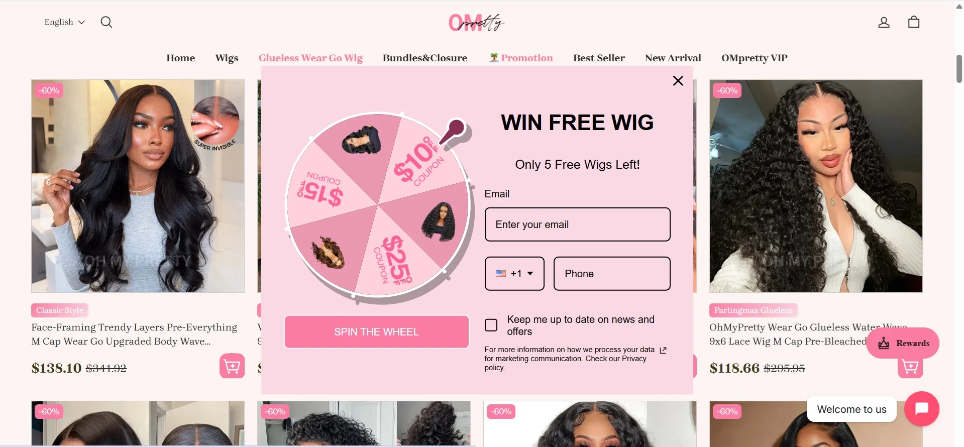
Offer type: gamified lead capture with limited prizes.
Best for: visitors who may ignore a plain signup form but will stop for a chance to win something bigger.
Time limit: based on prize availability rather than a countdown.
Best placement: homepage, promo pages, seasonal campaigns.
Why it works: “5 left” feels concrete. People understand that a free product can run out, so the offer creates pressure without needing a clock. The wheel also makes the signup feel less routine and a bit more fun.
Claspo tip: in Claspo, you can build a rewards pool with different prize options, set the winning odds for each one, and attach a separate promo code to every reward. That makes it easier to control how often big prizes land.
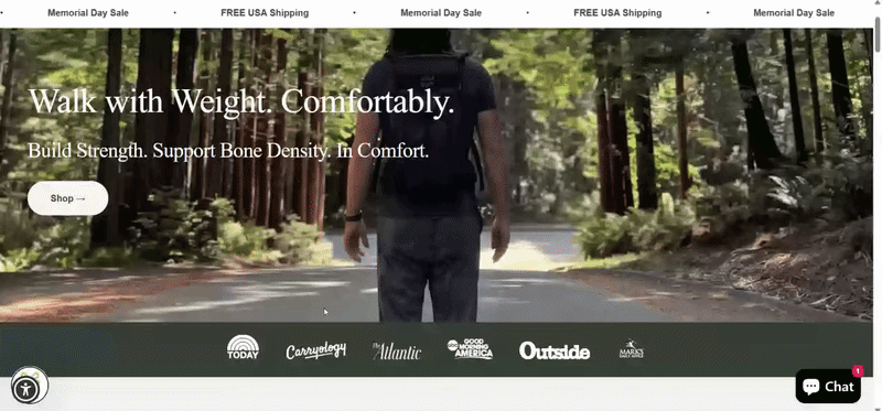
6. Holiday sale offer with a minimum order value
This limited-time offer example uses a full-screen pop-up for a Memorial Day Sale. There is no timer here, but the holiday context does the timing work: shoppers understand the deal belongs to a short seasonal campaign.
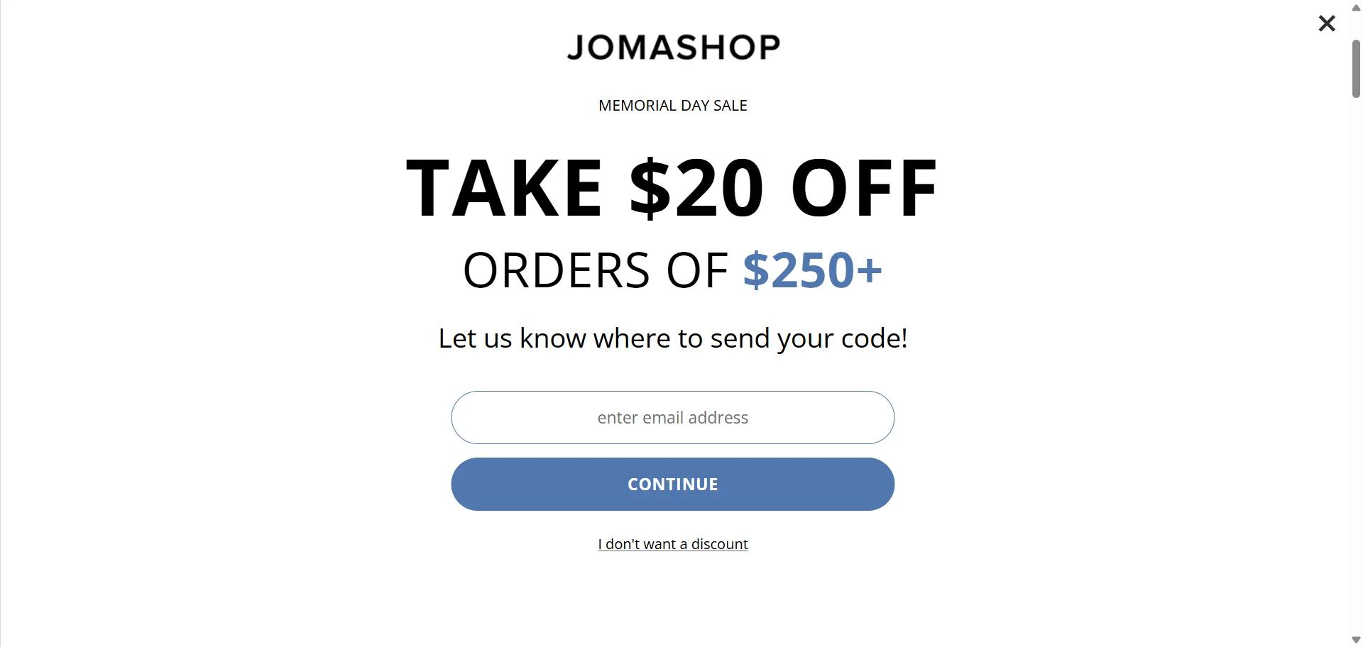
Offer type: discount with a minimum order value.
Best for: visitors browsing during a holiday sale who may be close to a larger purchase.
Time limit: event-based sale window.
Best placement: homepage, sale landing page, category pages.
Why it works: the $250+ threshold gives shoppers a reason to build a bigger cart, not just grab a discount. The full-screen format also fits the moment — holiday sales are one of the few times when a high-attention popup feels expected.
Claspo tip: use full screen for major campaigns, not everyday offers. If the sale has a real end date, add it near the headline or CTA so the LTO feels sharper.
7. Exit-intent offer for cart visitors
This limited-time offer example works at the “wait, don’t leave yet” moment. A relative countdown starts when a shopper tries to exit the cart page, giving them a short personal window to use the offer before it disappears.
Offer type: cart recovery offer with a relative timer.
Best for: shoppers who reached the cart but are about to leave.
Time limit: personal countdown for each visitor.
Best placement: cart page exit-intent pop-up.
Why it works: this is not a random discount thrown at a cold visitor. The shopper already showed buying intent, so a short timer feels more like a last useful nudge than pressure.
Claspo tip: the simple setup is to trigger this pop-up on exit intent from the cart page. With exit popup software like Claspo, you can make it more precise: show the offer only to visitors who have items in the cart and are trying to leave the site. This requires cart events in the Data Layer, but the offer will be aimed at the right people, not everyone with a moving cursor.
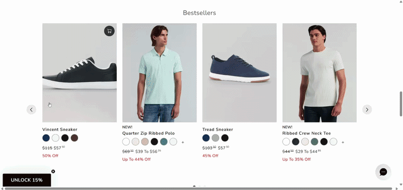
8. Countdown offer for bestsellers
This LTO puts the discount where it feels especially tempting: on the top 10 bestsellers. These products already have social proof baked in — people buy them for a reason. The timer just adds, “and today they are cheaper, but not forever.”
Offer type: discount on selected bestsellers.
Best for: visitors who are browsing popular products but need help choosing.
Time limit: countdown timer with a fixed campaign window.
Best placement: homepage, bestseller category, promo landing page.
Why it works: bestsellers reduce choice anxiety. The shopper does not have to start from zero; the store is basically saying, “Here are the products people already like, and here is a short-window discount on them”.
Claspo tip: use this setup when you want to push a curated sale, not a sitewide one. In Claspo, you can point the CTA to a bestseller collection or product list so the pop-up does not send shoppers into the whole catalog maze.
9. Holiday weekend offer with an animated pop-up
This limited-time offer example is built around a Memorial Day weekend sale. No timer, no pressure countdown — just a holiday window, a 30% discount, and a promo code people can use right away. The animated background does extra work by showing the product in different home settings.

Offer type: holiday discount with a promo code.
Best for: seasonal campaigns.
Time limit: Memorial Day weekend.
Best placement: homepage, collection pages, sale landing page.
Why it works: this softer approach works when the sale is tied to a familiar event. People already know a Memorial Day weekend deal has an end point, so the pop-up can focus on product appeal instead of heavy urgency.
Claspo tip: use animation when it explains the product, not when it only wiggles for attention. Keep the code visible and easy to copy, especially if the visual part of the pop-up is doing most of the storytelling.
10. Seasonal sale with a clear end date
This LTO is built around a Spring Sale, but it does not leave “spring” open to interpretation. The pop-up gives a precise end point. Nice and specific.
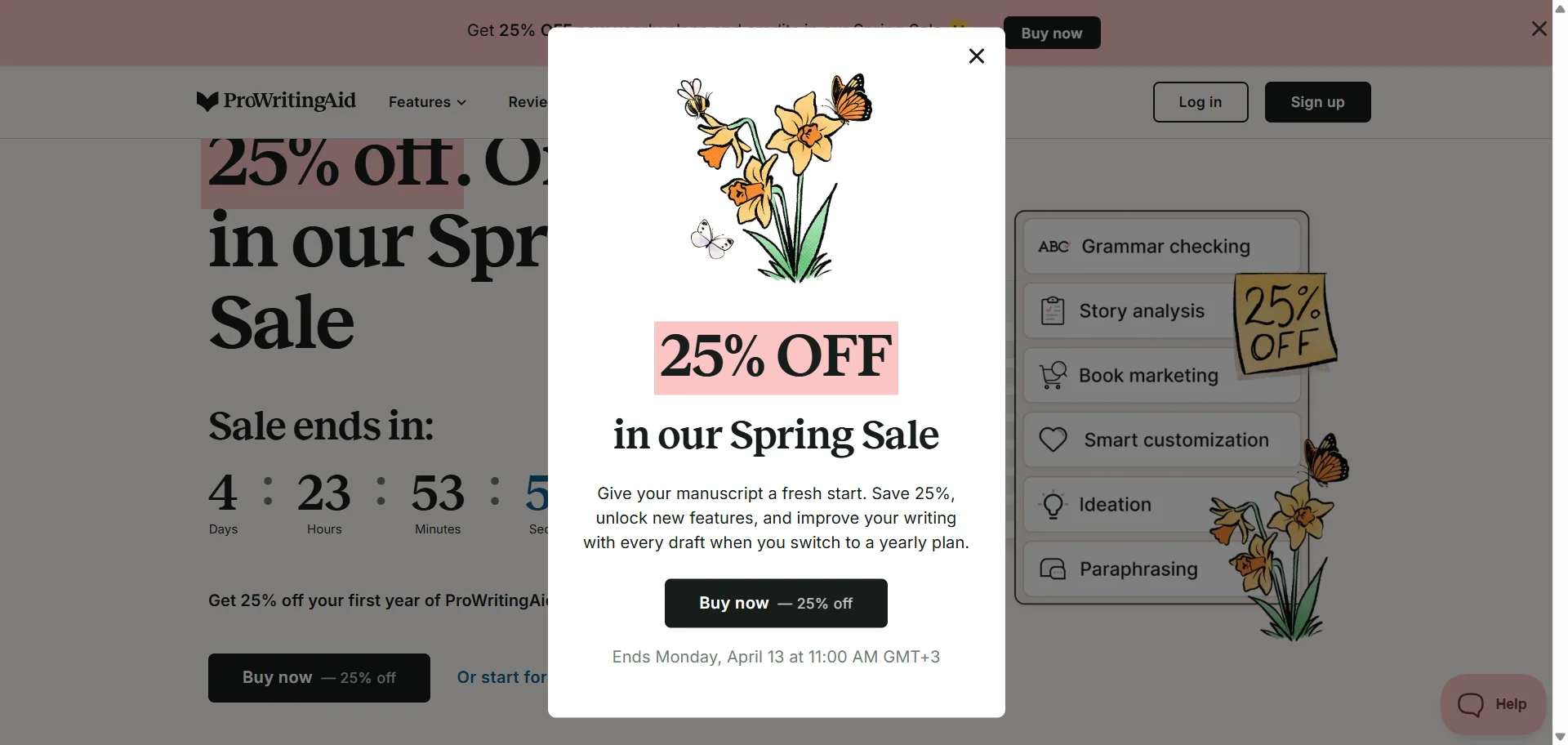
Offer type: seasonal discount.
Best for: visitors who are already browsing products.
Time limit: fixed date and time tied to the seasonal sale.
Best placement: product pages, homepage, exit-intent pop-up.
Why it works: seasonal sales can feel vague unless the deadline is spelled out. Here, the shopper knows exactly when the 25% offer disappears, and the copy explains what they get by switching to a yearly plan.
Claspo tip: schedule the pop-up to match the sale window instead of turning it off manually later. It is a small setup detail, but it saves you from showing a “Spring Sale” offer after the spring mood has left the building.
11. Seasonal signup offer with a better-than-usual discount
The limited-time offer example uses a Spring Fling Sale to make the email offer stronger. On a regular day, the brand offers 10% off for signup. During the sale, it becomes 25% off — and the pop-up gives a clear end date: 4/6.
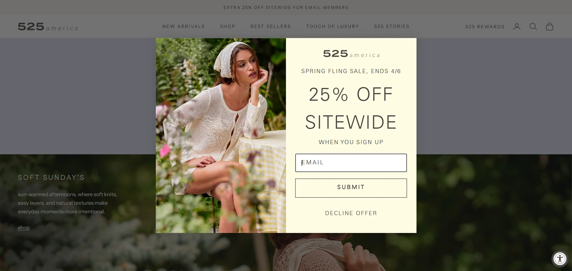
Offer type: email signup discount during a seasonal sale.
Best for: shoppers who are already browsing items and may want a better deal before buying.
Time limit: fixed sale end date.
Best placement: homepage, collection pages, sale landing page.
Why it works: sale traffic is usually warmer. People are already looking for a deal, so asking for an email in exchange for a better discount feels like a fair trade.
Claspo tip: the only weak spot: the pop-up could make the “25% instead of 10%” value clearer. That would make the offer feel more special.
12. Floating bar with a countdown timer
This offer does not interrupt the whole page. It sits in the top bar with a timer, while the shopper keeps moving through the site. The smarter detail is the progress message: “You are $10.00 away from 40% off your entire order.” That is much more useful than just yelling “sale ends soon”.
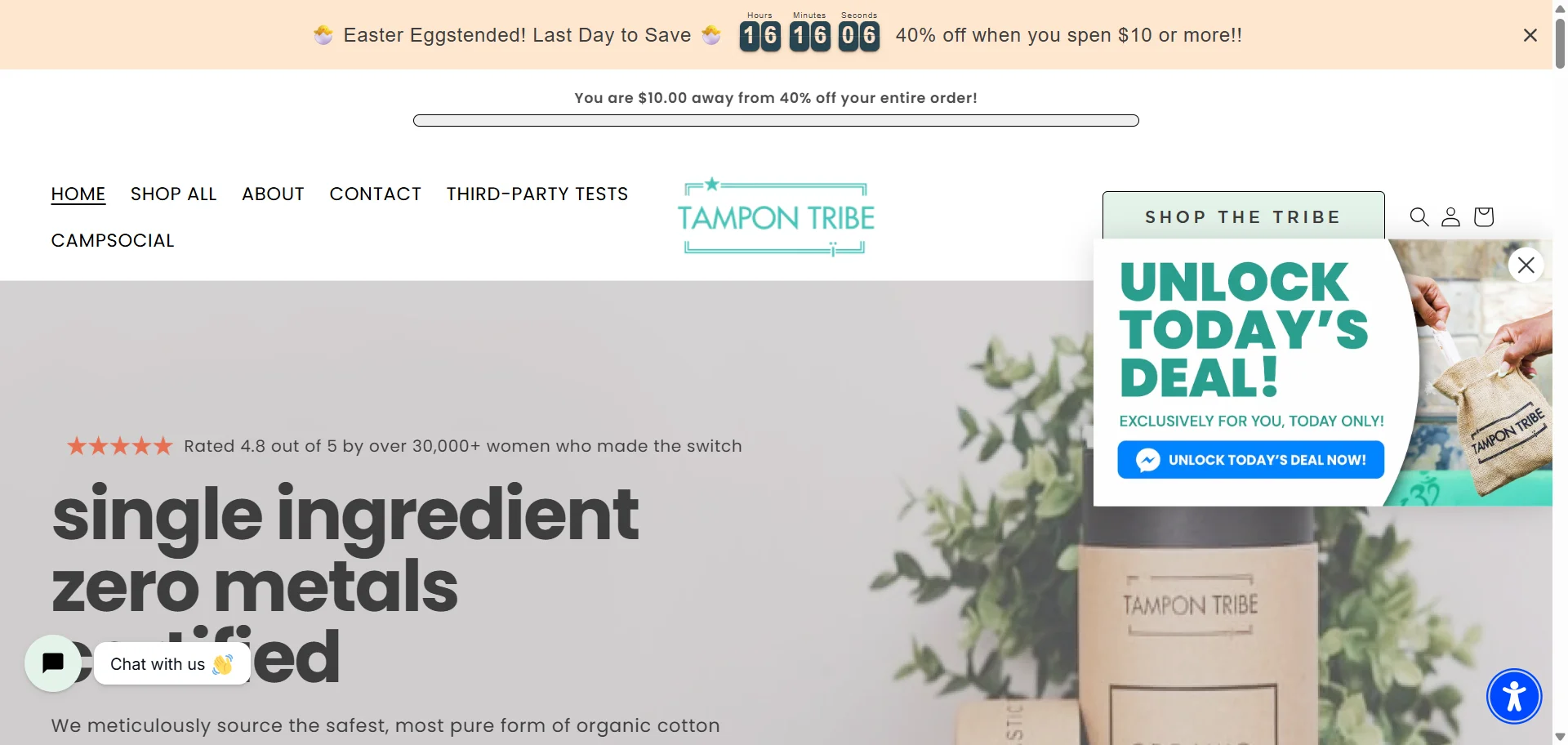
Offer type: a countdown timer popup with a spend-based discount.
Best for: shoppers browsing across the site.
Time limit: countdown timer for a short sale window.
Best placement: floating bar across homepage, product pages, and cart pages.
Why it works: the bar keeps the offer present without fully stopping the shopping session.
Claspo tip: this example also shows a common problem — too many widgets at once. The floating bar and floating box compete for attention. In Claspo, Silent Interval and Overlapping protection help prevent this, so one campaign does not step on another.
13. Birthday discount with a personal countdown
This limited-time offer example uses a birthday perk — a short personal discount. The visitor gets a 25% birthday code and a countdown to use it, so the discount feels tied to a real customer moment, not just another promo blast.
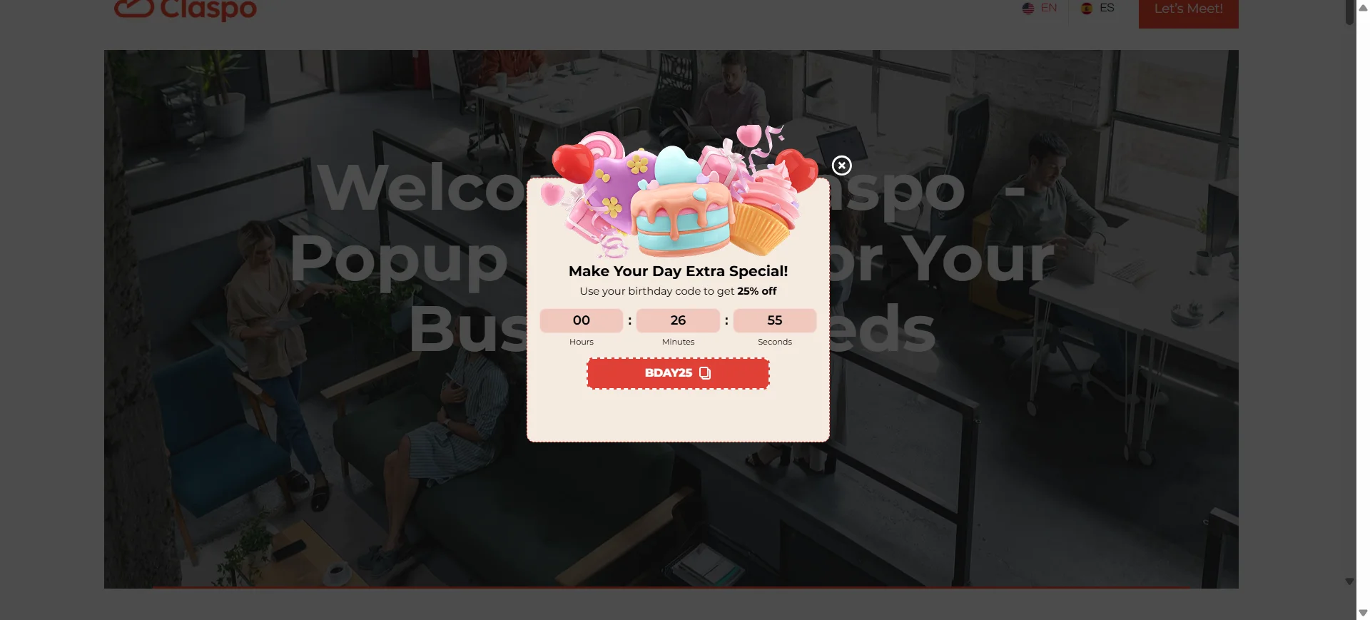
Offer type: birthday promo code.
Best for: registered customers with a birthday date saved in their profile.
Time limit: personal countdown around the birthday offer.
Best placement: account page, homepage after login, product pages for logged-in visitors.
Why it works: birthdays are one of the few times when a brand can offer a discount without sounding desperate. The timing feels natural: “it’s your day, here’s your code.” The timer simply keeps the perk from becoming an open-ended coupon.
14. Webinar registration with an event countdown
This is a classic media, B2B and SaaS LTO: the “offer” is not a discount, but a seat at a live webinar. The countdown works because the event has a real start time. Once it begins, the registration window is basically closing.
Offer type: event registration.
Best for: webinars, demos, product launches, workshops, and expert sessions.
Time limit: countdown to the live event.
Best placement: blog pages, resource pages, homepage, exit intent popup.
Why it works: the timer is tied to something real, not invented urgency. It tells visitors, “this session is happening soon, decide if you want in”. The speaker photos also help: this is not just a form, it is an actual event with actual people behind it.
Claspo tip: for webinar pop-ups, send the CTA straight to registration and keep the copy focused on the topic, date, and value of attending. If the event is close, a countdown makes sense. If it is weeks away, a simple date may feel calmer.
15. Collection preview event for subscribers
Event registration can work in e-commerce too. Here, the brand asks for an email in exchange for access to a Collection Preview Event. There is no timer, but the deadline is clear: the event ends Wednesday, August 2nd.
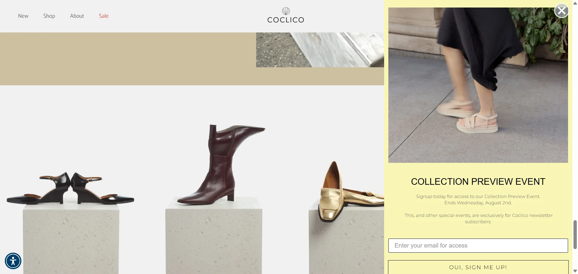
Offer type: subscriber-only event.
Best for: new collections, limited drops, VIP previews, early access campaigns.
Time limit: fixed event end date.
Best placement: homepage, collection pages, new arrivals, product launch pages.
Why it works: this is not “sign up for 10% off” again. The value is access. Shoppers who like the brand get a reason to join the list before the collection preview closes. It feels more like an invitation than a coupon.
Claspo tip: use this format when the email list should feel like an insider channel. Make the benefit clear: early access, private preview, limited drop, or subscriber-only event. “Sign up” is the action; access is the reason.
How to choose the right limited-time offer for your goal
After looking at all these limited time offer examples, the next question is obvious: which one should you actually use?
Start with the goal. A pop-up for collecting emails should not behave like a cart recovery offer. A birthday code should not be shown like a public flash sale. And a “last chance” message on the first pageview? Usually too much, too soon.
Use this matrix to match the offer to the shopper’s intent, your campaign goal, and the stage of the sales funnel you want to influence.
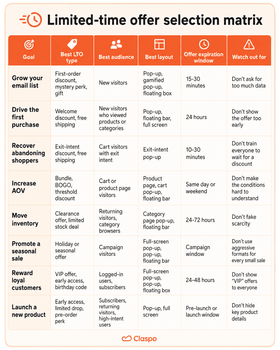
One more thing before choosing the biggest discount: check your margin. If margins are tight, do not start with the deepest discount. Try free shipping, gifts, bundles, threshold offers, or early access first. Sometimes “get this before everyone else” beats “take another 10% off”.
How to create limited-time offers with Claspo
You already know what kind of offer you want to run. Now the setup is mostly about five things: format, offer, audience, installation, and testing.
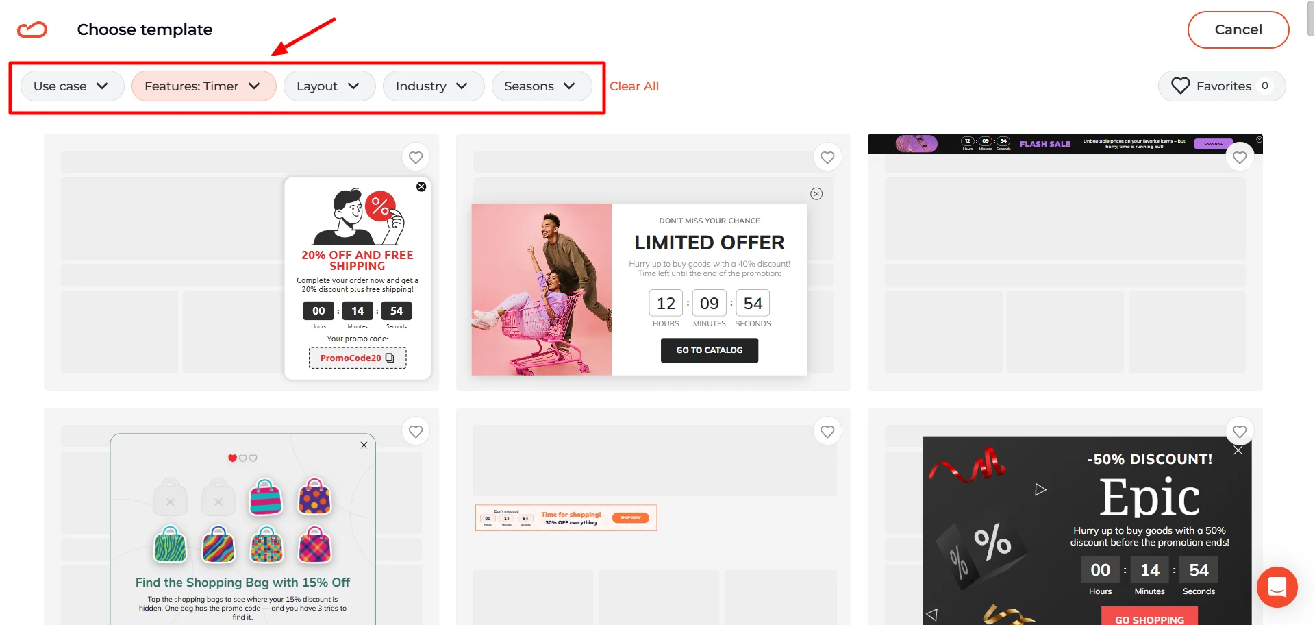
Step 1. Choose the widget format
Start with the format that fits the job. Different types of popups work better for different LTOs: use a countdown popup for a short sale, a floating bar for a sitewide offer, exit intent for cart recovery, and add a teaser if people may want to reopen the deal later.
Claspo has 1,000+ pop-up ad templates, so you do not have to start from a blank screen. Filter by use case, layout, feature, industry, or season.
Step 2. Add the offer and deadline
Edit the headline, CTA, image, promo code, form fields, and set up the timer. Keep the offer easy to read.
The widget should answer three questions fast: what the shopper gets, how long the offer lasts, and what to do next.
Need more detail? Our Help Center guide on customizing templates walks through the editor step by step.
Step 3. Set targeting and triggers
Choose who sees the offer and when. In Claspo, you can use time on page, scroll depth, exit-intent popups, device, location, traffic source, URL, or visitor type.
This is where the LTO becomes more precise. A cart-saving code should not be shown like a welcome discount. A VIP offer should not follow every random visitor around the site. For a deeper setup walkthrough, see the triggering and targeting section in our Help Center. Shopify newsletter signup form
Step 4. Add lead collection if needed
If the offer is gated, add an email or phone field. Add consent if your form needs it, and connect the widget to your ESP, CRM, or other tools.
Keep the form short. A small discount does not need a full customer biography.
Step 5. Run the pop-up
Shopify and WordPress users can connect Claspo through the app or plugin. For other platforms, add the installation script to your site header.
After that, you can preview, publish, and edit your popups on the web from Claspo without asking a developer to place every new campaign by hand.
Test the offer before you scale it
A/B testing is not only for button colors and headlines. With limited-time offers, the bigger question is often the offer itself: discount or no discount, 24 hours or 48 hours, email-gated or open to everyone, product drop or clearance sale. That matters because the same discount can look cheap in one context and smart in another.
Common limited-time offer mistakes to avoid
Even strong limited-time offers can lose clicks because of small setup details. Here are the mistakes worth checking before you launch.
Leaving the deadline implied, not clear
One of the easiest ways to weaken a limited-time offer is to make the deadline feel vague. In the first example, the shopper sees “Limited Time 15% Off,” but a user has to guess when the offer actually ends. That softens the urgency.
If the deadline matters, show it clearly. Use a countdown timer, an exact end date, or a plain line like “Ends Monday at midnight.”
Making the teaser hard to reopen
A teaser should keep the offer within reach after the pop-up is closed. But that only works if it stays easy to tap. In the limited time offer example, the teaser sits too close to another floating button.
On desktop, a shopper may still manage to click it. On mobile, that same placement becomes awkward. If the teaser is hard to reopen, it stops helping.
Before launch, look at the screen corners. Chat, accessibility, cookie, and teaser buttons often land in the same spots. If they overlap, the offer may be visible but not easy to use.
The result is not just visual clutter. It creates missed taps, blocked CTAs, and frustration. Before launching a campaign, check how the offer behaves next to every other sticky UI element on the page.
Relying on urgency to do all the work
Urgency helps, but it cannot rescue an unclear offer. If shoppers need extra time to figure out what they get, how to claim it, or whether it is worth it, the timer becomes a decoration.
Make the deadline worth believing
A limited-time offer should answer one simple question: why act now? Maybe the sale ends tonight. Maybe the code is good for 24 hours. Maybe the first batch is small. Maybe the event closes soon. The reason can be different, but it has to be clear.
So start small. Pick one offer, one audience, and one moment where the deal actually makes sense. Then test the part you are unsure about: the timer, trigger, format, discount, or placement.
Claspo pop-up builder gives you the pieces to build it — popups, floating bars, full-screen widgets, teasers, games, timers, targeting, and A/B testing. The real work is choosing the right offer for the right moment.


![How to add a Shopify newsletter signup form [+Tips & Templates]](https://framerusercontent.com/images/FavgBqCU1zgoOwEdQvBHxtOWIc.png?width=1320&height=756)