
30 Email Popup Examples & Best Practices [Full Guide 2026]

Summarize
We analyzed 3 years of data from over 779 million impressions to see what actually turns a visitor into a subscriber. While the average email popup conversion rate (CR) is 3.53%, the Top 10% of performers reach up to 41% by using specific triggers and layouts.
What is an email popup?
An email popup is an interactive window that appears to website visitors. Its primary purpose is to capture visitor information: a visitor’s email address, phone number, first name, subscription preferences, and so on.
The effectiveness of email popups depends heavily on factors like industry, the format of the email capture popup, timing, and design. Later in this article, you’ll discover the top 25 email popup best practices that make a popup truly effective and tailored to your audience.
30 Best email popup examples (and why they convert)
Email popups vary by goal and audience, but high-performing email signup popup examples tend to rely on the same essentials—good timing, persuasive messaging, a clear value offer, and frictionless UX.
Email capture popup examples from ecommerce
In ecommerce, popups are widely used for various purposes, including promoting offers, informing visitors about important events or business updates, and, of course, building a contact database.
Wayfair
Trigger: On entry | Format: Email popup with a Teaser | Incentive: 10% discount | Avg. CR: 3.85%
For merchants, percent-off discounts are the gold standard, used by 40% of the top 10% of performers.
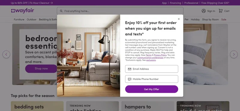
Besides, in their email popup design, Wayfair uses progressive data capture by asking for both email and phone to diversify its remarketing channels immediately. While adding fields usually drops CR, the immediate 10% incentive offsets the friction.
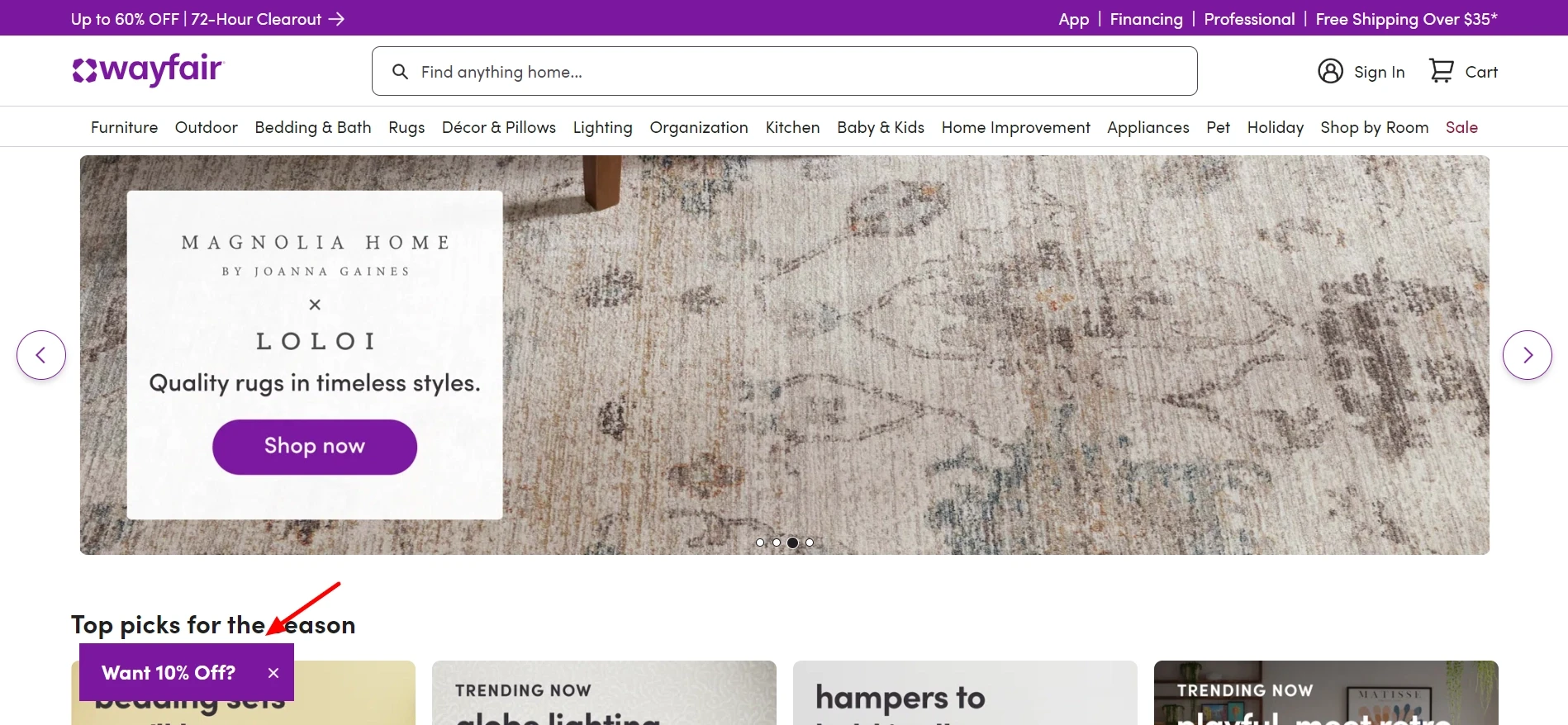
Pro tip: Wayfair uses a Teaser after a visitor dismisses the main email popup window. The offer is available but does not interfere with the screen. Users can still convert later in the session once they’ve found a product they like.
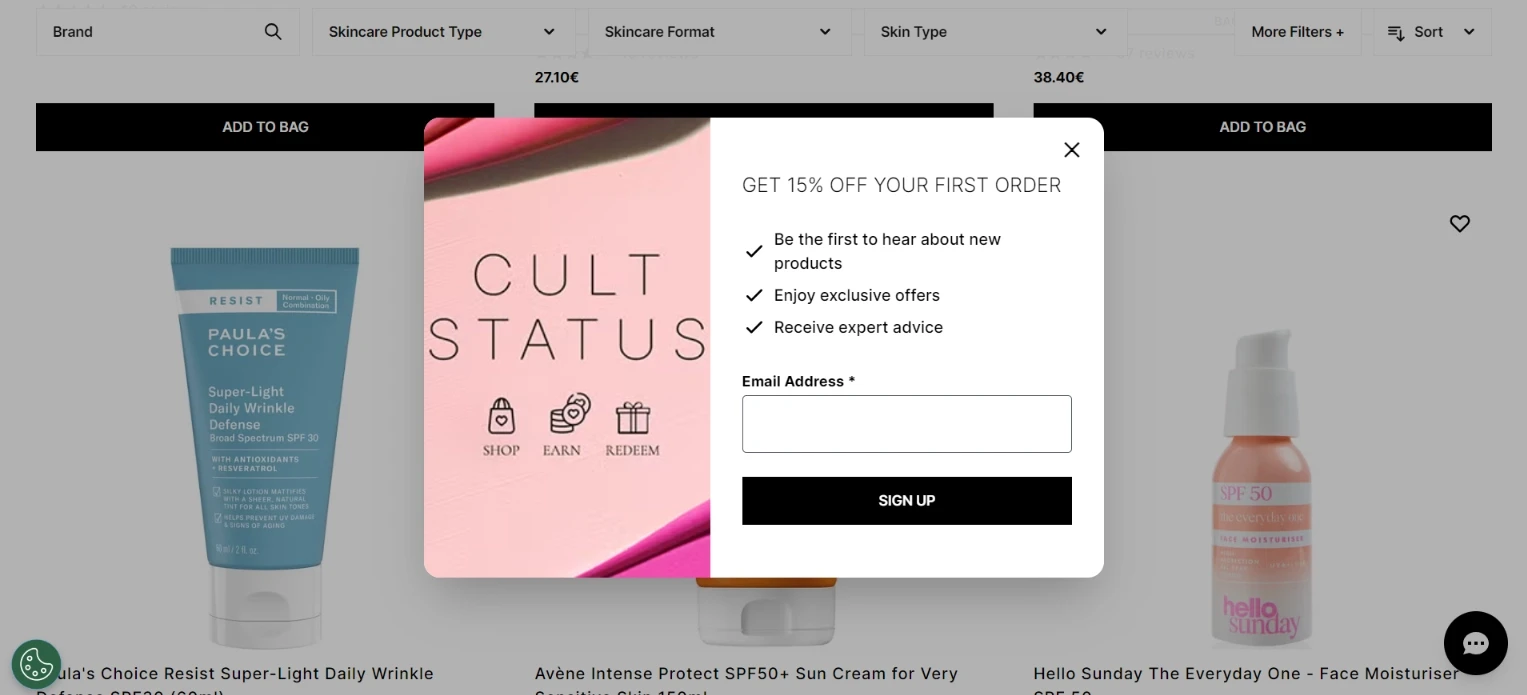
Cult Beauty
Trigger: 20s delay | Format: Email popup | Incentive: 15% off + Benefits | Avg. CR: 7%
The timing strategy gives users enough time to engage with the content before the email popup is displayed. Our data shows that delaying an email signup popup by 8–10 seconds increases CR by 34% over immediate triggers.
Honorable mention goes to the text organization: the bulleted benefits make their value proposition scannable and tap into curiosity.
Pro tip: Replace generic button text (“Sign Up”) with power words and benefit-first copy like “Get My Discount” or “Join the VIP Club.”
Craighill
Trigger: Exit-intent | Format: Email popup | Incentive: Free gift | Avg. CR: 5.76%
The combination of Email + Promo Code + Exit Intent is the golden combo for lead generation, with a 5.76% CR — the highest for non-gamified email popups in our 3-year study. It effectively captures the visitor’s attention just before they decide to leave.
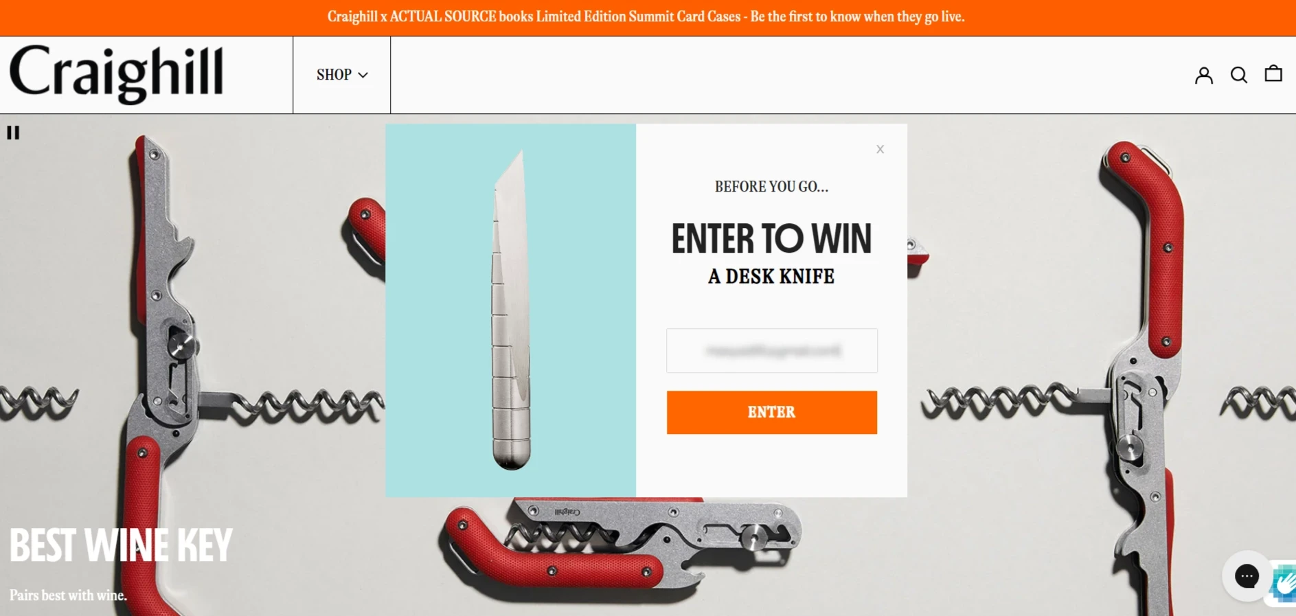
Craighill uses the Thank You page as a second storefront, displaying the prize image and a “Continue shopping” CTA to turn new leads back into active shoppers.
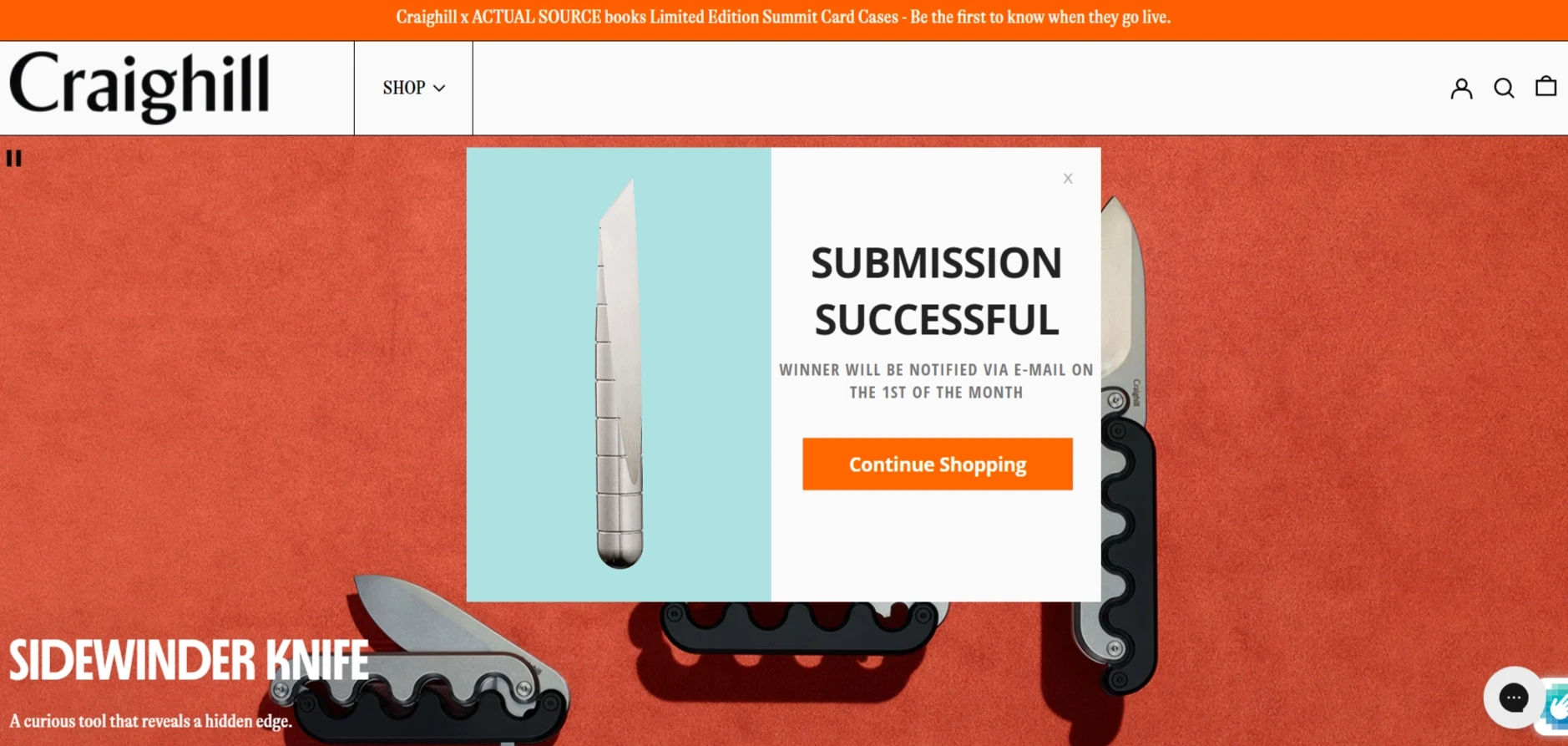
Pro tip: Don't let the conversation end at the sign-up. In Claspo, you can customize the “Already Subscribed” and “Success” pages of your email popup to include a discount code or a “Shop now” button to reduce bounce rates and boost ROI.
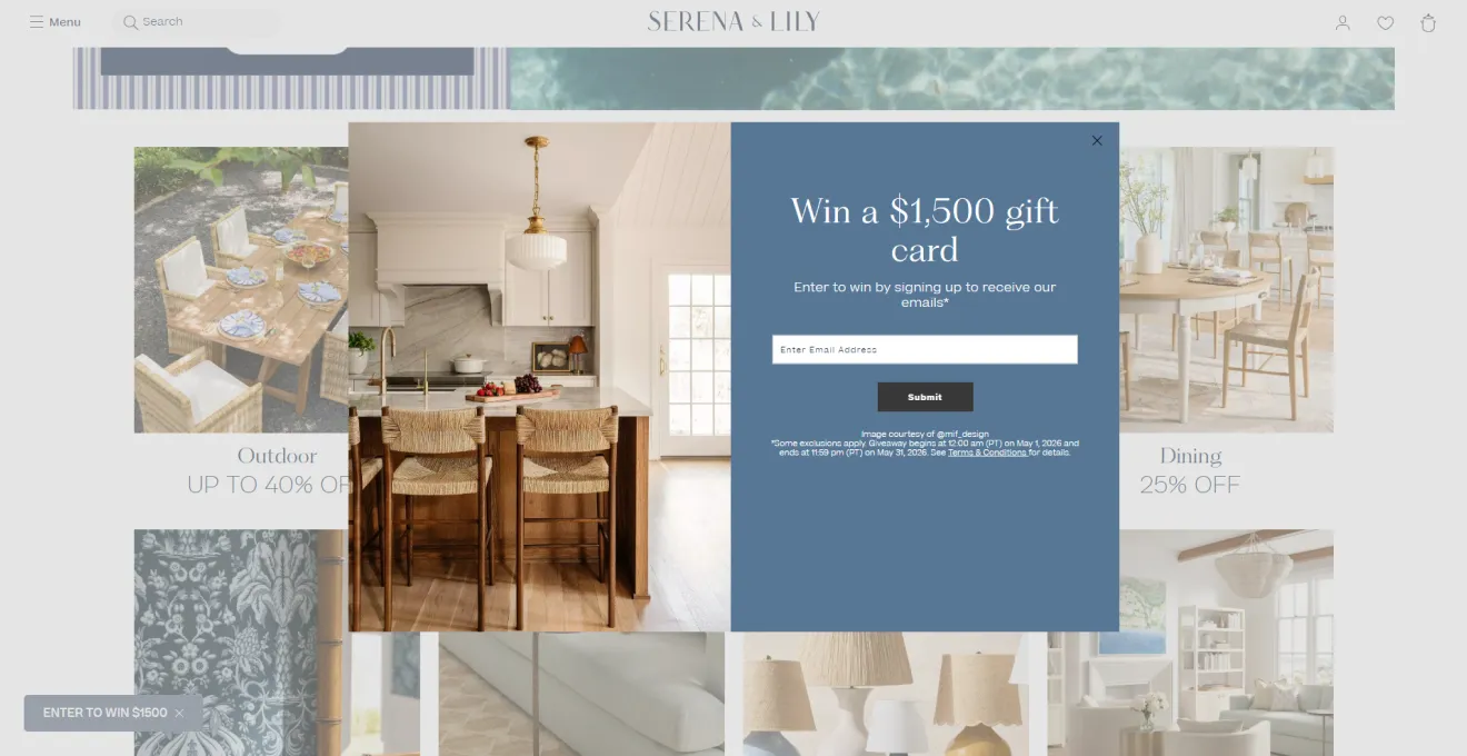
Serena & Lily
Trigger: On entry| Format: Email popup | Incentive: $1,500 gift card | Avg. CR: 3.85%–4.87%
For this email popup by Serena & Lily, emotional design (elegant visuals and large-scale giveaway) does half the job. They avoid traditional discounts to protect perceived value. Premium or brand-sensitive stores usually use non-discount incentives to keep the motivation high and protect margins.
Lululemon
Trigger: On entry| Format: Email popup with a GIF | Incentive: 15% off | Avg. CR: 3.85%–4.87%
Entry popups are typically static and predictable, but Lululemon introduces motion through a looping runner animation. This small but intentional detail ties the offer to the brand’s core athletic positioning.
Pro tip: Welcome discounts convert well, but open-ended coupons often delay purchase decisions. Adding a clear expiration window, such as “valid for 48 hours,” helps create urgency. Claspo allows you to add a Countdown Timer directly to the success screen to visually reinforce that time pressure.
Woolx
Trigger: Scroll | Format: Gamified full-screen email popup | Incentive: Mystery discount | Avg. CR: 9.18%
Our benchmarks show that gamified email capture popups consistently outperform traditional ones, achieving an average CR of 9.18% (compared to the traditional average of 3.53%). The top 25% of these popups can even reach a 26.41% CR.
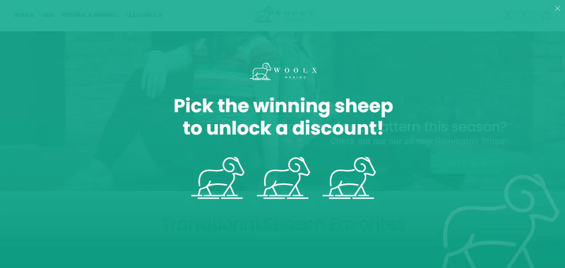
Pro tip: While Woolx uses a full-screen layout, Google’s mobile search signals prioritize unobstructed content. You can achieve the same 9.18% lift with a centered email popup or a floating bar on mobile devices.
You can recreate Woolx's successful example with a similar Claspo email capture popup. The fastest way is by customizing one of our gamification-ready popup templates. You can keep the default gift box images or easily upload your own.
Nimbus 48
Trigger: On entry | Format: Gamified floating box (Scratch Card) | Incentive: Mystery discount | Avg. CR: 9.18%–11%
Standard static popups deployed immediately on entry often trigger an instant muscle-memory reflex to close the form. However, gamified components change this loop.
Pro tip: Few popup formats fit mobile behavior as naturally as scratch cards. The simple “scratch-to-reveal” mechanic feels intuitive on touchscreens and helps these gamified email popups reach an average 11%+ CR.
Funko
Trigger: On entry to new visitors | Format: Gamified email popup (Spin-the-Wheel) | Incentive: Mystery discount | Avg. CR: 9.18%
Funko leans into its pop-culture identity by turning lead capture into a playful, on-brand interaction. The design stays visually consistent with the main site, and the offer appears only for first-time visitors to protect margins.
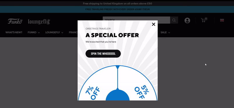
Pro tip: Displaying only the top half of the wheel cuts off the view of the prize pool. To maximize engagement, experiment with showing the full wheel.
Riding times
Trigger: On entry | Format: Gamified email popup (Spin-the-Wheel) | Incentive: 200€ | Avg. CR: 9.18%
Since this Lithuanian e-bike retailer sells premium electric bikes and motorcycles, a generic 10% welcome coupon would feel too weak to motivate action, and aggressive sitewide discounts would quickly damage margins. A visible prize wheel with dynamic rewards ranging from €50 to €200 off adds excitement to the signup flow without promising the highest discount every time.
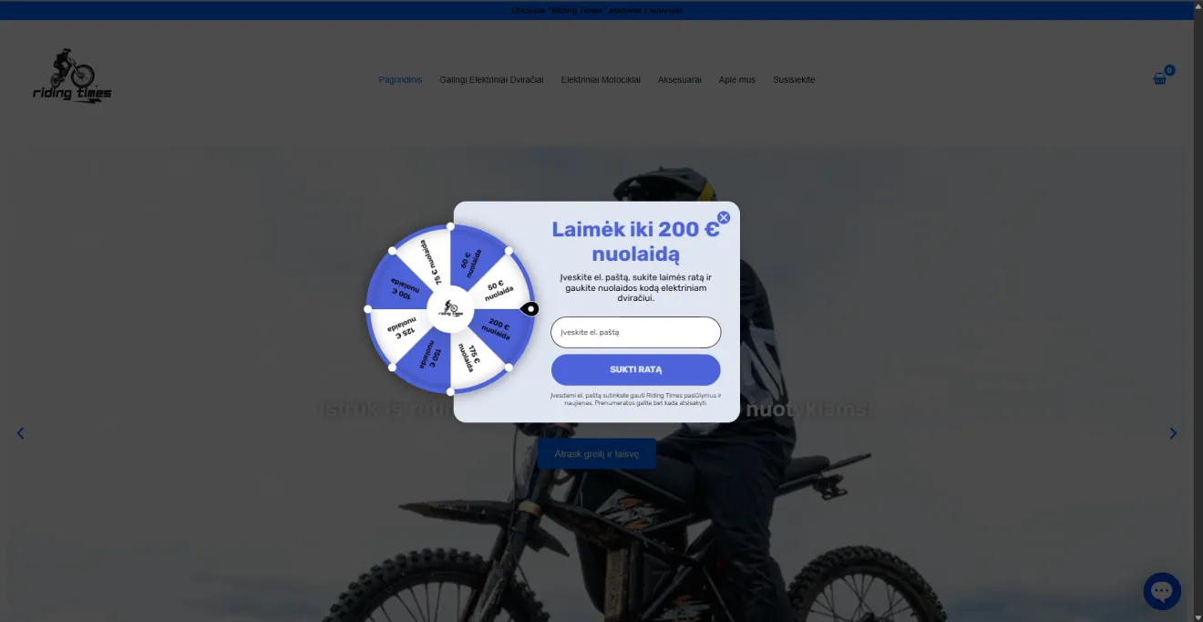
Pro tip: You don’t need to give every user your top prize to drive high conversions. With Claspo, you can set weighted win probabilities — most users receive smaller rewards, while a small percentage unlocks high-value prizes. This keeps engagement high while controlling cost.
Gard pro
Trigger: On entry | Format: Multi-step email popup | Incentive: Watch giveaway | Avg. CR: 4.56%
Gard Pro replaces standard lead capture with a vote-based entry flow. After choosing a potential gift, it’s hard to resist filling out the email and phone fields. A simple interactive choice, followed by staged data capture, lifts early engagement to a 4.56% CTR.
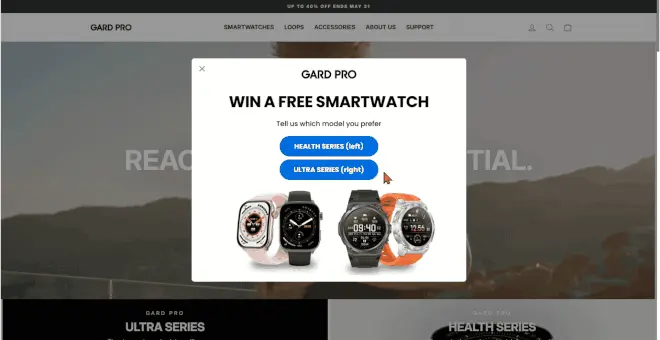
Pro tip: Connect choices from the email popup to ESP or CDP tags to trigger personalized campaigns.
SBLA Beauty
Trigger: Exit-intent | Format: Email popup | Incentive: 40% off VIP offer | Avg. CR: 5.76%
To stop visitors from abandoning their site, SBLA Beauty relies on 3D visual effects, oversized typography, premium product renders, and a stacked value proposition (“30% Off + An Extra 10% Off”)
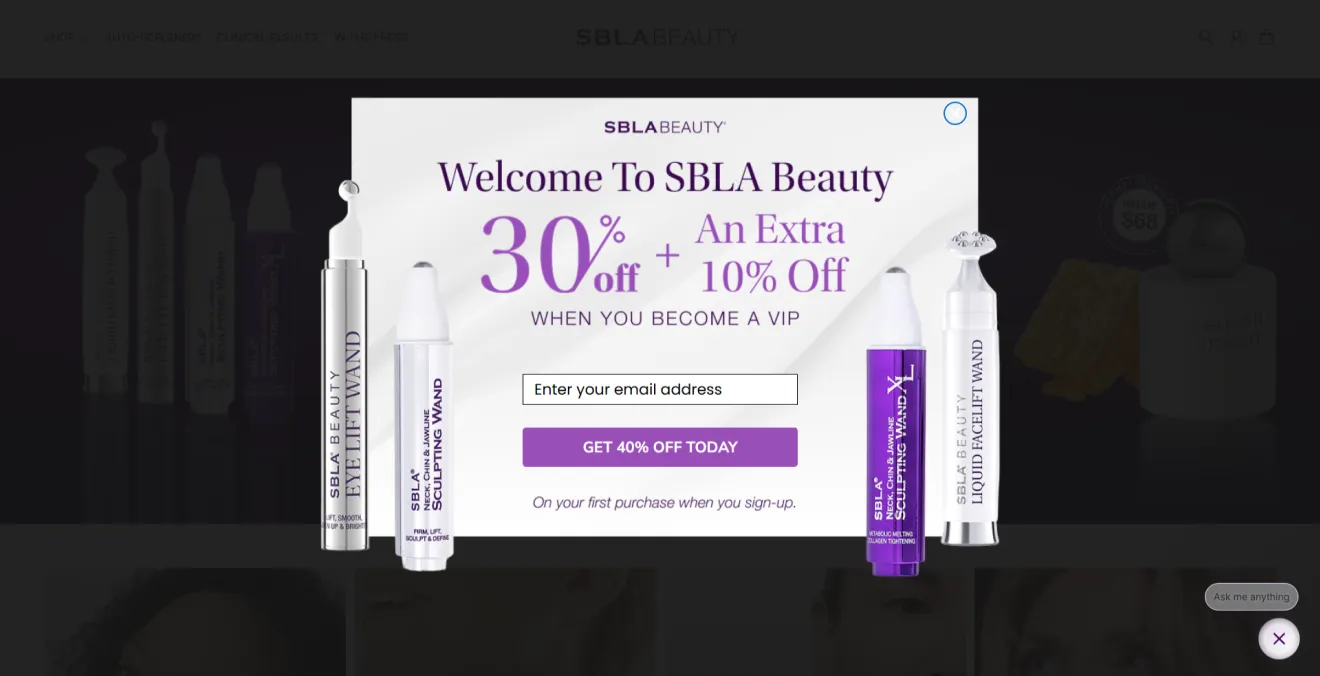
Pro tip: Beat drop-off by combining an exit-intent trigger with a clear promo code offer. Our data showed this combo had a 5.76% CR.
Food & drinks email signup form examples
In food and beverage, email capture popups consistently outperform other industries, driven by appetite-led engagement and a 7.18% average subscription rate. The best-performing brands, however, achieve up to 30.5% conversion by pairing high-impact food visuals with strong value offers such as recipes, mystery deals, and gamified experiences.
Heatonist
Trigger: On entry | Format: Multistep full-screen email popup | Incentive: 15% off + free shipping | Avg. CR: 5.74%
As a welcome popup, Heatonist shows a full-screen quick quiz with the component “Choice” — this low-effort move helps avoid immediate friction and has a pleasant effect on visitors. Asking for email, phone number, and preferences in a single-step form creates heavy friction and can reduce conversions to just 0.81%.
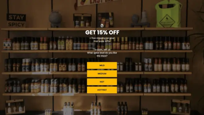
Pro tip: Multistep flows perform better because they spread commitment across smaller actions. Our benchmarks show multistep popups average a 4.56% CTR on the first interaction step, while delayed phone collection helps preserve overall signup rates.
Habit
Trigger: 10s delay | Format: Bottom-corner floating box | Goal: Grow email list | Avg. CR: 7.18%
Thanks to the trigger delay, visitors have time to take in the main high-quality visuals and understand the brand before signing up to a clean, minimalistic floating box in the bottom-right corner.
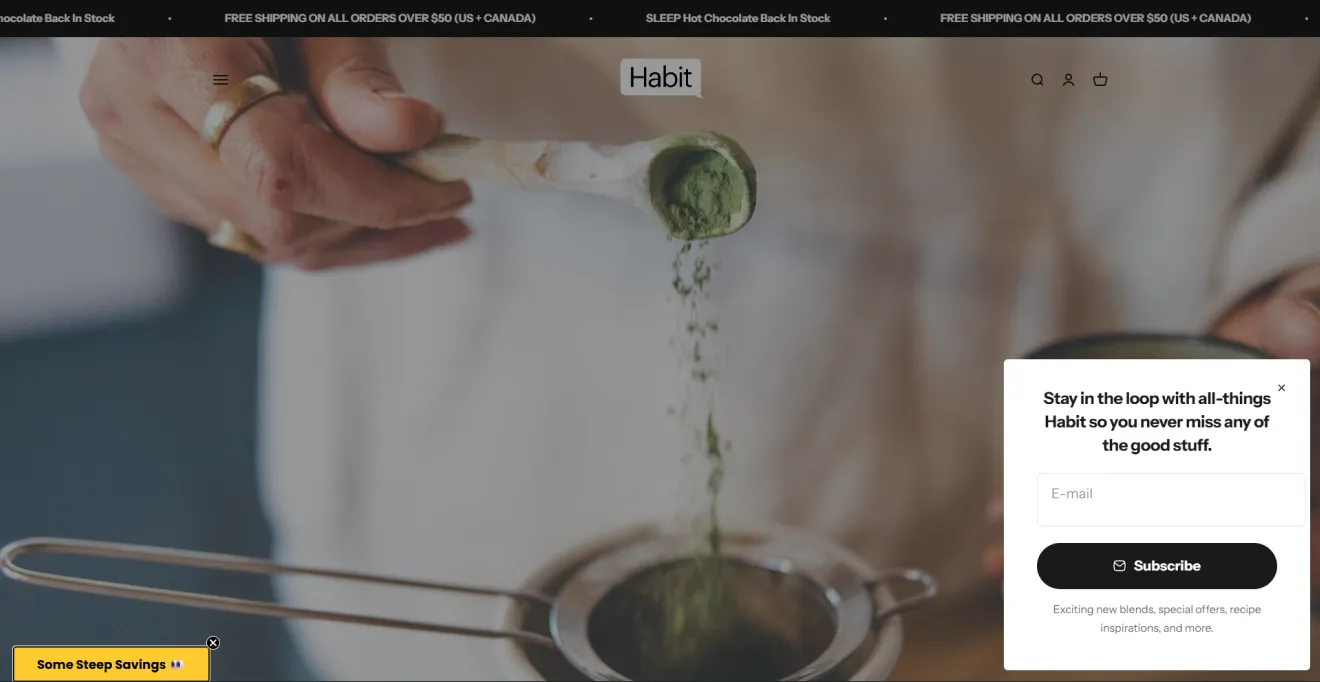
Pro tip: Traditional centered popups attract all the attention, but they can feel disruptive on homepages. Use a subtle floating box layout that stays visible without interrupting browsing. Our 3-year data analysis shows that floating boxes perform almost identically to traditional ecommerce popups (4.78% CR vs. 4.87% CR).
Ghia
Trigger: On entry | Format: Full-screen email popup with choice | Incentive: Mystery discount | Avg. CtR: 6.20%
Ghia used a 60-second timer and choice buttons to encourage immediate action even before any data entry begins.
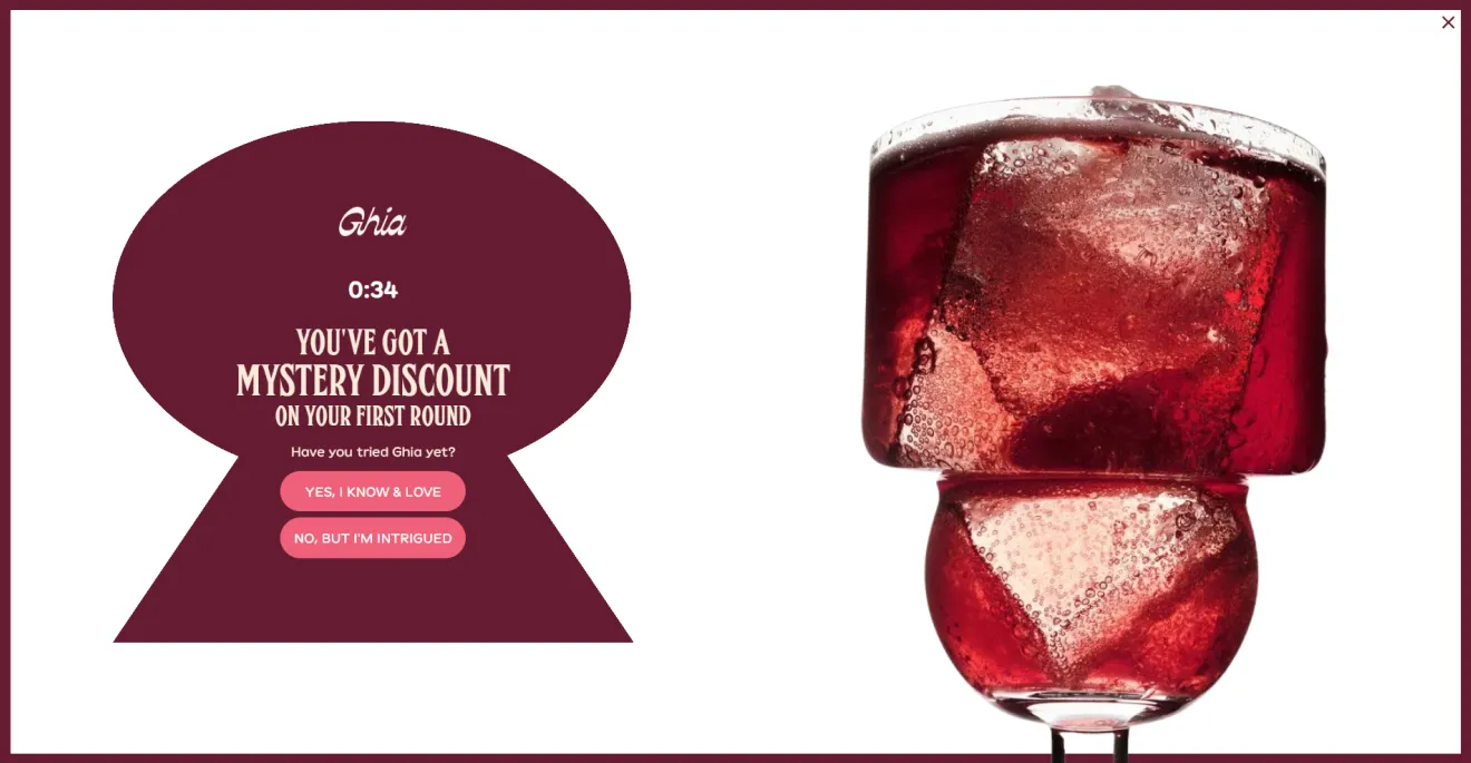
Pro tip: Our benchmarks show that a combo of a countdown timer and discount incentives can significantly boost performance, reaching up to a 6.20% CTR and converting passive visitors into high-intent users.
Psilly Goose
Trigger: On entry | Format: Email popup with dynamic visuals | Incentive: 15% off | Avg. CR: 5.13%–6.22%
Playful copywriting and a carousel of vivid product shots anchor the visitor's focus on entry. For this niche, dopamine design > everything.
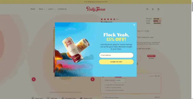
Pro tip: Emotion works exceptionally well in food and beverage marketing, but clarity matters just as much. Combine sensory visuals with simple, easy-to-scan offers.
Lyka
Format: Inline email subscription form | Incentive: 30% off two orders | Avg. CR: 3.85%–4.87%
Lyka abandons standard, pushy sales copy in favor of a conversational invitation that reads like a message from a friend. People get tired of transactions, so when brands bet on copy, they get higher CTR, CR, and engagement.
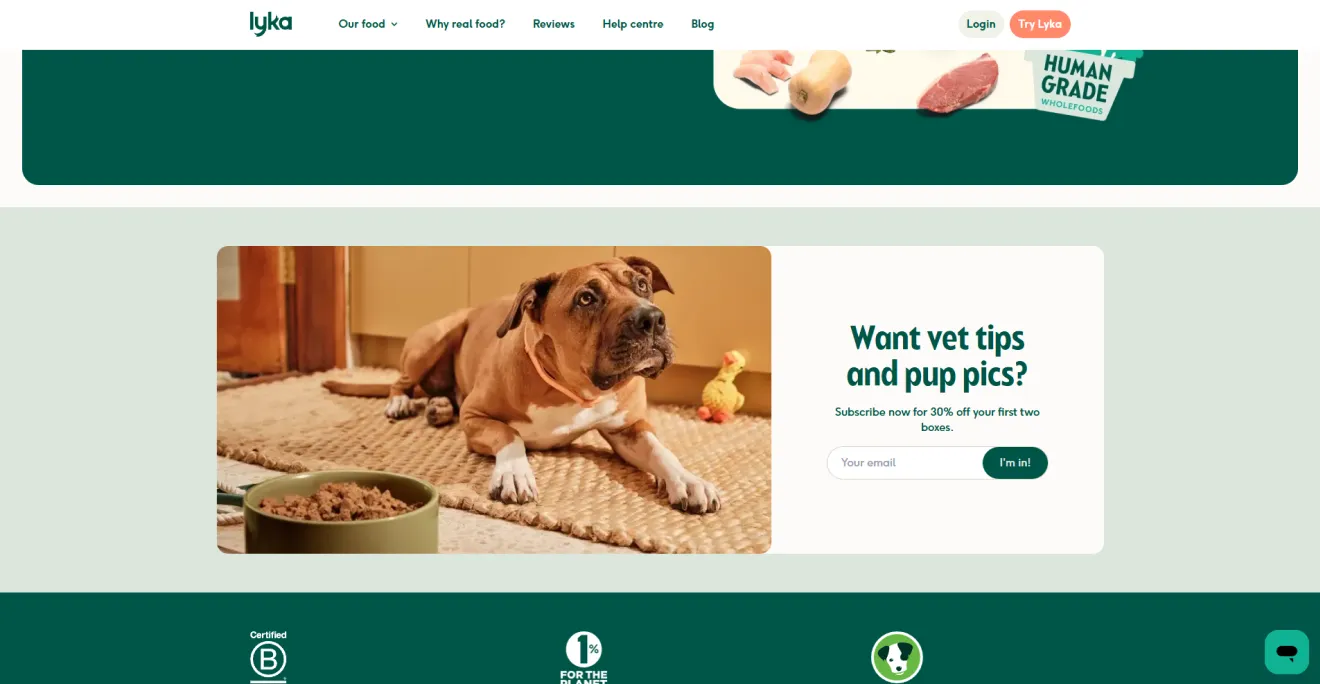
Pro tip: If you struggle with writing, use Claspo’s built-in AI copywriting agent to draft conversational, benefit-first headlines that match your brand’s tone perfectly.
B2B and SaaS email signup popup examples
In B2B and SaaS, email capture popups help to collect leads for further communication with the sales team.
Flowium
Trigger: 10s delay | Format: Email popup | Incentive: Free playbook | Avg. CR: 4.91%
A SaaS mailing list popup typically converts at about 1.17% because B2B buyers are careful with their data. Flowium overcomes this hesitation by offering useful educational content instead of discounts (which are used in only 14% of the best-performing SaaS email popups). Offering a free guide, checklist, or playbook is a safe strategy because information is a high-value, low-friction asset for B2B.
Pro tip: Stick to a single, friction-free email field, as 90% of elite email popups use only 1–2 fields to prevent drop-offs.
Customer experience strategies summit
Trigger: 20s delay | Format: Email popup with slider component | Goal: B2B lead nurturing | Avg. CR: 1.89%–4.91%
With a 20-second delay, the email popup gives corporate visitors time to review key event details — such as 20+ hours of content and 40+ speakers — before asking for email capture.
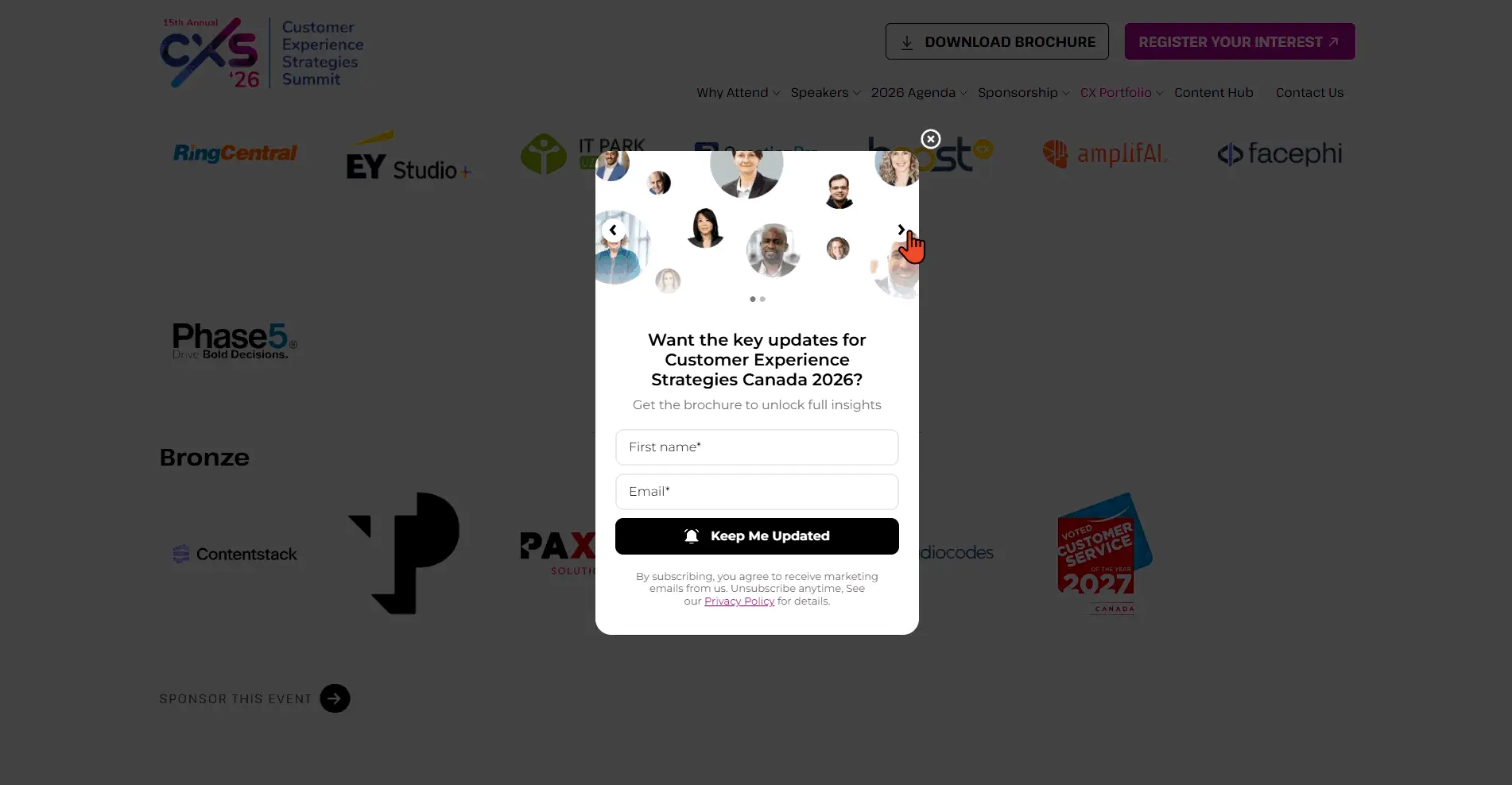
Pro tip: Standard B2B signup forms struggle due to high data sensitivity, resulting in a 1.89% CR baseline. This design improves engagement by using a dynamic Slider component featuring featured speaker visuals, resulting in a 9.53% CTR.
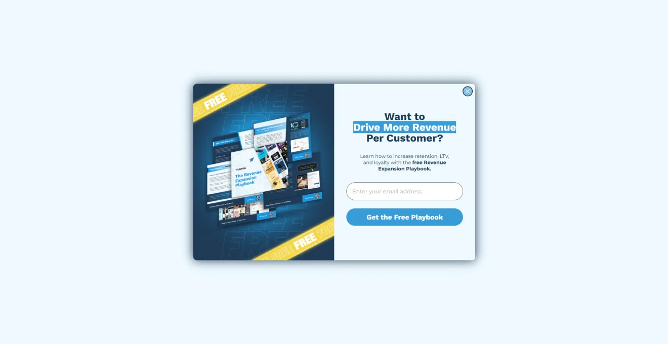
Virtuance
Trigger: On entry | Format: Email popup | Incentive: Free checklist | Avg. CR: 4.91%
This welcome popup aims to capture top-of-funnel prospects who aren't ready to buy immediately but are looking for expert resources. This email popup wins through focus and relevance — an expert, useful lead magnet can address their pain better than a generic newsletter subscription. In fact, our data shows that highly relevant downloadable resources can help B2B signup forms reach up to a 4.91% CR by offering immediate practical value instead of abstract promises.
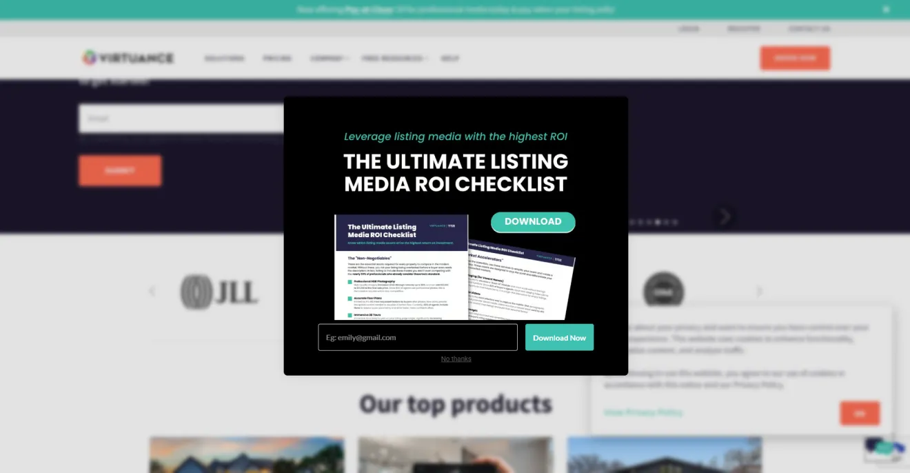
Pro tip: Relevance matters more than volume in B2B lead generation. Show a real estate ROI checklist on investment-related pages and a different asset on pricing or strategy content. In Claspo, you can do this with page-level targeting rules.
Email popup examples for the consumer services sector
Consumer service companies often have valuable information to share with their customers, making email campaigns beneficial for both sides.
Pvolve
Trigger: On entry | Format: Multi-step full-screen | Incentive: Summer Sale + 15% Off | Avg. CTR: 4.56%
Of all seasonal promotions, summer campaigns tend to perform best, with an average CTR of 8.71% compared to a 5.85% benchmark for standard campaigns.
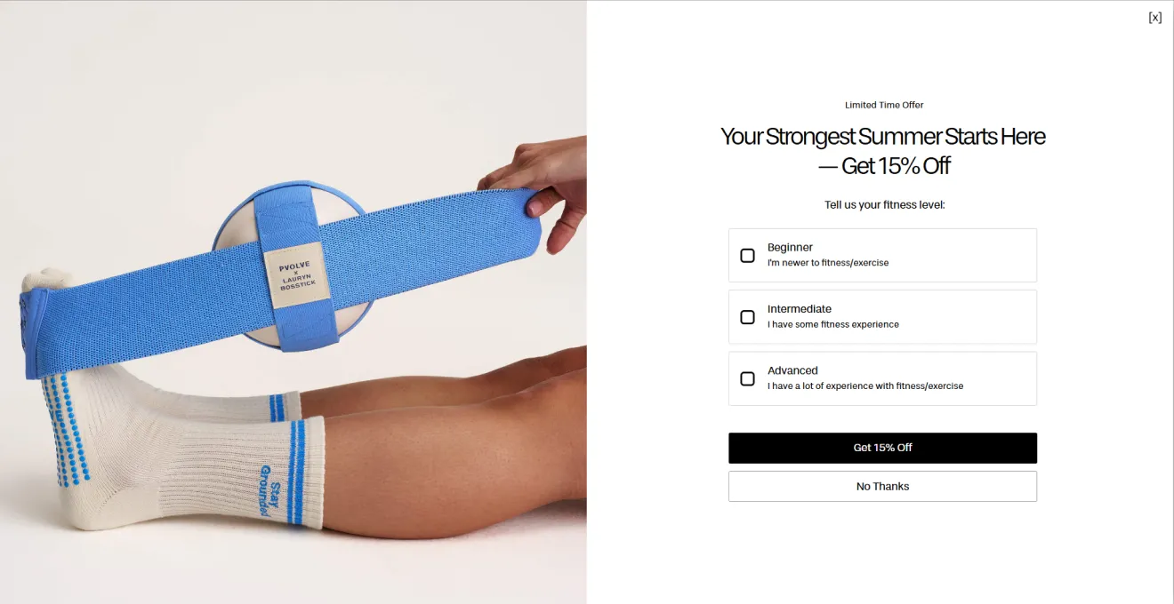
This full-screen email popup doesn’t demand an email upfront, but starts by asking users to select their fitness level. This micro-commitment lowers cognitive barriers, gets users actively clicking, and seamlessly guides them through the funnel.
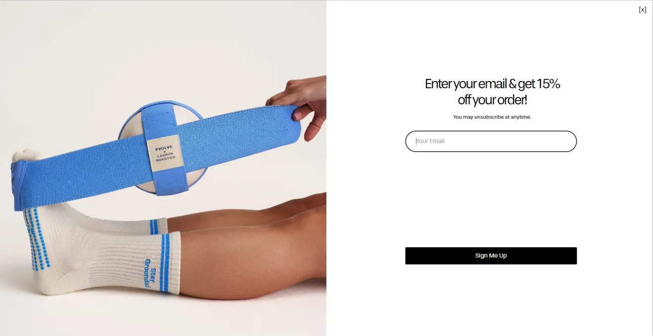
While multi-step components reduce sheer upfront list volume (CR), multi-step email popups average a 4.56% CTR. This is because such forms guide users through small actions first, which helps maintain interest and reduces resistance to completing the form.
Here is the email popup design trick: asking for a phone number on the third screen works much better than asking for it right away. After users have finished the quiz and entered their email, they’ve already invested time in the experience and are far more likely to share their number.
Pro tip: This email popup example shows that the signup itself is only half the job. The real magic happens on the Thank You page. Use our editor to show the unlocked promo code and pair it with a “Shop Now” CTA or curated product block. This gives subscribers a clear next step and encourages them to redeem the offer right away.
White Oak Pastures
Trigger: On entry | Format: Email popup | Incentive: Exclusive content | Avg. CR: 0.72%–1.17%
A welcome email signup popup from White Oak Pastures demonstrates that a friendly tone in the Top 10% lowers user friction. A welcoming, professional-friendly tone is a hallmark of elite lead capture; our data shows that value clarity reaches 97.5% in email popups that ditch clickbait and focus on genuine brand alignment.
Pro tip: Keep your fields and CTA entirely above the fold within the email popup. Since 60% of top-performing email popups keep content concise and easy to scan, combining a mobile app promo with dense text in a single popup can reduce conversion performance.
Doonails
Trigger: On entry | Format: Full-screen multi-step email popup | Incentive: 50% off | Avg. CR: 4.56%
Why not turn a welcome popup into an interactive feedback experience? This way, you get more insights about your prospects, their pains and motivations, get their contact details, and can alter welcome flows, product education, and promotional messaging around the user’s specific concern.
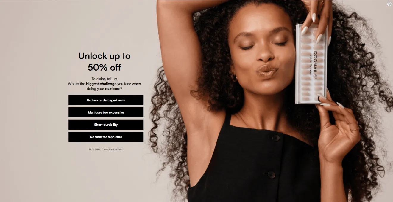
Pro tip: Interactive question-first flows reduce defensive reactions because users feel they are participating rather than immediately surrendering data. This approach helps maintain a higher conversion baseline.
Email popup examples from media & blogs
Email capture popups for bloggers and media are a vital tool for collecting readers' contacts. However, using them on websites with rich content has a few nuances.
McKinsey & Company
Trigger: 50% Scroll depth | Format: Floating bar | Goal: Segmented lead gen | Avg. CTR: 3.27%
This hyper-targeted email collection popup personalizes the user experience, capturing high-intent readers right when they are deeply engaged with a specific topic.
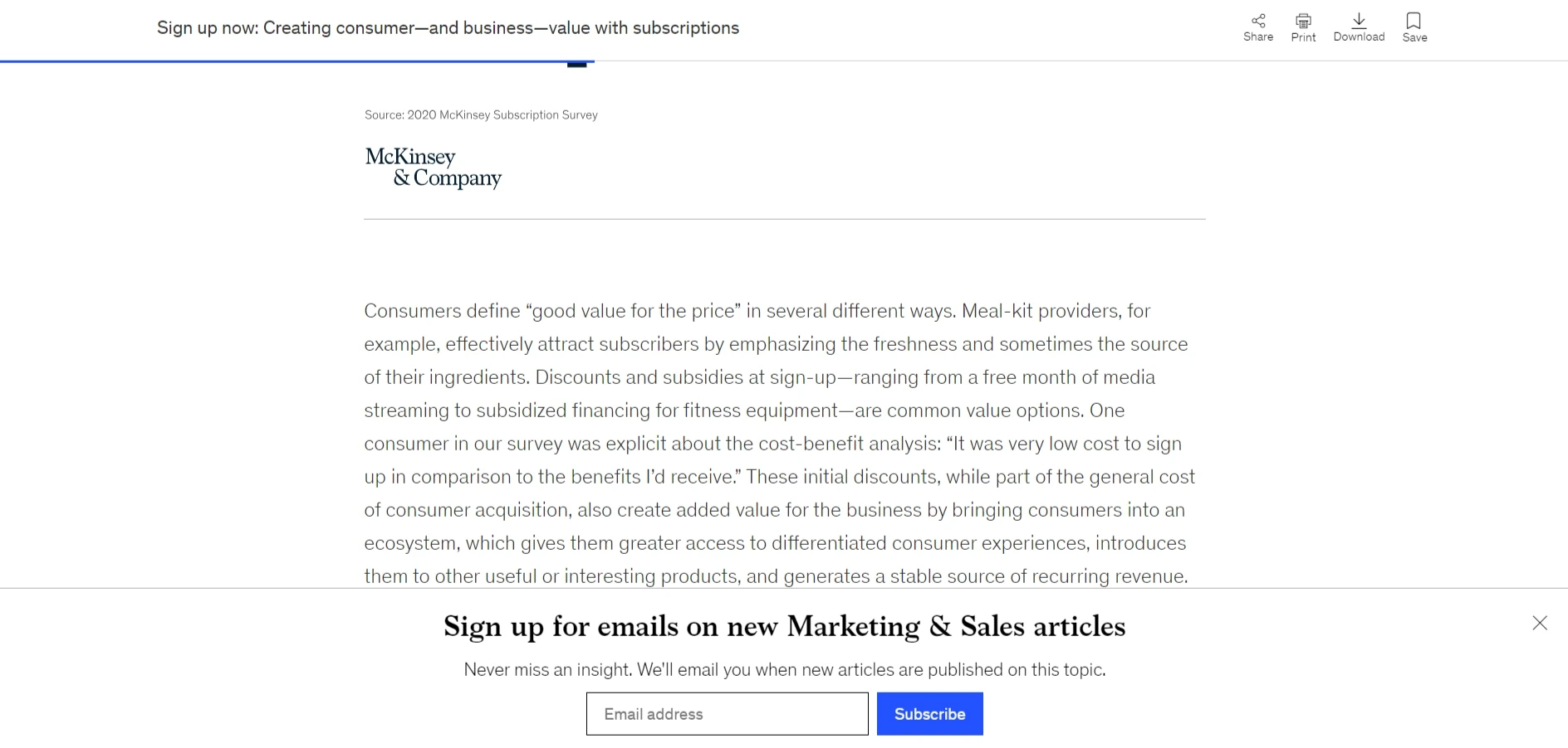
Even though floating bars usually have a lower CTR (3.27%), showing them at halfway scroll helps reach higher-quality leads.
Aspiration Marketing
Trigger: Time delay/Scroll depth | Format: Email popup | Goal: Lead segmentation | Avg. CR: 0.72%–1.17%
Our 3-year study confirms that adding extra fields generally introduces friction and drops sheer upfront volume, but advanced segmentation works differently in B2B and agency contexts. When you offer to choose content preference before sign-up, you create a personalized experience, trading raw sign-up quantity for highly qualified, deeply engaged leads.
Pro tip: High-friction, countdown offers in email popups require perfect layout transparency to prevent immediate bounces. In this example, the close button blends directly into the background graphic, making it hard to find. Always make your “X” icon visible and contrast. In Claspo, you can easily tweak button design and color or switch to a multi-step layout to split preference checklists across separate pages, capturing the email first and keeping user friction to an absolute minimum.
Forbes
Format: Inline email form | Goal: Grow email list | Avg. CR: 0.09%–0.77%
The form between article modules reaches readers who are already actively engaged with their reporting, offering a clear value proposition (“Our best stories, exclusive reporting and Forbes perspectives...” To counter banner blindness and the traditionally low CR for the niche, Forbes uses a high-contrast design.
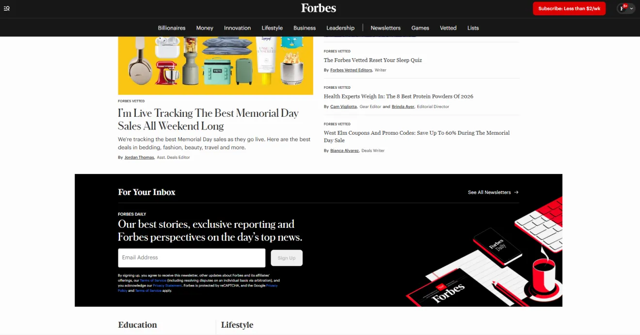
Pro tip: Inline forms capture high-intent readers but disappear once users scroll past them. Pair them with a subtle scroll-triggered floating bar to keep the signup visible on long pages.
Animalz
Trigger: On load | Format: Sidebar sticky box| Goal: Content newsletter subscriptions | Avg. CR: 0.32%
Traditional popups can sometimes irritate tech-savvy, B2B audiences who just want to read an article without interruption. Animalz positioned their email signup popup directly below the floating table of contents so it remains visible as readers scroll through the article.
Pro tip: Sticky sidebar forms work well on desktop but often disappear on mobile screens. Use mobile-specific display rules to replace them with a lightweight Teaser or bottom floating bar to keep your email signup popup visible across all devices.
Email popup examples on mobile
Mobile devices have shared web traffic with desktops almost equally for several years, making mobile popups essential for websites.
Perfume.com
Trigger: On entry | Format: Floating box on mobile | Incentive: 20% off | Avg. CR: 3.53%
Perfume.com improves mobile UX by using a small bottom box instead of a full-screen email popup. This keeps the page content visible while still offering a clear discount incentive without interrupting the experience.
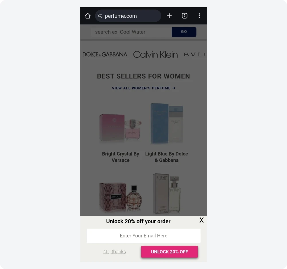
On mobile, less is more. The best-performing email popups stay under 50% screen height and prioritize large, easy-to-tap controls to prevent friction.
Pro tip: Don’t duplicate messaging between headline and CTA. Use action-driven button text like “Get My Discount,” and A/B-test opt-out copy variations to identify wording that minimizes drop-offs.
Bloomscape
Trigger: On entry/Scroll | Format: Email popup with a Teaser | Incentive: $20 off | Avg. CR: 3.53%
Mobile users are quick to exit when faced with intrusive overlays. This is one of those email signup popup examples that proves how important Teaser is for mobiles. Instead of losing the user after a single close action, the offer stays visible in the thumb zone while they continue browsing.
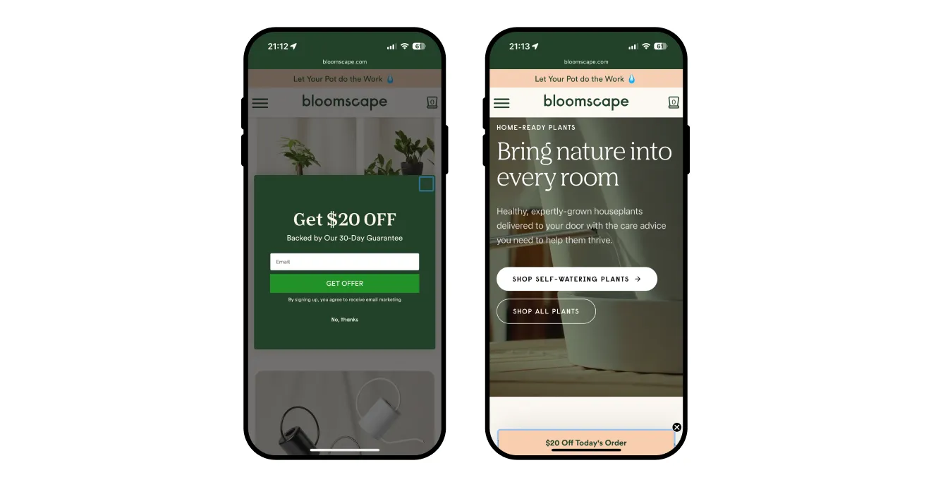
Pro tip: Experiment with the Teaser image. For instance, an A/B test could compare two versions: one with the gift icon and another displaying 20% OFF.
Zaful
Trigger: On entry | Format: Email popup | Incentive: 15% off | Avg. CR: 3.53%
Zaful keeps mobile email popups sharp and simple. The offer is clear (“15% OFF Coupon”), the audience is defined (New users), and the CTA (“I Love Saving Money!”) adds a playful conversion trigger.
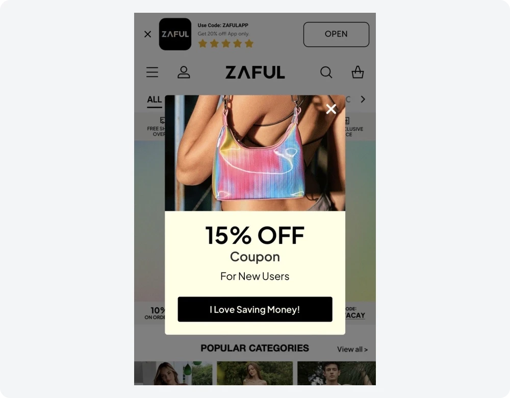
Pro tip: Give users a clear way out by adding a text opt-out under the CTA. In Claspo, you can frame it as “No, thanks, I’ll pay full price” to create a subtle loss signal.
Shopwine Direct
Trigger: On entry | Format: Email popup | Incentive: 10% off | Avg. CR: 2.48%–3.31%
Instead of asking for a subscriber's name, marketers opted to collect birthdates to use in their marketing strategy and comply with industry regulations.
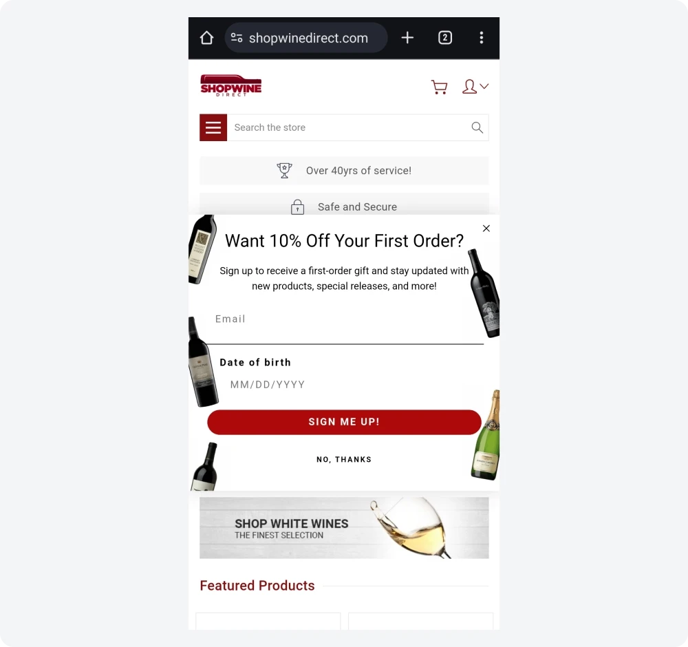
Pro tip: To keep mobile interactions as smooth as possible, make sure your form elements are simple, and the opt-out mechanism is easy to use (like the tap-friendly “No, Thanks” button under the primary button).
Email popup design conversion benchmarks (2026)
Based on an analysis of all Claspo popups over the past three years (779M+ impressions), we found that the average email popup converts at 3.53%, but top performers far exceed this. Gamified email popups reach nearly 10× the benchmark, and even non-gamified leaders perform about 8× higher.
Below is a breakdown of the variables that impact conversions.
Element | Top 1% pattern | Why this works | Performance impact |
Layout | ~74% use centered popups | Centers visual focus instantly, so the message isn’t lost in background noise. | 10.6% CTR (highest layout average). |
Complexity | ~90% use 1–2 fields | Reduces typing friction. | 2.48% CR baseline for email-only capture. |
Incentive | ~69% offer discounts | Provides immediate value instead of abstract benefits. | 3.85% CR vs. 2.48% baseline. |
Mechanic | Gamified components | Replaces friction with curiosity-driven interaction. | 9.18% avg CR (up to 34.48% in top performers). |
Timing | Exit-intent triggers | Captures users the moment they leave. | 5.76% CR when paired with a promo code. |
Trust | Visible close button (~71%) | Reinforces user control.
| Lower bounce rates. |
Focus | ~94% use one clear CTA | Concentrates attention on one action. | Removes decision fatigue, increasing click intent. |
Visual anchors | 73%–92% use imagery | Helps users connect with the offer emotionally. | +63% subscription lift vs. text-only popups. |
Tone | 95% friendly/professional | Clear, benefit-first messaging drives conversions. | Reaches ~97.5% value clarity threshold. |
Mobile UX | Thumb-zone anchored | Keeps interactions within thumb reach. | Improves mobile usability and avoids interstitial penalties. |
How to create an email popup with Claspo
Designing and launching an optimized email capture popup takes only a few minutes using Claspo’s intuitive, code-free builder. Here is the streamlined setup process:
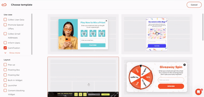
Step 1: Choose your template

Log in to your free Claspo account and click New widget. Filter the template library by your specific use case (e.g., "Grow email list") and layout format to find CRO-ready newsletter popup templates.
Step 2: Customize your email popup
Let’s customize an email popup together. The drag-and-drop editor gives you full control to make your email signup popup feel like a natural part of your website.

Match your site by choosing color palettes from the features Themes or fine-tune elements manually.
Click any text block to edit manually or use the built-in AI agent to generate headlines and CTAs aligned with your brand voice.
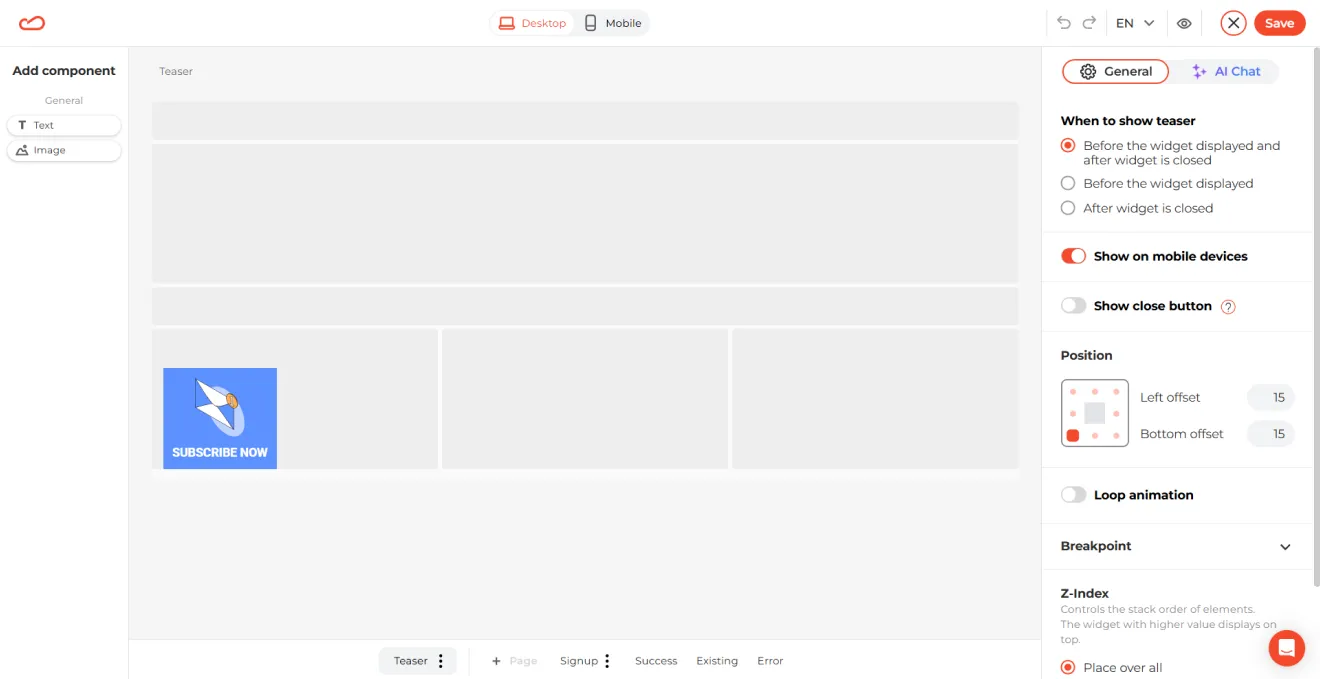
Every popup can collapse into a small teaser that stays visible in the thumb zone after closing, so the offer isn’t lost.
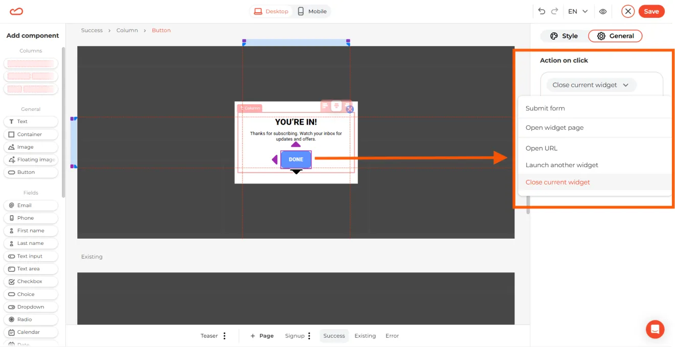
Customize what users see after subscribing. You can choose what happens when the user clicks the button on the popup: click the button and configure the action.
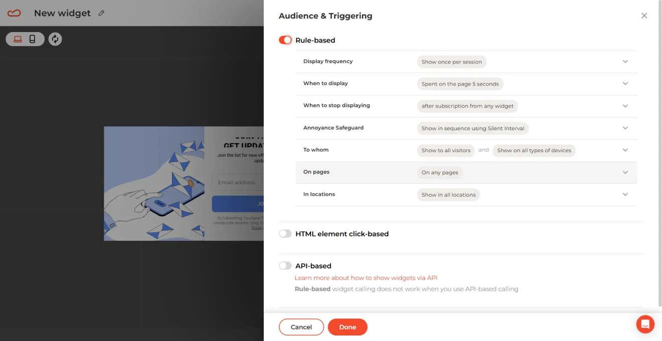
Step 3. Set up the display rules
Align your email popup triggers with real user behavior and specific traffic patterns: set display time, locations, audience, and pages where the popup should appear.
Step 4. Specify where to transfer data and go live
To make your collected emails useful, integrate Claspo with Mailchimp, Pipedrive, or HubSpot, etc. This way, new subscribers are automatically added to your email campaigns or sales pipeline without any manual work.
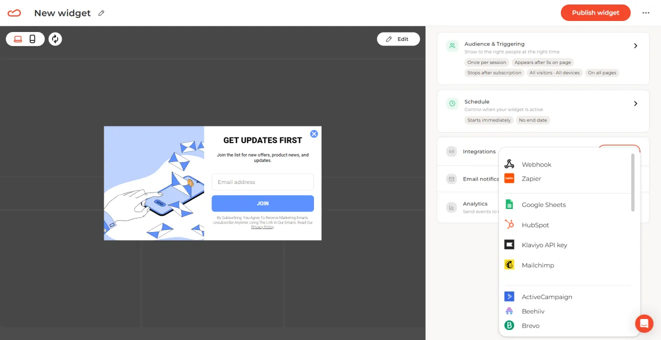
After you’ve done with integrations, click Publish and see your email popup live on your website.
Stop reading theory — start converting traffic
The fastest way to optimize your conversion funnel is to let your own audience data prove what works. Create a free Claspo account, choose a template, and launch your first A/B test to let real data improve your funnel.
FAQ: Email popup strategy & best practices
What is the best time delay for email popups?
Popups that appear instantly are often closed instantly. Our data from 779 million impressions shows that waiting until visitors are engaged leads to much better results.
8-Second delay: Giving users just 8 seconds to explore increases conversions by 34.57%.
Halfway scroll: On blog posts and long pages, trigger the email capture popup after readers reach 50% of the content.
Exit intent: When users are about to leave, a well-timed offer can recover 10% to 15% of traffic that was about to leave.
How many fields should an email popup have?
More fields mean fewer signups. Every extra question gives visitors another reason to leave.
Two fields convert at 3.31%. Five fields drop to just 0.81%.
Ask only for an email, or optionally a first name.
Use multi-step email collection popups to collect phone numbers and preferences after the initial signup.
What to offer in an email popup?
Discounts are effective, but they are not the only way to motivate signups. While 69% of top-performing email popups offer a discount, and promo codes increase average conversion rates from 2.48% to 3.85%, the real principle is providing immediate, tangible value rather than a vague “Join our newsletter” invitation.
There are several proven alternatives to protect your margins :
Gamified rewards. These convert strongly (9.18% on average and up to 34.48% at the top end) because users feel they are earning the outcome.
Quizzes and personalized tools beat discounts with relevance-driven value.
Educational content works best in trust-heavy niches.
Early access and exclusivity drive signups without constant discounting.
Expert insight: At Bully Max, the team replaced generic discount popups with a personalized “custom meal plan” quiz based on a dog’s breed, weight, and goals. Visitors received the plan and tailored product recommendations by email. According to Maris Laatre, this approach doubled opt-in rates while improving lead quality.
How to optimize email popups for mobile screens?
Mobile email popups require more careful design than desktop ones. Even though smartphone screens are larger than they used to be, available space is still limited, and intrusive popups can frustrate users or hurt your search visibility.
Keep the email popup compact. A common guideline is to limit the width to around 320 pixels and keep the height under 50% of the screen. This leaves the main content visible and makes the popup easier to dismiss.
Simplify the design. Use minimal copy and only one or two input fields. In Claspo, you can hide images on mobile to reduce clutter and create a more compact layout.
Respect Google’s mobile interstitial guidelines. Avoid email popups that block the entire screen immediately after page load. Instead, use a short delay, scroll trigger, or exit intent.
Optimize for thumb reach. Place the CTA and key controls in the lower portion of the popup where they are easier to tap with one hand.
Use teasers and floating bars. If a visitor closes the main popup, Claspo can automatically convert it into a sticky Teaser. This keeps the offer accessible without interrupting browsing.
Preview before publishing. Claspo’s built-in desktop and mobile preview modes let you verify that the email capture popup fits properly on different screen sizes.
How to improve email popup conversion?
The best means of increasing the email popup conversion rate over time is by doing constant A/B testing. A/B testing helps you to learn a lot about what your users like and how they behave, so that you can design an optimal email capture popup campaign. Below are three useful guidelines for A/B testing:
Test one variable at a time. Focus on a single element, such as the headline or call-to-action, to identify what drives performance changes.
Wait for statistical significance. Let the test run long enough to gather a sufficiently large sample. Early conclusions based on limited impressions often lead to false positives and unstable optimizations.
Scale winners systematically. Carefully review the test outcomes and apply the insights to optimize your email popups.
With Claspo, running A/B tests is super easy. Simply choose the popups you want to test and start the experiment, or use our auto-pilot.
How to grow an email list without bouncing visitors?
To grow an email list without increasing bounce rates, focus on when and why your popup appears. Engage users only after they’ve shown intent.
Delay display by ~20 seconds so users can first experience your content.
Match offers to the page context with relevant incentives (not generic signup prompts).
Trigger popups based on behavior like scroll depth (30–50%) or exit intent.
This combination captures higher-quality subscribers while keeping the browsing experience intact.
What copy makes email popups convert higher?
To make email popup copy convert at a top-performing level, avoid generic phrases like “Join our newsletter” or “Sign up for updates.” High-converting email popup copy replaces generic messaging with clear, benefit-first communication.
Top-performing popups (up to 30.5% CR) follow four rules:
Start with the benefit, not the action (“Get 15% off” > “Sign up”).
Prioritize clarity over creativity (value must be instantly obvious).
Use real urgency and curiosity, not fake scarcity.
Write CTAs as actions, not labels (“Claim my discount,” “Get my guide”).

![How to add a Shopify newsletter signup form [+Tips & Templates]](https://framerusercontent.com/images/FavgBqCU1zgoOwEdQvBHxtOWIc.png?width=1320&height=756)
