6 UX Mistakes That Lead to Drop-off in Gamified Popup Flows


Summarize
Most marketers sabotage their own fun. How? By launching a neon arcade on a premium boutique site. Gamification has evolved past the generic Spin-to-Win template. Today, it’s a high-stakes psychological game where a single UX mismatch can cost you thousands in lost income. We analyzed 779 million impressions to find the exact friction points where play turns into pain, and why your most creative ideas might be quietly killing your conversion rates. Shopify newsletter signup form
Mistake 1. The email gate
The email gate is when your popup looks like a toll booth: “Pay one email to play the game.” When this fires on entry, and a user who doesn’t know your product and its values decides to play it safe and dismisses the popup.
The demand-first UX leads to such friction points:
Skepticism. For a first-time visitor, an email address is high-value currency. Trading it for a chance to win feels like a bad deal.
Resistance. Humans hate being forced. The brain sees a gated popup as a dark pattern, so visitors instinctively click the “X”.
Delayed fun. If you hide the sweet win behind a wall, a moment of fun turns into dull data entry.
The fix: Play first, claim later.
Don’t break the principle of reciprocity — you need to give first if you want the visitor to give back. When the user spins the wheel or scratches the card immediately, the internal logic shifts.
User wins “20% OFF” → Dopamine spikes → The discount feels like their property → The email field becomes a claim form.
As a result of the Endowment Effect, visitors won’t see the email field as another sign-up for a newsletter, but as a claim for their prize.
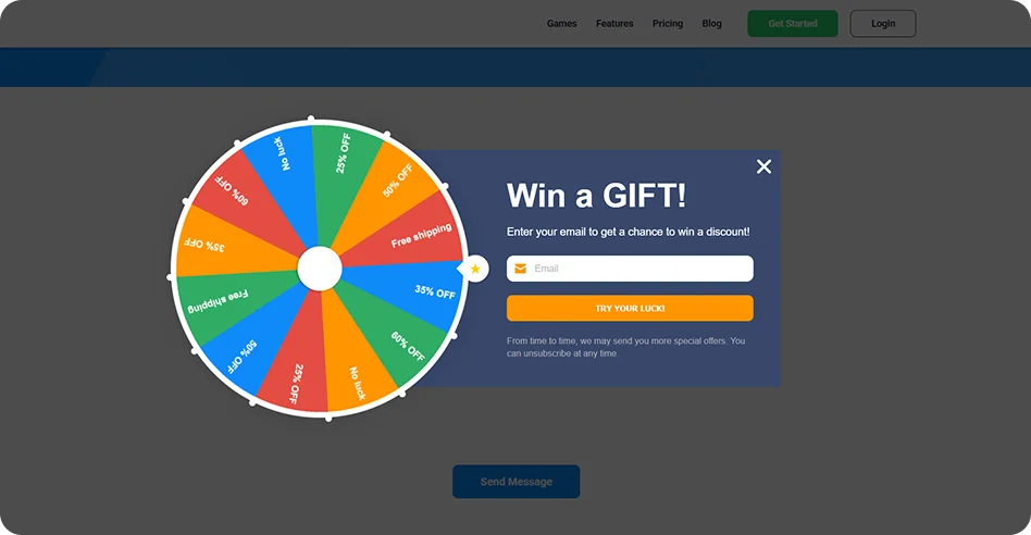
Mistake 2. Discounts for everyone
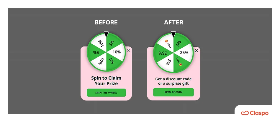
If your Wheel of Fortune looks like a carousel of discounts, we have bad news for you. If the win is guaranteed and obvious, it feels like a standard discount, killing all the dopamine we want to trigger. Like they say, “Where’s the fun without a bit of risk?”
Neuroscientist Robert Sapolsky discovered that dopamine levels in the brain spike highest when a reward is received only 50% of the time. Without the risk of getting a lesser reward, the user feels no excitement during the spin. The interaction becomes a chore they have to sit through to get the discount they already knew was coming. Let’s use this knowledge to fix your marketing campaign.
The fix: Control the randomness.
To create a high-conversion flow, you need to show various rewards and make it look like it’s real to win big. Here are some tips we’ve curated as marketers, after years of monitoring our clients’ success:
Have a tiered reward pool. When creating a wheel or gift boxes, mix frequent and rare rewards.
Add a Jackpot. Have a high-value prize (50% off or free product) with a tiny 1% win probability.
Play it safe. Let smaller rewards like 5% and 10% discounts handle most of the odds.
The real magic comes from showing the top prize — just seeing it creates a quick dopamine boost that makes the whole shopping experience feel more exciting from the start.
Mistake 3. Goal-mechanic mismatch
Spin-the-Wheel is so popular that a lot of brands just copy it, thinking, “Well, if everyone else is using it, it must work.” But fun doesn’t work that way. Different games create different feelings, and not every mechanic fits every audience. And using the wrong one creates cognitive dissonance.
For example:
A large, complex wheel on a mobile device where the screen is limited.
Using a high-energy Slot Machine for a serious B2B lead-gen offer.
Using the competitor’s tool, which reinforces banner blindness instead of breaking it.
The fix: Map the mechanic to the mindset.
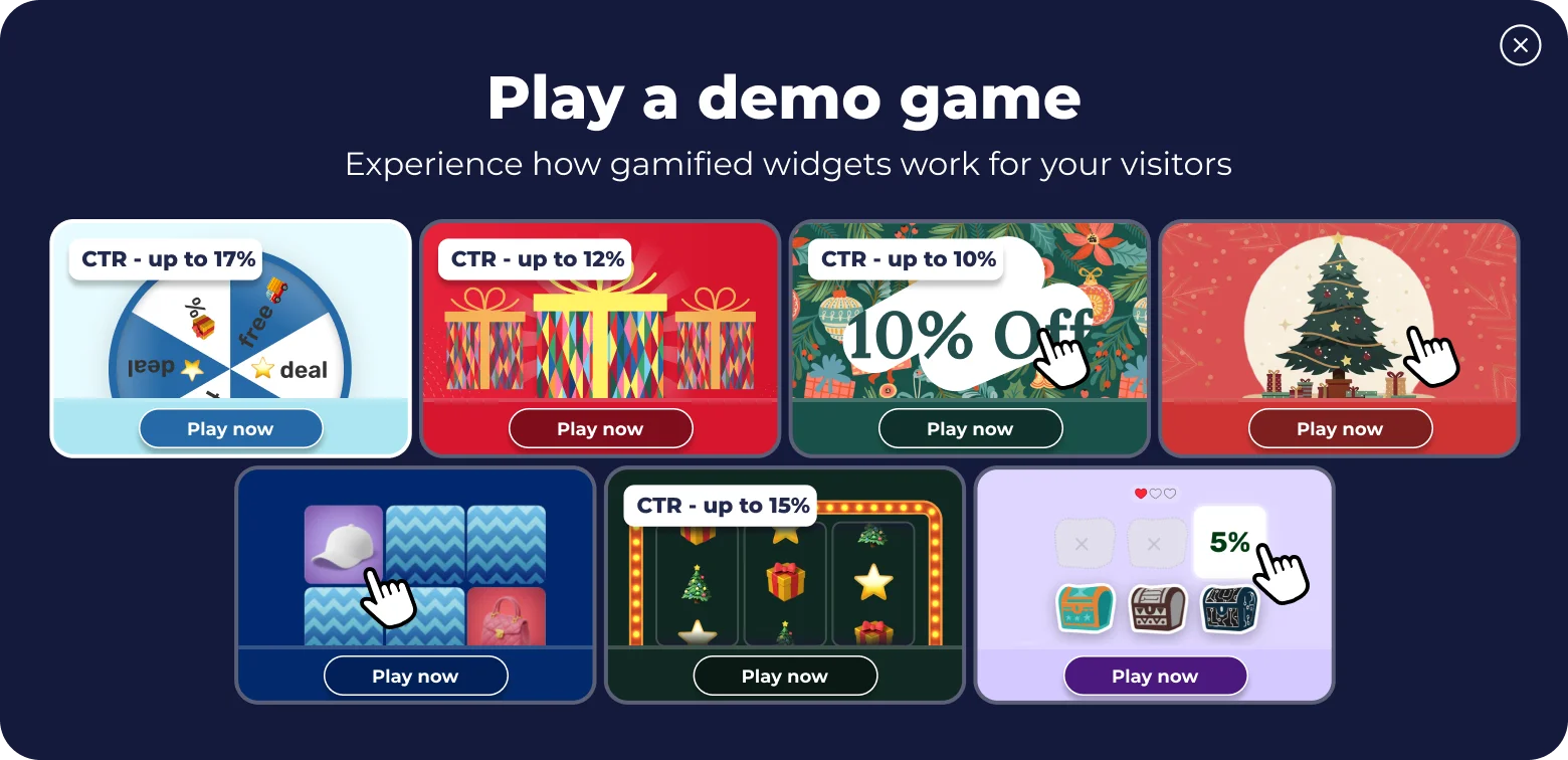
The data from our 3-year analysis of 779M impressions proves that the standard choice isn't always the highest performer. To lower your drop-off rate, map the game to the user's current journey stage:
For mobile clicks → Scratch Card.
It is tactile, compact, and delivers an 11%+ conversion rate (CR). The act of “rubbing” the screen fits the mobile thumb-scroll habit perfectly
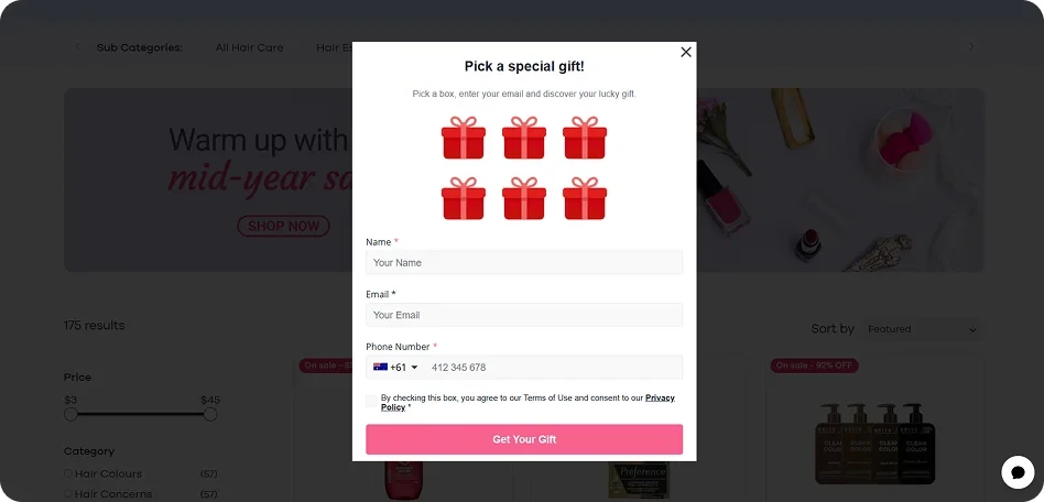
For sales and revenue → Pick-a-Gift.
Perfect for product pages. When a user selects a box, they feel the prize belongs to them, making it harder to walk away from the cart.
For dwell time and engagement → Memory Cards.
If your goal is to keep visitors on-site longer (for brand affinity or product education), use a memory matching game. It creates a pause in the user journey that requires focus, which keeps visitors on-site longer.
For email list growth → Spin the Wheel or Slot Machine.
These games are perfect for warming up cold traffic because they require zero cognitive load, deliver instant dopamine, and have a steady conversion rate between 9% and 11%.
For seasonal spikes → Shake the Tree or Break the Egg.
During Christmas or Easter, matching the holiday vibe transforms a standard sales notification into a festive toy. These popups can get you up to a 15% uplift in engagement compared to generic layouts.
For exploratory play → Treasure Hunt.
This is the long-game mechanic. Unlike one-click instant-win games, it invites users to search for and uncover rewards step by step. It keeps mid-funnel visitors engaged with your product catalog for much longer.
The alternative fix: Build your own game.
If your competitors are overusing the same wheel, your game becomes generic noise. Claspo now supports vibe coding — using an SDK and AI to build a signature mechanic that fits your brand, goals, and audience with just a prompt.
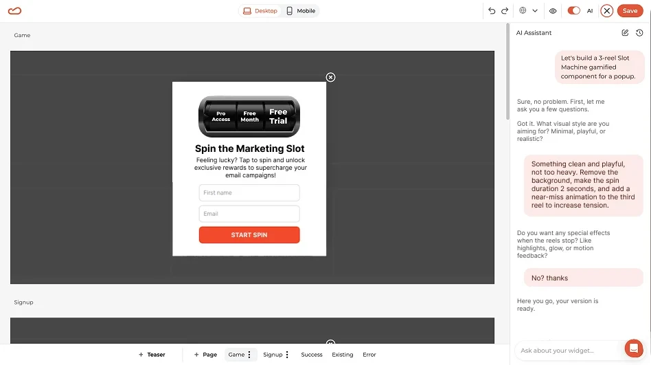
Instead of a Jira ticket, you describe your idea to the Claspo AI assistant in plain language. The AI generates the code and displays live results directly in the editor, making it easy to iterate, refine requirements, and polish the final experience. A custom game adds another advantage: its novelty helps break through user fatigue and captures attention better than standard wheel popups.
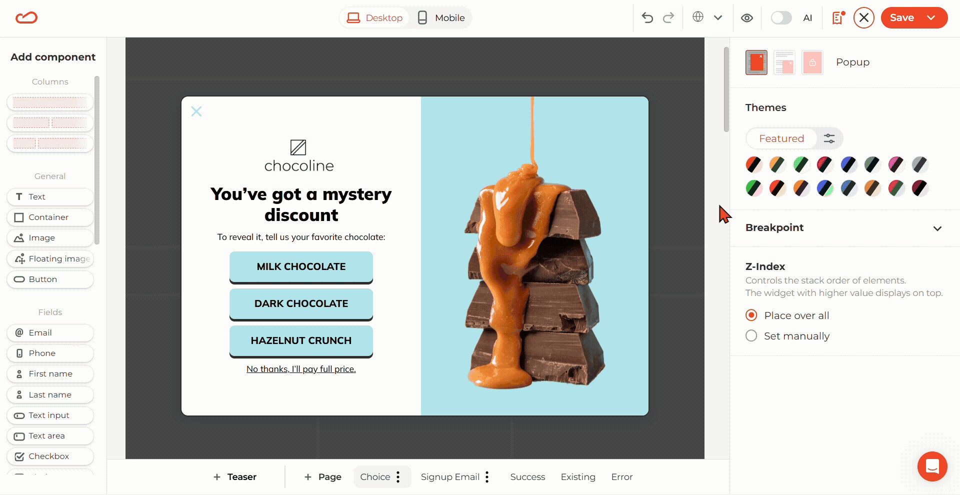
Mistake 4. Сhoice paralysis
Marketers often confuse variety with value. They offer a wheel with 12 segments or a grid of 9 mystery boxes, assuming more choices equal more fun. But in reality, this only paralyzes your customers. According to Professor Barry Schwartz in his book “The Paradox of Choice,” the more options we have, the less satisfied we feel with our decisions.
Too many options can ruin the fun. Instead of enjoying the game, users start stressing about making the wrong choice — and that regret can kick in before they’ve even finished playing. Every extra option forces the brain to calculate potential outcomes. When choice becomes work, your visitors will opt for the “X” just because it’s a path of least resistance.
The fix: Use tunnel vision.
To lower the drop-off rate, you must limit the cognitive burden. Expert UX design in gamification is about narrowing the funnel.
Use the rule of three: Limit your choices (mystery boxes, gift reveals, or key wheel segments) to 3 or 4 items. This is the best ratio where the user feels they have agency without overthinking.

With Claspo, you can actively toggle the number of options in games like Spin-the-Wheel, Treasure Hunt, Break the Egg, and Matching Cards. This ensures your popup remains a nudge toward the checkout, not a puzzle they can’t solve.
Mistake 5. Friction at the finish line
The most critical moment in gamification comes two seconds after the win. Very often, brands overlook the redemption flow. Imagine this: Your ad brought you a visitor, they decided to play the game and moved from skepticism to becoming a lead, the wheel is spinning, and dopamine is peaking, but then they see a clerical task: “Check your email for the code” or “Here is your promocode for a 10% off BF2026-XZ67.”

Such a thank-you page kills the momentum. When a user needs to take the detour, leaves your site to find a code in the inbox, or has to long-press and highlight a code on mobile to copy, the risk they’ll get distracted by a notification and never return increases with every extra move.
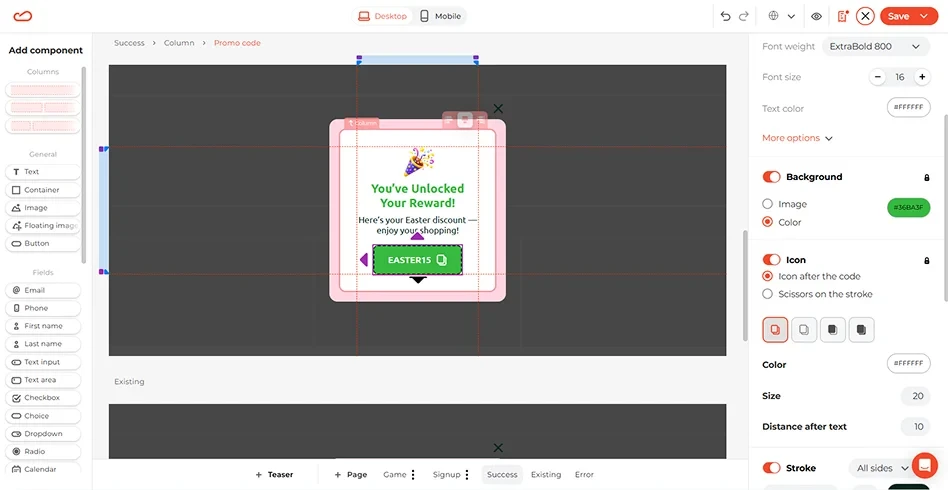
The fix: Auto-apply the code.
To maintain the shopping mode, you must bridge the gap between the win and the checkout automatically. Don’t gate the prize behind an email-only delivery. Show the code on the thank you popup page. It confirms the win and keeps the user on your page.
Additionally, a click-to-copy icon is an excellent UX practice for promo codes. It shows your users that the promo code can be copied with a click. For your convenience, the Claspo promo code component comes with such an icon out of the box.
For Shopify users, Claspo uses auto-redeem. The moment the prize is won, the code is applied to the cart in the background. No more memorizing, copy-pasting, or typing.
Mistake 6. Visual dissonance
Standing out doesn’t mean breaking visual consistency. Many brands assume popups should be loud and visually disconnected from the site, but that often hurts the UX. If your website is minimalist, a flashy “Vegas-style” game can feel intrusive rather than engaging.
The fix: Integrate the popup.
Consistent design is a functional requirement for trust. To the user, consistency = safety. Your gamified popups must look like a native feature: use the same brand fonts, radius settings, and color palettes as your primary CTA buttons.
Claspo allows you to choose ready-made themes or use AI Website Theme Sync, which scans your store and adapts the popup design automatically.
Apart from colors, the mechanic itself should match your industry's tone. A high-end luxury brand should opt for subtle elegance (like a Pick-a-Gift or Scratch Card with minimalist gold-foil accents). A streetwear brand, conversely, can afford a high-contrast, edgy Slot Machine. But still, the game must feel like it belongs to the same universe.
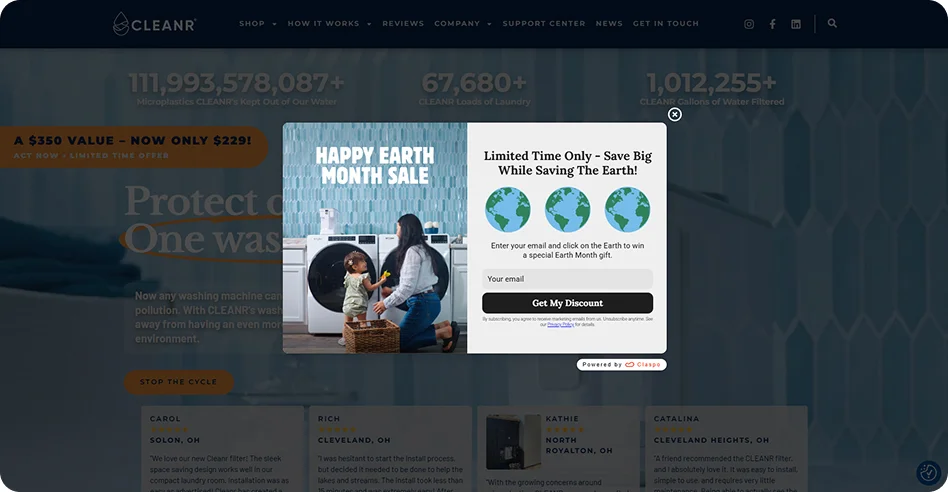
The CLEANR example is a masterclass in solving visual dissonance. Instead of generic Mystery Boxes, they replaced the game elements with Earth icons to align with their pro-environmental mission. The messaging shifted as well, moving from “Gambling for a coupon” to “Save Big While Saving The Earth!”
This gamification flow also leverages Claspo’s blur and scale effects to visually guide the user through the win. All the visual noise and secondary elements are pushed into the background, helping visitors stay locked on the prize. Field data shows that this interaction behavior alone increases average gamified conversion by 15%.
Such a total makeover of the Claspo Gift Box template transformed a generic mechanic into a brand-aligned experience that feels native to their site and their mission.
The bottom line
Gamification fails when it’s treated as a gimmick rather than a functional part of the UI. If the game feels like a chore, a scam, or a distraction, it’s just another obstacle between your customer and the “Buy” button.
Conversion doesn't come from the game itself, but from the lack of friction surrounding it. Whether you are automating discount redemption or simplifying the choice architecture, the goal is to get out of the user's way.
Ready to fix your flow?
We built Claspo to handle these UX logic checks automatically, from 1,000+ CRO-ready templates and intent-targeted triggers to AI-synced branding and Shopify auto-redemption.


![How to add a Shopify newsletter signup form [+Tips & Templates]](https://framerusercontent.com/images/FavgBqCU1zgoOwEdQvBHxtOWIc.png?width=1320&height=756)