How to Improve Subscriber Quality Before the Signup Happens


Summarize
Most e-commerce signup popups ask for an email immediately — before the brand learns anything about the visitor’s intent. Stronger-performing flows flip this. They start with a simple question like “Who are you shopping for?” (Men, Women, Kids), and only then show the email step. That first click creates a micro-commitment and captures intent upfront.
When we analyzed 779M+ popup views, the average conversion rate across signup forms was 3.53%. In some early campaigns where brands added a simple choice step before the email field, signup rates have already exceeded 20%.
Results always depend on traffic quality, targeting, timing, and the offer itself. But the pattern is promising — and it raises an interesting point: can a simple intent question improve both signup rates and subscriber quality?
In this article, we’ll explore why this pattern works, how e-commerce brands are using it in real signup flows, and how a single-choice step can help turn generic popups into more relevant, intent-driven acquisition funnels.
Why a small first click changes the entire signup flow
At first glance, adding an extra step to a pop-up might sound like a bad idea. After all, marketers usually try to reduce friction. But a simple choice step changes how the interaction begins. Typing an email address can feel like a commitment. Clicking a simple option is different. The visitor isn’t giving anything away yet — they’re simply expressing a preference.
Once someone takes that first action, the dynamic shifts a bit. The pop-up is no longer just something asking for attention — the visitor has already interacted with it. At that point, continuing feels much more natural. Entering an email is no longer a brand-new decision. It’s simply the next step in something the visitor has already started.
There’s another reason this pattern works: it signals personalization. When a pop-up asks what the visitor is interested in, it immediately changes the tone of the interaction. Instead of a generic signup request, it looks like the beginning of a personalized experience. The visitor understands why the question is there — and what they might get in return: more relevant emails, offers, or product recommendations.
And that expectation matters. In retail and e-commerce, personalized emails consistently outperform generic broadcasts. And the difference isn’t small. According to a 2025 industry report, behavior-based emails — built around customer preferences, buying patterns, and behavior — generate 22.6× higher click-to-open rates and more than 60× higher conversion rates compared to generic emails.
Shoppers respond much better when brands take their interests into account instead of sending the same message to everyone. A simple choice step in a pop-up helps start that process earlier — before the first email is even sent.
Should brands segment in the pop-up — or later in the email flow?
If you spend time in marketing communities, you’ll often see this advice: don’t ask too many questions in signup forms — let behavior do the segmentation. The logic is clear. What people click, browse, and buy often reveals more than what they say in a form. Many teams also use progressive profiling, gradually learning more about subscribers through their actions in email and on the site.
That approach makes sense. The catch is timing. Most behavioral signals appear after the subscriber has already entered the email flow. But the brand still has to decide what to send in the very first message. And that first welcome email matters more than many marketers realize.
According to Klaviyo’s 2026 Omnichannel Benchmarks Report, welcome flows generate some of the highest engagement in the entire lifecycle — averaging around 6.5% click rates, with top-performing brands reaching over 13.3%. They also drive meaningful revenue. On average, welcome emails generate about $5.75 in revenue per recipient, with top-performing flows exceeding $13.27 per subscriber.
In other words, the welcome message is one of the most valuable moments to get personalization right. But if the pop-up collected no signal about the visitor’s interests, that first email usually ends up being broad and generic — something like a standard discount message or a general brand introduction.
A simple choice step helps close that gap. By asking one quick question before the email field, the pop-up captures a small but useful signal about the visitor’s intent. This doesn’t replace behavioral segmentation later on. In fact, the best flows use both. The pop-up captures one useful preference upfront, and the welcome sequence continues to refine that profile through clicks, browsing, and purchase behavior.
Real pop-up examples where a single-choice step works especially well
Below are several pop-up real-world examples where this component naturally fits and helps capture intent and improve segmentation from the very first interaction.
Mystery discount flow
One of the most common ways to use a single-choice step is inside a mystery discount pop-up. Instead of revealing the offer immediately, the widget first asks a quick intent question. Once the visitor makes a choice, the pop-up shows the email field. After signup, the visitor is told that their discount will be sent to their inbox.
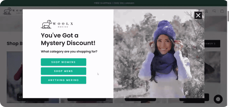
Why it works
To see the code, the visitor needs to open the first email — which naturally drives attention to the welcome message. The choice step captures a useful signal about the visitor’s interest, which can immediately shape the welcome email — for example by featuring products from the selected category.
Instant coupon reveal flow
Another common variation keeps the same structure but reveals the discount directly in the pop-up instead of sending it by email.

Why it works
This version removes the usual “go check your inbox” step. The visitor gets the code instantly and can apply it while they’re still on the site. That’s especially useful for shoppers who were already close to buying.
At the same time, the choice step still collects a useful preference signal. That signal can be used to personalize the welcome email and segment the subscriber for future campaigns.
Gamified signup flow
In this flow, the interaction usually starts with the game itself. The visitor scratches a card, spins a wheel, or opens a mystery reward to see what they’ve won. After that, the pop-up asks a quick intent question before moving to the email field.

Why it works
Games are great at getting people to engage. The challenge is that a game by itself doesn’t tell the brand much beyond the fact that the visitor interacted with it. It creates activity, but not much context.
A simple choice step helps solve that. It makes the flow more useful on the brand side. The reward can still drive signup, but the selected answer can also shape the first email, the featured products, or the follow-up sequence. The game captures attention, and the choice step gives that attention direction.
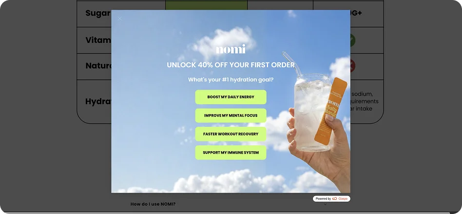
Instant promo code with intent question
Some pop-ups take a slightly different approach: they show the discount and the promo code immediately, before asking for any contact details. The visitor can see the offer right away, but the pop-up still asks a quick intent question before the email field appears.

Why it works
Showing the code immediately removes uncertainty. The visitor knows exactly what the offer is and can start using it right away. This structure allows the pop-up to support two goals at once. Some visitors will just grab the code and keep browsing — which can still lead to a purchase. Others will subscribe, giving the brand both an email address and a quick signal about what they’re interested in.
Free shipping threshold flow
Another variation combines a free shipping threshold offer with a single-choice step. The pop-up shows the incentive right away — for example, free shipping on orders above a certain amount. Before revealing the promo code, it asks a quick question about what the visitor is shopping for. After the visitor submits their email, the code is delivered — but it only applies once the cart reaches the required order value.
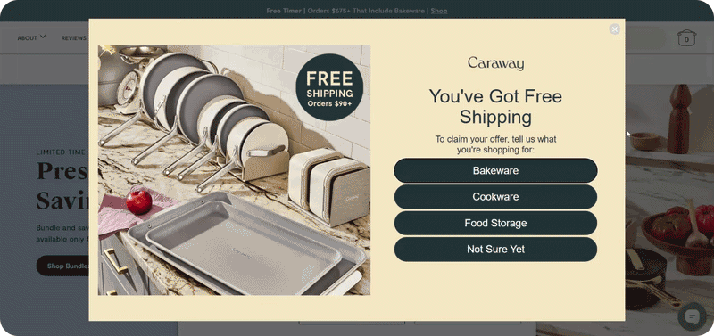
Why it works
Free shipping is a powerful motivator, but the threshold keeps the promotion financially sensible. Instead of discounting every order, the offer nudges shoppers to add a little more to their cart.
The choice step adds useful context at the same time. By asking what the visitor is shopping for, the pop-up captures a simple category signal before the signup is completed.
For e-commerce teams, this creates a nice balance. The pop-up can grow the email list, encourage larger carts, and collect intent data that makes future email campaigns more relevant.
No-discount signup flows
Single-choice steps aren’t only useful in promotional popups. They also work well in signup flows that don’t rely on discounts at all. Instead of leading with a promo code, the pop-up starts with a quick question about what the visitor is interested in. Once they pick an option, the signup invitation appears — usually framed as updates or early access related to that interest.

Why it works
That small shift changes how the signup is perceived. Instead of signing up for vague marketing emails, the visitor expects updates that match their interests — new releases, product drops, or collections that fit their style.
This pattern tends to work especially well for premium brands, niche stores, and enthusiast categories.
How Claspo’s Choice component helps marketers build these flows
Up to this point we’ve looked at how single-choice steps work in real popups. The good news is that building these flows doesn’t require custom development or complicated setup. In Claspo, you can start with ready-made pop-up templates that already include a choice step. Open the template library, turn on the Choice filter — and you’ll see ready-to-use options with this step already in place.

Then just customize it: change the colors, rewrite the copy, drop in your own visuals. You’re not building anything from zero — just adapting what’s already there.
Adding the Choice step to any signup template
The component isn’t limited to specific templates. It can be added to any pop-up that already collects email or phone numbers.
For instance, take a gamified signup flow like the one we discussed earlier. You might start with a template where:
the first step contains a game;
the second step collects the visitor’s email.
If you want to insert a choice step between those two actions, the process is simple.
First, duplicate the signup page in the widget flow. This creates a new step that can be edited independently.
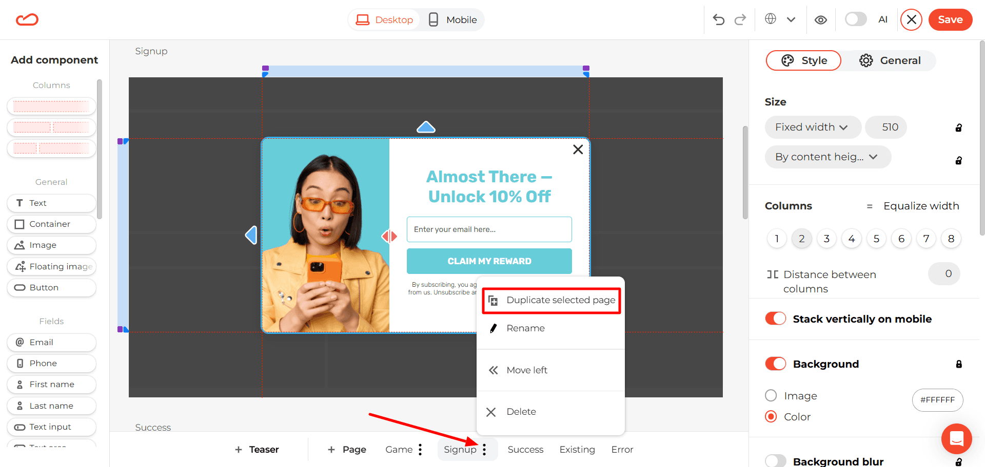
On that duplicated page, instead of the email field, you add the Choice component. Set up the answer options, and this step becomes the quick “intent question” before signup.

Next, make sure the buttons move the visitor to the next step — the email capture page. To do that, click on any option and assign the “Next page” action. The same action will automatically apply to all Choice buttons.

After that, the flow continues to the email capture screen.
What kinds of questions should brands ask?
Adding a single-choice component to a pop-up is the easy part. The harder and more important part is choosing the right question.
A good question does more than make the widget look interactive. It captures a signal the brand can actually use later — in the welcome email, in product recommendations, or in future segmentation. The best single-choice questions share a few simple characteristics. They are:
Simple — the visitor understands the question instantly.
Relevant — it connects to what they came to the site for.
Useful for segmentation — the answer actually tells the brand something meaningful.
The Litmus 2025 Email Marketing Report found that 26% of marketers consider interest-based segmentation the most effective strategy.
In e-commerce popups, several types of questions consistently produce useful signals:
Category interest — What type of product are you looking for today?
Shopping intent — What brings you here today?
Product preference — Which style do you prefer?
Use case — How do you plan to use this product?
Audience type — Who are you shopping for?
Personal goal — What are you hoping to improve or achieve?
Not every question improves a signup flow. In fact, some questions can slow the interaction down or collect data the brand never uses. Weak questions usually have a few common traits. They tend to be:
Too broad.
Too abstract.
Trying to be overly clever.
Too personal too early.
Not connected to any real segmentation or action.
Packed with too many options.
Hard to answer quickly.
If the visitor needs to stop and think for more than a second or two, the question is probably doing more harm than good.
How to measure whether the choice step is actually working
At this point the idea is simple: a single-choice step captures a useful signal. But the real question for marketers is practical: does it actually improve results? The answer depends on how the signal is used and how performance is measured. The first mistake many teams make is focusing only on one metric — the final email signup rate. But the impact of a choice component often appears across several stages of the funnel.
Once a visitor selects an option, that signal can influence several parts of the experience. For example, brands can:
pass the selected answer directly into the ESP;
tag subscribers by interest;
trigger a tailored welcome flow;
recommend relevant products;
guide visitors to a matching collection page;
align SMS follow-ups with what the subscriber selected.
To understand whether the choice step is actually improving performance, several metrics are worth tracking:
signup conversion rate;
email-only opt-in rate;
email + SMS opt-in rate;
welcome email open and click rates by selected option;
promo code redemption rate by segment;
first purchase rate by segment;
revenue per subscriber.
These metrics help reveal whether the additional step improves not only signup volume, but also subscriber quality. It’s also important not to judge performance too quickly. Sometimes the raw opt-in rate drops a little after adding a choice step. That’s not always a bad sign. If the extra context leads to better segmentation, stronger engagement, or more purchases later on, the pop-up may actually perform better overall.
When single-choice popups are a strong fit and when they are not
Like most marketing tactics, a choice step isn’t a universal solution. In the right context it can add a lot of value. In the wrong one, it just adds an extra click. So before adding it to every widget on the site, it’s worth asking a simple question: does the answer actually help the brand do something better afterward?
This pattern tends to work best when a store serves different types of shoppers or product interests. For example, it’s a strong fit for:
stores with multiple product categories;
industries like fashion, beauty, home, accessories, wellness, or pet brands;
stores where visitors often arrive with different shopping intents — browsing, gifting, replacing something, or exploring a category.
In these situations, even a small signal — like “Women,” “Skincare,” or “Gift” — can immediately make the next message more relevant.
On the other hand, the choice step may not change much if the store’s offer is already extremely focused. For example, the store sells one very narrow product category, or most traffic lands on a single product type. In those cases, the extra step may simply make the pop-up longer without improving the experience.
From email capture to intent-driven signup
At a glance, a single extra click may not seem like a big change. But in practice, it shifts the role of the pop-up — from a simple data collection point to the start of a more informed customer journey.
Instead of asking for contact details first and figuring things out later, the brand starts with context. And that context becomes much more powerful when it’s combined with the rest of the toolkit — behavioral triggers, audience targeting, and continuous A/B testing.
With Claspo, these flows are not theoretical. You can build, test, and iterate on them quickly — turning small interaction changes into measurable improvements in subscriber quality and conversion.

![How to add a Shopify newsletter signup form [+Tips & Templates]](https://framerusercontent.com/images/FavgBqCU1zgoOwEdQvBHxtOWIc.png?width=1320&height=756)
