What's New in Claspo
What's New in Claspo
Our team is constantly working to improve Claspo for you. Discover all the latest updates, from exciting new features to small fixes — on this page.
Coming Soon
New Feature
Accurate subscriber identification
Identify CRM-registered users, even if they’ve never seen a Claspo popup before. You will be able to hide newsletter sign-up forms from people who are already on your list.
New Feature
Accurate subscriber identification
Identify CRM-registered users, even if they’ve never seen a Claspo popup before. You will be able to hide newsletter sign-up forms from people who are already on your list.
New feature
Instant visitor segmentation
Detect a visitor's true status (new or returning) from day one, even if you just installed the script today. This way, you can show the right re-engagement campaigns without waiting for tracking history to build.
New feature
Instant visitor segmentation
Detect a visitor's true status (new or returning) from day one, even if you just installed the script today. This way, you can show the right re-engagement campaigns without waiting for tracking history to build.
New feature
Shopify promo codes sync
Creating promo codes manually will soon be a thing of the past. Claspo will generate and sync unique Shopify promo codes automatically.
New feature
Shopify promo codes sync
Creating promo codes manually will soon be a thing of the past. Claspo will generate and sync unique Shopify promo codes automatically.
New feature
Dynamic free shipping bars
The new floating bar component will sync with Shopify carts and display real-time progress toward free shipping, encouraging shoppers to increase their order value.
New feature
Dynamic free shipping bars
The new floating bar component will sync with Shopify carts and display real-time progress toward free shipping, encouraging shoppers to increase their order value.
Past Releases
Feature
June 2026
Stop showing welcome discounts to existing customers

Make sure first-time offers reach only new visitors — not customers already on your mailing list.
Exclude existing subscribers with a new display-rule toggle.
Recognize returning users across devices and email campaigns.
Use multiple signals, including ESP links, login status, and analytics data.
Detect returning visitors immediately after Claspo installation.
UI fix: “After subscription” is now “After submission”.
Feature
June 2026
Stop showing welcome discounts to existing customers
Make sure first-time offers reach only new visitors — not customers already on your mailing list.
Exclude existing subscribers with a new display-rule toggle.
Recognize returning users across devices and email campaigns.
Use multiple signals, including ESP links, login status, and analytics data.
Detect returning visitors immediately after Claspo installation.
UI fix: “After subscription” is now “After submission”.
Improvements
June 2026
Send leads directly to Meta Pixel
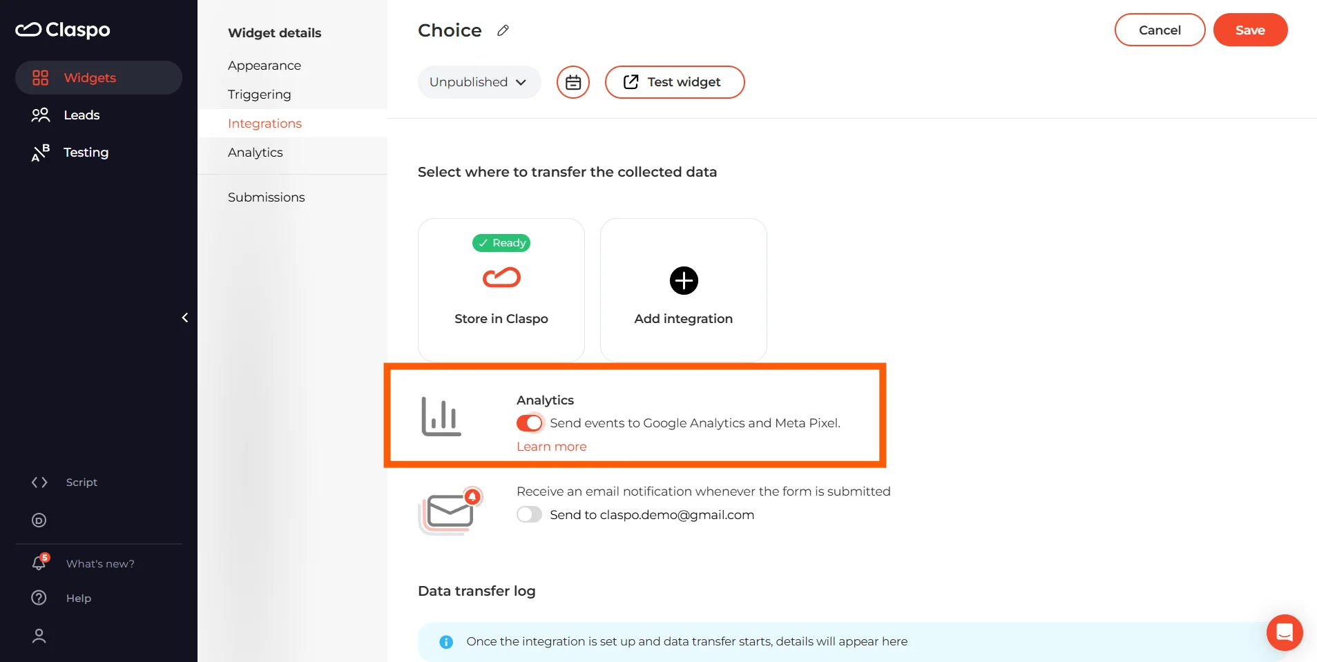
Track popup conversions more accurately by sending successful submissions directly to your Meta Pixel as Lead events.
Enable Analytics in your popup or publishing settings, and Claspo will automatically send events to both Google Analytics and Meta Pixel.
Improvements
June 2026
Send leads directly to Meta Pixel
Track popup conversions more accurately by sending successful submissions directly to your Meta Pixel as Lead events.
Enable Analytics in your popup or publishing settings, and Claspo will automatically send events to both Google Analytics and Meta Pixel.
Improvements
June 2026
Try new hyperrealistic skin for Wheel of Fortune
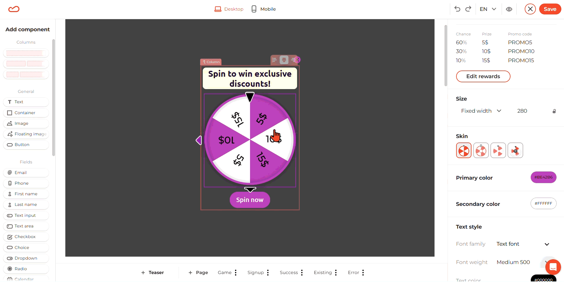
If flat graphics don’t fit your brand style, you can switch to the hyperreal skin to give the wheel a more detailed, realistic look.
Improvements
June 2026
Try new hyperrealistic skin for Wheel of Fortune
If flat graphics don’t fit your brand style, you can switch to the hyperreal skin to give the wheel a more detailed, realistic look.
Improvements
June 2026
Turn any Informer into a lead capture form
Found the perfect Informer design, but need to collect emails? Add form fields and turn it into a fully functional Request form without rebuilding the design.
Flexible fields: Email, phone, dropdowns, consent checkboxes, and more.
Smart adaptation: The editor automatically updates button actions and form settings, so your popup works right away.
Feature
June 2026
Trigger popups using real-time Shopify data
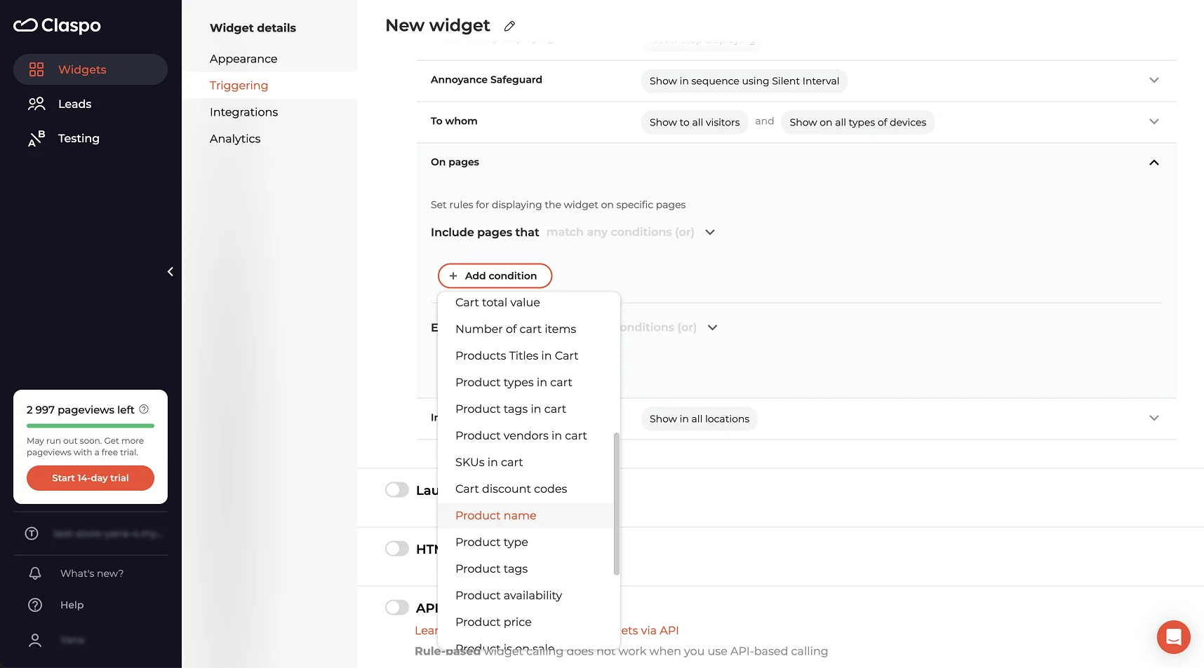
Build more relevant campaigns by targeting shoppers based on what they’re doing.
Show offers based on cart value or contents.
Personalize campaigns for specific products or collections.
Reward loyal customers or exclude existing subscribers.
Display live cart totals and customer details in your popup.
Use custom Shopify data for advanced targeting.
Feature
June 2026
Trigger popups using real-time Shopify data
Build more relevant campaigns by targeting shoppers based on what they’re doing.
Show offers based on cart value or contents.
Personalize campaigns for specific products or collections.
Reward loyal customers or exclude existing subscribers.
Display live cart totals and customer details in your popup.
Use custom Shopify data for advanced targeting.
Improvements
June 2026
Control your post-submission flow
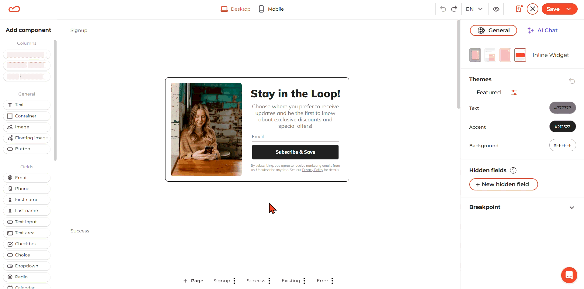
Remove default Success, Error, and Existing pages to simplify your form flow. After submission, you can redirect users to a custom URL or trigger a custom action.
Improvements
June 2026
Control your post-submission flow
Remove default Success, Error, and Existing pages to simplify your form flow. After submission, you can redirect users to a custom URL or trigger a custom action.