Conditional Logic Forms: Fewer Generic Emails


Summarize
Only 16% of marketers say they prioritize zero-party data. That leaves a lot of ecommerce teams trying to personalize campaigns without knowing what shoppers actually want — which is how everyone ends up receiving the same welcome email in a slightly different hat.
The missed opportunity is surprisingly practical. People are usually willing to answer a few relevant questions when the benefit is obvious. And you do not need a complex enterprise stack to collect those answers. A product recommendation quiz or conditional logic form can turn a few clicks into useful context for segmentation and follow-up emails with personalized content and offers.
In this article, we’ll look at how conditional logic forms differ from linear quizzes, whether these formats convert, and how ecommerce brands use them in real campaigns. You’ll also learn how to build a conditional logic quiz in Claspo and write questions whose answers can actually shape what the subscriber sees next — rather than retiring quietly inside a spreadsheet.
TL;DR
Conditional logic forms change the next question, message, or result based on the visitor’s answer; linear multi step forms keep everyone on the same path.
Popups with Choice buttons reached a 5% average CR — 1.36× the conversion rate of standard signup popups.
Irrelevant or non-personalized content drives 46% of email unsubscribes, according to Litmus. Quiz answers give brands the context needed to make follow-up more relevant.
You can build a conditional logic quiz in Claspo from a ready-made multi step popup template, connect each Choice button to a different page, save the answers, and pass the completed profile to your ESP.
What are conditional logic forms?
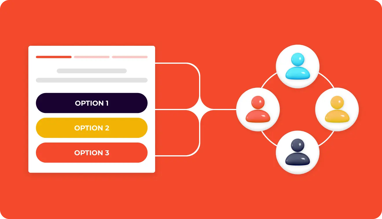
A conditional logic pop-up is a multi step form that changes as the visitor moves through it. Their answer determines what appears next: another question, a different message, or a result tailored to what they selected.
Say a pet store asks visitors who they shop for:
Dog → dog products;
Cat → cat products;
Both → recommendations for both.
This is how conditional logic forms work in practice. Instead of sending every visitor through one fixed sequence, the form creates different routes based on their answers. Brands often use this setup for a product recommendation quiz, lead capture, customer surveys, or guided product discovery.
The value goes both ways. Shoppers get fewer irrelevant questions and a result that makes sense for them. The brand gets preference data it can use for recommendations, segmentation, and follow-up campaigns.
Not every pop-up with several steps is a branching pop-up. The difference is in what happens after someone answers. A linear multi step pop-up may look like this: “Question → Email → Result”. Every visitor sees the same steps in the same order. One person may choose “Dog” and another “Cat”, but both continue to the same email field and the same final screen.
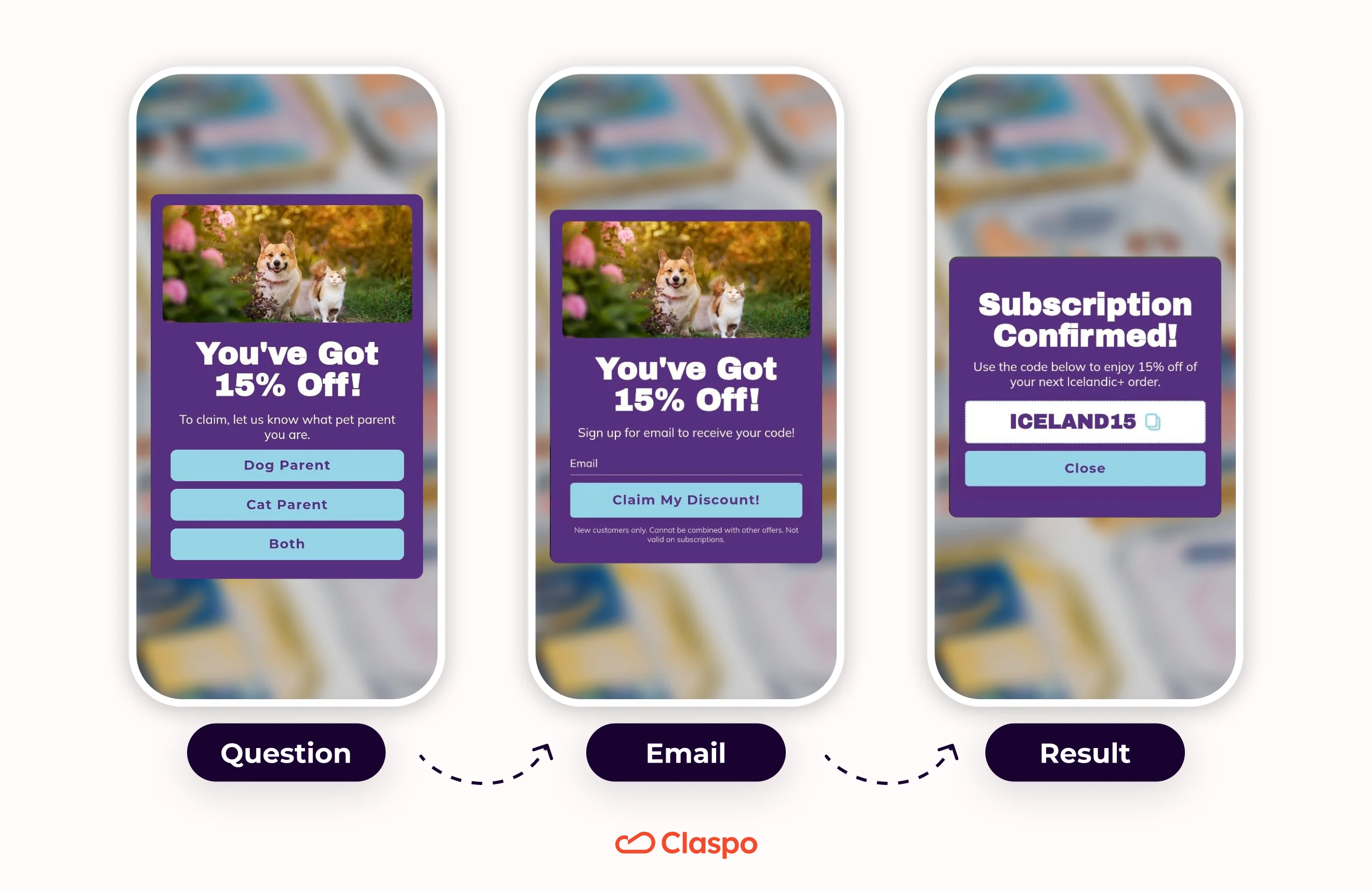
That does not make the answers useless. The brand can still save them as zero party data and use them to create segments or tailor later messages.
A pop-up built with conditional logic behaves differently: “Question → Relevant follow-up → Personalized result”. A dog owner might see a question about breed size. A cat owner might instead be asked whether their pet lives indoors. These conditional fields appear only when they are relevant, and the final result can change with them.
So, a linear mini-quiz and a true conditional logic quiz may look similar at first glance, but they do different jobs. One records different answers along a fixed path. The other uses those answers to decide where the visitor goes next.
Why ecommerce brands use conditional logic forms and quizzes
Most ecommerce popups are built around one task: capture the lead, promote the offer, or stop the visitor from leaving. Conditional logic forms and quiz-style popups can do something broader. They add a lightweight decision layer to the shopping journey.
Turn the first click into useful customer context
The first step of many popups is little more than a warm-up: “сontinue”,
“next”, “show me the offer”. The click moves the visitor forward, but tells the brand nothing.
A choice question gives that same click a job. Instead of asking someone to press a generic button, the pop-up can ask:
What are you shopping for?
What is your main skin concern?
Who are you buying for?
What type of pet do you have?
What result are you trying to achieve?
Now the first interaction already carries a preference signal. A skincare brand learns whether the visitor is concerned about dryness or breakouts. A pet store finds out whether they shop for a dog, a cat, or a household where the animals have apparently formed a coalition.
When someone shares their email and phone number, the brand gets more than another address. It also knows what brought that person in, making future emails, segments, and product suggestions more relevant.
Make personalization feel transparent
Shoppers are usually comfortable with personalization when they can see where it comes from. Forty-eight percent say it feels personal when a brand uses preferences they shared themselves. The reaction changes when a brand seems to know something they never mentioned: 42% say that makes them uncomfortable.
The difference is easy to see. A visitor selects “dry and sensitive skin”, and the brand recommends a gentle moisturizer. That connection makes sense. The shopper can see the link between what they chose and what they get back. When that link is missing, personalization starts to feel intrusive. A quiz keeps the exchange simple: ask a relevant question, use the answer, and show the shopper why it mattered.
This is one of the practical strengths of forms with conditional logic. The experience adapts, but it does not feel mysterious. Each follow-up question or recommendation has an obvious reason for being there. A well-designed product finder quiz therefore does more than personalize the result. It explains the personalization through the interaction itself.
Give shoppers a reason to share more
Most people do not mind answering a question when there is a clear point to it. What puts them off is being asked for information with no explanation. That is likely why 46% say they are more willing to share data when a business is upfront about what it collects.
For a lead generation quiz, that usually starts with the question itself:
Weak: “Tell us about yourself”.
Better: “Tell us your hair type to see products selected for your routine”.
The first version asks for information without explaining why. The second gives the visitor a clear reason to answer. They are not filling out a brand questionnaire for the joy of administrative labor; they are helping the system narrow down the options.
This turns data collection into a fair exchange. The brand gets useful zero party data, while the shopper gets less browsing, fewer irrelevant options, and a result shaped around what they actually need.
Benchmarks: do conditional logic forms convert?
To see how these formats perform in real campaigns, we analyzed popups published by Claspo users. The resulting benchmarks compare standard email signup popups with multi step popups and widgets that include Choice buttons.
The numbers do not support a dramatic “add a question, double your conversion” story. They show something more useful: both multi-step and Choice-based popups performed above the standard signup baseline.
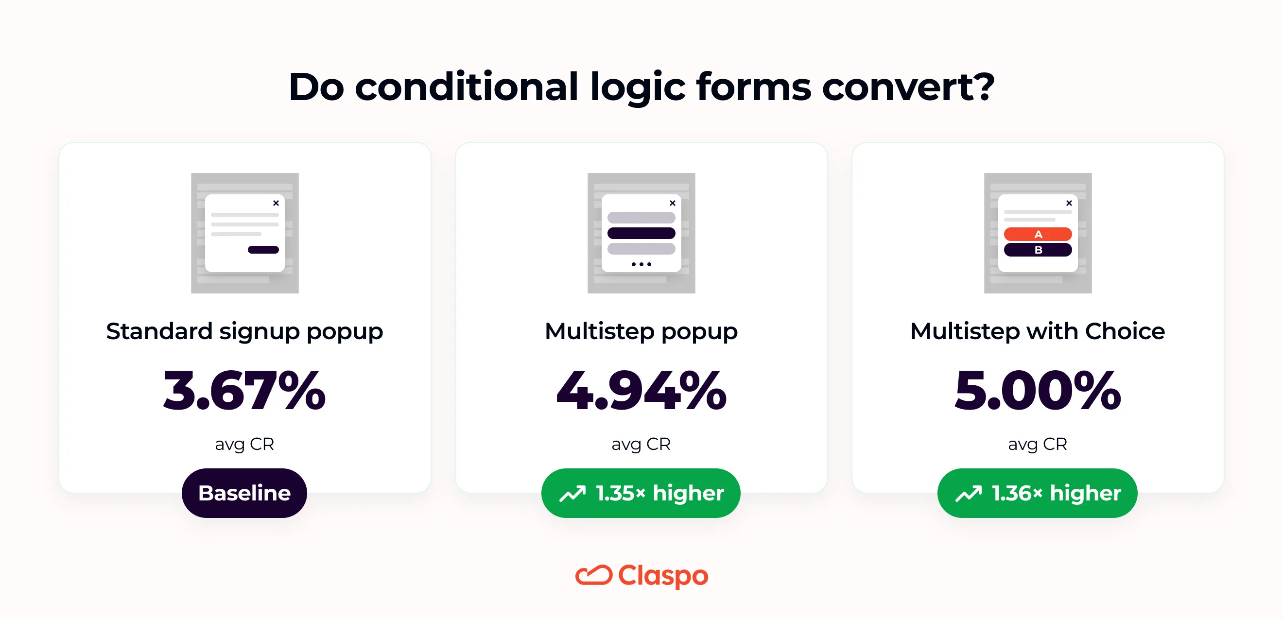
Choice-based popups did not meaningfully outperform multi step forms by conversion rate alone. Their advantage is that they achieved the same signup performance while adding a preference signal to each new contact.
Please keep in mind that form structure is only one part of pop-up performance. Conversion can change depending on: the offer, triggers, whether the pop-up has a teaser, the audience seeing it, where the email field appears, etc.
Conditional logic forms and quiz funnel examples in ecommerce
Not every useful quiz needs a sprawling decision tree, as these quiz examples for lead capture show. The examples below range from one-question signup flows to a full product recommendation quiz, plus an exit-intent survey popup built for research rather than lead capture. Some change what the shopper sees next; others keep the path linear and save the answers for later. The better question is: does each step help the shopper, give the brand something it can use, or ideally do both?

Travel planning lead generation quiz
What works
The quiz looks at home on the website. It uses the same warm colors and Morocco imagery, and the review beside the CTA gives visitors a reason to trust the company before they answer anything. The value is also clear from the start: take a short quiz and get help planning a trip that suits you.
How it is built
The flow has three question steps followed by lead capture:
Radio buttons ask when the visitor plans to travel.
Checkbox controls ask how many people are traveling.
Another set of radio buttons captures the type of experience they find most appealing.
This is a linear multi step quiz and every respondent appears to move through the same questions.
How the answers can be used
The questions are commercially useful. Travel timing shows how close the visitor may be to booking. A lead traveling within 30 days may need a faster sales follow-up, while someone “just browsing” is better suited to a longer nurture sequence.
Group size gives the team an early idea of what the booking may involve. A solo trip, a couple’s holiday, and a company group all call for different planning. The last answer shows which side of Morocco the visitor is drawn to. Marketing can use this answer to send more relevant itineraries and content instead of another broad “Discover Morocco” email.
Where this approach fits
This type of lead generation quiz is useful for tour operators, destination management companies, corporate travel services, retreats, group trips, and other businesses that need a few details before preparing an offer.
What could be better
The group-size options appear as checkboxes, although the answers are mutually exclusive. Radio buttons would make the expected action clearer.
The final CTA could also carry more value than “Submit”. Something like “Get My Trip Plan” would connect the form submission back to the promise made on the first screen.
A two-step lead generation micro-quiz
What works

This example keeps the flow very short and very focused. The fullscreen format removes competing page elements, so the micro-quiz gets the visitor’s full attention for a moment. At the same time, the close icon is easy to find and does not feel hidden, which matters. The brand is making a strong interruption, but not a coercive one.
The first step also does a good job of turning a generic discount pop-up into something more useful. Instead of asking for an email right away, it starts with a simple question: “What brought you to RYP today?” That makes the first click meaningful.
How it is built
This is a compact multi step popup with two different components:
Step 1 uses Choice buttons to capture motivation.
Step 2 switches to an email field and CTA.
This looks more like a short quiz-style flow than a conditional logic form with different paths. Still, the first answer adds a preference signal before the email step appears.
How the answers can be used
The question has real segmentation value. It tells the brand what problem or goal brought the visitor in.
Someone looking for a healthier soda may respond better to product education or ingredient-focused messaging. Someone trying to reduce sugar is a different conversation. Someone looking for more protein may be closer to a functional or fitness-driven use case.
That gives the team a clean starting point for follow-up emails, product recommendations, and campaign segments.
Where this approach fits
This kind of lead generation quiz works well for wellness, supplements, functional drinks, food brands, and other ecommerce categories where shoppers often arrive with a specific goal in mind but do not all need the same message. It is also a strong format for brands that want a softer path into signup. The first step feels more like a quick interaction than a form.
What could be better
The main open question is the mystery discount itself. It creates curiosity, but it also hides the value of the offer until after signup. That can work, but it should be tested against a version with a clear incentive.
It would also be interesting to see whether the next step changes based on the selected answer. If the brand showed a slightly different message or product angle after each Choice, the quiz would feel more personalized.
A fullscreen lead generation micro-quiz with a countdown
What works

This pop-up leans hard into the visual, and that is exactly why it works. The image, dark color palette, and mystery discount all pull in the same direction, so the offer feels like part of a campaign rather than a form placed over the page.
The fullscreen format keeps attention on the widget, while the close icon stays visible in the top-right corner. Visitors are not trapped, but the exit does not compete with the main action either.
How it is built
The quiz itself is tiny: one question, three answers, then the email field. That makes it easy to understand at a glance. A countdown timer runs across the flow and gives the visitor roughly 30 seconds to complete it.
The path appears to stay the same regardless of the answer, so this is a quiz-style signup flow rather than a full conditional logic form.
How the answers can be used
That first click already tells the brand which part of the catalog to lead with. Makeup shoppers can see launches, looks, and related product picks; skincare shoppers can be sent routines, ingredient content, or concern-based suggestions. “Both” gives the team much less to work with, though. If many people choose it, another question may be needed later.
Where this approach fits
This setup suits cosmetics, skincare, fragrance, fashion, and other visually led ecommerce brands. It is especially useful when the catalog has a few clear product categories and the team wants to attach one simple preference to each new subscriber.
The mystery angle also fits brands with a bold, theatrical identity. A quieter brand might find the same treatment a little overcaffeinated.
What could be better
The timer is the biggest question mark. Thirty seconds may be enough on desktop, but on mobile the visitor still has to make a choice, open the keyboard, type an email, and fix any typo. That leaves little room for hesitation.
It is also unclear what expires when the timer reaches zero. The discount? The pop-up? The size of the offer? Urgency works better when the consequence is obvious.
There is another tension here: the offer is both unknown and time-limited. Curiosity may pull people in, but some visitors will not rush to submit an email for a reward they cannot evaluate.
The visual idea is strong. The real test is whether the timer adds urgency or simply makes the mystery harder to enjoy.
A product finder quiz with progressive lead capture
What works

Bebonia puts the email field first, before asking anything about hair. That choice likely serves a practical goal: the brand secures the email even if someone skips the quiz or leaves before finishing the rest of the flow.
The offer is clear from the start — $20 off the first set — so the visitor knows what they get for subscribing. The quiz then works as an optional personalization layer rather than a condition for receiving the discount.
Visually, the pop-up is also well matched to the product. The large hair image shows the kind of result shoppers are looking for, while the copy connects the discount with finding a better curl match.
How it is built
The flow uses three stages:
Step 1 collects an email address and introduces the welcome offer.
Step 2 uses radio buttons to ask about curl type and hair color.
Step 3 asks for a phone number so the code can be sent by text.
The second screen contains two separate single-choice questions. Radio buttons make sense here because the shopper should select one answer from each group.
This is a linear multi step form, not a visible conditional logic form.
How the answers can be used
Curl type and hair color are useful product-matching signals, not filler questions added to make the form feel interactive. The brand can use them to:
suggest a closer extension match;
tailor product blocks in welcome emails;
group subscribers by texture or shade;
avoid promoting products that are unlikely to suit them.
Putting the email first also changes the role of the quiz. The questions enrich a lead the brand has already captured. Since the shopper can skip them, someone interested only in the discount can still subscribe, while those who want help choosing can share more.
The phone step adds another channel for follow-up. It may help Bebonia move high-intent shoppers into SMS, where the code and product reminders are harder to miss than another welcome email.
Where this approach fits
This kind of flow works best when shoppers need help choosing between similar options. For Bebonia, the key details are curl pattern and color. The same idea could work for foundation shades, skincare concerns, clothing sizes, or eyewear — anywhere a couple of answers can quickly rule out the wrong products.
It is also useful for brands building both email and SMS lists without asking for every detail on the first screen.
What could be better
The $20 messaging becomes unclear on the phone step. The first screen says the shopper gets $20 off after signing up, while the last screen says, “Get Your $20 Code Via Text.” It is not obvious whether the phone number unlocks an additional $20, or whether SMS is simply how the original code will be delivered.
A full product recommendation quiz with personalized results
What works

This is the clearest example of a full product recommendation quiz. Bambu Earth does not stop at collecting preferences. It turns the answers into a named skincare plan, explains why the routine fits, and shows the products on the same results page.
That last part matters. Shoppers can see that the questions led somewhere. Their name appears in the heading, their skin profile is summarized, and the brand explains how the suggested routine addresses it. The personalization is not hiding backstage.
The “Calculating your results” screen is a small but smart touch too. It makes the recommendation feel considered rather than instantly pulled from a hat.
How it is built
The quiz uses several component types instead of repeating the same answer format on every screen:
Choice buttons for questions such as skin type;
a 0-5 rating scale for skin sensitivity;
a text field for the shopper’s name;
an email field for sending the results;
an optional phone field for SMS signup.
The sensitivity question is not technically NPS, although the layout is similar. Here, the scale helps capture intensity: mildly sensitive skin and severe redness should not lead to the same routine.
The phone step is optional and includes a visible Skip option. That keeps SMS consent separate from access to the quiz result, which is a good call.
How the answers can be used
Skin type and sensitivity help determine which formulas are suitable and which ones may be too harsh. Other quiz answers can shape the routine order, product strength, and educational content shown later.
The name adds only a small personalization detail, but Bambu Earth actually uses it. “Maya’s Custom Skincare Ritual” feels more personal than a generic “Your results” page.
The email has a clear purpose: the brand tells shoppers it will send the results so they can return to them later. The optional phone number opens a second channel for launches, sale alerts, reminders, and follow-up around the recommended routine.
This data can also support later campaigns. Someone with dry, sensitive skin should not receive the same product sequence as a shopper with oily skin and low sensitivity. No crystal ball required; the customer already answered.
Where this approach fits
A detailed product finder quiz works well when customers need several products used together, rather than one simple item. Skincare is an obvious fit, but similar flows can help with haircare routines, supplements, nutrition plans, pet care, and other categories where the right recommendation depends on a combination of needs.
It is especially useful when the brand has to explain why a product fits. That explanation can reduce doubt before a higher-value bundle purchase.
What could be better
The opening feels longer than it needs to be. First, shoppers see a Yes/No question asking whether they want a personalized recommendation. Then they see another screen explaining that the quiz takes three minutes, provides a routine, and includes a discount.
The second screen already does the full job. It explains the effort, outcome, and reward. Starting there would remove one click without losing anything important.
The offer also becomes harder to follow as the flow continues. The intro mentions 20% off, while the later screen says the shopper qualifies for up to an additional 30% off. The results page then shows different discounts for trial and full-size options. The pricing may be correct, but the wording makes the shopper do a little maths when they should be admiring their new routine.
A short progress indicator would help as well. This is a proper quiz, not a two-click micro-flow, so visitors should know whether they are nearly done or have accidentally enrolled in a skincare degree.
An art product finder quiz that ends with curated picks

What works
This quiz does the selling part well. It takes the shopper through a series of questions, then lands on a curated set of prints with size and frame selectors right beside each recommendation. There is no awkward handoff to another page or vague “we’ll get back to you” ending. The shopper can move from taste discovery to cart in the same flow.
The fullscreen format also suits the category. Art is highly visual, and the large lifestyle image gives the questions some atmosphere without competing too much with the buttons. The quiz feels closer to browsing with a stylist than filling out a form.
How it is built
The flow starts with a first-name field, then uses Choice buttons throughout the main quiz. After the final answer, a short “Finding the perfect print” screen appears before the recommendations load. The results page then shows prints, each with a size-and-frame dropdown and an Add to cart button.
How the answers can be used
Some of the questions are especially useful for matching products. Home decor style, preferred art forms, and desired mood all speak directly to what the shopper may want on their wall. Those answers can help separate someone looking for bold statement pieces from someone drawn to classic or nostalgic work.
The questions about art ownership tell the brand how confident the shopper is likely to be. Someone buying their first print may want familiar options and more help choosing. A collector may be ready to consider larger pieces, bolder work, or higher-end framing.
The decade question is less convincing. It may be intended to pick up nostalgia or generational taste, but the connection is not obvious to the shopper. Unless it meaningfully changes the recommendations, it risks feeling like an extra question added because the quiz had room for one more.
Where this approach fits
A product finder quiz like this is a natural fit for art, home decor, furniture, rugs, lighting, gifts, and other categories where taste matters more than a simple technical spec.
It is especially useful when shoppers like several products but struggle to choose between them. The quiz narrows the catalog without asking them to learn art terminology first — always a kindness.
What could be better
The biggest missed opportunity is lead capture. The shopper goes through several questions and reaches a personalized result, but the quiz never asks for an email. That means the brand cannot send the recommendations, follow up if the shopper leaves, or reuse the preference data in future campaigns.
This is surprising because the flow already asks for a first name. Yet the name does not appear on the result screen and, without an email or another identifier, it has little practical value. At the moment, the quiz asks for personal information without showing why it needed it.
There are two cleaner options:
remove the name field altogether and keep the experience purely focused on product discovery;
or ask for an email near the end with a clear reason, such as “Send me my curated prints.”
The second option would turn the flow into a stronger quiz funnel. The brand would keep the direct sales path while also gaining a lead it could follow up with if no purchase happens.
A visible progress indicator would help too. This is not a tiny micro-quiz, and shoppers do not know how many questions remain. Even a simple “3 of 6” would make the commitment easier to judge.
An exit-intent survey popup for learning why visitors leave
What works

This is not a classic quiz, and that is what makes it interesting. Amika uses a short exit survey to ask the question most brands usually try to answer later in analytics: “Why did this visitor leave?”
The first step gives people a few concrete reasons to choose from. That is more useful than a vague “How was your experience?” prompt, especially when someone already has one foot out the door.
The floating box also keeps the interruption fairly light. Visitors can close it easily, and the survey does not take over the whole page.
How it is built
The flow has two Choice-based steps. There is no email field, offer, or product recommendation. Once the second answer is submitted, the interaction ends with a short thank-you message.
How the answers can be used
The first answer can point to specific friction in the shopping journey. A high share of “prices are too high” responses suggests a different problem from “didn’t find what I was looking for”. One is about perceived value; the other may point to navigation, product range, or discovery.
The age question gives the team another way to look at those responses. For example, shipping costs may be a bigger objection for one group, while another may struggle more with finding the right products.
Where this approach fits
This kind of exit survey popup is useful when a store wants answers fast. It can reveal whether people are leaving because of price, shipping, poor product discovery, or something else the analytics alone may not explain.
It can also help during a site redesign or after changes to pricing and delivery terms, when fresh visitor feedback is more useful than guesswork.
What could be better
The biggest missed opportunity is that the first answer does not change what happens next. This is where conditional logic forms could make the flow much more useful:
“Prices are too high” — show a lower-priced range or explain the product value;
“Don’t want to pay shipping” — show the free-shipping threshold;
“Didn’t find what I was looking for” — offer support, or a product finder quiz.
That would turn the survey popup from passive research into an attempt to recover the visit.
Build a conditional logic quiz in Claspo: step by step
There is no need to assemble the whole quiz from an empty canvas. In the template library, open Features filter and select Multi-Step. This narrows the gallery to templates that already have several screens.
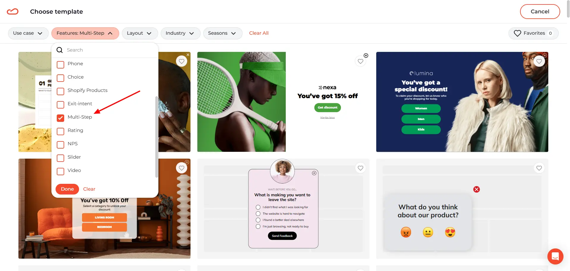
Choose the one that comes closest to the flow you have in mind. The colors, images, and copy can all be replaced later.
Plan the paths in your lead generation quiz
We will skip the usual template edits here. Claspo already has a detailed help-center guide on changing the copy, images, colors, and other design settings, so we can get straight to the logic.
For this example, we are building a conditional logic form with a short quiz for a pet store. The first page asks: “What kind of pet parent are you?” The Choice buttons offer three answers: Cat, Dog, Both.
That first click decides which follow-up question the visitor will see. Cat owners will go to a cat-specific page, dog owners to a dog-specific one, and people who choose Both will get a question written for multi-pet households.
To prepare those three paths, duplicate the page with the Choice buttons three times. In the page bar at the bottom of the editor, click the three-dot menu beside the page and select Duplicate selected page.
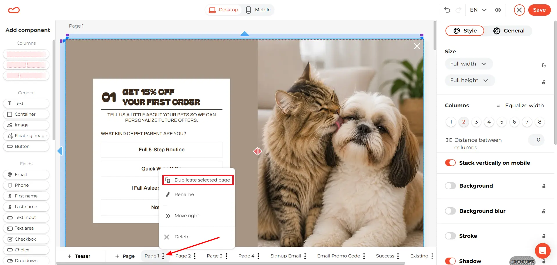
The same menu also includes Delete, which is handy for removing any template pages you do not need.
Connect each Choice to the right page
Now we can set up the conditional logic. Select the Choice component in the widget, open the General tab, and click Edit options.
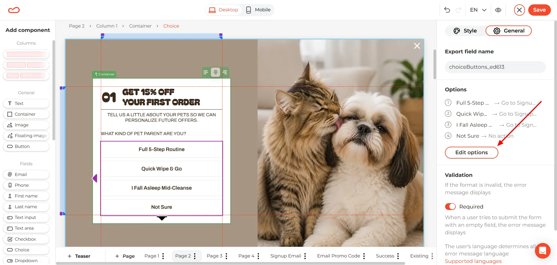
In the panel that opens, you can:
remove an option using the trash icon;
change the button text under Title in widget;
add an Export field name so the answer is passed to your ESP and can be used for segmentation;
choose what happens after each click under Action on click.
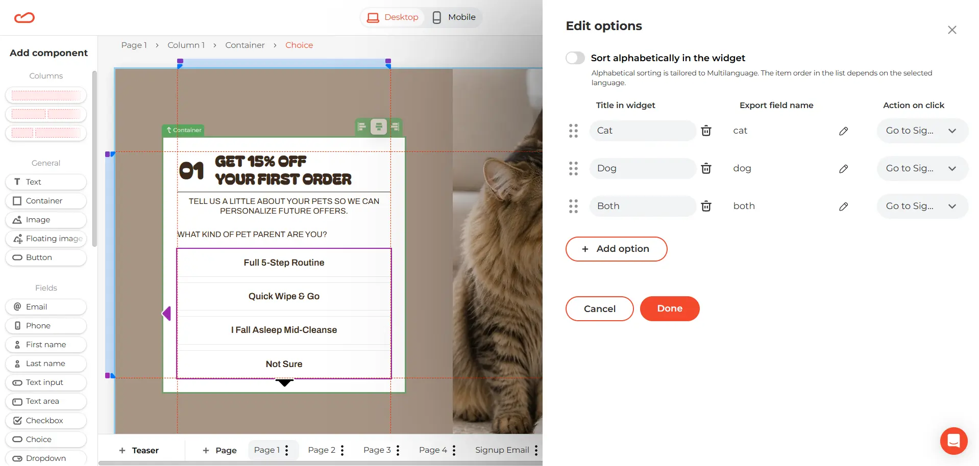
For our pet store quiz, we need three options, and each one should open its own follow-up page:
Cat → Page 2
Dog → Page 3
Both → Page 4
Select the matching page from the dropdown beside each option, then click Done.
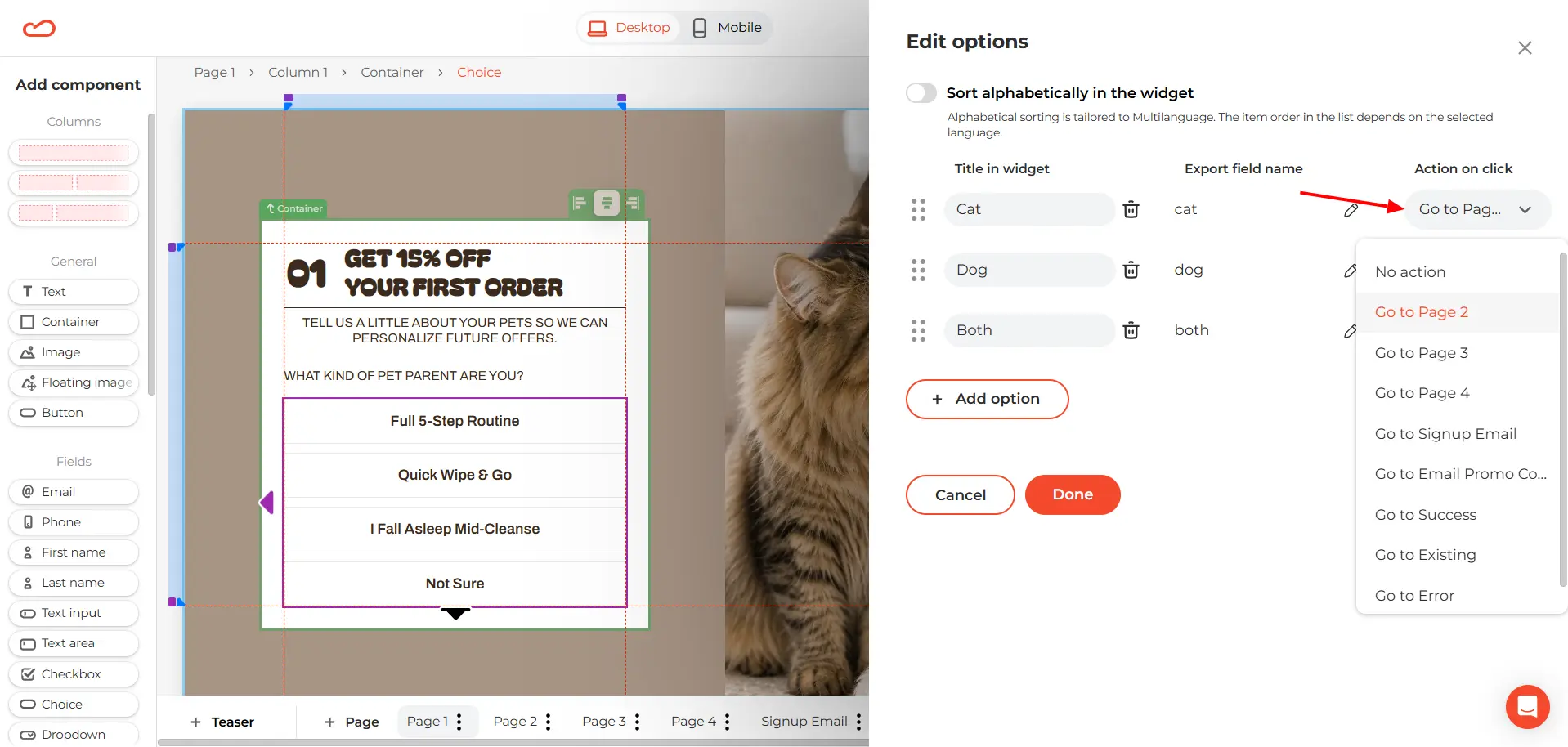
This is the point where a regular multi step pop-up starts behaving like a conditional logic form: the first answer decides which question the visitor sees next.
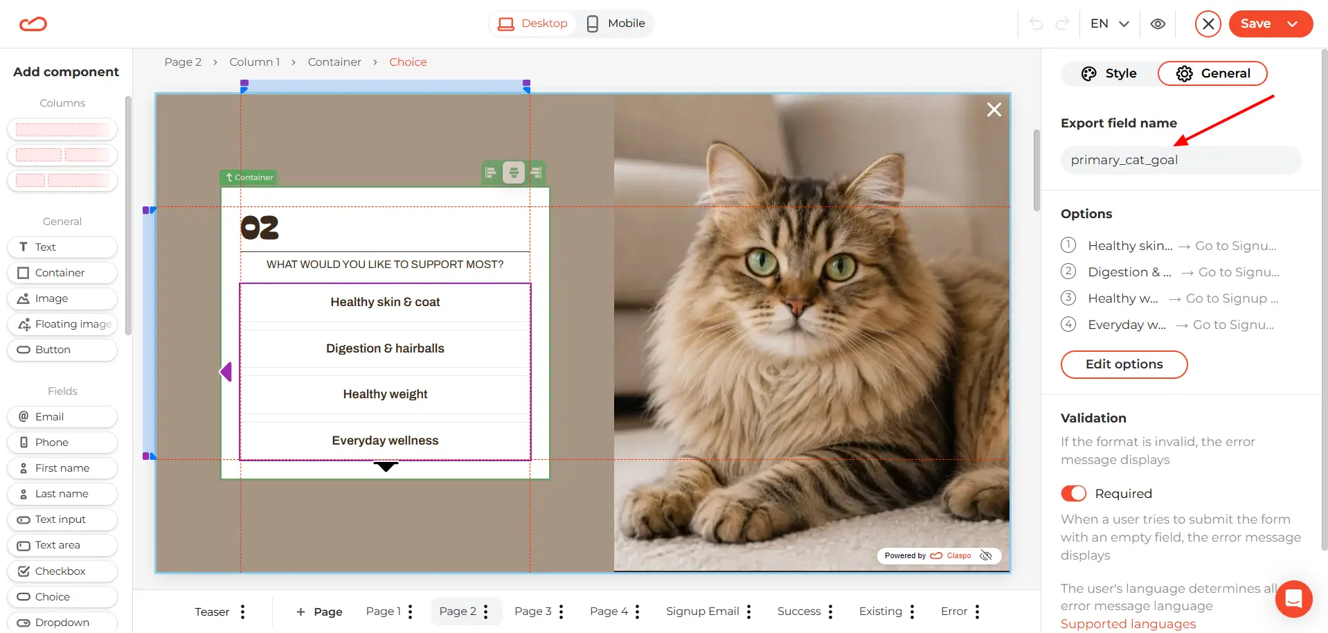
Also replace the default Export field name with something easy to recognize later.
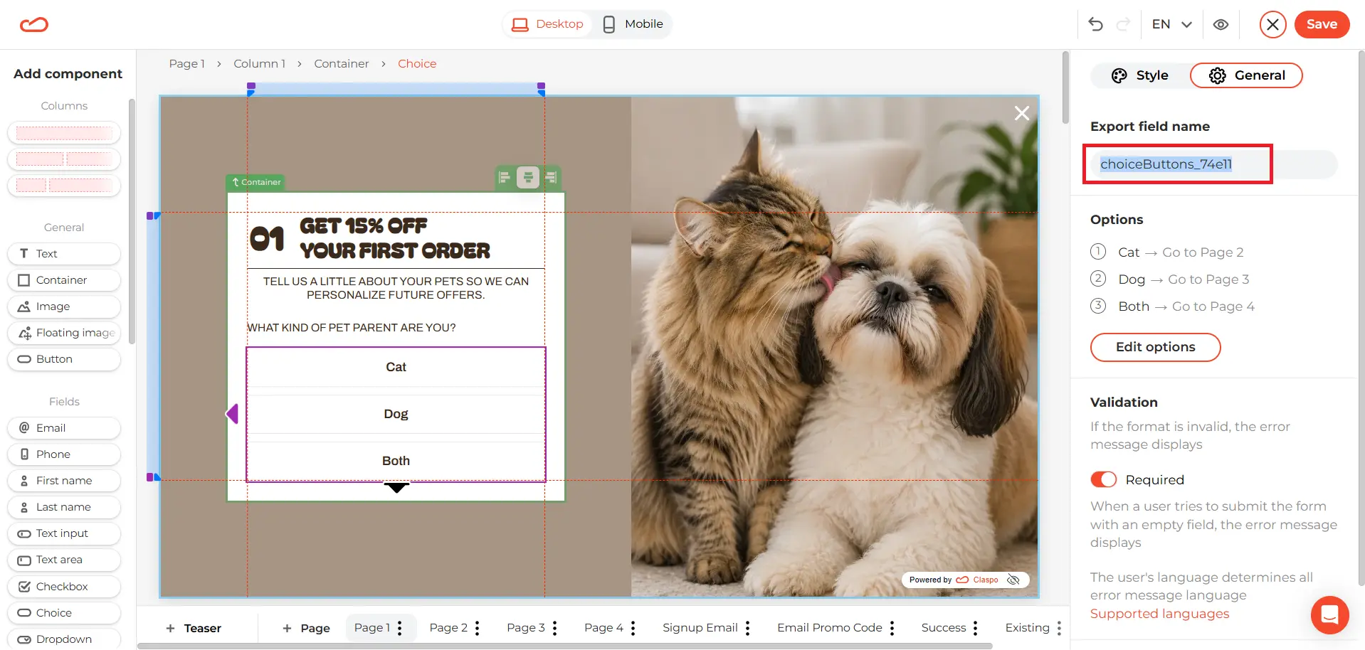
For the first question, we’ll use “pet”. The selected value — Cat, Dog, or Both — will then be stored under this field, making the data much easier to find and use for segmentation.
Add a personalized follow-up question
Now repeat the same setup on Pages 2, 3, and 4. Each page asks the same question: “What would you like to support most?”
The answer options change depending on the visitor’s first choice. Cat owners see cat-related goals, dog owners see dog-related ones, and visitors who selected Both get options suited to a multi-pet household.
Because we are building a short quiz, each follow-up page leads straight to the email form. Open Edit options and set Action on click to Go to Signup Email for every answer.
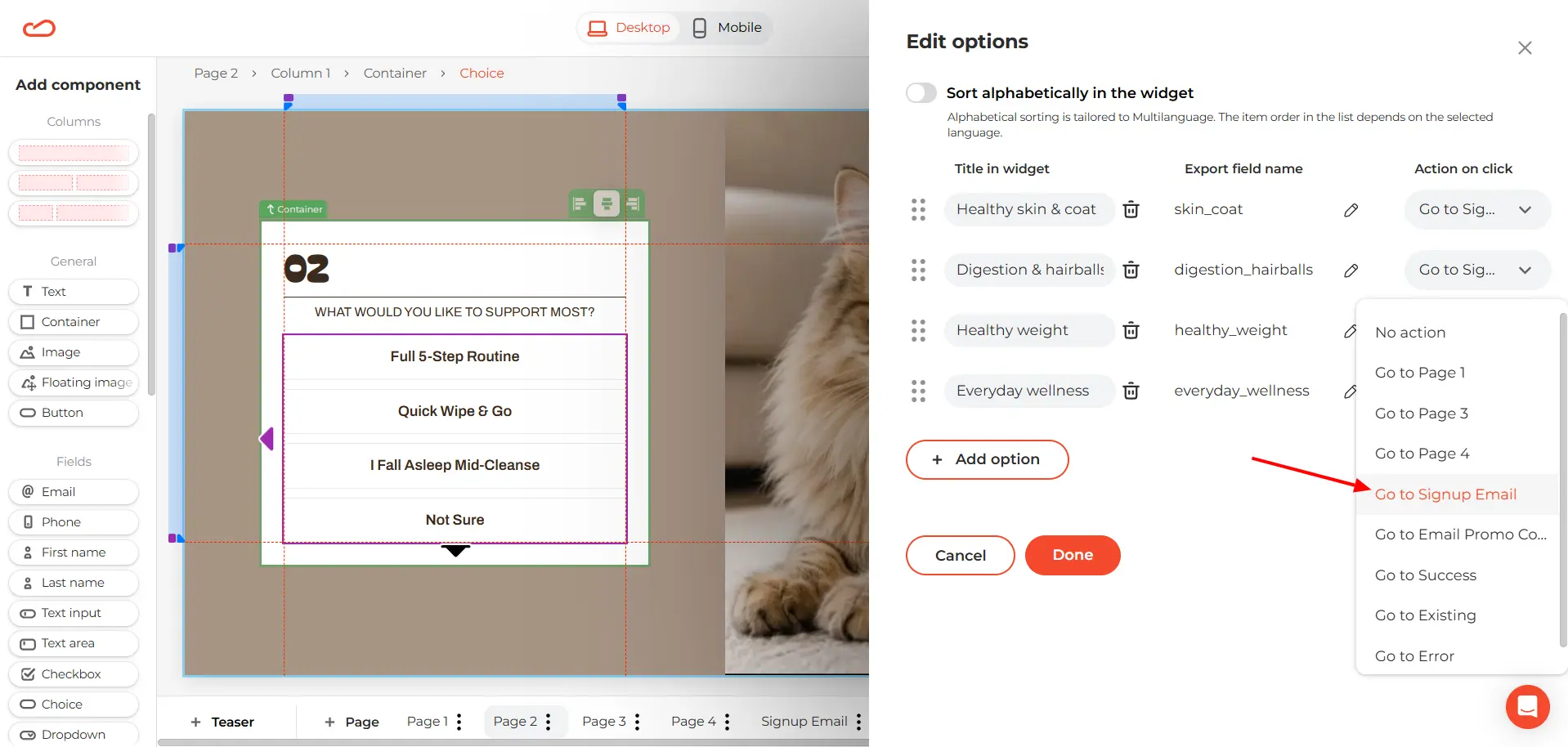
Also, we use primary_cat_goal as the Export field name for “Cat" option, primary_dog_goal for “Dog”, and primary_both_goal for “Both”.
Check the signup flow
On the signup page, we only changed the copy and design. The template already had the submission flow in place — one less thing to wire up by hand.
If you build the multi step form from scratch, select the Submit button and set Action on click to Submit form. Then choose which widget page should open for each outcome:
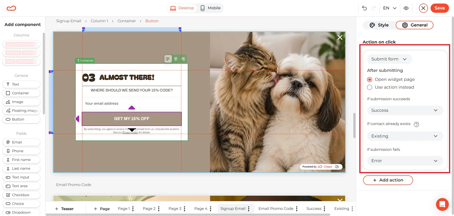
This makes sure every visitor reaches the right screen after entering their email.
Add a teaser
We’ll also add a teaser to give visitors another way into the quiz. Open Teaser from the page bar at the bottom of the editor, then adjust its copy and design.
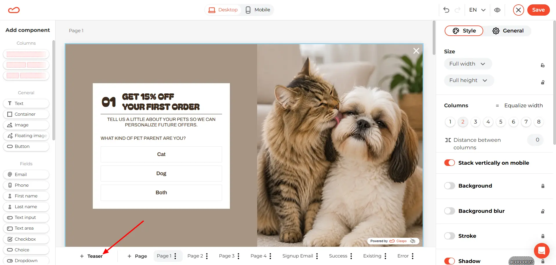
In the General tab, you can choose:
when the teaser appears;
whether to show it on mobile;
its position on the screen;
whether it has a close button;
the animation type and loop count.
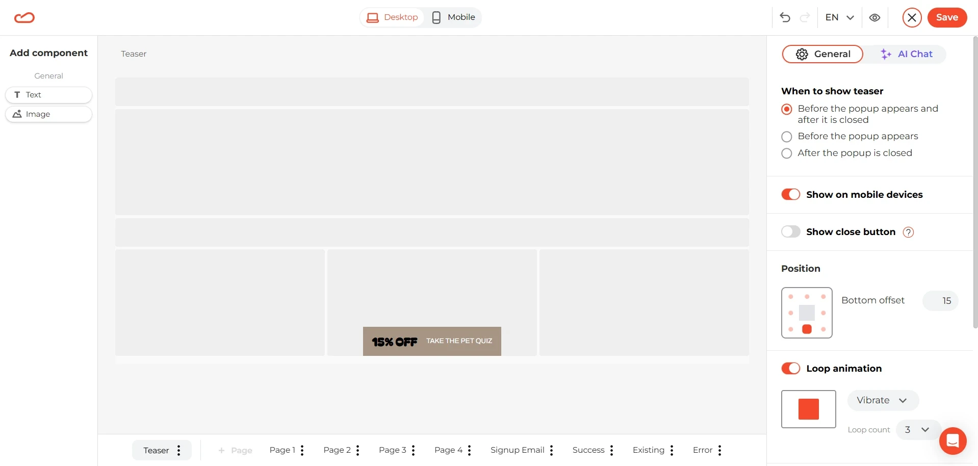
The teaser keeps the 15% offer within reach and gives visitors a quick way back into the quiz. We set it to appear before the popup and show again after the popup is closed.
Set the display rules
Once the template is ready, click Save. Claspo will take you to the widget settings, where you can decide who sees the quiz and when it appears.
Templates already include recommended audience and trigger settings, so you do not have to start with a blank page. Still, treat them as a starting point. Review the timing, frequency, pages, devices, and visitor segments before publishing.
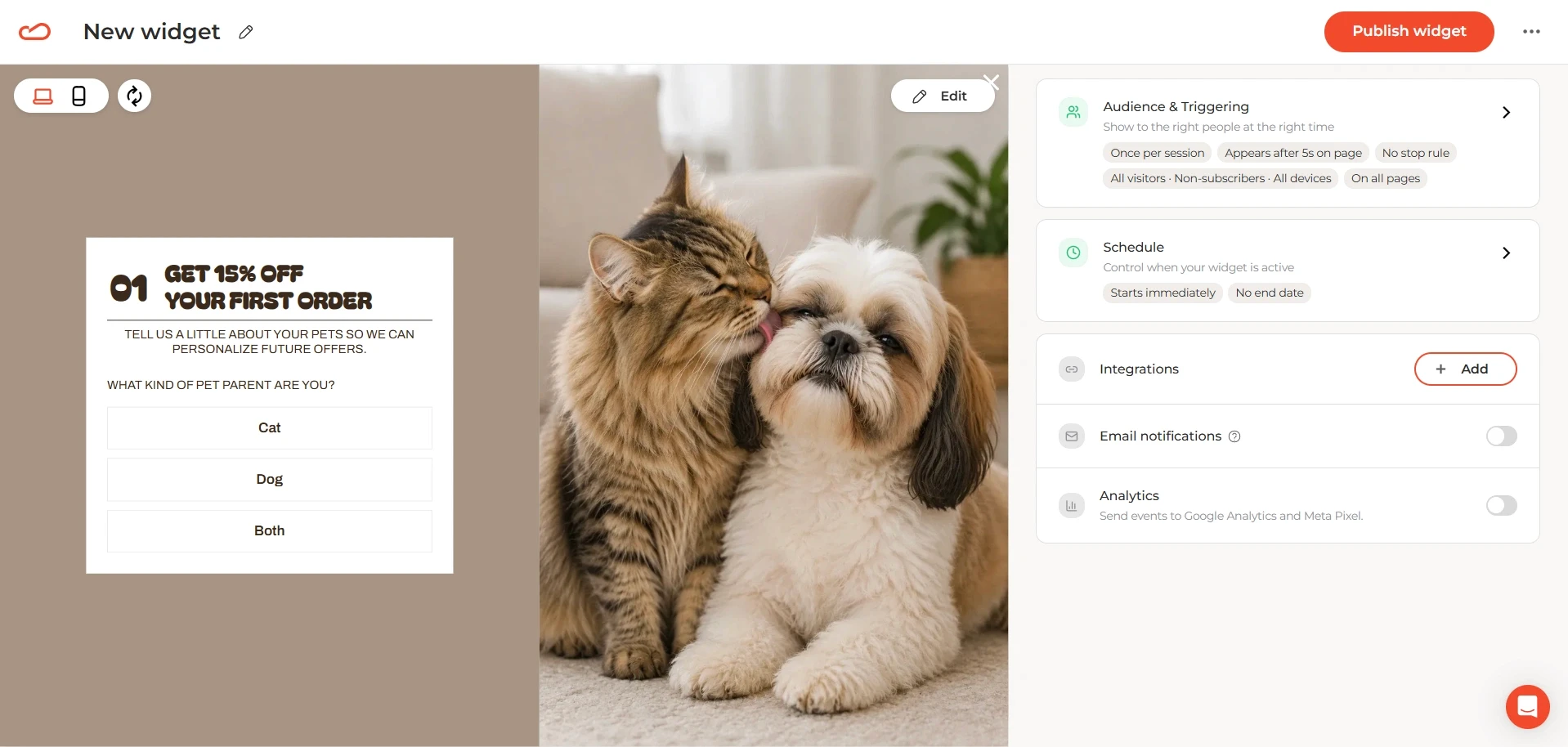
For example, a first-order pet store offer could appear to non-subscribers after a short delay and no more than once per session. The right setup depends on your traffic and how visitors usually behave on the site.
For step-by-step setup instructions, visit the Display rules section of the Claspo help center. It covers behavioral triggers, audience and page targeting, display frequency, and advanced conditions.
What the finished conditional logic form looks like

Once published, the flow works like this: the visitor opens the pet quiz, chooses Cat, Dog, or Both, answers a follow-up question written for that path, and then enters an email to receive the discount.
The useful part shows up in Claspo under the widget’s Submissions tab.
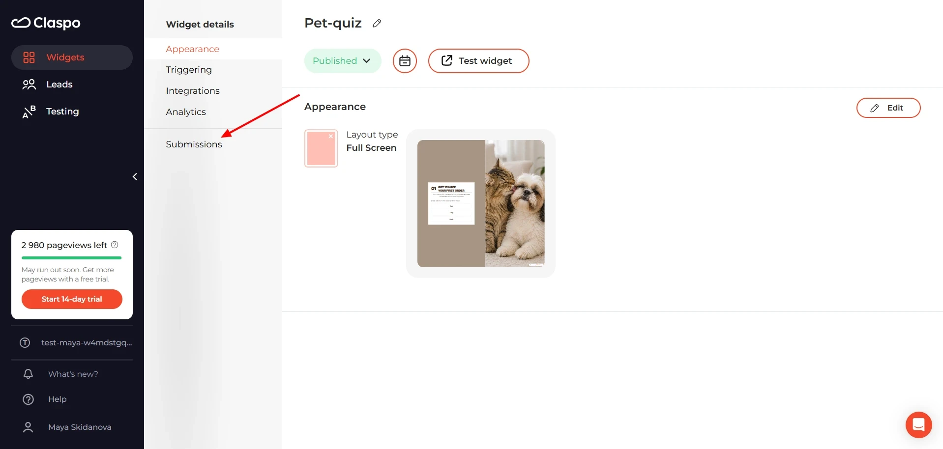
Each row includes the subscriber’s email, their pet choice, and the goal selected on the next step. Blank cells in the other goal columns are expected — the visitor only saw one of those pages.
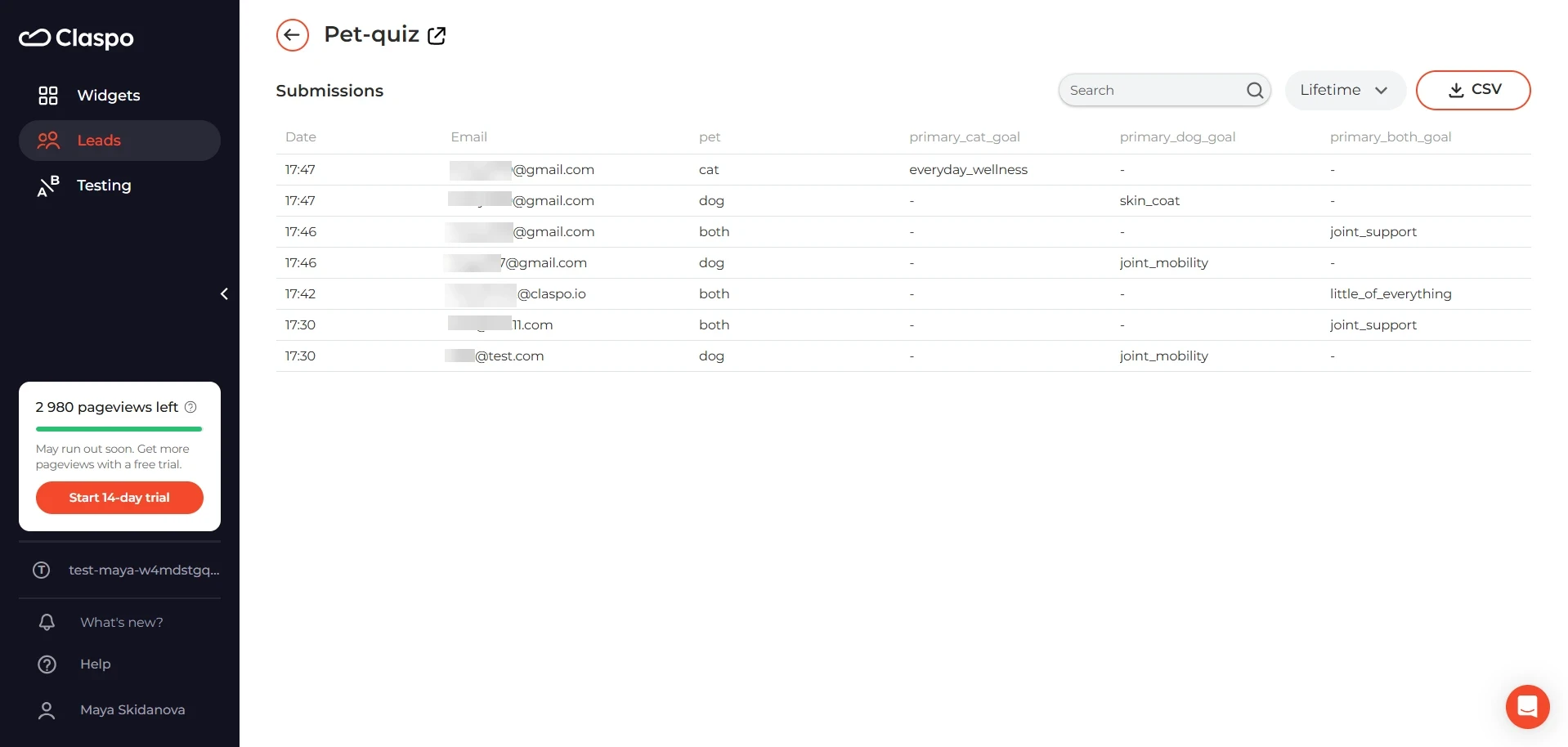
You can review the responses inside Claspo, export them as a CSV, or pass them to a connected ESP. So the finished quiz funnel brings in a new contact with a little context already attached.
How to write questions for conditional logic forms that marketers can use
Irrelevant or non-personalized content drives 46% of email unsubscribes, according to Litmus. A lead generation quiz can help with that problem by collecting the preferences, goals, and concerns people are willing to share themselves.
But adding a few buttons to a popup does not automatically produce useful zero party data. The questions have to lead somewhere. Otherwise, the brand runs a charming little interview, saves the answers in a spreadsheet, and sends everyone the same welcome email anyway.
The simplest rule is this: do not begin with “What could we ask?” Begin with “What will we do differently after someone answers?”
Start with the marketing action, not the question
Before adding a question to your conditional logic form, complete this sentence: If the shopper chooses ___, we will show or send them ___.
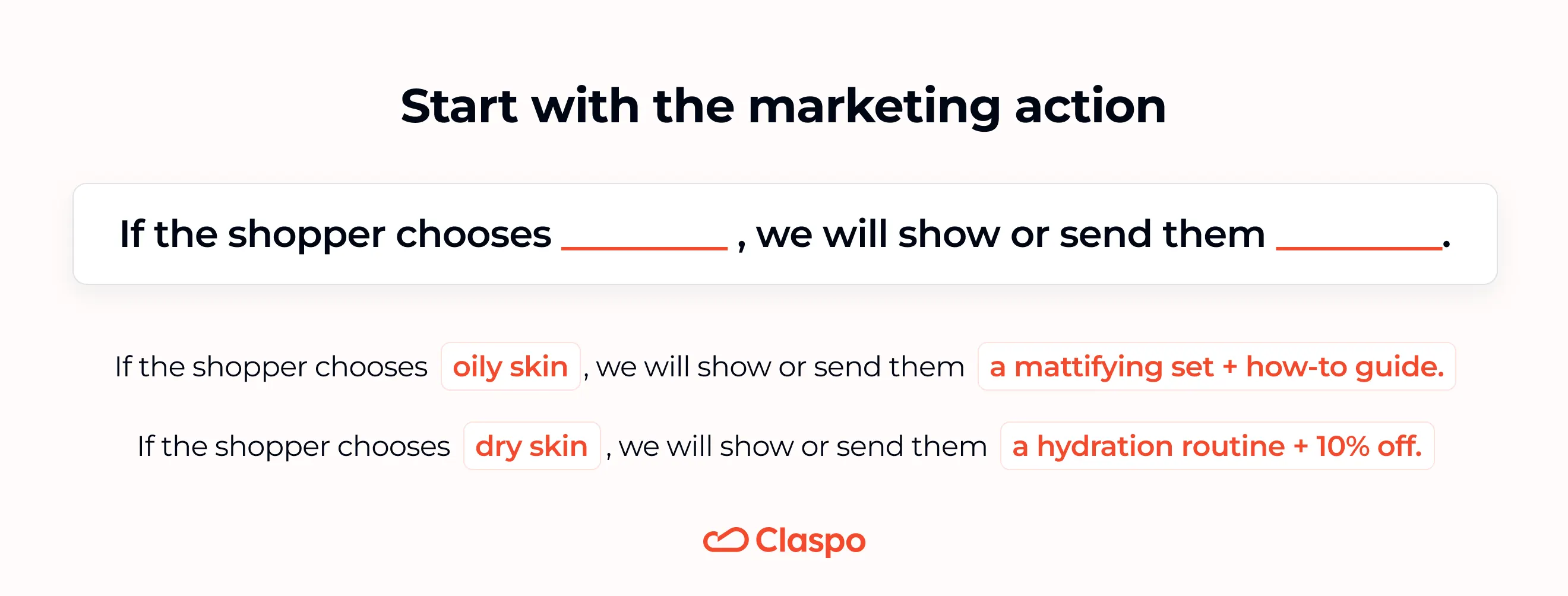
Suppose a pet store from our previous example asks: “What would you like to support most?” If someone selects “Joint mobility”, the store could place them in a dog mobility segment, recommend joint-support products, send a guide on keeping older dogs active, or feature a relevant bundle in the welcome flow. That answer has a job.
Now imagine asking for the pet’s favorite time of day. Cute? Certainly. Useful for product recommendations or email segmentation? Probably not, unless the store happens to sell a highly sophisticated line of 3 a.m. cat entertainment.
A question belongs in the quiz when at least one of these things changes after the answer:
the next question;
the recommended product or bundle;
the email segment;
the welcome content;
the offer;
the timing or frequency of follow-up.
When nothing changes, the question is likely collecting data for decoration.
Ask one routing question, then narrow the intent
For a short quiz funnel, two good questions can be enough.
The first question should establish the context and decide which path the visitor takes: “What kind of pet parent are you?” The second question should uncover a need the brand can act on: “What would you like to support most?”
After two clicks and an email submission, the brand has a much clearer subscriber profile:
Dog + Joint mobility
Cat + Hairball support
Multi-pet household + Mixed needs
That is enough context to change the first email, the product block inside it, and the campaigns the subscriber receives later.
Keep answer options clear and distinct
Each choice should represent one understandable signal. Avoid answers that overlap heavily:
Better skin
Healthier skin
Skin support
The shopper may see three options. The marketer sees one segment wearing three hats.
Be careful with “Both,” “All,” and “Other”. Catch-all answers make a quiz easier to complete, but they often produce weaker segments. Take the option “Both” in a makeup-vs-skincare question. It prevents the shopper from being forced into the wrong category, which is good UX. But it does not tell the marketer what to lead with next. A short follow-up can fix that: “What would you like to start with?”
The same applies to “A little of everything” in our pet-store example. It becomes useful when the brand has a clear plan for it, such as mixed bundles or household offers.
Do not collect personal details “just in case”. Age, gender, name, household income, or birth decade may be useful in some quizzes. But there should be a reason for asking.
Check the full path before publishing. Once the questions are drafted, map each answer to what happens next.
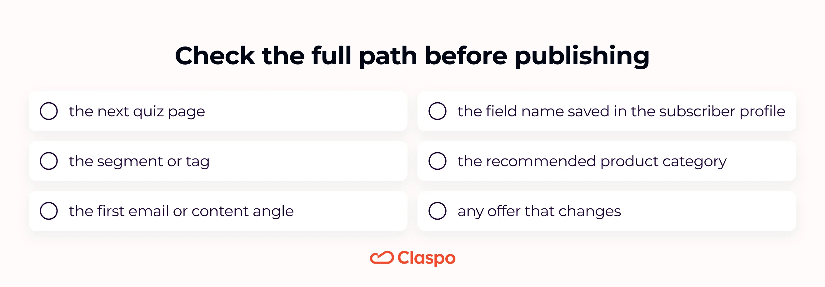
When every answer has a clear ending, the conditional logic form is ready to do more than collect clicks.
Make your next signup more valuable
A quiz is not valuable because it asks more questions. It is valuable because the answers help you stop treating every new subscriber like a blank profile. A well-planned conditional logic form can guide shoppers toward a relevant choice while collecting preferences your marketing team can use later.
With the steps above, you can quickly turn a Claspo multi step popup template into a lead generation quiz, send visitors down different paths, and save their answers for segmentation. Start with one routing question and one useful follow-up. That is already enough to begin collecting leads enriched with self-reported data — and give your next welcome email something better to work with than a polite guess.