10 Lead Generation Quiz Examples [How to create +Tips]

![10 Lead Generation Quiz Examples [How to create +Tips]](https://framerusercontent.com/images/sNtbO3zA2iztr4U0Z5jcl6w6k.webp?width=1320&height=756)
Summarize
Someone leaves an email address. Lovely. Now comes the less lovely part: figuring out what they actually want. A quiz for lead generation can answer that before your first follow-up goes out.
In this article, we take a close look at 10 lead generation quiz examples from real websites — mostly ecommerce, with several service businesses in the mix. We point out what is worth borrowing for your own audience tests. We also call out the parts that create friction, because a real example can be useful without being flawless.
Then we look at where the quiz can run and how brands make sure visitors actually notice it. These placement and promotion ideas also come from live websites, not from a particularly enthusiastic brainstorming session.
Finally, we build a Black Friday lead generation quiz in Claspo step by step. You will see how quickly you can launch one and start collecting a segmented subscriber base before the sale begins.
TL;DR
One question changed the conversion rate from 4.4% to 21.3%. In the Lavender World case study, replacing a yes/no gate with four forward-moving Choice options made the same lead gen quiz convert almost five times better.
In Claspo’s data, multistep popups reached 1.35× the baseline conversion rate, while popups with Choice buttons reached 1.36×.
The quiz result can be the incentive. A useful product match, routine, assessment, or quote may earn the email without a discount.
A good quiz still needs help getting noticed. Email popups with teasers averaged a 6.89% CR in Claspo’s benchmark — about 1.88 times the baseline.
What is a lead generation quiz?
A lead generation quiz is an interactive form that asks visitors a few questions and connects their answers to a contact the business can follow up with. Depending on the offer, the quiz might help someone choose a product, assess a need, get an estimate, or find the right service.
Like other lead capture forms, a quiz may ask for an email address or phone number. The difference is what arrives with it: a goal, preference, budget, timeline, or current challenge. An email address is useful. An email address attached to a clear need gives the next message somewhere to go.
A typical quiz for lead generation follows this flow:
Hook → Questions → Lead capture → Result or next step → Follow-up
There is no single right order. A software company, for example, might ask about team size and the problem someone wants to solve before requesting a work email.
If the response stays anonymous, the quiz can still help someone find their way around the site. But it becomes a lead generation quiz once the business can connect those answers to a person and knows what to do with them. Maybe the promised result goes straight to their inbox. Maybe the answers show a strong fit and sales picks up the conversation. Either way, the follow-up starts with something the person has already said, not another generic welcome email.
10 lead generation quiz examples
The most useful lead generation quiz examples do more than place an email field after a few questions. Some show the product match before asking for an opt-in. Others turn answers into CRM tags, flag a case for personal follow-up, or collect enough detail for a professional to prepare a quote. We will also look at what weakens the quizzes.
Most examples below come from ecommerce, where lead quizzes help shoppers navigate large or unfamiliar product ranges. We have also included service businesses to show how the same format can qualify both the request and the person behind it.
Value-first quiz for lead generation
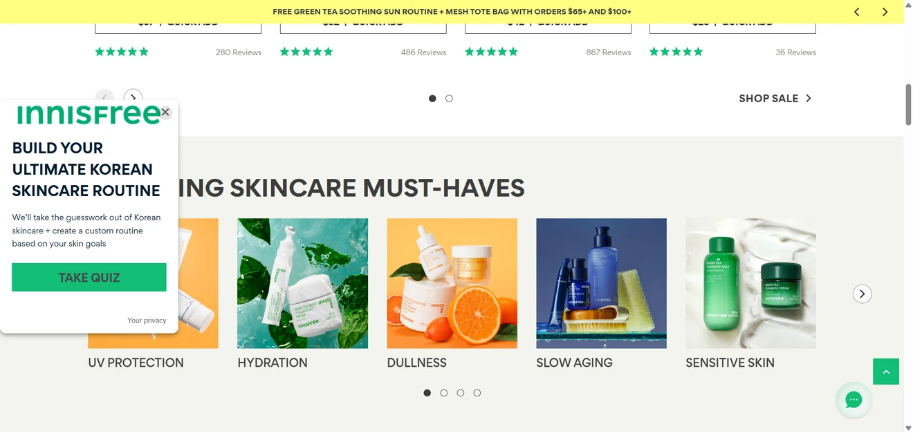
The result is the incentive. Innisfree promises to create a custom Korean skincare routine around the visitor’s goals. There is no discount for completing the quiz — and none is needed. The quiz solves a real shopping problem: “I know what bothers me, but I have no idea which products I need”. If someone already knew the answer, why take the quiz in the first place?
Sales remains the primary conversion. Choice buttons handle skin concerns and skin types, while a slider lets visitors place themselves somewhere between skincare newbie and expert.
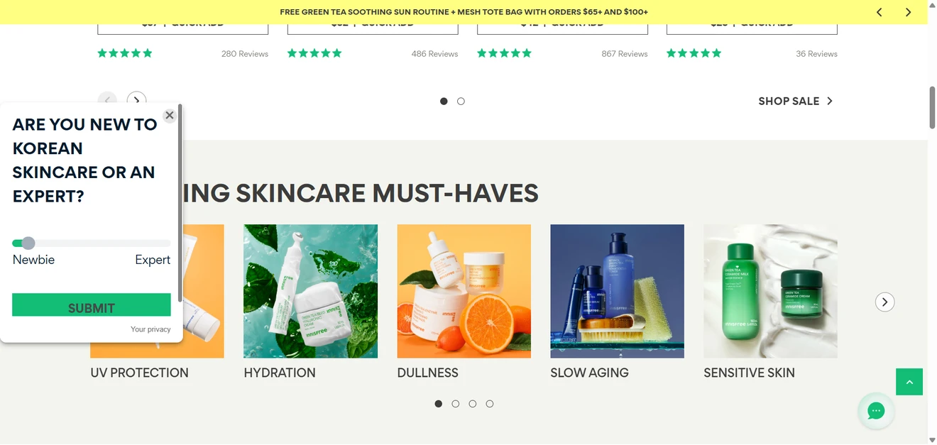
The email and phone fields are optional, so people can skip them and still see their four-step routine. This lead capture quiz does not hold product recommendations hostage to an opt-in. It helps visitors reach relevant products first and collects qualified leads when they want to stay in touch.
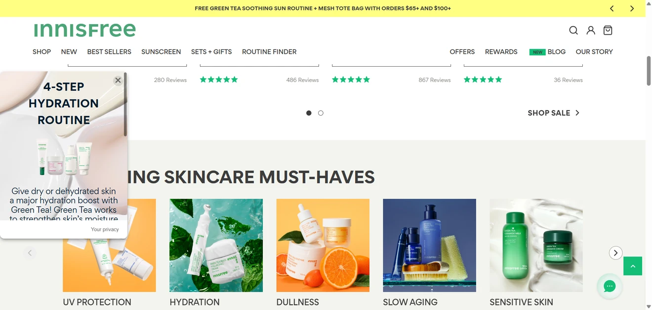
Each opt-in comes with useful context. Innisfree learns more than a name and email. The answers reveal the person’s skin concern, age range, skin type, and level of skincare knowledge. That data can support much sharper follow-ups: a beginner may need guidance on using each product, while an experienced customer may prefer ingredient details or comparisons. Even small touches serve a purpose. The quiz uses the visitor’s name in the next question and explains why age is relevant before asking for it.
A conditional lead generation quiz for mattress shoppers
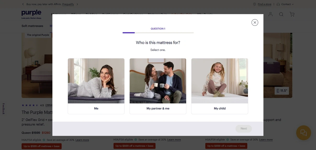
The questions mirror a real sales consultation. Purple asks who will use the mattress, how each person sleeps, what keeps them awake, which feel they prefer, and how much they are willing to spend. The popup uses conditional logic: someone shopping alone should not have to discuss another person’s sleep position.
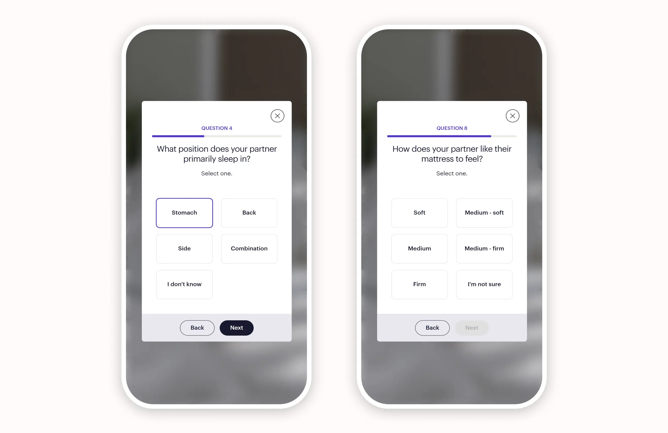
This keeps the quiz relevant while collecting the details needed for a high-consideration purchase.
Good UX leaves room for uncertainty. Options such as “I don’t know”, “I’m not sure”, and “No preference” stop visitors from inventing answers just to move forward. A segmented progress bar also makes nine questions feel manageable, while large Choice buttons work well on mobile.
What could be improved. “Full”, “Queen”, and “King” options appear without dimensions or an unsure option. This is where an illustration would help far more than the lifestyle images used on the first screen. The budget ranges could also use actual prices; one person’s “mid-range” is another person’s minor financial crisis.
Email supports the purchase instead of blocking it. Visitors can view their matches immediately or enter an email to save them. Purple then names a “Best Match”, explains why it fits, adds ratings and alternatives, and lets visitors change their answers.
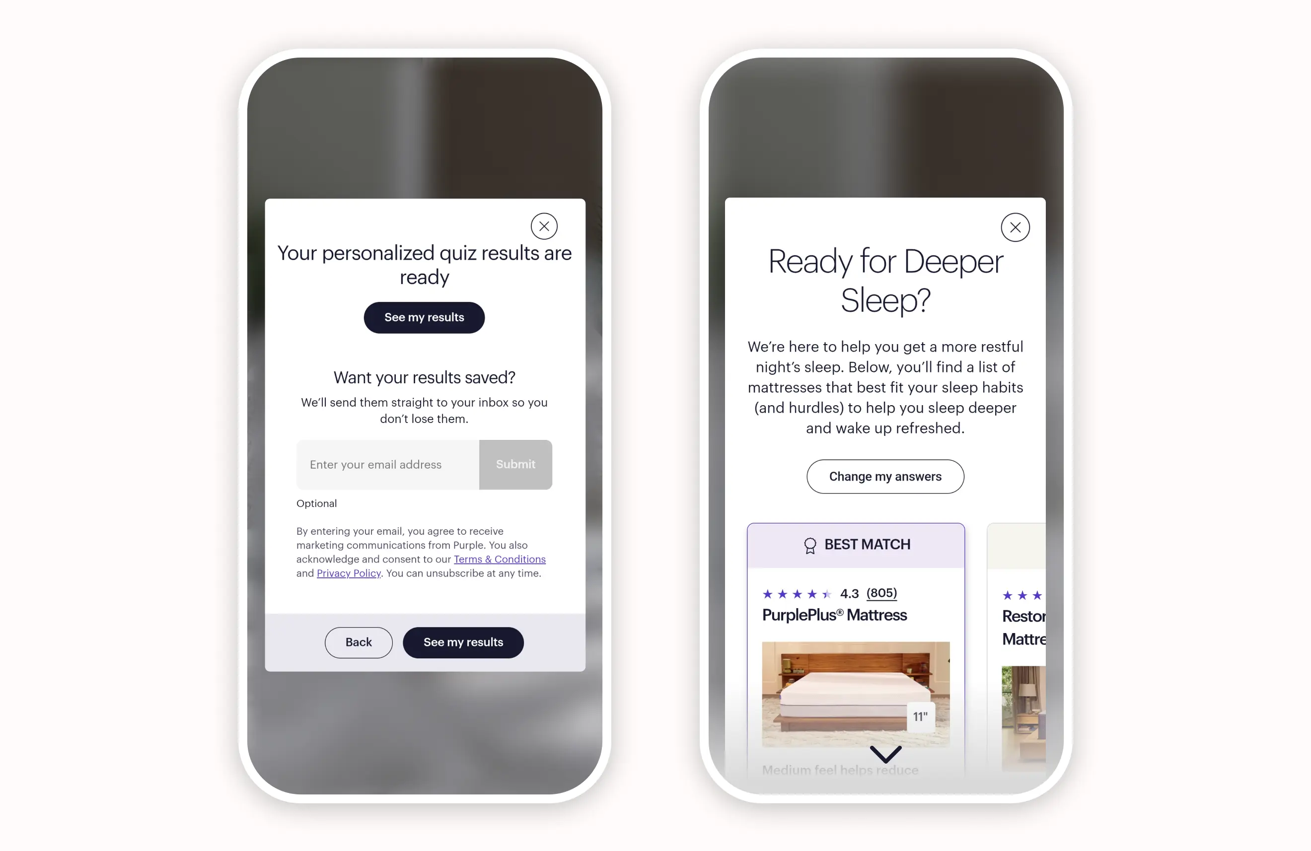
The main conversion remains the product selection, while the optional form can turn interested shoppers into well-qualified quiz leads.
Lead capture quiz with two opt-in opportunities
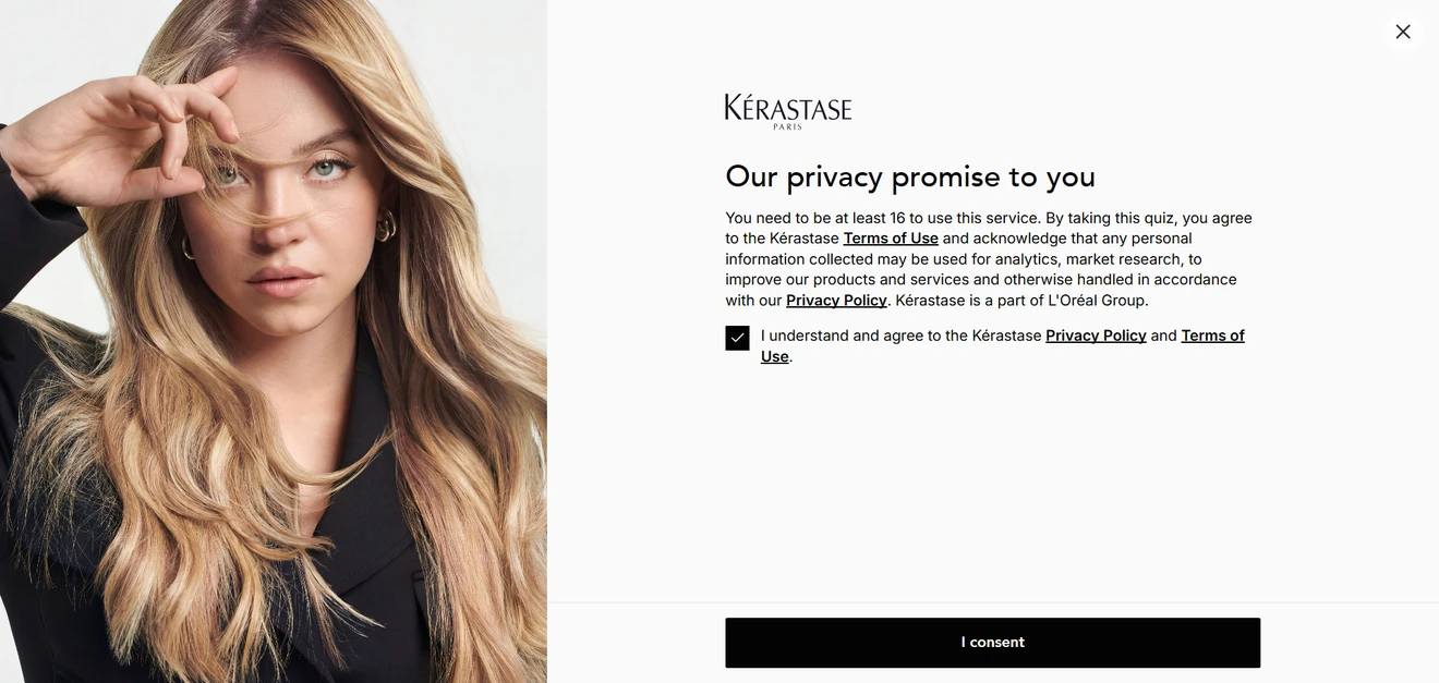
The privacy screen earns its place. Kérastase puts the notice before question one. Someone can leave without joining the newsletter, yet the brand will still have their quiz answers. And those answers go well beyond dry versus oily hair: they include things like age, hair loss, recent treatments, and daily styling. The first consent covers that quiz data. Permission to send marketing emails comes later, with a separate checkbox.
The questions do part of the consulting. Short explanations and Pro Tips clarify why each answer is needed and help people respond more accurately.
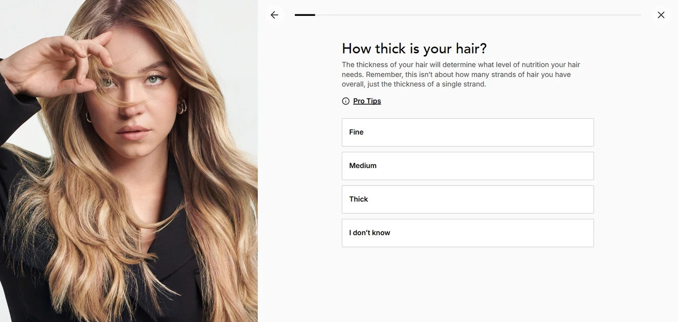
Gender and age can be skipped, which is sensible for personal questions — although marketers should still ask whether these details genuinely change the result.
Single-choice buttons often move visitors forward automatically, while typed and multiple-choice answers require a Next button.
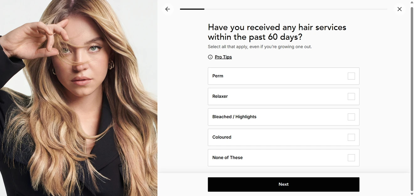
The pattern is not completely consistent, but a persistent Back arrow provides an escape route after an accidental click.
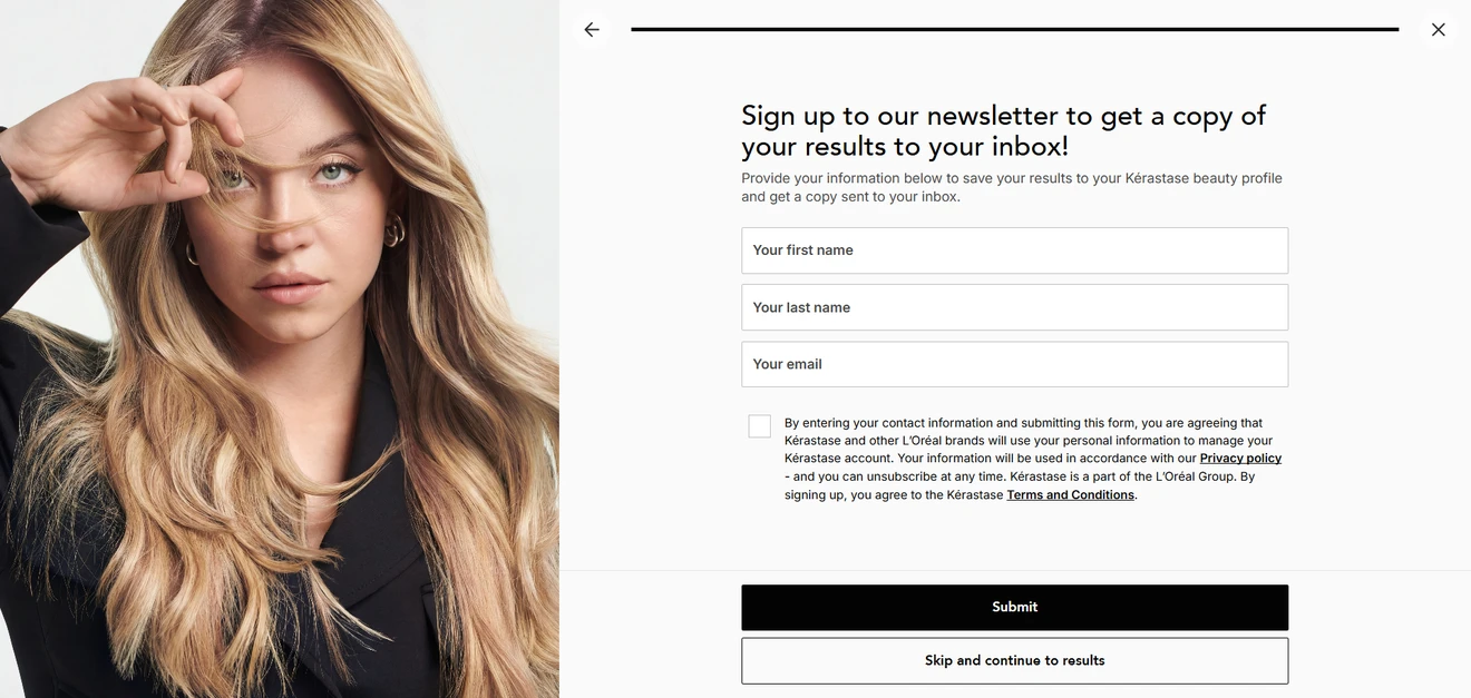
The first opt-in is optional; the second comes after the value. Visitors can skip the newsletter form and continue to their results.
An intermediate screen then shows Kérastase “analyzing” the answers and generating a profile, making the result feel earned rather than pulled from a hat.
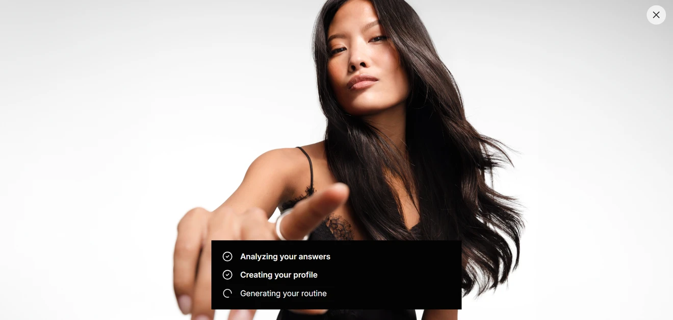
The final routine is divided into steps, explains why each product matches, and can be added to the cart in one click. The response tags are more useful than the impressive-looking 89% match score: they show what the recommendation is actually based on.
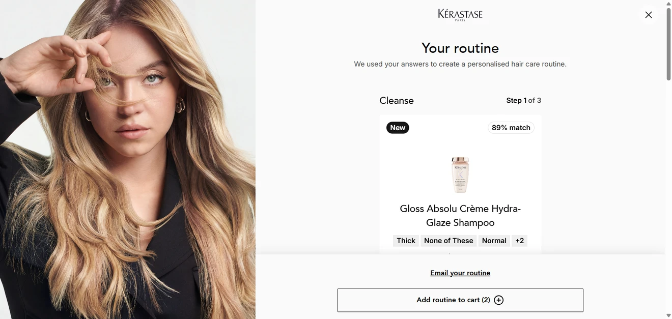
Visitors who skipped the first form can still choose “Email your routine” after seeing it. This gives Kérastase another chance to collect a qualified lead at a moment when the request makes more sense.
An archetype-led lead generation quiz
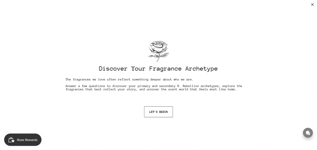
Buying perfume online comes with one obvious problem: the customer cannot smell anything. R. Rebellion works around it by asking who the visitor is before asking which notes they prefer.
The opening screen promises primary and secondary archetypes and matching fragrances. Most of the ten questions are built around personality and lifestyle: personal values, an ideal Saturday, or the kind of story someone identifies with. Only the last two turn directly to fragrance preferences.
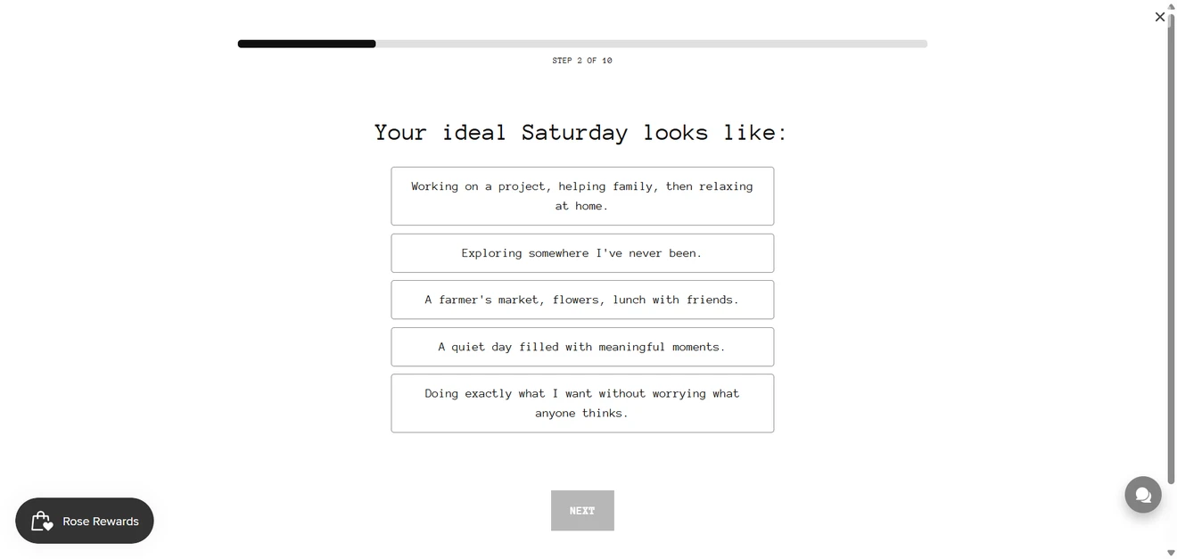
That mix makes sense. The archetype element gives people a reason to take the quiz even if they know very little about perfume. The final scent questions then keep the recommendations connected to something more concrete. Otherwise, the result could start feeling like a horoscope with a bottle attached.
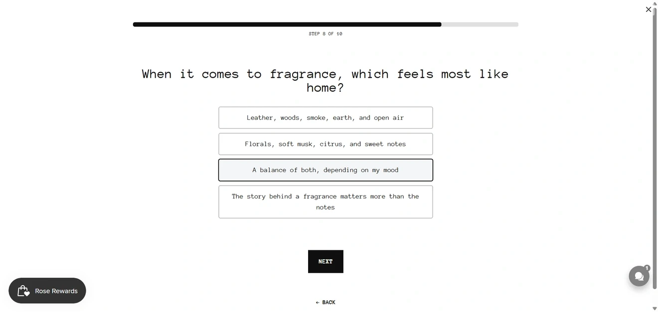
The answers can also be useful beyond the first recommendation. An archetype may become a CRM tag for follow-up campaigns, while an answer such as “The story behind a fragrance matters more than the notes” tells the brand how to present future products. Some subscribers may respond to ingredients and scent families; others are more likely to buy into the mood and story.
What could be improved
Once the quiz begins, a progress bar shows “Step 1 of 10”. That information should appear on the opening screen, ideally with an estimated completion time. Calling ten questions “a few” is doing some optimistic counting.
Navigation is another weak spot. A Back button appears on certain screens but disappears on others, leaving visitors unable to correct some answers. Since these options are subjective and often quite similar, returning to the previous question should always be possible.
The bigger issue is the email gate. Visitors only learn at the final step that an email is required to reveal the result.
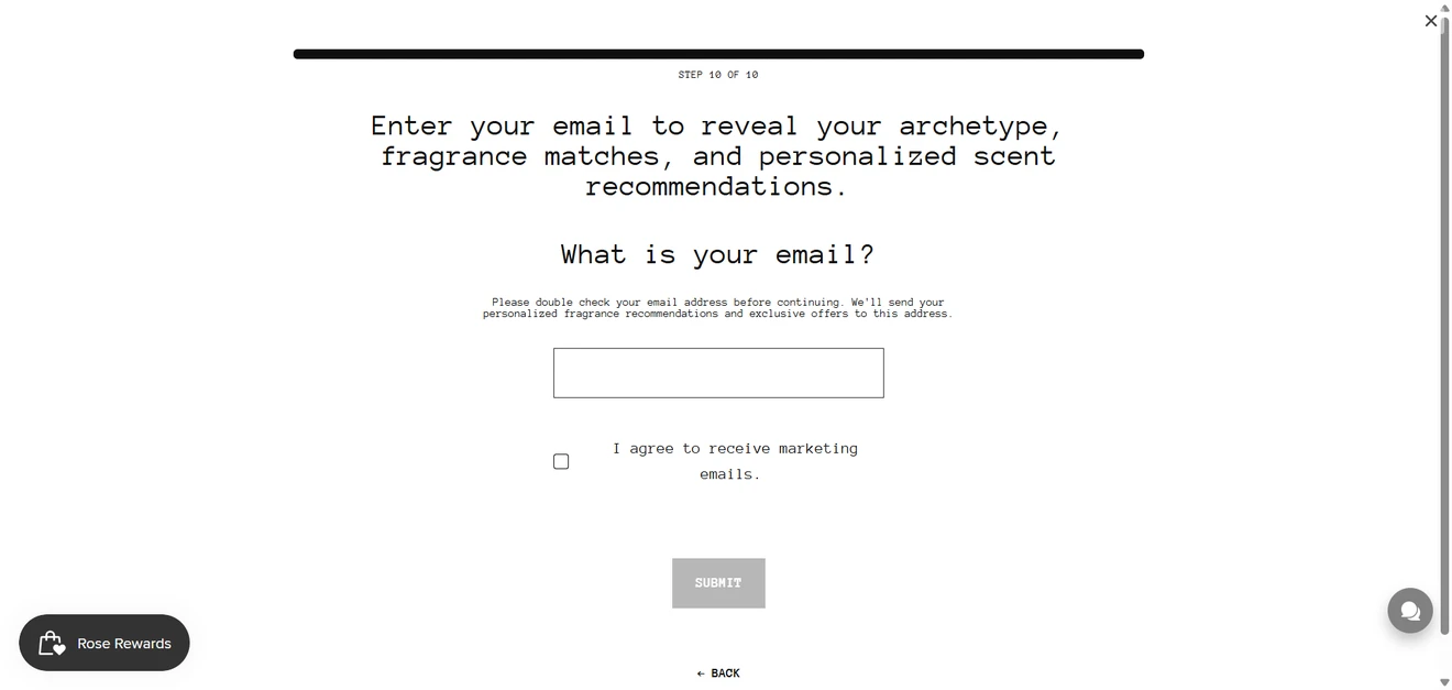
This may collect more quiz leads from people who have already invested time, but it can also feel like a hidden condition. The brand could mention the requirement before the quiz starts or show a short archetype preview before asking for an email.
Finally, the result needs to explain the match. Showing which answers led to each archetype and why those traits connect with particular fragrance notes would make the personalization feel credible, not merely poetic.
A product finder that doubles as a lead generation quiz
Personalization begins with the dog, not the owner. The first screen looks more like a pet profile card than a form.
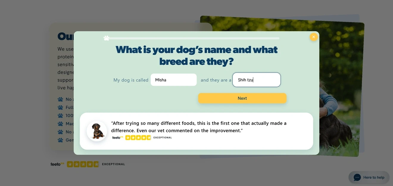
Happy Dog then uses the name throughout the quiz. It is a small touch, but questions about “Misha” feel far more personal than questions about “your dog”. By the final step, Misha has a richer customer profile than some B2B prospects.
The questions separate nutritional needs from shopping preferences. The quiz collects the dog’s age, weight, symptoms, diagnosed conditions, protein sensitivities, main concern, treat habits, and preferred food type. Each answer has a clear job. Medical conditions and reactions can rule products out, while feeding preferences help the brand recommend something the owner may actually buy. The age step even explains that Misha will be treated as an adult, showing how the information affects the result.
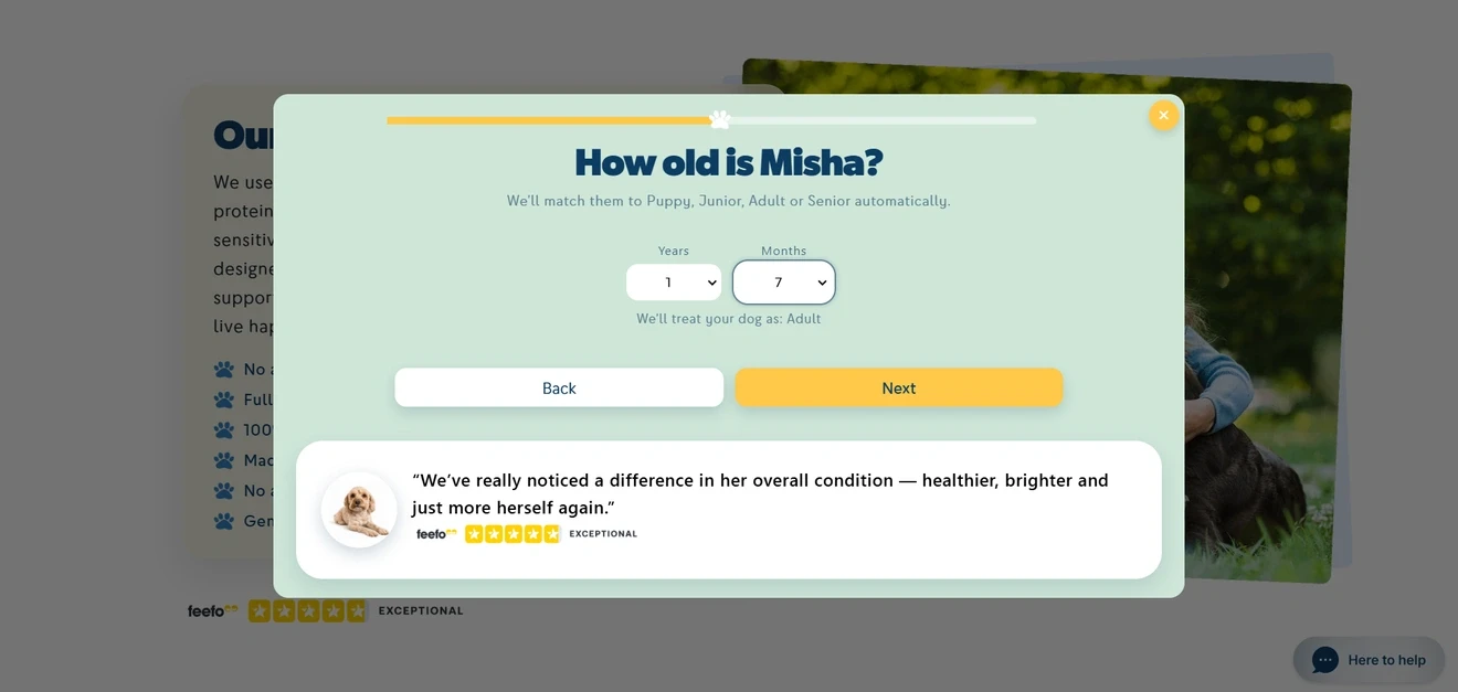
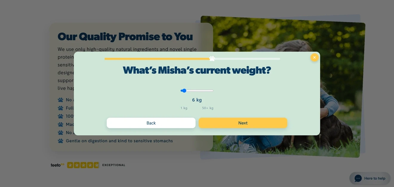
The interface changes with the answer. Happy Dog uses input fields for the pet profile, dropdowns for age, a slider for weight, and Choice buttons for most other questions. Single-choice and multiple-choice steps are clearly labelled, while visible Back and Next buttons give users control. The paw-shaped progress bar adds a little personality.
The quiz has more than one conversion path. Beyond recommending food, Happy Dog asks whether the owner wants support from a nutritional expert. A “Yes” can identify a higher-intent or more complex case for personal follow-up. This turns the product finder into a lead capture quiz without making every visitor request a consultation.
Social proof stays visible during the journey. Customer quotes, dog photos, and ratings appear on several screens. For a relatively long quiz involving health concerns and feeding choices, that reassurance is useful. The design manages to be cute without forgetting that the brand would still quite like to sell some dog food.
The final exchange could be clearer. “Your details please?” focuses on what the brand wants.
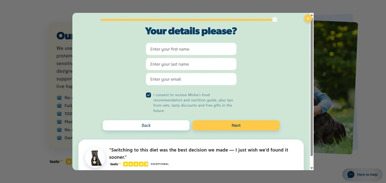
“Where should we send Misha’s food plan?” would make the value of sharing an email much harder to miss.
Lead generation quiz for personalized supplement plans
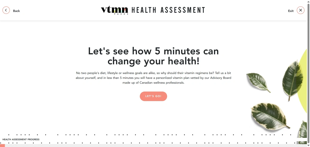
The quiz makes a fair bargain upfront. VTMN Packs says the assessment will take about five minutes and explains the payoff: a personalized supplement plan based on the visitor’s diet, lifestyle, and health goals. That time estimate matters here.
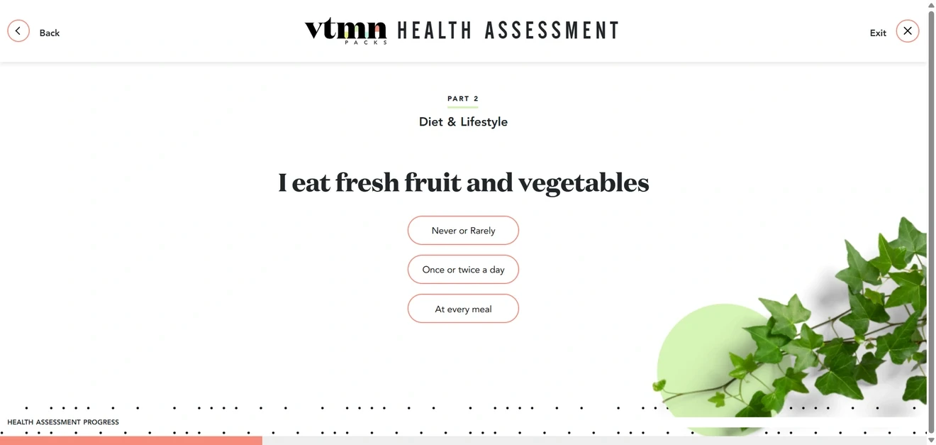
The design makes a long assessment feel more manageable. The quiz is divided into four parts. Images and color accents change between sections, giving visitors a visual cue that they are moving forward. The fullscreen format leaves enough room for long answer lists without competing with the rest of the website. Back and Exit are always visible too, so the experience never feels like a wellness-themed escape room.
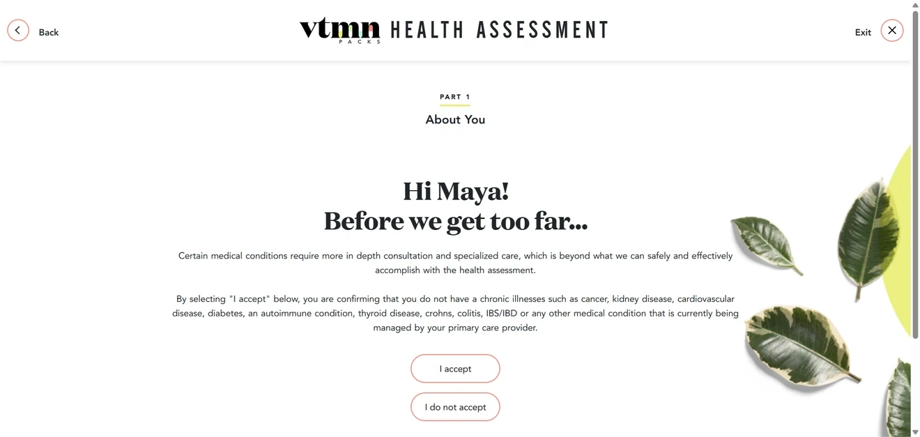
Personalization starts with the name, while lead capture happens early. VTMN Packs asks for a name first and later uses it in messages. After the opening step, the brand collects consent and an email address. This turns the assessment into a lead capture quiz before the visitor reaches the recommendations.
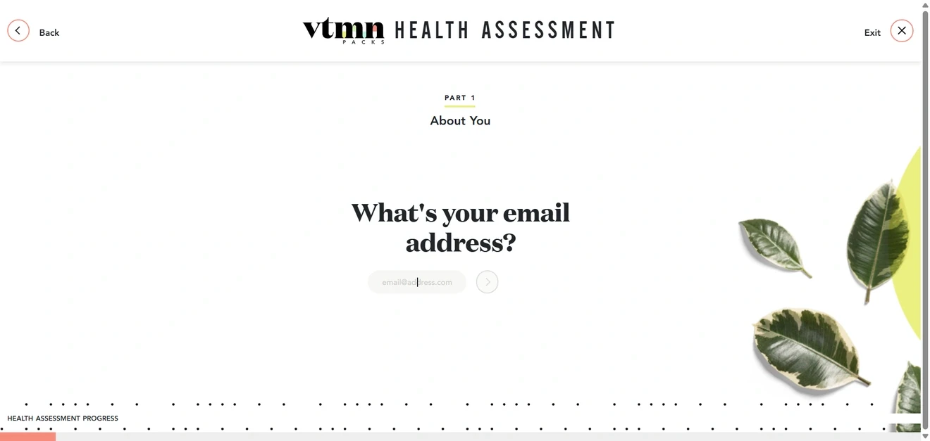
The email screen could make the exchange clearer, though. “Enter your email to save your assessment and recommendations” gives a stronger reason than simply asking, “What’s your email address?”
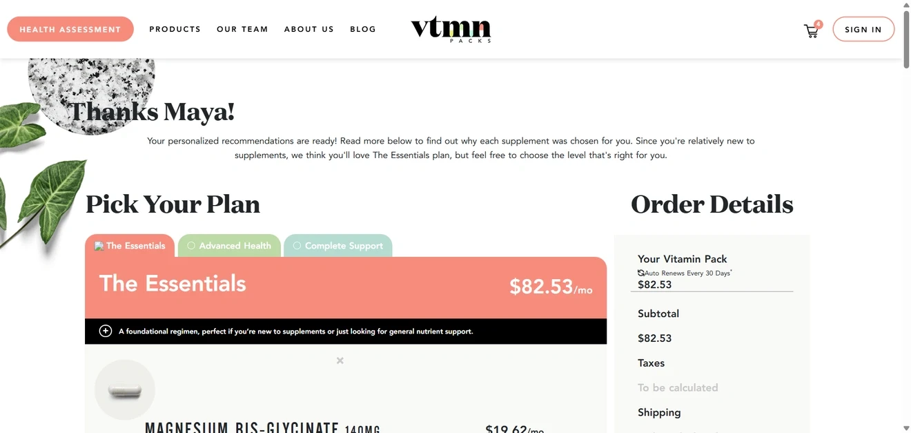
Every question feeds the recommendation. The assessment covers dietary restrictions, allergies, eating habits, supplement experience, health concerns, pregnancy, and regular medication use. On the result page, VTMN Packs refers back to the visitor’s limited supplement experience when recommending the Essentials plan. This small explanation shows how an earlier answer changed the recommendation.
The quiz starts building the order before showing the result. One of the final questions asks whether the visitor prefers alternating AM/PM packs or separate morning and evening boxes.
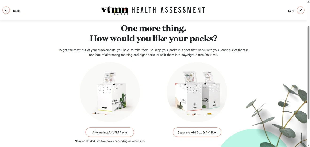
This does not help choose the supplements; it configures the future order and gets the visitor thinking about how the product will fit into their routine.
The progress indicator could be more informative. The section names and bottom progress bar show movement, but not how many questions remain inside each part. Adding “Question 8 of 20” would set better expectations.
Gamified quiz for lead generation with account registration
The gift-box game is the hook; the actual quiz comes next.
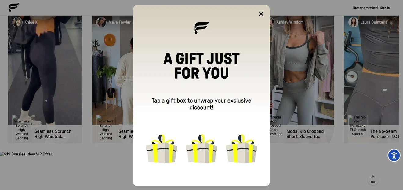
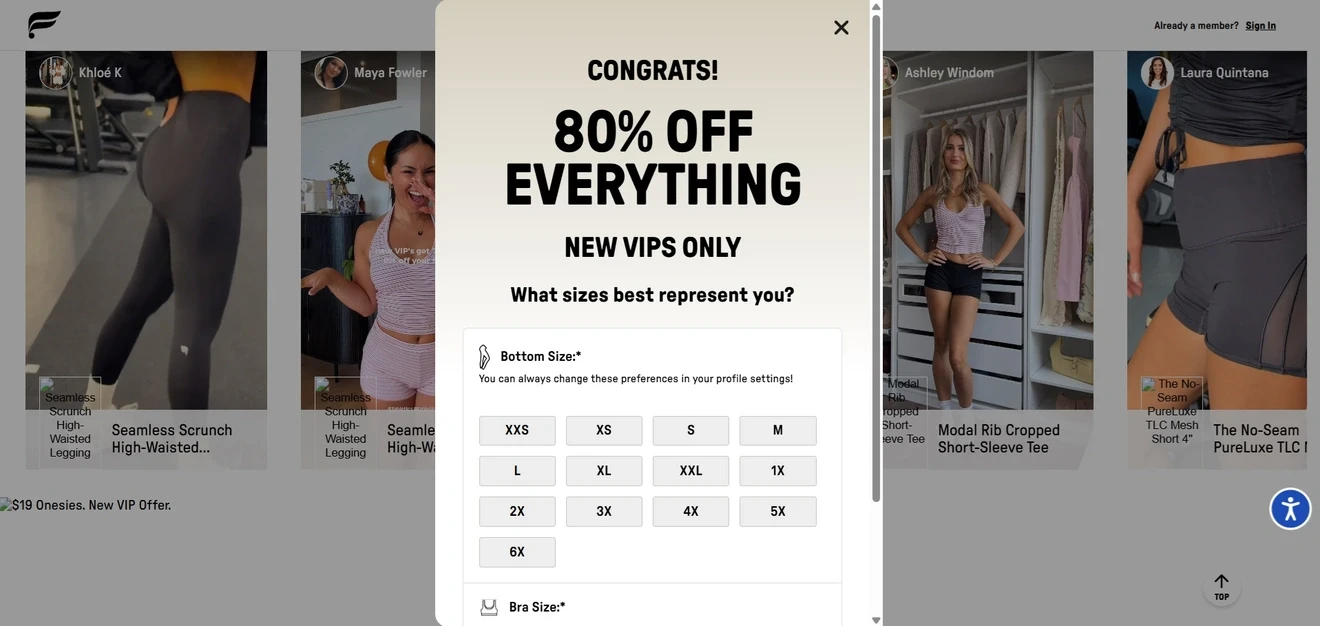
At first glance, it looks like one of the pick-a-gift popups. Choosing among three identical boxes does not tell Fabletics anything about the visitor — it simply makes revealing the 80% discount more fun. The useful data collection begins when the brand asks for separate bottom, bra, and top sizes.
A substantial reward supports a substantial ask. This funnel does not stop after collecting an email. To claim the offer, the visitor must create an account, set a password, say how they discovered the brand, and optionally provide a phone number.
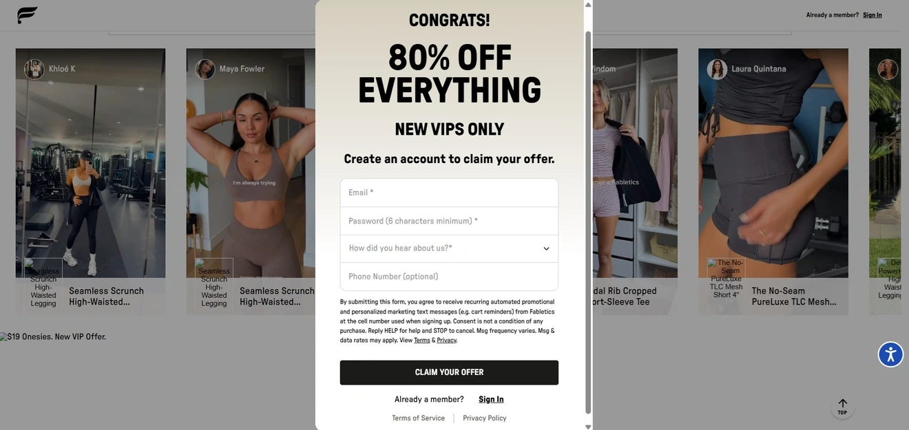
That is considerably more friction than a typical lead capture quiz, but 80% off is also considerably more tempting than the usual “Here’s 10%, please don’t spend it all at once”.
The size questions turn a new account into a usable customer profile. Fabletics can use this zero-party data to filter products, personalize recommendations, and make future email or SMS campaigns more relevant.
This is lead generation with a stronger next step built in. The visitor becomes identifiable and marketable, so the funnel still belongs among our lead generation quiz examples. However, it goes beyond collecting quiz leads: it creates registered users who are closer to shopping. They are not customers yet, but they are more activated than ordinary newsletter subscribers.
Lead generation quiz for services
Unlike the earlier examples, Bark operates in B2C services rather than classic ecommerce. The quiz needs to understand the job well enough to connect the customer with a suitable professional.
What Bark collects is not just a lead; it is the beginning of a quote. “I need a cleaner” does not give a professional much to work with. A one-off clean for a studio and weekly visits to a four-bedroom house are two very different jobs.
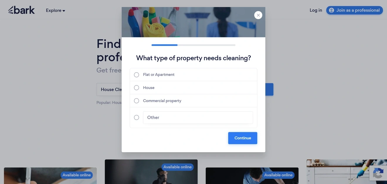
Bark gets those details first — rooms, frequency, preferred days, supplies, and postcode — and asks for contact information later. By then, the request is something a cleaner can actually assess, not an email address with “please clean my house” attached. The cleaning photo at the top is a small touch, but it immediately tells visitors they have not somehow opened the personal-trainer form.
Bark qualifies the customer as well as the request. The question “How likely are you to make a hiring decision?” works as direct lead scoring. It separates people ready to hire from those who are still researching. Cleaning frequency can also hint at the potential lifetime value of the request. For a service marketplace, these signals may be more useful than another generic “Tell us about yourself” field.
Contact capture comes after a series of small commitments. By the time Bark asks for contact details, the visitor has already described the job in detail. The final step therefore feels like the route to receiving quotes.
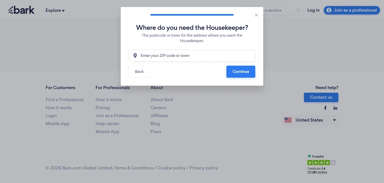
What could be improved. Bark could mention earlier that contact details will be required to receive matches. After a fairly long flow, that condition should not arrive as a surprise.
Financial advisor quiz for lead generation
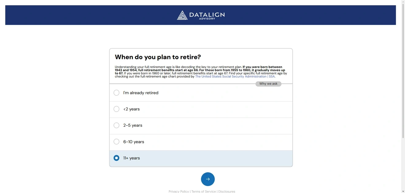
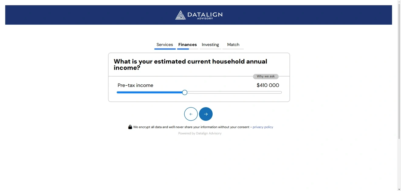
Sensitive questions come with an explanation — but only when the visitor wants one. Income, retirement plans, and portfolio management are hardly casual small talk. Datalign adds a “Why we ask” control to these steps. One click opens the explanation; another gets it out of the way, so the form itself stays clean.
The income question also comes with a short encryption and consent notice, placed right where privacy concerns are most likely to appear.
The quiz handles part of the discovery call in advance. It learns whether the visitor has paid for financial advice before, how they manage their investments, when they hope to retire, and how confident they feel about their financial plan. Those answers help Datalign assess fit while giving the advisor useful context for the first conversation. No need to spend ten minutes collecting information the prospect has already provided.
One match makes the result feel like a recommendation, not another directory. Datalign presents a single advisory firm and offers the next logical step: booking an introduction.
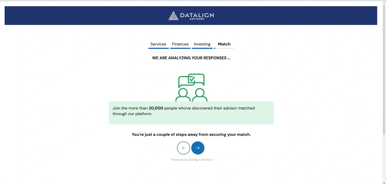
An “analyzing your responses” screen makes the match feel considered, while the mention of more than 20,000 previous users adds reassurance during the wait.
Real estate lead generation quiz
The icons earn their place. Clever opens with illustrated property types, making options such as a condominium and a townhouse easier to tell apart.
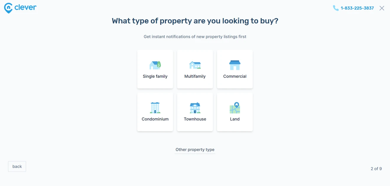
The line below each question also explains how the answer will improve the match. Budget points to agents with relevant experience; timing shows how quickly they may need to act.
Each answer adds another layer to the buyer brief. Property type and price range define the kind of deal. Search stage and timeline reveal whether someone is casually browsing or preparing to make an offer. Mortgage status adds a useful readiness signal. Clever can therefore qualify and route its quiz leads.
The result saves the user another round of research. Instead of opening a directory with hundreds of profiles, this lead capture quiz promises two or three personalized matches. That is a clear value exchange: nine answers in, a manageable shortlist out.
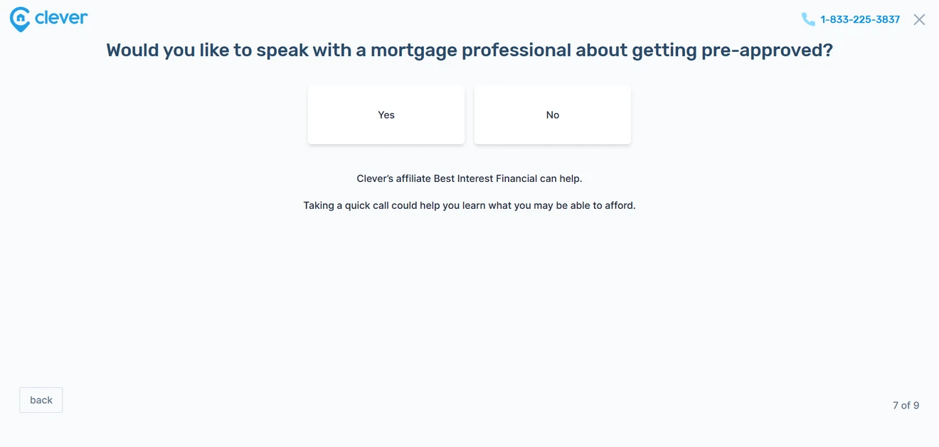
The quiz also creates a relevant secondary conversion. Buyers who are not yet pre-approved can request help from Clever’s mortgage partner. It fits naturally into the journey and does not block users who only want an agent.
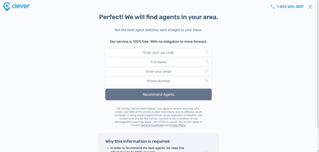
Social proof appears just before the biggest ask. Customer numbers, reported savings, and Trustpilot reviews show up one step before the form requests a ZIP code, full name, email, and phone number.
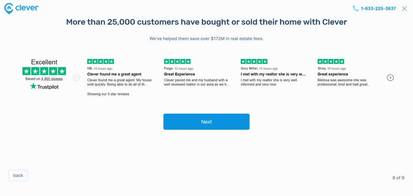
That timing makes sense: trust matters most when the fields get personal. Clever also explains why the information is required and notes that the service is free.
Do lead generation quizzes convert?
After all these examples of lead gen quizzes, one fairly important question is still hanging in the air: do they actually convert? We do not have access to the brands’ private results, so attaching a conversion rate to any of them would be guesswork. What we can examine is Claspo data for the same mechanics — multistep flows and Choice buttons — plus an ecommerce test where the numbers are available.
Across Claspo campaigns, multistep popups reached an average conversion rate of 4.94%, while popups with Choice buttons averaged 5%. Standard signup popups reached 3.67%.
These are not universal benchmarks for every quiz for lead generation. The data compares widget mechanics rather than grouping all quizzes into one neat category. Still, it shows that asking a relevant question before requesting an email does not automatically hurt signup performance.
A Claspo case study for Lavender World makes the point even clearer. Seven mechanics were tested with the same audience segment and the same 10% offer. The baseline discount popup converted at 1.64%. A quiz with a yes/no opening reached 4.4%. Once that gate was removed and visitors immediately saw four relevant answer options, conversion rose to 21.3% — nearly five times higher.
No, this does not mean every quiz will suddenly convert at 21.3%. It means the first interaction matters. The Lavender World quiz helped shoppers clarify what they wanted instead of first asking whether they felt like starting a quiz.
The answers also had a job after submission. Each subscriber’s choice was sent to Brevo as a contact attribute, creating a segment before the welcome email went out.
When assessing your own quiz leads, look beyond their number. Check whether the answers help you personalize the follow-up, identify intent, or route each lead somewhere useful.
Four lead generation quiz blueprints to adapt
A product finder and a service quote quiz may use the same Choice buttons, but they are not asking for an email for the same reason. Copying a list of questions from an unrelated business gives you a longer form, not a smarter funnel.
The four lead generation quiz blueprints below show what information to collect, which value supports the email request, and how the answers can shape future communication. Treat them as starting points rather than scripts written in stone.
Quiz use case | Business goal | What to ask | CTA examples | Follow-up |
Ecommerce product finder | Learn what the lead needs and build a profile for personalized offers | Shopping goal, main problem, preferences, relevant constraints, experience level, price range | “Email my personalized picks” or “Send offers selected for me” | Send relevant products, comparisons, or educational content. |
B2B solution matcher | Check ICP fit, understand the use case, and identify sales-ready prospects | Role, company size, industry, main challenge, current solution, timeline | “Send my solution plan” or “Get recommendations for my team” | Send a relevant use case, case study, or demo invitation. |
Service quote or match | Collect enough detail to assess the request and connect the lead with the right provider | Service type, scope, location, timing, frequency, budget | “Send my quotes,” “Find my matches” | Send provider matches, pricing information, or the next booking step. |
Consultation or assessment | Identify the person’s current level, priorities, and need for professional help | Current situation, goal, obstacles, previous attempts, available resources | “Email my assessment” or “Send my action plan” | Send a report, practical advice, or consultation offer. |
For ecommerce, email can be the result channel. Product recommendation quizzes do not have to generate a personalized product grid on the website. A Claspo quiz can collect preferences across several steps and request an email at the end. Those answers can then travel with the contact data to an ESP or CRM, where the subscriber enters a relevant segment.
Every answer needs a job after submission. When you build a quiz for lead generation, a question should change:
the segment,
recommendation,
lead score,
routing,
or follow-up.
If budget never affects the offer, asking about it adds friction without adding value. The same applies to company size, experience level, preferred service date, and every other tempting field.
This is especially important for quiz leads because they come with more context than ordinary subscribers. A skincare beginner and an ingredient expert may enter the same campaign but should not necessarily receive the same email. A B2B prospect planning to buy this month deserves different treatment from someone “just exploring”.
The email request should complete the exchange, not interrupt it. For a service quiz, contact details are the route to receiving quotes. For an assessment, they may unlock the full report. For an ecommerce product finder, they allow the brand to send tailored suggestions and save them for later. State that promise before asking for the address; do not wait until the visitor has finished eight questions to reveal that the inbox was part of the plan all along.
A quiz still follows familiar lead capture best practices. Ask only for contact fields you need, explain what the subscriber will receive, and separate result delivery from optional promotional consent where appropriate.
Where to place and how to present a lead generation quiz
Unlike simpler lead capture popups, a quiz asks for more than one quick action. Visitors need a reason to start and a format that gives them enough room to finish.
There are two separate decisions to make. The entry point determines where people discover the quiz. The format determines where they complete it. A third decision comes later: how to bring back someone who started answering but left halfway through.
Make the quiz easy to discover
Floating box
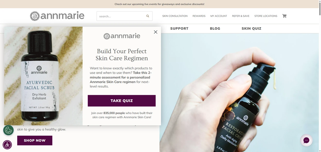
Annmarie uses a floating box to promote its skincare assessment. There is enough room to explain the result, mention that the quiz takes two minutes, and add social proof without taking over the whole screen.
When to use it. Choose a floating box when the quiz solves a common problem for visitors but is not the only reason they came to the page.
Main advantage. It is more noticeable than an inline link or teaser and gives you room to explain why the quiz is worth opening.
What to consider. A floating box still covers part of the page. Show it after a reasonable delay, some scrolling, or another sign of interest.
Teaser
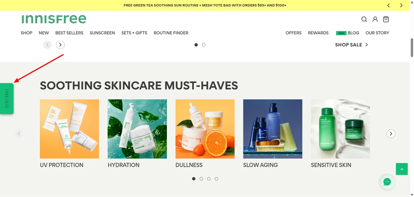
Innisfree keeps a small “Take Quiz” tab attached to the side of the screen. It remains visible while the visitor browses but opens only after a click.
When to use it. A teaser works well when you want to promote the same quiz across several pages without repeatedly opening a popup.
Main advantage. It stays within reach without interrupting shopping. The visitor decides when to engage.
What to consider. The label needs to sell the result. “Find my routine” or “Get my skin match” gives people a stronger reason to click than “Take quiz.”
Inline widget inside a page
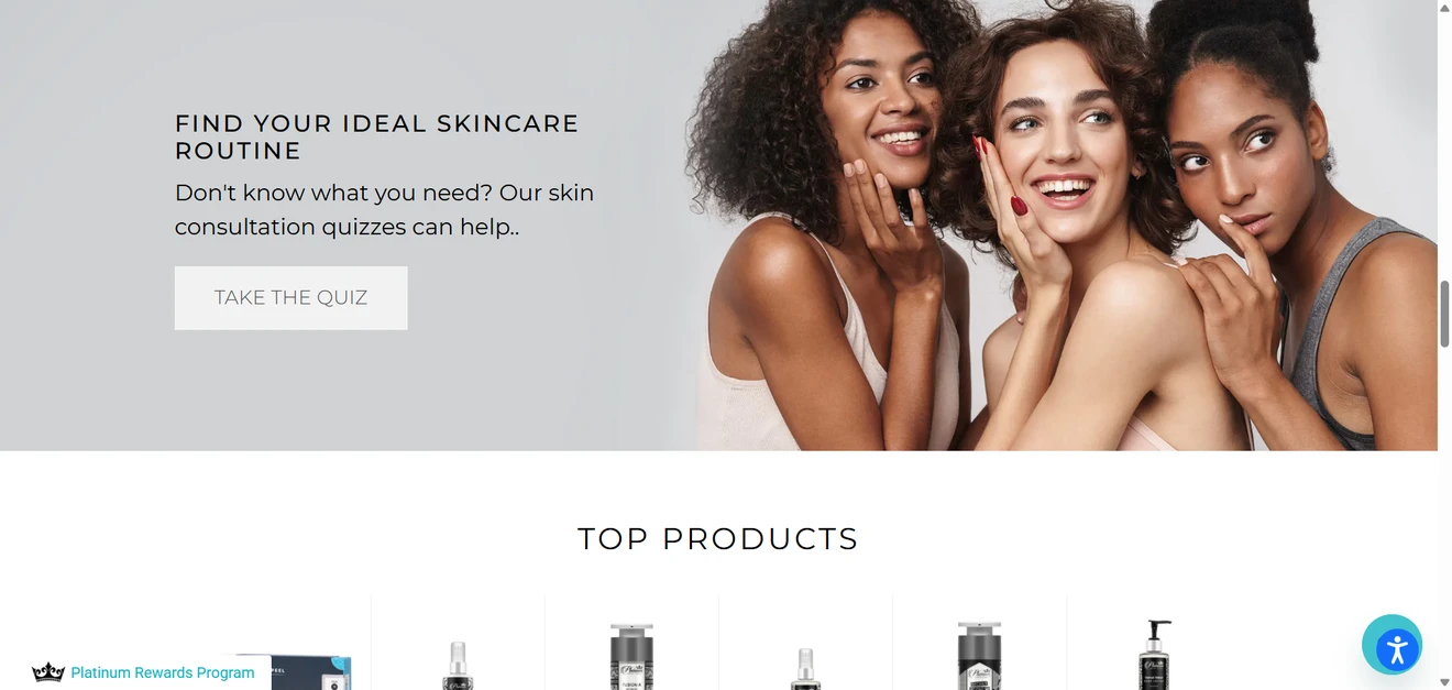
An embedded invitation can appear within a product category, article, or other relevant page. In the skincare example, visitors encounter the routine finder only after scrolling through part of the page.
When to use it. Place an inline widget where the surrounding content naturally creates a need for help. Someone reading about several skincare options may welcome a product finder more than someone who has just opened the homepage.
Main advantage. The quiz appears in context and does not compete with the rest of the site. People who reach it have already shown some interest in the topic.
What to consider. Many visitors will never scroll far enough to see it. If the quiz supports an important conversion, promote it somewhere else too.
Inline widget in the hero section
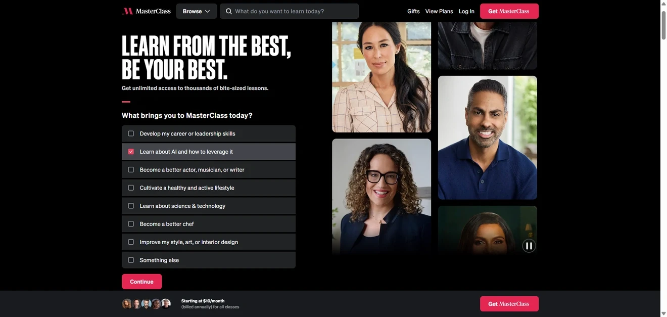
MasterClass begins with an interest question directly in the hero section. Visitors can choose what they want to learn before clicking Continue.
When to use it. Give a quiz hero space when it serves a large share of visitors and leads naturally toward the main product or subscription.
Main advantage. The visitor makes the first small commitment immediately.
What to consider. Hero space is expensive. Do not give it to a quiz that matters only to a narrow segment. The opening screen should also explain what happens next and, for a longer assessment, how much time it will take.
Header and footer links
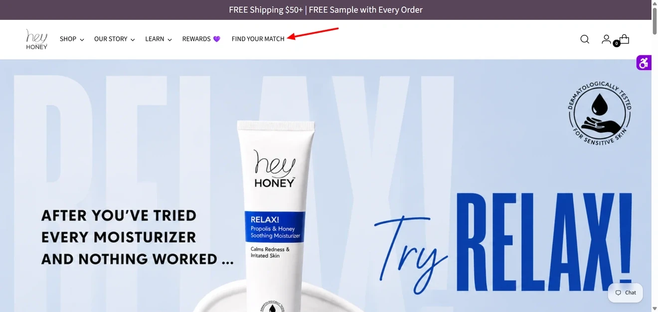
Hey Honey adds “Find Your Match” to its header navigation. Epicuren links to its Skin Quiz from both the header and footer.
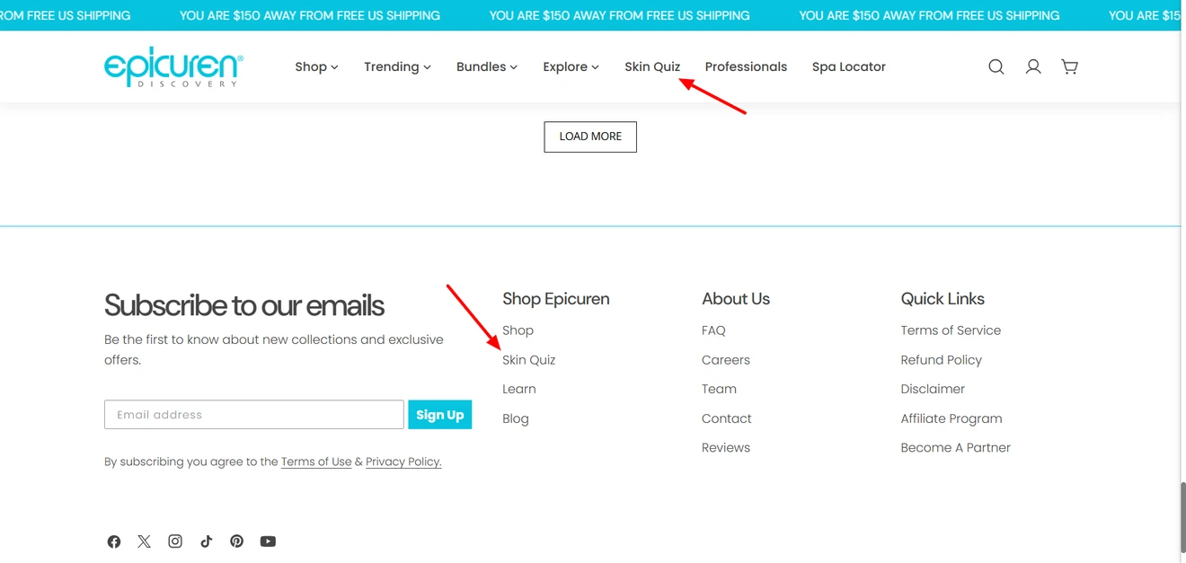
When to use it. Keep a permanent navigation link when visitors may deliberately look for a product finder, consultation, calculator, or assessment.
Main advantage. The quiz remains available without interrupting anyone. Repeating the link in the footer gives people another route after they have browsed the page.
What to consider. Navigation mainly serves visitors who already know they want help. Many people will not go searching for a quiz, so a header or footer link rarely does all the promotional work on its own.
One quiz can have several entry points. A permanent header link, an inline invitation on relevant pages, and a teaser for visitors who have not started it can all lead to the same flow. The goal is not to build three quizzes. It is to give people more than one sensible way to find the useful one.
Decide where people complete the quiz
Embedded on the page
A short quiz can run entirely inside an inline widget. This keeps the questions close to the products or content that prompted them. It works best when the flow is simple enough to fit the page without turning it into an endless questionnaire.
Popup or fullscreen
A popup keeps people on the current page while giving the quiz its own space. A compact popup may hold a micro-quiz or the first few qualifying questions.
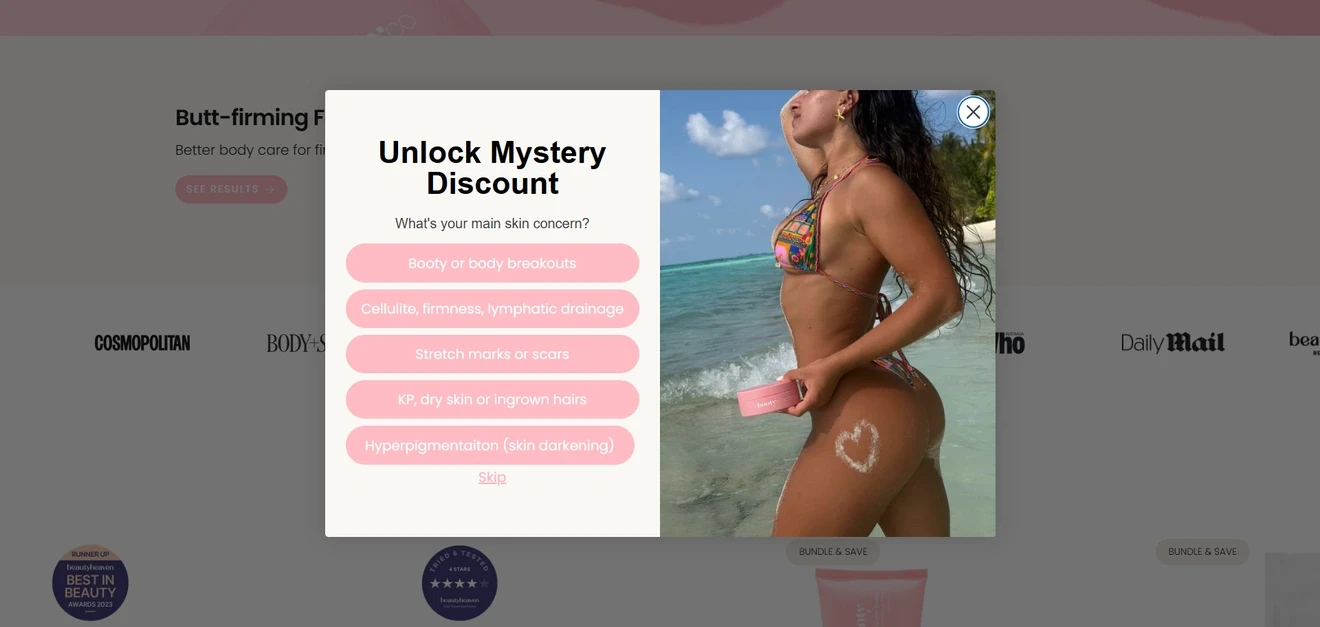
Fullscreen works better for longer flows with images, large Choice buttons, and multiple answer formats.
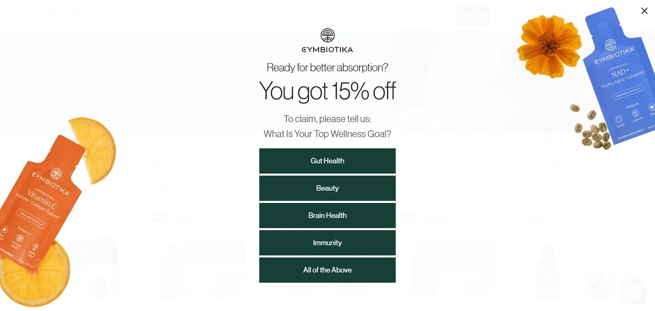
Because fullscreen removes most of the surrounding page, it demands more attention. Open it after a deliberate click whenever possible.
Not sure how much screen space your quiz needs? Our website popup examples show how different layouts work with different offers and levels of commitment.
Dedicated landing page
A separate landing page gives a long assessment room to explain the value, expected completion time, privacy terms, and result. It is also easier to share in email, social media, paid campaigns, or navigation links.
Bring back visitors who leave halfway through
Not every started quiz will become a completed quiz. Longer flows may need a recovery step, but the timing matters just as much as the message.
Offer to save the quiz for later
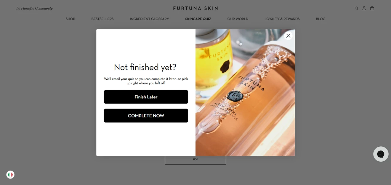
Furtuna shows a “Not finished yet?” popup with two options: complete the quiz now or receive an email reminder and return later. This can turn an abandoned session into an email opportunity without forcing the visitor to finish immediately.
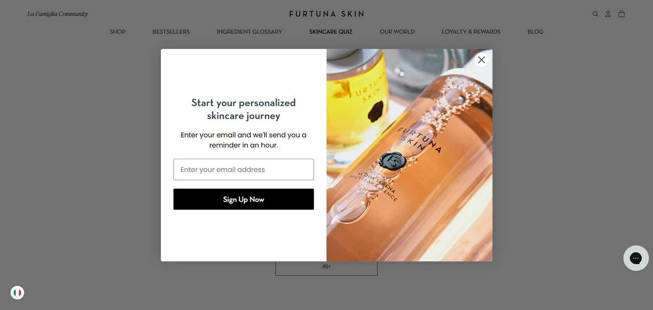
However, the offer makes sense only after some real progress, inactivity, or an attempt to leave. In the example, the popup appeared almost immediately — before there was much worth saving.
If the visitor chooses email, explain what will happen next: when the reminder will arrive, whether their answers have been saved, and where the link will take them.
Use exit intent as a final route back
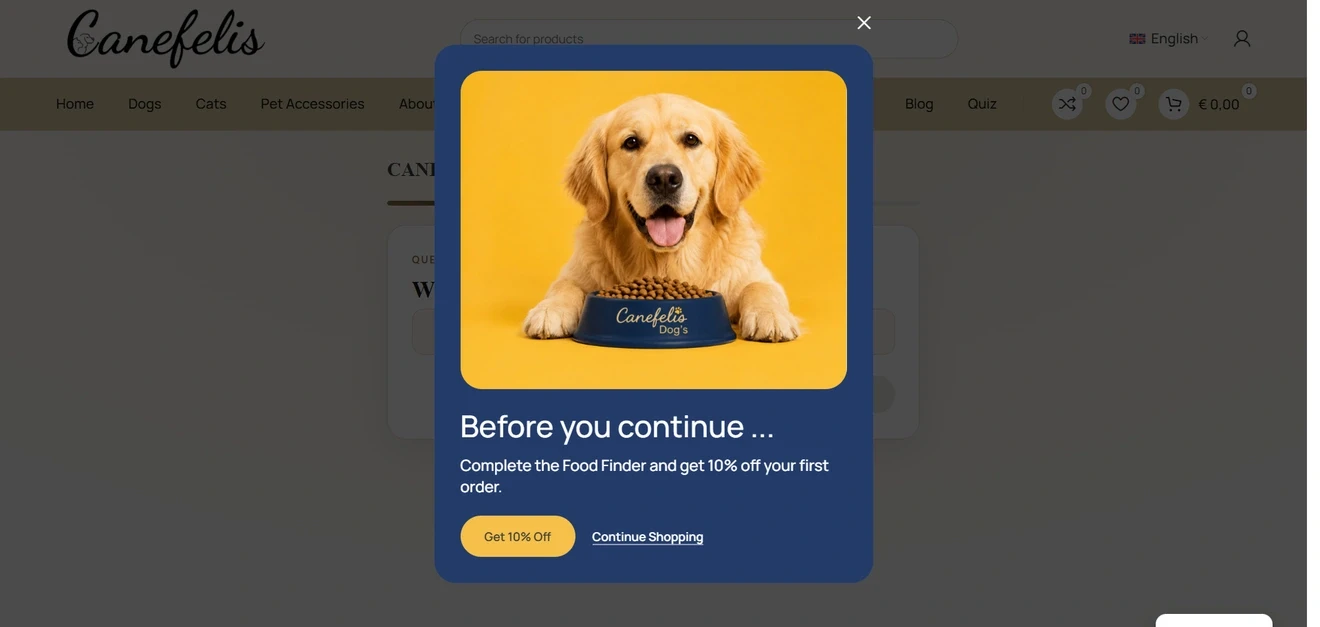
The dog-food example uses exit intent to offer a choice: continue shopping or complete the food finder and receive 10% off the first order.
This can recover a visitor who was about to leave, collect an email during the quiz, and provide a reason to make the first purchase. It also keeps a no-pressure route back to the store for people who do not want the assessment.
How to build a quiz for lead generation with Claspo
For this walkthrough, we will take a ready-made multi-step template and turn it into a simple linear lead generation quiz.
1. Choose a multi-step template
In your Claspo dashboard, click New widget and open the Template library.
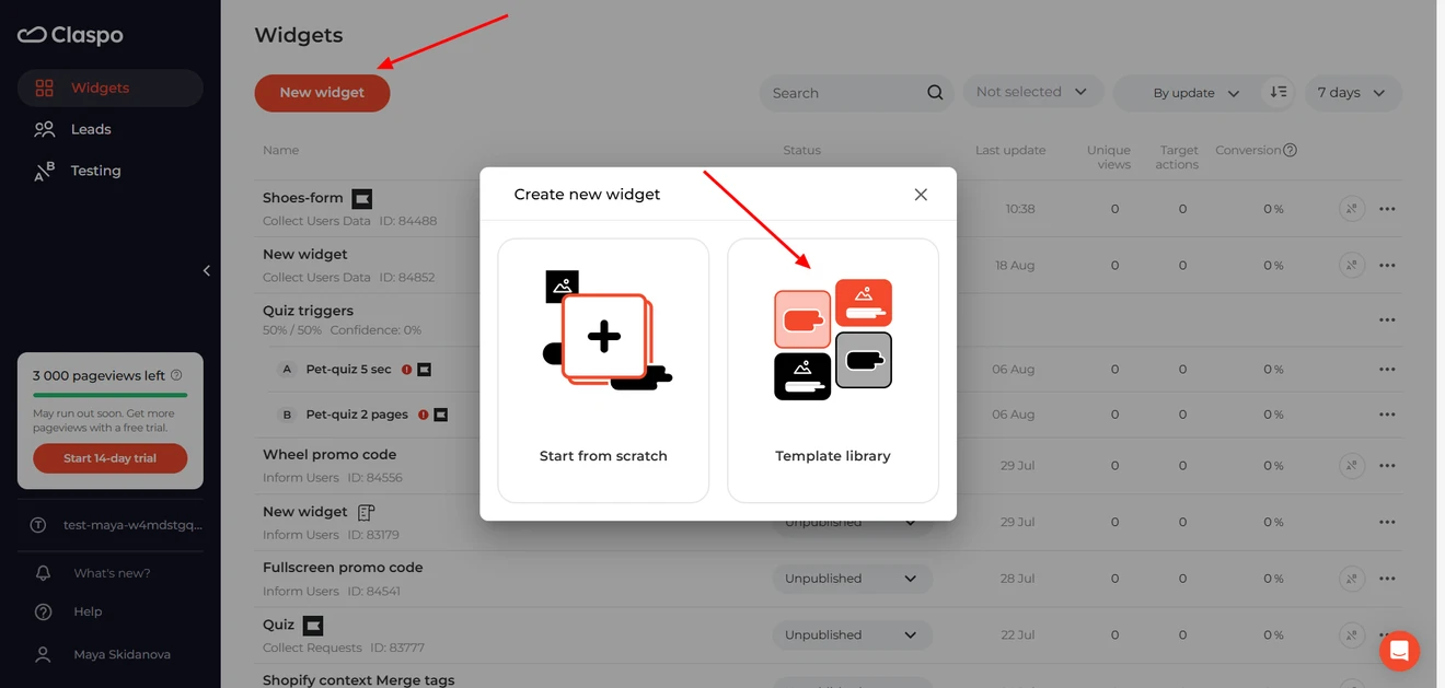
Select Multi-Step under the Features filter to narrow the library down to widgets that already have several connected pages.
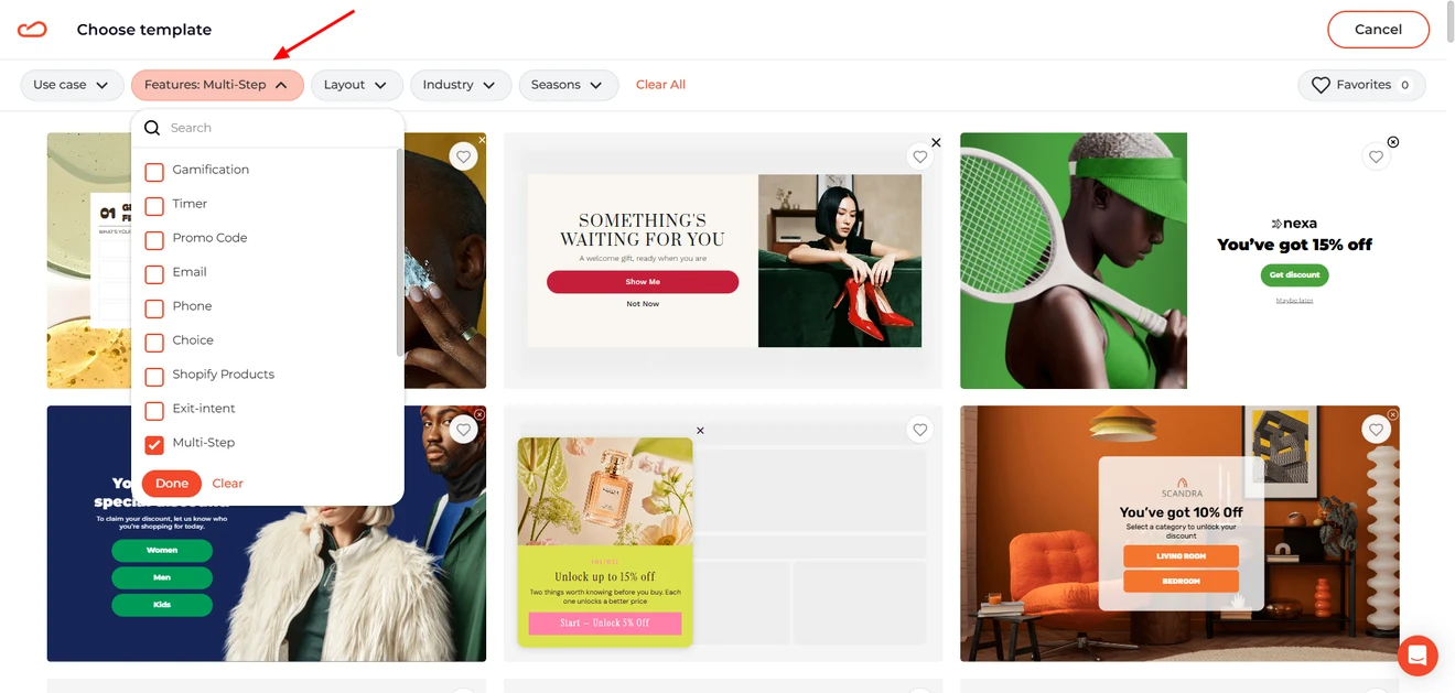
Before choosing a template you can click through all available pages, check which components are used, and switch between desktop and mobile views.
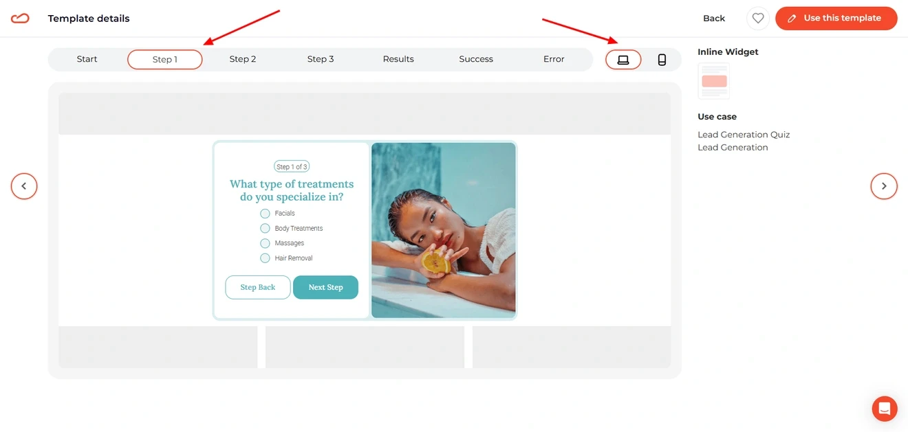
Colors and copy are easy to replace, so look for the template whose flow is closest to your idea. Once you find a good starting point, click Use this template and move to the editor.
2. Customize the quiz questions
The template we chose starts as an inline widget, but we want to use it as a popup. In the editor, select the popup layout — the pages and content will stay in place, so the switch really does take one click.
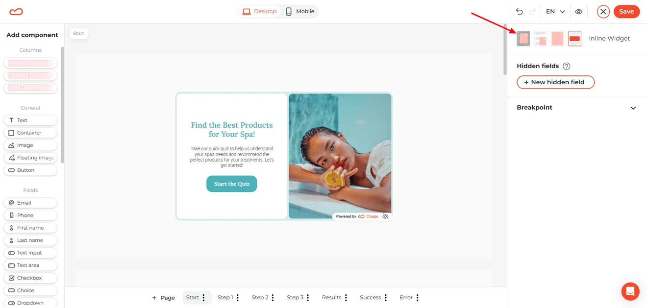
For our example, we will turn the template into a lead capture quiz for a Black Friday campaign. The idea is to collect subscribers early and learn what they plan to shop for before the sale begins.
We will not cover every design setting here. To change the copy, buttons, images, colors, or other elements, click the relevant component and use the settings panel on the right.
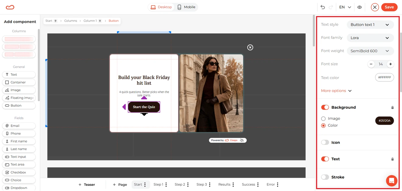
You can find the full walkthrough in this help center guide.
Instead, let’s focus on the questions. Select the Radio component, open the General tab and click Edit options.
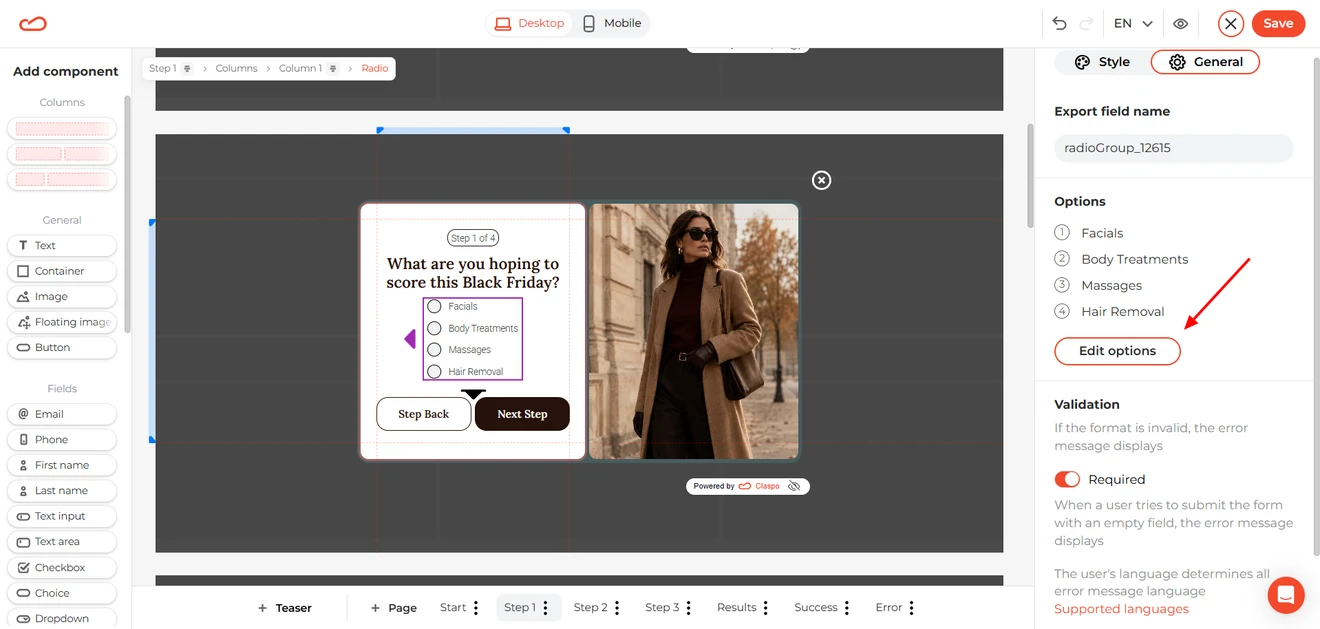
Replace the default labels with your own answers. For example, our first question is “What are you hoping to score this Black Friday?”, with Dresses, Tops, Jeans, and Jackets & coats as the options. Add a separate export value for every answer.
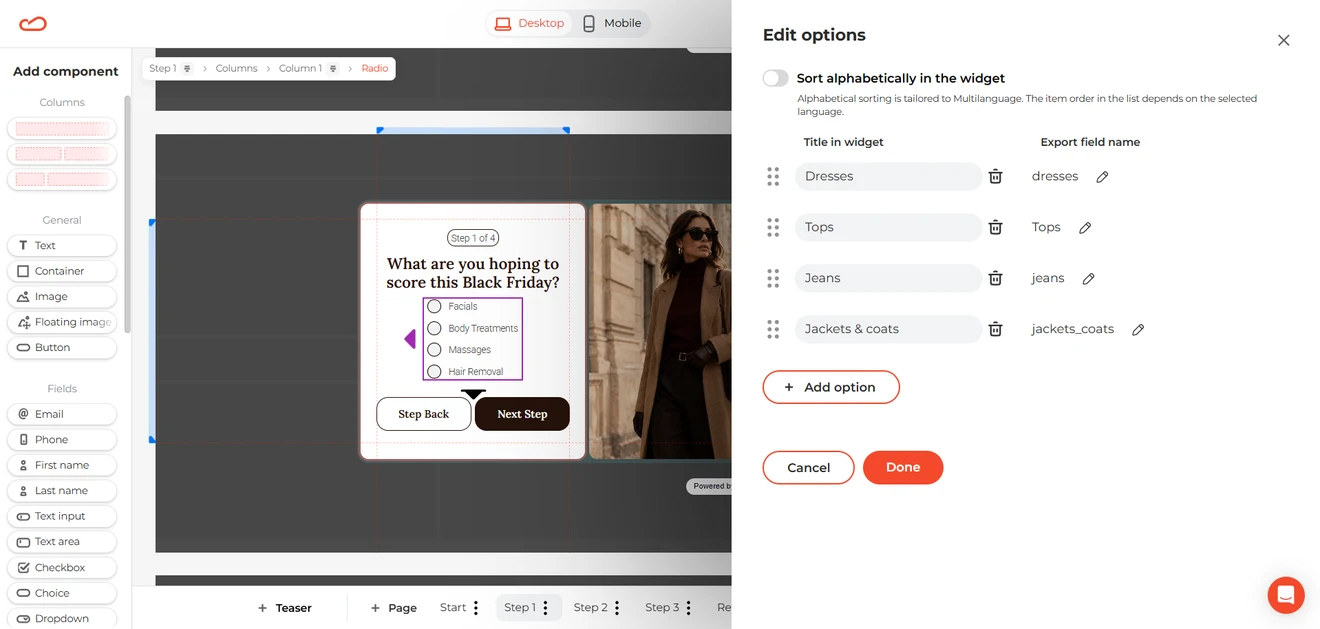
These values will be saved with the subscriber’s profile, so you can later segment the collected quiz leads and send each group more relevant offers. You can also add new options, or remove unnecessary ones.
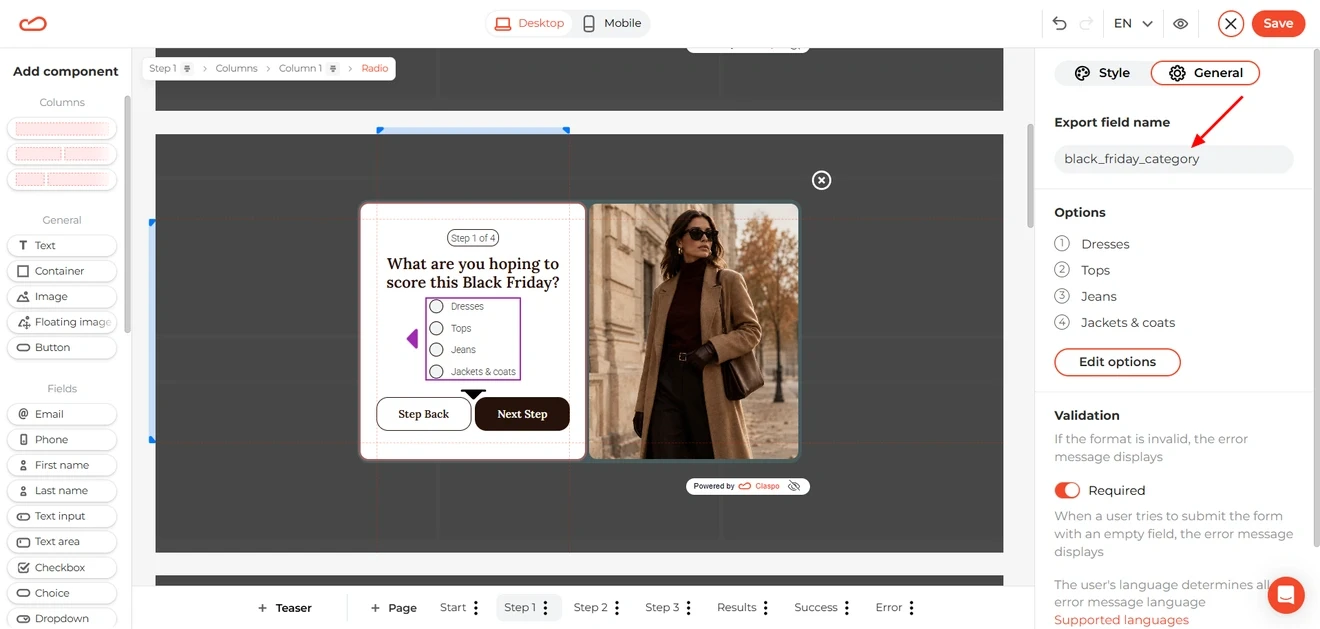
Don’t forget to give the question a clear Export field name, such as “black_friday_category”.
Customize the remaining question pages in the same way. If you need another step, click the three-dot menu beside a page in the bottom panel and select Duplicate selected page.
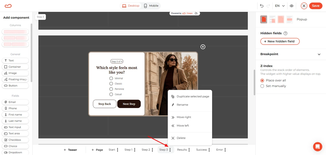
The same menu comes in handy if a page has the wrong name or sits in the wrong place. Rename it, move it along the row, or remove it altogether.
Building a linear quiz? Then leave the buttons alone. In Claspo’s lead generation templates, Next and Back already follow the page order shown in the bottom panel. Need different answers to lead to different questions or results? Follow our step-by-step guide to creating conditional logic forms in Claspo.
The bottom panel also has an option to add a teaser — a small on-page prompt that visitors can click whenever they are ready to open the quiz.
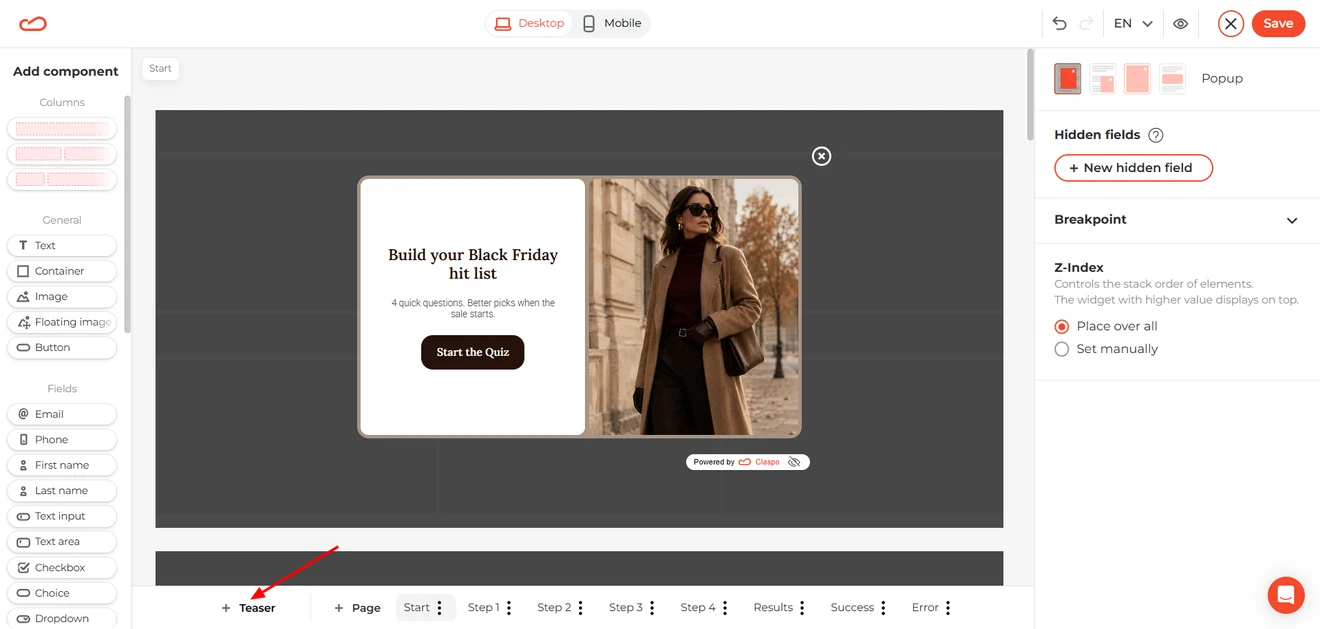
This little tab deserves more attention than its size suggests. In our latest Claspo benchmarks, email popups paired with teasers averaged a 6.89% conversion rate, while baseline popups averaged 3.67%. In plain English: the versions with teasers converted about 1.88 times as well.
For our Black Friday lead generation quiz, the teaser says “BF Hit List” and keeps the popup within easy reach without taking over the page immediately. Visitors who close the quiz can also use it to return later instead of losing it for good.
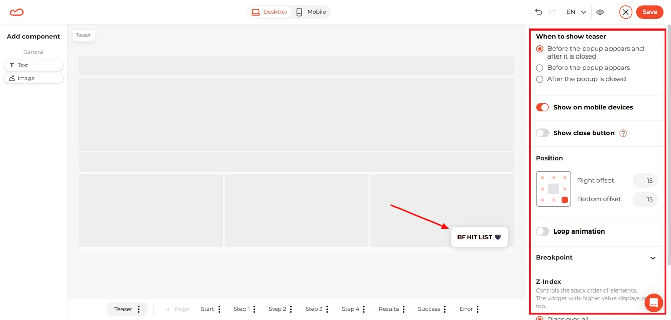
Edit the teaser copy and design to match your campaign, choose its position on the screen, and decide whether it should appear before the popup, after it is closed, or both. You can also set a separate mobile display option and add animation if the teaser needs a little extra “hey, I’m still here”.
3. Set the display rules and connect your data
Once your lead generation quiz popup is ready, click Save. This takes you to the setup page, where you can decide who sees the quiz and when it appears.
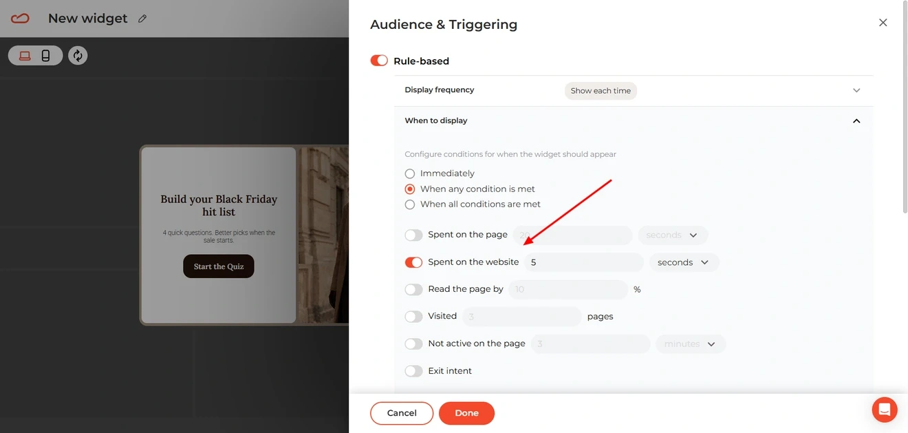
Claspo templates already come with display conditions selected for their use case. If you do not have enough site data yet, keep these settings as your starting point. Know your visitors well? Open Audience & Triggering and adjust the rules.
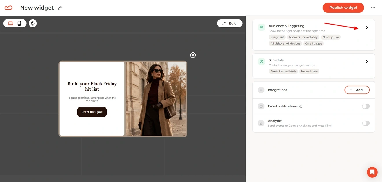
For example, you could show the Black Friday quiz after someone has spent five seconds on the website.
The same page is where you connect an ESP or CRM. Click Add under Integrations, choose your platform, and map the fields you want to transfer.
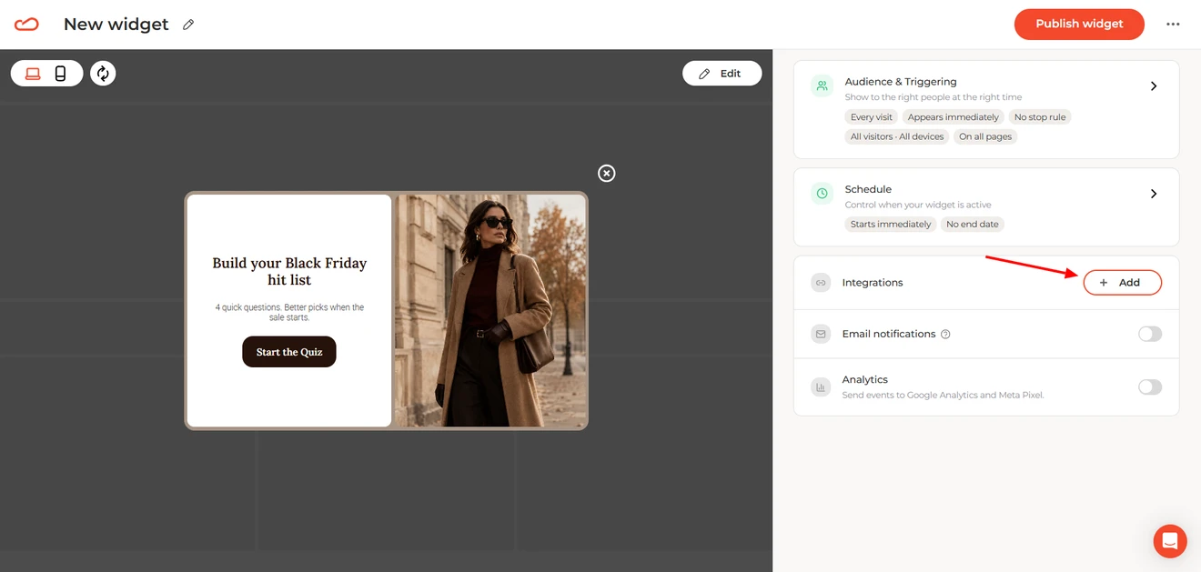
The email address and quiz answers can then move straight into your subscriber profiles for future segmentation.
Claspo also keeps the collected quiz leads in the Leads section of your dashboard.
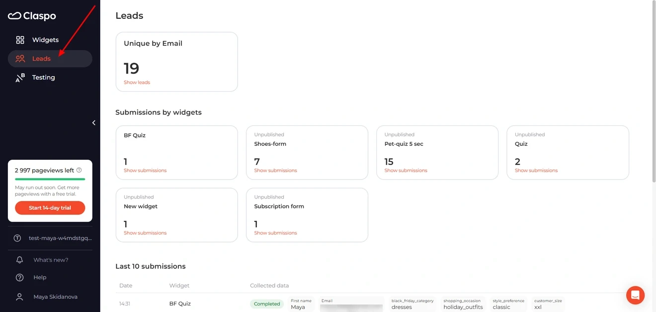
Once everything looks right, click Publish widget.
Turn more quiz responses into usable leads
Useful email capture tools should leave you with more than a longer list. A quiz adds the context behind each signup: what the person wants, what stands in the way, and which message should come next.
Ask only for information that will change the result, the segment, or the follow-up. If you will never use an answer, that question has no job in the quiz.
You do not need to add a separate lead generation quiz maker to your stack or learn complex quiz software for lead generation. Claspo provides ready-made lead generation quiz templates and all the tools for building linear and conditional flows. You can customize the questions, collect contact details, save each answer with the lead, and send the data to your ESP or CRM.
Start with one decision your customers regularly struggle with. Give them a useful next step, keep their answers attached to the contact, and use that context in your next campaign. This way, you gain more than an email address — and the new subscriber does not receive the same generic welcome message as everyone else.