Popup Conversion Rate Benchmarks 2026: Games Double Signups

Summarize
Most popups still follow a familiar pattern 'show an offer, ask for an email' and it still works. In our fresh popup conversion benchmark, standard Grow email list popups show an average conversion rate of 3.67%, and we’ll use this number as the baseline throughout the article.
But popup strategy is moving beyond the classic “discount + email field” approach. The gap starts to show when the pop-up asks for a little participation first. In our benchmark, gamified mechanics averaged 8.08% CR, which is roughly 2.2x higher than the baseline.
Not every campaign needs a game. But the behavior behind these formats is worth noticing: visitors are not just asked to submit an email.
TL;DR
Gamified popups are already a mainstream email-capture format. Every 5th widget published by Claspo users includes a game mechanic. Games are no longer just a seasonal “fun idea”; they have become a repeatable way to make the signup step more engaging.
Slot machine had the strongest average performance among games. It reached 12.60% avg CR, around 3.4x higher than the baseline. This makes it one of the clearest formats to test when the campaign has a simple, immediate reward.
Choice buttons produced a 5% CR, but their bigger value is the signal behind the click. Visitors tell you what they want before leaving an email, which can help with segmentation and follow-up.
Teasers lifted conversion at every level. Popups with teasers reached 6.89% avg CR, while top-10% results rose to 30.86% CR. The point is simple: even strong popups lose visitors at the first close, and teasers give the offer a way back.
Fullscreen had the strongest average layout performance: 7.17% avg CR and 48.15% CR in the top 10%. Still, pop-up slightly led in the top 1%: 78.13% vs 76.50%. The takeaway: fullscreen is powerful, but only when the offer earns that much screen space.
What we measured and how to read the data
Before we get into the numbers, a quick note on what we measured and how to read the popup conversion rate benchmarks.
For this study, we focused on Claspo formats that add more interaction to the standard email pop-up flow: new gamified mechanics, updated classic games, Choice buttons, multi-step layouts, fullscreen layouts, and teasers. In total, the analysis covered widgets with around 170 million impressions.
We included the classic games on purpose. Over the past few months, they have been seriously updated and modernized, so we wanted to look at their current performance, not rely on previous benchmarks. Small spoiler: more improvements are already on the way.
To structure the research, we used an LLM trained on AI vision to analyze popup screenshots and recognize more than 120 conversion-related parameters, from layout and form structure to interactive elements, incentives, visual style, and UX clarity. Then our team reviewed the data, and compared average performance with the strongest campaigns in each group.
Throughout the article, we’ll use three performance levels:
Metric | What it shows |
Avg CR | The average conversion rate across popups in this format |
Top-10% CR | What stronger campaigns can achieve when the setup is above average |
Top-1% CR | The performance ceiling when offer, timing, targeting, design, and audience fit are especially strong |
This distinction matters because average CR and top performance do not always tell the same story. Some formats are strong and stable on average. Others show their real potential only when the offer, traffic, and execution line up well.
One thing to keep in mind: the format is only part of the campaign. A strong offer, good timing, relevant traffic, and clean design can change the result a lot. So these benchmarks are best used as a starting point for what to test first, not as a fixed promise of what every campaign will get. Likewise, it's worth bearing in mind that figures throughout compare to an average overall benchmark conversion rate for ecommerce websites of 1.7-3%, according to research from Blend Commerce.
Gamified vs. Standard Email Popup Conversion Rates
For years, gamified popups were filed under “fun campaign ideas”: useful for a holiday sale, a big promo, or a brand that wanted the experience to feel more playful. That box has become too small. It no longer explains how marketers actually use gamification today.
Across popups published by Claspo users, every fifth widget now includes a game mechanic. That is already far beyond the “let’s test something fun” stage. Games are being used as a regular way to collect emails, reveal offers, and make the first step feel less like filling out a form.
The performance side supports this shift too. On average, gamified mechanics converted about 2.2x better than standard Grow email list popups. And this was not carried by one unusually strong format: 7 out of 8 gamified mechanics beat the baseline by average CR.
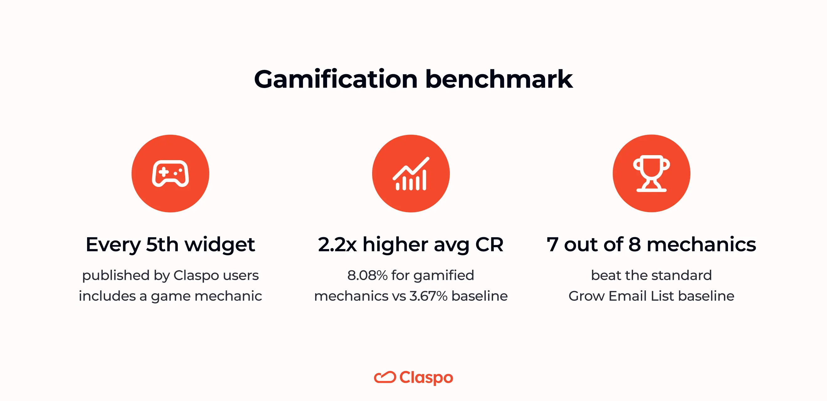
It shows that gamification has moved from novelty to a repeatable conversion format. The point is that a small action can change the mood of the signup. Instead of seeing a form right away, the visitor gets a quick reason to click, reveal, spin, or claim something first.
Gamified Popup Conversion Rates by Game Mechanic
Once we look at gamification as a category, the next question is obvious: which game should marketers test first?
There is no single answer. The numbers show that different mechanics win in different ways. Some deliver stronger average performance. Some have a higher ceiling when the offer and timing are right. Some work because they create curiosity, while others are better suited for seasonal campaigns or a quick instant-win moment.
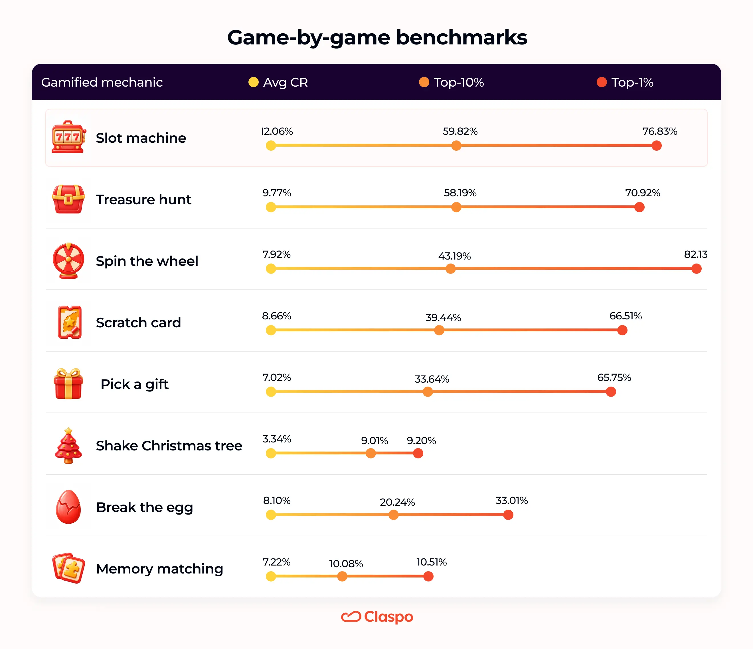
So instead of treating gamified popups as one group, let’s look at the mechanics separately.
Slot machine: the strongest average performer
Slot machine had the strongest average result in the gamification group, with an average CR of 12.60%. That is around 3.43x higher than the baseline. At the top end, Slot machine also held up well: 59.82% CR for the top 10% of campaigns and 76.83% CR for the top 1%.
This format is almost self-explanatory. No rules, no long setup, no “how does this work?” moment. The visitor spins, sees the result, and moves to the reward. For a welcome discount or first-order coupon, that quick loop is exactly the point.
Another advantage: Slot machine does not need a seasonal excuse. It can be a Black Friday game, sure. But it can also be a regular “spin to unlock your first-order offer” pop-up on any Tuesday.
Best use cases for Slot machine pop-up | |
|---|---|
Use case | Why it fits |
Welcome discount | It turns the first visit into a quick reward moment instead of showing a plain discount form right away. |
First-order coupon | The mechanic makes the coupon feel earned, even if the reward is simple: 10% off, free shipping, or a small gift. |
BFCM or seasonal sale | During busy promo periods, visitors see a lot of discounts. A quick game can make the offer feel more noticeable without making the flow complicated. |
Email collection with a strong immediate reward | Slot machine works best when the visitor understands the value right away and can unlock it in one simple action. |
Spin the wheel: the highest performance ceiling
Spin the wheel did not have the highest average CR in the gamification group: it averaged 7.92% CR. But its best campaigns climbed higher than any other game mechanic in the dataset.
The top-10% of Spin the wheel popups reached 43.19% CR. The top-1% went much higher: 82.13% CR, the strongest top-1% result among all gamified formats in this benchmark.
That jump says a lot about the mechanic. A wheel is easy to launch, but it is also easy to make it feel empty: six prizes that look the same, vague discounts, no real reason to care where the arrow lands. The best campaigns avoid that. They make the possible rewards feel different enough to create suspense, and strong enough to make the email step feel worth it.
It is also a format people understand immediately. The visitor can see there are several possible outcomes, which makes the offer feel more dynamic than a single fixed discount. That is why Spin the wheel works especially well when the brand has enough room to play with different incentives.
Best use cases for Spin the wheel popups | |
|---|---|
Use case | Why it fits |
Campaigns with several prize tiers | The wheel makes multiple rewards feel natural: 10% off, 15% off, free shipping, a gift, or a bigger rare prize. Instead of showing one discount, the brand can create a small sense of chance and let the visitor “unlock” their offer. |
High-energy seasonal promos | During BFCM, Christmas, birthday sales, or product launches, visitors already expect something special. A wheel does not need to invent that feeling from scratch. It simply gives the promo a quick “try your luck” moment before the email ask. For a complete strategy covering timing, formats, offers, and testing, explore our Black Friday popup playbook. |
First-time visitors from cold or mixed traffic | These visitors may not be ready to buy, but they can be curious enough to spin for a possible reward. The wheel turns a weak first visit into an email capture opportunity. |
Treasure Hunt vs. Scratch Card: Conversion Rate Comparison
Treasure hunt and Scratch card sit in a slightly different corner of gamification. They are not about spinning for one of several prizes. They are about revealing something that is hidden.
Treasure hunt came out a little stronger on average: 9.77% CR compared with 8.66% CR for Scratch card. Both are well above the baseline, so this is not just a cute wrapper around a discount.
The upper range is interesting too. For Treasure hunt, the top-10% reached 58.19% CR, and the top-1% reached 70.92% CR. Scratch card had a lower top-10% result, 39.44% CR, but its top-1% still climbed to 66.51% CR.
The appeal is simple, but useful: the visitor has to do a small action before seeing the reward. Find the hidden offer. Scratch the card. Reveal the code. That tiny bit of effort can make the email step feel less like a plain form and more like the last step in claiming something.
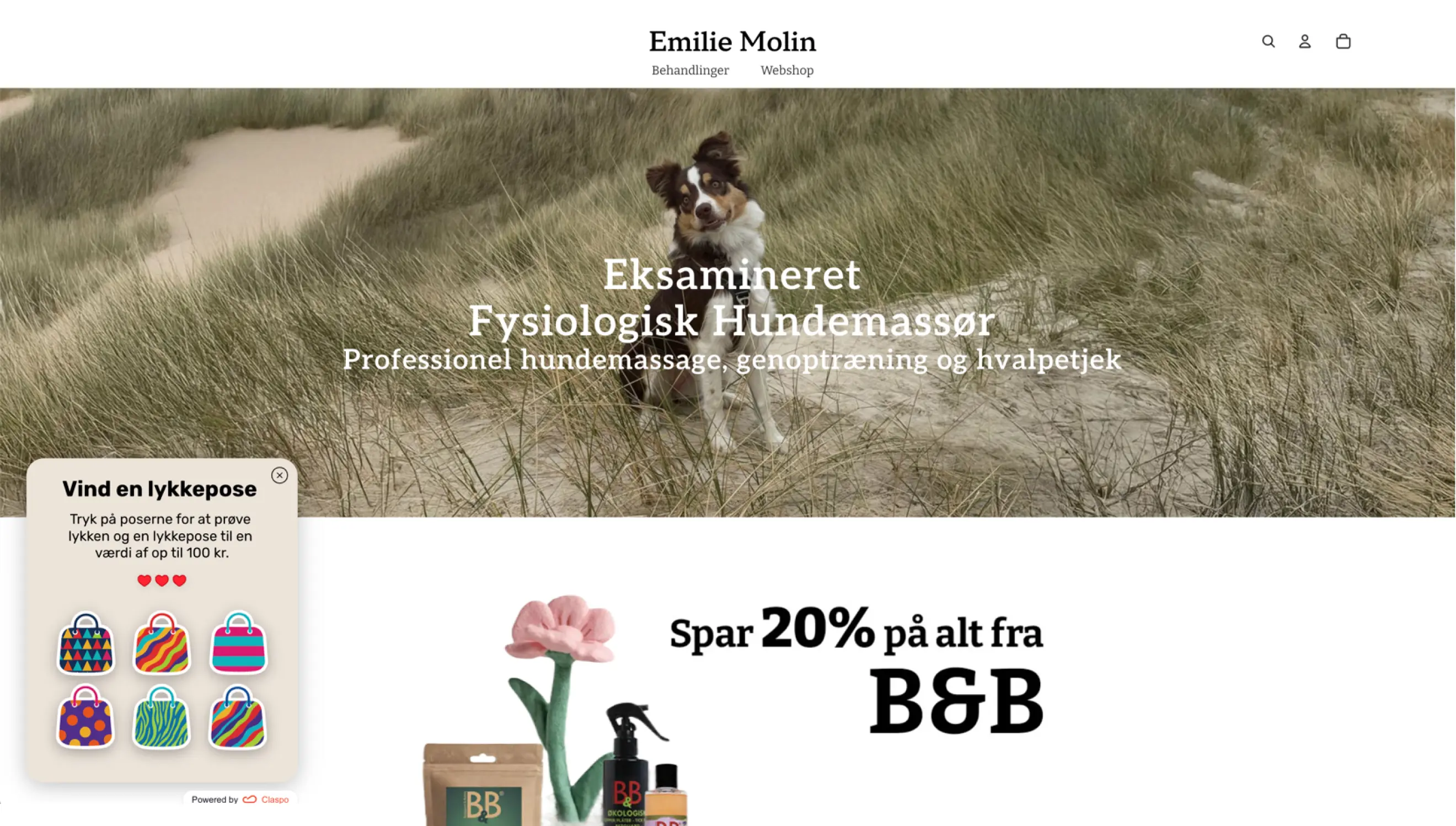
They are especially useful when a brand wants the offer to feel discovered, not just displayed.
Best use cases for Treasure hunt and Scratch card | |
|---|---|
Use case | Why these mechanics fit |
Mystery discount campaigns | Don’t show the discount right away; let the visitor uncover it first. Scratch card is the quick version: one action, one reveal. Treasure hunt gives you a little more tension. |
Seasonal or themed promos | These mechanics are easy to dress up visually: gift bags, eggs, pumpkins, envelopes, cards, ornaments. The core mechanic stays the same, but the theme can match the campaign. |
Gifts, samples, or order bonuses | The hidden reward does not have to be 10% off. It can be a free sample, a small gift with purchase, or a bonus code. These games are especially clean for this: scratch or find your gift, then leave an email to save or claim it. |
Pick-a-Gift Popup Conversion Rate Benchmarks
Pick a gift averaged 7.02% CR, which is about 1.9x higher than the baseline of 3.67%. So it is clearly above the classic email popup flow, even though it is not the strongest game by average conversion.
Its top-end numbers are interesting too: 33.64% CR in the top 10% and 65.75% CR in the top 1%. Compared with more action-heavy mechanics, it has a lower top-10% result. That makes sense: the interaction is usually softer. There is less tension than spinning a wheel, fewer attempts than Treasure hunt, and less tactile action than Scratch card.
But the top-1% result is still strong. At 65.75% CR, the best Pick a gift campaigns show that this mechanic can climb very high when the reward feels worth opening and the theme fits the campaign. It may not create the same competitive feeling as a wheel or slot machine, but it does something simpler: it makes the offer feel like a small surprise.
Best use cases for Pick a gift pop-up | |
|---|---|
Use case | Why it fits |
Birthday campaigns | For birthday campaigns, “pick your gift” sounds much better than another coupon. The visitor opens the box, sees the reward, and leaves an email to get the promo code. Simple, but it fits the occasion. |
Holiday offers | The mechanic is easy to retheme without changing the flow. It can be a Christmas box, Easter egg, Valentine’s envelope, Halloween pumpkin, or New Year card. The visitor still does the same simple thing: opens the object and claims the reward by email. |
Loyalty program campaigns | Instead of a dry loyalty program invitation, the pop-up can offer a small welcome gift first. The visitor opens it, likes the perk, and leaves an email to join. |
Conversion Benchmarks for Seasonal Popup Games
Not every game mechanic behaves like a universal list-building tool. Some formats need a tighter match between the campaign, the season, and the visitor’s mood.
Break the egg averaged 8.10% CR, which is still about 2.2x higher than the baseline of 3.67%. Memory matching also stayed clearly above the baseline, with 7.22% avg CR.
The top-end numbers tell a slightly different story, though. Break the egg reached 20.24% CR in the top-10% and 33.01% CR in the top-1%. That is strong, but much lower than the best results we saw from Slot machine, Spin the wheel, Treasure hunt, or Scratch card.
Memory matching was even more compressed: 10.08% CR in the top-10% and 10.51% CR in the top-1%.
That smaller gap between top-10% and top-1% is worth noticing. These formats seem less likely to create huge breakout results. Instead, they behave more like niche mechanics: useful when the theme is right, but less explosive when the only goal is fast email capture.
Shake Christmas tree is the most context-sensitive in the email capture dataset. Its average email CR was 3.34%, slightly below the 3.67% baseline, and even the top results stayed relatively narrow: 9.01% CR in the top-10% and 9.20% CR in the top-1%.
But that does not mean the mechanic is weak. It may simply be stronger for a different campaign goal. When used for Increase sales campaigns, Shake Christmas tree shows a much better engagement pattern: 10.76% avg CTR versus the 6.30% baseline, or about 1.7x higher. The top-end results are also much higher, with 50.38% CTR in the top-10% and 86.55% CTR in the top-1%.
So we would not write off the Shake Christmas tree because of the email CR. It may simply belong closer to sales promos than list-building. The game already feels like a holiday offer moment; asking for an email in the middle can slow it down, while sending the visitor straight to the deal may fit the interaction better.
Best use cases for Break the egg, Memory matching, and Shake Christmas tree | |
|---|---|
Use case | Why these mechanics fit |
Easter campaigns, spring promos | Break the egg is a simple and familiar mechanic: choose, reveal the offer, claim it by email. It works best when the campaign theme already makes eggs feel natural, not forced. |
Campaigns for playful or family-friendly brands | Memory matching needs a brand where a few extra clicks feel natural. A candy shop, pet store, toy brand, hobby store, or playful beauty brand can usually get away with that. A store selling laptop chargers or spare parts probably cannot. |
Christmas and New Year promos | Shake Christmas tree may work better when the goal is to reveal a holiday deal and send visitors to shop, not necessarily collect an email first. |
Popup Conversion Rates With vs. Without Teasers
A teaser changes one small but important part of the pop-up experience: closing the widget is no longer the end of the offer. That matters more than it may seem. In our benchmark, email popups with teasers averaged 6.89% CR, compared with the baseline popups. That is about 1.88x higher.
The average lift is the loudest one, but the top segments matter too. Teaser widgets reached 30.86% CR in the top-10%, while the baseline top-10% was 22.43%. At the top-1%, the gap was smaller, but still there: 83.93% vs 79.14%. In other words, teasers are not just there to save weak popups. Even strong campaigns can lose people at the first close.
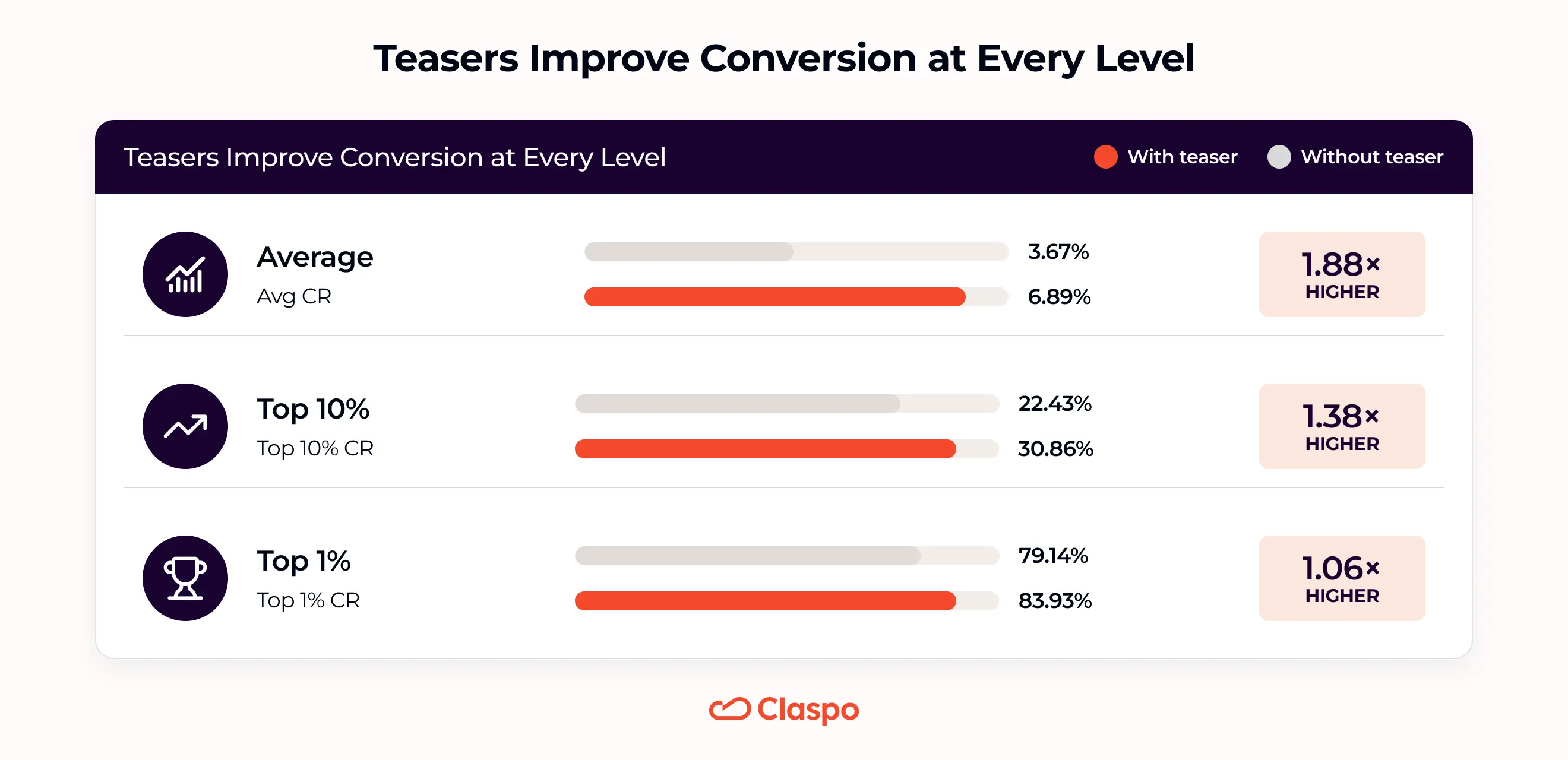
Psychologically, this is different from showing the same pop-up again. The visitor has already closed the main window, so forcing it back can feel annoying. A teaser is more like leaving the door open. The visitor closed the pop-up, but the offer is still there if they decide they want it after browsing a little more.
For email capture, that matters. A visitor may want the discount, gift, or code, but not at the exact second the pop-up appears. With a teaser, the offer stays within reach until the timing feels better.
Best use cases for teasers | |
|---|---|
Use case | Why teasers fit |
First-order discounts | Many visitors close a welcome offer before they know whether they want to buy. A teaser keeps the discount nearby for later, when they have looked around and the offer matters more. |
Long browsing sessions | In categories where people compare products, sizes, prices, or styles, the first pop-up moment may be too early. A teaser gives the offer a second chance later in the session. |
Mobile campaigns | A small teaser can keep the offer accessible without taking over the screen. |
Multi-Step Popup and Choice Button Conversion Benchmarks
Multi-step popups are not new in Claspo, but they recently got a more useful first step: Choice buttons. Before, a multi-step email pop-up usually meant splitting the flow into several screens: first message, then form, then reward.
Choice gives the first step a job. Not just “continue”, but “tell us what you need”. The visitor clicks one option, and the next screen can feel a little less generic.
That matters because the first click is easier than the email field. In the example above, the plant shop does not ask for an email right away. It first asks what brought the visitor here. The answer can shape the segment this visitor falls into ESP later.
The benchmark shows a moderate but real lift. Multi-step popups did better than the standard email widget: 4.94% avg CR versus the 3.67% baseline. In plain terms, that is about 1.35x higher.
The upper range is where things get more interesting. The top-10% reached 28.01% CR, and the top-1% reached 70.92% CR. So multi-step is not a magic layout by itself. A lot depends on what the visitor sees before the email field: a clearer offer, a lighter first click, or just another screen to get through.
Choice buttons landed in almost the same place on average: 5% CR, or about 1.36x higher than the baseline. Its top-end numbers are more modest: 17.16% CR in the top-10% and 22.55% CR in the top-1%. So Choice does not look like a dramatic extra lift on top of multi-step by conversion alone. But that is not the whole point. Choice is less about creating huge breakout conversion spikes and more about making the flow smarter. The visitor gives you a signal before they give you an email. That signal can be used for segmentation and personalization.

Best use cases for Multi-step + Choice | |
|---|---|
Use case | Why it fits |
Preference-based signups | Start with a question people can answer quickly: “Looking for a gift?”, “Shopping the sale?”, “Need help choosing?” The email field comes after that, so the form no longer feels completely generic. |
Choose-your-perk campaigns | This is a simple way to compare incentives inside one pop-up flow. Visitors choose the perk they want — discount, free shipping, sample, or gift — and those clicks show what feels most attractive. |
Product or category routing | This is useful when one popup has to serve more than one shopper type. A beauty store may need skincare, haircare, and body care paths. A gift shop may need “for me” and “for someone else”. Choice buttons help sort that out before the email field appears. |
Popup Conversion Rates by Layout
Fullscreen is the boldest layout in the group, and the average numbers reflect that. It reached 7.17% avg CR, ahead of pop-up at 4.96%, floating box at 2.57%, and floating bar at 1.28%.
The same pattern shows up in the top-10%. Fullscreen reached 48.15% CR, while pop-up reached 26.93%, floating box 15.52%, and floating bar 5.52%. So if we look at regular and strong campaigns, fullscreen clearly gets more response.
The top 1% is the one place where fullscreen does not lead. It reached 76.50% CR, while pop-up was slightly ahead at 78.13%. So the fullscreen takeover is not a shortcut to the highest possible result. A regular pop-up can still win when the offer, timing, and audience match well.
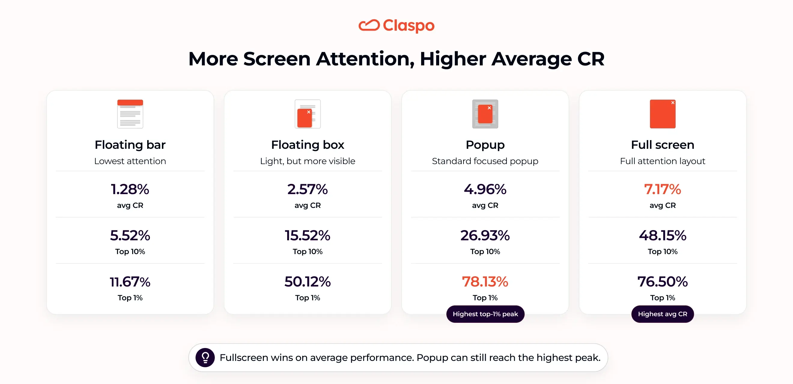
So the takeaway is not “use fullscreen everywhere”. It is more specific: fullscreen pop-ups work when the offer is strong enough to deserve the space they take. If the message is weak, vague, or shown too early, the layout can feel too heavy. But when the value is obvious, fullscreen gives the campaign enough room to make the offer impossible to miss.
Best use cases for fullscreen popups | |
|---|---|
Use case | Why fullscreen fits |
High-value discount | A small generic offer may feel too aggressive in this layout, but a clear high-value deal gives the visitor a reason to stop and respond. |
Major seasonal sale | This is where fullscreen feels most natural. Not for every small discount, but for the campaign the store really wants people to notice. The deal should be clear within a few seconds. |
Early access or gated offer | Use fullscreen when the visitor needs to understand what they are unlocking. Early access, private sale, member-only drop, limited collection — these offers often need a short explanation before the email ask feels fair. |
What to Test to Improve Popup Conversion Rates
Benchmarks can help you decide what to try first. They cannot do the whole job for you. A weak offer will not become strong just because it sits inside a game. A fullscreen pop-up will not work only because it takes more space. So before testing button colors or rewriting the CTA for the fifth time, check one thing: does the format actually fit the job?
If you chose... | Make sure... |
Gamification | The reward is clear enough to make the game worth playing. |
Teaser | The offer is something visitors may want to come back to later. |
Multi-step | The extra step makes the email ask easier, not just longer. |
Choice buttons | The selected answer helps segment contacts for follow-up. |
Fullscreen | The offer is strong enough to justify taking over the screen. |
Once that fit is clear, the next layer is execution. This is where many campaigns win or lose.
Format | What to test | Why it matters |
Gamified popups |
| A game can feel exciting or empty depending on what the visitor can win and when the pop-up appears. |
Teasers |
| A teaser should feel like a way back to the offer, not like the same interruption in a smaller size. |
Multi-step with Choice buttons |
| A multi-step flow only helps if the first step makes the email ask easier or more relevant. A vague question, too many options, or a layout that feels heavy can turn the extra step into friction. |
Fullscreen |
| Fullscreen takes more attention than other layouts, so timing and control matter more. Show it too early, too often, or to the wrong visitors, and the format can feel pushy instead of valuable. |
And this is where testing becomes less painful. In Claspo, you can run built-in A/B tests for the things that usually decide performance: offer, copy, layout, trigger, teaser behavior, game settings, and more.
There is also A/B testing autopilot for teams that do not want to manage every experiment by hand. The system creates new versions, changes selected elements, splits traffic, tracks the results, finds a winner, sends more traffic to it, and then keeps looking for the next improvement. So after you choose the format, the next step is not guesswork. It is iteration.
How to Choose the Right Popup Format
If there is one useful way to read this benchmark, it is this: popup formats are not interchangeable. A wheel, teaser, Choice flow, and fullscreen layout all deal with a different reason people pause before leaving an email.
If visitors need a reason to engage, gamification can make the offer feel more worth clicking. If they close the pop-up too early, a teaser can keep the offer within reach. If the signup feels too abrupt, multi-step can soften the first move. If the offer should feel more personal, Choice buttons can capture intent before the email field. If the value is strong enough to stop the session, fullscreen can give it the space it needs.
Average CR is a good signal, not a complete answer. The visitor’s mood still matters: browsing, comparing, hesitating, closing the pop-up, looking for a deal. The format should match that moment, not just chase the biggest number in the table. Visibility is still part of pop-up optimization. But the better question now is not only “Will people see it?” It is “Does this interaction make sense before the email ask?”
Claspo gives you everything you need to test that answer: gamified popups, teasers, multi-step layouts, Choice buttons, fullscreens, triggers, targeting, and built-in A/B testing tools to keep improving after launch.