Fullscreen Pop-ups, Explained Through Real Use Cases


Summarize
Fullscreen pop-ups are one of the most debated formats in CRO. Some teams swear by them. Others avoid them completely — especially on mobile, where they can feel too aggressive. Google explicitly warns about intrusive interstitials — yet many high-performing sites still use fullscreen in critical moments.
That contradiction is where things get interesting. In this article, we’re not going to repeat generic “best practices”. Instead, we’ll look at real implementations — gamified flows, micro-commitments, exit-intent takeovers — and break down why they work. The goal is simple: give you a clear sense of when fullscreen is a smart move, where it doesn’t, and how to use it without hurting the experience — especially on mobile.
Fullscreen isn’t about size — it’s about control
At first glance, a fullscreen pop-up seems easy to define. But the term “fullscreen” is often used loosely, and different formats get grouped together even though they behave quite differently.
A true fullscreen pop-up takes over the entire viewport and removes all other elements from attention. The page behind it is no longer part of the experience — visually or mentally. Instead of competing with the page, it replaces it for a moment and presents a single, focused interaction. This creates a clear decision point: engage with the message or close it and return.
Many formats sit somewhere in between:
large popups covering most of the screen;
welcome mats that push content down;
content gates blocking access to the page.
Strictly speaking, these aren’t all fullscreen formats. But for the visitor, the experience is often similar — the flow gets interrupted and something demands attention. The difference is how strong that interruption feels:
A standard pop-up suggests an action;
A large pop-up demands more attention;
A content gate or fullscreen takeover forces a decision before continuing.
So while the layouts differ, the underlying mechanism is the same: they temporarily take control of the user’s attention. This is exactly why we mention these “in-between” formats. Because when you choose between them, you’re not just choosing a design — you’re choosing how much friction you introduce into the experience.
Fullscreen sits at the extreme end of this pattern. It clears everything else out and puts one action in front of the user. That can work really well — but it also means there’s less room for mistakes. If the timing or message is off, people feel it immediately.
Why marketers choose fullscreen pop-ups
Fullscreen usually isn’t the starting point. Teams move to it when lighter formats don’t get a response.
One common case is time-sensitive campaigns — flash sales, limited drops, seasonal promos. When there’s a deadline, it’s easy for smaller elements to be missed, so the message gets a more prominent placement.
When you need a clear next step.
Some flows work better when you guide the user into a specific action — for example:
choosing a category or preference;
starting a quiz or product finder;
confirming location, language, etc.
In these cases, fullscreen helps structure the experience rather than just promote something.
When the page itself isn’t doing the job.
Sometimes the issue isn’t traffic — it’s that visitors don’t notice or act on what’s already there. For example, an e-commerce store may have a “10% off for new customers” offer in the header or buried somewhere on the page. It’s technically visible, but many visitors just scroll past it and never engage. In cases like this, a fullscreen step can bring that action forward and make it explicit. Instead of hoping people notice it, you move it front and center and make the action explicit. See our roundup of email popup examples.
Choosing fullscreen is less about design preference and more about intent. You’re essentially deciding:
Is this message important enough to interrupt the journey?
Does the visitor have enough context to respond?
Is there a clear benefit behind the action?
When the answer is yes, fullscreen can work well. When it’s not, it tends to feel forced.
How fullscreen shifts the way people make decisions
Once you switch to fullscreen, you’re not just changing how the message looks. You’re changing how people deal with it.
It breaks the “just browsing” mode.
A typical visit is fast and a bit distracted. People jump between sections, compare things, and leave tabs open. When a fullscreen step appears, that flow stops for a second. You’re no longer just scrolling — you’re being asked to react.
That small shift matters more than it seems. Some people will close it instantly, of course. But others will actually read and decide, simply because the context changed.
It removes the “I’ll deal with this later” option.
With smaller elements, it’s easy to postpone action: “I’ll check this later”. Most of the time, that “later” never happens. Fullscreen makes that moment more immediate. The choice is right there, and there’s nothing else competing for attention at that second. So the decision happens earlier — either yes or no.
The same offer can feel different.
Place the same offer in different spots, and it won’t be perceived the same way. In a footer, it’s easy to ignore. In a small floating box, it’s noticeable but optional. In fullscreen, it feels like something you’re expected to respond to. Nothing about the offer itself changed — just the way it’s presented. But that alone can shift how seriously people take it.
Fullscreen doesn’t guarantee better results. What it does is change the conditions under which people decide.
Fullscreen pop-ups and Google: what you need to know (especially for mobile)
Fullscreen pop-ups don’t exist in a vacuum. How and when you show them can affect not just UX, but also how your pages perform in search. Google doesn’t prohibit pop-ups. The issue is more specific: blocking access to content too early, especially on mobile. That’s what they call an “intrusive interstitial”. Fullscreen pop-ups often fall into this category — but only in certain conditions. The biggest red flag is simple: fullscreen on page load, before the user sees anything.
When fullscreen is usually fine
The same format becomes much less problematic when it appears later or by choice. For example:
after the user scrolls or spends some time on the page;
after visiting a second page;
on exit intent (when they’re already leaving);
after a click on a teaser or button.
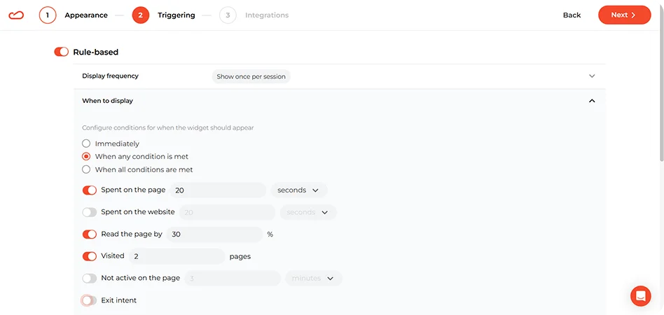
In these cases, the user has already seen the content, understood the context, and engaged at least a little. So the pop-up doesn’t block access — it builds on it.
Why mobile requires extra caution
On desktop, fullscreen can feel like a layer. On mobile, it feels like a wall. There’s no side space, no background context, no easy way to ignore it. That’s why the same interaction can feel acceptable on desktop and frustrating on mobile. Small details matter more here:
a visible and easy-to-tap close button;
fast loading;
minimal friction in the interaction.
If any of these are off, users feel it immediately — and that’s exactly the kind of experience Google tries to discourage.
What to avoid
Fullscreen isn’t “bad” in Google’s eyes. But it’s sensitive to timing and context. A few patterns are consistently problematic:
showing fullscreen immediately on landing (especially from search);
forcing interaction before any content is visible;
making the pop-up hard to close;
redirecting users to a separate page just to show a form or message.
These are the cases where fullscreen stops being a tool and starts getting in the way.
How to use fullscreen without hurting the experience
Fullscreen can work well, but only if it’s handled carefully. Most of the negative feedback around it doesn’t come from the format itself — it comes from how and when it’s used. This is where details matter.
Show it to the right people
Not every visitor should see the same fullscreen message. A first-time visitor, a returning user, and an existing subscriber are in very different situations — but they often get the exact same pop-up. That’s where things start to feel off. A few simple adjustments already make a big difference:
don’t show signup prompts to people who are already subscribed;
adjust the message for traffic sources (email vs ads vs organic);
treat returning visitors differently from new ones;
use behavior signals (viewed products, cart activity) where possible.
Even basic targeting improves the experience noticeably.
Keep the ask proportional
Long forms, multiple CTAs, or too many steps tend to backfire here. The interaction should feel quick and easy to complete. What helps:
one clear action;
minimal input fields;
a message that’s easy to grasp at a glance.
If it takes effort to understand or complete, people will just close it.
Make it easy to say “no”
One of the fastest ways to create frustration is to make the popup hard to dismiss. Even if the offer is relevant, users want control over the experience. Make sure:
the close button is easy to find;
it works well on mobile;
there’s no confusion about how to continue without engaging.
Design principles that matter specifically in fullscreen
Fullscreen gives you more room, but that’s exactly where many pop-ups go wrong. Give someone a full screen, and the instinct is to fill it — more copy, more images, more going on. But that usually ends up cluttering the experience instead of helping it. A fullscreen pop-up works best when the extra space creates clarity.
Use the space to simplify the decision
The goal is not to fill the screen. The goal is to make the next step easy to understand. That usually means: one main idea, one main action, one visual direction.
If the visitor has to figure out what matters most, the layout is already doing too much. A good fullscreen pop-up doesn’t need explaining. You see it, and it just makes sense.
Don’t mistake size for permission to add more content
This is one of the most common design mistakes. A larger canvas does not mean people are suddenly willing to read a mini landing page in the middle of their browsing session. That’s why compact copy often works better here than long explanations.
The headline should carry the main promise. The supporting text should do just enough to remove doubt or add context. Everything else should earn its place. If a paragraph can be removed without hurting understanding, it probably should be.
Build a clear visual hierarchy
In fullscreen, hierarchy matters even more than decoration. The user should not have to search for the important part of the message. Their eye should land naturally on:
the core benefit;
the action;
any supporting proof or clarification.
That means the design needs contrast, spacing, and restraint. Not five highlighted elements screaming at once. A common failure pattern is when the discount, image, CTA, timer, supporting text, badge, and close icon all compete equally. Nothing stands out because everything is trying to.
Let empty space do some of the work. The breathing room is not a waste of space here. It’s part of the design logic. Fullscreen already creates visual intensity by taking over the page. If you also pack every corner with text and graphics, the whole thing starts to feel loud and effortful. A bit of openness helps the message feel easier to process.
Use visuals to support the offer
Because fullscreen is visually dominant by default, it doesn’t need extra drama just to be noticed. The visual should help answer one of these questions:
What is being offered?
Who is it for?
Why act now?
What happens next?
If an image is there just to fill space, it usually doesn’t help much. Big product shots, background textures, random shapes — they can make the layout look busy, but they often just get in the way of the main message.
Mobile fullscreen needs its own rules
The mobile version needs more restraint, not just responsive resizing. On mobile, the first visible screen does almost all the work. If the main benefit, action, and close option are not clear right away, many users won’t stay long enough to figure it out. They won’t scroll to discover the logic of the pop-up. They’ll just leave it.
Copy should get tighter, not just smaller. One mistake teams make is keeping the same amount of copy and simply reducing font size to make it fit. Technically, everything is still there. Practically, readability collapses.
Mobile fullscreen needs shorter copy, sharper hierarchy, and faster comprehension. The wording has to do more work in fewer lines. If the desktop version explains, the mobile version should signal.
On mobile, small details like button size start to matter a lot more. You still see pop-ups with tiny close icons or cramped fields, and they’re just awkward to use. Controls should feel effortless:
buttons should be easy to reach and press;
fields should be minimal;
tap targets should have room around them;
the close icon should be obvious.
On mobile especially, splitting the interaction into steps can improve usability. Not because multi-step is automatically better, but because it helps keep each screen simple. One question, one choice, one action. That’s often easier to process than showing everything at once.
Where fullscreen works best: real examples
The value of fullscreen depends on how it’s used. These examples show different patterns and explain why it is a good fit in each case.
Gamified fullscreen: plinko-style mystery deal
This is a fullscreen pop-up built around a plinko-style game. The visitor clicks on the board, triggers the drop, and sees possible outcomes at the bottom. But the key detail is what happens next. You don’t immediately get the result. You’re asked to enter your email to reveal it.
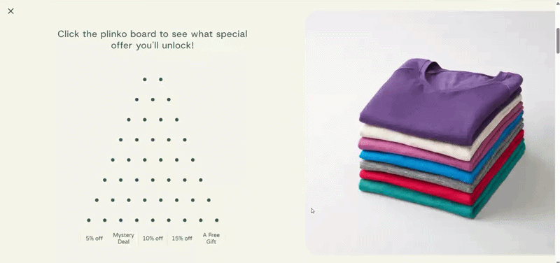
What works well
The game doesn’t feel fake. This setup shows all possible outcomes upfront. You can see what you might get before you even click. That changes the perception.
It feels less like a gimmick and more like a simple “try your luck” moment.
It plays on curiosity in a very specific way. The interesting part isn’t just the discount. It’s the fact that one of the options is unclear — the “mystery deal”. That creates a small gap: I’ve already played, now I want to know what I got. At that point, entering an email doesn’t feel like a cold ask. It feels like the last step of something already started.
Why fullscreen makes sense here
This is one of those cases where fullscreen isn’t just about visibility. The interaction itself needs space:
the board;
the clickable area;
the result labels.
If you try to squeeze this into a standard pop-up, everything gets tighter: smaller targets, harder to read rewards, and less obvious interaction. And that’s before you even think about accessibility. For someone on mobile, or just someone not staring at the screen closely, small game elements can become frustrating fast.
Fullscreen solves that by making the interaction clear at a glance.
Pick-a-gift mystery offer
This is a fullscreen pop-up built around a simple “pick a box” interaction. The visitor sees a few identical options, chooses one, and immediately reveals the reward — a specific discount. To claim it, they’re asked to enter their email.
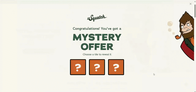
What works well
There are just a few boxes, and they all look the same. You don’t overthink it — you just pick one. And once the result appears, it feels like: “this is what I got”. Even if the outcome is predefined, the act of choosing creates a sense of ownership.
The reward is revealed before the ask. This is a key difference from the previous example. Here, the user already sees the discount before entering their email. That changes the dynamic:
less curiosity;
more clarity;
more trust.
At this point, entering an email feels less like a gamble and more like: “ok, I’ll take this”.
Why fullscreen makes sense here
At first glance, this could fit into a standard pop-up. It’s not as visually complex as plinko. But fullscreen still plays an important role — just in a different way. Here, it’s less about space for interaction, and more about framing the moment. The layout does a few things at once:
isolates the choice;
removes distractions;
makes the action feel intentional.
If you place the same three boxes inside a small pop-up, they feel like just another UI element. Easier to ignore. There’s also a practical side: the boxes are easier to tap (especially on mobile), and the result is clearly visible.
Spin-the-wheel fullscreen
You’ve probably seen this before — a spin wheel where you try your luck and land on a discount or free shipping, then enter your email to get it. It’s one of the most widely used gamified formats — and for a reason: it consistently delivers double-digit conversion rates, often 10% and above.
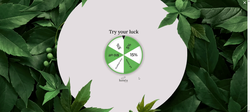
What works well
People already know how it works. There’s no learning curve here. You don’t need instructions. That matters more than it seems. Less thinking means faster interaction, so more people actually engage.
The possible rewards are visible on the wheel, so users understand the range before they even spin. That makes the result feel fair enough to accept.
Why fullscreen makes sense here
A spin-to-win wheel works in a standard pop-up. You see it everywhere. So the question isn’t “can it work in fullscreen” — it’s “when does fullscreen make it better”? It works well when:
you want to engage visitors right after they land;
you’re running a strong incentive campaign;
you need a fast, high-volume interaction — for example, during a campaign or traffic spike.
In this setup, the wheel isn’t competing with the page — it is the experience for that moment.
A fullscreen layout is a must when the design relies on visual impact. Look at the example above — the wheel sits in a clean central area, with strong contrast and plenty of space around it. That does two things: makes the interaction obvious, and makes the reward easy to read after the spin. In a smaller pop-up, the same wheel feels more cramped, competes with text and other elements, loses some of that visual clarity.
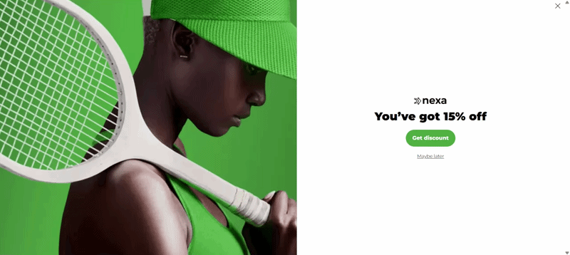
Fullscreen with micro-commitment: single “Yes” step
This is a fullscreen pop-up built around a two-step flow. The visitor sees a seasonal offer (St. Patrick’s Day sale with 15% off) and a single primary action:
“Yes, please!” If they click it, the next step appears — the email field to claim the offer. There’s no visible “No” button. The alternative is simply closing the pop-up.
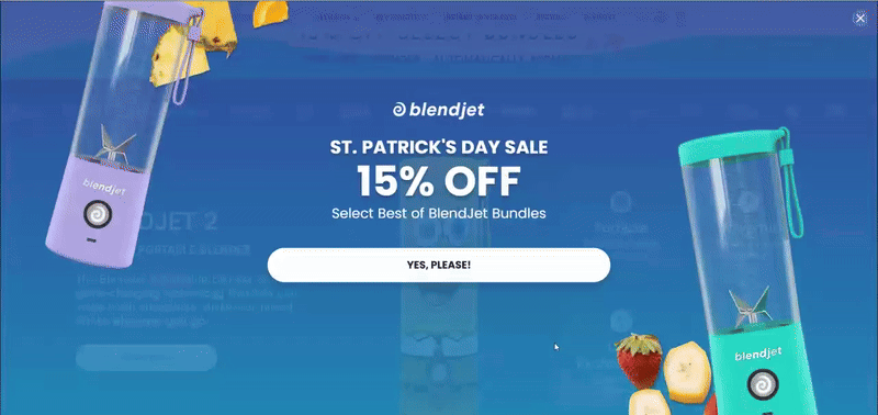
What works well
It removes friction at the entry point. There’s no form, no field, no decision to “share something” yet. Just one simple action. Clicking “Yes” feels almost automatic — it’s closer to a reaction than a decision.
It avoids overthinking. With Yes/No, some users pause and think: “Do I want this? Not sure…” Here, that moment is skipped. That keeps the flow fast and reduces hesitation.
It pre-qualifies interest without asking for data. Not everyone who sees the pop-up will click “Yes”. But the ones who do have already shown intent. So by the time the email field appears, you’re not asking a cold audience anymore. You’re asking people who: noticed the offer, reacted to it, and chose to continue. That’s a subtle but important difference in lead quality.
Why fullscreen makes sense here
This only works if the “Yes” button stands out right away. On a smaller pop-up, it can feel like just another button on the screen — easy to skip without thinking. In fullscreen, the offer is front and center.
It works especially well for campaign-driven moments. This isn’t a generic signup — it’s tied to a specific promotion with limited-time offer and clear benefit.
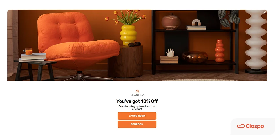
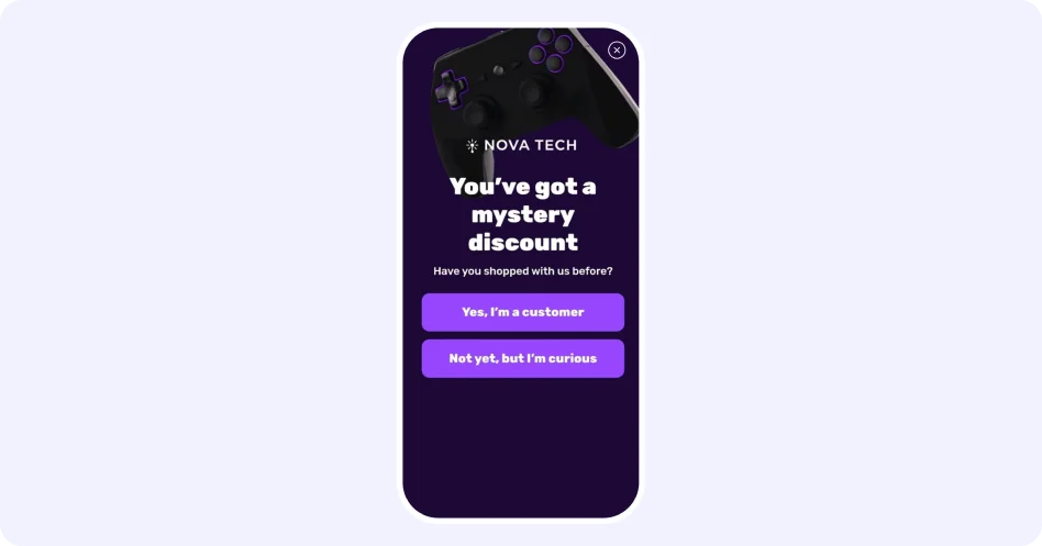
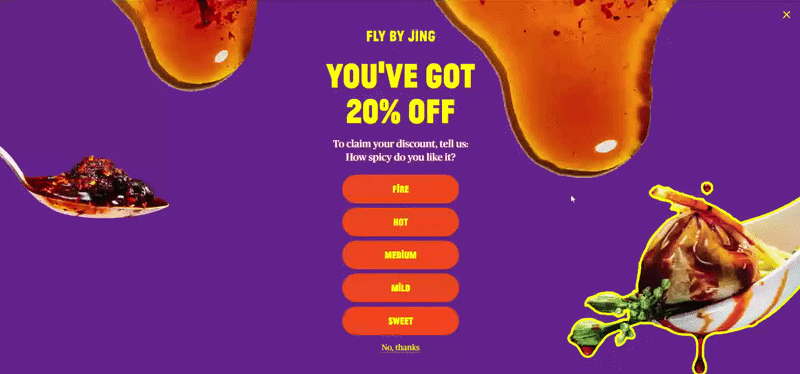
Single choice fullscreen: mystery discount with qualification
This is a fullscreen pop-up that starts with a simple question: “What’s your skill level?” The visitor chooses one option, and only after that moves forward to share their email and claim a mystery discount.

What works well
It turns a generic offer into something tailored. At its core, it’s still a discount. But instead of showing it right away, the pop-up asks a question first. That small step changes the feel of the interaction. Instead of “Here’s 10% off” it becomes “Let’s figure out what’s right for you”. Even if the discount isn’t truly different, the flow makes it feel more relevant.
You’re not just clicking randomly here. The options make sense, so you pick the one that fits you and move on. That small choice already tells you something about the visitor. Not a full profile, but enough to adjust what you show next. That means:
more relevant follow-ups;
better targeting;
less “one-size-fits-all” messaging.
Why fullscreen makes sense here
This pattern relies on the user actually noticing and completing the choice. If you place this in a small pop-up, a few things happen:
the question feels less important;
the options look like secondary buttons;
it’s easier to skip without engaging.
In fullscreen, the question becomes the center of attention. You don’t just see it — you process it. That matters, because this step is not decorative. It’s doing real work: qualifying the user, setting up the next step, shaping how the offer is perceived.
Fullscreen with choice and extended data capture
This is a fullscreen pop-up that combines a clear reward with a short preference question. After choosing an option, the next step asks for an email and birthday to claim the discount.
What works well
The reward is clear from the start. The user already knows what they’re getting before doing anything. That removes hesitation right away. At this point, the interaction feels less like exploration and more like: “ok, how do I get this?”
The options don’t feel like a random question. They’re directly tied to the product. So instead of slowing the user down, the question feels like part of the shopping experience — almost like a recommendation step.
It collects more than just an email without feeling heavy. You’re not only asking for an email, but also for a birthday. Normally, that would feel like too much.
But because the flow starts with a clear reward and a quick choice, the user is already “in”. So the second step doesn’t feel as heavy as it would in a one-step form.
Why fullscreen makes sense here
This is one of those cases where a standard pop-up would start to break. There’s simply more going on:
a strong visual (product + branding);
a headline with a clear offer;
multiple choice options;
a second step with more than one field.
Try putting all of this into a small pop-up, and it starts to feel tight pretty quickly — the buttons shrink, the text gets harder to scan, and nothing really stands out. In fullscreen, it’s much easier to follow what’s going on.
Fullscreen with request form
This is a fullscreen pop-up used for a request form — something more substantial than a typical email capture. It can be opened via a teaser, which already signals intent: the user clicks, expects a next step, and gets a full form.
Why fullscreen makes sense here
A request form like this isn’t a quick interaction. It usually involves:
multiple fields;
personal details;
a bit of time to complete.
Trying to place that inside a small pop-up creates friction almost immediately. It feels cramped, harder to navigate, and slightly out of place. Fullscreen solves that by giving the interaction the space it actually needs. It doesn’t feel like a form on top of a page — it feels like a step you move into.
When the form is triggered by a teaser, the user is not interrupted — they choose to open it. That changes the dynamic completely. At that point:
they expect something more detailed;
they’re ready to spend a bit more time;
they’ve already shown intent.
You could place the same form directly on the page, and in some cases that works. But these forms are often easy to miss. People focus on other content, or never reach that part of the page at all. With a teaser and a fullscreen step, it works differently. The form shows up only after someone clicks, and at that point there isn’t much else on the screen to distract them.
Exit-intent fullscreen: redirecting to a better-fit offer
This is a fullscreen pop-up triggered on exit intent. Instead of pushing a discount or asking for an email, it offers a simple alternative: “Watches under $200” — with a clear CTA to explore that selection.
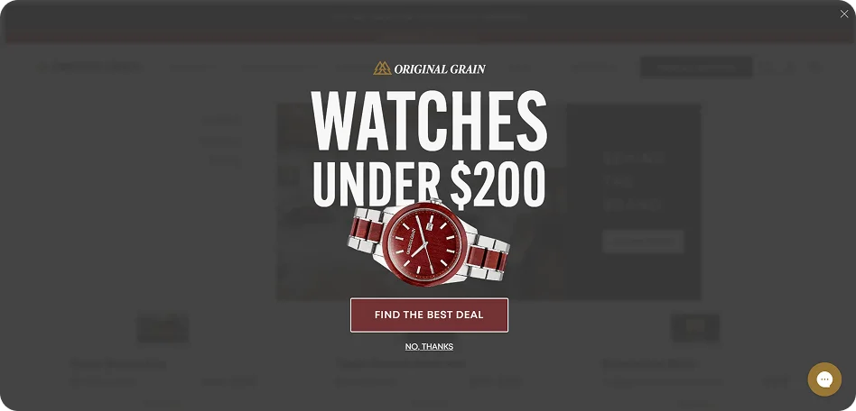
What works well
It addresses a likely reason for leaving. People rarely leave randomly. In many cases, it’s because:
the price feels too high;
they didn’t find something within their budget;
they’re still comparing options.
This offer speaks directly to that. Instead of trying to stop the exit, it reframes the experience: maybe you just didn’t see the right option yet. That makes the message feel helpful. At exit, users don’t want to evaluate multiple choices.
This pop-up gives them one clear path: stay and explore cheaper options or leave. That simplicity is important at this stage.
The value is clear without extra explanation. “Under $200” is instantly understandable. You don’t have to think — you just click and see.
Why fullscreen makes sense here
Exit-intent is a very specific moment. The user has already decided to leave. At that point, small elements often don’t register at all. But fullscreen creates a real pause at the moment of exit. Not a suggestion — a moment to reconsider. That matters here, because you only get one chance and there’s no second impression. If the message doesn’t land immediately, the user is gone.
Fullscreen on exit intent works best when:
the alternative offer is highly relevant;
the value is immediately clear;
the user is likely leaving for a specific reason (like price).
This kind of thing falls apart pretty quickly if the message is just a generic newsletter ask, or if it doesn’t line up with what the person was browsing. And on some sites, it simply feels too heavy for the way the rest of the experience works. In those moments, fullscreen just feels like overkill.
Reading fullscreen performance beyond surface metrics
Fullscreen pop-ups are tricky to measure. They tend to get attention, they often drive interaction, and at first glance, the numbers can look great. But that’s exactly why it’s easy to misread them. A strong top-line conversion rate can hide what’s actually happening underneath. To really understand what’s going on, it helps to look a bit wider than just the signup itself — what people did before it, and what they do right after.
It’s not uncommon to see this: a pop-up collects a lot of emails, but at the same time fewer people keep browsing or engaging with the site. That’s why it helps to pair conversion rate with a few surrounding signals. Where to look:
In analytics (GA4, etc.): bounce rate, session depth, engagement rate on pages where the pop-up appears.
In your pop-up tool: conversion rate, impressions.
When these numbers move in opposite directions, it’s usually a sign that something needs adjustment.
Track what happens after the interaction. A signup or click is not the outcome — it’s the starting point. What matters is what those users do next. Depending on your setup, this could mean:
purchases after signup (check in your e-commerce platform or CRM);
trial activation or demo attendance (product analytics, CRM);
email engagement (ESP: open rates, clicks, conversions).
Compare segments, not just totals. Fullscreen pop-ups don’t perform the same way for everyone, so it helps to break the data down. Some useful splits:
new vs returning visitors;
traffic source (email, paid ads, organic);
mobile vs desktop.
These comparisons often reveal patterns that aren’t visible in overall metrics.
Putting it into practice
After going through these examples, you start noticing a pattern. It’s not really about the fullscreen format itself. The same pop-up can land well in one case and feel off in another — mostly because of when it shows up, who sees it, and what it’s asking for.
That’s also why copying a “best” version rarely works. You change the timing a bit, tweak the message, or simplify the flow, and people react differently. You only see those shifts once you try a few variations.
All the patterns we looked at — games, exit intent, multi-step flows — follow the same idea. You’re shaping the moment: choosing when to show something, who to show it to, and how easy it is to respond. That’s basically how Claspo is set up. You can build fullscreen countdown popups, decide when they appear using different triggers, control who sees them, and try out variations to see what performs better. All of that is available regardless of the plan, so you’re not limited in what you can test.
Fullscreen isn’t something you switch on and leave as is. It’s something you adjust as you go. And the more you try different setups, the clearer it becomes what actually works for your audience.

![How to add a Shopify newsletter signup form [+Tips & Templates]](https://framerusercontent.com/images/FavgBqCU1zgoOwEdQvBHxtOWIc.png?width=1320&height=756)
