Welcome popups: 15 Templates & How to create [Tips + 12 Examples]

![Welcome popups: 15 Templates & How to create [Tips + 12 Examples]](https://framerusercontent.com/images/rgah6Q1Y5N8FRkigt8TbSwf42dY.webp?width=1920&height=540)
Summarize
Chat GPT
Perplexity
Gemini
Claude
If you think a welcome popup is just a box with an email field and a “10% off” discount, you’re living in 2020. If you fire the same welcome popup on load, it's no wonder that most of your traffic leaves. We analyzed 100 million popup views and 779 million impressions across 51,000 different websites that use Claspo. We studied the highest-performing popups and decoded what the top 1% are doing differently and what works.
In this guide, we’re sharing the benchmarks and templates you need to transform your first impression into your conversion tool.
What is a welcome popup?
A welcome popup is a message to new or non-registered visitors. The main goal is to greet them and offer something of value, thus converting window shoppers into subscribers or paying clients.
The common myth that “popups don’t work” usually stems from people breaking the reciprocity principle. Most website welcome popups just ask too much on the first touch (email) and don’t offer a proportional reward. In contrast, welcome popups that offer 10% off, a free checklist, or early access to a new drop are proven best practices that give your visitors a reason to share and stay with you. See how businesses can benefit from a welcome popup with the right offer:
E-commerce — promote launches, sales, and restocks.
Blogs & media — share updates, curated reads, and insider tips.
SaaS & digital products — deliver product news, feature tips, or onboarding content.
Online education — announce webinars, new courses, or send helpful resources.
Service providers — offer expert tips, case studies, or limited-time deals.
The takeaway: A welcome popup is a bridge between a first visit and a long-term customer. If the bridge looks unsafe or offers no rewards for crossing it, the visitor will stay on the other side.
Welcome popup performance benchmarks
Our analysis of 779M impressions showed that there is a massive gap between standard welcome popups and those used by the top 1% of performers.
The engagement baseline
The average signup rate across all industries is 3.53% conversion rate (CR). However, the top 1% are 9x more effective, often achieving CRs above 27%.
The gamification effect
One of the biggest discoveries in our 3-year study was the power of interactive mechanics. Traditional static sign-up popups are losing to gamified ones, 3.53% CR vs. 9.18% CR, with the top 25% of gamified forms achieving 26.41% CR.
Expert tip: A simple Spin-the-Wheel or Scratch Card element triples conversions by replacing friction with curiosity.
Industry-specific results
Depending on what you sell, the conversion baseline and success numbers will differ drastically. Here is the high-performer baseline:
Industry | Business goal | Top 10% benchmark |
Ecommerce | Grow email list | 28%-41% CR |
Travel & Tourism | Increase sales (clicks) | 25.67% CTR |
SaaS | Engagement/Feedback | 20.50% CTR |
Food & Drink | Grow email list | 30.50% CTR |
Education | Increase sales (Clicks) | 18.62% CTR |
If you’re tired of losing visitors, explore these lead capture popup examples to see how to turn traffic into an engaged contact list.
Seasonal tendencies
The data shows that timing remains as crucial as the offer itself. During BFCM, people are eager to click and buy since shoppers are in a buying mood. At the same time, summer sales see a +50% higher click rate (8.71%) than the annual average, yet sign-ups remain modest.
Pro tip: In summer, visitors are exploring, so we recommend using sliders rather than aggressive lead-capture forms.
4 High-converting welcome popup types and when to use them
A welcome popup is only as good as the context in which it appears. A 10% discount is useless if your SaaS user is looking for a technical solution, just as you wouldn’t offer a long whitepaper to a mobile shopper. Our 2026 study shows that the most successful brands align their offer with visitor intent. Based on our analysis of the highest-performing Claspo popups, here are the four strategic archetypes that the top 10% performers use.
Welcome popup with an incentive
This is the classic value exchange tactic. You offer a tangible reward (a discount or a free gift) to lower the psychological barrier to a first-time purchase.
The data | Best for | Top 1% tactic |
69% of top performers rely on a discount incentive. | Lowering the barrier to first purchases | A fixed-sum discount ($10 off) for tighter margin control on stable order sizes. |
Gamified welcome popup
These popups turn the signup into a game. With an interactive component in your welcome popup, you can transform a transaction into a fun experience driven by curiosity and dopamine.
The data | Best for | Top 1% tactic |
Gamified forms average 9.18% CR, triple the industry average. | High-traffic periods (BFCM) or playful brand voices. | 83% of Claspo users show the code on the “Thank you” page, not just via email. |
Educational/Informational welcome popup
In industries where a discount feels cheap (e.g., SaaS and B2B), deliver value through expert knowledge and problem-solving.
The data | Best for | Top 1% tactic |
SaaS popups convert 4x better with “Problem-Solution” framing. | Professional services, SaaS, and Education. | 76% of top SaaS popups use functional visuals (UI screenshots) to build trust. |
Multi-touch welcome popup sequence
This isn't just one welcome popup, but a logic-based sequence that meets the user at different touchpoints. It might start as a floating welcome bar and transition into an exit-intent popup if the user doesn't engage.
The data | Best for | Top 1% tactic |
The exit-intent + email combo has a 5.76% CR, more than double the standard rate. | Reducing bounce rates on high-traffic pages. | Use a subtle Teaser for returning visitors who ignored the initial welcome popup. |
Pro tip: Don't stop at timing; personalize the content of your sequence. Use Claspo Merge Tags to pull category info from your Shopify URL and automatically update your welcome popup message. For example, instead of a generic “10% off,” show this message to a visitor browsing jeans: “Love our jeans? Grab 10% off your first pair before you go!”
12 Welcome popup examples
We’ve collected some real-life examples from brands all around the world and the corresponding templates you can find in the Claspo library. Let’s get inspired with these welcome popup ideas and analyze what makes these welcome popups effective.
Classic welcome popups with incentives
This is the bread and butter of ecommerce brands. Our benchmarks show that 69% of top-performing signup forms use this exact approach. In most cases, the key is not just the offer, but how it’s visualized and messaged.
Welcome popup with the human element
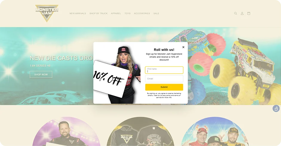
Many merchants stick to minimalist safe welcome popup designs, but Monster Jam stays true to its vibe with a high-energy, personality-driven aesthetic to break the banner blindness.
Why it works:
The character breaks the frame of the popup, which is a proven attention-grabbing tactic that stops the scroll.
The CTA is high-contrast yellow, guiding users where to click.
All the details in this welcome popup, from the model’s outfit to fonts and colors, align with the Monster Jam universe.
While 1-field forms are the baseline, 40% of the top 10% of e-commerce forms include a Name field for follow-up campaigns.
Pro tip: The name field is great for personalization, but our data shows that adding extra fields generally lowers conversion rates. Monster Jam can afford this because they have a high-affinity fan base. If you are a new brand with zero trust, stick to the email-only format (2.48% CR) until you’ve built enough authority to ask for more.
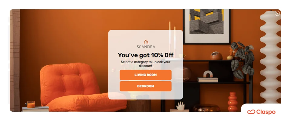
Benefit-first welcome popup
The next welcome popup idea by YESNYOU is a textbook example of a clean, modern welcome popup design used by 70% of top performers. Instead of a standard signup form, this popup focuses on a friction-free workflow by providing a direct discount code for visitors ready to commit.
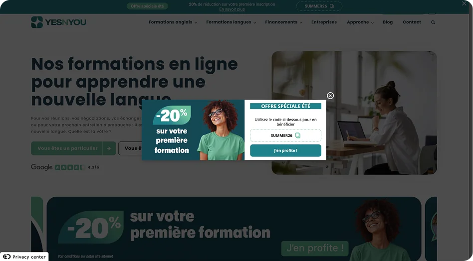
Why it works:
The 50/50 balance between the -20% offer and the action-ready right side makes the promo code digestible in under two seconds.
YESNYOU frames their offer as a seasonal special (“Offre Spéciale Été”) to turn a casual browsing visit into a limited-time offer.
83% of the top 1% prioritize the reward-reveal approach, which shows the code instantly with a click-to-copy icon to remove inbox hopping.
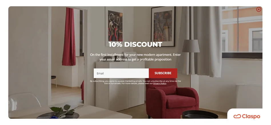
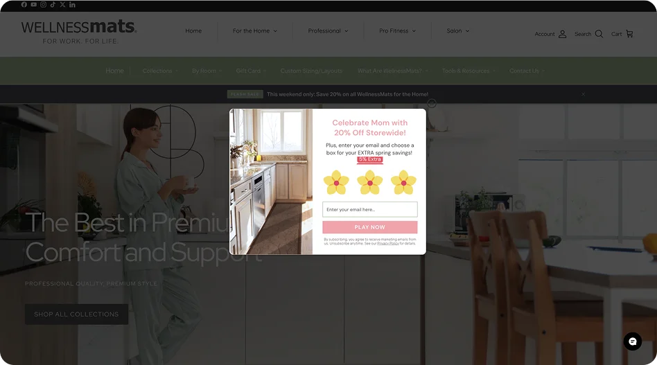
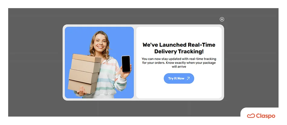
Welcome popup with product image
The next welcome popup by WellnessMats focuses on the outcome. The offer is placed over a high-quality product photo, and the discount feels like a natural step toward owning a premium home upgrade.
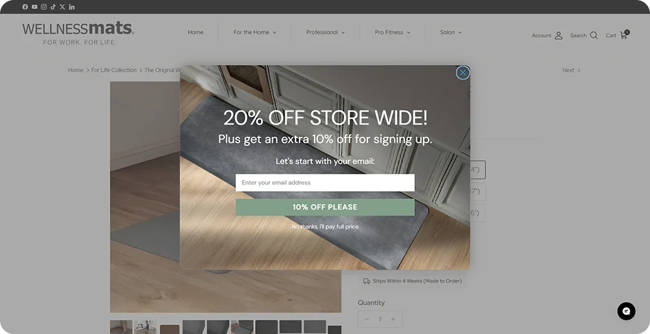
Why it works:
The popup follows the 100% imagery rule found in top-performing retail popups. The photo showcases the product in its natural environment, instantly building desire to have one.
The “10% OFF PLEASE” button copy uses active language to reinforce the reward and make the user feel they are gaining something, not just giving away data.
The small “No thanks, I’ll pay full price” link highlights the cost of not signing up without being overly aggressive.
Gamified welcome popups
Interactive gamified popups work because they don’t make people work (yes, pun intended). Visitors see a chance to win and subconsciously lean in. Our data shows that gamified mechanics like Spin-the-Wheel and Scratch Cards are performance multipliers, tripling the average conversion rate from 3.53% to 9.18%.
The Wheel of Fortune
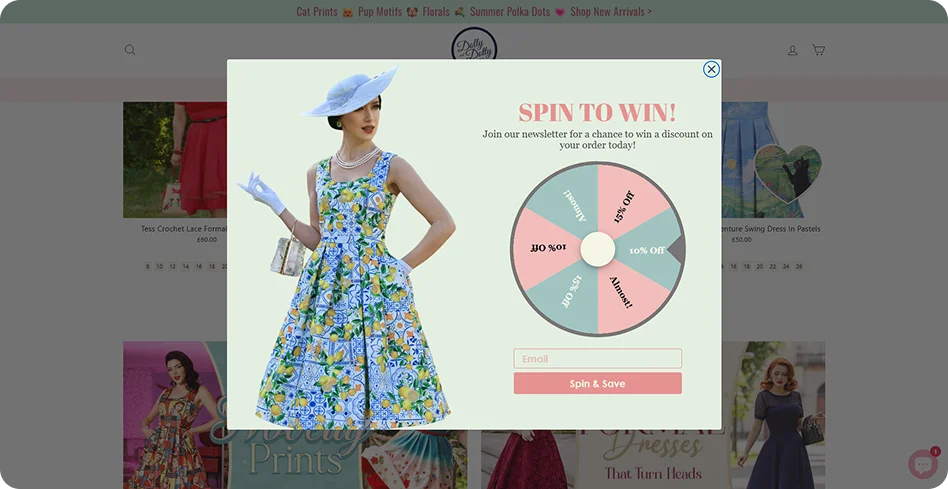
76% of all gamified popups use the Spin-the-Wheel component, which makes it the undisputed leader in gamification.
Why it works:
Dolly and Dotty combined their vintage aesthetics, product photos, and a sense of suspense around the spinning wheel to keep visitors emotionally involved until the result is revealed.
Switching from a static form to a wheel like this one can lift your baseline conversion rate to 9.25%.
Want people to act faster?
Check out these countdown popups. Showing a clear deadline helps push decisions forward, especially when paired with gamification.
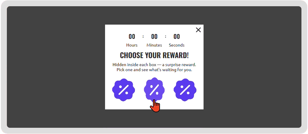
Pick-a-Gift seasonal welcome popup
WellnessMats makes our list again, but this time with a creative Mother’s Day campaign. We adore how they customized the Claspo Gift Box template and replaced the standard gift box icons with flowers. It’s elegant and feels like a genuine discount offer, not another cold marketing strategy.
Why it works:
Pick a gift popups spark immediate curiosity, thus visitors are naturally inclined to see what’s inside. This move makes sharing an email feel like a fair trade for the reveal.
Gift box mechanics maintain a strong 7.26% CR, consistently outperforming traditional static forms.
Treasure Hunt welcome popup
The marketers behind the Sakuramerch store use a conversion hack: while spinning wheels are more popular, mystery reveal mechanics have an average CR of 11.29%.
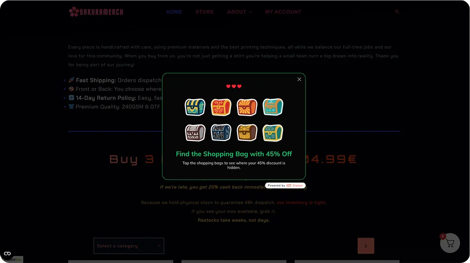
Why it works:
The brand hid a jackpot discount (45% off) behind an interactive choice, creating an offer hard to resist.
Multi-step welcome popups with segmentation
These welcome popups are designed to separate browsers from buyers. A standard popup treats everyone the same, but a multi-step and segmented popup asks a question first. This way, in addition to emails, you collect intent and zero-party data for highly personalized future campaigns.
Intent-based full-screen welcome popup
Nat’v Basics uses a classic two-step strategy: lead with a big reward, ask for a preference, and only then provide the discount code.
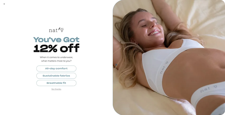
Why it works:
Psychologically, once a user clicks a preference, they are more invested in the process and more likely to provide their email on the second screen to claim their reward.
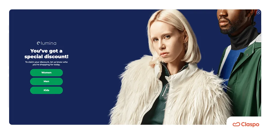
Welcome popup with audience segmentation
Icelandic+ uses the Claspo template with clear, visual buttons to segment its audience from the start. Which is quite reasonable from the business perspective: a dog parent has very different needs than a cat parent. This welcome popup ensures they only receive relevant offers in future campaigns.
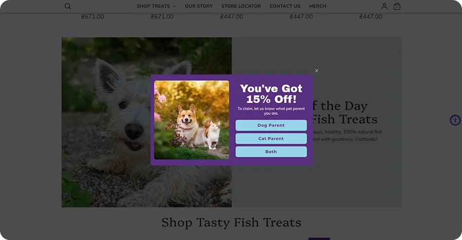
Why it works:
It’s efficient. They don’t lump everyone into a single massive email list; they segment users at the first touchpoint. This is a sure strategy to get higher open rates and lower unsubscribe rates.
Segmenting based on user traits or preferences averages a 15-25% CR uplift.
You can follow the same tactic for your apparel store. Shopbop combines a high-value incentive (15% off) with simple radio buttons to filter its list by gender.
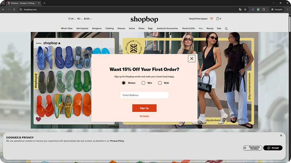
Even with an extra field, the top 10% of e-commerce forms maintain high CRs because the value proposition is strong enough to outweigh the minor friction of choice.
Need better insights?
Use survey popups. Ask a couple of focused questions, keep it quick, and get more responses without disrupting the user journey.
Navigation-led welcome popup
This welcome popup on the Scalpmicro website acts as a fork in the road. It provides a menu of directions to reduce navigation fatigue for new visitors. They placed the most important site destinations exactly where the user is looking.
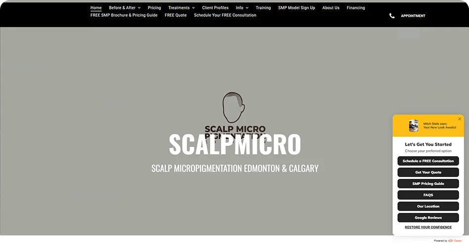
Why it works:
It lets visitors choose their own journey. Whether they are looking for social proof (Google reviews), cost (Pricing guide), or direct contact (Schedule a consultation), they can find it in one click.
In the Travel and Service sectors, popups that inform or guide achieve some of the highest engagement rates (8.08% CTR) because they assist the search process.
Pro tip: Use these route guides if you have a complex service or a long sales cycle. It helps prequalify your traffic: users who click “Pricing” are high-intent leads, while those who click “FAQs” are in the nurturing phase. This allows you to track exactly what your audience is looking for.
Product recommendation quiz popup
The Story Grove uses a welcome popup to launch a reader-type quiz. This is a smart move to increase Average Order Value (AOV) and lead quality with a single popup.
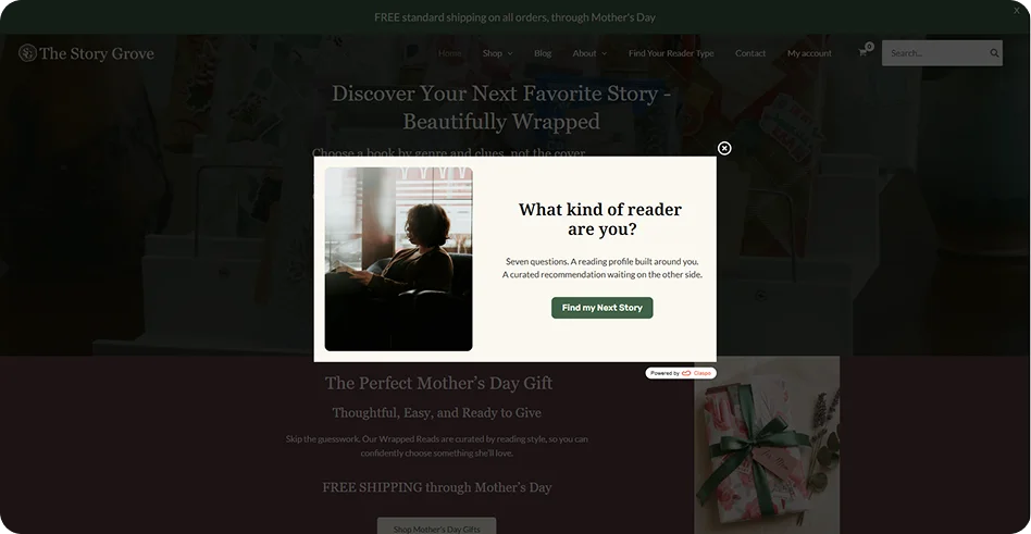
Why it works:
The brand offers a curated recommendation instead of a generic discount — this reduces the choice overload that often causes new visitors to bounce.
The welcome popup is honest about the commitment (“Seven questions”), lowering the barrier to entry by setting clear expectations.
Pro tip: Got a wide product range? Add a quiz to guide users. It increases conversions and gives you insights for targeted emails with up to 3x higher open rates.
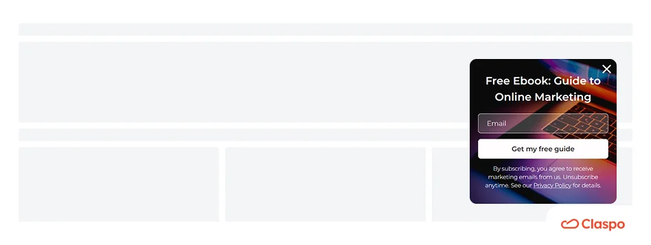
Welcome popup with a lead magnet
On their website, Sophi Liddell uses a full-screen popup to offer exclusive digital content for their readers. And this is a smart move since this approach works best for authors, creators, or SaaS companies where educational capital is the primary product.
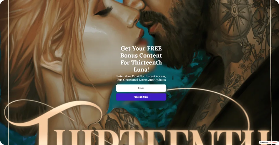
Why it works:
Full-screen popups command 100% of the user's attention. The action-oriented CTA “Unlock now” frames the email submission as a key to a secret, rather than generic email subscription forms.
Our study shows that offering a free guide, checklist, or bonus content is a core strategy for 17% of top-performing popups.
In the Media and Content sectors, problem-solution or bonus framing helps popups convert significantly better than generic newsletter popup templates.
For more inspiration, explore these email pop up examples from top ecommerce and SaaS brands. You’ll find 40+ real-world designs that show how to grow your list and turn sign-ups into conversions.
Best practices for a perfect welcome popup
We’ve collected specific patterns found among the top performers of our study. Here are the laws behind high-converting welcome popups.
Tips for perfect triggering and targeting
One of the most common mistakes is showing a popup the moment a user lands, as it often triggers an immediate bounce. The amount of time you need to wait before you show your welcome popup depends on your specific marketing objective.
Goal | Trigger | 2026 Benchmark | Why it works |
Lead acquisition | 20-sec delay | 10–20% CR uplift | Allows visitors to settle in and understand your value. |
Mobile sales | 30% scroll | 10–15% CR uplift | Prioritizes screen clarity. |
Reader capture | 50% scroll | 3.70% CTR | Targets high commitment. |
Local market sales | Geotargeting | Variable uplift | Builds trust via regional relevance. |
Scaling social Ad traffic | UTM (10-sec delay) | 43.1% CTR | Bridges the gap from TikTok/IG shoppers to checkout. |
Tips for flawless welcome popup design
While bold welcome popup designs look good in a portfolio, the numbers favor clarity and low friction. 77% of top-performing popups use a modern minimalist aesthetic.
Design element | Top 1% Standard | Impact on CR |
Visual style | Modern minimalist | Reduces cognitive load and bounce rates. |
Imagery | High-res product/lifestyle | Used in 100% of top-tier Retail and Travel popups. |
Field count | 1–2 fields maximum | One field (email) is the baseline for maximum volume. |
Hierarchy | High-contrast CTA | Instantly guides the eye to the primary action. |
Dismissal | Prominent “X” or “No thanks” | Visible in 75% of successful popups to build trust. |
The copy formula: High-converting copy follows a Benefit → Mechanic → Timing sequence, i.e., What they get → What they do → When they get it. For example, “Get 15% off” → “Spin to win now!”).
Tips on popup building
Friction is the enemy of welcome popups. Every additional field or element acts as a variable in your conversion rate. Our 2026 study tracked the performance of specific pairings:
Field & component combination | Avg. conversion rate (CR) |
Email + Promo code + Exit intent | 5.76% (Highest Performance) |
Email + Promo code | 3.85% |
Email + Countdown timer + Promo code | 3.42% |
Email + Countdown timer | 2.56% |
Email-only | 2.48% |
Email + Preferences | 2.38% |
Email + Phone + Promo code | 2.10% |
Email + Phone | 1.99% |
Phone-only | 0.44% |
Multi-step | 0.43% |
Key insights
Adding a promo code consistently improves the CR across all combinations.
Including a phone field typically lowers the CR below 2%, as users perceive it as a higher privacy cost than email.
While multistep forms show the lowest volume (0.43%), the top 1% use them to filter for high-intent, high-quality leads.
Tips for a seamless mobile experience
Here’s the dilemma: while mobile traffic dominates, mobile screen real estate is really expensive. And those welcome popups you designed for desktop can easily ruin the experience for smartphone users. Here’s what you need to pay attention to:
Shift to the bottom. Do not center your welcome popup and block the entire view; use a bottom drawer or slide-in layout instead. This allows the user to see the top 70% of your site and helps you avoid Google’s Intrusive Interstitial penalty.
Optimize for tap. Make buttons at least 44x44 pixels. Small buttons lead to accidental clicks, frustration, and bounces.
Trigger it right. As shown in our benchmarks, triggering at 30% scroll depth on mobile ensures the user is engaged before the welcome popup appears.
Looking to grow your mobile channel?
Check out these SMS popups to see how brands get up to 98% open rates. You’ll find ideas on using multi-step forms and gamification to turn visitors into loyal subscribers.
Tips for legal compliance and trust (GDPR/CCPA)
For any opt-in popup transparency is a must. Popups that collect email addresses or personal data must include explicit legal disclaimers. Under GDPR, non-compliance risks fines of up to 4% of global turnover.
Freely given consent: Consent must be active, specific, and granular. This means using unchecked checkboxes.
Transparency: You must clearly state what data is being collected and for what specific purpose (e.g., “Monthly newsletter”). Always include a direct link to your Privacy Policy.
Easy withdrawal: The process for opting out or unsubscribing must be as simple as the process for opting in.
Remember that data privacy laws vary by territory. Your welcome strategy should be tailored to your audience's location:
Law | Opt-in requirement | Context |
GDPR (EU) | Explicit opt-in | Requires active consent; no pre-checked boxes allowed. |
LGPD (Brazil) | Active opt-in | Strictly requires the user to take affirmative action. |
CCPA (California) | Opt-in for minors | Focuses on the right to opt out of data sales for adults. |
CAN-SPAM (US) | Opt-out links | Requires unsubscribe options in the emails themselves. |
Pro tip: Use a checkbox like “I agree to receive emails and have read the Privacy Policy” to bridge the gap between compliance and trust. This improves lead quality since only truly interested users will subscribe.
P.S. To ensure your site remains compliant while selling restricted products like alcohol or tobacco, learn how to implement age verification popups that protect your business and reputation.
How to create a high-converting welcome popup
Now, after all the theory and tips, let’s create a welcome popup to invite visitors to subscribe to your newsletter.
Step 1. Pick a CRO-ready template
We’ve created over 1,000 CRO-ready templates for businesses of any kind for any goal. Filter the template library by use case and choose the one that fits your needs.
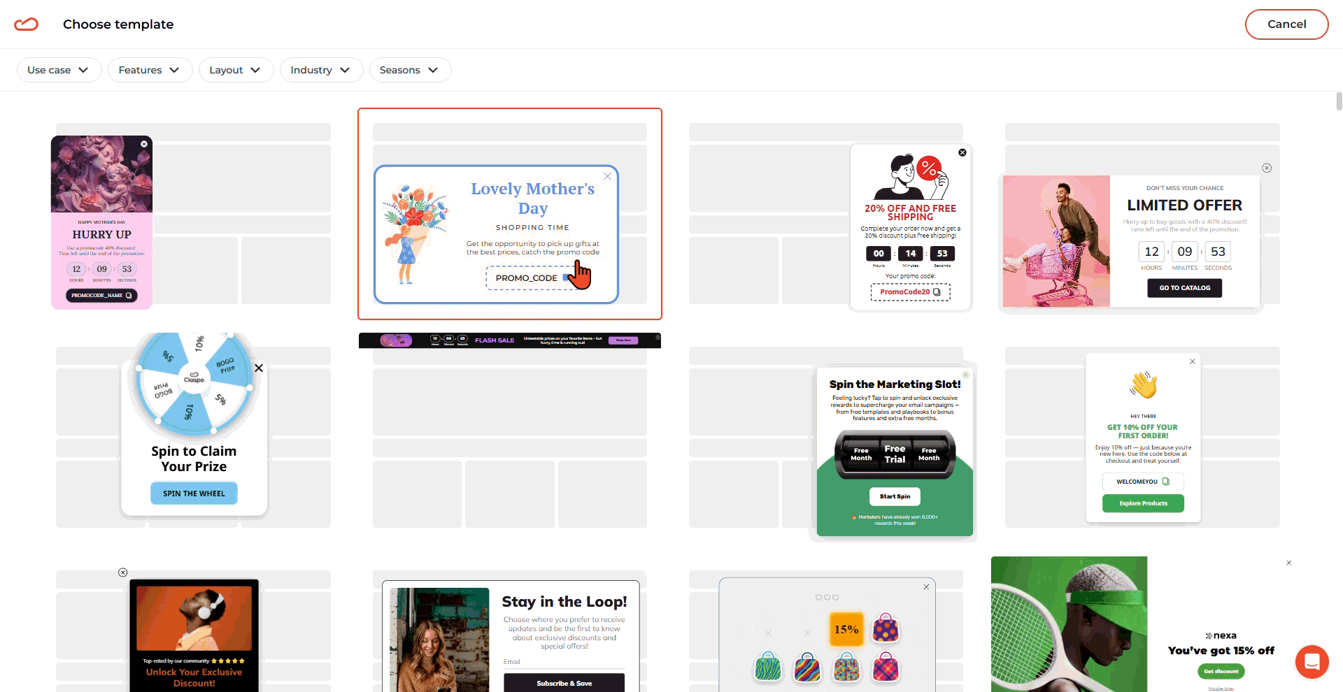
Need volume? Start with a minimalist lead capture form.
Targeting mobile? Select a floating box layout to stay compliant with Google's mobile guidelines.
Want zero-party data? Pick a multi-step or quiz-based template.
Step 2. Customize the template
92% of top-tier popups look native to the site. Use the drag-and-drop editor to ensure the popup feels like a part of your brand.
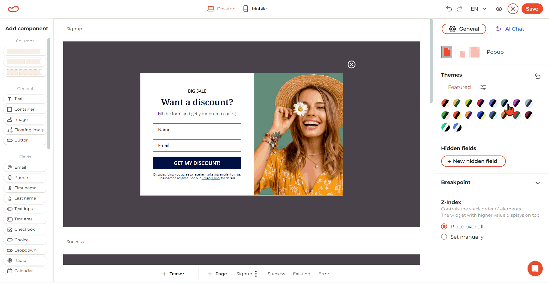
Use Claspo Themes to instantly match the background, text, and accent colors to your website.
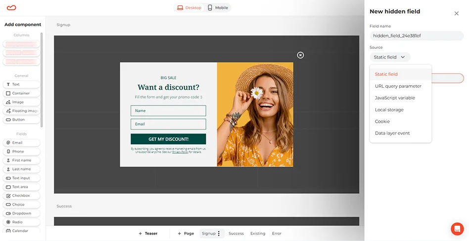
Your visitor might see only one or two fields, but your CRM can receive much more. Hidden fields let you track where a lead came from without asking them. In the editor, you can add a new hidden field and define its behavior based on several data sources.
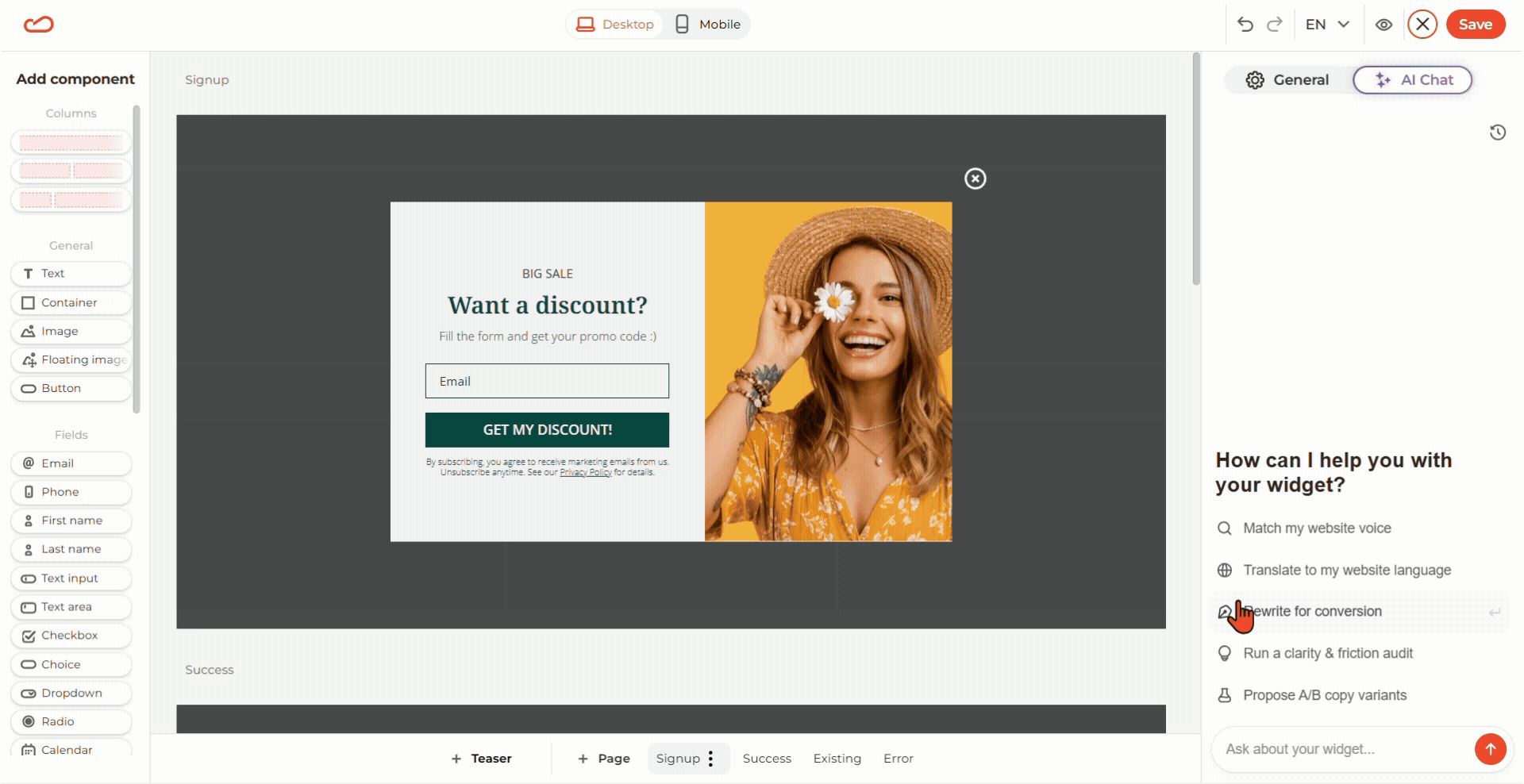
If you aren't a copywriter, use the Claspo AI agent. It scans your domain to match your brand voice and can rewrite headlines, buttons, and placeholders for maximum conversion.
Want to see how others are doing it?
Check out these website popup examples across different industries.
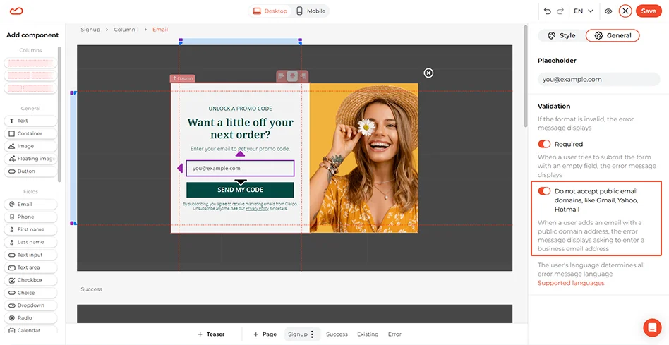
For B2B or SaaS, enable the “Do not accept public email domains” toggle to filter out generic Gmail/Yahoo addresses and capture high-quality business leads.
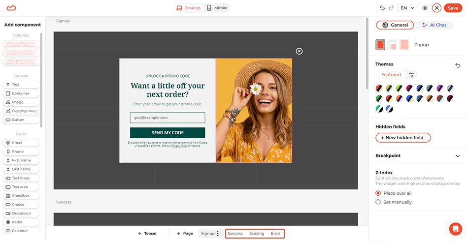
Don’t forget about the subscription screens — Success, Existing, and Error. Visitors will see these depending on what they do. To edit them, just scroll down or pick them from the bottom panel.
Step 3. Set display rules
The magic behind welcome popups is in the triggers. Don’t let your popup jump scare your website visitors the moment they land on the site. Use the best practice tips we’ve covered above to fit your use case.
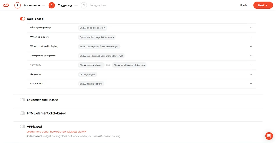
Apart from that, there are three universal rules:
Time-based trigger: 15–20s delay for broad lead acquisition
Scroll trigger: 50% depth to target engaged visitors
UTM trigger: 10s delay for paid social traffic to align with ad intent
Step 4. Sync your marketing stack
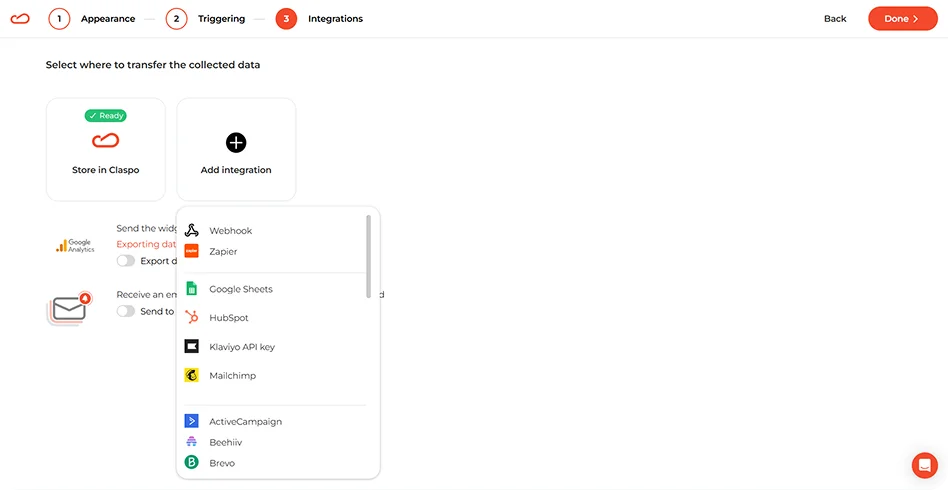
A welcome popup is only the beginning of the customer journey. Sync Claspo with your CRM to ensure every new lead is automatically added to the welcome flow.
Step 5. Publish and A/B test
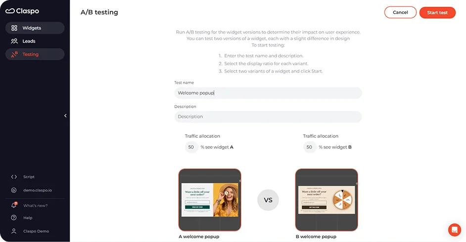
The building work is done, but the optimization begins at launch. Use Claspo’s built-in A/B testing to pit different incentives (e.g., "$10 off" vs. "15% off") or different layouts against each other. Ultimately, the only correct opinion is the one backed by your users’ clicks.
Summing up
Claspo provides the CRO-ready templates and smart behavioral triggers you need to create a high-conversion engine. Whether you’re launching a simple discount or a complex discovery quiz, you can build, test, and scale your welcome strategy in minutes, no coding required.
Don't let your brand's first impression be a missed opportunity. Start your free trial with Claspo today and let the results speak for themselves.
Start converting more visitors today. Get started in minutes and see results right after.


