Best Button Color For Conversion


Summarize
Conversions on your website depend on various factors, including your offers, your CTAs' messaging, and even button colors. Some companies see up to a 30% conversion increase thanks to changing the color of their CTA buttons. So, this topic definitely warrants further attention. And we (with the help of our designers) are here to guide you through the sometimes difficult choices that make your design effective. Keep reading to learn step-by-step about best practices for CTA button colors!
Why are Call-To-Action Button Colors Important?

Numerous neuromarketing studies show that color can shape people's perceptions, attitudes and emotional reactions. More importantly, it can shape customer behavior. Colors can influence how customers feel about a brand or product and, consequently, their decision-making process.
Studies claim that the initial assessment of products takes place in around 90 seconds – and 65-90% of that assessment comes down to colors. 85% of people admit color alone might be a primary reason for purchasing a product – which increases to 90% for impulse buys. So, the right choice of color can lead to increased engagement, higher conversion rates, and stronger brand loyalty.
Phew. We hope that we have proved to you that color matters. So now it is time to help you choose the right one for your CTA button.
What Color to Choose For CTA Buttons?
The best call-to-action button color can only be identified through A/B testing. Still, several factors and strategies can be relied on when using the colors initially.
Color associations
In Western cultures, different colors are often associated with specific meanings and emotions. So, the best colors for CTA buttons for your product will depend on the correlation between the emotions you want to evoke and the psychological effects the colors tend to have.
For instance, red is known to evoke feelings of urgency and excitement, making it a popular choice for sale and discount CTAs. It also makes people more hungry – that's why most fast-food chains use it. On the other hand, red is also associated with aggression, dominance and prohibition (think of the traffic lights). You should keep this duality in mind.
In contrast, blue is often associated with trust and reliability, which is why many financial institutions and tech companies favor it.

Green is linked to youthfulness, growth and tranquility, making it an excellent choice for actions related to progress or environmental themes. However, it also speaks about money, so you can rely on this meaning when necessary.

Yellow can grab attention and create a sense of optimism, but it should be used sparingly to avoid overwhelming the user.
Lastly, black can convey luxury and sophistication, which might be suitable for high-end products. On the other hand, it's also the color of mourning in Western culture, so it requires a careful approach.
Brand colors
Consistent branding can boost revenues by up to 23%. So, the easiest way to choose good button colors is to follow your branding. This approach helps maintain brand consistency and reinforce brand identity. When your CTA buttons match your brand’s color scheme, they create a cohesive look that strengthens your brand recognition.
However, ensure that the button color stands out enough to attract attention. For instance, if your brand colors are mostly neutral, use a brighter shade within your brand palette for the CTA button to make it more noticeable.
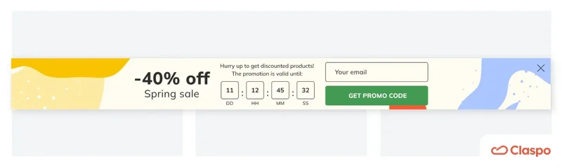
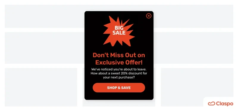
At Claspo, this is the approach we took for our website. As you can see, the color of the buttons is the same as the logo and is also used to emphasize other elements.

Contrasting colors
The contrast between your CTA button and the background is crucial for visibility. Neuromarketing principles indicate that a high-contrast color scheme can catch the viewer's eye more effectively, increasing the likelihood of a click. This principle is grounded in the visual processing areas of the brain, which are more activated by contrasting colors. This doesn't necessarily mean using clashing colors but rather choosing shades that make the button clearly distinguishable from other elements on the page.
Moreover, contrast is important for accessibility, as it impacts how easily users with visual impairments can see and interact with your buttons. Adhering to the Web Content Accessibility Guidelines (WCAG) ensures that your CTA buttons meet the required contrast ratio, making your site more inclusive and user-friendly.
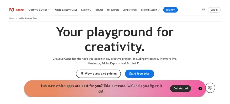
The CTA buttons on Adobe's website are blue. When you have a white background, pretty much any button can be seen as contrasting. But for their pop-up, they use black. If they kept the button blue, it would have clashed with the background color. In such cases, the best button colors for websites and pop-ups might differ. Make sure, however, that the buttons have something else in common (with Adobe, it is shapes and fonts.)
At Claspo, we have many templates with contrasting colors. Here, for example, the green button stands out prominently against the mostly yellowish background.
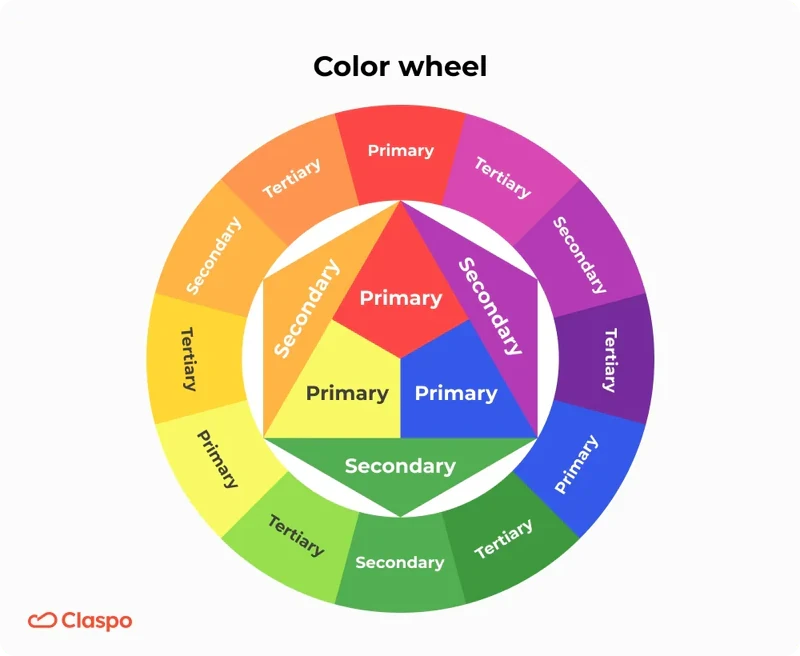
If your website is more colorful and you want to pick a contrasting CTA button color, use the color wheel to guide you. The logic is quite simple: colors on the opposite sides are the most contrasting. So we get the classical red and green pair – but also yellow and lilac, blue and orange, and so on.
Audience's favorites
Different audiences might respond better to different button colors. Consider the preferences and expectations of your target demographic. For example:
Younger audiences prefer more vibrant and playful colors. They are associated with lightheartedness, energy, and openness to new experiences. Moreover, younger audiences are used to spending a lot of time online, so the colors that pop, even neon ones, are more likely to catch their eye and stop scrolling.
In contrast, an older demographic might appreciate more subdued and classic tones. Colors that evoke nostalgia, like earthly muted colors, might be perceived in a positive way. Muted greens and grays that offer a sense of security will also work better with them. Of course, they value clarity and legibility more, so remember about the contrast.
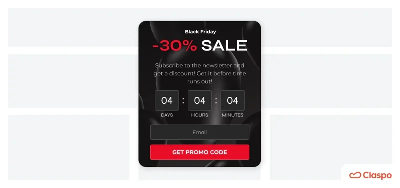
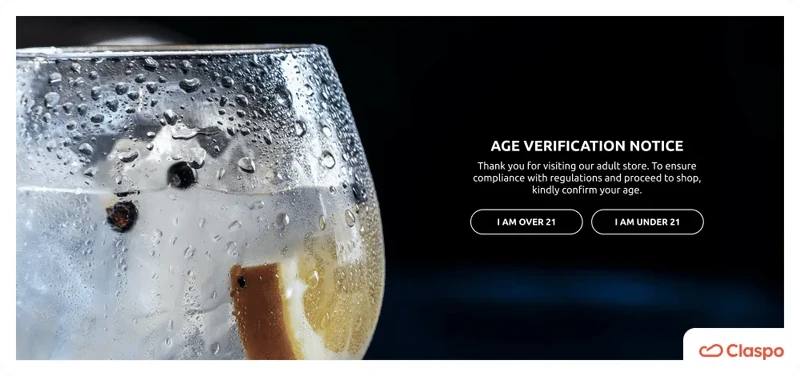
As we've already mentioned, darker colors like black and deep red are linked with maturity, wisdom and sophistication. They are more favored by older people who value elegance and luxury. So, the brands that try to emphasize their high status often use black-and-white schemes on their websites. Dior, for example, has a white background with black and white CTA buttons:
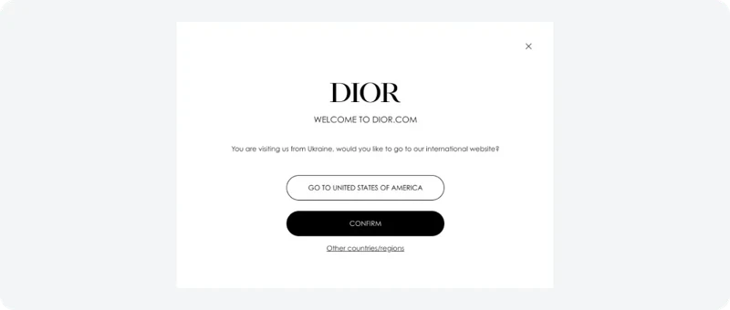
It helps convey a sense of luxury, comfort and stability to the target audience. Understanding your audience's preferences can guide you in choosing a color that resonates well with them.
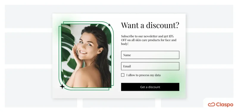
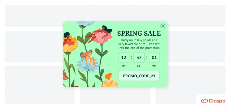
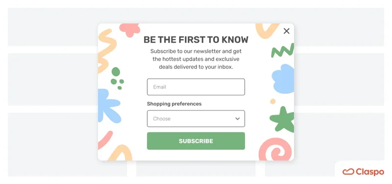
This template from Claspo’s library, for example, is meant to appeal to younger women. So, we use bright colors in general and green specifically on the background and CTA to emphasize this youthful exuberance.
Red vs green
Red and green are two of the best button colors for websites due to their strong psychological impacts and visibility. Studies have shown that red might convert better because it creates a sense of urgency and excitement, making it ideal for actions that require immediate attention, like the "Buy Now" or "Limited Time Offer" buttons. On the other hand, green is associated with growth, safety, and positivity, making it suitable for actions such as "Sign Up" or "Learn More." However, the effectiveness of red or green depends heavily on your product and the overall vibe of your website.
One crucial consideration is to avoid using red and green together. These colors are indistinguishable for individuals with color blindness, so using more contrasting colors is essential for accessibility. Even for people who distinguish them, this combination can lead to decision paralysis and make it difficult for users to choose. When you want to prompt users to take one action over another, you can make one button red or green and the other of background or neutral color.

If you want to capitalize on red's powerful potential and avoid associations with prohibiting or warning signs, you can opt for orange or colder/pinker shades of red.
Clear background
When you create more than one button (for example, "Sign up" as your primary CTA and "Learn more" or "Dismiss" as a secondary), it might be helpful to make the background of the secondary ones the color of the website's background instead of a separate color.

When there's a distinction between the actions you'd like your users to take, this helps downplay the secondary buttons a bit.
On the other hand, if that works with your brand messaging and you want to convey a sense of calmness and sophistication, you can stick with clear-colored buttons in general (like we saw with Dior above). Just make sure that the text is contrasting and visible.
Remember, there's no one color to rule them all. The proven way to find the best colors for call-to-action buttons is through A/B testing. Numerous case studies have shown how optimizing button colors through A/B testing can significantly improve conversion rates and user engagement. For example, one company identified that the red button outperformed the green button by 21%, showcasing the impact of color on user behavior. However, results can vary based on context, making testing different colors within your unique environment essential.
To assist you in this process, we offer a comprehensive A/B testing template designed by our team of marketing experts at Claspo. Since Claspo always emphasizes the importance of A/B testing and regularly runs our own experiments, our template includes all the key stages of this process. It helps you put any hypothesis into practice and gather meaningful business insights to optimize your results. The best part is that this template applies to any A/B tests, not just button colors, and suits businesses from various industries.
How to Create a Best CTA Button
We talked with Claspo's designers about creating an efficient button. They work on our website and the templates we offer our clients, so they are highly skilled at using colors for commerce. They were kind enough to help us create this pro guide for you.
Step-by-step
#1. Decide on the button form and size
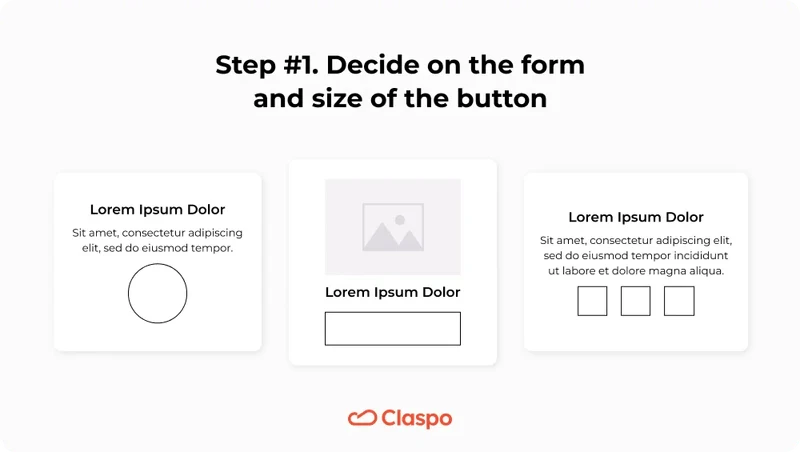
The form of the button can be square, round, or rectangular.
The size of the button depends on the size of the form itself.
The size depends on whether you're creating a form for desktop (32x32 points and more for any devices with cursors) or mobile (at least 44x44 points, with a touch target of at least 38px by 38px). In any case, the size should allow the user to click on it with a cursor (on desktop) and tap with a finger (on mobile).
#2. Adjust the style and the colors
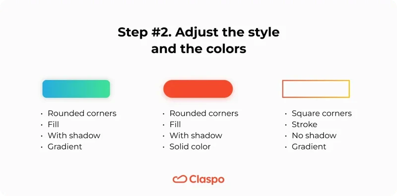
Depending on your product's branding, you decide on the following:
Rounded or square corners
Fill and/or stroke
Drop shadow
Gradient.
It's also the stage where you actually choose the button's color. Keep in mind the brand colors, the colors of the website, and the specifics of color psychology we've mentioned.
#3. Work with the style of text
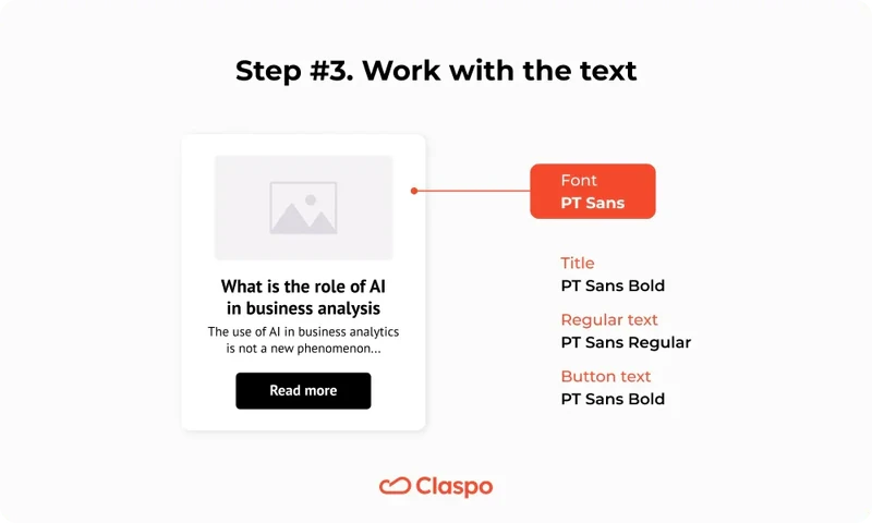
The font(s) also should correspond to the branding.
It's best to use one typeface for the whole form. So, make sure your button font correlates with the others you use on your website and your form.
For the whole form, don't use too many font sizes. You can make the header larger and use the same font size for everything else.
A font smaller than 14px is hard to read.
Don't use whole sentences; 1-3 words are more than enough.
The text should be either a brand color or a color contrasting to the button's color. Shades of black and white are always a safe option.
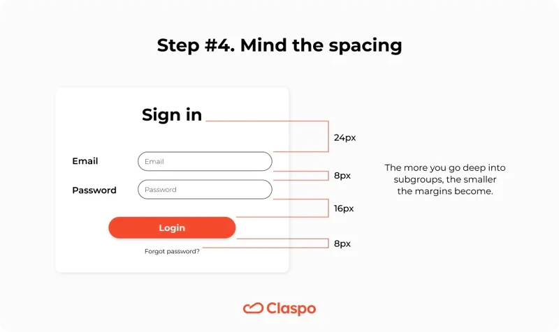
#4. Mind the spacing
The space between the text and the button's edge is called padding. Generally, horizontal padding is around 2 to 3 times larger than vertical.
The space between the button and the elements around it is called the margin. The rule of thumb is the following: if the margin between input fields is x (for example, 6 px), the margin between the input fields to the button will be 2x (12 px), and the margin between all the content and the edges of the will be 3-4x (18-24 px).
Tips and best practices
Keep in mind the following:
Remember about the visual hierarchy
The placement of elements in your form should be the following: heading, description, input field(s), then button. This way, the users learn all the info they need to make a decision by the time their eyes land on the button. If you place the button, for example, at the very top, you're creating unnecessary friction as users have to return to it.
The CTA button should be visible and accessible
The call to action button is meant to be seen. Don't make it too small: according to WCAG, it should be at least 44px wide, and according to Google – at least 48px. Also, don't put it in a corner where no one will see it. Make it easy to click both on desktop and mobile.
Be consistent with your color choices
If you decide to use purple for all your “Buy” buttons on your website, make sure to use this color only for these buttons. Don't use this color for anything else that might confuse people, like the “Subscription” button or a “Contact” button.
Remember typical color associations
It is better to use colors that people worldwide use for specific actions. For example, the “Cancel” or “Deny” buttons are often red. That's why this color can be heavily associated with denying and canceling. So, don't use the same shade of red for the “Buy” or “Contact” buttons that you'll see on "Cancel."
Create your high-converting CTA button with Claspo
When you choose a template or start from scratch in Claspo's intuitive drag-and-drop editor, it's very easy to customize the button any way you want. So you can easily apply all the advice you've read. The size of the button and its relation to the text, its placement, text style and color, stroke, shadows, rounded corners, and even hover effects can all be done without coding or design knowledge.
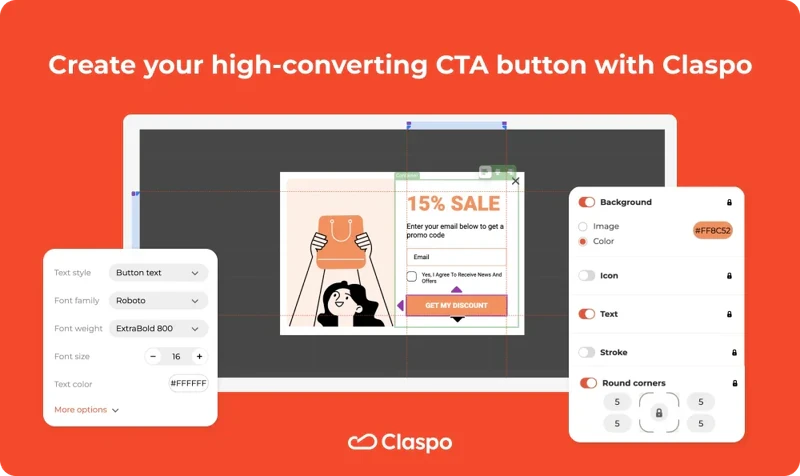
Moreover, with Claspo's capabilities, you can easily conduct A/B testing for any design element, including button colors. You don't need any extra tools to determine whether this or that specific shade converts better on your website. Claspo's a time- and cost-efficient tool to do just that. Use our templates, conduct A/B testing of button colors with our pop-ups and find out what shows the highest conversions for your business. When you get the first meaningful results regarding the best CTA color, you can apply changes to other buttons on your website.


