25+ Email Newsletter Signup Examples & Best Practices


Summarize
Newsletter signup popups asking for your email are everywhere today, and for a good reason — they’re designed to capture leads and send them straight to your ESP, where they can be nurtured through targeted email campaigns. These popups consistently rank among the top tools for improving email marketing efficiency.
In this post, we’ll show you how to optimize your newsletter form template for better results. You’ll find real-life email subscription examples for inspiration and learn how to seamlessly integrate this lead-generation tool into your website funnel. Ready to level up your newsletter marketing strategy? Let’s dive in 😉
Why matter
Newsletter signup is the first step a user voluntarily takes to engage with your business. They provide you with a key to building future communication — their email. And it is up to you to reap the benefits.
To make that first step even more effective, it’s worth examining proven email pop‑up examples that demonstrate how compelling copy, timing, and placement can significantly boost engagement. These real-world cases highlight best practices that you can adapt to your own site's design and audience behavior.
So, what are the benefits? What pain points do they help you resolve?
Customer acquisition
Email marketing is still one of the most cost-effective strategies for landing clients.
According to the 2026 statistics (source: EmailChef), 89% of marketers used it as a primary channel. This strategy costs little to set up and maintain compared to others, returns $36 for every $1 spent (now that’s ROI!), and allows space for scalability and creativity.
Forms that facilitate the best newsletter sign up (examples further down the page) ensure you're maximizing this channel by growing your list organically without the need for expensive advertising campaigns.
Another important point is that retargeting based on captured data improves customer retention and repeat purchase rates by 5 times as opposed to new acquisition efforts, our research found.
Customer retention and lifetime value (LTV)
For several reasons, like comfortable personalization and the ability to nurture and grow relationships over time, email subscribers have a higher LTV than other traction channels.
They are also more likely to purchase repeatedly, which might be owing to correct segmentation and targeting and their growing brand loyalty.
Thus, a “subscribe to our newsletter” form with thoughtful design ensures you bring in the most qualified and engaged leads. To boost retention and engagement even further, many successful brands have adopted a multi‑step form strategy. By breaking the signup into bite‑sized steps—like first asking for the email, then optional preferences—you guide users through a smoother experience that feels less overwhelming and builds momentum toward completion.
Effective newsletter signup best practices with examples
Spoiler alert: no single technique from email newsletter sign-up best practices is guaranteed to improve conversions for every company, as shown by the countless “sign up for our newsletter” forms you’ll find online.
Here, we have collected 25 of our favorites. As you explore the real-life newsletter subscription examples below, you'll see how varied subscription forms can be in appearance, message, and display behavior. To know what email sign up form best practices work for your business, always test and experiment.
However, in our experience, there are universally applicable newsletter signup best practices that every marketer should learn and follow to save time and get better results.
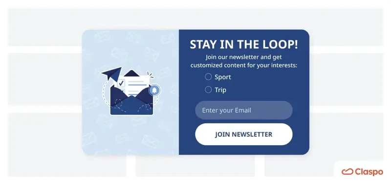
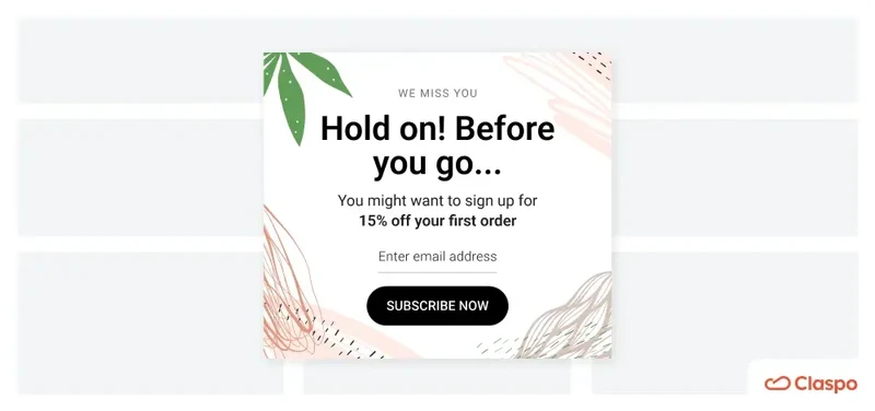
‘Join our mailing list’ is not enough — think through your message
We have already established that almost every website asks for an email address. Yet, only 74% of people subscribe to a maximum of 10 newsletters, and only 19% will let 11 or more brands send them emails.
How do you make it onto that shortlist? What sign-up messages should you add to your draft sheet?
Start by clearly explaining to site visitors why they should join your sign up email list, emphasizing the value it will provide to them. Let’s, look at the Cowboy’s email form example:
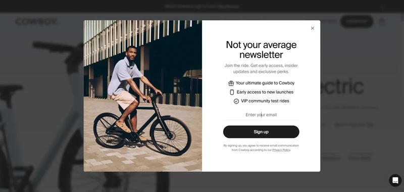
“Not your average newsletter”. Boom. First line, and it’s already playing offense. This isn't your grandma's dusty email digest. The phrase sets the tone: we're cool, we're different, and you're going to want in. The messaging invites you into an experience, not just a mailing list. It creates a sense of belonging and exclusivity. The value is crystal clear — a helpful guide, first dibs on new stuff, and real-world perks like VIP test rides. The subscribe message example is not fluff, it’s actionable.
So, focus on your message's wording. As detailed in this article on conversion copywriting, there are many language-based techniques to improve metrics. Let’s conduct a tiny workshop, shall we?
It turns out there are many ways to transform the usual “subscribe to our mailing list” into more value-oriented messages that increase subscriptions. We also explain why each option works better. Here are three of them:
1. “Unlock exclusive insights and stay ahead of the curve — subscribe to our email newsletter today!”
Why it works:
Exclusive insights: The word “exclusive” creates a sense of privilege and uniqueness, making subscribers feel they are getting something special that others aren't.
Stay ahead: The phrase “stay ahead of the curve” appeals to the desire for competitive advantage and being well-informed.
2. “Be the first to know about the latest trends and updates — sign up for newsletter email now!”
Why it works:
First to know: This phrase appeals to the human desire for novelty and being the first to receive information, which can create a sense of urgency and importance.
Latest trends and updates: Promises timely and relevant information, which is a strong motivator for many subscribers.
3. “Get insider access to the limited deals — subscribe today!”
Why it works:
Insider access: Creates a sense of exclusivity, making subscribers feel they are getting special access that non-subscribers don’t.
Limited deals: While not a lead magnet in the traditional sense, it implies that new subscribers will get access to promotions and discounts available on a first-come, first-served basis, adding significant value.
The message's essence remains the same in all three cases, but the wording makes it more appealing and compelling. At Claspo, we’ve seen the importance of well-thought messages firsthand. We A/B tested several email sign up form examples, comparing a regular message with a value-oriented one, resulting in a 300% increase in conversions! The winning best version is still in use, delivering excellent results.
You'll definitely subscribe to the popup builder Claspo newsletter now to avoid missing out on exclusive offers and insightful data, right?
Consider using clear value proposition
There is a difference between the wording of your “join our email list” and the clear value proposition (CVP) it puts forward. Think of the former as the packaging and the latter — the gift inside. While at it, a clear value proposition is also a benefit that specifies the message.
“We realized our were hitting a wall; people were either blind to them or unsubscribing shortly after signing up. The root issue was that it felt like we were asking before offering. So we reversed that. We started focusing on micro-experiences, like letting users build a quick landing page mockup before inviting them to get pro templates by email. This gave value first, and conversions followed naturally.
We tested personalization heavily. Instead of one-size-fits-all pop-ups, we used page context and user behavior to show different copies. Someone editing a portfolio template saw: “Want more creative templates like this? Join our creator list.” Conversion rates jumped by 29%.
Incentives were tested A/B/C style, like discounts vs. exclusive content vs. early access. For us, exclusive content won. Our community valued insider tips and sneak peeks more than coupons. AI came in handy when analyzing this, especially identifying which segments stuck around post-signup. It helped us tailor our follow-up flows so subscribers didn’t just opt in, they actually stayed.
The biggest learning for us was that email growth isn’t about being louder, it’s about being more relevant at the right moment.”
Monica (Radu) Panait
CMO, CRO Expert, Brizy.io
The three whales of a CVP are questions you need to answer:
why a customer needs to choose your product over your competitors;
how it solves their problems or meets their needs;
what makes it stand out from the alternatives.
Let’s look at the real-life sign up for newsletter popup and analyze its message to uncover these “3 whales” of CVP ideas.
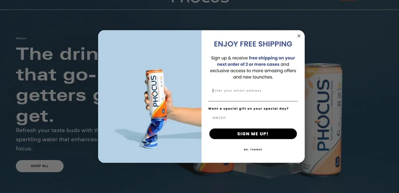
Right out of the gate, Phocus hits you with a very practical incentive: “free shipping on your next order of 2 or more cases”. Translation: “Hey, we’ll save you real money immediately”. While competitors might be flexing lifestyle or brand image, Phocus speaks to your wallet — and who doesn’t love a bit of financial love?
Their copy tells you that signing up isn’t just about newsletters — you’re unlocking exclusive offers and staying ahead of new product drops. For customers who like a little VIP treatment (and who secretly fear missing out on cool new flavors), this hits a sweet spot. Bonus points for the birthday gift field — it taps into the universal human desire for a little special attention on your big day. Problem solved: you want better deals, early access, and some extra love — they deliver. what is an abandoned signup incentives with urgency
Unlike many generic “Sign up newsletter email for 10% off” offers, this form copy stacks multiple benefits without overwhelming you:
Free shipping = immediate value.
Exclusive offers = ongoing value.
Special birthday perks = personalized value.
Competitors often stop at one basic incentive, but Phocus layers their offer to feel more thoughtful, more fun, and frankly, more human.
The specifics, or details, do not always channel the value directly. Let’s take a look at more examples:
1. “Do you want 10% off? Subscribe to our newsletter and get a personal discount!”
Not only do you get a monetary value of paying 10% less for any product on the website, but it is also a personal discount, implying that it could be different (even bigger!) for just you.
This type of CVP is very straightforward, almost tangible, and immediate.
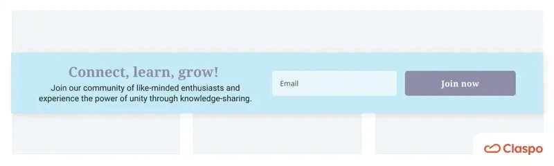
2. “Connect, Learn, Grow! Join our community of like-minded enthusiasts and experience the power of unity through knowledge sharing!”
The value of this proposition lies in the promise of community. As S. Junger highlights in his book “Tribe. On Homecoming and Belonging”, we are built to seek community and share our lives with others.
However, today, people are often alienated and unable to find a group where they belong. This subscription form sample is offering an almost effortless way to become part of something bigger — isn’t that lucrative?
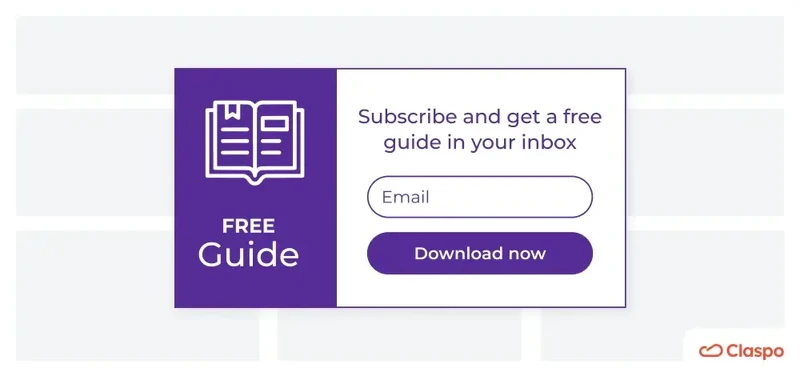
3. “Free Guide: Top Design Tools for Your Business — Subscribe to our newsletter to download a free guide”
First and foremost, the guide is free. You don’t need to pay anything to get solid research that took time to conduct, analyze, and present. In this scenario, the newsletter might be a welcome bonus on top of something already beneficial.
Here, you can find more CVP tips and ideas for your email sign-up forms.
Keep customer journey stage in mind
At this point, we understand that newsletter registration becomes desirable when a customer sees a clear value proposition channeled through a clear messaging. However, users’ expectations and needs change throughout the customer journey. Even a generous discount in exchange for a subscription may not be effective if it doesn’t meet your audience's current needs. Therefore, adapting your best to match the customer journey stage is crucial. For instance, a subscription form shown during the consideration stage can highlight product comparisons or exclusive content, helping to convert warm leads into engaged subscribers. Matching the type of subscription form with the user's intent makes the message more relevant and conversion-focused. newsletter exit triggers on mobile exit-intent popup tools for ecommerce
Firstly, this approach is an effective form of personalization that even small businesses and websites with low traffic can employ. Besides, our data shows that aligning your content with the journey stage can boost conversions by 72%. Finally, this strategy is also easily implemented with Claspo, which allows you to place “signup to newsletter” popups and forms on the right pages and target them to selected audience segments, unlike many ESPs.
So, how can we identify the characteristics and needs of people at different stages? I discuss this in detail in a separate article. It is a must-read for anyone looking to correctly integrate popups into the customer journey and strengthen their lead generation strategy. Here is a brief summary.
Awareness stage (with the best newsletter signup examples)
Characteristics of customers: they feel a certain need but don’t fully understand it yet. They seek problem-specific content such as “Top reasons for...”, “How to deal with...”, and “What is...”
How to generate leads: provide insights into their issues without immediately proposing your product. Offer thematic guides, checklists, research, expert interviews, or similar content directly to their inboxes.
Let’s take a look at how Lovevery absolutely nails the awareness stage with their newsletter inscription pop-up — and does it without shouting “BUY NOW” at stressed parents.
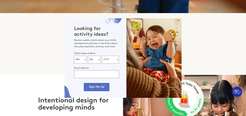
At this point, the customer isn’t quite ready to shop yet. They’re still figuring things out. They know they want to help their child develop, but they’re not 100% sure how or what they need. Lovevery’s popup steps in like a friendly guide, saying: “Hey, we’ve got some ideas — no pressure”. The headline talks like a human — “Looking for activity ideas?” Simple, friendly, and exactly what’s going through the parent’s mind.
The offer focuses on helping, not selling. Weekly emails with tips about child development, new play ideas, and even a few promos thrown in? Perfect. For parents in the awareness stage, this is gold — they get useful info without feeling like they’re being funneled into a sales trap.
Smart personalization. Asking for the child’s date of birth allows Lovevery to send age-appropriate advice. That way, parents aren’t getting “how to entertain your 3-year-old” when their baby is still learning to roll over. It feels personal, but not invasive — just helpful.
Notice there’s no hard pitch for a subscription box here. Instead, Lovevery quietly builds trust. Once parents feel supported and informed, they’ll naturally be more open to exploring products down the road. It's a classic “serve first, sell later” strategy.
Example of using Claspo: place a website newsletter subscription with CVPs on relevant blog article pages.
Consideration stage: newsletter form ideas and examples
Characteristics of customers: They have gathered enough information about the problem and are comparing available solutions, visiting your site's feature lists, competitor sites, review platforms, etc.
How to generate leads: Throw in an offer like “join our newsletter” with a weekly frequency in exchange for a free trial, successful case studies, or product comparisons to show why your brand is the superior choice.
Here’s one of the “subscribe to our mailing list” examples — from Wyzowl.
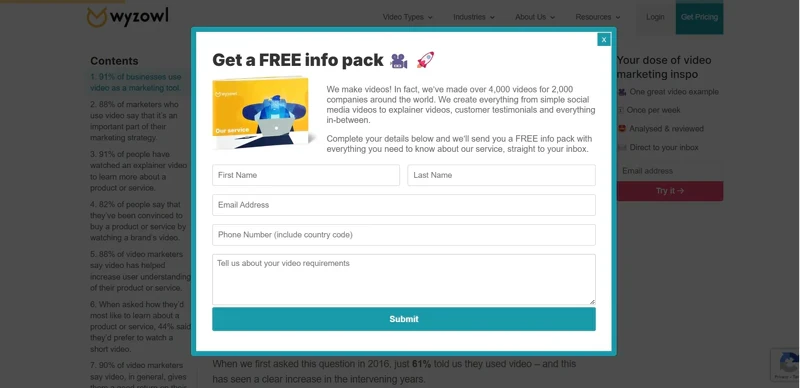
Instead of simply saying “Sign up to our weekly newsletter”, the company promises a free info pack. This immediately signals: “We’ll give you everything you need to know to make a smart decision”. In the consideration stage, that’s exactly what people want — helpful, concrete info they can actually use to compare options. The copy casually mentions: “We’ve made over 4,000 videos for 2,000 companies”. Without shouting, it drops a credibility bomb. That number helps reduce hesitation and positions them as experts who clearly know what they’re doing. Wyzowl doesn’t push for an instant sale. Instead, they collect just enough info to keep the conversation going — name, email, phone, and project details. This also allows them to personalize future offers and follow-ups, making the lead feel seen See our roundup of website popups.
Example of using Claspo: set up email popups to appear to visitors who have spent significant time on feature list pages or use UTM targeting to display popups to those arriving via active website links from review platforms.
Decision stage: subscription form sample explained
Characteristics of customers: they frequently return to your site, use keywords containing your brand name in search engines, browse pricing pages, and may have interacted with your support team.
How to generate leads: recognize that these individuals are close to buying and simplify their decision-making process. Offer discounts, promo codes, or bonuses to add value to their potential purchase, as Pathology did:
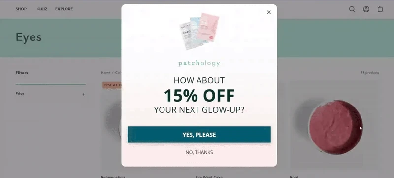
We see a “sign up for our email list” pop-up with a straight-up offer and two buttons. No complicated pitches, no long explanations. Just a clear, instant reward. You’ll notice they don’t ask for the email right away. Instead, the first button says: “yes, please”. Why? Because it creates a micro-commitment:
Clicking “Yes” feels easy. The visitor says “I want the discount” without having to give up anything yet.
Once they’ve clicked, they’ve already mentally committed to getting that discount — so entering their email feels like a natural next step instead of a big ask.
This little “yes before email” trick helps reduce form abandonment and increases conversion. It’s a gentle way of getting people to say yes twice — once in their head, and once on your “register for our newsletter” form.
There’s no extra info here, no product details, no lengthy copy. That’s intentional. At the decision stage, they don’t need more convincing — they just need a final reason to convert. This popup keeps them laser-focused on claiming their reward.
Example of using Claspo: show a popup only to returning visitors, those who spend a long time on the website having gone through many pages, or those who came to the site from an ad that appeared after entering your brand keywords in search engines.
Focus on the design of your newsletter subscription form
Subscription form design can influence business outcomes. In fact, 94% of first impressions of a website are based on its overall design and the look of its separate elements. Therefore, the appearance of your newsletter signup form can significantly impact the decision to subscribe. On our blog, you can read more about successful popup design in general and CTA buttons as crucial elements in particular. Here are some fast facts:
using large fonts for discounts enhances perceived value;
changing CTA button colors can lift conversions by 30%;
high-contrast color schemes attract attention and increase clicks.
While conversion-boosting newsletter popup design may seem complex, there is some good news. Claspo has a library of 1000+ pre-designed templates incorporating visual techniques to enhance results. All our signup form templates are easily customizable to match your branding and needs in less than 5 minutes without any design skills.
Choosing the right subscription template can significantly influence user engagement, especially when it aligns with your website’s aesthetic and tone. A thoughtfully selected subscription template not only enhances visual appeal but also reinforces your message and encourages action.
In addition, with Claspo's A/B testing feature, you can validate newsletter signup form design hypotheses and fine-tune your strategy based on actual results, not just theory.
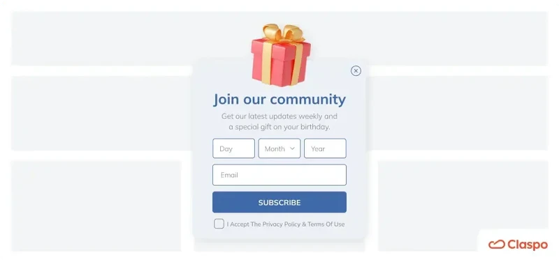
Don’t overuse input fields in newsletter registration
This approach aligns with both legal regulations and business objectives. According to the GDPR, you are required to collect only the data necessary for the intended purpose.
Additionally, the more fields your newsletter signup page has, the less likely users are to complete it, leading to a decrease in conversions with each additional field. However, it might not be entirely accurate for the health and fitness industry and horoscope niche, among others, where detailed forms show the product's immediate value through peak personalization.
So, what is the optimal number of fields for e-commerce? There is no universal answer. Studies mentioned above suggest keeping the number under five; others say that forms with three fields show the highest conversion rate, and many successful “sign up for newsletter” examples below have one to three fields, so they don’t need to be detailed and graphic. Therefore, start with the bare minimum and then use A/B testing to determine which number of fields show the highest conversion rate on your website.
Besides, Claspo allows you to make some fields required and others optional. For example, you definitely need an email field and possibly a name field for basic personalization of future email campaigns. Meanwhile, information such as gender, age, and date of birth can be optional, allowing users to provide it at their discretion.
Focus on user experience and behavior
Display rules significantly impact user experience, determining whether your newsletter form converts visitors into leads or annoys them. Correctly set rules also provide a personalized experience based on user behavior, showing your offer at the right moment and in the proper context, enhancing its effectiveness. One effective way to do this is by using a pop-up form that responds to real-time visitor actions, such as scroll depth or time spent on a page. A well-timed mobile popup display rules not only draws attention but also improves lead capture without disrupting the browsing flow.
The problem is that many either don't know how to set up display rules correctly or can't do so due to the limited capabilities of the platform they use for creating newsletter subscription forms. This leads to the stereotype that popups are intrusive. But with Claspo, you have all the necessary functionality to create the best email sign up forms and countdown timer popups and full control over their behavior. Let's explore a few possibilities.
User experience
Regardless of the text used, some of the most irritating factors of popups that show up on website pages include:
seemingly popping up everywhere;
appearing as soon as the customer enters the site;
the same popups show up every time a user opens the website.
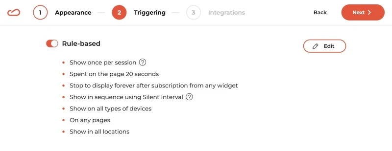
Our predefined display rules address all three pain points:
show a “sign up for our mailing list” popup 20 seconds after entering the page;
stop showing popups to those who have already joined the mailing list;
implement a 3-minute interval between displays of popups with the same triggers (if any).
You can easily customize these display rules to suit your needs and analytical metrics. However, our preset options offer an effective start, ensuring user satisfaction and avoiding bounce rate growth.
Personalization based on user behavior
With Claspo, you can place your newsletter subscription form in the proper context in several ways:
Show on selected pages: if you provide a discount on a product/service as a CVP, place your email subscription sign up form on the product/service page or a blog article related to the problem it solves.
Scroll trigger: when a visitor scrolls a certain percentage, like 70%, through an article about a skincare problem, a popup offering a guide on the topic in exchange for a subscription will appear.
Click-on trigger: when a visitor clicks on a specific element, like a "Learn more about the product" button, a widget will display offering a free demo or product samples in exchange for emails.
Setup our flexible display rules to create truly human-focused popups that integrate seamlessly into the customer journey. Be sure to run A/B testing to clarify what triggers most effectively capture those valuable leads.
Make your “subscribe to our newsletter” form GDPR-compliant
While striving for conversions, it is crucial to stick to the legal requirements of data collection outlined in the GDPR. You must inform your potential subscribers about why you are collecting their data and how it will be stored. In turn, they must give explicit consent to data processing. Therefore, include a link to your privacy policy or terms of use and a checkbox for them to tick.
Claspo simplifies this process. Our editor features a special component called “Data Processing and Terms of Use,” which you can easily drag and drop into your “sign up to our mailing list” banner template. This component includes default notification text, a checkbox for consent, and a field to link to your privacy policy or terms of use (as shown in the template below). Just customize the text and insert the relevant link. With ISO/IEC 27001:2013 certification, Claspo ensures your subscribers' data is safe and secure.
Run A/B testing regularly
A/B testing is worth highlighting as a powerful technique on its own. Why? Because all the statistics and research in the world are just theories — they don't guarantee that any particular solution will work for your specific case.
When you create your first version of the "subscribe to receive our newsletter" form, be ready for a series of experiments to help you optimize your results and discover your ideal conversion formula. Starting with a proven email signup template gives you a strong foundation for testing variations in copy, design, and triggers. It simplifies your workflow while letting you focus on improving performance based on actual user behavior. Thankfully, Claspo has a built-in A/B testing option, making it easy to validate any hypothesis.
25 great newsletter signup examples and why they work
Let's move from theory to practice and dive into real-world newsletter sign up form examples from various industries. We'll highlight exactly what we love about each example to make it more informative. We'll also show you how easy it is to implement your favorite ideas with Claspo for maximum inspiration and benefit.
1. SportPursuit
SportPursuit wastes no time engaging users with a form that captures the site's value upfront. With a strong lead magnet, compelling social proof, and clear GDPR compliance, they create trust and drive action.
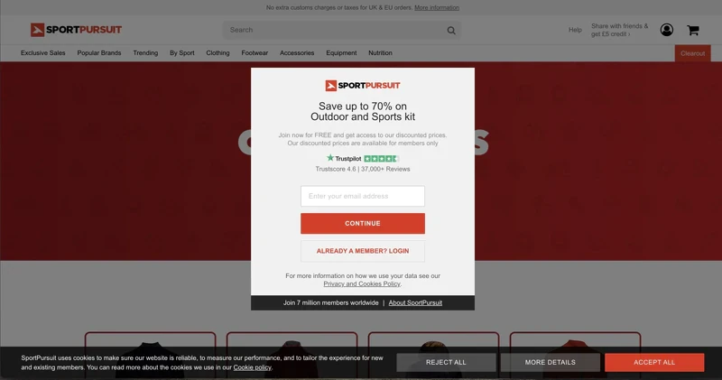
What we like
Trigger: arguably, the signing up to the newsletter form appearing simultaneously with the website’s loading might be considered bad taste. However, we see it as an advantage regarding the form’s content: it squeezes the site’s value essence.
Lead magnet: firstly, you save up to 70% on a specific purchase; secondly, you are granted free access to the best deals; thirdly, there is a growing community for you to join.
Social proof: the brand boasts of a Trustpilot score of 4.6 and the number of reviews it received. Moreover, over 7 million people already have experience with the business. To us, that is a significant number!
GDPR compliance: SportPursuit provides an active link to the terms of use and privacy policy, which detail how and where the collected data will be stored.
With Claspo, you can replicate such subscription form examples and add an opt-out button so that the customer is given a clear choice to continue or not. Additionally, you can A/B test the form with and without this button to see if it impacts your conversions at all.
2. Later
Later features a built-in email newsletter sign-up form in all its blog articles.
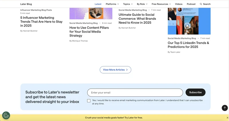
What we like
Headline: it taps into the fear of missing out on the next trend while simultaneously pushing the personalization buttons. This combo works great, given the fast-paced nature of social media marketing.
GDPR compliance: the form reminds users they can unsubscribe anytime. It also features a consent checkbox, ensuring users voluntarily and knowingly share their contact information. The bar leads the user to create an account with the platform with the same reminder and links to their Terms and Privacy Policy.
Location: the form is positioned mid-page on desktops, becoming visible as readers scroll. It’s one of the newsletter form examples that don’t interrupt the reading experience.
Later likely finalized this approach through A/B testing, and with Claspo, you can replicate its success. We constantly develop hypotheses, test them, and share our results with our audience.
3. Convince & Convert
Convince & Convert employs different built-in subscription forms at the bottom of website pages, as shown in the images below.
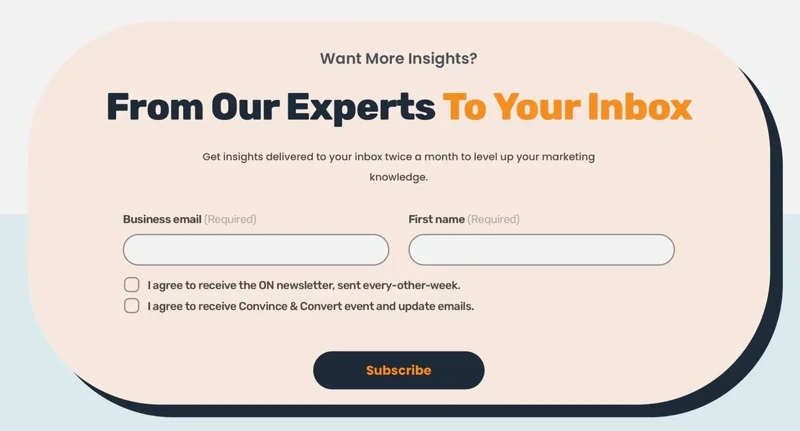
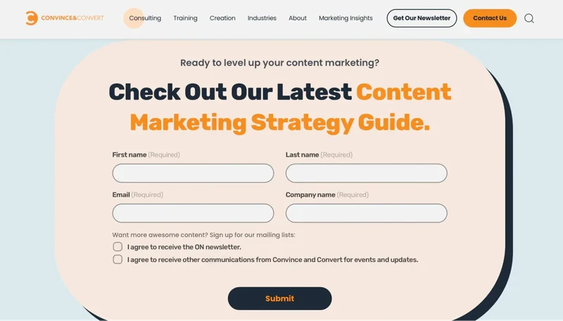
What We Like
Correct context: the subscription form is located on the main page, just beneath the section listing the company’s strategic insights. This placement makes the proposal logical and timely.
Like other email signup form examples with lead magnets, the form in the second image is on a page dedicated to a specific service industry. The logic is simple: a visitor explores the service section of interest, reviews the solutions and offers, and is primed to exchange their email for a relevant guide by the end of the page.
GDPR compliance: both newsletter signup examples include a consent checkbox indicating the mailing frequency. Subscribers can choose whether they want additional communications from the brand or just informative newsletters. The lead magnet form allows users to opt for only the guide or additional mailings, ensuring transparent communication and reducing the risk of future unsubscribes.
Input fields: As a B2B company, Convince & Convert aims to qualify leads and ensure they are communicating with company representatives. The number of input fields varies. In the second case, they need more information about a representative responsible for a specific sector (e.g., content marketing) who can influence decision-making within their areas of responsibility.
Claspo allows you to customize your email newsletter sign-up form to accept only business emails, blocking public domains with a single click in our editor. You can also edit the placeholder text to inform potential subscribers that a business email is required.
4. Fashion Nova
Fashion Nova presents a simple popup subscription form that appears in the center of the screen as the user has been browsing for a while, indicating they use a timed trigger and browsing history for display rules.
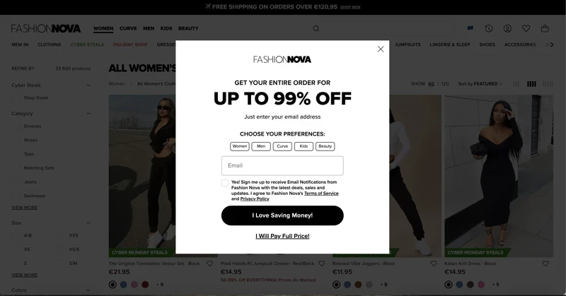
What we like
Large font for discount: displaying the discount amount in large font (and the discount itself is rather large, right?) is a common and effective technique in e-commerce newsletter signup form examples. According to studies, it immediately grabs visitors' attention and makes even a small discount seem more significant.
Shopping preferences: this practice allows online stores with a wide range of products to segment subscribers based on their tastes and likes, enabling personalized email offers in the future.
Opt-out button: the popup includes both the classic cross in the top-right corner and an additional button. The latter implies that closing the popup means agreeing to pay full price, making shoppers think twice before opting out.
GDPR compliance: there is consent text and a checkbox, active links to privacy policies and terms of use, and a clear explanation of the content subscribers can expect — excellent attention to detail!
Claspo allows you to gather shoppers' preferences during subscription with radio buttons, checkboxes, or dropdown lists. Since Claspo integrates with many email service providers, all data is automatically transferred to the chosen platform for segmentation and personalized newsletters.
5. Puma
When you enter the main page of the Puma website, you'll see a launcher in the lower left corner. Clicking on it triggers a full-size popup asking you to subscribe.
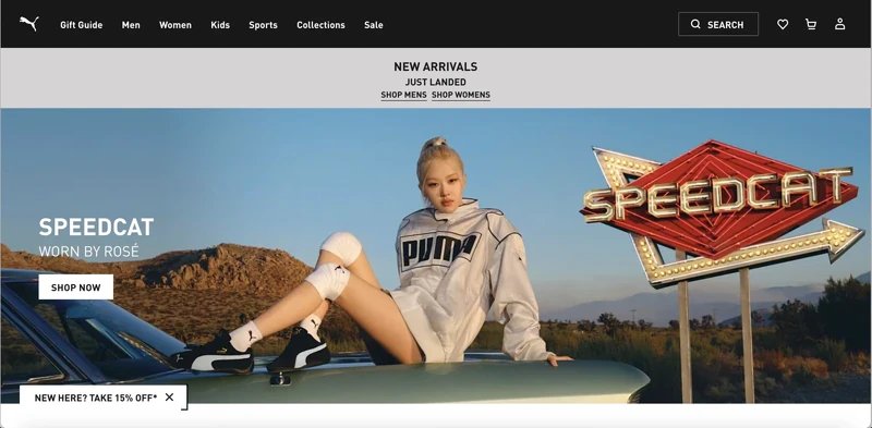
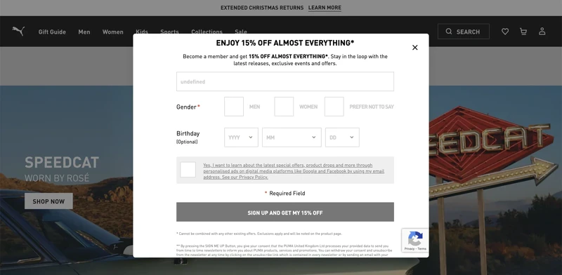
What we like
Launcher: this miniature version of the newsletter subscribe message takes up minimal screen space without interrupting the browsing experience. Puma confidently places it on all pages, avoiding intrusiveness. The launcher highlights the main offer, a discount, which grabs attention and motivates clicks to open the full-size popup.
Design: the black and white color scheme aligns with Puma’s branding, and maintaining brand consistency can boost revenue by up to 23%. Additionally, the design is clean and uncluttered, focusing visitors’ attention solely on the subscription message. Even though it’s close to grey monochrome, the hero blocked by it contains enough bright colors to set off the popup’s rigor.
Message: the concise form includes action words like “Sign Up” and “Get,” which drive immediate action and can increase conversion rates by up to 121%.
GDPR compliance: the popup features an active link to the privacy policy and a notice of financial incentive. Clicking the link informs users that they will receive other marketing emails from the company in addition to a one-time discount.
Some sign up form samples in Claspo’s library come with a default launcher, which can be customized to fit your branding and needs in our editor. You set the display rules for the launcher, and the full-size popup appears automatically after clicking it.
6. Shein
Shein also uses a launcher on the right side of each webpage. It doesn’t interfere with content viewing but constantly reminds you of the offer.
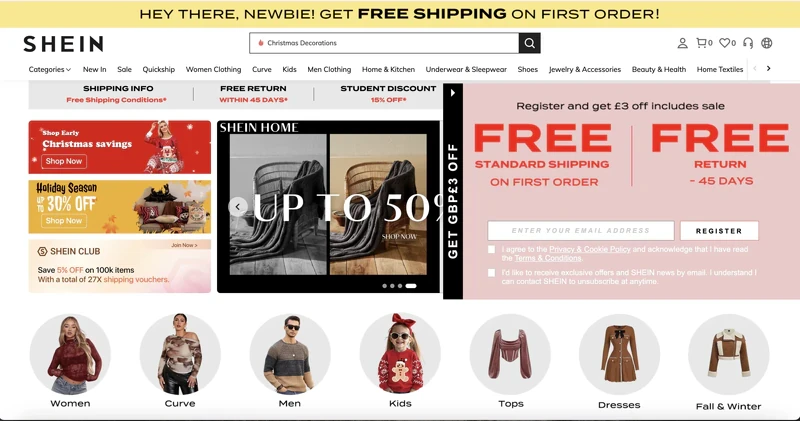
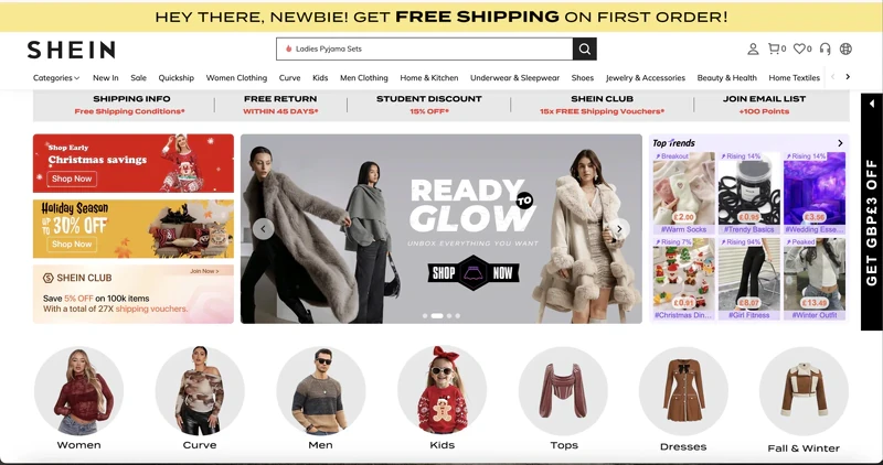
What we like
Focus on value: this newsletter signup popup has minimal text but effectively conveys the value proposition, motivating shoppers to share their email addresses.
Winning design: the layout features proper visual accents — advantages are highlighted in large font, and the trigger word is repeated twice for greater impact.
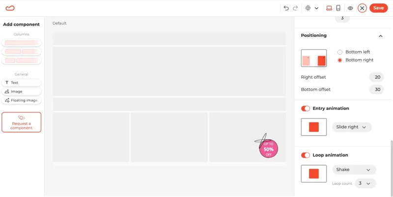
Contrast: the black launcher contrasts with the overall page design, making the mini offer more noticeable. Additionally, the CTA button’s color stands out without disturbing the popup’s color scheme. When tested, it can potentially boost the conversion rate.
Claspo allows you to enhance your launcher’s visibility not only with contrasting colors but also with animation. In our editor, you can set up entry and loop animations to make your launcher stand out even more against static page content.
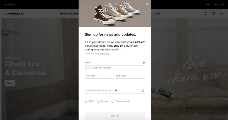
7. Converse
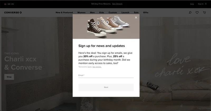
What we like
Lead magnets: the section with value features at least three benefits a customer will get from subscribing to their newsletter. It is visually bigger than an input field for an email address, which implies how much more one could get for giving so little.
Date of birth field: collecting this information allows sending future birthday emails, which show a 481% higher transaction rate and generate 342% more revenue per email than regular promotional emails.
Message: the form includes action words like “Next” and “Sign up,” driving immediate action and potentially increasing conversion rates by up to 121%. This proves that a compelling message and thoughtful wording can bring great results even without using a lead magnet.
With Claspo, you can easily replicate the successful elements of Converse’s subscription form. Our editor features a date picker component you can add with a single click. Additionally, you can display shopping preferences as a drop-down list to save space on your popup.
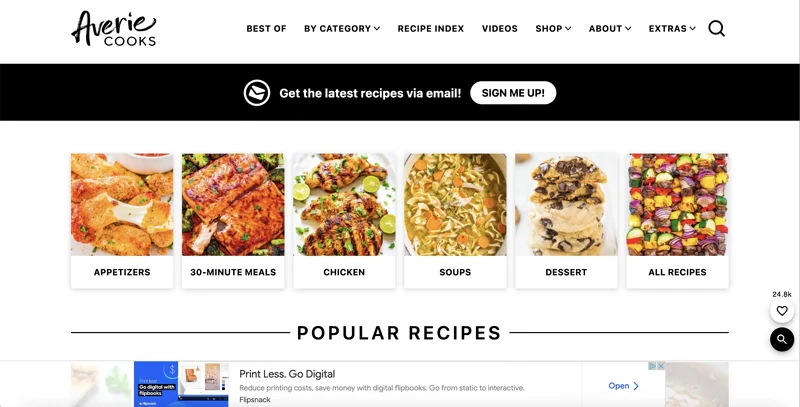
8. Averie Cooks
Averie Cooks is a food blog featuring various recipes designed to inform and inspire. Their sign-up messages are cleverly distributed across different pages. Built-in forms are placed at the top of hero pages, inviting visitors to get this and other recipes delivered to inboxes. Additionally, popups appear on select pages as we navigate the site.
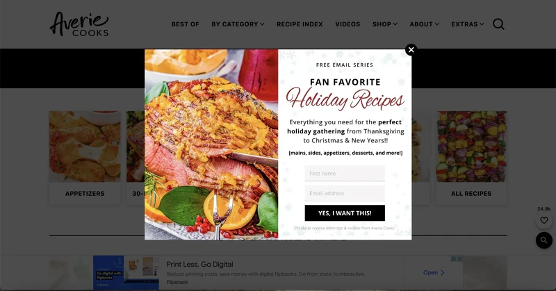
What we like
Timing: the first popup doesn’t appear until a reader has spent time on the site. This suggests that Averie Cooks uses a time or scroll trigger or configures the popup to show after viewing a certain number of pages. This tactic ensures users have enough time to explore and get interested in the content, making them more likely to subscribe.
Seasonality: the popup above appeared at the start of the winter holiday season. As we like to track our favorite popup users at least once per quarter, we can attest to Avery Cooks’ team’s tuning in their popups to the occasion. This approach makes sense as the popup offers relevant content, increasing the chances of conversion.
Mobile adaptation: the images show how the same widget looks on the site's desktop and mobile versions. On mobile, Averie Cooks removes the image to free up space, enhancing the user experience for mobile visitors.
Claspo also lets you strategically place and time your popups for maximum effectiveness. You can customize how the popup appears on different devices, just like Averie Cooks. For instance, you can easily hide certain columns on mobile with a single click.
9. Backlinko
Backlinko uses a multi-layered strategy to capture emails, with pop-ups, built-in forms, and a dedicated subscription page. Coupled with vibrant colors, clear value propositions, and an inviting "Try It" CTA, they make subscribing hard to resist.
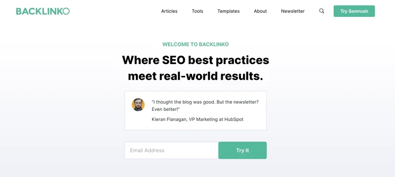
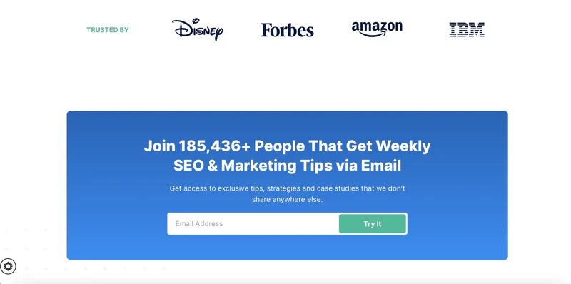
What we like
Strategy: several popups urge the visitor to enter email to subscribe. The first one is embedded in the hero section of the site, thus making it the immediate attraction for the user. On a different page, there is a built-in form, taking almost half of it. If that wasn’t enough outreach, Backlinko also has a separate page dedicated exclusively to the newsletter subscription message, and there is no need for an individual form design. Talk threefold!
Design: launched in, the deep purple form is a welcome color pop at the otherwise calm-looking page. The same goes for the blue built-in one. In both cases, clear value propositions are presented in larger letters, which works well for immediate influence.
CTA button: unreligious “Try It” takes the user beyond passive newsletter reception into the wealth of value the product offers.
10. No Revisions
As an a-la-carte marketing agency, No Revisions knows how important it is not to lose a single lead and hook prospective customers with thought-through lead capture approaches.
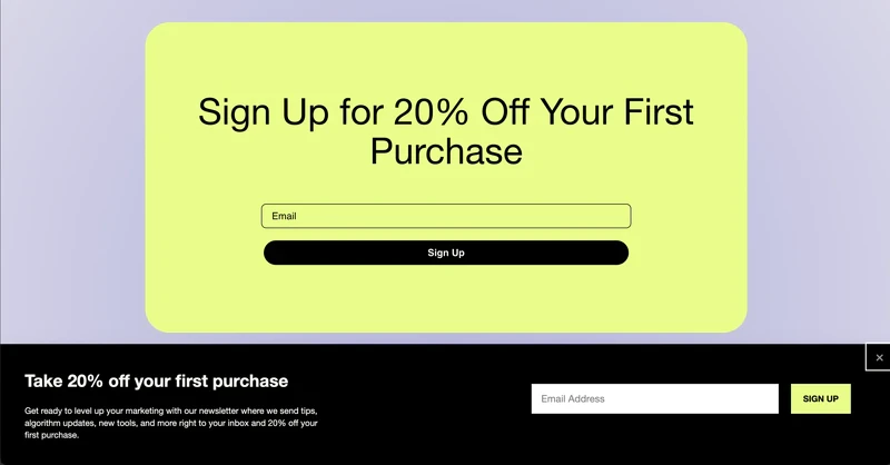
What We Like
Enhanced placement: here, we have another combo of a mid-page built-in form integrated into the reading flow and a popup form that emerges from the bottom prompted by a timed trigger.
Clear value: сuriously, both subscribe email examples reiterate the same value of a 20% purchase discount. However, the one that actually pops also informs the user that they will subscribe to company newsletters by entering their email.
Color scheme: the anchored form draws all attention with its lime-yellow filling, whereas the bottom one appears as if a continuation, aesthetically connected by the black “Sign Up” button and the background of a popup.
11. Smashing Magazine
Smashing Magazine is more than just a resource for web designers and developers — it is a community of like-minded people. Curiously, the Magazine team changed their approach to the newsletter signup popup from a central content-blocking one to a sidebar on the right of the main page.
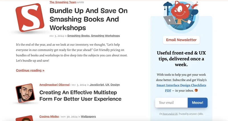
What we like
Specified mailing frequency: Smashing Magazine stipulates that the newsletter is sent once a week. This is a great approach since 51% of users unsubscribe from brand emails because they are sent too frequently.
Opportunity to learn more: the form includes an active link to a page where potential subscribers can review a summary of the lead magnet. This helps potential subscribers understand the valuable insights they will receive before sharing their email. It serves as an icebreaker for those unsure about the downloadable file, acting as a teaser that further entices them to subscribe.
GDPR compliance: the company clearly states that by providing their email addresses, subscribers will receive not only the promised checklist but also other materials. With this transparency, they understand they are primarily signing up for newsletters, with the checklist as an added bonus.
Social proof: in a small grey font at the bottom of a popup, we can see that the community is rather large and equals 207k people!
12. iHerb
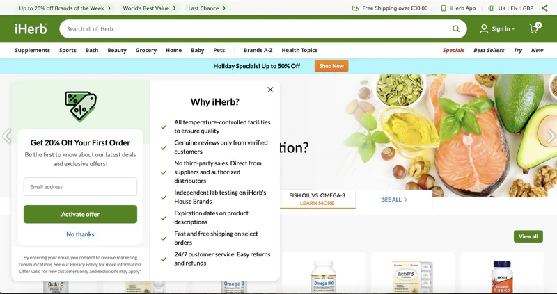
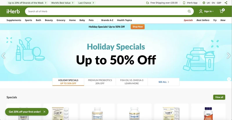
What we like
User experience: like Shein, iHerb features a non-intrusive launcher anchored to the bottom of the page so that it stays in place during scrolling. It does not cover much content but is unmistakably there if needed.
Value proposition: iHerb gives 20% off the first purchase and offers insider access to deals and the latest trends, creating a sense of exclusivity and chosenness.
Selling point: iHerb clearly understands that they are not selling just products; they are selling the brand. They want to create a sense of almost medicinal reliability in their user, and a list of seven advantages is there to help them do that.
Adopt iHerb's best practices with Claspo. Here, you can find a suitable floating bar template that can be easily customized to match your branding using our intuitive editor.
Unlike on most platforms where the subscription form is a secondary feature, you can fully control your widget's behavior. Target first-time visitors? No problem! Control display frequency? Absolutely! Stop displaying to those who closed the widget? Certainly! Enhancing the user experience will make visitors more likely to return and convert!
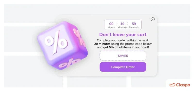
13. Pit Viper
Pit Viper prominently features an embedded newsletter sign-up form in the middle of its homepage. However, when we visited the site, we were greeted by a popup inviting us to join their mailing list with a discount incentive.
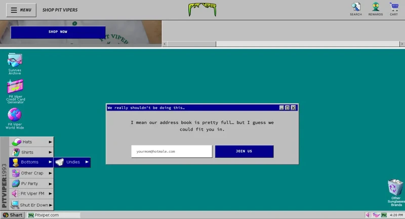
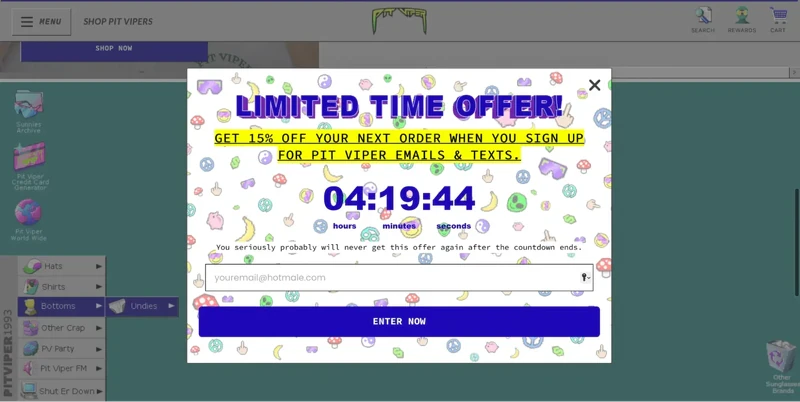
What we like
Time-limited offer: Pit Viper uses a countdown timer to stress the limited time visitors have to exchange their email for a discount. They enhance this urgency with a catchy headline and a note that the offer will never be available again, tapping into the fear of missing out (FOMO), a proven sales motivator.
Brand consistency: both email newsletter signup examples reflect the brand's retro style and maintain the company's humorous and slightly provocative tone of voice.
Message: despite the humorous tone, the embedded form conveys an important message — many people have already joined their mailing list, providing social proof (even if the exact number of subscribers isn't verifiable).
Placeholder text: instead of the usual field labels, they use placeholder text with a unique tone, including a playful joke about your mom. Placeholders provide clear hints about the required information and format.
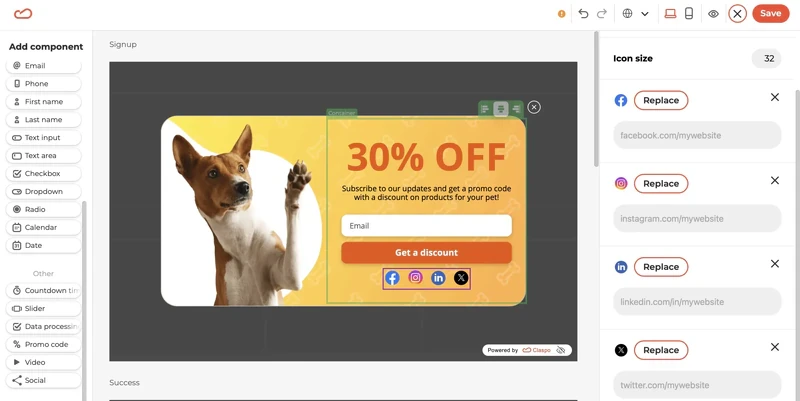
Claspo provides numerous of the best sign up newsletter designs with countdown timers, but if you can't find the perfect one, you can easily drag and drop a timer into any layout using our editor.
What sets us apart from other builders and platforms is our relative timer. It starts counting down individually for each visitor. If they fail to take advantage of your offer in the allotted time, it disappears only for them but remains available to other visitors whose time has yet to expire.
What does this mean for you? You can honestly tell visitors that they won't get a second chance to exchange their email for a discount. However, if you decide to give them another opportunity, simply adjust the timer to restart in the Claspo settings.
14. Nature's Fynd
Nature's Fynd uses built-in subscription forms in the footers of various pages. However, as we scrolled halfway down the main page, a popup appeared inviting us to subscribe.
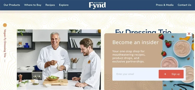
What we like
Timing: the popup appears after a visitor has had the chance to learn about the product, get acquainted with the unique selling proposition, and see where to buy it. This warms them up and makes them more interested in joining the mailing list.
Unobtrusive: the widget appears only on this page and just once (at least during our visit). This suggests that Nature's Fynd may have limited the display frequency or set it to stop showing after being closed, showing consideration for the user experience.
Layout: Nature's Fynd uses a floating box that sits on the side of the screen so it doesn’t block content and provides a pleasant viewing experience.
Message: instead of just inviting you to share your email, their newsletter subscribe message invites you to become an insider and lists exclusive content you can access by leaving your email.
If you liked this subscription form, you can recreate it with Claspo. Simply choose one of our floating box templates and customize it to suit your strategy.
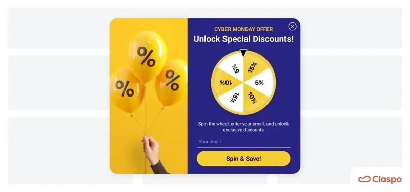
15. TOMS
TOMS uses gamification and thoughtful design to engage visitors. With a spin-the-wheel discount, pastel tones, clear CTAs, and transparent messaging, they create a seamless and inviting experience.
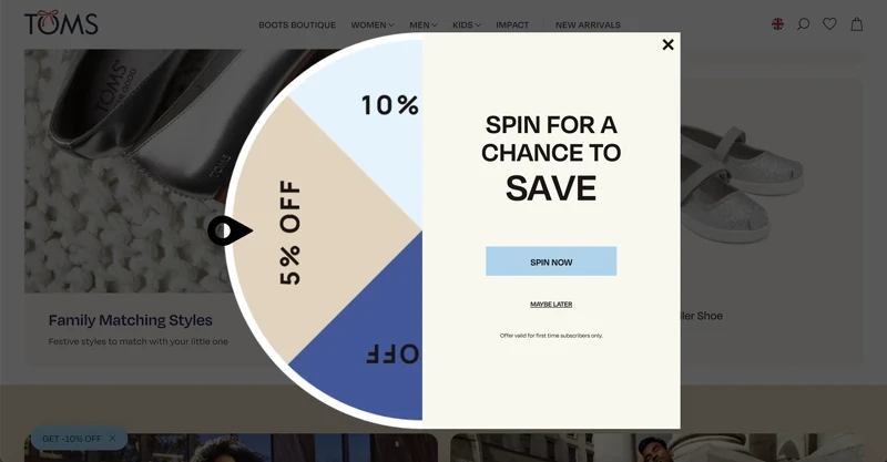
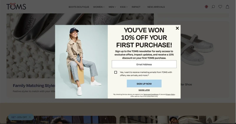
What we like
Gamification: the TOMS team knows that spin-the-wheel is the great engagement tactic to improve website funnel and user experience. Not burdened by multiple options, it offers a definite discount for the first purchase. We got 10%!
Design: pastel colors and laconic shapes reinforce the soft and warm brand message. The wheel and the email newsletter signup form make up an organic unity, further conveying the wholesomeness.
CTA options: the company uses “Sign up now,” paired with “Maybe later,” which leaves the door open for a subscription possibility.
Message and GDPR: every segment of the popup clearly states what the company offers, what signing up means, and what the subject of consent is. It also provides terms and privacy policy through active links. Even though this is just for newcomers, this condition is duly indicated at the bottom of each popup.
At Claspo, you can design your dream, and most importantly highly converting, spin-to-win wheel. Check out our Christmas theme!
16. Emmy & Ollie Photography
This company uses a popup on the main page and built-in subscription forms at the bottom of various pages on the site. Although the wording varies slightly, the main emphasis is on VIP access and exclusivity.
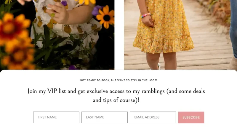
What we like
Trigger words: VIP and exclusive are powerful trigger words that appeal to buyers' emotions and significantly boost newsletter conversion rates. It’s one thing to join a mailing list but another to join a VIP list with special access.
No conversion conflict: the subscription form is located after the service descriptions and several calls to book a photo session. This placement ensures it doesn’t distract those focused on making a purchase but can still convert visitors not yet ready to buy into leads.
Message: the form title perfectly aligns with the visitors' current state — they're not ready to buy and may need more information or time to decide. This is typical for consumers in the consideration stage of their customer journey, studying the product and its alternatives. Therefore, placing a form with such wording on the service description page is a smart move.
17. JustFoodForDogs
This is a great mailing list example. The message is enhanced by a compelling image that clearly demonstrates the product and emotionally appeals to dog parents. And what a cute, festive puppy!
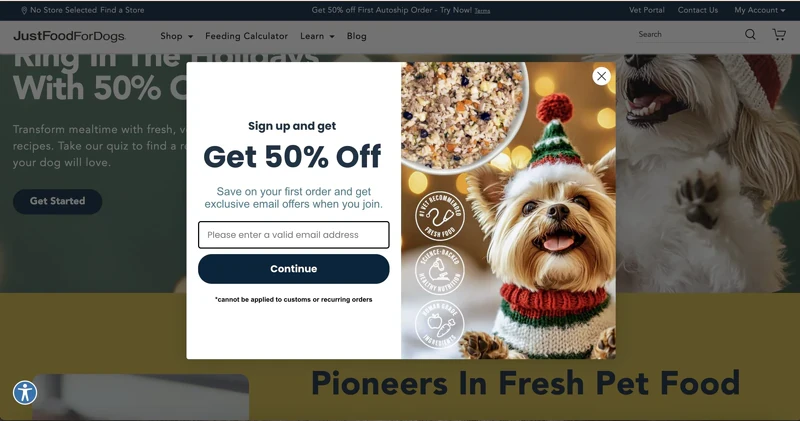
What We Like
Image: the adorable dog melts hearts, and the product image clearly shows what subscribers can buy at half price. Impressively, the image highlights three powerful competitive advantages of the company: addressing basic criteria for choosing dog food, dispelling doubts about product quality, and undoubtedly increasing purchase intention.
Message: the company clearly states that potential subscribers will receive a discount and the opportunity to save. This answers the question of why someone should leave their email. Combined with the image, this popup shows that the dog’s parent is not skimping on quality but purchasing premium food with an exclusive discount on the first order.
Input field: the placeholder text emphasizes the need to enter a valid email address to ensure future mailings are delivered. The ability to auto-fill this field through Gmail synchronization minimizes the chances of error.
Claspo helps ensure that only valid email addresses reach your mailing list. Our smart tool automatically corrects spelling errors in public domains before transferring them to your ESP.
18. Food4Pets
Unlike the previous pet food retailer, Food4Pets uses an inline widget for its subscription form and does not offer a discount as a lead magnet.
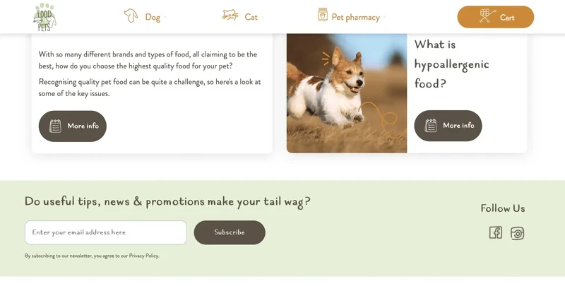
What We Like
Brand consistency: the style of fonts and icons on the form matches the site's overall design, making its appearance very organic and cohesive.
Tone of voice: Food4Pets uses a playful analogy of a wagging tail instead of traditional calls to action. Just as dogs wag their tails when they’re happy, you’ll feel the same joy by joining their mailing list.
Social media integration: the form includes active links to the company's social media accounts. This is a smart move, as 54% of consumers use social media to research products, and 77% are more likely to buy from brands they follow on social media.
In the Claspo editor, you'll find a special “Social” component. When you add it to your layout, icons of the most popular social media platforms automatically appear. You can customize this list by adding or removing icons, adjusting their appearance, and adding active links to your accounts.
19. Stradivarius
Stradivarius integrates built-in subscription forms across its website. The main form is on the homepage, while others are scattered throughout the footer sections of various pages.
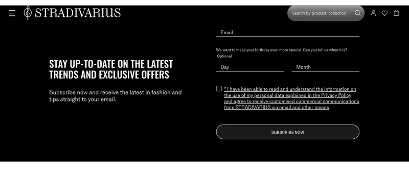
What we like
Color scheme: the black background of the subscription form stands out against the white page, ensuring it catches visitors' attention and doesn't blend in with other content.
Input fields: Stradivarius keeps it simple with just two fields, a proven practice according to many studies. Additionally, making the date of birth field optional gives visitors a choice, increasing the likelihood they’ll complete the form.
GDPR compliance: the form includes a link to the privacy policy, text implying the visitor has read it, and a consent checkbox. Stradivarius also highlights that subscribers will receive personalized commercial communications, a major incentive for sharing contact information.
When creating a built-in form with Claspo, you can adjust the number of input fields to suit your needs or customize required and optional fields. Additionally, you can easily make your built-in popup GDPR-friendly by dragging the Data Processing and Terms of Use components onto your layout when editing.
20. Scrapbook.com
Here we’ll see a charming design with smart tactics. From a cotton-candy-inspired color scheme to reinforcing their value proposition and strategically placed pop-ups, they create a truly user-friendly experience.
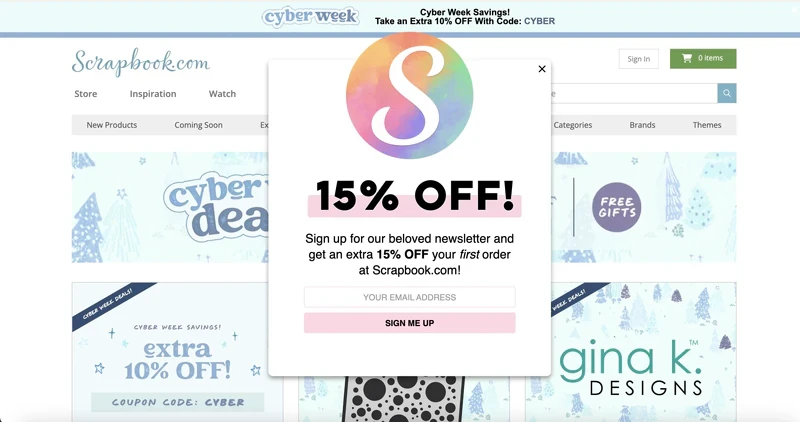
What We Like
Color scheme: is it possible for a webpage to have a taste of cotton candy? A proportionally large brand logo draws immediate attention, with its watercolor blur pleasing to the eye. The sweetness of the brand is also channeled through the word “beloved” describing a newsletter.
Value reinforcement: sadly, many of us nowadays require the information to be repeated at least twice to grasp it. Perhaps that’s the intention Scrapbook.com pursued when they put their value proposition in tall caps midpage and repeated it just beneath in bold.
Triggering and placement: the popup appears seconds after the page has loaded, blocking the hero section, with enough product offers to be visible from behind it. Seeing possible products paired with a discount offer might guide the visitors toward signing up and planning their first purchase. At Claspo, we have many discount offer templates that you can use to offer your customers some of the best incentives. Feel free tp try them out!
Claspo allows you to replicate this popup behavior and avoid intrusiveness on your website. Our predefined display rules limit the popup to once per session, but you can customize this setting with a single click.
21. WoodUpp
WoodUpp acoustic panel store delays showing their popup until about 20 seconds after entering their website, grabbing attention with a compelling offer.
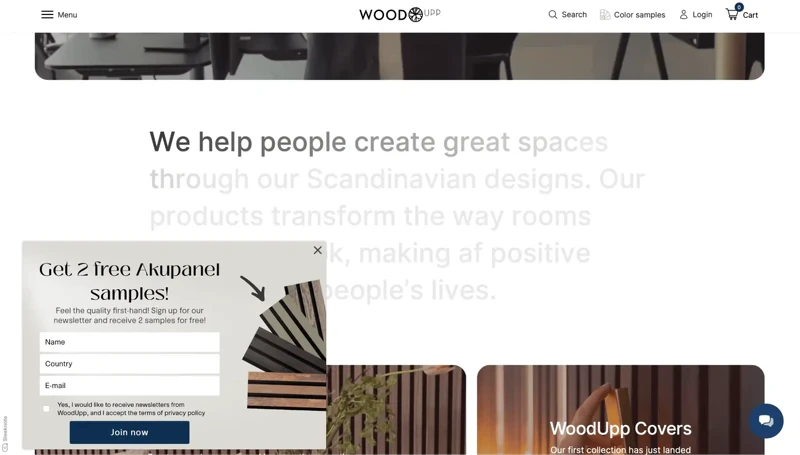
What We Like
Timing: the delayed display allows visitors to explore the unique selling proposition, view photos and videos of products, and even compare sound quality with and without an acoustic panel. This makes their offer, “subscribe to our newsletter and get 2 free samples,” highly relevant and timely.
Offer: free samples are a fantastic lead magnet. They allow potential customers to experience the product's value firsthand, reducing uncertainty and building trust. Additionally, 70% of consumers who receive free samples are likely to buy the product, making them effective in moving potential leads down the sales funnel.
User Experience: WoodUpp uses a floating bar neatly located on the side of the screen that scrolls with the user without interfering with content. Moreover, once closed, the widget does not reappear on subsequent visits, indicating limited display frequency or cessation for users who dismiss it, avoiding intrusiveness.
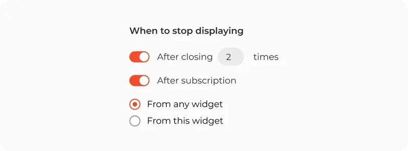
With Claspo, you can also choose when to stop showing the popup. For instance, further sign-up messages are irrelevant if a user has already subscribed. Similarly, if a user closes your popup multiple times, it indicates disinterest, so it's best not to show it again. You can conduct A/B testing to determine which offers or wordings yield the highest conversions.
22. Merrell
Marrell takes a different approach by avoiding intrusive pop-ups, letting customers explore at their own pace. With a minimalist form, a thoughtful CTA, and seamless integration with their brand identity, they create an experience worth seeking out.
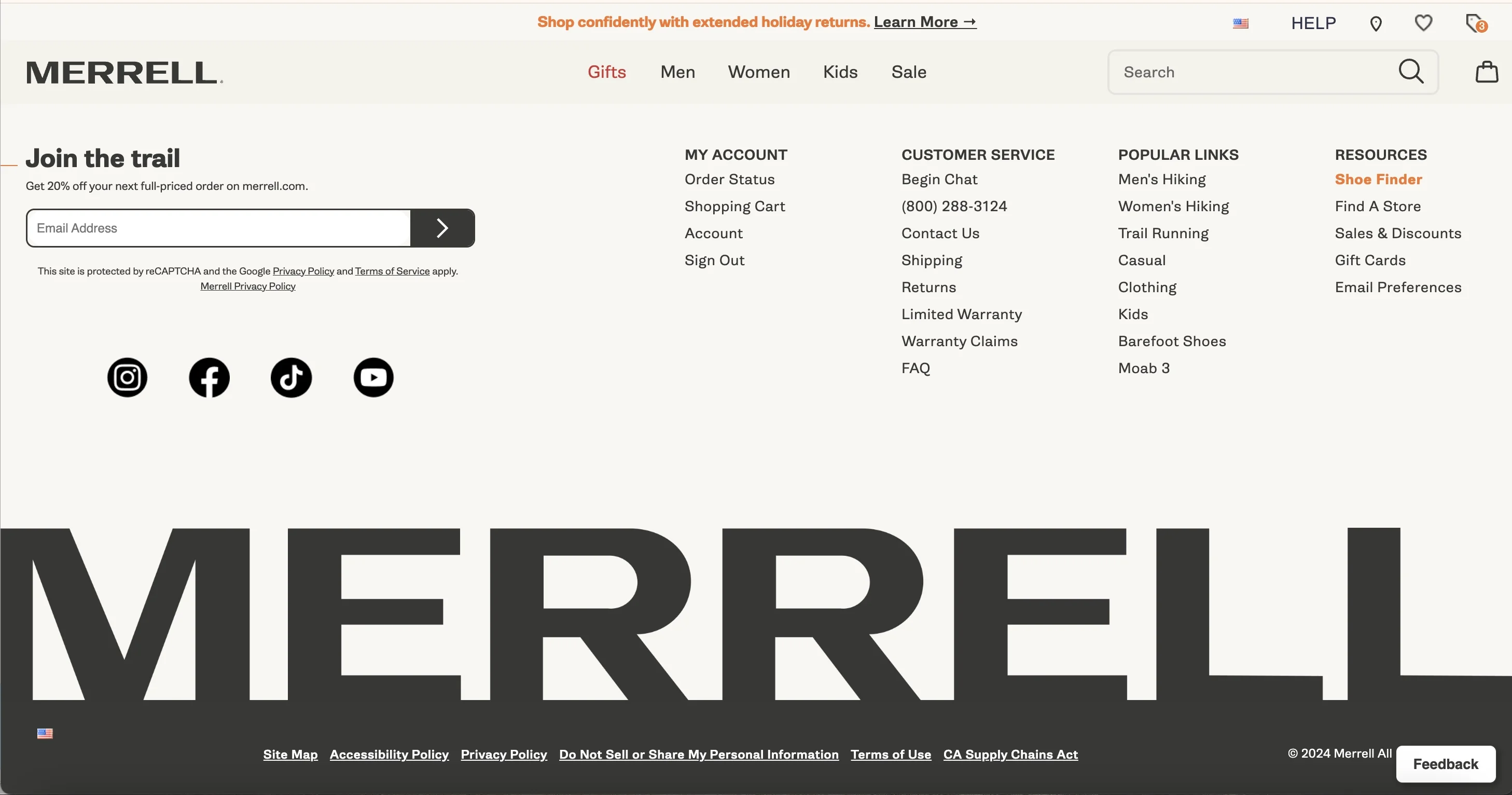
What We Like
Location: a little unconventional for a fast-paced online reality where everyone wants to grab a user’s attention pronto, Marrell does not do triggered popup forms. They let their customer uninterruptedly scroll to the very bottom of any page on the website and then choose to subscribe or not.
Coherent Perception: the form comprises minimal elements, beginning with a CTA and merging into the links to the brand’s social media at the page footer. It is like value in itself that a customer will be eager to seek out.
CTA: “Join the trail” is solid marketing that projects the brand essence. A trail is a way and a metaphor for following in someone else’s tracks. It marks the favorite activity of the brand audience and hints at a community.
Even though it is not part of the newsletter signup form, a roller bar at the top of the page is a truly user-friendly experience of digital best practices and effective use of space. At Claspo, we have a range of templates that incorporate this component into a form. You can combine rollers with interactive and static elements to maximize user engagement.
23. Saatchi Art
Art promoters and dealers are rather avant-garde or at least contemporary to popup trends. Just this past Cyber Monday, they were showering their customers with special offers.
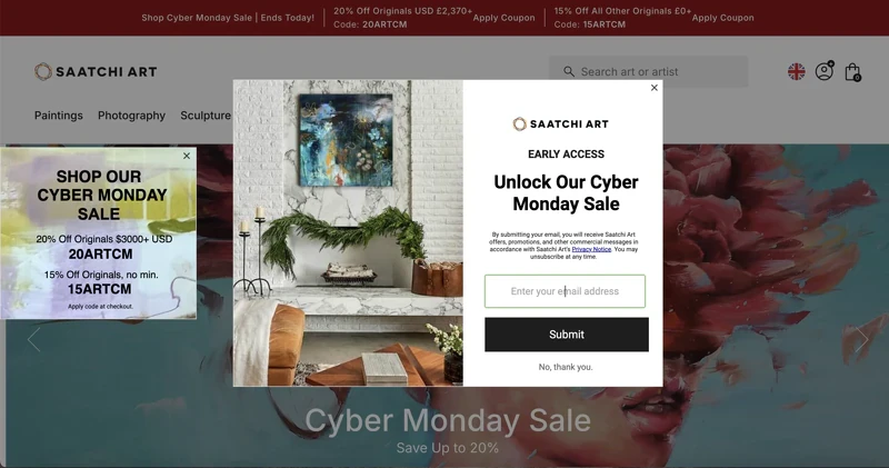
What We Like
Consistent Design Messaging: all the elements on the screenshot play into the brand's overall strategy to make the most of this day. A popup offers a key to Cyber Monday goodies and a newsletter subscription. To the left of it, a popup with promo codes appears — they are right there, ready to be used. At the top of the page and below the central widget are reminders of an ongoing Cyber Monday sale.
It is not just the popup carrying all the weight and promise of higher conversions; it is the entirety of the webpage that works to improve sales.
Value Proposition: there is exclusivity in the early access, a tailored newsletter bundle of deals, offers, and other promotions, and possible Cyber Monday sale discounts that are perceived as the desired outcome of engaging with this website.
Exit buttons and GDPR: a customer can choose to disengage with the form by pressing the x or “No, thank you” button. They are also given the link to the privacy policy and reminded they can unsubscribe at any time. These are examples of good business practices.
24. Better World Books
Better World Books uses simple, easy-to-complete multi-step popup forms to engage customers. From asking easy questions to offering specific discounts and balanced button designs, they create a thoughtful and user-friendly experience.
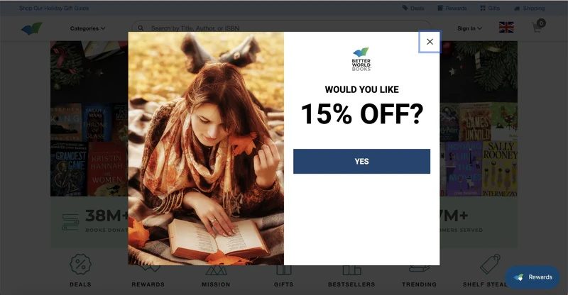
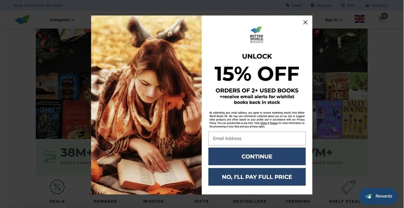
What We Like
Multi-Step Form: simple, its first screen asks a straightforward question: “Would you like 15% off?” It is true that the only answer is “Yes,” but if it’s the opposite one, a customer can always close the form. After pressing the yes button, the user sees the screen with the actual value proposition.
Specific Offer: unlike most retailers, Better World Books offers a very specific discount that can be applied to a purchase of over two used books. The same is true for the newsletter: they want to send you alerts when the books from your wishlist become available for purchase.
Unorthodox Buttons: the nature of things is that a “subscribe” button is always bigger and more attractive than the “exit” one. However, Better World Books deems both options equally important. To the customer, it might show that it’s not just about the money, and the business will still benefit either way.
We understand the effectiveness of multi-step forms at Claspo, as they are brilliant at building gradual yet strong engagement. The more steps the user takes, getting value or the promise of it on every step, the more they are interested in receiving their prize. Check out one of our templates!
25. Madsen Cycles
This business keeps it simple and rewarding. By offering real cash discounts, providing product previews, and showcasing happy, relatable images, they create a compelling experience. And this business does not want you to leave, so they pop up an exit-intent form.
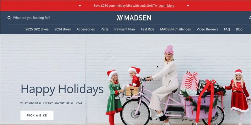
What We Like
Incentive: one of the few businesses that offers the actual money rather than a percent off the purchase as a discount. On top of that, new and seasoned customers can benefit greatly from the guide to the products that are yet to come to the market.
GDPR: having subscribed to the form, the users can opt out at any time with no strings attached. The exit button is also visible, even though it is opposite where one usually expects to find it.
Conveying image: a photo shows a happy family and how they are using the product in question. The subtle message is that the bike does not require much effort for a mom of three to ride it, laughing.
The Claspo library also offers ready-made exit-intent templates for collecting email addresses, but you can turn any subscription popup into an exit intent with one click in our form builder. Why is this effective? First, it ensures the offer appears after the visitor has explored your site enough to make an informed decision.
Most importantly, it ensures that lead conversion does not interfere with your primary sales conversion. The popup does not distract visitors from shopping and only appears when they are about to leave the site.
What sets high-performing apart?
Although it might seem like everything has been done before, there are ways to make your newsletter subscription forms stand out. And it is not always the craziest “sign up for newsletter” design that wins the customer’s heart. Mainly, it is due to creativity and the unhackneyed approaches that creative engineering minds keep coming up with.
Pay attention to these key attributes that would be a welcome addition to already existing basic practices:
1. Dynamic personalization is a set of features that captures provided data and utilizes it immediately to adapt to user behavior in real time. One of the best features already live in Claspo is merge tags and data layer.
For instance, inserting a merge tag like {{FirstName}} in a widget will automatically display the visitor's first name, creating a more personalized experience.
The Data Layer is a temporary storage area (like a list) where information is kept in an organized way. This can include details about what users do on your site — for example, adding a product to the cart — or product information like price and ID. Claspo uses the Data Layer to track these actions and decide when and where to show widgets, based on how users behave on the site.
2. Multi-step forms seem to contradict the section where we discussed the perfect amount of input fields. However, that still stands because multi-step forms contain 1-3 fields per screen over a progressing sequence of screens or steps. Step-by-step flow, less overwhelming experience.
Multi-step forms seem to contradict the section where we discussed the perfect amount of input fields. However, that still stands because multi‑step form design helps break down complex data entry into smaller, more manageable steps, reducing user fatigue. This multi‑step form design approach ensures each screen maintains focus and clarity, guiding users effortlessly through 1–3 fields per screen over a progressing sequence of steps. Step‑by‑step flow, less overwhelming experience.
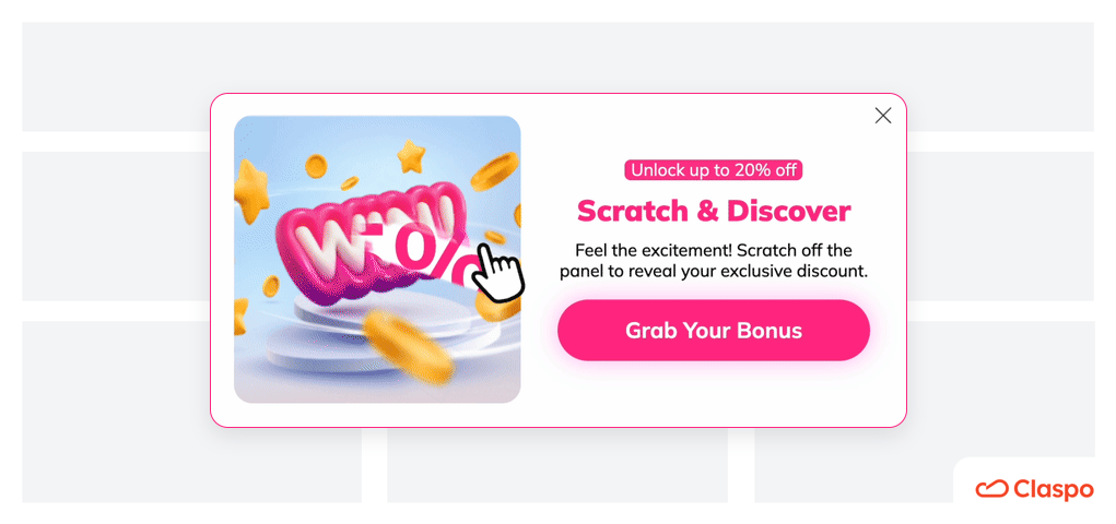
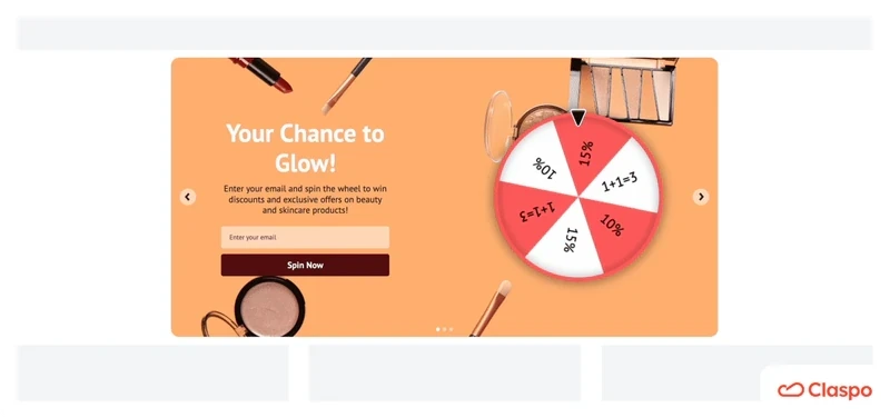
3. Gamified mechanics are an absolute win today, and marketers strive to add them to their website widgets and email campaigns alike. What’s so cool about them? Well, it’s the dopamine rush when experiencing curiosity and expecting a reward, and to date, they are the most engaging type of popups that seem effortless but bring so much fun! Some examples taking center stage are:
Spin-the-wheel is probably the god of gamified widgets where all rewards are visible on display at once, and the mystery is only about the one you will eventually get.
Scratch card is a nostalgic coin-scratch lottery transformed with a guaranteed reward. Since you don’t see what you might get, it only fuels positive anticipation.
Pick a gift box does not need further clarification — it is a box that contains a gift.
Deep dive: behavioral triggers and personalization
What makes site popups appear at the right moment? Triggers.
That’s not the end of the paragraph. Triggers are based on advanced behavioral patterns, and commonly known ones are:
Time-based triggers that appear after a user has already been on the website for some time, usually 20-30 seconds;
Scroll-based triggers are activated by how a user moves through your website;
Click-based triggers emerge once a customer clicks on a specific item.
However, you can go for advanced mechanics set off by exit intent, geolocation, or browsing history.
Exit intent is advanced because it is rooted in anticipation, not a fact, and it tracks a user’s cursor movement, designed to appear before they leave the website.
Geolocation can be useful for businesses offering localized content, events, discounts, etc.
Finally, a browsing history trigger utilizes complex data and intertwined behaviors to go live. It might revolve around a page view history, time spent, or repeat visits to the page, to name a few.
It might be true that to achieve simplicity in lead generation and higher conversions, you should master complexity first.
Sign up for newsletter — design tips & examples
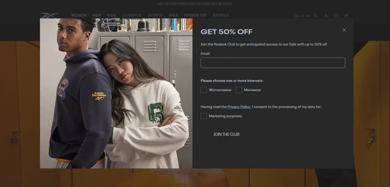
Old proven ways work, but only for some. How do you know? You study your audience by A/B testing the features you roll out. Another important tip is to keep abreast of the latest trends and developments in your field — what if there is something your customers would absolutely love, but you are missing it? Some newsletter subscription design trends we are keen on embracing at Claspo are dark mode compatibility, micro-animations, and dynamic content.
Surprisingly, not only the tech crowd loves dark themes. Many regular people prefer them because they are easier on the eyes, especially in poorly-lit environments, might extend battery life, and, needless to say, it’s the aesthetics of the dark. One of such subscribe to newsletter examples is a pop-up from Reebok:
Micro-animations target a certain component of the whole. In the context of widgets, it might be a floating bar or box.
The intent behind the feature is to activate users' attention without distracting them from the overall concept, which guides them to subscribe to the newsletter form through the moving design.
Also known as a “text-roller,” dynamic content on the widget almost serves as Hermione’s time-turner. With a measured time delay, this feature rolls out phrases that signal different values a customer will get from signing up for your newsletter.
These are not the only newsletter subscription form design hot trends but also examples of non-intrusive UX strategies that truly work for higher engagement.
Placement tips beyond basics for better conversions
The default placement tactics for popups (like the center of the screen or scroll down) do their best to engage users with your newsletter registration form. Still, you can always optimize your strategies for even higher ROI. Consider the following newsletter signup tips tested by our team.
1. Embed your built-in subscription forms within interactive content, especially in hero sections.
By interactive, we mean quizzes, surveys, or gamified tools that simply beg for a user’s active participation. As for the hero section, it guarantees the user's instant attention. Strengthened by a tailored CVP and appealing CTA, it will turn a curious visitor into a customer.
2. Introduce scroll-triggered sticky bars for long-form pages.
They are a highly effective strategy for capturing leads on long-form pages, such as blog posts, product descriptions, or educational content. These “subscribe to our email list” forms appear as users scroll through the page, offering them a chance to sign up or engage without disrupting their reading experience.
3. Consider pre-cart or pre-checkout forms for e-commerce upsells.
Not to call your customers fish, but aren’t they supposed to be tightly hooked at this point? For instance, if you're running an online store on Shopify, implementing a Shopify popup newsletter at these strategic touchpoints can help turn abandoning visitors into subscribers. A Shopify sign up for newsletter not only supports list growth but also creates a direct channel to nurture future conversions through email.
How to set up an effective newsletter signup form using Claspo
As you can see, real “join our mailing list” examples vary in layout, design, style, and placement. No matter which one inspires you, you can effortlessly replicate it on your website with Claspo's comprehensive functionality. So, how do you create a newsletter signup form without coding or design skills or — wasting time? Let’s break it down step by step.
Step 1: Get started
Log in to your free account and click the "New widget" button. You can create an email capture form from scratch or choose a ready-made high-converting newsletter signup form template. We recommend the second option to save time. Our templates have a well-thought-out structure and catchy design, so you can easily customize the one you like to fit your needs and add an email subscription to your website in a few clicks!
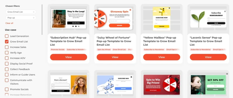
Step 2: Choose the template
Use the search filters in the sidebar to quickly find what you need. Since your goal is to add a newsletter to the website, select the "Grow Email List" use case. Other filters are optional. Know what layout you want? Check the “Layout” section for popups, floating bars, built-in widgets, etc. Select your industry and topic in the filters below to narrow your search further.
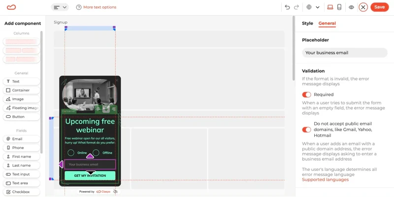
Step 3: Edit your template
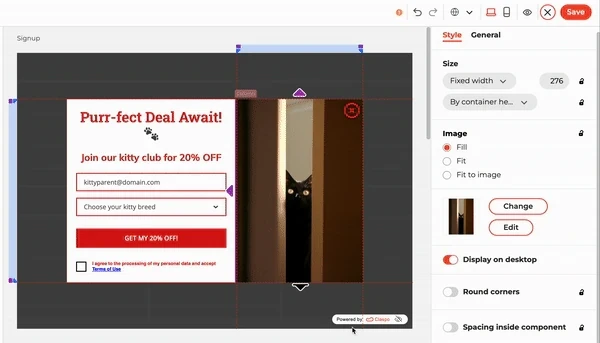
Once you've selected a template, you'll be taken to our intuitive drag-and-drop editor. Here, you can customize it extensively to match your vision and requirements. While we can't cover all the possibilities of Claspo in one article, we'll show you an example of how we customized a template.
Before
After
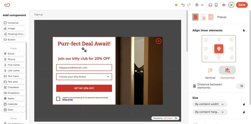
Quite impressive, right? So, here is what we have done in several minutes:
Removed the “Name” input field and replaced it with a drop-down list for selecting the kitten's breed.
Added placeholder text for both input fields.
Replaced font style and size.
Changed the image by selecting one from our built-in photo stock.
Added custom text for the title, description, and CTA button.
Adjusted the size ratio between the columns, giving more space to the message rather than the image.
Added a checkbox for consent to data processing.
Changed the colors of the text, buttons, and outlines of input fields.
Increased the distance between the input fields and the CTA button to highlight it.
Moved the opt-out button from outside to inside the layout, increased its size, and changed its color.
Added an animation to the button.
Step 4: Preview your popup
After making all your desired changes, it's crucial to preview how your popup appears on both mobile and desktop screens. Our pop-up is sizable, and we ensure it doesn't dominate smaller mobile screens to maintain a seamless user experience. Therefore, we've optimized it to display the image exclusively on desktop screens, preserving clarity and usability on mobile devices.
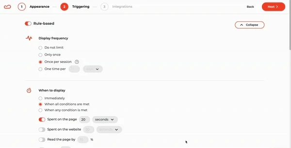
Step 5: Setup display rules
After perfecting the appearance of your popup and moving to the Triggering section, you might wonder how to set up an email subscription for a website. Here's the good news: optimal display rules are already preconfigured for you.
These include delayed display, limited frequency, protection against simultaneous appearances, and stopping display after a subscription — ensuring a flawless user experience. You can also easily customize these rules with just a few clicks without needing any coding skills.
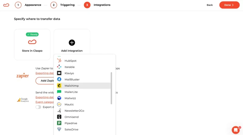
Step 6: Select desired integrations
When you add the best email signup forms to the website, you must ensure all subscriber data is seamlessly transferred to your chosen platform for sending welcome email campaigns and other high-converting emails. To do this, integrate Claspo with your selected ESP or CRM during the widget setup and specify the fields you want to transfer.
Step 7: Embed your popup on a website
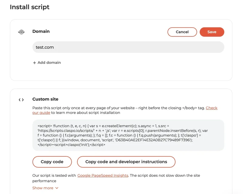
Once you've finished the settings, you might wonder how to add a newsletter subscription to your website. It's easy!
Copy and paste the finished script code into your site via Google Tag Manager or the Claspo Chrome extension using our step-by-step guides. For WordPress or Shopify sites, simply install the Claspo plugin for an even smoother integration.
If you still have any questions, please contact our customer success manager, and we will embed the popup for free!
Start growing your newsletter subscribers with Claspo
Throughout this guide, we’ve explored how brands of all sizes build their newsletter list using great signup forms that convert. You’ve seen plenty of signup form examples to inspire you — from clean and simple designs to creative offers and smart personalization tricks. And hopefully, you now have a better idea of what makes a great newsletter signup and what your signup form needs to actually work.
No matter which email newsletter signup form examples caught your eye, you can easily bring those ideas to life with Claspo. Whether you’re setting up a newsletter signup for the first time or looking to drive your newsletter signup rate, Claspo makes it simple.
With our huge template library, intuitive drag-and-drop builder, and flexible display rules, you can add a form to your website that doesn’t just sit there — it works. You can create a simple signup form in just 5 minutes and start growing your email list right away. And thanks to built-in A/B testing, you’ll be able to see what works best, tweak, test, and improve your email newsletter form as you go.
Remember: one of the best ways to gain from your newsletter is to make sure people actually subscribe to your newsletter in the first place. A well-designed form makes that happen — it lowers friction, highlights the value, and gently nudges your visitors to say, “Sure, I’ll sign up for your newsletter.”
Still not sure? No worries — you can try Claspo’s free lifetime plan with full access to all features. Play around, create your great signup form, and build your email list without any pressure. Once you see how easy it is, you’ll wonder why you waited so long to want your signup form to finally work.

![How to add a Shopify newsletter signup form [+Tips & Templates]](https://framerusercontent.com/images/FavgBqCU1zgoOwEdQvBHxtOWIc.png?width=1320&height=756)
