Website Widget A/B Testing by Linda Bustos


Summarize
With all the design and customization options for the widgets available nowadays, it’s easy to get overwhelmed by the possibilities. While there are many tools to A/B test any aspect of your website widget to prove what performs best, it’s important to test the right variables first to avoid endless rounds of trivial tests.
Because what rockets conversions for one site might fail on another, you want to determine what design and delivery decisions work best with your customer.
I'm Linda Bustos from Ecom Ideas, I’ve been an ecom consultant and blogger covering the ecommerce marketing and UX space since 2007. I want to share a practical playbook based on usability and conversion best practices that addresses the critical design decisions and widget settings first to maximize your testing data.
Testing stage 1: Find the best performing Layout
In this stage, you want to figure out the best way to serve your widget, so we’ll only be testing layout settings against each other. Remember the golden rule of A/B testing: one change at a time.
Within Claspo’s Builder, you have the choice of widget layouts, including:
Popup
Floating Box
Floating Bar
Built-in Widget
Content-blocking
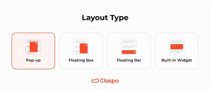
Right off the bat, let's sideline the built-in and content-blocking layouts. They've got their uses—built-in is a good choice for blogs or landing pages, and content blockers are primarily used to verify age before accessing any website adult content. That leaves us with the pop-up, floating box, and floating bar as the contenders.
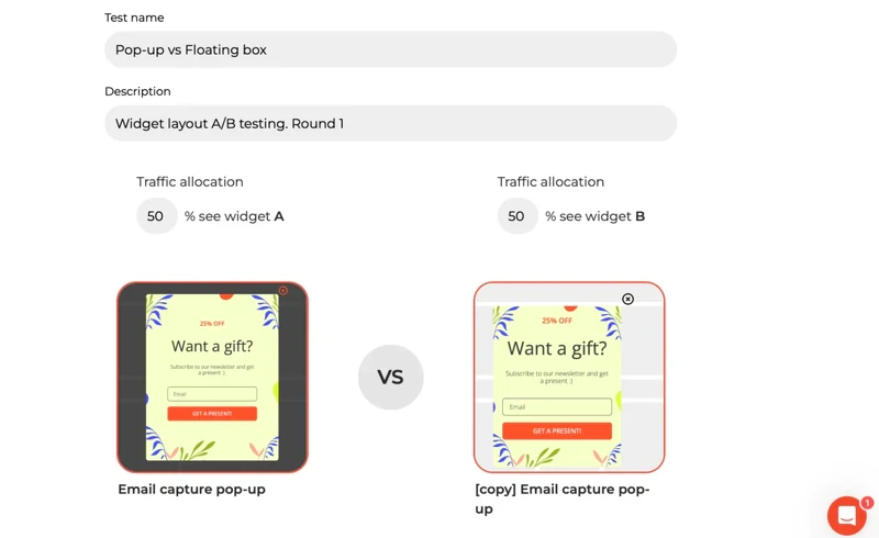
Style your widget as you like, but make sure any colors, fonts, fields, copy and settings are consistent across all versions. You want to control your test results for a single variable – the Layout.
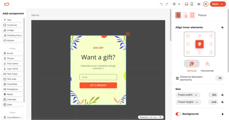
Then, head over to the dashboard and make a copy of your pop-up draft.
Jump into the editor and switch the layout to a floating box. It's just a click away in the top right corner.
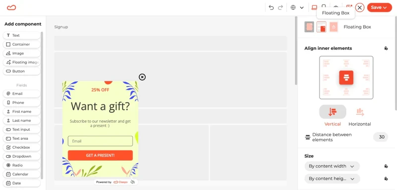
Save your second draft, and boom, your floating box is also ready to roll.
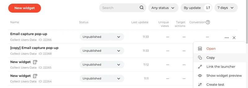
Then go to the A/B testing tab, and:
Click New test and select a Widget A and B
Give your test a title and description
Publish both widgets to kick off your test
Let it run till you reach at least 90% statistical confidence level. And when you have a champ, you can re-run the winner in a new test against the Floating Bar, or move on to trigger timing.
Once you’ve found your ultimate Layout champion, move to stage 2: trigger timing.
Testing stage 2: Trigger timing
Form submission rate and growing your email list means nothing if your trigger causes more visitors to bounce too soon. You want to reward visitors, not scare them away.
You certainly can choose your testing options based on average time spent on the website or a specific page. But because email offers are “welcome” perks, I recommend first gauging the impact of an immediate offer against a 5 second delay. Beyond 5 seconds, your customer is likely engaged in a task – scrolling, searching or digesting your amazing merchandising and messages.
For this next test:
Grab the widget with the winning layout
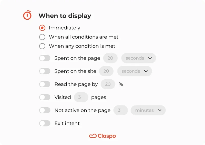
Find the "Triggering section" and set the "When to display" to "Immediately"
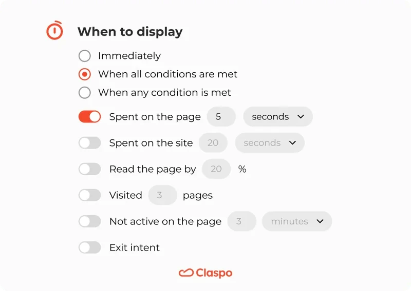
Save, then clone this widget, replacing "Immediately" with "Spent on the page 5 seconds" in the copy
Then, let it rip! Once this test concludes, it’s time to test a slightly different trigger condition:
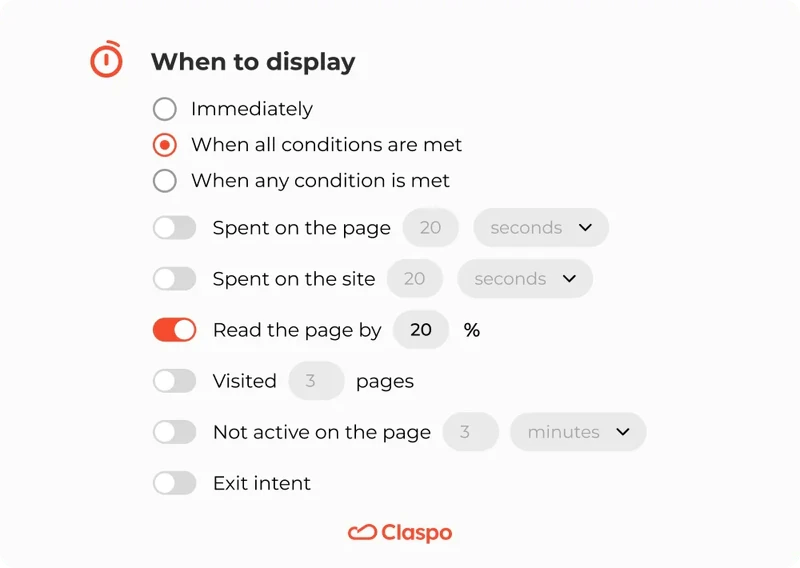
Take your timing champ widget and make a copy
In this clone, change "When to display" rules from timed trigger to "Read the page by [20%]" (or whatever makes most sense based on your scroll-depth insights – shoot for something over 80% of your visitors are likely to see)
Continuing to test various trigger conditions is a great idea, but it’s also important to determine the best offer for conversion. For this reason, we’ll take the timing test winner and move to testing your Offer.
Testing stage 3: Offer
Your incentive to join your list – be it a discount, free shipping, gift with purchase, chance to win or the trending “mystery offer” – has to impress your customers or they won’t convert. Period!
Use this round to test such offers against each other – e.g. discount A vs B, discount against free shipping, or discount against mystery offer. If you’re not able to test more than one offer or discount level due to margin constraints or other business reasons, use this round to test your headline and CTA (call to action button) copy.
Some of my faves include:
“Get X% off” vs “X% off your first order” (determine whether a shorter, action oriented headline outperforms longer, clarity-focused copy)
“Enjoy X% off” vs “X% off” (does “enjoyment” persuade more than a short and concise?)
“Sign up for $X off” vs “X% off your first order” (which call to action - sign up or purchase - persuades more?)
“Unlock X%” vs “Save X%” (sophisticated vs cheap – what motivates your customer?)
“Want X% off?” vs “Get X% off” (asking vs telling)
Your offer is the most influential component of your email pop-up, but you need to make sure you’re serving it at the right time, with the right layout.
Follow the same A/B testing setup steps, and focus this round on finding a killer offer that can anchor the rest of your experimentation rounds. Your offer is the most influential component of your email pop-up, but you need to make sure you’re serving it at the right time, with the right layout.
Now that you’ve nailed down the core basics, the rest of your testing program can get as creative as you want!
Testing stage 4 and beyond: Everything else
If you’ve made it this far, you’ve tested enough variables to have a solid Control version that you can test against all kinds of creative treatments, including:
🧪 Widget design (colors, fonts, graphics)
🧪 Copy and microcopy
🧪 Privacy policy visible vs no
🧪 Countdown timers
🧪 Form field shape and styling
🧪 Email hint text
🧪 With or without logo/branding
I’ve compiled some of my favorite testing variables and live merchant examples on Ecom Ideas for your inspiration.
Keep iterative testing (one variable at a time) or try “radical” redesigns for bigger lifts. Just keep in mind, when you test multiple variables together, you can’t determine which is responsible for the uplift. Testing is both art and science.
Final Thoughts
With A/B testing, you've got endless ways to optimize your email collecting tool. From picking the best layout to pinpointing the perfect messaging, every step is a chance to boost your conversion rate and other key performance metrics.
Remember, A/B testing is not just about making changes; it's about making informed decisions that drive your strategy forward. Don’t be afraid of testing out bold ideas and tailor your widgets to resonate with your audience and amplify your outcomes.
Happy testing!

![How to add a Shopify newsletter signup form [+Tips & Templates]](https://framerusercontent.com/images/FavgBqCU1zgoOwEdQvBHxtOWIc.png?width=1320&height=756)
