
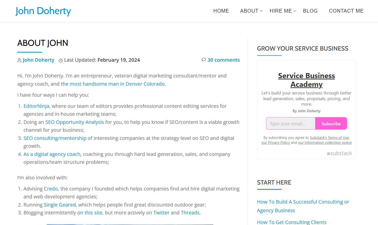
22 Best Ways to Collect Email Addresses for Marketing
Let’s be real — collecting email addresses for marketing sounds simple enough, but ask any marketer, and you’ll get a heavy sigh and maybe even an eye roll. Building a solid contact list can feel like a never-ending battle. There are endless obstacles: low opt-in rates, unsubscribes, spam folders… not to mention the constant task of finding new ways to gather emails without being pushy or annoying.
But online subscription forms can be more than just ‘sign-up here’ boxes. When optimized correctly, they’re powerful tools that do more than just collect emails. They bring quality leads for email marketing who actually want to hear from you.
In this article, we’ll show you how to obtain email addresses using proven techniques, such as timing your pop-ups to perfection, finding ideal spots for pop-up signup form, and using interactive components that really help to get more emails. You’ll get tips on segmenting your lists from the start and learn about mechanics that increase conversion rates by 400%!
Building an Email List: What It Is and Why It Matters
A people’s email addresses list is a collection of contacts from consumers interested in your business. Think of it as your direct hotline to potential customers and loyal fans — perfect for staying connected, sharing updates, and keeping your brand top of mind.
There are several key reasons why any business should collect emails for further email marketing purposes.
Reducing customer acquisition costs
Finding new customers can be pricey, especially with rising ad costs. With a high-quality and segmented email list, you’ve got a budget-friendly way to engage leads again and again. So, collect emails wisely. It will lower your overall marketing budget.
Dependable marketing channel
Are you relying on ads alone? Risky! When your leads come solely from ads, stopping your budget means stopping your flow of new customers. With an email list, you control a reliable marketing channel, reaching your audience directly without worrying about algorithm drama and increasing ad prices.
Improving сonversion rates
An email list lets you nurture leads through targeted campaigns, increasing conversion rates. With personalized, well-timed messages, you’ll reach your audience exactly when they’re ready to listen. It’s a fact: 75.4% of people surveyed prefer getting promos in their inbox.
Direct communication & insights
Social media’s fun, but let’s face it — they are shifting towards pay-to-play models, limiting your organic reach. Collecting email addresses gives you direct access to your audience and valuable data on their preferences. With 84.9% of consumers checking their email twice daily, it’s an effective channel for communication and customer insights.
Recovering abandoned carts
With cart abandonment rates averaging 70.19%, email follow-ups can remind customers of pending purchases. You can even toss in free shipping to seal the deal and reduce abandonment.
Get real customer feedback
Email makes it easy to collect feedback through surveys. People on your list are more likely to engage, and their insights help you refine products and services.
Buying List of Emails for Marketing: A Shortcut You Must Skip
Buying email lists may seem like a quick way to gather email addresses, but it’s a strategy that often comes back to bite you. Many email service providers (ESPs) have a zero-tolerance policy for purchased contact databases and can block your account if they suspect you’re using them. This usually happens during the first mass email campaign when high bounce rates or spam complaints raise red flags.
When you find email lists, find email by phone number, or buy them, you’re basically sending unsolicited messages to people who never asked to hear from you. This breaks the law under regulations like GDPR, CCPA, and LGPD, which require you to get explicit permission before sending any emails.
On top of that, those purchased lists are usually full of contacts who are not interested in what you’re offering. Even if your emails get through (which is doubtful), they are unlikely to convert anyone.
Instead of taking shortcuts, focus on building an email list list organically. We’ll tell you how to obtain email addresses on your website quickly and efficiently.
22 Actionable Tips on How to Obtain Email Addresses
When it’s time to gather email addresses, subscription forms are the obvious go-to — until you realize most CMS forms and banners look like they missed the style upgrade. They’re often hard to customize and might even require a developer's help. So, we’ve rounded up creative widget ideas to help you capture those visitor contacts without a headache. Let’s dive into the types of widgets for your websites you can use, where to place them, and how to make signing up feel irresistible.
Widget Types to Effectively Collect Emails
Google found that consumers who fill out a lead form are 3.5 times more likely to make a purchase from that brand than from others they were aware of before starting their customer journey. So, let's see what options you can use to obtain email addresses for marketing purposes.
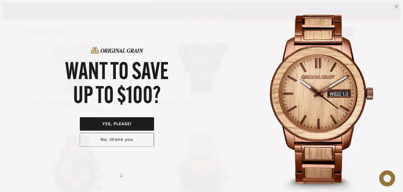
1. Gamified Campaigns
With interactive widgets like Spin to Win, Gift Box, and Scratch Card, website visitors are tempted to share their emails for a chance to win.
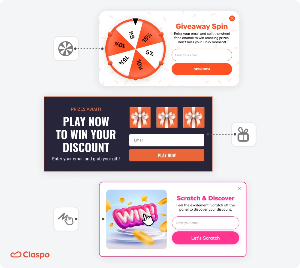
Why it works
Gamified pop-ups spark curiosity and excitement, making users more likely to opt in. It’s the best approach to collecting emails. Our e-commerce clients have seen a 400% conversion growth and 50% more engagement. Specifically, Spin-to-Win pop-ups have shown a 41% higher CR compared to traditional widgets with countdown timers. So, gamification in eCommerce can increase conversions and engagement, nudging up average order value (AOV) and even lifetime value (LTV) as customers keep coming back for more.
How to implement it
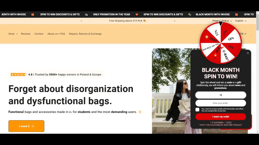
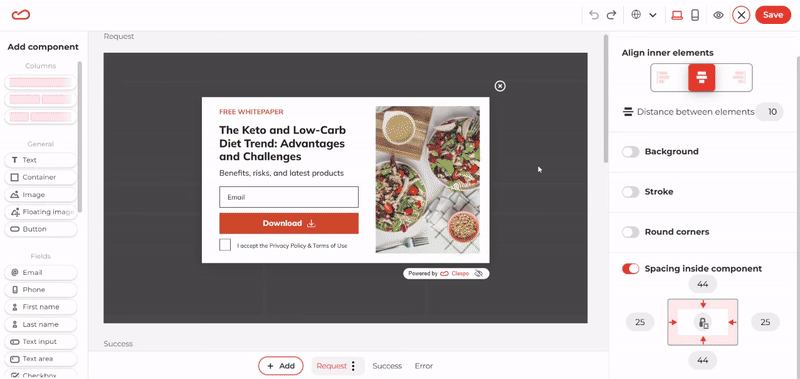
In Claspo, you can customize a template’s design and the reward pool settings to set winning probabilities to tailor your goals. For example, configure a Spin to Win widget with a 60% chance of offering a 5% discount, a 30% chance for a 10% discount, and a 10% chance for a 15% discount. You can also assign unique promo codes for each reward level. It is also possible to add custom prize options like WhoseThatBag did:
2. Multi-Step Forms
This approach breaks up the process of obtaining emails into small pieces, guiding users through easy steps instead of bombarding them with one giant contact form.
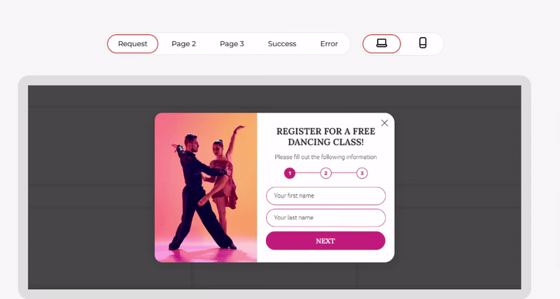
Why it works
People love simplicity, and multi step forms give them just that. By breaking things down, visitors feel less overwhelmed and more likely to finish the form. So, you’ll get emails for ongoing email marketing campaigns. Adding interactive bits or micro-rewards keeps things fun and increases completion rates.
How to implement it
To make your multi step forms even more irresistible, try these tips:
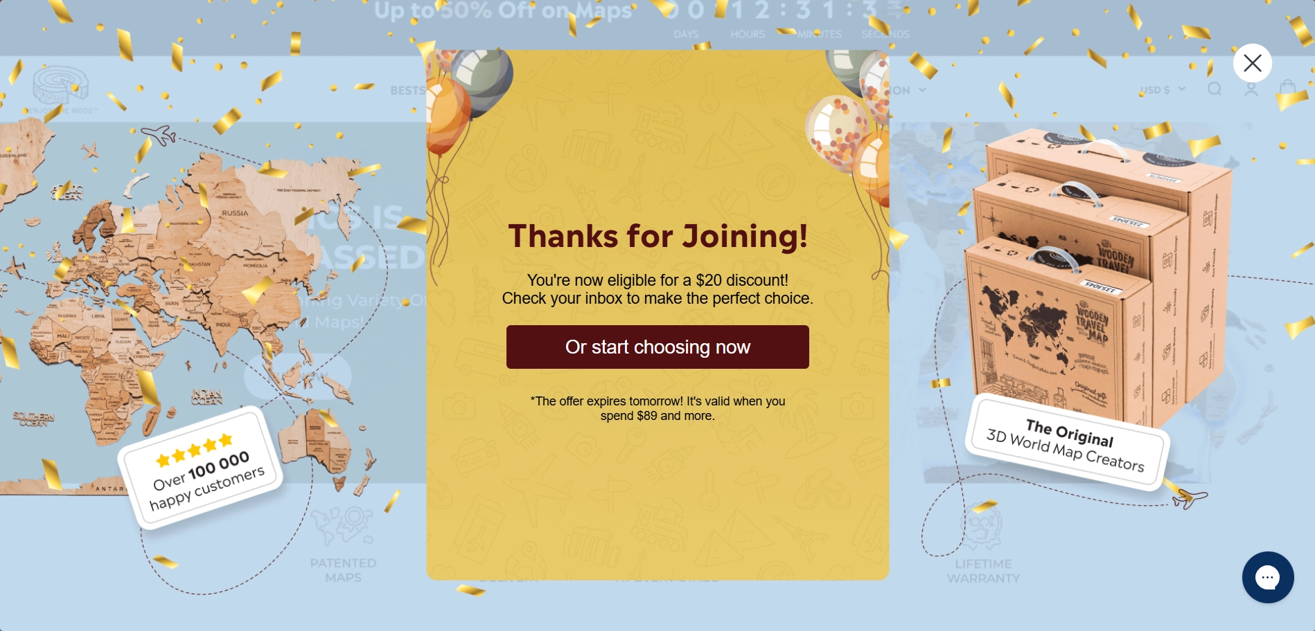
- Start simple: begin with easy, non-pressuring questions, as Enjoy the Wood did:
- Add incentives: throw in a little something at the end — a discount or freebie.
Instead of emailing a promo code, embed it in the Thank You box with a ‘copy’ button. This keeps users on-site, making applying the code at checkout easy.
- Make it pretty: use images or progress bars to make the form as visually exciting as it is easy to follow.
3. Slider Subscription Form
This option can be a good alternative to the hero banner to get people's emails. Not every visitor will wait for a new slide with an interesting offer to appear in front of them, especially if there are no rewind arrows, as in this example:
So, only the very patient ones will wait for the subscription slide and go to another page to fill out the form. Instead, you can use a floating box with a slider component:
Why it works
These sliders naturally slip into the browsing flow, catching eyes without demanding all the attention. They’re subtle yet effective — keeping the opt-in message in sight as users scroll down, so it’s there when they’re ready to engage without being in-your-face.
How to implement it
- Strategic placement: trigger the slider floating box when users have scrolled a certain percentage of a page. This keeps it relevant and less ‘popup-ish’.
- Use multiple slides to build interest: for example, start with a catchy headline, add some benefits, and wrap it up with the subscription form.
- Direct form or link: embed the form in a slide or link to a landing page.
4. Gated Content Widget
A gated content widget appears before the user after a ‘sneak peek’ of valuable content, like an article, report, etc. Users can read the intro or a preview, but a form waits for them as they scroll, asking for an email address to access the rest.
Why it works
By piquing curiosity and promising exclusive content, these forms make visitors feel like they’re on the verge of something valuable, motivating them to hand over their email. This approach often helps to collect emails as people go for full access and stay on a website longer. However, overuse can annoy the audience, especially if the content doesn’t match the hype. Make sure what’s behind the gate is actually worth the email — it’ll keep users happy and trusting.
When to use it
Gated content forms shine for:
- In-depth articles and reports.
- Exclusive tutorials or e-books.
- Premium insights and practical advice.
5. Full-Screen Overlay
It is a pop-up that takes over the entire screen to ensure visitors notice an offer or prompt — whether it's to sign up for a newsletter, grab a discount, or join a loyalty program.
Why it works
High visibility — it’s simply hard to miss! By blocking out everything else, it puts all eyes on the call to action. Since this widget type can be annoying, you should use it carefully to gather emails for a mailing list without distracting from the main conversion or irritating your visitors.
When to show it
- After a purchase: customers have already committed, so the invitation feels more like a natural step than an interruption.
- Exit-intent: since visitors are already on their way out, it doesn’t interfere with their shopping flow. Try to get people’s email addresses by offering something valuable in return, such as discounts, exclusive content, etc.
- Re-engaging inactive users: When someone seems to pause or drift off mid-browse, an overlay can gently nudge them back. It’s less of a disruption and more of a ‘Hey, check this out!’
6. Exit Intent Opt-Ins
It is that last-second attempt to stop a visitor when their mouse drifts toward closing the tab. It tracks when someone’s about to exit and pops up with one last call to action — usually to subscribe or get an exclusive offer. An creative exit intent popup, done right, is like a friendly wave goodbye... that also hands you a coupon.
Why it works
Unlike mid-scroll pop-ups that interrupt, exit intent overlays wait until the visitors have already checked out mentally, making them feel less invasive. A good exit popup tool taps into the fear of missing out. Highlight a discount, special content, or limited-time offer, and watch visitors reconsider that tab close.
How to make it work
- Give a reason to stay, like discounts, coupons, exclusive content, or limited-time offers. For example, Brahmin offers a birthday gift:
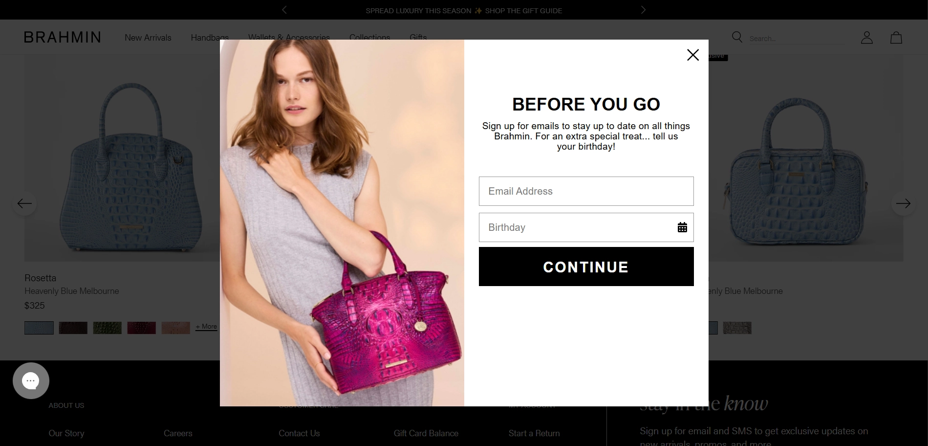
Gather extra details about your subscribers to segment your list and send more personalized emails — like asking for their birthday. With Claspo's Date Component, adding this to your form is easy. Plus, 84% of consumers love personalized birthday offers, making this a smart way to get more emails
- Add social proof to highlight the usefulness and credibility of your newsletter.
- Optimize for mobile: exit intent on mobile can be tricky without a cursor — trigger it with time and scroll behavior.
7. Classic Pop-Ups
Web pop-ups are attention-grabbing windows that offer visitors a chance to sign up for a deal, newsletter, or exclusive content. When used strategically, these email opt-in forms are a solid option for how to collect emails.
Many believe that pop-ups will send users running, but our data show they have a bounce rate similar to pages without them, increasing sign-ups by 16%. Even better, behavior-triggered pop-ups can reduce bounce rates and grab even more targeted email addresses.
Why it works
A pop-up demands attention and prompts quick action. Sure, some users may grumble, but it’s hard to ignore a clear call to action!
How to implement it wisely
Use targeting and behavioral triggers to display widgets to relevant audiences and visitors who have shown signs of interest in the site and its content. Specifically:
- Time-based triggers: let the pop-up appear on the page or site after a set time.
- Scroll-based: trigger it when visitors reach a certain point. For example, on the All the Things Newsletter website, the pop-up reacts to scrolling and offers to subscribe to receive similar content in the inbox. Notice the clever ‘how to get emails’ strategy — social proof in the email input field.
Focus on your site's statistics, but if you don't have such data yet, know that, on average, 42% of users view only the top 20% of a page, and 65% spend time on the top 40%.
You can also target specific visitor segments with widgets. For example, Rixo shows a pop-up to new visitors to get email list members for marketing campaigns:
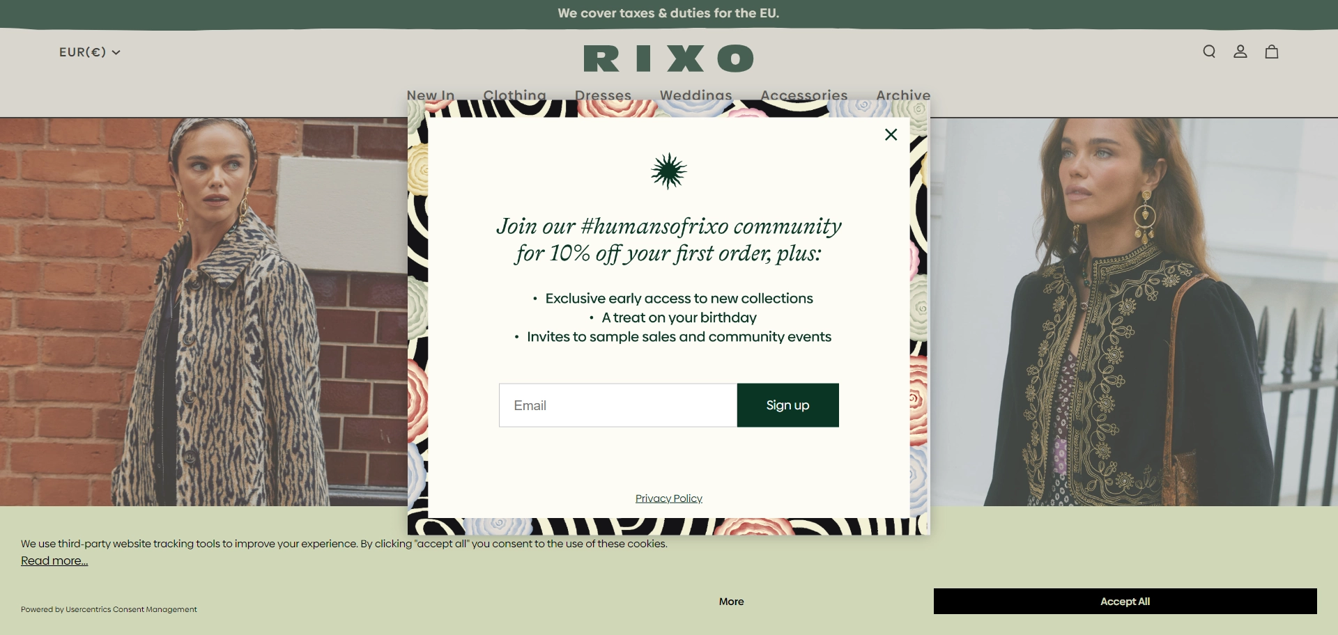
In Claspo, you can set a similar rule for displaying widgets for newcomers in one click.
8. Call-to-Action Button and Launchers
Want to know how to get email addresses discreetly? Combine an embed form with a pop-up. Embed subscription forms in spots like the footer, with just a call-to-action and a button. When clicked, a pop-up appears with the full form.
Alternatively, use launchers — small widgets that stay visible as users scroll, offering a gentle nudge without interrupting the browsing experience. By the way, all of our templates have ready-made launchers that can be attached to the selected widget in the library:
Why they work
These methods balance visibility with user experience. Unlike traditional pop-ups, launchers let users engage on their own terms, staying in the background but always there when needed.
When to use them
- Embed form + pop-up: perfect for content-heavy pages where you want to invite subscriptions without interrupting browsing (great for e-commerce or blogs).
- Launchers: best for promoting time-sensitive offers or campaigns — always visible, ready to catch attention when the time's right.
Optimal Pages for Sign-Ins
When selecting a widget type, whether a pop-up or an embed form, it’s important to keep in mind where you plan to place them. Typically, businesses add them to pages with the highest traffic, where they have a better chance to get emails for marketing purposes.
According to statistics, 37% of subscribers come from subscription forms placed on the homepage, and 33% from forms on various customer-facing pages. However, one of our clients found success by adding widgets specifically to high-traffic but low-conversion pages. So, analyze your website statistics to choose the best strategy for you.
9. Landing Superstar
This is a dedicated page designed with one goal: to get people to leave their contacts or sign up for a newsletter.
Why it works
Without any distractions (no competing blog posts or products), it’s easier for visitors to choose to sign up for your content, discounts, exclusive offers, etc.
How to implement it
- This is your top-shelf offer, so make it something irresistible — an exclusive e-book, a free trial, or a major discount. Something visitors can't say no to! For example, Mailchimp offers a report on a landing page tailored to its audience’s interests.
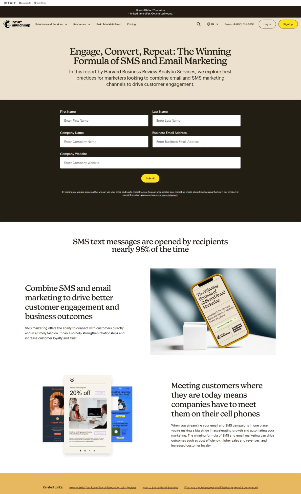
Here, they use a dedicated page with space for an advanced form that collects key details like the company name and qualified marketing email addresses.
How do you get email addresses from company employees? Use our editor’s data validation rule to block public email domains in your form
- Ditch the clutter, and make sure the form stands out. No one will sign up if they can’t find the form.
- Write a bold, clear, and impossible-to-miss CTA. Try to use power words. By the way, we’ve got an awesome selection of 600+ trigger words and phrases — download the PDF and pick the best ones for you.
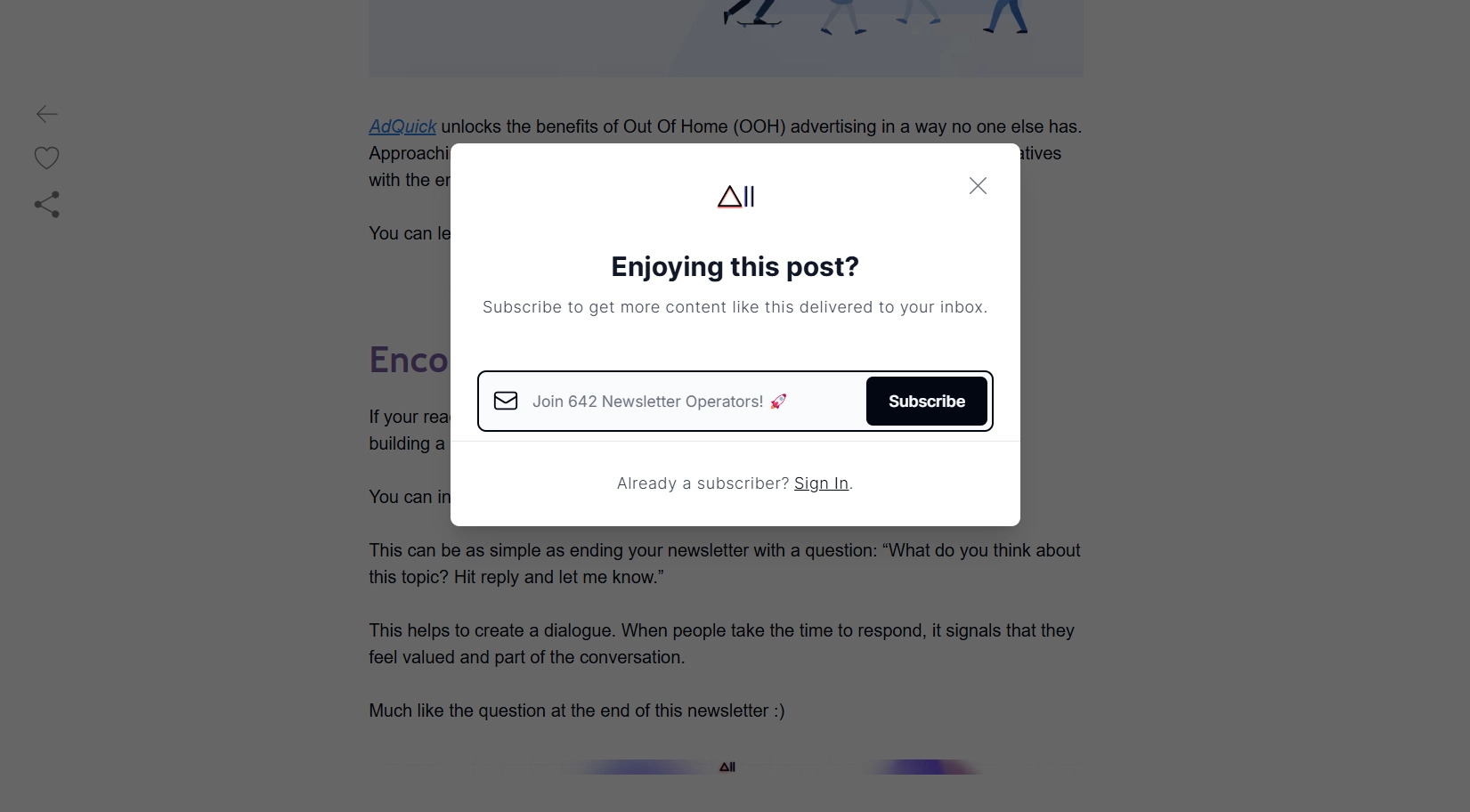
10. The Contextual Forms for Rich-Content Pages
This is a pop-up or inline subscription form that appears inside the article. The main thing is that its content should be contextually related to the topic of the publication or, even better, complement and expand it.
Why it works
It doesn’t feel pushy because it’s woven right into the content readers are already engaged with, giving them value at the perfect moment. When they are deep into your article, they’re primed for something more — so why not give it to them?
How to implement it
Add the widget when users are deeply engaged with your content. Use time- or scroll-based triggers for pop-ups and place embedded forms in relevant spots. Although forms often work well near the top, Esquire, for instance, places a subscription form at the end of articles with a CTA that’s thematically related.

The editorial team gets emails from interested readers, which is the best way to build an engaged subscriber list.
Here’s the trick: place your pop-up mid-article with a two-step opt-in. First, they’ll click to say, ‘Yes, I want this awesome something!’ then they’ll enter their email. That extra step makes it feel like they’re initiating the action, which can increase conversions
11. The Product Page Deal
A pop-up or inline form offering a sweet discount or other perks right on the product page, tempting shoppers to get a deal if they hand over their email. Think of it as a friendly reminder saying, ‘Hey, you can get this for less!’
Why it works
It catches shoppers when they’re already browsing a product, amping up their excitement and giving them that extra push to buy. A discount feels like a reward, making it much harder for them to walk away without clicking ‘Add to Cart’.
How to implement it
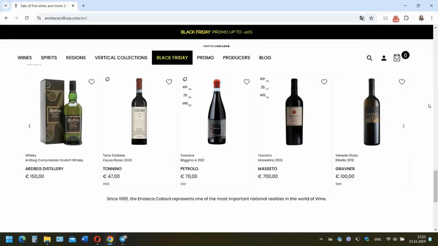
Use an exit-intent pop-up that triggers when they’re about to leave the page. And don’t forget to design it for mobile — about half of your shoppers are probably browsing from their phones. The built-in form can be placed below the main product information and made clearly visible. For example, G-Star opted for a laconic form that matches the site’s overall design. However, it is clearly visible due to its relatively large size.
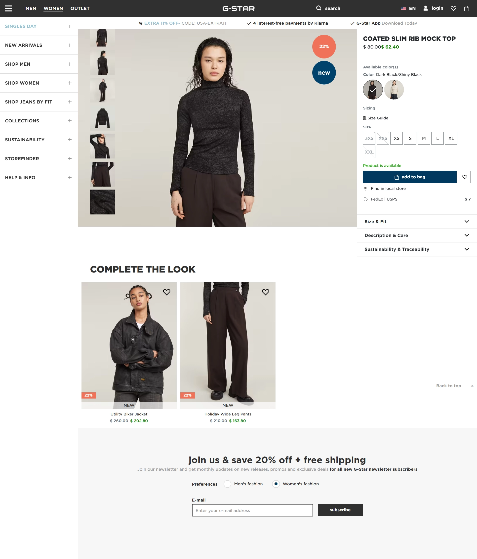
Notice that the form immediately gives subscribers a choice of which newsletter they want.
According to a study, 80.8% of consumers want to receive emails with content personalized to their interests. Personalizing emails with new customers is difficult due to a lack of information about them, but it's still possible. Add an option for users to select topics of interest by including Radio, Dropdown, or Checkbox components in your form.
12. About Us Page
Consumers visit this section to learn more about the company as part of their purchase decision. These pages often use built-in forms that avoid distracting the visitor.
Why it works
Your About Us page isn’t just a place for visitors to learn your story; it’s where they go to decide if they like you. If they’re already here, they’re interested, so why not use that moment to turn them into subscribers? For businesses like lifestyle brands, personal services, or SaaS companies, it’s a smart move. Any business with a unique story or brand voice will benefit from inviting visitors to subscribe at this point. It’s also a low-pressure way to convert browsers into leads without screaming ‘Subscribe!’ from every corner of your site.
How to implement it
The key here is delicacy — don't overshadow your history. A simple form at the end of the About Us page or as a non-intrusive slide-in does the trick. In the signup form example below, the form sits neatly at the top side of the page — out of the way but still eye-catching, thanks to the bright CTA button.
13. Homepage Hero Section Subscription
The hero section is your first impression, and by placing a big built-in subscription form there, you’re making the most of it. This immediate, in-your-face approach ensures that your visitors know exactly what to do if they’re interested in your content right from the start.
Why it works
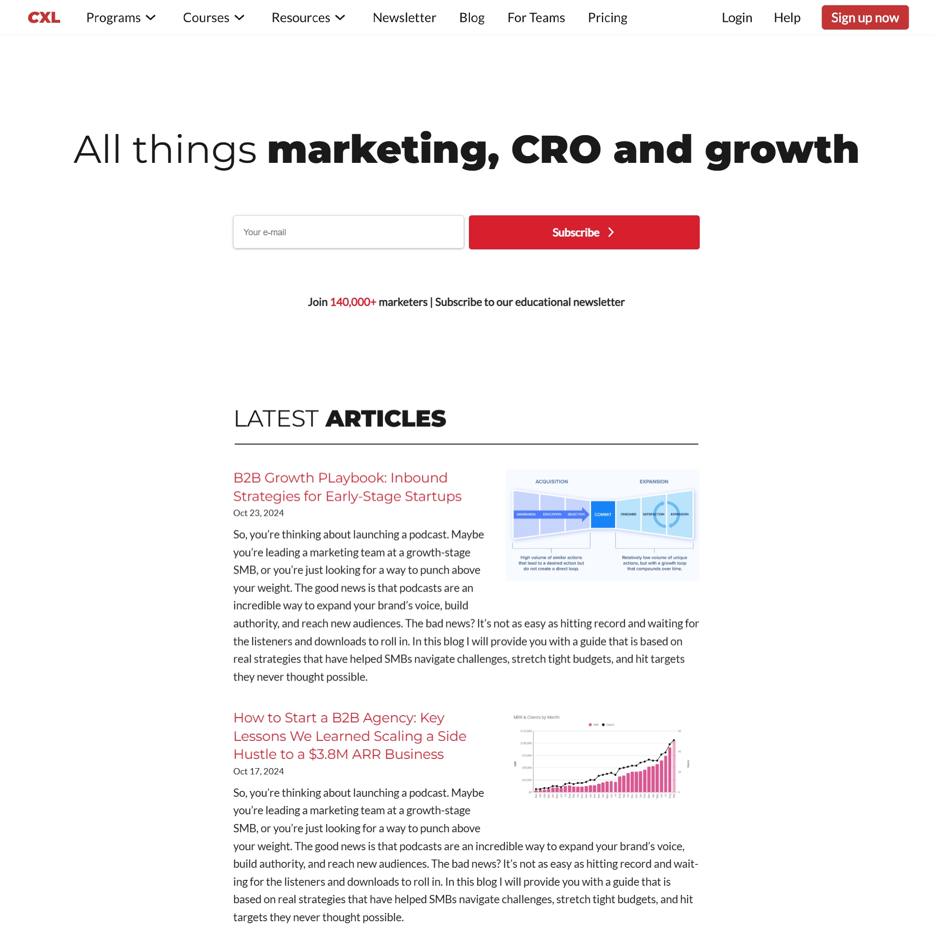
A prominent hero section subscription form catches attention before anything else can distract them. It creates a strong first impression, letting visitors know you’re serious about delivering value, just like CXL does with a simple, concise value proposition paired with a no-fuss email field. And, when they throw in a little social proof, they’re tapping into FOMO — who wants to miss out on insights that 140,000 others are finding useful?
How to implement it
Make your value proposition short and sweet. In one clear sentence, tell visitors what subscribing will get them. Make it specific and personalized to your audience. Make sure your CTA button stands out — bold colors and action-oriented text work well.
Remember, the strategy isn’t for everyone. It is best suited for businesses that rely on regular content, like blogs, online publications, or brands focusing on audience-building. If your site is less about content and more about showcasing a product or service, consider placing your subscription form somewhere less front and center.
Subscription Form Placement Options
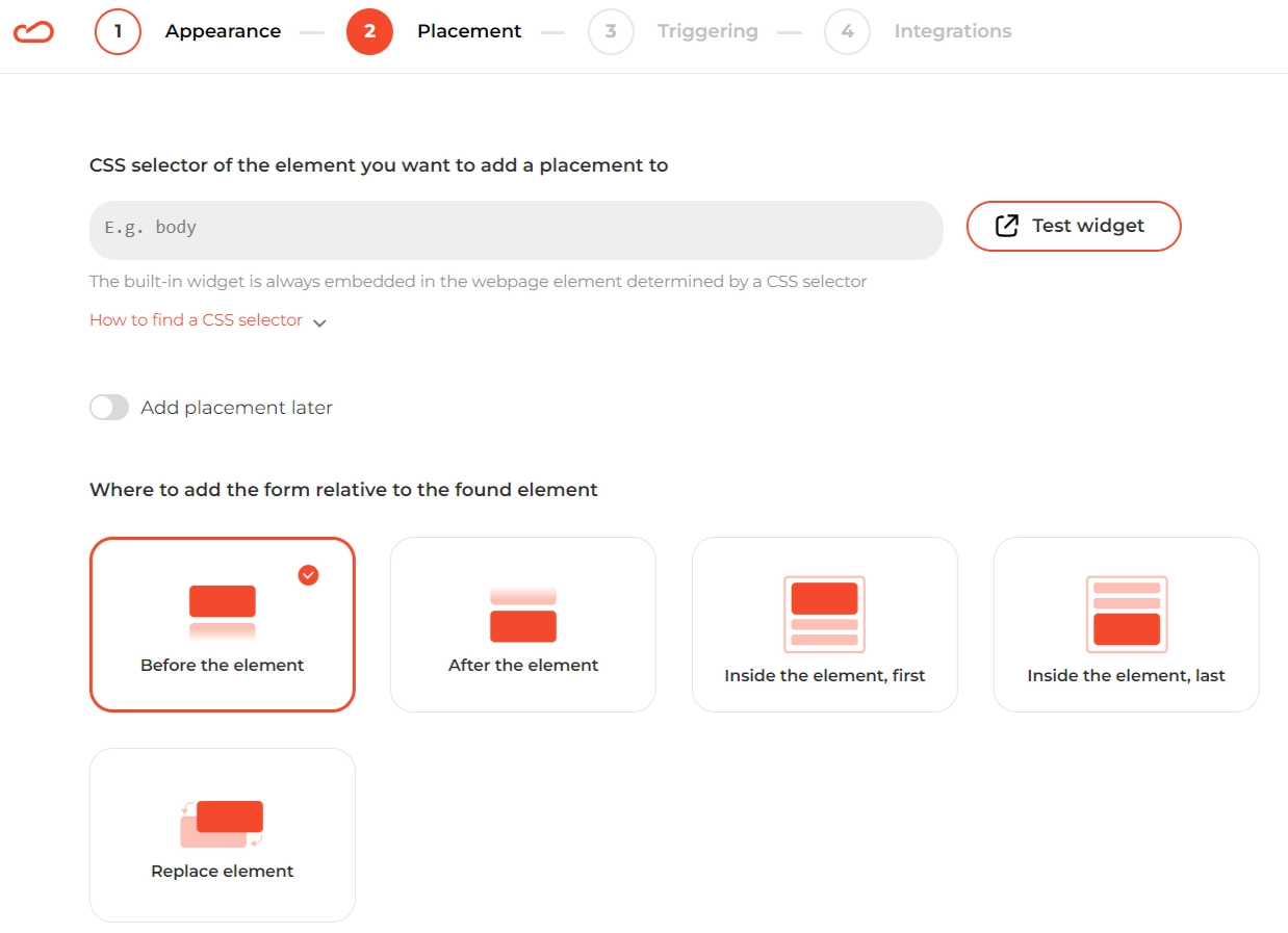
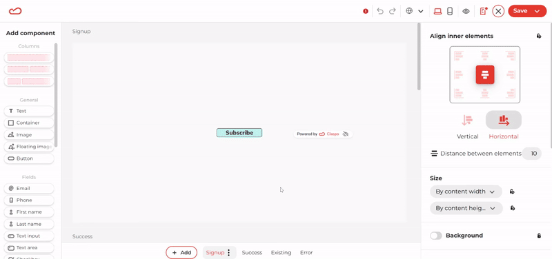
Placing subscription forms on pages is crucial, especially for built-in forms, which Claspo lets you add literally anywhere on your site:
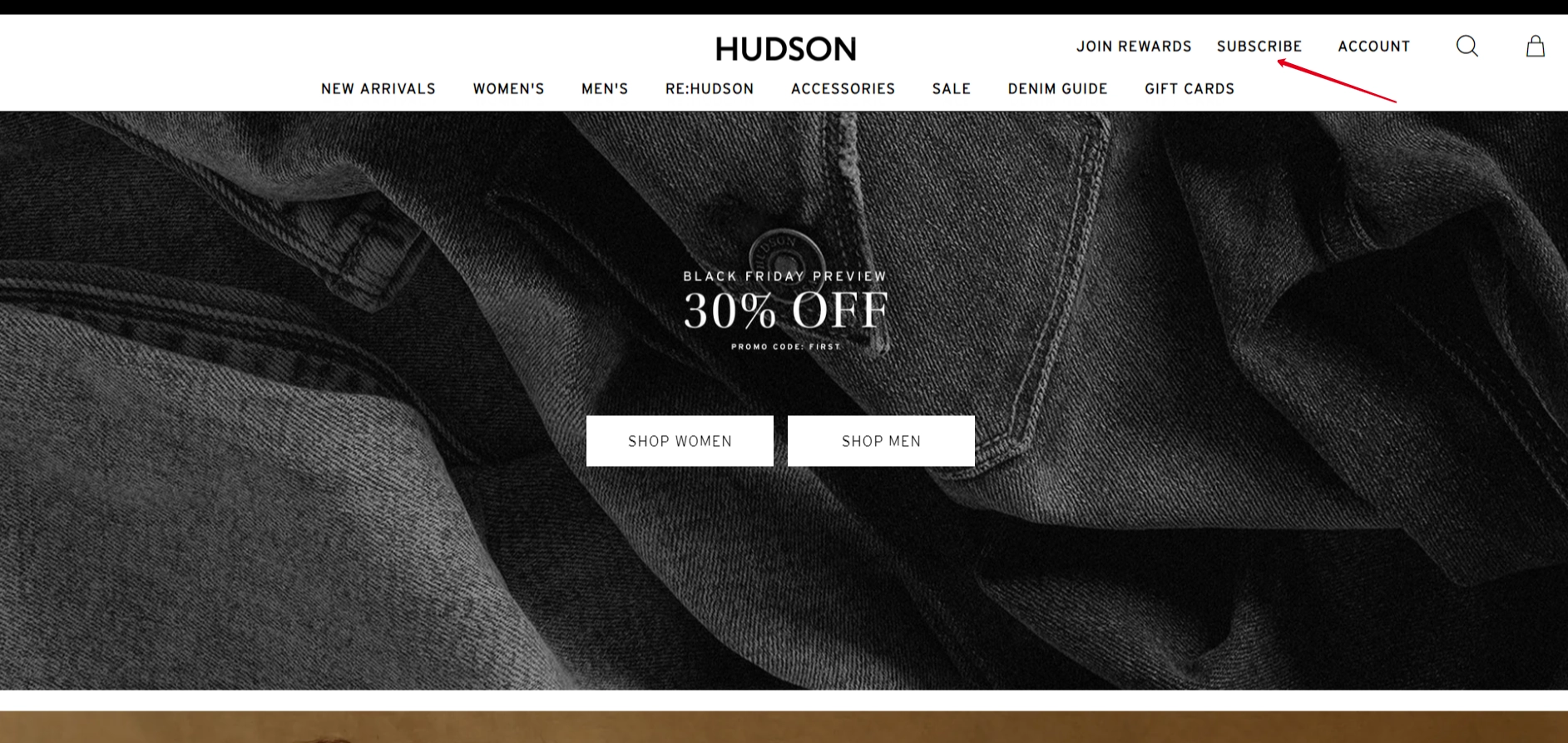
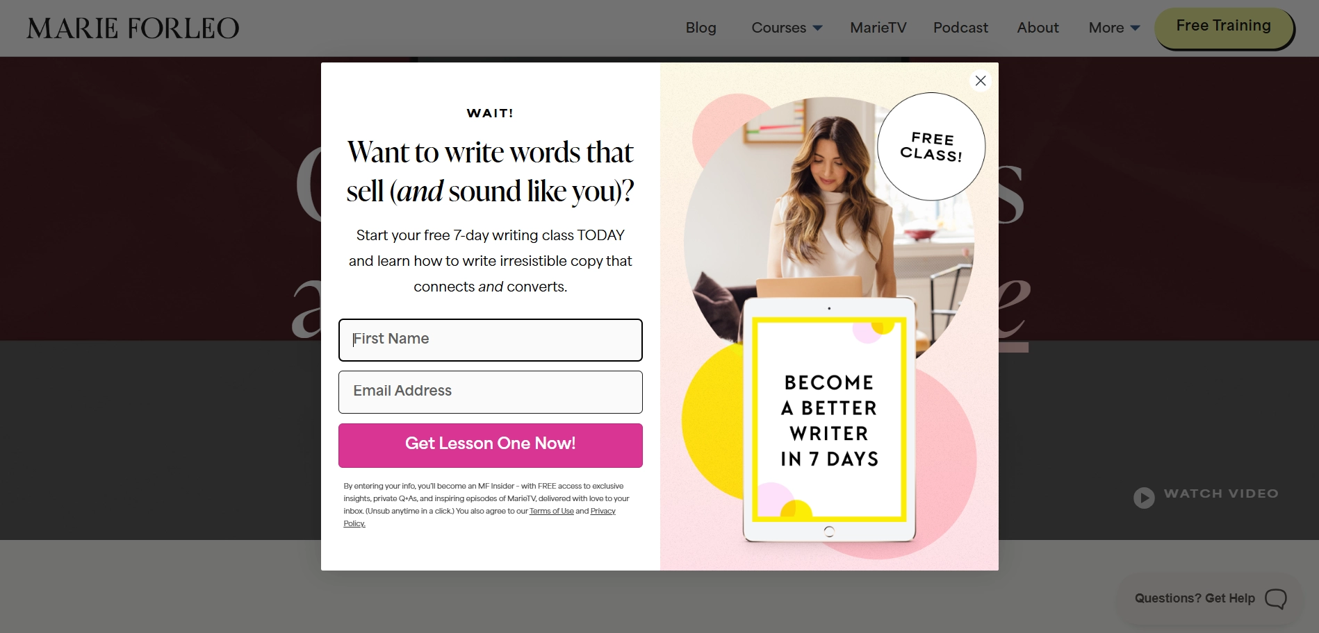
14. Menu-Integrated Opt-In
Think of it as the quiet achiever of ‘collect emails for free’ tactics — a simple ‘Join our list’ or even ‘Subscribe’ link living right in your menu. It’s always there, visible but not in your face.
Why it works
Menus naturally draw the eye, so sticking an opt-in link up there gives it constant visibility without disrupting your user’s flow. Plus, this placement means no pop-ups or flashing banners — you’re keeping things low-key and classy.
How to implement it
Your menu should stay neat, so don’t add too many words here. However, a direct call-to-action like “Get free tips” or “Grab freebies” works wonders for blogs, educational sites, and content-heavy brands. See how this is implemented on the Marie Forleo website:

The top-right corner is often where the eye goes last, so try placing your opt-in form there if you want a softer approach. For a bolder move, position it closer to your brand logo, as many opt-in templates actually do. The font, color, and size should stand out but not look out of place.
In Claspo, you can link a popup with a subscription form so that it appears when a user clicks on a specific element of the site, in this case, the ‘Subscribe’ link. Alternatively, you can turn the built-in form into a small button and add it to the menu section, then add a link to the subscription landing page or pop-up activation.
15. Menu-Above Opt-In Floating Bar
It is a slim, attention-grabbing bar that floats at the top of your site, just above the menu. It sticks with visitors as they scroll, serving as a gentle reminder that subscribing is only one click away. Also, you can use a built-in form layout for this purpose, as we see in the Mirasee blog:
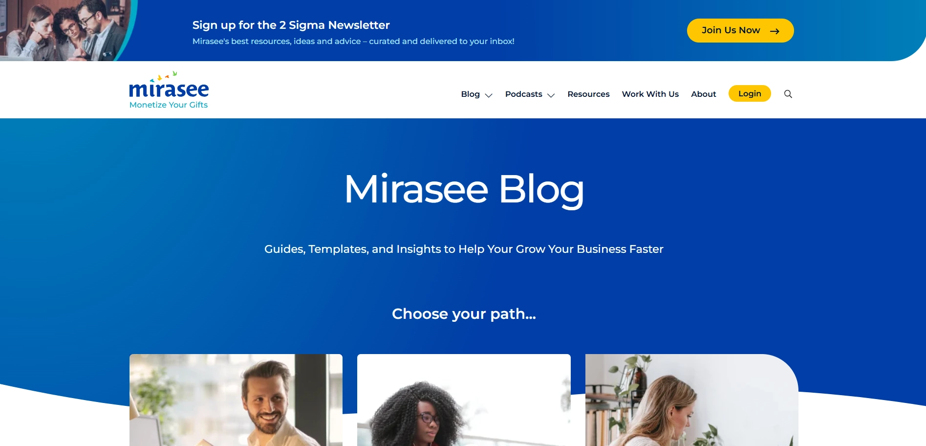
The above-menu subscription form is great for blogs, e-commerce, or any site looking to get an email list without taking over the screen.
Why It Works
Floating bars are unintrusive yet effective. Since they’re always visible, they increase your chances of getting sign-ups without disrupting the browsing experience. It is also perfect for mobile since it takes up minimal screen space while keeping your call-to-action up top.
How to implement it
The bar should be simple, with just a brief message and one clear CTA button. There is no need for extra text or images here; simplicity is what makes floating bars so effective. It shouldn't be flashing or bouncing — let it float calmly at the top and do its job.
16. Attention-Grabbing Under-Menu Form
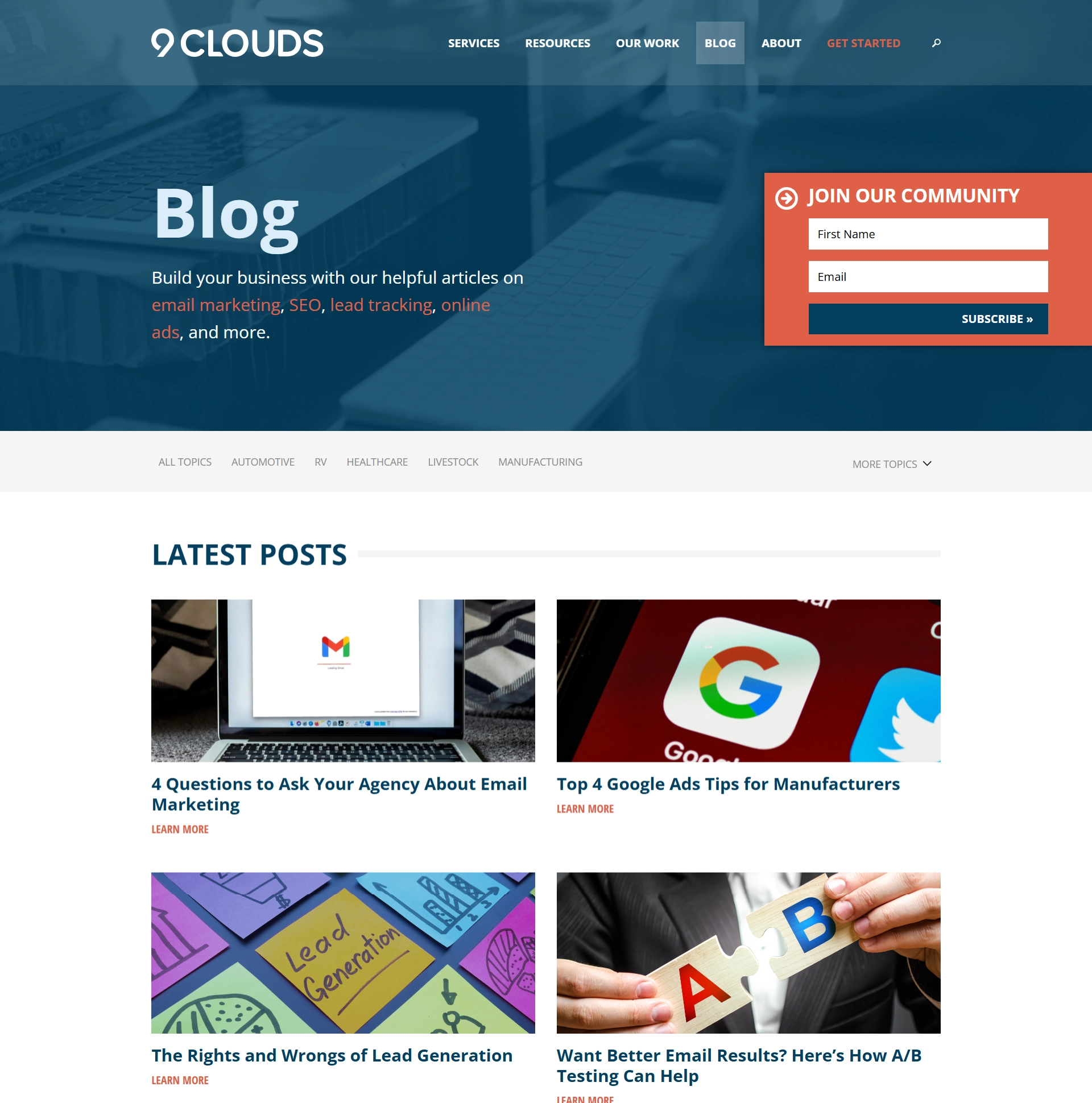
This approach is very similar to the one described above, but it is perfect for those pages that aren’t your homepage, like blog posts, service pages, etc. You can use a narrow floating bar or add a prominent built-in form to the hero section, as 9clouds did:
Why it works
This opt-in form pulls you in without trying too hard. It’s especially effective on landing pages or secondary pages where visitors are already engaged with content and are more likely to take action. It's a good solution when you don’t want to clutter your homepage with more CTA distractions but still want to capture leads from deeper within your site.
How to implement it
Each page is different, so your CTA should match the context. Make the message personal and specific to what your visitor is likely interested in at that moment. Avoid long paragraphs — just a clear statement of value. If you want to use a floating bar rather than a built-in form, adjust the widgets' behavior based on user interaction. Show it after they’ve been on the page for a few seconds or when they reach the middle of the content. Experiment to find the right balance so the bar feels timely, not pushy.
17. Bottom Bar CTA Link
It is a simple yet effective call-to-action that lives at the bottom menu of your page. It's always there, quietly hanging out, waiting for the right moment when the visitor finishes reading or scrolling through your content.
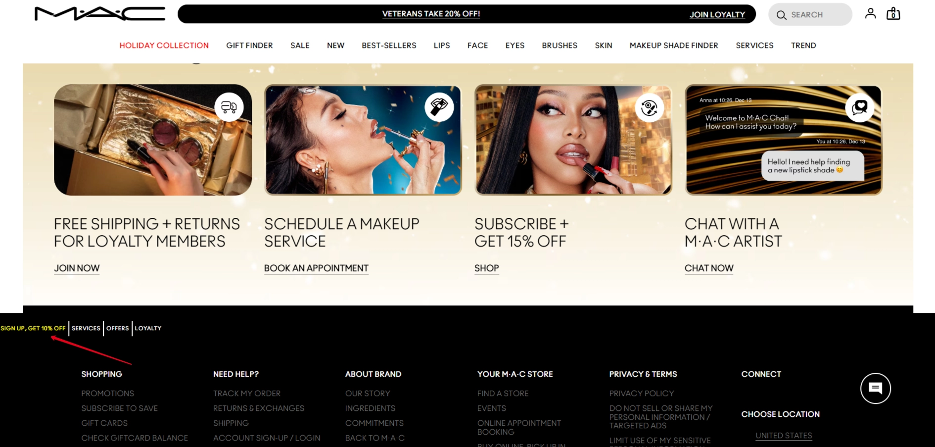
Why it works
Visitors who scroll to the bottom of the page are usually either highly engaged or ready to leave — so a well-timed CTA at this stage is more likely to convert them. The bottom bar CTA doesn’t disrupt the browsing experience, but it’s still available for users when they’re ready to take action. It's unobtrusive and easy to ignore if they’re not ready, but they’ll appreciate the gentle reminder if they're interested.
How to implement it
While the bottom bar should be subtle, it still needs to be noticeable enough to be clicked. Use a contrast in color that complements the overall design of your page. Using Claspo, you can take it one step further and link your bottom bar CTA to a subscription form pop-up or redirect users to a landing page.
18. Traditional Sidebar Sign-Up Form
The built-in sidebar form might seem like an oldie, but it’s still a goodie for getting subscriptions. It’s like putting a sign-up sheet in a coffee shop. It’s visible, but it doesn’t grab you by the shoulders.
Why it works
The sidebar form is often placed on content-heavy pages. It’s perfect for people who are already reading your content and might be interested in hearing more from you in the future. By positioning your opt-in here, you give them an easy, non-disruptive way to subscribe.
How to implement it
Add the form on pages where visitors are most likely to want more information. However, avoid adding it on every page of your site; instead, make it a feature where content engagement is highest. The sidebar is often the first place people look when they want to take action without interrupting their browsing experience. Make your form simple with an easy-to-find email input field. Consider adding sign-up preference options for ongoing segmented email marketing campaigns.
19. Footer Opt-In Built-in Form
While it might not be as flashy as pop-ups or hero-section forms, it’s an anchor for capturing those who made it through your content journey and are still engaged enough to subscribe.
Why it works
For those who aren’t sold at the top or mid-scroll, the footer form presents a no-pressure chance to stay connected. It’s perfect for visitors who want to look around before committing to a subscription, letting them do so at their own pace.
This approach is especially effective on content-rich pages like blog articles or product pages where visitors are already committed to reading, scrolling, and learning more about what you offer. And while footer forms don’t always show sky-high conversion rates (typically hovering around 1-2%, depending on traffic quality), they attract people who are genuinely interested — no accidental clicks here.
How to implement it
Since the footer can easily become a content graveyard, make sure the form is clean and visually distinct. Give it some breathing room, using contrast to make the form noticeable yet harmonious with the footer design. Looking for inspiration? Check out newsletter signup form examples.
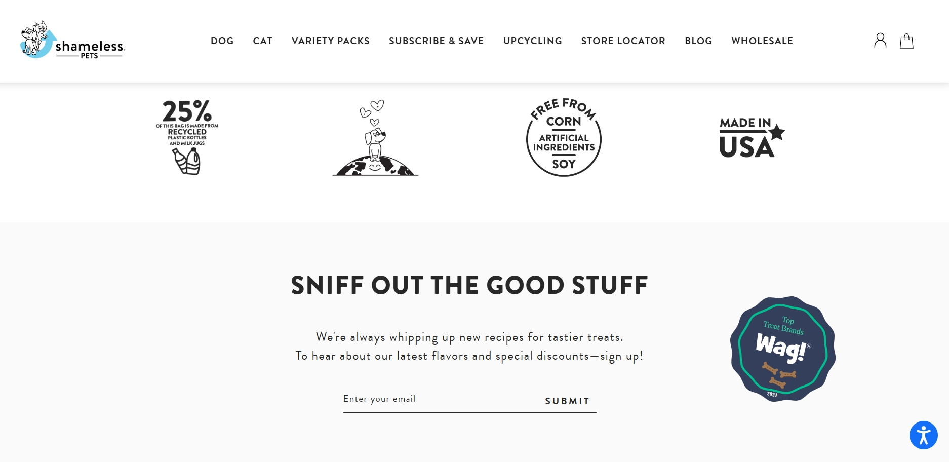
If possible, tailor the form’s language based on page type and your brand tone of voice, like Shameless Pets did:
Lead Magnets to Grow Your List of Emails for Marketing
Sure, discounts and other financial perks are crowd-pleasers, but not every business prefers them. Good news: you can use lead magnets that deliver real value without emptying your wallet. No wonder 52.9% of entrepreneurs and small businesses say lead magnets are their go-to for generating leads.
They’re affordable, valuable to recipients, and easy to automate for collecting email addresses and sending content. That’s why 44.3% of respondents said this method offers the best ROI. In this section, we'll explore ideas and examples for creating lead magnets, with more inspiration available in this article.
20. Value-Driven Downloadable Lead Magnets
It’s a targeted pop-up or subscription form with a downloadable incentive designed to make visitors say, ‘Yes, I need this!’ You can collect emails, offering a free eBook, cheat sheet, checklist, webinar access, or any other event. These lead magnets speak directly to the interests of your audience.
Why it works
Let’s be frank — emails don’t come easy anymore. Visitors are spoiled with options, so a simple ‘Subscribe’ just won’t cut it. Lead magnets work because they’re value-packed, making the exchange mutually beneficial. Look at the Baymard Institute's lead-magnet pop-up titled ‘Learn Why Users Abandon…’ That’s not just an email grab; it’s a solution to a problem their audience wants to solve.
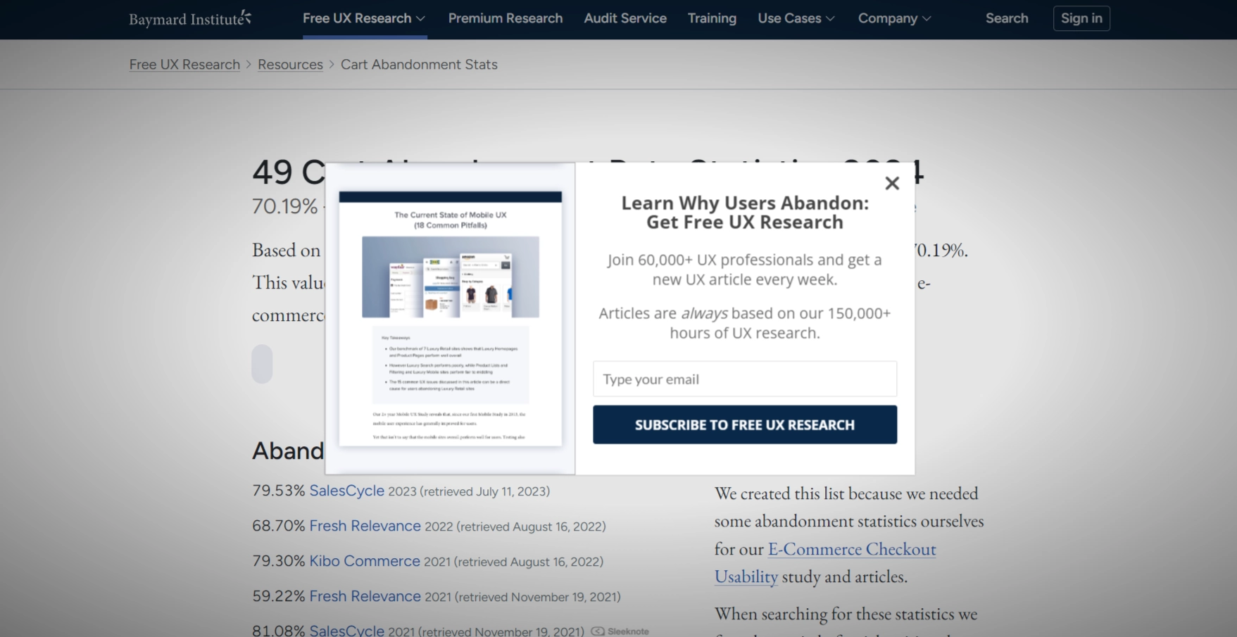
The possible result? Higher opt-in rates, more engaged subscribers, and a real shot at turning visitors into loyal followers or customers. Lead magnets can yield 5-15% conversion rates depending on their relevance, quality, and placement. Downloadable resources generally convert better on blog pages, educational hubs, or any page where users are already seeking information.
How to implement it
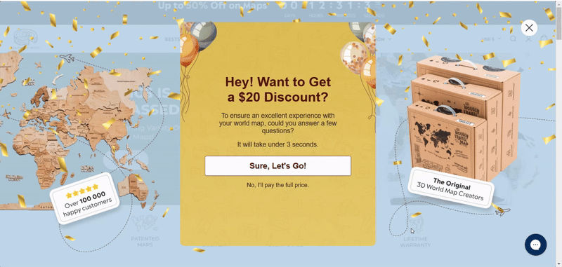
Tailor the lead magnet to match the page’s content. The more aligned the offer is with the user’s immediate interest, the better your conversion rate. Catching visitors before they leave the page can also work wonders. If they’re about to bounce, an exit-intent pop-up with a lead-magnet is a gentle but compelling nudge.
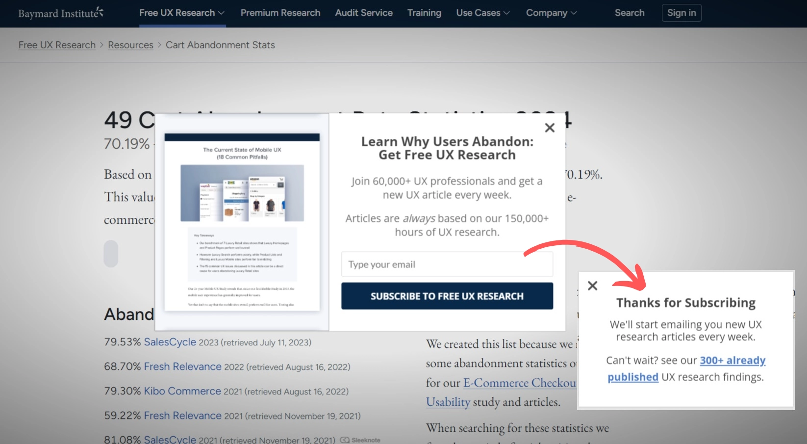
Don’t overlook the ‘Thank You’ message box — it should guide visitors to the next steps. For example, Baymard Institute not only confirms the research is on its way but also suggests other relevant content on the site
You can easily create something similar in our editor, as all template windows are customizable.
21. Engagement-Driven Email Course
The lead magnet is all about using a pop-up or subscription form to gather email addresses in exchange for a valuable educational series. The course arrives in the subscriber’s inbox, usually with daily lessons over a set period.
Why it works
This method is effective because it goes beyond a one-time freebie. Offering a free course signals that you’re serious about delivering value, and your subscribers see you as an expert. This kind of lead magnet increases ongoing engagement, as sending content daily keeps your brand fresh in subscribers’ minds. Instead of a single interaction, they’ll look forward to your emails day after day, strengthening the bond with your brand.
A subscriber who commits to a multi-day course is often genuinely interested in the subject. By the end, they’re more knowledgeable and more connected to your brand, making them excellent candidates for future sales offers, especially when the final email introduces a related service or product.
How to implement it
Use the pop-up to clearly communicate what visitors will gain from the course — focus on benefits and specific skills they’ll learn. A well-timed pop-up works wonders. Consider a delay, like after 30 seconds, so people are more settled on your site. Place it where visitors are likely to be curious.
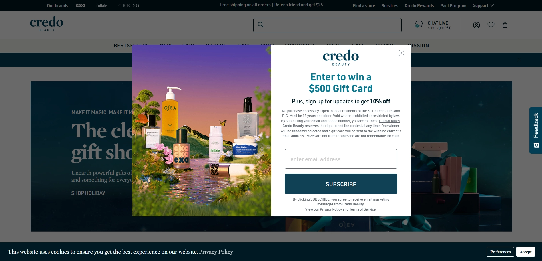
22. Lead Magnet with Giveaway
A product giveaway could be a great alternative if you're considering a financial incentive as a lead magnet but don’t want to go all in. For example, Credo Beauty offers a gift card. It’s a great ‘low-risk, high-reward’ lead magnet.
Why it works
People love free stuff. Giveaways trigger excitement, encouraging people to subscribe and participate. For brands, this means increased email sign-ups without discounting the whole range of products. Subscribers who opt-in for a giveaway are already showing interest in your product. If the giveaway is related to what you sell, these are solid potential leads that you can nurture further.
While results can vary, giveaway-based lead magnets often see higher-than-average conversion rates — sometimes as much as 15-25%. The key is to ensure the prize is valuable and relevant, which keeps your new leads warm and interested.
How to implement it
Pop-ups work well on pages where visitors already show some interest, like product pages or blog posts that discuss your main offerings. You might also try exit-intents on the cart page, enticing users to stay engaged. Consider adding a countdown timer to create urgency. From our customers’ experience, a strong offer paired with a countdown timer and clear call to action can increase CR by 112%.
Maximize the FOMO effect with our Relative countdown timer. It starts individually for each visitor so that everyone has an equal chance to get the deal. When time runs out for one user, the offer disappears for them but stays for others
How do you Target and Trigger Your Forms to Collect Emails?
In some of the above examples, we mentioned the need for precise targeting of specific audiences, as well as triggers. Let's briefly review what widget display rules you can set in Claspo.
Targeting and behavioral triggers allow you to decide who sees your pop-up and when. Claspo offers targeting like:
- geotargeting,
- device type,
- UTM tags,
- newcomer targeting.
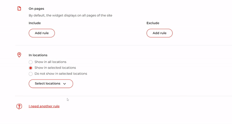
Geotargeting. Perfect for businesses with region-specific offers. It lets you target users by location, including countries, regions, and cities. Say you’re opening a new local shop in Austin — set your pop-ups only to be shown to those within the city to get emails instead of welcome discounts.
UTM targeting. UTM tags on your incoming traffic are a goldmine for personalization. If someone clicks through from, say, a social media ad or your Facebook page post with a specific UTM tag, you can show a tailored pop-up that matches the ad’s promise. Monitor UTM-tagged campaigns in your analytics to see which channels and promotions yield the highest traffic and conversions. Adjust pop-ups based on your findings.
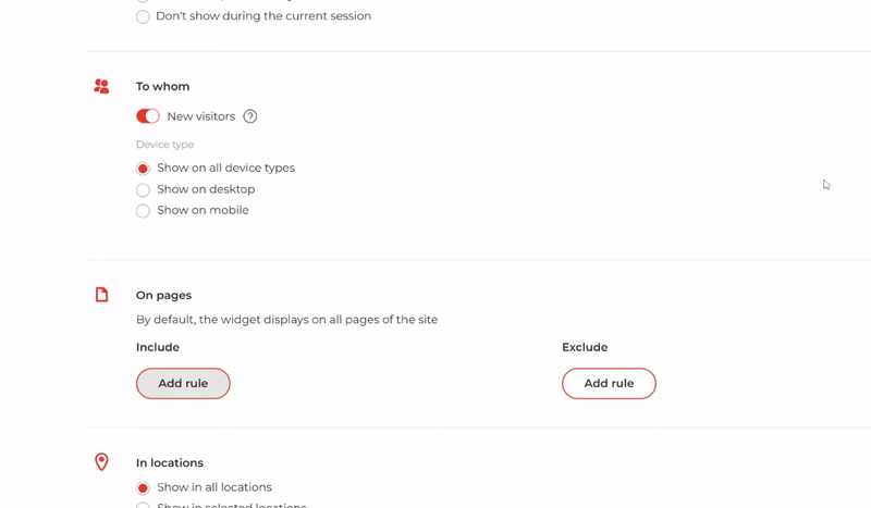
Device type targeting. All our widgets are mobile-friendly, but you may need to create separate campaigns for different devices. Mobile users respond better to shorter, more concise offers, while desktop users can handle more content.
New visitor targeting. First-time visitors might appreciate a warm welcome or a new-subscriber discount.
Behavioral triggers activate pop-ups based on visitor actions, such as:
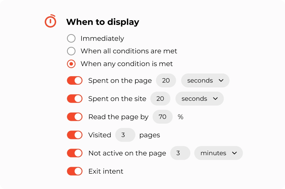
Time-based triggers: look at your average time-on-page and time-on-site stats to set an appropriate time trigger. You may need a longer delay for more complex pages, while shorter pages might only need 10-15 seconds.
Scroll depth: check which pages on your site have the highest scroll rates, as these are ideal for scroll-triggered pop-ups. Try different depths (like 50% vs. 80%) to see what works best.
Number of pages viewed: this is great for e-commerce, where more page views often mean browsing products. Setting the pop-up trigger for users viewing 3-4 pages can encourage sign-ups from shoppers.
Inactivity: choose an inactivity period based on average session times. For shorter sessions, a 10-second idle trigger works well; longer sessions may benefit from a 30-second idle trigger.
Exit intent: Look at your exit rates in analytics to see which pages could benefit most. Checkout or product pages are prime spots for exit-intent pop-ups.
Build a Pop-Up Form in Claspo in 4 Simple Steps
Enough with the theoretical blah, blah, blah; let's get creative and take your email marketing to new heights! All you need to build your first subscription form on the Claspo platform is a little time. In just five minutes, your popup is live with no developers or designers required!
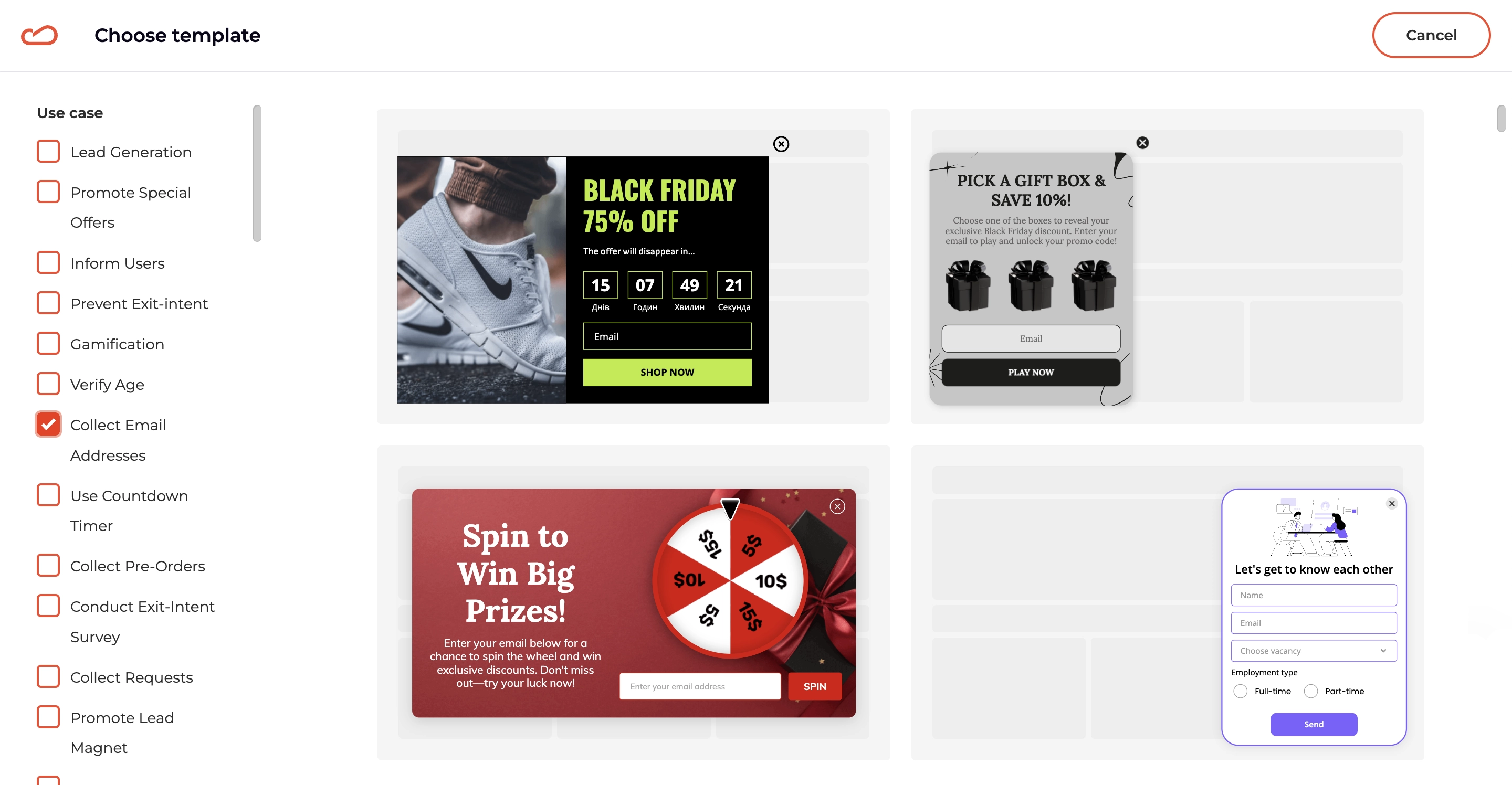
Step 1: Pick a Template
First, choose from 800 widget templates organized by industry and occasion to find your perfect match quickly. Here, you can find a list of subscribe form templates.
Step 2: Customize Design and Set Display Rules
Edit colors, fonts, shapes — you name it. Need images? Claspo has a built-in library! Prefer a video? Just add a YouTube link, and you’ll get a video popup. Customize further with gamification, countdowns, promo codes, and sliders to hook users.
Make sure your popups make connections only with the right audience. With Claspo’s triggers, they only show up when you want, keeping your site clutter-free.
Step 3: Integrate with Your Marketing Tools
Claspo works seamlessly with your favorite email marketing software, such as ESP, CRM and CMS. Our direct integrations cover 80% of our users' needs. If you need to connect to software that is not included, webhooks are at your service. Speaking of martech, we have an article about email marketing services for small businesses. It may be useful if you are currently choosing something for yourself or your clients.
Integration with an ESP allows Claspo to collect emails from website visitors and automatically send their contact information to the email marketing service. Then, ideally, you should set up Double Opt-In to ensure a high-quality contact database. By the way, you can find examples of confirmation email templates here.
While you're setting up automated workflows to collect leads, it's also helpful to track how much time your team spends on different lead generation strategies. Tools like TimeCamp help monitor productivity and campaign effectiveness across various collection channels.
Step 4: Publish & Run Tests
Next, preview your ready pop-up, tweak it as needed, and publish. Sit back and watch those conversions rise. But in reality, you don't have to sit around because, as we all know, marketing is a continuous process. This is also true for popups.
Among Claspo features, regardless of your plan, you will find A/B testing. We advise you to regularly conduct experiments to get to know the preferences of your target audience better. You can track the performance of your campaigns and test results directly on the dashboard in your account.
Make Your Users Want to Share Their Data
So there you have it — your roadmap for turning subscription forms from basic to brilliant! Now, you know how to strategically place your forms, time pop-ups for maximum impact, design forms that actually get clicks, and use instant segmentation to target the right audience.
Ready to turn these tips into results? With Claspo’s lifetime free plan (the best on the market, if we may say so!), you’re not just dabbling in theory. You’re getting unlimited access to every feature and a full library of proven templates. So go ahead, dive in, and quality leads and impressive conversion rates are just around the corner!


