
40+ Email Popup Examples to Get Newsletter Subscribers in 2026
Emails remain one of the most cost-effective and high-ROI marketing channels for engaging customers and driving conversions. According to one study, 75.4% of consumers prefer to receive promotional messages via email. Moreover, 32.7% subscribe to newsletters to access exclusive offers and personalized discounts.
To efficiently grow newsletter subscriber base and scale their lead generation efforts, savvy marketers increasingly rely on newsletter subscription popups — targeted, automated on-site tools that help convert website visitors into loyal email subscribers.
In this article, we’ll analyze real-world newsletter popup examples used across various industries, including ecommerce, SaaS, and content-driven websites. You’ll discover how to implement a sign-up pop-up strategy that aligns with your sales funnel, improves user engagement, reduces bounce rates, and drives conversions. From UX-focused designs to engaging copywriting, you’ll learn what makes these sign-up pop-up forms effective and how to apply similar tactics to your marketing strategies using Claspo.
What Are Email Popups?
An email popup is an interactive window that appears to website visitors. Its primary purpose is to capture visitor information: a visitor’s email address, phone number, first name, subscription preferences, and so on. Depending on the settings, these popups are typically triggered by user behaviors like time spent on a page, scroll depth, or exit intent, enabling marketers to present targeted offers at optimal moments in the user journey. Using a customizable popup form allows you to fine-tune how and when the message appears, making it easier to match user intent and increase conversions. With flexible targeting options, these forms can be adapted to suit different goals — from email capture to special promotions or surveys.
To streamline this process even more, many brands use a specialized lead capture pop‑up to segment audience intent—offering tailored incentives like free guides or discount codes based on user behavior. This type of smart form not only collects vital details efficiently but also enhances targeting for follow-up campaigns.
Once captured, this valuable data is then synced with your Email Service Provider (ESP) or Customer Data Platform (CDP). It allows you to nurture your contact base and guide email subscribers through targeted email marketing campaigns that drive product or service conversions.
While the layout and design of email sign-up popups can vary, they all share a common feature: a compelling, value-driven message or incentive (also known as a lead magnet). This incentive is designed to motivate visitors to share their contact information. With a tool like Claspo’s email list builder, you can effortlessly convert more visitors into engaged subscribers, boosting your lead generation and email marketing ROI.
How Effective Are Email Subscription Popups?
Email subscription popups are among the most powerful lead generation tools in a modern digital marketing strategy. Backed by data, their effectiveness is hard to ignore: according to Entrepreneur, websites without popups generally see a 3.7% conversion rate, while those using popups can reach up to 16%. On average, email subscription popups convert around 10% of visitors, making them one of the highest-performing digital lead capture tools available.
Moreover, incorporating elements like gamification, such as spin-to-win wheels, can further enhance engagement and conversion rates. These interactive pop-ups not only capture attention but also provide a sense of value and entertainment, encouraging users to subscribe.
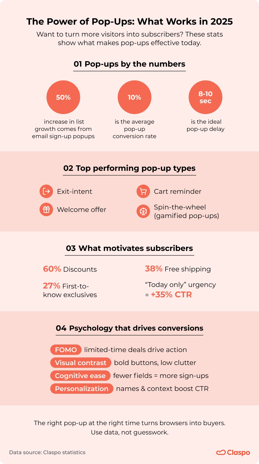
The effectiveness of email popups depends heavily on factors like industry, the format of the email subscribe popup, timing, and design. Later in this article, you’ll discover the top email pop-up best practices that make a pop-up truly effective and tailored to your audience.
40+ Best Newsletter Pop-up Examples (and Why They Convert)
In our quest to find the best newsletter popups, we’ve examined dozens of websites across various industries. While the subscription forms vary based on business goals and audience segments, certain elements remain consistent. The most effective pop-up newsletter examples all follow core best practices: strategic timing, persuasive copy, seamless user experience (UX), and a compelling value proposition.
Email Capture Popup Examples from E-commerce
In e-commerce, pop-ups are widely used for various purposes, including promoting offers, informing visitors about important events or business updates, and, of course, building a contact database. Let’s explore how different companies implement newsletter pop-ups on their websites.
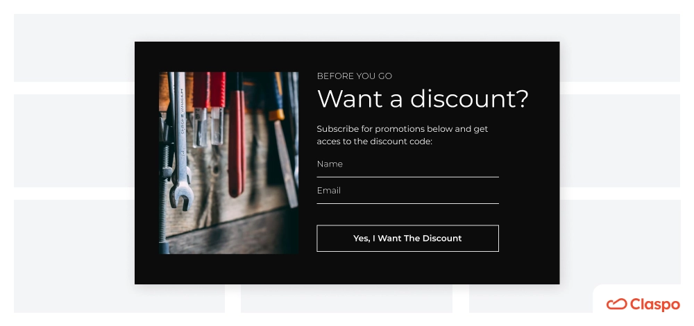
Wayfair
When you land on wayfair.com, you are immediately welcomed with a discount popup.
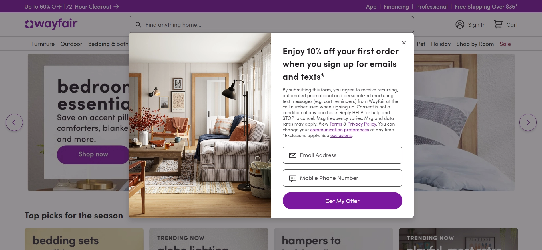
What is good
Because Wayfair asks for an email and phone number, the newsletter sign-up popup makes it clear what you agree to and how you can opt out. The design is clean, and the button text nudges you to act.
Discounts are one of the strongest incentives for collecting emails. Check out our email signup discount forms to see how you can set them up and customize them for your site.
Areas for improvement
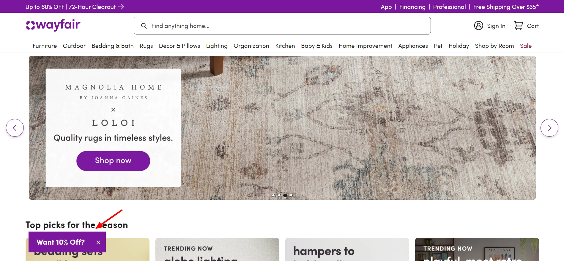
If you don’t feel like claiming the offer immediately, you can do it later by clicking the launcher button or teaser.
But once you leave the homepage, the subscription pop up disappears completely. Keeping it visible across the entire website could be a smart choice. This type of email capture popup doesn't disrupt the user experience, and visitors can easily take advantage of the subscription discount offer.
What happens to the data when someone submits the email capture form? If you use Claspo, you can plug it into your ESP or CPD. If you're looking for a similar service, check out our review of the best newsletter platforms.
The collected data will flow right into the connected system. So, for example, if you send out a coupon code, your prospects will get the offer they signed up for in their inboxes.
Cult Beauty
Our next newsletter popup example comes from Cult Beauty, a British online marketplace for makeup.

What is good
The elegant email popup form they use appears after 20 seconds of website browsing. This timing strategy gives users enough time to engage with the content before the widget is displayed, increasing the likelihood that they will interact positively with its message.
A strategically placed email pop-up can significantly grow your email list, especially when paired with targeting rules. In Claspo, the default delay for your email signup popup is also set to 20 seconds, but you can adjust this timing to your liking. This customizable approach to popup engagement ensures it aligns with your audience's unique behavior and preferences.
The popup design is quite simple and matches the rest of the site. In the first heading, there is a clear offer. The popup supports it with a list of exclusive benefits the users get for subscribing, which makes it easy to read. The image on the left further showcases the benefits of not only becoming a subscriber list but also shopping at their site. This thoughtful pop-up newsletter design helps communicate value at a glance and encourages action.
Areas for improvement
Using so-called power words on the button may make the newsletter signup popup more interesting. Whether you use email pop-ups or embedded newsletter signup forms, strong copy and visuals are key to high conversions.
American Trucks
This email popup example from American Trucks states the value proposition loud and clear.
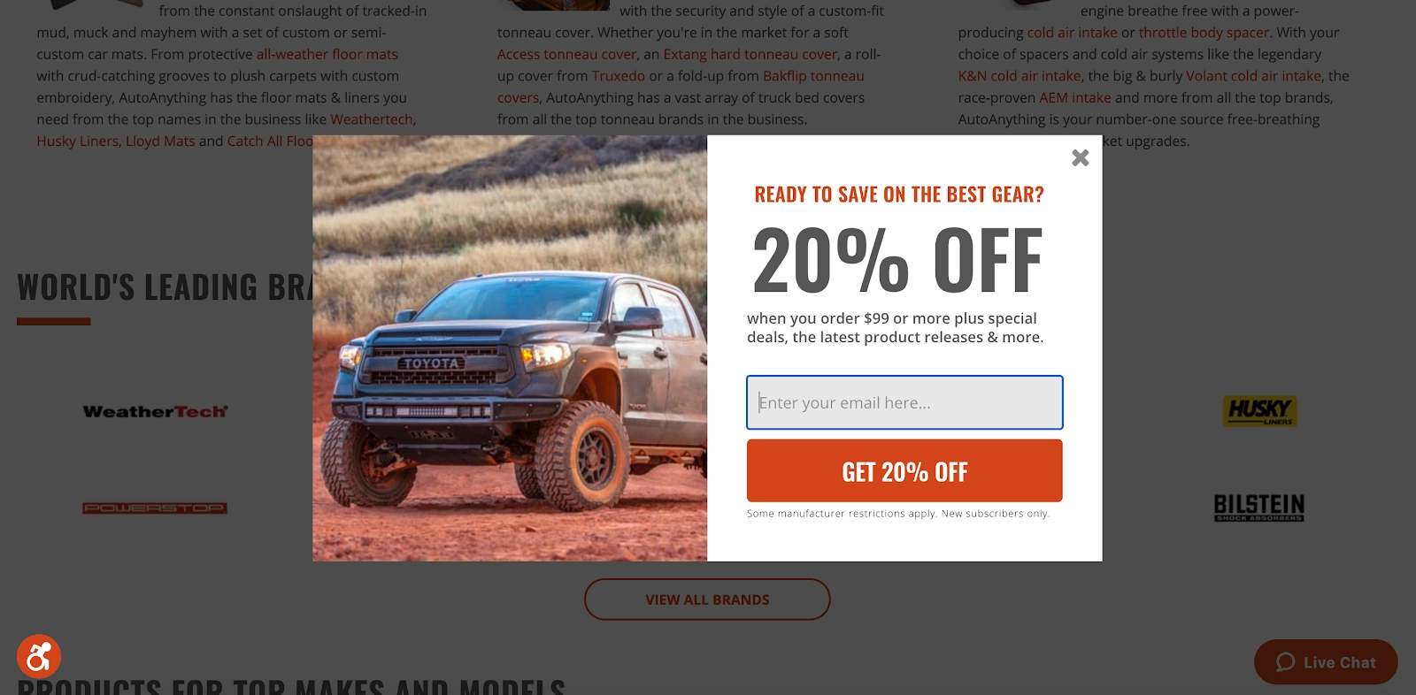
What is good
The benefit, i.e., the discount, takes up the most space, instantly grabbing the site visitors' attention. The button features action-driven text, and the color does two things simultaneously: it matches the palette on the site and fuels the desire to take action. Finally, there's also a cool picture of a truck.
Puma
Puma has taken a different approach. As soon as you enter the website, the launcher appears in the bottom left corner.
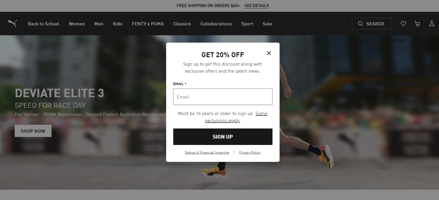
What is good
The launcher shows the email popup sign up form only when you click on it. This gives users the freedom to explore the site and click the launcher button if they want to. To entice people to click it, Puma uses a clever CTA that says: “Get 20% off.”
Launchers are great because they don’t cover the main content and don’t disrupt the user’s session. Most Claspo templates come with launchers that you can customize. You can also create a separate launcher and connect it with an existing widget in Claspo.
Heatonist
This newsletter signup popup example comes from Heatonist.
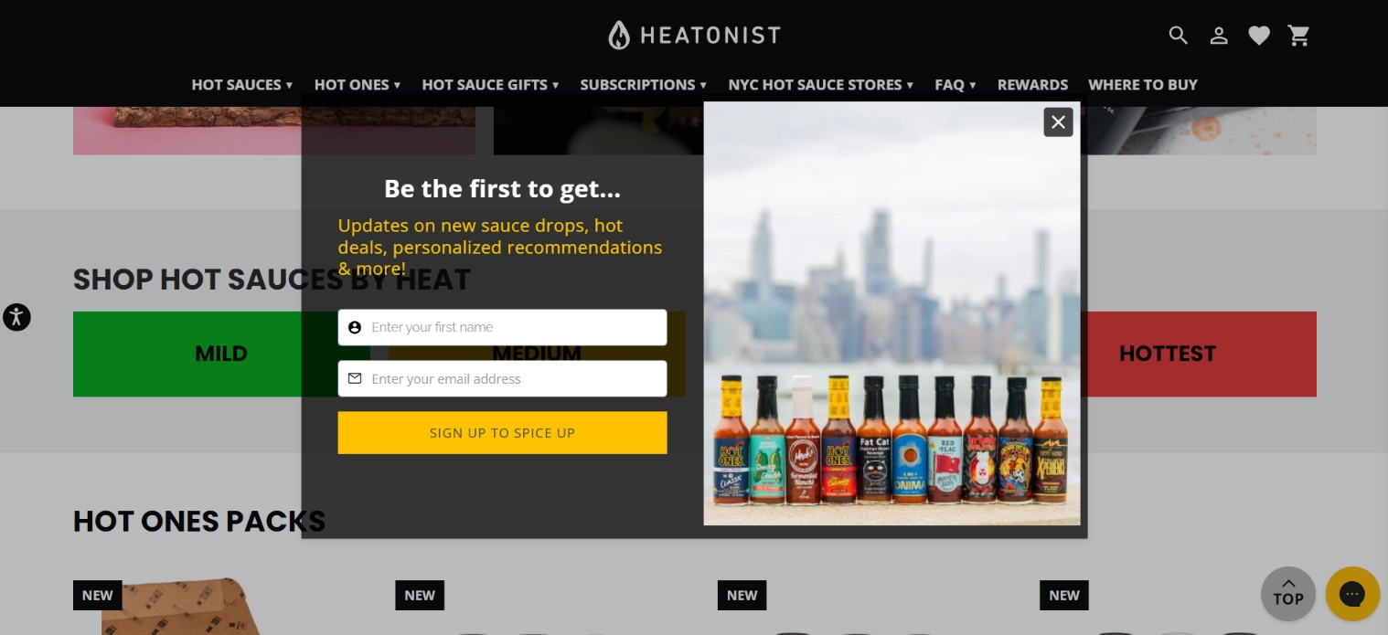
What is good
Judging by the headline, Heatonist wants to tap into the fear of missing out. They support this with creative button text: “Subscribe to spice up.” This nicely intertwines with the product they’re selling. The image on the right features the different sauces available. We assume this image represents variety; anyone can find what they like.
Finally, the pop-up email subscription form also asks for the user’s first name. In Claspo, you can add additional fields to any email newsletter popup template to gather more information about prospects. In this case, getting the person’s name allows for personalizing future email campaigns.
Areas for improvement
The email pop-up sign up form appears within 10 seconds of landing on a website. It feels almost instantaneous, which can be annoying for visitors. In such a short period, people don't even have time to look around the site. Therefore, giving your visitors a little more time before trying to encourage sign-ups is better.
The Trendy Toddlers
This is an online shop specializing in baby and toddler clothing, based in the USA.
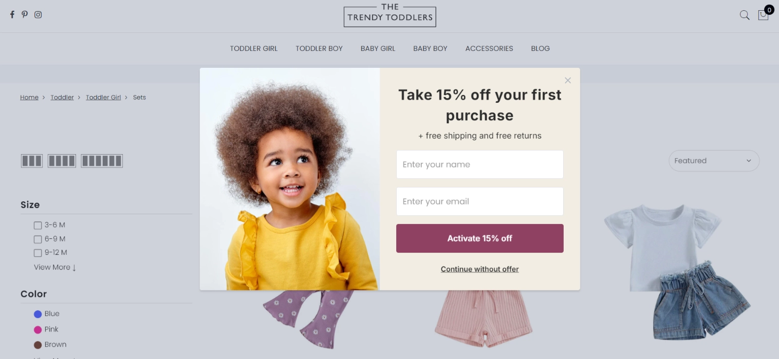
What is good
We immediately see a clear offer and a subscription pop-up form with just two fields.
They also tweaked the form button, nudging the user to activate the offer. We also see an opt-out button with the text ‘Continue without offer’. This button is crucial as it respects user autonomy and provides a non-intrusive way for visitors to decline the offer, enhancing the user experience. In Claspo, you can easily incorporate a similar opt-out feature, ensuring your audience feels in control and valued.
The additional text immediately deals with possible consumer objections to the delivery price and return policy. Lastly, since the site targets new parents, they used a photo of a happy toddler wearing a cute outfit. This helps establish a positive association with the brand.
Nike
The following newsletter subscription popup examle stood out to us, not so much for its design but for its additional fields.
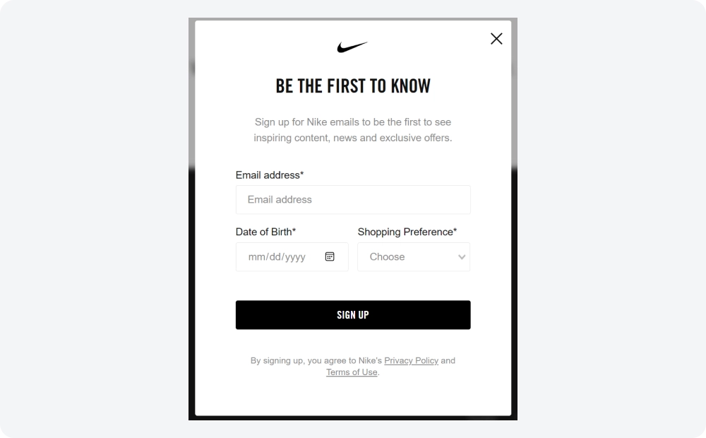
What is good
These extra fields help collect emails more strategically. By gathering key subscriber data upfront, marketers can immediately segment their audience. This allows for personalized email campaigns, customized delivery, and offers tailored to each contact’s preferences. If you collect a subscriber's date of birth, you can even send them birthday emails. According to a survey, 84% of consumers appreciate personalized birthday offers.
With Claspo, you can easily create a similar widget with components to collect additional information to segment new subscribers. Add components such as radio, dropdown, and calendar to your email capture pop-up.
Areas for improvement
The black and white popup looks a little boring. They could possibly make it more dynamic and visually appealing with an eye-catching image.
Tessemae’s
A good heading can’t go unnoticed. Take it from Tessemae’s.
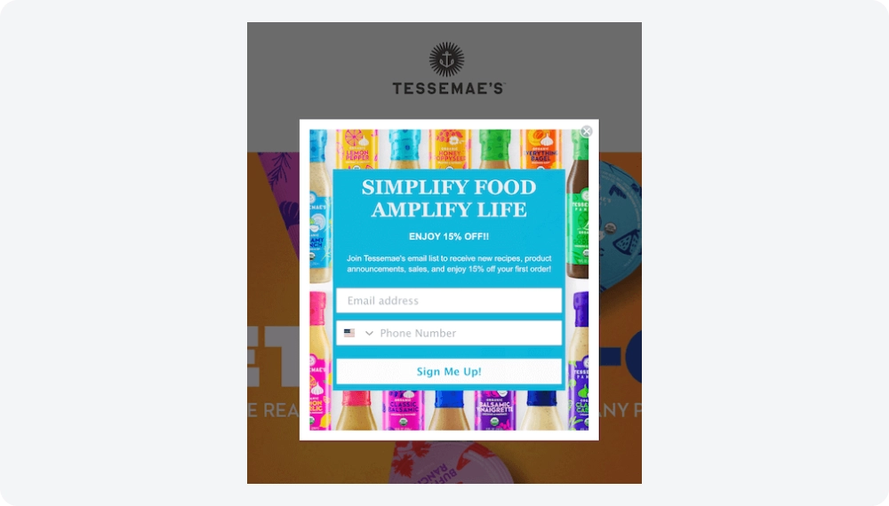
What is good
The company follows newsletter popup best practices: the headline is clear and has a good rhyme. The body text is clear and emphasizes the benefits of subscribing to the newsletter. Two fields for email and phone numbers expand the marketer's ability to communicate with customers by supplementing emails with notifications in SMS or messengers. The design of this email signup pop-up is bright, thanks to the background, but not obtrusive, as the monochrome of the main part of the subscription form maintains the color balance.
Craighill
To attract newsletter subscribers, Craighill relies on free gifts.
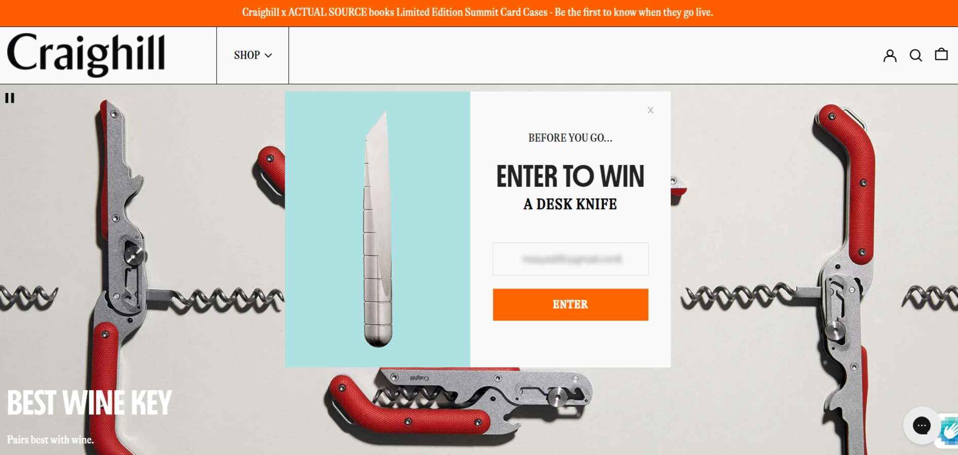
What is good
Most high-converting sites use a subscribe pop-up to capture leads right before users leave the page. Brand marketers use the exit intent popup to solve two tasks simultaneously:
- to get newsletter sign-ups;
- to try to return the visitor to shopping.
To maximize retention across devices, you can also detect exit intent on mobile. By tracking gestures like fast upward scrolling or browser tab-switching, mobile-specific popups help recover abandoning users on smartphones just as effectively as on desktop.
Eye-catching design works for both purposes: the image of a prize that can be won for subscribing.
The same product is also displayed on the Thank You widget, and the CTA button nudges visitors to continue shopping. Perhaps the product image will inspire some people to continue shopping. This second pop-up also explains the terms and conditions to the participant — where and when to wait for the news of the win.
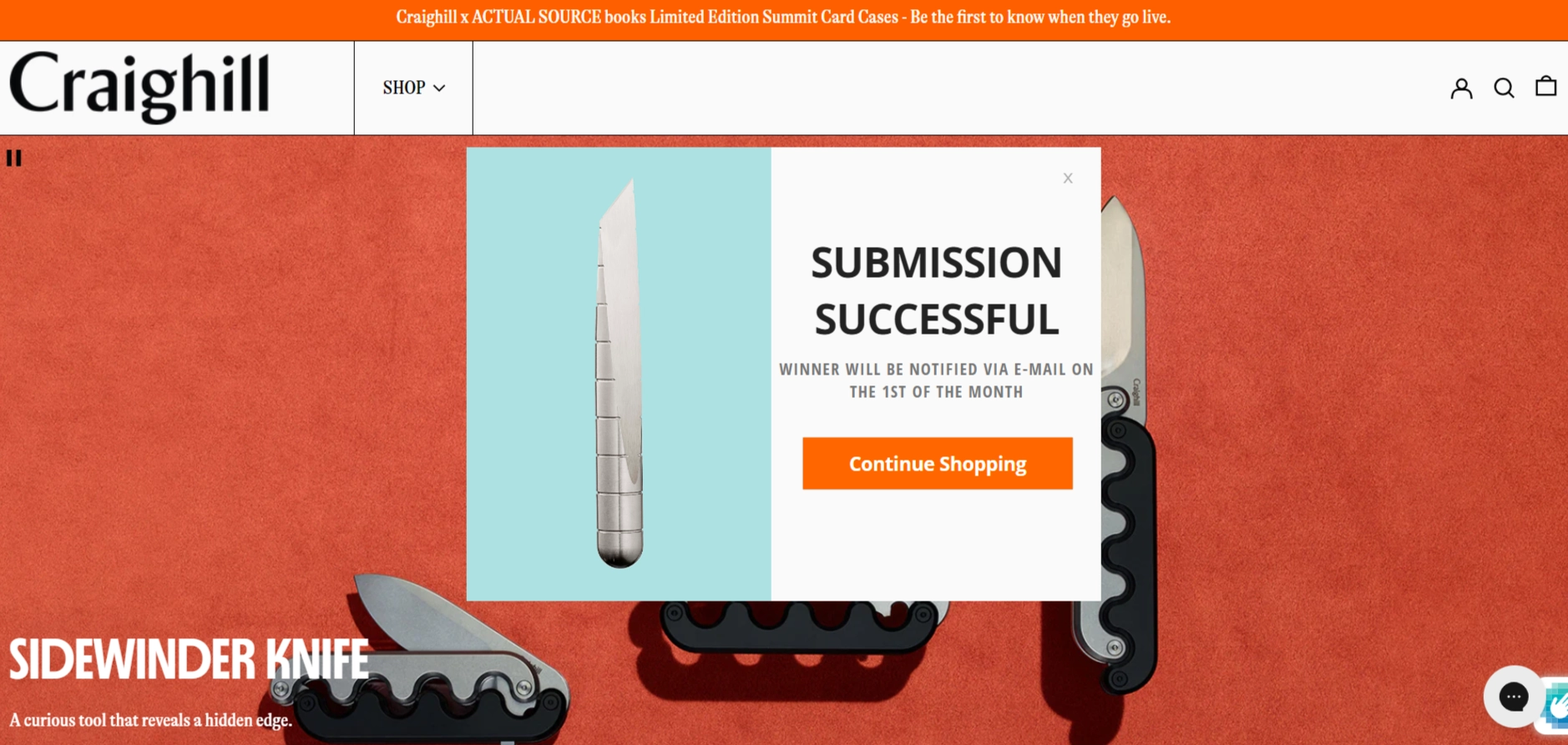
All of Claspo's newsletter popup templates include additional widgets for the following statuses: 'thank you,' 'already subscribed,' and 'error.' Each comes with a pre-written default message, but you can easily customize it and add components like a discount code. This way, visitors can use the code immediately without needing to check their inbox.
Dollar Tree
Another interesting email popup example is the widget on the website of the popular American store Dollar Tree.
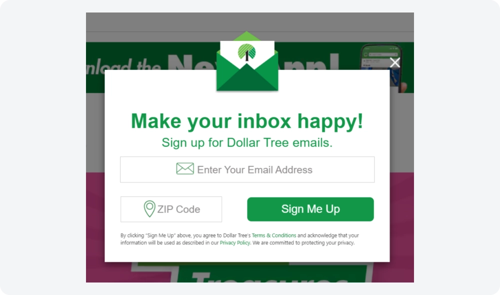
What is good
First, the newsletter popup design is eye-catching. It's light and almost airy, with ample space between the elements. The color scheme sticks to the brand's signature green. The unique headline encourages visitors to ‘Make your inbox happy’ instead of the generic ‘Subscribe’. The CTA button stands out, with the text written in the first-person perspective — one of the clever tricks in copywriting. However, what truly makes this email subscription popup original is its shape, featuring a 3D image of an envelope with the brand’s logo.
In our drag-and-drop editor, you can easily create a similar sleek design using the floating image component. You can upload your own image or icon and place it anywhere in the widget, or choose from a variety of options in our built-in pictures library.
Quiet Town
Next, let's explore some pop-up newsletter sign up examples from Quiet Town.
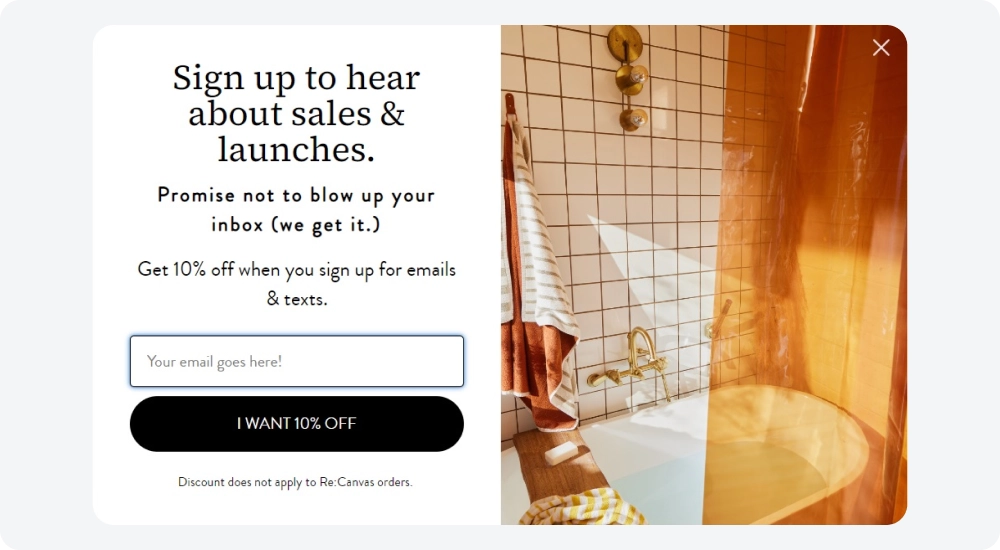
What is good
The headline clearly highlights the benefits of subscribing to the newsletter. In the body copy, the company addresses common concerns of skeptical visitors about being 'bombarded with spam.' The discount is mentioned twice — once in the explanatory text and again in the first-person CTA.
The second step of this multi-step subscription invites users to share their phone numbers. A headline encouraging users to 'Become a VIP' stands out, appealing to a sense of self-importance. The accompanying text explains the exclusive perks for these subscribers.
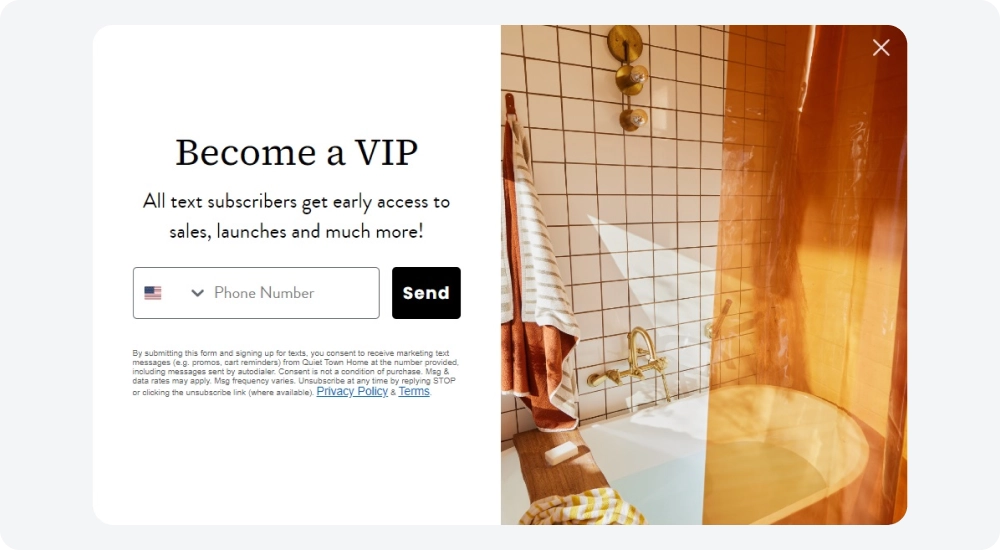
Areas for improvement
It may be worth experimenting with different incentives for subscribing to the SMS newsletter or being more specific — rather than just offering 'early access,' they could try something like 'Get access 2 hours/2 days earlier,' for example.
Fabdog
This example from Fabdog also utilizes a multi-step form in their signup process, but in a unique way.
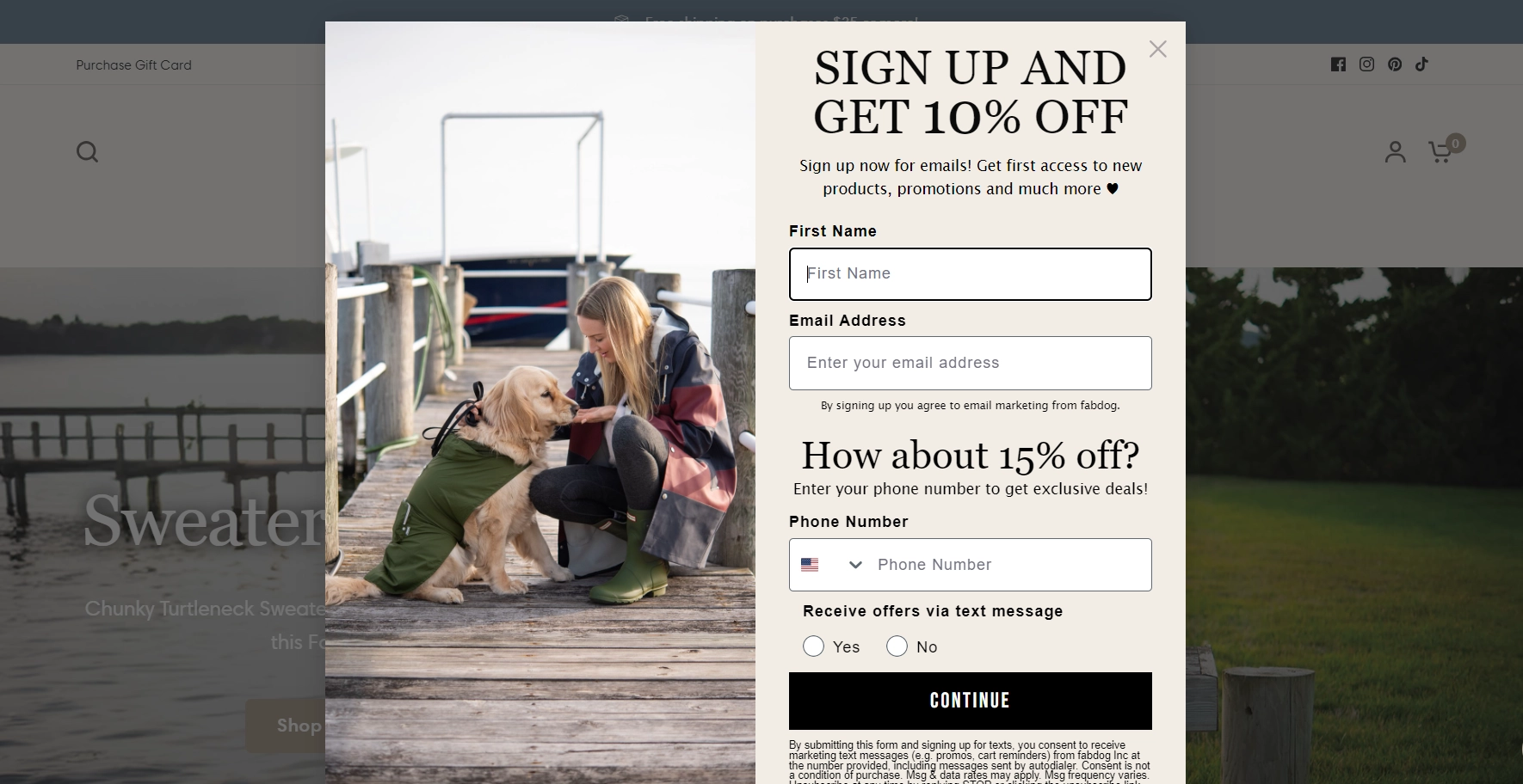
What is good
Fabdog combines both email and SMS marketing subscriptions in one pop-up. The email marketing pop-up is visually divided into two sections using headers. Aware that people may be hesitant to share their phone numbers, they offer a larger discount for subscribing to the SMS newsletter.
After completing the first form, users are presented with a second step: collecting additional information for segmentation and birthday offers. Finally, a third 'Thank You' message explains where to find the promo code.
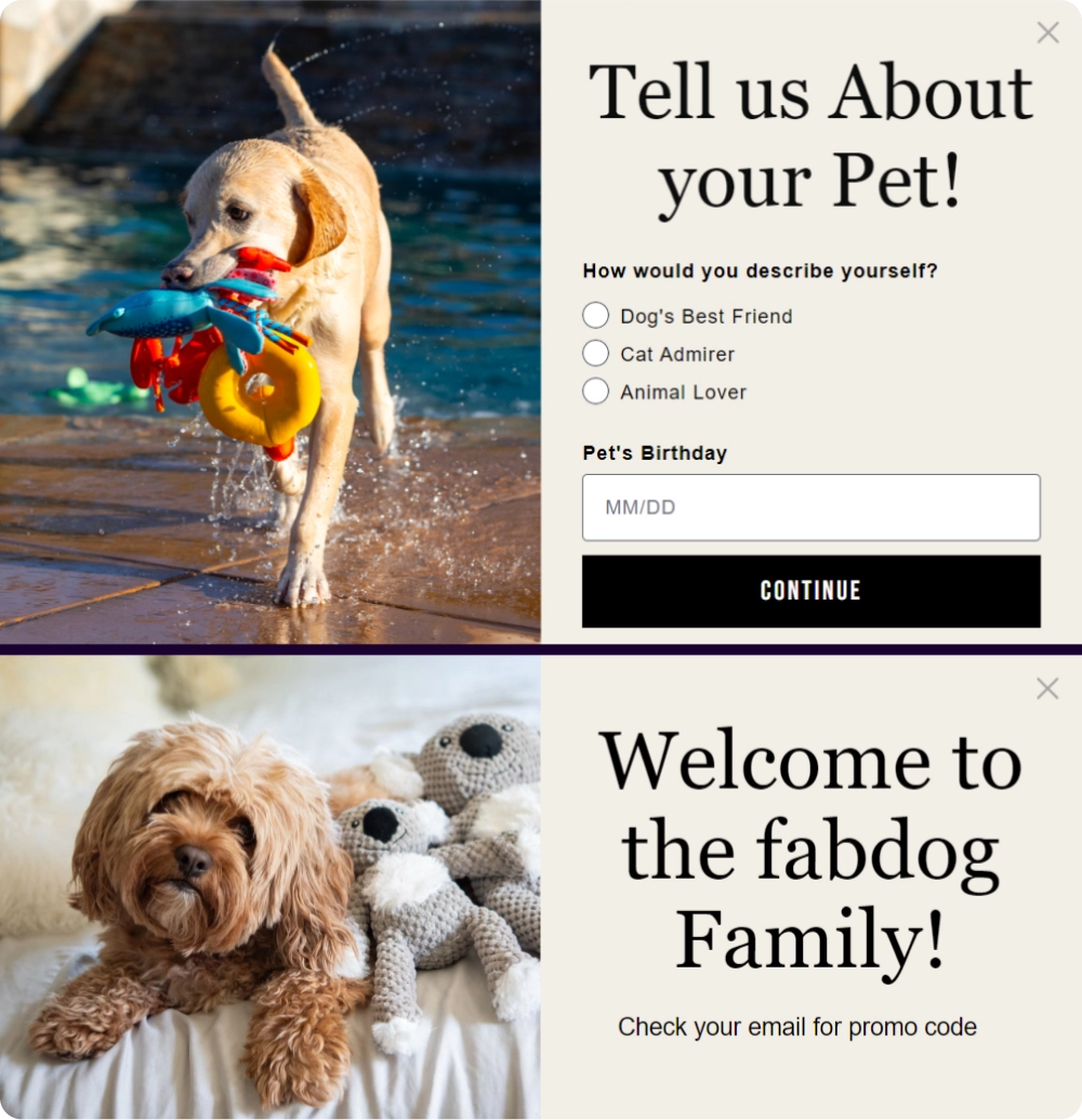
This last thank you pop-up is a bridge to the first inbox email. If you want to make a great first impression, check out the examples of the best welcome emails for new subscribers we've collected.
Areas for improvement
The first subscription form could be shortened to fit within a single screen. Additionally, the popup appears immediately upon entering the site, which can be off-putting. It would be better to give users a bit more time before displaying the pop-up to avoid annoying visitors.
A well-timed lead capture popup can dramatically increase signups — see how top brands are using them effectively.
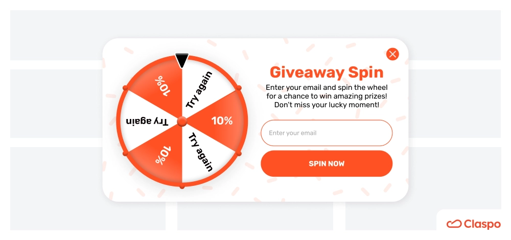
Woolx
To engage visitors, Woolx uses a gamified widget that takes up the entire screen. This interactive gamified pop‑up not only captures attention but also encourages participation by turning email sign‑ups into a fun experience—ideal for brands aiming to boost conversion and engagement.
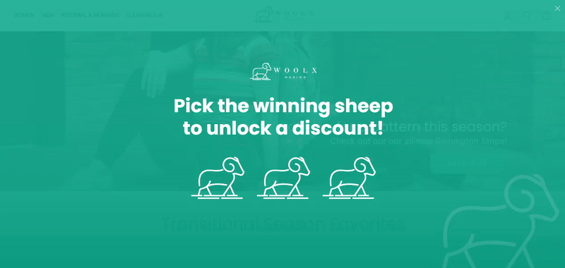
What is good
The popup window uses the popular game mechanic ‘choose one of three’. The user has to choose one of the offered sheep to open the discount. Moreover, the user's curiosity is further piqued by informing them about getting the maximum discount. However, no specific numbers are shown. So, to find out the exact amount of the discount, a person needs to share their email and receive a promo code in their inbox.
You can create a similar widget in Claspo using the same mechanics. The fastest way is by customizing one of our gamification-ready popup templates. You can keep the default gift box images or easily upload your own. Typically, such games offer users three options to choose from, but Claspo allows up to ten options — perfect if you want to create a gamified floating bar.
Areas for improvement
Returning to the example we've discussed, you can change its layout from a fullscreen email popup to a less intrusive one. After all, Google doesn't welcome the use of this type of widget, except for age verification cases.
Funko
Funko, the well-known brand of collectible action figures, took it as a divine mission to entertain its website visitors, providing us with our next gamified pop-up newsletter subscription form example.
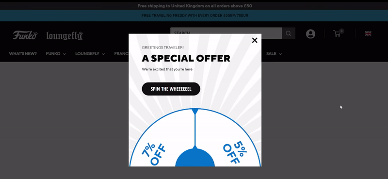
What is good
The widget design seamlessly blends with the site’s overall style, using the same colors and font, making it feel like an integral part of the site rather than something intrusive. The call to action on the button is clear, and the playful spelling of the word 'wheel' adds a fun touch. A clearly visible close button offers users an easy way to exit if they’re not interested in the offer. Additionally, the email subscription popup is shown only to new visitors who haven't subscribed yet, preventing annoyance for existing subscribers.
One engaging variation perfect for brands looking to add a fun twist is a pick-a-gift popup, where users select from options (like boxes or cards) to reveal their exclusive offer. This not only entertains but also creates a small moment of suspense that can significantly boost conversions and enhance visitor interaction.
Areas for improvement
The email collection pop-up appears almost immediately when the visitor enters the site. Subscriber popups work best when triggered by user actions like scrolling or lingering on a page, giving visitors time to get invested before being asked to subscribe.
Also, it's possible to experiment with the design of the interactive email popup, namely, to show the entire spin-the-wheel pop-up.
Want to explore more pop-up newsletter ideas like these? Learn more about popup gamification — including its benefits, creative uses, and how to design gamified popups that actually convert.
B2B and SaaS Newsletter Signup Popup Examples
In B2B and SaaS, popups help to collect leads for further communication with the sales team. Let's take a look at some interesting email signup popup examples and highlight marketing approaches to attracting the target audience.
Virtuance
With this email signup popup, the team at Virtuance aims to build a list of prospects with whom they can build a relationship later.
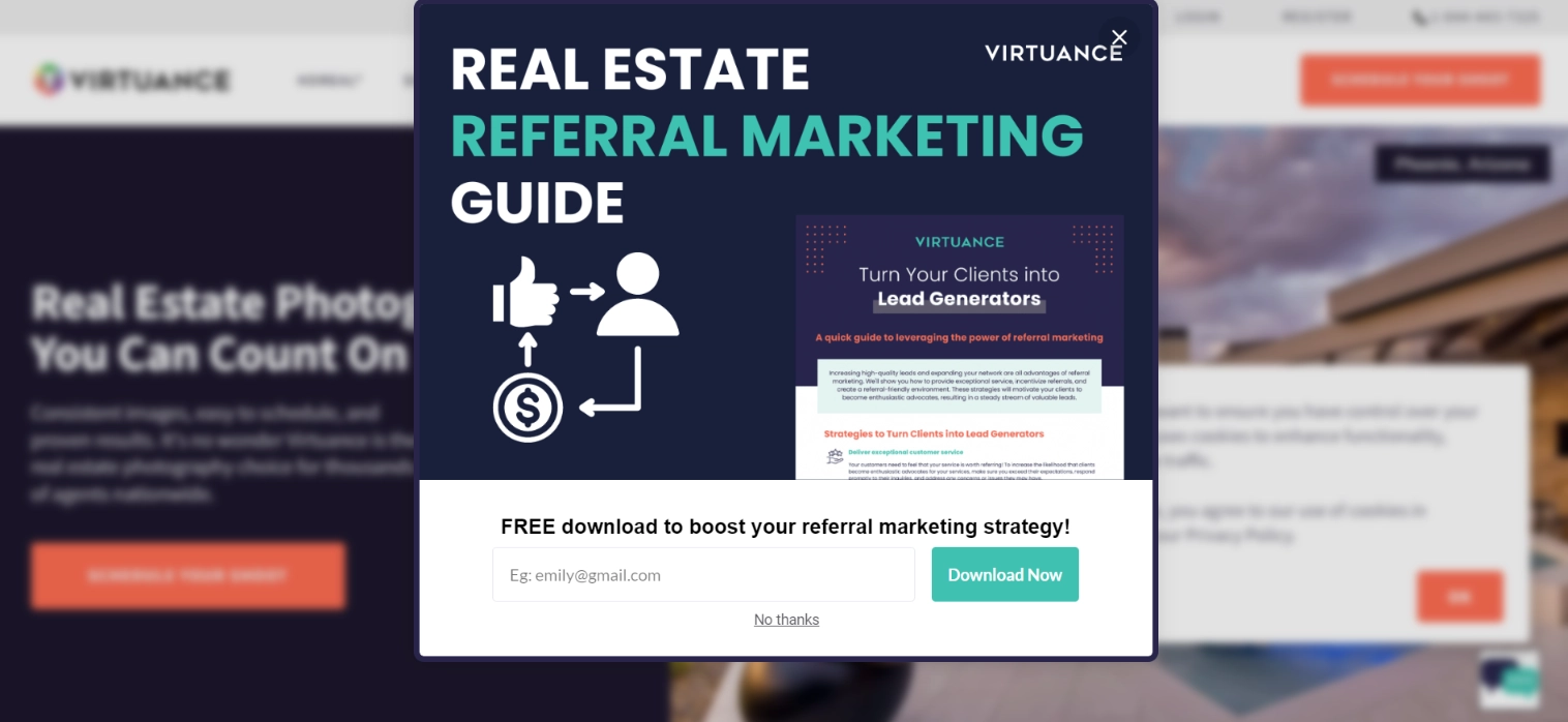
What is good
This popup features a lead magnet. Since the B2B marketing and sales cycle is usually longer and more complex, lead nurturing plays an important role. As you keep browsing the website, more popups appear. However, this one offers a different incentive.
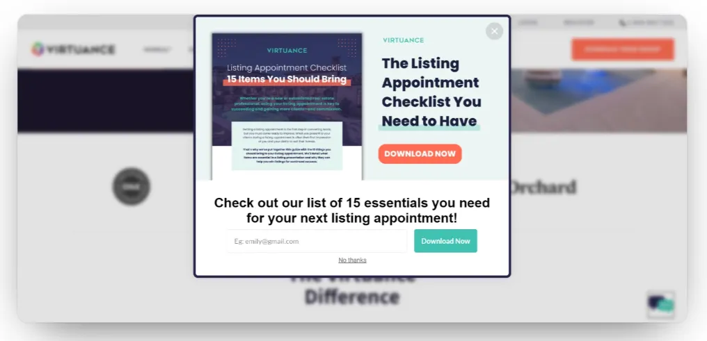
Relevance is key when creating newsletter popups. So, place different lead magnets across the pages. This allows you to tailor the popup to the page’s context. You can try out this tactic for yourself with Claspo.
Flowium
Flowium also offers a freebie for busy marketers in exchange for an email.
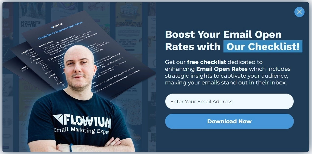
What is good
The popup text clearly states the gains users get from downloading the checklist. This email popup example also features an image of one of the team members. This can have several positive effects:
- Personalization: It adds a human touch to the message, making the popup feel less like an automated prompt.
- Branding: The corporate T-shirt reinforces brand identity.
- Trustworthiness: Seeing someone from the team can make the company appear more trustworthy and approachable.
Finally, a friendly face can draw users' eyes to the popup, increasing the chances of interaction.
Visme’s Subscriber Newsletter Pop-Up Design
Sometimes, visuals speak louder than words.

What is good
This is one of those newsletter popup ideas where design and copy work in perfect harmony. The bold headline, eye-catching visuals, and clear explanatory text come together to create a compelling and professional impression. The strong synergy between visuals and messaging suggests that signing up will deliver real value, specifically, high-quality design tips.
A link to the terms of use is placed below the CTA button. The next step after subscribing is to send a double opt-in email, which will protect you from possible spam accusations. If you are interested in this topic, we have a blog post with ‘confirm your subscription’ email templates.
Quantum Metric
Here is another example of a company that used a lead magnet to build a subscriber base.
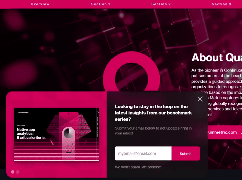
What’s good
Instead of using many different popups, the company made one widget with a slider that shows two guides. The pop-up features are set up to appear when the reader scrolls to the end of the page with the report. This approach ensures that users are not interrupted while engaged in their research. Additionally, the widget doesn’t appear in the middle of the screen, overlap other content, or disrupt the user experience.
In our editor, you can create a similar widget from scratch by adding the ‘slider’ component or customizing pre-made templates. The slider allows you to include any number of images or videos in the widget.
Email Signup Popup Examples for the Consumer Services Sector
Consumer service companies often have valuable information to share with their customers, making email campaigns beneficial for both sides. Below, we’ve highlighted some compelling email capture popups, along with newsletter popup examples that show how these companies turn visitors into subscribers
Pvolve
This fitness company with a network of studios, online courses, and a merchandise store, launched an engaging widget on its website ahead of Labor Day.
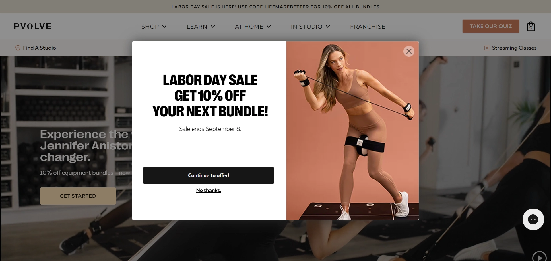
What is good
It grabs attention by serving two purposes simultaneously: promoting a holiday sale and growing the subscriber list. The image shows an example of a bundle that can be bought at a discount, which is emphasized in the headline. If visitors are interested in the offer, they can enter their email in the second window of this two-step pop-up. This approach tackles one of digital marketing’s key challenges — collecting contact information without distracting visitors from the main conversion.
Areas for improvement
The explanatory text in the first widget mentions the campaign's end date. To enhance the FOMO effect, consider using a countdown timer instead.
In Сlaspo editor, you can add a relative timer tailored to each visitor. The countdown starts when the popup appears, and if the visitor doesn’t act before the timer runs out, the widget disappears. However, for every new visitor, the promotion resets, giving each one a personalized countdown.
White Oak Pastures
For businesses in the consumer service sector, it’s important to create a friendly and welcoming atmosphere, even with a newsletter popup form. We found a great example of this on the White Oak Pastures website.
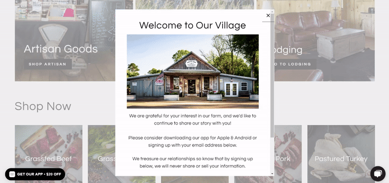
What is good
The pop-up stands out with its simple and sincere text, which makes it feel genuine. The farmhouse photo further enhances the positive, inviting vibe. Overall, the subscription form aligns perfectly with the site’s design and the brand’s tone of voice.
Areas for improvement
It would be helpful to shorten the text so that users don’t have to scroll to reach the email field and CTA button. This could be achieved by removing the section promoting the mobile app, especially since the same call to action appears in the second pop-up activated by the launcher.
Email Popup Examples from Media & Blogs
Email subscription popups for bloggers and media are a vital email collection tool. However, using them on websites with rich content has a few nuances. Let's take a look at some examples.
This Lonely Planet
The company chose to grow their email list with a pop-up that targets travelers seeking adventure and exploration.
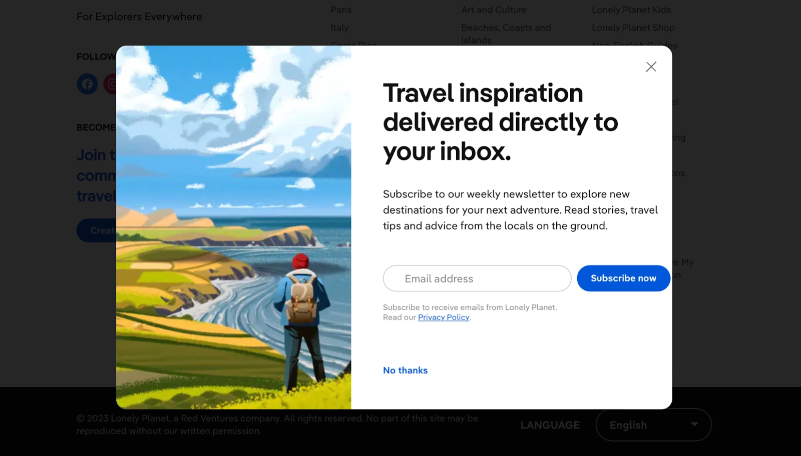
What is good
The headline and body text clearly outline the benefits of subscribing, and the call to action encourages immediate action. It clearly outlines how often emails will be sent and what type of content the editorial team will share. However, most of the user's attention is drawn to the enticing image, which is the true highlight of this widget. You can create a similar image using available AI image generators. By the way, we have an article on our blog that reviews these services.
Areas for improvement
The pop-up layout appears to be broken, as the CTA button is positioned too far to the right. A better solution would be to place it below the email field for a cleaner design.
Darren Rowse
While researching email capture examples for blogs, we came across the website of Australian blogger and speaker Darren Rowse.
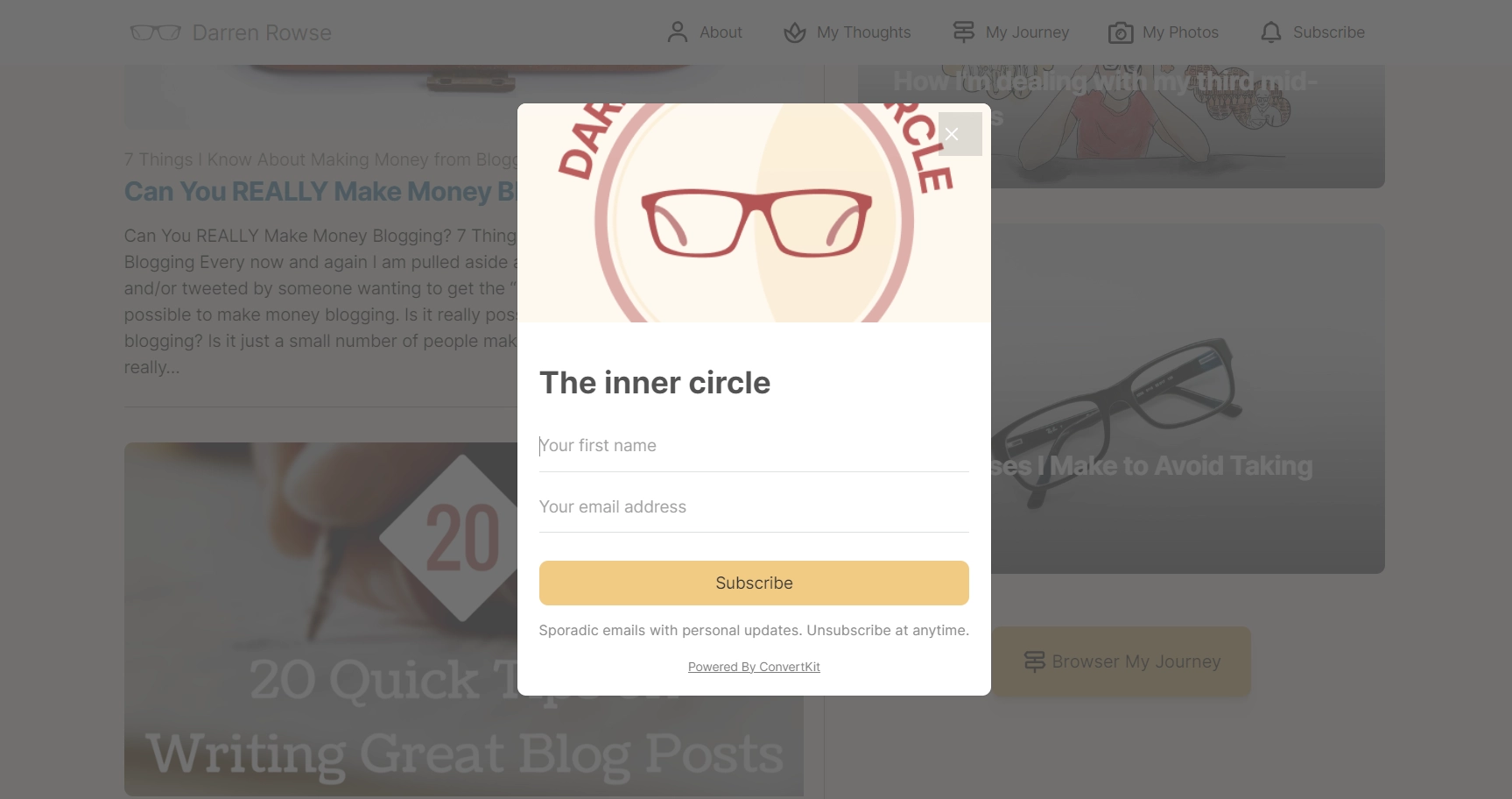
What is good
The author doesn't promise his subscribers extravagant rewards but instead invites them to join an exclusive circle of insiders through an email pop-up on a website. Visitors are reassured that there is no strict newsletter schedule, so they won't be overwhelmed by a flood of emails in their inbox.
The widget is non-intrusive, as it is activated only when the visitor clicks on an element in the top menu.
Areas for improvement
Overall, the widget complements the site’s design and creates a positive impression with its soft, calming colors. However, the image contains a cropped phrase that leaves the viewer wanting more. A better approach would be a horizontal pop-up, allowing the vertical image to be fully displayed.
Forbes
Even a renowned publication like Forbes is thinking about how to get more email subscribers.
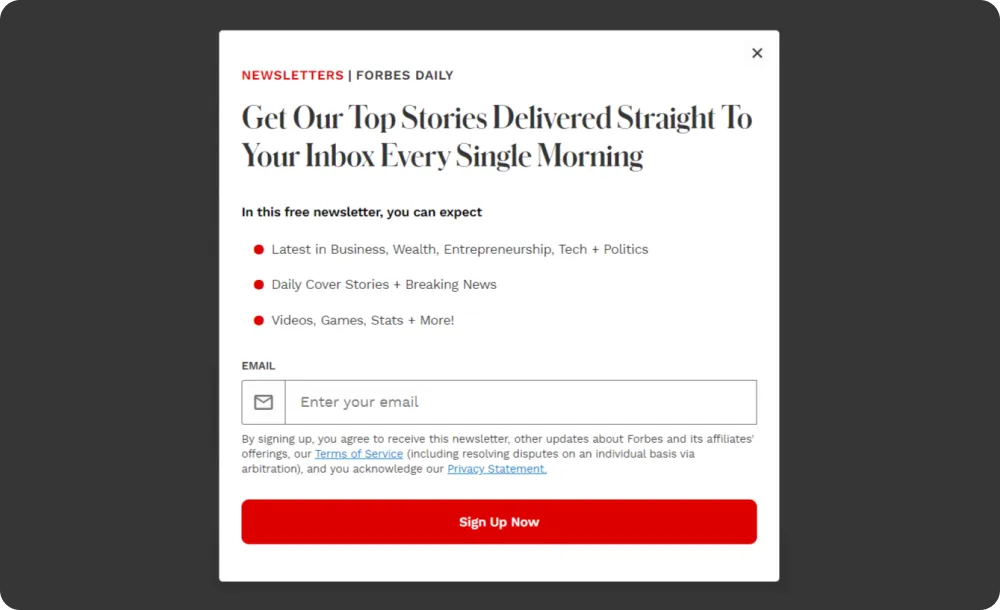
What is good
The widget’s design is minimalist yet detailed and clear in terms of content. A bulleted list is used for better readability, and the newsletter frequency is clearly stated in the header. Additionally, the terms of use are included in the form, enhancing transparency.
According to a survey, 71% of consumers are more likely to trust a company with their personal data if its usage is clearly explained. When creating a widget in the Claspo popup builder, you can easily add a terms of use component to the subscription form with just a few clicks.
McKinsey & Company
Consulting company McKinsey & Company uses pop-ups to build a subscriber base on its blog.
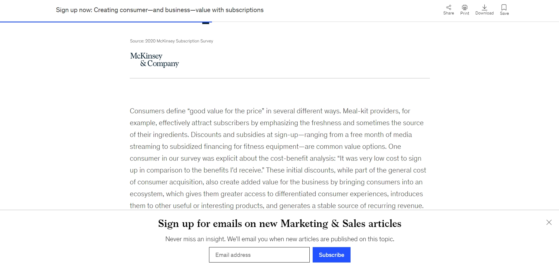
What is good
The company relied on a floating bar to not interfere with the reader's experience and not distract users. It matches the almost monochromatic design of the site as much as possible. Its only bright spot is the CTA button. The widget appears when the visitor scrolls to the halfway point of the article.
Pay attention to the thematic relevance of this newsletter popup — it offers to subscribe to article updates from the section the user is viewing. This personalizes the user's experience, increasing the likelihood of converting them into subscribers.
Aspiration Marketing
Aspiration Marketing's form stands out from other newsletter popups due to its length, but there's a practical reason for this.
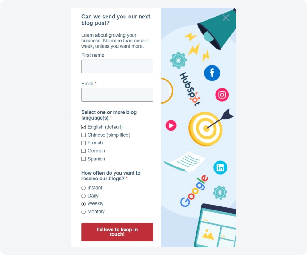
What is good
In addition to the standard name and email fields, visitors can select the language of the newsletter and how often they want to receive it. This gives new subscribers control over the frequency of emails right from the start. Its large size ensures the pop-up won't go unnoticed, but A/B testing is needed to determine if this approach resonates with your site's visitors.
Areas for improvement
The close button blends into the colorful background image, making it hard to spot. It would be better to make the ‘x’ more prominent by increasing its contrast.
Subscribe Pop-Up Examples from Non-Profits
Subscribers are just as crucial to nonprofit organizations as they are to businesses. Statistics show that, on average, every thousand fundraising emails sent generates $42 in donations. However, the use of newsletter pop-ups in this sector has its own nuances. Typically, they are designed to be as non-intrusive as possible to avoid distracting visitors from the main goals — whether it’s making donations or registering as a volunteer.
Catholic Relief Services
Here’s an example of a floating bar that the Catholic Relief Services uses to build their subscriber list.
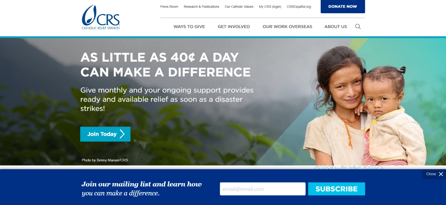
What is good
This email subscription popup highlights the nonprofit's mission and invites visitors to join their cause. The widget is perfectly designed for the website and looks very natural.
Floating bars offer excellent visibility, as they stay visible as visitors scroll. Also, by remaining on users’ screens, they encourage them to take action. If you want to try a different type of widget for collecting email addresses, Claspo also offers floating bars.
Smithsonian Institution
The Smithsonian Institution’s website takes a very cautious approach to collecting subscribers.
What is good
The email popup is configured to appear only after visitors click a special button located at the bottom of the page.
Areas for improvement
While this method of triggering the widget is suitable for a nonprofit organization, the design of the pop-up itself needs improvement. Given that the Smithsonian’s website is filled with original and captivating images, it’s surprising that they haven’t created a more eye-catching newsletter pop-up to encourage visitors to share their emails. The lack of an image also makes the widget’s structure look unbalanced.
The Animal Rescue Site
Such cases are rare, but The Animal Rescue Site operates its own online store, with proceeds going to charity.
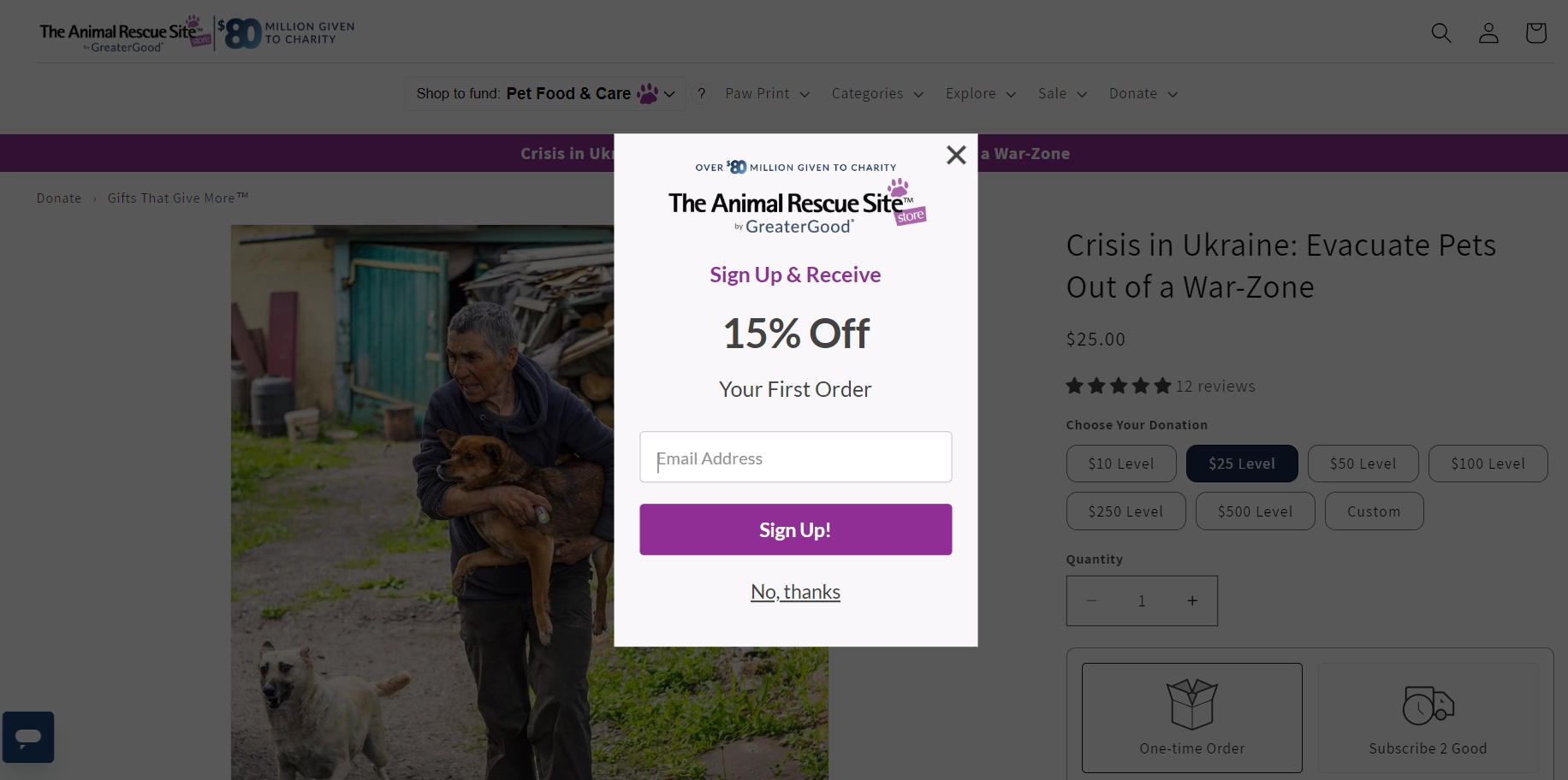
What is good
This is a classic example of a discount offer template on the first purchase in exchange for subscribing to a newsletter. The emphasis is on the size of the discount and the call to action.
Areas for improvement
Including a brief explanatory text that clearly outlines what users will receive by subscribing might be helpful. Without this information, it’s unclear whether subscribers will get updates from the nonprofit organization or just product information. A concise explanation would help prevent any confusion.
Email Pop-Up Examples on Mobile
Mobile devices have shared web traffic with desktops almost equally for several years, making mobile popups essential for websites. Let's explore some key features.
Perfume.com
Perfume.com’s mobile version greets visitors with a discount promotion.
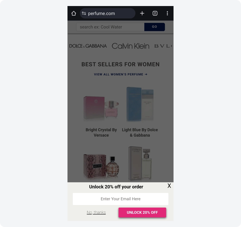
What is good
This is a classic e-commerce example of encouraging subscriptions. The popup’s small size, appearing at the bottom of the screen, is a crucial feature. Clear text and a bold CTA button effectively highlight its benefits, and the easily visible 'x' allows users to close it effortlessly.
This kind of compact design is just one smart trick. Check out our full article on popup for mobile to discover more ways to boost conversions without annoying users
Areas for improvement
There’s potential to experiment with the button text. Something more creative could be used for the CTA instead of repeating the title. For the opt-out button, they may want to test options that emphasize the loss of benefits.
Bloomscape
Another example of a compact pop-up newsletter sign up is shown on the Bloomscape website.
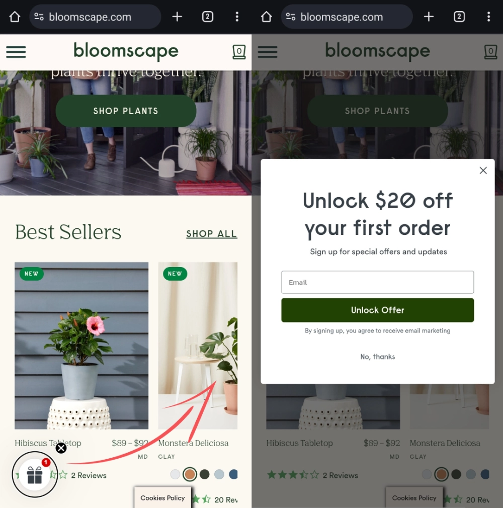
What is good
The site features a launcher that, when clicked, displays a full email capture pop-up for mobile users. The launcher quickly grabs attention with a gift icon, while the notification indicator showing '1' creates a clear association with an unread message. This combination encourages visitors to click and view the notification.
Areas for improvement
The company could experiment with the image on the launcher. For instance, an A/B test could compare two versions: one with the gift icon and another displaying '20% OFF.'
Shopwine Direct
Shopwine Direct provides a great example of a lightbox popup with an appealing visual design.
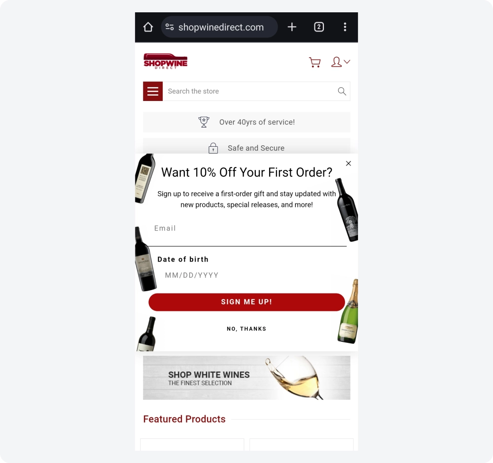
What is good
The signup popup covers about half of the screen, keeping it from feeling overwhelming. The generous use of white space gives it an airy, uncluttered look, while the red CTA button immediately grabs attention. The title, body text, and CTA clearly guide the user on what to do and what to expect. Instead of asking for a subscriber's name, marketers opted to collect birthdates to use in their marketing strategy. The pop-up design also features an image background with products, which keeps the widget compact while enhancing its visual appeal.
Zaful
In our next example of a mobile pop-up mail from Zaful, the main focus is on copywriting that says just enough.
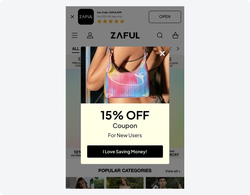
What is good
The pop-up newsletter catches attention fast, and the inscription makes it clear why it’s worth subscribing. The visitor sees who exactly can apply for a coupon and what kind of discount. The callout on the CTA button emphasizes the main benefit in a very cheerful style. The visual part of the widget shows the product, which adds brightness to the whole popup. A clearly visible close button allows the user to easily refuse the offer.
Areas for improvement
Adding an opt-out button could increase the sense of control among visitors.
Want to capture more subscribers without annoying mobile users? Learn how to use exit intent on mobile to trigger popups at just the right moment, without hurting the user experience.
Best Practices for Creating Effective Email Popups
Just like any tool, email popup forms only deliver when used strategically. To maximize their effectiveness, consider the following advice:
1. Make Sure the Popup Is Relevant
The best email popups are those that add value. Popups that have nothing to do with the page's content disrupt the user's flow and can be annoying.
What can you do to ensure your email popup is perceived as a helpful suggestion rather than an unwelcome interruption? Here are a few tips:
- Analyze page content: Understand the primary topic and purpose of the page where the popup will appear. Tailor the message to complement or enhance this content.
- Offer relevant resources: Provide popups that offer additional resources or information related to the page content. For example, if a user is reading a blog post about social media strategies, a popup offering a free guide on social media tools would be relevant.
- Match user intent: Consider the user’s potential intent on the page. For example, if they’re on a product review page, using a popup to offer a discount on that product or similar items would be highly relevant.
2. Choose the Right Timing
Picking the right time to show the email subscribe popup is another crucial aspect you need to consider. Research suggests that showing a popup after a person spent 8 seconds on the site increases conversions by 34.57%. The rule is the thumb tells us to wait at least 5 seconds.
However, the best thing to do is analyze the site metrics. Look at how long visitors stay on the page. Try publishing popups on pages that have the longest sessions. As Nielsen Norman Group’s research illustrates, the longer the user stays on the page, the more interested they are. This, in turn, increases the chances of them interacting with your popup.
Time spent on the page is only one way to trigger. You can also experiment with exit-intent popups. Look at the pages with the highest bounce rates and try adding exit intent popup software. Using a mailing list popup alongside exit-intent can help capture visitors before they bounce and save 10 to 15% of lost visitors. To implement this seamlessly, consider using popup maker — a tool designed to detect exit‑intent behavior and display compelling opt‑in forms just when users are about to leave. Its intuitive setup and smart triggers make it ideal for capturing those nearly‑lost leads effectively.
Set triggers based on user behavior. For example, in Claspo, you can set display rules based on scroll depth. Say you have a blog post about investment strategies. Thus, a blog popup could appear after the user has scrolled through a certain percentage of the page and reached a specific section, displaying an offer related to that section.
3. Write a Catchy Headline
Use attention-grabbing words or phrases to pique curiosity and make visitors want to learn more. Online reading is very different from traditional reading. To sift through tons of information, users scan pages, looking for things that catch their attention, which include headlines and subheadings.
Claspo simplifies your task. Our email popup templates already contain short, attractive headlines that will appeal to your website visitors. But you can easily change them to suit your brand’s tone of voice.
4. Offer Something in Return
A lead magnet is a specific benefit you offer prospects for free in exchange for their emails. This could be a discount, helpful information, a tiny free service (audit, delivery), an e-book, a white paper, etc. Shoppers love perks; therefore, using a free lead magnet in an email popup can increase the effectiveness of a popup by 100%.

“At Bully Max, we sell premium dog food and supplements, so trust is everything. Our challenge with email signups wasn’t just getting attention—it was earning it. We saw that pet owners were tired of loud pop-ups and didn’t want to give their email just for a generic discount. So, we shifted to building real value first. We created a free “custom meal plan” quiz based on your dog’s breed, weight, and goals (bulking up, staying lean, etc.). At the end, we offered to send the plan and product recommendations via email. That one flow doubled our opt-in rate and actually improved our list quality too.
We also tested small changes with a big impact. For example, just changing the CTA from “Subscribe” to “Send me my dog’s plan” made it feel more helpful and less salesy. We used AI to analyze customer behavior, especially which breeds or use cases led to better engagement, and used that data to tailor our incentives and follow-up emails.
What worked best for us was keeping it personal, making it feel like a real dog owner was helping another, not just a brand trying to grow a list.”
Maris Laatre
CMO, CRO Specialist, Bully Max
5. Create a Powerful CTA Button
A good button text is like a mini billboard on your screen — it needs to be clear, concise, and persuasive to get users to click.
The button text should be action-oriented. It should tell users exactly what will happen when they click. Use verbs like "Download," "Start," "Get," or "Buy." Highlight the benefit users will receive by clicking. Consider using words like "Now" or "Today" for time-sensitive offers or limited quantities to create a sense of urgency.
Finally, the CTA button must be clearly visible on your email capture popup. Make it stand out by using contrasting colors and cleaning up the space around it. CTAs with more white space boost conversions by 42%.
6. Work on Visuals
An attractive visual will capture more of your visitors’ attention. An image in an email popup design can help you better reflect your business, create an emotional connection with prospects, and generate more leads. Specifically, an image increases email subscriptions by 63%.
With Claspo, you can add an image to your email popup in three different ways:
- Upload it from your computer.
- Paste an image link.
- Choose the right one from our built-in photo stock.
7. Adjust the Popup Style to Match Your Brand
Have you ever noticed how some email popups look like they crash-landed on a website? To avoid this jarring experience, make sure your popups seamlessly integrate with your overall design.
This goes beyond just colors and fonts. Consider your brand's tone of voice – the way you communicate with your customers. A consistent and engaging storytelling style keeps visitors happy and more likely to respond to your call to action.
Before hitting "publish" on your email popup, ask yourself: Does it feel like it belongs on my website?
8. Make Sure the Popup Is Optimized for Mobile
Although most mobile devices today have relatively large screens, they don’t compare to desktops. Given the limited space, pop-ups are likely to annoy smartphone users. What can you do about it?
First, make sure the email pop-up is adequately sized. A common recommendation is to use a maximum width of around 320 pixels and a height that adjusts according to the content but does not exceed 50% of the screen height. Next, simplify your pop-up. For example, in Claspo, you can choose to hide images on mobile, making your pop-up more compact.
Make sure the pop-up doesn't disrupt the mobile experience. Google is quite strict about mobile interstitials. Your pop-up should not block the main content on mobile. This gives you a few options: delay the popup, use a teaser, like a launcher, or use a floating bar. Integrate a web page widget like a teaser or inline panel on your site footer to capture subscribers without interrupting the browsing experience.
With that in mind, Claspo offers a preview function for your email popups. This lets you see how they appear on desktop and mobile screens before publishing. For Shopify users, check out our Shopify email popup integration to seamlessly incorporate email capture popups into your store’s theme, increase the number of Shopify newsletter signups, and optimize subscriber growth. Adjusting the height and width is also possible, ensuring a good fit for any device layout.
9. Go Easy on Input Fields
The more information you have about prospects, the more personalized offers you can present to them. Some business owners add three or more input fields to a single email pop-up, trying to get all the information they can.
This decision can backfire because statistics suggest that each added input field reduces the conversion rate. An email popup with 2 fields has an average conversion rate of 3.31%. Meanwhile, popups with 5 fields have a 0.81% conversion rate.
Claspo email popup templates have the optimal number of input fields for your conversions. You can add, remove, or replace them directly in our editor.
10. Test Different Versions of the Email Popup Form
A/B testing, also known as split testing, involves comparing two versions of a popup to determine which one performs better. Doing research when creating the email popup form is great, but theory is one thing, and practice is another.
Split testing allows you to get valuable insights into user preferences and behaviors, leading to more effective and optimized email subscription popup campaigns. Here are three useful tips for running successful A/B tests:
- Test One Variable at a Time: Focus on a single element, such as the headline or call-to-action, to identify what drives performance changes.
- Use a Large Enough Sample Size: Ensure your test runs long enough to collect significant data for reliable results.
- Analyze and Implement Findings: Carefully review the test outcomes and apply the insights to optimize your popups.
With Claspo, running A/B tests is super easy. Simply choose the widgets you want to test and start the experiment.
How to Create an Email Popup with Claspo
With Claspo, creating a customized email capture popup becomes a breeze. Design and launch stunning popups in a flash, saving precious time and resources. Here’s how the process works:
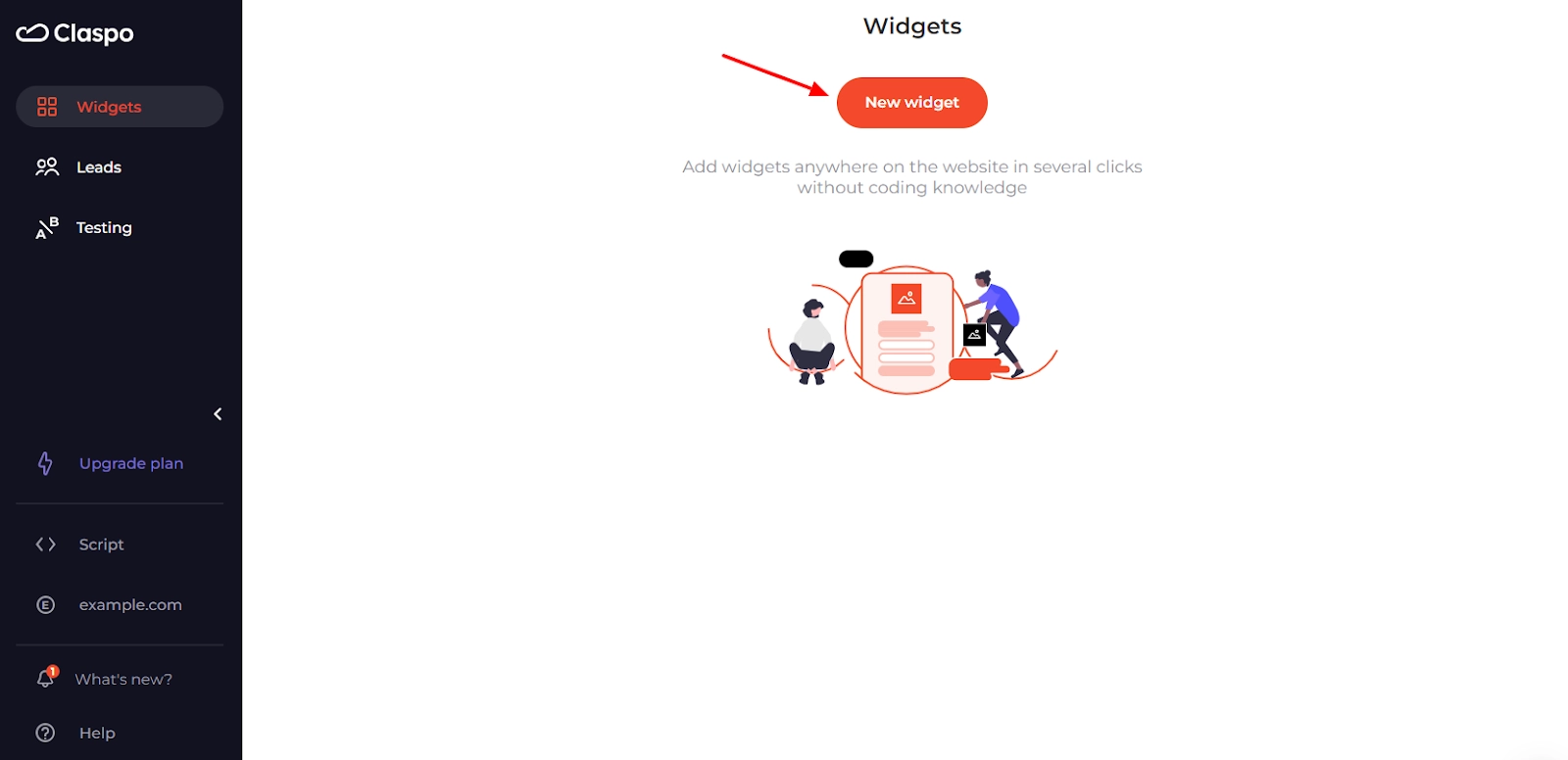
Step 1. Sign Up and Start Creating
First, you need to create a free Claspo account. Click on the New widget button to start building your subscription popup.
You can start from scratch or use a template from our library. We suggest the latter because it speeds up and simplifies the whole process. Our templates work out of the box, but advanced users can customize the newsletter popup HTML to create unique layouts.
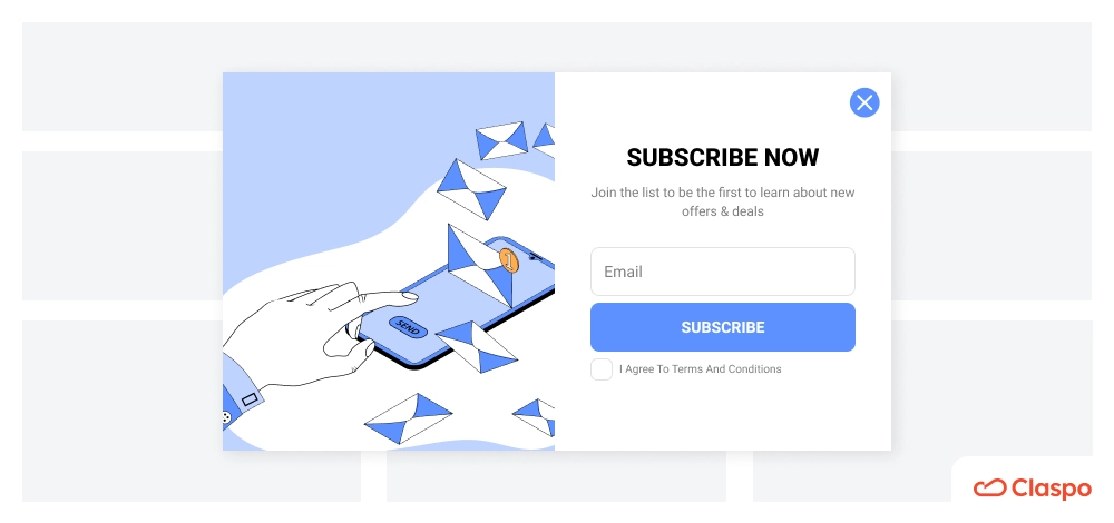
Step 2. Select a Newsletter Subscription Popup Template
On the left sidebar, you will find template filters. Pick Collect Email Addresses in the Use Case section and a Pop-up layout. You can also apply additional filters if you’d like.

Step 3. Customize Your Widget
This is where your email popup will start to take shape. Let’s customize a widget together. Say you want to get people to subscribe to your newsletter using this template:
On the left sidebar of the drag-and-drop builder, you have all the components that you can add to your popup. Say you want to add a field to get the person’s first name. Hover over the component you'd like to add, then pick it up and place it where you want.
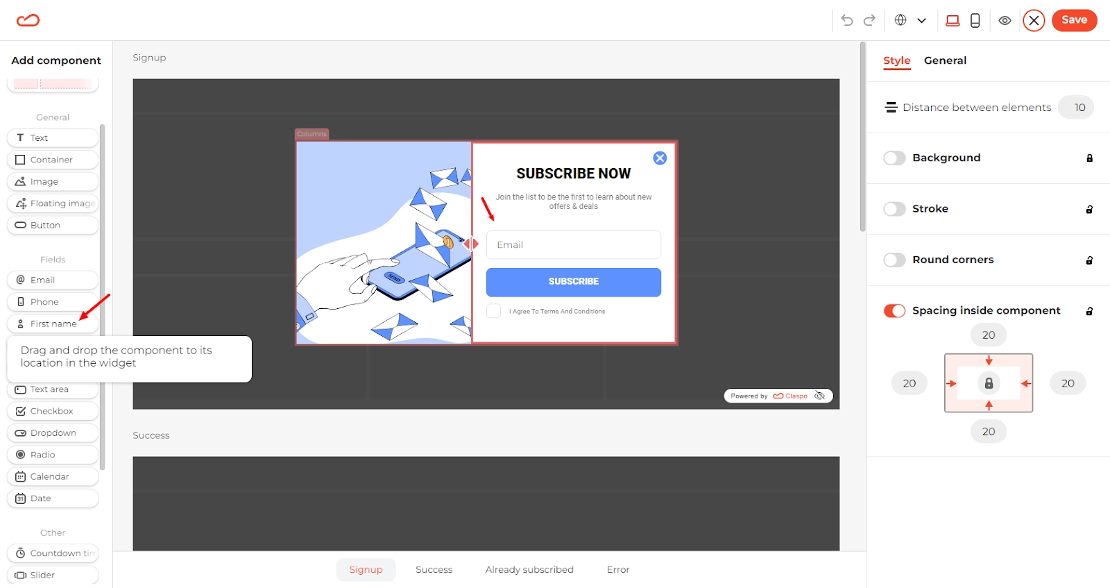
Now, let’s change the text to fit the page's context. Double-click the text placeholder to edit the text. On the right sidebar, you can also adjust the size, font, spacing, and other settings.
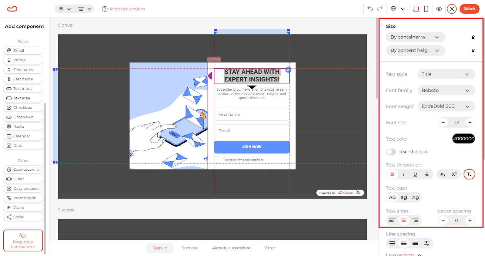
So far, it looks good. Let’s say you want to change the icon used to close the popup to make it blend in with the rest of the form. Click on the icon, and pick the style you like in the right sidebar. You can also change its size and position if you want.
![]()
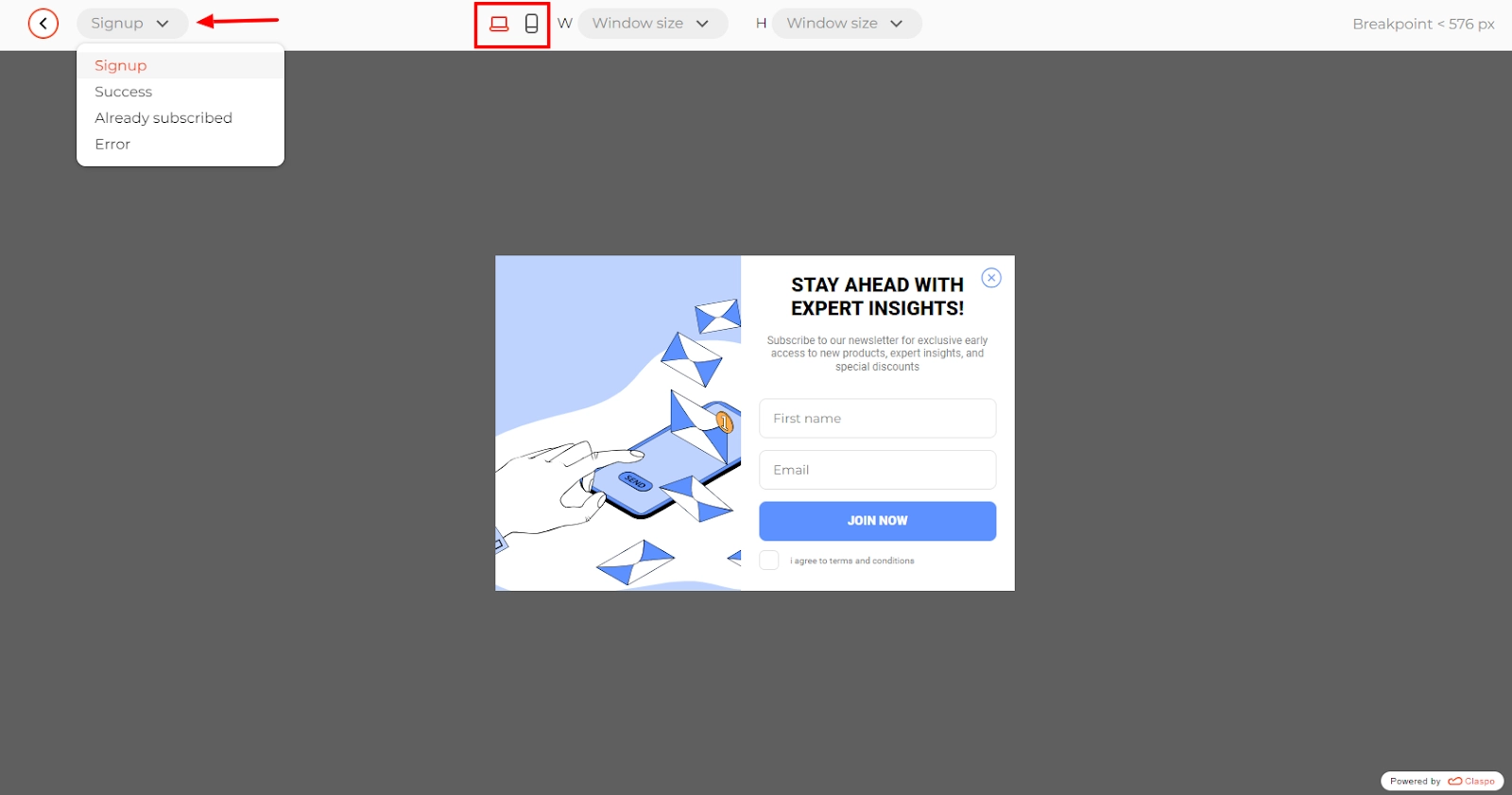
The signup form is ready; now, let’s customize the success and error forms. Success and error forms let users know if what they did worked or if something needs fixing. They make the website easier to use by preventing frustration and helping users complete tasks. These forms also make the site look more professional, which helps keep users engaged and happy.
Scroll down, and you will see three additional forms:
- Success form
- Already subscribed form
- Error form
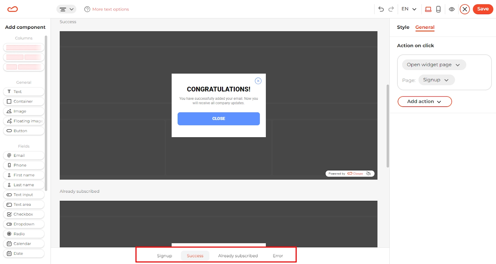
You can change headings and text and rename buttons, but most importantly, you can choose what happens when the user clicks the button on the popup.
Click the button, then in the right sidebar, select General, and configure the action:
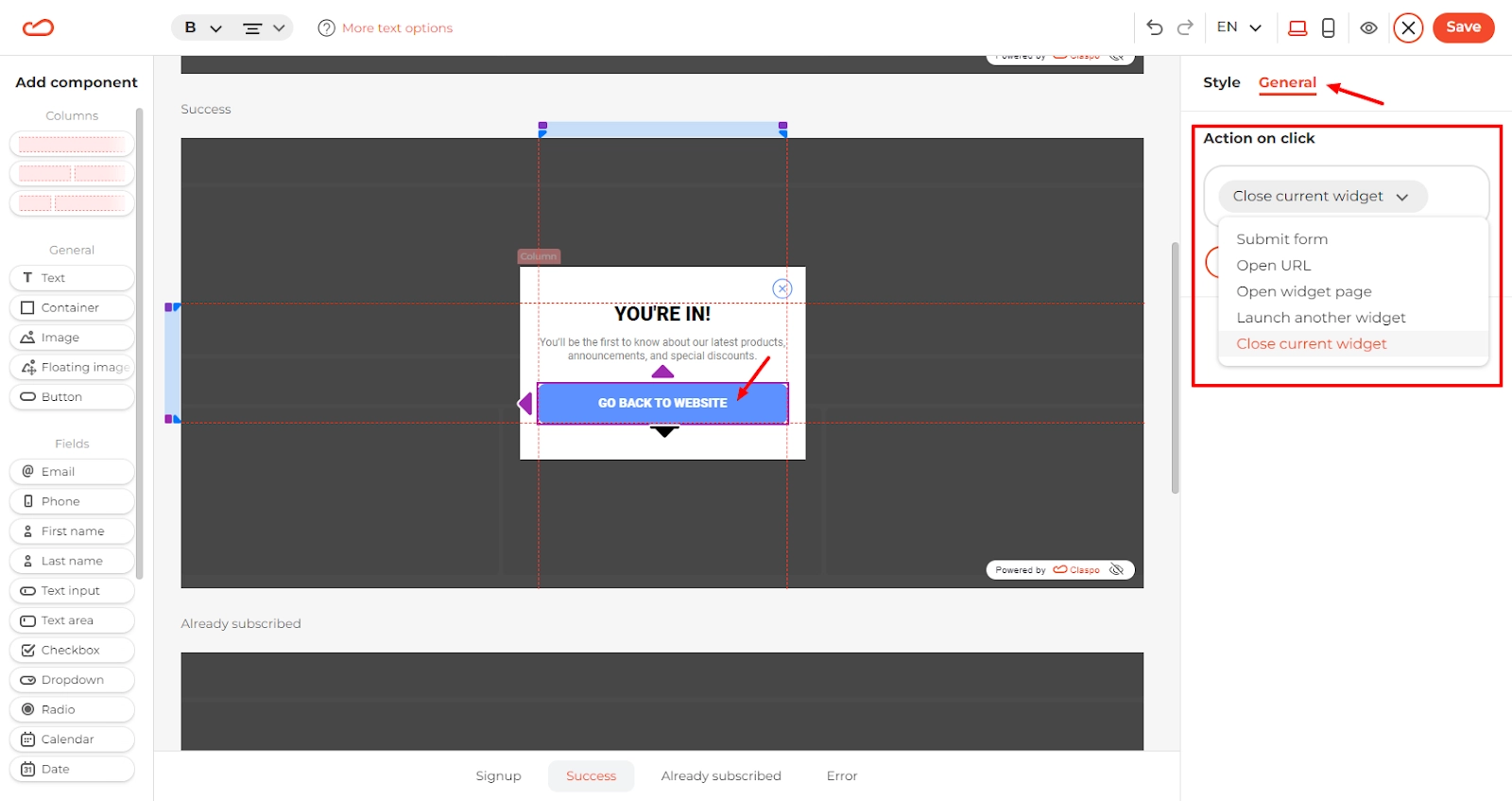
You can do this for each additional form independently.
Step 4. Preview Your Widget
Let’s say you’re done with settings for now. Let’s see what you’ve got. In the top right corner, you’ll see the Preview button.
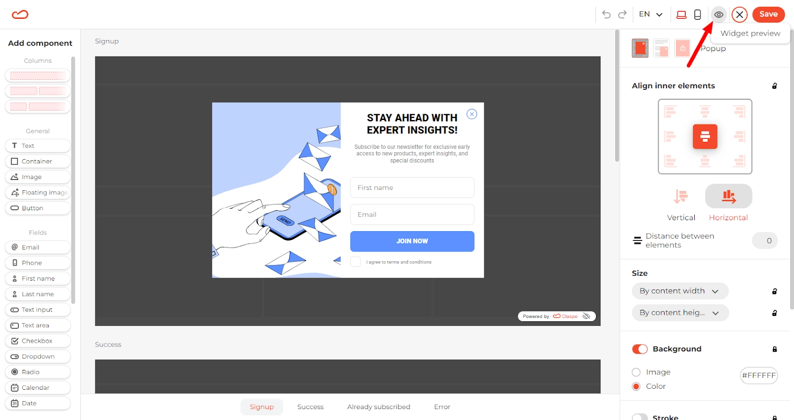
The app will switch to preview mode. You can see how each popup will look on desktop and mobile:
If you want to make any changes, simply go back a step by clicking the arrow button in the top left corner.
Step 5. Choose a Trigger and Set Up a Launcher
We’re done with the design. Now, let’s get your email subscription pop-up form ready for launch. The default display rules are set to provide a smooth user experience. The popup will appear after 20 seconds and once per session. Claspo applies the Silent Interval to prevent multiple widgets from overlapping.
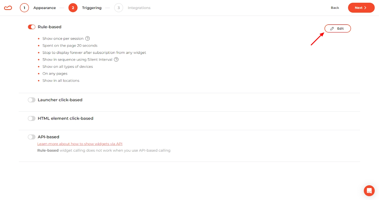
But, of course, you can change the display settings to meet your goals. Click on Edit and pick display time, locations, audience, and pages where the popup should appear. You can even implement a WordPress popup without plugin by embedding Claspo’s code directly into your theme or template. This approach gives you all the flexibility of Claspo’s advanced trigger settings—such as scroll depth, exit intent, or timed display—without the overhead or maintenance of additional WordPress plugins.
Step 6. Specify Where to Transfer the Data
To effectively manage and utilize the emails and related information you collect, integrate Claspo with popular apps like Mailchimp, Pipedrive, HubSpot, etc. This integration allows you to automatically trigger email campaigns and seamlessly add prospects to your sales pipeline. Additionally, by connecting Claspo with Google Analytics, you can analyze what’s working in your email pop-up marketing campaigns and optimize their effectiveness.
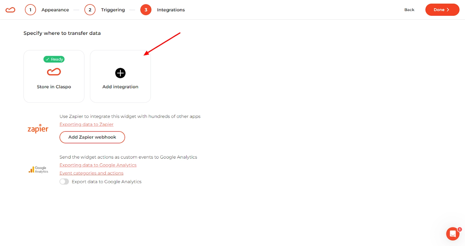
Click Done, and your widget is ready!
Step 7. Install the Script
Now, you need to install the script to show popups on your site.
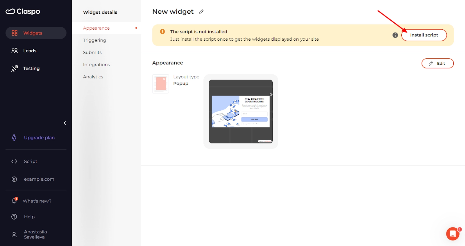
There are several ways to do that:
- Install the script directly into the code of every page where you want the pop-up to be.
- Get a plugin for Shopify. If you're running an online store, choosing a reliable Shopify popup app can significantly boost your email capture and sales conversions.
- Download a plugin for WordPress subscription forms and popups. You can simply search the plugin directory for a reliable WordPress popup form plugin that complements your Claspo setup.
- Use Google Tag Manager to add widgets to any CMS.
Follow the prompts on the screen for detailed instructions for each method. If you encounter difficulties, don’t hesitate to contact our team, and we’ll help you install your script.

Once you’re done, check if the script is working properly.
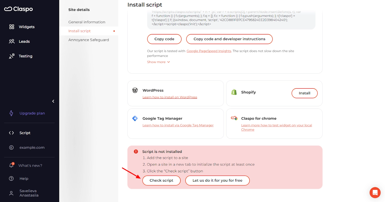
If you have any questions, click the chat icon in the bottom right corner, and our support team will help you.
If you're avoiding extra plugins, check out how to create a WordPress popup without plugin using simple code or embedded tools.
So, now that you're ready to build your email list, you might be thinking about creating a welcome email series. Check out our blog post for choosing a suitable 'thank you for the subscription' email template.
Leverage the Power of an Email Popup
Email popups are powerful tools for businesses looking to connect with customers and drive subscriptions. They can help increase website conversions, build a warm lead base, and expand customer base.
The key is to use them strategically. Well-designed popups that provide value to your target audience are more likely to be perceived as helpful additions rather than annoying interruptions. We hope the above email opt-in form examples have helped you to get oriented on what exactly your email popups should look like.
Claspo offers a seamless and intuitive experience, making creating customized, engaging popups easier than ever. Most importantly, our advanced triggering rules allow you to reach your audience at the right moment, maximizing engagement and conversions.
Create and publish an email popup on your website effortlessly with Claspo. Sign up for a free account today and enjoy lifetime access at no cost!

![How to Create Popup Modal In WordPress [Easy to Use Plugin]](https://static.claspo.io/var/www/html/public/photos/shares/Blog/новые картинки/How_To_Create_Popup_Modal_In_WordPress__Easy_to_Use_Plugin__2.webp "You Might Be Interested in")
![12 Best WordPress Popup Plugins of 2026 [Free and Paid options]](https://static.claspo.io/var/www/html/public/photos/shares/Blog/новые картинки/12_Best_WordPress_Popup_Plugins_of_2024__Free_and_Paid_options__2.webp "You Might Be Interested in")


This article on email pop-ups is a pleasant surprise! It was great to see such a good step by step guide about creating the pop-ups. I'm thinking about mentioned advices on visuals and brand consistency and how can I use them for my own projects
This article on email pop-ups is awesome! It explains things in a way that's easy to understand. I love how it emphasizes the importance of a catchy headline, clear offers, and the power of a well-crafted call-to-action button. The examples for different industries are cool and show how it works in real life. And the step-by-step guide on creating pop-ups is super helpful for someone like me who's not a tech expert. Kudos to the author for making a potentially overwhelming topic so user-friendly! 🌟
In my opinion this article about popup email signup was really instructive!) I had no idea there were many points to successfully using them. I have a question how frequently should I have an email pop-up on my website? I want to capture leads but I also don't want to irritate my visitors.
Sarah, we are glad you found the article about popup email sign-ups instructive! Set a frequency cap to limit how often the same visitor sees the pop-up. For instance, you might show it once per visit or once every few days.
I've seen some websites that use email capture popups and I think it's 100% smart strategy!) Email capture popups are a great way to collect valuable customer information and build a strong email list. This guide helps me understand why it is so important and how to implement it on my clients websites.
hey there! I appreciate your instructions on how to create popup email form using Claspo!) but how important is the timing of when the pop-up appears on the website? should I show it immediately when someone lands on my site or is it better to wait until they've spent some time browsing?
Lori, we are glad you found the instructions helpful for creating a popup email form using Claspo. The best timing for your pop-up can vary depending on your specific goals and the nature of your website.
I appreciate how the article recognizes the potential annoyance that poorly executed popups can cause and emphasizes the importance of balancing user experience with lead generation goals. By showcasing various popup designs and strategies, the article offers valuable insights and inspiration for businesses looking to optimize their email marketing efforts. Overall, this article serves as a valuable resource for marketers and website owners who want to leverage email popups effectively to grow their subscriber base and boost their marketing campaigns.
Thanks for very informative post!
Thank you for your informative post and clear explanation of email popups. I'm just beginning my studies in email marketing, and this post has been quite helpful. 100% Pure is my favorite email popup example since it is so creative. I also own a small eco-cosmetics business, and I'd like to include such popups on my website.
Nice examples!
Popups are quite successful for email collection. Thank you for compiling this list of stunning and elegant popup instances 😃
This article has been very helpful, thanks Nikita! Seeing real-life examples makes learning much easier. Really, really great explanations especially for somebody who's not that good with pop-ups yet
Thanks for the list of such amazing pop-ups! The "Bathing Culture" one is the most beautiful in my opinion.
Thank you for this great post! It's really inspirational, nice popup examples. And liked the tool, it seems to be straightforward to use. I will try it for sure. All the best!