
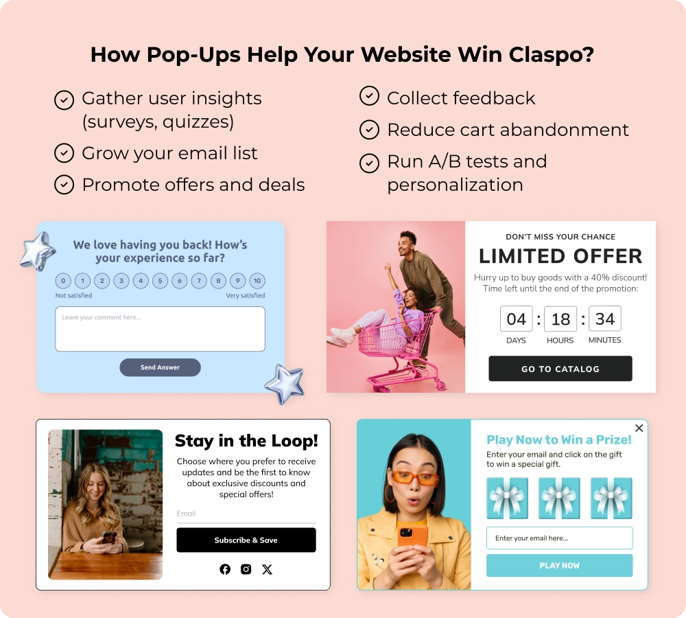
Website Pop-Up Design Examples & Best Practices
Want to increase signups, reduce cart abandonment, or capture user feedback — without redesigning your entire site? Try this: improve your website pop-up design.
In this how-to guide, you’ll learn:
- What a pop-up is and why it works
- How to design a pop-up that gets results
- Real examples and best practices you can apply today
Whether you’re a designer, developer, or marketer, you’ll get clear, practical instructions and real popup examples to help you build pop-ups that actually do their job.
What Is a Website Pop-Up and Why It’s Key to Higher Conversions
What is a popup (or pop-up)? A website pop-up is a small overlay window that appears on a page. Today, smart websites use popups as part of a thoughtful user experience.
With better targeting, design, and timing, pop-ups have evolved into helpful, non-intrusive elements that guide users and support business goals. They are more than attention-grabbers, but powerful UX tools that help websites convert visitors into leads, customers, or loyal fans.
Why Pop-Ups Still Matter in 2026
Pop-ups remain one of the most effective ways to collect zero-party data (like emails, interests, or survey answers) — especially now that third-party cookies are disappearing.
They also give you flexibility to test different messages, offers, or popup design ideas without affecting your main site. To get started, simply run an A/B test in Claspo and track the results using our analytics module.
Now, let the numbers speak for themselves:
- Pop-ups can increase conversions by up to 9%,
- Websites with pop-ups convert 4 times better than those without,
- E-commerce sites that use pop-ups see up to 70% more sales.
In short, pop-ups help you understand your visitors, grow your list, and drive more revenue, all with minimal effort.
We cover more pop-up benefits and use cases in a separate article. The main thing to remember is that getting real results is possible only with a competent approach to pop-up design. So next, we’ll show you in more detail how to create a pop-up website design.
Best Practices and Design Principles for Effective Pop-Up Window Design
Great pop-up web design is both visually appealing and thoughtfully tailored to achieve results without annoying users. That’s why the best pop up designs follow proven UI/UX principles and include a few secret tricks. Here’s how to make your design work:
1. Match Your Brand’s look and Voice
Pop-ups shouldn’t feel like an interruption — they should feel like part of your site. Research indicates that consistent branding can boost revenues by up to 23%, and pop-ups are no exception. They should feel like a natural extension of your website, not a random interruption.
Best practice: Use your brand’s colors, fonts, and tone of voice to help people recognize and trust your brand more whenever they interact with it. Whether your brand is playful or professional, your pop-ups should reflect that same style.
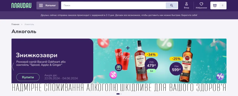
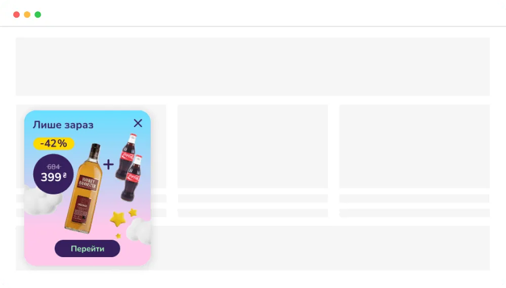
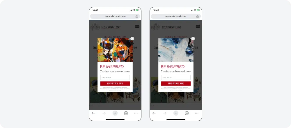
Why go far for pop-up design examples? The eCommerce platform MAUDAU customized Claspo pop-ups using brand fonts and colors in just a few clicks. In the first picture, you see the site's general design; in the second, you see our widget. Everything looks consistent, doesn't it? Spoiler: The results of using our widgets were highly successful.
2. Use Clear Visual Hierarchy
Your message should have a clear reading order. People scan content fast, so your pop-up should guide their eyes with clear levels of importance from headline to call-to-action (CTA).
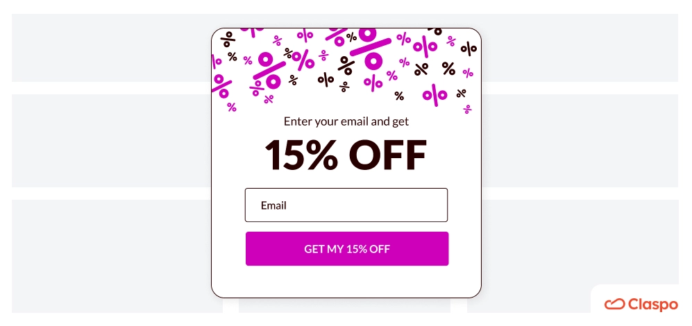
Best practice: Use a clear layout with distinct font sizes, spacing, and placement to prioritize key elements.
How to do it: Keep the hierarchy simple: headline → subheadline → button. For example, lead with a short, benefit-focused headline (“Get 15% Off”), follow it with one line of context, and finish with a bold, clickable CTA. Don’t bury your CTA below paragraphs of text. If users have to search for the button, your conversion rate will drop.
Choose from 1,000+ templates that follow best practices — or learn how to create a pop-up using code in our step-by-step guide.
3. Create Clear and Compelling CTAs
The right call-to-action (CTA) makes the difference between a user clicking or bouncing.
Best practice: Use action-driven language that highlights the benefit. Make your CTA stand out visually using contrast, bold buttons, and clear fonts. According to one study, high-contrast color schemes catch the visitor's eye more effectively, increasing click-through rates. For instance, if your pop-up has a dark background, a bright neon green or vivid yellow button will make the CTA pop out more. This visual contrast is key to catching the user's attention and encouraging them to act without second-guessing.
How to do it: To really get visitors to take action with your pop-up design website, carefully consider where you put the CTA, how it looks, and what it says. Place the CTA where the eye naturally lands, and use clear, benefit-focused phrases like “Get 20% Off” or “Join Free Today” to drive action instantly.
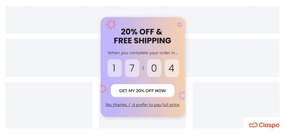
4. Make Pop-ups Easy to Dismiss
Although creative popup design is great for promotions and converting more visitors, if pop-ups are hard to close, users get frustrated and bounce rates go up.
Best practice: Always include a clear “X” in the top-right corner, where most people expect it to be, making it easy to spot and click.
You can also add a secondary button that shows users what they will miss if they close the popup. For example, the primary CTA might offer a discount, while the opt-out button reminds them they’ll pay full price if they dismiss the offer — a clever psychological nudge that can boost conversions by 14% or more.
5. Optimize for Mobile and Cross-Device Compatibility
Over 90% of users browse on mobile, so your pop-ups must be responsive. Statista reports that 96% use mobile phones, 94% prefer smartphones, and 62% choose a laptop or desktop. Therefore, pop-ups must work well and look good on any device.
Best practice: Design pop-ups that automatically adapt to different devices. Keep mobile layouts simple, easy to tap, and clutter-free. And don’t forget about speed — users expect pages (and pop-ups) to load in 3 seconds or less, which is the golden rule.
How to do it: Use vertical stacking, large tap targets, and minimal text for smaller screens. Claspo’s widgets automatically adapt to mobile and meet top performance scores on Google PageSpeed Insights, so you get fast load times without compromising UX or conversions. This means they will not slow down the site's loading speed, allowing you to maintain an excellent user experience and higher engagement.
6. Use Subtle Animations to Engage
Motion can enhance your pop-up’s appeal by making it feel dynamic, but it needs to be gentle to avoid annoying users.
Best practice: Apply light, purposeful animations that attract attention without interrupting the browsing flow.
How to do it: Use fade-ins or slide-ups for a smooth entrance. Add hover effects on CTA buttons to signal interactivity. Keep animations under 0.5 seconds — quick enough to notice but subtle enough to avoid distraction. For instance, a smooth slide-up with a softly pulsing button invites clicks without overwhelming the visitor.
7. Use White Space to Focus Attention
Cluttered pop-ups feel overwhelming and confuse the user. White space helps key elements stand out.
Best practice: Don’t overload your pop-up with text, icons, or images. Let content breathe with generous spacing.
This improves readability and makes your CTA easier to notice. For example, instead of stacking multiple benefits and visuals, focus on one message. A CTA like “Sign up and get 10% off” in the center of the widget with ample padding around the button will definitely draw the eye.
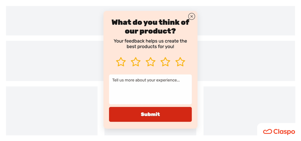
8. Use Visual Cues to Guide Behavior
Smart visual design isn’t just for aesthetics. It strategically directs user attention and motivates action.
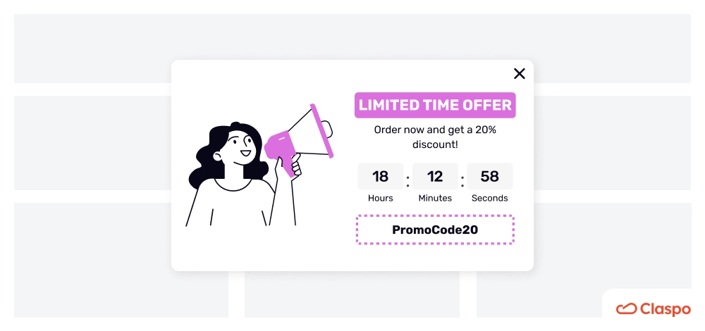
Best practice: Use visual cues, such as arrows, countdown timers, and human imagery, to create urgency and guide attention toward the CTA.
How to do it: For instance, placing a countdown timer next to a “Claim Offer” button can increase urgency. A subtle arrow or drop shadow helps direct the gaze. Human faces looking at the CTA create an emotional connection and guide focus without words.
Best Website Pop-Up Design Examples and Why They Work
How do different companies make their pop-ups work? To demonstrate, we’ll walk through the best website pop-up design examples, explain why they work, and show you how to recreate similar results. This includes screenshots, copywriting tips, and layout breakdowns.
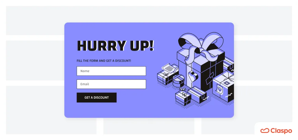
Claspo
Since we specialize in creating efficient and attractive pop-up designs, our website's exit-intent widget is also created according to best practices.
- The color of the CTA button matches our branding. At the same time, this warm color provokes action, which increases the likelihood of a click.
- The CTA button messaging shows value and advantage for users, and given that the button contrasts with the overall color scheme of the widget, we get a better chance of clicks and conversions.
- The main message in the title is highlighted in bold, as are the keywords in the description, which helps quickly and clearly convey the meaning and value to visitors.
- The provocative image of burning money enhances our text message. It clearly shows what users lose when they don't use exit intent pop-ups.
- Finally, it's easy to close it (the upper right corner, as most users are used to).
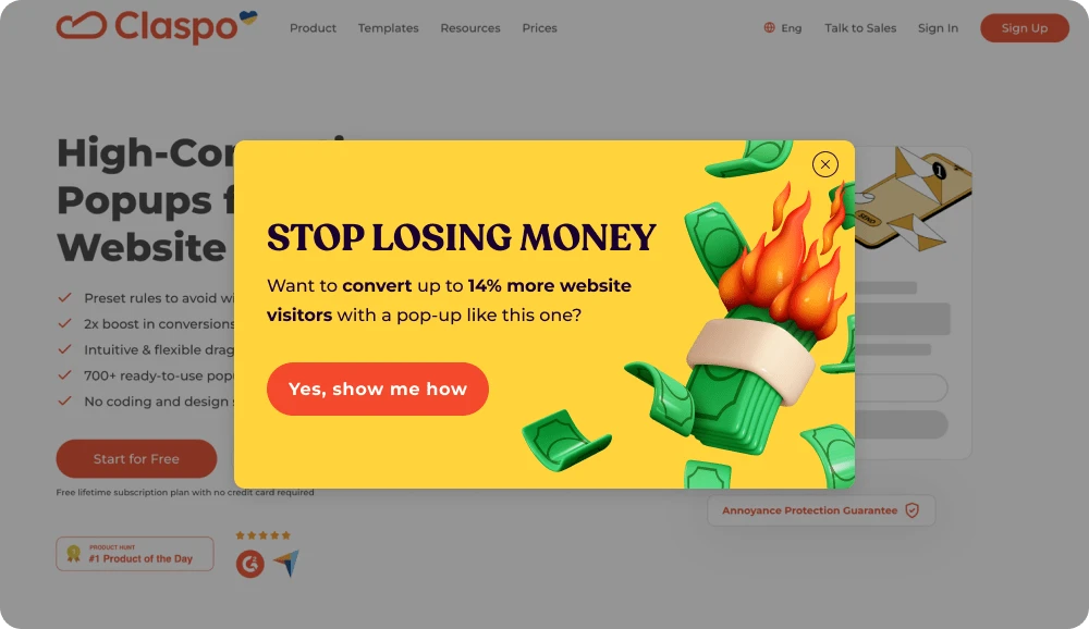
For digital marketing teams looking to create high-converting popups across the rest of the website, this is one of the best popup practices to follow. It’s clean, useful, and easy to replicate with ready-to-use templates.
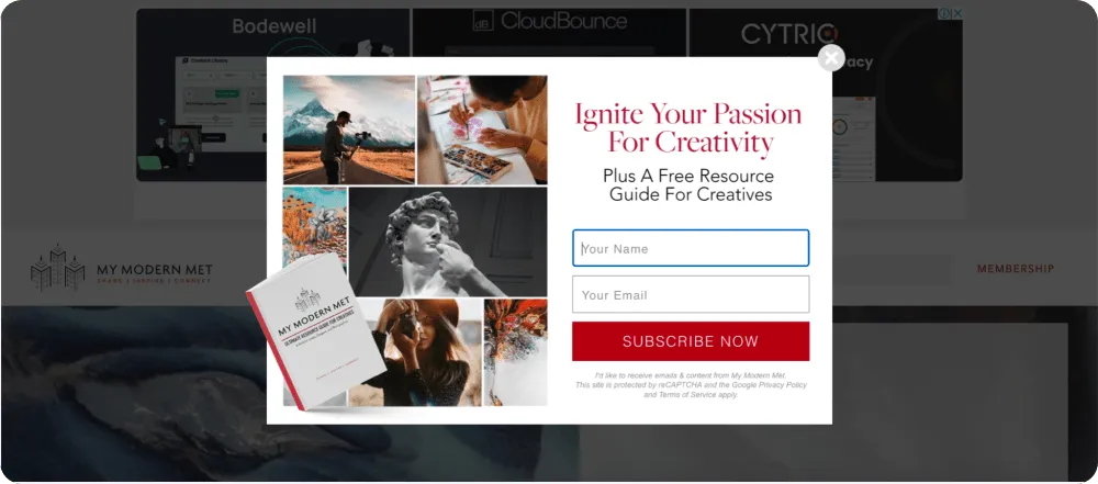
Jasper AI
This pop-up might be a bit on the wordy side, but the design totally makes up for it.
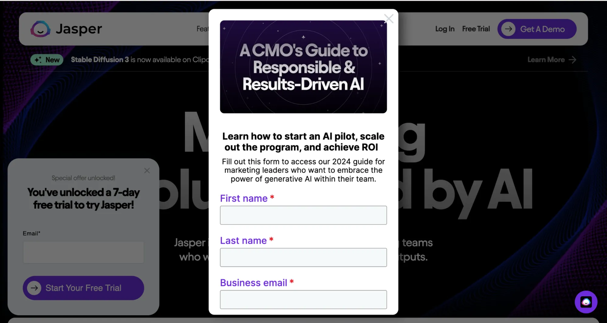
It stays true to the brand’s style, which helps build trust. The value of the offer is immediately clear, making it easy for users to understand what they get. The visual hierarchy is also well thought out — your attention naturally goes from the image to the headline, then to the supporting text. Even if someone only reads the text on the image, the main message still conveys its meaning.
This is a lightbox pop-up — one of many formats you can use. Discover 48 more types of pop ups in our guide.
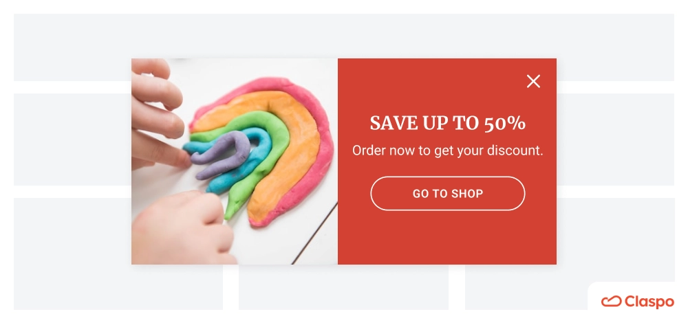
Di Bruno Bros
The colorful website pop-up design immediately makes it clear that we're on a culinary website (and, frankly, makes one want to eat). High-quality visuals, whether a photo or an illustration, are vital for improving your brand's credibility and demonstrating your actions.
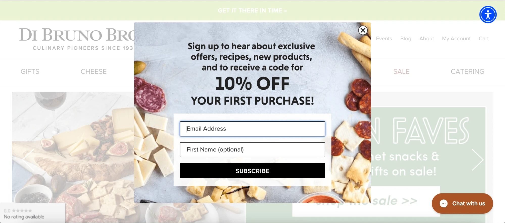
Using the Claspo editor, you can upload or drag your image to the pop-up layout. Alternatively, feel free to choose the appropriate visual from our built-in stock of photos.
DIOR
Dior provides an excellent example of an informative pop-up that doesn't try to sell anything and instead helps users improve their experience.
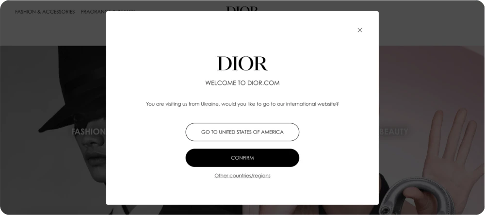
Many e-commerce platforms with national/language-specific websites or shipping worldwide start interacting with their users by asking about their location. In this case, you should stick to a minimalistic design that does not distract the user from your message and allows them to focus on the action they need to take to continue working with the website.
Still, maintain high contrast, make buttons noticeable, and make the pop-ups easy to close.
Solo Stove
Among all the inspected exit-intent popups, this one stands out because of its eye-catching headline.
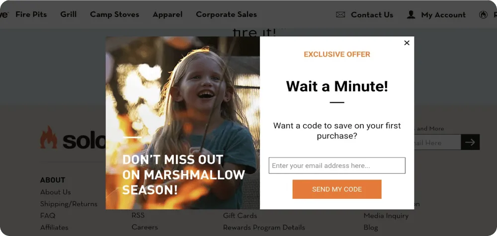
It keeps the tone and the image positive and light-hearted, but it does make you pause. An exclusive offer and a call to stay on the website so users don’t miss it, or at least read the pop-up text in full. The contrasting color of the button and the white space around it motivate users to receive that promo code.
Reverly
This is a great example of a design that aligns with a brand's colors and vibe while offering clear value for the customer and providing the information needed to facilitate further interactions.
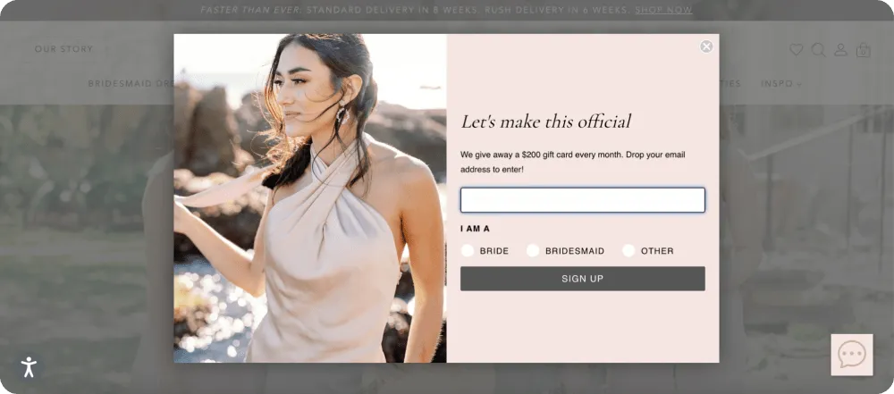
Besides, this pop-up invites users to specify whether they are a bride or a bridesmaid. This way, the company can easily segment the audience and provide personalized offers.
With Claspo, you can adopt this tactic and add custom input fields on your pop-up to get more information about new subscribers and enrich customer profiles from the start.
Buffy
Buffy has quite a unique pop-up design. It's scrollable, but more for the vibe than to fit more information.
The main image resembles movie posters with critic reviews, making you stop and consider it. So, sometimes, originality is a good way to stand out.
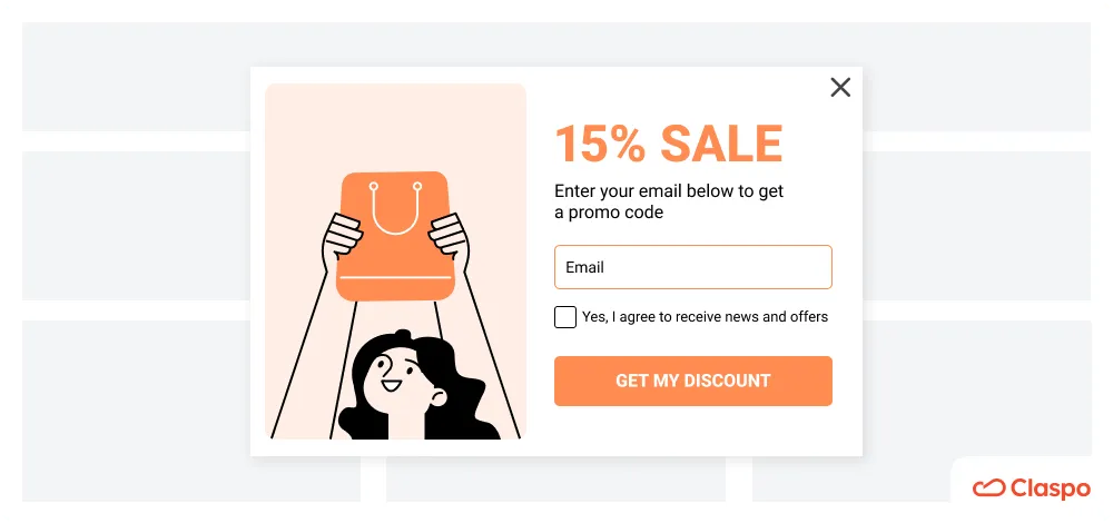
Mented
This is another great example of aligning your pop-up with the brand identity by making the pop-up background the same as your website background.
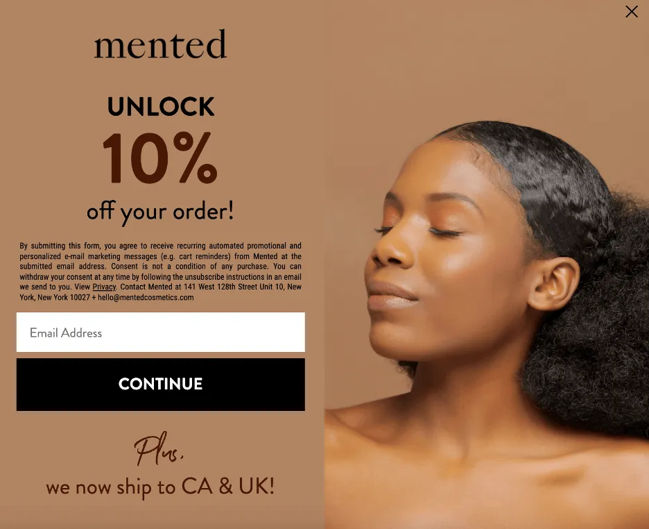
It still doesn't make the message less readable or the CTA less clear.
MeUndies
The MeUndies pop-up design shows how simple language and direct messaging can effectively attract clients and increase conversions.
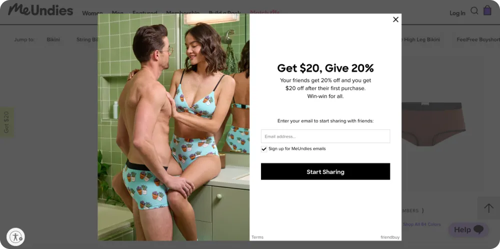
The bold headline "Get $20, Give 20%" quickly communicates the value of subscribing to their email list in an engaging way. The call to action emphasizes the brand's high-quality email content and creates a sense of exclusivity. By focusing on customer desires and using persuasive language, they can drive conversions and grow their business through their pop-up design.
The Pool Factory
The Pool Factory has a great way of making a statement with its pop-up design.
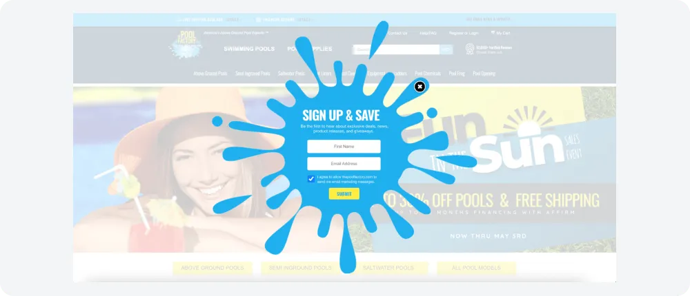
Their pool splash graphic is eye-catching, and the title "SIGN UP & SAVE" is straight to the point. The informative description offers first-time visitors exclusive discounts, news, product releases, and giveaways. The Pool Factory's pop-up design is an excellent example of attracting website users and increasing conversions using appealing visuals.
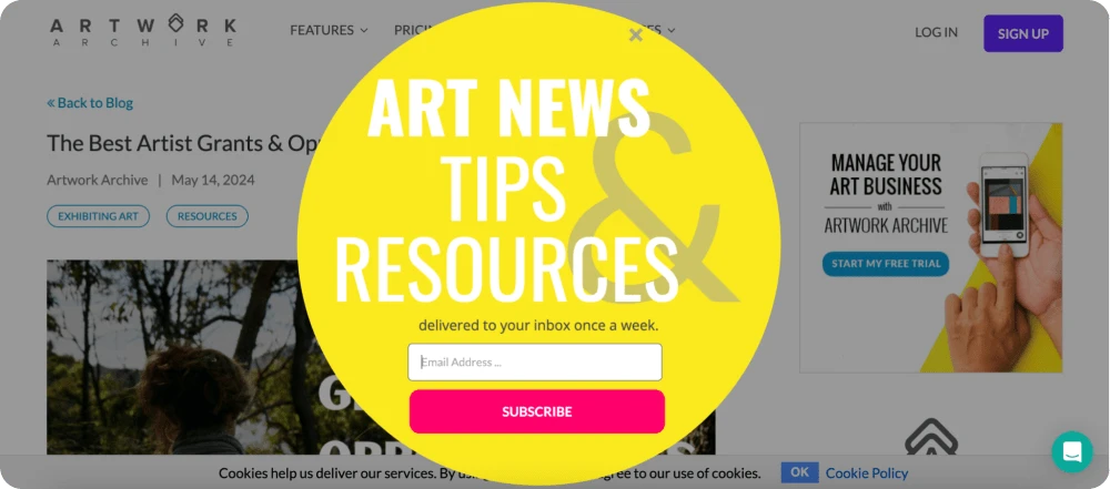
Here's another example of a non-rectangular pop-up by Artwork Archive. They might be a bit harder to design, but they definitely catch the eye and help overcome banner blindness due to their unusualness.
Pop-ups don’t have to be boring. See how to make your popup overlay unmissable (and high-converting).
Italist
The Italist pop-up design shows how a clean, elegant layout can boost conversions. Its focused, high-contrast headline and generous white space quickly draw attention, while the model image reinforces the brand’s stylish, aspirational vibe.
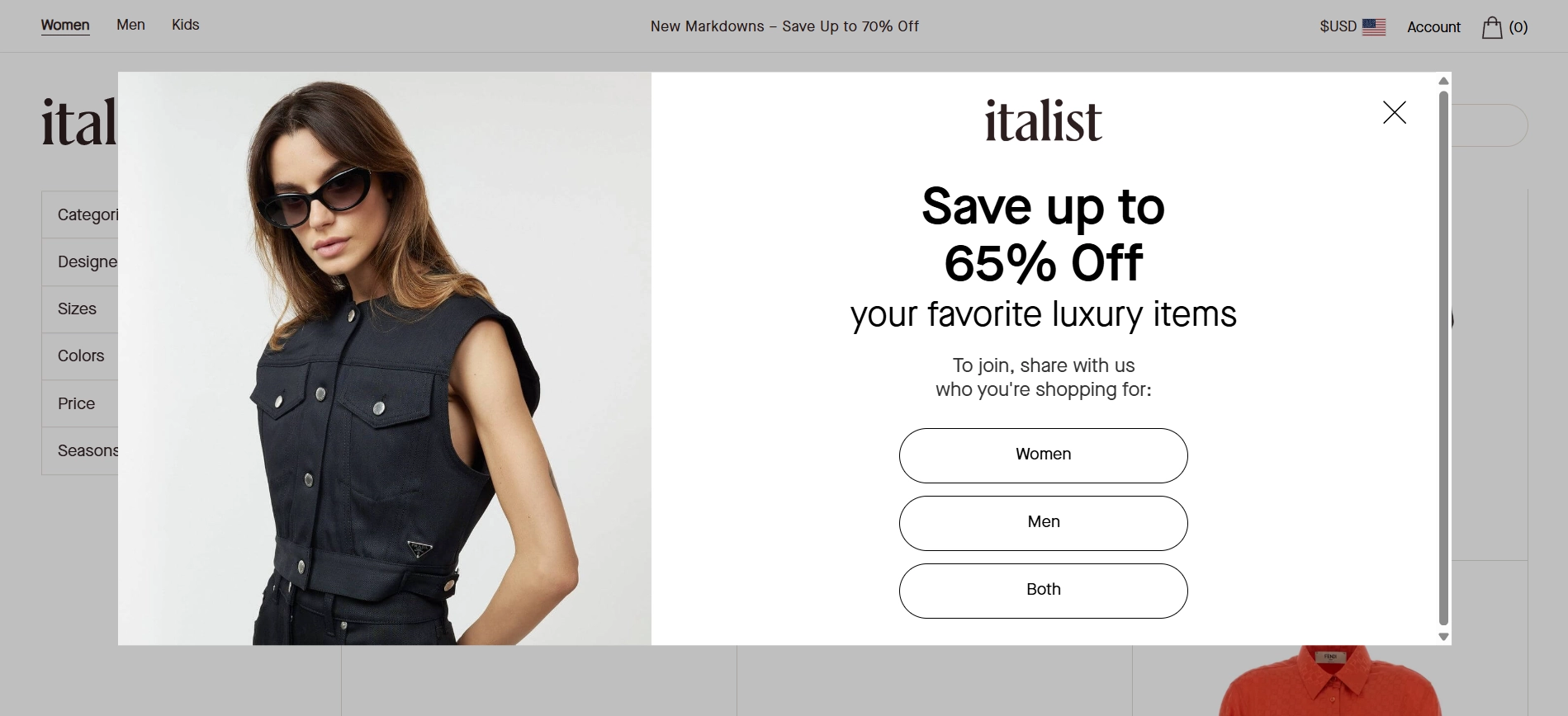
What we want to highlight here is the smart and elegant approach to audience segmentation. The design is both subtle and functional. Since it’s an online boutique, it’s crucial for their email marketing campaigns and targeting to understand who is who. The form’s interactive buttons for audience segmentation add personalization without overwhelming the visitors.
Dossier
The pop-up form design by Dossier is proof that good design doesn’t need to shout — it just needs to feel right. The company did its homework well and added animated elements to the pop-up form design to create a subtle, sensory experience that aligns with the brand.
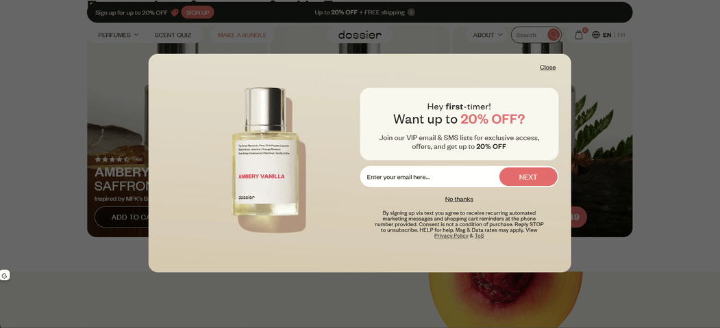
The animated ingredients draw the eye without overwhelming, creating a multisensory feel that hints at the fragrance experience itself. The bold “20% OFF” headline is clear and enticing, while the warm palette and simple form make it easy to convert.
It’s a great example of how thoughtful visuals and minimal copy can work together to capture attention and drive signups.
PRESS Healthfoods
PRESS Healthfoods adds a playful twist to lead capture with a gamified pop-up that taps into curiosity and reward psychology.
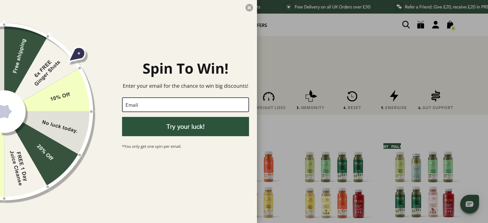
The sliding-in spinning wheel grabs attention and adds a game-like feel. It turns a simple email signup into a chance to win something, from discounts to free products. The “Try your luck!” button of this discount form template fits the playful tone and encourages action.
The design is clean and easy on the eyes. The soft colors, simple layout, and clear form field make it feel friendly, not pushy. The dark green button pops without clashing, aligning with the brand’s natural health focus.
Among other popup design examples, this one stands out for how it blends interactivity with emotion. Even something as simple as anticipation can elevate the conversion experience, and PRESS nails that balance beautifully.
KraveBeauty
KraveBeauty uses a clean and helpful pop-up to offer a 10% discount and learn more about their customers right from the landing page.
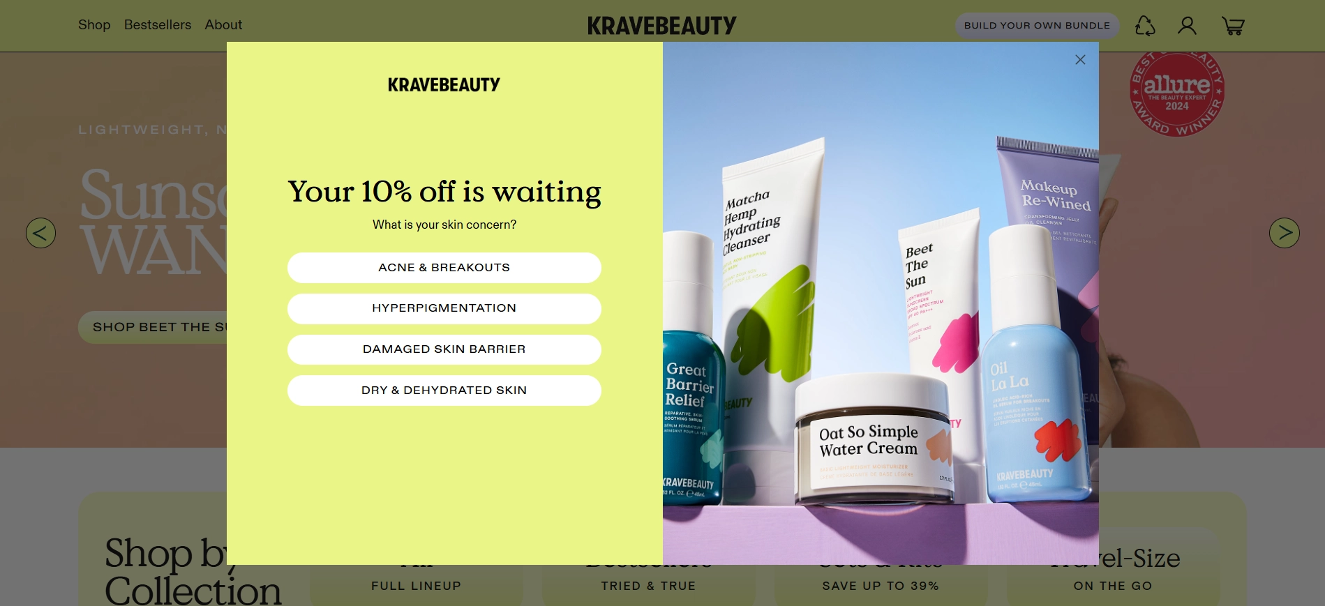
Instead of just asking for an email, they first ask about your skin concern. This makes the experience feel more personal and helps the brand recommend better products later.
The design is fresh and simple enough, with soft colors and easy-to-read buttons. It feels more like a quick quiz than a form, which keeps users engaged.
It’s a smart way to combine a welcome popup and a discount offer with a bit of product education and personalization.
De La Calle
How to make a boring ecommerce popup stand out? Add some spice. De La Calle brings the party energy front and center with a bright, bold sign-up form that’s impossible to ignore.
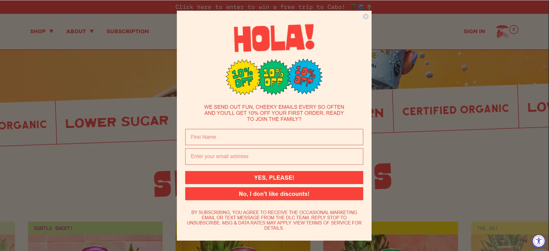
Bursting with personality, the form opens with a loud and proud “HOLA!” and echoes “10% OFF” like a rhythmic chant, instantly setting a cheeky, vibrant tone that mirrors the brand’s colorful identity. The design is simple yet loud: high-contrast colors, oversized, playful typography, and a neon-colored call-to-action button that beams “YES, PLEASE!”.
De La Calle’s pop-up doesn’t just ask you to join — it shouts you into the club, with a wink and a grin.
Buoy
Here’s a pop-up that knows how to hook you without being pushy.
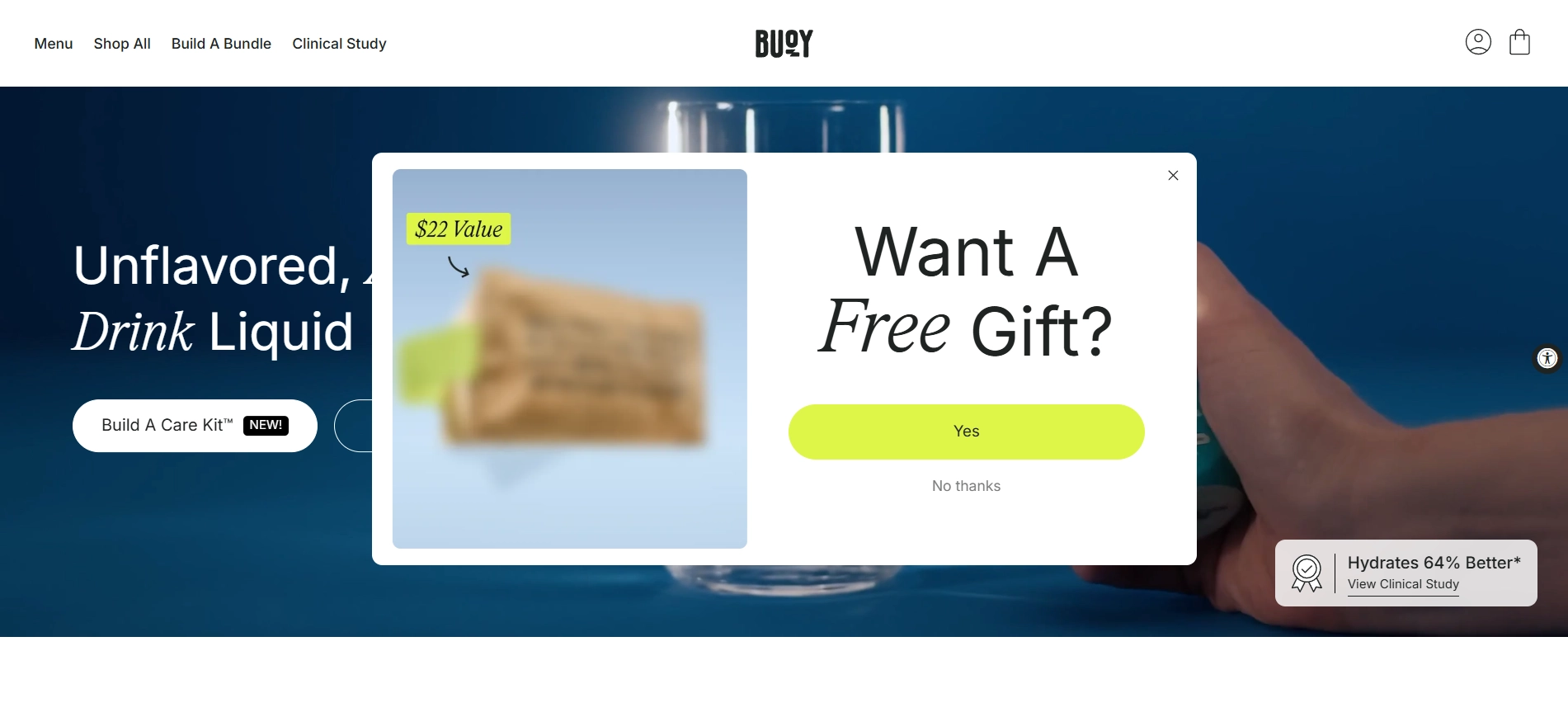
Their pop-up asks, “Want a Free Gift?”, and just to make it tempting, there’s a blurred image along with a neat little tag saying it’s worth $22. It’s like, “Come on, you know you wanna see what that is.” The yes or no buttons keep things casual and easy — no annoying forms or long asks. It’s playful, low-pressure, and just enough to get you clicking without feeling overwhelmed.
When it comes to pop up design examples, this one shows how curiosity and simplicity can work together to drive engagement without adding friction.
Ghia
Rather than pushing urgency or exclusivity like other online stores, Ghia creates a moment of light interaction that aligns with their brand’s relaxed, joyful tone.
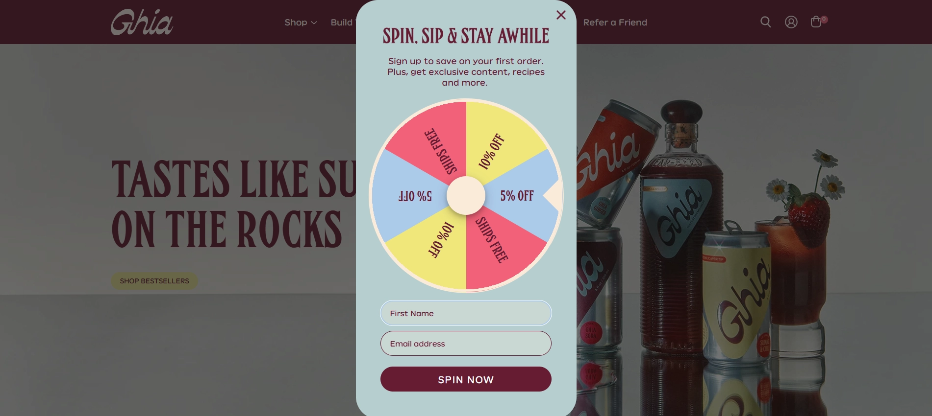
The wheel promises only pleasant outcomes — free shipping or a modest discount — making it a low-stakes, feel-good engagement. Users don’t risk “losing,” which keeps the emotional experience positive and on-brand.
Visually, it leans into calm pastel colors and smooth typography, inviting users to “Spin, Sip & Stay Awhile.” This phrase cleverly mirrors the product experience: casual, social, and enjoyable.
A great example of how gamification can boost engagement without cheapening the brand — perfect inspiration for marketers looking to generate leads with standout popup campaigns.
Sometimes Always
A blast from the past, or how Sometimes Always turns a simple signup into a bold brand moment with a voucher that looks like an old-fashioned cut-out coupon.
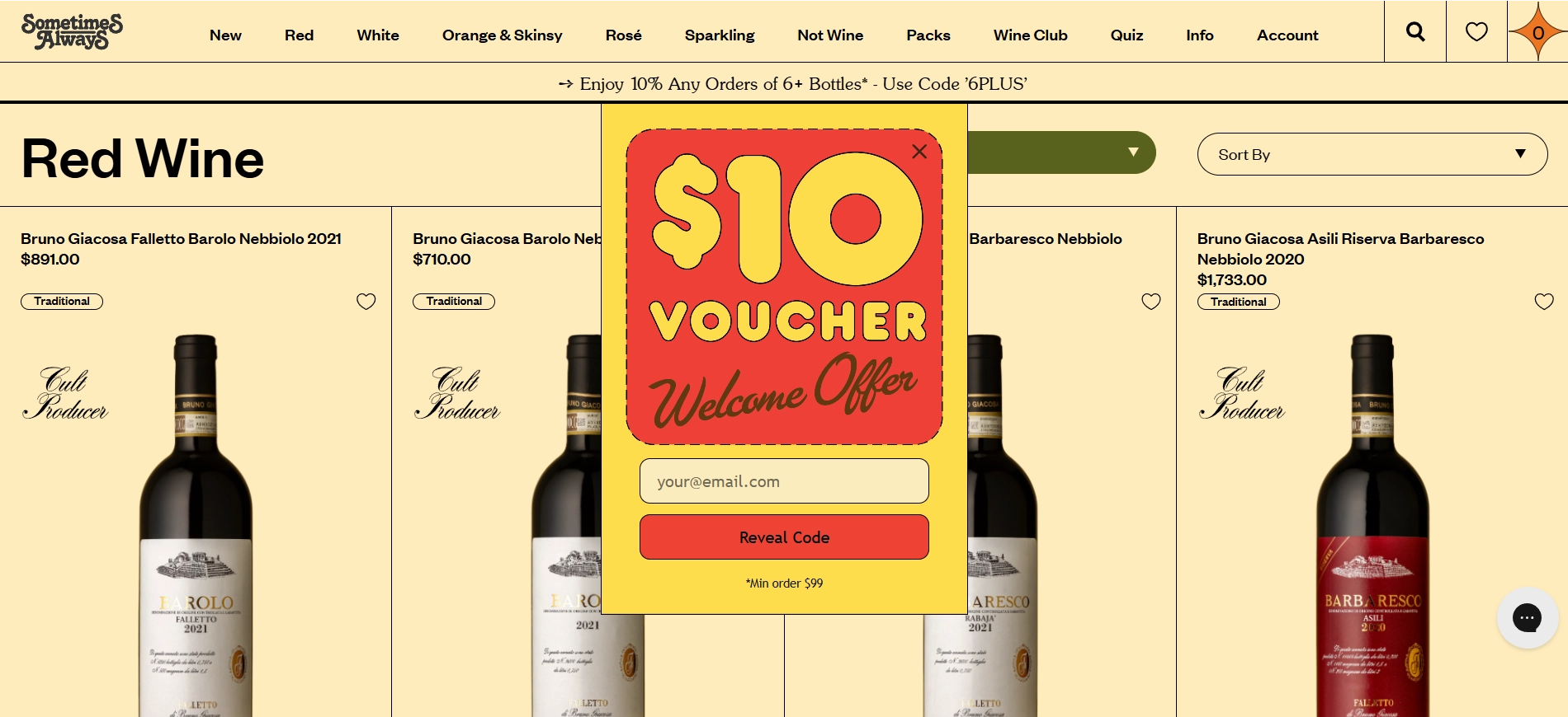
This lead generation popup design evokes the tactile feel of a paper voucher, and this nostalgic pop up style adds both charm and visual distinctiveness. Minimal copy and a clear reward reduce friction, while the “Reveal Code” phrasing introduces a subtle element of curiosity. It’s a no-fuss design that delivers value quickly and effectively.
As far as high-converting website popups go, it’s a great example of how strong brand personality and a bold reward can make even a basic form feel exciting and memorable.
Bulleit
How to turn a boring age verification into a stylish gateway to the whiskey world? Follow the Bulleit design approach.
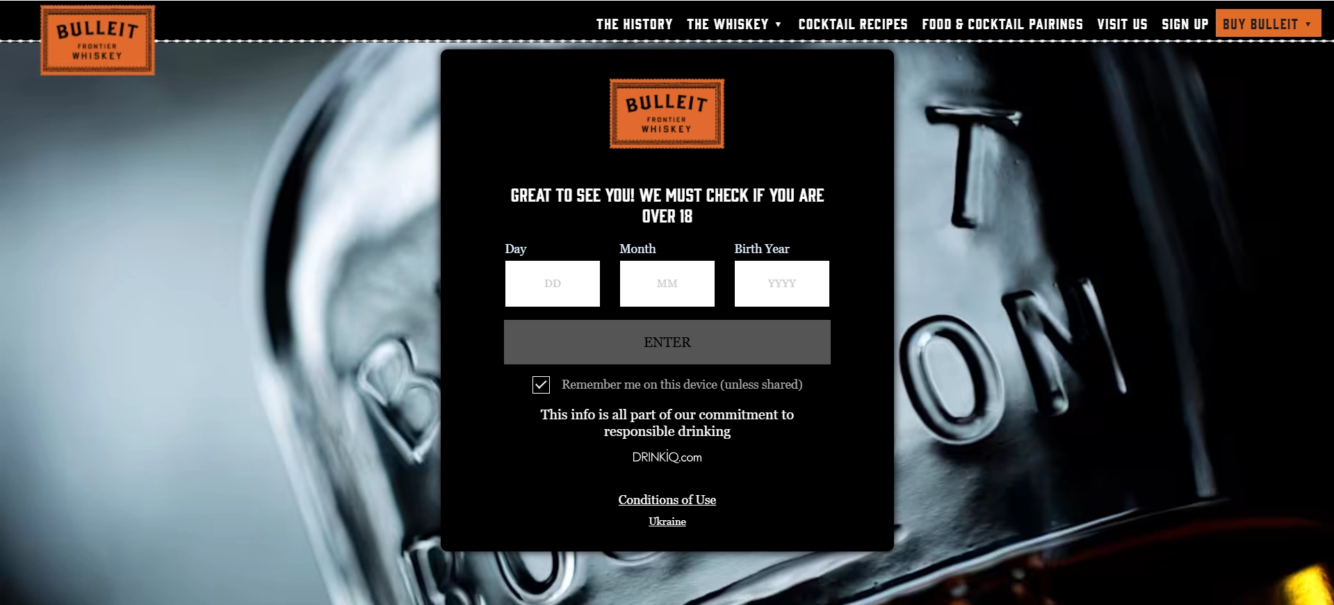
The first interaction is a gatekeeping pop-up that asks for the user’s birth date, essential for alcohol brands. While legally required, Bulleit integrates it cleanly: the centered black module contrasts sharply against the frosted bottle backdrop, reinforcing the brand’s premium aesthetic.
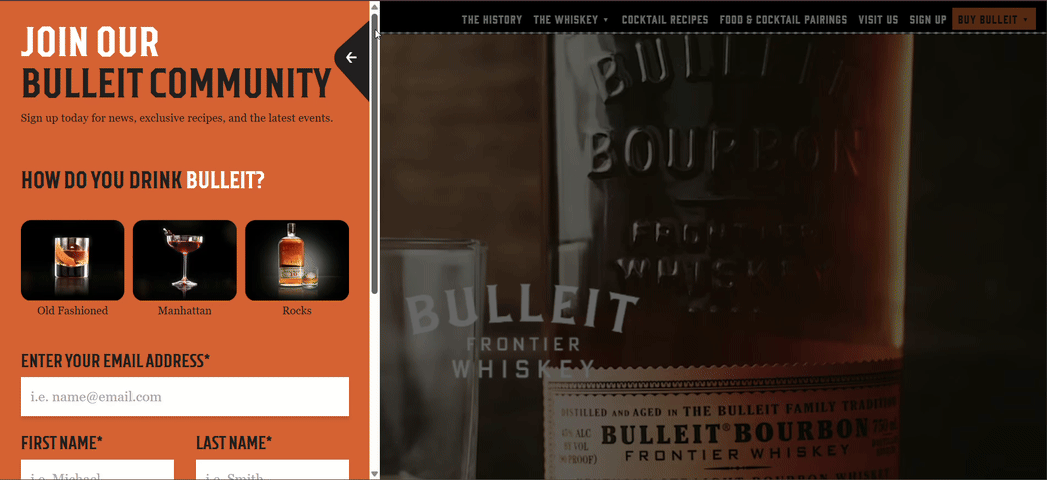
Once verified, users are met with a vivid orange side panel pop-up inviting them to join the “Bulleit Community.” The headline is assertive, the form is visually segmented, and the imagery adds a touch of lifestyle aspiration. The “How do you drink Bulleit?” question, with clickable image options, adds a dose of interactivity while reinforcing product context. The design holds attention while staying true to the brand’s bold, masculine aesthetic.
It’s a great demonstration of how even regulatory requirements can be used to deepen brand engagement and guide users smoothly into a well-crafted lead capture experience.
Bonus Example from AI
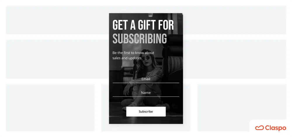
Claspo allows you to bring your unique ideas to life and easily create a design that meets all your requirements without any skills. Still, using AI design tools is another way to simplify your life even more. They help you create images that can then be quickly uploaded into the Claspo editor. You can also go one step further and ask the AI to generate a rough layout of your pop-up, which you can recreate in Claspo. Even if the result from AI is not ideal, it will still give you ideas for inspiration.
So, we asked Ideogram AI to generate an image for us following the prompt: “Please create an image of a pop-up window on a website that offers to buy decorative cosmetics at a discount. This pop-up should collect users' emails.” Here is the result.
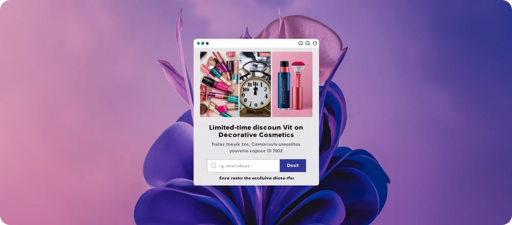
What do we like?
- The AI added a catchy headline in bold font that announces the limited-time offer, thereby grabbing attention.
- The CTA button's color contrasts with the rest of the layout, which, as we already know, increases the likelihood of a click.
- AI offers to reinforce your message with strong visuals — product photos and a picture of a clock — prompting them to hurry up and take advantage of the offer.
This is a neat design idea that can be easily implemented in Claspo. You can place images like in this example or use our slider to show them as a dynamic slideshow.
Still searching for a pop-up that fits your style? Take a look at these 45+ pop up examples — there’s something for every brand.
Best Practices and Popup Design Examples for Mobile Pop-Ups
In 2022, more than 60% of users accessed the internet on mobile devices – and the trend is only growing. So, you can't disregard mobile popup optimization if you want to increase your conversions. Follow these tips from successful pop-up design examples that prioritize user experience:
Choose Your Layout Wisely
First, it's worth clarifying (or reminding) that email popups are just one widget type. They appear in the center of the screen and overlap the content, darkening the background. What is the problem with using them on the mobile version of the site? They can be too bulky for a small screen, making it difficult for visitors to interact with or close them.
There are two optimal solutions here. First, choose a different widget type instead of a pop-up — for example, a floating box or bar. Unlike popups, these take up less space on the screen and do not completely cover the content. This is one of the key conversion optimisation design tips for mobile: prioritize formats that work seamlessly across all screen sizes without hindering user experience.
The second solution is to choose a built-in widget for the mobile version of the site. As the name suggests, it is embedded strategically on your website rather than appearing on top of content as a pop-up. Thanks to this, it does not interfere with viewing the page on a mobile screen and can provide a better user experience. Claspo allows you to create embedded widgets as easily and quickly as pop-ups. Besides, you can also create a customized, attractive popup web design for them.
Optimize for Mobile
When creating mobile popups, floating boxes, or pop-up ad designs, you have to respect the limited space available on mobile devices. Your widget or pop up window design should be responsive, user-friendly, and visually appealing to improve the user experience. A clean, minimal design helps improve user experience and leads to more high-performing campaigns.
Yana, Claspo's designer, gives some advice to make pop-ups more friendly for mobile:
- Use larger buttons and larger, understandable fonts to make it easier for users to click and read your message.
- On mobile, we have a small viewport (the space where we see a pop-up). Considering this, remove all elements that serve purely decorative reasons, such as GIFs. This will allow the pop-up to open quicker.
- Website popup design should adapt to the screen size of the user's device to encourage them to take action.
- Shorten the text whenever possible. On the web, you can talk more about your proposition, terms and conditions, etc. On mobile, leave only the bare minimum.
Mobile version
Desktop version
Mobile vs Desktop: Design Separately
Claspo’s editor allows you to preview how your ready-made widget looks on mobile and desktop screens separately. Most product page popups automatically adapt to different screen sizes. But if you are not satisfied with the pop-up's appearance on a mobile screen, you can always make the necessary changes before publishing it on the website.
Desktop version
Mobile version
Don't Overuse the Fields
Keep the number of fields limited to one to two and ask only for the essential information.
First, if you ask for too much information at once, users are likely to be uncomfortable sharing it. Don't try to learn their entire biography with one popup.
Second, on mobile, especially, navigating multiple fields is almost impossible to do comfortably. You need to zoom in and out, scroll, and so on, which creates a lot of user friction. So, make sure your pop-up is focused on one goal and uses only one or two fields.
Claspo popup templates contain 1-2 input fields, which is optimal for the conversion rate. But you can always change, remove, or add fields as you wish.
Common Mistakes to Avoid in Popup Web Design
Pop-ups used to be so intrusive that Google cracked down on them in 2016, ranking websites that made it hard for their users to access their content lower. Good news! We're no longer in the Wild West of bad design, and there are ways to ensure your pop-up doesn't interfere with your website's usability. It's important to avoid common mistakes that can negatively impact your users' experience and drive them away.
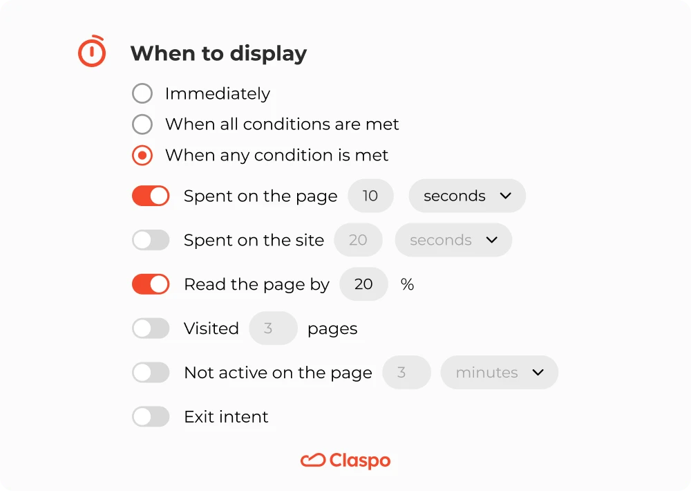
- Don't show the pop-up immediately. Unless for legal reasons (for example, verifying the user's age or asking for their consent to use cookies), don't show the pop-up immediately after the user opens the website. Instead, use Claspo’s timed or scroll trigger to delay the display until the users spend a specific amount of time on the page or read it to a certain percentage. According to statistics, these triggers boost conversion rates.
- Don't use multiple pop-ups on a single page. This can create a feeling of pressure and lead users to abandon your website or app altogether. Instead, strategically place pop-ups where they will have the most impact and limit their frequency. If you need to use multiple popups for different reasons (for example, one for cookie usage and one with a promo), make sure they are demonstrated one after another.
Claspo offers a preset silent interval between widget displays. It prevents your widgets from appearing simultaneously, even if you duplicate their display rules by mistake.
- According to standard guidelines, it's best not to create pop-ups that resemble system or app notifications or warnings. Some companies use this technique to ensure that their pop-up messages attract attention, but it is not ethical. You play on the feelings of customers and mislead them. This is not the best tactic for building long-term relationships.
- Don't show pop-ups nonstop. "I see them every time I visit a website" is one of the most common reasons website visitors hate popups. Imagine that visitors who have already subscribed to your newsletter see a pop-up inviting them to share their email addresses every time. A little annoying, isn't it? Claspo will help you prevent this.
- Our display rules allow you to stop displaying a widget to those who have already joined your mailing list through a specific or any Claspo widget on your website. In addition, you can stop showing the pop-up to those who have already closed it one or more times. In both cases, you provide a great user experience on the site and motivate them to return to you (and even buy from you) again.
By avoiding these common pop-up design mistakes, you can create captivating pop-ups that engage your audience without interrupting or driving them away.
Parting Words: Key Takeaways for Effective Pop-Up Design
To create a pop-up design that grabs your audience's attention and increases conversions, it's vital to follow the best practices of graphic design in general — for example, have a distinct visual hierarchy, develop a harmonious yet contrasting enough color palette, and leave white space around the blocks of information and the buttons. To successfully follow best practices in the website pop up design specifically, you should keep in mind the following:
- Keep everything simple and focused.
- Prioritize mobile optimization.
- Offer value.
- Make a pop-up easy to close.
- Test and iterate.
Implement these best practices now with Claspo’s intuitive editor and see the difference for your business.

![How to Add a Popup to Your Shopify Store [Step-by-Step Guide]](https://static.claspo.io/var/www/html/public/photos/shares/Blog/How_to_Add_a_Popup_to_Your_Shopify_Store___Step-by-Step_Guide__2.webp "You Might Be Interested in")


