How to Create a Pop-Up in HTML for Your Website


Summarize
Whether you're designing a landing page, optimizing conversion paths, or just experimenting with front-end features, knowing how to create a pop-up in HTML is a valuable skill. In this guide, we’ll show you two practical approaches to adding a custom pop-up to your website — one using HTML, CSS, and JavaScript, and another with a no-code builder that gets it done in minutes.
If you enjoy hands-on coding and full design control, you’ll appreciate our step-by-step walkthrough of the manual method. And if you'd rather skip the technical complexity, we'll introduce you to Claspo — a powerful, code-free tool for building responsive, high-converting pop-ups in just a few clicks.
As a bonus, we’ll also share expert tips on web popup usability, design best practices, and how to make your pop-up feel like a natural part of your site, not an interruption.
How to create a popup in HTML and without code
In this section, we'll explore two primary methods: creating a popup notification in HTML, CSS, and JavaScript and using a template to streamline the process. The first option is still used due to the endless customization possibilities. Meanwhile, the second refers to no-code solutions that are gaining momentum and becoming a cure for non-technical users and those who cannot afford to hire a developer whenever they need a pop-up.
Popup in HTML CSS: a code-required method
Advanced coding skills allow you to create a custom pop-up window in HTML from scratch and adapt its appearance and behavior on the website to suit your needs. So, how do you make a popup in HTML if you have such skills? Let's go through it step by step.
Step 1: Prepare your image
Before you start coding, make sure you have a pop-up image for your HTML popup box ready (can’t do it yourself? Congrats, you need a designer as well). The image should be hosted on a server so it can be accessed via a URL. You can upload your image to your website’s server or use an external image hosting service.
Step 2: Popup structure with a popup button in HTML
The popup HTML code forms the structure of your widget. Here's a popup code explanation:
1. DOCTYPE declaration: defines the document type and version of HTML.
2. Head section: contains meta-information about the document, such as character set and links to stylesheets and scripts.
3. Body section: contains the main content of the document, including the popup button in HTML to trigger the pop-up and the pop-up itself.
Container div: centers the pop-up box in HTML and button.
Button: triggers the pop-up on click.
Popup div: contains the pop-up content, including an image, a heading, a message, and a close button.
Image: displays the image you’ve prepared. The src attribute should point to the URL where your image is hosted.
Step 3: CSS popup styling
CSS popup design is used to style the widget and make it look appealing. Here’s what each part of the CSS code does:
1. Import font: imports a custom font from Google Fonts.
@import url('https://fonts.googleapis.com/css2?family=Poppins:wght@400;500;700&display=swap');
2. Global styles: sets default styles for all elements.
3. Container styles: centers the content on the page.
4. Button styles: styles the button popup and adds a click animation.
5. Pop-up styles: styles the pop-up and controls its visibility and entrance animation (such as fade or slide).
Tips to make your pop-up in HTML CSS stand out
When you create an HTML popup, it's not just about functionality — it’s about visual impact. A well-crafted popup can instantly draw attention and drive engagement if designed with clarity and purpose. Here’s how to enhance your popup using common design strategies.
1. Use an overlay with adjusted opacity.
An overlay is a semi-transparent layer that sits behind the popup. It dims the rest of the screen, allowing users to focus on your message. To achieve this, create a separate div as an overlay container for the popup and set its background-color with rgba and an appropriate opacity value (like 0.6) in your CSS.
2. Keep the HTML popup box centered and styled for impact.
When you create HTML popups using CSS, ensure your container is styled with padding, a max width, subtle shadow, and a rounded border. Design your popup container with a white or bright background, subtle shadow, and generous padding. Whether you’re displaying it at the top of the screen, the center, or near a menu, visual contrast is key. Use a strong CTA and an eye-catching font (like Poppins or Montserrat) to increase visibility.
3. Add smooth animations with CSS transitions.
Animations like fade-in or slide-down can elevate the experience. Apply a class with transition and transform properties to your HTML and CSS popup. This makes it feel more interactive and modern, even without JavaScript-heavy effects.
4. Responsive by default.
Don’t forget to ensure your popup works on all screen sizes. Use @media queries and percentage-based widths for your container. This makes your pop-up with HTML approach mobile-friendly without extra tools.
By combining structure, HTML and CSS, and subtle animations, you can create an HTML popup that’s not just functional but truly eye-catching — designed to stand out and convert.
Step 4: JavaScript functionality
JavaScript is used to bring the popup screen in HTML to life by controlling its behavior. Here’s what the basic functions do:
1. Get pop-up element: selects the pop-up element by its ID.
let popup = document.getElementById('popup')
2. Open pop-up function: adds a class to show the popup and initiate the animation.
3. Close pop-up function: removes that class to hide the popup and restore the default state.
Using JavaScript, you can control when and where your popup appears — such as on specific pages like your pricing, blog, or checkout. This ensures your message is relevant and well-timed, rather than disruptive.
No-code method: pop-up templates
The main benefits of no-code solutions for creating a popup window in HTML are time savings and flexibility. When you have a ready-made template, you don't waste time preparing a pop-up image, and the drag-and-drop editor gives you the flexibility to customize the template to suit your needs. We can add saving money to this list since you don't need a developer and designer. So, how to add a popup in HTML in this case? In general, the process boils down to the following steps, making it much simpler than coding a popup in HTML with CSS from scratch:
Select a ready-made template that suits your purpose (such as an opt-in pop-up, informer, prevent cart abandonment etc.) from the options available in the library.
Customize it according to your branding, website design, and specific requirements.
Preview how your finished pop-up looks on the mobile and desktop versions of the site.
Set up pop-up display rules (when, where, how often, and to whom it is displayed, and so on).
Embed the pop-up on your website and publish it.
This option seems much simpler than the previous one, right? That's how it is if you choose Claspo. After all, you have already come to us, so see below how to create a popup in HTML with CSS (using our intuitive editor, of course!) and get down to business immediately after reading the article.
How to make a pop-up with Claspo: 8 steps
The first thing to know is that Claspo, one of the best popup tools, gives you the same comprehensive customization options as the code-required method. However, unlike the latter, Claspo is suitable for those without programming and design skills. It makes creating a pop-up in HTML a simple and quick task. Let's see how to make a pop-up using our builder without extra effort.
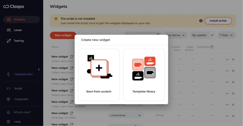
Step 1. Sign up and get started
Create a free account in Claspo and click the "New Popup" button. You are offered the option to create a popup from scratch or use the template gallery. To save maximum time, we’ll go with the second option.
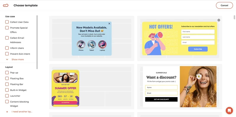
Step 2. Choose your template
Our template library contains more than 1000 ready-made templates that cover multiple use cases. You can easily find your ideal match using the filters on the left side of the screen. They allow you to choose the use case, layout (HTML popup form, floating bar, floating box, content-blocking widget, etc.), industry, and theme. Once you have found an example you need, you go to the editor.
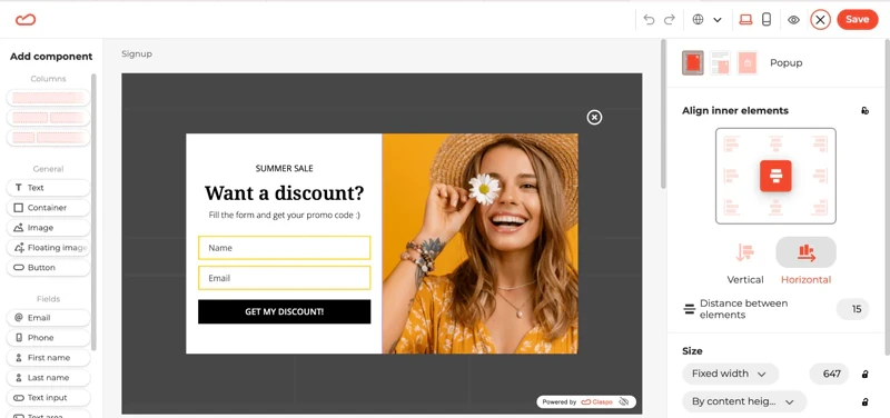
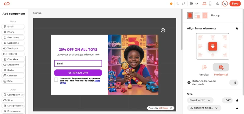
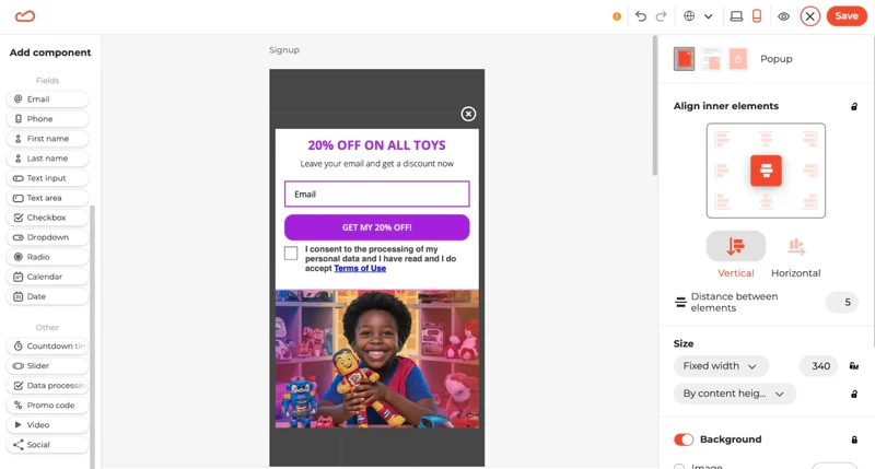
Step 3. Customize your template
Since this article is devoted to how to make a pop-up in HTML on your website, we chose a pop-up as a layout and one of the most popular use cases for it — collecting user data. As you can see in the example below, our template can be changed beyond recognition.
In this case, we replaced the image, first creating one using AI, replaced the text of a pop-up form in HTML, removed one input field, added a checkbox for consent to data processing to make the pop-up GDPR-friendly, and ultimately modified the color scheme, including the CTA button color. The only limitation is your image, so you can customize the template even more.
Step 4. Preview your pop-up
Once you have made all the necessary changes, you can preview how your pop-up looks on your website's desktop and mobile versions. To do this, click on the icon of the corresponding device in the upper right part of the screen. If you are not satisfied with something, you can always continue editing.
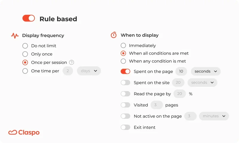
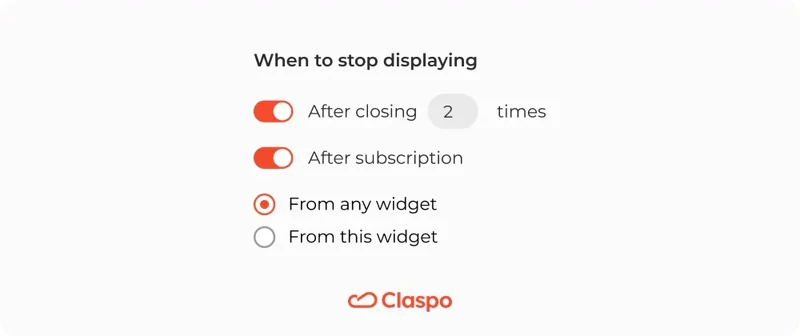
Step 5. Set up display rules
If you're wondering how to create a popup in HTML on a website without annoying users, Claspo has you covered. Our platform offers advanced targeting capabilities and optimal display rules for a seamless user experience, preset by default. For example, the HTML notification popup automatically appears once per session after the user has spent 20 seconds on the page. In addition, it automatically stops being displayed for those who have already left their email, helping you capture your website's audience effectively. Logical, right?
And the icing on the cake — we automatically protect your pop-ups from appearing simultaneously and overlapping. This means you can safely scale your lead generation strategy with popups without fear of scaring off visitors.
Still, you can always customize the display rules to suit your needs. You can easily toggle various options to target specific user behavior, such as enabling exit-intent triggers. Unlike the code-requiring method, you just need to click a few buttons in our “Triggering” section, without needing to delve into complex pop-up CSS. This means a Claspo popup offers more control and flexibility when creating a popup using our intuitive tools to collect email addresses and other valuable data.
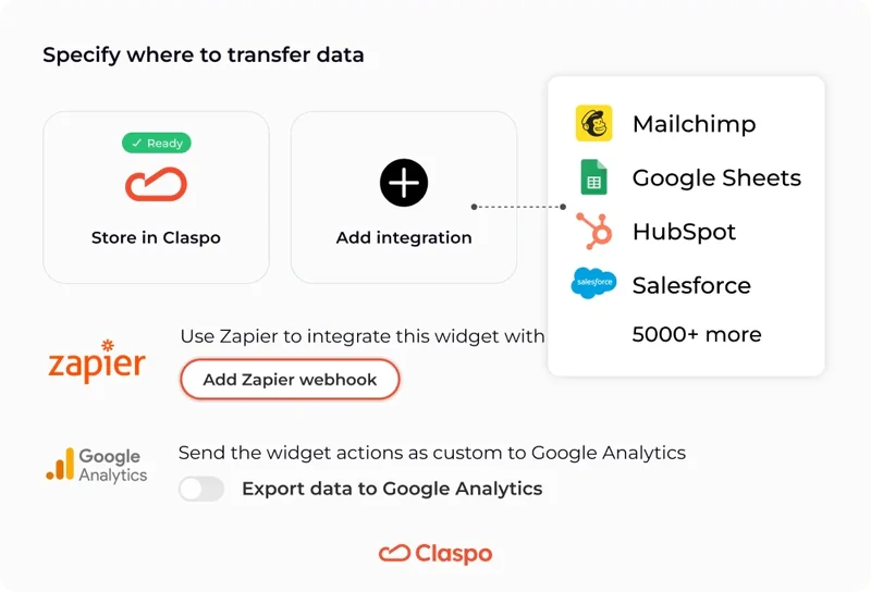
Step 6. Integrate Claspo with your chosen platform
Beyond the question of how to create a pop-up on your website, you need to understand how to sync a popup message in HTML with other marketing tools. But in Claspo, this task also comes down to a few clicks.
Integrate Claspo with a suitable CRM, ESP, or CDP from the drop-down list. In this case, all information about users collected using our pop-ups will be instantly transferred to the selected platform for subsequent segmentation and launch of your automatic campaigns.
Integrate Claspo with Google Analytics. It will give you more valuable insights into how users interact with your pop-ups and help you optimize them for better performance.
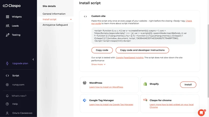
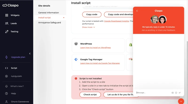
Step 7. Install your pop-up
Once your pop-up is ready, you will receive a ready-made script code that you need to embed on your website. You’re probably thinking, "Wait! I thought we were talking about how to create a pop-up on a website without popup coding skills!" This is true! In Claspo, you only need to copy and paste the finished code following one of our step-by-step instructions. You can easily find them under your script code in our editor.
Still, if you can't handle it on your own, feel free to contact our support team, and we will install the HTML pop-up message on your website absolutely free of charge!
Step 8. Analyze and optimize
Your pop-up has been created and is actively working to increase your conversions! But how successful is it? You can always track key performance indicators of each pop-up, such as the number of unique views, the number of targeted actions, and the conversion rate directly in Claspo. Do you have any ideas on improving your pop-up's performance? Use our A/B testing to experiment with any elements and check what resonates best with your audience.
Claspo aims to simplify your task and get you the desired results faster. With this in mind, our marketing team created an A/B testing template. It contains the critical stages of this process and allows you to put any hypothesis into practice. Get it for free and use it for all subsequent A/B tests (not just those related to pop-ups).
How to format a pop-up to be user-friendly
Disclaimer: the optimal appearance of your pop-up can only be determined through A/B testing. However, a few basic rules will help you create a pop-up design that is attractive to users and effective for you.
Branding is vital, so make sure all pop-up design elements are consistent with your brand's color scheme and style. This will help reinforce your brand identity and make the pop-up look like a natural part of your website.
Remember the reciprocity principle and offer something in return for their contact information.
Reinforce your message with an image to increase the click-through rate by up to 25%. Use high-resolution images to ensure they look good on all devices. Blurry or pixelated images can detract from the professionalism of your pop-up.
Don't add too many input fields. Statistics show that pop-ups with two input fields have the highest conversion rate. This is enough to clarify the prospect's contact details and name without boring them with your pop-up form.
Make sure each field is clearly labeled so users know exactly what information is required. Use placeholder text to provide examples or additional instructions.
Design for visibility and readability. Use high contrast between the text and background to make your message easy to read. Choose fonts that are easy to read and avoid overly decorative fonts that can be hard to decipher.
Optimize for mobile. Ensure your pop-up form is responsive and looks good on all screen sizes, including smartphones and tablets. Make sure buttons and links are large enough to be easily tapped with a finger.
Be careful with full-screen popups. Norman Nielsen Group advises using widgets that block content only when you need to verify users' age, get their legal consent, etc. In other cases, they can make your advertising intrusive and irritate users.
Ensure there is a clearly visible close button so users can easily dismiss the pop-up if they are not interested. Allow users to close the pop-up by clicking outside of it or pressing the escape key.
Tips on tuning the pop-up window
Even the most visually appealing pop-up can be intrusive, driving visitors away from your site. Therefore, to answer the question of how to create a pop-up that converts and does not annoy, it is vital to discuss not only the design but also the display rules.
Don't bombard users with pop-ups. 45.6% of visitors complain about too many pop-ups on a site. With Claspo, you can avoid this in several ways:
Use the pre-configured silent interval to prevent the simultaneous appearance of pop-ups, and show them once every three minutes (the interval can be adjusted)
Choose pages with the proper context for a specific pop-up rather than just showing the same pop-up throughout the website.
Personalize your pop-ups, for example, only for first-time visitors, users from a specific geolocation, or those who came to the site from a specific traffic source or campaign

28.6% of users hate the immediate pop-up display. Create a pop-up that appears when the user has spent at least a few seconds on the website. This way, you give them time to get comfortable and learn a little more about your company before showing them your offer. This improves their browsing experience and increases your chances of conversion. Our preset display rules delay pop-ups by 20 seconds, but you can always adjust this timing.
Use a scroll trigger for your pop-up form. It allows you to show a pop-up when the user has scrolled the page by a certain percentage, bringing more conversions than a time trigger. The main reason is that your pop-up appears in the proper context.
For example, if a user has read your blog article to a certain point, invite them to subscribe to your newsletter for more helpful information. A pop-up may also appear when the user has scrolled to the pricing section to offer a discount on the first order or a free trial.
Stop your pop-up displaying in a timely manner. 20% of users get annoyed when they see the same pop-up forms every time they visit a website. Take care of their experience! Refrain from showing the pop-up to those who have already closed it one or more times and those who have already left their contact information. It is easily achievable with Claspo.
Conclusion
So, there you have it! You've learned how to create HTML pop-ups and the incredibly simple, no-code path. We hope you've seen just how much Claspo can genuinely simplify your life and your web design projects. With Claspo, you don't need any prior coding experience to get your first popup for site. Our platform lets you create popups that look great on any device, from desktops to smartphones, ensuring a seamless experience for your visitors.
Whether your goal is to build your email list with compelling email pop-up examples, gather feedback, or announce a special offer, you can literally have stunning popups in minutes. Once you discover successful cases of pop-up usage, you naturally want to create a pop-up for your website as well. That’s why we invite you to take the plunge with our free lifetime plan. You can start building and seeing real results for your business without spending a dime. It's the perfect way to use HTML (without actually coding it!) to drive your website's performance. Why not give it a try and see how easy it is to create impactful widgets for your site today?


![How to add a Shopify newsletter signup form [+Tips & Templates]](https://framerusercontent.com/images/FavgBqCU1zgoOwEdQvBHxtOWIc.png?width=1320&height=756)