Overlay Pop-up Best Practices, Examples, and Templates


Summarize
The term "popup window" has negative associations for many Internet users. A picture that covers the desired text fragment appears in front of your eyes. When trying to close, the user often goes to another resource altogether.
Despite this bad reputation, pop-ups can also be helpful. Initially, they were just a type of dialog used in programming as a user interface element. They serve as information and a means of dialogue between the user and the program (web application). However, overlay pop-ups are used mainly for advertising purposes on the network.
What Is an Overlay Pop-up?
Modal windows, overlays, or pop-ups are a type of message in an application. Large user interface elements sit on top of the application's main window, often with a transparent layer that allows users to see the main application.
Pop-up windows are used to display additional information in cases where it is presented in an abbreviated form in the main window. For example, a pop-up window can be used to show the user the full access route when it is not contained entirely within the given area or some other textual information.
Even though pop-ups are one of the types of advertising that users dislike, they aid in the following objectives:
Subscription to the company's newsletter;
Downloading useful content (in this case, the user must also leave his email address or phone number);
Registration on the site for discount coupons.
Pop-up overlays don't have to be intrusive. When you use them correctly, you can motivate the site visitor to take the action you want. To do this, you only need to decide on the type of pop-up windows and the content you will place there.
Types of Pop-ups Similar to Overlay
Pop-ups are not just pop-up spam. When used correctly, they can serve as valuable tools that improve the user experience in an app and can even improve retention and long-term engagement.
Here are some of the types of website pop-ups.
1. On-Click
On-click pop-ups work by inserting a campaign pop-up trigger into pinned text. These pop-ups are really good because they are seen by users who are interested in what you have to offer. This means you are getting super hot leads. As a result of this, you can expect much more conversions.
Stays.net was able to increase its monthly sales by 10% using on-click pop-ups.
2. Lightbox
It is the most common type of pop-up window. When such a pop-up window appears, the browser's background becomes darker, drawing all your attention to the information on the pop-up window. Most often, lightboxes are used to expand the list of email addresses.
3. Full-Screen Modals
Full-screen modal messages are for messages you think are so important that they deserve the user's attention. For example, an exceptional app update or confirmation of critical action.
A pop-up on the site is an excellent way to quickly collect a contact base, increasing the conversion rate and reaching the audience. Splicing every time stimulates the growth of additional income: subscribe to a subscription, take a reduction in exchange for a phone number or email.
Pop-up Overlay Best Practices and Examples
Pop-ups are the most common cause of poor user experience. But to prevent this from happening to you, you need to follow these tips to avoid negative impacts from annoying pop-ups:
Resist the urge to follow the crowd and annoy your users by getting in the way of working to maintain short-term performance.
Explore alternative approaches that consider your users' needs and keep the intent to collect feedback, notify users of data collection, or solicit email addresses.
Save modal overlays for important information.
Don't interrupt important tasks or block access to content with a cumbersome and very intrusive pop-up.
Conduct usability testing to make sure your pop-ups don't discourage users and that you get real information to help you improve your service.
Let's look at the quality of pop-up overlays from well-known brands.
1. A New Look for Gmail
Gmail has used in-app message overlays to communicate some important UI update news to users. The app has been given a new look with three different layout options. In this example, Gmail communicates the message with consistent branding and concise copy, creating a compact embedded environment that engages and informs the user.
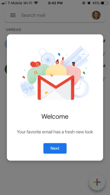
By leveraging in-app messaging, you can reduce the risk of churn associated with design changes or major changes to your user interface.
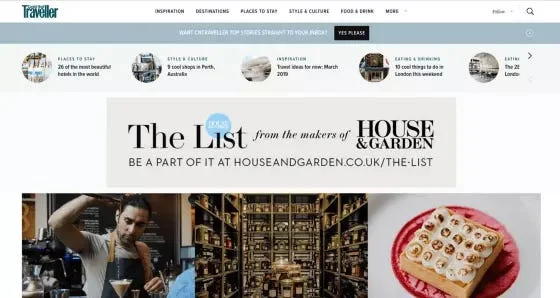
2. Conde Nast Traveller
The website presented its newsletter as a small, discreet banner below the navigation bar. This design allowed interested users to subscribe to the newsletter but did not distract those who simply wanted to read the site's content. Pop-up content: don't rely on the overlay to deliver a message to the user.
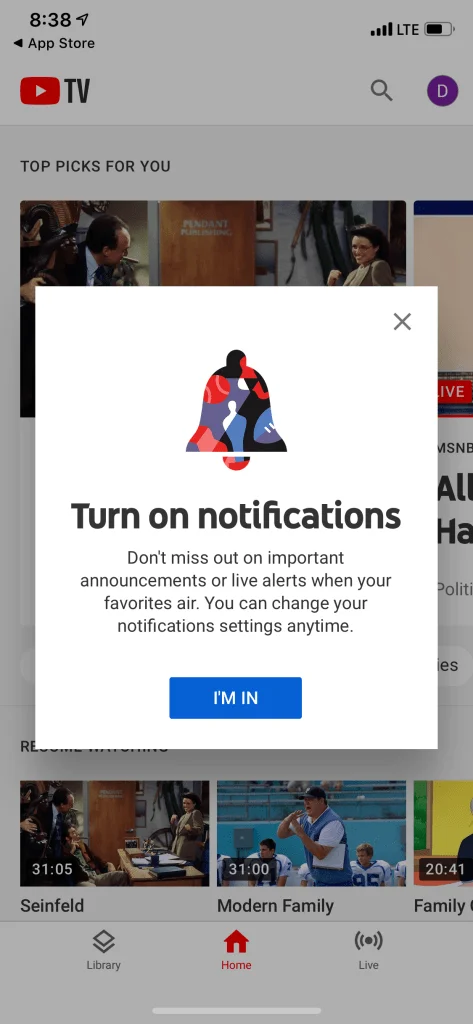
3. Enabling Push Notifications on YouTube TV
YouTube's permission request is one of the best pop-ups. Instead of asking for permission without context, the app positions notifications as a required feature. Messages effectively communicate the benefits of push notifications and play on users' fears of missing out.
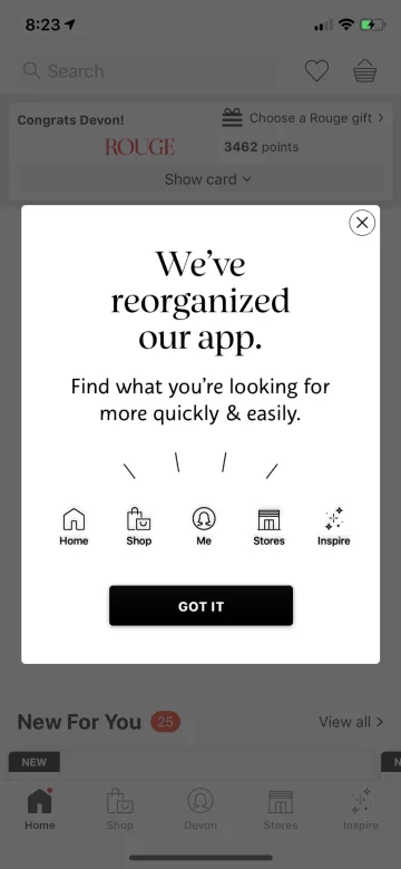
4. A Simple Sephora Design Update
Sephora used a fantastically simple pop-up to inform users of the app's menu changes. We like that this quick start guide doesn't allow for much interpretation and emphasizes that a conscious improvement has been made to the user's navigation.
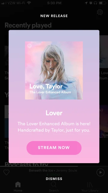
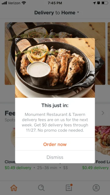
5. Individual Offer from Caviar
Caviar uses users' location information and application settings to generate personalized in-app messages. Caviar uses an overlay to promote new restaurants, letting users know that delivery charges from a new, nearby restaurant are free for a limited time. An enticing image catches the eye and gives hungry users a reason to browse.
6. Request for Feedback in OpenTable
Getting users to provide feedback in any format is quite tricky. But for applications like OpenTable, user-generated content is essential.
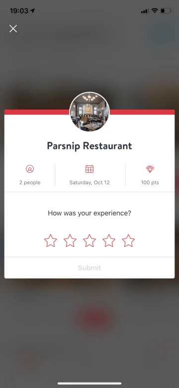
Using a mobile pop-up as a feedback portal is a smart and efficient way. It serves as a reminder that the app was helpful to the user (last restaurant reservation) and is effective because using a small overlay gives users the impression that it will be a quick and easy experience.
Pop-ups are unmatched in their ability to reach all users in context and simultaneously. You need to use modal solutions wisely, and then you can enjoy long-term and predictable growth in revenue and retention.
Overlay Pop-ups Best Templates by Claspo
You can easily create a fully functional pop-up window without programming knowledge. You may choose one of the ready-made templates and customize it in a simple form editor. In Claspo, you can find a pop-up overlay template for every taste and every request.
Below we present some sample templates.
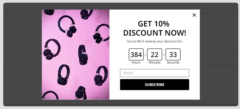
1. “Statue of Freedom” — this template will help keep the visitor's attention by using a turn-down timer.
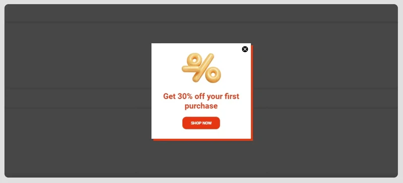
2. "Wild Orchid" — helps collect email addresses and attract an interested audience.
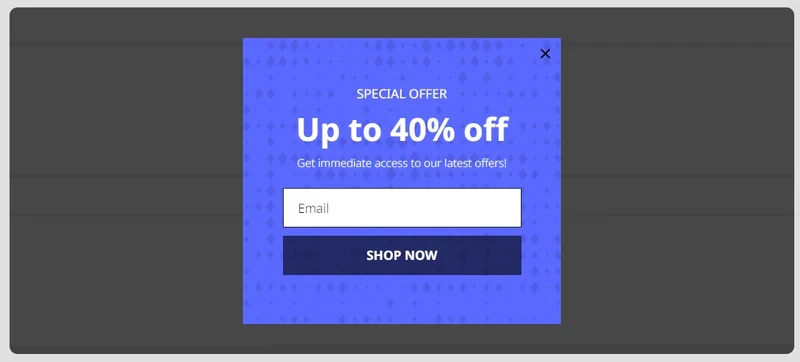
3. "Golden Discount" — this template attracts potential buyers by promoting special offers.
On the site, you can choose the template that suits you best and will help you effectively increase your sales.
Step-by-Step Guide: Creating Effective Pop-up Overlays with Claspo
By their nature, pop-ups are not a major problem for the user. Like many other digital interface elements, the design decides whether this interaction experience will be painful or pleasant. Therefore, it is so important to carefully consider the design of pop-ups to please the user and convince him to take the targeted action.
Let's see how to create pop-up with Claspo that will lead to high conversions.
1. Registration
First, you need to register on the Claspo website and create your profile. You can also log in via Facebook or email.

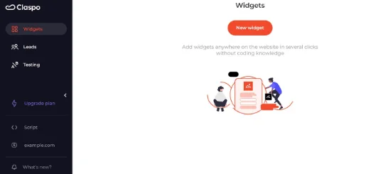
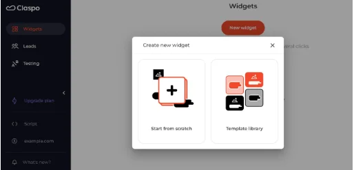
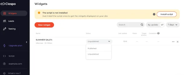
2. New Popup
Next, you click on the Popups button and create a new one. You need to come up with a name that the client will definitely pay attention to.
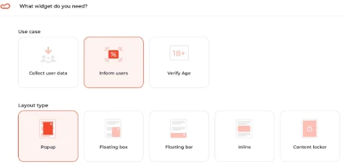
3. Goal and Type of Pop-up
Choose your perfect goal and type of your future pop-up. The user on your site has to clearly understand what you want from them and what they will receive in return.
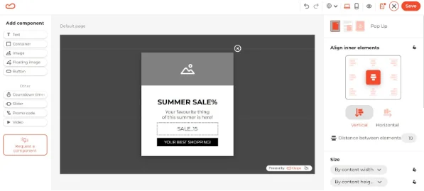
4. Relevance and Call to Action
Make your offer and call to action relevant, clear and understandable. Promo codes, discounts, and the word "free" always work. Adjust the size, and margins, and add an image or background.
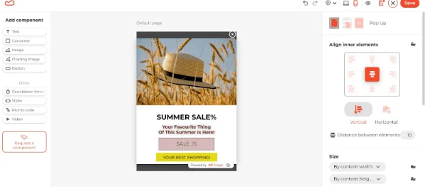
5. Bright Colors and Style
The pop-up needs to stand out, so use contrasting colors. For example, combinations of yellow and black and pink and white attract attention.
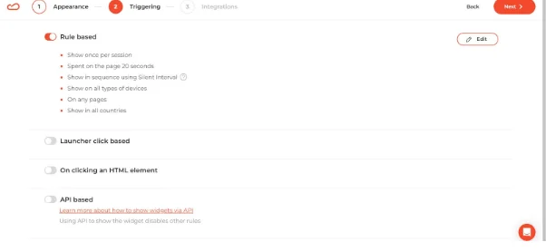
6. Triggers and Integrations
Here you need to choose the operation option of your pop-up window, when, how, and where it should appear.
7. Testing
Test how it looks before you embed a pop-up in your resource. A pop-up should not interfere with or cause negativity but also be noticeable.
There is a wide range of pop-up templates to help you create different types of pop-ups and drive traffic, collect emails, or attract visitors to your social networks or sites. You can also find out how to create a video pop-up on our site.
Conclusion
It is a myth that pop-ups do not benefit businesses but only annoy site visitors. Pop-ups are a powerful marketing tool that positively affects sales, customer awareness, and customer service. With the right design of pop-up windows, you can achieve quite a high conversion rate. Most importantly, remember that it is worth considering a well-designed form and user behavior.

![How to add a Shopify newsletter signup form [+Tips & Templates]](https://framerusercontent.com/images/FavgBqCU1zgoOwEdQvBHxtOWIc.png?width=1320&height=756)
