
Best Exit Intent Popup Examples, Practice Hacks & Strategies
"Our Google Analytics data reveals that while 7,000 people visited our site today, only 13 of them made a purchase."
The sad truth of running an ecommerce business is this: Not everyone who visits your website will convert into a customer.
With nearly 70% of online shopping carts left behind, a significant portion of potential sales is slipping away, making abandoned carts a major headache for marketers. You need to boost conversions by any means necessary, re-engage visitors about to leave, and capture those on the fence.
The good news here: Exit popup software are an effective way to retain and convert site visitors.
What is an exit intent popup? It appears when visitors are about to leave your site and swoops in with an offer to grab their attention and keep them engaged.
According to exit intent popup stats, they can:
- Boost an ecommerce store’s conversion rate by up to 20% (BigCommerce).
- Increase sign-ups by 25% (Entrepreneur).
- Save 10-15% of lost website visitors (MailChimp).
At Claspo, we know how to effectively retain and convert users with popups, and in this article, we'll share practical tips, actionable strategies, and exit intent popup examples from successful brands.
Why Exit Intent Popups Fail
When marketers don’t consider the target audience’s interests or their stage in the funnel while creating exit-intent popups, they quickly become a major turn-off for potential customers.
Here are some of the top reasons why exit intent popups fail:
- Showing them as soon as a visitor arrives on your site.
- Making the close button extremely small so that it is hard to find.
- Covering a large portion of the site’s content with the popup.
- Using a large popup on mobile devices that users have difficulty closing.
Using these approaches will not only fail to reduce the bounce rate but will also drive users away. Sadly, many brands make these mistakes, leading to the common belief that users hate popups.
According to a G2 survey, here’s why people aren’t fans of pop-ups:
- Omnipresence (45.6%): Popups are everywhere, and that’s a big turn-off.
- Immediate Appearance (28.6%): Showing pop-ups the moment users land on a site can be annoying.
- Repeated Displaying (19.2%): Pop-ups popping up on every visit? Users wish sites remembered them better.
- Boring Design (5.7%): A few people find pop-up designs dull, but it’s worth noting.
People tend to fall into two camps: Those who think popups ruin the user experience and those who believe they’re worth the risk. We know exit-intent popups can be super effective, but the secret is all in their personalization and the way they’re set up.
Let’s dive into some successful exit intent recommendations below.
How to Avoid Disrupting the User Experience with Exit-Intent Popups
The purpose of an exit popup is to give users one final chance to remain on your website before they leave.
You might be asking, "Do exit-intent popups actually work?" The answer is yes.
It provides one last chance to convert visitors. Exit intent popups can increase conversions by 10-15%. It’s all about giving visitors a reason to stay or take action before they leave the site.
It reduces cart abandonment. Exit intent popups can reduce cart abandonment by 30% when used with targeted offers.
It increases email subscriptions. Popups in the form of exit intent forms can grow your email list by 600%. That’s a big increase when you consider capturing visitor info.
It increases website engagement. Websites with exit intent popups see up to 50% more engagement when offering relevant content or incentives at the right time. Source: Crazy Egg
Right Timing
The first challenge is timing your pop-up just right. It might seem simple — show the exit-intent pop-up when a visitor moves their cursor to close a tab, or on mobile, when they try to switch tabs or hit the Back button.
But why stop there and just trigger the pop-up on the exit?
Do it after a period of inactivity. For instance, if a visitor hasn’t interacted with the site for 3 minutes, why not give them a little nudge to make a purchase?
For example, Claspo allows you to set up a pop-up that triggers if a visitor has been on the cart page for more than 2 minutes without proceeding to checkout. In this scenario, you could display an offer for a 10% discount or free shipping to give them that extra push toward completing the sale, helping to reduce cart abandonment and increase conversions.
Think About the Sales Funnel Stage
To avoid irritating visitors with a pop-up asking them to stay, think about the page they're on and the sales funnel stage. Maybe they’re not planning to leave — like when someone is reading an article and might take their time. They might be engaged in reading and not ready to interact.
On the other hand, if someone is lingering in the shopping cart without action, they might be weighing their purchase. A useful pop-up in this scenario would be a cart abandonment pop-up designed to encourage the visitor to complete their purchase. This pop-up could include the following elements:
- Urgency Message: A message like "Your items are almost gone! Complete your purchase now before they sell out."
- Discount or Promo Code: Offer a limited-time discount, such as "Get 10% off if you complete your purchase in the next 10 minutes!"
- Free Shipping Offer: Entice them with free shipping, e.g., "Enjoy free shipping on your order when you check out now."
- Visual Reminder: Show a small image or a list of the items in their cart to remind them of what they’re about to leave behind.
- Call-to-Action (CTA) Button: A clear, compelling CTA button like "Claim Your Discount & Checkout Now!" to encourage immediate action.
Personalize the Experience
You’ve got the classic exit-intent trigger, but you can get even more creative.
Where possible, personalize your exit-intent pop-up to each visitor’s browsing behavior, preferences or history. This will give you more targeted offers, higher engagement and better performance.
For example, if a visitor has been browsing a specific category (e.g. home appliances) show them a pop-up with an offer on those products. If the visitor has shown interest in a specific brand before, show them a pop-up with deals on that brand’s products. Or if a returning visitor already visited your website during sales, you could offer them an exclusive discount or early access to upcoming sales in the pop-up. By matching the pop-up content to the visitor’s interests and past behavior you’ll create a more relevant and enticing experience that will drive more conversions.
Mix and match these triggers, or choose just one to suit your needs. Claspo offers many trigger options for when your popup appears. For example, you trigger a popup when a user scrolls to a certain point on the page or spends a certain amount of time. This gives you the flexibility to create popups for different scenarios and goals, whether you want to reduce cart abandonment, grow email subscribers or promote special offers.

Optimize Popup Display Frequency
Flooding users with a different pop-up on every page? Not a good move.
The stats we mentioned earlier also apply to how often your widgets should reappear. Even if you’ve nailed the timing, you still need to fine-tune the display frequency.
Prioritize what’s most important to you at each stage. Do you want to nudge them to complete their purchase on the cart page? Or maybe you’re aiming to get a blog reader to signup to a newsletter. Perhaps you want to understand why they’re leaving and collect their contact details for follow-up.
Focus on the most important action. If you have multiple goals, make sure each visitor only sees one exit form that aligns with their journey and where they’re about to leave from.
Additionally, your site might feature other popups like promo code offers, new collection announcements, or website subscription forms. To avoid having these widgets overlap, pop up one after another, or overwhelm your users, it's essential to coordinate their display timing.
For example, Claspo offers special features to ensure a smoother user experience: Overlapping Protection and Annoyance Safeguard. Annoyance Safeguard helps reduce annoyance by setting silent intervals between displaying popups, ensuring the next floating widget appears only when no others are currently or recently displayed. The Overlapping Protection prevents floating widgets from overlapping by setting display rules when multiple popups need to appear on a page.
Choose the Best Page for Your Popup
What matters most is ensuring that your offer is customized to both your business objectives and the visitor's stage in the sales funnel. Here’s how you can entice users who are about to leave with exit intent technology:
- From Your Blog: Offer a checklist, guide, or eBook in exchange for their contact information. This keeps the conversation going with potential customers and allows you to nurture the relationship.
- From Your Catalog: Ask a quick website customer exit survey about what held them back from making a purchase. For instance, they might need a different size or more product details. Include a field for their email or phone number and offer personalized assistance based on their responses.
- From the Cart: Provide a promo code for free shipping or a significant discount, and ask for their email in return. This encourages them to complete their purchase while adding a new subscriber to your list, who you can later convert into a loyal customer.
Examples of Exit Intent Popups
To keep visitors engaged, you need to give them a compelling reason to stay or to share their contacts. For example, 39% of people share their email addresses for discounts.
Welcome Offer
For instance, The Turmeric Co. offers a discount on the first order and reassures users that there’s no rush — the offer can be redeemed whenever they’re ready. This creative exit intent popup not only encourages conversions but also helps grow their subscriber base.

Of course, the benefit can be more than just a discount.
Promote Lead Magnet
Ebooks: In 2026, popups offering eBooks and guidebooks achieved an impressive 83.60% conversion rate. These types of popups are highly effective because they provide valuable content in exchange for user information, such as email addresses.

Whitepapers: 91% of online buyers rank whitepapers as the second-most effective content type during the purchasing process. This type of content is particularly influential in complex B2B purchases, where detailed and well-researched information can significantly impact the decision-making process.

Free Courses: 64% of marketers find lead magnets offering courses to be highly effective. This popularity is due to the value of educational content in attracting and nurturing leads. This approach helps build trust and credibility, making it easier to convert leads into paying customers while positioning your brand as a thought leader in your industry.

Webinars: 45% of respondents view popups promoting webinars as highly effective. By using popups to promote webinars, you can attract high-quality leads who are actively seeking valuable content and are more likely to convert into customers.

Prevent Exit Intent
Offering monetary incentives like discounts is among the most effective exit intent popup strategies, consistently driving high conversion rates (Web Marketing Insights).

Offer Free Shipping
Free shipping is the top motivator for 70% of online shoppers. For instance, an exit-intent popup that appears when a visitor is about to leave the site could offer a free shipping promotion as a last-minute incentive. This type of popup not only helps to capture potentially lost sales but also enhances the overall shopping experience by addressing one of the primary barriers to purchase.

Prevent Cart Abandonment
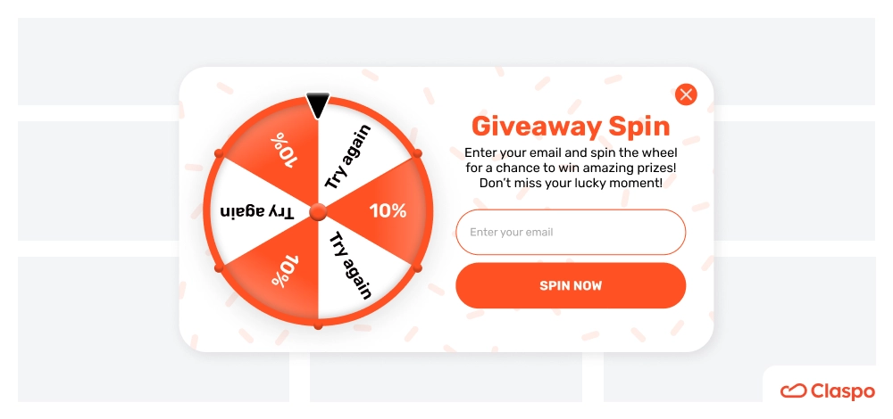
Add an element of fun to your popups by incorporating games or quizzes. For example, offer a gift box where users can win discounts or prizes. This interactive approach not only grabs attention but also increases engagement and makes the user experience memorable:

Exit Intent Surveys
Use your exit-intent popup to gather valuable feedback. Implement a short survey asking why they’re leaving or what they were looking for. This provides insights into user behavior and gives users a reason to stay and share their opinions, potentially improving future user experiences. In addition, you can immediately offer the user help with solving their problem.

Gamified Popups
93% of marketers say gamified ads effectively boost engagement and conversions (Market Gen report).
Limited-Time Offers
Create a sense of urgency with time-sensitive offers. For example, display a countdown timer for a special discount or promotion in the exit intent window. This tactic encourages users to take action before the opportunity expires, boosting the chances of conversion.

Popup with Interactive Elements
Integrate interactive features like sliders, clickable tabs, or image galleries into your popups. For example, allow users to explore different product options or view additional details by interacting with the popup. Interactive elements can keep users engaged and increase the exit intent popup conversion rate.

Popup with Dynamic Content
Personalize your popup content based on user behavior or preferences. For instance, show different exit intent offers based on the products they’ve viewed or the pages they’ve visited. You can implement this by Claspo UTM targeting. For example, you can personalize your offers by showing different promotions to a visitor who was browsing boys' items compared to a user who was looking at girls' products:

With Claspo, creating a slider is easy since it's already built into the drag-and-drop editor. Simply choose your desired content and adjust the slider template settings to get started.
Exit Intent Popup Best Practices
A well-designed exit intent banner can attract the attention of the visitor and encourage them to take the desired action.
As we mentioned earlier, one of the reasons users dislike popups is because they often have a boring design. So your challenge here is to strike the perfect balance between eye-catching design and a seamless user experience.
What makes a marketer's life even easier? A robust library of templates filled with ready-made customizable popups.
At Claspo, we offer a diverse selection of exit intent widgets to suit any business or specific need, making it easy to find the perfect solution for your requirements. Whether you want to start from scratch or tweak an existing exit intent popup design, the drag-and-drop editor lets you do it all — no need for a designer or developer. Simply drag the necessary blocks into the workspace and customize your popup to match your site’s design.
Plus, you can add elements that boost your exit intent popup conversion rate, like:
- A promo code that users can copy with just one click.
- A carousel to showcase products from different angles or highlight multiple items.
- Gamification like Wheel of Fortune or Gift Box features to make interactions more engaging and fun.
If you want to enrich your contact list, consider not providing discounts directly on the site after users submit their email addresses. Instead, encourage them to open the confirmation email and verify their subscription to receive the discount.
Stay On-Brand
Your website exit popups should reflect your brand’s style and personality. Use your brand’s colors, fonts, and imagery to create a consistent look. For example, if your company is known for minimalism, keep the design clean and uncluttered. In the Claspo drag-and-drop editor, it is easy to create the desired design with many settings for different elements of the popup.
Here’s how TheSTEMKids crafted a straightforward creative exit intent popup that perfectly mirrors the design of their homepage:

Include an Image of the Offer
Visuals speak louder than words. If you’re offering a free ebook, discount, or any other incentive, include an image of it in your pop-up. A compelling product image can grab attention instantly.
For instance, if you’re offering a discount on a new product, show a high-quality image of the product along with the discount details. This makes your offer more tangible and attractive.
BlendJet designed an exit pop-up that features a vibrant image and offers a free product, making it both visually appealing and hard to resist:

Use Arrows to Guide Attention
Direct your visitors’ eyes to where you want them to focus by incorporating arrows in your design. Arrows are potent tools that naturally guide the viewer's attention to your call to action (CTA).
For example, place a bold arrow pointing directly at your “Subscribe” button to ensure it doesn’t go unnoticed.

Add Animation
Bring your popup to life with subtle animations. Movement naturally draws the eye, making your CTA hard to ignore. For example, a gently pulsing “Get My Discount” button can capture attention more effectively than a static one.
Just be sure the animation enhances the user experience rather than distracting from it.

Use Striking and Eye-Catching Images
Sometimes, a bold image is all you need to stop a visitor in their tracks. Whether it’s a quirky photo, a humorous graphic, or a dramatic visual, make sure your popup stands out.
For instance, for a back-to-school sale, consider using a playful image, like a colorful stack of school supplies or a dynamic shot of kids joyfully rushing off to school with new backpacks.

Use Color to Direct the Eye
Use high-contrast colors to emphasize important elements like your CTA button. For example, if your popup has a light background, use a bold, contrasting color for the CTA button to make it pop.
Additionally, strategically place these elements along the natural “F-shaped” pattern that users’ eyes follow on a page to maximize engagement.

Measure the Success of Exit-Intent Popups
Track metrics such as conversion rates, click-through rates, and bounce rates to assess the effectiveness of your exit-intent popups. You can also use A/B testing to compare different exit intent popup designs and offers to determine what works best for your audience.
For example, Claspo makes it easy to track widget performance. For each exit pop-up, you can view metrics over various intervals on intuitive graphs, allowing for clear and effective analysis of both mobile and desktop versions.

Identify the Most Effective Popup with A/B Testing
Implement A/B testing. By creating and testing different versions of your popups — whether varying the design, messaging, or offers — you can see which version performs best with your audience and use only the best exit intent popup examples.
By analyzing the results, such as click-through rates, conversion rates, and user engagement, you can determine which popup is most effective and make data-driven decisions to optimize your strategy.
To simplify the process, Claspo offers built-in A/B testing functionality. You can experiment with two, three, or even four different popups. The system will automatically identify the most effective version and provide you with detailed results, making optimization straightforward and efficient.
How to Overcome Design and Usability Challenges in Exit Intent Pop-ups on Mobile
Remember, a significant portion of your website visitors will be on mobile devices. Not only should your site be mobile-friendly, but don’t forget to optimize your exit-intent popups for mobile as well.
For a seamless mobile experience, keep the following in mind:
- Responsive Design — make sure your exit popup adjusts smoothly to various screen sizes and orientations.
- User-Friendly Interface — ensure buttons are easy to use on smaller screens.
- Readable Content — use larger fonts and keep text concise for easy readability without zooming or excessive scrolling.
Here are some useful steps to create mobile-friendly exit popups that users will love.
Simplify Your Content
Keep it short and sweet. Mobile users often multitask, so your message should be clear, concise, and straight to the point.
For example, instead of saying, “Sign up to receive our newsletter with the latest updates, special offers, and more,” just say, “Get our best deals straight to your inbox!”
Ensure Easy Dismissal
Don’t trap your users. Make sure your popup is easy to close by adding a big, visible “X” or a clear “No Thanks” button.
Imagine you’re on your phone and can’t find the close button — frustrating, right? Avoid this by making it super obvious.
Optimize Loading Times
No one likes to wait, especially on mobile. Compress images and streamline your code to ensure your exit popup loads in a flash.
For example, if you’re using a high-res image, try compressing it to a web-friendly format without sacrificing quality. A faster load time keeps users happy and on your site.
Test on Multiple Devices
Your popup might look great on one phone, but how about on others? Make sure to test it on different mobile devices and browsers.
For instance, what looks good on an iPhone might need tweaking on an Android. Testing across various devices ensures a seamless experience for everyone.
With Claspo, you don’t have to worry about responsiveness. Claspo widgets are automatically adaptive, and the editor lets you preview and tweak the mobile version effortlessly.

Final Say
Exit-intent popups are your secret weapon for snagging those visitors who are about to bounce. When done right, they can give your conversion rates a serious boost.
Personalize your popups to match where your users are in their journey, as well as take advantage of extensive template library and A/B testing to supercharge your popups and keep users engaged. With Claspo’s easy-to-use editing tools and powerful analytics features, you can bring these strategies to life.
Creating a popup with a developer can be both time-consuming and costly. Many builders offer tools for designing popups and include a free trial period.
With Claspo, you can create up to three free popups with no time limit. You’ll have access to all the tools you need to engage visitors and convert them into customers immediately.
Dive in, start experimenting, and turn those near-exits into valuable conversions.


![SMS Popups to Collect Phone Numbers [Guide, Examples & How to Create]](https://static.claspo.io/var/www/html/public/photos/shares/Blog/SMS_Popups_to_Collect_Phone_Numbers__Guide__Examples___How_to_Create__2.webp "You Might Be Interested in")

