How to Create a Bootstrap Pop-up: Full Guide


Summarize
Pop-ups are an effective marketing tool withhigh conversion rates. You can create them yourself with little or no programming skills. Let's find out how to make pop-ups and add them to the website using Bootstrap and apply alternative ready-made solutions.
What Is Bootstrap Pop-up
A HTML pop-up is a separate website frame that is displayed on top of the rest of the content while the site is downloading, temporarily blocking it to draw attention to a particular message. Examples include ads, reminders about pendingpurchases, offers to subscribe to updates, requests to save a file, etc.
Pop-up Bootstrap is a free toolkit designed for creating web applications and modern dynamic websites. It consists of templates written in HTML and CSS markup languages and JavaScript extensions.
Thus, using JavaScript you can create modal pop-ups that are tied to a specific event such as when, for example,the mouse pointer leaves the main frame or when a certain time expires. Using the Bootstrap plugin, you can get elements that perform the following functions:
offer to go to a chat room or order a callback;
collect data for customer segmentation;
provide help and referenceinformation;
display multimedia content in full view;
promote products and services;
offer to register to use all the site's features;
help a visitor to find the information he or she needs, etc.
Bootstrap allows you to create convenient and effective marketing tools. They help to focus avisitor's attention on a specific offer and lead a visitorto the target action. Even a bit of above mentioned programming languagesknowledge o gives an opportunity to significantly increase the conversion rate and improvebusiness financial performance.

How to Create a Pop-up Form in Bootstrap
Creating a pop-up window does not require any programming skills, because you can extractready-made code snippets from the repositories. Let's figure out how to create pop-up window using Bootstrap with a minimal set of functional elements.
Example for creating Bootstrap Pop-up
Before you start to create pop-up form in Bootstrap, you need to make sure that your website meets the requirements of the plugin. They should be considered for each specific version of the tool. For example, to connect the current Bootstrap 5.3, you should use the HTML5 markup language with the adaptive design that allows you to adjust the window to the parameters of any screen.
The easiest way to activate Bootstrap is to add a code snippet containing CSS template addresses and JavaScript libraries to the <head> section:
You can also download a ready-made distribution from GitHub to integrate into your development environment. Developers also offer other installation options, such as package managers.
How to Create Pop-up Window Using Bootstrap and JavaScript
Bootstrap developers offer the following example to assessthe capabilities of their tool.
Launch demo modal
This code snippet generates a small pop-up window with a text and two buttons. A simple animation is applied to it — the frame descends from above, gradually acquiring features. It closes if you press the corresponding button or just click in the background. In both cases, the window goes up and darkens, disappearing completely.
Let's take a closer look at this example.
Calling a pop-up window
The example uses the simplest option — calling the pop-up window with a button. This is useful if you offer a visitor a registration form or help on using a specific function. The following snippet is responsible for launching the code:
Launch demo modal
Do you want the window to open automatically? Then you'll have to dive into JavaScrip study. For example, you can use the following script to start the function in 2 seconds after the page is downloaded:
Another popular option is to call a pop-up window when the mouse cursor goes beyond the main display frame. Realizing that a user is about to close the tab, show him the final sentence. This script is used for this purpose:
The "Modal" block
So, how to make modal popup responsive in bootstrap.
The pop-up window in our example consists of three parts:
header with the name;
main window with a text description;
footer with buttons.
This categorisation is standard for pop-ups created with Bootstrap. However, you can fill in each part at your own discretion, using numerous functional elements from the plugin libraries.
Pop-up window modifications
The code described above will be enough to create simple marketing tools. But you can get much more by personalizing the frames.
For example, the following snippet allows you to set a certain size of a pop-up window:
where OO is the variable that specifies the desired format and can take the following values:
sm — corresponds to a width of 320 pixels;
lg — 800 pixels;
xl — 1140 pixels.
If you omit the size variable, a pop-up window of 500 pixels will appear on the screen by default. To stretch the frame to the full screen, use the following code:
If you want to change the animation of a pop-up window, pay attention to the modal-fade variable. Bootstrap libraries offer a variety of effects. For example, if you want the frame to zoom in like a camera zoom, insert the following code snippet:
To make the animation work correctly, you will also need to configure CSS styles and create the appropriate script:
Another interesting feature available in Bootstrap is blocking a pop-up window. It doesn't allow you to close the frame by clicking in the background or by pressing Esc. To go to the website content, a user has to perform a targeted action, such as registering after the trial period expires. In this case the following code is used:
How to Create a Pop-up with Claspo
If you need a brighter and more eye-catching visual element, you can use a ready-made solution for creating pop-ups.
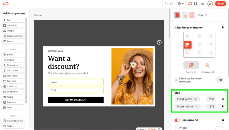
One of the most convenient options is the Claspo.io tool. It allows you to create pop-ups of any complexity level without any knowledge of programming languages — they are made according to the "constructor" principle by dragging various elements onto the screen. Let's learn more about creating a pop-up using Claspo.
Step 1: Registration
Go to Claspo and create an account. You can also sign in using social networks or your Google account.
Choose a suitable tariff plan. You can get acquainted with the functionality of Claspo for free — in this case three popups for a website with a total number of views up to 30 thousand per month are available. In addition, a pop-up window will provide a link to the web tool.
Claspo's tariff plans are affordable and flexible compared to other services. Choose the best option for your business without overpayment for extra features and views.
Step 2: Create a pop-up window
Claspo guides you through the following steps:
define the purpose — specify what function you want to implement;
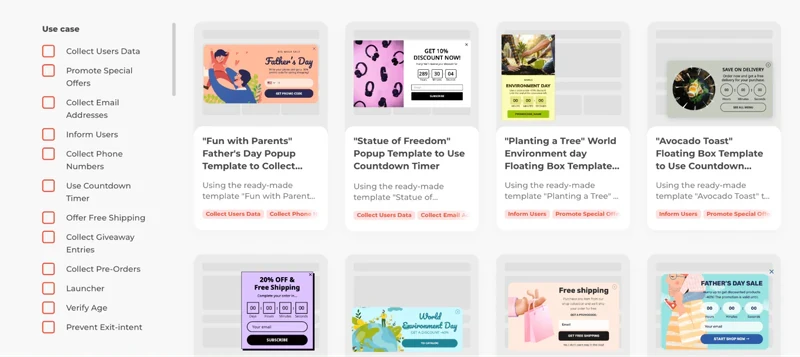
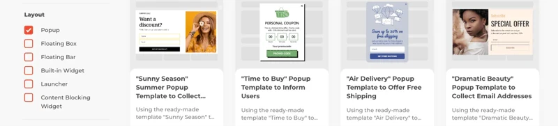
select the format — a classic window, a banner,a floating frame, etc;
style setup — choose the design that corresponds to your website design;
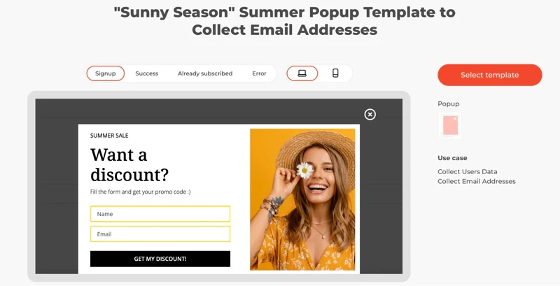
choice of template — the pop-up window takes a complete form;
content — drag and drop functional elements onto the frame, enter text, add pictures, etc.
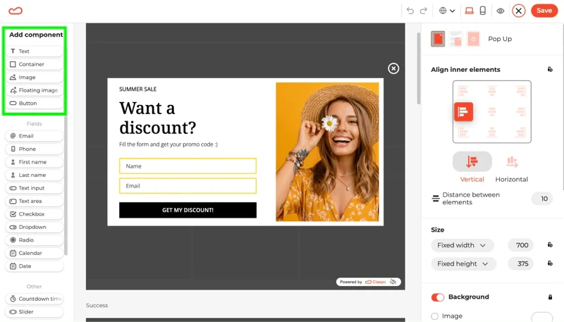
The advantage of the tool is that in a few minutes you can create not just a basic window with a piece of text, but a bright visual element that attracts a visitor's attention and provides high conversion rates.
Step 3: Integration
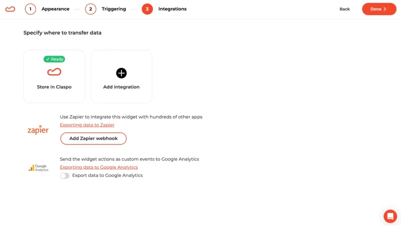
When you create a pop-up, you get a script that links to Claspo's own libraries. You can integrate it yourself — the tool provides ready-made code and helps you find where to insert it. Integration with most popular content management systems (CMS), including WordPress, is also available.
Step 4: Launch
Once integrated into your site's code, the pop-up will start working immediately. Manage it in the Claspo web interface, changing settings if required and getting detailed statistics. The tool is also compatible with CRM and other corporate software. Its deep integration allows you to create personalized offers for each site visitor based on activity history or segmentation by various characteristics.
How to quickly generate a pop-up window on the site: conclusion
Using pop-up Bootstrap, you can quickly generate pop-up windows, flexibly managing their content, sizes, functions, and even display animations. Basic programming skills will suffice for performing the simplest tasks as most of the code can be taken from open-source repositories like GitHub.
But if you're looking for an effective conversion tool for your website, it's worth using Claspo's turnkey solution. You can create bright and functional pop-ups quickly and easily without any knowledge of the code! They are assembled according to the constructor principle, choosing the design and content, and the tool adapts them toall devices, screens and browsers.
You can try all of Claspo's features for free! Sign up now to assess the potential of thetool and choose the best version of smart pop ups for your business!


