
Lead Magnet Landing Page: Real-life Examples + Tips to Capture More Leads
Imagine boosting conversions by nearly 80% just by changing the layout of a lead magnet landing page. That’s precisely what Truckers Report achieved, and it highlights the power of choosing the most effective strategy for lead generation.
With so many industries, each with unique challenges, it can be tough to find actionable, industry-specific strategies that work. Some convert like crazy, while others fall flat. The difference lies in the details — the headline, the offer, the design, and the call-to-action (CTA).
In this guide, we’ll analyze 5 real-life lead magnet landing page examples from various industries and share the best tips to help you overcome common marketing challenges.
We’ll also touch on another popular technique for capturing leads — full-screen popup site widgets. Unlike traditional landing pages, lead capture pop-ups appear on their current screen, making it easier to capture leads without interrupting their flow. We’ll compare both lead generation techniques and introduce you to Claspo — an intuitive, no-code tool for creating convertible lead magnet popups.
Before we jump into creating full-screen popups with Claspo, let’s take a moment to understand the core principles that make a good lead magnet page.
What is a Lead Magnet Landing Page?
A lead magnet landing page is a dedicated web page designed to capture potential customers' information by offering something valuable in return. This "something valuable" is known as a lead magnet.
Ultimately, to attract a lead, you will give away something of value for free. It’s the first step to developing client trust and allowing you to nurture a potential client relationship.
Lead magnets can play a key role in:
- Attracting target leads. These visitors are more likely to convert into leads by leaving their contact details, typically through an opt-in form.
- Building trust. Offering valuable resources for free builds trust with potential customers, showing that your brand is invested in their needs.
- Demonstrating authority. When sharing your expertise and valuable resources, you show genuine concern for your audience’s needs rather than simply pushing them to a sale.
- Easier decision-making. Lead magnets offer a way for customers to test the quality of a product or service before making a purchase. It is particularly helpful for expensive or complex products.
- Establishing long-term connections. A valuable lead magnet can help nurture potential client relationships over time, fostering deeper connections and brand loyalty.
Key Lead Magnet Examples
Different types of lead magnets attract different leads, so a lot of it depends on your industry, audience, and goals. Here are some examples:
- Ebooks: Сomprehensive guides on relevant topics, providing in-depth information and insights from domain experts. Ebooks are the most popular lead magnet type, used by more than 27.7% of digital marketers.
- Checklists: Иimple, actionable lists that help users complete a task or a process more efficiently.
- Webinars: Live or recorded sessions offering domain insights and engagement opportunities, with an average conversion rate of 56%.
- Templates: Ready-to-use documents or tools made to save users time and effort when doing certain tasks.
- Free trials: Limited-time access to a product or service, allowing potential customers to experience its value firsthand.
Why Do I Need a Lead Magnet Landing Page?
The answer is simple. The success of your lead magnet depends on how effectively it's promoted and delivered to your audience. A lead magnet landing page demonstrates your offer and persuades visitors to share their contact information in return. This page often lets visitors preview or interact with your lead magnet before they decide to download it.
Let’s be more specific and discuss how lead-capture landing pages are useful in your digital marketing strategy:
1. Higher conversion rates.
Lead magnet landing pages are designed to convert. With a single clear objective, these pages minimize distractions and keep visitors focused on one goal: Sharing their contact information. Marketers who use lead magnets to boost their signups report a 50% increase in conversion rates.
2. Personalized messaging.
Lead magnet landing pages allow you to deliver messages that speak directly to your audience. Unlike general landing pages, they are advertised to a narrow target audience and address their specific needs and interests. Such lead magnet landing page templates will be more relevant and appealing. For example, personalized CTAs have been shown to perform 202% better than generic ones.
Overall, personalized content can captivate interest and strengthen relationships with your audience, increasing the chances of conversion.
3. Automated lead generation and nurturing.
Landing pages can help you automate lead generation and grow your email list. With marketing automation tools, you can segment your audience and use different lead magnets or landing page designs to reach them more effectively. Automation helps acquire higher quality leads and better conversion rates faster and more efficiently.
4. Maximized return on investment (ROI).
An optimized lead magnet landing page not only boosts conversion rates but also lowers ad costs by attracting genuinely interested visitors. By focusing on visitors who are most likely to convert, you get more out of your marketing budget. Lead magnets can significantly improve ROI, with 53% of marketers allocating at least half their resources to lead generation.
5. Scalable and measurable results
Lead magnet landing pages offer a scalable solution for lead generation. You can test various elements like headlines, images, and call-to-action (CTA) buttons to find what works best for your audience. A/B testing these elements can lead to a 10% improvement in conversion rates. With clear metrics at your disposal, you can continuously refine your pages for better performance, ensuring that your lead-generation efforts keep improving over time.
How to Design Great Lead Magnet Landing Pages that Convert?
Lead magnet abandonment rates can be alarmingly high. 67% of site visitors will likely exit your lead magnet form forever if they find it too long or face other difficulties.
That’s why even the tiniest design choice may heavily impact your lead magnet landing page conversion rate.
A high-converting lead magnet landing page carefully balances aesthetics, usability, and conversion rate optimization (CRO) practices. These aspects are reflected in our next core design principles.
1. Each element of your lead magnet landing page serves a purpose.
According to recent studies by Forbes, one visitor will spend an average of 54 seconds scrolling your website before engaging in some content or ditching your website forever.
Your page has seconds to “sell” its offer and present benefits. This means every design element on your page must have a purpose and something to add to the overall message. What is more, it should communicate the value of your lead magnet in a way that resonates with visitors.
A Headline that Hooks
Your headline is the first thing visitors see, so it needs to make an immediate impact. Think of it as your elevator pitch — short, sharp, and straight to the point. Whether you use a single headline or combine it with a sub-headline, the goal is clearly communicating your unique value proposition.
To create effective lead magnet landing pages, make sure your headline stands out visually. The typography should be larger and bolder than anything else on the page. This grabs attention and sets the tone for what’s to come.
As always, Neil Patel nailed this task perfectly:

But we can’t say the same about Square (the good news - it’s an old design):

Compelling, Benefits-Driven Content
Your content does more than just explain your offer; it answers the visitor’s most pressing question: “What’s in it for me?”
Every word on the page should convince them that they’re in the right place and that your offer is exactly what they need. Effective copy addresses user pain points, presents solutions, highlights benefits, and breaks down key features.
For instance, instead of a generic “Get Our Free Guide,” try something more specific like “Discover the Secrets to Boosting Your Website Traffic by 50%.”
Keep your copy clear, concise, and free of jargon. Bullet points or short paragraphs help make your message easier to read. Finally, make sure the content guides through the page with a logical flow, using typographical hierarchy and white space.
Shopify made sure their messaging reflects the value but does not occupy the entire screen:

Supporting Visuals
Whether it’s a photo, illustration, or video, your visuals should complement the text and provide additional context for your offer. If an image doesn’t add value or align with your landing page's overall design and message, it doesn’t belong there. Effective visuals are strategically chosen to enhance the user experience and reinforce your message.
Keep in mind that using real photos can boost conversions by up to 35%. It especially relates to images of people involved in creating the lead magnet or providing the service (instructor, life coach, lecturer, etc.).

A strong Call to Action (CTA)
When it comes to CTAs, you must always be direct and descriptive, using action-oriented verbs like “Send Me” or “Start Now”. Using first-person language in your CTA is another way to improve conversion rates up to 90%. Other powerful words like “free,” “exclusive,” and “limited time” evoke emotion and urgency and make your offer even more compelling.
For maximum impact, make sure the same CTA button appears multiple times as they scroll. It will reinforce the action you want visitors to take and increase the chances of them following through.
Social Proof
Any feedback from satisfied customers adds a layer of validation, credibility, and trust. Testimonials, reviews, or user-generated content (UGC) show how others benefited from your lead magnet and increase the likelihood of potential leads opting in.
But for social proof to be truly effective, it must feel authentic. Including real user names and photos will add an extra layer of credibility. The social proof can be a quote, screenshots from review platforms, or, even better, UGC. According to the Stackla report, 59% of consumers find UGC to be the most authentic type of content, with this number being even higher among younger users.
The author of the BloggingForDevs course, Monica Lent, includes 10 Twitter reviews on her landing page, showing how much her newsletter subscribers benefit from this content:

Here at Claspo, we offer a built-in widget for product reviews and a few social proof templates, making it easy to set the reviews window prominently on your landing page.
2. Even the best lead magnets fail to convert without a seamless UX.
A smooth and frustration-free UX keeps visitors moving forward.
- Slow load times = High bounce rates.
- Complex forms = Higher abandonment rates.
That’s why you should always work on the quality of user experience. The page should load quickly, layouts must be optimized for various screens, and fonts should be easy to read.
If you’re unsure where to start, let’s learn the basics. These seven fundamental UX principles covered by the UX Design Institute will guide you in creating a seamless and effective landing page experience:
1. User-centricity — Helps to prioritize user needs in every design decision and create experiences that fully meet user expectations.
2. Design consistency and responsiveness — Helps to minimize the learning curve for users and retain up to 72% of mobile users prioritizing mobile use over desktop.
3. Visual hierarchy — Helps to structure the page and guide users naturally toward their call-to-action (CTA). This means choosing simple, focused layouts with ample white space and organically-placed elements. Elements that feel “secondary” can be removed for the sake of better engagement rates.
Use directional cues like arrows or lines to subtly guide the visitor's eyes toward your CTA. This small detail can increase focus on the desired action.
4. Context — Helps to design with the user’s context in mind. Context defines how and where they will interact with your page (whether on mobile or in noisy environments) and tailors the experience accordingly.
5. User Control — Allows users to easily undo actions or navigate away from mistakes. Clear options like “Cancel” or “Undo” help users feel in control and reduce frustration with navigation.
6. Accessibility — Ensures your landing page contains elements like high-contrast colors for higher readability, voice assistant, or alternative image text for users with disabilities to read your page. Keep in mind that the European Accessibility Act comes into force on 28 June 2026, so it’s important to prepare your website accessibility for these new requirements before the deadline.
7. Usability — Makes it easier for users to navigate your page and complete desired actions.
Every element of your design must prioritize usability, and the best way to do this is to experiment with different lead magnet landing page templates.
A/B testing different versions of your page — like adjusting the number of form fields or the CTA button placement — helps you find out which elements drive higher conversions for a particular target audience.

A/B Testing in the Claspo builder
3. A good lead magnet landing page design aligns with your brand identity.
Your landing page is an extension of your brand. If visitors feel like they’ve landed on a completely different website, you risk losing them. Your page should clearly convey the benefit of your lead magnet, making it apparent why your offer is valuable. Consistency in design builds trust and ensures that visitors feel confident engaging with your offer.
It starts with aligning the language and tone of your copy with your brand’s voice. After all, using casual language will never work for a non-profit organization. Then, we match the colors, fonts, and overall style to your main site or ad campaign.
Such a seamless flow builds trust and keeps users engaged, ensuring they feel like they’re still within your brand’s ecosystem.
Use custom icons and any unique elements reflecting your brand’s aesthetics. They help maintain a distinctive brand identity and make your landing page stand out while staying true to your brand.
A nice example of brand identity in action is Neil Patel. Neil uses his own photo next to a speech bubble on his lead magnet page, creating a comic-like effect that makes it feel as if he’s speaking directly to us through the screen.

Lead Magnet Landing Page Examples
Lead magnet strategies continue to grow and change, setting higher standards across industries. Someone has already mastered the art of lead capture, and we are here to learn from them.
Check out these 5 real-life examples and why they work. Feel free to use these insights to level up your own lead generation game.
1. Style Quiz Lead Magnet from Warby Parker (E-commerce)

Personalized quizzes can be both fun and highly effective as lead magnets, especially when tailored to offer something unique and valuable to the user. Warby Parker's style quiz is a perfect example of this.
Tactics used:
Warby Parker's landing page invites users to take a 7-step quiz to suggest the frames based on their style preferences. The page is clean, minimalist, and user-friendly and features a photo of the box customers receive after completing the quiz. The process is outlined in three simple steps, emphasizing how easy and risk-free it is, with free shipping and returns highlighted as key benefits.

Why it works
Interactive content, such as quizzes, is known to be 81% more effective at capturing attention than static content. Warby Parker's personalized approach not only appeals to users but also increases the likelihood of them sharing their contact details in exchange for tailored product recommendations. The offer of free shipping and returns further reduces the hesitation to proceed, making it easier for users to commit to the process.
What can be improved?
Adding more dynamic visual elements, such as animations of the glasses or the box, could further captivate users and make the experience even more engaging.
2. CMO’s Playbook by Attribution (SaaS)
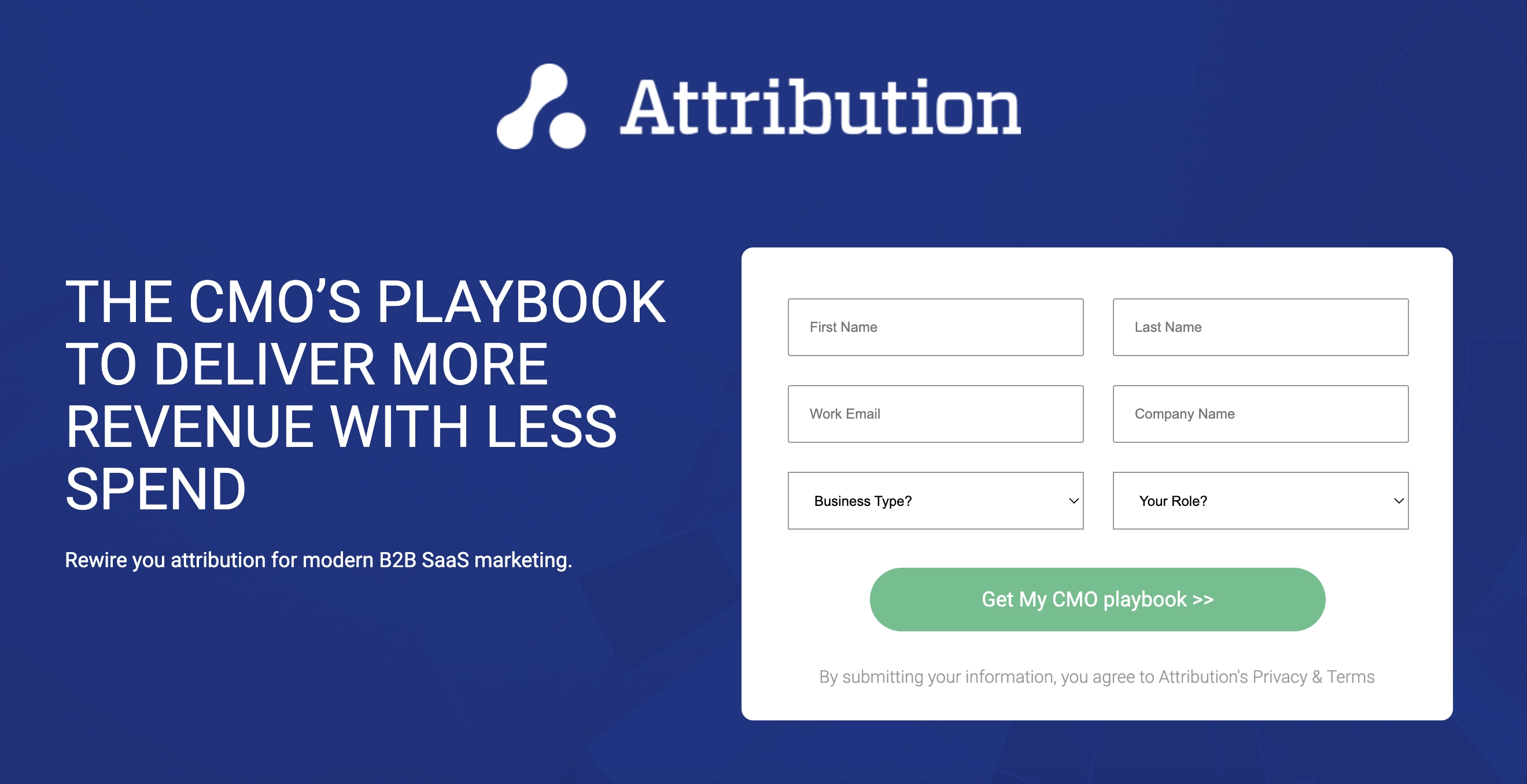
A compelling lead magnet can turn casual visitors into engaged clients by addressing their specific needs and pain points. The Attribution landing page for the CMO’s playbook achieved this goal perfectly.
Tactics used:
The page features a bold headline that speaks directly to CMOs, promising solutions to a critical challenge. The opt-in form and the CTA button are placed front and center, making it easy for visitors to subscribe immediately. Then, the page includes a detailed outline of what the playbook offers and displays social proof, such as positive reviews and industry awards, for extra trust and credibility.
Why it works:
The page delivers a straightforward message without overwhelming the visitor. The headline targets a specific audience pain point, ensuring the content is relevant and compelling. The visible opt-in form template encourages immediate action, while the inclusion of social proof and awards builds trust and credibility.
What can be improved?
The page could benefit from more dynamic elements and visuals like the playbook preview or a brief video summarizing its contents.
3. Free Guide for Email Subscription from Love and London (Blog)

Bloggers and content creators use content freebies to attract more readers and clients. Love and London offers a resource landing page lead magnet, namely a free London guide, in exchange for a newsletter subscription.
Tactics used:
A clear and engaging headline immediately conveys the guide’s value, using the strong action word "must" to point out the importance of learning the insights from the guide. It also highlights the number of people who downloaded the guide, demonstrating high credibility.
Why it works:
The straightforward value proposition and instant access to the guide make it a compelling offer. Adding social proof brings value to the guide’s quality, making it even more appealing to potential subscribers.
What can be improved?
The current design feels a bit outdated. It needs to better reflect current trends and aesthetics. Current design solutions will make this lead magnet opt-in page look more appealing to average users.
4. Charity: Water’s Free Guide Lead Magnet (Non-profit)

Lead magnets can educate and inspire visitors to make a significant impact as donors. One of the best examples of non-profit lead magnets is Charity: Water. It effectively combines clear communication and compelling stories to motivate users to take action and become loyal donors.
Tactics used:
The landing page makes excellent use of storytelling and emotional appeal to connect with its audience. The design is clean and minimalistic, with a soothing color palette that makes it easy to focus on the content. Elements like the CTA and power words are highlighted in bright colors to naturally draw the eye to key information.
Why it works:
The page uses powerful storytelling that highlights the importance of downloading and reading the handbook. It hooks the target audience with a compelling headline and gives a brief overview in a short bullet list, allowing users to understand the book’s value. Finally, it provides a clear, compelling path to action with a simple opt-in form.
What can be improved?
Incorporating more interactive elements — such as a preview of the guide or user testimonials — can boost even more engagement.
5. 12 Free Lessons from Drumeo (eLearning Platform)

Free trials, courses, or demos are the most effective lead magnets for eLearning projects. They engage new leads and start long-term relationships with potential customers. Drumeo is the best example of such an approach in action.
Tactics used:
Drumeo’s landing page is simple and straightforward. It starts with an eye-catching headline and continues with a strong UVP — 12 free drum lessons for everyone who gets started on the drums. The page features a well-designed lead capture with one field for the user’s email address, reducing friction in the sign-up process. Vibrant visuals and photos demonstrating the teacher in action add to user appeal and excitement.
Why it works:
The page immediately communicates the value of the offer: accessing 12 free lessons from one of the world’s recognized drum teachers. This is a strong incentive for users to share their contact email. It not only helps Drumeo collect leads but also lets users experience the value of Drumeo’s lessons before they commit to a paid subscription.
What can be improved?
Adding video testimonials or success stories from current users will demonstrate social proof and make the page more dynamic. This can increase the conversion rate by as much as 160%.
Full-Screen Popup Widgets: Are They a Good Alternative to Lead Magnet Landing Pages?
So far, we’ve talked about lead magnet landing pages, defining their key elements and outlining their core design principles.
Now, it’s time to discuss the alternative solution — full-screen popup widgets.
This is where Claspo comes in. With Claspo, you can easily set up and customize your popups to promote lead magnet pages — all thanks to advanced targeting and personalization features.
Claspo lets you customize these popups to match your brand's aesthetic and trigger them to specific user actions, like scrolling, inactivity, or exit intent. This way, your message reaches the right audience at the right time.
But first let’s compare traditional lead magnet landing pages with full-screen popups to promote lead magnets.
Traditional Landing Pages VS Full-Screen Popups
Traditional landing pages often require visitors to leave the main site and navigate to a separate page to view the offer. This extra step may be one of the reasons for higher drop-offs and lower conversion rates.
On the other hand, full-screen popups offer a fresh take on engaging your audience and capturing leads. They’re designed to seamlessly integrate into the website flow and grab attention immediately. This means a popup covers the visitor’s screen, ensuring your offer stands front and center. It is a significant UX advancement, allowing you to capture more valuable leads.

But let’s speak numbers. Studies show that full-screen popups have an average conversion rate of 11.04% — higher than other types of popups. The reason is that popups capitalize on the visitor’s current engagement, making it easier to convert them into leads.
Lead Generation Made Easy with Claspo Popup Widgets
With Claspo, you don’t have to spend countless hours designing popups for lead magnets. Nor do you need tons of money to hire someone who can code a landing page from scratch.
Our popup tool is a versatile and user-friendly solution for lead generation and beyond. With the right popups in place, you can use just one tool to design, test, and track the performance of your lead generation forms.
So, what benefits does Claspo bring to your lead generation table? Let’s talk about a few of the main ones.
Fast A/B Testing
Claspo makes it simple to test and optimize your lead generation hypotheses. It has everything to quickly create multiple popup variations and gain immediate feedback from real-time interactions. The immediate feedback comes from user interactions triggered by actions like exit intent or scroll depth.
Overall, popups are less disruptive than full-page changes. This means you can test different elements like headlines or CTAs without changing the overall user experience and site structure.
Flexibility and Ease of Use
One of the biggest advantages of using popups is their adaptability. You don’t need to be a tech guru to create or modify popups. With Claspo, you can design, test, and track your lead generation forms using a single tool. Just select one of 700+ pre-designed templates and adjust the rest of the content with our drag-and-drop popup maker — as easy as copying and pasting a few lines of code.
Also, popups can seamlessly integrate into your existing website, reducing the need for a separate webpage and their maintenance. Unlike popups, traditional landing pages often require more complex setups and ongoing design work — even for simple builders like WordPress or Wix.
Personalized Trigger & Display Options
Unlike traditional landing pages, Claspo popup widgets offer dynamic interactions with users based on their behavior and engagement.
Namely, popups can be triggered by a particular action, such as how long a visitor spends on a page, how far they scroll, or if they show signs of exiting. These settings allow for highly targeted offers at the most optimal timing — ensuring more engagement in a way traditional landing pages can’t match.

Budget-Friendly and Low Maintenance
Finally, designing and maintaining an extra landing page for each lead magnet will cost you 3x more (with minimal expenses) than subscribing to one of the Claspo plans. You can even sign up for a free plan and utilize our full range of tools without any upfront costs.
No landing page will be as easy to launch and manage for the price of 2 cups of coffee. Unlike them, popups do not require regular paid maintenance, making it easy to keep your campaigns budget-friendly and hassle-free.
Tips and Real Examples of Using Lead Magnet Popups as an Alternative to a Lead Magnet Landing Page
Full-screen popups are just as versatile as best lead magnet landing pages and can be adapted to various scenarios.
Collecting Email Subscriptions
Most websites immediately greet you with a full-screen popup, offering a free eBook or exclusive content in exchange for your email address. This approach grabs attention right away and provides a clear, valuable offer. No wonder popups make up for more than 66% of all enabled email collecting tools, whereas landing forms make up only 5.1%
By placing this popup prominently, you capture leads at their peak interest. It’s the perfect moment to encourage them to subscribe.
Here’s one of Claspo’s templates for a lead magnet ebook landing page:

Reducing Cart Abandonment
For most e-commerce companies, the issue of cart abandonment has become a big concern. The good news is that a full-screen popup offers a simple solution.
An exit intent website popup will likely include a tempting offer, such as a discount or free shipping, and surprisingly, it can change the game like crazy. Some popups for cart abandonment create urgency with a countdown timer, making it hard to ignore.

Event Registration
If you're hosting a webinar, conference, or any event, a full-screen popup can impact your registrations. Visitors may never find information about your upcoming event, BUT they will always see a popup announcement.
With Claspo’s intuitive pop-up builder, it takes about 3 minutes to design a popup that captivates and simplifies the registration process to 1-2 steps.

Encouraging Social Media Follows
Full-screen popups are perfect for blogs or personal brands looking to increase their social media following. They might use social media pop up templates to promote their social media channels and encourage visitors to follow them. The popup below features a minimalistic form but a clear call-to-action and a rocking emoji ...

Gathering Feedback and Surveys
Full-screen popups can also be used to collect valuable feedback from visitors. Imagine a tech company using a popup to ask users to participate in a quick survey about their website experience. By making the survey easily accessible through a full-screen popup, the company ensures that visitors are more likely to engage and provide useful insights.
Alternatively, a feedback form tailored after an effective client exit survey template can help you find out why visitors abandon the purchase at the last minute.
This is one of the exit-Intent survey templates from the Claspo library:

Performance Tracking & Optimization: Key Metrics for Full-page Popups
After your popup has been up and running for a while, it's time to learn how well your campaign is doing. Performance metrics reveal if your popups were successful and impacted user behavior, helping you refine strategies for even better results.
- Conversion rates — your most critical metric. It tracks the percentage of users who complete the desired action after interacting with your popup, such as signing up for a newsletter or making a purchase. A high conversion rate means your popup is effectively driving user actions.
- Click-through rate (CTR) — measures how many users click on your popup compared to the number who see it. A high CTR indicates that your popup’s content is engaging and compelling. For instance, if 1,000 users see your popup and 100 click on it, your CTR is 10%.
- Bounce rate — measures the percentage of users who leave your site after viewing the popup without interacting with it. A high bounce rate might suggest that your popup is either irrelevant or too intrusive. Keeping this rate low means your popup is engaging and well-timed.
- Time on page — measures how long users stay on your page after interacting with a popup. If visitors spend more time on your site, it’s likely a sign that your popup successfully guides them to the desired content.
- Engagement metrics — for specific popups like exit-intent or scroll-triggered, you can track how users engage with the popup and whether they continue interacting with the site afterward.
Where Can I Track My Popup Performance?
Tracking your popup performance should be straightforward and insightful, not complicated.
One of the standout advantages of using popup platforms like Claspo over custom-built solutions is the simplicity of tracking and focusing on analytics. With custom development, you’d need to set up tracking from scratch each time. But with Claspo, you simply install the script on your site and get all the data you need right away.
Claspo’s built-in dashboard provides a quick snapshot of your popup’s performance. You can easily see unique views, target actions, and conversions. Claspo Analytics remains useful for many of our customers, especially when it comes to A/B testing. They believe it’s a quick way to check for any updates and track which of the tested versions have higher conversions and lower bounce rates.

Useful: In addition to our dashboard, Claspo can integrate with Google Analytics 4, so you can easily track these crucial metrics in a place that’s convenient for you.
Now, you’re all set with the essentials of popups and their performance. But as you move forward, remember that just knowing about performance isn’t enough.
What’s important is to know how to keep popups performing at their best.
Why Do I Need to Continuously Test & Optimize Popups?
Popups are not static — they’re tools that should evolve with user behavior and trends. Testing and optimizing your popups only once won’t keep them as effective as possible.
Continuous testing and optimization are the only ways to maintain high performance over time.
Unlike traditional landing pages that can be time-consuming to tweak, Claspo makes sure testing and optimization are simple and quick. You can test different designs, messages, and timings without any coding knowledge. Regular A/B testing helps you understand what works best for users at a particular time.
If you spend just one extra hour every 3-4 weeks fine-tuning your popups, you’ll most certainly see the results. That’s how fast it takes to design and launch new popups with Claspo.
Final Say: Lead Magnet Landing Pages or Popups?
Choosing between lead magnet landing pages and full-screen popups depends on the context and specific goals of your campaign:
When should you use a lead magnet landing page?
- Detailed information: If your offer requires a thorough explanation or multiple sections to showcase its value, a landing page is your go-to.
- Complex forms: For campaigns that require detailed user information, landing pages offer a better layout for longer forms, making it easier for visitors to fill out without feeling overwhelmed.
- Ongoing campaigns: You’re running a sustained lead generation, so you need a dedicated page for ongoing traffic and SEO benefits.
When to use a full-screen popup?
- High-traffic sites: Popups can engage visitors on high-traffic sites where they are likely to leave without converting.
- Time-sensitive offers: If you have a limited-time deal or an urgent call to action, popups can create a sense of urgency and prompt immediate action.
- Retargeting: Popups can re-engage users who have previously interacted with your site but didn’t convert. They serve as a gentle nudge to remind them of the value you offer.
Finally, it's time to put these insights into practice. Experiment with different designs and refine your copy to see what works best for your audience. And remember, continuous A/B testing will help you fine-tune your popups based on the latest user needs for maximum impact.
At Claspo, all of our 700+ pre-built templates are designed with both trends and usability in mind. Just click the link to explore their variety based on the goal, layout, use case, and theme.


![12 Best WordPress Popup Plugins of 2026 [Free and Paid options]](https://static.claspo.io/var/www/html/public/photos/shares/Blog/новые картинки/12_Best_WordPress_Popup_Plugins_of_2024__Free_and_Paid_options__2.webp "You Might Be Interested in")
![How to Create Popup Modal In WordPress [Easy to Use Plugin]](https://static.claspo.io/var/www/html/public/photos/shares/Blog/новые картинки/How_To_Create_Popup_Modal_In_WordPress__Easy_to_Use_Plugin__2.webp "You Might Be Interested in")
