45+ Website Popup Examples (+Templates That Boost Sales)
Popups are often misunderstood. People tend to think of them as annoying ads that appear out of nowhere, disrupting the browsing experience. But the truth is that popups on sites are powerful, conversion-focused design elements. Just like any other part of your website, they should be seamlessly integrated so visitors don’t feel overwhelmed or tempted to close your site as soon as a popup appears.
Whether you’re just considering pop-ups for your website or you’ve already decided to add them to your marketing strategy, we'll give you plenty of website pop-up examples and ideas to follow in this post. Our goal? To show you how to make popups the perfect missing piece to your website puzzle—one that feels natural and enhances your lead generation efforts.
Some Numbers First
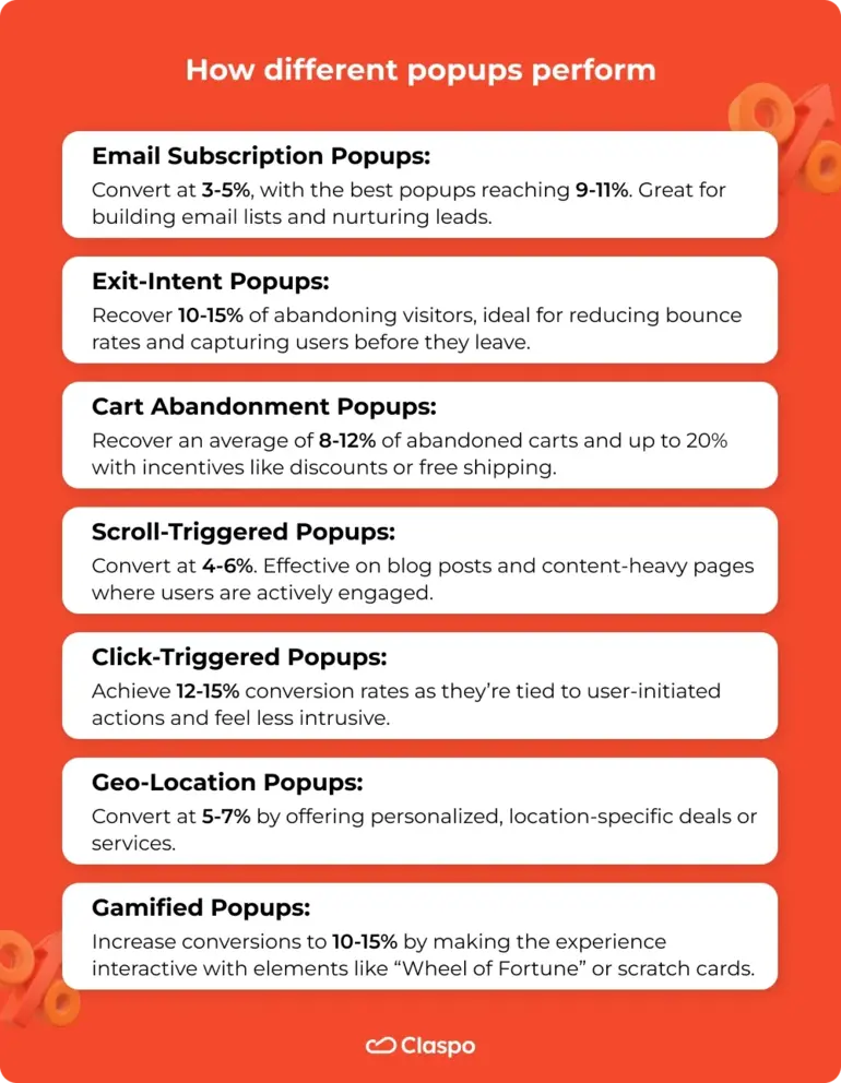
Even though there are many types of website popups, they all serve a similar purpose: getting users to take action, whether it’s making a purchase, downloading a resource, or subscribing to a newsletter. Let’s take a closer look at how different popup ads perform and which ones can drive the best results for your goals.
Claspo’s Insights
Since many of our clients run website pop-ups using Claspo, we know that well-designed website popups, personalized to user behavior and optimized for mobile, consistently outperform generic popups that target everyone and appear the moment a visitor arrives.
These are the core principles we follow with our display rules. But don’t worry—we’ll dive deeper into how to implement these strategies effectively later in the article, so keep reading!
Why Website Popups Are Effective for Boosting Sales
Website popups are highly effective for boosting sales because they capture attention at the perfect moment and drive users to take action. Popups are designed to stand out, making it easier to communicate important offers or messages.
When well-placed and well-timed, they can align with a visitor’s behavior, increasing the chances of turning them into customers. For instance, popups triggered by specific actions—such as when a user is about to exit—are particularly successful in pushing users to complete their intended actions.
Another reason website popups work so well is their ability to create urgency. Promoting limited-time offers or scarce inventory taps into the customer’s fear of missing out, motivating them to act quickly rather than delaying or abandoning their purchase.
Lead generation is another benefit of advertising popups. They provide an easy way to collect customer information in exchange for something valuable. This not only captures leads but also builds a long-term relationship with potential customers for future marketing efforts.
In addition to growing leads, website popups are effective for increasing the average order value through upselling and cross-selling. For example, when a customer adds an item to their cart, a popup can suggest related products or upgrades, making the shopping experience more personalized while driving additional sales.
Lastly, website popups help reduce cart abandonment. Website exit intent pop-ups remind users of items left in their cart, offering incentives like discounts or free shipping to encourage them to complete the transaction. This approach recovers sales that might otherwise be lost, directly boosting revenue.
20 Types of High-Converting Popups on Websites (+ Examples)
We love to scour the Internet in search of standout website popup examples, so much so that pop-ups no longer annoy us—in fact, they excite us. Each time we encounter the best popups, it’s an opportunity to learn and gather inspiration. In this collection, we’ll showcase 20 websites with pop-up ads.
We’ll analyze the design of each website pop-up and detail how these companies seamlessly integrate them into their overall user experience. Let’s take a closer look at popups in their natural habitat!
Seasonal/Event-Based Popups | Claspo
Why not show how we use our popup maker for lead generation? During the holiday season, people often look for seasonal deals, gifts, or themed items. So, it makes sense to offer promotions tailored to the occasion.
Our Halloween-themed website pop-up draws attention by aligning design and content with the holiday spirit. The spooky-themed copy and visuals create relevance, engaging users in the seasonal context. The CTA button matches the site’s main color, maintaining brand consistency and trust.
Additionally, the countdown timer instills urgency, motivating users to act quickly to take advantage of the 50% discount on annual plans. Placing the website popup in the bottom right corner ensures visibility without disrupting the user experience.
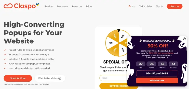
What we like: the design stands out from the rest of the site but isn’t too far off. Our pop-up doesn’t block the main content, so visitors can keep browsing the site.
Promote Special Offers or Discounts | Glossier
Here, we have an interesting website popup example. Let’s look at the copy first. The phrase "You deserve it" appeals to the human need for self-worth and validation. Next, we also see “special offer” and “just for you.” Both help customers feel valued, making them more likely to respond positively to a promotion.
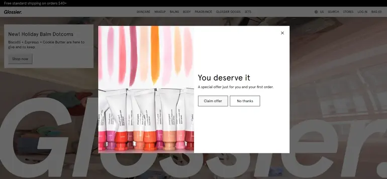
Moreover, the "You deserve it" message follows the broader "treat yourself" cultural trend. This culture emphasizes self-care, indulgence, and rewarding oneself, which resonates especially with Glossier's target market of millennials and Gen Z.
These generations are often looking for products that feel like a small indulgence, and Glossier is framing purchasing their products as self-love or self-reward. It ties purchase not to necessity but to personal care and well-being, which emotionally connects the product to positive feelings.
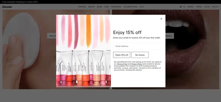
Next, there’s a scarcity component. While not explicitly stated in the message, the discount on the "first order" creates a subtle sense of scarcity or urgency. This encourages people to act quickly to take advantage of it. Who knows when Glossier will offer another discount?
With this offer, Glossier also reduces purchase anxiety. For many customers, making an online purchase from a new brand can trigger hesitation or “purchase anxiety.” The discount lowers the cost of entry, which can alleviate concerns, as they’re paying less on their first try. This creates a smoother pathway to making that first purchase.
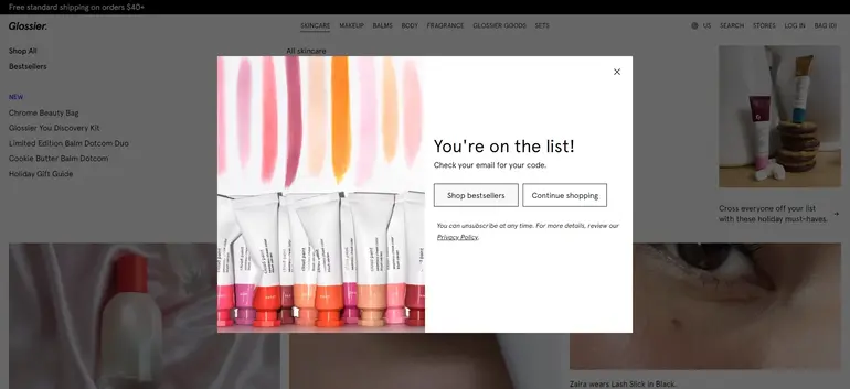
Finally, with their thank you message, Glossier guides users and gives them freedom at the same time. They redirect you to the bestsellers page to ensure you continue shopping and assist you with navigating their vast catalog of products. But you also have the freedom just to browse the site. Maybe you already have a product you want to buy.
What we like: The overall design is good. We love the copy because it appeals to the brand’s target audience. Users are also given a choice: they can refuse the offer and unsubscribe from emails. This helps the promotion feel less pushy.
Lead Capture Popups | MOO
MOO offers custom online business printing and design services. Their lead capture popup is a creative and engaging way to encourage visitors to subscribe.
The website popup is primarily text-based, but it makes excellent use of clever copy. One standout feature is how MOO incorporates its brand name into the word “newsletter,” branding it as the “MOOsletter.” This small detail adds personality and helps reinforce brand recognition.
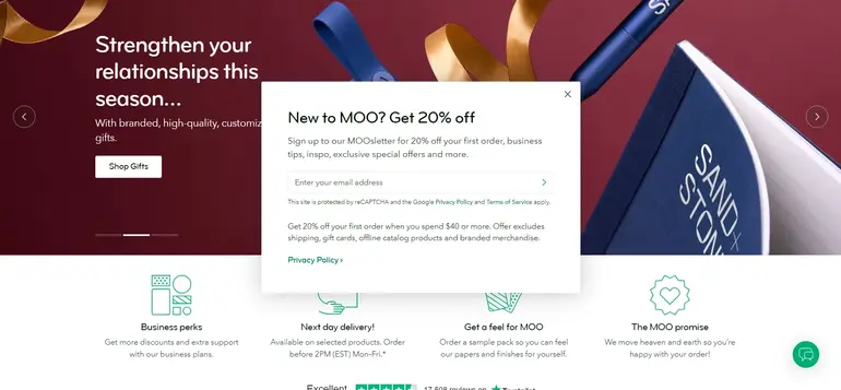
MOO’s website popup presents a clear incentive—20% off the first order, applicable on purchases starting at $40. This is an attractive hook, especially for new visitors considering their first purchase. In exchange, subscribers gain access to business tips, exclusive offers, and inspiration, making it feel like they’re joining a value-driven community.
The copy reflects MOO’s playful yet professional tone. Even the follow-up step of confirming the email includes the line: “Confirm your email so we know we got the right inbox.” This adds a touch of friendliness and humor, making the process feel less transactional and more personable.

The additional step of confirming the email serves two purposes: verifying that the email provided is valid and reinforcing the user’s commitment. This confirmation is rewarded with the promo code, ensuring subscribers feel motivated to complete the process.
What we like: MOO’s website popup is an effective example of how thoughtful copy and a well-structured lead capture strategy can create a welcoming, branded experience that encourages users to engage and convert.
Gamification | Blue Apron
Blue Apron’s spin the wheel popup is a powerful marketing tactic that leverages gamification and behavioral psychology to engage customers and drive conversions.
At its core, the gamified design taps into people’s enjoyment of games, creating anticipation and excitement that triggers a dopamine release. This feeling encourages users to participate.
The range of prizes, from smaller discounts to significant ones like 50%, leverages uncertainty to keep users engaged. Even a modest reward can feel satisfying, making visitors more inclined to stay connected with the offer.

The immediacy of revealing the discount after spinning adds an element of instant gratification, which aligns with the human desire for immediate rewards. This prompt reward system helps drive users to continue through the purchasing process while still experiencing the “high” of winning.
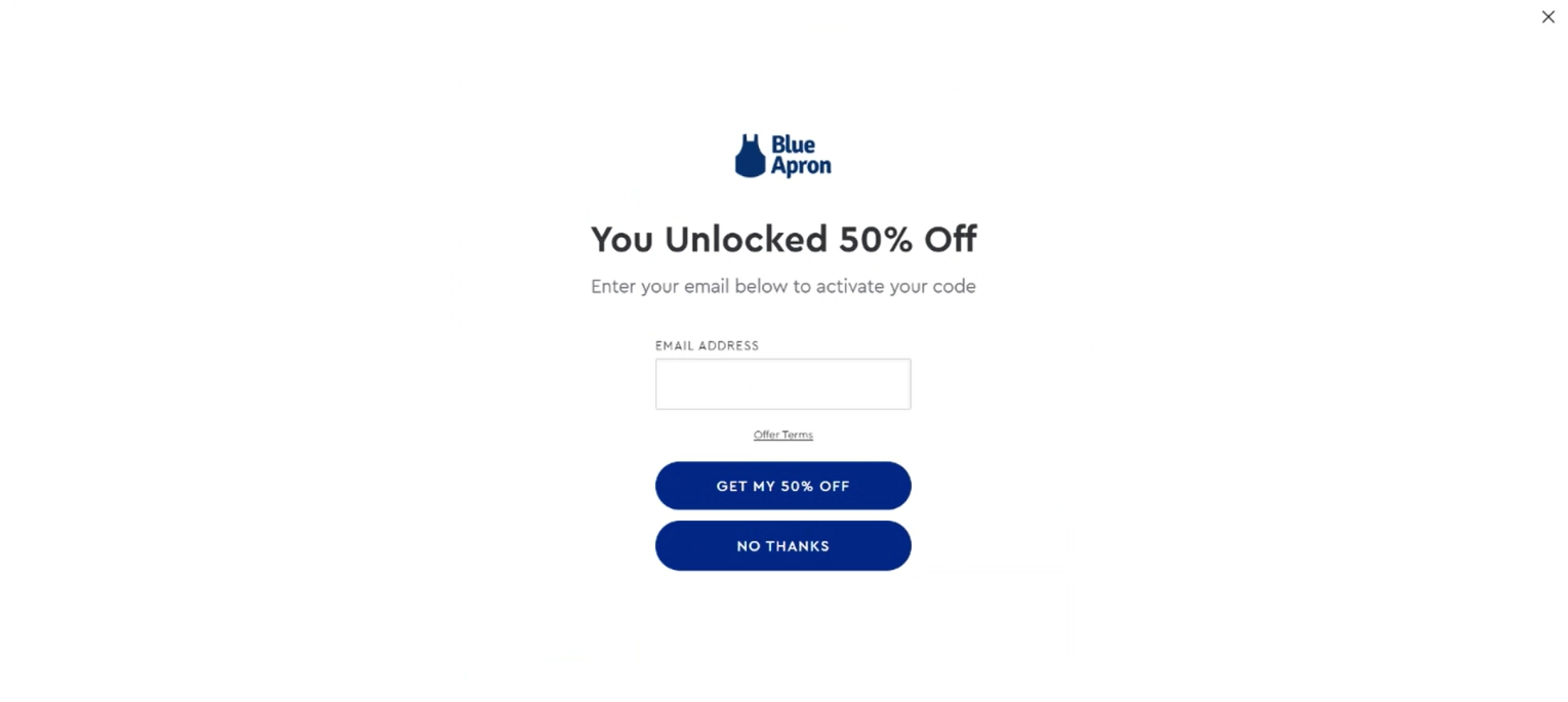
Additionally, the popup asks for an email to activate the discount, using the commitment and consistency principle. Once users make a small commitment by providing their contact information, they are psychologically more likely to follow through with a larger action, such as completing their purchase.

After spinning the wheel, users are offered two choices: customize and complete their email subscription for website or continue browsing. This choice allows users to feel in control and avoids pressure, keeping the experience user-friendly.

Lastly, Blue Apron’s optimized landing page ensures that once users receive their discount and provide their email, they’re directed to a page tailored to convert. This page likely minimizes friction and highlights value propositions, maintaining the momentum created by the engaging popup and leading users seamlessly toward finalizing their purchase.
What we like: Blue Apron’s spin-the-wheel promotion is a well-designed blend of gamification, behavioral psychology, and smart funnel optimization. The entire process aims to keep the user moving forward, reduce friction, and maximize the chances of converting a visitor into a paying customer. Arguably, it is one of the best website pop-ups on this list.
Prevent Exit-Intent | MOO
Yes, there are two website pop-up examples from MOO, because why not? You can learn great stuff from these guys. If the user decides to leave the editor without placing an order, MOO shows them this message.

They encourage you to say by warning you that you will lose your design. And they keep their playful tone. The sentence “Then we can remember the good times we shared together here” is a witty, personal touch that lightens the mood and adds humor, making the interaction feel more like a friendly nudge than a pushy sales tactic.
What we like: again, MOO shines with their copy and wittiness. The company doesn’t use discounts to keep the customer; they try to build a relationship and use that bond to retain prospects.
Promote Lead Magnet | CoSchedule
CoSchedule’s sticky bar is a great example of how to grab attention without interrupting the reader’s experience. As you scroll through one of their blog articles, a sticky bar slides up from the bottom of the screen, offering something valuable: a free marketing calendar.
The copy does a fantastic job of emphasizing exclusivity and long-term value. It tells readers they’re getting something unique that won’t cost them a dime, which is perfect for catching the interest of marketers and content creators who appreciate practical, free tools.
What really makes this popup pop is the “FREE” badge. It’s simple but highly effective, drawing the eye immediately and reinforcing the no-cost promise.

What we like: The sticky bar is a smart, non-intrusive way to promote CoSchedule’s lead magnet, blending seamlessly with the reading experience while delivering clear value and encouraging action.
Promote Limited Time Offers | Indestructible Shoes
Indestructible Shoes uses a countdown website popup to turn new visitors into customers. The headline, “Your feet deserve the best,” creates an emotional connection by emphasizing comfort and quality, making visitors feel that the brand values their well-being. This approach appeals to those looking for reliable, high-quality products and motivates them to take action.

The standout feature is the visually prominent timer, which is hard to miss. It reinforces the urgency of the offer, making users aware that the deal is time-sensitive. You have only fifteen minutes! This added pressure encourages quicker decisions, ensuring visitors don’t leave without considering their purchase.
However, we would argue that fifteen minutes may not be enough to pick a pair of shoes. While there’s a nice rhyme to it, you may want to give your customers a bit more time to browse the catalog.
What we like: the thoughtful language and strong visual timer make this website popup effective and engaging, pushing new visitors to act quickly while still feeling valued.
Offer Free Shipping | Skinny Mixes
Skinny Mixes’ welcome popup design for new visitors is a great example of simplicity paired with an enticing offer. As soon as new visitors land on the site, they’re greeted with a website popup that offers free shipping on orders over $30 in exchange for subscribing to the company’s email list.
The design is clean and balanced, with one side featuring a simple subscription form and straightforward copy that explains the deal. This makes it easy for users to understand what they’re being offered and how to act on it. On the opposite side, a vibrant, high-quality image of a syrup bottle and a prepared drink grabs attention and visually reinforces the product’s appeal.
The offer acts as a compelling hook, especially for first-time visitors who might be on the fence about making a purchase. By tying the free shipping incentive to an email subscription, Skinny Mixes not only encourages immediate action but also builds an email list for future marketing efforts.

What we like: this popup doesn’t overwhelm users; it’s simple, visually appealing, and offers clear value right from the start, setting the stage for increased engagement and conversion.
Collect Giveaway Entries | Omigo
The headline in Omigo’s popup, highlighting the $500 gift voucher, is hard to miss and immediately grabs attention. On top of that, Omigo sweetens the deal by offering 20% off the first order, making it even more tempting for visitors.
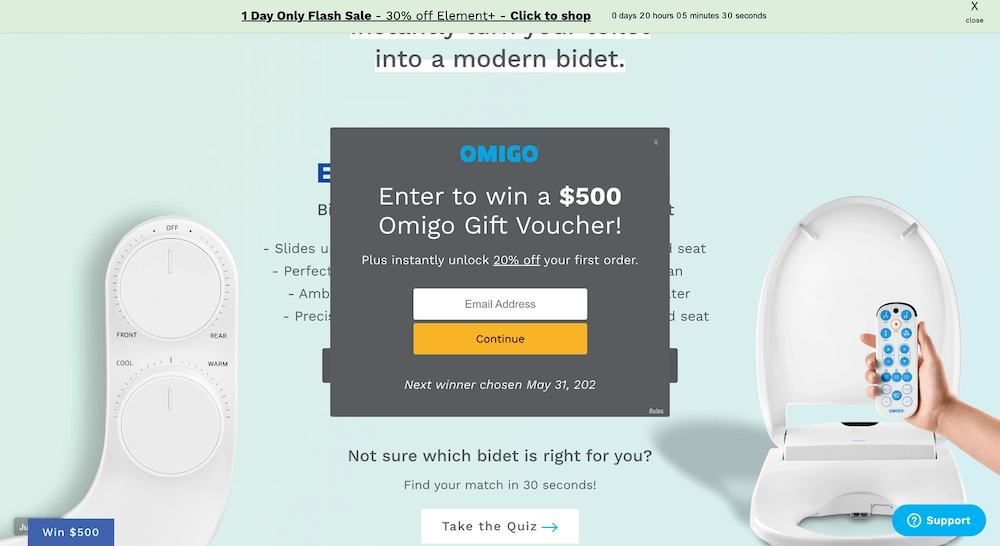
The popup is triggered by a 10-second time delay, which is a smart move. This delay gives visitors a brief moment to browse the site and get a feel for it before being shown the offer. It balances giving users space and ensuring they see the promotion early enough to act on it.
For those who aren’t ready to make a decision right away, Omigo ensures the popup remains accessible by placing a teaser in the bottom left corner. This feature makes it easy for visitors to revisit the offer when ready.

To make the promotion even more compelling, the popup emphasizes FOMO (fear of missing out) by mentioning when the giveaway winner will be announced. This subtle nudge adds urgency and encourages users to take action so they don’t miss out on a valuable opportunity.
What we like: Omigo’s popup is engaging and hard to ignore, thanks to its bold headline and dual benefits. The 10-second delay is well-timed, allowing users to explore before being shown the offer, which keeps it non-intrusive.
Invite to Webinar | Virtuance
Virtuance’s popup form is an excellent example of how to promote a B2B webinar effectively. This pop-up uses a lightbox effect, which is especially effective here as it helps the form stand out against the site’s colorful background. The lightbox ensures that visitors' attention is drawn directly to the form without distractions.

What stands out about this popup is the visual layout. The top portion features an eye-catching graphic that provides all the key details about the event, including co-hosts and a brief summary. This visual acts as an immediate overview, helping users understand the value of the webinar.
The form structure is also noteworthy. The headline and signup field are positioned at the bottom, making it easy for users to subscribe. Virtuance keeps it simple with just one signup field, which reduces friction and makes the registration process quick and appealing.
What we like: using the lightbox effect ensures focus, while the informative visual on top provides context at a glance. Keeping the signup simple with just one field makes it easy for users to join, enhancing conversion rates. This design effectively balances visual appeal and functionality, making it a strong tool for capturing webinar signups.
Welcome User | Flaus
Flaus’ welcome popup demonstrates how to engage new visitors right from the start. Shortly after landing on the homepage, users see a popup offering 10% off their first order and free shipping, which provides immediate value and incentive to subscribe.

What makes this website popup particularly inviting is the added benefit of receiving tips from the founder when you sign up, which adds a personal touch and positions Flaus as a knowledgeable and approachable brand. To make the offer even more relatable, the popup includes a picture of the founder holding the product, enhancing the sense of connection.
But what truly reinforces trust is the “As Seen on Shark Tank” label. This mention boosts credibility and signals that top-tier business minds have vetted the product on a respected platform. It tells visitors that Flaus has an innovative and unique offering that stands out from the competition.
The Shark Tank label functions as a form of social proof, indicating that the product has already captured significant interest and passed high scrutiny, making potential customers more confident in exploring the offer.
What we like: The combination of a warm welcome, strong incentives, and personalized content makes this popup highly effective. The founder’s image adds authenticity, while the Shark Tank mention builds immediate trust and elevates the brand’s status. Together, these elements create a compelling reason for visitors to engage and subscribe.
Recommend Products | Lammle’s Western Wear

Lammle’s website popup example is a smart blend of product recommendations, cart abandonment tactics, and an exit-intent strategy. When a user with a product in their cart signals an intention to leave, the popup appears with a playful, brand-themed message: “Hold your horses for a moment.” This light, engaging tone aligns with the overall theme of Lammle’s site, making the popup feel cohesive and consistent with its brand voice.
By integrating product recommendations with an exit-intent trigger, Lammle’s encourages users to stay engaged and explore more items, which can increase browsing time and the likelihood of further purchases.
What we like: This popup is a great example of using multiple strategies in one well-designed interaction. The combination of reminding users about their cart, suggesting popular products, and using on-brand, engaging copy effectively retains visitors and potentially boosts conversions.
Measure Net Promoter Score (NPS) | MailTag
This feedback website popup example keeps things simple and effective. The copy is short and to the point, making it easy for visitors to quickly understand what’s being asked of them.
The design features a simple rating system paired with a small text box, encouraging users to share feedback without feeling overwhelmed. This approach is a good example of how minimalism can drive engagement—keeping feedback requests brief and clear helps boost response rates.

The color scheme is clean and visually appealing, using a combination of blue and white that feels inviting and matches the site design.
What we like: this feedback popup is a masterclass in balancing design and functionality to collect valuable user input efficiently.
Redirect to Another Page | Sephora Australia
Sephora’s welcome popup is a strong example of how to capture new visitors’ attention with an exclusive offer. When users land on the site, they’re greeted with a popup that offers 10% off their first purchase.

The largest text, “Get 10% off,” is the focal point, ensuring the main value proposition is front and center. Supporting text adds context without overwhelming the user. The “Shop Now” button is simple and direct, inviting users to act immediately.
Clicking this button leads to a dedicated landing page that continues the promotion with a prominent banner reiterating the offer, creating consistency. This page also showcases featured products, encouraging visitors to explore and make their first purchase.

What we like: This pop-up example shows that pop-ups can be easily integrated into the user journey and lead them through the website pages. Overall, Sephora’s welcome popup is visually impactful, clear in its message, and structured to drive action while setting the stage for conversion.
Subscribe to Newsletter | Copyhackers
When you land on their homepage, you’re immediately greeted with a floating bar that states, “Get essential and advanced copywriting techniques in your inbox.” The message is short and to the point, capturing the essence of what visitors to a copywriting-focused site seek.
Notice how it’s carefully worded to highlight the value proposition without unnecessary details. This shows Joanna’s expertise in effective copywriting. Plus, the immediate relevance helps to engage visitors from the moment they arrive.

What we like: this is one of our favorite website pop-up message examples. Copyhackers’ floating bar combines expertly written copy and a user-friendly format to capture attention and encourage sign-ups in a way that feels natural and valuable.
Prevent Cart Abandonment | Rothy’s
Rothy’s cart abandonment popup example is a clever way to re-engage visitors who might be on the fence about completing their purchase. The headline—“Your cart qualifies for $20 off”—immediately grabs attention and makes users feel like they’re getting an exclusive offer. This messaging can encourage users to reconsider leaving and push them a step closer to buying.
The structure of the website popup is simple and effective. Users are prompted to enter their email and select their shoe preferences, adding an interactive touch that feels personalized. The call-to-action buttons are also thoughtfully done: “Take $20 off” and “No thanks.” By presenting these clear choices, Rothy’s subtly encourages users to go for the discount rather than pass it up.
One aspect that could use more clarity is what users are signing up for when they provide their email. It’s unclear if this means receiving a newsletter, special promotions, or product updates. Adding a brief note about what subscribers can expect would make the experience more transparent and help build trust.

What we like: Rothy’s cart abandonment popup does a good job of guiding users back toward making a purchase, but a touch more information about the email subscription could make it even more user-friendly.
Display Social Proof | Urban Outfitters
Urban Outfitters uses social proof to encourage shoppers to act quickly. As you browse their products, a badge appears in the bottom right corner with a message: “49 people have recently purchased this item. It’s selling fast.”
Social proof is a powerful tool in marketing because it leverages the idea that people often look to others’ behavior to inform their own decisions. By showing that many others have purchased the item recently, Urban Outfitters creates a sense of popularity and demand. This can make potential buyers feel more confident in their decision, knowing that others are making the same choice.
The message “It’s selling fast” adds urgency, suggesting that they might miss out if the user doesn’t act soon. This combination of social proof and urgency can push shoppers from simply browsing to making a purchase.

What we like: the design choice to place this badge in the bottom right corner is subtle enough not to disrupt the shopping experience but noticeable enough to catch the eye. It’s a smart, non-intrusive way of building trust and prompting action.
Collect Pre-Orders | Burrow
Pre-order form samples and early access websitebpopups effectively increase conversion rates by leveraging key psychological triggers: exclusivity, urgency, and value. Take Burrow’s simple yet effective Black Friday website pop-up as an example.

Offering early access to promotions and an enticing 10% discount sitewide makes users feel like they're getting VIP treatment. This adds to the fact that Burrow is a luxury furniture brand. Plus, with a clear deadline at the bottom, the popup adds a layer of urgency that pushes people to sign up quickly before they miss out.
What we like: it’s simple, clear, and value-driven. The promise of exclusive deals paired with a tangible benefit like 10% off encourages immediate engagement. The deadline is a nice touch that creates a sense of “act now” without feeling too pushy.
Offer Product Demo | Drip
We’re almost at the end of our examples, and now we’re looking at popups that aren’t as common: demo request website popups. These are particularly important for B2B companies and SaaS platforms, where showcasing a product through a demo is essential for lead generation and sales.
Usually, demo requests are handled through dedicated landing pages or integrated CTAs on the website. This approach makes sense, as promoting a demo often requires more detailed content that explains the product’s benefits and key features. These dedicated pages typically include a compelling copy, an overview of the product’s advantages, and an easy-to-use form that allows visitors to schedule a demo seamlessly.
Still, you can build a funnel using a popup and direct your visitors to the landing page. Take Drip, for example. They use a floating bar to announce a special offer dedicated to Black Friday and Cyber Monday.

The floating bar redirects users to a dedicated landing page that describes the offer and the product's benefits. Naturally, the copy and the page itself are aimed at facilitating conversions.
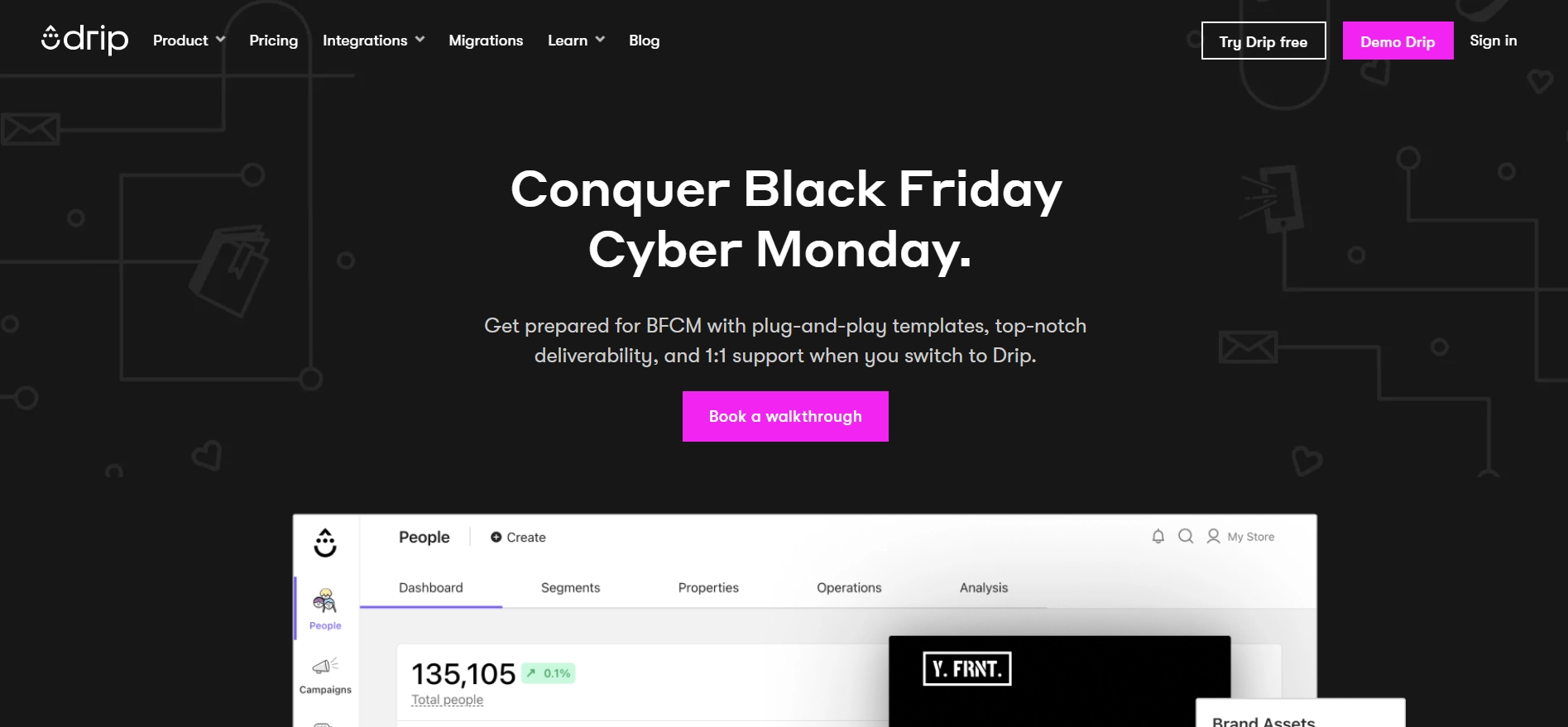
When you click the ‘Book a walkthrough’ button, you are redirected to the demo request form.

While popups for demo requests might not be as common as other types, we have templates you can use. Like this one:
Conduct Exit Survey
This one stumped us. It seems like nobody does these, even though exit surveys have immense potential and can help gather valuable insights. But again, our customer exit survey templates come to the rescue. Keep reading for detailed examples of exit-intent popups.
Popup Templates That Drive Results (+ Links)
Now that we’ve explored some successful website popups from across the internet, let’s explore Claspo’s popup samples. This is going to be a deep dive into our library. We’ve picked some of our best pop-ups and explained how you can use them.
Sales Conversion Popups
These website pop-ups are designed to drive immediate action from visitors. They usually showcase products, highlight promotions, or offer exclusive discounts to turn passive visitors into active customers. You can expect a 3-9% conversion rate when thoughtfully implemented.
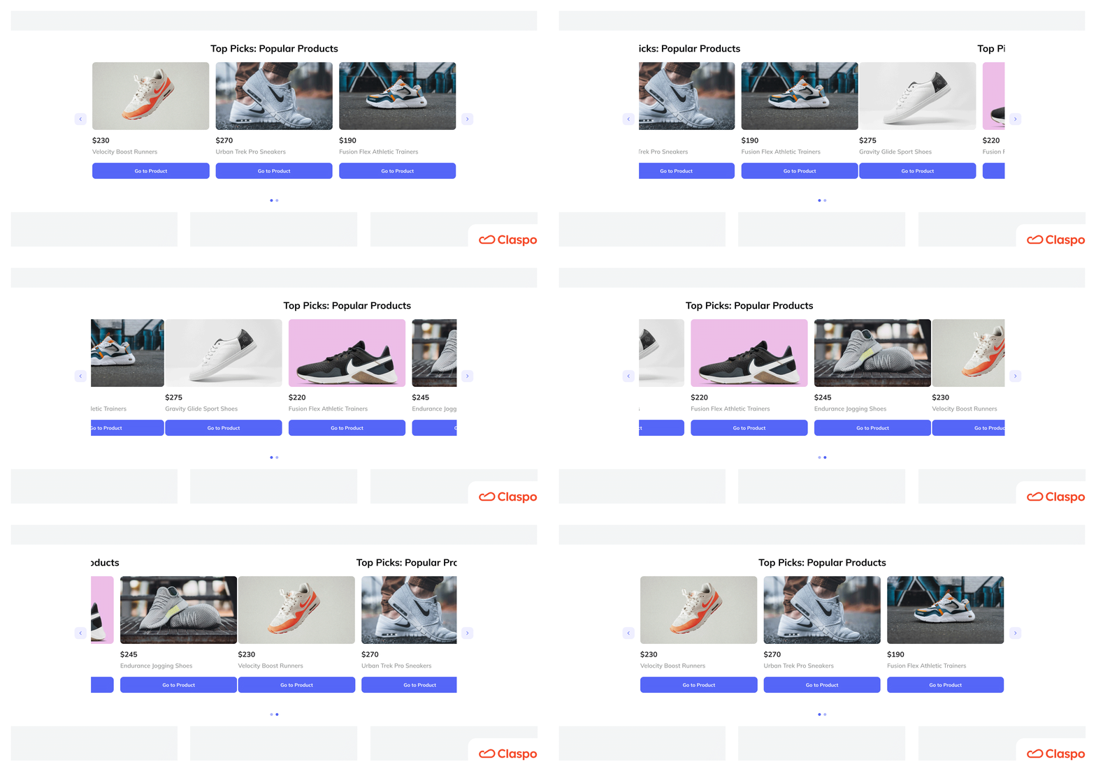
First up, we have an inline widget with a slider. It is placed directly within the page layout, acting as a sleek, animated product showcase.
The inline design integrates naturally into the content, making it an excellent choice for displaying chosen items. The slider animation not only grabs the user’s attention but also allows multiple products to be highlighted in a limited space, making it ideal for users actively exploring the site.
Then we have a classic website pop-up window example: lightbox. This website pop-up window acts as an informer. Use it to tell visitors about an enticing discount offer.
Designed as a lightbox pop-up, it effectively isolates the message, prompting users to take action without cluttering the page. Once visitors click, they’re redirected to a catalog of discounted items, streamlining the path to purchase.
Another interesting feature of this pop-up is a wiggling button. Studies from Baymard Institute, Nielsen Norman Group, and CXL Institute have concluded that animated buttons can increase CTR by 10-30%, depending on the context and animation style.
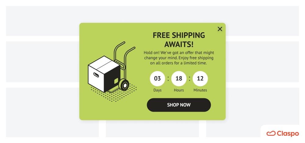
Last but not least, run a flash sale!
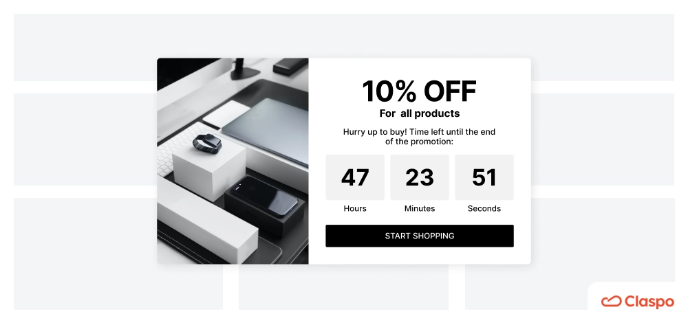
Here, we’ve taken our informer template and added a timer. A pop-up message on a website that includes a countdown timer encourages quick decision-making. You can amplify the effect by running flash sales on exclusive or high-demand items.
Also, many flash sales include “buy more, save more” deals or bundling discounts, incentivizing customers to purchase more items to maximize the perceived value. Known as the “shopping momentum effect,” this occurs when making an initial purchase prompts customers to keep shopping. Here’s a pop-up window example that demonstrates such a tactic:
Email Subscription Popups
Building an email list through website pop-up designs is worthwhile: according to studies by Campaign Monitor, customers who sign up for a newsletter are 50% more likely to purchase than those not part of a mailing list.
Email subscription website pop-ups are one of the ways to build a direct line of communication with potential customers. The average conversion rate for email pop-ups ranges between 1.95% and 5%, with higher rates seen when pop-ups are personalized or offer a clear value.
There are many ways you can use a pop-up on a website to build your email list:
- Use lead magnet templates to offer e-books, guides, etc.
- Run giveaways
- Invite visitors to subscribe to your newsletter
- Run webinars
- Do personalization quizzes
- Offer gifts for a subscription or exclusive perks
Let’s pick apart some pop-up form examples we find worth a close inspection:
This template takes engagement a step further by embedding a video directly into the website pop-up box, allowing users to watch without leaving the page. This design is ideal for sharing information about an upcoming webinar, giving users a preview of what they’ll experience if they register. It’s a great way to introduce new audiences to your content.
Next, we have a pop-up example that allows you to use birthday marketing. The website pop-up banner is very simple, and the fact that it’s a sticky bar makes it less potentially irritating. Now, why is this form great? According to Experian, birthday marketing emails generate 179% more clicks, 481% more transactions, and 342% more revenue per email than the average marketing email. Birthday rewards also help you establish emotional loyalty with your customers.
For example, if you own an e-commerce site, offer a birthday reward, not a discount. Rewards feel less like a marketing tactic, and if you’re smart about them, you can upsell. For example, offer a freebie for every purchase a customer makes on their birthday. See, it's such a simple form but has so much potential!
The website pop-up message, in this case, offers a lead magnet in exchange for an email. It is a strong approach for building an email list, particularly in B2B, but it also works well in other industries.
By offering a tangible resource, for example, a style guide, you directly address the user’s needs and pique their interest in a way that feels immediately rewarding. Unlike general offers, a lead magnet provides specific, actionable insights, increasing the likelihood of signup.
Cart Abandonment Popups
Cart abandonment is a common struggle for e-commerce businesses. As of 2026, the global average for e-commerce cart abandonment stands at 70.19%, with variations by industry.
Adding a pop-up box on the website is a practical and proven method to deal with this issue. To understand how to use popups for this purpose, we should first understand why buyers don’t complete their purchases. Some of the most common reasons are:
- Unexpected costs like expensive shipping or taxes/fees.
- Complicated checkout process.
- Long delivery time.
- High total cost.
- Using the cart as a wishlist.
Now, if you’re seeing a high rate (say 60-70%) of abandoned carts in your shop, it’s a sign to look into the technical side of things and inspect the checkout process. But if those are generally OK, then website popups to the rescue. Exit intent popups in the form of cart abandonmet surveys, to be more exact. They can help address the reasons we spoke about a minute ago.
Analyze your customer’s behavior and address issues accordingly. Offer free shipping, a freebie with the purchase, or a significant discount. These can help reduce the customer’s hesitation to complete the purchase.
Gamification
We already know why pop-up gamification works from Blue Apron’s popup form example, so let us show you how Claspo can help you achieve the same or even better results. You’ll find three types of popup ads:
Spin to win
Scratch card
Gift box
You can change the copy, design, and prize pool to your heart’s content. For example, you can add from one to six gift boxes or different rewards to the spinning wheel, like discounts or free shipping.
Lastly, the animation is an outstanding feature of our gamified popups. Static images can go unnoticed, but a moving object is harder to ignore, which means your ad has a higher chance of being seen and interacted with.
Exit-Intent Popups
We’ve talked about using exit intent popups to reduce cart abandonment, but that’s not the only way to use them. Let’s give you more detailed website pop-up ideas.
Firstly, exit intent website popups can help retain visitors who would otherwise be lost, reducing bounce rates. There are many reasons a visitor may leave your site; not all are apparent, even with tracking tools. You can do a short survey asking why the person is going. This can help adjust your SEO efforts or site design, which can positively affect sales in the long run.
You can also ask why people don’t want to purchase from you.
And, of course, you can try to convert those leaving by offering perks or valuable resources. It all depends on the intent of the page where you place the pop-up.
Campaign Scheduled Popups
Automation is a business’s best friend, would you agree? It allows marketing teams to plan and execute multiple campaigns efficiently without constant oversight. At the same time, scheduled popups ensure that special promotions receive maximum exposure by appearing at the right time.
You’ll find many pop-up form examples in our library tailored to celebrations and holidays. Let’s take this one for example:
To schedule this popup for Halloween, create and save your widget. Then, in Widget details, under ‘Appearance’, click the Calendar icon.

And now you can set the time and even days when the popup should be shown.

Scroll-Triggered Popups
Scroll-triggered popups appear when a user scrolls down a specific percentage of a webpage. They are an effective tool because they engage users who have shown interest by actively browsing content but may not have reached the point of conversion yet.
On blog pages or articles, trigger a popup offering an ebook or guide related to the article’s topic when users scroll past 50%.
On product pages, trigger a popup with a limited-time discount once the user has scrolled 60-70% of the page to encourage purchase decisions.
On content-heavy pages, trigger a popup inviting users to sign up for a newsletter form to receive exclusive tips or updates when they scroll past a certain point.
You can offer membership to a loyalty program or become part of the community after users show interest by scrolling through articles or product descriptions.
Finally, you can use a scroll-triggered popup at the end of long-form content to collect feedback or ask users if the content met their expectations.
Time-Delayed Popups
Popups have a bad rep mainly because users are bombarded with different messages and windows right when they enter the website. Time-delayed popups do the exact opposite. They appear after a user has been on a page for a predetermined amount of time.
If you go to triggering settings in Claspo, you’ll notice that the default value for time delay is 20 seconds. We know visitors need time to settle into the content or browse before being presented with a message or offer. Visitors are more likely to appreciate and respond to a popup that appears after they’ve generated some interest.
Here are some ideas for time-delayed pop-ups on websites:
On product pages, you can set a delay and offer support or a demo to target users who might have questions.
Similarly, place a popup on product or category pages that offers a discount. Give visitors time to browse your catalog, then nudge them towards a purchase with a discount or another special offer.
You can also target new visitors and offer them a welcome gift.
And, of course, you can use this type of popup to build a newsletter subscriber list, promote your ebooks and events, or recommend related products.
Click-Triggered Popups
As the name suggests, these website popups appear when a user clicks on a specific element or link on a page. Since they respond to specific user intent, click-triggered popups are more likely to convert users into leads or buyers. They also feel more integrated and respectful of the user's browsing flow because users control when the popup appears.
Among such website pop-up examples is a clickable box called the launcher (or it also called a teaser).
You can use them for different purposes:
- Promote special offers
- Informa users
- Invite to events
- Promote your educational resources
- Offer a demo
There’s also another way you can trigger popups in Claspo. It activates a HTML pop-up when a user clicks on a specific HTML element on the page, such as a button, link, or image. This gives you more flexibility since you can set popups to trigger from any clickable element embedded in your webpage.
For example, you can use it to reveal special offers when a user clicks a product image, display forms when users click a "Learn More" link, or activate surveys when users select certain page features.
Geo-Location Popups
Personalization is proven to increase user interaction and conversion rates. People respond more positively to content that feels customized to their experience. Therefore, displaying popups based on a user's location allows you to offer region-specific information, deals, or content, making your messages more relevant.
Your popups should be in the local language to improve comprehension and trust. This may sound putting off because of additional work, but Claspo has a trick up its sleeve. You can simply add a language, and Claspo will translate the content for you. Just a few clicks and you speak your customer’s language.
Onto examples now. Firstly, you can use popups to inform users about nearby events or store openings, driving foot traffic to physical locations. If you don’t have a physical store, you can announce the launch of a new localized site.
Secondly, you can celebrate local holidays and tailor promotions accordingly. Our template library has popup examples for many occasions. Rosh Hashanah (Jewish New Year), Diwali (Indian Festival of Lights), Hanukkah, you name it! Recognize the culture of your customers and celebrate with them.
How to Implement and Track Popup Performance
Now, you have plenty of ideas for your website popup. All that’s left is to discuss how to start using pop-ups so they don’t scare your visitors away.
Be Mindful of the Number of Pop-ups You Display
There's popup blindness and there’s alert fatigue. Though it originates from healthcare, the concept applies well to web design.
Alert fatigue can occur when users are repeatedly interrupted with excessive notifications or poorly timed pop-ups, leading to frustration, disengagement, or even increased bounce rates. So, one of the most important things you need to do is mind how many alerts/popups users see when they visit your website.
This includes all alerts, not just pop-up ads. Chances are you have a cookie alert, notification permissions, or other types of notifications. When adding popup ads, consider all alerts your users see and display popups when they are least overwhelmed.
If you’re going to run multiple popups on your site, make sure Annoyance Safeguard is on. You will find it in the settings when configuring triggering. This will prevent multiple pop-ups from overlapping and cluttering the screen.

Follow Core Design Principles
Our templates are made with user experience in mind. But since they’re templates, you’ll likely want to adjust them to fit your website’s style. When you do, remember to follow these design principles:
- Minimalism: Maintain a clean and uncluttered layout to ensure users can quickly understand the message. Ample whitespace helps separate elements and improves readability.
- Brand Colors: Use colors that align with your brand to create a cohesive look. Ensure that CTA buttons have a contrasting color to stand out clearly and draw attention.
- High-Quality Visuals: Integrate sharp, relevant images or illustrations that complement the popup's content. This adds professionalism and increases engagement.
- Readable Fonts: Choose simple, web-friendly fonts that are easy to read. Establish clear text hierarchy by differentiating headings and subheadings with varied sizes and weights.
- Bold CTAs: Ensure the call-to-action buttons are large, visually distinct, and easy to spot. The text should be concise and action-oriented.
- Background Overlays: Apply semi-transparent overlays behind the popup to focus user attention while still providing a sense of the page underneath. Soft edges or rounded corners add a friendly, modern touch.
Be Extra Careful with Popups on Mobile
Displaying popups on mobile can be tricky. Popups should be optimized for smaller screens, with responsive elements that adjust well to mobile devices. Text, buttons, and interactive areas must be large enough to be easily tapped without error. We did our best to make sure our templates were responsive. But as we said, templates are meant to be edited.
So, make sure your popups can’t block the content and are easy to dismiss. You don’t want to frustrate users and cause higher bounce rates. Use the preview mode in the editor to see how your design looks on mobile.
Use the time-delayed or scroll-triggered popups we talked about. This will help engage users without disrupting their experience too soon.
Lastly, use mobile popups strategically for specific purposes, such as collecting emails, promoting discounts, or offering limited-time deals. If you want to play it safe, you can choose not to show the popup on mobile devices when setting up the campaign.
Personalize Your Popups for Your User’s Journey
With Claspo, there are multiple ways to personalize popups and make them more relevant to your users. You can use UTM tags to display targeted messages based on specific campaign parameters.
Claspo also allows you to target new visitors separately, tailoring their experience to encourage first-time engagement. Additionally, you can strategically place popups on specific pages to tailor messages that align with the content or intent of those pages. We’ve also talked about geo-location targeting as a way to personalize popups with region-specific content or offers.
You can also use merge tags, which automatically insert user-specific details like name, email, or phone number into messages. This feature enhances thank-you or error messages, making the user’s experience feel more human and personalized.
Test Different Layouts and Messages
To optimize the effectiveness of your website popup campaigns, you need to experiment with different copy, colors, placements, and layouts. While learning from the best websites with popups is a good starting point, remember that there is no one-size-fits-all solution. User preferences and behavior vary, so testing allows you to find the unique combination that works best for your audience.
A/B testing is a powerful way to compare various versions of your popups to see which resonates more with users. Claspo offers an easy way to run tests and document them.
Download our A/B testing checklist to help you document hypotheses, track the variables tested, and analyze the results comprehensively. This structured approach provides clear insights into what drives higher engagement and conversions, ensuring data-driven decisions for future campaigns.
Wrapping Up
What a journey! We’ve explored numerous website popup form examples and dissected over 40 effective ways to use them. Now, it’s time to put all that knowledge to work.
Start experimenting with the templates mentioned in this guide, and launch your first popup. With Claspo, you can sign up for a free lifetime account, use the templates, integrate your tools, and go live—all at no cost.
Don't wait to turn insights into action—your next high-converting popup is just a click away!


