
The "Frankenstein" Widget is Dead: How We Solved On-Brand Adaptation with Science
You can’t conjure beautiful design, but you can use an equation of hue, saturation, and luminance to make magic.
For years, marketers have been told that design is a subjective art. But when it comes to user trust and consequent conversion rates, design is actually a hard science — and the clock is ticking faster than you think.
According to the groundbreaking study by Lindgaard, G, users form a visceral aesthetic judgment of your website within 50 milliseconds (0.05 seconds). That is faster than the human brain processes the word “hello.”
But the challenge doesn't stop there. A study by Bentley University’s Design and Usability Center reveals that after that initial split-second judgment, you have exactly 6 seconds to cement a positive impression.
In this tiny window, visitors are engaged in what behavioral scientists call “Screen-and-Glean” behavior. They rapidly scan visual cues before they commit to reading a single word. If the visual cues are disjointed, the “Screen” phase fails, and they leave.
The consequences are brutal:
- 94% of users cite design flaws as the primary reason they distrust a website.
- 75% judge a company’s credibility solely on design.
- 38% will stop engaging entirely if the content or layout is unattractive.
The stakes are incredibly high. Yet, most websites commit a fatal error the moment they try to capture a lead with a mismatched or poorly designed popup: they break internal consistency.
The Problem: The “Frankenstein” Widget
You’ve hired a skilled designer and built a sleek, professional website. The fonts are curated, the palette is premium. Then, you decide to add a discount popup. You choose a high-converting template, hit publish, and suddenly… the magic breaks.
A generic widget appears. It uses a standard “success green” that clashes with your teal branding. The font is Arial, yours is Lato. It looks like a foreign object glued onto your interface. It looks like a Frankenstein.

When a widget doesn't visually match your site, users subconsciously perceive it as an ad, spam, or a third-party intrusion. As a result, banner blindness kicks in, and they close the widget instinctively because it feels “off.”
Marketers know this is a problem, but fixing it is an operational nightmare. To make a widget look “native,” you face:
- Manual labor: Wasting hours with color pickers, trying to manually match hex codes to regain that “family” look.
- Design bottleneck: Waiting days for a designer to “beautify” a simple 10% discount popup.
- Accessibility trap: Manually picking colors that look consistent but fail readability standards (e.g., placing white text on a pastel button), effectively blinding your users.
The Psychology of Consistency: Why “Different” Means “Dangerous”
UX pioneer Jakob Nielsen defined the Heuristic of Consistency and Standards as key to a usable interface. The principle is simple: users shouldn't have to wonder whether different words, situations, or actions mean the same thing.
Your website is a single product family. Internal consistency means that every element — from the header to the footer to the popup — follows the same rules.
What happens when you break this rule? When a widget appears that doesn't match your site's internal logic, you increase the user's cognitive load. Instead of instantly recognizing the offer, their brain pauses to verify: “Is this safe? Is this part of the site?” This micro-hesitation might and eventually will kill conversion.
The Data Proof: 57% of Conversion is Just Trust
You don't have to take our word for it. We looked at both our own data and external academic research to see what separates high performers from the rest.
1. The trust equation (Academic research)
A 2024 study on innovative website design (Srisathan et al.) found that user trust accounted for 57.1% of the variability in conversion rates. Critically, this trust is driven by “Technology integration.” When users see a widget that adapts seamlessly to the site (high integration), their “Anticipated website quality” spikes. They assume the business is legitimate and secure. When they see a “Frankenstein” widget (low integration), trust evaporates.
2. The correlation stat (Behavioral science)
Research on “The Impact of Website Design on Users’ Trust” (Fimberg & Sousa) found a near-perfect statistical correlation (r = .898) between visual design and perceived trust. In their A/B experiment, a professionally consistent design resulted in 2x longer dwell time and 3x more clicks than an outdated, inconsistent one.
3. The real-world benchmark (Claspo data)
We analyzed 779 million widget impressions from Claspo users over 3 years. The results were precise: The Top 1% of highest-converting widgets blend into the website design and mimic the UI instead of screaming for attention with clashing styles.
The highest conversion rates happen when the user forgets they are interacting with a widget and feels like they are interacting with your brand.
At Claspo, we believe manual workflows are obsolete. To fix this, we decided to add a virtual digital designer that lives inside the code.
The Technical Challenge: Why “Copy-Paste” Design Fails
If consistency is so important, why do most tools fail to deliver it? The status quo in the market is static. Most platforms offer fixed templates or basic “themes.” But simply extracting a brand color and applying it blindly doesn't work. Context is everything.
- Case A: If your brand color is a pale lemon yellow, applying it to a button with white text makes it invisible.
- Case B: If your brand uses a deep midnight blue, using it as a background requires a complete inversion of your text hierarchy.
To solve this, we had to move beyond simple color extraction. We needed a system based on smart extraction & algorithmic harmony.
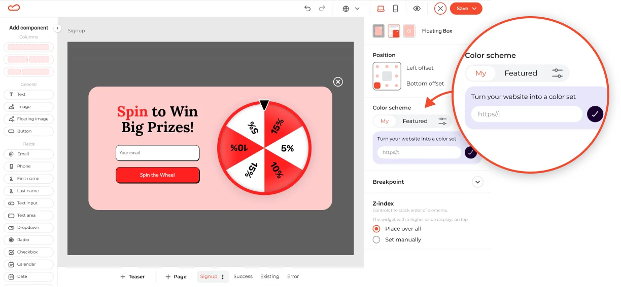
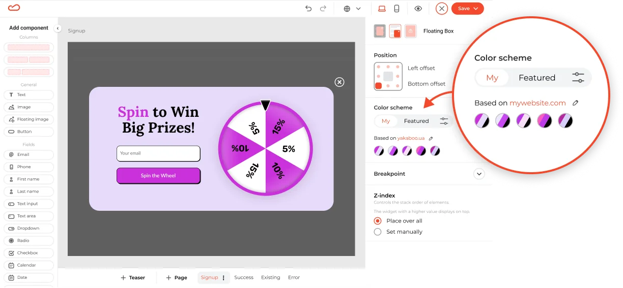
The Solution: Website Theme Sync
We are rolling out Website Theme Sync — a visionary step toward a future where widget design is completely autonomous. The technology automatically adapts our entire widget library to fit your brand’s visual DNA.
Our goal is to shorten the path to value. We want users to hit that “Aha-moment” instantly, seeing a widget that feels native to their site in just one click, without hours of manual tweaking.
To do this, we conducted deep research into algorithmic design to answer a difficult question: How do we teach a machine to think like a professional designer?
The Mechanism: Teaching Math to Understand Beauty
We built a logic engine, led by our UX Tech Lead Yevhen Gromov, that categorizes your brand into three distinct scenarios to ensure perfect harmony.
Step 1: Smart extraction
You enter your website address, and our system scans your domain to identify the dominant brand colors, accents, and font hierarchies.
Step 2: Contextual application
Not every brand color works in every situation. A pale yellow logo is beautiful, but a pale yellow button with white text is invisible. Our system analyzes your brand and adapts it to three common situations:
- The “Pastel” Brand: If your brand uses light colors (like soft mint or pale lemon), using them for text will kill your readability. Our system detects this and automatically generates a slightly darker “sibling” shade for your buttons and text. You get the same soft vibe, but your customers can actually read the offer.
- The “Vibrant” Brand: For bold corporate colors (like royal blue or red), we apply color theory to create high-converting CTA buttons that pop off the screen without clashing with the background.
- The “Dark” Brand: If your site uses deep blacks or navys, we switch to “dark mode” logic — smartly lightening background elements to ensure your widget looks sleek, not heavy.
Step 3: The “contrast police”
This is our safety net. Even if a color combination looks artistic, it must be readable to convert.
We run a real-time check against web accessibility standards (WCAG). If a button color makes the text hard to read, the system automatically adjusts the contrast until the text pops. You never have to worry about invisible text or “ugly” combinations again.
The Result: Native UI in One Click
The impact of this technology goes beyond just “looking nice.”
- Trust & Credibility: Your widgets now look like they were hard-coded by your development team. They feel native, reducing cognitive load and building trust.
- Speed: You don’t need to plan a whole sprint with designers to launch a perfectly branded campaign. You can do it during your lunch break.
- Conversion: As the academic and benchmark data prove, visual consistency is the silent driver of conversion. By removing visual friction, you clear the path to the sale.
What next?
Stop fighting with color pickers. Stop guessing which shade of gray works best for a border.
Beautiful design is indeed an equation, but you shouldn't have to solve it yourself. With Claspo’s Website Theme Sync, we let the algorithm handle the design so you can focus on the strategy.


