
Countdown Timer Popup [Guide, Examples & How to make]
You open your popup builder. You see the countdown timer option.
And you hesitate. Because this isn’t just a design choice. It’s a strategic one.
Will this lift conversions — or make the brand look desperate? Will it protect margins — or slowly train customers to wait for discounts? What if it works… but attracts low-intent buyers who only convert with pressure?
Countdown timer popups aren’t inherently aggressive. They’re just tools. Used well, they clarify decisions. This guide breaks down how to use them the right way. Inside, you’ll learn:
- When countdown timers increase conversions and when they hurt trust.
- How to choose between fixed and personal deadlines.
- What performance data actually shows in 2026.
- How to build and launch a countdown timer popup step by step.
And yes — when used correctly, timers can deliver measurable impact. In Cracku case study, short seasonal countdown campaigns lifted CTR from ~1.8% to ~7-8%, and also drove 2,200+ signups from ~28.7k views in just a few days.
TL;DR
- Countdown timer popups work — but only when tied to something real.
- Email + timer gives a slight lift. Gamification + timer can drive ~6× higher conversion.
- Fixed deadlines work for shared campaigns (BFCM, launches).
- Evergreen personal timers work best for new visitors.
- Fake urgency (resetting timers, zombie countdowns) kills trust.
What is a countdown timer popup?
A countdown timer popup is a popup, overlay, floating box or bar that displays a live timer counting down to a specific deadline — with one clear goal: to push a decision forward.
The key difference from a regular popup? The timer isn't a decoration. It’s a mechanism. A regular popup puts an offer in front of you. A countdown popup adds a clock to the room. That small detail changes the mood. Without a timer, people feel like they have unlimited runway. With a timer, the offer suddenly has edges.
But here’s an important nuance: a timer doesn’t automatically create urgency. It visualizes a deadline — one that either already exists or is defined by your campaign rules. What actually expires is what drives action. That could be:
- a discount, bonus, or free shipping window;
- a webinar seat;
- early access to a launch;
- a price increase;
- access to gated content.
The countdown timer simply makes the end point visible.
What countdown timer popups solve & why you need them
A countdown timer popup isn’t about adding pressure. It’s about removing friction, protecting your pricing, and making campaigns measurable in a way static offers simply aren’t.
1. They protect your pricing
This matters most with things like:
- welcome discounts;
- first-order codes;
- subscriber-only offers.

Instead of turning your welcome discount into a permanent margin leak, you frame it as what it should be: a temporary incentive to start a relationship.
2. Countdown timers reduce “coupon as souvenir” behavior
In lead capture and welcome flows, a common pattern shows up: people grab the code “just in case” and never use it. Without a time boundary, the coupon becomes a bookmark. With a countdown timer attached, the code becomes part of a decision. It has context. It has a window. The practical impact is simple:
- higher redemption rates;
- a tighter link between signup and purchase.
When the code expires soon, purchases tend to happen closer to the moment of signup. That makes it easier to see whether your lead capture flow is actually driving revenue.
3. They make promotion measurable in time
Static campaigns tell you whether they converted. Countdown popup campaigns tell you when people converted. That opens up useful analysis most teams skip. One important nuance here: the depth of time-based analysis depends on how your promo codes are handled.
If you use unique promo codes
When each user receives an individual code — generated on the e-commerce side (for example, in Shopify) and passed into the countdown timer popup — you unlock much cleaner analysis. In that setup:
- Each visitor gets their own unique discount code.
- The code is stored in your e-commerce system or CRM.
- You can see the exact timestamp when the code was issued.
- The exact timestamp when it was redeemed.
From there, a simple calculation becomes possible: time to redemption = redemption timestamp – issue timestamp. That metric tells you something powerful: how long it actually takes users to move from interest to purchase under a time-bound incentive. Now you can answer questions like:
- Do most customers redeem within the first hour?
- Do 24-hour windows actually lead to delayed purchases?
- Are shorter countdowns accelerating decisions?
This isn’t something a popup builder measures on its own. It requires integration between your onsite widget and your e-commerce or CRM system. But once connected, the timer becomes more than a visual device — it becomes a behavioral measurement tool.
If you use shared promo codes
Even without unique codes, time-based insights are still possible — just at a campaign level rather than at an individual level. For example, if you run a three-day promotion with a visible countdown popup, you can analyze:
- Redemptions on the first day vs second day vs third day.
- Revenue generated in the first half of the campaign vs the final hours.
In this case, you’re analyzing how revenue distributes across the campaign timeline. Does most revenue cluster at the start? Do customers wait until the final hours?
These patterns can be observed through your e-commerce reports or GA4 purchase data — especially if you tag promo codes or campaign variants properly.
Countdown timer types
Adding a countdown timer isn’t only about how the popup looks. What really matters is how the clock works behind the scenes — and who the deadline actually applies to.
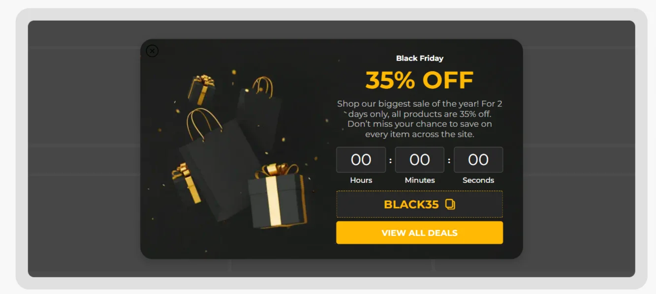
Fixed deadline — hard stop at a specific date and time
In this case, you set one clear end date in your campaign settings, and the timer simply counts down toward it. Every visitor sees the same remaining time decreasing. This format works best when the deadline is genuinely shared:
- seasonal sales;
- product launches;
- limited drops;
- shipping cutoffs;
- campaign end dates.
When the timer hits 00 : 00 : 00, something should actually change — price, availability, bonus, access. Otherwise, the clock becomes cosmetic. This type of timer is about aligning the interface with a real-world event.
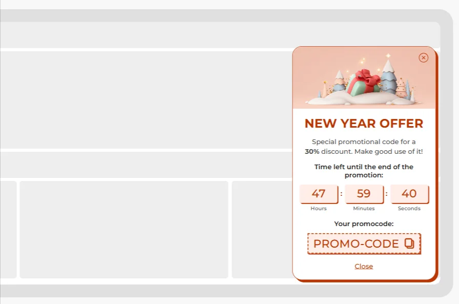
Relative countdown timer popups with the personal deadline
Here, the timer still looks the same — ticking numbers inside the popup — but the end moment isn’t global. The countdown begins when the popup appears for that person. The design looks identical for everyone, but the remaining time depends on when they triggered it. This type is common for:
- welcome discounts;
- first-order incentives;
- lead magnet access.
The key difference is that the timer reflects a personal window, not a campaign end date. And this is where evergreen countdown timer popups become strategically powerful. You can run the same offer continuously — for months if needed. If you limit it to first-time visitors, the offer shows up where it makes sense — without following people around forever. New visitors see a time-bound incentive. Returning customers don’t feel like your store is perpetually discounting itself.
Countdown timer popup performance benchmarks (2026)
Are countdown timer popups effective? Short answer: yes — but not in isolation, and not in every configuration. Let’s look at actual averages.
Form popups (conversion rate)
Baseline comparison first:
- Email-only form — 2.48% CR
- Email + Countdown timer — 2.56% CR
- Email + Countdown timer + Promo code — 3.42% CR
- Gamification + Countdown timer — 16.13% CR
Email-only forms sit at 2.48% on average. Add a countdown timer and the number shifts to 2.56%. The change isn’t dramatic, but it shows that even a simple time boundary can move behavior slightly.
The bigger lift happens when the timer is paired with a tangible incentive. Adding a promo code alongside the countdown timer moves the average to 3.42% CR. That suggests the timer works best when it visualizes something concrete expiring.
And when urgency is layered with interaction (gamification + timer), performance jumps significantly — 16.13% CR on average. In that case, the timer supports momentum rather than trying to create it.
Engagement popups (CTR)
If we shift from form completion to click-through rate:
- Countdown timer alone — 5.72% CTR
- Countdown timer + Promo code — 6.20% CTR
Again, the pattern repeats: the timer alone performs solidly, but pairing it with a clear benefit improves interaction. The timer attracts attention. The incentive converts that attention.
Below is a simplified view of how different countdown setups affect performance:
| Configuration impact on conversion | ||
|---|---|---|
|
Configuration |
Avg. performance |
Observed impact |
|
Email-only form |
2.48% CR |
Baseline |
|
Email + Countdown timer |
2.56% CR |
Slight lift |
|
Email + Countdown timer + Promo code |
3.42% CR |
Clear uplift |
|
Email + Gamification + Countdown timer |
16.13% CR |
Strong amplification |
|
Countdown only (engagement) |
5.72% CTR |
Attention driver |
|
Countdown timer + Promo |
6.20% CTR |
Stronger hook |
Seasonal performance: why Christmas behaves differently from BFCM
Now let’s look at seasonal engagement data (countdown-only popups):
- Christmas — 9.75% CTR
- Black Friday & Cyber Monday — 5.56% CTR
- General (no celebration) — 6.41% CTR
This is interesting. Countdown timers during Christmas outperform both general campaigns and BFCM campaigns — even without additional incentives. Why? Psychologically, Christmas has a natural, external deadline. Shipping cutoffs. Gift planning. Calendar pressure. The timer aligns with something people already feel.
BFCM works differently. During Black Friday and Cyber Monday:
- users expect discounts everywhere;
- urgency is ambient across the entire internet;
- a timer alone doesn’t differentiate.
In fact, users may be waiting for better codes, deeper discounts, or stacked offers. The baseline expectation is already “this is time-limited”. That’s where pairing becomes important.
For BFCM popups:
- Promo code + Countdown timer — 7.57% CTR
- Promo code + FOMO text — 6.34% CTR
- Countdown timer only — 5.56% CTR
Two insights emerge. A timer performs better than text-based FOMO alone. Visual urgency beats written urgency. But during BFCM, the timer works best when paired with a concrete incentive.
How to create a countdown timer popup (step-by-step)
Let’s put this into practice and build a simple example — a personal countdown popup with a promo code.
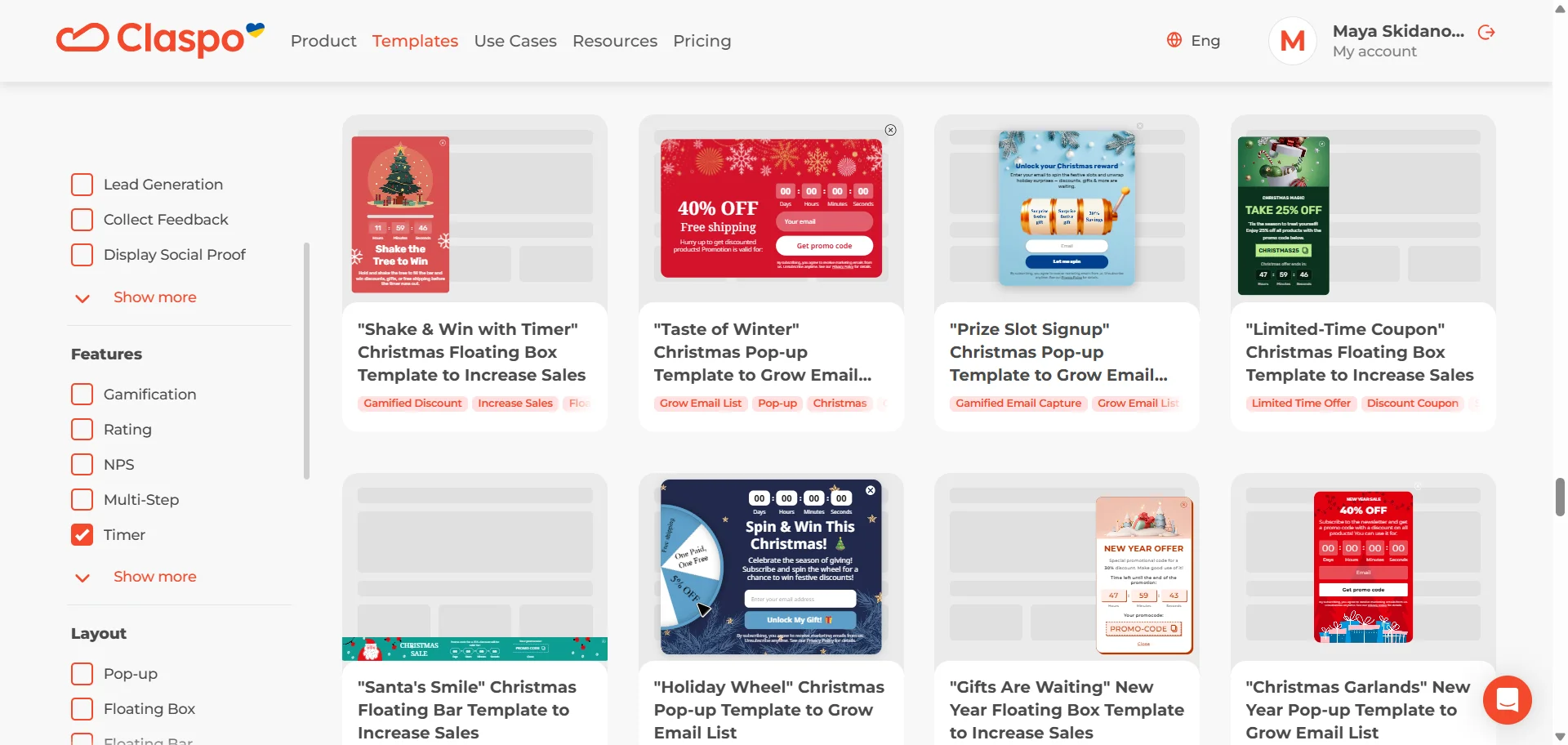
1. Start with a pre-built countdown timer popup structure
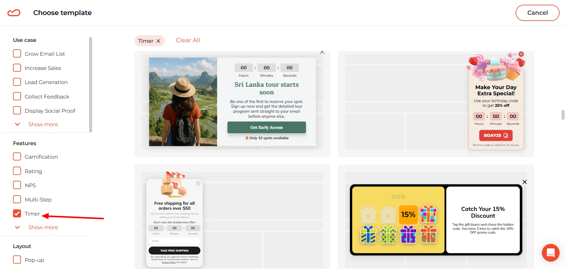
You could start from a blank canvas. But unless you enjoy moving boxes around for 20 minutes, it’s much easier to grab a ready-made template and adjust it. The layout is already thought through, which means you can focus on the offer instead of alignment.
Turn on the “Timer” filter and the library trims itself down to relevant options. Browse through, grab the one that’s closest to your use case, and adapt it.
2. Make it feel native to your website
Right inside the editor, you can quickly adjust the layout of the selected template. For example, we picked a floating box format — but if that placement doesn’t fit your use case, you can switch it to a classic popup or even a content-blocking format.
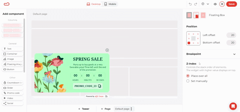
Just select the layout type you need, and the structure adapts instantly.
You don’t need to dig through menus to adjust the template. Just click on whatever you want to change — the headline, the image, the button, the countdown timer — and the relevant controls will open on the right.
For example, if you want to replace the image, just click on it in the canvas. Then, in the right panel, hit “Change”.
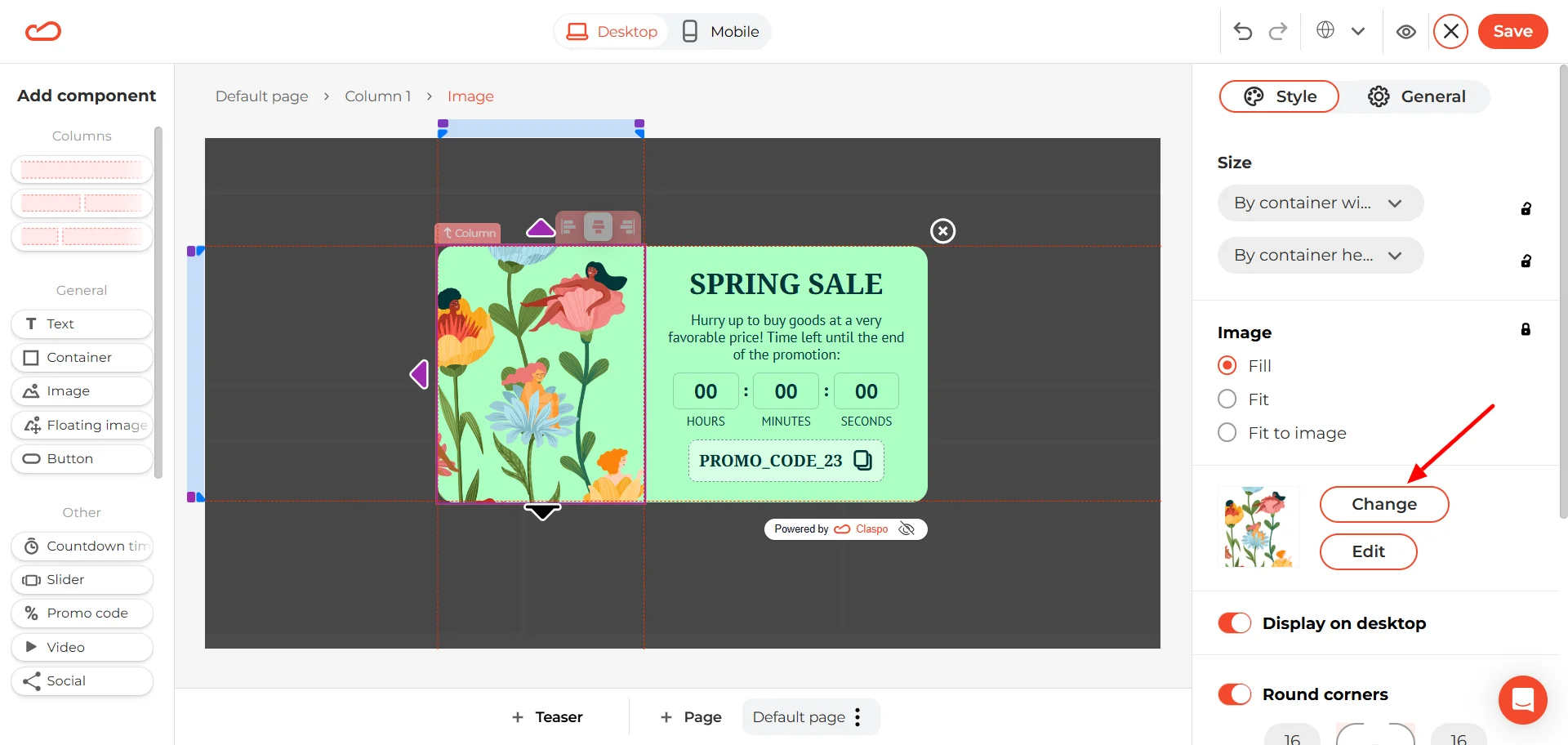
A media window will open where you can:
- Upload your own image from your device (My images).
- Paste an external link.
- Or choose from the built-in stock library (photos and icons included).
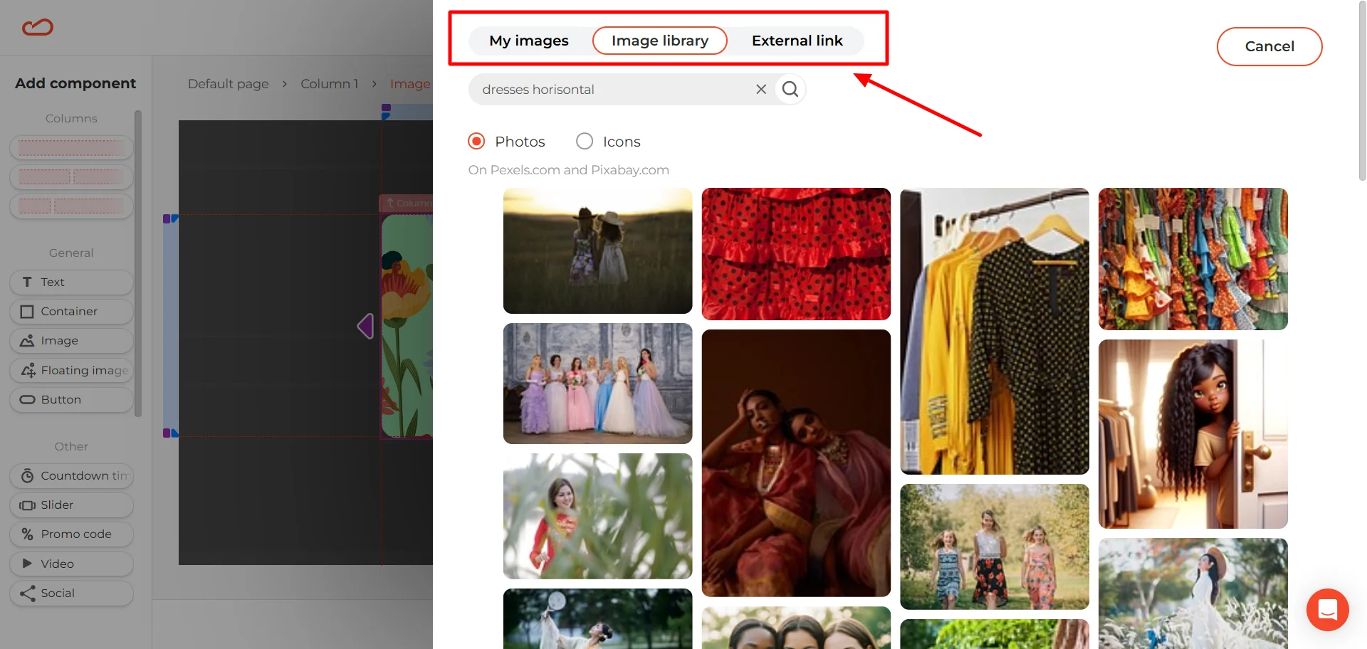
If your store has a specific aesthetic, use your own visuals. If you just need something clean and quick, the built-in library works fine too.
The background color works the same way. Select the widget, then look to the right panel — you’ll see the color swatch there. Click on it and adjust the shade manually.
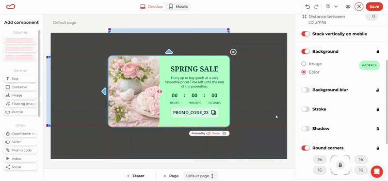
You can also paste your HEXА or RGBA code if you already know the exact brand color you want to use. If you’re matching an existing design system, it’s usually faster to drop in the code directly instead of guessing the tone.
For a complete breakdown of styling options — including borders, colors, and typography — see the full customization guide here.
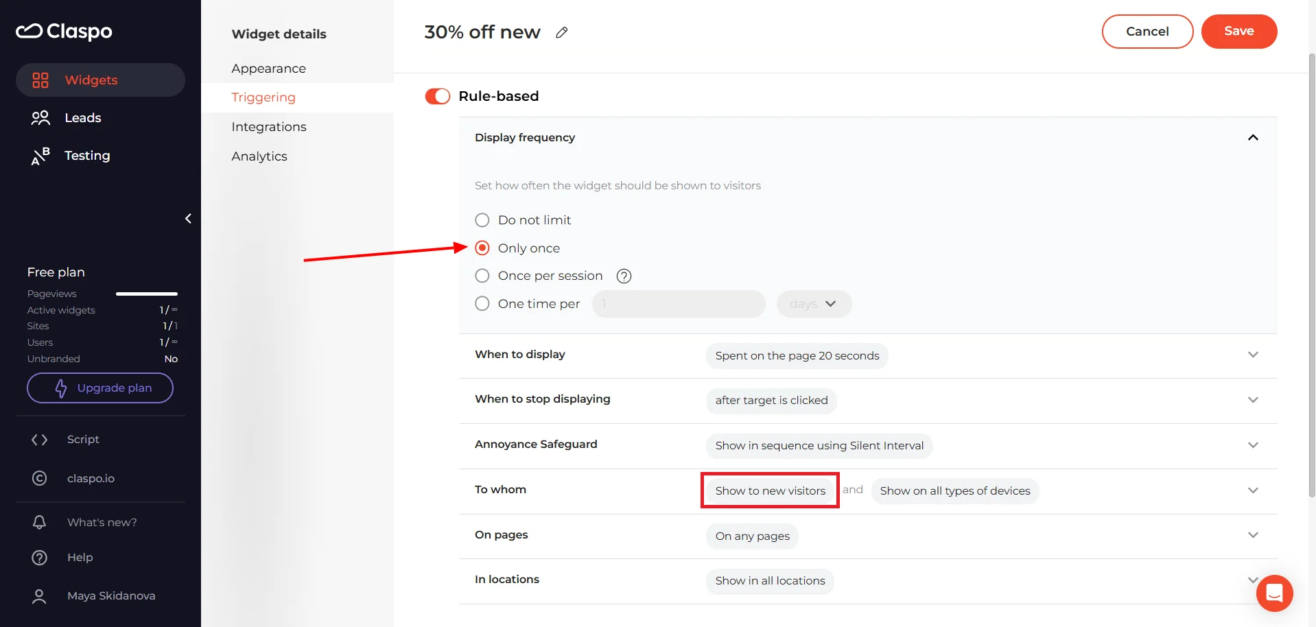
Set the countdown timer logic
Before touching the settings, pause for a second and decide what kind of urgency you’re creating. Is this a shared deadline that ends for everyone at the same time? Or is it a personal decision window that starts when the visitor sees the popup?
If you’re running a personalized flash sale, you’ll want a relative countdown — for example, 15 minutes from the moment the widget appears.
Click on the countdown timer component inside the template. Then open the General tab on the right. First, choose how the timer should be displayed. In the Format dropdown, you can select what units are visible:
- days + hours + minutes + seconds;
- hours + minutes + seconds;
- minutes + seconds;
- or seconds only.
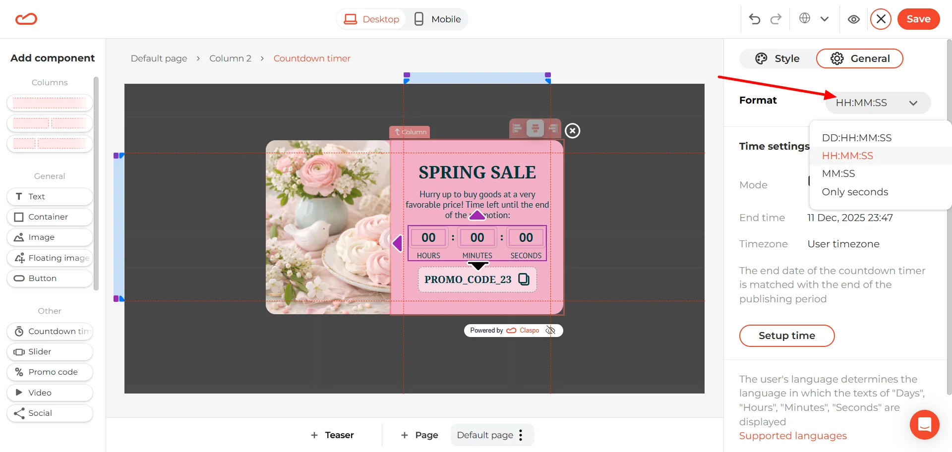
Pick the format that matches the intensity of your offer. A 48-hour campaign doesn’t need seconds. A 10-minute flash sale does.
Next, click Setup time.
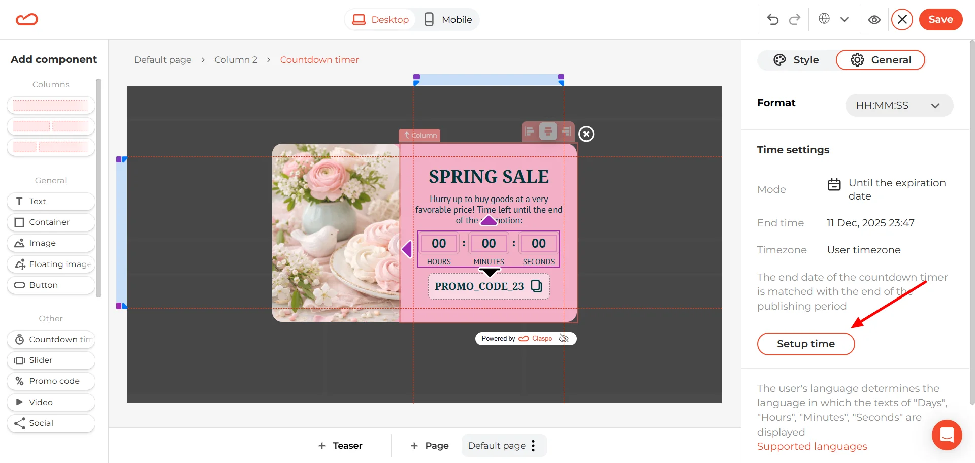
For a relative countdown timer, select “From the start of displaying.” Then set the duration. By default, it’s usually 10 minutes, but you can adjust it to whatever fits your campaign.
Below that, you’ll see reset options. You can choose when the widget becomes eligible to show again after the countdown ends:
- During the next session
- Or after a specific period (for example, 1 day after expiration)
If you don’t want the timer to restart at all, simply turn off the “Reset the timer after the countdown ends” toggle.
Configure the promo code element
To change the promo code text itself, just click directly on it and type in your own code. Since this popup includes a promo code, it’s worth spending a few extra minutes refining this block. It’s the part people will actually interact with. You can:
- Add an icon after the code.
- Switch to a “scissors on the stroke” style (a subtle visual cue that the code can be “clipped”).
- Adjust the icon color so it either stands out or blends into the design.
- Add or remove a stroke (border), choose which sides it appears on.
- Enable a shadow if you want the block to feel slightly elevated.
- Round the corners — and you can adjust each corner individually if needed.
- Turn on hover effects for a bit of interaction feedback.
The goal is simple: make the promo code impossible to miss, but consistent with your overall design.
3. Set smart display triggers
Resist the urge to launch the countdown timer popup the second someone lands on the page. Most visitors will close it before they even read the headline. Instead, connect the timer to actual engagement. A few solid starting points:
- After 15-20 seconds on the website.
- After the visitor scrolls 40% of the page.
- After they’ve viewed 2-3 pages.
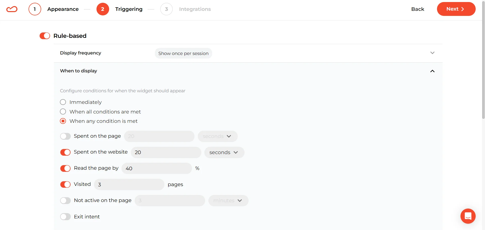
The timer shows up once the visitor has already invested attention — which means they’re far more likely to act on it.
If you're using a relative countdown timer popup, it usually performs best when shown to a specific audience segment. For example, you can target new visitors only.
You can configure this in the To whom section by selecting New visitors under Visitor type.
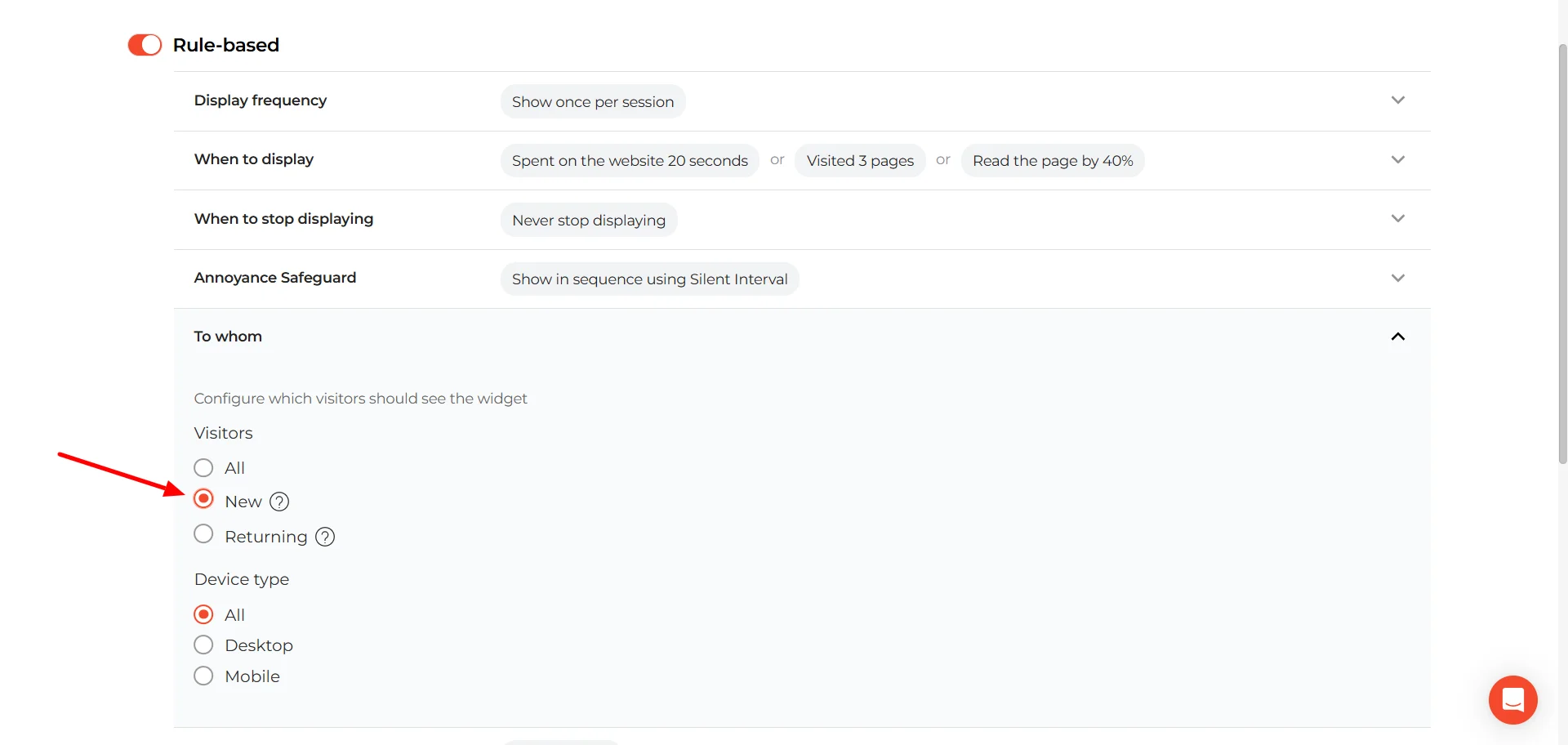
Save your settings and test the widget on your website. During testing, only you will see it — your visitors won’t. If everything looks and works as expected, go ahead and publish. That’s it. Your countdown timer popup is ready to welcome new visitors — and gently push them toward their first purchase.
Countdown timer popups in e-commerce: best practices to improve conversions
Countdown timers popups work best in e-commerce when they don’t feel like a trick. The goal isn’t to add urgency. The goal is to make the buying decision clearer, tighter, and easier to finish.
1. Tie the countdown timer to a real expiring thing
In e-commerce, the strongest “expiring things” are often operational and believable — not just discounts.
Shipping cutoffs are a classic. “Order in the next 3 hours for dispatch today” is an urgency customers already respect, because it’s tied to logistics, not marketing mood.
Price step-downs (30% today, 25% tomorrow, 20% after) are even sharper because waiting has a visible cost — not just a vague “ending soon.”
And if you have inventory-linked perks (limited colorway, limited add-on), the countdown timer popup feels natural because it matches how shoppers already think: “If I want that version, I should move”.
2. Choose the countdown timer type based on the shopper journey
A lot of countdown underperformance comes from using the wrong timer logic.
A fixed deadline works when shoppers expect a shared calendar moment: Black Friday, holiday sales, announced drops.
An evergreen personal window makes sense when the offer is always available but you want it to stay contextual — welcome discounts, or cart nudges. Here the countdown timer starts when the visitor sees a popup. But be careful with personal micro-deadlines on higher-consideration products (furniture, mattresses, premium fashion). “You have 15 minutes” can feel out of place when the product requires comparison. In those categories, a fixed deadline with calmer, informational urgency often converts better.
3. Use countdown timer popups to lift AOV without looking like a discount machine
Countdown timers can increase conversion with discounts, but that path is expensive. It can hurt margin and teach shoppers to expect price cuts. A cleaner strategy is to put the countdown on a perk that nudges cart value:
- The free shipping threshold with a deadline is a strong one. “Free shipping over $X (ends tonight)” pushes shoppers to add one more item, and it doesn’t anchor your brand to “always on sale”.
- A timed free gift over $X works similarly and can feel more premium than a discount. It’s also easier to control from a cost standpoint.
- Timed bundle bonuses are great when you want higher AOV while keeping your pricing intact.
The underlying idea is simple: if you want urgency without brand dilution, don’t always put the timer on price. Put it on value.
4. Segment count offers so you don’t train the entire market to wait
If every visitor sees a countdown timer popup and a deal, you’re not just running a campaign — you’re teaching behavior. And shoppers learn fast. Use segmentation to keep urgency contextual:
- For first-time visitors, evergreen welcome windows work well — but only with frequency limits (show once) so it doesn’t follow people around.
- For returning visitors, consider smaller perks (gift, shipping) or no timer at all. If the same countdown timer popup keeps showing up on every visit, it stops feeling like a window
- For exit intent, reserve countdown discounts for higher-intent signals: meaningful cart value, several product views, or checkout started event. Otherwise you train people to “almost leave” just to unlock the deal.
- For existing customers, avoid discount timers where possible. This is where “access urgency” tends to work better: early access, limited bonus points, members-only drops, limited extras, etc. It keeps your brand premium and avoids turning loyalty into coupon-hunting.
A good countdown timer popup strategy isn’t “more urgency”. It’s urgency with boundaries — shown to the right people, tied to the right thing, at the right stage of the journey.
Countdown timer popups: common mistakes & anti-patterns
Countdown timer popups can increase urgency, pull forward demand, and improve conversion. They can also quietly destroy trust, train bad behavior, and inflate vanity metrics. Below are the most common and most expensive mistakes marketers make when using countdown timers.
1. Resetting or “Groundhog Day” timers.
The timer restarts on refresh or in a new tab. Users notice. When that happens, urgency stops being a business rule and becomes theater. And once shoppers realize the clock is flexible, every future countdown becomes weaker.
If you can’t persist the timer (via cookie, local storage, or account logic), don’t run a hard deadline. A soft message is better than a fake clock.
2. Countdown hits zero… and nothing happens.
The timer reaches 0. The discount still works. The banner stays live. The sale continues. That single moment teaches customers something powerful: deadlines here are optional. And once that lesson is learned, it’s very hard to unlearn.
If you run a fixed deadline, enforce it. At minimum, change the creative, adjust the offer, or switch the messaging when it expires.
3. The “zombie timer” problem.
You’ve probably seen this. The banner says “Ends 3/31 at 11:59PM.” The timer shows 00:00:00:00. A countdown that has already died but remains visible is like a store sign that says “Grand Opening!” three years later. Timers need maintenance. If the campaign ends, the clock should disappear with it.
This isn’t just a UX oversight. It signals operational sloppiness. Worse, it tells customers the brand doesn’t take its own deadlines seriously. The banner says there's a 15% discount, but the price of the item is down 17%.
4. Timer as decoration.
Numbers tick, but what actually ends? The discount? Free shipping? A bonus gift? Early access? If the user can’t immediately understand what disappears when the timer hits zero, urgency collapses into noise. A single clarifying sentence near the timer solves this.
5. The countdown timer nobody sees.
If the countdown is too small, with low contrast, buried under paragraphs, or below the fold it becomes design clutter. Urgency must be visually anchored to the value statement. The timer should live next to what’s expiring, not hidden like a legal disclaimer.
Countdown timer popup examples
Below are real-world countdown timer popup patterns — and what makes each of them convert.
Popup with an event countdown (fixed deadline)
This is the cleanest, “no drama” use of a countdown timer: it’s counting down to a real event start time. The timer isn’t trying to manufacture urgency — it’s just making the schedule impossible to ignore.
What works well here, and why the timer helps: days + hours + minutes makes sense for events. This timer format fits the context. A 7-day countdown feels normal for a webinar. You’re not forcing a 10-minute panic window.
What could be improved: adding the actual date/time + timezone near the timer. A countdown is great, but users still want the anchor: “Starts on Feb 21, 2 PM ET.” This reduces anxiety for international audiences and avoids “wait… what time is that for me?” moments.
BOGO flash deal popup with a short countdown (fixed window)

This one is a classic “promo-first” e-commerce countdown timer popup: one offer, one action, one clock. The timer is doing real work here because a BOGO-style deal is easy to understand — and easy to postpone.
What’s strong, and how the timer helps: BOGO deals are straightforward and transactional. A ticking timer fits that vibe better than long explanatory copy or “fear of missing out” paragraphs.
Countdown timer format fits a flash deal: hours/minutes/seconds signals “this is a short window”. For quick promos, seconds can be helpful because it visually reinforces momentum.
Popup with a second-stage countdown timer

This widget is doing something smarter than “here’s a timer, hurry up”. The timer doesn’t hit you on the first screen. It shows up after you’ve made a small choice — and that order matters.
What’s strong here, and why the timer works better on stage 2:
- Micro-commitment first, friction second. The first step asks a low-effort question (“What brings you here today?”). Clicking a button is easy. Once someone has picked an option, the email step feels like a continuation, not a cold ask.
- The countdown timer supports momentum, not discovery. On step 1, people are still orienting. On step 2, they already entered the flow. That’s the right moment to add a countdown — it pushes completion, not attention.
- Mystery discount pairs naturally with a countdown timer. A surprise incentive is emotional (curiosity-driven). A short clock adds urgency to that curiosity. This combo can outperform a plain “10% off” banner.
The big question: is 30 seconds good? It can work, but it’s risky. 30 seconds is not a deadline. It’s a stress test. On desktop with autofill, it’s fine. On mobile (typing, switching keyboards), it’s easy to miss — and then people think “ugh”.
What a 30-second timer tends to do:
- Filters for high-intent + fast-entry users (autofill, returning customers).
- Loses a chunk of valid leads (mobile, slower typers, non-native language users).
- Increases “this feels pushy” reactions.
A timer that feels like a bomb countdown can work against you. What could be improved without killing the concept? Give the user a realistic window, like a minute.
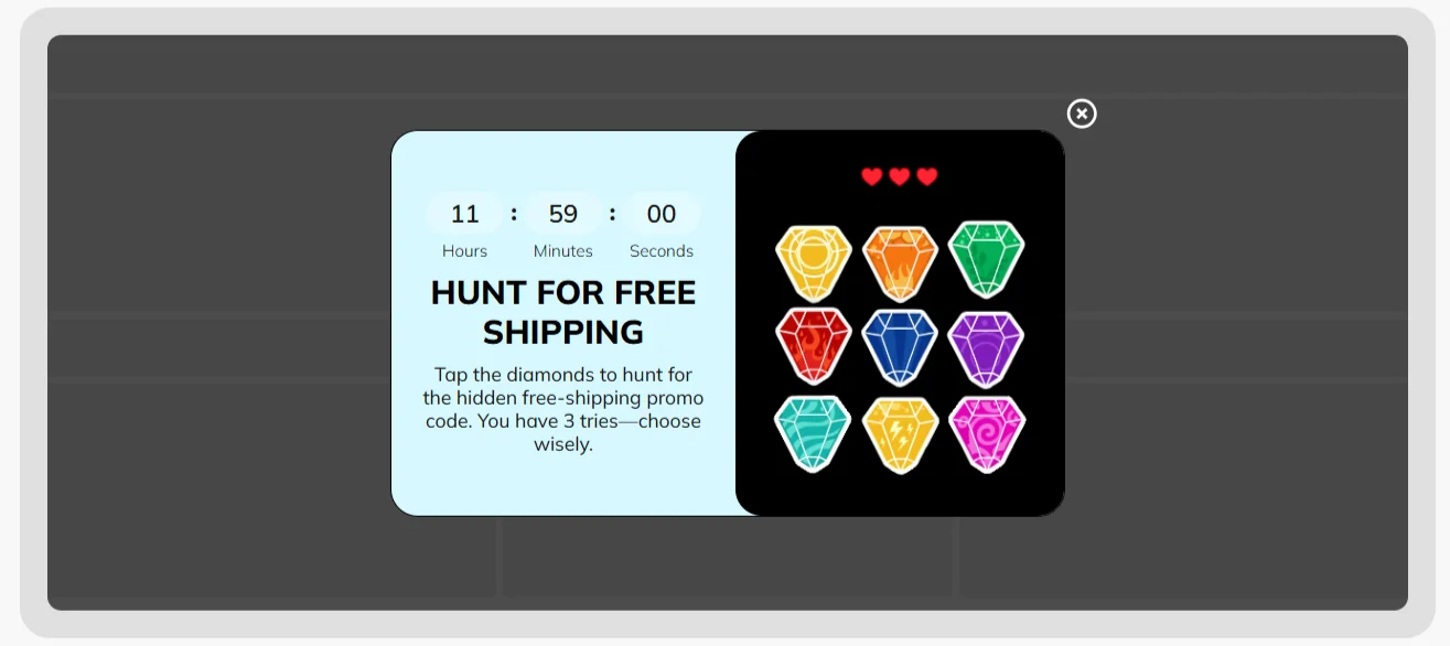
Gamified popup with a post-win countdown timer
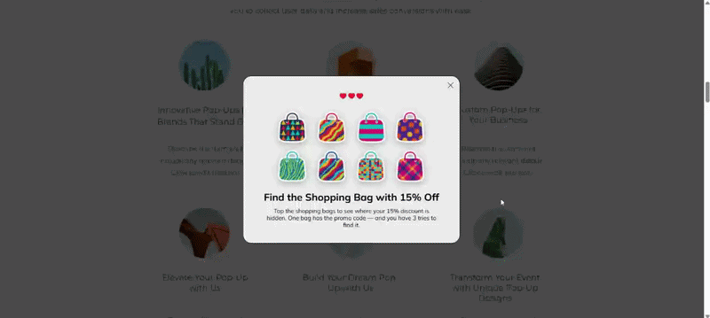
This one flips the usual order. The timer doesn’t push you to play. It appears after you’ve already won. That’s an important distinction.
What’s strong here, and why the timer works differently: the urgency is attached to a reward, not an entry form. It creates a clean psychological arc:
- Curiosity (find the bag).
- Engagement (tap to play).
- Dopamine hit (you won 15%).
- Urgency (use it before it expires).
The countdown timer popup now protects the reward from becoming a souvenir.
Floating bar countdown for a seasonal sale
This one is a persistent floating bar at the top of the site. Different format with different psychology. What’s strong here, and why a floating bar makes sense:
- Low friction, high visibility. A floating bar doesn’t interrupt browsing. It stays present while users scroll, compare, and explore. For a multi-day seasonal sale, that’s ideal.
- It creates background urgency. Instead of “act right now,” it communicates “this window is finite.” It feels informational rather than aggressive.
Floating countdown timer bars tend to perform best when the deadline is tied to something real and widely relevant — like seasonal campaigns, sitewide promotions, scheduled price increases, shipping cutoffs, or major product drops.
They’re less suited for situations that require immediate action or personal commitment. Lead capture flows, short micro-deadlines (like 10-15 minute offers), or deep-funnel urgency such as cart recovery usually benefit from more direct formats than a passive bar at the top of the page.
Exit-intent cart countdown timer popup
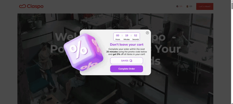
Exit intent is a last-second moment. The visitor is already drifting away, and you get one shot to change direction. A promo code alone can help, but it also creates a new problem: people grab the code and leave anyway. That’s exactly what the timer is trying to prevent.
Why the timer fits this use case:
- The timer gives the code a short shelf life, pushing it toward immediate redemption.
- If the reason for leaving is small (shipping cost, hesitation, “maybe later”), a short window can be enough to keep them in checkout and finish.
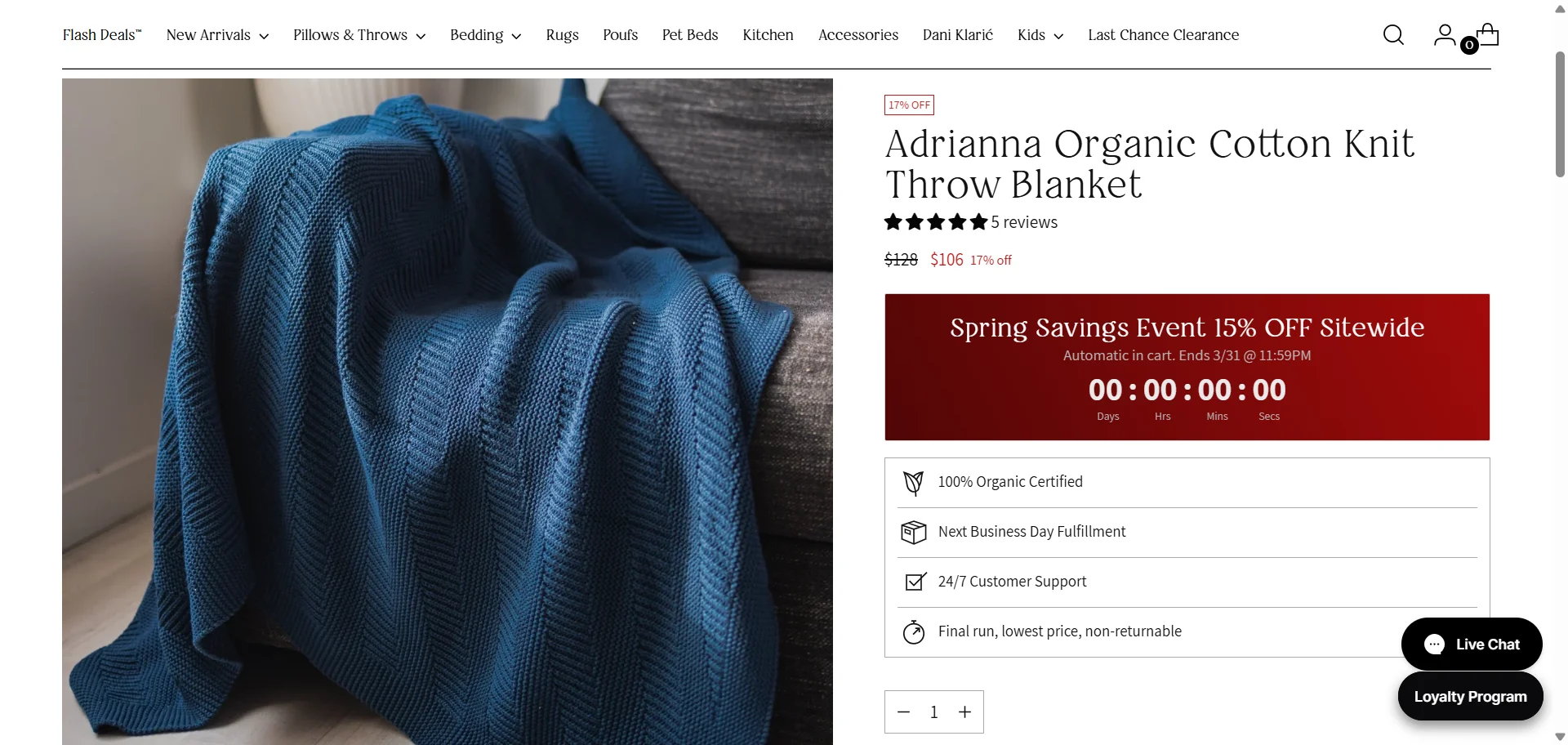
Built-in widget with a countdown timer for a multi-day promotion

This one isn’t a popup or a floating bar at the top. It’s baked right into the page — a full-width banner that lives as part of the layout. That distinction matters. Why this format makes sense for multi-day holiday campaigns:
- The urgency feels legitimate. This countdown timer is clearly tied to a calendar event.
- It matches a broad, sitewide offer. The offer is BOGO 50% OFF sitewide — that’s a big, global promotion. A large built-in banner communicates scale.
- It supports repeat visits. Multi-day promos usually bring people back more than once. A built-in banner helps because it’s simply there every time they return. The clock keeps moving without you having to re-trigger anything, and after a while it just feels like part of the page.
Built-in banner with countdown + decreasing discount
This example takes urgency one step further. It’s not just a countdown to the end of the promotion. It’s a countdown to the best price. Why this approach is powerful: it introduces loss aversion, not just scarcity. A standard countdown says: “This ends soon.” A decreasing discount says: “If you wait, you lose value.” That’s a completely different psychological trigger. Instead of fearing that the promotion will disappear, shoppers now fear paying more later.
Countdown timer popups that drive opt-ins and revenue
A countdown timer popup should react to user behavior, not just sit on the page.
Claspo makes it possible to connect urgency to real engagement while keeping the setup manageable.
Games that consistently outperform standard popups
If you’re aiming for real conversion uplift, interaction matters. Static countdown timers create urgency, while gamified mechanics create participation. When you combine both, the impact grows. As the benchmarks section showed earlier, combining gamification + a countdown timer can drive about 6.3× higher conversion than a classic email + timer popup.
Claspo currently offers 7 gamified mechanics: Spin the wheel, Slot machine, Pick a gift, Scratch card, Shake the tree, Memory matching, and Treasure hunt. And we continue expanding beyond the “classic wheel” format.
Different audiences respond to different interaction styles. Some prefer instant reveal. Others engage more with light challenges or motion-based mechanics. By offering a wider set of formats, you’re not relying on a single tactic — you’re increasing your chances of capturing attention in competitive environments.
110+ conversion-ready countdown timer templates
Need to move fast? Start with a proven design. We offer over 110 countdown timer popup templates designed for real use cases — product drops, seasonal campaigns, flash sales, lead magnets, cart incentives, and more. You’re starting from something that already works — and adapting it to your offer.
Built for customization without complexity
Every element inside the popup can be adjusted to match your brand and conversion goal. Change layout, copy, styling, countdown logic, or placement — or drop a countdown timer into any custom design you’re building.
The point isn’t design freedom for its own sake. It’s being able to align urgency with your funnel stage. Because placement matters. In some campaigns, positioning a timer near the CTA significantly increased conversions. In others, adding urgency close to product details drove measurable revenue lift. Different strategies work for different funnels. Claspo lets you test both without rebuilding everything.
Smart display logic that protects conversions
Urgency works. Overload doesn’t. Claspo gives you rule-based display control so your countdown timer popup appears at the right time to the right segment without clashing with other campaigns.
If your timer says “10 hours left”, it should mean exactly that. With built-in campaign scheduling, you define launch and end times — and the widget activates and deactivates automatically. No expired offers still running, no broken urgency.
Claspo’s countdown popups aren’t “show to everyone” tools. They’re built for segmentation. You can trigger them based on:
- UTM parameters — match urgency to specific campaigns.
- Behavioral engagement — time on site, scroll depth, pages viewed, etc.
- Exit intent — re-engage visitors before they leave.
- Geo location — show offers only where they apply.
This way, urgency is contextual and converts better.
From urgency to revenue: what to do next
Countdown timer popups are about structuring time inside your funnel. When tied to a real incentive and shown to the right segment, they help you understand not just whether people convert, but how quickly they decide.
The strongest setups in this article had one thing in common: the timer was connected to something concrete — a reward, a shipping window, a price change, or access. The format matched the context. And they paid attention to how and when the timer appeared, so it didn’t feel intrusive or overused.
If you want to move from theory to action, start with a focused experiment. Build one countdown timer popup — for example, a first-time visitor incentive with a 24-hour window. Then test it against a control version without a timer. Measure not only conversion rate, but also redemption timing and revenue per visitor. Does the timer accelerate purchases? Does it change the average order value? Does it pull revenue forward — or simply increase opt-ins without follow-through?
From there, you can layer complexity. Compare a standard email + timer setup with a gamified version. Test different countdown lengths. Experiment with placement. If the timer improves velocity without hurting perception or margin, scale it. If it doesn’t, adjust the incentive, the segment, or the deadline logic — not just the design.
FAQ
How do I measure countdown timer popup ROI (revenue, not just opt-ins)?
One practical way to do this is to use a dedicated promo code for the countdown campaign. Even something as simple as a specific code name or prefix lets you isolate the revenue that came from that timed offer inside your store reports.
Next, compare performance against a control group. For example, run the same offer without a timer for part of your traffic. Then compare:
- Revenue per visitor.
- Redemption rate.
- Time to purchase.
- Average order value.
If the countdown version drives faster purchases or higher revenue per visitor, it’s doing real work. If opt-ins go up but revenue doesn’t move, the timer may be inflating signups without improving buying behavior.
Which trigger is best: on page load, scroll, after X pageviews, or exit-intent?
There isn’t one best trigger. The right choice depends on intent and timing.
On page load is usually the weakest option for countdown popups. Visitors haven’t engaged yet, so urgency feels premature. This trigger works only when the deadline is global and widely expected — for example, a major sitewide sale.
Scroll-based triggers (like 30-50%) work well because they signal attention. If someone has started reading or browsing, a time-bound offer feels more relevant.
After X pageviews trigger is stronger for product-led stores. If a visitor has viewed 2-3 products, they’re comparing. A countdown tied to a perk (shipping, bonus, small incentive) can help move them forward.
Exit-intent works best for high-intent traffic — especially cart visitors. The timer gives the offer a short shelf life and pushes immediate action.
Should I show countdown timer popups to everyone or only to specific segments?
In most cases, don’t show countdown timer popups to everyone. When every visitor sees a timer, it stops feeling urgent and starts feeling permanent. That can train customers to wait for deals.
Segment instead. Show personal countdowns to new visitors. Use stronger incentives for cart or high-intent users. Avoid discount timers for existing customers when possible.
How do frequency caps work for countdown timer popups (and what settings are recommended)?
Frequency caps control how often the same visitor sees your countdown timer popup. Without limits, the timer can reappear every session — which quickly weakens urgency and annoys users. For most setups:
- Relative countdown timers (personal timers) — show once per user. Don’t restart the timer after it expires.
- Fixed seasonal campaigns — show once per session at most. The visitor shouldn’t see the same popup multiple times during one visit.
- Exit-intent timers — limit to once per session to avoid training “almost leaving” behavior.
How do I handle time zones for fixed end-time countdowns?
If your offer's time limit has a specific expiration — just clearly state it in the popup — something like: “Lasts till Nov 28th at 7:00 PM ET”. That way, people know they have a clear idea of when the deadline is. And no need to worry about time zones in Claspo either — the countdown automatically uses the visitor’s local time as default. So someone in New York and someone in Berlin will each get to see the time left in their own local time, without having to do any manual adjustments.
Are countdown timer popups compliant if the deadline is “evergreen” (is it misleading)?
An evergreen countdown timer popup isn’t misleading by default — it depends on how it’s used. If the timer represents a real, personal window, and the incentive genuinely expires after that period, it’s compliant. The key is that something actually changes when the timer hits zero — the discount stops working, the bonus disappears, or access closes.
It becomes misleading if the timer resets on refresh, restarts every session without limits, or if the offer never truly expires. In that case, the countdown is just decorative urgency — and that can raise compliance and trust concerns.
Are countdown timer popups mobile-friendly?
Yes — countdown timer popups can work perfectly on mobile. In Claspo, all widgets are responsive by default, so the timer and layout automatically adapt to smaller screens.
If you want, you can tweak the mobile view separately. For example, adjust spacing, resize text, or simplify the design for phones — while keeping the desktop version exactly as it is.
Can countdown timer popups hurt SEO or violate Google’s intrusive interstitial guidelines?
Countdown timer popups don’t hurt SEO by default. The risk isn’t the timer — it’s how the popup is shown. Google’s intrusive interstitial guidelines mainly target popups that block content immediately after a user lands on a page, especially on mobile. If your countdown appears right on page load and covers the screen, that can be a problem. To stay safe:
- Avoid showing full-screen popups instantly on mobile.
- Trigger them after engagement (scroll, time on site, pageviews).
- Use less intrusive formats like floating bars for broader campaigns.


