
25 Best Sign-Up Form Examples: Best Practices, Mistakes to Avoid, and Design Inspiration
When someone visits your website for the first time, it’s rarely by accident. Maybe they clicked a Google ad, found you through search, or engaged with one of your social media posts. However they arrived, it likely cost you, whether in time, money, or both.
According to the latest reports, paid advertising is one of the most expensive ways to acquire new customers. Paid search and social media ads continue to dominate marketing budgets across industries. And even if you’re leaning on organic channels like SEO or social media, the effort to bring in traffic is still significant.
That’s why your sign-up form matters. A well-designed, beautiful sign up form doesn’t just collect emails or phone numbers — it builds your owned marketing channels like email and SMS. It’s your moment to offer a discount, share a perk, or invite someone into your brand community. The best sign-up forms don’t just capture attention — they kick off a customer relationship, boost conversions, and drive long-term sales.
In this post, we’ll look at the best sign up form examples that get results. You’ll see what works, what to avoid, and how to apply the same tactics to your own site.
20 Best Examples of Sign-Up Forms for Inspiration
What does a great sign-up form actually look like in the wild? In this section, we’ve rounded up real signup form examples from brands that get it right — combining smart design, clear messaging, and just-right timing to turn casual visitors into loyal subscribers. We’ve grouped the examples by the types of sign up forms, focusing on the purpose they serve — perfect if you’re looking for fresh sign up form ideas to try on your own site.
Sign-Up Forms That Clearly Tell Users What They’ll Get – Like Launch & Product Updates
1. Dandy Worldwide
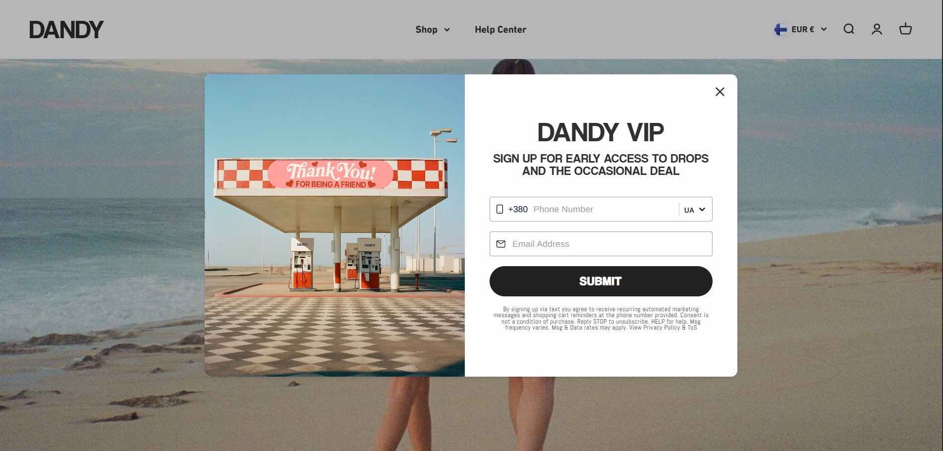
The first on the list of the best sign up examples is Dandy Worldwide. The brand is known for its embroidered outerwear, which is why it offers a sign-up form that reflects its laid-back brand vibe. The form is visually appealing and gets the core message across quickly.
What’s good about this sign-up form:
- A clear value proposition: Exclusivity of VIP status and early access speak directly to fashion-savvy users who want to stay ahead of drops.
- Minimal number of form fields: The form remains clean and uncluttered despite asking for two pieces of information.
- On-brand visuals: The nostalgic gas station photo reinforces the brand’s retro aesthetic without distracting from the message.
What could be improved:
- Generic CTA: The “Submit” button is a chance to add more personality. A phrase like “Unlock VIP Access” would match the tone and offer feel more exclusive.
- Input requirements: Asking for both phone number and email upfront might create friction. In situations like this, consider offering an immediate benefit to motivate users to complete the form.
- Small print: While the legal disclaimer is necessary, consider making it short, simple, and matching the sign up form design.
Key takeaway
Simplicity and brand alignment go a long way. A strong visual identity and a clear promise of exclusivity can drive sign-ups without overwhelming flashy gimmicks.
At the same time, don’t forget to make every element work – replace generic button copy with action- or benefit-oriented language.
2. Dollar Shave Club
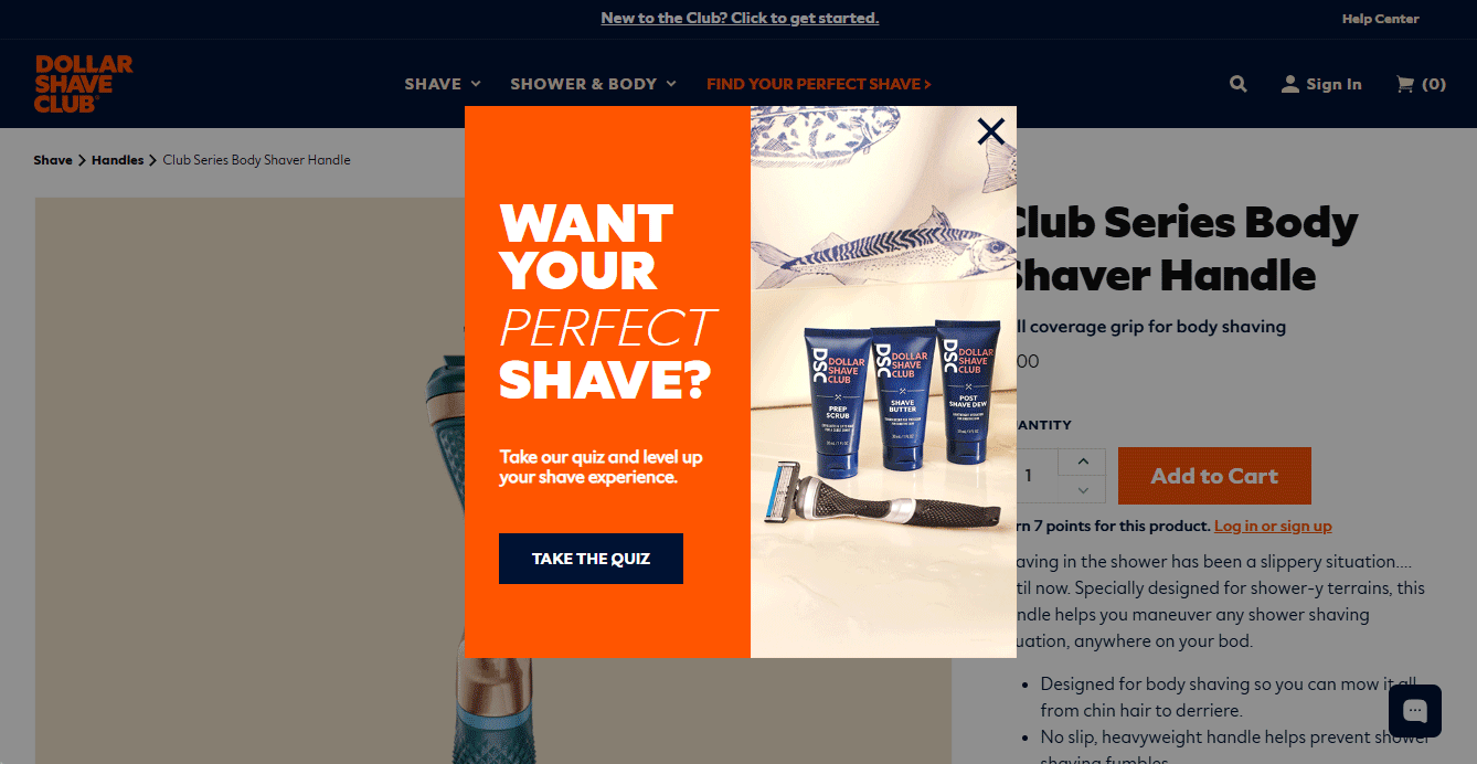
Dollar Shave Club offers website visitors a quick, 3-question grooming quiz, which is a win-win tactic for both their prospects and the company. Users get personalized product recommendations, while the brand collects email addresses in return for updates. We won’t analyze the quiz itself, instead, let’s focus on the sign up form design.
What’s good about this sign-up form:
- Strong visual hierarchy: The bold “LAST STEP!” headline grabs attention and sets clear expectations, which is great for urgency and navigation.
- Progressive disclosure: The form appears only after users complete the quiz, so they’re already engaged and more likely to convert.
- Option to skip: Users can still view their recommendations without handing over an email. This reduces friction and avoids a dead-end experience.
What could be improved:
- Extra incentive: Including a small reward or exclusive content could help turn curiosity into action.
- Vague value proposition: “Send you updates” is a start, but a clearer benefit could drive more sign-ups.
Key takeaway
Quizzes are a clever way to engage users before asking for their email. If you let users invest time upfront and then offer personalized results, you’ll make the sign-up feel like a natural next step rather than a barrier.
3. Chairish
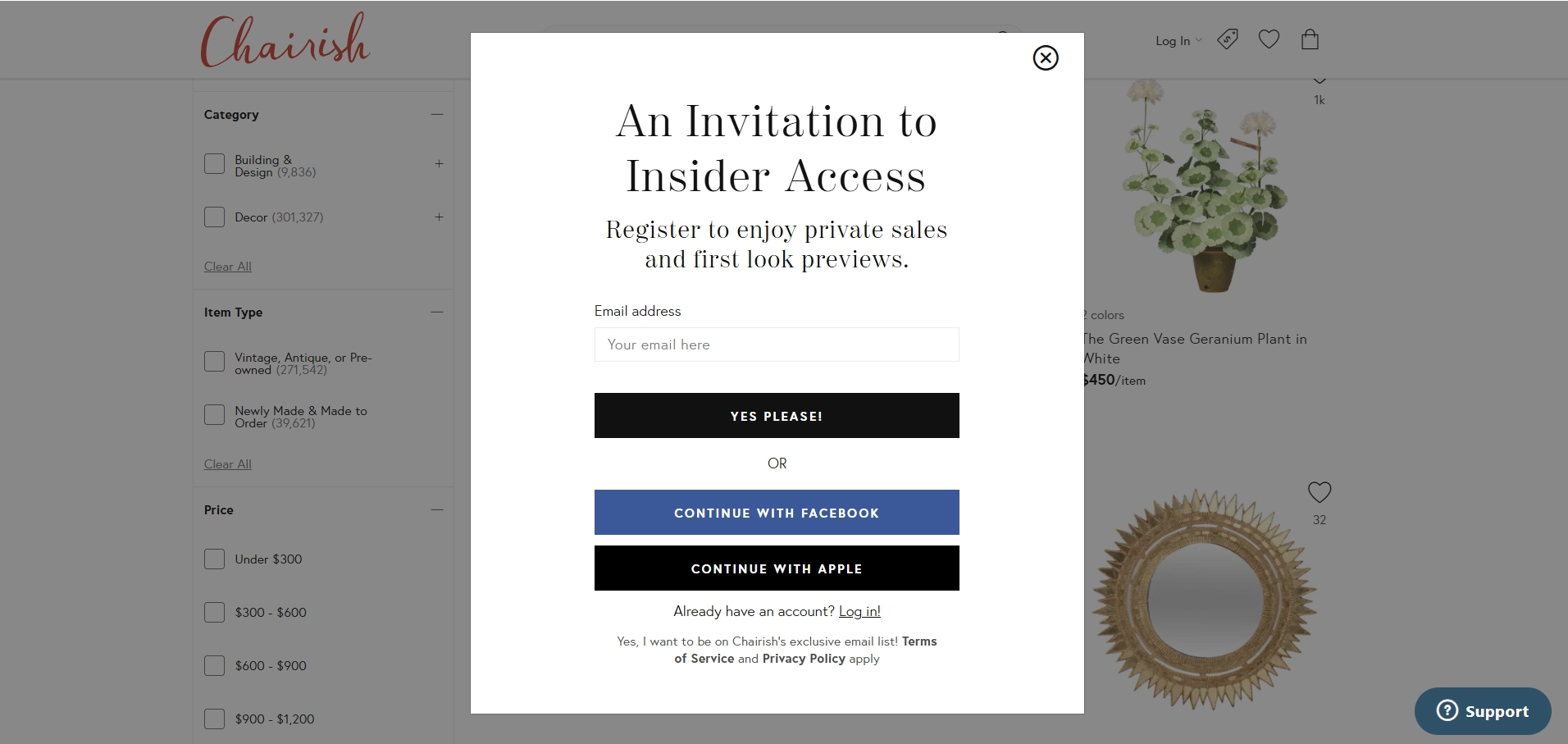
When users visit a vintage marketplace, they expect a certain atmosphere. Chairish knows it and adds boutique charm to a usual pop-up.
What’s good about this sign-up form:
- Elegant positioning: “An Invitation to Insider Access” sounds like a privilege, not another flashy pop-up.
- Branded personality: The playful “Yes please!” CTA adds a human touch that keeps the tone warm.
- Multiple sign-up options: Letting users continue with Facebook or Apple removes friction and speeds up the registration process.
- Trust-building microcopy: The opt-in text (“Yes, I want to be on Chairish’s exclusive email list”) is clear and supported by links to terms and privacy.
What could be improved:
- Clarified value: “Private sales” and “first look previews” sound exclusive, making them more specific could double their impact. A more tangible offer, like “New drops every week”, could engage more visitors to act.
- Creating urgency: A limited-time message can nudge users to take action now. A line like “This week’s drop closes in 24 hours” could increase the conversion rate.
Key takeaway
Polished copy and elegant presentation build trust, but even luxury shoppers need a clear reason to sign up today.
Sign-Up Forms That Tempt with Discounts & Special Offers
4. Mignonne Gavigan
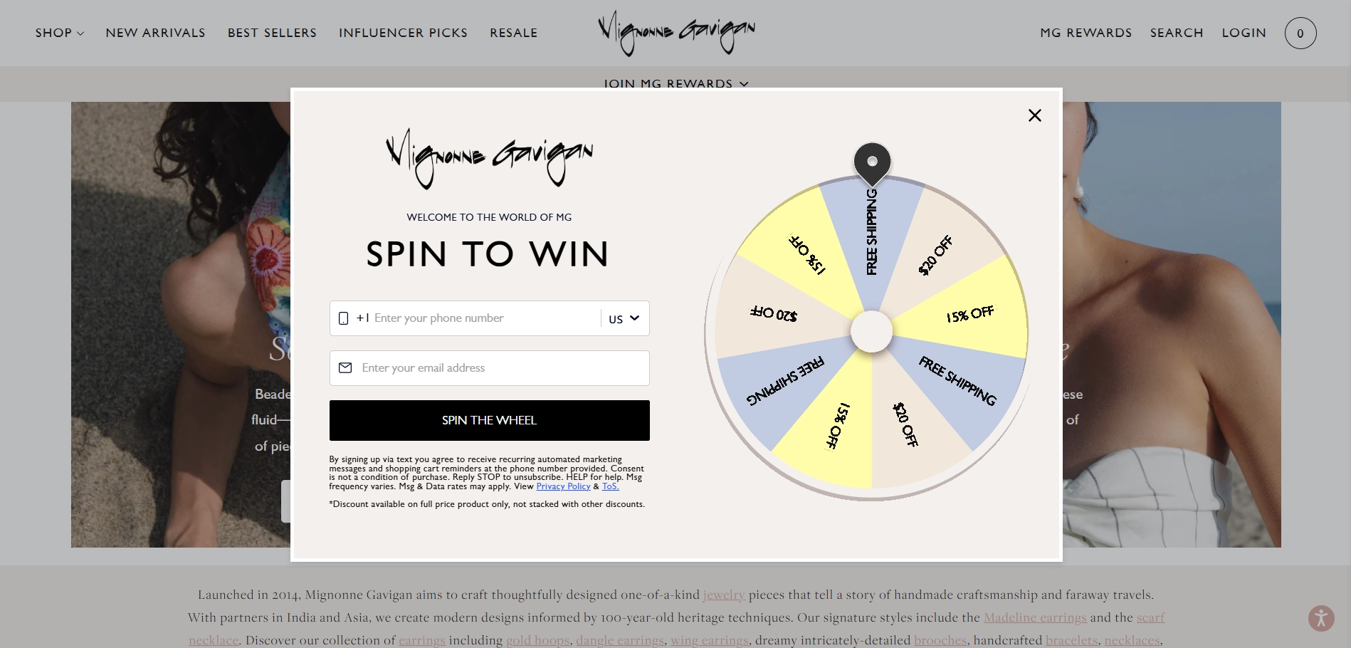
Mignonne Gavigan brings a playful touch to lead capture with a spin-to-win popup form that mirrors the brand’s bold, maximalist jewelry style. This example can become a real sign up form inspiration for businesses. Let’s see why it works.
What’s good about this sign-up form:
- Interactive hook: The spin-the-wheel mechanic adds fun and a sense of chance, encouraging engagement and immediate curiosity.
- Dual data capture: Asking for both phone and email upfront helps grow two marketing channels at once.
What could be improved:
- Friction risk: Asking for both phone and email before play might deter cautious users who aren’t yet that interested in the product.
- Small print overload: The dense legal disclaimers feel at odds with the otherwise playful design and could be visually minimized.
Key takeaway
Gamified forms can improve engagement and memorability, especially when they reflect the brand’s personality.
5. GAP
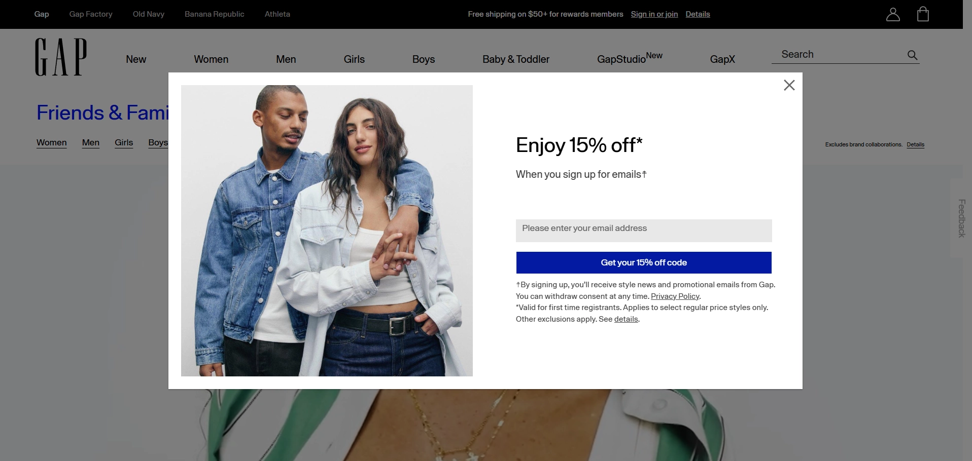
GAP’s form is a textbook example of sign up form that is built for conversions. It leans on a clear discount, simple structure, and brand-aligned visuals to quickly hook and convert.
What’s good about this sign-up form:
- Immediate incentive: "Enjoy 15% off" is a strong, direct value proposition that appeals to both deal-seekers and new customers.
- Minimal friction: One field only makes it easy and fast to complete.
- Clear CTA button: “Get your 15% off code” is benefit-oriented, not just a generic “Sign up.”
- Strong visual pairing: The look of the models connects the offer with the kind of fashion the shopper can expect.
What could be improved:
- Lack of personality: The tone feels a bit dry. A bit more warmth or brand voice could add more connection and engagement.
- Small print overload: The visual weight of the legal disclaimer makes the form feel less friendly.
Key takeaway
GAP’s sign-up form is ideal for high-volume conversions. But while it does the job, it misses a chance to build a deeper emotional connection with prospects.
6. CPD Online College
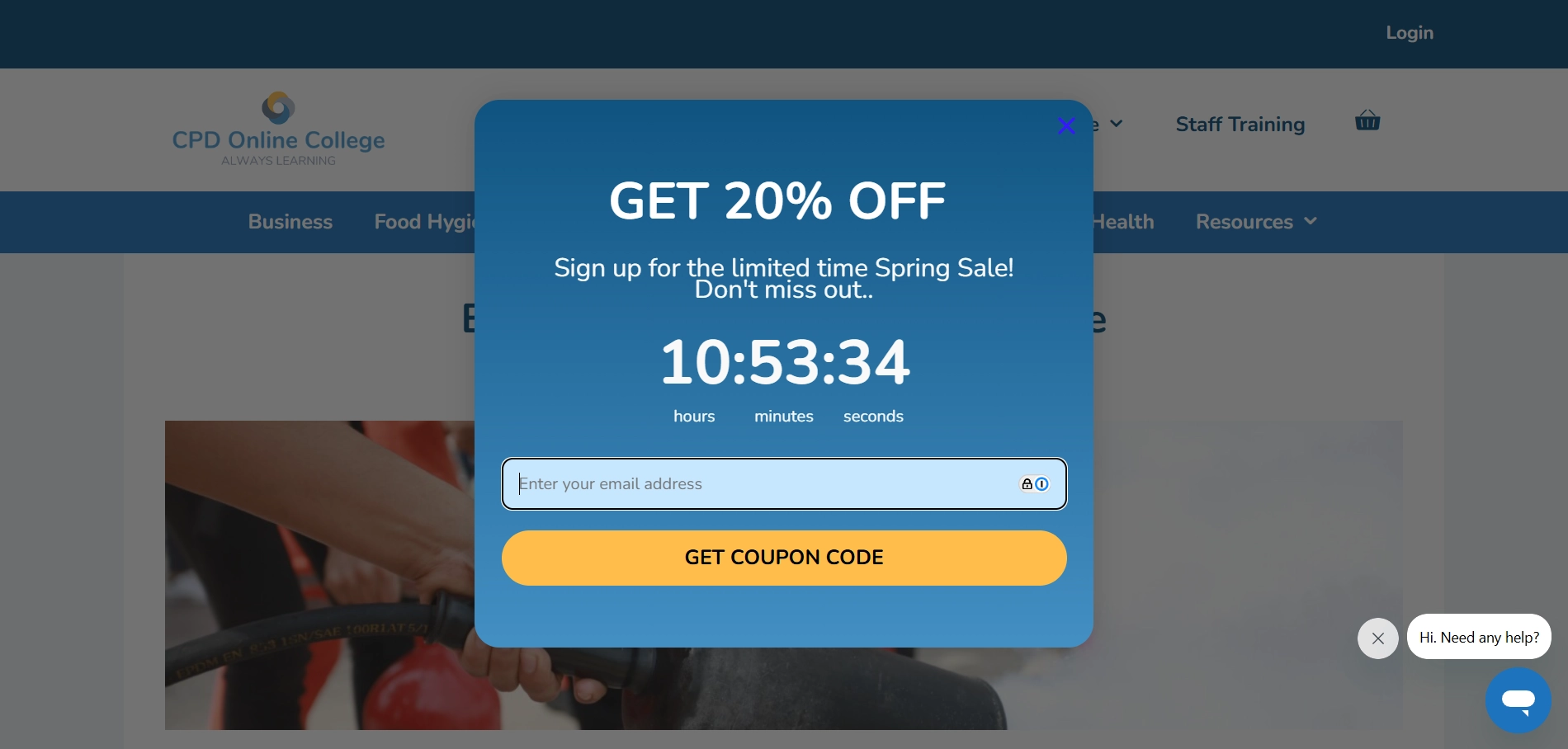
CPD Online College’s sign-up form slides in discreetly, offering a limited-time Spring Sale discount. The urgency of a countdown and a clear value proposition encourage users to act fast.
What’s good about this sign-up form:
- Sense of urgency: The countdown timer adds urgency and motivates users to act before the offer expires.
- Simple action: The form is clean and easy to follow, requiring just an email address to claim the coupon code.
- Clear value proposition: The offer of a 20% discount is a straightforward and compelling reason to sign up.
What could be improved:
- Lack of trust signals: While the countdown and offer are compelling, the form could benefit from some trust-building elements (e.g., security badges, testimonials, or reassuring microcopy) to increase user confidence in sharing their email.
Key takeaway
This signup form design is an excellent example of how urgency and a clear value proposition can work magic and spark immediate action.
7. Spiritual Gangster
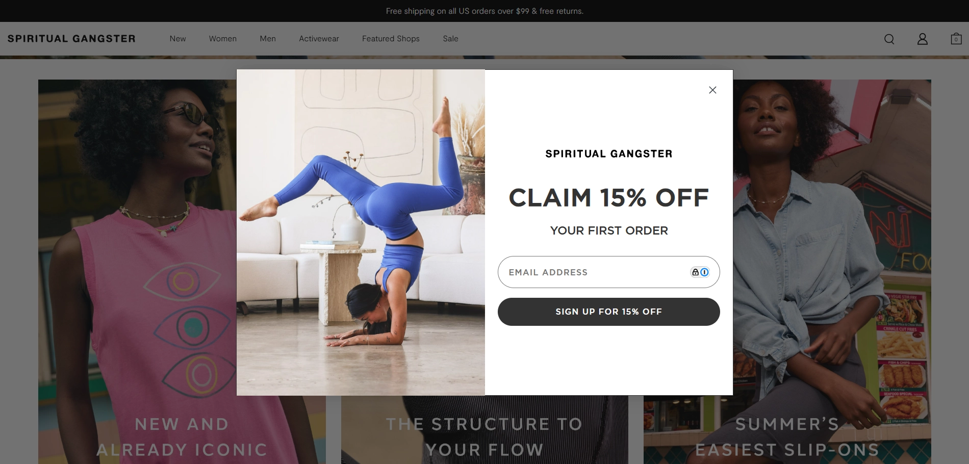
Spiritual Gangster’s sign-up pop-up is a good example of how wellness vibes can blend with a direct offer. The minimal layout, aspirational imagery, and clear incentive make it easy for visitors to engage.
What’s good about this sign-up form:
- Clear, compelling offer: “Claim 15% off your first order” is straightforward and benefit-driven.
- Clean design: The uncluttered layout keeps focus on the message and reflects the brand’s calm, purposeful aesthetic.
- Aligned imagery: A woman doing yoga and wearing SG products immediately communicates who the brand is for and what kind of lifestyle it supports.
- Action-oriented CTA: “Sign up for 15% off” leaves no place for second-guessing about what users get and what to do.
What could be improved:
- Tone lacks soul: The copy is functional and delivers the message, but it misses the soulful, empowering energy the brand broadcasts on other pages. A few changes to reflect mindfulness could build stronger emotional resonance with the audience.
Key takeaway
Spiritual Gangster’s popup is clean and effective — it hits all the technical marks for conversion. A bit of brand voice could turn a routine sign-up form into a memorable brand touchpoint.
8. ASYSTEM
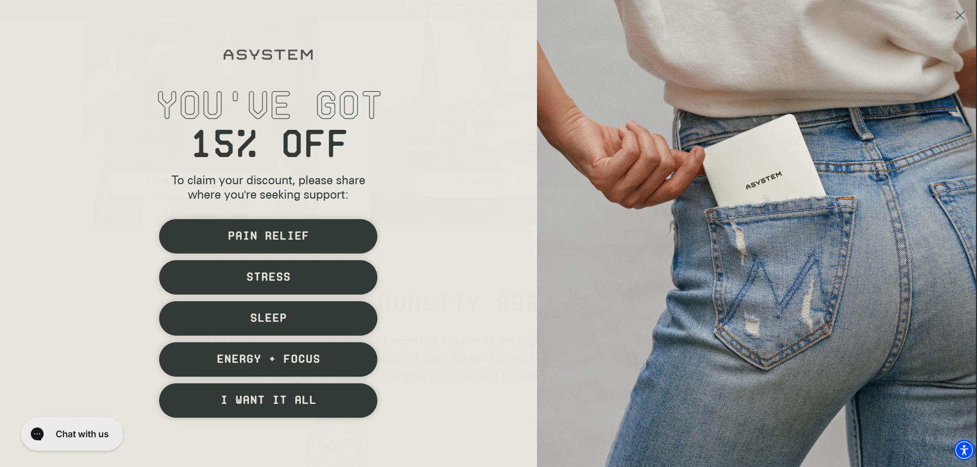
ASYSTEM’s multistep sign-up form turns a simple discount into a guided experience. From the very first step, it narrows in on customer intent, setting the stage for more personalized marketing while maintaining a clean, branded design.
What’s good about this sign-up form:
- Intent-based segmentation: Asking users where they need support (pain, stress, sleep, etc.) not only feels relevant, but also helps ASYSTEM tailor follow-up messaging for their email marketing campaigns.
- Value reminder: Each sign-up page throughout the interaction consistently reminds users why they’re filling out the form, with a striking 15% off offer.
- Visual and verbal alignment: The minimal layout, paired with the casual image of the product, reinforces ASYSTEM’s message — wellness that’s modern, effortless, and part of your daily routine.
What could be improved:
- Friction in the final step: Requiring a phone number after collecting an email may feel too much, especially without clearly explaining the benefit of SMS beyond “activating” the discount.
- Lack of transparency upfront: Users may feel surprised by the text opt-in screen. A preview or note in the first step could help manage expectations.
Key takeaway:
ASYSTEM’s form uses progressive disclosure and an engaging question to segment their customers. However, to build and maintain trust, you need to be transparent about the process and make sure every screen has a clear purpose, both functionally and emotionally.
9. Instacart
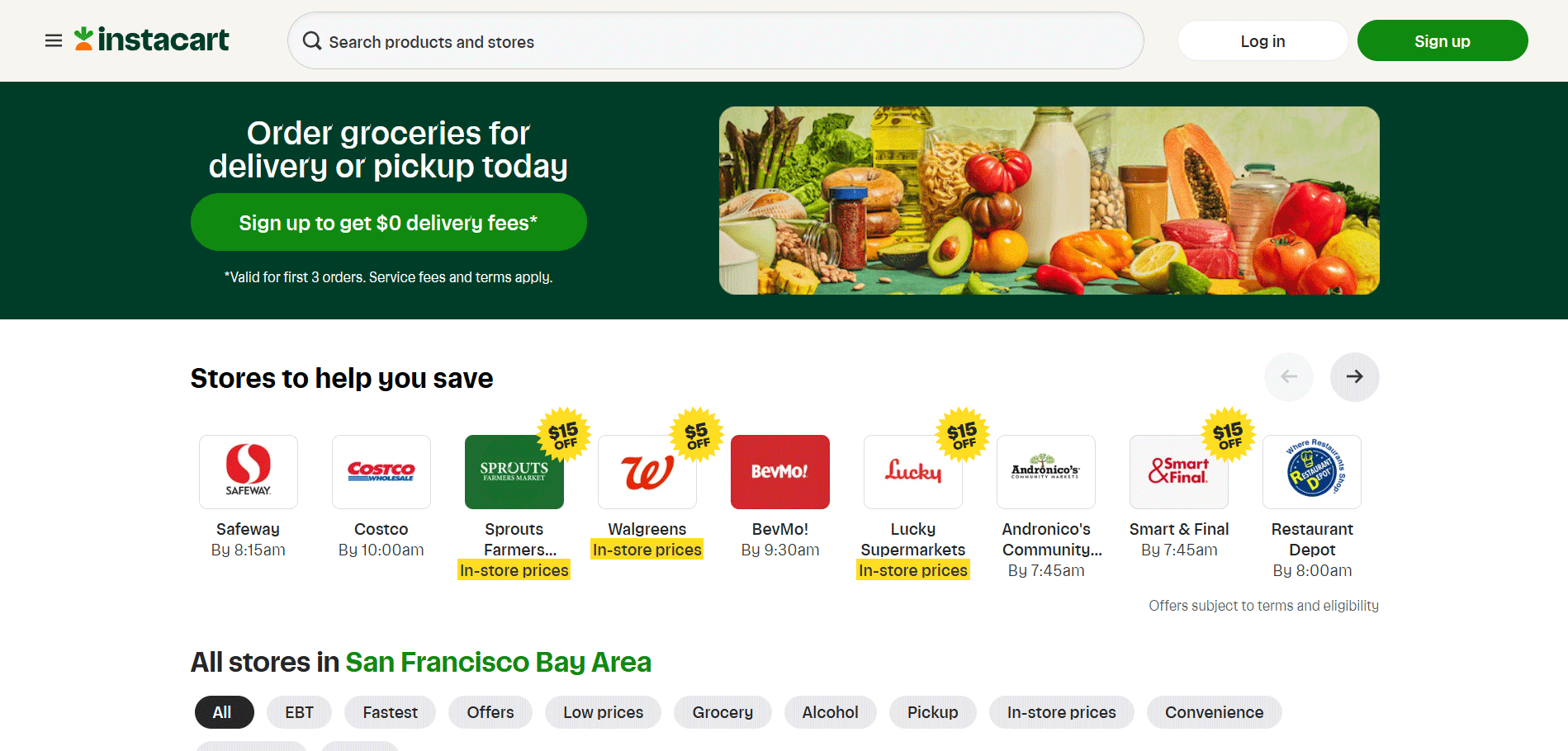
Instacart’s banner with free delivery meets you right at the top of the page and takes about a third of the space, making sure newcomers never miss the offer. What’s prominent about this user signup form is its seamless experience — it leaves no room for friction since a user has multiple ways to sign up (using Google, Facebook, phone, or email).
What’s good about this sign-up form:
- Eye-catching value proposition: The headline and offer of "$0 delivery fees" immediately grab attention, showing a clear and compelling reason to sign up.
- Multiple sign-up options: Offering several sign-up buttons lets users choose their preferred method, making the process more flexible and convenient. This is a great solution for cases when prospects are deterred by filling out forms themselves.
- Transparency about terms: The note about service fees and terms is upfront, helping manage expectations from the start.
What could be improved:
- Limited value beyond the discount: While the $0 delivery fee is eye-catching, the form doesn't explain why users should stick around after claiming the deal. Highlighting additional benefits — like wide store selection, fast delivery, or easy reordering — could strengthen motivation and increase sign-up rates.
Key takeaway
Even if you follow all the sign up form best practices, offer compelling incentives, and are triggered at the right moment, they can still suffer from email friction. If your data shows that users hesitate to share their email, consider incorporating social login options like Google or Facebook — they reduce friction, build trust, and streamline the path to conversion.
10. Aviator Nation
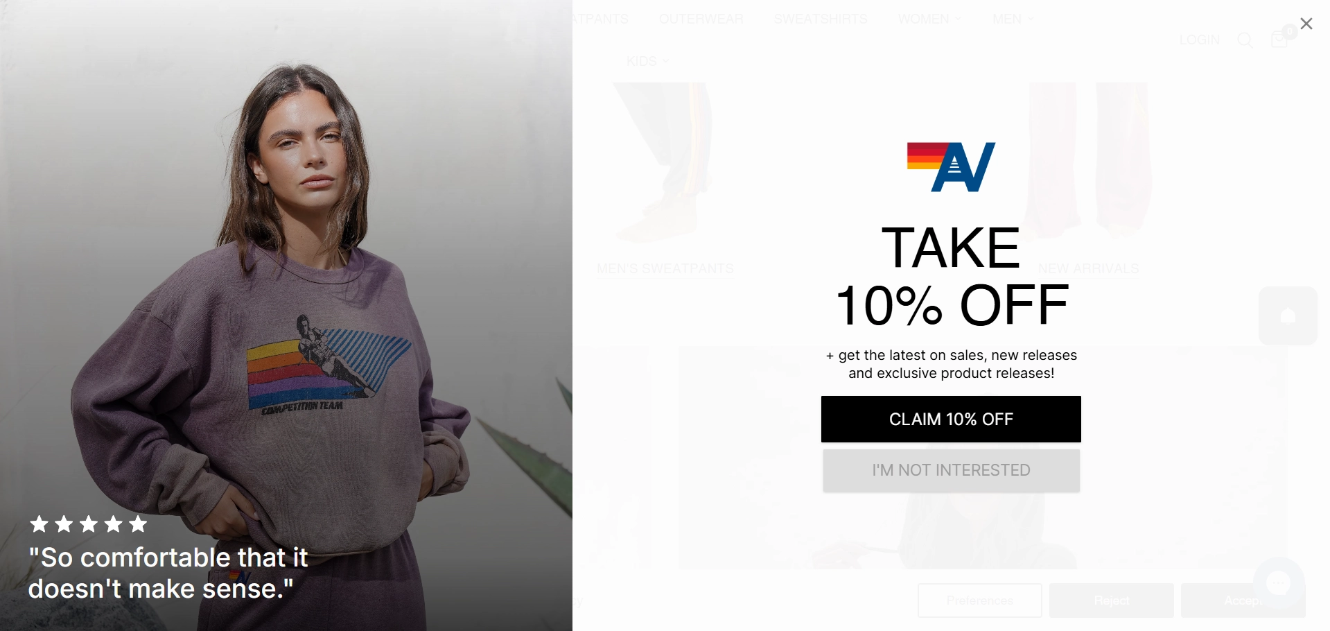
Aviator Nation’s welcome mat sign-up form is bold and immersive. It appears within five seconds of a user's first visit, takes over the screen, and uses a lifestyle image with a straightforward offer to nudge prospects into making a decision.
What’s good about this sign-up form:
- Quick, clear value: A discount and VIP access to sales and new releases tell users exactly what’s in it for them.
- Emotional testimonial: Five-star ratings and customer testimonials are the trust signals that speak shoppers’ language.
- Opt-out button: The “I’m not interested” button is a great tool that respects users’ autonomy and leaves them in control of the form.
What could be improved:
- Interruptive timing: Triggering a full-screen takeover just five seconds after landing can feel abrupt, especially before a user has explored the brand. A slight delay or triggering after a scroll or intent action could reduce bounce rates.
Key takeaway
Aviator Nation’s welcome mat combines a compelling offer with a respectful UX move — the “I’m not interested” button. This allows users to make a choice without feeling forced, creating a more positive first impression that builds trust.
11. NATV Basics
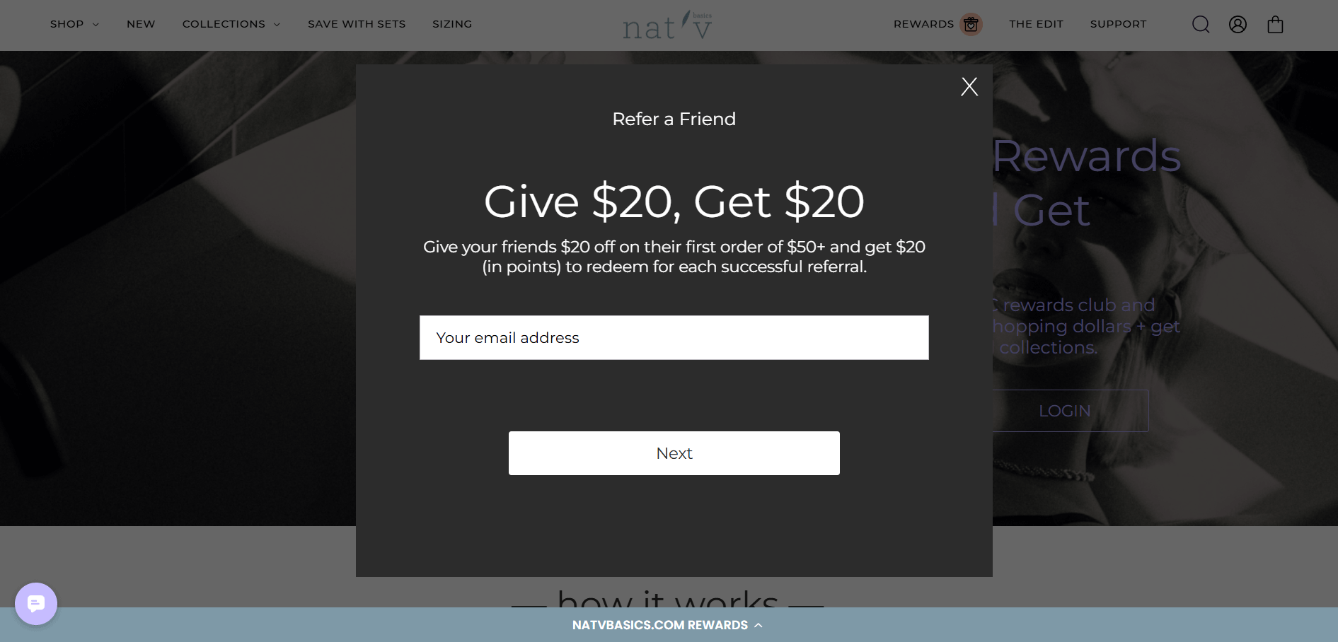
NATV Basics made a smart move and turned one sign-up form into two. Referral sign-ups aren’t very common, however, they can capture emails and drive word-of-mouth at the same time, especially if prospects are into your product.
What’s good about this sign-up form:
- Strong incentive: The $20 discount is clearly communicated. It’s mutually beneficial, giving both the referrer and the new subscriber a reason to take action.
- Direct explanation: There is a brief explanation of how the discount works, which reduces confusion and builds trust.
- Minimal friction: Only one field keeps the entry barrier low.
- Built-in social sharing: Users can not only refer a friend’s email, but also spread the word on social media, providing virality and wider coverage for the brand.
- High-contrast layout: The black background with white form elements ensures the email field and CTA button stand out.
What could be improved:
- Generic CTA: Instead of just “Send,” something like “Claim Your $20” could be more persuasive.
- Lack of branding: There are no product images or mention of what NATV Basics sells. New users landing here cold might not know what they’re signing up for.
Key takeaway
NATV Basics makes the most of a simple format, combining a clear reward with easy sharing tools to maximize growth. While the design is simple, the social sharing and compelling incentives are doing heavy lifting.
12. Cosmetic Capital
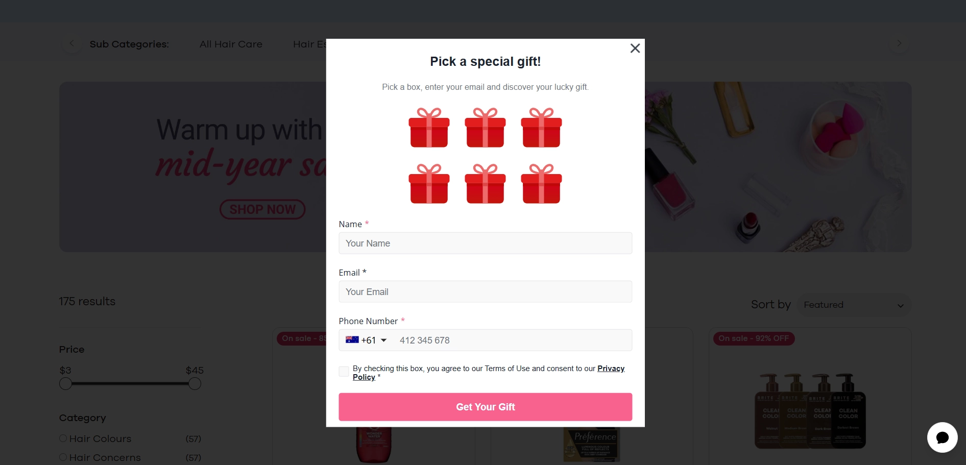
Instead of giving the usual “10% off”, Cosmetic Capital gamifies the experience with mystery gifts. With its bold colors, playful icons, and direct CTA, this form is designed to engage quickly. Let’s see what’s in it.
What’s good about this sign-up form:
- Gamified hook: The “Pick a special gift” format adds a sense of interactivity and surprise, which can boost engagement and opt-ins.
- Bright visuals: Pink buttons, red gift icons, and a simple field layout create a cheerful, on-theme experience that fits the cosmetics category.
- Mobile-friendly layout: Vertical stacking and large buttons make this form easy to complete on any device.
What could be improved:
- Unclear reward: “Pick a gift” is enticing, but users don’t know what they’re getting, which may raise skepticism. A line like “Win a mini mascara, lip gloss, or 15% discount” would set clearer expectations.
- Friction from required phone number: Requiring all three fields (name, email, phone) might deter some users.
Key takeaway
A fun, visual-first approach can drive engagement, as long as the reward feels real.
Newsletter Sign-Up Forms That Actually Make People Want to Subscribe
13. Cowboy
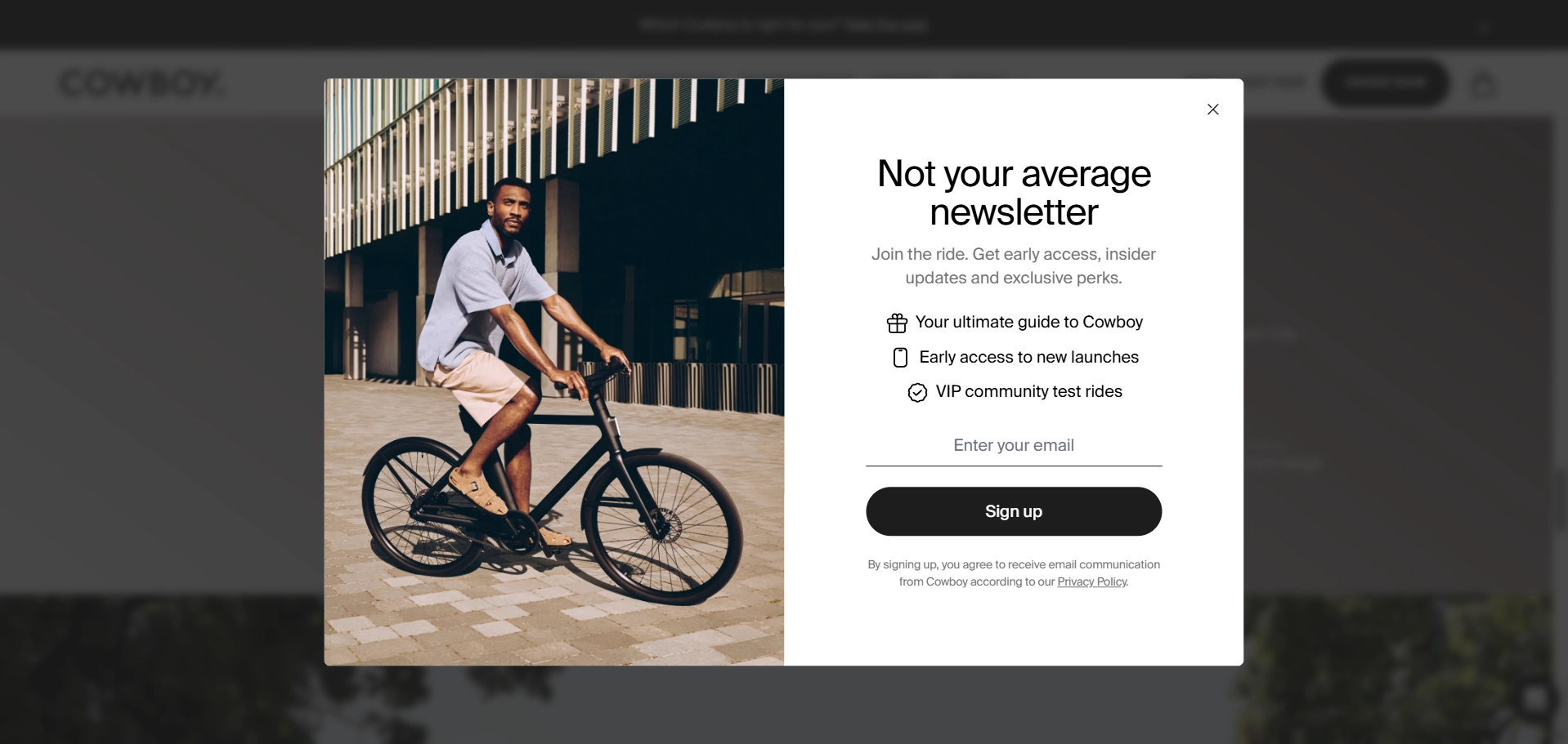
When you look at it, this sign-up form not only collects emails, it’s a VIP pass to a lifestyle. Besides, it's designed to hook prospects early. Let’s dissect this benefit-driven sign-up pitch and see if it lives up to the promise.
What’s good about this sign-up form:
- Unique positioning: The headline “Not your average newsletter” sets the form apart from standard promotional emails and offers a sense of exclusivity.
- Clear value: The bulleted list quickly shows users what they will get.
- Strong visual: The product and the lifestyle image speak for themselves, inviting prospects to become part of the club.
What could be improved:
- Popup trigger: Quick timing may feel too aggressive, especially for this product category. Proper display settings could increase engagement.
Key takeaway
Cowboy’s sign-up form is more than a newsletter opt-in — it’s a gateway to the brand’s lifestyle. Strong headline, VIP perks, and compelling visuals add to exclusivity. However, great storytelling needs great timing, thus, a delayed trigger is a must.
14. YOOX
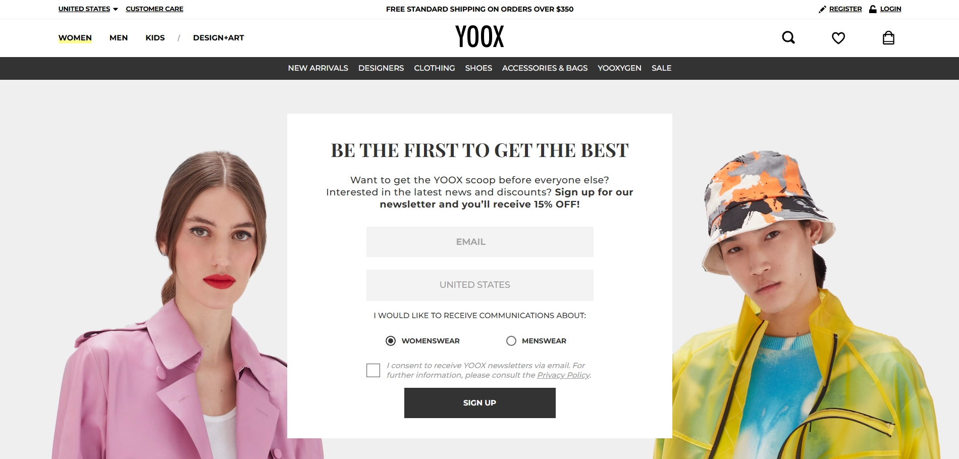
With a clean layout and fashion-forward tone, YOOX keeps things simple and elegant. Let’s see how they achieved it.
What’s good about this sign-up form:
- Gender targeting option: To personalize future communications, Yoox uses a smart move for segmentation by letting users choose between womenswear and menswear.
- Clear consent language: The form includes an explicit opt-in with a checkbox, ensuring GDPR-friendly compliance. The brand is transparent about its policy, which helps build trust.
- Extra incentive: Users sign up for the newsletter plus get a 15% discount. Even though it’s a familiar practice, it’s still effective in fashion eCommerce.
- Visual design: The form is balanced, with clean typography and seamless integration with the surroundings.
What could be improved:
- Generic CTA: “Sign up” is functional but standard. A more value-driven CTA like “Get My 15%” or “Unlock the Discount” could better encourage action.
Key takeaway
When everything looks perfect but doesn’t work, check the CTA.
15. The Black Tux
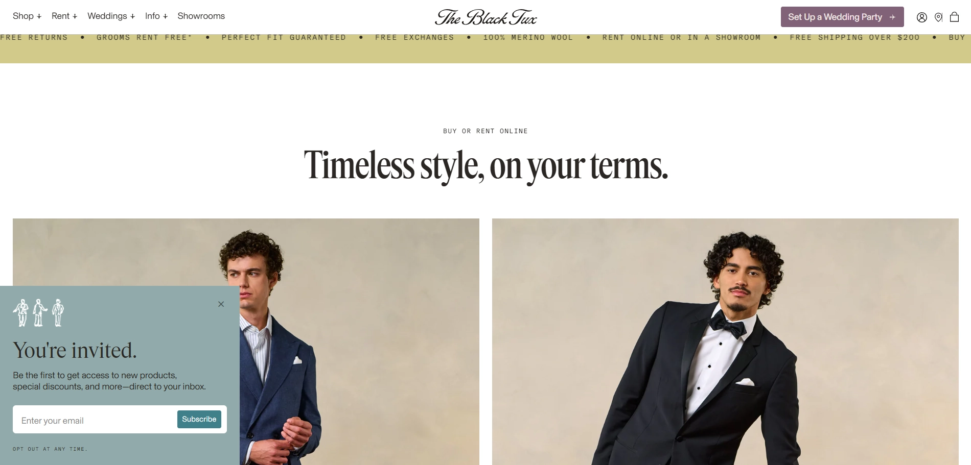
The Black Tux knows what it means to be classy, so they stick to it in everything. This form doesn’t pop, flash, or shout, and that’s the point. Sliding in quietly from the corner, it mirrors the tone of the brand: understated, polished, and intentional, which makes it one of the most beautiful signup forms on the list.
What’s good about this sign-up form:
- Elegant messaging: “You’re invited” fits the brand’s formalwear positioning and feels more like a personal gesture than a typical marketing trick.
- Slide-in placement: The sign-up form is positioned in the lower corner, doesn’t interfere with the experience, and feels more like a gentle invitation than a demand. This is an ideal fit for a premium brand journey.
- Subtle microcopy: The “Opt out at any time” message builds trust without cluttering the design.
What could be improved:
- Lack of specific value: Many users are likely to scroll past without a reason to sign up now.
Key takeaway
Minimal doesn’t mean forgettable — when tone, placement, and copy align with brand values, even a quiet form can convert.
Want more inspiration beyond these three? Check out our curated list of the 25 best sign up for newsletter examples packed with fresh ideas to help you design smarter, better-performing forms.
Sign-up Forms That Give Instant Value for Emails – Freebies, Guides & Free Resources
16. Private Label Skincare
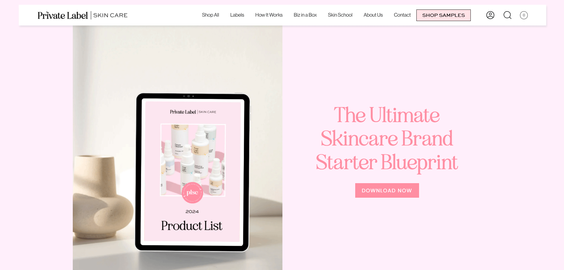
Another great way to get emails is to offer unique content. In this case, Private Label Skincare offers a lead magnet with real value: a downloadable guide to launching a skincare brand. This resonates with their target audience, since the company sells white-label skincare products.
What’s good about this sign-up form:
- Tangible offer: a blueprint on how to start a business can beat any discount or product update email. It speaks directly to users' goals, which makes it feel immediately useful.
- Educational positioning: Framing it as a “starter guide” shifts the value from salesy to supportive, just what first-time founders need.
- Progressive data capture: Asking for name, email, and phone number upfront may seem like a lot for a B2C sign-up form, but in this B2B context, it helps qualify leads and opens up SMS as a future marketing channel.
What could be improved:
- Weak CTA: “Download” is functional, but flat. A more active verb or benefit-driven CTA (“Get the Guide” or “Start Your Brand”) could encourage better.
- Overuse of capitalization: Title case is good for headlines, but using it in descriptions or long blocks of text reduces readability and breaks the natural rhythm of reading.
Key takeaway
Offering real value is step one. Delivering it through intuitive page design and conversion-smart language is what seals the deal.
17. Hooper Ruff
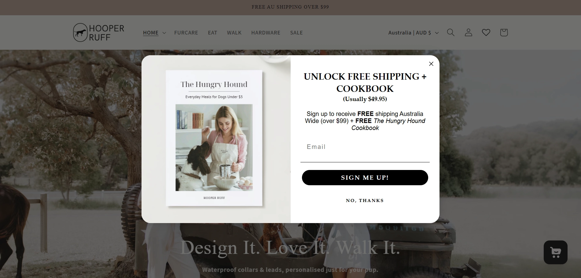
Hooper Ruff knows how to steal pet parents’ attention. Free shipping and a cookbook for dog lovers are a real bargain and value tailored to the audience.
What’s good about this sign-up form:
- Compelling incentive: While a discount may feel too generic, a dog cookbook is a useful, thoughtful gift that reflects the brand’s values.
- Double value: Combining free shipping and a gift amplifies the deal.
- Price anchor: Mentioning that the cookbook is “Usually $49.95” makes the offer feel more substantial. Classic pricing strategy never gets old.
- No-pressure approach: A clear, friendly “No, thanks” opt-out link is an often-overlooked detail that builds trust. It gives users a way to decline an offer without feeling trapped or guilty.
What could be improved:
- Minor context clarity: The offer mentions “over $99”, but it’s unclear whether a purchase is required to receive the cookbook. A line like “with your first order” or “no purchase necessary” could help users get rid of confusion.
Key takeaway
When your offer speaks to your audience’s values and lifestyle, not just their wallet, your form stops feeling like a sales pitch and starts building a connection.
Love the design examples? Now it’s your turn! Start building your own high-converting pop-up form with Claspo — it’s fast, easy, and free to try.
Forms That Get People Excited to Enter Your Giveaway or Contest
18. Oh So Fitting
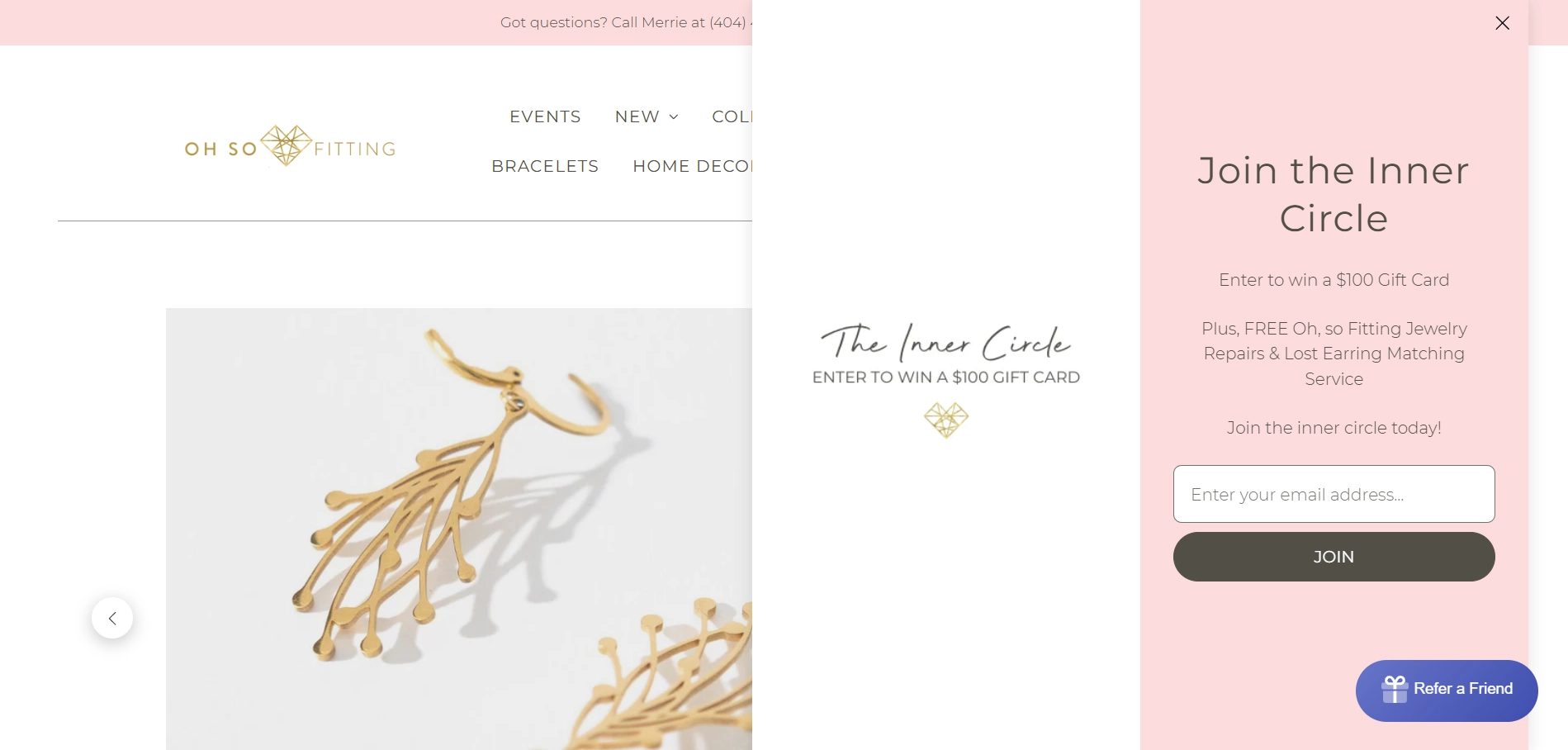
Unlike other Shopify-powered stores, Oh So Fitting offers more than just Shopify sign-up for newsletters. It promises exclusivity, a $100 gift card giveaway, and free jewelry services — all in exchange for just an email.
What’s good about this sign-up form:
- Incentive with added value: A chance to win a $100 gift card is a strong hook, especially when paired with free jewelry repairs and earring matching services — unique perks that feel brand-specific.
- Welcoming messaging: Invitation to the “inner circle” feels more like an exclusive community than a typical email list.
- Low-effort sign-up: Just one input and a clear CTA make signing up effortless.
What could be improved:
- Lack of urgency: The form doesn’t say how often gift card winners are chosen, or if there’s a deadline. Without that, the incentive may not feel time-sensitive enough to drive action.
- Low visual contrast: The form blends into the background due to similar coloring. Adding a blurred or darkened overlay would help it stand out and draw focus.
Key takeaway
Soft aesthetics paired with exclusivity can draw people in, but urgency pushes them to act.
19. Princess Polly
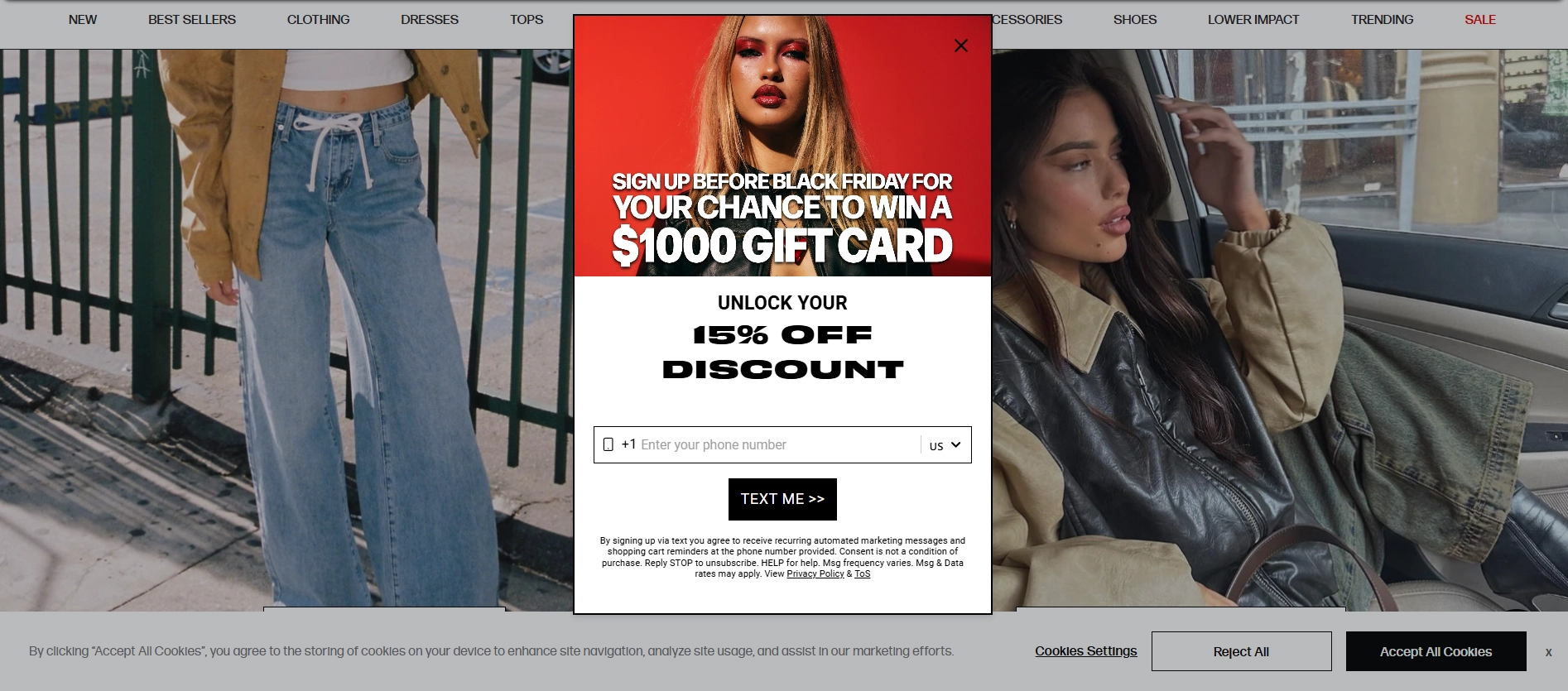
Princess Polly relies on bold visuals and big rewards to deliver to their prospects the same energy as the brand itself — fast, flashy, and built to convert.
What’s good about this sign-up form:
- Double incentive: Offering both a discount and entry into a high-stakes giveaway is a strong combo that appeals to impulse shoppers and deal seekers.
- High-impact visuals: The bold, editorial-style photography paired with aggressive typography makes this pop-up impossible to ignore — a good fit for the fast-fashion brand.
- Timely urgency: “Sign up before Black Friday” creates a deadline that motivates immediate action.
What could be improved:
- Unclear value hierarchy: Competing CTAs (“Win $1,000” and “Unlock 15% off”) fight for attention. One offer should lead, and the other one should support the deal.
Key takeaway
Big incentives work, but without visual focus and message clarity, even great offers can get lost in the noise.
20. European Wax Center
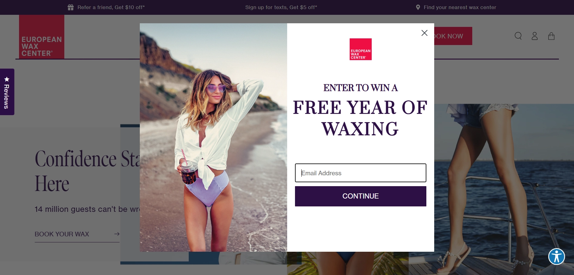
Simple doesn’t usually mean bad. Wax Center proves it with their clean and high-impact sign-up form.
What’s good about this sign-up form:
- On-brand, high-value incentive: A year of free waxing is a generous offer that speaks directly to the core service.
- Clean layout: Strong contrast, plenty of white space, and minimal distractions keep the focus where it should be — on the headline and CTA.
- Focused copy: Short, sweet, and easy to read. “Enter to win” says everything without fluff.
- Easy opt-in: One field without unnecessary steps.
What could be improved:
- Missed urgency: There's no deadline for the giveaway. Simple microcopy like “Ends soon” or “Winner chosen monthly” could drive more action.
Key takeaway
Sometimes all you need is a strong offer, a clear headline, and an email field.
This was the final brand from the category of the best signup form design. However, if you feel you need more signup form examples, please explore 40 inspiring email pop-up examples that turn user attention into real engagement.
5 Mistakes to Avoid in Signup Form Design
In sign up form design, even small missteps can lead to a poor user experience and lost conversions. Below, we’ve collected five common mistakes that can turn potential customers away. By learning from these, you can optimize your forms and create a smoother, more effective sign-up process.
1. Dbrand
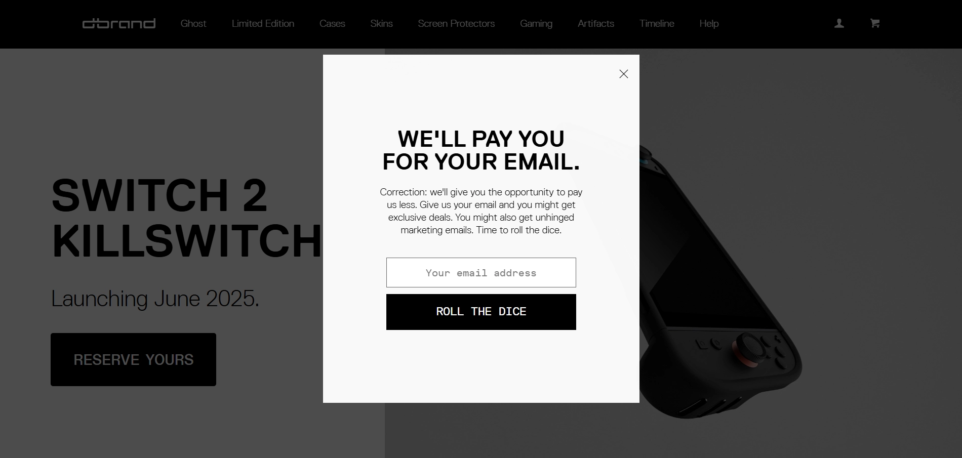
While Dbrand’s sign-up form seems provocative, does it really work the way it’s supposed to? An edgy tone of voice and humor can grab attention, but it risks backfiring when clear value is missing.
What to avoid:
- Confusing offer: “We’ll pay you for your email” sounds promising until it’s immediately walked back. Mixed messaging like this confuses rather than converts.
- Too much playful tone: Framing the sign-up as a gamble (“Roll the dice”) makes it feel risky, not rewarding. Personal data shouldn't be treated like a coin toss.
- Unclear message: Lines like “you might get exclusive deals” and “you might also get unhinged marketing emails” feel unserious. Besides, when one rolls the dice, one gets only one result. So, what exactly will a customer get when they make their move?
Key takeaway
A strong brand voice is powerful but not at the expense of clarity, trust, or motivation. Your email form still needs to answer the user’s core question: What’s in it for me? Humor should highlight the value, not hide it.
2. NUUN
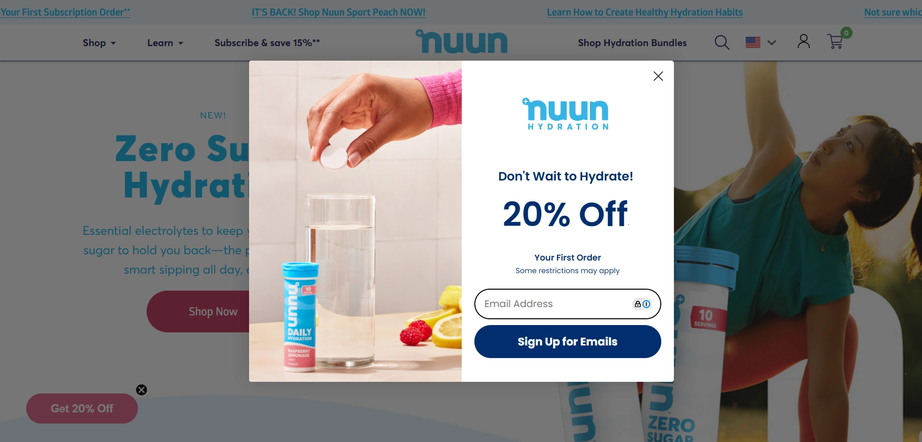
Unlike the previous brand on our list, NUUN decided to stick to minimalism and do less talking. The design is clean and eye-catching, but the messaging breaks down at the moment of action. While the incentive is solid, the CTA raises more questions than confidence. Here’s why.
What to avoid:
- Mismatch between copy and CTA: The form promises “20% Off” but the button says “Sign Up for Emails.” That disconnect creates friction and leaves users doubting whether they’ll get a discount or just fulfill business needs.
- Discouraging fine print: While it’s important to communicate terms, writing “Some restrictions may apply” right under the offer instantly undercuts all the excitement. Even worse, it offers no clarity: what restrictions? When forms raise questions instead of answering them, you lose conversions.
Key takeaway
Vague disclaimers and mismatched messaging erode trust. If you’re promising a discount, make it feel real, not conditional.
3. Fenty Beauty
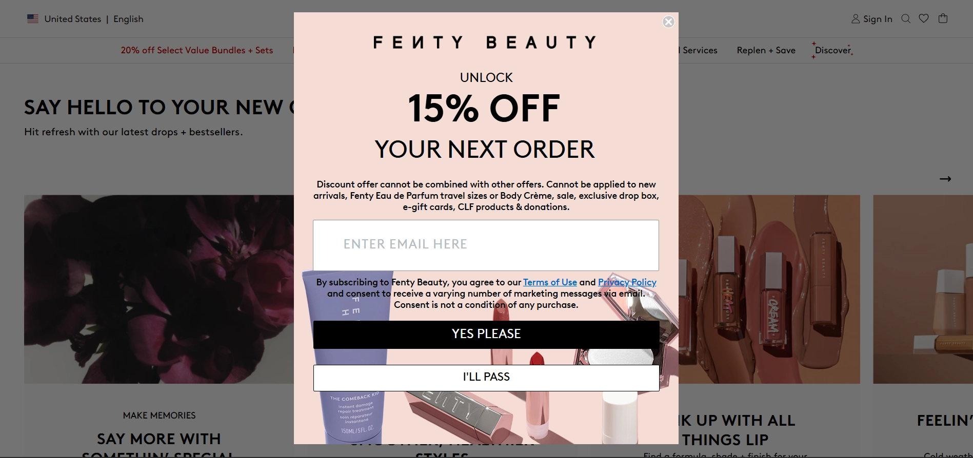
Fenty Beauty’s sign-up form is bold, but not in the best way. The brand is known for its glam aesthetics, but when one prioritizes visuals, usability can suffer. While the 15% discount may seem solid, the design could use some refinement.
What to avoid:
- Distracting background: The image behind the form is packed with colorful product shots, making it hard to focus on the text.
- Low readability: The offer text gets lost in the visual noise without a contrast box or overlay.
- Heavy fine print: The disclaimer is long and dense. It immediately follows the “15% OFF” headline and dampens excitement with a wall of restrictions.
Key takeaway
Design should support your message, not compete with it.
4. Gold Paw Series
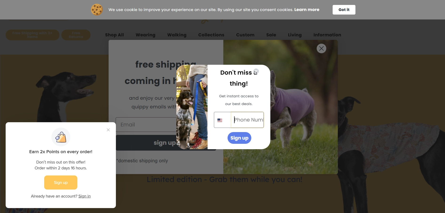
Goldpaw Series clearly wants your attention and your email, but their approach feels more like a digital ambush than a warm welcome. Within seconds of landing on the homepage, users are hit with not one, not two, but three competing sign-up forms layered on top of each other. Instead of boosting conversions, this tactic risks pushing visitors away.
What to avoid:
- Pop-up overlap: When multiple widgets trigger at the same time, demanding users' attention, users get overwhelmed. Instead of a smooth experience and product onboarding, they get visual overload and cognitive friction.
- Wrong timing: When a form appears too soon, your visitors don’t get a chance to get to know your brand. Moreover, if the form messaging feels pushy, you risk losing a client.
- Lost messaging: Each form offers a different incentive: points, deals, discounts. Instead of supporting the value, it dilutes it. One compelling offer would likely work better.
Key takeaway
Stacking sign-up forms doesn’t increase opt-ins — it breaks attention and trust. Strict hierarchy, thoughtful display rules, and smart timing will convert better than a pop-up waterfall.
5. Made in the Shady
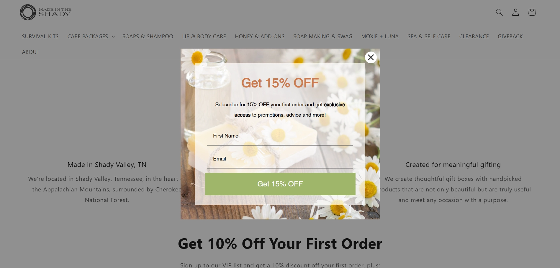
The Made in the Shady website experience feels like a stroll through a spring forest, until you stumble upon a fork in the trail — is it 15% off or 10% off first offer?
What to avoid:
- Conflicting incentives: Showing a 15% discount in the popup and a 10% offer on the page behind it confuses visitors. They may wonder which offer is valid, whether one is outdated, or if they’re being misled.
Key takeaway
Consistency is key. Once you choose the optimal discount off the first offer, stick to it across all sign-up touchpoints.
Best practices for high-converting sign-up forms
Once your form is designed well, it’s the small details that turn cool sign up forms into high-performing ones. Here’s what to focus on:
Clear purpose, minimal effort
The best signup forms don’t ask for too much and make it obvious why someone should sign up. That means one or two fields plus:
- A headline that communicates the value
- A button that makes the next step feel easy and worth it.
Remember, you’re not closing a sale here, you’re opening a door. The simpler the ask, the better the response.
Every Element Has a Job
A great sign-up form isn’t just a box with an input field, it’s a persuasion tool. Here’s what needs to work together:
- Headline: grabs attention and delivers value
- Sign up form fields: the fewer, the better
- CTA button: action-oriented and benefit-driven
- Visuals: an eye-catching product image that helps the form stand out
- Microcopy: small text that builds trust
Together, these elements of sign up form UI make your form not just visible, but compelling.
Don’t Show the Form Too Soon
Give visitors a moment to engage with your site before asking them to sign up. Exit-intent popups, scroll-triggered forms, or delays of a few seconds help your message land better. For instance, we recommend showing a “Sign up for our newsletter” widget at least 20 seconds after a user lands on the page.
Match the Message to the Moment
Your sign-up form should feel like a logical next step, not a distraction. That means tailoring the offer to what the visitor is doing right now. Are they reading a blog post? Offer a blog sign up form with a free resource or newsletter. Are they choosing a product? A discount or back-in-stock alert might hit the mark. And if someone’s about to leave, an exit popup tool can recover up to 10–15% of abandoning users by offering the right nudge at the right time.

“We noticed a big problem with our opt-in forms; people were either skipping them or unsubscribing after just one or two emails. We work with busy contractors and field service pros, so we realized we needed to cut the fluff and get straight to value. The biggest shift happened when we tied our forms directly to what users were doing on the site. For example, after someone used our cost calculator, we’d say, “Want us to send you a breakdown with tips to save time on job costing? Drop your email.” That one change alone improved opt-ins by over 40%.
We also moved away from static pop-ups and started embedding our forms into helpful blog posts and tool pages. These forms were simple, with no distractions, just a promise of more tools and advice tailored to their trade. We tested incentives like checklists, scheduling templates, and time tracking tips. AI helped us analyze which offers got the most engagement and which ones kept people subscribed.
The biggest lesson for us was that for our audience, personalization doesn’t mean using someone’s name; it means understanding their day-to-day struggles and offering real solutions, not gimmicks.”
Luke Chapman
Senior SEO Strategist, CRO Specialist, ClockShark
Focus on Benefits
A newsletter is just the envelope. What matters is the gift inside — the deal, the guide, the insight. That’s why your copy should make the value obvious. Instead of vague CTA’s like “Sign up” or “Submit”, use action-oriented buttons that tell users what they’ll get: “Get My 10% Discount”, “Send Me Tips”, “Unlock the Guide”.
The same goes for headlines and microcopy — they should focus on the benefit, not the mechanics. A simple change from “Sign up for updates” to “Get early access to new drops” can significantly improve conversions.
Minimize Friction
Each unnecessary field you remove brings users one step closer to converting. Keep your form as short as possible, especially on mobile. In most cases, just an email address is enough. Remember, you can always collect more details later — start simple to get the sign-up.
Reassure With Trust Signals
People hesitate when unsure what they’re signing up for, or who’s behind the form. That’s why small lines of reassuring microcopy can go a long way. Some extra phrases can help reduce friction and make people feel safe. For example:
- “No spam, ever.”
- “Unsubscribe anytime.”
- “We’ll never share your email.”
These trust signals don’t take up much space, but they make your form feel more human and respectful, which makes users more likely to say yes.
A/B Test One Change at a Time
Only guessing won’t get you conversions, but testing will. Experiment with different headlines, CTAs, images, form placement, timing, and triggers. But test one variable at a time to pinpoint what actually made the difference. Claspo’s signup form builder makes it simple to gather this data, helping you create more targeted and effective email campaigns.
Differentiate Placement Based on Context
Where and when you show a form can matter as much as what it says. The best sign up forms meet the visitor where they are in their journey without interrupting it.
Here’s what you can try to make it work:
- Embedded forms in blog posts or footers are subtle but effective for readers already engaged with your content.
- Popups for first-time or exiting visitors can capture attention when it matters most, especially when paired with a relevant offer.
- Slide-ins work well mid-scroll on product pages, nudging users without covering the main content.
- Sticky bars are great for promotions or free shipping alerts since they are always visible but not intrusive.
Use behavior-based triggers like scroll depth, time on page, or exit intent to time your forms right. Respect your users’ journey and avoid showing the same form again once they've already signed up. For the best results, avoid anything that might feel repetitive or intrusive. Now that we’ve covered the theory, let’s move on to practice by analyzing a few standout signup form examples.
Segmentation from the First Click
A sign-up form can also personalize your emails and nurture thankful customers from day one. Let users choose what they're interested in using with buttons like “I want discounts” or “I want tips”. Such a tactic is also great for collecting data like user preferences, birthday, gender, or any detail that helps you tailor future messages and offers.
Wrapping up
So, what’s the secret behind high-performing sign-up forms? It’s simple: make them feel natural, rewarding, and worth the user's time. Good design gets the email. Great design earns the user. When users feel like they’re getting something valuable, not just giving up their data, everyone wins.
Need a shortcut? Grab a ready-made signup form template from Claspo. With over 1000 flexible, beautifully designed templates for any need and occasion, you don’t need to reinvent the wheel. No code, no clutter — just smart timing, compelling messages, and forms that convert.


