
How to Create a Mobile Popup that Converts: Examples & Best Practices
We all know that responsiveness is super critical for mobile popups. Smaller screens, shorter attention spans, and a million other distractions mean you have seconds to get it right. However, when designed and used correctly, mobile popups are a great way to engage your casual browsers and turn them into subscribers or even customers.
In this post, we’ll break down the best practices for mobile popups, ensuring they engage users without disrupting their journeys. You'll learn how to create a mobile popup that just perfectly performs its functions, follows UI best practices, and remains responsive across all devices.
Table of Contents
10 Best Practices for Mobile Popups
10 Examples of Responsive Mobile Popups
How to Create a Mobile Popup Using a Popup Builder
What is a Mobile Popup?
A mobile popup is a type of website overlay or an on-screen message that appears on a mobile screen in response to specific triggers or user interactions. To better understand the definition of popup, consider how it functions on mobile devices. A popup is designed to appear in response to specific user actions, capturing attention and encouraging conversions. Whether it’s a promotional offer, lead capture form, or a simple notification, the definition of popup encompasses these types of interactions designed to engage users effectively. It can take different forms like small banners, full-screen overlays, slide-ins, but the core function is the same: to deliver a message that prompts an action. It is designed to capture attention and encourage specific actions, such as subscribing to a newsletter, claiming a discount, or consenting to cookie policies.
Unlike desktop popups, mobile popups must be carefully optimized to fit smaller screens so they do not disrupt the user experience or cause frustration. Due to strict Google guidelines, intrusive popups that block content can negatively impact a website’s SEO ranking. So, while desktop popups can fill the entire screen or float from various sides, mobile options are more limited and they should not cover the entire screen or be difficult to close.
10 Best Practices for Mobile Popups
First, we’ll look at the principles for mobile popups that will help you convert website visitors without irritating them.
1. Use Responsive Popup UI Design
With mobile screens ranging from small smartphones to larger tablets, it's crucial that the mobile popup design stays responsive. This means it should automatically adjust to different screen sizes and orientations. Make sure to test your popups on multiple devices to ensure they display correctly and do not interfere with essential content.
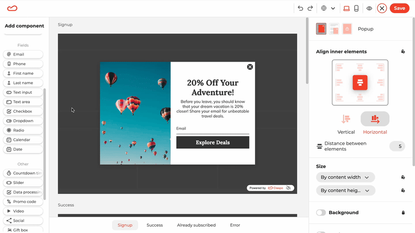
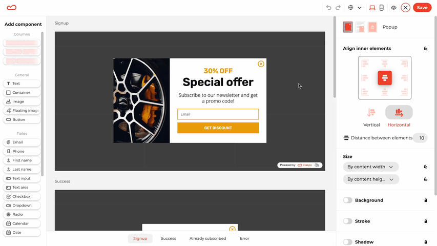
In Claspo, the column component is specifically designed for easy mobile optimization. It automatically arranges all elements of your widget into a vertical layout for a seamless mobile experience. Additionally, you have the flexibility to hide specific columns and their content in mobile mode while keeping them visible in the desktop version.
For instance, when creating a floating bar for smaller screens, you can hide the image column to shorten the pop-up’s length. If your widget includes just one or two form fields, consider keeping the image, as it can enhance emotional engagement and clarify the widget’s purpose for users. To determine which approach works best for increasing your conversions, you can use Claspo A/B testing feature to experiment with different versions.

Besides, when creating web widgets in Claspo, you can test how they display on different screen sizes.

2. Keep It Simple and Minimal
Mobile popups should deliver a clear message with minimal distractions. Avoid lengthy paragraphs, oversized images, or cluttered designs. Instead, opt for a clean layout that’s easy to read. When designing a lead capture popup for mobile, it's crucial to focus on clarity and simplicity. Keep your form minimal, ensuring it is both easy to interact with and quick to submit. Use concise, impactful headlines paired with a few lines of supportive text, and ensure your CTA stands out.

3. Make the Close Button Easy to Find
Make it simple for users to close popups without extra effort. Position the "X" or close button in a familiar spot — typically the top right or left corner — and ensure it’s large enough for comfortable tapping. We recommend a minimum size of 44 x 30 px for mobile buttons to enhance usability.
This is important for mobile users, as popups that are difficult to close can lead to frustration and increased bounce rates. A well-placed close button promotes a smoother user experience and encourages further exploration.
4. Avoid Full-Screen Popups
To ensure a positive user experience and comply with Google’s guidelines, avoid using full-screen popups that block access to your content. Google penalizes sites that employ intrusive interstitials, especially those that completely take over the mobile display. Instead, opt for smaller popups that cover no more than 25% of the screen. This less disruptive approach enhances user engagement while ensuring your site adheres to mobile usability standards.
If you still need a pop-up in the center of the screen, a launcher can make it less irritating for mobile users. However, this element also takes up space on the screen and, unlike a pop-up, cannot be closed.
The launcher is small, so don't overload it with content. Write a catchy CTA or add a clear image or icon such as an envelope for a subscription form, or use telephone callback form template. It should encourage users to click on it to see a mobile-friendly pop-up with more detailed information.
For example, this is how the Decor Market launches a request form.

5. Prioritize Fast Load Time
Mobile users expect speed, and slow-loading sites can lead to quick exits—52% of mobile shoppers will abandon your website after a bad experience. To keep users engaged, make sure your pop-up is lightweight and opens instantly without dragging down overall page performance. Optimize images, avoid heavy animations, and implement efficient coding practices to deliver a fast and seamless experience, a priority for cross-platform app development companies aiming to enhance user satisfaction across all devices.
6. Use Mobile-Specific Triggers
Set up your triggers based on user behavior: consider using scroll-triggered pop-ups when users have scrolled through 50-75% of the page or employ time-delay pop-ups after a few seconds of engagement. Avoid displaying pop-ups immediately upon page load, as this can disrupt the user experience before they’ve had a chance to engage with your content.
With Claspo, it’s easy — just activate the relevant rules in your widget display settings. Plus, we offer Overlapping Protection and Annoyance Safeguard features. Overlapping Protection keeps your website clean by preventing multiple popups from appearing at the same time, ensuring a smoother user experience. Meanwhile, Annoyance Safeguard manages how often popups appear so visitors aren’t overwhelmed, leading to better engagement.
7. Focus on One Clear Call-to-Action
Avoid overwhelming users with multiple choices; instead, focus on one eye-catching CTA that’s easy to tap, like “Sign Up Now,” “Get 10% Off,” or “Download Free Guide.” Ensure the button is large enough for mobile use and surrounded by ample white space to prevent accidental clicks. You can also include an opt-out button that closes the popup, with clever copy like “No, I’ll pay full price” to make users reconsider missing out on the offer.
For mobile popups, it’s best to expand the CTA button to the full width of the screen. This approach makes it easy for users to tap, no matter how they hold their phone, ensuring accessibility for both right-handed and left-handed users.
8. Minimize Form Fields
When adding forms to your mobile popups, less is more. Stick to one or two essential fields, like name and email, to streamline the process. Long forms can be frustrating on small screens, increasing abandonment rates.

For more complex data collection, consider using multi-step forms. This approach breaks the process into bite-sized steps, keeping users engaged without overwhelming them. If you're looking to gather more information from your users, a multi-step popup could be a great solution. This approach uses a sequence of forms or questions displayed one at a time, reducing the cognitive load and keeping users engaged without feeling overwhelmed.
9. Use Exit-Intent for Mobile
Exit-intent on mobile is a bit more challenging than it is on desktop since there’s no mouse cursor. On mobile, use back-button exit-intent popups that activate when users tap the back button, indicating their intent to leave. To improve user retention, implementing exit intent on mobile can be an effective strategy. By triggering pop-ups when users attempt to leave your site, such as tapping the back button, you can capture valuable leads or offer incentives that encourage them to stay. This approach ensures that even without a mouse cursor, you can still engage mobile users at a crucial moment.
This tactic is less intrusive yet still gives you a valuable opportunity to engage users, whether offering discounts or capturing leads. Additionally, Claspo has a display rule: "Not active on the page for X time." You can also use this condition to trigger your popup.

10. Test and Optimize Regularly
Mobile user behavior tends to change, so regular testing and optimization are essential. Run A/B tests on different elements like designs, CTAs, and triggers to find what resonates best.
Track important metrics such as click-through, conversion, and bounce rates to assess performance. With these insights, you can make informed tweaks that keep improving your popups. Stay flexible, and keep optimizing based on the data to ensure you’re reaching your goals.
Bonus Tip 1. Exclude Return Visitors
According to a G2 survey, 19.2% of users find repetitive popups frustrating, while 45.6% feel overwhelmed when popups appear too frequently across pages. To enhance user experience and avoid annoying visitors, set display rules for popups so that returning users only see them once. This approach prevents repetitive interruptions and helps maintain a positive interaction with your content.
Bonus Tip 2. Implement Floating Bars at the Bottom
A floating bar positioned at the bottom of the mobile screen offers a less intrusive way to capture attention without disrupting the user experience. Use it for subtle reminders like sign-ups, promotions, or cart abandonment. Since the floating bar remains visible as users scroll, it enhances visibility while keeping the interaction seamless and enjoyable.
10 Examples of Responsive Mobile Popups
Now, let’s look at mobile pop-up examples to understand the do’s and don’ts to follow when adapting your widgets for mobile devices.
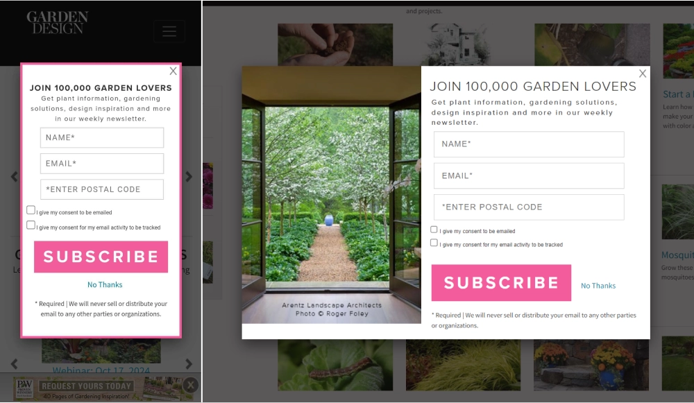
1. Garden Design
This company created a subscription form for both desktop and mobile versions of their website, but they made some adjustments for mobile. First, the mobile pop-up doesn’t include an image, as images take up too much space and force users to scroll.
Instead, they added a colorful border matching the button to create a visual accent. They also changed the layout: the popup on mobile has buttons stacked vertically, whereas on desktop, they are aligned horizontally. This seemingly little tweak allows to keep the design of the mobile popup coherent.
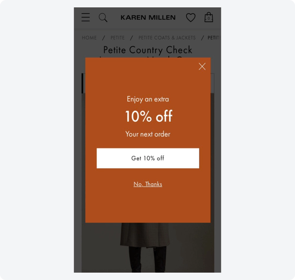
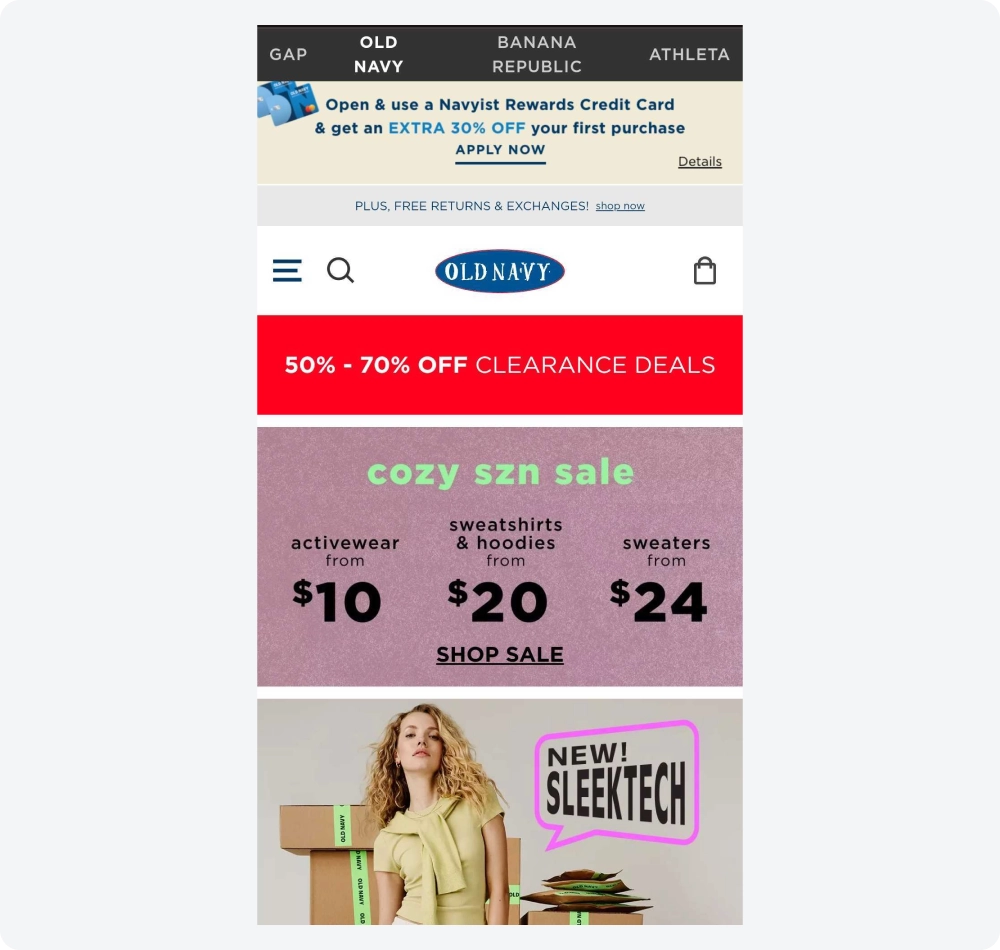
2. Old Navy
Old Navy took a different approach and used a completely different type of popup for mobile. On the desktop, the discount widget appears as a popup after the visitor has spent some time on the site, featuring an image and a prominent CTA button.
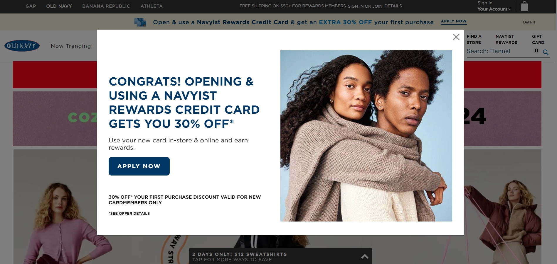
On mobile, this widget becomes a floating top bar without images and in different colors, featuring clickable text instead of a button. This mobile pop-up design doesn’t interrupt browsing yet delivers the message and remains visible until it gets closed.
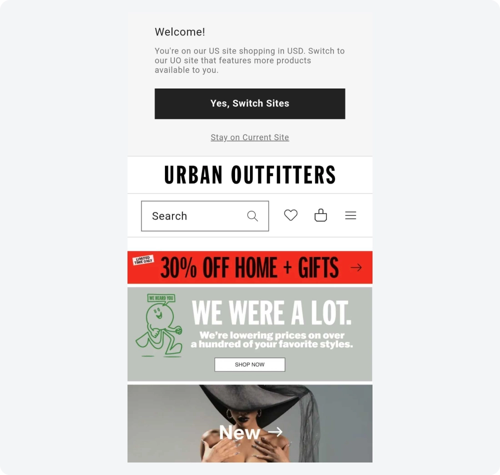
3. Urban Outfitters
Urban Outfitters created an informer that grabs attention with bright colors and a bold discount highlighted in large font. This vibrant design draws the customer’s eye, while the button encourages immediate action.
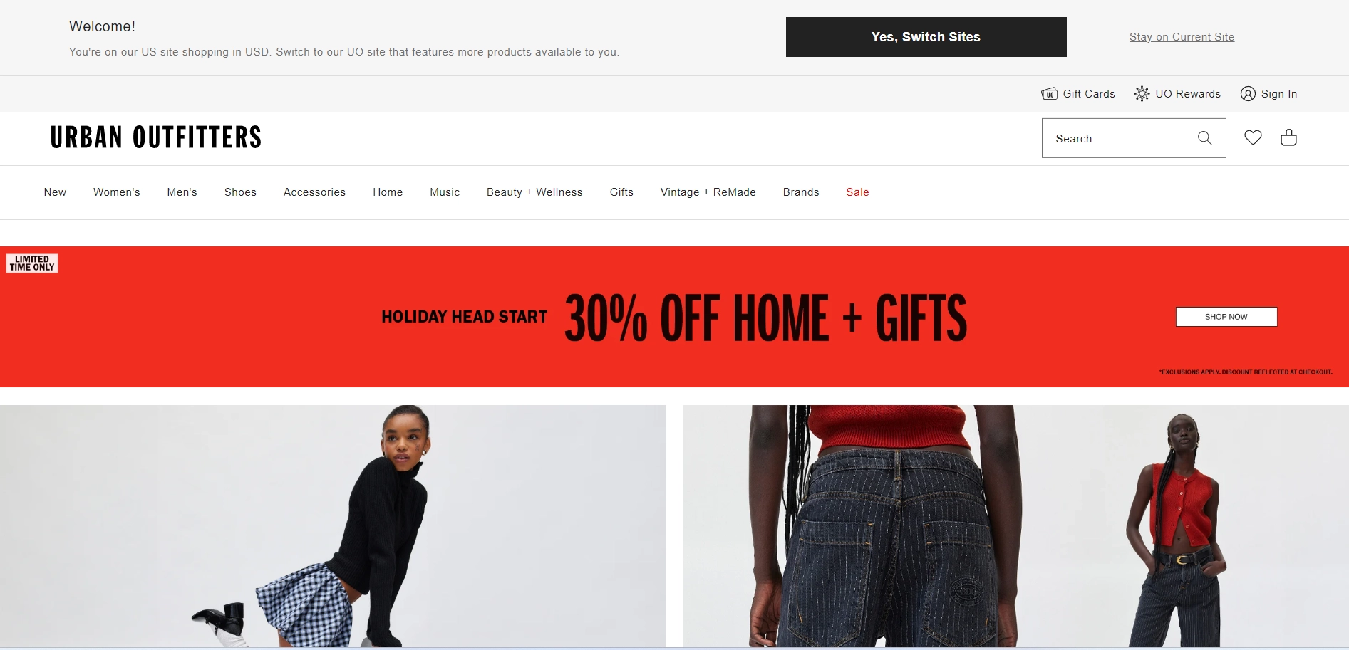
The mobile version's design was slightly adjusted: the button was replaced with a simple arrow, and the text was shortened to ensure the main message remained clear and easy to read on smaller screens.
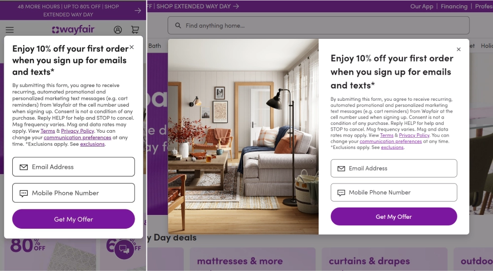
4. Wayfair
This company’s mobile popup form is generally a good example in terms of how the elements are stacked. They optimized it by removing the image to save space. They didn’t quite get the close button right — it feels too small and cramped next to the text.
Additionally, the subscription form immediately presents the user agreement when collecting data. While this builds trust, using such long text in the pop-up on mobile might overwhelm visitors, causing them to close it instead of reading.
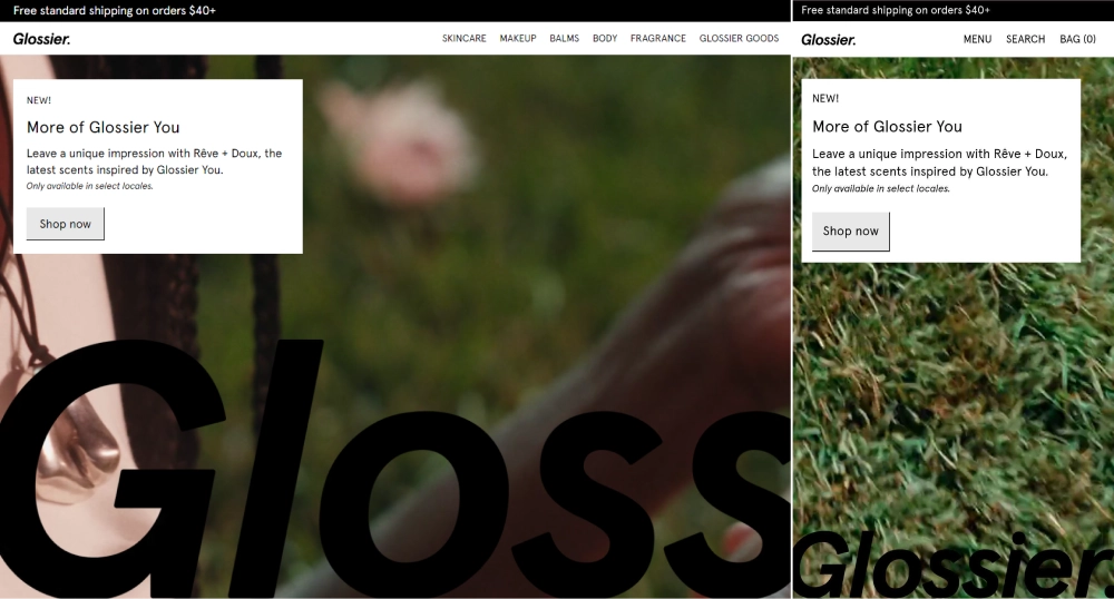
5. Glossier
This example illustrates how a slight change in layout can enhance the interaction with a popup. On desktop, the popup appears as a small window in the upper left corner, while on mobile, it takes up about one-third of the screen. This adjustment allows visitors to read the text and comfortably tap the button easily.
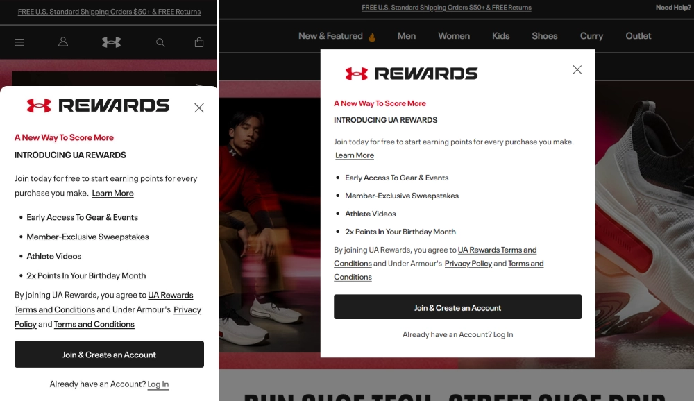
6. Under Armor
This company’s mobile popup demonstrates the powerful impact of font size on how users perceive information. To enhance mobile usability, they optimized the text size. While the content remains unchanged — neither shortened nor altered — it’s still easy to read on mobile. The popup takes up two-thirds of the screen, improving visibility, while it’s centered nicely on the desktop version.
7. Victoria’s Secret
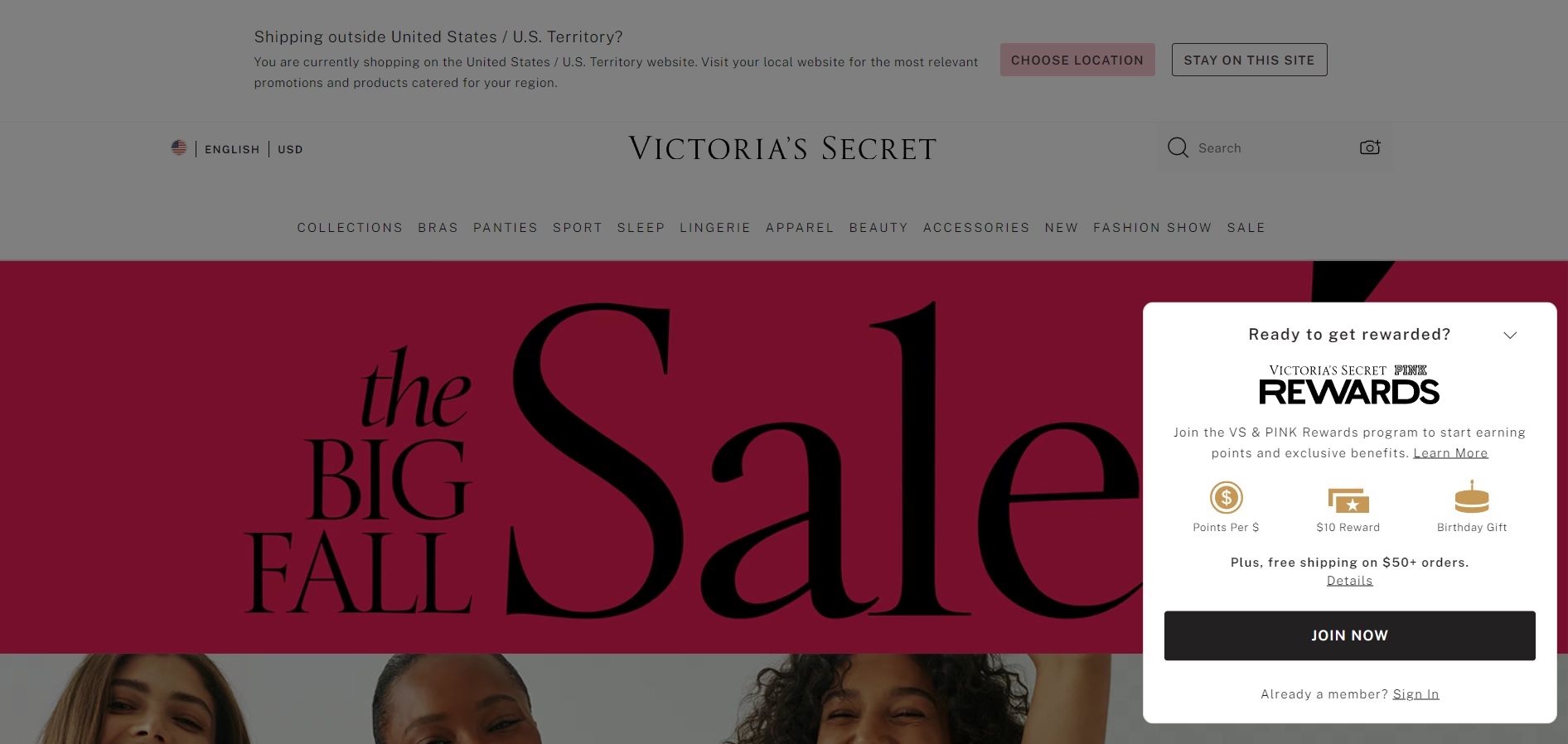
Victoria's Secret used a launcher to enhance the user experience on mobile. Instead of displaying a popup like on the desktop version, they incorporated a small button that, when clicked, opens a popup with the details of the offer.
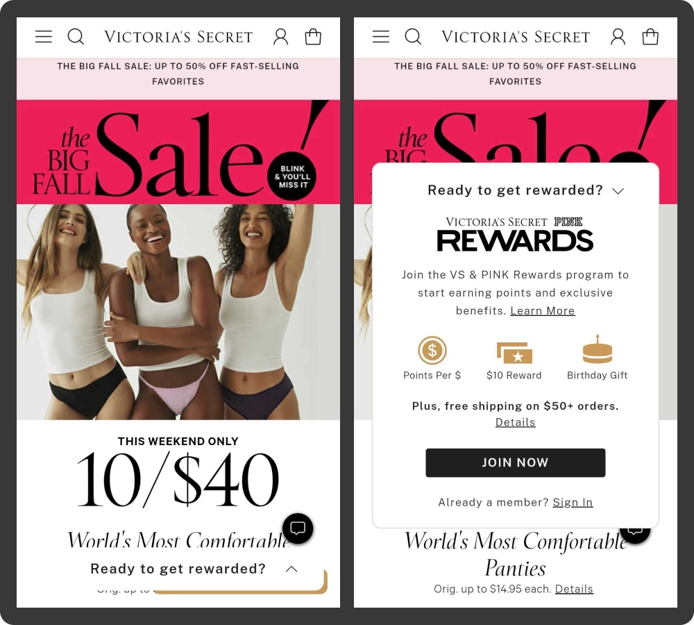
This approach maintains a clean interface while providing easy access to important information, making it more convenient for mobile users.
With Claspo, you can do the same thing. Choose a ready-made teaser from the template library and link it to your widget, or create your own teaser. This flexibility allows you to customize how popups are displayed, ensuring a seamless user experience on your site.
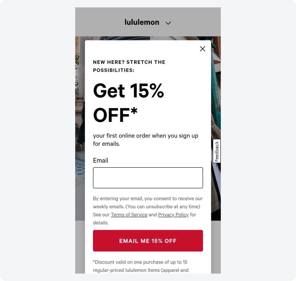
8. Lululemon
Lululemon aimed to create a mobile-friendly popup by removing images and logos and adjusting font sizes.
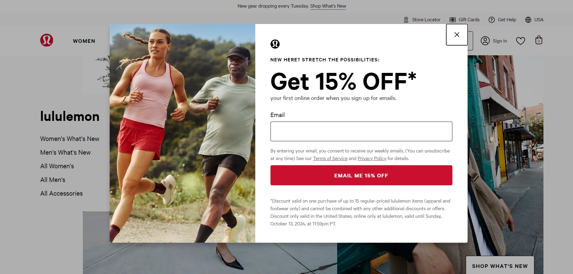
However, the offer still doesn't fit on a single mobile screen, requiring users to scroll to view the entire popup. There's still some work needed to enhance the user experience for this popup.
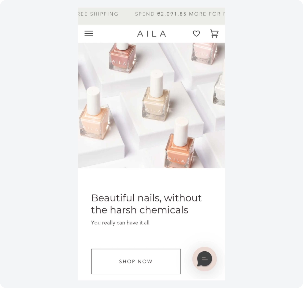
9. Aila Cosmetics
This popup was customized for mobile in a catchy way. On the desktop version, a floating bar at the top encourages customers to order a certain amount to receive free shipping. However, on mobile, the text of this popup is displayed as a scrolling marquee because the static text doesn't fit on one screen.
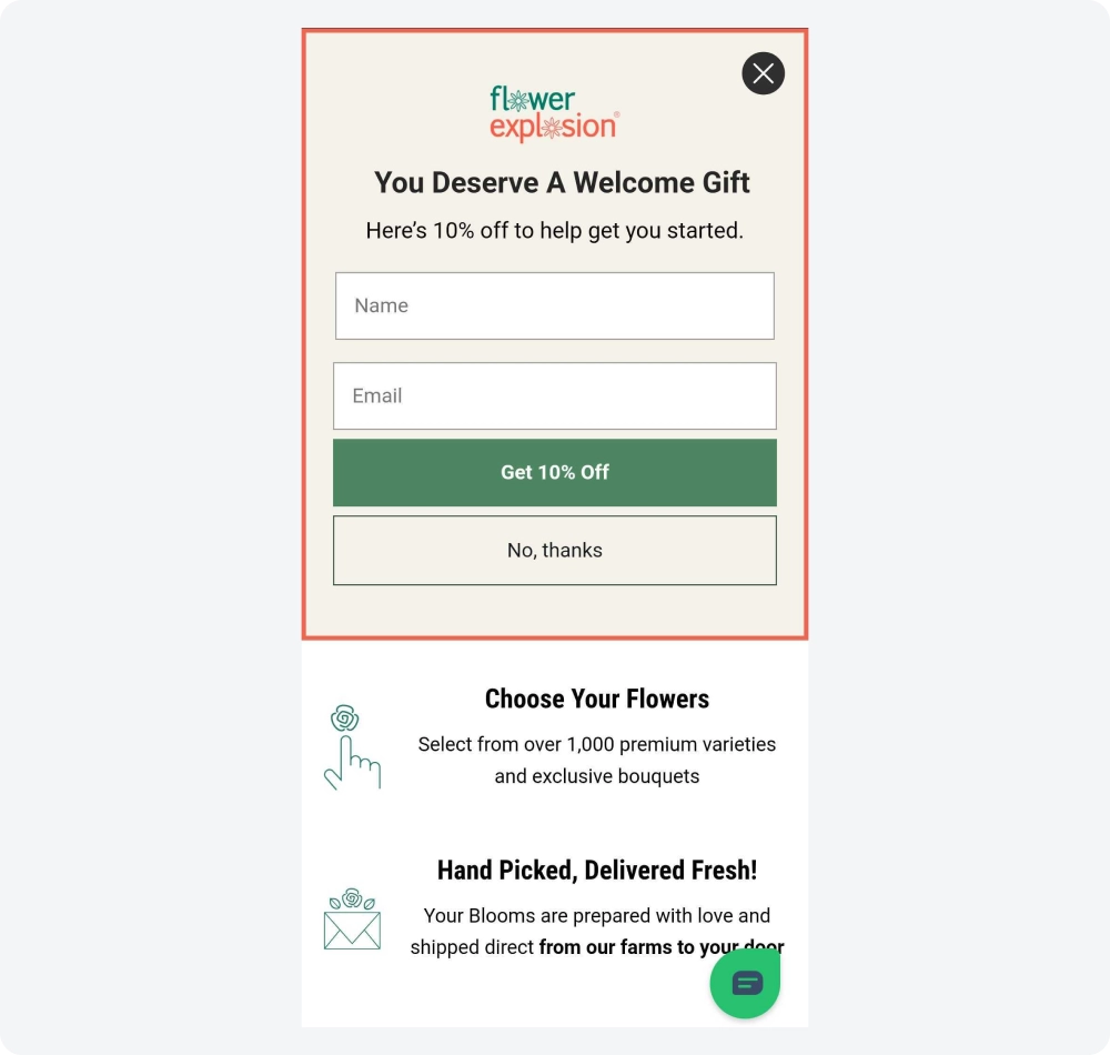
10. Flower Explosion
On the desktop version, visitors are shown a popup with a slider where images rotate one after another. However, this element would take up too much space on mobile and could annoy users, so it was removed. The mobile version only keeps text content with the offer and terms. The close button is clearly visible and conveniently placed, and the popup doesn’t cover the entire screen, adhering to Google’s guidelines. Additionally, it can be closed with a swipe for easier user experience.
How to Create a Mobile Popup Using a Popup Builder
You have some examples and know the tips to create an effective and friendly popup design on mobile. Let’s put that knowledge into practice.
Step 1: Choose a Popup Creation Tool
Many platforms provide demo versions or limited features, requiring a subscription for full access. However, with Claspo, you can use all tools and advanced features with free lifetime access. Claspo mobile popup maker comes with a user-friendly drag-and-drop editor and all the tools you need to quickly implement widgets that deliver results.
Plus, its extensive template library not only offers inspiration but also helps you save time in designing effective popups. This combination of flexibility and ease of use makes Claspo the best popup builder for businesses looking to enhance their online presence and increase conversions without coding headaches and spending money on features you won’t use.
Step 2: Define the Objective of Your Mobile Pop-up
Before starting with the design, identify the goals you want to achieve with your pop up on mobile. Some common objectives include:
- Lead Generation: Collect email addresses or phone numbers by using a newsletter popup template.
- Promotions and Discounts: Showcase special offers, coupon codes, or flash sales.
- Reduce Bounce Rate: Engage users before they leave your site with exit popup software.
- Content Promotion: Encourage users to explore other content or resources.
- Feedback Collection: Gather opinions, ratings, or survey responses.
Clearly defining the objective will guide every element of your mobile pop-up, from content and design to CTA buttons and triggers.
Step 3: Choose a Template and Design Your Popup
When creating your popup, Claspo template library is your starting point. It features a wide range of mobile pop up designs and templates categorized by popup type, goal, or layout. Whether you need event-based popups like Black Friday or exit-intent popups for mobile users, there’s a template for you.
For mobile, we suggest such layouts as:
- Top or Bottom Banners: Great for unobtrusive announcements, such as promotions or cookie consent messages. If you're creating a pop-up form, it’s important to ensure it’s optimized for mobile devices.
- Slide-Ins: Appear gently from the bottom or side and are ideal for collecting user information without blocking content.
- Floating Bars: Stay fixed at the top or bottom of the screen and work well for urgent messages or small forms.
Avoid using full-screen pop ups for mobile, as they can lead to poor user experience and higher bounce rates. This type of pop-up also goes against Google’s guidelines, so it might hurt your site’s SEO.
Using a drag-and-drop editor, create the popup text, emphasize the call-to-action (CTA), and include interactive elements such as countdown timers, promo codes, games, or images.
This approach ensures that your popup is not only mobile-friendly but also engaging and effective for your audience. By focusing on both design and functionality, you can create popups that resonate with users and drive desired actions.
Step 4: Customize for Mobile
Make sure that your mobile version looks clean and is easy to interact with. Consider reducing the number of input fields or using a multi-step form to avoid the need for scrolling.
Additionally, adjust the placement of the close button for easy access, and increase the font size of specific text elements for improved readability.
Keep in mind that the screen space is limited, so focus on clarity and comfort:
- Use a Vertical Layout: Mobile screens are tall and narrow, so position elements in a single-column, vertical layout.
- Font Size and Button Sizing: Use larger fonts (16px and above) and tappable buttons (at least 44x44 pixels) to accommodate finger navigation.
- Minimal Content: Keep your messaging concise—use fewer words and ensure each one adds value.
- High-Contrast Colors: Choose contrasting colors for text and buttons to make them stand out against the background.
- Prominent Close Button: Include a large, clearly visible close button (“X”) that is easy to tap without zooming or misclicks.
Images, icons, and other visual elements should support, not overwhelm, your pop-up. On mobile, visuals should also be used strategically:
- Use Compressed Images: Choose images that are compressed for mobile screens to maintain fast load times.
- Consider Image Placement: Avoid using large images that take up most of the screen. Instead, use smaller visuals to support the text or create a focal point.
- Remove Unnecessary Elements: Hide non-essential elements, such as decorative graphics or extra form fields, to keep the pop-up streamlined.
Step 5: Implement Mobile-Specific Triggers
Once you've finished designing your popup, it's important to configure its timing and display location effectively. Claspo provides a variety of rules to help you set this up. For mobile popups, consider using display conditions such as scroll depth, time spent on the page, or exit intent to determine when the popup should appear.
Additionally, you can target users based on their geolocation and adjust the frequency of the popup's appearance to prevent user annoyance. For example, you might choose to show it only to new visitors or limit it to once per session or once a week.
Lastly, show the pop-up only on relevant pages. For example, a lead magnet pop-up should appear on a blog page, not on a product page. Also, exclude pop-ups from checkout or payment pages to avoid disrupting the purchase process. These strategies will help ensure that your popup is both timely and relevant, enhancing the overall user experience.
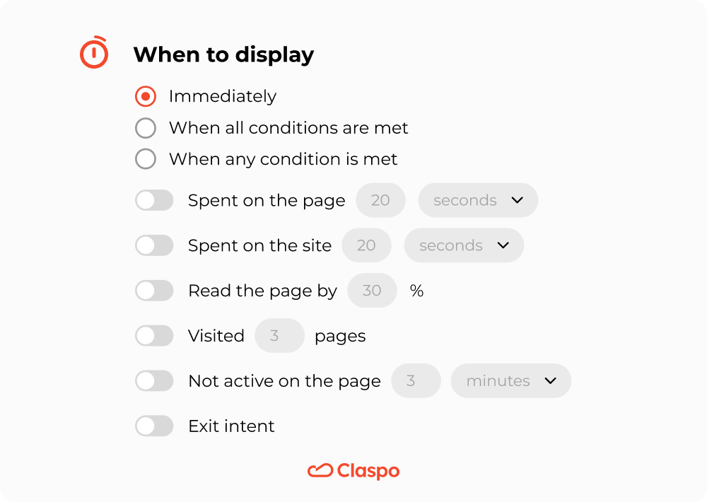
Avoid triggering pop-ups immediately upon page load, as this can feel intrusive. Instead, focus on user behavior to determine the optimal time for engagement.
Step 6: Integrate with Your Marketing Platforms
With popups, you can effectively grow your subscriber base, gather client preferences and additional personal data, and collect valuable feedback. All this information is valuable for maintaining customer relationships, encouraging loyalty, and driving repeat purchases.
To efficiently manage and process the data collected from your popups, it’s essential to integrate them with your marketing platforms, such as an Email Service Provider (ESP), Customer Data Platform (CDP), or other tools.
Claspo offers numerous ready-made direct integrations with popular platforms like Mailchimp, Klaviyo, Active Campaign, Hubspot, Pipedrive, and others, making it easy to get started. Additionally, you can set up connections with any marketing app using webhooks, ensuring that your data flows seamlessly and enhances your marketing efforts.
Step 7: Test and Optimize for Mobile
Test the mobile responsiveness of your popup by viewing it on different screen sizes to ensure it's visually appealing and easy to interact with on any device. Additionally, run A/B tests to find the most effective version of your popup. Test various elements like font size, CTA placement, and timing to optimize for better performance and conversions.
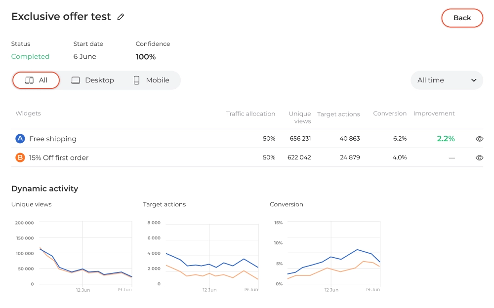
Claspo simplifies the A/B testing process with a built-in feature that allows you to easily test your popups. Just select the widgets you want to test, and the app will automatically determine the version that resonates best with your audience based on performance metrics. This approach enables you to optimize your popups efficiently and with minimal effort, ensuring that you achieve the best possible results.
Measuring Mobile Popup Performance: A/B Testing Tips
A/B testing (also known as split testing) allows you to compare two or more variations of a popup to identify which version performs best in terms of a specific metric—whether that’s click-through rates (CTR), conversion rates, or engagement time.
This becomes even more crucial in a mobile context due to specific challenges such as screen limitations, user impatience, and varied internet speeds.
Key Metrics to Measure in Mobile Popups
1. Conversion Rate: This is the percentage of users who completed the desired action, such as subscribing to a newsletter, making a purchase, or filling out a form.
To get a more granular view, break down your conversion rate by device type (e.g., Android vs. iOS). This can reveal whether your popup design or offer appeals more to a specific user group.
2. Click-Through Rate (CTR): The ratio of users who clicked on your CTA to those who saw your popup. A high CTR indicates that your message and design are compelling.
Popups with clear, concise text and a strong CTA button have been shown to achieve up to 10.5% higher CTR than those without.
3. Time on Page After Interaction: Measuring the time users spend on the page after interacting with a popup can show whether the popup drives deeper engagement or simply disrupts the user experience.
Consider testing the placement and delay timing of the popup. For example, popups that appear 5 seconds after a user lands on a page tend to have better engagement rates compared to those that show immediately upon arrival.
A/B Testing Strategies for Mobile Popups
When running A/B tests for mobile popups, focus on the elements that are most likely to impact user behavior. Here’s a structured approach:
1. Test Different Types of Mobile Popups
- Full-Screen Popups: These cover the entire screen and command attention but can be intrusive.
- Slide-In Popups: These appear discreetly from the bottom or side, offering a less disruptive experience.
- Floating Popups: These remain fixed at the bottom or top, making them visible without obstructing the main content.
Start by testing the same message with these different formats to see which one works best with your mobile audience.
2. Timing and Trigger Testing
Timing and triggers are crucial on mobile devices. Common triggers include:
- Time Delay: Appears after a set amount of time.
- Scroll Depth: Appears when the user has scrolled a specific percentage of the page.
- Exit-Intent: Exit intent on mobile is based on actions like scrolling up quickly or hitting the back button.
Run separate A/B tests to find the optimal delay time. A 10-second delay has been found to work well for most mobile users.
3. Copy and CTA Testing
- Short vs. Long Copy: Since screen space is limited, experiment with copy length. Shorter text can drive quick actions, while longer copy can provide more context.
- Action-Oriented CTAs: Test phrases like “Get My 20% Off Now” vs. “Claim Your Discount” to see which resonates.
In one case study, a company saw a 35% increase in conversions simply by changing their CTA from “Submit” to “Get My Free Guide.”
4. Design Elements: Colors, Fonts, and Images
- Color Psychology: Use colors that evoke the right emotions—red for urgency, green for trust, etc.
- Font Size and Type: Ensure readability, as text that’s too small will be ignored. A minimum of 16px is recommended for mobile popups.
- Images: Minimize the use of images to avoid slowing down load times on mobile. Instead, consider using icons or illustrations.
Always preview your popups on different mobile devices to check for responsiveness and design integrity.
5. Testing for Different Audiences
Not all mobile users behave the same way. Segment your audience by factors such as:
- Device type (iOS vs. Android)
- New vs. Returning visitors
- Referral source (e.g., social media vs. organic search)
Implement geo-targeting to deliver location-specific offers. For example, a food delivery service could show different offers based on the user’s city or region.
Final Words or Why Claspo?
While many competitors offer mobile-friendly pop-ups, Claspo focuses on mobile-first design and functionality to increase mobile conversion rates. Its combination of adaptable display options, mobile-specific templates, precise behavioral targeting, and performance optimization truly differentiates Claspo as the go-to choice for marketers looking to maximize their mobile engagement.
Claspo goes a step further by offering true mobile adaptability, which includes:
1. Adaptive Display Options
Unlike standard pop-up builders that merely resize desktop versions for mobile, Claspo provides adaptive display options that allow you to fully customize the look, feel, and functionality of each element specifically for mobile users. This ensures that every widget not only fits the screen perfectly but also maintains usability and aesthetics, preventing the common issues of overlapping buttons, distorted images, or illegible text.
2. Advanced Behavioral Targeting for Mobile
Claspo’s targeting options are specifically optimized for mobile behavior patterns. For instance, users can set precise triggers like scroll depth, mobile exit intent, or on-screen time to ensure pop-ups appear at the most opportune moments, reducing bounce rates and enhancing engagement. Many competitors struggle with these nuanced behaviors, offering only basic time-delay or page-view triggers.
3. Mobile-Specific Templates
Claspo includes a rich library of mobile-first templates designed specifically for small screens. This contrasts with other tools that typically adapt desktop templates for mobile use, often resulting in cluttered and less effective designs. With Claspo, mobile pop-ups are crafted with streamlined layouts, thumb-friendly buttons, and compact visuals to provide a frictionless user experience.
4. Mobile-Friendly Analytics and Insights
Many competitors lack in-depth insights into mobile performance. Claspo, however, offers mobile-specific analytics, allowing users to track engagement, conversion rates, and user behavior separately for mobile devices. This data-driven approach helps marketers optimize their campaigns based on unique mobile user journeys, leading to better-targeted strategies.
5. Minimized Load Impact on Mobile Sites
Claspo’s widgets are optimized for fast load times to avoid compromising the performance of mobile sites. Where many competitors’ pop-ups can slow down page loading or even affect SEO rankings, Claspo uses lightweight scripts and asynchronous loading to minimize the impact on page speed, ensuring a smooth and responsive browsing experience.
The best part is that you can try Claspo for free without time or feature limits with our free lifetime plan.


