
How to Create Responsive Widgets: 6 Tips with Examples
Responsive widgets for websites are becoming increasingly essential. Given that almost 58% of web traffic comes from mobile devices, it is important that all elements of your website, including popups, easily adapt to different displays. In this article, we'll share tips on how to create widgets that look perfect on both desktop and mobile screens. Additionally, we will analyze different mobile-friendly widgets on actual websites and demonstrate how easy it is to create similar ones in our editor.
What is a Responsive Widget
Responsive widgets or popups are web elements that automatically adjust their layout and size to fit different screens. This ensures a seamless user experience across various devices, including desktops, tablets, and mobile phones. Another option is adaptive widget design, which involves creating multiple versions of a pop-up, each optimized for a specific screen. While it grants finer control over the design for each device type, it also means managing and maintaining those different versions.
In Claspo, you can use both approaches. With responsive elements, you can quickly and easily create web and mobile versions of a widget simultaneously. While using adaptive elements, you can make adjustments to each version separately if necessary.
Creating Responsive Widgets: 6 Tips with Examples
Our extensive library contains over 700 templates, all optimized for mobile displays. You can easily replace images, change text styles, add backgrounds, and more to ensure everything works perfectly. Additionally, creating a completely new responsive widget is simple, as we provide all the necessary tools.
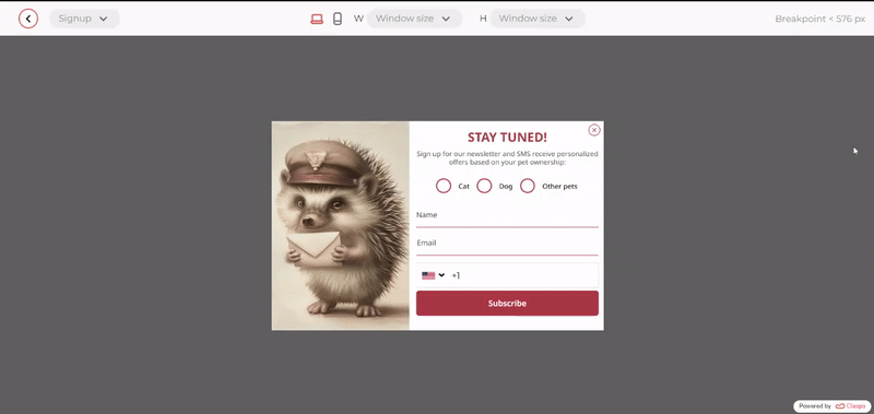
1. Use Columns to Create Responsive Widget
Our editor has the columns component, which you can use to ensure your subscription form looks good on mobile. Let's take a closer look at its features.
Automatic Top-Down Content Placement
It automatically places all widget elements vertically. This is because users view content on mobile devices from top to bottom. So you can be sure that your widget will be displayed correctly on a small screen.
However, if necessary, you can disable this option when the columns are small. For example, we placed a tiny icon in one column and a short text in the other. For a more compact look of the mobile widget, it is better to arrange them horizontally rather than vertically.
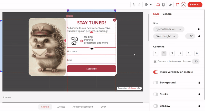
Adjusting the Length of Responsive Widgets
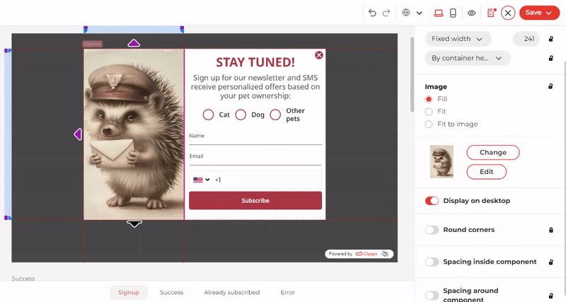
If an image takes up a lot of space in the desktop version, the system reduces its size to 150px in the mobile version. This is possible because the columns have special display proportions that are recalculated when switching to the mobile version. The optimization focuses on the image, so you don't have to worry about any important fields disappearing in the mobile version.
Additionally, you can easily hide any column in the mobile version and keep it in the desktop version.
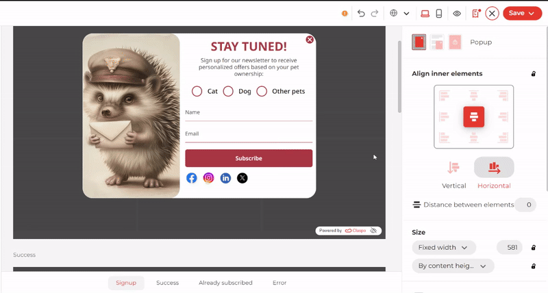
2. Make Clean Responsive Widgets
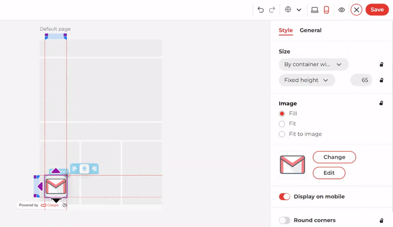
Mobile widgets should be appropriately sized to ensure they do not block users from accessing the main content. This is specifically stated in Google's requirements for popups. To reduce the size of a responsive widget, you can minimize its visual component. In the Claspo editor, hiding images is straightforward. Simply switch to mobile editing mode and click the corresponding button. This will keep the image in the desktop widget but remove it from the version for smaller displays.
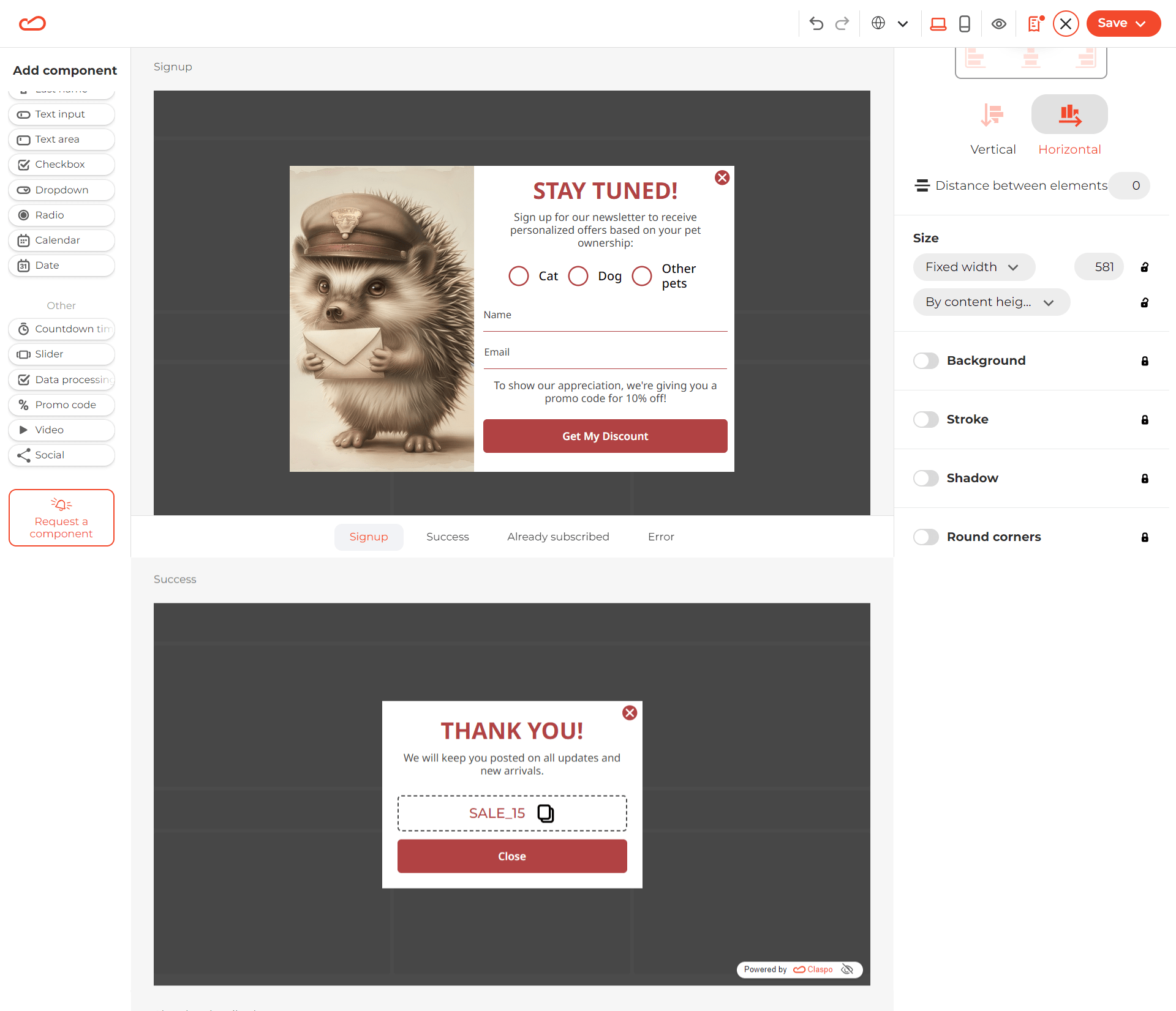
In Claspo, by default, when editing a sign-in form, all fonts are automatically changed on the subscription status templates: Success, Already Subscribed, Error. The font size is synchronized in both versions. However, you can reduce it separately in mobile mode to make the text smaller and look more organic on a small screen. In the settings, click on the drop-down list next to ‘Text style’ and select ‘Remove style from an element.’
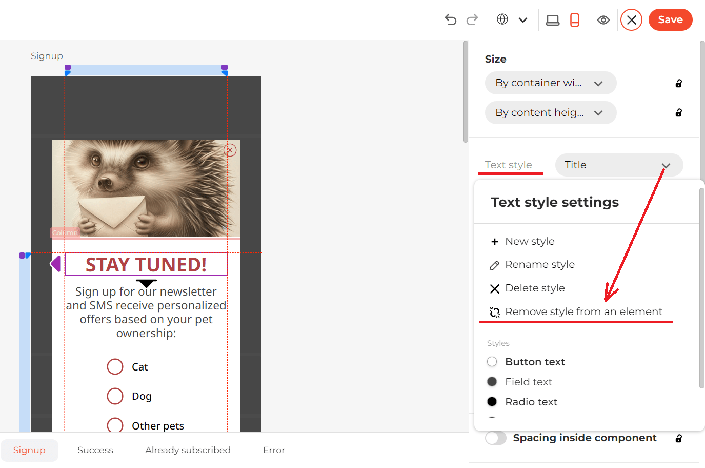
For the mobile version, we recommend using fonts 2-4 points smaller than those used on the desktop. However, you shouldn't make the main text smaller than 14-16 points or footnotes and tips smaller than 10-12 points.
Please note that removing the text style will also require changing the font size in additional templates if you are creating a sign-up form template.
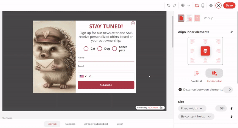
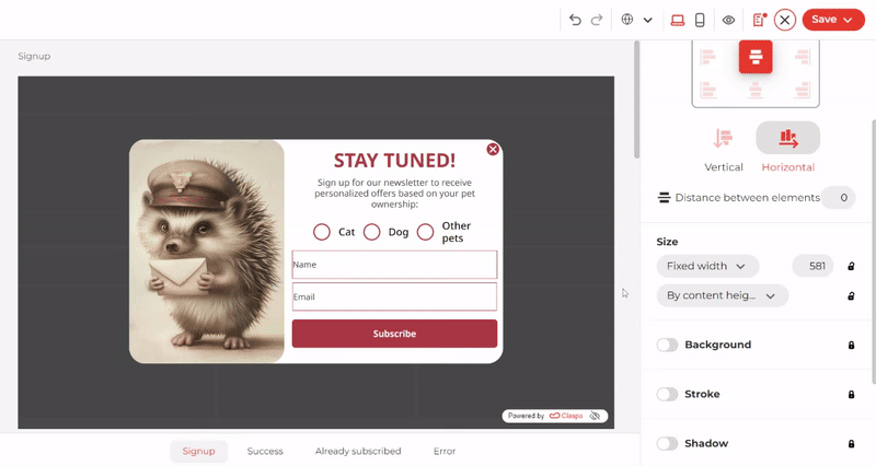
You can simultaneously change the settings for both the desktop and mobile versions of a responsive widget. The system synchronizes settings such as background, stroke, shadow, and round corners. For example, you can change the look of the email and subscriber name fields by rounding the corners and adding a background. The same thing happens instantly in the mobile version.
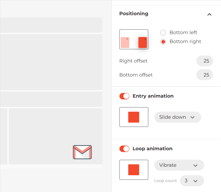
3. Use Launcher to Run a Responsive Widget
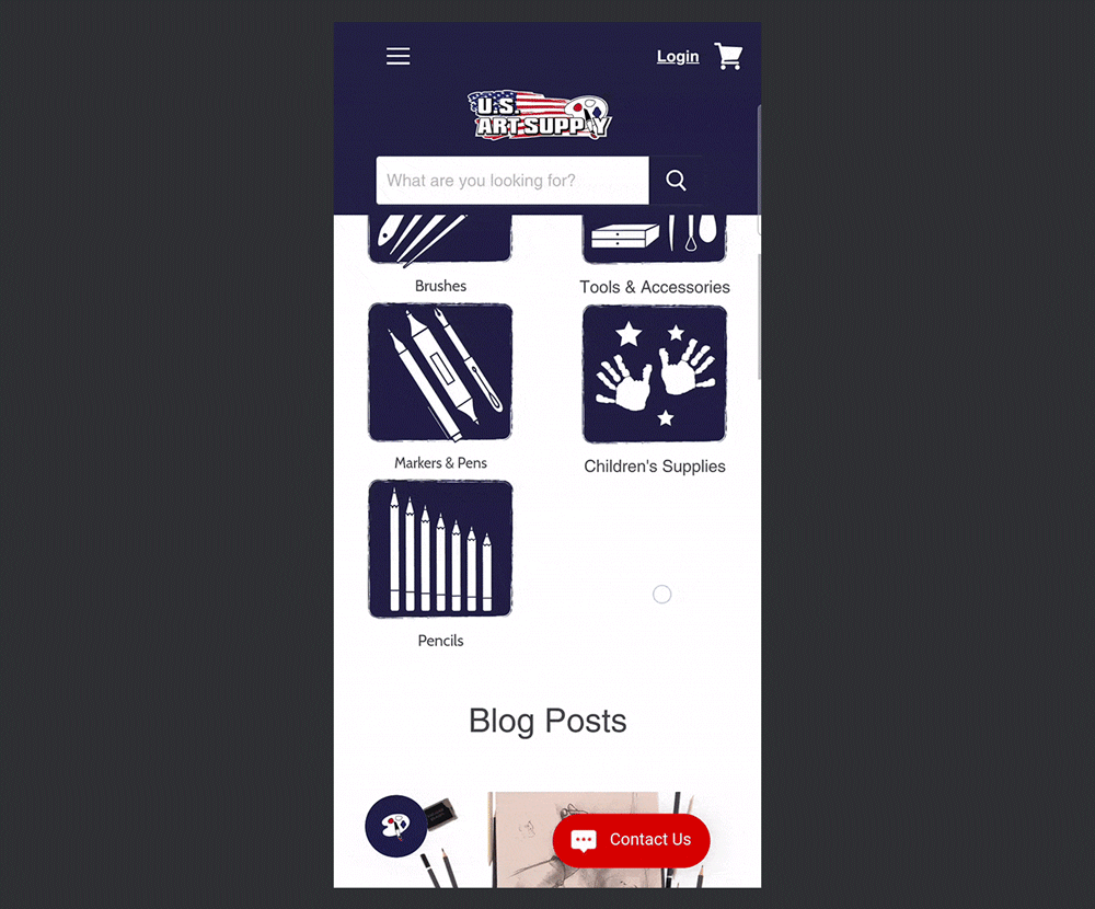
If you need to add a large subscription form or some other sizeable responsive widget, you can use the launcher. This element takes up minimum screen space while being noticeable. Check out how this approach is used on the U.S. Art Supply website.
In Claspo, all subscription templates have launchers that can quickly be customized. Just as easily, you can build one from scratch and attach it to a specific pop-up design. Choose an entry animation to make the element pop up on the left, right, bottom, or top. If you want to make the launcher more noticeable, set it to Loop animation. This will help highlight it if there is a chat button next to it, etc.
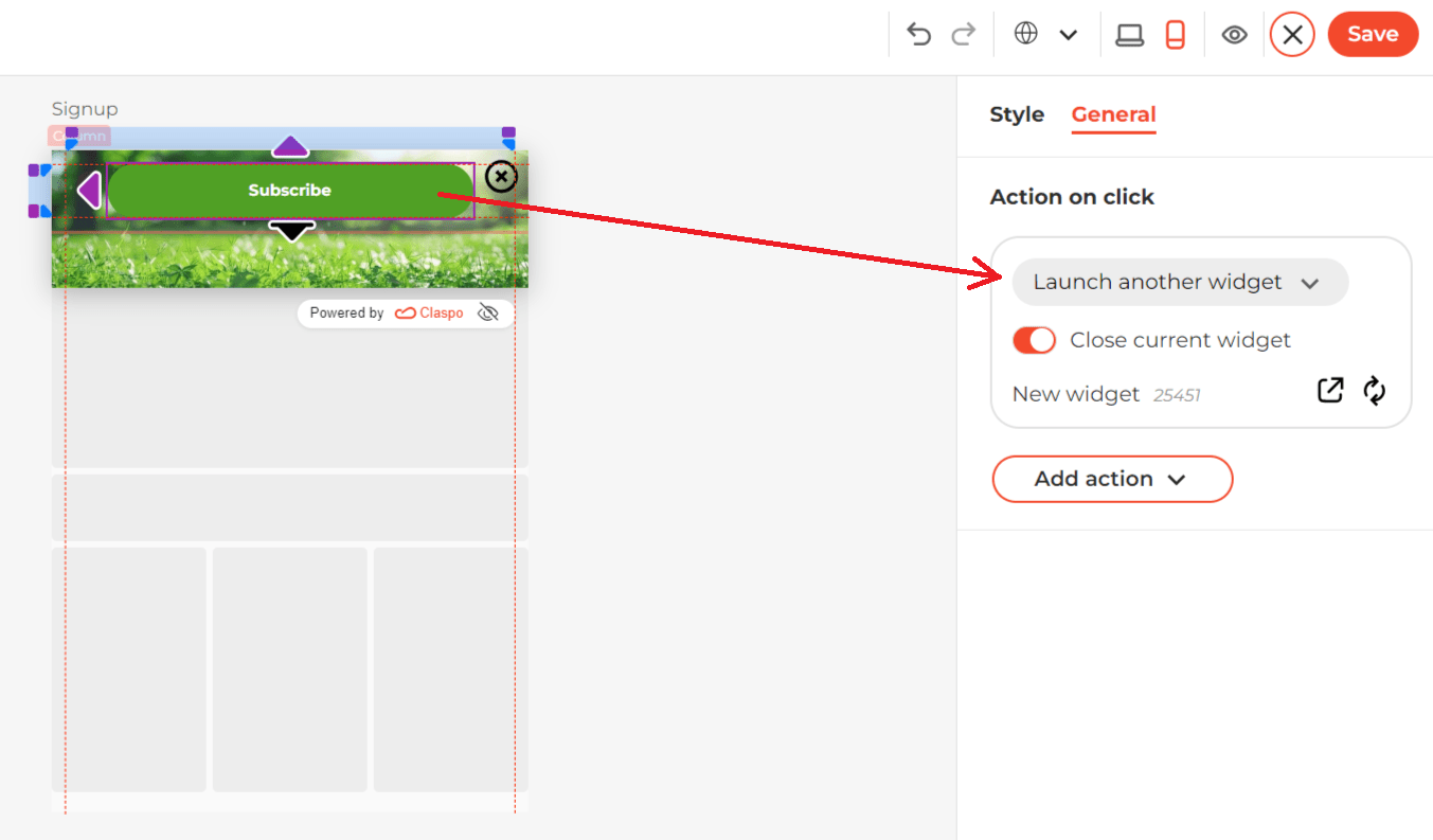
4. Consider Alternatives to Launcher
The launcher is a very handy element, but some users may find it intrusive because it cannot be closed. If you are afraid of such a reaction from your site visitors, try creating a small responsive widget instead, which will open another full-size popup when they click on it. See how it looks on the Handicraft website:
Visually, the only difference from a launcher will be the presence of a close button.
To set a rule for it to call another popup, open the ‘Action to click’ option in the settings and attach the ready-made widget.
You can also set up a floating bar in a similar way. For example, the Makers Market company has created a laconic widget with a single button that activates a full-size subscription form.

In our editor, you can create a similar responsive widget and customize it by changing the color of the CTA button, adding a background that matches your website design, etc.
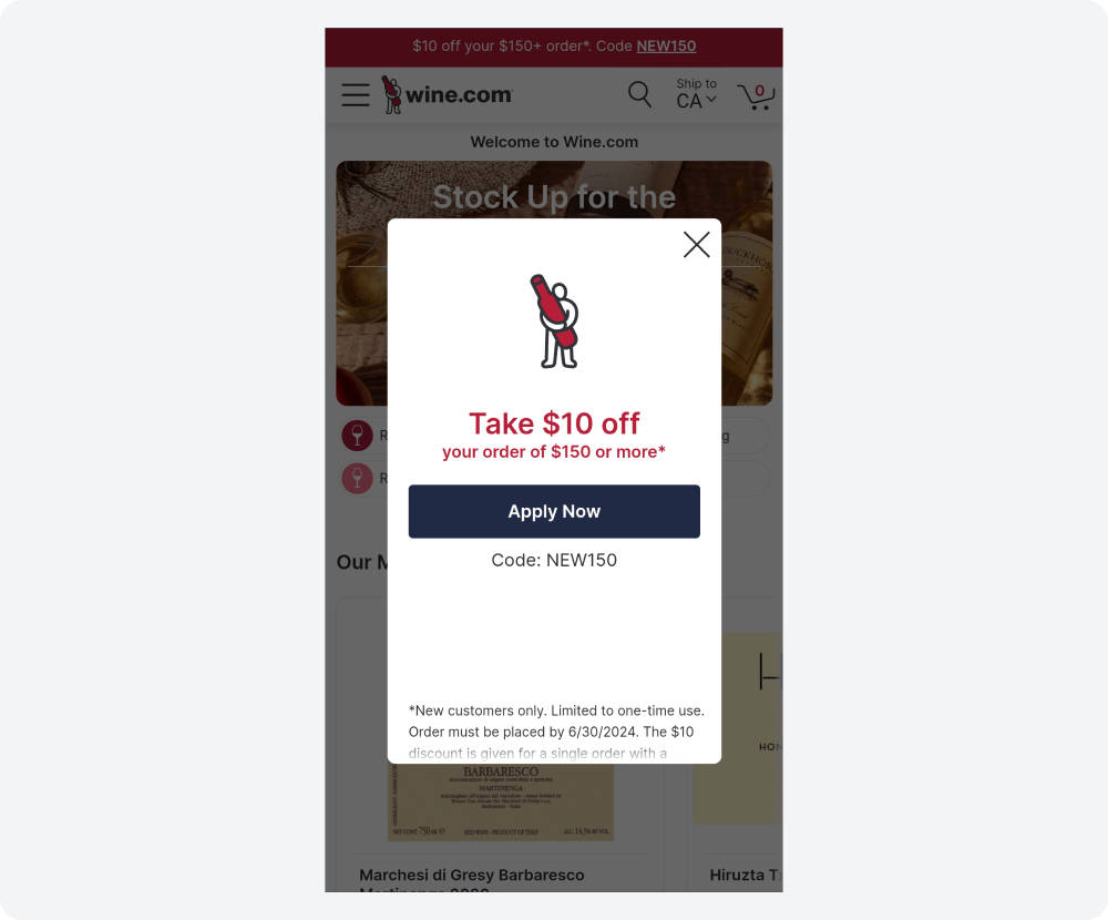
5. Run Responsive Widgets with Converting Elements
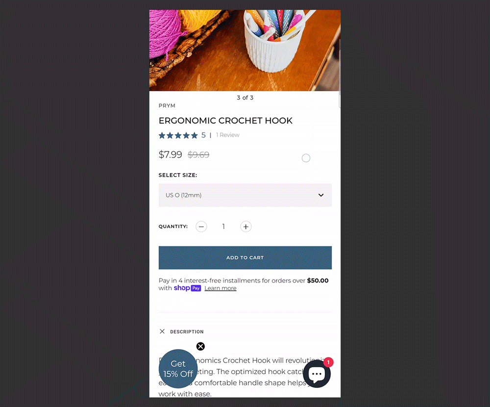
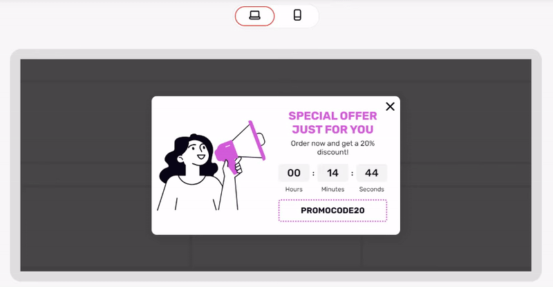
You can add special components to responsive widgets to capture users' attention and encourage conversion. For example, Wine.com offers new visitors a promotional code for their first purchase:
And guess what? In the Claspo editor, you can add a promo code embedded in the widget that the user can easily copy and rush to make purchases from you. For example, use this approach in free exit-intent popups to catch visitors about to leave. Here's what it looks like on one of our responsive widget templates:
You can also encourage users to subscribe to your newsletter by offering them an instant discount on their purchases. For this purpose, add the embedded promo code component to the Success template. This will increase the chances that the visitor will convert into a buyer and, at the same time, increase your contact base.
A limited time offer template can boost the FOMO effect of your discount. The Fragrance Outlet brand uses it in an exit-intent pop-up.
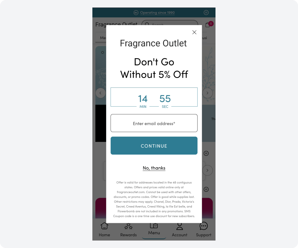
Claspo's relative timer component starts counting down when the widget appears in front of the specific user. Besides exit-intent, it can be added to any promotional responsive widget to increase urgency. The relative timer's unique feature is tailoring the time period for each visitor. This allows you to run an 'eternal promotion' and attract a larger audience without raising suspicions of dishonesty. One person's decision-making time expires, but other visitors will be able to take advantage of the offer before the timer reaches zero for them.
6. Avoid Responsive Widget Placement Mistakes
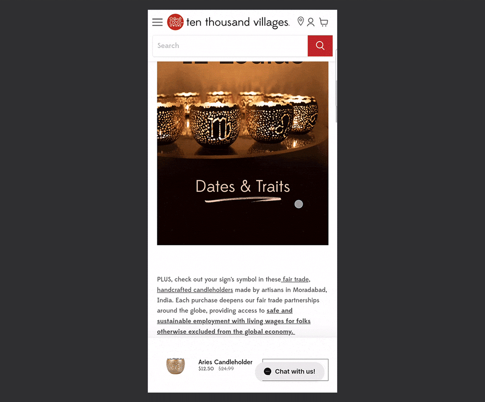
Sometimes, the placement of responsive widgets can be problematic when a pop-up or launcher overlaps with other content on a mobile screen. For instance, on the mobile version of the Ten Thousand Villages blog, users have a low chance of reaching the product page because the chat button blocks the CTA button.
Similarly, the Jubilee brand risks losing potential subscribers due to the small distance between the ‘send email’ button and the chat button. When pressing the screen with your right thumb, it's easy to miss the ‘send email’ button.

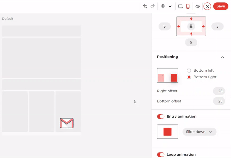
To prevent such issues with a launcher, you can easily adjust its placement. Simply place it on the opposite side of the screen from other important site elements. Additionally, you can set a custom distance from the launcher to the edges of the screen if necessary.
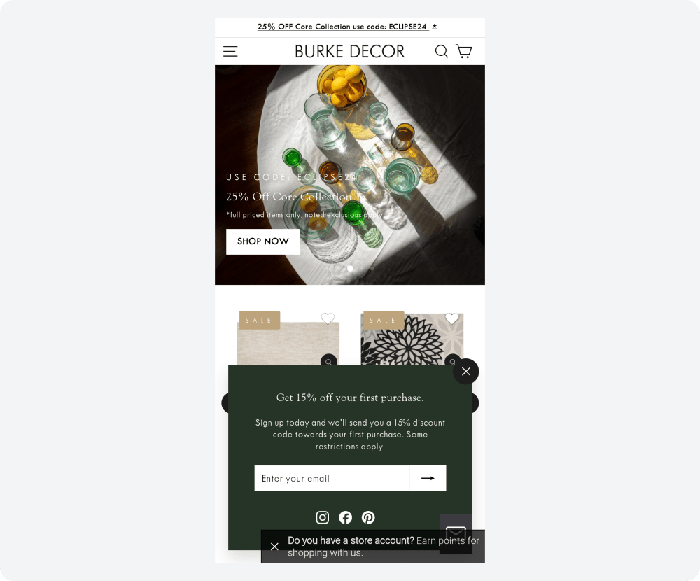
If you want to add multiple widgets to your website for different purposes, it’s important to avoid the mistake of running them simultaneously, as happened on the Burke Decor website:
Claspo protects you from messy screens with its smart features — silence interval and overlapping protection.
Set the silence interval to create a buffer between widget displays. The default 3-minute interval ensures a smooth browsing experience, but you can easily customize it based on your website's average visitor time or specific page dwell times.
Additionally, Claspo takes the pressure off by automatically preventing widget overlap, even when you have duplicate display rules. This means you can focus on creating engaging content without worrying about managing complex popup configurations.
Enhancing UX with Responsive Widgets
Responsive widgets are key website elements to a positive user experience. They ensure your content remains accessible and engaging, regardless of screen size. Claspo simplifies the process by offering pre-built mobile-optimized templates and intuitive editing tools.
Before publishing, test your ready-made popups on the site. Our platform makes it easy to do. This way, you will see their actual location and can quickly make the necessary adjustments.
After launching them, start A/B testing. This can also be done directly in Claspo. Gradually test all the essential elements: design, CTA, text, and more. This will help you understand your audience better and increase conversions. The best part is that you will get all the functionality described in this article, including testing, with our lifetime free plan. So, sign up and create responsive widgets without any hassle.


