
Add To Cart Button Color: 6 Best Examples
Small details often turn out to be the most important. According to Toast's statistics, a simple change in the color of the "Add to Cart" button can increase conversion rates by 200-350% and increase sales several times. Of course, these statistics should be considered in the context because a website is a complex set of UI elements, each directing a user to the target action. That is why today we are looking at a very narrow but important topic — how button color affects key performance indicators of e-commerce.
Why Color Is Important for Add To Cart Buttons
The human brain is attuned to instantly recognize visual patterns. When it sees familiar shapes and colors, it reacts immediately, forcing us to make subconscious decisions. In ancient times, it was used to help us pick edible berries and escape from predators, and today, it helps us choose the best deals in online stores.
The color of the "Buy Now" button impacts conversion. According to research by Top Design Firms, it is a determining factor for the decision of 40% of buyers. The color of small conversion elements affects sales just as much as all the photos and videos in the product card.
Add to Cart Button Color: Key Tips
First, we should point out that there is no universal color scheme for the "Add to Cart" button that always works everywhere. When developing your website's conversion elements, you should consider the peculiarities of the company's corporate style, the design of other UI elements of the web resource and even the characteristics of the target audience. To improve the performance of your online store, you can also follow the following tips for choosing the color of the "Add to Cart" button.
1. Make it contras
In 1933, German scientist Hedwig von Restorff discovered that people first and foremost notice isolated elements that significantly differ from surrounding ones. Therefore, conversion elements should be different from other UI details, although not so much that they cut the eyes of site visitors.
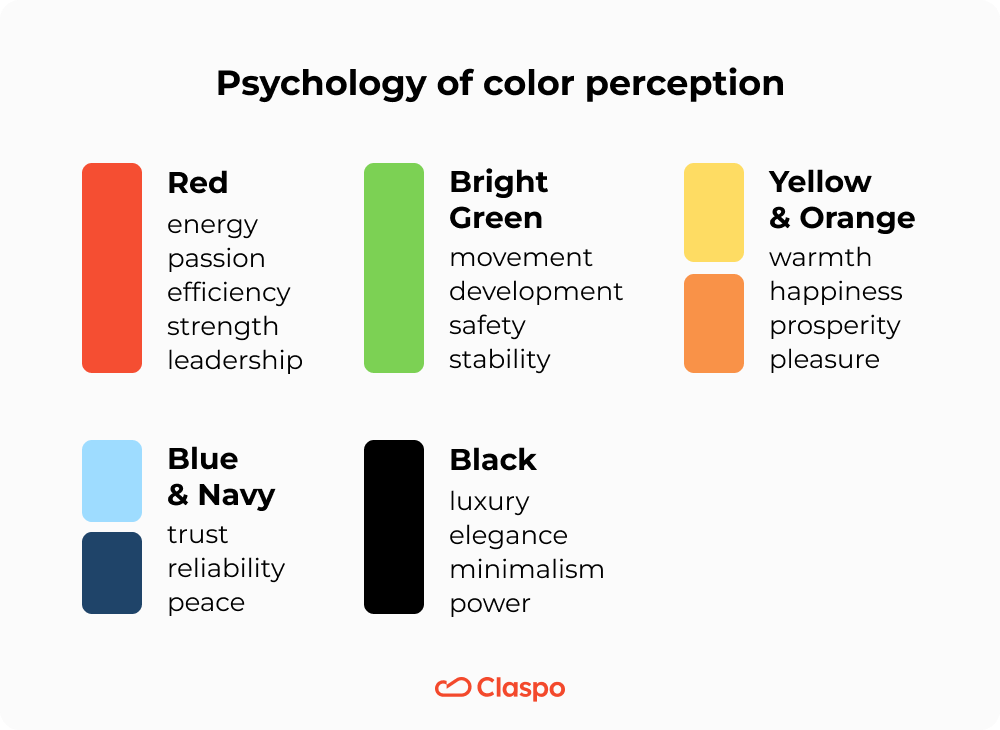
2. Consider the psychology of color perception
To put it as simply as possible, the psychological meaning of the colors you choose should correspond to your brand values:
- Red = energy, passion, efficiency, strength, leadership
- Bright Green = movement, development, safety, stability
- Yellow and Orange = warmth, happiness, prosperity, pleasure
- Blue and Navy = trust, reliability, peace
- Black = luxury, elegance, minimalism, power
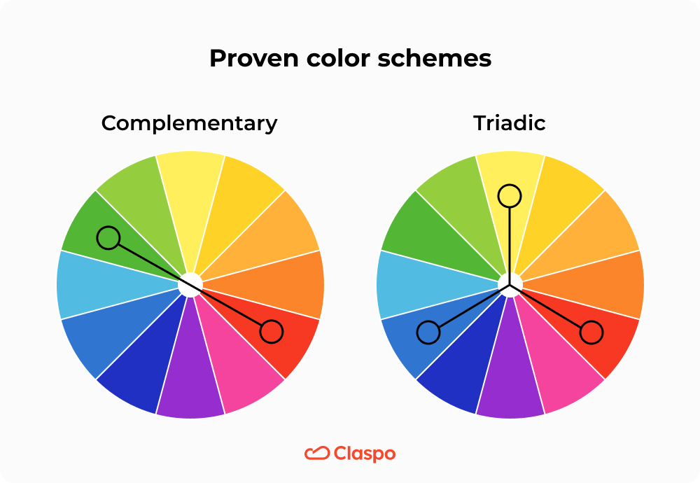
3. Use proven color schemes
The research conducted by prominent psychologists during the 20th century also helped us learn about the existence of color schemes that are attractive to people:
- Complementary - two opposite colors. They create maximum contrast, first drawing attention to the "Add to Cart" button. This scheme is perfect for stimulating emotional purchases.
- Similar - two similar colors. This scheme also allows you to highlight the conversion element but does not distract attention from other details, such as product photos or contact information.
- Triadic - three colors that are equidistant from each other in tone. This combination creates a sense of harmony and calmness and motivates people to make well-informed, rational decisions.
- Square - four equidistant colors. This color combination has the lowest contrast but evokes a sense of trust and emphasizes the aesthetics of the products. It is suitable for selling unique products, such as branded clothing or works of art.
4. Rely on the brand book
Contrasting colors and psychologist-approved best colors for the “Buy Now” button are great. However, they shouldn't break the rules of your corporate design. If you have to deviate a little from the generally accepted solutions or change the color tone of a button in one step to get a coherent and harmonious UI for your site, do not hesitate to do so.
5. Use ghost buttons
There is a phenomenon in psychology that is useful for e-commerce. People make decisions faster when they have an alternative. If this alternative is less convenient and profitable, the decision can be made within a few milliseconds. To increase conversion, you can place an additional button next to the main one, such as "Call" or "Contact". To make a customer focus on conversion, make the second button a ghost - choose a transparent background for it. This way, you will create an alternative and leave an additional option without reducing the number of clicks.
6. A/B test button colors
As we mentioned above, there are no "one-size-fits-all" colors for the "Add to Cart" or "Buy Now" buttons. Therefore, you should experiment and discover the color solutions that will give your business the best results.
For example, A/B testing helped one company find that a red button led to a 34% increase in conversions compared to a green button. Meanwhile, another company's A/B testing showed that a blue button led to a 9% lift in conversions compared to an orange button.
Want to follow their example? Claspo can help. Our marketing team has prepared a universal template for A/B testing. Use it to put any of your hypotheses into practice and get meaningful results.
Best Buy Now or Add To Cart Button Colors & Brand Examples
We've already mentioned that each company chooses its own color scheme based on the specifics of its business and audience characteristics. Now, it's time to demonstrate how it works in practice.
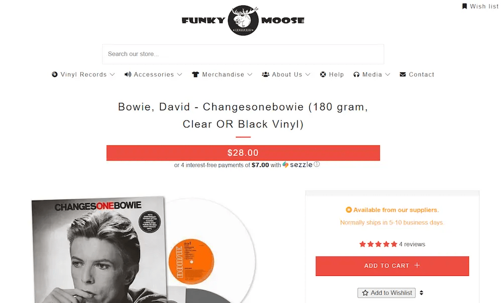
1. Red — Funky Moose Canada
The red "Buy Now" button creates strong emotions that motivate users to act immediately to get the most out of the pleasure. It's not surprising that a Canadian recording studio chose it. They also placed a rating of a particular product and a link to a review block. Social proof increases emotional motivation and gives customers a reason to convert without hesitation.
Funky Moose Canada's red "Buy Now" button is very contrasting. It stands out against the minimalist black-and-white design of the online store. This solution is perfect for industries where emotions come to the foreground: music, video, computer games, etc.
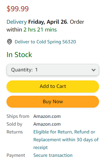
2. Yellow and orange — Amazon
What do we look for in marketplaces? First of all, the possibility to compare products from different sellers. Amazon's designers are well aware of this and, therefore, chose yellow and orange as their conversion elements — colors associated with wealth, benefit and prosperity. Thus, customers have access to two buttons at once — "Buy with one click" and "Add to cart".
Amazon provides one of the best examples of Buy Now buttons, both in terms of color scheme and UI design. Next to them are the price and purchasing terms. Everything is as honest and transparent as possible, which coincides with the common theme of benefit and rationality.
3. Purple— MAUDAU
The Ukrainian marketplace shows a successful example of the "Buy Now" button design for several reasons:
- The purple color of the button perfectly contrasts with the white background of the page, which attracts attention.
- Purple matches the company's branded colors, providing integrity and consistency.
- Purple is associated with uniqueness and exclusivity, further motivating the audience to take advantage of MAUDAU's special offers.
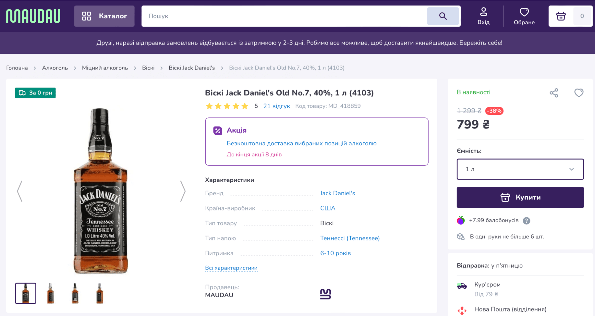
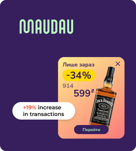
But MAUDAU went further and enhanced their results with Claspo. Our web widgets also harmonized with the site's overall design, promoting special offers and directing visitors to product pages for review and purchase, where a well-designed "Buy" button is ready to greet them. The results? There was a 14% increase in product views, 15% in cart additions and 19% in transactions.
Choose Claspo and repeat the success of MAUDAU! Our widgets can direct customers to both the product page and the checkout page. Design your widget in any color in our simple editor, and check which color schemes produce the best results with our built-in A/B testing feature.
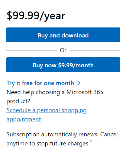
4. Blue — Microsoft
We entrust our productivity, security and free time to a computer's operating system. That's why the top software developer chose the blue "Add to Cart" button, primarily symbolizing reliability and trust. In the case of Microsoft, it is about two equivalent buttons at once — to buy the program with a one-time payment or to subscribe.
Along with the blue "Buy Now" buttons, there is all the necessary information, such as prices, trial terms & conditions, contacts of company representatives, etc. This makes the overall message of trust coherent and as convincing as possible. Using Claspo, you can also add two buttons to your widget, each redirecting users to a specific page, depending on their selection. When you add a new button to your widget, it automatically takes over the design of the existing one, simplifying the editing process.
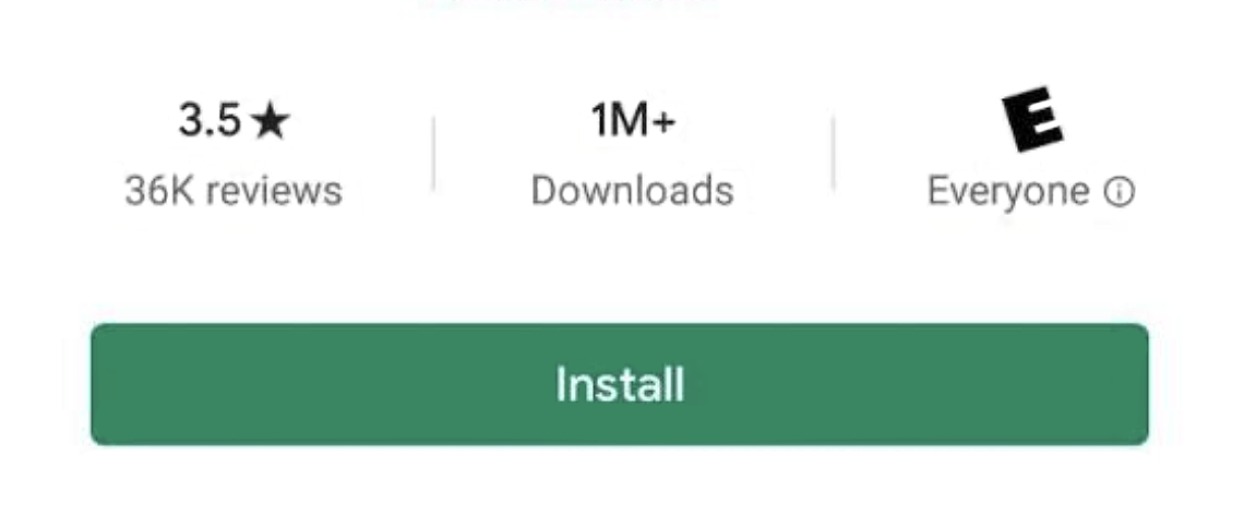
5. Green — Google Play
The mobile app market is a world of continuous movement. Therefore, the Google Play online marketplace motivates customers to make quick decisions by offering them a green Install button. As we already know, this color is associated with movement, development, safety and stability. To further dispel hesitation, the app rating and number of downloads were added as social proof.
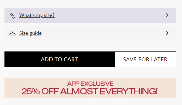
6. Black — Boohoo
Many clothing stores use black for the "Add to Cart" button because it is associated with luxury and elegance. The British retailer Boohoo.com is one of them.
This is a great example of using an alternative option with a ghost button. The additional button allows you to save the item to your favorite item's collection, but the site design shows it as an undesirable choice, emphasizing the importance of conversion.
Conclusions
UX/UI website design is a rather complex area where the smallest details can have a significant impact on engagement and conversion rates. Particular attention should be paid to elements that lead to a transaction, such as Buy Now, Add to Cart, Order, Install, or Subscribe buttons. Finding the "perfect color" is possible through regular A/B testing.
With Claspo widgets, you can gain valuable insights into the winning button color without extra costs. Just use our free plan, create your first widgets with buttons in matching colors, and set them up for A/B testing. This will allow you to validate your priority hypotheses before making significant changes to button colors throughout your website.


