
Best Email Opt-In Form Examples to Boost Your Email Campaign
Are you planning the email opt-in campaign and need some inspiration? We've got your back. Here you'll see great opt-in email examples that will put you on track. Even though there are many options for how you can get the personal information for your email list, you can get inspired with examples of the best opt-in forms to upgrade your email marketing.
Table of Contents
What is Opt-In Email Marketing?
What is Opt-In Email Marketing?
Before sharing examples of opt-in emails, we would like to cover what opt-in marketing is.
Opt-in email marketing is a type of marketing campaign that collects email addresses from eager customers using permission-based email collection techniques. This can happen during user registration or through pop-ups and subscription offers.
You probably already know about email marketing, but the magic starts with that “opt-in” part. Why? Because opt-in emails get better open rates, more clicks, higher engagement, fewer spam complaints, and ultimately, a stronger conversion rate. It’s the foundation that turns casual visitors into loyal subscribers — and buyers.
Luckily for humankind, email marketing keeps growing every year because people love receiving interesting, useful emails, don't they? But a quick heads-up: no one likes weird, unsolicited emails (and sending those can even be illegal). So always ask before you email. When you do it right, your readers will connect with your brand, happily buy your goods, and stick around for the long haul. After all, friendship is good business.
Email Opt-In Form Examples: 19 Ideas For Your Business
Okay, off with the theory, and let's check some examples of opt-in emails. Here we've gathered some of our favorite ones. If you remember other top-notch opt-in email examples, you can write them down in the comment section at the end of this article. We would be happy to check out some other great opt-in email marketing works!
We divided the best email opt-in form examples by layout so you can see which formats work best for different goals.
1. Pop-up Newsletter Opt-In Examples
These forms literally pop up on your website after visitors spend some time on a page or show signs of exit intent. They’re designed to grab attention and encourage quick sign-ups. Even though they might seem a bit bold, a well-timed pop-up sign-up form converts really well and can be customized with catchy offers or fun features like countdowns. Here are some of the prominent examples.
Mounser
A fashion retailer like Mouser knows how to get your attention, with elegance and patience.
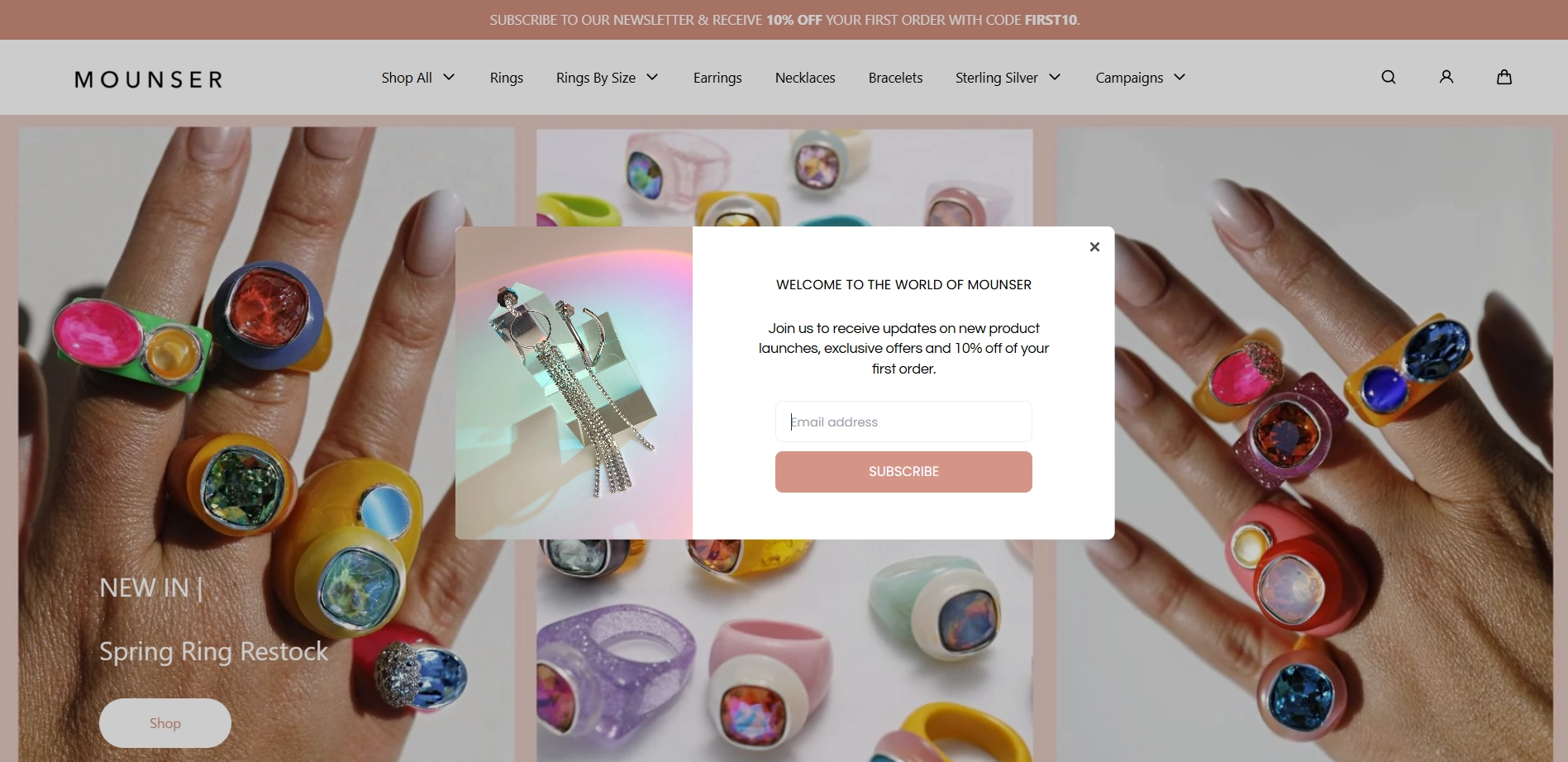
When a user lands on the site for the first time, Mouser gently invites them to subscribe to the newsletter. But if the visitor isn't ready to commit just yet, no pressure — they can simply close the pop-up and continue browsing.
That’s where the second opt-in form comes in. It patiently stays visible on every page of the website, ready when the visitor is. Notice the subtle peach sticky bar at the top. It’s minimalistic yet effective — always present, never intrusive. As users explore the site and browse through items, the sticky bar gives them time to connect with the brand and decide, at their own pace, whether or not to subscribe.
Offer real value, like discounts or free shipping, to grow your email list with ease. Try Claspo’s email list builder to capture leads and boost sales
The New Yorker
A well-known print and digital magazine shows how to make email opt-ins feel irresistible by offering something truly worth sharing.
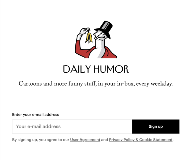
This opt-in example is a masterclass in clean, minimalistic design. You might have seen cartoons prior to that, but the New Yorker’s are lit, and the editors know that. Marketers simply have to put several words to it to make something iconic work, which is humor.
Of course, this approach won't work with every business. Smaller brands should outline the topics they will cover in the newsletter in more detail to earn subscribers' trust. But for some giants like New Yorker, Apple, or Nike, sometimes all it takes is naming the niche. The brand does the rest.
NotShy
A French apparel store keeps it simple, using a classic opt-in form template that still works wonders and gets people to subscribe.
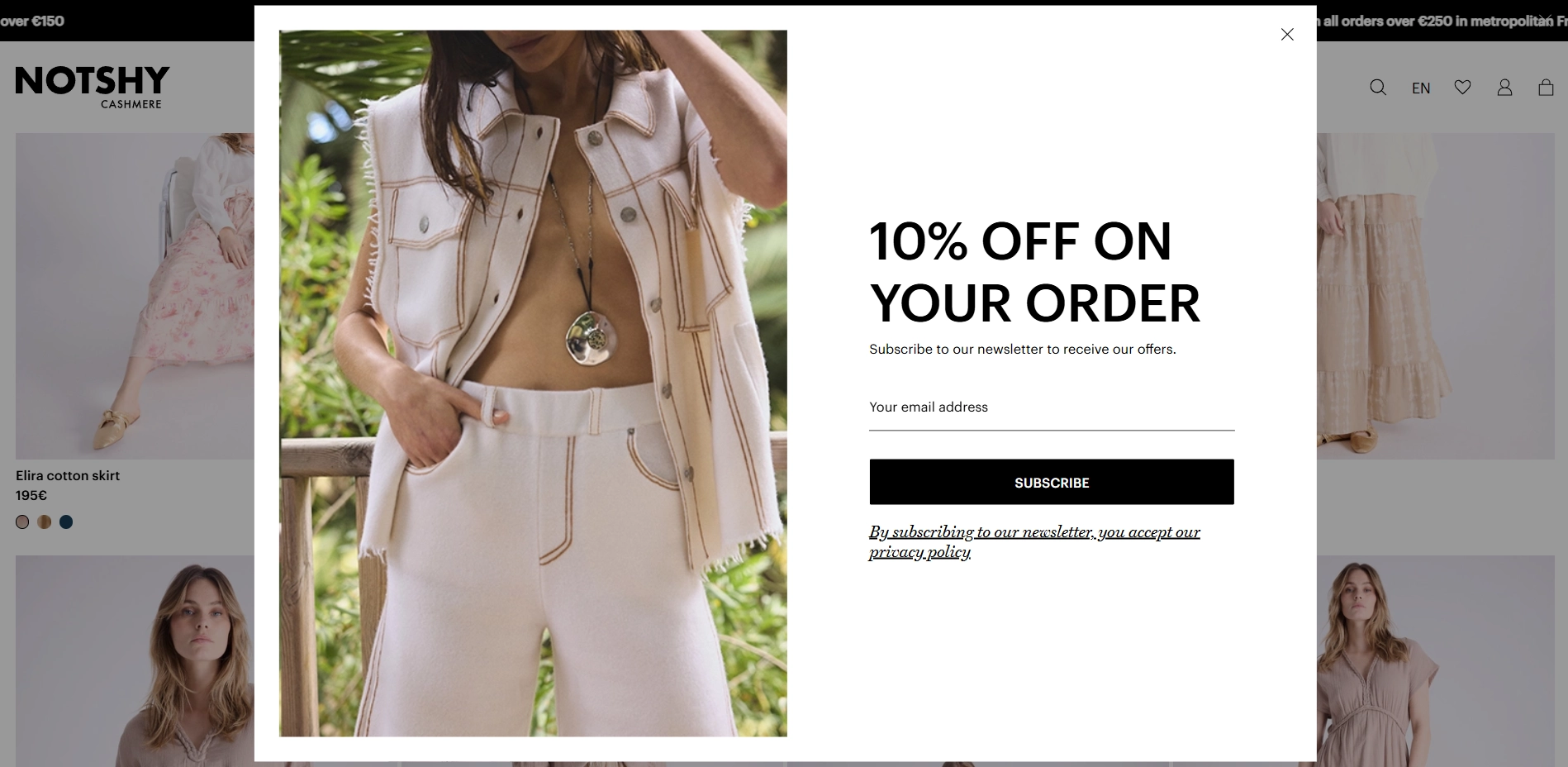
It is a popular move among fashion retailers to offer a discount for a subscription. And it works perfectly. People love a good deal, and they’re happy to share their email to get it. But the real challenge starts after the first purchase.
To keep subscribers engaged, make sure you create the best content you can. When creating your marketing emails, spend some time with the stylist to shoot inspiring outfit ideas that speak directly to your audience’s tastes and build a connection. Every email should feel like it’s coming from a friend, not just a random seller.
The Carbon Bar
The Carbon Bar brings restaurant-quality dining straight to your inbox and your table.

This is an intriguing approach as the website offers you to subscribe to the newsletter twice. Visitors are greeted with a welcome pop-up when they first land on the site. And the second, more subtle opt-in, awaits them in the footer of the page, which is perfect for those who need a little more time to warm up.

The bold CTA buttons match the site's lively aesthetic and clearly communicate what’s on offer, and that's a big yes from us. And while great design might not be the marketer’s job, it plays a huge role in conversions. First impressions count — and here, both the visuals and value proposition work together seamlessly.
2. Inline Opt-In Email Examples
Inline forms live naturally within your page content, for example, at the end of a blog post or beside an article. While they don’t interrupt the user experience, they work well primarily for visitors who are already engaged and ready to subscribe. Below, we’ve rounded up some of the best email opt-in form examples in this category.
BYRDIE
Byrdie keeps it short, bold, and impossibly on-brand.
This is a classic inline form that awaits visitors at the bottom of the page. But the real magic is in the copy. “We don’t keep our beauty secrets.” One line, but it hits like a headline and a value proposition in one.
It’s clever, confident, and speaks directly to the audience’s curiosity. You’re not just subscribing — you’re invited into something exclusive.
The design is clean and editorial, just like the rest of the site. A single field for your email, a simple “Subscribe” button, and a gentle encouragement from the surrounding layout, finished off with social icons for extra engagement.
A perfect example of how tone, brevity, and clarity can turn a standard form into a branded experience.
This one’s a copywriting gem and one of the most irresistible wording examples you’ll find in the beauty space.
Vox
Vox knows how to handle a variety of topics, and lets you choose exactly what you want to hear from them.
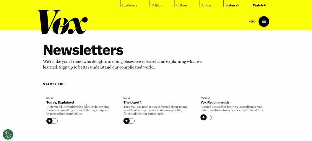
Don't get scared with this opt-in example. While it might seem overwhelming at first glance, it uses smart mechanics worth borrowing. Instead of sending a generic newsletter, Vox breaks their content down into clearly defined topics. Visitors can pick and choose which subjects they actually care about, making them more likely to open and read emails rather than delete or unsubscribe.
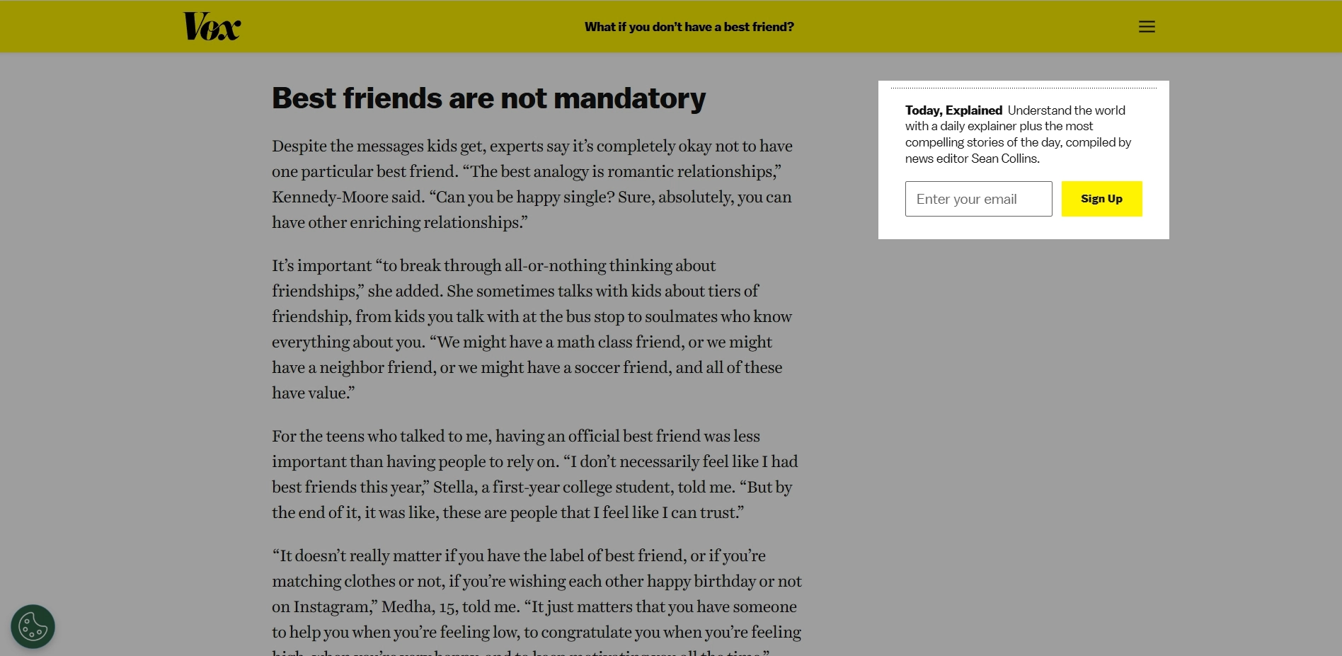
You’ll also spot classic inline forms subtly placed to the right of articles. What’s smart is that the copy adapts to the article category, offering different value propositions depending on what the reader is currently browsing. This personalization makes the subscription feel more relevant and timely, boosting the chances of conversion.
Placing your subscription form where visitors are most engaged, like at the end of an article or during key moments, increases sign-ups and quality leads.
Robinhood
A bit different approach to asking you to subscribe from the financial news website Robinhood.
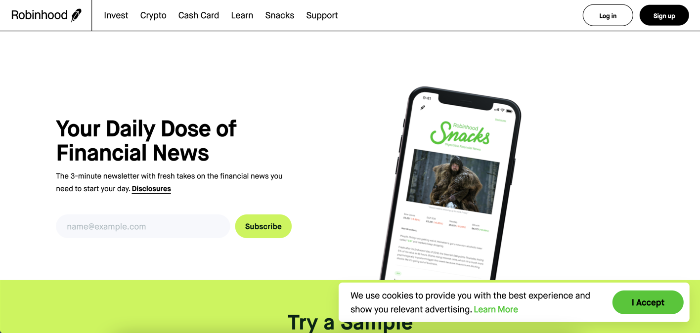
This opt-in email example is very interesting, as this is the first thing you see on Robinhood’s news landing page. As you can see from the design, the banner does a great job of showing what the newsletter looks like and clearly stating what readers will get. Finally, they promise it’ll take only 3 minutes to read the news to catch up with the financial world!
That “3-minute read” angle is a clever way to ease commitment and highlight value. It reassures visitors that staying informed won’t take much time. A technique worth borrowing for your own email form!
Mansion Global
Positioned right where it matters most, Mansion Global’s opt-in form captures only the engaged readers.
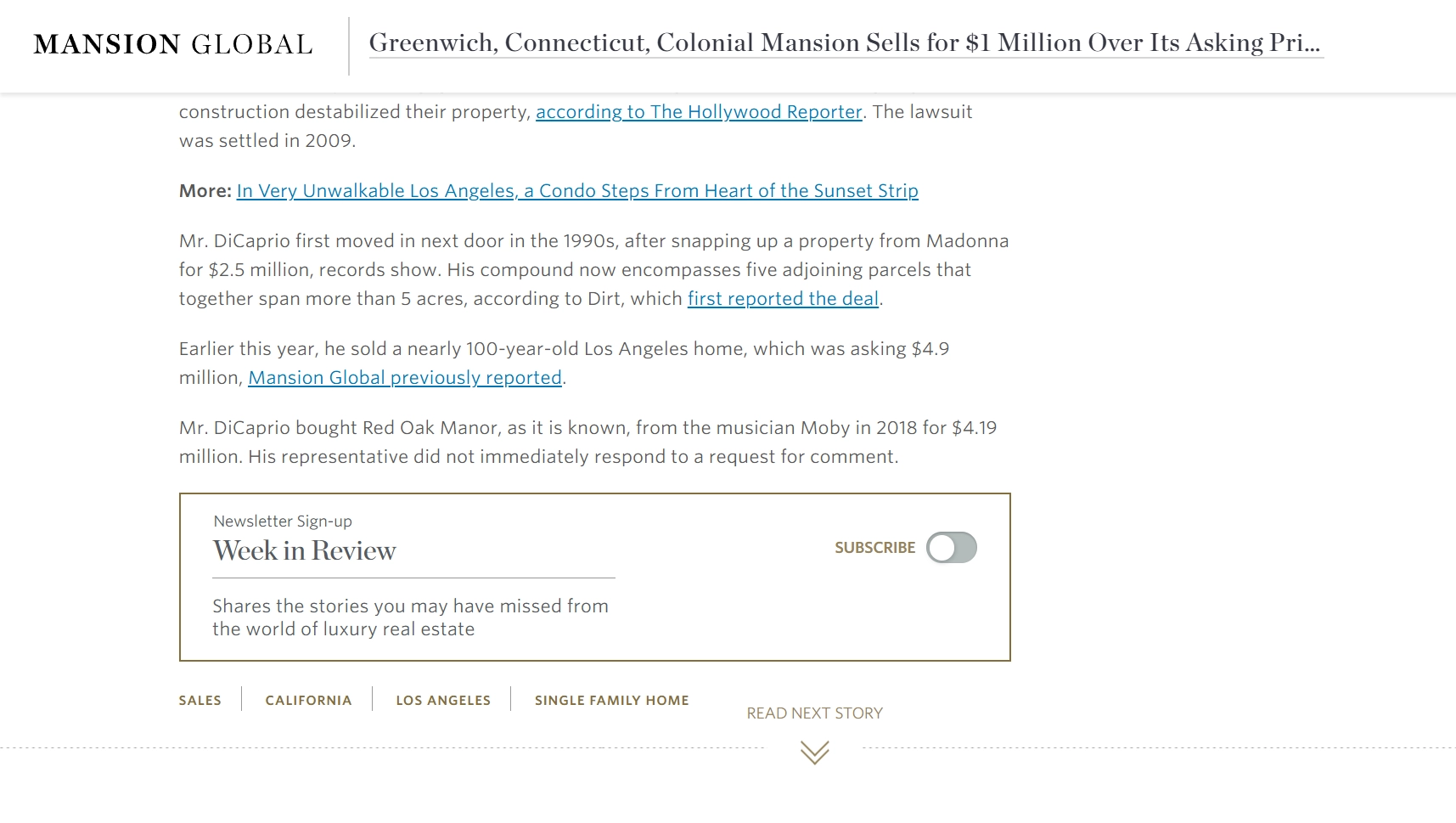
Nestled right at the end of an article, this opt-in targets readers who have already engaged with the content. By waiting until the final paragraph, it ensures the leads captured are genuinely interested, not just casual visitors. This smart timing improves the quality of subscribers and likely increases conversion rates.
The copy is clear, authoritative, and perfectly tailored to Mansion Global’s sophisticated audience. It also gives a hint that subscribers won’t be bothered or spammed daily, receiving only a weekly roundup.
Another notable feature is the unconventional toggle-style subscribe button, rather than a typical email input field. This unusual design choice attracts attention and simplifies the interaction.
This form shows how strategic placement, clear copy, and innovative design work together to create a high-quality opt-in experience that fits Mansion Global’s luxury image.
Morning Brew
Morning Brew knows how to hook busy readers from the very first glance. This business newsletter (covering not just finance, but a broad range of current topics) is designed to help you understand the zeitgeist even during casual watercooler chats at work.
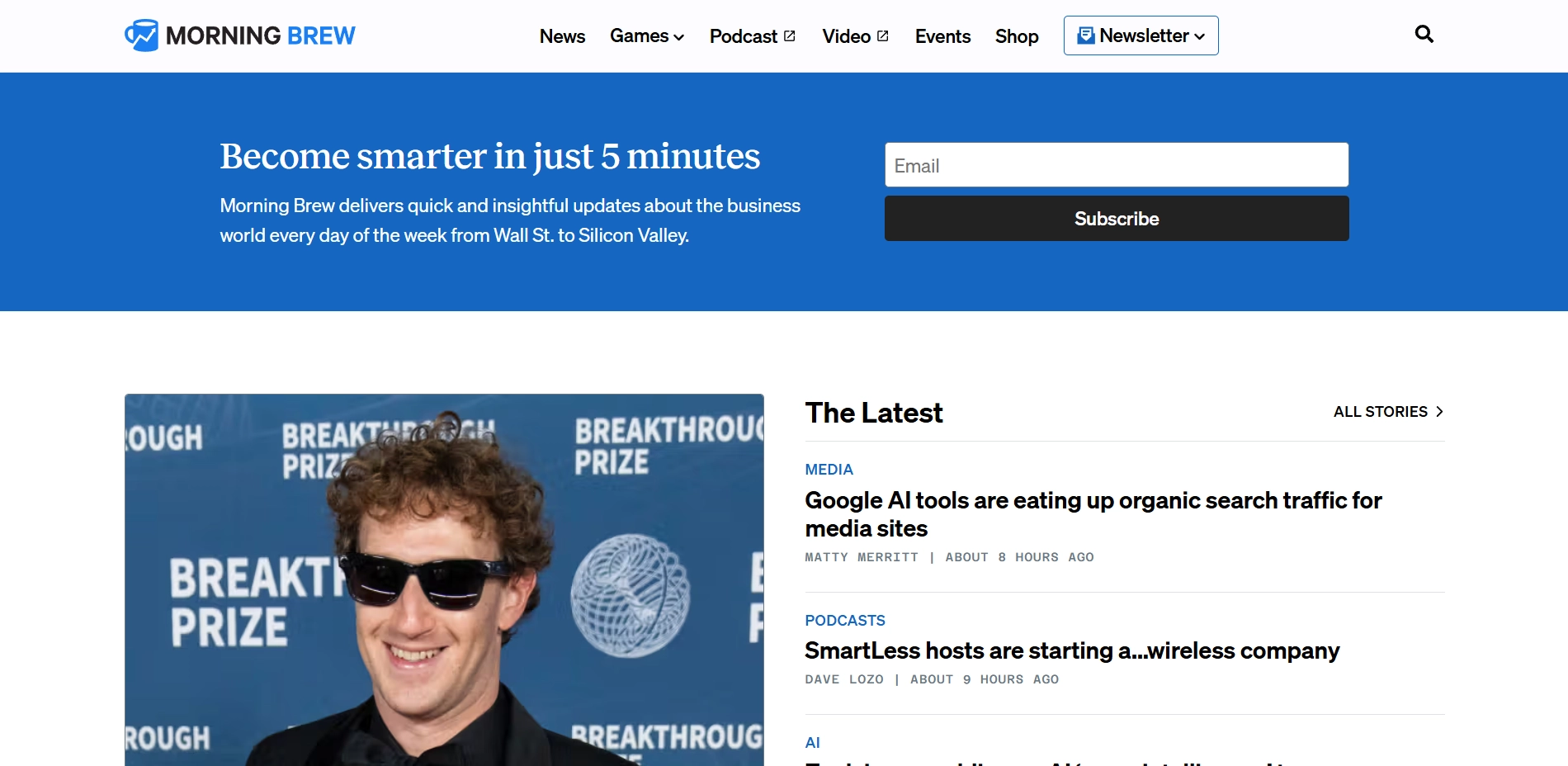
From a design perspective, placing the opt-in form right at the top of the homepage is a smart move. No one can miss it.
Like Robinhood, Morning Brew promises a quick read — just 5 minutes to get through the day’s news. It's nice and doable for anyone who wants to be on trend but does not dive deep into specific topics. As the world moves faster, it is necessary to keep on track with current issues in different niches, right? So maybe you also have something to share that people could later discuss with their friends.
WPBeginner
WPBeginner uses a high-impact approach to building its mailing list. Their opt-in strategy is based on double exposure: a persistent sign-up form on the landing page and an exit-intent pop-up that captures visitors before they bounce.
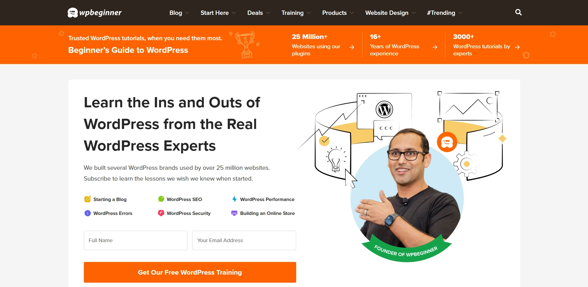
What makes these forms click is how instantly clear the value is. You’re not just “signing up for updates”, you're subscribing to real benefits. You get access to free WordPress tutorials, videos, bonuses, and a toolkit to help grow your site and save money. It’s a solid pitch, and it works.
The other form pops up when you show signs of leaving. A classic double opt-in strategy, and a smart one.
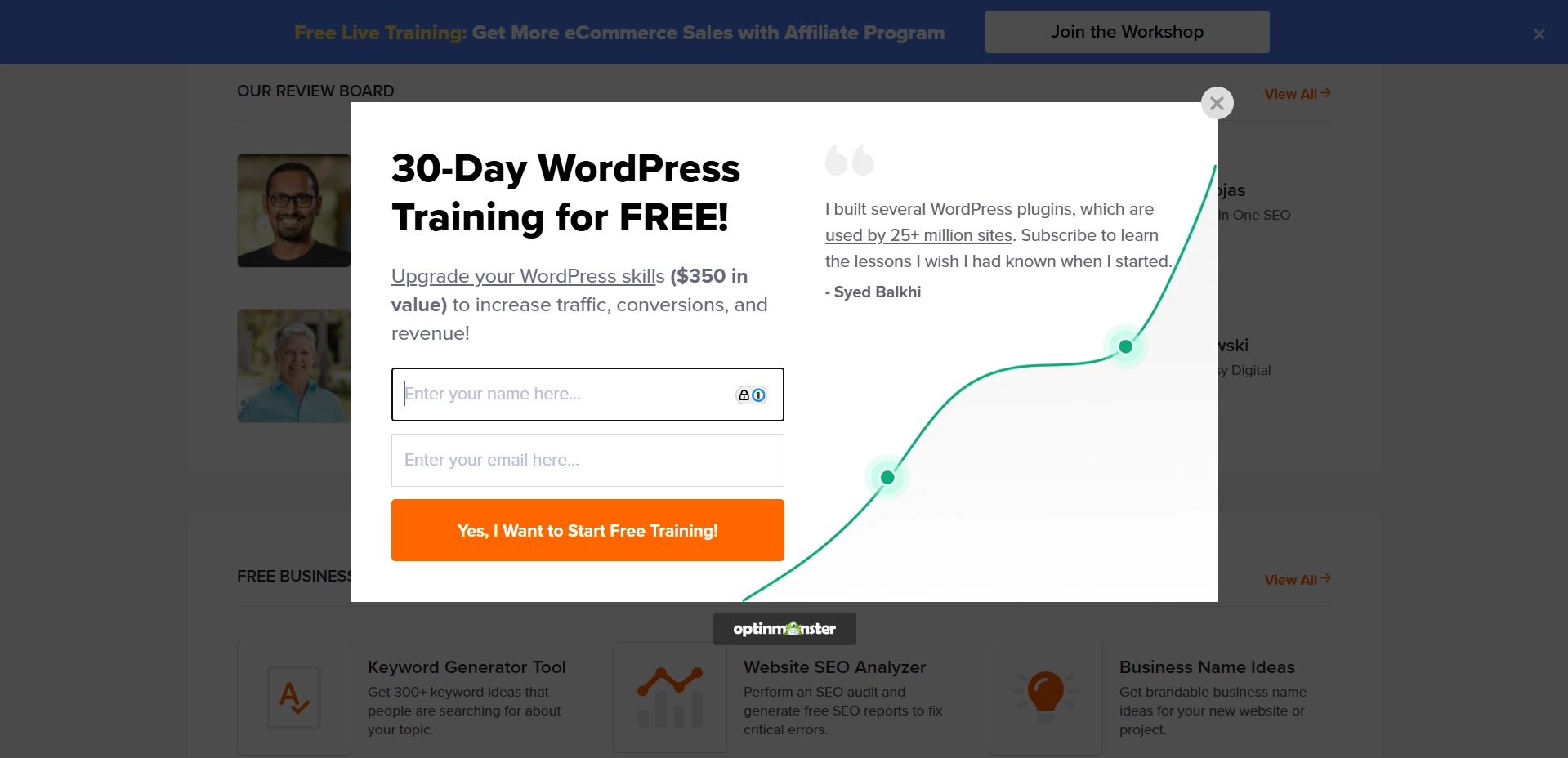
The layout is as straight as a pencil: bold headline, short subcopy, and a clean CTA that makes you feel like you’re grabbing something valuable rather than giving away your email.
And there’s a cherry on top — a social proof boost from Syed Balkhi, the founder of WPBeginner. His testimonial on the pop-up reminds you that this isn’t just some random newsletter with lessons. It’s curated by people who really know WordPress. That personal touch adds a ton of trust right where it counts, just before you bounce.
Belle & Bloom
Meet a clean, low-friction inline form that lives quietly in the footer of the Belle & Bloom website.
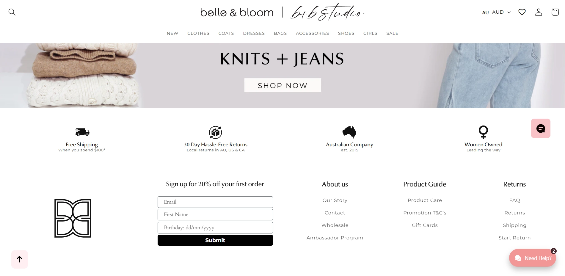
Just a simple offer: 20% off your first order in exchange for your email, name, and birthday. This is a classic value-for-data swap, dressed up with a polished look that matches the brand’s aesthetic. Offers like this are often the backbone of effective email marketing campaigns.
The form fields are minimal and tidy, and the black “Submit” button stands out without overwhelming visitors with flashy colors. It feels more like joining a community than signing up for a promo.
What really seals the deal is the subtle stack of trust markers just above: free shipping, hassle-free returns, women-owned business, and local credibility as an Australian brand. Together, they add quiet authority and help cue hesitant visitors over the line without a hard sell.
3. Slide-In Opt-In Examples
Slide-ins appear from the side or bottom as people scroll. They’re less distracting than popups but still grab attention, making them a great middle ground to boost sign-ups without annoying visitors. Let’s check out some of the best newsletter opt-in examples that use slide-ins the smart way.
Nature
This slide-in form takes the backseat, and that’s exactly what makes it work.
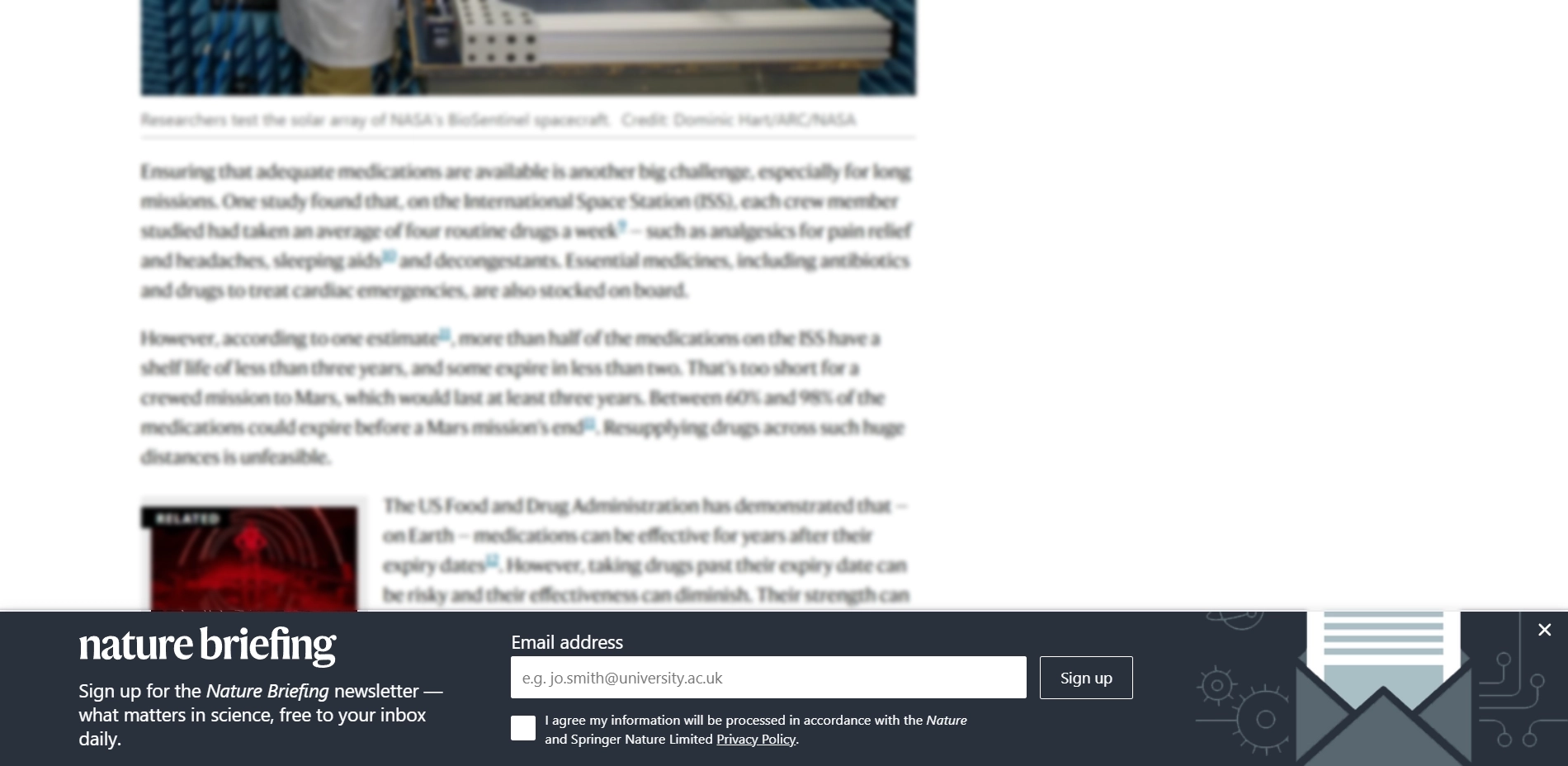
It appears quietly from the bottom of the screen while you’re in the middle of reading an article. No flashy animations or pop-up drama — just a gentle invitation.
The design leans into Nature’s signature aesthetic: cool, blue-gray tones that blend seamlessly with the site’s layout. The form is not trying to steal the spotlight and feels like a natural extension of the reading experience. A subtle envelope icon adds a visual cue without noise and makes us understand, without any words, that the form is about email. This is the way smart design minimalism should work.
The copy is clear, direct, and fluff-free, and that’s precisely what the Nature audience is looking for. The type of opt-in form, the message, and the design are perfectly tuned to its audience of serious readers and science enthusiasts.
A great reminder that sometimes less is more, and tone-perfect delivery is everything.
Mr. Coffee
Let’s take a look at the classic approach to the slide-in opt-in example, but with a catch.

Like most slide-in forms, this one doesn’t interrupt the user experience, but rather complements it. It quietly appears in the bottom right corner, subtle but intentional.
The real hook is the headline: “SEE WHAT WE’RE BREWING UP NEXT.” It’s sharp, clever, and very on-brand. A playful nod to coffee culture that doubles as a teaser for future perks — recipes, giveaways, exclusive deals, early access to new products, and more. That’s the kind of copy that makes people pause. It doesn’t scream “sign up.” It sparks curiosity.
It’s one of the more creative wording examples out there — the kind that turns a forgettable opt-in into a branded moment people remember.
This form shows how smart microcopy and thoughtful layout can turn a basic slide-in into a branded, high-converting moment.
Trinny London
When effortless design meets a smart marketer, you get a stylish conversion tool.
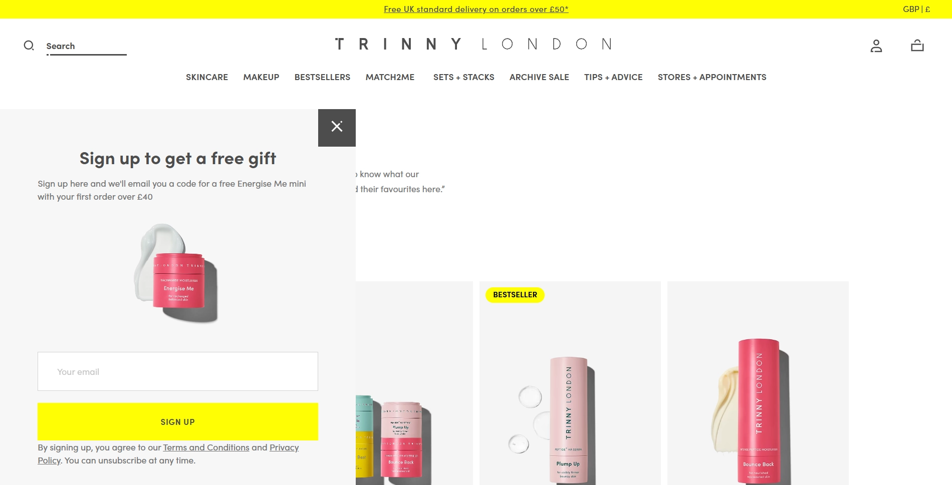
Trinny London keeps it simple and stylish with this slide-in form. Every element in this form is designed with a purpose. The soft, muted gray background of the form highlights the tangible offer without overwhelming the user. The straightforward headline promises immediate value. The gift image makes it feel real and desirable. The contrasting yellow SIGN UP button draws the eye and guides users towards action. Finally, the fine print builds trust by guaranteeing privacy and the freedom to unsubscribe.
Altogether, this slide-in is a balanced blend of style and function, perfectly aligned with Trinny London’s chic yet accessible brand vibe.
4. Fullscreen Sample Opt-In Forms
Fullscreen forms take over the entire screen, demanding full focus from your website visitors. They are perfect for major announcements or special offers since they’re hard to miss. Thanks to this, such forms can drive big conversion spikes when used sparingly and with clear value. Let’s dissect the following opt-in samples to see what makes the best fullscreen opt-in forms so effective.
Neil Patel
Who would do better than the marketing rockstar, Neil Patel? Let’s take a look at his opt-in email form approach.
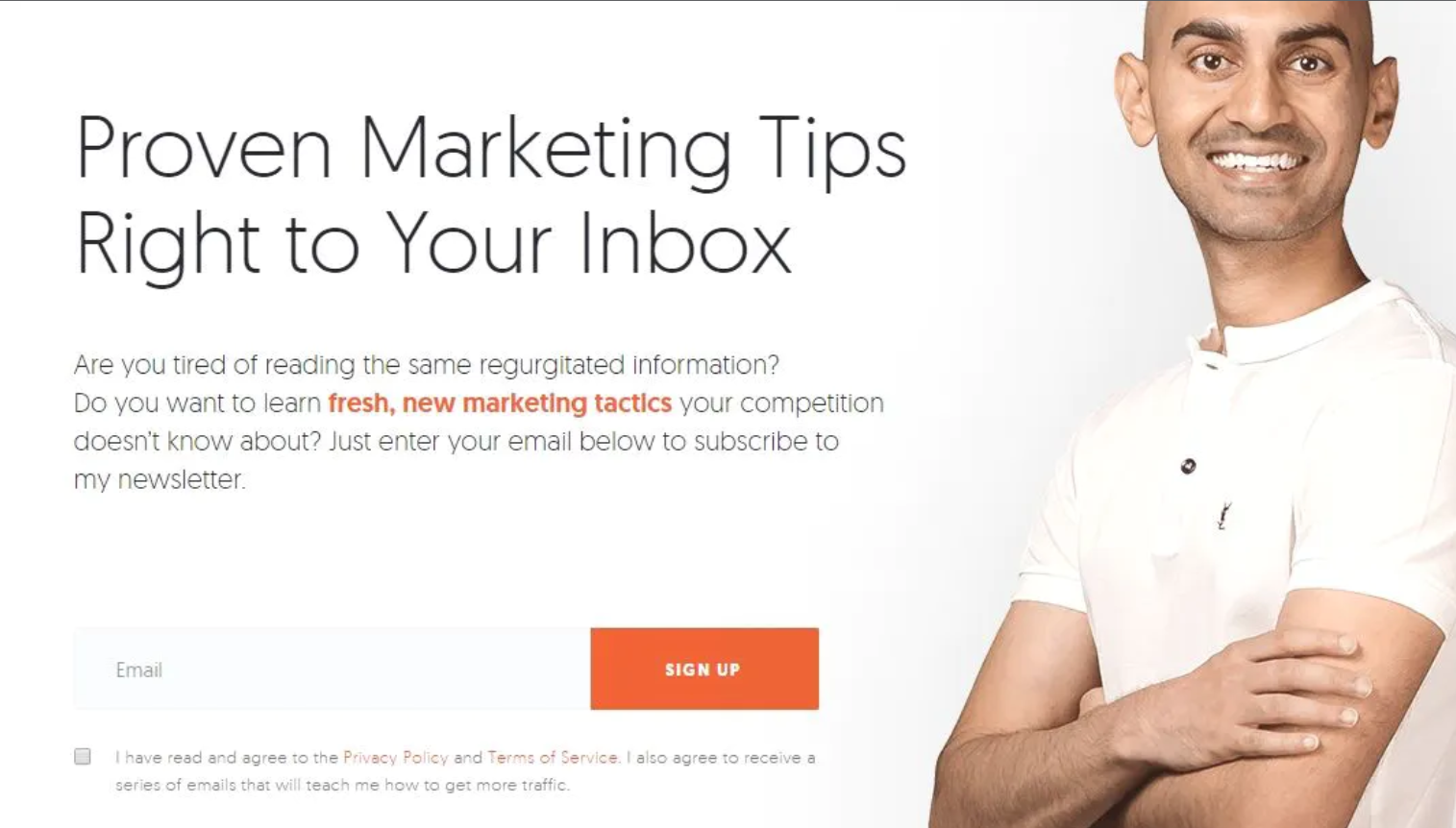
Even though Niel is a well-known marketing expert and many people will subscribe to his newsletter, he still has to prove his value, right? This opt-in email example does just that. With the right words, it clearly shows what readers will get. Besides, Neil writes about the key pain point for his audience — competitors. And he has tips on how to deal with them!
Substack
Substack is an emerging email subscription platform where writers can build mini blogs and send posts straight to subscribers’ inboxes. Each creator has its own page, which resembles a small online media that you can subscribe to.
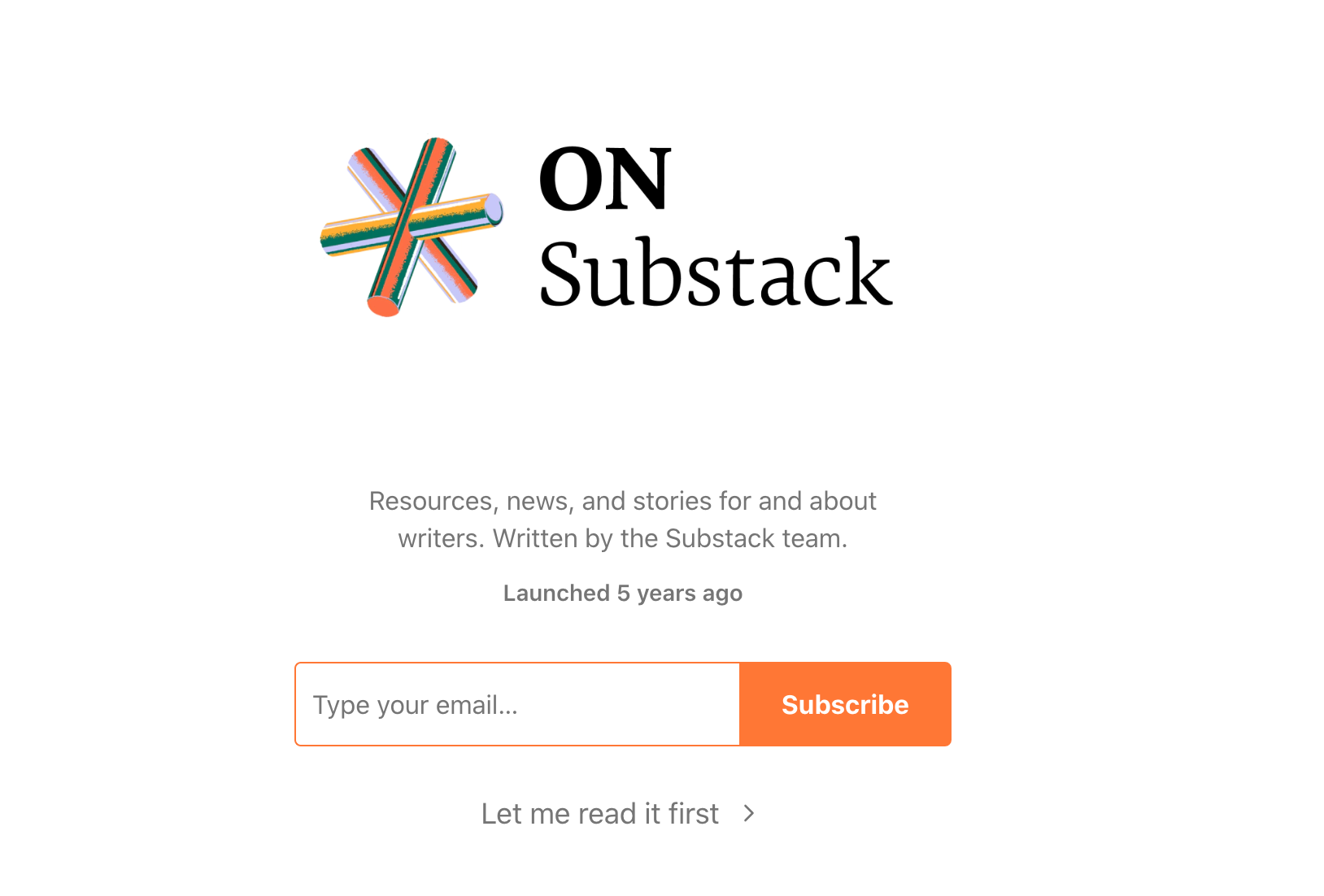
This opt-in email example stands out because it’s not just one form — it contains thousands of little blogs. Every Substack blog uses the same opt-in layout, but each writer adds their own message to attract readers. So this is what makes it interesting for us and for smaller businesses.
Unlike big names like The New Yorker or Neil Patel mentioned above, you can’t rely on brand power alone. You have to make every word count. So if you're creating an email opt-in form, we want to call you to take your time. Make sure your message is clear, catchy, and worth the click.
Clinique
Why not turn skincare into a fun, gamified experience?
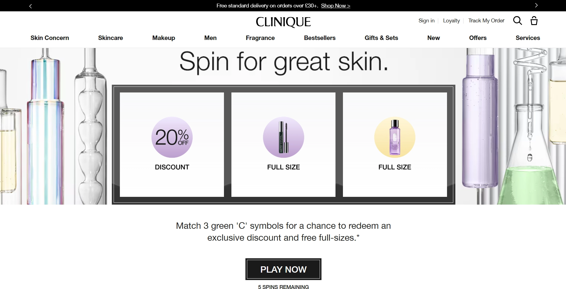
Instead of just asking for an email, Clinique invites visitors to “Spin for great skin.” The clinical aesthetic and modern design feel fresh and easy to navigate. The slot-machine layout instantly signals fun and reward.
It’s a simple game mechanic that makes the experience fun, not pushy. The “PLAY NOW” button is clear and inviting, and the countdown of spins adds just enough excitement to keep users engaged.
It’s a smart way to grab attention, give something back, and grow the list — all without overwhelming the user.
Use gamified pop-ups to make email collection feel like a reward, not a request. A small prize can spark action where a plain form gets ignored.
NPR's Pop Culture Happy Hour
Keep on track with everything happening around you.
Notice how NPR keeps it simple: they mention the newsletter is a weekly guide and clearly outline what kind of information you'll get. Nothing more, nothing less.

Another smart touch: all the essential links (Terms of Use, Privacy Policy, and Terms of Service) are placed right above the SIGN ME UP button. It’s a clear, transparent move that shows they respect your data protection rights and want you to know exactly what you’re signing up for. By highlighting these links, they make it obvious that you’re giving explicit permission to receive content. NPR follows a trustworthy approach that builds user confidence.
Charlotte’s Web
Charlotte’s Web’s opt-in form hits the sweet spot between strong visuals and personalized offers.
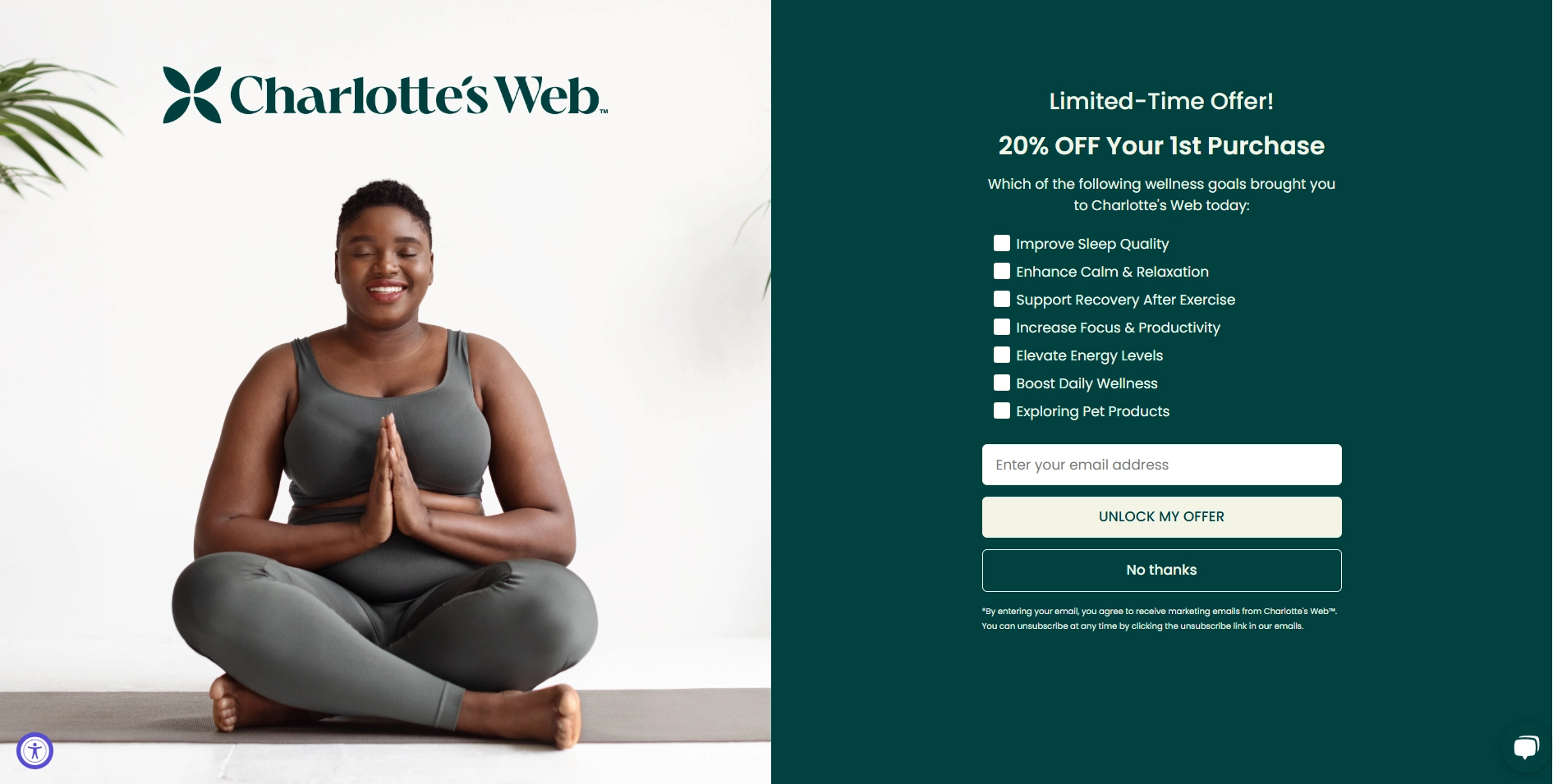
The thoughtful design of this sample opt-in form adds to the user experience. The photo is giving yoga vibes and creates a serene, health-conscious atmosphere. This aligns well with the brand's niche and the lifestyle of its customers. By offering 20% off, the form captures attention and encourages users to join.
What really sets this form apart is the wellness goals checkbox checklist. By asking users to select their specific needs, from improving sleep to boosting daily wellness or even exploring pet products, Charlotte’s Web personalizes the experience. This not only makes the offer feel more relevant but also helps gather valuable data for tailored email marketing campaigns.
As a cherry on top, a bold “UNLOCK MY OFFER” button creates a clear call to action. On the other hand, the “No thanks” option respects user choice without pressure, rounding out a smooth opt-in process.
Overall, the design and copy work hand in hand to create an engaging, user-centered opt-in form that speaks directly to Charlotte’s Web’s wellness-focused audience.
Be Transparent in Opt-In Email Forms
Don't rush in creating an opt-in email form without looking at and analyzing every one of those examples we've covered earlier. All of them are fresh and bright, covering different business niches, from finance to culture, cuisine, and clothing. You just have to get inspired by the marketing best practices of those business owners who've nailed the opt-in game.
To build a healthy email list, start with a transparent opt-in process. While single opt-in makes it easy to start sending emails right away, double opt-in adds a layer of trust by asking users to verify their subscription through a confirmation email. Whichever you choose, the key is to make it easy for subscribers to join without friction.
Be real with your customers. Don't go on hiding something or writing unclearly. If people get too suspicious, you might end up not getting subscribers at all!
Anyways, we hope you can now go and create the best opt-in email form that will bring you lots of newsletter subscribers. And if you are not ready, you can check out other stories we have on our blog.


In my experience, there are several effective practices for drawing in readers through email communication. These include crafting an attention-grabbing subject line that incorporates emoticons and an appealing phrase, personalizing the message by addressing the recipient by name, highlighting the clear benefits of subscribing, and incorporating visuals such as emojis and bold text to emphasize important aspects of the email. I personally utilize this particular approach when creating emails.
A helpful guide on how to obtain customer consent for email marketing. Opt-in email addresses should be collected and valuable content should be offered to meet the audience's needs. This attracts and retains more customers.
Practical examples, thanks!