
Website Gamification: HowTo & 10 Best Examples
Сreating gamified websites people want to engage with? Web design best practices with mockups, prototyping, and iterations are just the beginning of your journey. We will provide design frameworks, accentuate UX funnels, and offer stellar examples of how your favorite websites implemented gamification.
So, how do you make gamified websites? With the help of web page widgets, of course!
Unlike most digital products that exist for utility, gamified widgets, or popups, serve for motivation and work outside of the core value exchange (in ecommerce, its formula is money for a product). However, they are not standalone components but parts of a larger ecosystem — a website that keeps evolving and is shaped by how customers interact. Therefore, your gamified pop-ups need to be simple, clean, and easy to use or, in other words, unifunctional, to fulfill their purpose of motivating customer behavior.
How to create a gamification website
6,000 consumers across the US and Europe were surveyed about their online shopping behavior and how website functionality influences it. Relevant to our discussion are the following data:
- Customers: 60% choose to abandon their carts
- Ecommerce companies: each consumer made an average 5 purchases less than usual per year
Guided by bias and misconception, some people quickly give popups negative aura points, believing they are annoying and just about discounts, too complex to implement, suitable only for ecommerce, slowing down websites, and so on.
But are they all that, or are we just not doing it right?
Thought-through popups that fit into the overall website engagement architecture can help you address your customers’ pain points and work towards resolving them. Gamified popups don’t have to be annoying. They should feel like a reward in themselves.
However, it’s one thing to know the techniques; it’s another to design an experience that works. We’ll go over layout, timing, and storytelling strategies that turn curiosity into action.
Designing for simplicity — why less is more
When it comes to gamification in marketing, simplicity is key. Overloading users with too many options or complex gameplay mechanics can quickly lead to disengagement.
Simplicity is the quality of being easy to understand or do. In terms of gamification, your users need to know immediately what you expect of them and what they will gain from the interaction. Why immediately?
Cognitive load theory, as a psychological framework, suggests that our working memory has a limited capacity, and so too much information at once can make our brain say “Hard pass, but thanks.”
So, limit the number of choices or actions your users need to take to get the reward. If you want to further streamline your efforts, avoid multiple goals or ambiguous instructions.
Let’s break this concept further down to get to its semantic core built on the ideas of clarity, minimalism, consistency, efficiency, and accessibility.
Clarity
Here, we mostly concentrate on the content of your popup. Information is presented in a straightforward, easy-to-understand way.
The language is simple, there is no unnecessary jargon, and the messaging contains no ambiguity and fully conveys the goal you want your users to achieve.
|
Do ✅ |
Don’t do ❌ |
|
|
Instruction |
Spin the wheel to win a discount! |
Click here for a chance to win something amazing! |
|
CTA |
Spin now |
Get started |
|
Analysis |
Concise instructions, no verbal ambiguity, users understand the value of this exchange and are motivated by it |
Vague messaging, unclear reward, and even more confusion added by the CTA — what are users to get started with? NB: Such instruction (minus the CTA) can work well for narrowly themed niches that deal with fantasy fiction, magic, and surprise gifts, so this element of mystery may be contextually advantageous |
Minimalism
Mainly perceived as a visual style that should appease customers, it calls for your popups to be clean, truthful, and honest in that they use only basic elements and don’t distract from the core message.
All the listed ingredients, done properly, have the potential to make an intuitive user interface, as they will improve customer focus and enhance information perception. As for the game mechanics, stick to their core features.
|
Do ✅ |
Don’t do ❌ |
|
|
Elements |
One mechanic, short instruction, single CTA button |
Multi-step form in 3 screens: 1st asks for an email, 2nd offers to play, 3rd reveals the actual mini-game |
|
Intuitiveness |
Buttons and CTAs are placed where users expect them |
Busy background, multiple fonts, and overlapping elements |
|
Analysis |
No distractions, unnecessary graphics, or text |
Users are forced to actively restore the interactive flow to understand what’s happening on the screen which usually results in frustration |
Consistency
Uniform design patterns and behaviors across the user experience help users predict outcomes and navigate effortlessly.
When elements function the same way throughout the interface, users build familiarity and confidence. This way you shape their expectations, reduce friction, and enhance overall engagement.
|
Do ✅ |
Don’t do ❌ |
|
|
Elements |
A popup uses the same color scheme, font, and button style as the rest of the website |
A popup that made its goal to stand out from the rest of the website design as much as possible |
|
Analysis |
User perceives it as a natural part of the experience; no interruption, no unnecessary questions and actions are provoked |
User is most likely to feel like it’s an alien intrusion and might be a scam NB: This radical approach might work well for the niches, where grabbing attention is key:
The key to knowing if it’s for your business? TEST! |
Efficiency
Unlike its related concepts, efficiency focuses on how quickly and effortlessly users can complete a desired action.
To achieve efficiency, you need to eliminate all extra steps, integrate your popup smoothly into the browsing flow, and prioritize quick decision-making.
|
Do ✅ |
Don’t do ❌ |
|
|
Steps |
Three: enter email, click on a box, collect the reward |
Many: fill out a form, watch a quick promo video, pick a box, rate your experience, collect the reward |
|
Progression |
Clearly linear, supporting one intention, which concludes with an actionable result after step three |
Fake-linear, following multiple intentions and requiring more than one feedback from the user |
|
Analysis |
The process is ultraquick and requires minimal effort |
Such design creates unnecessary friction and may lead to user drop-off if not negative reviews |
Accessibility
Simple is accessible to broader audiences, and the more users understand how to use your widget, the more of them will.
Another building block here is cross-device functionality, which might seem like a default best practice. However, not everyone actually takes pains to implement it.
|
Do ✅ |
Don’t do ❌ |
|
|
Devices |
Popup works seamlessly on desktop and mobile devices |
Popup is optimized for mobile devices, making the wheel hard to spin |
|
Instruction |
Click to spin for desktop and swipe to spin for mobile |
Swipe for both device types |
|
Analysis |
Even if the same user interacts with the popup on different device types, they will enjoy the experience |
User might not find the way to interact with the widget right away and thus lose patience to proceed |
Timing your popups — when to engage for maximum impact
Even the best-designed gamified popup will fall flat if it appears at the wrong time, leading to the user's frustration rather than sheer excitement. Luckily, years of running tests and evaluating their results have helped us establish best practices for when your popups should appear.
There are triggers based on user behavior and customer journey stage, ensuring the popup appears at the optimal moment to engage visitors who are most likely to convert.
Behavior-based triggers and what might set them off
- Time. Engage your users after a specific duration on the page:
- a user has spent 60 seconds on your website and had a chance to look around
- a reminder popup after 2 minutes of a user being inactive on the website
- Scroll. Activate popups at certain scroll percentages:
- at 50% down the page, show them product recommendation quiz
- at 75% — a scratch card with a reward if they signup for your newsletter
- Exit-intent. Detect when users are about to leave and present a last-chance offer:
- a user moves cursor to close the page
- they can also aim for the address bar, in both cases you can ask them for the reason they are leaving, provide a special offer in exchange for an email, etc.
- Action. Respond to specific user interactions:
- clicking a button
- hovering over an element
- Awareness stage: use gentle, informative popups for first-time visitors to introduce your brand
- Consideration stage: offer incentives (like discounts or exclusive offers) to guide hesitant users toward conversion
- Decision stage: use time-sensitive offers to create urgency for those close to purchasing
Avoiding popup fatigue
As you remember, we talked about decision fatigue, and now there’s a popup one. Yes, people can get easily tired of different things, so always evaluate your ideas. We have collected some to get you started:
- Space out popup triggers to prevent overwhelming users with repeated interruptions. If your user saw a welcome popup message, don’t show another one for at least 30 seconds on the website.
- Limit the frequency of popups to maintain a positive experience. It can be maximum one per visit or per page or per user depending on the session.
- Ensure that popups don’t interrupt critical user tasks. You can test different trigger times (e.g., 10 seconds vs. 30 seconds on-site) to see which results in higher engagement.
- Testing and optimizing trigger points for different user segments. Show different popups for new visitors vs. returning customers or engaged users vs. those about to leave.
Use previous user data (like browsing history or past purchases) to trigger highly relevant popups because personalized timing ensures the popup feels helpful rather than intrusive.
Storytelling: the how of gamification design
Case 1. A fitness website that frames daily workouts as training for a “heroic marathon.”
Case 2. A language-learning platform that turns lessons into a journey to “unlock ancient secrets.”
Both cases are examples of storytelling as is: they concentrate on the “what” and strive to transform a user experience into a quest. However, it can also be very helpful as the design technique that addresses another question — “how?” How do we make our users’ experiences cohesive? How do we help them get more than our products or services?
As always, let’s start with the definition:
Storytelling is the connection between parts of any complex entity like a brand’s marketing campaign and reality as a whole. Unlike narration that exists to give account of events, storytelling provides cohesion and purpose for anything it ties in together.
For example, you can design gamified popups along with the actions you want your customers to take. However, the way and frequency of their interactions, further actions they will or will not take, and how that will influence the development of your business — may be conditioned, prognosed, and then measured, but not predetermined. Understanding your product from this perspective allows you to find more opportunities for growth.
As we’ve established how storytelling is the connection, we should also name the system itself — a gamified popup incorporated into a website and user experience. Now let’s see what its elements and goals are.
Elements
Characters
In marketing, each customer should feel like the main character at the epicenter of events — the chosen one, if you will. With countless visitors to your website, how can you make sure everyone tries on a hero cape?
Start by personalizing the experience — call them by their name, show them dynamic content, and tailor the journey to their actions. Claspo makes this easy, especially when paired with a page builder. Ultimately, these tools let you visually place gamified widgets and personalized elements exactly where they matter most.
Not to get too techy, but we need to talk about how to make that happen. In Claspo, we can use Data Layer events to, among other things, display the names of logged-in users as dynamic content in widgets.
The Data Layer is a standardized tool for data exchange in digital marketing and web analytics, especially in e-commerce. It acts as a bridge between your website and services like Google Tag Manager or Claspo.
Using the Data Layer, your website can retrieve stored user information (such as a name from a login) and dynamically display it in popups, banners, or product recommendations.
This level of personalization transforms generic interactions into deeply personal experiences.
Conflict
We usually attribute negative connotations to this word, but it is actually neutral and means a clash or incompatibility between forces, ideas, and even states.
In gamified widgets, such oppositions are choices your customers need to make. To illustrate, let’s look at the mockup questions they might be asking themselves:
- “Should I take this reward or wait for a better deal?”
- “Do I need to act now or lose my chance to win a prize?”
- “Which choice will give me the biggest benefit?”
Setting
A setting is time and place, where time means when they interact with your business, and the place is where it happens. The first one refers to the actual time of the day, season, whether there is a special occasion or holiday as well as how fast your popups appear. The second one is the overall visual and strategic design that frames their experience.
Plot
Here, a plot is a structured sequence of events that moves users from initial curiosity to meaningful interaction. If we were to break it down with examples, it would go like this.
- The hook captures your user's attention: a spin-the-wheel pop up appears with the message: "Your luck is calling! Spin for a surprise discount!"
- Engaging them with your mechanics translates to the rising action: they spin the wheel, scratch a card, or pick a mystery box, triggering excitement and an emotional investment in the outcome.
- The climax is when they make a decision and get rewarded for it: "You won 15% off! Redeem now or try your luck again tomorrow?" — but it is not the end!
- You need to encourage your user to act further — make a purchase, sign up for your newsletter, etc. — and this makes the resolution: a “Redeem now!” CTA button that will take your customer to perform the action on the right page.
FYI Resolution is also the final element of storytelling. Now let’s see what purposes storytelling in marketing through gamified popups pursues.
Purposes
The main purposes of using gamified popups to enhance user experience are to captivate, persuade, and entertain, making the audience feel connected to the message.
Storytelling in gamified popups isn't just about adding narrative elements — it's a strategic framework that structures user interactions, making them more engaging, intuitive, and purpose-driven.
By integrating storytelling elements, businesses can guide users through a seamless, emotionally compelling journey that drives action, improves personalization, and enhances user experience.
Mapping your audience’s journey and when gamification is relevant
A mental sunrise that transforms confusion into insight is…?
Your immediate guess would probably not be “aha-moment,” but it surely is something we want our users to have almost immediately as they arrive on our websites. Moreover, it is a point of the customer journey where business- and user-centered funnels meet. Generally, aha-moment is most likely to occur during the decision stage of the customer journey, but you can trigger it in your visitors anywhere you deem necessary.
By definition, aha-moment is a point when a user experiences a breakthrough or a deep realization of the value a product or service offers (a mental sunrise, if you will). Gamification in ecommerce can be of great help as among other things, it can support your marketing efforts by providing:
- instant gratification and rewards
- clear goal orientation
- surprise and delight
- earnest reasons to feel curious
And that will all work well if you truly know your customers. However, there’s no point in introducing gamification if you don’t know when and where it will have the most impact. Because if you don’t understand the journey, you can’t gamify it.
The customer journey — where engagement falls short
Before you can figure out where to insert digital marketing gamification, you need to know where your current engagement strategy is falling flat. Is it during the discovery phase when users first encounter your brand? Or maybe they’re losing interest during the decision-making process, bouncing right before purchase. Users may drop half the way through (or even sooner) and have multiple JTBDs that will not culminate in at least one purchase.
There are several approaches to map these complex sets of activities. Generally used is the one that reflects the ideal journey as a linear progression of motivated steps a customer takes towards conversions. It usually looks like this:
Awareness → Consideration → Decision → Purchase → Post-Purchase → Advocacy/Loyalty
It’s common knowledge, but we’ll say it: apart from analyzing your own data by means of business intelligence, consult with the benchmarks of your niche to detect the stage(s) where you need reinforcement. Here is what their numbers — actual and aspired — have looked like for ecommerce in the past couple of years.
For the first four stages, benchmarks suggest that a little short of 50% of customers move towards viewing the product (i.e., dwindle around the decision stage), almost 15% add products to a cart, and the decision-to-purchase conversion is 2-4%.
Post-purchase or repeat customer rate of 20-40% is considered good, whereas 50% and above — excellent. One real-market example for this stage is the data Metrilo collected from their customers in 2023-2024: on average, 28.2% returned to make at least one more purchase.
Advocacy/Loyalty benchmarks are harder to track and thus measure, but there are several indirect ways to infer them. For example:
- See the percentage of customers that are only loyal to one brand to benchmark your numbers
- 12-15% of customers are loyal to a single retailer, yet they represent 55-70% of total sales.
- Check the percentage of customers from referrals; surely, you will not be able to verify every customer stream, but affiliate links and promo codes will give you enough to draw baseline conclusions
- online businesses receive 60% of sales from referrals by brand advocates and superfans.
Depending on when your user became authenticated and thus trackable for your analytics, you can choose a different approach to mapping their journey. Keeping in mind all the “ideal” steps they should take and smaller JTBDs that usually escape our eye, start with the first confirmed step and map 3-5 steps before and after. This approach can support you when you feel lost for ideas on how to detect where you are losing engagement.
Discovery with gamification — creating a first impression that sticks
You never get a second chance to make a first impression — that’s why welcome experience is so important. It’s when new visitors decide if your brand is worth their time. If the experience is dull or overwhelming, you’ll lose them fast. Gamification during discovery can be a game-changer — literally.
Discovery corresponds with the consideration stage, meaning your potential customers are at least willing to hear you out. On top of that, an effective guided introduction to your product can:
- Reduce friction by helping users navigate the site and find what they’re looking for
- Build trust by presenting your brand’s value proposition and credibility
- Increase engagement by encouraging users to explore more products and features
- Drive conversions by leading users toward making a purchase.
At the beginning, we talked about the power of the aha-moment without mentioning how it plays into user activation. Yes, discovery, aha-moment, and user activation are parts of a broader customer journey (or product adoption lifecycle: in brackets to mitigate the confusion).
You might appreciate analogies, so think of the connection between these three as a complete communication loop, where a sender (your business) shoots a message (clear value proposition during onboarding), and a receiver (your user) gets it (aha-moment) and gives positive feedback on it (starts using your product — user activated ✅).
Here’s how they fit with each other in product marketing terms under the ideal conditions:
- Discovery introduces the product's core value →
- The core value sparks the aha-moment, encouraging deeper user engagement →
- Aha-moment leads to user activation, which increases the likelihood of retention and long-term loyalty.
When we say that aha-moment is to be sparked, it sounds a bit vague, as if magic should happen. However, behind the “spark,” there always stands intentional persuasion carefully planned by the marketing team. In his book “Influence: The Psychology of Persuasion,” Dr. Robert B. Cialdini suggests that there are six principles of persuasion. High on the list is reciprocity: having received a favor, a user is more likely to return it — quid pro quo.
Make discovery interactive and rewarding
Your audience doesn’t know you yet, so make that first interaction count. Think interactive quizzes with mystery rewards that help them discover their perfect product match and reveal a welcome surprise offer when they reach the end. Playful first-touch experiences turn passive scrollers into engaged visitors. In addition, let your shoppers' voice guide your marketing. Pull winning phrases straight from reviews and weave them into your gamified campaigns.
Gamifying the decision-making stage — turning browsers into buyers
Your visitors are interested. They’re browsing product pages and comparing options, but they’re not fully committed. You need to give them a little push in the right direction. However, before that, you should look into why they are still hesitant. Knowing common reasons will help you find the appropriate means to address and leverage them.
Apart from decision fatigue and lack of urgency, there are two more whales of indecisiveness:
- Price concerns are an umbrella term for wanting to turn the tables on destiny: your visitors look for a better deal, be it on your or your competitors’ website
- For both cases, timing is crucial, and you need to introduce your singular or better manifold value either after a certain number of pages viewed or at the exit-intent — in our experience, these triggers work best
- Offer an interactive discount or gift through a gift box or spin the wheel
- Uncertainty about product fit, especially with items like clothing, tech gadgets, or subscription services. Even if your user added something to the cart, they may well abandon it
- Naturally, hesitation occurs due to the lack of information or inner confidence. Persuasion by authority conveying a perceived value increase can mitigate both kinds. If a business were to say it as a phrase to their indecisive customers, it would sound like this: “We know what will suit you, and so will you in just a bit.”
- Use product recommendation games
By addressing these hesitations with well-timed gamified elements, you not only guide visitors toward making confident decisions but also enhance their overall shopping experience. The more enjoyable and engaging the process, the more likely they are to complete their purchase and return for future interactions.
Make a buying experience feel experiential
The moment of decision is where hesitation steps in, so make commitment exciting. You know what's trending? Special gift editions! Try a limited-time challenge that lets them do specific actions for a special gift and reward them instantly. Little surprises = big dopamine. To take it further, implement gamified price drop surveys, where customers vote on which item gets a flash sale next, making them come back again.
Post-purchase engagement — Using gamification to build loyalty
The customer journey doesn’t end when they click “Buy.” Post-purchase engagement is crucial to building long-term relationships, especially in ecommerce, and gamification can help you nurture them in a way that feels rewarding and fun.
Yes, big news: customers still exist after purchase, and, as we learned, the likelihood of them coming back is quite high. Apart from encouraging repeat purchases, you can gather valuable insights while keeping post-purchase communication engaging through interactive experiences, deepen brand connection, and promote product usage, say, through challenges.
If you are a fan of looking at things differently, think of a post-purchase stage as the start of a new interactive relationship with your customer rather than a continuation of the old kinda transactional one.
Keep the excitement going
Limited editions can be as simple as refreshing your best-sellers or collaborating with like-minded brands. Try scratch cards or gift boxes to reward your subscribers, first-time customers, repeat buyers, top reviewers, and VIP members with early access to exclusive discounts or limited gift editions. Remember: it is not about pushing giveaways on your customers but creating emotionally charged and memorable experiences that will play into a stronger brand ties in the long run.
Retargeting and re-engagement — bringing back lost customers
Fact: you will always lose customers. How many — depends on you. You can strike a chord with your drop-off wanderers by combining traditional retargeting efforts with gamification strategies. A hint: you can also look into gamification in email marketing.
While planning your campaign, remember these retargeting basics:
- Monitor engagement metrics to adjust timing and frequency
- Avoid over-messaging to prevent customer fatigue
- Use personalization and gamification to make outreach more appealing and less intrusive
We recommend diversifying the incentives so that the principles of increasing perceived value and dopamine anticipation work together. Plus, you rarely know why exactly the silent lot stops doing business with you. Therefore, when some of them interact with your re-engagement campaigns, you can build hypotheses as to what they might have lacked in the first place.
Curiously enough, an aha-moment can be kindled even in churned customers. Even though statistically the majority experience it around consideration and decision stages, some of your users can finally be struck by the value you provide long after they have seemingly parted ways with your business.
Reward engagement, not just spending
Personalize campaigns to each customer segment’s preferences. Create dedicated segments based on past purchases to spotlight products they'll love most and offer bundles or gifts tied to their profiles to drive engagement. In addition, you can tempt them with an exclusive program. The catch is that it doesn’t have to be something costly — just a bit different from the rest of your offers.
Gamified websites: 10 fresh examples of what we loved on the market
1. Trihard: Your chlorine-free bundle rodeo
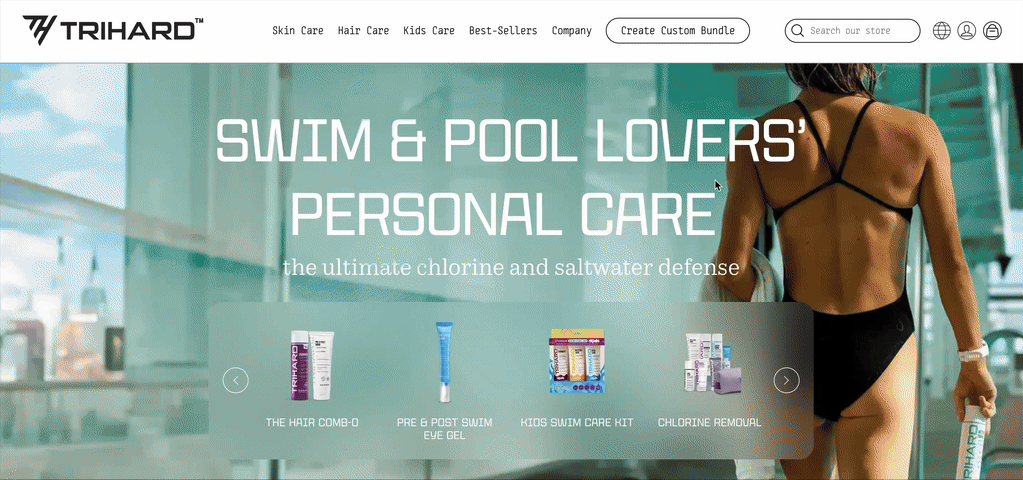
Trihard elevated the idea of a bundle deal to a whole new level. You are advised to choose three products as stated by the highly interactive widget on the interface’s right. The maximum number of products is eight, but why would you need so many?
First of all, the quality, and if you are active, you will go through all the products in about six months anyway. Secondly, by adding each following product to the cart, you get rewards in the shape of a growing discount and free gifts. Some of us didn’t even know Trihard had swimming caps!
The design is consistent: the pure (or mostly pure) yellow color for CTA buttons; the “Add to cart” content dynamically changes based on the user's actions. The widget does not break the customer journey as it opens modestly on the side, leaving most of the products still visible to the customer, and we never actually leave the product page. It almost resembles an in-store experience minus the shop assistant working on commission.
The reward game is also stunning: you can see the real things and choose between them.
2. NYX: Write your main character story

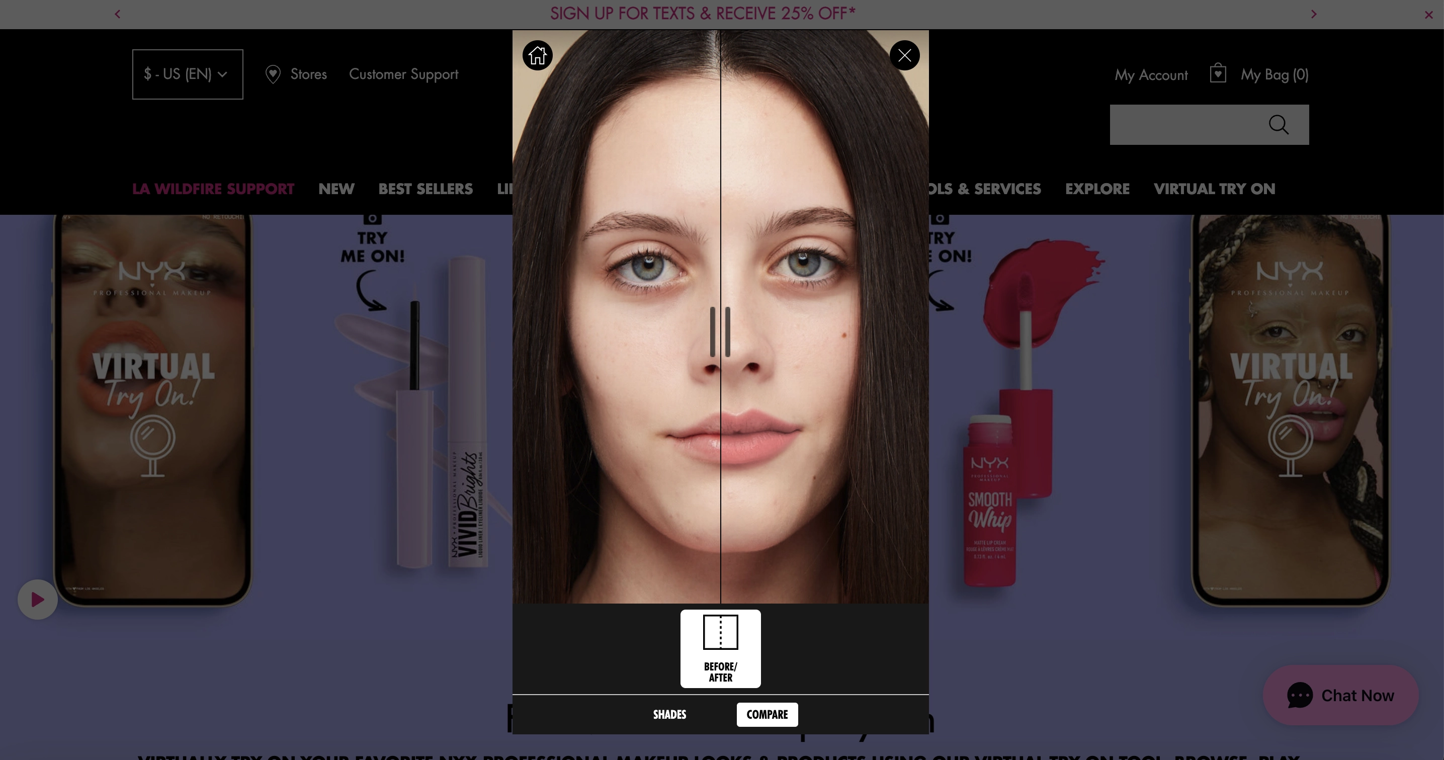
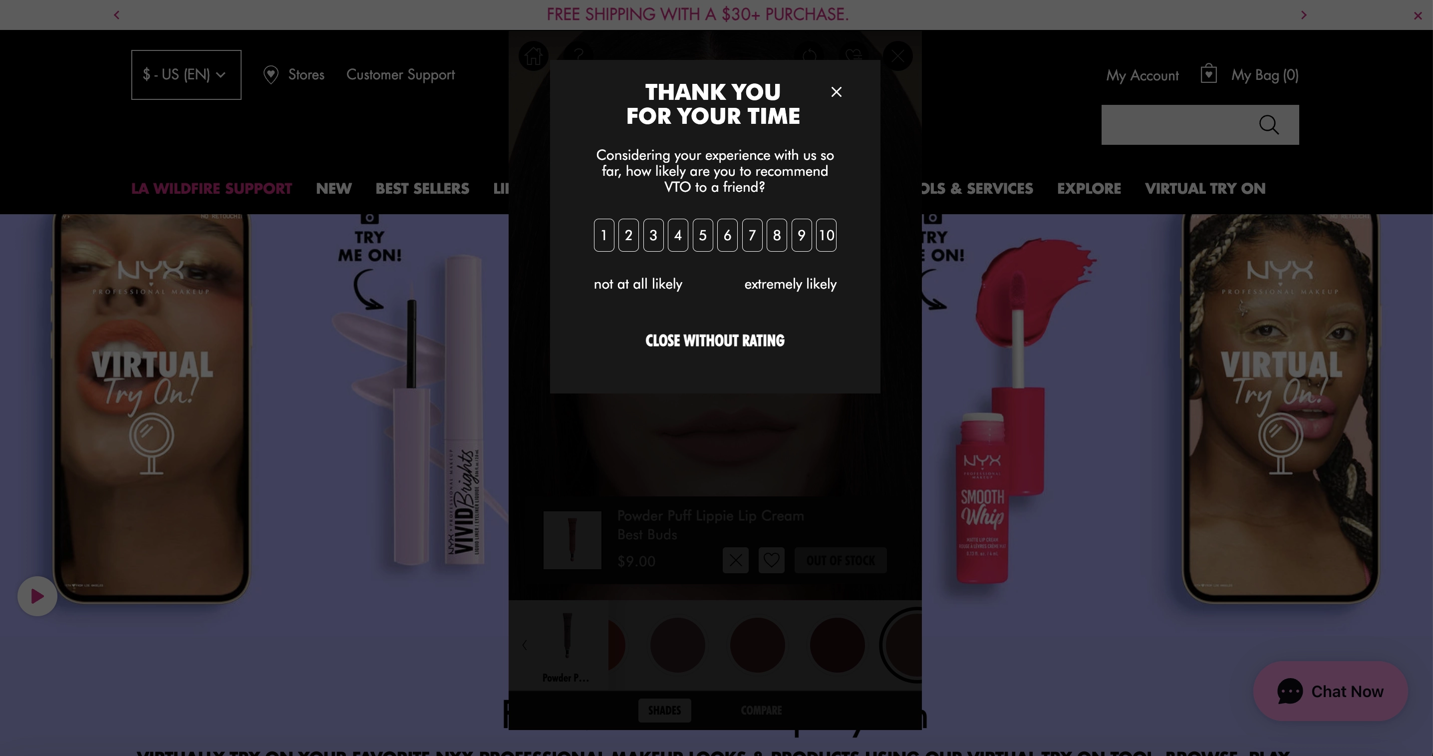
If NYX’s virtual tryon studio is not the it of personalization, we wouldn’t know what is off the top of our heads.
Before purchasing a product, you can see what it could look like on you by uploading your photo and applying the digital makeup product. Don’t have a valid pic? Too tired to get up and take one in natural lighting? No problem, just choose your complexion and type from one of the preset photos. You can also compare what you would look like in different colors and have them compete for your final choice.
To us, such an approach also champions accessibility and efficiency, and at the end, the customer is asked to rate their experience because their opinion matters.
3. Clean Beauty Collective: Find your perfect scent
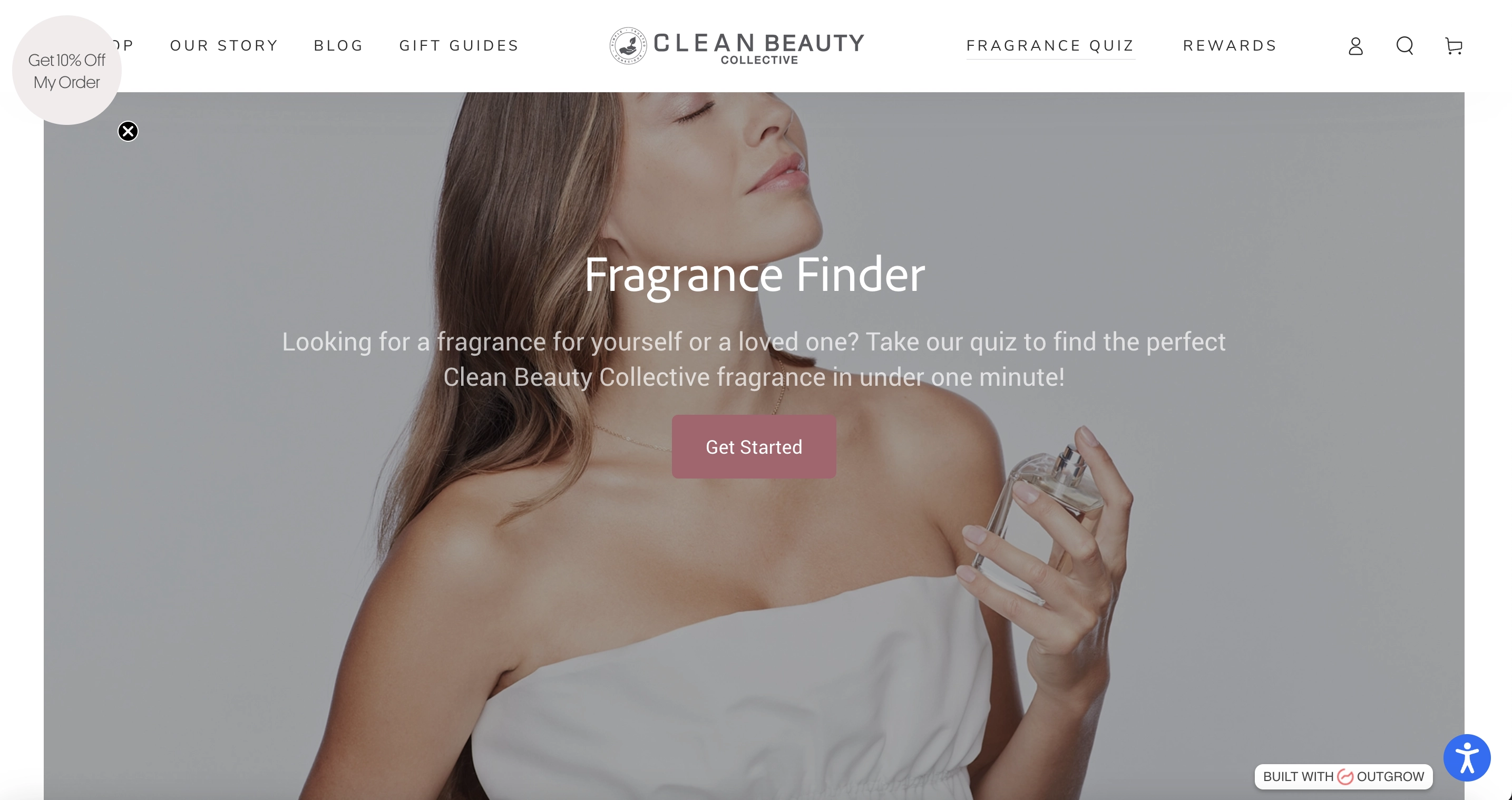
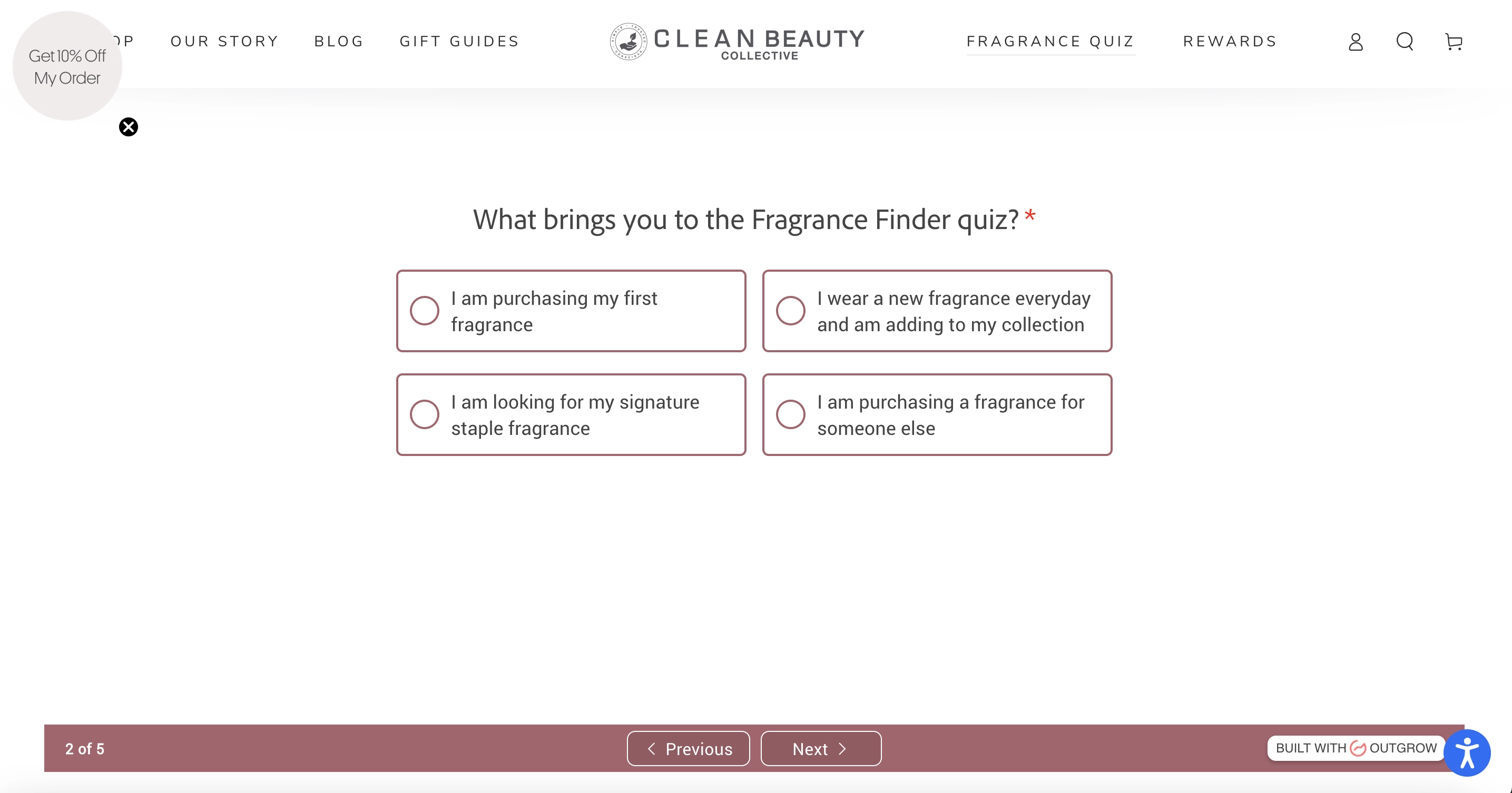
Quizzes are a popular way to fill two needs with one deed: as a marketer, you get to learn more about your customers while keeping them excited to stick to the end. Taking a personalized tour of your likes speaks to the human need to be the main character and educate customers about the product(s).
The instructions and questions for the quiz are formulated in a laconic yet capacious way, and the customer is kept in a loop regarding how much is left to complete with the screen number indicators. Clean Beauty Collective combines this gamification experience with a discount-promising widget at the top left corner, thus reminding us that the value is at least twofold.
Another benefit is that such an approach leaves no place for popup fatigue, as the widgets are quite different in nature (an inline quiz and a launcher discount), yet they create a wholesome experience.
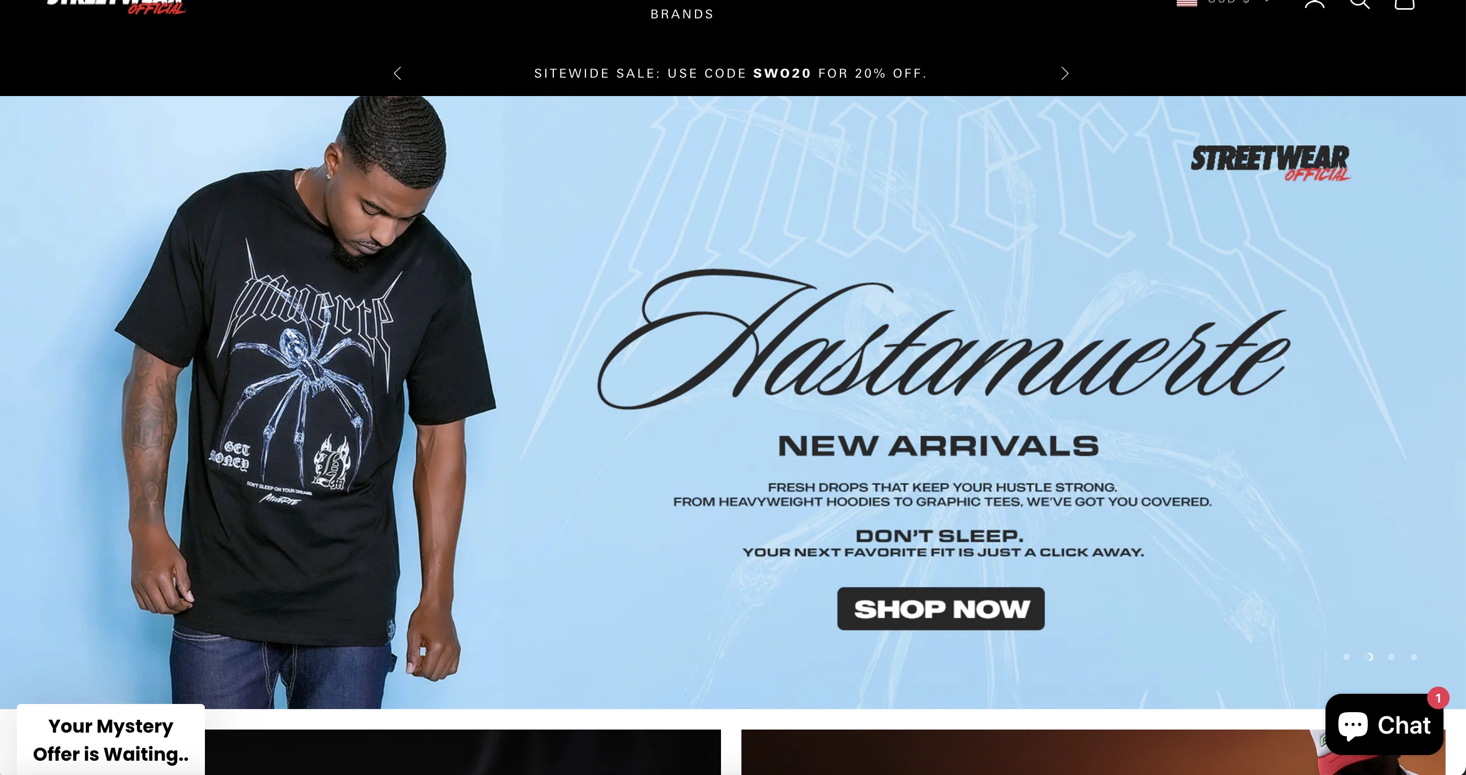
4. Streetwear Official: Will you sacrifice your email to know the answer?
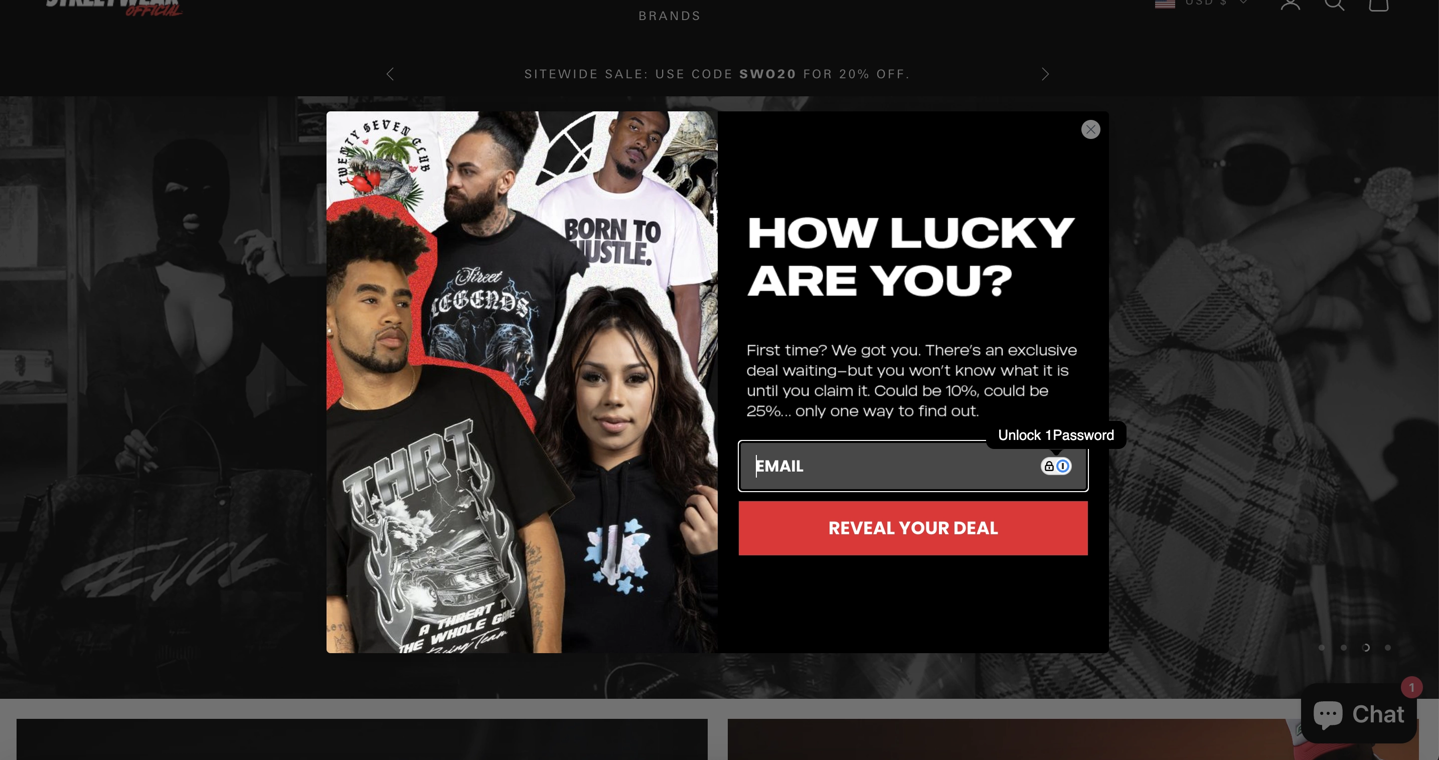
If you peek into the page’s code, you’ll see that Streetwear Official calls their widget an “animated teaser” — is it not? The mystery is to know what your guaranteed reward is. At Claspo, this feature is realized across three mechanics — wheel of fortune, gift box, and scratch card. All of them play into human curiosity and anticipation of greater things.
However, this fashion business takes it a bit further: you will not know how big your reward is until you share your email address. This approach can be somewhat controversial. On the one hand, the experience is truly… experiential: the customer experiences a dopamine rush striving to know the answer. On the other hand, keeping things too mysterious might be a direct way to lose your customers’ interest. You know what? You should go for whatever resonates with your audience, and if they respond well to a two-step mystery, go ahead and give it to them!
5. SwimTrek: When the value proposition cannot get any more enticing
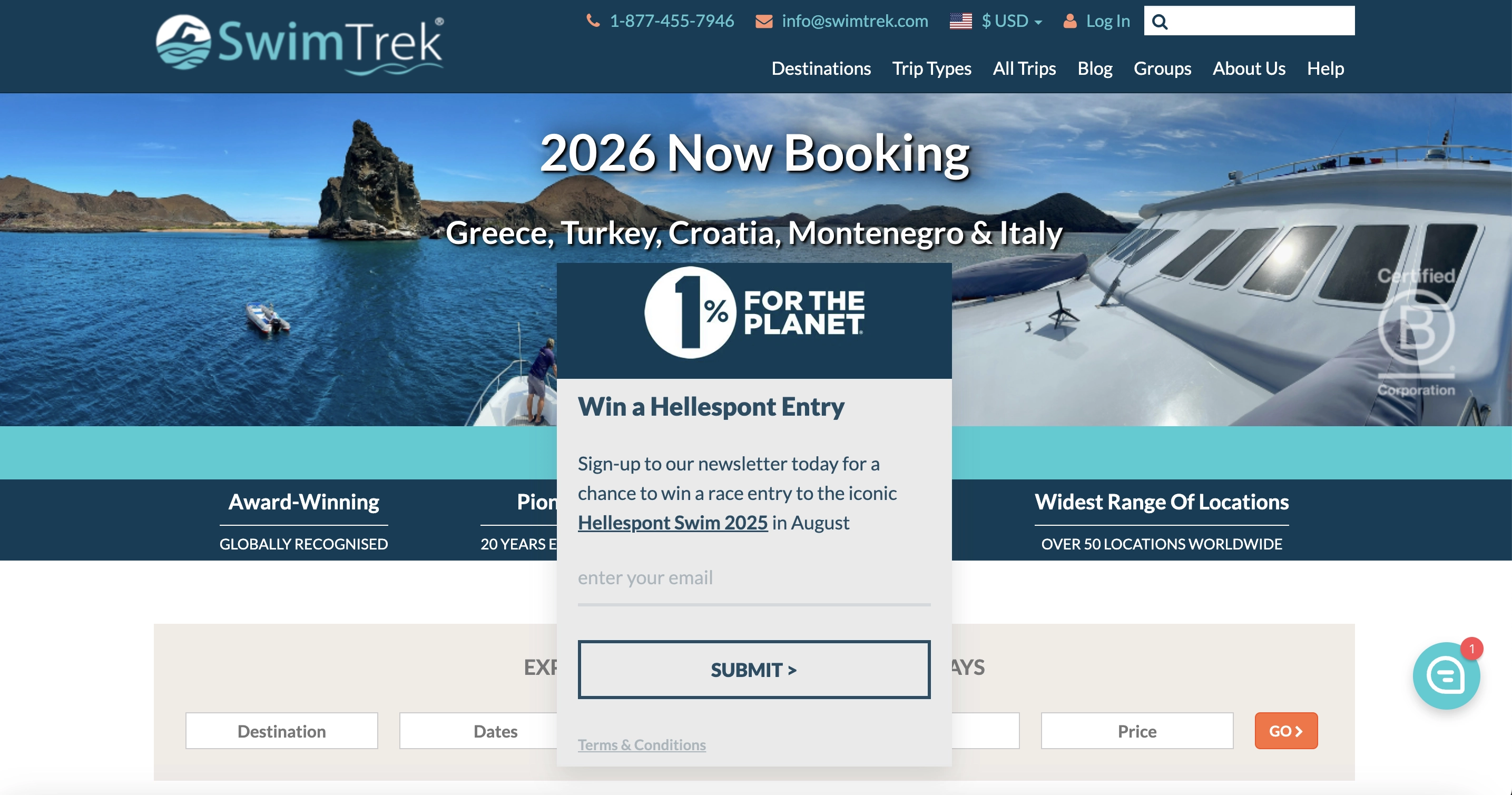
Convincing your audience to share their contact information and become a part of something bigger is what SwimTrek is good at. The “1% for the planet” motto means that this organization pledged to donate 1% of its annual revenue to environmental causes. It means that if you were to participate in SwimTrek's activities, some of your money will definitely be put to do good for the world around.
On top of that, by submitting your email, you participate in the lottery — a chance to win an iconic swim holiday. Now, that’s clearly gamification, right? Yes, as well the 1% rhetoric as it plays into a different type of reward, i.e., will you belong to the community united by a bigger cause?
This popup appears after a new user has spent about 20 seconds on the website — thoughtful timing, enough for them to scroll down and see what content there is.
One more thing: have you noticed a blue conversation bubble at the bottom of the page? It is a chat launcher which is there to help you choose your perfect trip. You know where we are going with this: per-so-na-li-zation.
6. SpoiledChild: Not so spoiled after all

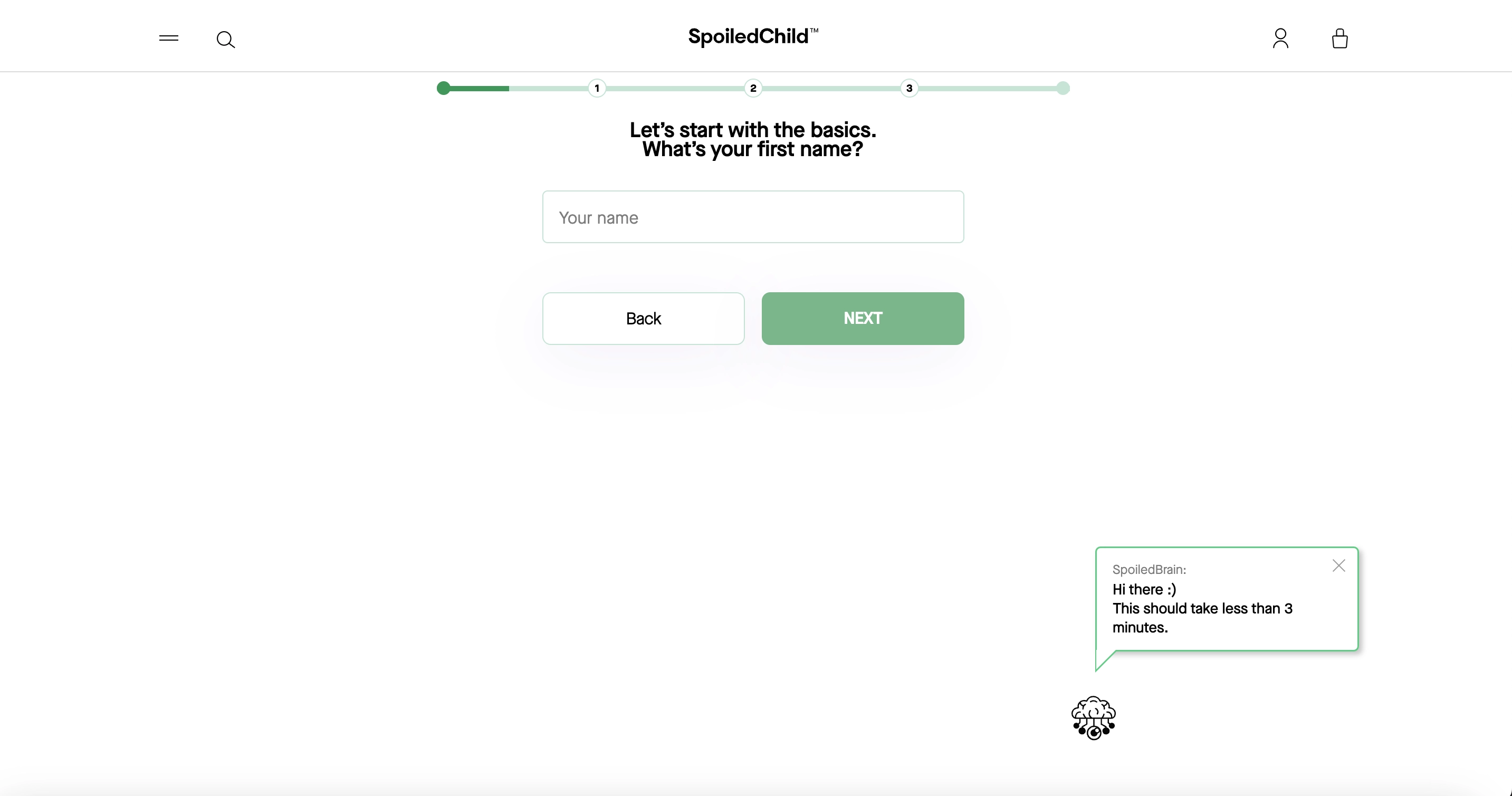
Hoping you appreciated a clever juxtaposition of the brand name and our evaluation of their gamification strategy: it looks very clean, efficient, and organized.
Brand’s messaging is straightforward in its attempt to build immediate rapport with their customers. After all, we don’t need to be pushed on products we don’t need. Moreover, SpoiledChild wants you to know that it is not some team analyst who will be calling the shots on what to offer to customers but an objective and cool-minded AI tool.
As customers begin the test, they are shown a progress bar that fills along with their moving forward, and the mascot — SpoiledBrain — tells them exactly how long this activity will take. Not only did this brand make its widget minimalist, but it also used white space efficiently with a classic diagonal composition.
7. Floraïku: The art of notification

There may be times when you wonder if a website element is a widget. Maybe those times are never, but we are geeky, and the red 4 notification layered over the bell icon caught our attention.
According to a marketing study, red is the color of urgency; it catches your attention and is presented as a notification, nudging you to interact with it. Imagine this: you are a first-time unregistered user, but whole four notifications are waiting for you. You click on them and see that they serve as pathways to further gamification of the experience — Floraïku wants you to see how your desires align with their products.
The tactic is to create urgency but do it subtly. The notification doesn’t pop; it is an organic part of the user experience. Once the website records your visit, these notifications will not reappear.
8. Simon&Schuster: Are you sure you wanna leave?


This huge book publisher combines several widgets to address their customers' needs at different points of their journey. As one lands on the website, they are met with a small widget at the bottom left corner. It offers to take newcomers directly to a specified genre of books.
Scrolling on, you see an inline widget that offers an unspecified but free ebook to collect. Still not sure and want to leave? — Bam! Simon&Schuster throws a content-blocking exit-intent widget as a bolder way to remind the user that the offer is waiting for them.
Where is gamification here — you may wonder. Exactly in the promise of a free book, but to know which one means that the customer needs to engage with the product and take active steps toward the solution. And also, have you noticed that there is a hint of urgency there? Save it before it’s gone!
9. TYR: The time is running out

Another example of using urgency best practices is here: a countdown timer and a red CTA button.
There is one more thing we liked about this widget: the use of a fitness model to convey the idea of why taking action now matters. Do you want to look as spectacular while taming those gym ropes (they definitely have a specific name)? Do you want to embrace being a part of this health- and progress-dedicated community? Sign up!
10. BelarteStudio: The sweet aesthetic spot of personalization
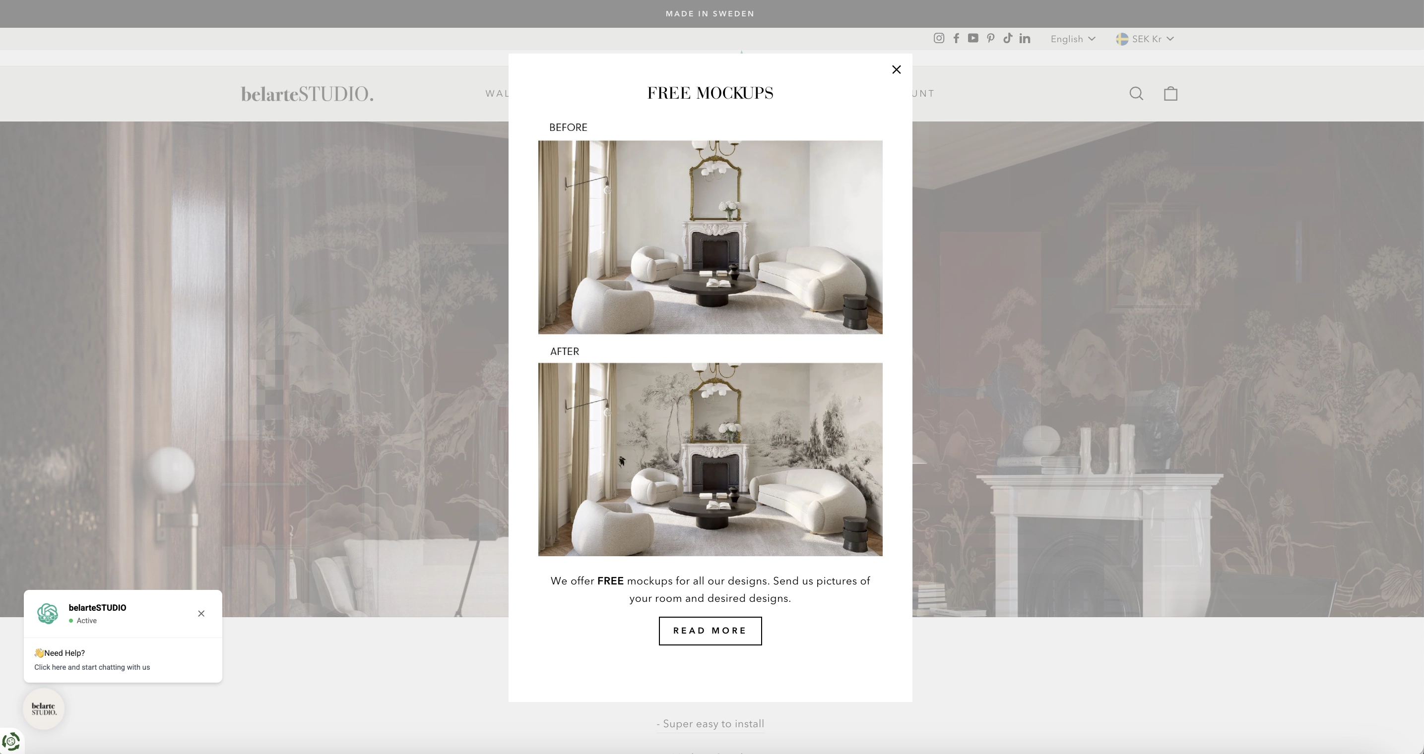
With BelarteStudio, we are in the world of contemporary yet personalized design. As a customer, you see what you like, and you are highly likely to get it. And what if you don’t? What if you need just a little more convincing and vision to make your dream designs come true?
This brand decided to help its customers realize their dreams by visualizing what their exact interior would look like with the help of Belarte services. A widget on the scroll allows a user to upload a picture of their place, and a group of professionals will show what it would look like with a little artistic touch.
The experience is seamless, highly personal, and even a bit sentimental. It’s almost like Sims, but in the real world.
Gamify your website with Claspo
First and foremost, each business should understand the pragmatics of implementing website gamification, i.e., why do they need it? Hopefully, the answer is not: “Because it’s trendy!” By gamifying your users’ experiences, you can achieve greater engagement and higher conversions — and these are just a few of the benefits.
Unlike most digital products that exist for utility, gamified widgets serve for motivation and work outside of the core value exchange (in ecommerce, its formula is money for a product). However, they are not standalone components but parts of a larger ecosystem — a website that keeps evolving and is shaped by how customers interact. Therefore, your gamification strategy needs to be simple, clean, and easy to use or, in other words, unifunctional, to fulfill their purpose of motivating customer behavior.


