Claspo Widgets and Klaviyo Forms: Same Visitor, Different Jobs
When people compare Claspo widgets to Klaviyo forms, sometimes it feels like you’re evaluating two tools that look similar on the surface — both can collect emails, both appear on your website, both interact with the same visitor. But here’s the catch: they’re built for completely different roles in your funnel. And that’s exactly the point.
This isn’t a ‘Klaviyo bad, Claspo good’ kind of post. Klaviyo is a powerhouse ESP — one of the best for email automation, SMS, segmentation, and lifecycle flows. Claspo, on the other hand, is built for something completely different: on-site experience and conversion. So of course Claspo is going to be more advanced on-site. That’s literally its whole purpose.
Klaviyo basically wakes up the moment you hand it an email. That’s its territory — flows, segments, campaigns, all the post-signup magic. Claspo works earlier in the timeline. It handles the messy stage — the visitor still browsing, getting distracted, or about to leave. That’s where all the on-site nudges, timing, targeting, and little ‘wait, before you go…’ moments happen. Two tools, two layers of the funnel, zero drama.
What are these tools actually built for?
Claspo is basically your on-site workhorse. Popups, banners, multi-steps, surveys, gamified stuff — all the little things that help you squeeze more out of the traffic you already paid for. If you want higher conversions, better leads, or the freedom to test weird ideas without begging a developer, that’s where Claspo shines. Great fit for ecom, SaaS, media — honestly anyone who treats their website like something that should actually do things, not just sit there looking pretty.
Klaviyo lives on the other side of the funnel. It’s built for email/SMS: flows, campaigns, segmentation, all the retention nerd stuff we love. It does have forms, but they’re more of a ‘hey, we should probably include that too’ feature. They’re fine if you just need a basic signup box to get people into your welcome flow. Klaviyo makes the most sense for teams that already have a solid retention setup and don’t plan to run a bunch of on-site experiments or personalized widget scenarios.
What you can actually build with Claspo and Klaviyo
Before comparing features, it helps to look at use cases instead of tools. Most marketers don’t wake up thinking, ‘I need a popup’. They think: ‘I need more emails. I need fewer abandoned carts. I need people to see this promo. I need feedback. I need returning visitors to convert better.’
Claspo and Klaviyo cover very different parts of the on-site experience. So, here’s what each platform actually lets you do on your website.
How Claspo solves the everyday problems marketers face on-site
Claspo gives you pretty much everything you’d ever want to show on a website. The easiest way to see the difference is to group it by goals.
Lead capture
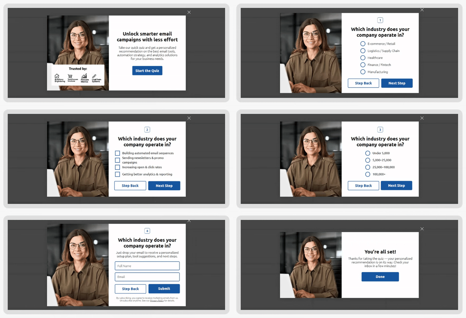
Subscription forms, multi-step forms, quizzes.
These aren’t just ‘drop your email here’ boxes — they help you filter traffic and collect richer data. Multi-steppers reduce friction and quizzes segment users before they ever hit your ESP, so your emails land more relevant from the very beginning.
Sales & AOV drivers
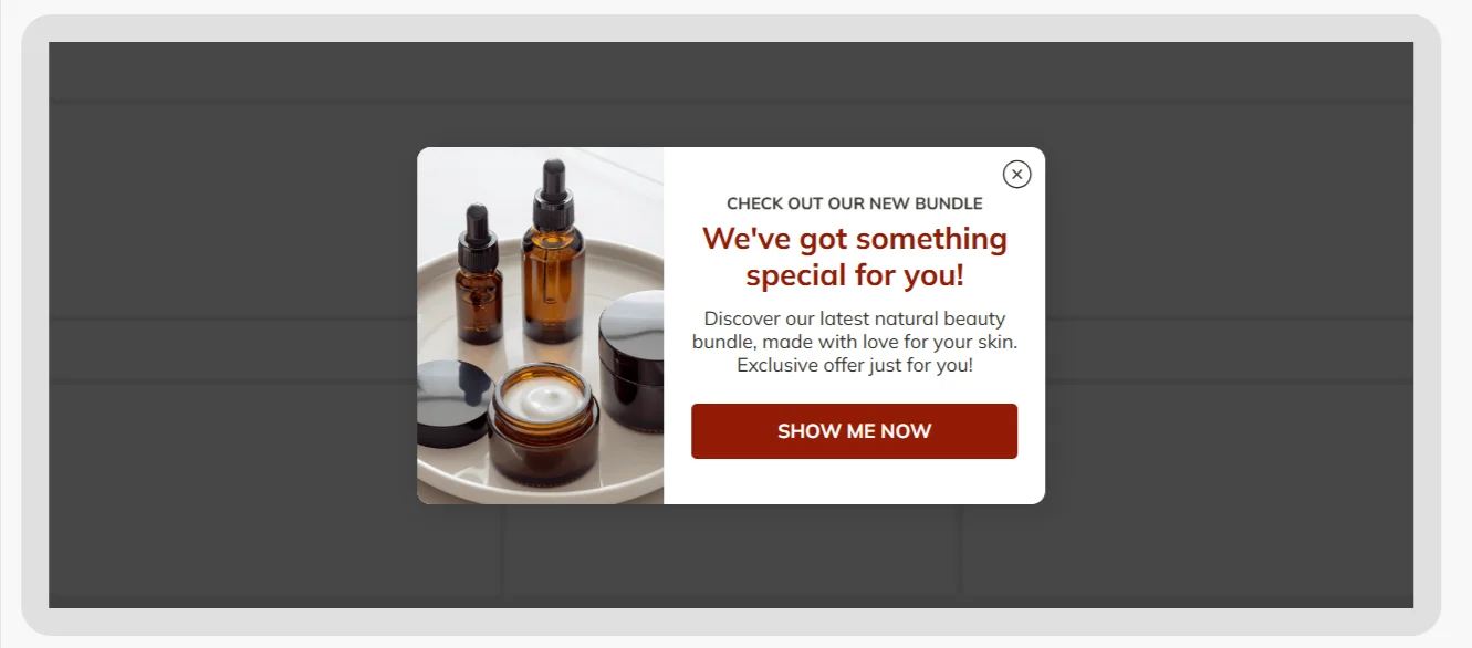
Discount popups, coupons, upsell/cross-sell, bundles, BOGO, free-shipping progress bars
These tackle the two big ecom battles: ‘convince them to buy’ and ‘help them buy more’. Whether it’s nudging a hesitant shopper with a coupon, suggesting a matching product, or helping them reach free shipping, these widgets quietly bump both conversions and cart value.
Cart recovery & exit control
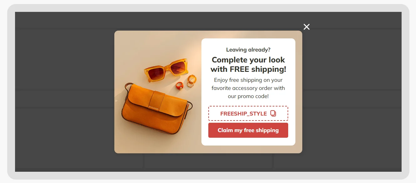
Exit-intent popups, Cart triggers, comeback offers
This is where lost revenue gets a second chance. Instead of waiting for an abandoned-cart email, you catch people before they leave — right when the intent is still warm. A well-timed exit popup often recovers sales instantly without needing a flow.
Gamification
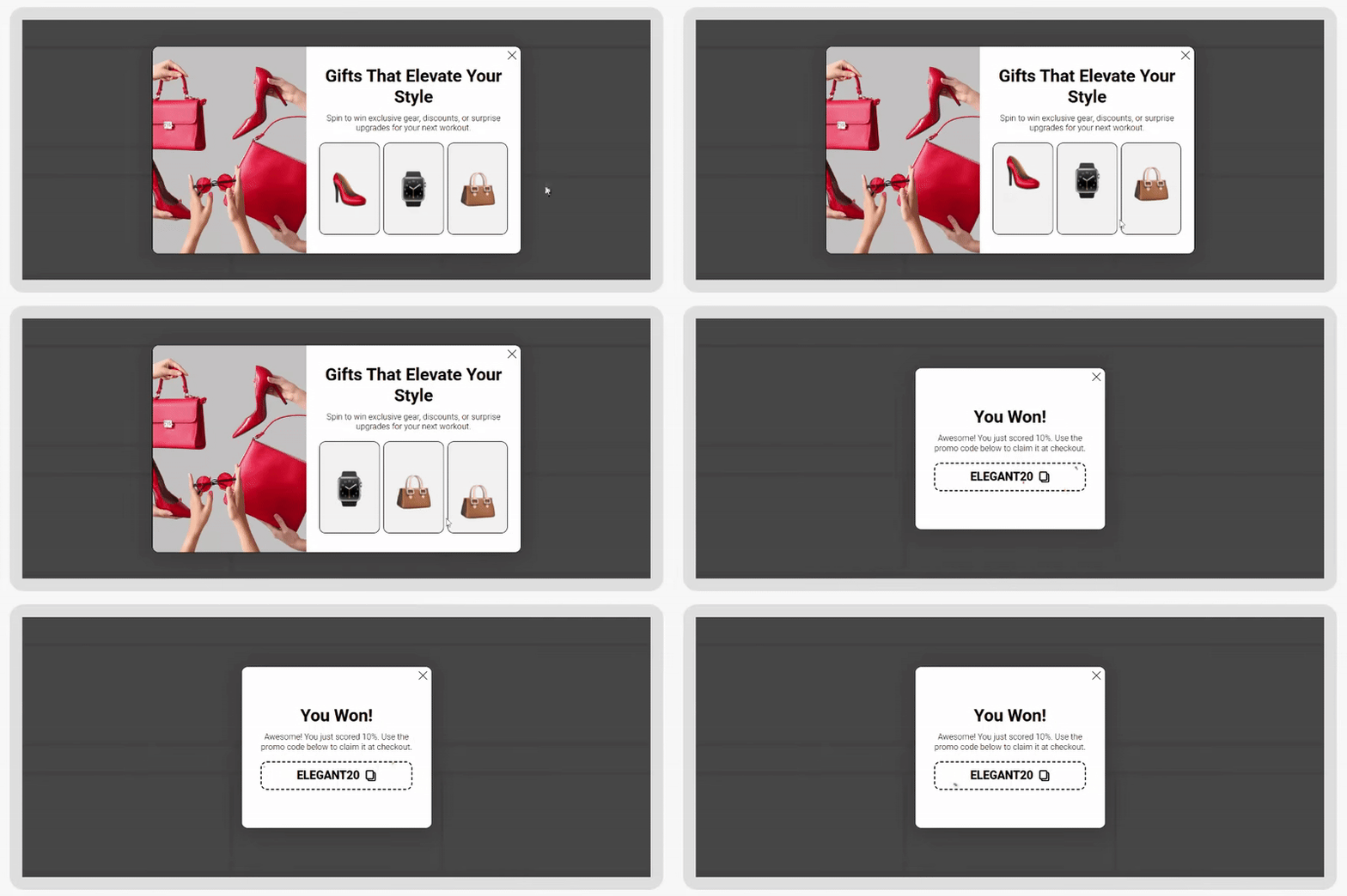
Spin the wheel, scratch card, slot machine, pick a gift mechanics
Gamified widgets win attention where static forms fail. People interact longer, the rewards feel earned, and the captured leads convert better because they’ve already invested micro-effort. It’s one of the easiest ways to lift CR without deeper discounts.
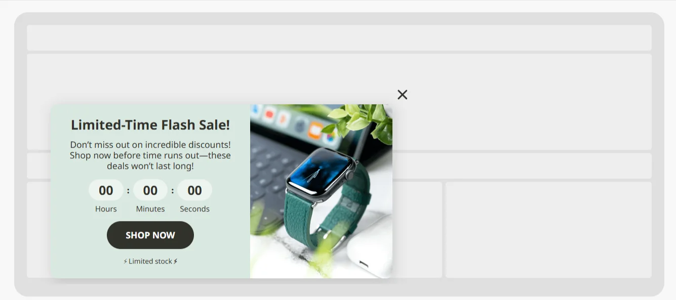
Urgency builders
Countdown timers, banner bars, sticky teasers
These tap into simple psychology: deadlines drive action. A timer or a limited-time banner often drive same-session conversions, especially for promos like BFCM, seasonal drops, or low-stock items.
Social proof
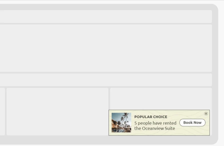
Reviews, ‘X people viewing’, ‘just bought’ widgets
On-site FOMO works. Seeing activity from other shoppers reduces hesitation, builds trust, and speeds up decisions — especially for new visitors who don’t know your brand yet.
Surveys & feedback
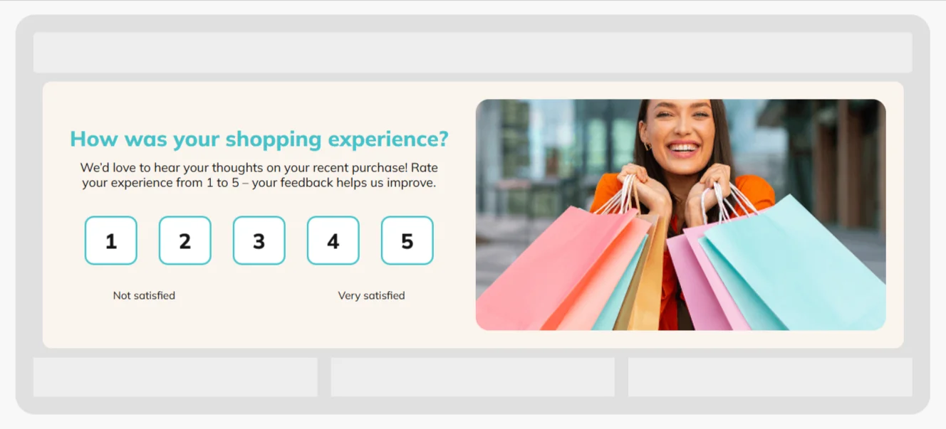
NPS, CSAT, CES, exit surveys
Quick on-site surveys give you real insights while the experience is fresh. Want to know why people bounce? Why didn't they finish checkout? Why do they love or hate a new feature? These widgets collect truth you won’t get from email surveys.
Info & navigation helpers
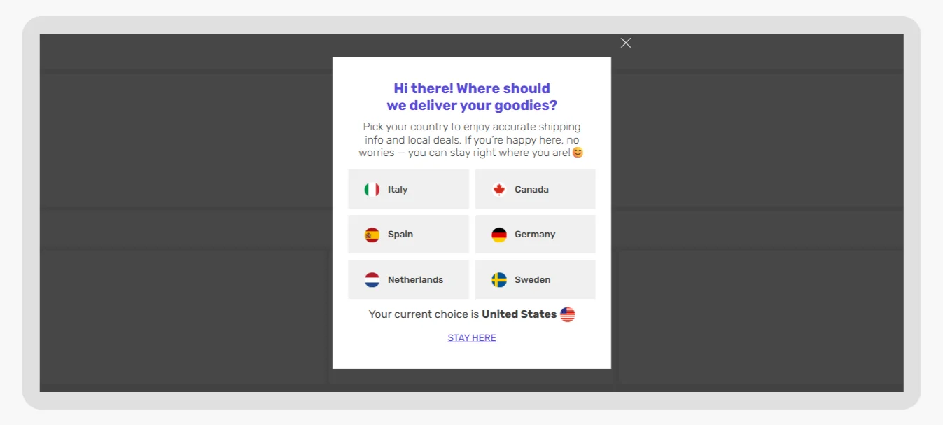
Announcement bars, local offers, language/geo banners
Useful for guiding traffic without interrupting the browsing flow. Perfect for store hours, shipping info, holiday cutoffs, region-specific delivery rules, etc.
Compliance & content control
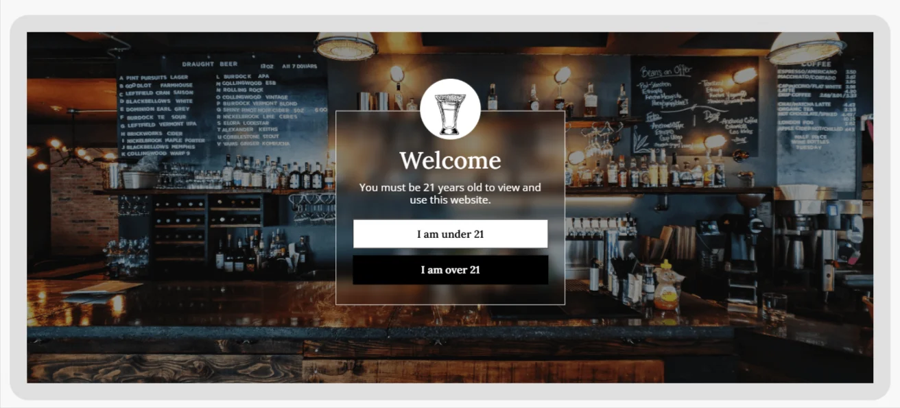
Age gates, cookie consent, content warnings, access blockers
Some industries must control access — alcohol, adult content, CBD, gambling, etc. Claspo can fully block the page until a visitor confirms their age or consent.
Klaviyo — forms that do one job well
Sign-up forms
Great for feeding the ESP. If all you need is a clean way to collect emails and drop people into a welcome flow, this covers the essentials.
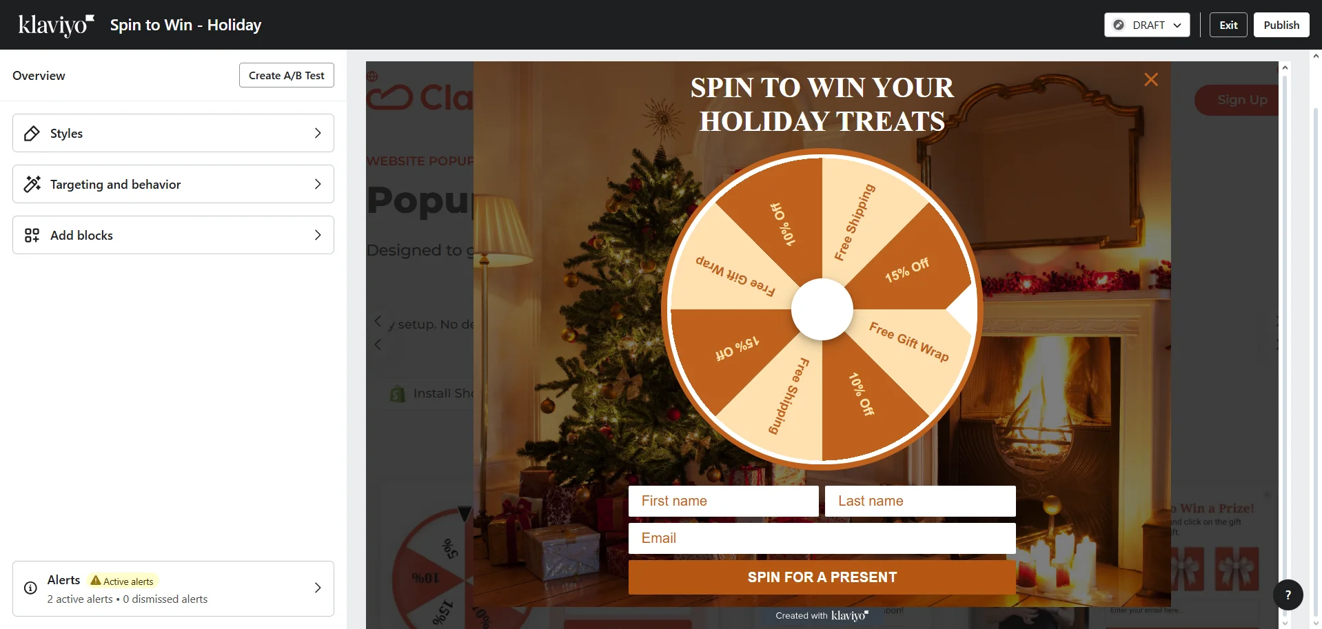
A little gamification
Spin-to-win (one format). Good for engagement, though limited if you want different games, prize strategies, or more advanced logic.
Promo elements
Coupon blocks, basic countdown timers. Useful for straightforward lead magnets or limited-time offers — just don’t expect deep behavioral control.
Reviews (via Klaviyo Reviews)
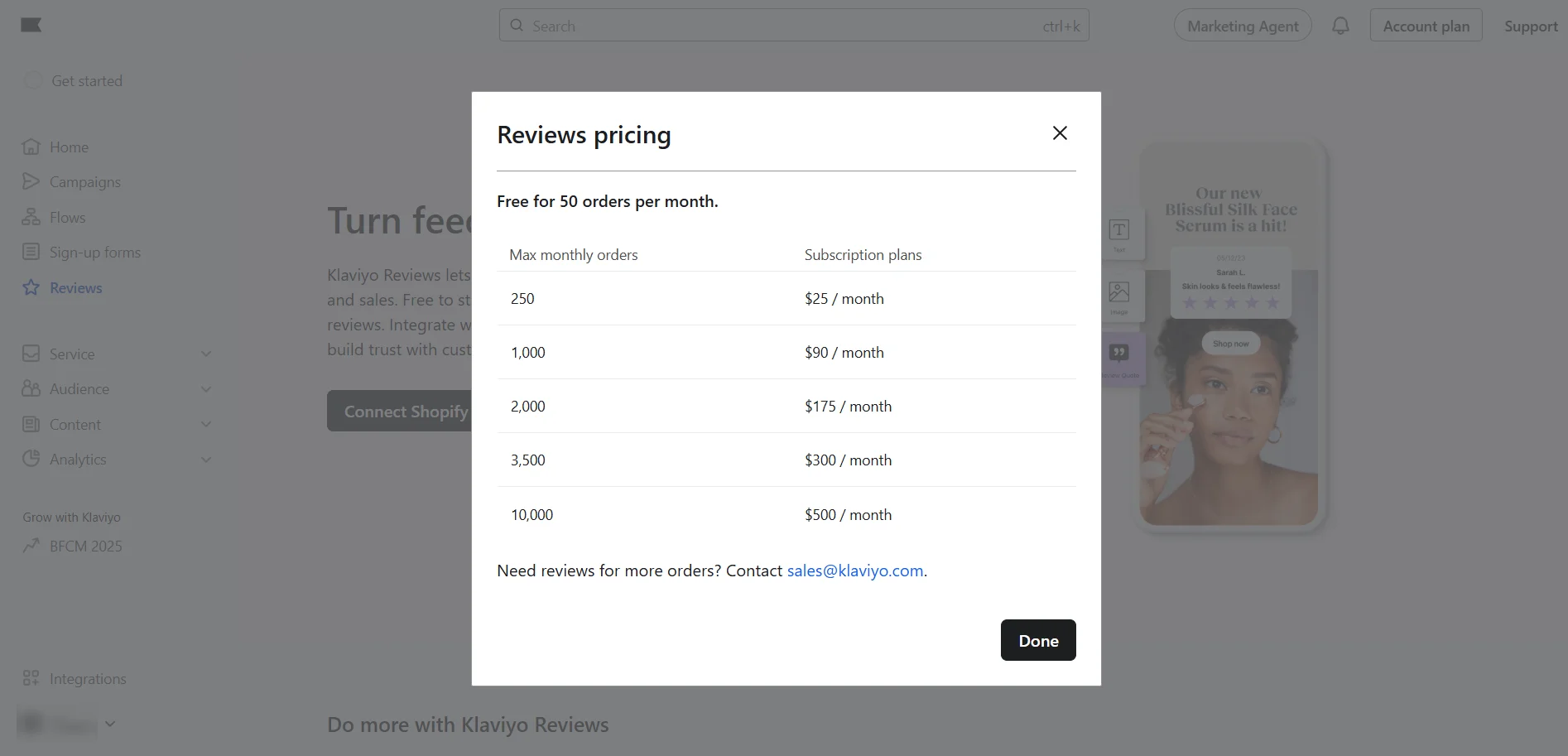
The review system ties nicely into email/SMS follow-ups, but on-site it’s more static and less customizable compared to dedicated UX widgets. Also worth noting: reviews aren’t fully free. You get up to 50 orders/month at no cost, and after that it becomes a paid add-on. Pricing starts around $25/month and climbs fast as your order volume grows.
Good for basic review collection, but not a replacement for flexible, on-site UX widgets.
Builder UX: ‘How painful is it to move one button?’
If you’ve ever built a popup at 2 AM before a sale goes live, you know that editing UX matters. A lot. Here’s what it feels like in both tools — from an actual ‘hands-on’ perspective.
Claspo — a Canva-like editor with templates for basically everything
Claspo’s builder feels like it was made by someone who has actually suffered through building popups in other tools and said, ‘never again’. Here’s what that looks like in practice:
- 1,000+ templates designed by marketers and designers (not ‘intern made this in 2016’ energy).
- Pretty much every use case you can imagine already has a template — from simple newsletter forms to age gates, product bundles, games, exit-intent offers, surveys, and more.
- Drag-and-drop for the easy stuff, pixel-level control for people who like things ‘exactly 12px to the left’.
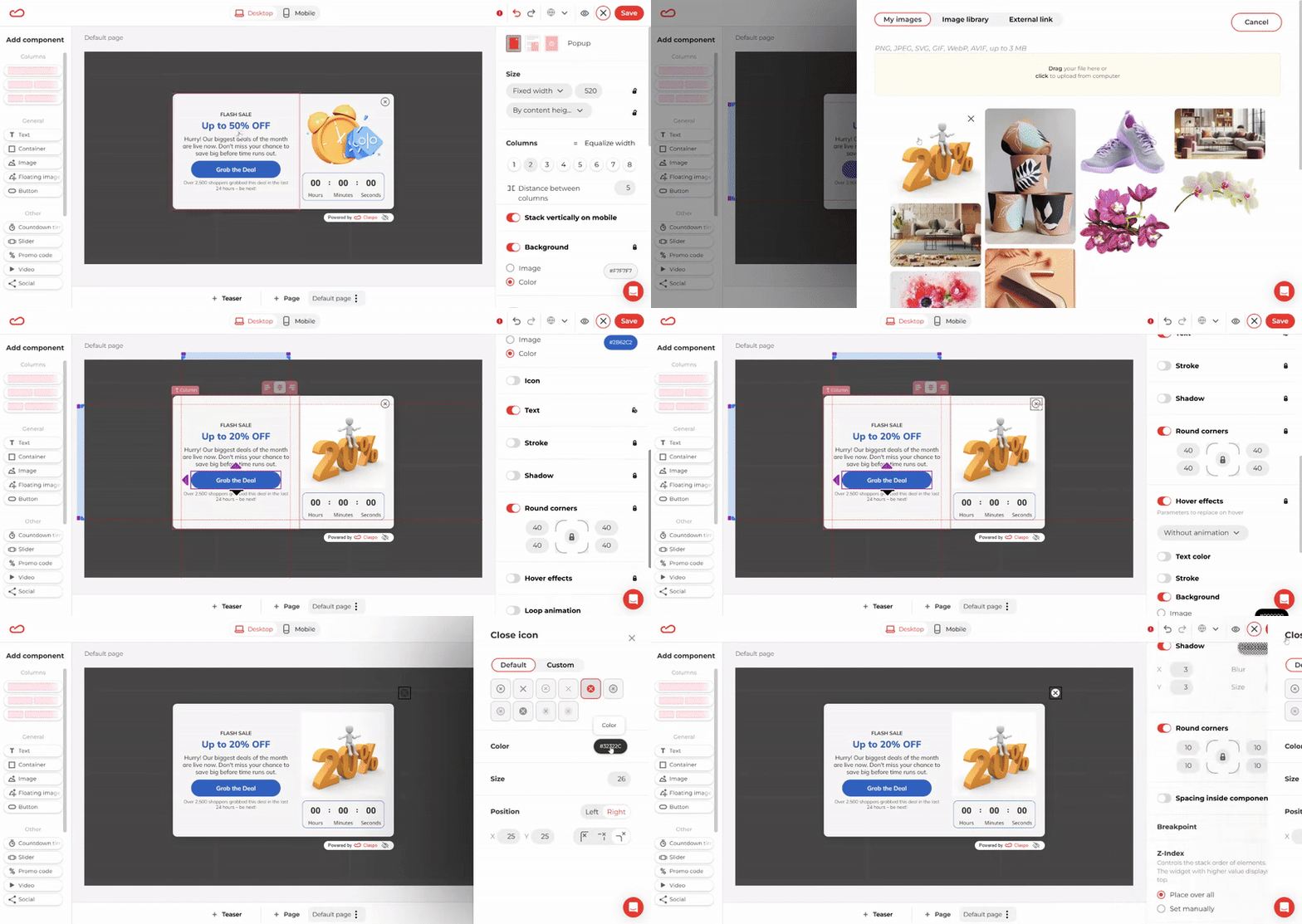
- New elements automatically match your styling. Add a new button or field? It instantly picks up your existing colors, border radius, shadows, fonts — everything. No more hunting for the right hex code or trying to remember which font weight you used.
- Responsive by default — with optional mobile-specific editing. Every template already looks great on desktop and mobile. But if you want to fine-tune mobile separately, you can: shorten copy, hide images, remove social icons, rearrange layout — all without affecting the desktop version.
- Gamified widgets with real control over probability. You don’t just design a nice game — you control the logic behind it. Want the 5% discount to be common and the 20% gift card to be rare? Set the exact chance for each win. That means you’re not playing financial roulette with your margins. You get engagement, your customers get excitement, and nobody comes out losing money.
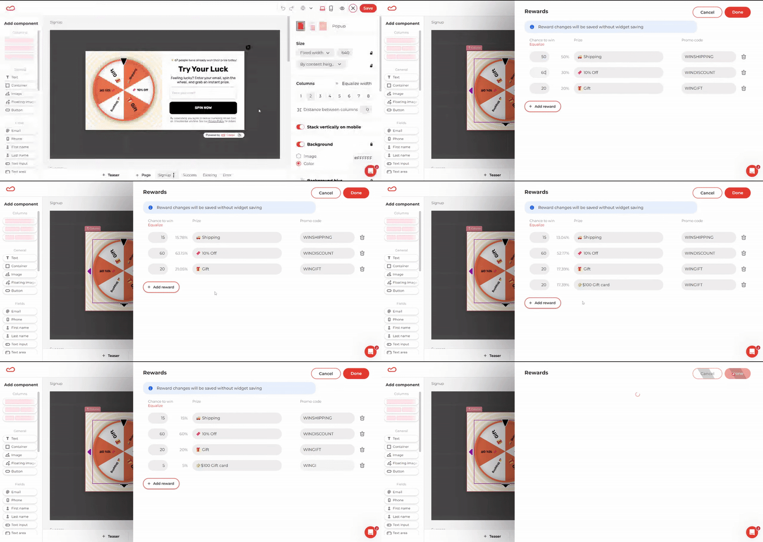
You can customize a template, make it on-brand, adjust mobile view, add logic, and publish faster than you can explain to your manager why the last popup took three hours in another tool.
Klaviyo’s builder — solid for forms, not meant for deep customization
Klaviyo’s form builder will absolutely let you create a form. It does the basics reliably. But once you try building something more than a basic form, the editor starts fighting you. Here’s what you run into.
No undo. No keyboard control. No mercy. The first shock hits fast: you move something by accident, reach for Ctrl+Z, and nothing happens. Want to delete something? Your instinct says ‘press Del’. The editor says ‘nah, do it manually’. You quickly realize that keyboard shortcuts simply don’t exist in this editor. Everything is drag-and-drop, and if you drag-and-drop the wrong way… good luck. There’s no safety net. No undo history. For new users, this feels oddly stressful. For experienced users, it’s a nostalgic reminder of why tools like Canva exist.
Adding a new button is an adventure. This one catches everyone off guard.
You add a new button expecting it to copy your current style. Instead, a mysterious dark rectangle with white text appears — completely unrelated to the design of the existing buttons.
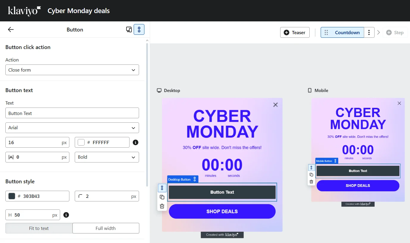
Want it to match? You now have to manually configure: background color, text color, font weight, border radius, padding, etc. In Claspo, adding a new button takes one click. It automatically inherits your theme — colors, font, corners, everything. You just change the text and move on with your life.
Limited customization means lots of look-alike forms. Because Klaviyo’s editing tools are so restricted, most merchants can only change: the image, the colors, the text. That’s it. You’re not imagining it when you spot the same style of popup on a bunch of different sites. Klaviyo just doesn’t give you much room to change things beyond the basics. Everyone ends up with roughly the same layouts. If you want something eye-catching or unique, you’re basically forced to build it from scratch — which defeats the purpose of having a template library at all.
Text editing in the side panel — surprise invisibility. This part feels unintentionally comedic. You can’t edit text directly inside the widget. Instead, you must edit it in the side settings panel. Sounds fine, right? Until your text on the widget template is white… and the editing panel’s background is also white.
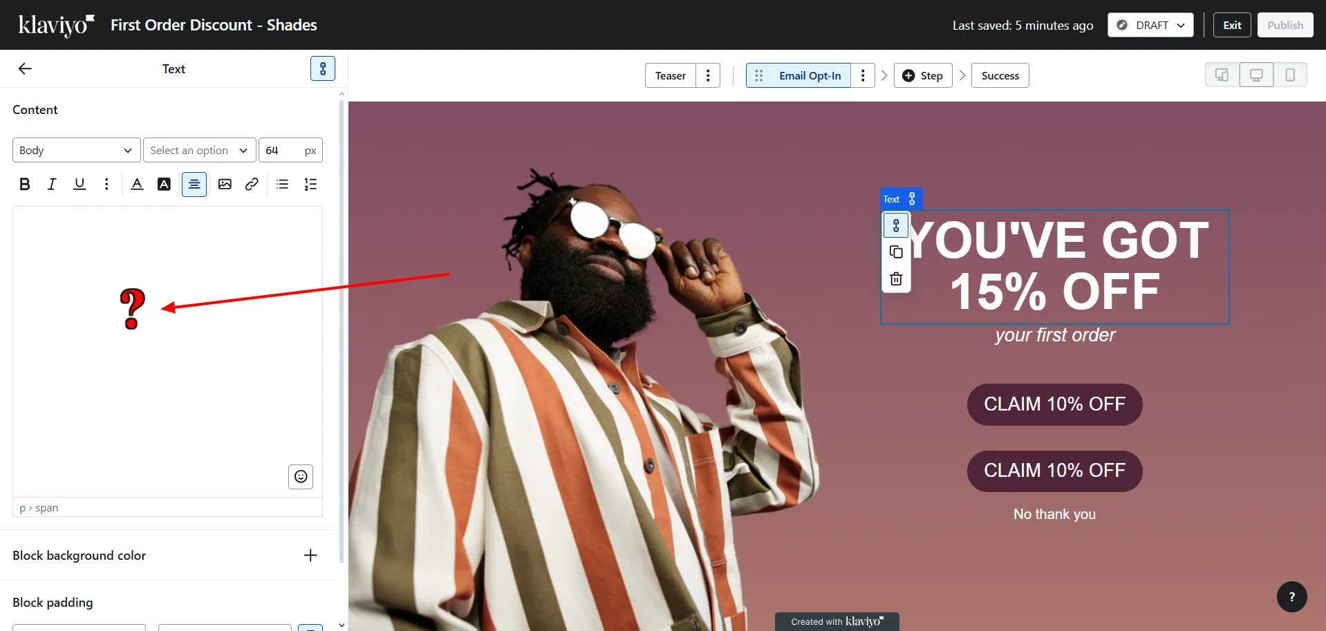
New users regularly get confused by this. Even experienced users need a second to understand why the words seem to have disappeared. In Claspo, you simply edit text inline — on the actual widget — and see everything live.
Full-screen templates but no real age gate. Klaviyo technically has full-screen formats, so you might think: ‘Oh great, I can make an age gate!’ Except:
- you cannot remove the default close button;
- you can only make it transparent, not delete it;
- even if you build a full-screen widget from scratch, the close button is still baked in and cannot be removed.
That means you cannot create a real blocking age gate or content gate in Klaviyo. Visitors can always dismiss it. This isn’t a bug — Klaviyo forms were simply never designed for compliance or content gating.
Claspo can create true age gates and blockers, because it’s built for on-site UX control, not just signups.
Targeting & triggers: who sees what and when?
Targeting isn’t just a settings panel — it’s where on-site campaigns actually win or lose. And the difference becomes obvious the moment you need something specific like ‘We need a popup that shows only to users from Warsaw who’ve already added two items to the cart’. Because maybe your store offers same-day delivery only in Warsaw, and this visitor is already halfway to checkout. They’re warm, they’re interested, and they just need one extra reason to complete the order today. In that situation, a generic discount popup won’t do much — unlike a contextual message such as: ‘Hey, good news — we offer same-day delivery in Warsaw. Order now and get it today.’
And the only way this works is if your tool can target by city and cart status at the same time — not just ‘country’ or ‘all visitors’. That’s where on-site targeting stops being a nice feature and starts becoming a real revenue lever.
Claspo — deep on-site targeting that works like a real brain
Claspo doesn’t just let you choose when a widget appears. It lets you define exactly which visitor, on which page, in which context, and with what behavior should see it.
Claspo reacts to real user behavior — scrolling, reading, hesitating, trying to leave — and responds instantly:
- After time on page — great for deep reads or product detail pages.
- After time on site — perfect for sitewide promos once interest is proven.
- Scroll depth — catch engaged readers mid-flow with a relevant CTA.
- After viewing several pages — ideal for demos or stronger offers.
- After inactivity — a gentle ‘still there?’ recovery pop-up.
- Exit intent — save the cart, save the lead.
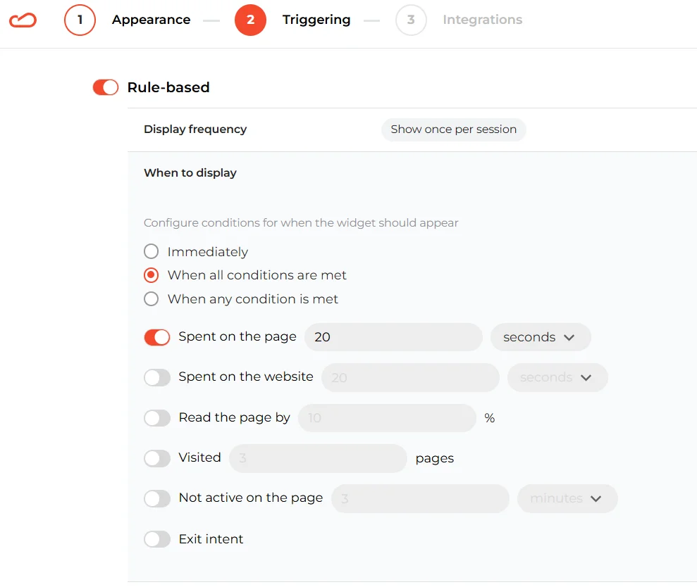
These rules help you hit the moment between curiosity and decision — the exact place where conversion happens.
Audience targeting — here’s where Claspo feels very different from traditional ESP form builders:
- New vs returning visitors — welcome one, reward the other.
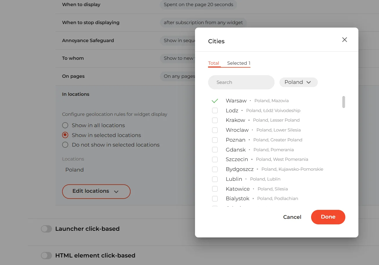
- Geo targeting down to the city — run ‘Berlin only’, or ‘LA same-day delivery’ promos.
- Device targeting — tailor the experience for mobile vs desktop.
- UTM + traffic source rules — match your message to the ad, email, or campaign they came from.
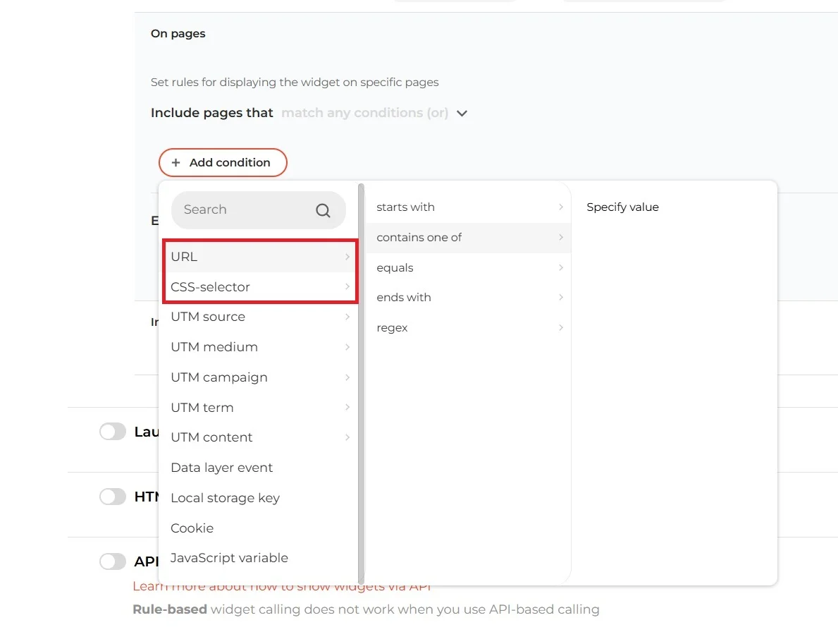
Page targeting — you can control widget visibility with precision:
- Specific URLs — product pages, pricing, blog posts, checkout, anywhere.
- Exclusions — hide on Thank You pages or other irrelevant areas.
- CSS element targeting — trigger based on what appears on the page, even if the URL doesn’t change.
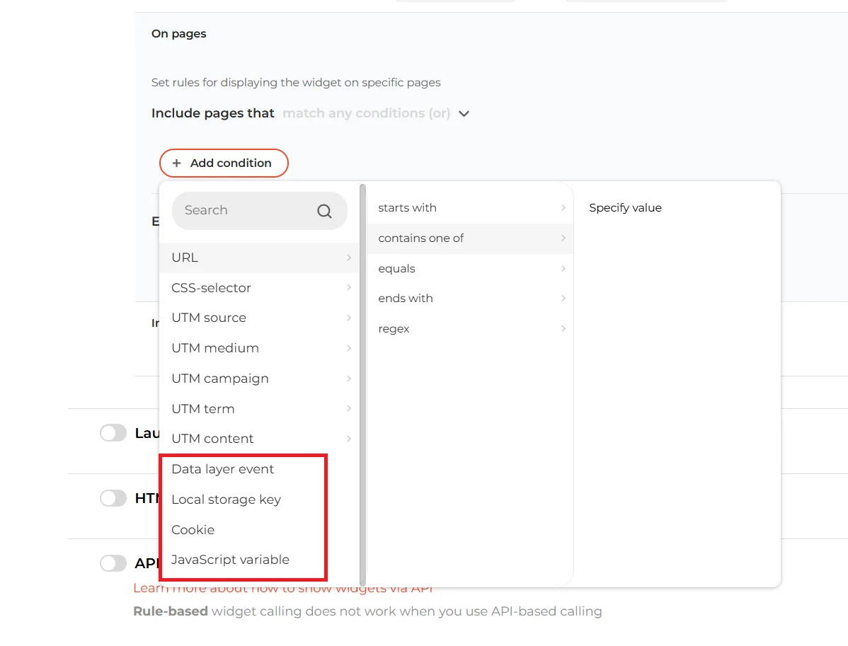
Advanced targeting — Claspo integrates with your site’s actual data logic:
- Data Layer events — trigger on add-to-cart, purchase, sign-up, etc.
- Local Storage and cookies values — remember preferences between pages.
- JavaScript variables — pass custom states like logged-in, VIP, cart total.
- Merge tags — personalize content based on dynamic data.
Add A/B testing on top of all that, and you can actually test everything that matters — copy, design, discount size, timing, triggers, layouts, entry rules, even entire widget formats.
Klaviyo — strong segmentation in email, basic logic on-site
Klaviyo’s targeting is great… inside Klaviyo’s ecosystem. If you want to segment an email flow or SMS audience, the power is fantastic. But once you step into the on-site world, things get much simpler — and more limited. Here’s what the targeting panel looks like.
What Klaviyo can do on-site:
- Show/hide forms for existing Klaviyo profiles, email subscribers, SMS subscribers, profiles in a specific list or segment.
- Basic geo targeting: region, countries (no cities, no local campaigns).
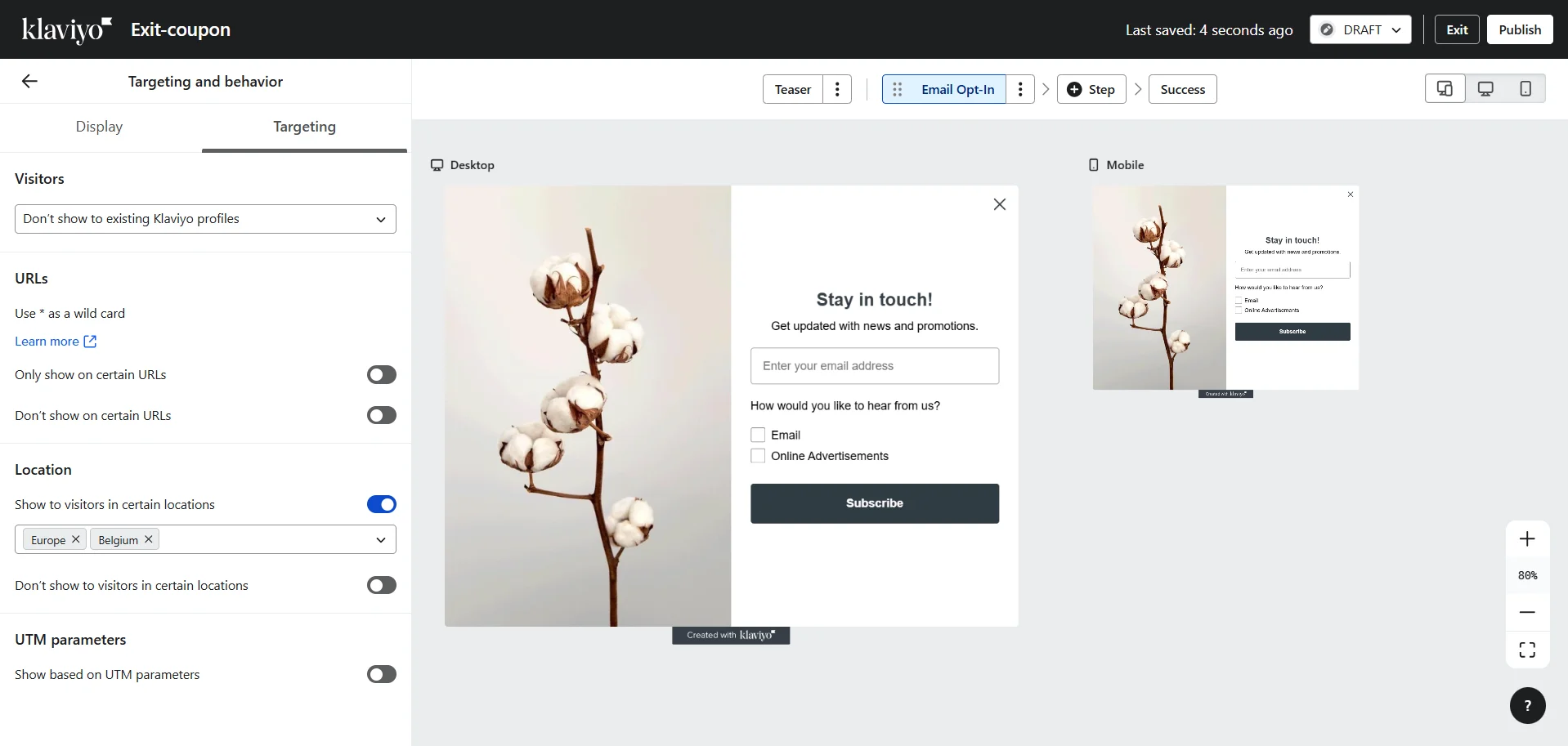
- Behavioral triggers: exit intent, time delay, scroll percent, number of visited pages
- Device targeting: desktop and mobile.
- URL targeting: show on homepage, hide on /thank-you, etc.
- UTM-targeting (source, medium, campaign, term, ID).
Klaviyo’s on-site logic is enough for a few simple sign-up forms. But when you’re trying to orchestrate full on-site experiences, the limitations appear fast.
Overlap & ‘popup attacks’: who’s actually in charge of on-site UX?
Every marketer eventually hits this problem: you set up one form in Klaviyo, then another, then a promo bar in your CMS, then a cookie banner from a plugin, then a seasonal offer… and suddenly your website feels like five different tools are fighting for screen time.
Klaviyo gives you a simple, honest display rule: ‘Don’t show again after submit or URL click. If closed, show again after X days’. And that’s great if you run one, maybe two forms. In that case, you can keep all the logic in your head — the signup form appears on blog posts after someone reads a few pages, the exit coupon fires only on product pages, and in theory nothing should overlap or get in the way. But as soon as your site grows, the puzzle gets messy fast. Because now you also need:
- a cookie consent widget,
- a category-specific sale notification,
- a newsletter form,
- a cross-sell widget suggesting a belt for a dress,
- and maybe a survey or feedback form.
Each needs its own timing, URLs, targeting, and frequency. And they need to appear in a reasonable order, without covering each other or popping up at the same time.
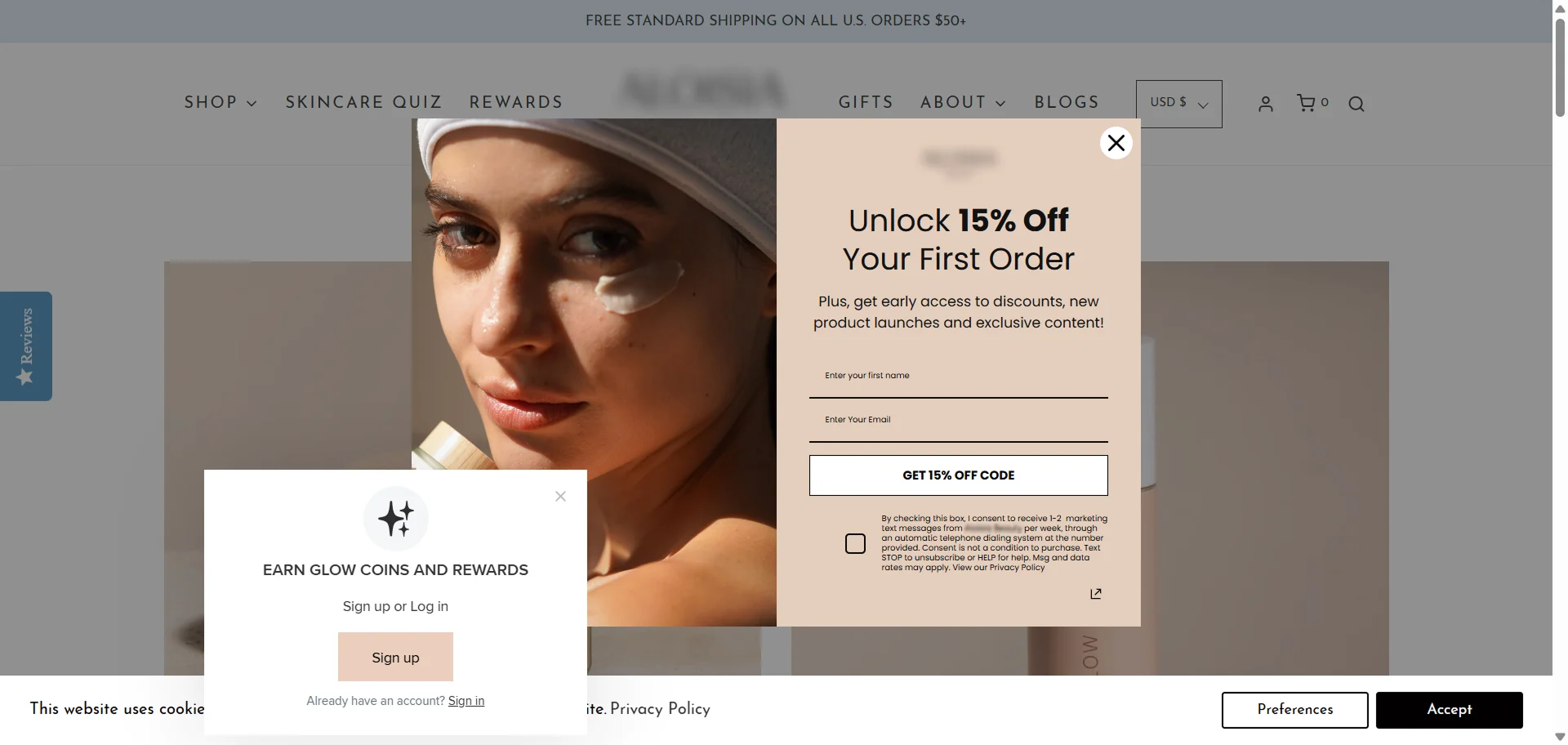
Handling all of that by hand quickly becomes confusing. This is exactly where Claspo behaves differently.
Claspo isn’t just a form builder — it’s the traffic controller for every on-site widget. It decides when something appears, what happens if two things want to appear at the same time, and how to avoid overwhelming users. Here’s the essence of how it works.
Annoyance Safeguard — prevents chaos before it starts. If two widgets are supposed to show at the same moment, Claspo doesn’t display them all together. One appears, and the others are postponed or skipped so the visitor isn’t hit with multiple elements at once.
Overlap Protection — decides who has priority. Some widgets are more important than others. For example, an Age Gate should always override a promo bar. Claspo understands this and automatically prioritizes blocking critical widgets over optional ones. The site feels coordinated instead of chaotic.
With Claspo you can show widgets in a logical flow — teaser first, main offer later, survey after purchase, and so on. Instead of everything firing whenever it wants, the site feels intentional and calm. Everything — popups, banners, teasers, gamified widgets, surveys, cookie bars, age gates — lives under one roof and follows the same rules. This is a big difference from the typical setup where five different tools each show their own widget without talking to each other.
Why you need both: on-site conversion first, lifecycle automation second
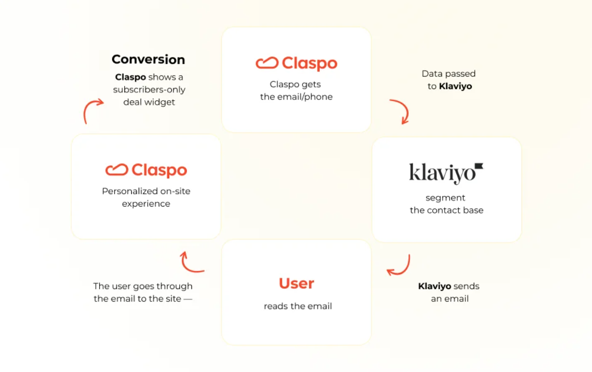
Claspo and Klaviyo were never meant to replace each other. They sit in different parts of the funnel — and the handoff between them is where the real magic happens.
Claspo runs everything that happens before the signup or sale: targeted widgets, quizzes, multi-step forms, gamified offers, exit recovery, geo-specific messages, and more. It also collects richer signals — UTM, referrer, device, city, quiz answers, visitor type (new/returning), and behavioural triggers.
All of this data is passed to Klaviyo as custom properties or events (such as sign-ups). Klaviyo then takes over: flows, campaigns, SMS, segmentation, and retargeting — everything it’s built to excel at.
Claspo can then use behavioural data to personalize the on-site experience again. For example, it can:
- hide signup forms for existing subscribers;
- display ‘welcome back’ offers;
- show promos to users who arrived from a specific email, etc.
It becomes a loop: Claspo → Klaviyo → Claspo → revenue.
There are situations where you genuinely don’t need Claspo — at least for now. If your setup is simple, Klaviyo’s native forms will cover the basics just fine. For example, maybe you’re running a straightforward landing page where the main growth lever is what happens after signup: emails, SMS flows, and automations. In that case, a couple of lightweight opt-in forms may be all you need.
Some brands also don’t prioritize on-site personalization or conversion rate optimization. They don’t plan to run contextual messages, targeted offers, or behavior-based on-site campaigns. And some teams prefer to keep their tech stack as small as possible and are perfectly comfortable using the generic templates their ESP provides. And that’s completely okay. If your on-site needs are basic, Klaviyo’s forms will do the job without requiring anything extra.
At some point, the native Klaviyo forms stop matching what the business needs. Most teams reach this moment when the site needs something beyond a basic popup. That might be the desire to lift conversion rates from existing traffic, experiment with games and interactive formats, or tailor offers depending on where visitors came from, which pages they viewed, or whether they’ve been on the site before. Or you want to run real A/B tests to compare layouts, timings, and messages. In short, once on-site experience becomes a real growth channel rather than ‘just a form’, Claspo is the tool that lets you scale that part of the funnel properly.
The real takeaway behind all these differences
If there’s one thing this comparison makes clear, it’s that most teams still underestimate how much revenue is won or lost before a subscriber ever enters your Klaviyo flows. The inbox plays a huge role, but most decisions don’t start there — they start on the website.
When someone is scrolling a product page, hovering over the cart, slowing down before closing the tab, or clicking into a quiz or a game ‘just to see’, that’s the moment their mind is being made up. These small signals are what decide whether they’ll sign up, buy now, or come back later.
Klaviyo steps in after you capture that email — and that’s exactly where it shines. Claspo handles everything before it. And when the two work together, you start running a true conversion loop. And it’s where the difference between ‘collecting emails’ and ‘capturing revenue’ actually lives.
And here’s the part where you get to test whether everything written above actually matches reality. Claspo’s lifetime Free plan gives you full access to the platform:
- all features,
- the entire template library,
- unlimited widgets,
- unlimited teammates,
- no restrictions on testing.
If you’ve ever wanted your website and your email/SMS flows to feel coordinated, consistent, and intentional, this is your chance to create that kind of system.


