Product Recommendation Templates for Your Website
Increase sales with Claspo’s product recommendation templates. Suggest personalized products to your visitors and enhance their shopping experience effortlessly!
We haven't created templates with selected parameters yet. Please let us know if you need precisely these templates.
Request Widget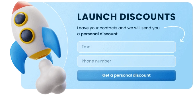


Top Template Categories
Take your website conversations and customer journey to the next level with zero coding and design skills. Claspo widgets are your key to maximum results with minimal effort.
GDPR Compliant. Your data is safe and secure with us.
Website Templates for Product Recommendations: A Web Design Guide
If you’ve ever tried to build a recommendation block from scratch — whether it’s ‘You might also like’, ‘Frequently bought together’, or ‘Just for you’ — you already know it’s not exactly plug-and-play. Between customer data, layout design, filtering logic, and styling, it gets complicated fast.
That’s where a product recommendation template comes in. Instead of engineering the entire recommendation process, you start with a ready-made structure that’s built for one thing: helping your visitors find what they’re most likely to want — without wasting their time (or yours). These templates handle the heavy lifting behind personalized product recommendations and make it easier to scale what works, even if you don’t have a dev team or a data scientist on speed dial.
Especially in e-commerce, where attention spans are short and catalogs are big, a smart template isn’t just helpful — it’s a competitive edge.
Why product recommendation templates are a must-have in e-commerce today
Most shoppers don’t browse the way we’d like them to. They skim. They bounce between tabs. They get overwhelmed when they see too many choices. That’s where personalized recommendations can completely shift the experience.
Done well, a product recommendation isn’t just about selling more. It’s about helping someone navigate your site in a way that feels intuitive — like you get what they’re looking for. It’s a small moment of clarity in what could otherwise be a noisy page.
Templates make this easier to execute. You don’t need to start from scratch or figure out how to connect every moving piece. A lot of these templates already handle the basics — showing related products, filtering by rating, that sort of thing. Most of the time, it just takes a few edits to get it working the way you want. No need to rewire your whole site or pull in a developer every time you want to adjust something.
For teams without technical resources, that’s a big win. You can drop a form template on your homepage or collection page, use it to gather a bit of context (like preferences or size), and instantly recommend products that feel personalized without needing a full-blown machine learning model.
And the best part? These templates are designed with real behavior in mind — how people browse, what they tend to click, and how they decide what to add to cart. When you align those moments with the right product recommendation template, you’re not just increasing relevance. You’re directly improving the conversion rate.
In other words, it’s not guesswork anymore — it’s guidance. And it works.
Types of website recommendation templates that actually work
Recommendations only work when they feel relevant. If they’re off, people ignore them — or worse, leave the site entirely. That’s why choosing the right kind of product recommendation template for each touchpoint is key. The format, the timing, and how much data you’re using all play a role in whether someone clicks ‘Add to Cart’ or moves on.
One of the most effective formats? Email. Let’s say a customer looked at a few items but didn’t buy. Or maybe they just made a purchase, and there’s a logical next step. A well-timed product recommendation email helps you follow up without sounding like a generic promo blast. When it’s built using customer data — like purchase history, past behavior, or saved items — the message can highlight products that actually make sense for that person.
Another format that works especially well on websites is the product recommendation quiz. These kinds of quizzes help when someone lands on your site and doesn’t quite know what to pick. You ask a few simple things — like what they care about most or how they plan to use the product — and based on that, you show them a smaller set of options that actually make sense. It’s not about over-personalizing — just making the decision easier. And the bonus? You pick up bits of useful info that can help later on, whether it's for a follow-up email or just understanding what people are after.
Starting with solid templates for both formats makes setup easier, and gives you room to customize the experience while staying consistent with your brand.
The power of filtering, ratings, and ‘Similar products’ blocks
Sometimes, the best product recommendation template is one your customers barely notice — because it fits so naturally into the page.
Think about category pages or search results. This is where templates with filters, ratings, or even attribute logic can quietly improve the shopping experience. People don’t want to scroll through dozens of options that all look the same. Filters and smart sorting help narrow things down — whether it’s by price, size, or just what’s actually in stock. A good widget with recommendations doesn’t just throw more products on the page. It makes it easier to find something that actually feels like a match.
And then there are those subtle moments — the ‘People Also Bought’ blocks or ‘You Might Like’ sections — that seem small but often lead to another click. These work best when the logic behind them is dialed in. Think bought together data, frequently asked questions tied to similar items, or dynamic bundles based on cart content. Many templates even let you customize the display based on budget, which is huge for upselling or nudging hesitant buyers.
When done right, these templates don't just recommend. They guide — and that’s what makes them so effective.
Building a smarter recommendation engine with website recommendations templates
If you’re using templates to recommend products, it helps when they work with the tools you already rely on. That means your website recommendations templates should plug into your builder or CMS without friction. You shouldn’t need a developer every time something changes — especially if your catalog shifts often.
In B2B and service-based setups, where decisions usually take more steps, it’s helpful to gather some context first. A short survey form or a basic request form can do the job. Ask for what you actually need — like industry type, budget range, or specific challenges — and skip the fluff. When the collection process is straightforward, people are more likely to respond, and you’ll end up with the necessary details to make your suggestions feel thoughtful, not random.
The goal here is to match what you offer to where someone is in their journey. A first-time visitor might be in browsing mode. A returning customer might just want a quick reorder. If your recommendation templates are flexible enough, you can fine-tune what gets shown depending on what’s known — whether it’s past user interactions, recent customer purchases, or even what page they came in on.
This isn’t about overcomplicating the setup — it’s about reducing guesswork. When your templates adjust naturally based on what people are doing or asking for, it makes their experience better. And when the integration doesn’t slow your team down, it makes yours better too.
What makes a great product recommendation website template?
Some templates look good at first but fall apart when you actually try to use them. The ones that hold up are the ones that make sense behind the scenes — the layout, yes, but also how well they fit into your real workflow.
The best templates aren’t just about layout — they give you room to adjust things without making it a whole project. Maybe you need to swap a block, hide a section, or rewrite a few fields to match a promotional campaign. You shouldn’t have to rebuild anything just to do that. Flexibility matters more than flashy features.
It’s also a lot easier when the template works with whatever you’re already using. If you’re on Shopify, or WordPress, or something more custom — it shouldn’t be a battle to get it in place. When you integrate something that actually fits your setup, the marketing team doesn’t have to sit around waiting on developers to make small changes.
As your traffic picks up, you’ll see more types of site visitors landing on your pages. New folks, returning customers, people coming in from different channels — they don’t all need the same thing. So your target setup needs to be able to shift for different use cases depending on who’s there and what they’re doing. Templates that let you adapt like that — without breaking things — save time and make a bigger impact.
Now, if you’re asking for info — through a quiz product recommendation template, for example — and it involves sensitive information, be upfront about it. Keep it short. Let people know why you’re asking and what you’ll do with it. When the process feels clear and safe, people are more likely to follow through.
And one more thing — it has to look like it belongs. If a recommendation widget suddenly shows up with clashing colors or weird wording, it throws people off. Fonts, tone, layout — all of it should feel like part of the same experience. That’s how you keep trust, reduce drop-off, and quietly boost conversions without shouting for attention.
How to use these templates to boost conversions
You don’t need to be deep in the code to get value from product recommendation templates. The trick is starting simple, watching what works, and adjusting as you go. A basic layout — headline, a few product blocks, and maybe a small data collection form to learn about the shopper — is more than enough to start. No fancy automation required.
One easy win? Test how you position the recommendations. Try switching up the headline: ‘You Might Like’ vs. ‘Popular Picks’ vs. ‘Customers Like You Bought’. Small changes like this — or tweaking the layout — can make a surprising difference.
If you're working with a large catalog, think about segmenting. You can set up templates that change based on the number of products someone has viewed, where they came from (campaign source), or their purchase history. Someone arriving from a referral form template or email might need an entirely different approach than someone who just browsed for the first time.
Want to push things a bit further? Consider offering a quick survey or request form right inside the template. Ask something useful — ‘What are you shopping for today?’ or ‘What’s your budget?’ — and use that to personalize what you show next. You’re not just tossing products into a grid; you’re offering personalized product recommendations that respond to customer preferences.
Let’s say someone’s just bought a high-end camera. You could follow up with accessories — bags, memory cards, lenses. That’s a classic upselling move. Or maybe someone hasn’t bought yet but looked at several items in one category. You could showcase similar products in your catalog, based on what they’ve shown interest in. It's all about making it feel like the site is paying attention.
You don’t need complex algorithms to make it work. Even simple setups, if they’re based on the data you already have, can make the difference between a visitor leaving… and a visitor buying.
Smarter recommendations without the extra work
Templates are often treated like shortcuts, but in the right hands, they’re way more than that. When it comes to product or service suggestions, a good template isn’t just about speed — it helps you focus your energy on what to recommend and when, not how to build it from scratch every time.
If you’re part of a marketing team, that’s a game changer. Instead of spinning up new layouts for every campaign, you can reuse what already works and tailor it based on results. Adjust headlines. Swap in different products. Try different entry points based on behavior. It’s a process that’s easy to streamline, especially if your stack supports integration with the tools you already use.
You don’t need an AI model or an engineering team to do something smart. You need something flexible — something customizable. Maybe you start by showing items that pair well with what someone just bought. That’s where personalization starts: with small steps that actually help people choose.
What makes this work long-term is the loop. You try something, see how it performs, and collect feedback to shape the next round. Over time, your system gets sharper. You’ll start noticing patterns in customer preferences, timing, and what makes someone click. You’re no longer guessing — you’re learning, then adjusting.
And that’s what makes the biggest difference. Not the widely used tool. Not the layout. It’s understanding your site visitors decision-making patterns, paying attention to how they browse, and stepping in with a helpful nudge when it makes sense. That’s how you build trust. That’s how you leverage and drive repeat visits — and keep people coming back, not just for what you sell, but for how easy it is to find what they actually want.
So start small. Pick a page or moment in the journey where a recommendation might help. Test something. Doesn’t need to be perfect. You’ll learn more by doing than by planning for weeks. And that’s how real wins stack up.