Create No-Code Pop-Up Opt-In Forms That Align with Your Marketing Strategy
Done well, a pop-up opt-in form can quietly do a lot of heavy lifting. It’s not there to be flashy — it’s there to meet someone at the right moment and offer them something that actually makes sense. Maybe it’s a discount, early access, or just a chance to stay in the loop. The real power of an opt-in pop-up isn’t in the animation or bold fonts. It’s in the timing. It’s in the way it shows up when someone’s clearly interested — not just scrolling for the first time. You’re not begging for attention. You’re catching it because the offer feels natural.
Marketers who get this aren’t throwing pop-ups on every page. They’re thinking about intent. They’re asking: what’s the person doing right now? Why would they want to hear from us again? And when they do it right, they capture email addresses from people who actually want to stay connected.
That’s what this guide is here for — to help you create a popup that doesn’t interrupt, but invites. You’ll get practical tips, honest strategies, and ideas that work whether you’re brand new or just looking to do things a little smarter. No fluff. Just a better way to use a widget that earns its keep. Let’s dive in and build a form that works as hard as you do.
What is an opt-in pop up and why it matters
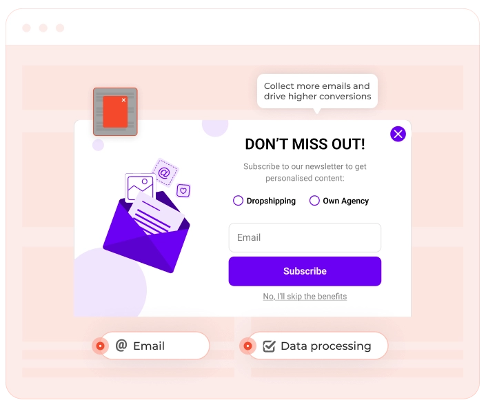
Let’s clear something up: not every pop-up is an opt in popup. There’s a big difference between a form that invites someone to subscribe — and one that traps them with ‘Enter your email or else’ energy. A real popup opt in form gives people a choice. It shows up, usually with a small offer or helpful promise, and says, ‘Hey, want in?’ That might be for a discount, a guide, or early access to something cool. The user gets to decide. No tricks. No guilt. Just a simple yes or no.
That’s what makes opt-ins work — they’re based on permission. You’re not buying a list. You’re not scraping emails from some sketchy third-party tool. You’re building your own list of email subscribers who actually want to hear from you.
Algorithms shift, ad prices climb, social reach goes up and down. But your email list? That’s yours. Every opt in popup that converts is one more direct connection — someone you can reach without begging a platform for attention.
It’s not about flooding inboxes. It’s about using smart email pop up opt-in forms to grow your audience in a way that feels good — for you and for your visitors. Because when someone willingly signs up, they’re already halfway to becoming a customer.
That’s the magic of a solid opt-in: no pressure, no noise — just a clear offer that earns attention and builds trust.
When to use a pop-up opt-in form and when not to
Pop-ups can be powerful — or painfully annoying. If they’re timed well, a pop-up opt-in form can help you turn abandoning visitors into subscribers. But if it hits too early or feels like it’s hijacking the browser window, expect a spike in bounce rates. That’s why context is everything.
Imagine someone just landed on your site. They’re still figuring out what you do — maybe skimming your homepage or reading the first paragraph of a blog post. And then BAM — full-screen popup. That’s not helpful. That’s just an interrupt.
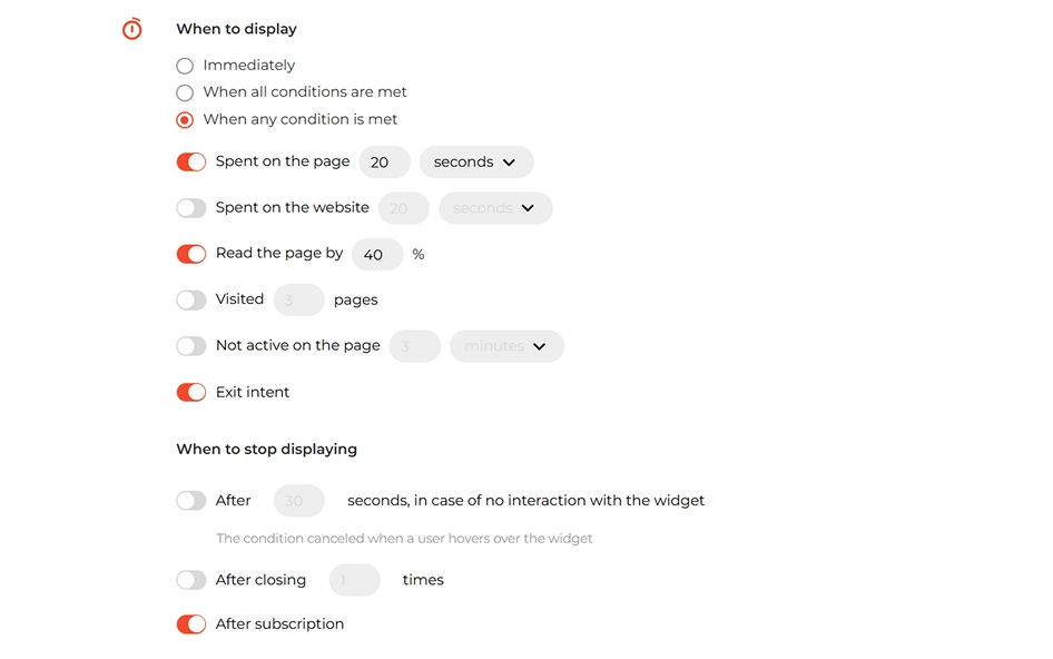
Now flip it. They’ve scrolled 70% down the page. Or maybe they’re hesitating at checkout. They move their mouse toward the ‘close tab’ button. That’s your moment. Smart pop-ups use behavioral triggers. Here are a few that tend to work:
- Exit intent: detects when someone’s about to leave and shows your offer just before they go.
- Time delay: waits until someone’s been on the page for 20-30 seconds — long enough to show interest.
- Scroll depth: triggers the popup opt in form after a visitor has engaged with a solid chunk of your content.
- Inactivity: perfect for situations where someone stops clicking or scrolling — often a sign they’re distracted or about to bounce.
Now think about inline forms. These are more like quiet invitations woven into the page — maybe after a blog post, tucked in a sidebar, or beneath product descriptions. They blend into the content and work best when someone’s already paying attention and reading with interest.
The key takeaway? Not everyone’s ready to see a popup right away. But if you match the offer to their mindset — at just the right moment — it can feel less like an interruption and more like a helpful nudge.
Timing isn’t just a good practice to use — it’s the difference between engage visitors and scare them off.
How to create an opt-in pop up that converts
Let’s be frank: nobody wakes up excited to ‘create a popup’. But when you’re building a funnel that actually works, a smart, well-timed opt-in can do more heavy lifting than half your ads. Here’s how to create an opt-in pop-up that doesn’t just show up — it brings results.
1. Start with the ‘why’.
Before touching any builder or design, know your goal. Want to grow your newsletter? Offer a promo code? Launch a giveaway? Your objective shapes everything — from wording to timing to design.
2. Match the message to the moment.
The secret to a high-performing opt-in popup isn’t just when it appears — it’s what it says, where, and why. Ask yourself:
- Is the visitor just browsing or comparison shopping? Try: ‘Want a quick guide to help you decide?’
- Are they exploring your blog? Try: ‘Like what you're reading? Get more tips straight to your inbox’.
- Are they showing signs of purchase intent? Try: ‘Here's 10% off — just for you’.
Tailor your offer to the emotional stage your visitor’s in. People don’t always need a discount — sometimes they just want to feel like they’re getting value, time-saving help, or insider access.
Add subtle urgency. ‘This offer’s available today only’ or ‘Just 5 spots left’ taps into the psychology of fear of missing out (FOMO) — and yes, it still works.
“Exit‑intent on listing advice articles (mobile and desktop) worked best when we swapped a static form for a 3‑step micro‑quiz with a progress bar: “When are you planning to sell?”, “Have you spoken to an agent?”, “Where is your property?” The incentive was clear and helpful: “Email me a personalised seller checklist.” This gave instant value and set clear expectations. Across two weeks (n=29,580 sessions), the quiz captured 7.9% vs 4.2% for the control (+88% relative). Mobile completion rose from 54% to 67%. Downstream, booked agent appointments per 100 emails increased 27%. The small friction of steps actually signalled credibility and weeded out tyre‑kickers."
Barbie Ann Jurolan
Head of SEO & Content, Which Real Estate Agent
3. Craft a short, clear message.
No fluff. Just say what they’ll get, like: ‘Get 10% off your first order’, ‘Join our list for weekly insider tips’, ‘Unlock the free ebook’ etc. Look at real opt-in email examples from brands you admire. What pulls you in?
4. Design for all screens.
A beautiful popup on desktop that breaks on mobile? It’s a no-go. Use a builder that lets you preview and adjust for both. You want something responsive, fast-loading, and easy on the eyes — no matter the device.
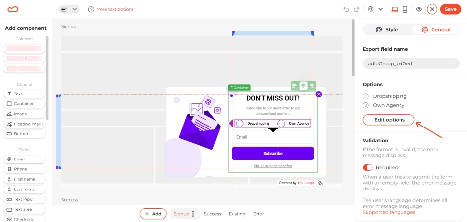
5. Add form fields — but only what you need.
Name and email are enough for 90% of cases. The more you ask, the fewer people fill it out. And don’t forget the trust bit: include a link to your privacy policy so visitors know they’re in safe hands.
6. Build with tools that don’t make you want to scream.
There’s no need to hard-code or mess with plugins if you don’t want to.
Modern widget builders — like Claspo — gives you visual editors that make it all intuitive — drag, drop, change, publish. In Claspo you can create a popup and launch it in under 5 minutes.
Best practices to optimize for higher conversion rates
You’ve got a popup — now make it one people actually want to engage with. Design isn’t just about appearances — it’s about how the popup feels to the person seeing it. Can they read it quickly? Does it make sense right away? Is it inviting or pushy? These are the things that decide whether someone engages or just clicks away.
Make it feel natural.
First, let it breathe. A short delay (about 15–20 seconds) before the popup appears gives visitors a chance to orient themselves. It’s a good practice to use — not just for the user experience, but also to reduce bounce rates caused by immediate interruptions.
Position it smartly. Dead center on the screen works when you’ve got a strong offer, but a subtle slide-in (floating box) might feel more user-friendly if you’re going for a softer ask. Just don’t obstruct key content — nobody wants a popup covering the ‘Add to Cart’ button.
Design for attention.
Use eye-catching visuals, but skip the flashing arrows and clashing colors. A clean layout with a strong headline, supporting image (if any), and a clear CTA button is often all you need. The CTA should highlight the value — something like ‘Get My Free Guide’ or ‘Yes, I Want 10% Off’ is more enticing than ‘Submit’.
Add subtle animations if it fits your brand. A soft fade-in or slide is often enough to draw a visitor’s attention without startling the user. Keep the motion smooth and quick. And yes, always include a visible, working close button. It builds trust and makes your popup feel optional — not like a trap.
Build trust with privacy and transparency.
People are more willing to subscribe when they know what’s coming next. Add a small line near the submit button like: ‘We respect your inbox. Unsubscribe anytime’ or ‘You’ll receive occasional emails with offers and tips. We never share your info’.
If your audience includes folks in the EU it’s smart to mention your privacy policy and let people know what they’re signing up for. It builds trust, keeps your email list healthy, and helps you stay on the right side of data protection rules.
Pop-up opt-in form ideas that actually work
Your pop-up offers need to feel like a no-brainer. The best opt-in email examples have one thing in common — they make the trade feel worth it. Here are a few pop-up opt-in ideas that go beyond ‘sign up for our newsletter’ and actually get clicks — organized by what kind of site you’re running.
For e-commerce sites.
‘Get 10% Off Your First Order’ is a classic for a reason. It works. But you can take it a step further:
- Offer free shipping in exchange for a subscription.
- Unlock a ‘mystery gift’ with a purchase — shown only after opt-in.
- Run seasonal promotions (like ‘Valentine’s Day Deals Inside’ or ‘Black Friday Early Access’) that feel timely and relevant.
With these, your opt-in popup becomes more than a form — it’s a limited-time offer on your landing pages that nudges visitors to take action.
For SaaS and tech products.
Visitors to your site are usually comparison-shopping, cautious, or just curious — so your popup has to give them something they can’t get just by browsing. Here’s what actually works:
- Exclusive early access to new features or beta tools — position it as a VIP test group or private preview.
- A free downloadable resource tailored to your product niche — like a setup checklist, industry report, or strategy playbook.
- ‘X-day free trial’ + bonus onboarding pack for subscribers only — this could include video guides, templates, or one-on-one setup help.
- Give early access to limited-time deals — especially if your product goes through launches or timed rollouts. It gives people a reason to sign up now, not later.
By offering something specific and helpful — like a sneak peek, trial extension, or bonus resource — your opt-in popup doesn’t just blend in. It speaks to what the person already wants, and makes their next step obvious.
For bloggers and content creators.
Blog readers are already engaged — your goal is to give them a reason to stick around:
- Turn your blog post into a downloadable checklist or PDF guide.
- Create a ‘content vault’ of gated resources available after opt-in.
- Invite readers to join a short email course or mini challenge that ties directly into the topic they’re reading about.
The best part? These pop-ups feel less like an ad and more like a helping hand — especially when they appear just as someone finishes reading. It’s not a disruption. It’s a ‘hey, want to take this further?’
Build and launch a pop-up opt-in form without code
Here’s the thing: pop-ups aren’t dead. Bad ones are. A thoughtful popup opt-in form, shown at the right time, with a clear message and a real benefit, can turn your website into a list-building machine. When done right, it doesn’t interrupt — it invites.
So if you’ve been putting off building your list, this is your sign to start. You don’t need to be a developer to launch something that works. A good opt-in pop-up can be built with the same ease as writing a short email — especially if you’re using a visual tool like Claspo. Just choose your goal, set the timing, drop in your message, and you’re ready to go.
Keep it simple. Make it feel like a helpful nudge, not a pushy ad. When the form looks good, shows up at the right time, and offers something people actually want — that’s when things click. One small widget can make a big difference. And yes — it is possible to grow your email list without annoying your visitors. You just have to respect their time, stay clear about what you’re offering, and keep the experience smooth.
You pick the parameters: when it shows, who sees it, and what they get. Whether it's a welcome discount, a lead magnet, or early access to something new, you’ve got full control — and it actually feels fun to build.