
Popup Conversion Benchmarks: 3 Years, 779M Impressions, and Insights from the Top 10%
Ever wondered why some pop-ups make you click, while others make you close the tab? We analyzed thousands of widgets to uncover what truly converts: from smart design and copy to components that turn visits into sign-ups and sales.
Our study distills three years of real-world data into clear, actionable patterns. Learn how design, copy, and incentives shape visitor behavior — and what you can do to make every widget perform better.
How we researched it
We analyzed every widget published by Claspo users over the past three years — more than 779 million impressions in total.
To make sense of that massive dataset, we used a Large Language Model (LLM) trained on AI vision to recognize over 120 conversion-driving parameters — from business goals and design style to emotional tone, incentives, and UX clarity.
Then we divided all widgets by industry and by their structure — things like layout, form type, number of fields, and interactive elements. This helped us see how different setups behave in real conditions and which combinations consistently bring better results.
After that, our team checked every insight by hand: reviewed the data, calculated conversion rates, and compared average widgets with the very best — the top 1%, 5%, and 10%.
The outcome is a clear, data-grounded view of how various industries approach engagement and what actually makes users take action.
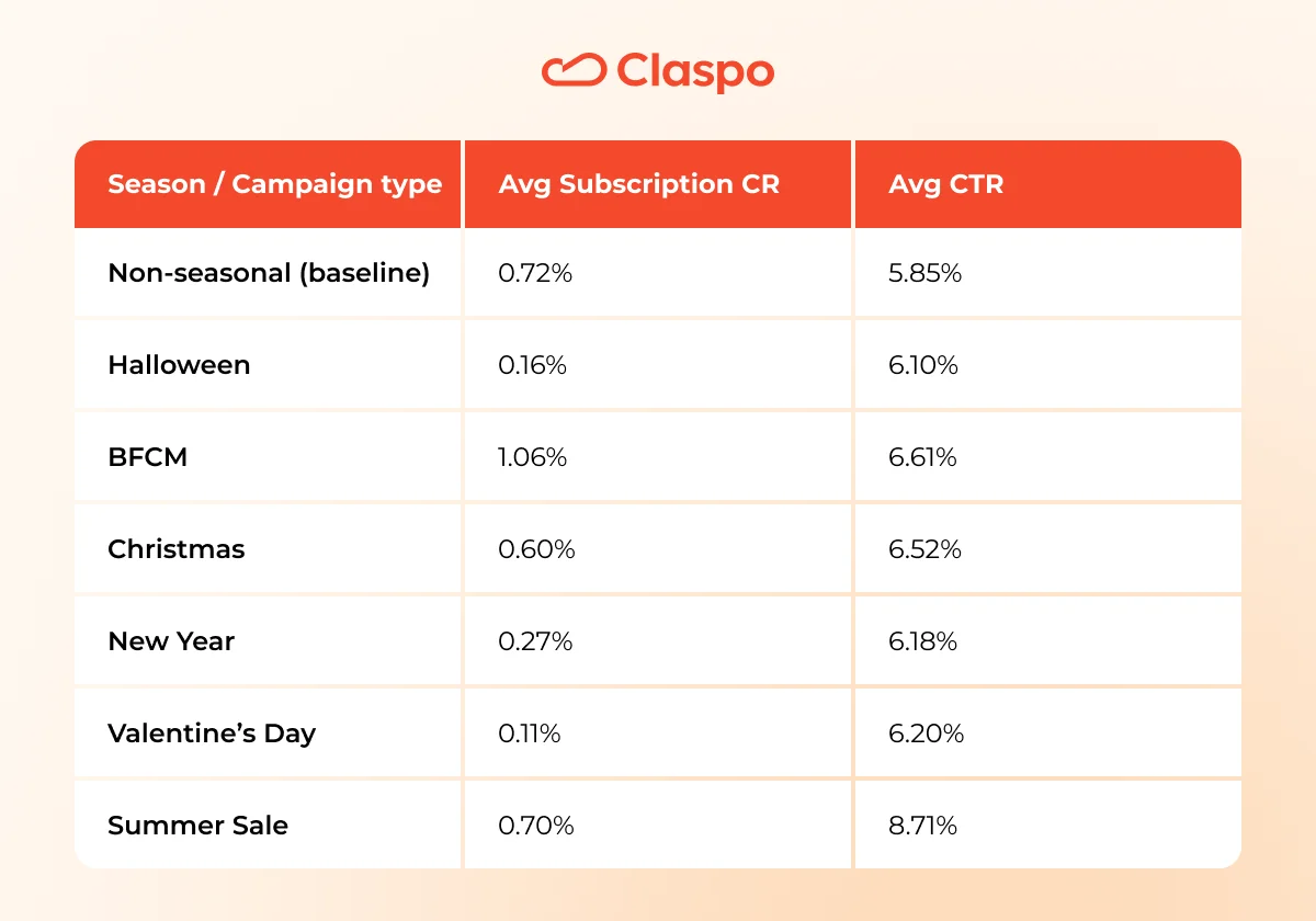
How seasonal campaigns shape conversion patterns
Because this benchmark is being released during the peak marketing season, we started by looking at how seasonal campaigns perform compared to evergreen ones. Holidays like BFCM, Christmas, and Valentine’s Day fill websites with themed popups and special offers — but do they actually convert better? To find out, we analyzed how subscription and click rates shift across major retail seasons versus non-seasonal periods. The results show when festive energy drives engagement — and when it doesn’t.
Key insights:
1. Seasonal = higher engagement
- The average CTR across seasons sits around 6.7%, versus 5.85% for non-seasonal — a ~15% uplift in engagement.
- Yet, average subscription CR during seasons (≈ 0.5%) trails the non-seasonal 0.72% baseline.
Strategy: festive campaigns spark curiosity and browsing but rarely sign-ups. They should prioritize quick interaction over form submission.
2. BFCM leads both clicks and subscriptions
- CTR 6.61%, CR 1.06% — both top among all seasons.
- The high-intent shopping mindset aligns perfectly with clear rewards like promo codes or spin-to-win games.
Strategy: strongest window for data capture and sales-linked campaigns.
3. Summer Sale surprises with the highest CTR
- Nearly +50% higher click rate than the annual average, though sign-ups remain modest (0.70% CR).
- People explore deals in a relaxed mindset — not urgent, but open to browse.
Strategy: use bright, visual promo popups or sliders to capitalize on discovery behavior and keep forms secondary.
4. Halloween draws attention but not commitment
- 6.1% CTR shows strong engagement with themed visuals and interactivity, but 0.16% CR confirms it’s surface-level.
- The theme encourages play, not data sharing.
Strategy: leverage playful animations or gamification purely for engagement metrics, not for lead capture.
5. Emotional holidays create warm and clicks
- Christmas, New Year, and Valentine’s hover around 6-6.5% CTR.
- Shoppers focus on gifting inspiration, not subscribing.
Strategy: feature curated offers or gift guides — soft, non-form widgets work better than sign-up prompts.
Gamified signup forms: what makes the Top 25% stand out
Seasonal campaigns grab attention for a few weeks — but gamified widgets keep it long after the holidays end. While festive offers rely on timing and emotion, gamified forms build engagement through interaction itself.
Our next analysis explores why playful mechanics like wheels, scratch cards, and gift boxes outperform classic forms by up to 3×.
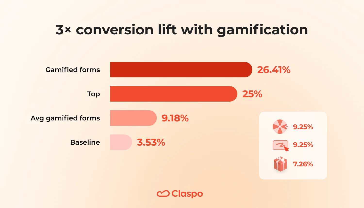
Gamified signup forms consistently outperform traditional ones:
- Average CR for all signup forms: 3.53%
- Average CR for gamified forms: 9.18%
- By mechanic:
- Spin to win: 9.25%
- Scratch card: 11.29%
- Gift box: 7.26%
This is a clear pattern: adding a simple game mechanic triples conversion. Gamified forms turn the usual ‘enter your email’ moment into an experience — fast, fun, and rewarding.
Moreover, the Top 25% of gamified widgets reach 26.41% avg. CR — nearly eight times higher than a standard form.
What they have in common (winning patterns of the Top 25%)
Layout & UI
Most gamified forms appear as popups (≈73%), while floating boxes (15%) and built-in formats (12%) play supporting roles. Design stays simple: standard popup layout, centered alignment (61%), and a single CTA (100%), almost always at the bottom (≈88%). The close button is visible (≈85%), which helps trust without hurting engagement. These widgets grab attention but don’t trap users — a subtle psychological advantage.
Form simplicity
Complexity kills curiosity. 95% of forms use only one or two fields, most often email-only (56%) or email + name (12%). Phone or preference fields appear rarely (7-10%) and are best collected later through progressive profiling.
Game mechanics
The undisputed leader is Wheel of fortune (≈76%), followed by Scratch card (15%) and Gift box (10%). Each serves a purpose: wheels for excitement, scratch cards for suspense, and gift boxes for elegance or seasonal flair.
Incentives
Top gamified forms offer a clear reward:
- Promo codes in ≈83% of cases.
- Discounts in ≈88%, mostly percent-off (78%).
- Freebies (samples or tools) are used rarely (~12%)
It’s all about immediate gratification — users see the win right after the play, not later in the funnel.
Copy & messaging
Tone is friendly and playful (≈95%), always value-first (100%) and benefit-clear (100%). Nearly all use curiosity hooks (≈98%) — ‘Spin to reveal’, ‘Try your luck’, ‘Find your prize’, etc.
Emotional triggers are subtle: low to moderate urgency (61% have none; only 15% use countdowns). Common hooks include exclusive-access (56%) or limited-time (29%), but always with a real reason — never false scarcity.
Why it works
Gamification replaces friction with curiosity. Instead of asking for data, it offers an experience — one that feels like a tiny win. Every step (spin, scratch, reveal) taps into micro-dopamine triggers: anticipation, reward, surprise. Visitors stay longer, interact more, and perceive the signup as entertainment, not effort. This approach also normalizes data exchange. Users who play feel they’ve already received something valuable — a discount, a sense of fun — so sharing their email feels natural, not transactional.
How to recreate the success
1. Choose the right mechanic. Each game format drives different emotions and fits a specific goal:
- Wheel of fortune — for new visitors and big campaigns. Use it in mass promotions, BFCM, or welcome offers when you need instant engagement. The spin creates anticipation and reward curiosity — people expect a win and stay longer.
- Gift box — for brand storytelling and limited-time promos. Best for launches, holidays, or premium campaigns. The ‘unwrapping’ moment sparks curiosity and emotional warmth — it feels like a real gift, not a pushy discount.
- Scratch card — for loyalty and reactivation. Ideal for returning customers or post-purchase flows. The act of scratching adds effort-based satisfaction — users feel they’ve earned the reward, which deepens attachment.
- Slot machine (new) — for drawing attention through motion and novelty. The spinning reels create a moment of suspense — people instinctively wait for the outcome. That brief pause keeps them emotionally involved. It’s a fresh, instantly familiar format that is great for seasonal offers or to see how your audience reacts to something new and fun.
2. Build a clear, fair game setup:
- Reward matrix: one strong prize + 2-3 medium + 1-2 soft rewards.
- Add a one-line rule or note under the CTA explaining how rewards work — transparency increases engagement.
3. Keep the form friction-free. Use email-only or email + name. Collect other data (phone, preferences) only after subscription — through a follow-up quiz or profile step.
4. Design for ‘one action — one win’. Stick with a popup, single CTA button (bottom-placed), and clear visual hierarchy. Make the close button visible — hiding it breaks trust more than it helps conversion.
5. Make the incentive clear and margin-safe:
- Default to percent-off promo codes — easy to manage, psychologically stronger.
- Use fixed discounts when AOV is stable and you need tighter cost control.
- Display the reward instantly after signup (on the ‘thank you’ screen + via email).
- Prevent abuse with anti-fraud rules: one-time codes, minimum order value, category exclusions.
6. Write copy that feels like a win. Formula for headlines: Benefit → Mechanic → Timing. For example, ‘Get –15% — Spin the wheel now’.
Subhead: one clear line of conditions. Tone: friendly, playful, concise. Use exclusive-access or limited-time hooks only if they’re real — fake urgency kills credibility fast.
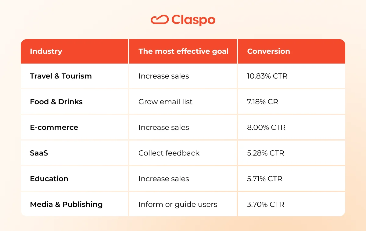
How different goals perform across industries
We analyzed thousands of Claspo campaigns to find out how different objectives perform — from ‘Add to Cart’ nudges to newsletter sign-ups. Use these industry averages as your baseline for smarter testing and realistic expectations.
E-commerce
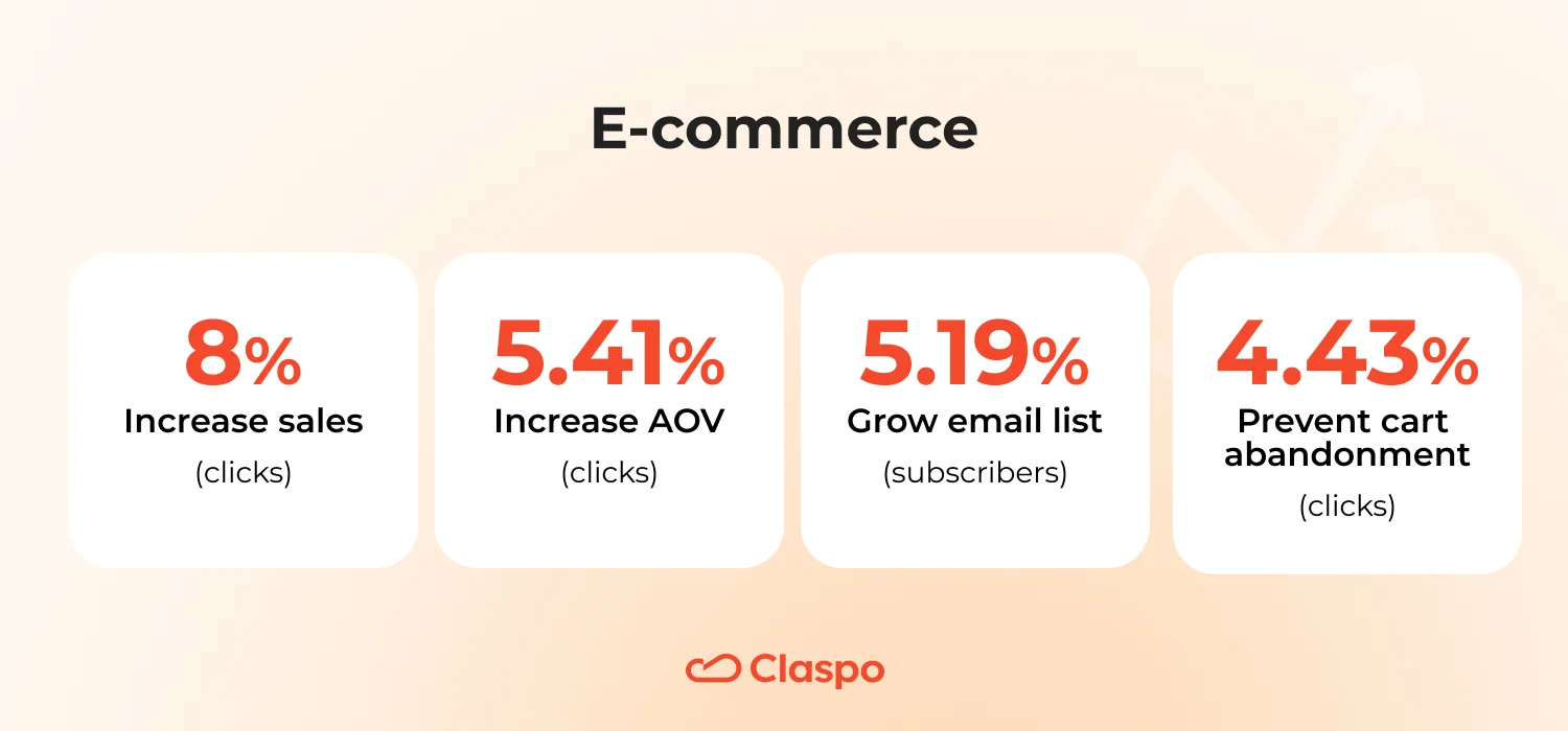
Grow email list — 5.19% (subscribers)
E-commerce visitors tend to sign up when they see clear future value — discounts, drops, or early access. This moderate average shows how trust and timing matter more than popups alone.
Increase sales — 8% (clicks)
Sales-focused widgets convert highest because intent is immediate — shoppers are already browsing or buying. The best performers use urgency or bundle offers to convert clicks into carts.
Prevent cart abandonment — 4.43% (clicks)
A solid rate for reactive widgets. Triggers on exit intent or idle time prove effective — especially when paired with small incentives or reassurance like free shipping or secure checkout.
Increase AOV — 5.41% (clicks)
Cross-sell and upsell widgets hit well when positioned naturally — post-add-to-cart or before checkout. The sweet spot lies in personalized recommendations, not generic ‘buy more’ prompts.
Food and drinks
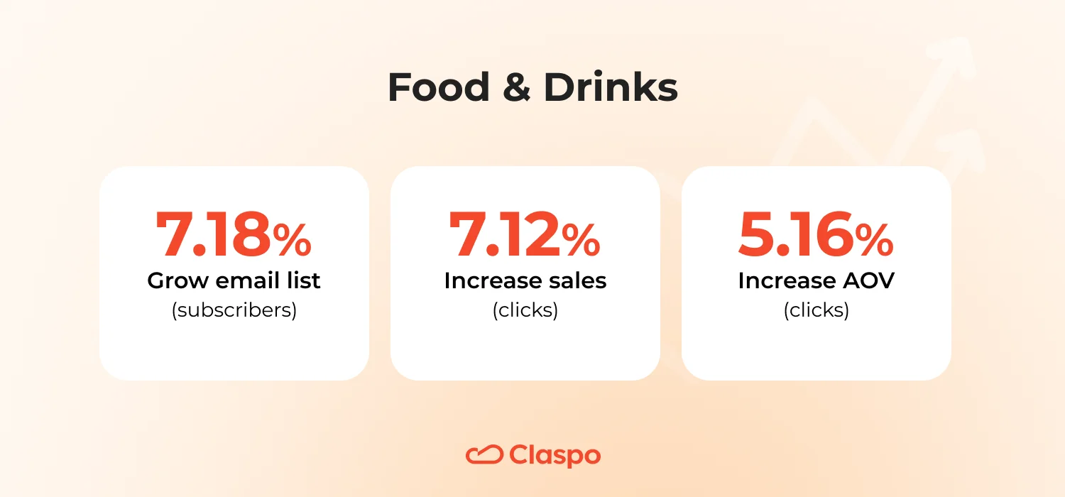
Grow email list — 7.18% (subscribers)
One of the highest signup rates across industries. People are receptive to recipes, tips, or loyalty perks, so value-based lead magnets outperform discounts alone.
Increase sales — 7.12% (clicks)
Sales widgets thrive on appetite appeal — mouthwatering visuals, limited-time offers, and strong FOMO messaging. Emotional design does half the selling here.
Increase AOV — 5.16% (clicks)
Upsells work when framed as experiential add-ons (‘Pair it with…’, ‘Complete your box’) rather than transactional. Smart phrasing drives curiosity.
SaaS
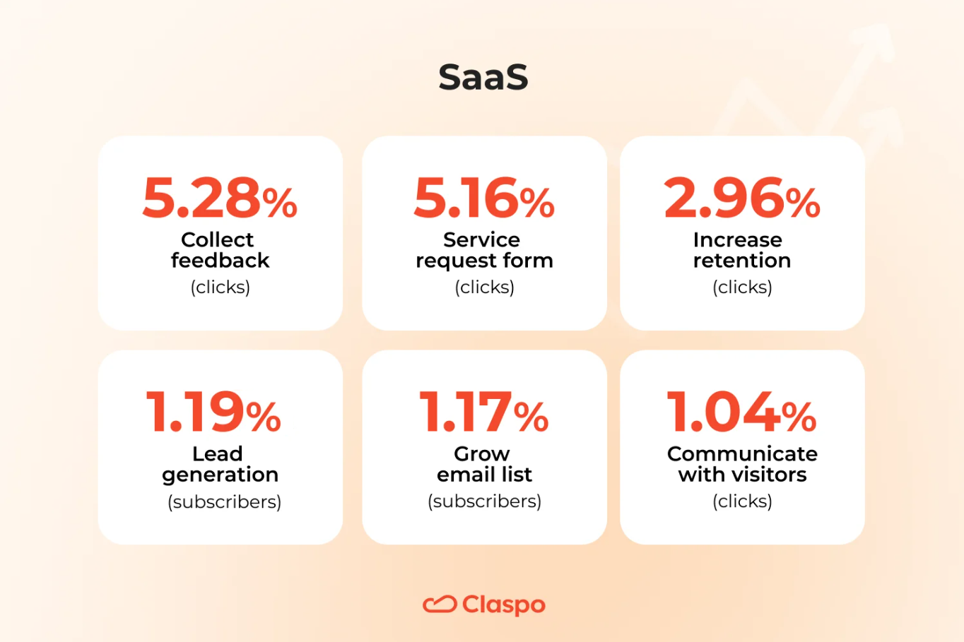
Collect feedback — 5.28% (clicks)
Feedback widgets shine here — users like sharing quick opinions, especially after an update or milestone. Short, frictionless questions outperform long forms.
Service request form — 5.16% (clicks)
A strong result for direct intent. Clear framing (‘Request demo’, ‘Book consultation’) wins, especially when urgency and pricing are transparent.
Increase retention — 2.96% (clicks)
Retention nudges rely on education and value reminders — success stories, new features, or ‘you’re missing out’ messaging. It’s emotional reassurance more than persuasion.
Lead generation — 1.19% (subscribers)
These require deeper commitment, so conversion drops — expect better performance with pre-qualified traffic or gated content offers.
Communicate with visitors — 1.04% (clicks)
Pure engagement widgets aren’t conversion-first. They build familiarity, not signups — ideal for top-of-funnel nurturing.
Grow email list — 1.17% (subscribers)
Predictably low — SaaS audiences need context and trust before subscribing. Educational incentives (like a free guide) or feature updates work best.
Media and content publishing
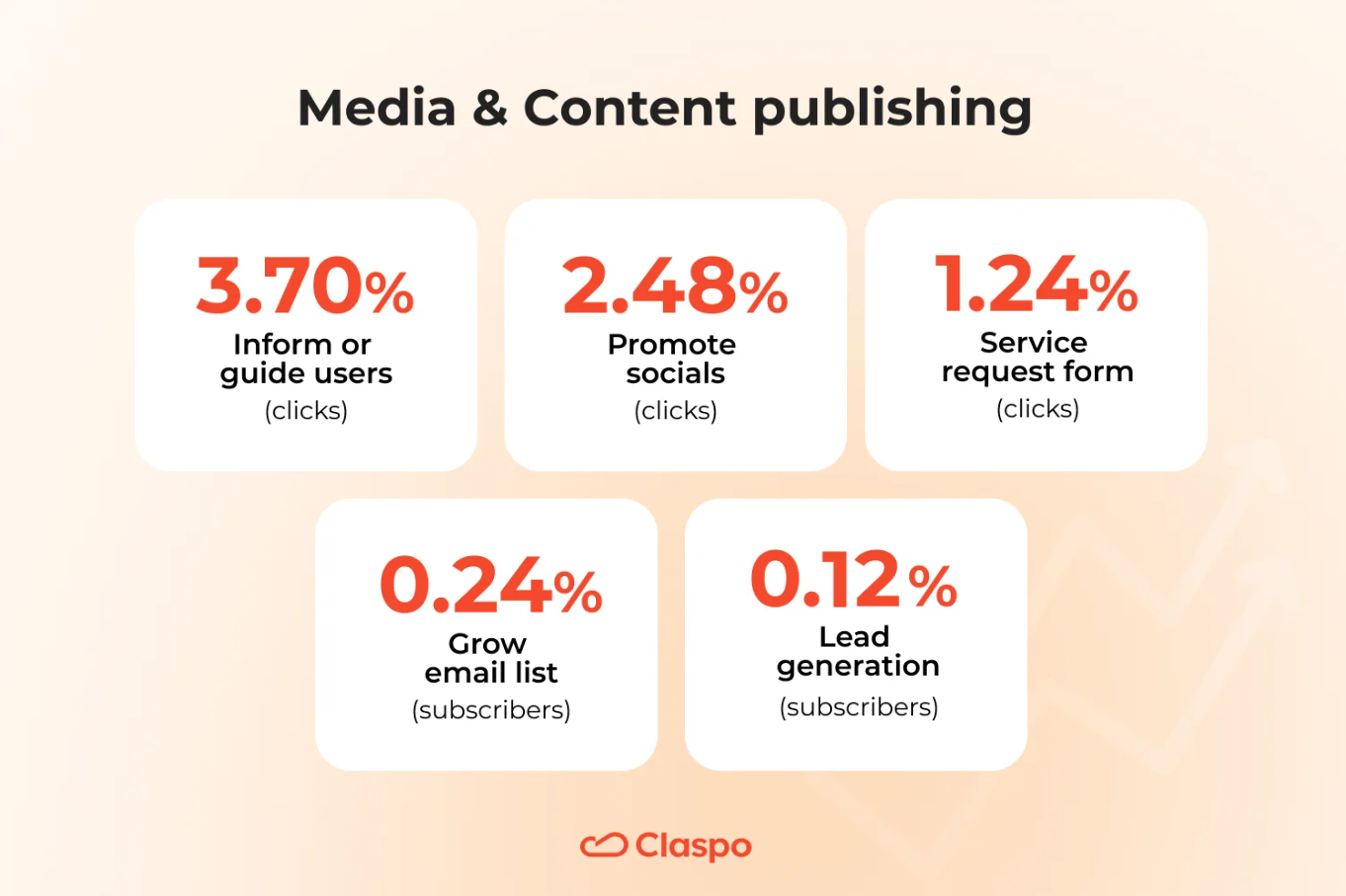
Inform or guide users — 3.70% (clicks)
Strongest goal for this sector. Readers click when widgets enhance their content journey — such as related articles suggestions or key updates.
Promote socials — 2.48% (clicks)
Social CTAs perform well because they feel light and reciprocal — readers enjoy staying connected outside the site.
Service request form — 1.24% (clicks)
Expectedly low — service forms aren’t the focus for publishers.
Grow email list — 0.24% (subscribers)
Lowest across industries — attention spans are short, and users resist distractions mid-article. Embedded or post-content forms work better than popups here.
Lead generation — 0.12% (subscribers)
Media visitors skim and bounce quickly. They engage with content, not forms, which makes high-intent data capture difficult without a strong value exchange.
Education
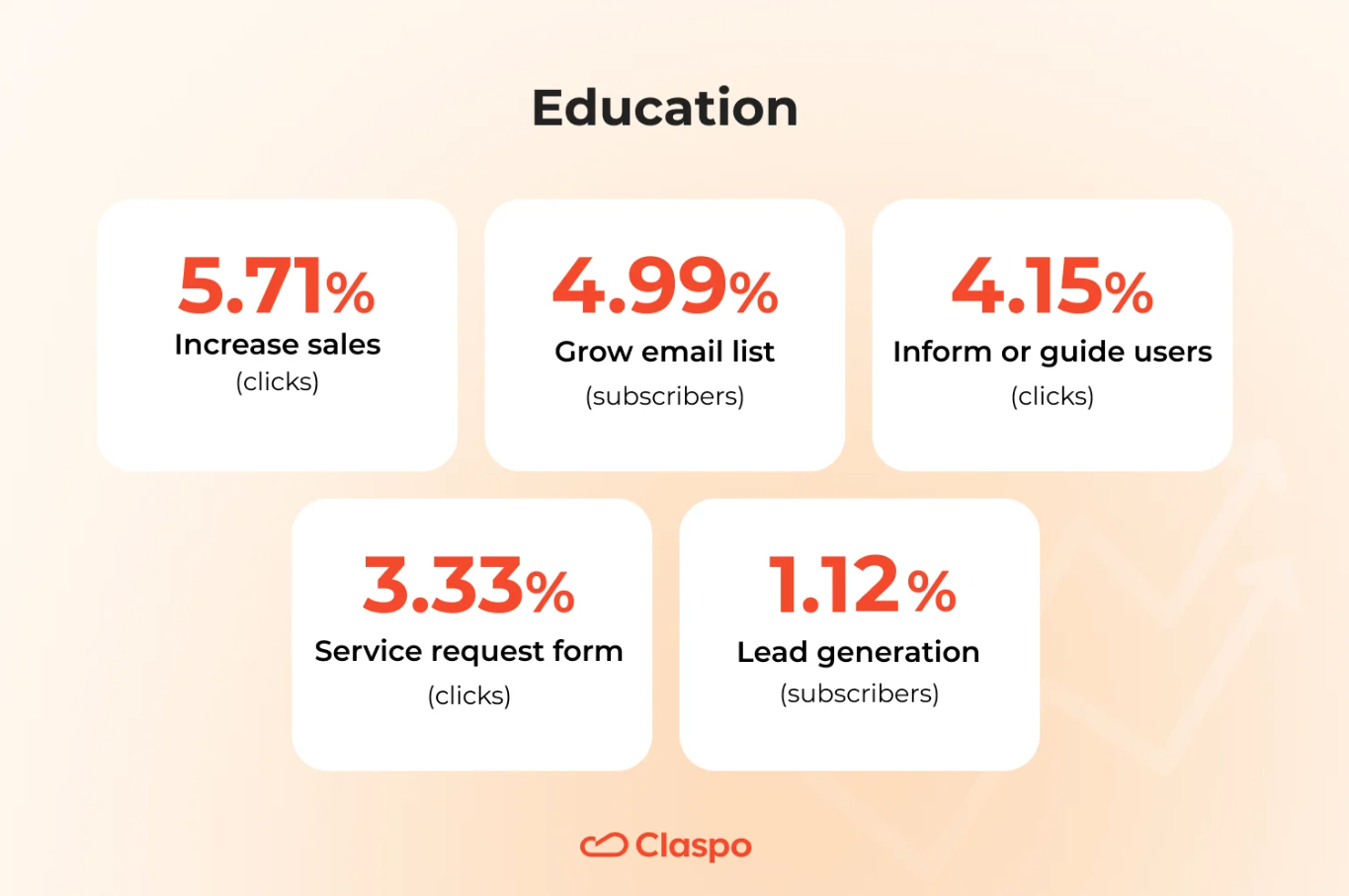
Increase sales — 5.71% (clicks)
High-performing for education, as audiences act decisively once convinced. Deadline-based offers (‘Enroll before Monday’) lift results significantly.
Grow email list — 4.99% (subscribers)
Consistent with the trust-driven nature of this niche. Guides, webinars, or course samples make great lead magnets.
Inform or guide users — 4.15% (clicks)
Educational brands benefit from clarity — program explainers and step-by-step visuals keep users moving down the funnel.
Service request form — 3.33% (clicks)
Lower due to higher friction — prospective students need reassurance before sharing contact info. Adding trust signals (accreditation, testimonials) helps close the gap.
Lead generation — 1.12% (subscribers)
Education leads require more consideration. Visitors compare programs, pricing, and credibility, so they share their contacts only when the offer promises clear next steps or personal guidance.
Travel and tourism
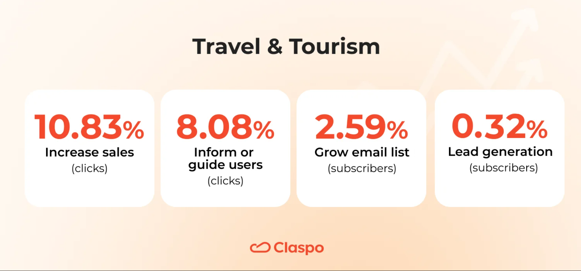
Increase sales — 10.83% (clicks)
Top of the chart. This sector thrives on emotion and timing — when travelers are ready to book, compelling visuals with clear CTAs do the rest.
Inform or guide users — 8.08% (clicks)
High engagement proves that educational content sells — trip planners, destination guides, or visa checklists build trust before purchase.
Lead generation — 0.32% (subscribers)
Most users are still comparing destinations and prices. Unless the offer accelerates their planning (custom routes, budget estimates), they postpone sharing details.
Grow email list — 2.59% (subscribers)
Lower, but expected — travel signups rise only when the reward feels personal or exclusive (for example, insider deals or early-bird routes).
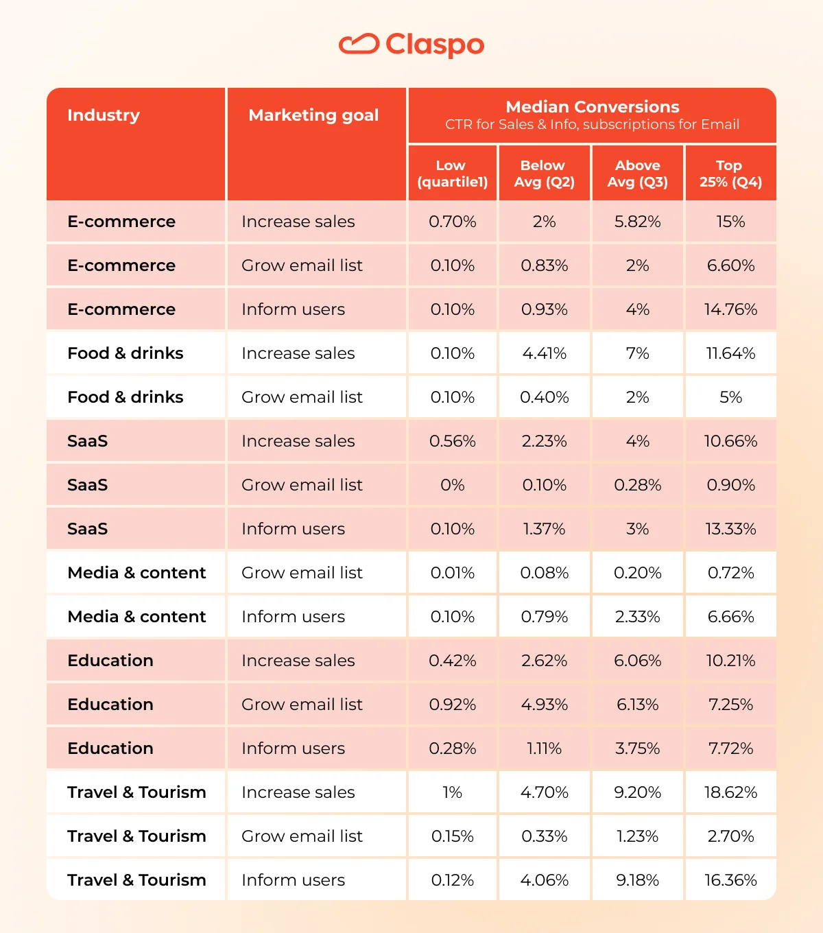
Beyond averages: median quartiles that show where you stand
While most of this report uses average conversion rates, the table below adds another lens — median quartiles. This view helps you see how results are distributed: from the lower quartile to the top 25% performers. It’s a practical way to compare your current metrics with what’s typical in your industry — and what excellence looks like.
Inside the Top 10%: cross-industry insights on high-converting widgets
The top 10% of widgets — from signup forms to promo popups — convert 3× to 9× better than their peers. Their shared DNA: simplicity, visual focus, meaningful incentives, and transparent tone. Here’s what each industry’s best performers reveal about designing experiences that convert attention into action.
E-commerce Top 10% signup forms: how to repeat their success
Gamification wins
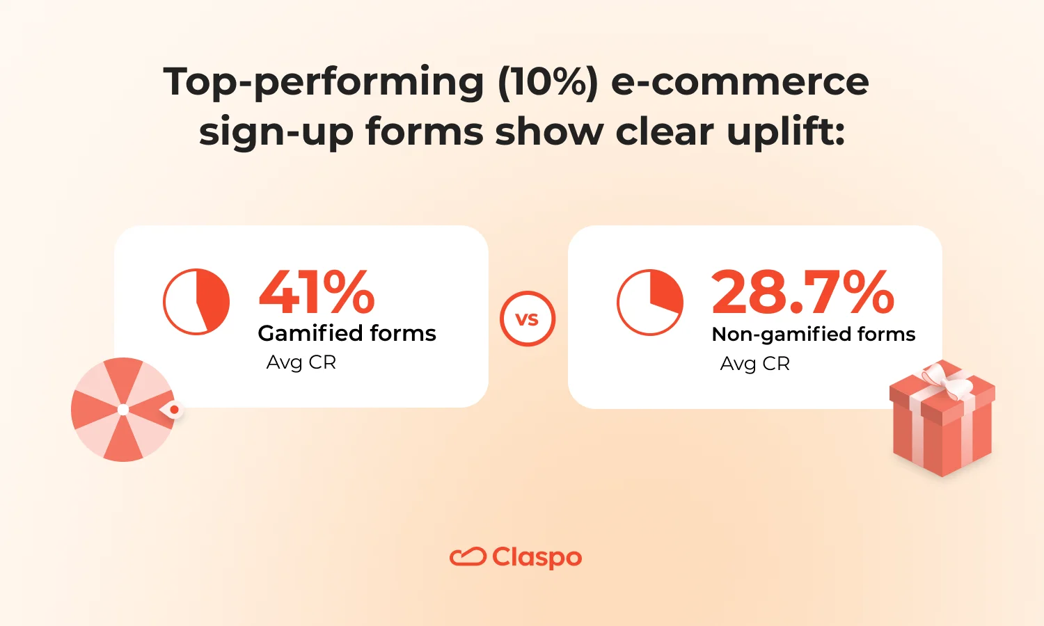
The top gamified e-commerce signup forms achieve an average CR of 41%, compared to 28.7% for non-gamified forms — a growth of roughly 10-12 percentage points. Interactive formats like wheels, mystery gifts, slot machines, or scratch cards clearly turn curiosity into conversions.
Gamified widgets work best for cold or mixed traffic, promotions, BFCM, or holiday campaigns — expect a higher subscription rate. Classic forms are ideal for warm traffic or when the brand tone doesn’t fit a playful style.
Layout & UX
Around 85% of top-performing forms appear as popups — they grab attention instantly and make interaction easy. Nearly nine out of ten (90%) use a modern design, and every single one features a clearly visible CTA. In most cases, the close button is easy to spot (75%), which helps build trust instead of friction. What it means:
- Use popups with one clear CTA at the bottom.
- Make the close button visible — it builds trust. Avoid multiple buttons that compete for attention.
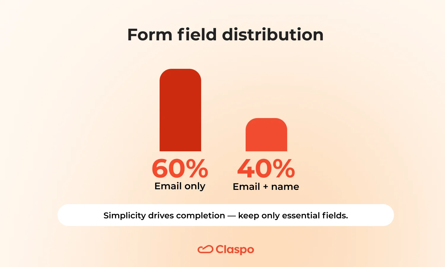
The common thread is simplicity: nine in ten forms include just one or two fields, so the signup feels effortless. Every form collects an email, while 40% also include a name for personalization. Fields like preferences or phone numbers appear rarely. So, collect only what matters. Keep it light: email only or email + name is enough to start. If you need more data (preferences, phone), ask after signup — not before.
Copy & tone
All top forms use a friendly tone with a clear value message. Urgency is minimal — three-quarters avoid it entirely, and if it’s present, it stays subtle and authentic. Messages are short, benefit-first, and easy to digest.
Keep copy short and friendly. Say what users get and how — one line for the reward, one for the action. Skip forced urgency; if you use a deadline, make it real.
Incentives
Almost all offer a discount (90%) — split between fixed amounts (50%) and percent-off deals (40%). A smaller share (10%) use freebies as a non-discount alternative for premium or brand-sensitive stores.
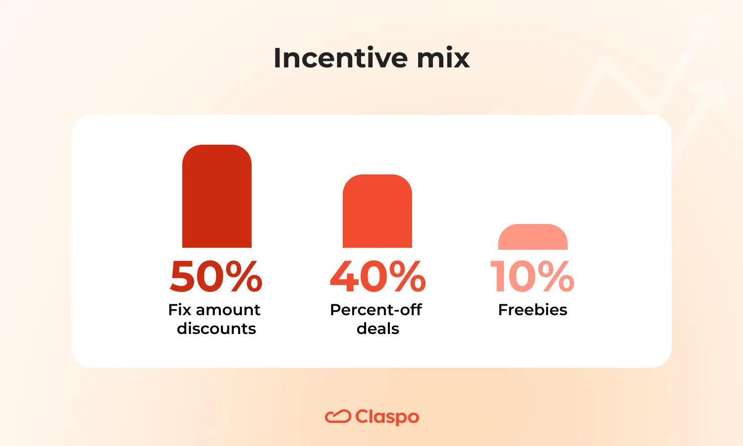
- Fixed amount: for stable check sizes or when you need tight margin control.
- Percent-off: for variable orders where you want to scale value with cart size.
- Freebie: best alternative when discounting doesn’t align with your brand.
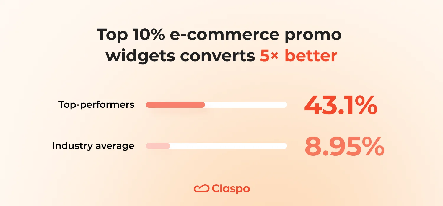
E-commerce Top 10% promo widgets: the formula behind their 43% CTR
The top 10% of e-commerce promo widgets achieve an average click-through rate of 43.1%, compared to the overall category average of 8.95% — nearly a fivefold increase.
Layout & design
Every top promo widget is a popup (100%), most using a clean or minimalistic style (70%). A single, high-contrast CTA appears in 87%, always easy to spot, while a close button is present in all cases but kept visually quiet so it doesn’t compete for attention.
Copywriting
Almost every promo widget communicates a clear value proposition (93%) in a friendly tone (100%). The benefit is explicit in about 80%, while hooks appear occasionally (≈20%). Attention naturally centers on the CTA (100%), not on extra visual effects or hype.
Try this content structure. Begin with a headline that spells out the benefit. Under it, add one quick line that explains what users will see or get next. Keep your button copy active and specific — ‘Get the offer’, ‘See details’, ‘Try now’.
Keep the message friendly, direct, and honest — no clickbait. Skip artificial urgency. If a real deadline exists, mention it briefly without drama. Use hooks sparingly — only when they add context or curiosity, not as a substitute for value.
Incentives
Most promo widgets don’t rely on rewards (60%), but when they do, it’s usually a discount — typically tied to a sale announcement or seasonal promotion.
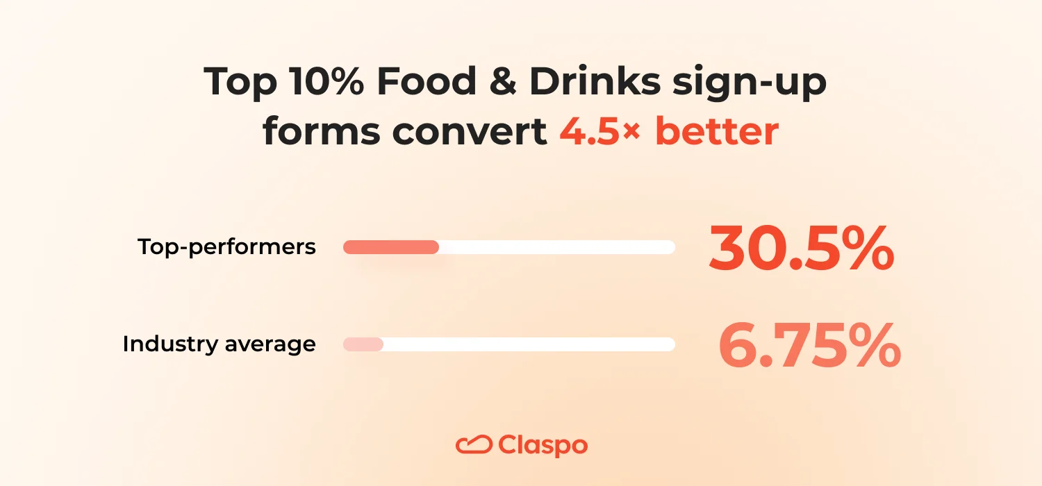
Top 10% Food & Drinks signup forms: how to match their 30% CR
The best Food & Drinks signup forms convert at about 30.5%, while the industry average is only 6.75%. That’s almost a fivefold gap. And it’s not because they’re louder or more complex — these forms feel deliberate. Every element has a purpose: the visuals, the incentive, even the tone of the message.
Design & layout
About half of them are popups, a third use floating boxes, and one in five are built-in layouts. Most keep things clean and contemporary — 70% modern, 20% timeless, a few slightly trendy — mixing minimalist, festive, or elegant themes depending on the brand’s tone.
And there’s one constant: every single one uses imagery. Often it’s a product photography with sharp contrast — black, gray, or muted tones that let the offer stand out naturally. Forms stay simple: one field in 90% of cases, usually email-only, and just one CTA (80% at the bottom, 20% centered).
So, include a product photo or lifestyle image. Every top widget in this category used imagery to evoke taste, mood, or quality. And remember that the best-performing forms keep things effortless: one field, one button, one clear action. Clarity still beats creativity in driving the final click.
Incentives & gamification
Top widgets go heavier on motivation: discounts appear in 50% (vs. 27% across the industry) and promo codes in 50% — four times more often than average.
Use strong but honest incentives. If discounts fit your pricing strategy, make them visible:
- Percent-off: works best for varied order sizes.
- Fixed or free shipping: best for higher-value orders. Use it as a threshold incentive to encourage larger carts.
- Gift with signup: perfect for seasonal or loyalty-driven campaigns.
Gamification shows up in 30% — three times more than standard setups — confirming that interactive mechanics work well in this niche.
Test gamification. Interactive elements (wheel, slot machine, gift box, scratch card) can triple engagement in this niche. Use them for new visitors, holidays, or special editions.
Copywriting & tone
Top performers speak with energy. Tone distribution: excited (30%), professional (30%), urgent (20%), playful or neutral (10% each). The copy is honest, clear, and value-driven, often with compelling benefit framing (spotted in 40% of top widgets vs. 23% in average forms). Curiosity hooks appear in 60%, and FOMO or urgency is used strategically — 40% show urgency (vs. 13.6% average) and 30% display high FOMO (vs. 9%).
Still, the messaging stays credible — countdowns (20%) or ‘limited-time’ phrases (40%) appear only when real.
Food and drinks buyers respond well to emotion — but keep it grounded. Use vivid visuals and emotional tone, yet make the offer easy to grasp in one glance.
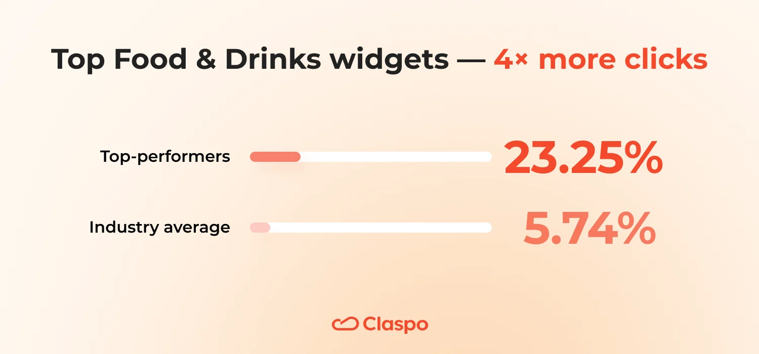
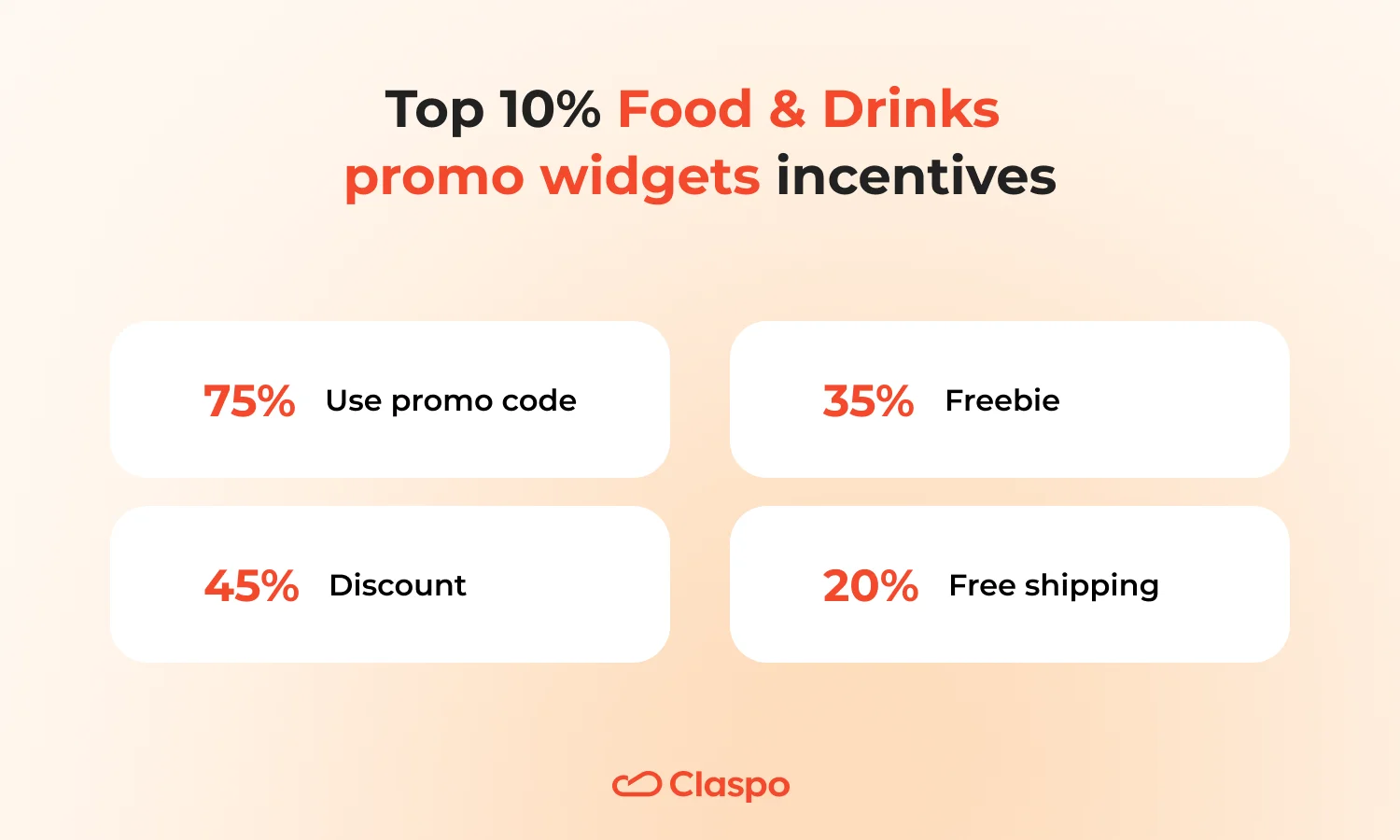
Top 10% Food & Drinks promo widgets: 23% CTR — how they earn attention
The top-performing Food & Drinks promo widgets achieve an average click rate of 23.25%, compared to the industry average of 5.74% — about four times higher. Their strength lies in simplicity, a crystal-clear offer, and incentives that actually fit the context.
Layout & design
Most of these promo widgets are popups (75%), each with a single, clear CTA (95%), usually placed at the bottom. A visible but unobtrusive close button (85%) keeps the design user-friendly. Attention level stays moderate — no full-screen takeovers.
Go with a popup layout — it’s still the most effective format in this category. Use a single CTA, make it stand out visually, and place it where people naturally finish reading — near the bottom. The close icon should stay easy to find but never fight for attention. You want users to notice the offer, not feel cornered by it.
Visuals
Images appear in 85% of widgets. Include a real product or lifestyle image — something that evokes taste and quality. Avoid filler stock photos and show what makes your brand appetizing.
Incentives
Coupons stay the core of most promo widgets — 75% use promo codes. When it comes to incentive options, the distribution is as follows: discount 45%, freebie 35% (samples, guides, etc.), free shipping 20%.
Incentive patterns that work:
- Promo code: use as your base offer. Add a countdown only if there’s a genuine deadline.
- Free shipping: often performs better than a percent discount when delivery costs influence purchase decisions.
- Freebie (sample, recipe, or guide): perfect when you want to add value without lowering the price.
Copywriting
All top promo widgets use honest, benefit-first copy (100%), with 95% rated as good or compelling. Tone is friendly (70%), never pushy, and urgency is applied selectively — countdowns in 30%, limited-time mentions in 45% — only when the time frame is real.
Write terms in two short lines — one for the benefit, one for the condition — so the message stays clear even on mobile. Open with the promise, not the pitch. Tell people what they’ll get by clicking, in plain words. Write like you’re talking to a customer, not announcing a sale — friendly, easy, and real.
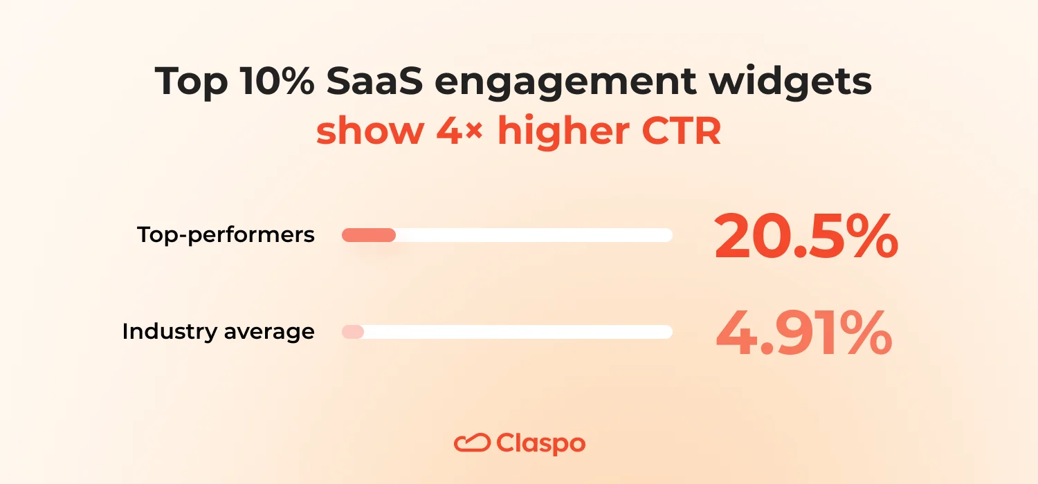
SaaS engagement widgets: what makes the Top 10% performers click
SaaS engagement widgets turn clarity into conversion. The top 10% reach 20.5% CTR, while the industry average sits at 4.91% — more than 4× higher performance.
These widgets win through structure, focus, and relevance: each click feels purposeful — to explore a new feature, learn something useful, or act on an update.
Layout & design
Popups dominate (58%), but floating boxes hold a strong share (30%). Most popups use a standard format (80%) without overlays or heavy effects. What it means:
- Use a standard popup for short, high-intent messages — like product updates or launch announcements.
- Reserve the floating box for longer-running campaigns that need visibility without disruption, such as ongoing trials or feature promotions.
Visuals
76% of top SaaS engagement widgets include visuals, but only one-third use human images — and even then, 72% are neutral or expressionless. What it means:
- Skip stock smiles — show the product, not the people.
- Use a single visual anchor, like a UI screenshot, product frame, or minimal illustration that highlights the feature being promoted.
- Keep it functional and focused — clarity builds credibility faster than emotion.
CTA strategy
One clear CTA appears in 66% of top widgets, usually placed at the bottom (77%) and clearly visible (71%). What it means:
- Stick with one main action.
- If context demands, add a subtle secondary link (‘Details’), but never two equal CTAs.
- Maintain contrast and generous click zones for accessibility; keep button copy to 2-3 words.
Theme, style & readability
Themes lean informative (42%) and professional, with modern styling (65%) and balanced text (60%). Avoid dense text blocks — SaaS readers skim. Keep content scan-friendly with bullets or short lines that fit one screen view.
Incentives & components
Promos are rare — only 6% use promo codes, 14% use discounts, and countdowns appear in 4%. SaaS engagement widgets sell value, not discounts. If you need an incentive, make it informational or functional — early access to a feature, limited-time trial, or downloadable resource.
Copy & tone
Tone stays professional, clickbait is nonexistent (0%), and copy relies on problem-solution framing (33%) and pain-point relevance (50%). Value clarity reaches 97.5%. Write in a professional-friendly voice: confident and human, without jargon.
You can use the formula: [Feature or update] → [Benefit to user] → [Action]. For example, ‘New dashboard filters — find insights faster’.
Follow with one short line that links it to user pain or improvement (‘No more manual sorting’). Whenever possible, support the message with one data point (‘50% faster reporting’).
Urgency & FOMO
Only 40% include urgency, usually subtle; 32% use genuine time limits. What it means:
- Don’t pressure — engagement widgets thrive on trust.
- Use time cues only for scheduled events (such as, ‘Join before Oct 15’) or expiring features (‘Beta closes soon’).
- Skip artificial deadlines; they lower credibility in B2B contexts.
Why it works
The best SaaS engagement widgets act like micro-product updates — informative, visual, and action-driven. They respect user attention, speaking in outcomes rather than adjectives. Each element — minimal design, focused CTA, data-based proof — reinforces authority. The result: higher CTRs and better qualified clicks, achieved without discounts or emotional pressure.
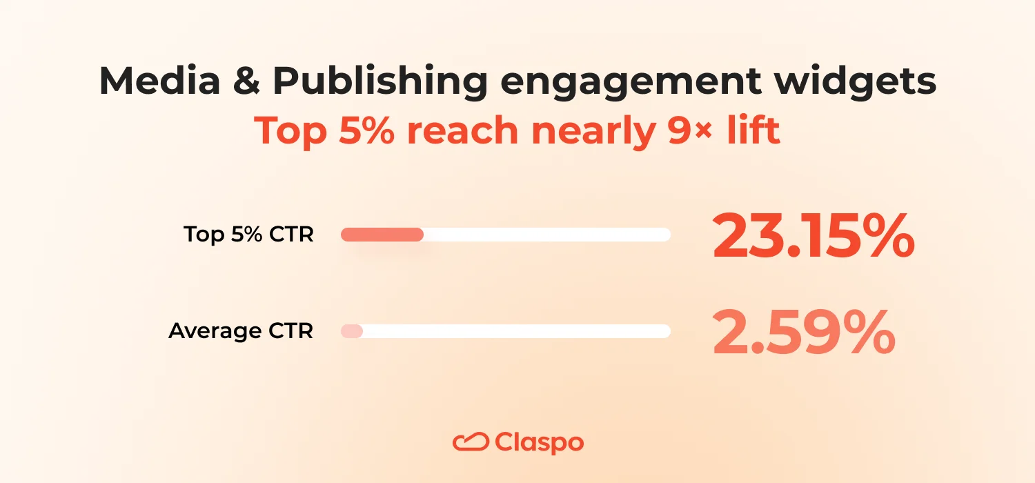
Media & Publishing engagement widgets: Top 5% turn readers into clickers
The best media engagement widgets don’t sell — they invite. Across the category, the average engagement widget CTR is 2.59%, but the Top 5% reach 23.15% — a nearly ninefold uplift. These widgets don’t rely on flashy visuals or aggressive tones. They succeed because they deliver clarity, timing, and emotional pull — the kind that fits right into the reader’s experience instead of interrupting it.
Design & layout
Top performers prefer popups (58%), while average engagement widgets lean toward floating boxes or built-in layouts. They use centered alignment (58%) instead of the left-heavy positioning typical for most (69%). Standard popups (67%) outperform ‘gentle’ ones, suggesting that clear framing works better than subtle fades.
Visuals appear in 92%, but only 17% include people (vs. 24% in average widgets) — meaning content itself takes center stage. Every top engagement widget has a single bottom CTA (100%) — large, visible, and easy to act on. What it means:
- Readers don’t need design experiments — they need readability.
- Top-performers look like an editorial callout, not an ad.
- They center the message visually and emotionally: one thought, one visual, one click.
Incentives
Promo codes appear three times more often in top widgets (17% vs. 5%), while discounts appear less often (17% vs. 29%). Freebies are entirely absent, compared to 18% among general engagement widgets. The perceived ‘irresistibility’ of offers is notably higher (17% vs. 10%). What it means:
- In publishing, trust is the real currency.
- Top performers use incentives sparingly — not to push, but to reward attention.
- A single, contextually relevant promo (for example, ‘Subscribe now and get early access’) outperforms a pile of free offers that break editorial tone.
Components & functional details
Countdowns, social icons, or contact lines appear in 42% of top engagement widgets vs. 29% of average ones. These small elements subtly communicate urgency and credibility. What it means: even a tiny timer or social link can make a pop-up feel more alive — connected to real-time content, not a static banner.
Copy & emotional tone
Top engagement widgets use curiosity hooks more often (42% vs. 34%), diversify tone beyond ‘professional’, and experiment with urgent, excited, or trustworthy voices.
FOMO appears at 25% (vs. 9%), urgency doubles (25% vs. 13%), and the tone grows slightly less friendly (75% vs. 87%) — more confident, less conversational. What it means:
- Top-performing media popups don’t just inform — they provoke curiosity. They sound like editors breaking news, not marketers writing copy.
- The tone is energetic but factual, drawing readers in with headlines that tease the insight, not the sale.
Why it works
In media and publishing, attention is fleeting — and trust is hard-earned. The top 5% engagement widgets master both: they respect the reader’s space while sparking just enough emotion to prompt action. They don’t distract — they continue the story. Each element, from centered layout to curiosity-driven copy, mirrors how people already consume editorial content: linear, simple, yet emotionally charged.
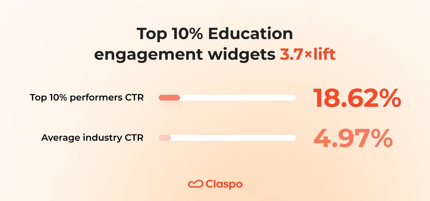
Top-10% Education engagement widgets: straightforward and 3.7× more effective
In education, clarity sells better than creativity. The top 10% of education high-performers reach an average CTR of 18.62% versus just 4.97% overall — that’s a 3.7× lift. The best-performing widgets win not by dazzling visuals or academic tone, but by pairing financial clarity, flexible CTAs, and real urgency.
Design & layout
Top engagement widgets rely on popups (51.5%), while average ones still favor floating boxes (32%) or bars (22%). They use standard popups exclusively (100%), skipping the ‘gentle’ softened variants that dilute focus.
Photos of people appear in 33% of top engagement widgets (slightly fewer than average), with neutral or happy expressions. CTAs are more flexible: while most widgets still use one button, 21% of top performers use two, giving users clear options. And 18% include subtle emojis, adding warmth without breaking professionalism. What it means:
- Top educational engagement widgets communicate like a good teacher: structured, lively, and clear.
- They make information easy to digest — strong contrast, one visual, two clear paths, and no hesitation about showing emotion.
- Popups outperform other layouts simply because they command attention without resembling ads.
Incentives
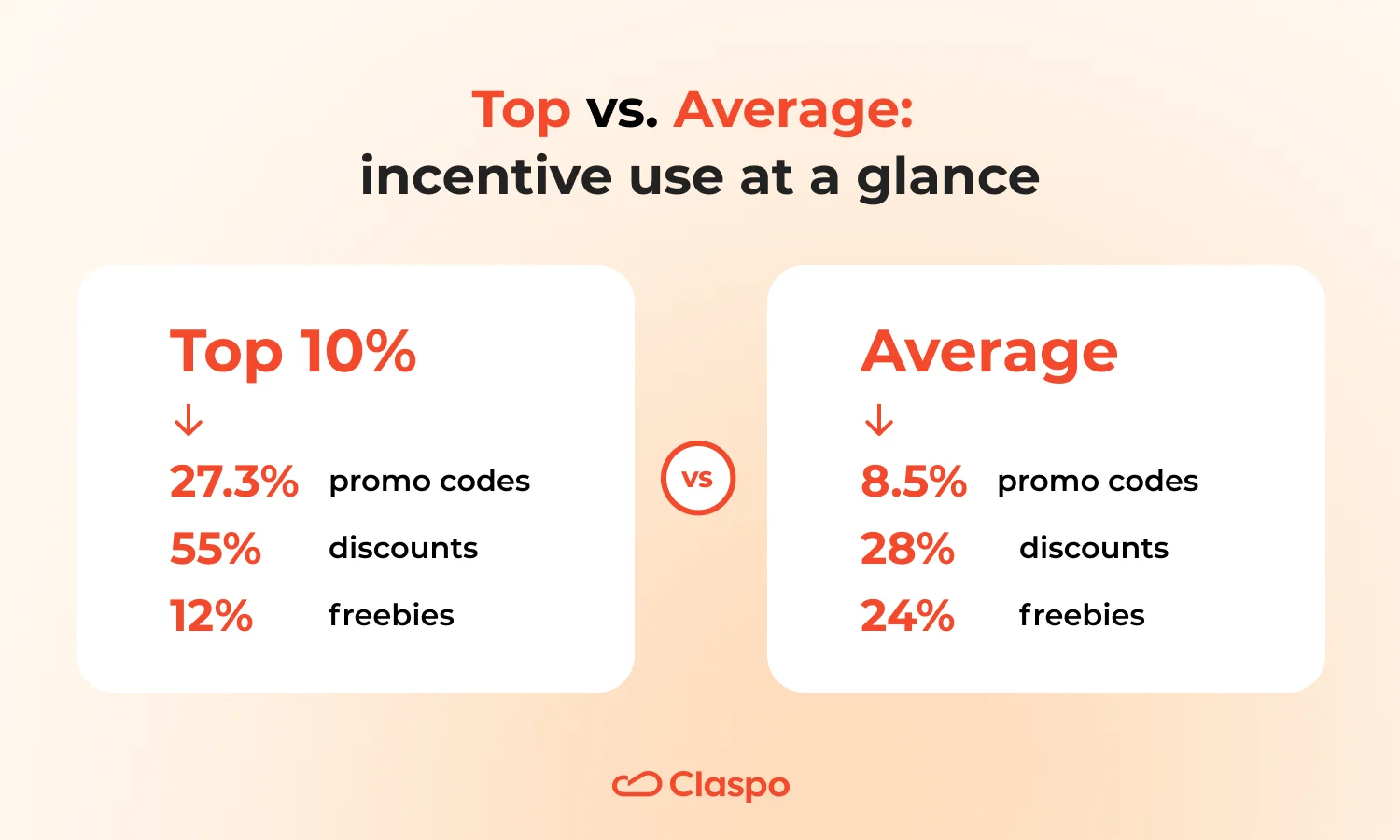
Promo codes appear three times more often in top performers (27.3% vs. 8.5%). Discounts are used in 55% (almost double the average 28%). Freebies, however, drop by half (12% vs. 24%) — proving that audiences here respond better to immediate monetary value than to vague educational gifts. ‘Irresistible’ offers rise slightly (21% vs. 19%).
What it means:
- Education buyers — students, parents, and professionals — are value sensitive.
- Top performers know that a clear discount beats a generic guide.
- They talk about money and timing — not promises of future learning, but immediate advantage (‘Enroll today and save 30%’).
Components
While half of the general widgets had no extra components, top performers use promo codes (24%) and countdowns (18%). What it means:
- These elements turn abstract intent (‘Join our course’) into real opportunity.
- A visible code plus timer conveys specificity, urgency, and trust — visitors know exactly what they’re getting and how long they have to decide.
Copywriting & tone
The tone stays mostly professional (55%), but with a notable rise in urgency (21% vs. 13%). Hooks shift toward limited-time (33%), replacing softer problem-solution angles. High FOMO appears in 21% (up from 14%), and countdowns + urgency text work together in over half the top examples.
The tone also grows bolder: aggressive personality increases from 14% to 24%, while ‘friendly’ stays stable at 70%. What it means:
- Top-performing education popups sound motivational, not promotional.
- They use real deadlines and time-sensitive hooks. It’s not about fear — it’s about helping the user act before missing out.
Why it works
Education audiences want two things: clarity and confidence. Top widgets deliver both — through straightforward visuals, financial transparency, and time-aware messaging. They reduce cognitive load while amplifying action: users immediately see what’s offered, what it’s worth, and why timing matters.
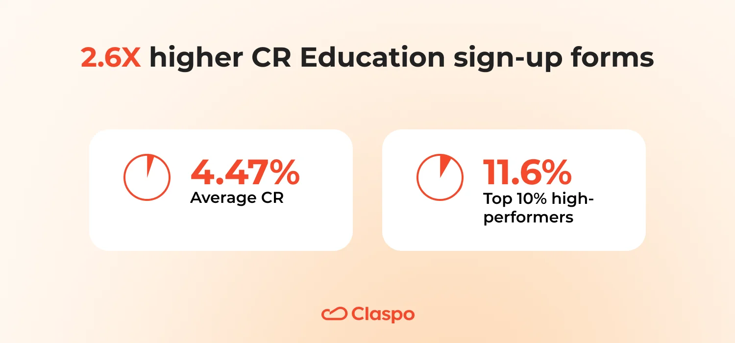
How the Top 10% of Education sign-up forms earn 2.6× more leads
In the education industry, persuasion is about clarity, trust, and gentle encouragement. The average CR of sign-up forms in this niche is 4.47%, while the Top 10% reach 11.6% — a 2.6× improvement. These forms don’t shout or pressure. They inform, reassure, and invite — proving that professional warmth converts better than aggressive marketing.
Design & layout
Top performers rely entirely on popups (100%), compared to a mix in the general widgets (52% popups, 26% floating boxes, 16% bars). They favor professional themes (70%), keeping messages aligned with trust and credibility, while mixing in a subtle emotional note.
Left alignment (90%) dominates — it’s easier to read and feels more natural for educational audiences. Every top widget has one CTA (100%), always placed at the bottom with strong visibility and no distractions.
In style, timeless and modern appear equally (50/50) — showing that clear structure matters more than trendy visuals. What it means:
- Top educational forms look like a trustworthy brochure — calm, structured, and consistent.
- Left alignment and a single clear CTA help the eye move linearly, mirroring how people read study materials.
- Simplicity isn’t aesthetic minimalism here, it’s cognitive comfort.
Incentives
Promo codes (30%) appear four times more often than in average forms (7%). Percentage discounts (30%) outperform fixed sums. Freebies drop to 20% (only guides, no tools or consultations), and gifts-for-subscription rise to 40%, becoming a strong emotional driver. What it means:
- Education audiences respond to clarity and immediacy.
- A visible percentage-off or a small reward works better than abstract freebies.
- Simple tangible value — like a ‘10% off enrollment’ or ‘free checklist for subscribers’ — translates directly into action.
Components
General forms mostly rely on a single email field, but top ones introduce feature combinations: Email + Phone + Promo (10%) or Gamification + Promo (20%). What it means:
- Adding a second lightweight field or a small interactive feature makes the form feel more personalized and engaging, without adding friction.
- Gamified touches work well when paired with a clear message — they break monotony while keeping focus on the reward.
Copywriting & tone
Tone remains professional (70%) with a hint of playful/friendly (10% each) — calm yet warm. Exclamation marks appear a bit more often (60% excited vs 40% calm), adding subtle energy. FOMO is low (90%), and scarcity almost absent (90%), proving that trust converts better than pressure. Personality skews friendly (90%). What it means:
- Top education sign-up forms use a tone that feels like a helpful mentor, not a sales rep.
- They focus on clarity (‘Get your free study guide’) rather than emotional triggers (‘Don’t miss out!’).
- When everything else looks honest and balanced, urgency becomes optional.
Why it works
Educational leads convert when they understand value and feel respected. The best forms deliver both:
- Clear structure: one action, one promise.
- Professional tone with warmth: expert, not robotic.
- Transparent reward: discount, gift, or guide.
They remove pressure, replace it with guidance — and still lift conversion by more than twice the average.
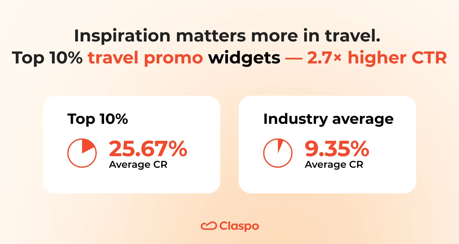
Top 10% of Tourism promo widgets: calm design, clear visuals, 2.7× higher CTR
In travel, inspiration matters more than persuasion. The average click-through rate for promo widgets in this niche is 9.35%, but the Top 10% reach 25.67% — nearly 2.7 times higher. They don’t shout about discounts or urgency. Instead, they invite curiosity with clean visuals and one clear path forward.
Design & layout
Top performers lean on the floating box layout (70%), followed by popups (20%). This layout quietly anchors the message on the page — visible, but never intrusive. All top widgets use one CTA (100%), placed at the bottom (95%) and made unmistakably clear. Design stays modern (85%) and minimal, with timeless (15%) accents for balance. What it means:
- Floating box remains the traveler’s sweet spot: it keeps the message in view while letting the adventure imagery breathe.
- One CTA keeps users focused — less choice, more action.
- Modern minimalism fits travel audiences perfectly: it looks current, light, and trustworthy.
Visuals & emotions
Every top promo widget uses a visual (100%), while only 89% of average ones do. Photos tend toward neutral (10%), satisfied (15%), or excited (10%) expressions — calm happiness rather than exaggerated joy. A subtle emoji presence (20%) adds warmth without clutter. What it means:
- Travel decisions are emotional, but not impulsive.
- Balanced visuals — sunsets, destinations, relaxed smiles — evoke aspiration, not urgency.
- A quiet, human tone outperforms bright banners or stock ‘happiness’ clichés.
Incentives
Incentives shrink in intensity but grow in authenticity: discounts appear in 20% of top performers (down from 31% in generic widgets), while freebies rise to 15%. Typical offers: travel guides, consultation calls, or early-access perks — simple, low-pressure rewards. What it means:
- Tourism promo widgets work best when they help.
- A ‘Free guide to weekend getaways’ builds more trust than a ‘10% off today’ alert.
- The best widgets give a reason to explore, not a deadline to panic over.
Copy & tone
Copy stays friendly (35%) and professional (20%), occasionally trust-based (15%) — a blend that feels human yet credible. Excitement appears in 60% of messages, balanced by calm language (40%). FOMO remains low (65%) and urgency subtle — often implied by context, not countdowns. What it means:
- Top tourism promo widgets sound like travel guides, rather than travel agents.
- They share possibilities — ‘Discover hidden gems’, ‘Plan your next weekend trip’ — without theatrics.
- Soft energy, confident rhythm, and real value inspire clicks far more effectively than forced enthusiasm.
Why it works
Travel decisions are emotional but slow-burning — people dream first, act later. The top promo widgets succeed because they match that rhythm instead of rushing it.
The floating box doesn’t break the traveler’s experience, so curiosity turns into voluntary engagement, not defense against interruption.
Tourism is sold through vision. Full-width imagery quietly activates ‘mental travel’ — users imagine themselves in the scene, which primes them to click for more.
Fewer elements and one CTA create a sense of order and professionalism. For travel brands, that translates to trust: visitors associate clean design with reliability and quality of service.
Calm tone builds emotional safety. Unlike retail, where urgency drives impulse, travel audiences need reassurance. Friendly, confident language lowers anxiety about cost, logistics, or timing — making engagement feel effortless.
Real value replaces artificial pressure. Instead of fake countdowns or bold discounts, top promo widgets offer useful rewards (guides, consultations). That creates reciprocity — users respond because they receive value before committing.
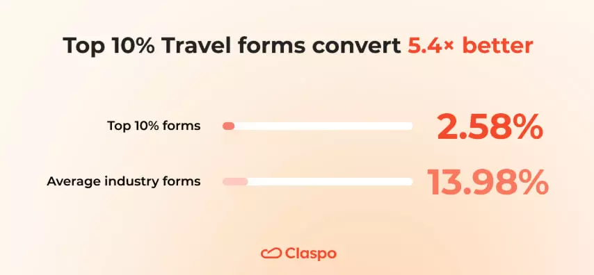
How the Top 10% of Travel forms inspire 5× more subscribers
Travelers don’t subscribe because of discounts — they subscribe because of dreams. Across the industry, average sign-up forms convert at 2.58%, while the Top 10% reach an impressive 13.98% — a 5.4× uplift driven by design restraint, emotional storytelling, and clear trust signals.
Design & layout
Popups lead the way. While most brands split between popups, floating boxes, and bars, top performers go all-in on popups (80%) — the clearest, most attention-anchoring layout for subscription capture.
Top designs favor timeless aesthetics (60%) over flashy modern trends. Calm color palettes, centered focus on the form, and left-aligned text (100%) keep reading flow natural.
And they don’t over-illustrate: only 60% include visuals compared to 73% overall — fewer pictures, more message clarity. Why it works: in travel, whitespace sells serenity. Minimal forms mirror the calmness of an organized journey, evoking trust and composure.
Incentives
The best travel forms abandon discounts entirely. While 41% of average widgets rely on sales, top ones reach higher CR without a single percentage-off banner. Instead, they offer soft-value incentives:
- Freebies (60%) like destination guides or trip-planning tools.
- Exclusive content (20%) — early access, premium itineraries, or curated experiences.
- Occasional vouchers (20%), used sparingly and contextually.
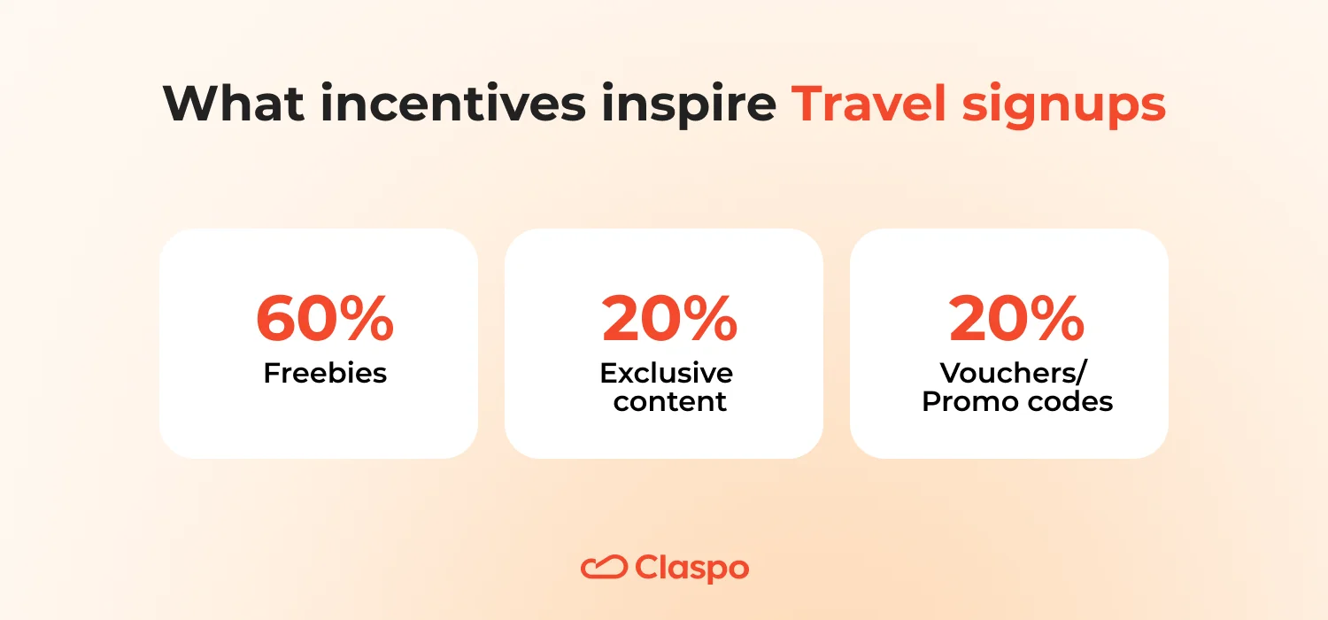
They replace financial pressure with informational generosity — help first, sell later.
Copywriting & tone
Top forms elevate copy into conversation:
- Emotion without excess. They double the use of emotional tone — 40% friendly, 40% excited — but with fewer exclamation marks (60% vs 78%). The excitement feels human, not hyped.
- Curiosity and relevance. 80% include curiosity hooks, compared to 51% overall. Travel forms thrive on imagination — questions like ‘Where will your next adventure start?’ pull readers in more than promises of savings.
- Subtle urgency. 60% convey urgency, often through time-sensitive context (‘Seasonal routes open soon’) rather than explicit countdowns.
- Real empathy. Pain-point targeting (60%) helps travelers feel understood — addressing planning fatigue, decision overwhelm, or budget worries.
- Premium confidence. The tone leans toward value-focused (60%) and premium (40%), appealing to travelers who seek quality.
- Trust through transparency. GDPR notice presence jumps to 80% — the highest across all industries. It signals respect for privacy, making users feel safe when sharing data.
Psychology of conversion
The Top 10% succeed because they balance aspiration with assurance. Calm, uncluttered visuals make interaction effortless and trustworthy — travelers instinctively respond to simplicity that feels genuine. Instead of relying on imagery, these forms tell short, emotional stories through text, sparking imagination and a quiet sense of escape.
The offers feel practical and relevant, not sales-driven — a useful tip or guide feels like genuine help, not bait. A touch of urgency adds gentle momentum, encouraging users to act while still feeling in control. Clear privacy signals, such as GDPR mentions, reinforce that trust and close the final hesitation gap.
What the Top 1% of widgets can teach every brand
Even if your niche isn’t in our industry benchmarks, this section shows what truly works everywhere. The Top 1% of signup forms and engagement widgets achieve between 4× and 10× higher conversion rates, regardless of category. These insights reveal the universal patterns — from layout and tone to incentives and UX choices — that define the anatomy of a high-performing widget.
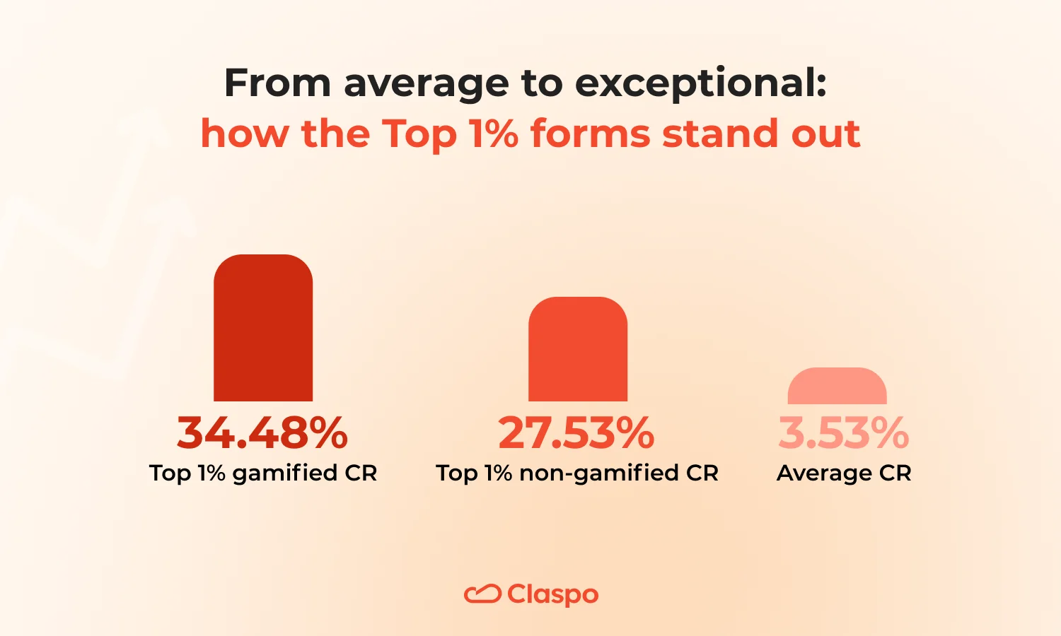
How the Top 1% of signup forms consistently outperform the rest
On average, signup forms convert at 3.53%, but top performers raise the bar dramatically. The best gamified widgets achieve nearly 10× higher than the overall benchmark. Even non-gamified forms in the top segment are about 8× higher than the average.
Gamified vs. non-gamified results
Gamified widgets outperform traditional ones — but both can deliver impressive results when done right.
- Gamified widgets: Avg. CR — 34.48% (min 13.32%, max 66.51%)
- Non-gamified forms: Avg. CR — 27.53% (min 10.29%, max 55.63%)
The portrait of a high-converting signup form
Most winning forms are popups (74%) — they grab attention fast while staying focused.
Designs lean modern (77%), often playful (34%) or minimalist (14%), proving that clarity and personality beat clutter.
Nearly 9 in 10 forms are simple, with just 1-2 fields — usually email only or email + name.
Incentives:
- Discounts (69%) dominate — percent-off for varied order values, fixed-sum for stable checks.
- Freebies (17%) like checklists or small gifts perform well when discounts aren’t an option.
- Exclusive content (3%) works best when paired with early-access perks.
Copy is benefit-driven, concise, and visually clean. Trust-building details matter: a visible close button (71%), one clear CTA (94%) keep engagement high without feeling pushy.
How to apply these insights
1. Lead with popups. Use popups with behavioral triggers and targeting as your go-to layout. Switch to built-in or floating formats only when subtlety matters — like blog pages or long reads.
2. Keep it clean and modern. Modern + playful or modern + minimalist styles dominate top performers. Prioritize white space, readable fonts, and one clear CTA.
3. Simplify your form. Stick to 1-2 fields (email, name). Gather extra info later through a second step — simple forms convert best.
4. Match incentive to your business model.
- Discounts — universal driver; choose type by your pricing model.
- Freebies/tools — perfect when you avoid discounts or sell premium products.
- Gamified discounts — best for high-traffic moments (BFCM, holidays, new visitors).
5. Communicate value in one breath. Use one short benefit line (‘Get 10% off your first order’) and one clear condition (‘Shown after signup’).
6. Make trust visible. Keep the close button obvious, show GDPR if needed, and skip fake urgency — transparency converts better long-term.
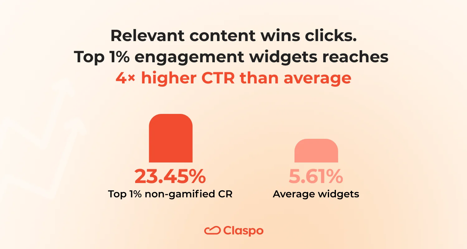
Top 1% engagement widgets: 23% click rate — here’s what they got right
The Top 1% of engagement widgets reached an average click rate of 23.45%, compared to the overall average of 5.61%. That’s more than 4× higher performance — proof that when content feels timely and relevant, users don’t need an extra push to click. These widgets work because they show up with information people genuinely care about, at exactly the right moment.
They’re most common among service-based businesses (30%), media and publishing brands (25%), SaaS platforms (20%), and e-commerce companies (20%).
The portrait of a high-converting informer
Most top performers are popups (75%) — they instantly capture attention while keeping the message focused and easy to act on.
About half of top-performing engagement widgets keep their text balanced and mid-length — clear enough to explain the point, but never heavy to read.
Roughly three-quarters include a visual element that draws the eye, while almost none use emojis. The result feels polished and professional, not noisy.
Most designs lean modern (55%) or timeless (40%) style, proving that clean presentation still outperforms trends. Layouts rely on one clear CTA (90%), usually placed at the bottom (85%) — making it natural to read first and click next. A visible close button (70%) signals respect and transparency — both essential for engagement built on credibility.
Messages are clear (95%) and benefit-driven (90%), focusing on what the visitor gains by clicking. Tone skews professional (45%) or friendly (20%), evoking confidence and ease rather than hype.
Half of top engagement widgets use a problem-solution angle (50%), while 40% rely on straightforward, informative messaging — both effective ways to guide action through relevance.
How to apply these insights
1. Lead with value, not offers. Engagement widgets perform best when the content itself is the reward — breaking news, updates, or guides that earn a click naturally.
2. Popups tend to drive the most interaction, while floating boxes help keep the message visible for longer periods without interrupting the flow.
3. Keep the copy concise and easy to skim — enough context to make it clear, but never so much that it slows the reader down. Visuals help clarity.
4. Prioritize trust and readability. Show your close button, keep one clear CTA, and design with modern or timeless simplicity. It feels credible and professional.
5. Subtle urgency works best. FOMO is low across top widgets; gentle nudges (‘limited seats’, etc) outperform loud countdowns or exaggerated scarcity.
Conversion benchmarks that show what works across industries
Now that you’ve seen how top-performing widgets achieve their results, let’s bring it closer to home. Maybe those TOP numbers still feel out of reach — and that’s okay. The first step is knowing where you stand. Here are the average conversions across key industries and widget layouts — so you can see what’s normal in your niche and what’s possible next.
E-commerce
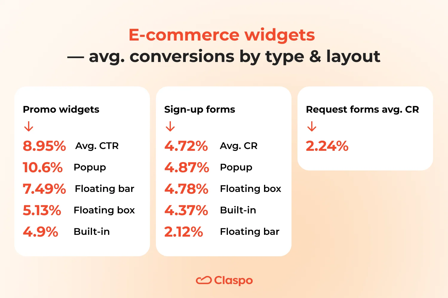
Promo widgets AVR CTR — 8.95%
Average CTR by layout:
- Popups (10.6%) outperform other layouts, proving that visibility still drives engagement.
- Floating bars (7.49%) and floating boxes (5.13%) work well for secondary promotions or free-shipping reminders.
- Built-in (4.9%) underperform when hidden deep in the page — best reserved for content-driven stores.
Sign-up forms AVR CR — 4.72%
Average CR by layout:
- Popups (4.87%) and floating boxes (4.78%) perform almost equally — suggesting flexibility for different UX approaches.
- Built-in forms (4.37%) show strong performance when placed in high-intent areas — for example, account pages, post-purchase thank-you screens, or loyalty program invites.
- Floating bars (2.12%) attract attention but rarely drive deeper actions like subscribing.
Request form AVR CR — 2.24%. Lower overall CR reflects higher friction: these forms ask for more data, used mainly for quotes or demo requests.
E-commerce thrives on timing and relevance. Use popups to capture impulse attention, built-ins for high-intent zones, and keep forms as short as possible.
Food and Drinks
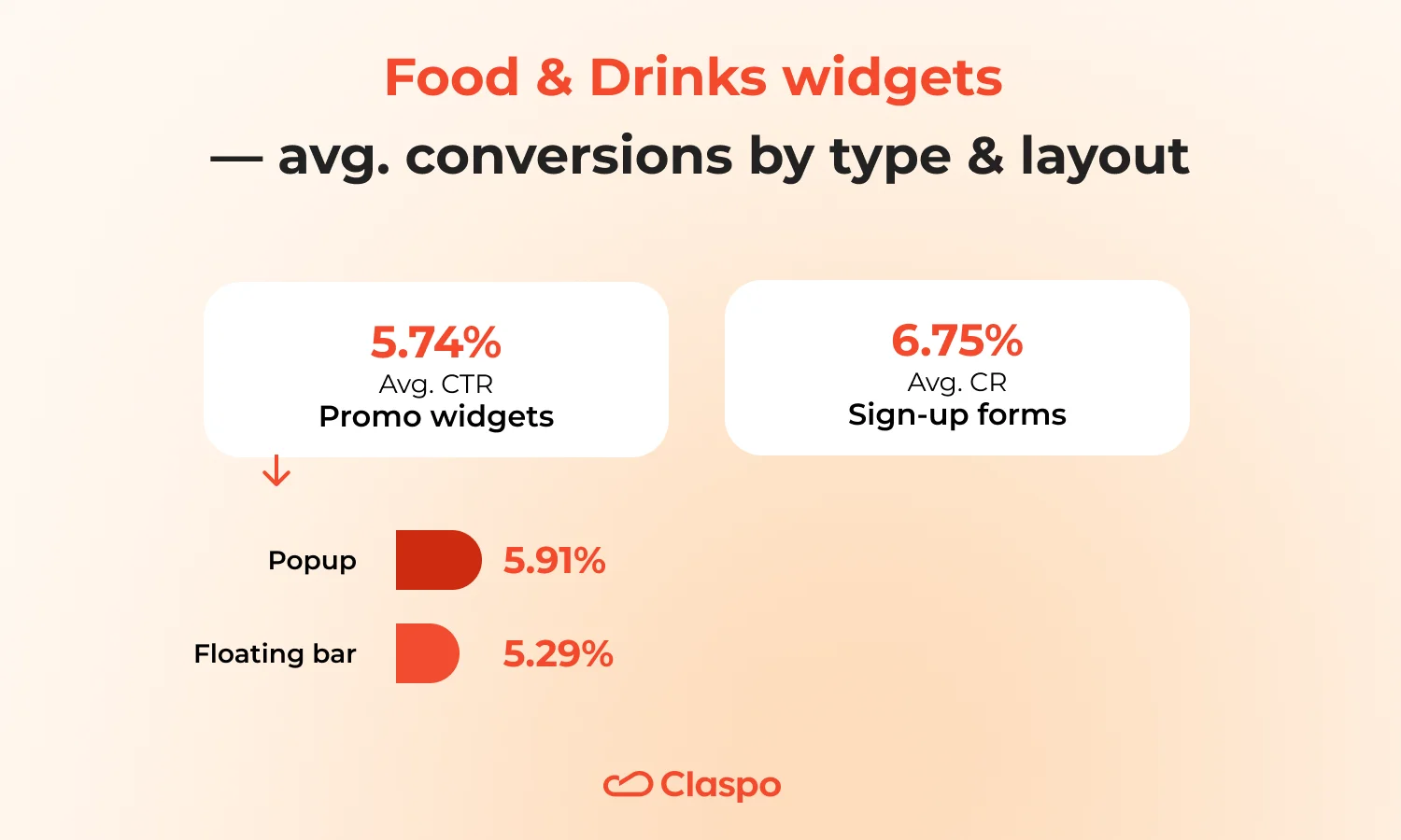
Promo widgets AVR CTR — 5.74%
Average CTR by layout:
- Popups (5.91%) and floating bars (5.29%) perform similarly, indicating that even subtle placements can convert when visuals and tone match appetite appeal.
Sign-up forms AVR CR — 6.75%. Emotional design and tangible incentives (recipes, promo codes, tasting guides) fuel interaction.
SaaS
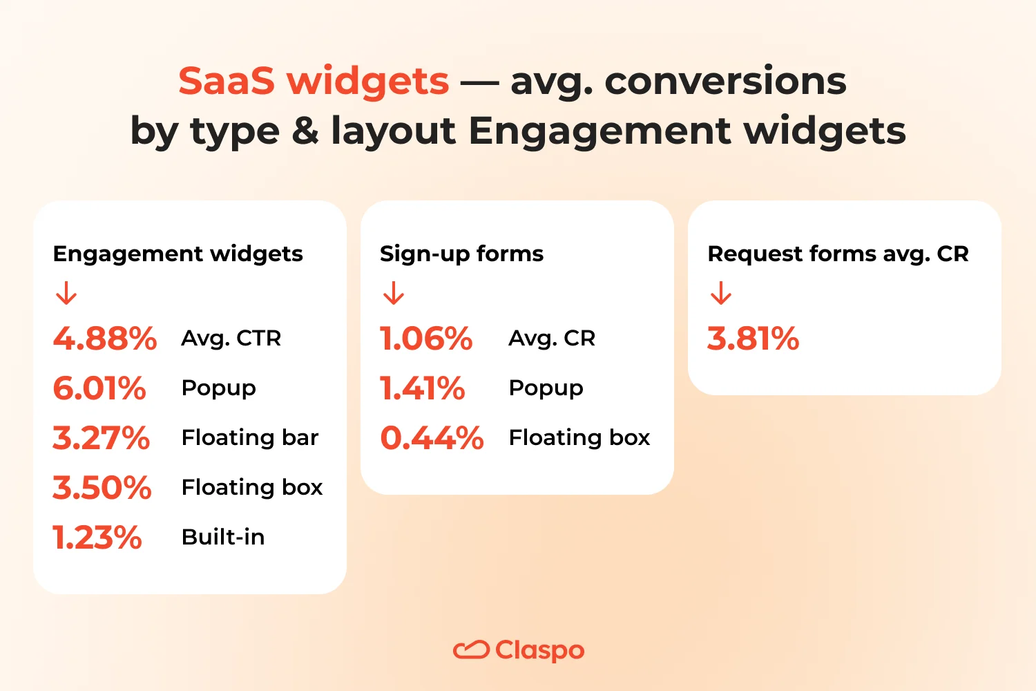
Engagement widgets AVR CTR — 4.88%
Average CTR by layout:
- Popups (6.01%) dominate, proving that concise, product-focused updates outperform floating bars (3.27%) or boxes (3.50%).
- Built-ins (1.23%) rarely work — SaaS users scan fast and ignore static blocks.
Sign-up forms AVR CR — 1.06%
Average CR by layout:
- Popups (1.41%) still lead but overall CR is modest — SaaS forms often require more commitment.
- Floating boxes (0.44%) perform weakly — they stay visible but don’t create enough urgency or perceived value for SaaS signups.
Request form AVR CR — 3.81%. Higher CR shows that contextual intent matters more than format — demos and trial requests convert better than cold signups.
In SaaS, clarity beats creativity. Use popups for feature announcements and lead magnets, but rely on contextual CTAs (demo, free trial) for real signups.
Media and content publishing
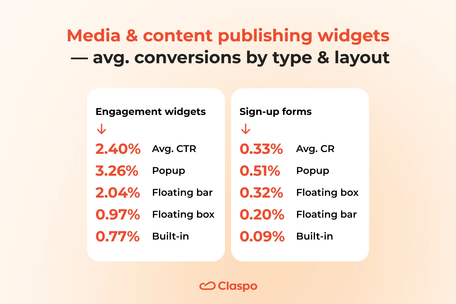
Engagement widgets AVR CTR — 2.40%
Average CTR by layout:
- Popups (3.26%) slightly outperform floating boxes (2.04%), showing that a bit more visibility helps grab attention without breaking the reading flow.
- Floating bars (0.97%) and built-ins (0.77%) underperform because they’re too quiet — readers simply scroll past them while focusing on content.
Sign-up forms AVR CR — 0.33%
Average CR by layout:
- popups — 0.51%
- Floating box — 0.32%
- Floating bar — 0.20%
- Built-in — 0.09%
Popups still lead, but overall numbers reflect banner blindness — looks like this industry users treat forms like ads.
Education
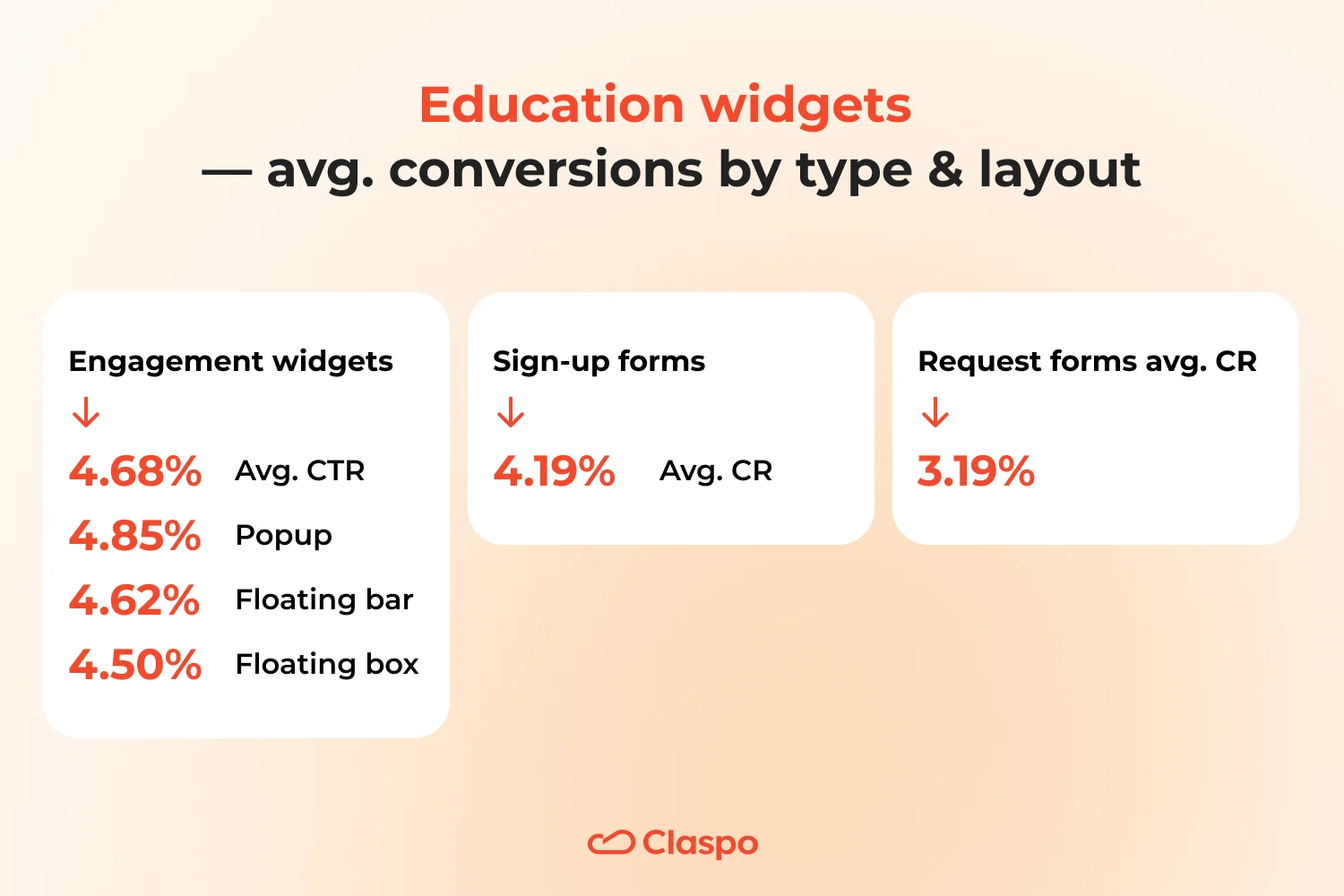
Engagement widgets AVR CTR — 4.68%
Average CTR by layout:
- Popups (4.85%), floating boxes (4.62%), and floating bars (4.50%) perform almost equally — a rare case of format parity.
This even spread shows that message relevance outweighs format in the education sector. Visitors are less reactive to design and more to clarity of value — such as course updates, free lessons, or scholarship alerts. In practice, this means you can choose layouts based on UX and context, not just CR.
Sign-up forms AVR CR — 4.19%. Balanced, close to informer performance — education audiences read carefully before engaging.
Request form AVR CR — 3.19%. Slightly lower, but still solid — these usually involve higher friction. Adding short explanations (‘Takes less than 1 minute’) or progress indicators can ease hesitation and lift completion.
Travel and tourism
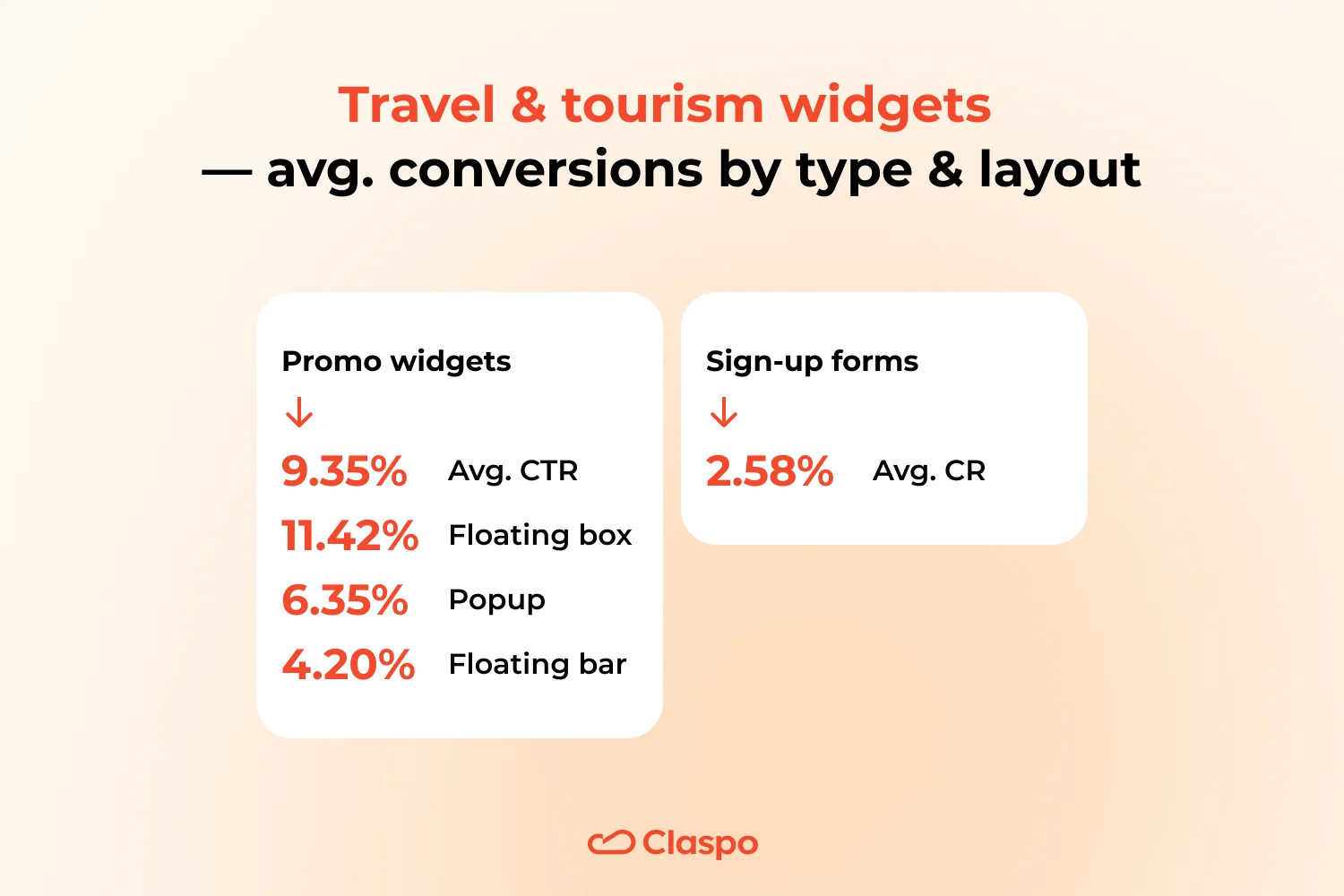
Promo widgets AVR CTR — 9.35%
Average CTR by layout:
- Floating boxes (11.42%) outperform popups (6.35%) and floating bars (4.20%) — a clear sign that travelers prefer smooth, contextual engagement over sudden interruptions.
Overall, these high averages show that travel audiences are emotionally primed to click — they’re planning, dreaming, and open to inspiration.
Sign-up forms AVR CR — 2.58%. While significantly lower than promo widgets, this still reflects healthy engagement for a mid-commitment action. The drop reveals a typical behavior pattern: travelers engage eagerly with content and offers but hesitate to commit to ongoing communication until they see tangible value (exclusive deals, trip ideas, loyalty perks).
Widget anatomy: how every extra field and element shapes conversion
Less isn’t always more — but in widget design, it often is. We analyzed thousands of widgets to understand how the number and type of fields influence conversion. The findings show where simplicity wins, where incentives lift performance, and when adding interactive elements can actually pay off. Use these insights to design forms that feel effortless yet persuasive — because every extra step needs to earn its place.
Average conversion by number of fields and their variety
Subscribers: the power of focus
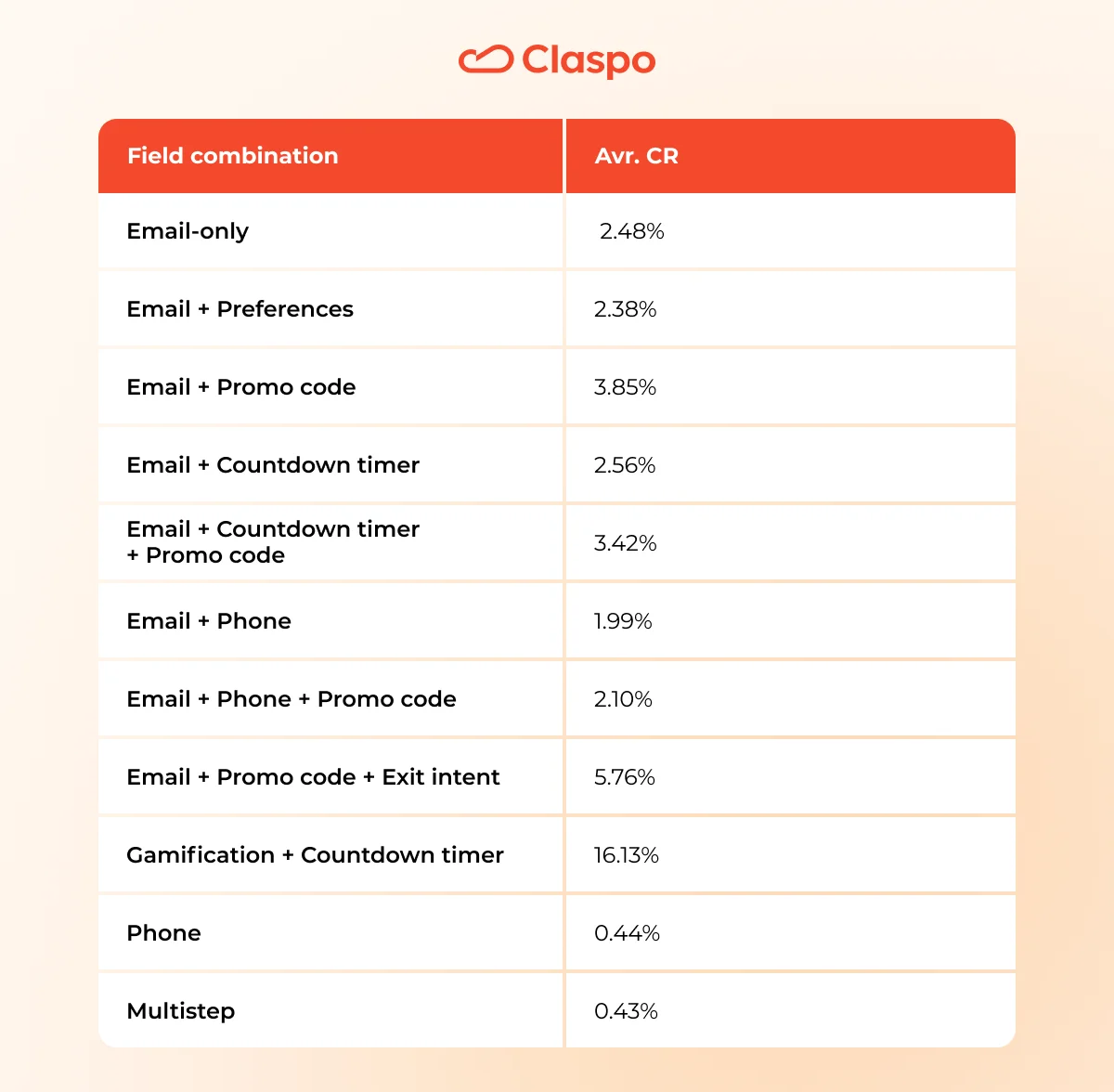
Insights:
- Email-only (2.48%) sets the baseline: it’s simple, quick, and friction-free — ideal for first-time visitors.
- Adding a promo code lifts results to 3.85%, showing that visible, immediate value motivates users far more than personalization fields like ‘preferences’ (which slightly reduce CR).
- Countdown timers add only a minor lift unless paired with a reward — urgency alone doesn’t sell, but urgency plus value does.
- The winning combo — email + promo code + exit intent (5.76%) — proves timing is everything. Showing an offer right when users intend to leave delivers up to 2× higher conversion than standard popups.
- Gamification + Countdown timer (16.13%) — combining play with urgency multiplies results. The timer heightens anticipation during the game, pushing users to act immediately.
- Phone fields drop conversions sharply — they signal higher commitment and privacy friction. Reserve them for post-lead qualification or loyalty programs.
- Multistep forms (0.43%) show that while multi-stage flows may capture higher-quality leads, they rarely maximize sheer volume — best used in B2B or service funnels. It could work with quizzes in e-commerce.
Clicks: when interactivity and incentives meet
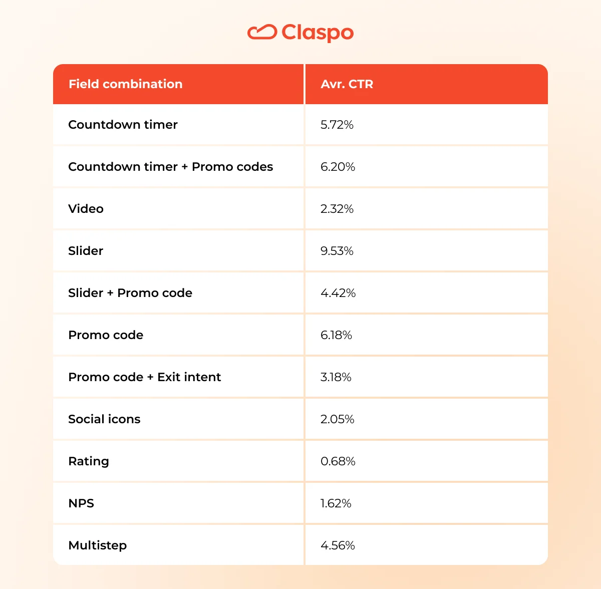
Insights:
- Sliders lead the pack (9.53%) — dynamic movement and curiosity grab instant attention. It’s interaction without friction, perfect for promotions.
- Countdown timers (5.72%) and promo codes (6.18%) remain universal conversion triggers, but they perform best together (6.20%) — urgency + incentive = momentum.
- Video widgets (2.32%) engage emotionally but convert moderately, as they’re better at awareness than immediate action.
- Promo code + exit intent (3.18%) performs weaker than expected — users leaving the page need a stronger emotional or practical reason to stay, not just a discount.
- Multistep interactions (4.56%) convert well here — showing that when clicks, not forms, are measured, a guided path keeps engagement high.
- Ratings and NPS (≤1.6%) stay low because their goal isn’t conversion but insight — still essential for improving overall UX.
Now it’s your turn to test what the data proves
Every discovery from this benchmark is ready to apply in Claspo. All features, templates, and analytics tools are unlocked in every plan, including Lifetime Free. Run your own experiment — and see how your widgets perform against the best.


