Opt-in form [Best practices & How to create]

Drive sign-ups with strategic opt-in forms

Turn website visitors into loyal subscribers with opt-in forms that fit your brand and capture attention at the right moment.

email_opt-in_forms

What is an opt-in form?

An opt-in form is how site visitors sign up when they actually want to hear from you. They enter an email, hit submit, and subscribe — simple as that. Many teams use an opt-in form template instead of building everything from scratch. It’s faster, and it helps avoid setups that slow people down or confuse them.

What an opt-in form solves & why businesses use it

If you're relying solely on social media or paid ads to reach your audience, you're playing on rented ground. An opt in form gives you ownership. It’s a way to build a contact list you control — made up of people who’ve actively shared their email because they want something valuable from you. Here’s why businesses prioritize opt-in strategies:

  • Capture leads while interest is still high.

Opt-in forms collect names and emails at the moment site visitors are already engaged.

  • Increase conversions with better timing.

Forms shown on the right landing page — or triggered at the right moment — tend to convert more consistently.

  • Build an audience you actually own.

An email list isn’t affected by social media platform changes or algorithm updates.

  • Support long-term engagement.

Once people subscribe, it’s easier to reconnect through a newsletter and ongoing email marketing campaigns.

  • Segment without overcomplicating signup.

Opt-in form fields help collect useful data for more relevant messaging later.

  • Consent is usually handled out of the box.

Most opt in forms already include the basic permission text, so compliance doesn’t become a separate task.

You’ll see opt in forms everywhere — from ecommerce discounts to newsletter signups inside blog posts. They’re still one of the simplest ways to support lead generation and keep people coming back.

Opt-in form performance benchmarks (2025)

Looking at performance benchmarks, the average conversion rate for email opt-in forms sits at about 3.5%. That’s enough to make them a consistent source of new subscribers. Where things get interesting is at the top end. When timing, copy, and the offer align, conversion rates jump fast. The top 1% of opt-in forms reach roughly 27.5%, and some go even higher — 55%+ isn’t unheard of in the right context.

There’s also a clear pattern behind those high performers. Among the top 1% of signup forms, most winners are pop-ups (about 74%). They work well because they focus attention on a single action, without asking users to hunt for the form.

How form fields affect conversion rates
Field combination Avg. CR Why it performs this way
Email only 2.48% Lowest friction. One field, one decision.
Email + preferences 2.38% Extra choice adds a pause. People start thinking instead of acting, which slightly lowers completion.
Email + countdown 2.56% Urgency nudges action without asking for more effort. The form still feels quick to complete.
Email + phone 1.99% Phone numbers feel personal and high-commitment. Many users aren’t ready to share that upfront.

What an email opt-in form pairs well with

An email opt-in form works best when it’s part of a bigger strategy. Pair it with:

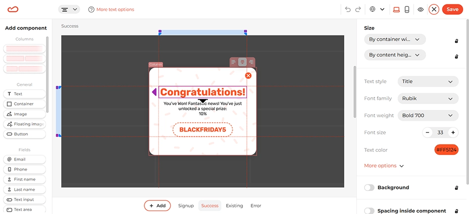
  • Gamified widgets — things like spin-to-win or scratch cards tend to lower resistance. People don’t mind leaving email addresses when it feels light and quick.
  • Exit-intent — shows up at the moment someone is already leaving. Sometimes that pause is enough to get a response.
  • Lead magnets — a small free download can be enough to justify sharing email addresses, especially on content-heavy pages.
  • Feedback forms — a single question works better than a long survey. One form field is often all you need.
  • Waitlists / pre-launch forms — gather early interest before something goes live.
  • Event or webinar sign-ups — use a short form to keep people informed before and after the event.

In practice, a single form field can do more than collect data — it can start a real connection.

How to set it up

Here’s how to create an email opt-in form in Claspo that doesn’t just blend into your site — it actually helps you generate leads and grow your subscriber list.

Step 1: Choose a template

Head to Claspo’s library and pick an opt-in form template designed for email signups. With over 1000 pre-made designs available, you don’t need to build from scratch — each one is optimized for clarity and conversion.

Step 2: Customize the form

Use Claspo’s drag-and-drop editor to tailor the design to your website. You can adjust colors, fonts, button styles, and placements in just a few clicks. Click any element — headline, form field, image, or CTA — and you’ll see editing options on the right.

For example, if your chosen template includes an opt-in consent checkbox, you’ll need to link it to your privacy policy. Just double-click the checkbox message — the link settings will appear in the right-hand panel. Click the 'Link' option and paste your privacy policy URL into the designated field.

email_opt-in_forms

You can upload your own visuals or select from Claspo’s built-in image and icon library. And if your website visitors speak different languages, no worries — just add translations and Claspo will detect browser settings and display the right version automatically.

Spin the wheel popup widget states editor showing success, error, and existing user message screens

Step 3: Set display timing

Now it’s time to control when your opt-in form shows up. To avoid overwhelming users right away, set a trigger to delay the form’s appearance — a smart default is 20 seconds, but you can customize it based on your average session length.

For example, a popup triggered by time on page or scroll depth works well. It gives users time to explore your site first, making them more likely to engage when the email opt-in form appears.

email_opt-in_formss

Step 4: Sync with your email marketing tools

To make follow-ups automatic, connect your form to your existing email marketing stack — like your ESP or CRM. Claspo’s built-in integrations ensure that once someone subscribes, their details are passed directly into your workflows. This way, your new email subscribers can instantly receive welcome emails, get added to segmented lists, or trigger a broader email marketing sequence — all from that first signup.

Fully designed email opt-in form templates

Proven recipes to grow email list

Types of opt-in forms

An email optin form should be visible without feeling і. How it appears often matters as much as when it shows up. There’s no single best layout — it really depends on what you’re trying to do. A few layout types are used far more than others:

  • Pop-up — puts the form front and center. Works best when triggered by behavior, such as exit intent. Common choice for short offers and ecommerce opt-in forms with discounts.
  • Floating bar — stays fixed at the top or bottom of the screen. Easy to notice, easy to ignore.
  • Floating box — slides in from the corner and stays there while scrolling. Draws attention without blocking content.
  • Launcher-triggered form: opens when users click a button or icon. Best for service requests, gated content, or opt-in forms that require more user readiness.
  • Embedded forms (built-in): static forms added directly to the page content. Works great on blog posts, landing pages, or footers — wherever users expect to find subscription options.

Best practices for opt-in form placement

Once you choose a layout, decide where to place it. Here’s where inline or embedded opt-in forms work best:

  • On landing pages — especially ones offering a lead magnet, freebie, or webinar.
  • At the end of blog posts — when users have already consumed value and are primed to subscribe.
  • In the sidebar — for persistent visibility on educational or editorial content.
  • In the website footer — a common, expected spot to invite subscriptions.
  • On product pages — to collect email addresses from high-intent users.

With more dynamic formats, timing often makes the difference. A form that appears too early gets ignored; one that shows up after some engagement feels more natural. Good opt-in form examples don’t just show up — they show up with a reason. They feel relevant to the page and make it clear what the subscriber gets in return.

Best practices for opt-in form elements

A full-screen form or one in the sidebar — both work better when they blend into the site. Here’s what most high-performing opt-in forms include:

  • A short headline that explains the benefit of subscribing.
  • Form fields — usually just name and email for higher completion rates.
  • A clear CTA (such as ‘Get my free guide’).
  • Visual elements like icons or illustrations to draw attention.
  • Optional incentive — a discount, freebie, or content upgrade.
  • Consent checkbox or micro-copy to comply with regulations.
  • After submission, show something simple — a short confirmation or a thank-you screen.

Also worth remembering: fewer fields usually mean more completions. But if your goal is to qualify leads, you can experiment with one or two extra questions.

Common mistakes when creating opt-in forms

Most opt-in forms don’t fail because of design. They fail because of small decisions that quietly kill intent. A lot of opt-in forms break for the same few reasons

  • 1. Asking for too much, too early

If someone hasn’t heard from you before, they won’t fill out five fields. Extra questions only make sense once there’s a clear reason to answer them.

  • 2. Vague or generic value

‘Subscribe to our newsletter’ isn’t a reason. If the benefit isn’t clear right away, most people will just scroll past.

  • 3. Showing the form at the wrong moment

A form shown before someone understands your product feels pushy. A form shown after they’ve engaged feels helpful. Context beats visibility every time.

  • 4. Treating all visitors the same

New visitors, returning users, and existing customers don’t have the same intent. One generic opt-in for everyone usually works poorly.

  • 5. Assuming one form is done forever

User behavior changes. Traffic sources change. Offers get old. An opt-in form isn’t a one-time setup. It’s a small system that needs occasional tuning.

FAQ

How can I increase the conversion rate of my website's opt-in forms?

The biggest gains usually come from small but smart changes. Start with A/B testing. Even minor tweaks — headline wording, button copy, design or timing — can shift results. Using our opt-in form builder that shows performance side by side makes this much easier, because you can see what actually works.

Next, pay attention to when the form appears. Triggers based on behavior (scroll depth, time on page, return visits, etc.) tend to outperform forms shown immediately. This matters even more for an ecommerce opt-in form. Showing it after some interaction usually works better than showing it right away.

Also, keep the form short. Every extra field adds friction. In many cases, removing just one field does more for conversion than changing colors or layout.

What is the difference between single opt-in and double opt-in?

Single opt-in is the simpler setup. Someone enters their email and that’s it — they’re on the list. Nothing else to confirm. It’s quick and usually gets more signups, but mistakes and low-intent emails slip through more often.

Double opt-in slows things down a bit. After the signup, there’s a confirmation email, and the subscription isn’t complete until the link is clicked. The list ends up cleaner, just smaller.

What some marketers could forget is the moment right after the signup. Once someone fills out the opt-in form, don’t leave them guessing. A short confirmation works. If there’s a follow-up email, mention it. Otherwise, deliver the offer and move on.

How do I add an opt-in form to my website without coding?

You don't need to code anything to add a free opt-in form. With Claspo, setup starts with a single script added to your site. That’s it. Most people copy it once and forget about it — the whole step usually takes under a minute.

If you already use Google Tag Manager, you can add the script there instead. For WordPress sites, there’s a dedicated Claspo plugin. Install it, connect your account, and forms are ready to go. Shopify users can do the same through the Claspo app.

Once the script or integration is in place, everything else — design, targeting, testing — happens inside the drag-n-drop editor and the dashboard. No developer required.

Can I integrate these forms with my existing CRM or Email Service Provider (ESP)?

In most setups, yes — the opt-in forms can be connected to the tools you already use. Claspo has direct integrations with many common ESPs and CRMs. For a lot of teams, that’s enough to cover day-to-day needs without any extra steps. Once it’s connected, new signups don’t sit around — they go where you expect them to go. Those native integrations handle about 80% of typical cases. You link the account, match the fields once, and that part is done.

For everything else, there are Webhooks. If your setup is custom, or you use a less common CRM or internal system, Webhooks let you send opt-in data wherever you need it. That’s how the remaining 20% of cases are handled.

Can popups hurt SEO, and how do I keep opt-in forms SEO-friendly?

Pop-ups can hurt SEO, but only in very specific cases. Pop-ups aren’t the issue on their own. Google usually starts paying attention when a form shows up too early and blocks the page, especially on mobile.

To keep opt-in forms SEO-friendly don’t block content on page load from search. Full-screen popups that appear instantly are the biggest risk, particularly on mobile. Delay the form until there’s some interaction. Showing it after scroll, time on page, or on exit intent is usually fine. At that point, the visitor has already engaged.

Make sure content stays accessible. Users should always be able to read the page and close the form easily. If they feel trapped, that’s bad UX — and Google notices UX patterns.

Legal or required overlays are a different case. Cookie notices, age gates, or login prompts are generally not treated the same way as promotional popups.

Do these forms work on mobile devices and meet Core Web Vitals standards?

Yes. These forms work on mobile and are designed to stay within Core Web Vitals limits.

In practice, issues usually come from heavy scripts or elements that cause layout jumps. Claspo’s script is lightweight and doesn’t block page rendering, which helps keep mobile pages responsive. Triggers also react fast — up to 200 ms, which matters most for things like exit popups, where timing affects both UX and performance.

As long as the opt-in form doesn’t cover content right on load and appears after some interaction, it generally plays well with Google’s page experience metrics.

Are these opt-in forms GDPR and CCPA compliant?

Yes — these opt-in forms can be used in GDPR- and CCPA-regulated regions. Claspo is set up to support common privacy requirements: personal data is handled only to provide the service, and users have rights like access, correction, and deletion. Requests related to GDPR and CCPA are supported at the platform level.

That said, compliance isn’t automatic. As the site owner, you’re still responsible for explaining how data is used and collecting clear consent. All opt-in widget templates in Claspo include a built-in consent block. The consent text can be adjusted and linked to your own privacy policy or terms. There’s also a dedicated “Data processing and terms of use” component with a checkbox. It lets visitors explicitly confirm consent before submitting the form, which is often required in GDPR-regulated regions.

How do I handle cookie consent with email capture forms?

Collecting an email and handling cookies are two different steps. A basic opt-in form usually works without cookies at all. In that case, what matters most is clear consent at the form level — a short explanation and a link to your privacy policy.

Cookie consent becomes relevant when the form triggers tracking or marketing tools in the background. If analytics, ad pixels, or attribution cookies are involved, those shouldn’t fire until consent is given.

A common and safe setup is to show the cookie consent first, and only then display opt-in widgets that rely on tracking.

Can I trigger forms based on user behavior (scroll depth or time on page)?

Yes, you can trigger opt-in forms based on user behavior — and that’s usually where they work best. Rather than picking a moment at random, forms can react to what’s already happening on the page. Someone scrolls. Stays for a bit. Clicks around. Those signals matter more than a fixed delay.

You’re also not stuck with a single trigger. It’s common to stack them. For instance, waiting until a visitor has both spent time on the page and moved past a certain point, or showing a form only after a few page views. That kind of setup usually feels more intentional than firing the same popup for everyone. That’s often more effective than showing the same popup to everyone on page load.

There are also triggers for moments when attention starts to drop — like inactivity — or right before someone leaves the page. Those are useful when you want a last chance to offer a simple signup without interrupting the main flow too early.

On top of behavior, you can narrow things down even more by who the visitor is and where they are. New vs returning visitors, traffic source, device type, or specific pages can all be part of the logic. That way, opt-in forms don’t just appear at the right time — they appear for the right people.

How can I prevent spam sign-ups on my forms?

Claspo validates email format at the field level, so obvious typos and broken addresses don’t go through in the first place. That alone removes a surprising amount of junk.

If you’re running a SaaS or B2B product, there’s also a toggle to block public email domains like Gmail or Yahoo. It’s a simple way to cut down low-intent and automated sign-ups when you only want business emails.

For extra protection, double opt-in still works. It won’t stop bots entirely, but it filters out fake and mistyped addresses and keeps your list cleaner over time.

In practice, the best setup is layered: field validation first, domain rules if they fit your use case, and double opt-in when list quality matters more than raw volume.

Which on-page form metrics matter most and how do I interpret them?

The one metric that matters most is conversion — how many people who saw the opt-in form actually signed up. That’s the clearest signal that the form is doing its job, and it’s why conversion is the primary metric shown in Claspo.

Views help you understand exposure. If views are high and conversion is low, the issue is usually timing, messaging, or audience fit — not traffic.

Target actions (submissions) show how many visitors completed the opt-in form. Paired with views, this gives you a realistic picture of performance without overanalyzing steps in between.

A good opt-in form creator keeps the focus on what actually drives results: how often the form is seen, how often it’s completed, and how that changes across devices and time. Everything else is usually noise for subscription forms.

Are multi-step opt-in forms more effective than one-step forms?

Short answer: it depends on what you’re optimizing for. In Claspo’s data, simple one-step forms win on volume. An email-only signup averages around 2.48% conversion, mostly because it’s quick and asks for very little.

Multi-step opt-in forms show a different pattern. Their average conversion sits closer to 0.43%. Each extra step filters people out, which lowers total signups but often improves lead quality. This is where an opt-in form generator with multi-step logic makes sense — mainly for B2B, service funnels, or quiz-style flows in ecommerce.

Get help with spin the wheel popup widget setup and customization

Need help or have questions?

Book a Call

What Our Clients Say About Us

Stefano P. review
Stefano P.

Digital Marketing Manager

I've been using Claspo for over a year, initially starting with the free plan and then moving to the paid one. Claspo has been a fantastic tool for displaying news and offers to our website visitors. I originally found Claspo through Stripo, the email editor we use. We switched from HelloBar to Claspo because it offered a larger selection of templates and features, which provided us with more flexibility and creativity when advertising on our website. The setup was incredibly easy, making the transition smooth for our team. The product is slightly less expensive compared to our previous solution, and it delivers great results. Claspo allows us creative freedom when displaying news and offers and offers numerous options on how and when to trigger these features, enabling us to effectively reach the right audience at the right time. I particularly appreciate the intuitive design and customization of popups. The builder is straightforward, and the targeting options are simple to use, ensuring that our marketing reaches the intended audience seamlessly. Since using Claspo, we’ve noticed an increase in subscriptions, clicks, and sales, leading to more engagement and newsletter sign-ups. The simplicity and reliability of Claspo, combined with its ability to deliver results, make it a product that I would readily purchase again. Overall, it's the easiest and most flexible tool I've tried for creating popups and bars on our websites, and they convert very well.

G2
quote
Tetiana R. review
Tetiana R.

Director of Business Development

We've been using Claspo for a few months to promote our upcoming launch and collect waitlist signups. We chose pre-order forms for waitlist and notification bar to inform visitors about recent news and deals. It was easy to set up widgets and style to our website design. The marketing team did it without any devs help, and the widgets looked professional and up to expectations. The analytics dashboard helped to track engagement. We also liked the direct integration with CRM and we didn't lose any leads during pre-launch period. The customer support was very helpful and instructed us on how to target the widgets the way we wanted.

G2
quote
Valentin M. review
Valentin M.

CRM marketing manager

Claspo is a great popup service. The visual editor is very intuitive — we were able to set up everything quickly, integrate with Brevo, and start collecting contacts in no time.
I especially like how easy and transparent the display condition settings are. The Annoyance Safeguard feature is also fantastic – it lets you define how often and with what priority a popup will appear right when you’re setting it up.
I also love the Launcher feature – the ability to create a small clickable mini-popup that triggers a larger popup. It’s a smart and quite unique option that I haven’t seen often in other tools.
Customer support works really well — it’s convenient that you can ask questions right in the website chat and get a quick reply from a real person, not a bot. The responses are fast and helpful, which makes the setup process much easier.

G2
quote