
How to Grow Your Newsletter Subscriber List in 2026
Building a thriving and quality email list still remains one of the smartest investments for small and medium businesses. In fact, email marketing continues to be one of the most effective growth strategies, delivering a huge bang for your buck, with an estimated $42 return for every $1 spent. Despite the rise of social media and chat apps, customers haven’t lost their love for high-quality emails: over 75% of consumers prefer to receive promotions via email, and about one-third subscribe to newsletters specifically to get exclusive offers. If you're wondering how to grow your newsletter, you're in the right place.
The challenge, of course, is convincing your website visitors to actually sign up. But if done right, conversion rates for opt-in forms average around 10%, and 70% of new email subscribers often originate from on-site forms. That’s why understanding newsletter growth strategies and leveraging the right tools is key.
Below we break down actionable growth tactics to grow your newsletter subscriber list, focusing on pop-up/form builders as a primary tactic. We’ll cover everything from user experience must-haves and smart timing to incentives and tool tips to help you promote your newsletter and drive your subscriber base.
1. Prioritize a user-friendly experience in your sign-up forms
Pop-ups have a bit of a bad reputation, and we’ve all encountered ones that made us roll our eyes or frantically hunt for the “X”. The truth is, the problem isn’t pop-ups themselves – it’s how and when they appear. A sign-up form that’s intrusive or confusing can burn trust in seconds. On the other hand, a well-timed pop-up that respects the user’s journey can actually enhance engagement. It’s a delicate balance: each pop-up is a brief interruption, a moment where you either earn the visitor’s trust or lose it.
Here are some ways to grow your newsletter by putting the user experience first.
Give visitors control
Build trust with visitors. Always include a clearly visible “close” button (the classic “X”) on your pop-ups and make it easy to dismiss them. If a visitor wants to opt out, let them do so effortlessly – trapping them only breeds frustration.
By the way, all templates in our extensive library include strategically placed close buttons that match the widget’s design and follow UX best practices. So by using them, you’ll avoid common usability mistakes.
Use human-centered language
Keep your copy conversational and helpful, not pushy. Avoid any guilt-trippy messages on your buttons or decline links. (We’ve all seen those “No thanks, I prefer to pay full price” or “No, I hate free stuff” lines – they don’t make people laugh; they make people leave). Instead, maintain a friendly tone that treats the reader with respect. For example, a simple “No thanks” link is far better than a snarky quip. This helps build a successful newsletter from the start.
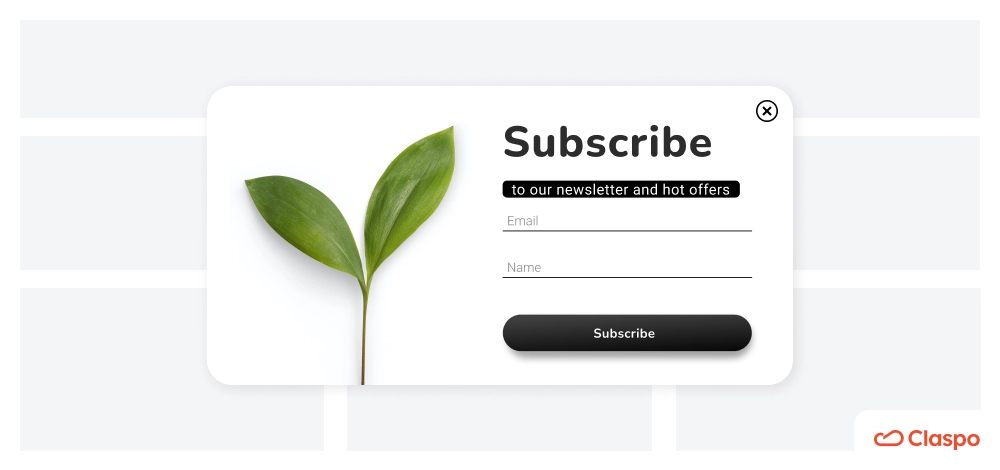
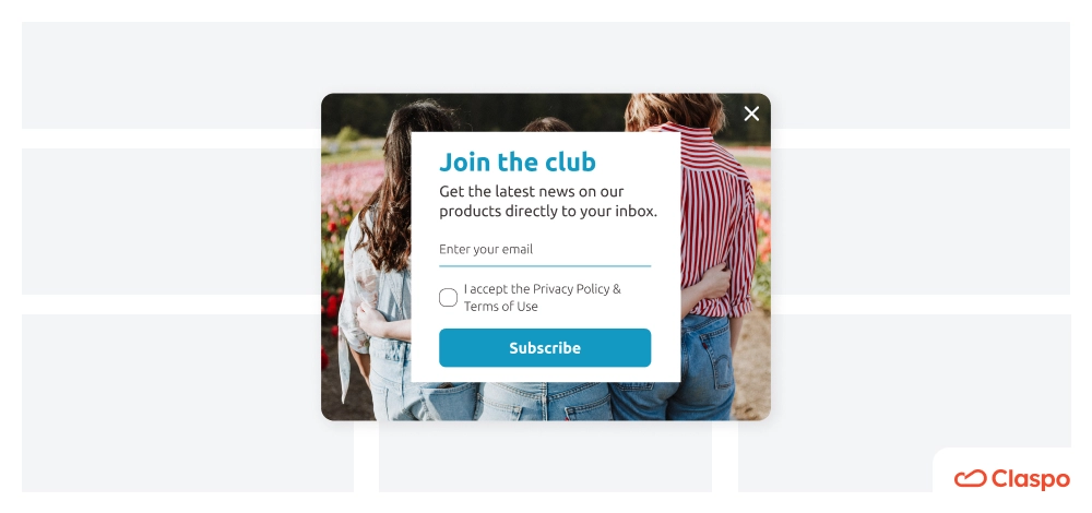
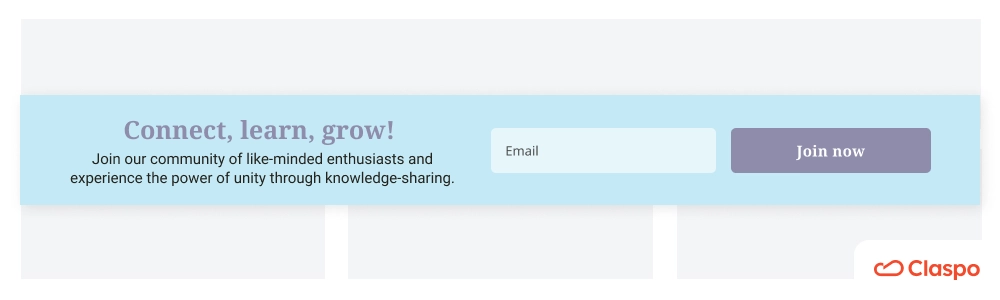
Match your design to your brand and keep it calm
Focus on a clean, brand-matching sign-up for newsletter template design. Use your brand colors and a clean layout so it doesn’t feel jarring or “spammy.” Also, resist the urge to add obnoxious effects like flashing animations or shaking buttons that demand attention. Not only can these feel tacky, but over-the-top animations can overwhelm users (and even trigger motion sensitivity in some). Subtle visuals and clear text typically perform better than anything that hijacks the senses.
Don’t bombard or distract
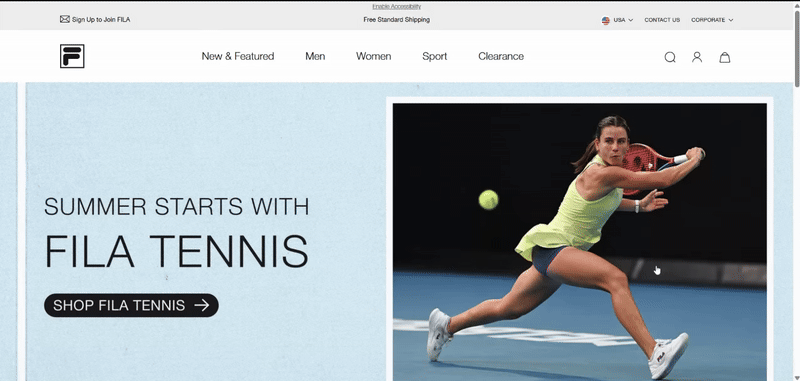
It should go without saying, but never show multiple pop-ups at once or back-to-back. One offer at a time is plenty. If your website uses several forms (say, a newsletter pop-up and a promo banner), configure them so they don’t overlap or compete, like in this real-life example:
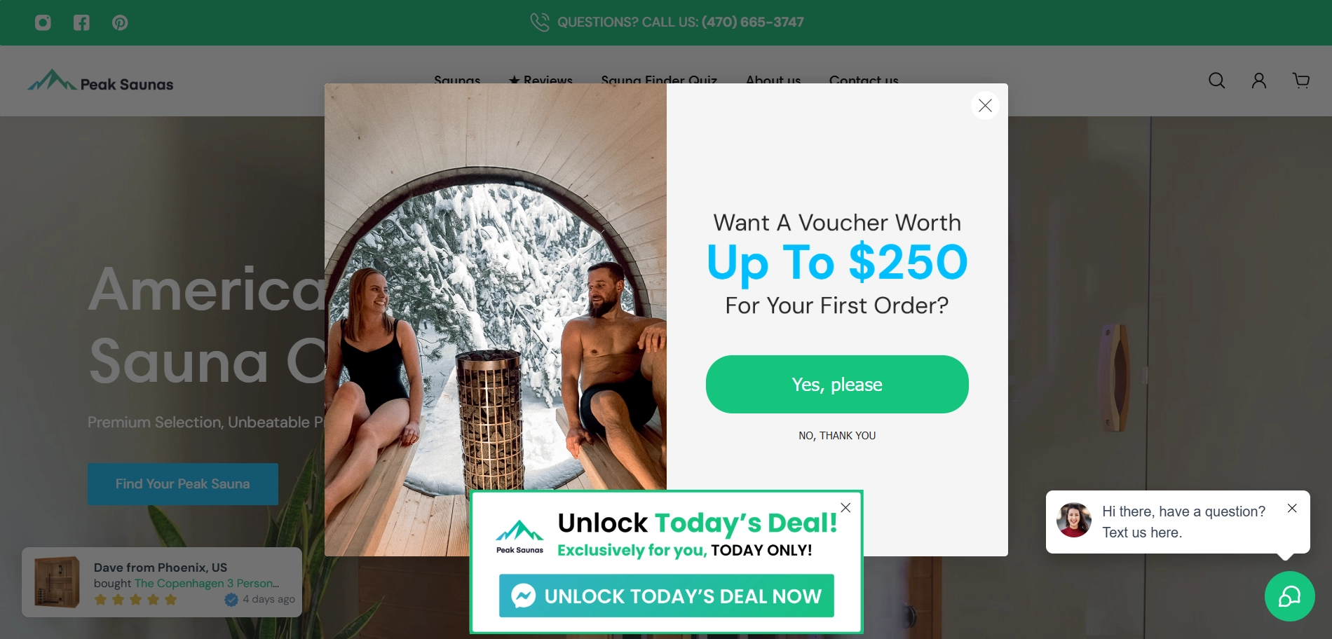
Many modern form builders include an “annoyance safeguard” to prevent this exact issue. Use those settings! Likewise, avoid covering important content or navigation with your form – it shouldn’t completely derail what the visitor came to do. These kinds of growth strategies contribute to how to build newsletter subscriber lists without hurting user experience.
2. Time and place your pop-ups strategically for newsletter growth
Timing is everything when it comes to capturing sign-ups. Trigger a pop-up at the wrong moment and you’re guaranteed an annoyed user (and a quick click on the “X”). The goal is to display your email sign-up offer at a moment when visitors are most receptive. So, how do we find that sweet spot?
Don’t ambush new visitors immediately
A common mistake is throwing a newsletter form in someone’s face the second they land on your homepage. Imagine walking through a store’s door and instantly being asked for your email – not a great feeling. It’s no surprise that if a popup displays the moment a visitor enters, it’s likely to annoy them. Give people a chance to engage with your site first. Let them scroll, read, or browse around a bit so they can see the value you offer. This is an important way to grow your list with respect to the user journey.
Use smart triggers and delays
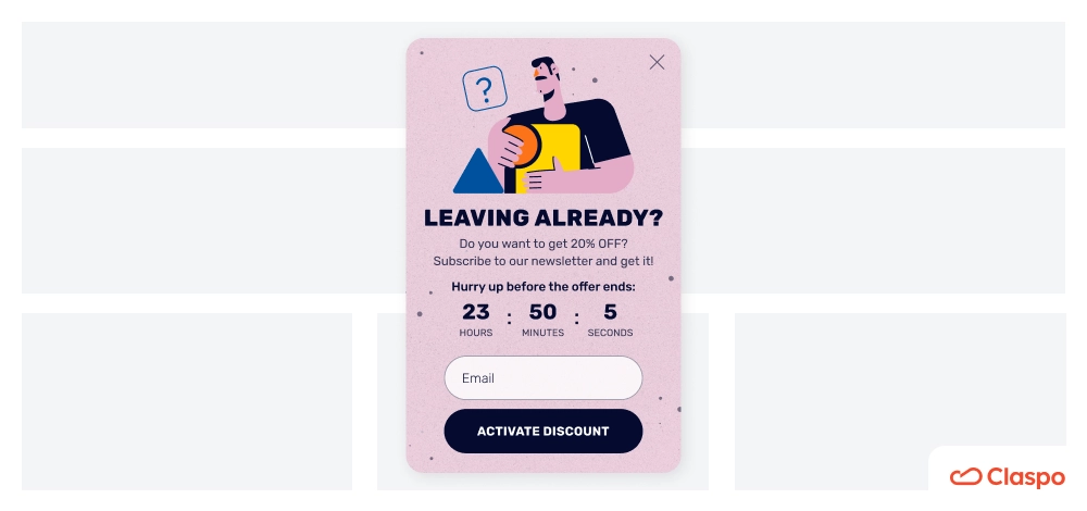
Instead of an instant, in-your-face approach, trigger your pop-up based on user behavior or a sensible time delay. For example, exit-intent pop-ups are great for list growth. Exit-intent pop-ups (which appear when the user’s cursor moves toward the browser’s close button) are a proven way to catch visitors just before they leave – offering a “wait, don’t go yet” incentive like a discount or free guide can “work miracles” in re-engaging them.
Another effective trigger is a scroll-based pop-up, which appears after the visitor scrolls, say, 50% down a page. This way you reach people who’ve shown some interest by reading halfway. (In fact, our data found a site that waited ~20 seconds before showing a form – enough time for users to get oriented – saw improved engagement with the pop-up).
What does the data say about timing? Analytics from thousands of pop-ups indicate that showing a sign-up offer too early can backfire. Our data show that a more user-friendly window is about 15–30 seconds into a visit – by then, users are generally engaged and more open to input. Pop-ups fired in the first few seconds might grab attention, but they often yield lower quality sign-ups or simply get closed out of irritation. A good rule of thumb is to allow at least a handful of seconds (or a certain scroll depth) before interrupting your visitor with a request. Every site is different, though, so you may need to experiment (more on testing later).
Choose the right placement and format
“Pop-up” is a broad term – it doesn’t always have to be a huge center-screen modal. Depending on your site design, you might consider more subtle formats that are still effective. For example, a slide-in form at the bottom corner that appears after a user scrolls could be less intrusive yet still eye-catching.
Or a top banner (often called a hello bar or floating bar) with a sign-up offer can be present without blocking content.
Many form builders allow a variety of formats: modals, slide-ins, full-screen overlays, sticky bars, etc.. The best placement depends on your content and audience; the key is it should be noticeable without completely derailing the user’s experience. If one approach isn’t working, try another type – maybe your audience responds better to a small slide-in than a full-screen splash. You can even create a landing page dedicated to signups.
Leverage user-initiated triggers when possible
An even more polite strategy is to let the user trigger the sign-up form. For instance, you might have a “Subscribe” button or link on your page that opens a pop-up form when clicked. This way, the popup appears at the visitor’s request.
Not surprisingly, pop-ups that are triggered by a user’s own action tend to have the highest conversion rates (nearly 29% in one analysis), since the timing is perfectly in line with user interest. Compare that to generic pop-ups that appear on a timer or on scroll – those can convert in the single digits, or even under 3% for some scroll-triggered ones. The takeaway: whenever you can tie your email capture to a user’s intent (like clicking a “get my free ebook” link), you’ll see better results. This also increases the chance that subscribers will share your newsletter with friends and colleagues.
In short, meet your visitors at the right moment. Pay attention to what pages or times users might be most inclined to subscribe – for example, at the end of a valuable blog post (they enjoyed your content, so offer them more via email), or when they’re indicating exit intent (they’re leaving, so give a reason to stay in touch). By being strategic about when and how your forms appear, you significantly boost the chance that visitors will actually welcome them.
3. How to build a newsletter subscriber list from mobile visitors
In 2026, it’s safe to assume a large chunk of your traffic is coming from mobile devices. That means your newsletter sign-up strategy must account for smaller screens and different user behaviors on phones and tablets. What works on desktop can flop on mobile if you’re not careful. Worse, a bad mobile pop-up can do more than annoy – it can hurt your search rankings, thanks to Google’s stance against intrusive mobile interstitials. That’s why adapting your newsletter content for mobile is essential.
So, how do we grow our subscriber list without wrecking the mobile experience (or our SEO)?
Design mobile-friendly pop-ups (or consider alternatives)
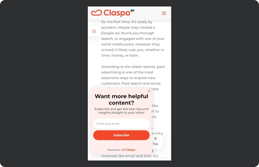
On mobile screens, space is at a premium. A giant fullscreen popup that appears immediately can feel like an aggressive roadblock. In fact, Google actively penalizes sites that show intrusive full-screen pop-ups right when a user lands on mobile. To stay on Google’s good side (and keep users happy), use fullscreen pop-ups very sparingly on mobile. If you do use one for a high-value offer, make sure it’s timed well (not instant) and easy to close. Often, a better approach is using a less obtrusive format on mobile: for example, a sticky banner at the top or bottom of the screen, or a floating box that invites users to subscribe without covering the whole page.
This way, the content remains accessible and the user can continue browsing while deciding to sign up. This is a smart growth marketing newsletter move.
Adjust triggers for mobile behavior
Mobile users navigate differently – scrolling is almost constant and there’s no cursor for exit intent. Rather than time-based triggers (which might pop at an awkward moment on a phone), our team recommends triggering a mobile sign-up form on scroll depth instead of time. For example, show your newsletter offer after the user has scrolled 60% down an article. This ensures they’ve consumed some relevant content first (indicating interest) and won’t be as startled by the popup. Additionally, be mindful of frequency: it’s wise to show a mobile pop-up only once per session or only after a significant delay. If a user closes it, don’t keep pestering them on every page load.
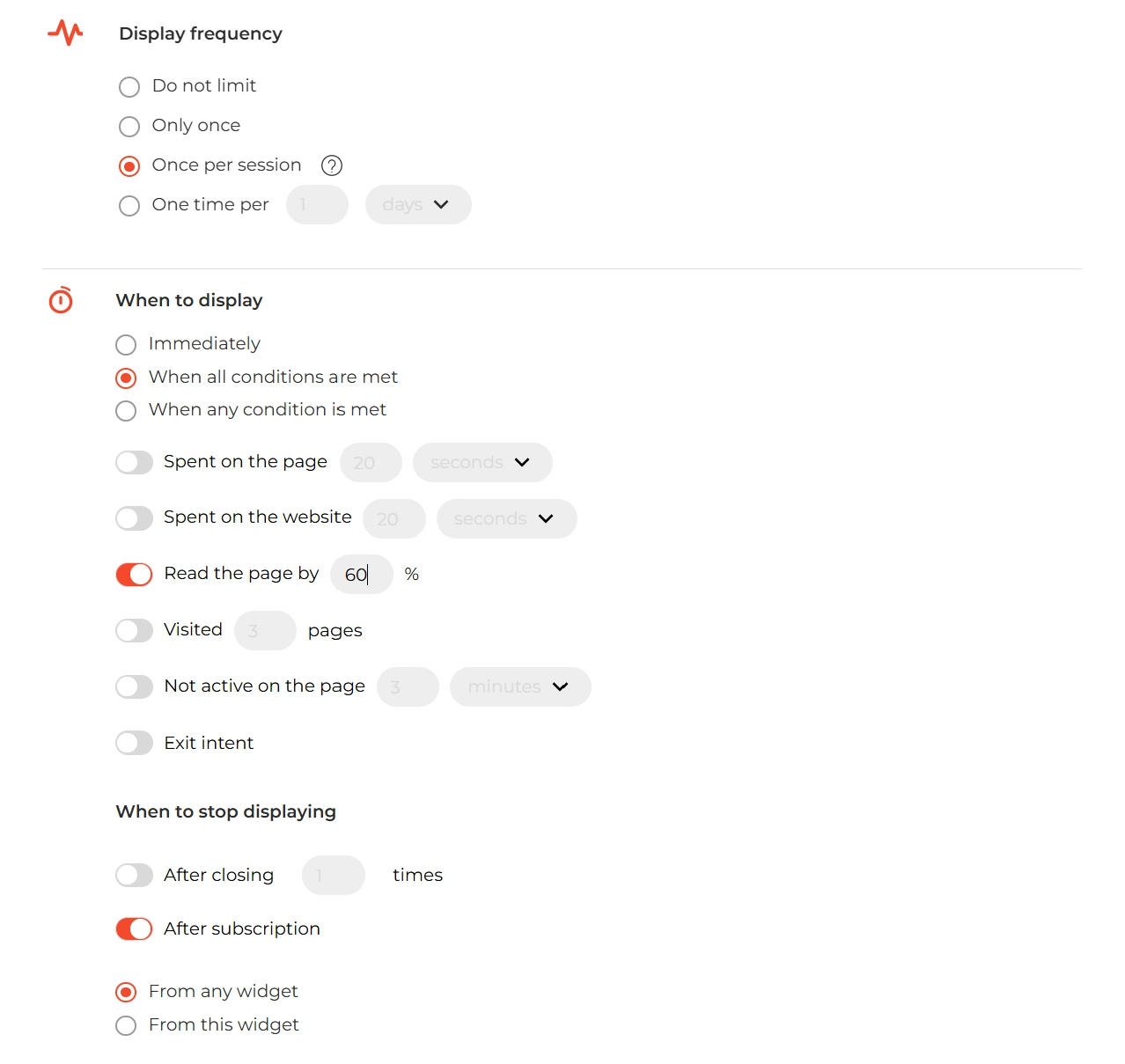
Most pop-up tools let you set frequency rules (e.g., “don’t show this again for 7 days after close”). Use those settings to avoid overdoing it. These practices help you generate interest without frustrating visitors.
Make it easy to dismiss (with thumb-friendly design)
Nothing is more frustrating on mobile than a pop-up you can’t get rid of because the close button is tiny or hidden in a corner. Ensure your close icon is large enough and not tucked away. Better yet, consider enabling “swipe to close” gestures for mobile pop-ups if your tool supports it – this leverages the intuitive swipe motions we all use on phones and makes closing feel natural. Also, place your call-to-action and close options within easy reach of a thumb. Typically, keeping important buttons in the lower half of the screen works well on mobile. This small UX win can lead to quick wins in list conversions.
Test on real devices
This is a practical tip: always preview and test your sign-up forms on an actual phone or tablet. Many pop-up builders have a mobile preview mode, allowing you to see how the form adapts to smaller screens. Use that, but also do a quick test on your own phone. Check that the form displays correctly, that all text is readable without zooming, and that the close button works on the first tap. Ensuring mobile responsiveness isn’t just about layout – it’s about the whole interaction being smooth on mobile.
By optimizing for mobile, you’ll capture subscribers from the on-the-go crowd and avoid alienating a huge segment of your audience. The bottom line: what’s a great user experience on a desktop should also translate to a great (or at least not frustrating) experience on a phone. You can even share your content through mobile-friendly emails and forms that invite people to share with friends.
4. Entice sign-ups with valuable incentives (give them a reason to subscribe)
Even with the prettiest form and perfect timing, people still need a reason to hand over their email. Simply saying “Subscribe to our newsletter” isn’t very compelling – inboxes are crowded, and consumers are protective of their personal info. To grow your newsletter, you have to offer something of value in exchange for that email address. Marketers call this the “lead magnet” or incentive, and it can dramatically increase sign-ups when done right. It’s one of the most powerful newsletter growth levers you can pull, whether you use email forms alone or combine them with an SMS opt-in popups.
Think about your target audience and what would motivate them. Discounts and deals are classic incentives, especially for e-commerce and B2C brands. In fact, data show that exclusive offers are a top reason people subscribe to newsletters, and consumers overwhelmingly respond to a good deal. Offering, say, “10% off your first order” or a free shipping coupon for new subscribers can be highly effective. (Our industry analysis found that discounts were the #1 motivator for around 60% of subscribers, with free shipping not far behind.)
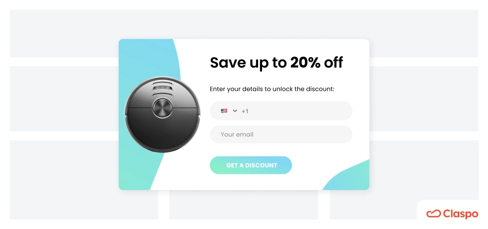
If you’re running an online store, a sign-up form advertising a one-time discount code in return for an email is almost a no-brainer – it immediately tangibly benefits the subscriber, and it can even drive an instant purchase. It’s a great tactic for how to grow a newsletter list quickly.
Monetary incentives aren’t the only route. Content and freebies work great for brands that aren’t product-centric or for B2B and services. This could be a free e-book or guide, a cheat sheet, an email course, or access to an exclusive video, podcasts, or hosted webinars. The key is that it should be something your audience actually cares about. For example, a SaaS or consulting business might entice sign-ups by offering a high-value whitepaper or template that helps the user do their job better.

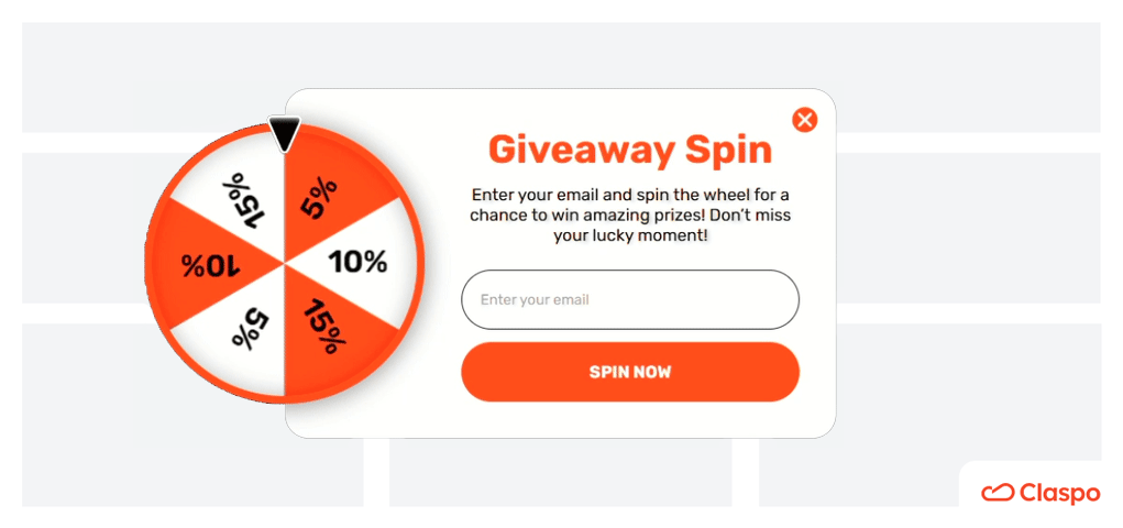
Meanwhile, a retail brand might stick to coupons or maybe a chance to win a gift card (contests and giveaways can work as long as they’re clearly presented and not spammy). Always ask yourself: “What’s in it for them?” If you can answer that with a compelling benefit, your conversion rate will reflect it. And don’t forget to link to your newsletter on thank-you pages or via word of mouth prompts.
It also pays to match the incentive to the audience and context. If someone’s reading a blog post about, say, email marketing tips, an appropriate lead magnet could be a downloadable checklist or a PDF of “Top 50 Email Subject Lines That Get Opens”. On the other hand, if they’re browsing product pages on an e-commerce site, a discount on their first purchase might be more enticing. Data shows that different industries use different carrots: SaaS companies often give educational content (e.g. e-books, reports), whereas e-commerce tends to dangle discounts or free samples. Know your audience’s preferences – for a fashion store, a “15% off your first outfit” or “Get early access to new arrivals” might be golden. For a software platform, “Sign up to get our free 10-page guide to improving [relevant skill]” could be more appealing than a generic “subscribe for updates.” These are subtle but effective ways to grow your newsletter based on user intent and insight.
Lastly, once you promise an incentive, deliver on it promptly and clearly. If it’s a discount code, the confirmation message or welcome email should prominently show that code (and explain how to use it). If it’s a downloadable asset, provide the download immediately or send it straight to their inbox. This not only fulfills your end of the bargain but also trains your new subscribers to see value from you right away. It’s an excellent first impression to make: they gave you an email, and boom, they got something awesome in return. That builds momentum for your weekly newsletter and long-term engagement.
5. Test, Tweak, and Refine (Continuous Improvement is Key)
Growing your newsletter list isn’t a one-and-done project – it’s an ongoing process of testing and learning. What works for one website (or even one page) might not be optimal for another. That’s why A/B testing and analytics are your best friends in this endeavor. The idea is to continuously experiment with your pop-ups and forms, measure how people respond, and then make data-driven tweaks to improve sign-ups over time. This is how many creators approach how to build an email list effectively.
Try A/B testing your forms
A/B testing (or split testing) means showing two versions of something to two segments of your audience and comparing the results. Most good email capture tools will let you A/B test your pop-up easily – for example, you could create Variant A and Variant B of your newsletter sign-up form. Perhaps Variant A has a generic headline (“Subscribe for updates”) and Variant B has a value-driven headline (“Join 5,000+ marketers who get our weekly growth tips”).
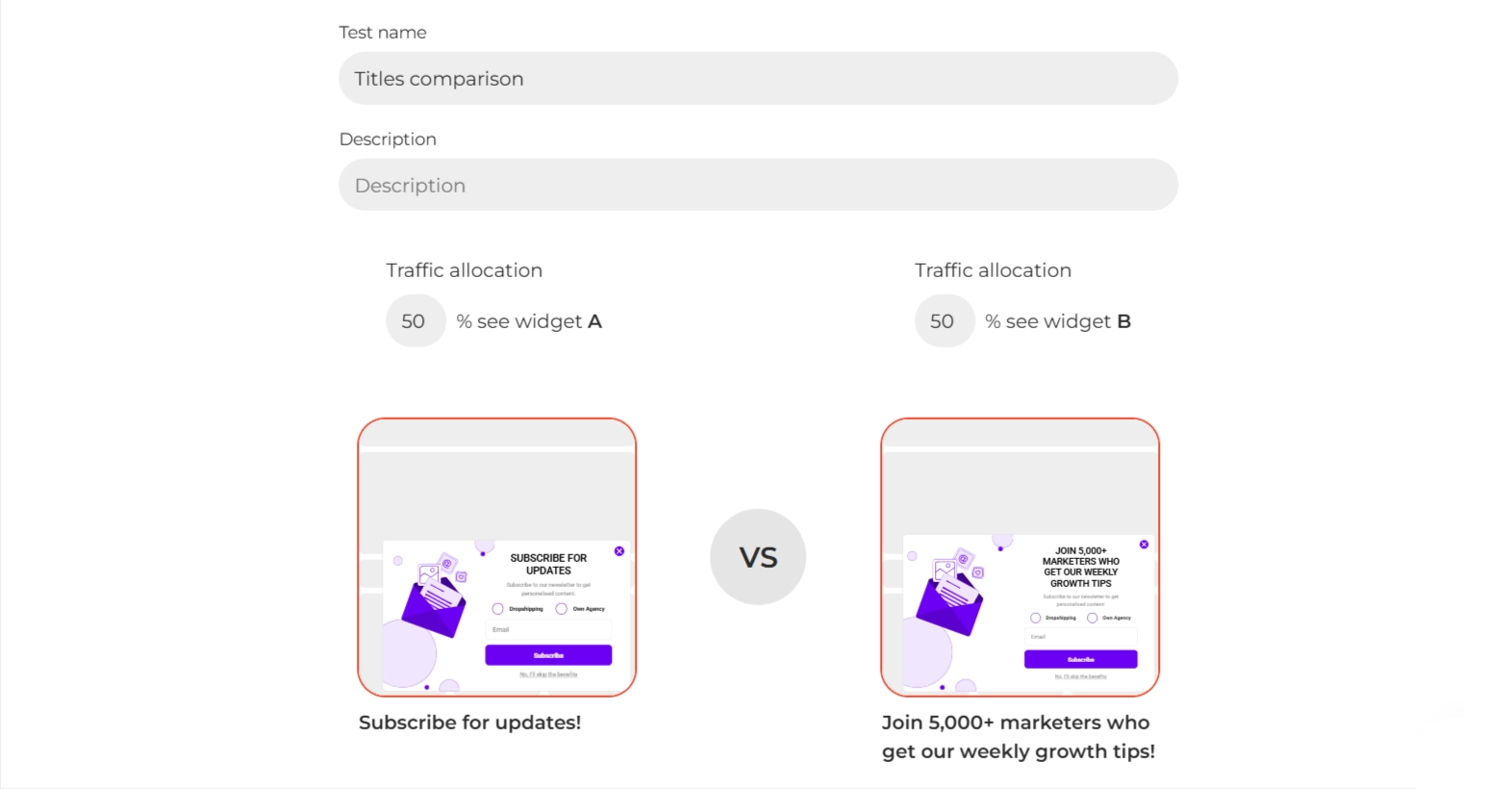
Run the test and see which one gets more sign-ups over a couple of weeks. You might be surprised by the difference a single phrasing change can make. As another example, you could test different incentives: is the sign-up rate higher when you offer “10% off” versus when you offer “Free shipping on your first order”? Testing will tell you. Headlines, button text, imagery, background color, form placement – all of these are variables you can experiment with.
Not sure what to test first? Look at the components that might be weakest. If lots of people see your pop-up but few convert, maybe the offer or headline isn’t compelling – test a new one. If people start signing up but don’t complete (e.g., they open the form but abandon), maybe the form is too long or confusing – try a simpler one with fewer fields. Even the timing and trigger can be A/B tested: some tools allow you to split test showing the form after 5 seconds vs. 15 seconds, or scroll 30% vs. 60%. As Claspo’s experts note, finding the right pop-up formula is often “a process of trial and error”, so don’t be afraid to experiment until you hit the sweet spot.
Measure what matters
Keep an eye on your conversion metrics – primarily, your conversion rate (what percentage of visitors actually sign up when shown the form). Also monitor things like how often the form is viewed (to ensure it’s triggering as expected), and perhaps the bounce rate or time on site for visitors who see the pop-up (just to make sure your pop-up isn’t inadvertently driving people away). If your pop-up builder integrates with Google Analytics or has its own dashboard, use that data. For example, if you notice that a certain page yields a lot of sign-ups, you might want to double down on that page (ensure the form shows there, maybe even highlight the incentive more strongly). Conversely, if a page has high traffic but very low sign-ups, investigate why – maybe the content of that page doesn’t align with your current offer, or maybe you should try a different format there. These actions help you avoid the biggest mistakes and add value at every step.
Iterate and improve
Implement the winning variants from your tests, then consider new tests. The goal is incremental improvement. If you boosted your sign-up rate from 1% to 2% – great, that’s double the subscribers! – see if you can get to 3%. Over time, these gains add up significantly. Also, don’t set it and forget it: the internet, seasons, and user behaviors change. What works in Q1 might need adjustment by Q4. For instance, during holiday season, a more aggressive pop-up with a limited-time offer might perform well, whereas in other months a softer approach is better. Continually refining your approach ensures you’re always squeezing the most value out of your traffic. And don’t forget to include your newsletter in your author bio if you're publishing blog content to drive visibility organically.
One more thing: testing isn’t just about the pop-up itself, but also what happens next. Monitor the quality of subscribers you’re getting. Do the people who sign up via that flashy pop-up actually open your emails later? If not, you might be attracting the wrong crowd with a gimmicky offer. The best list-building practices get you not just more subscribers, but engaged subscribers who stick around. Use your welcome email stats or subsequent campaign engagement as a feedback loop to gauge if the sign-ups you’re getting are truly interested in your content. This is a key mindset shift in how to grow an email list that performs long-term.
6. Leverage the right tools (pop-up builders make it easy)
Executing all of the above strategies might sound daunting – but fortunately, you don’t have to code any of this from scratch. There’s a whole class of tools specifically designed to help marketers create and optimize pop-ups and sign-up forms with ease. Tools like Claspo work as a powerful free email list builder and streamline the process of growing your email list.
Yes, by using Claspo, you can save time and unlock capabilities that would be hard to implement on your own (like advanced targeting or built-in A/B testing). With an intuitive drag-and-drop interface and a vast library of pre-designed templates, Claspo lets you create customized email capture forms in minutes. In fact, it comes loaded with 1000+ ready-made templates for all sorts of use cases, you can easily tweak the colors, images, and text to match your brand, ensuring a seamless look and feel across your site (and yes, that includes previewing how the pop-up will look on mobile or desktop before it goes live).
Beyond aesthetics, Claspo shines in the strategy department. It provides granular controls for when, where, and to whom your pop-ups appear. For example, you can set up precise display rules: show the form after 15 seconds on the homepage, or only trigger it on exit-intent for product pages, etc. You also have control over frequency and conditions – e.g., you can prevent pop-ups from showing more than once per session, or stop displaying them after a user has already subscribed. This level of targeting and timing ensures you’re implementing the best practices we discussed (like not overwhelming the user) without needing to manually tinker with code. Claspo even has advanced targeting options, allowing you to do things like show certain offers only to visitors from specific campaigns or geographies, or trigger a special pop-up for first-time visitors versus returning visitors. Personalizing the experience like this can significantly boost relevance and conversion.
Another big advantage of using Claspo is built-in analytics and testing. You don’t have to juggle separate tools to see how your forms are performing – the dashboard will show you views, conversions, and other metrics at a glance. Plus, Claspo includes A/B testing features out of the box. Want to test two different headlines or offers? You can set that up within the tool and let it automatically split traffic between versions, then report on the results. This makes the optimization process we described much more straightforward.
Finally, consider the seamless integrations a good form builder provides. Claspo, for instance, integrates with popular email marketing services and CRMs like Mailchimp, Klaviyo, HubSpot, etc.
This means when someone joins your list via the pop-up, their email can flow directly into your email platform of choice, where you can automate welcome emails or add them to segmented nurture sequences. Integration with Google Analytics is another plus – you can push event data to GA to include sign-up events in your broader web analytics. These integrations ensure that your new subscribers don’t just sit in the pop-up tool’s database, but are immediately actionable in your wider marketing stack.
In short, the right tool can be a game-changer. It enables you to implement best practices (design, UX, timing) without needing a developer, and it provides the flexibility to adapt and improve your forms over time. Claspo is one strong option that emphasizes customization, design quality, and usability – exactly what busy marketers and business owners need. Of course, there are other popular solutions out there, and the best choice will depend on your specific needs and budget.
But whichever tool you choose, make sure it empowers you to follow the strategies we’ve outlined: it should let you create attractive forms, control the user experience details, and continually optimize through testing. That’s how smart creators build trust, boost engagement, and expand their channel organically.
How to grow a newsletter the smart way
Growing your newsletter subscriber list in 2026 is both an art and a science. It’s about understanding your audience, refining your messaging, and using smart newsletter growth tactics to reach the right people in your niche. Personalization plays a big role here — when you personalize your message and align your offer with what your visitors care about, they’re far more likely to subscribe to your newsletter.
And thanks to modern pop-up builders like Claspo, even small teams can execute these strategies at a professional level without overspending or overcomplicating things. Whether you're running a blog, a shop, or a growth daily newsletter, tools like Claspo allow you to stay agile and effective.
Remember, the end goal isn’t just a big list — it’s a list of people who want to hear from you. Every signup you get by using these strategies is a potential customer or loyal community member, so treat that relationship with care from the very first pop-up interaction. Avoid the hype and gimmicks; stick to respectful, well-reasoned tactics that put the user first. Do that, and you’ll find your subscriber list growing not only faster, but stronger, week by week, month by month.


