
Multi-Step Form: Definition & Benefits, How to Create a Step Form [Tutorial]
According to HubSpot, multi-step forms deliver impressive results, with an 86% higher conversion rate compared to single-step forms. Marketers using them also report 17% higher satisfaction with their lead generation efforts and consistently self-report higher conversion rates.
This guide covers everything you need to know, from essential tips for creating effective multi-step forms to a detailed tutorial on designing multi-step forms using Claspo’s widget maker.
Table of Contents
Multi-Step Form: Definition and When It's Best to Use
Multi-Step Forms vs. Single-Step Forms: What to Choose
Key Factors to Keep in Mind When Creating Your Multi-Step Form
10 Multi-Step Form Design Examples
How to Create Multi-Step Form in Claspo
Multi-Step Form: Definition and When It's Best to Use
A multi-step form is an interactive form broken into smaller sections or steps. Instead of overwhelming users with a long list of fields, it guides them through a series of steps, each presenting a few fields at a time. This structure reduces friction and keeps users engaged, making it ideal for capturing leads or gathering detailed information.
Multi-step forms are particularly effective in the following scenarios:
- When the form has more than 3 fields or gathers detailed information.
- When engagement or qualification is a priority (e.g., quizzes or detailed lead forms).
- When your goal is to make the process feel lightweight and user-friendly, especially on mobile.
Why Use Multi-Step Forms?
1. Reduce User Overwhelm
Multi-step forms simplify the experience by showing only a few fields at a time, preventing users from feeling overwhelmed. Instead of facing a long, intimidating form, users can focus on one small section at a time.
This approach makes the process feel manageable and increases the likelihood of the user starting the form. Breaking complex forms into steps also helps users process information more easily. This structure is especially useful for detailed lead generation forms or surveys.
2. Higher Conversion Rates
By presenting fields incrementally, users are more likely to continue filling out the form once they’ve started. Each step completed provides a sense of progress, encouraging users to finish. This gradual flow reduces drop-off rates, particularly for forms with more than three fields. For businesses, this means more leads captured without sacrificing user experience.
3. Better Lead Engagement
Multi-step forms are inherently interactive, making them more engaging for users. They can include tailored questions or conditional logic to personalize the experience based on user input.
For example, a quiz might adapt questions depending on previous answers, keeping users interested. This interaction not only captures user attention but also provides richer, more qualified leads. Engaged users are more likely to trust your brand and complete the form.
4. Mobile-Friendly Design
Multi-step forms are a natural fit for mobile devices, where screen space is limited. By displaying one step at a time, they avoid overwhelming the user with too much information on a small screen. A responsive multi-step form also makes tapping and navigating fields easier without scrolling excessively.
Multi-Step Forms vs. Single-Step Forms: What to Choose
Each form type can help achieve specific goals and overcome challenges. Let’s understand when a single-step form is best and when a multi-page form is best.
1. Length and Complexity of the Form
Use a multipage form when gathering more than 3–4 pieces of information, such as name, email, phone number, preferences, or additional insights (e.g., quiz answers or survey feedback). Simple forms are best for collecting just a name and email, especially in widgets designed for quick lead capture.
2. Conversion Optimization
Users are more likely to start the form when only one or two fields are shown initially. With a multiple-step form, you can structure fields so personal information (e.g., phone number or demographics) comes last, reducing early friction.
A one-step widget, on the other hand, can be effective when the task is simple, straightforward, and requires minimal effort (e.g., “Enter your email for updates”).
3. Engagement and Lead Quality
Multi-step forms are better for qualifying leads. They allow you to collect detailed information about the prospect and build further communication accordingly. Single-step forms focus on volume over engagement. Use them when lead quality is less critical than quantity (e.g., for promotions or giveaways).
Multi-Step Forms Pros & Cons
|
Pros |
Cons |
|
Breaking the form into smaller sections makes it less intimidating |
More steps mean users might feel it takes longer to complete |
|
Users are less likely to abandon the form |
Requires more development effort |
|
Helps users understand the context of the questions and progress logically |
|
|
Steps can dynamically adjust based on prior answers, making forms more personalized |
|
|
Placing personal information fields at the end reduces friction and makes it likelier the user will start filling out the form |
Single-Step Forms Pros & Cons
|
Pros |
Cons |
|
Users can see all fields at once and fill them out without switching screens |
Seeing too many fields at once can intimidate users and increase abandonment rates |
|
Easier to implement and maintain compared to multi-step forms |
With many fields, the form can look complex, especially on mobile devices |
|
Users don’t need to adjust mentally between steps |
Key Factors to Keep in Mind When Creating Your Multi-Step Form
Show Progress
A key component of any effective multi-step form is precise progress tracking. Users want to understand where they are in the process and how much effort remains to complete the form. A progress bar or step indicators at the top of the form can help achieve this.
If you’re using Claspo’s multi-step form templates, this design element is accounted for. All forms include built-in progress indicators, which you can customize as needed. For example, instead of a progress bar, you might opt for checkpoint pages that inform users about their progress and what lies ahead.
Focus on One Task at Each Step
Organizing your form into well-thought-out sections is just as important. Each step should focus on a single, clearly defined task — for example, one step for personal details, another for contact information, and so forth.
To maximize efficiency and reduce user fatigue, keep each step concise, limiting it to five to seven fields. Use headers to clearly communicate the purpose of each section and seamlessly guide users through the process.
Add Hints
When designing a multi-step form, clear instructions and context are essential. Users are more likely to complete the form if they understand why certain information is requested and how to provide it.
Consider adding short, explanatory text at the beginning of each step. For example, if a step asks for address details, include a note like: “Please enter the address where your items should be delivered.” These small touches can make a significant difference in user experience.
Include Confirmation and Error Screens
The final steps of a user’s interaction with your form leave a lasting impression. A well-designed confirmation screen should indicate that their submission was successful, using friendly language and visuals such as a green checkmark or celebratory icon.
Additionally, include a clear call to action (CTA) to guide users to the next step, such as exploring their account or returning to your homepage.
For error screens, clarity is crucial. Clearly explain what went wrong and how the user can resolve the issue. Use specific instructions, a supportive tone, and actionable options like a "Retry" button or troubleshooting tips to minimize frustration and maintain trust.
With Claspo templates, confirmation and error screens are already built-in. Simply configure these pages to suit your brand.
Make Responsive Multi-Step Form for Mobile
Modern smartphones have screen sizes between 6.1 and 6.7 inches, so the form needs to be adjusted for small screens. Ensure that the fields and buttons of the multi-step form on mobile devices are large enough for seamless tapping. Design all elements to stack vertically, eliminating the need for horizontal scrolling. To optimize space further, consider disabling large images or videos.
10 Multi-Step Form Design Examples
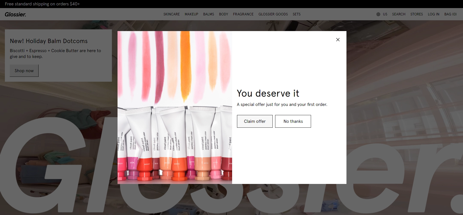
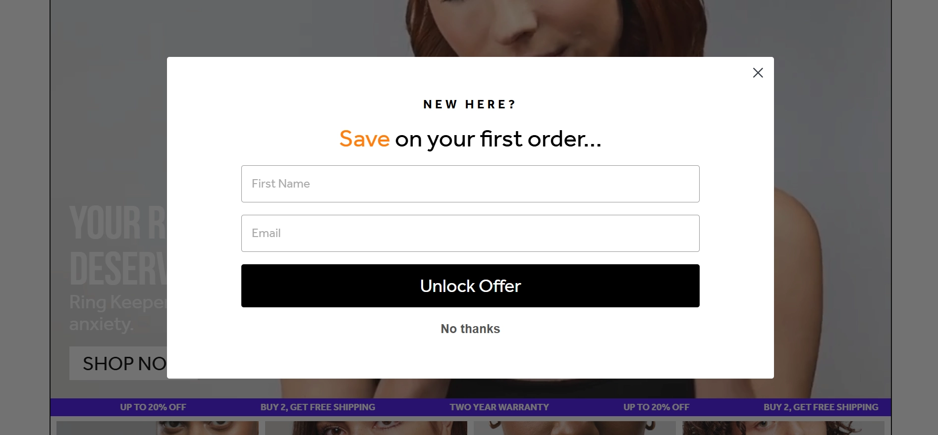
Glossier
Glossier kicks things off with a powerful statement: “You deserve it.” This is a great example of how a simple copy can grab attention and evoke emotion. Also, the offer hasn’t been revealed yet, which helps build intrigue.
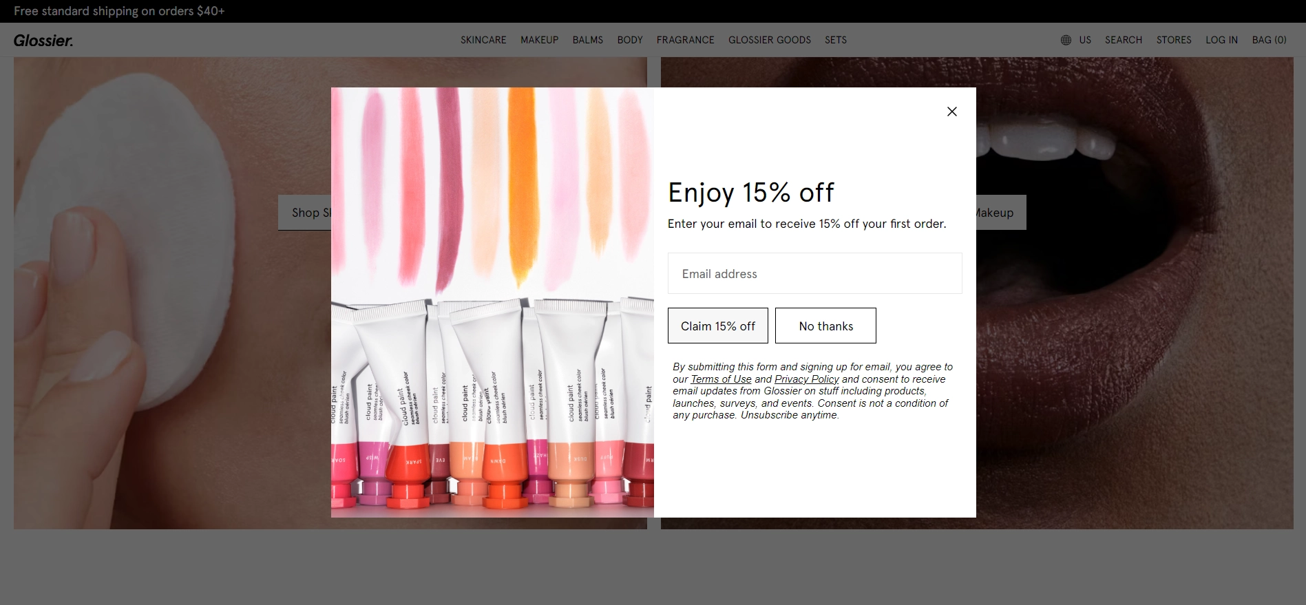
Ah, there we go. As the second step, the form reveals the incentive, yet again supporting it with excellent copy.
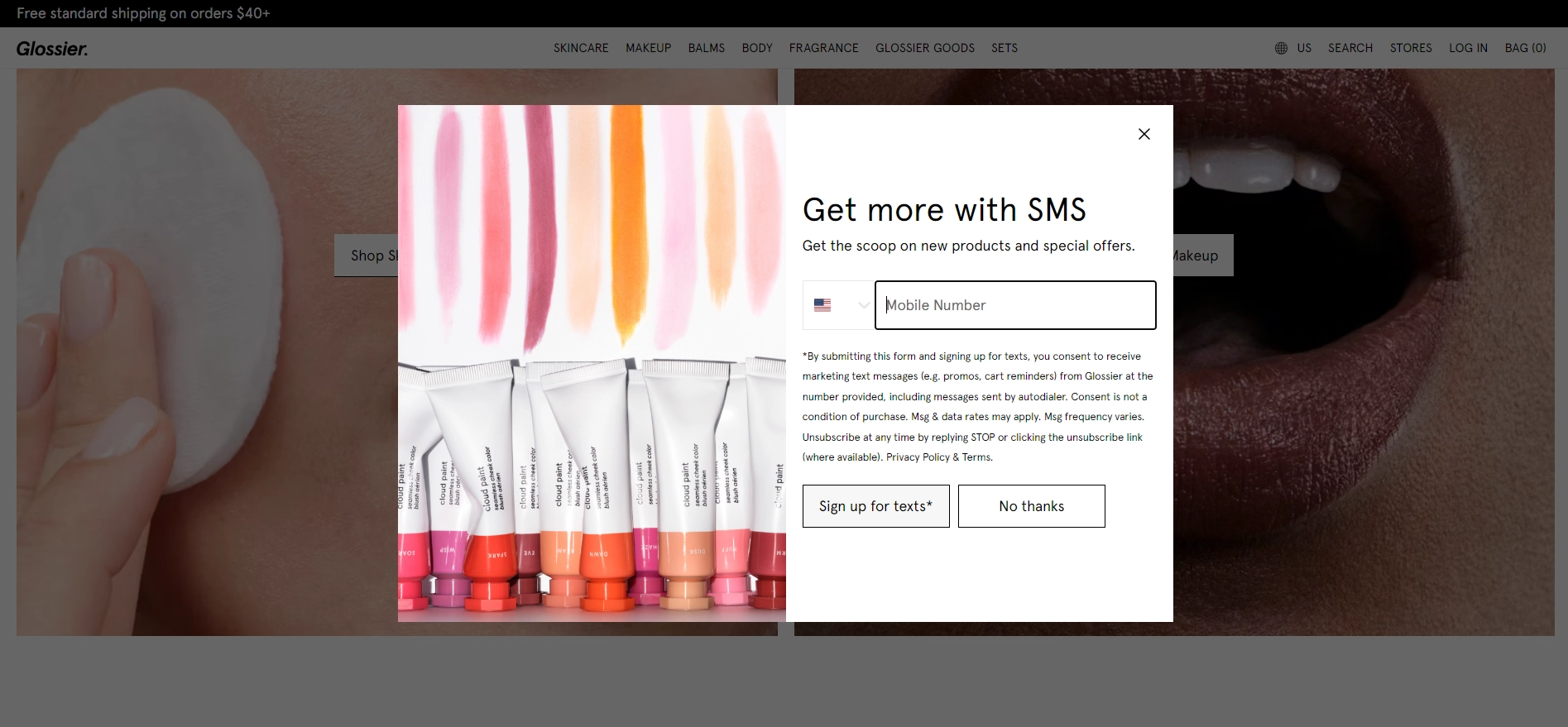
Glossier now has basic information, but why not ask for more? But of course, you need to give them a reason to subscribe.
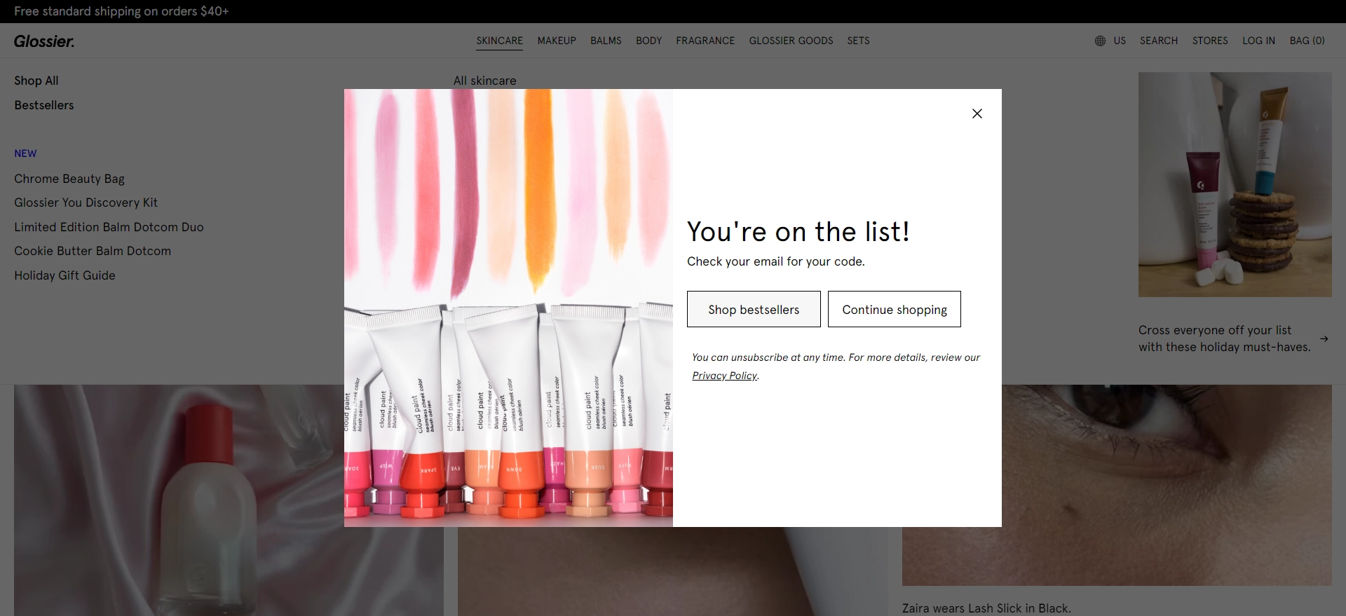
Finally, the form makes you feel included and directs you to product pages to increase the likelihood of purchase.
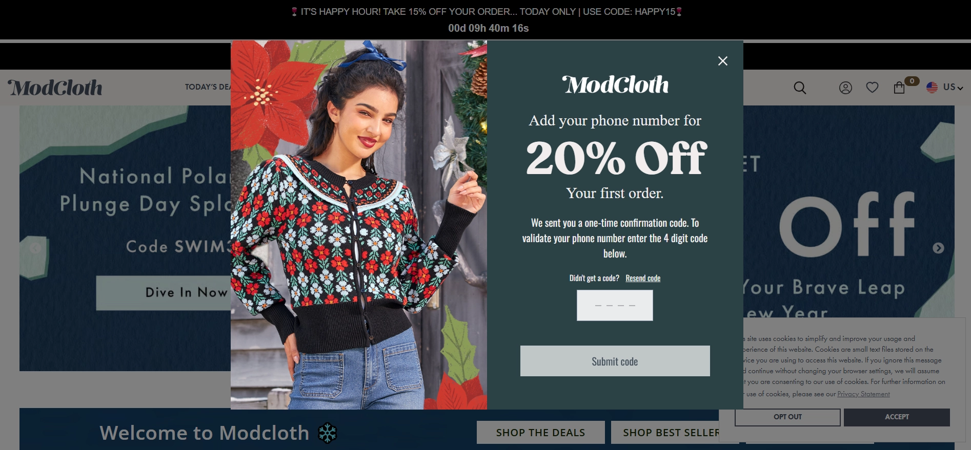
ModCloth
Next, we have the multi-step widget from ModCloth. The design blends nicely with the site's aesthetics. The discount is the focus of this widget and remains so throughout the form, reminding you what you get in the end.
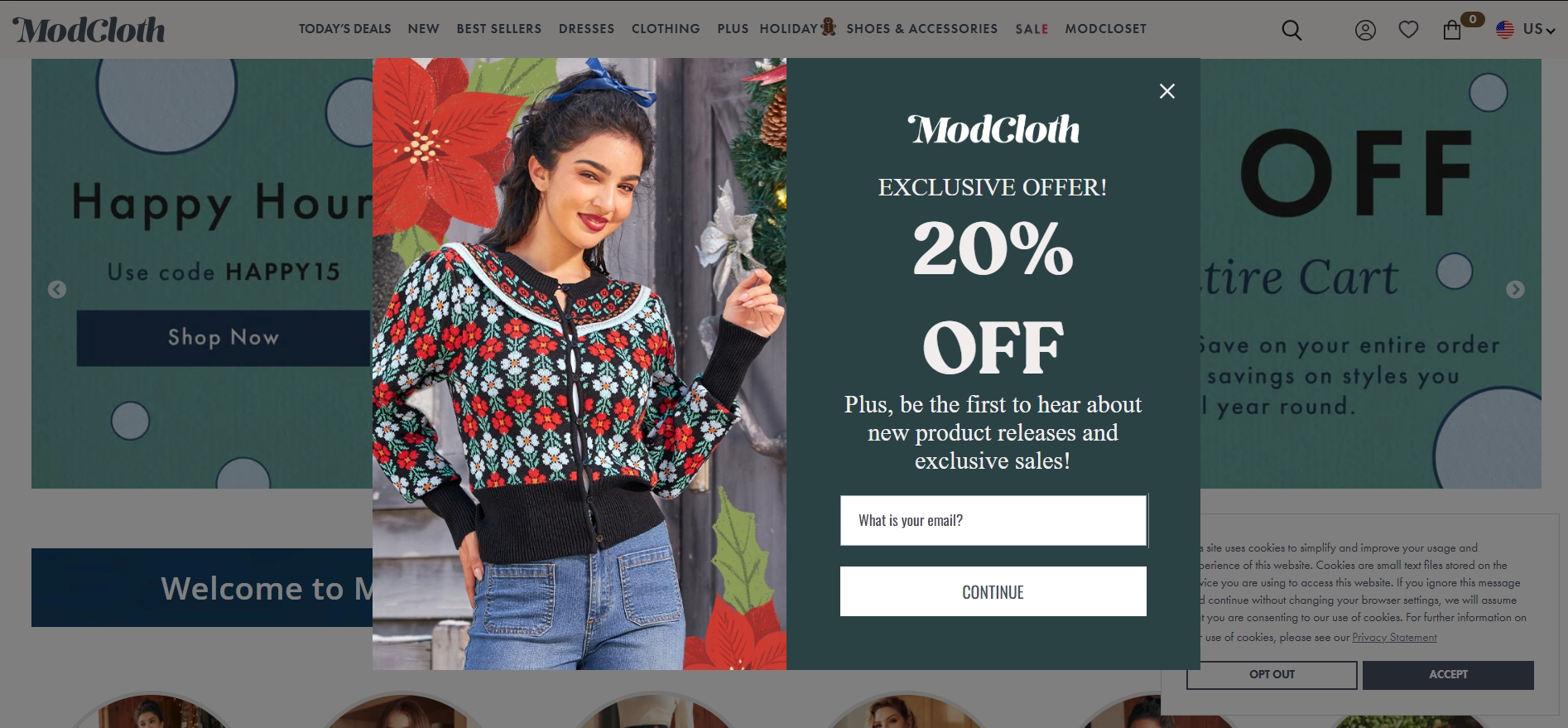
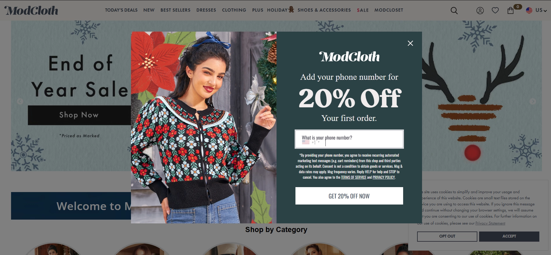
To maintain the quality of leads, ModCloth uses phone verification to validate the phone number and make sure their messages are delivered and seen.
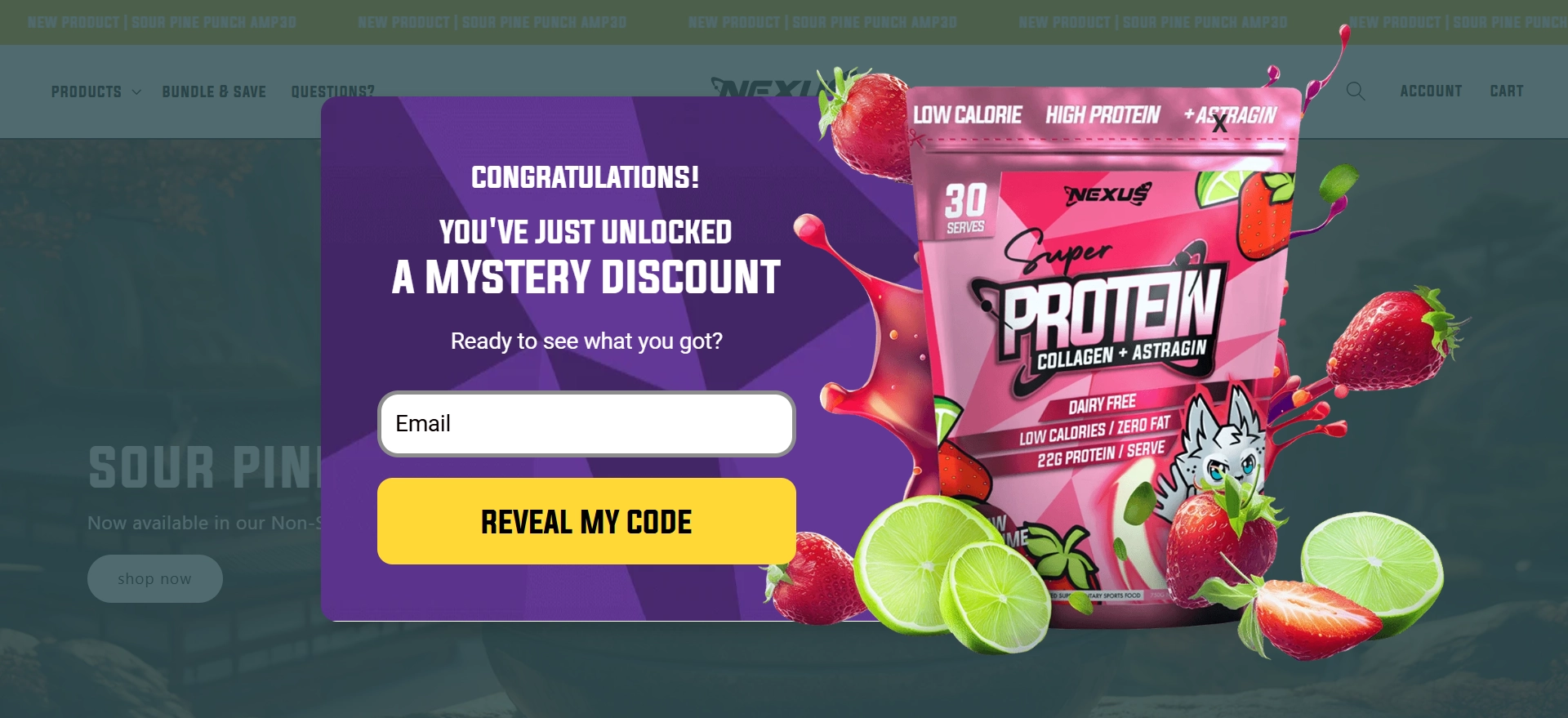
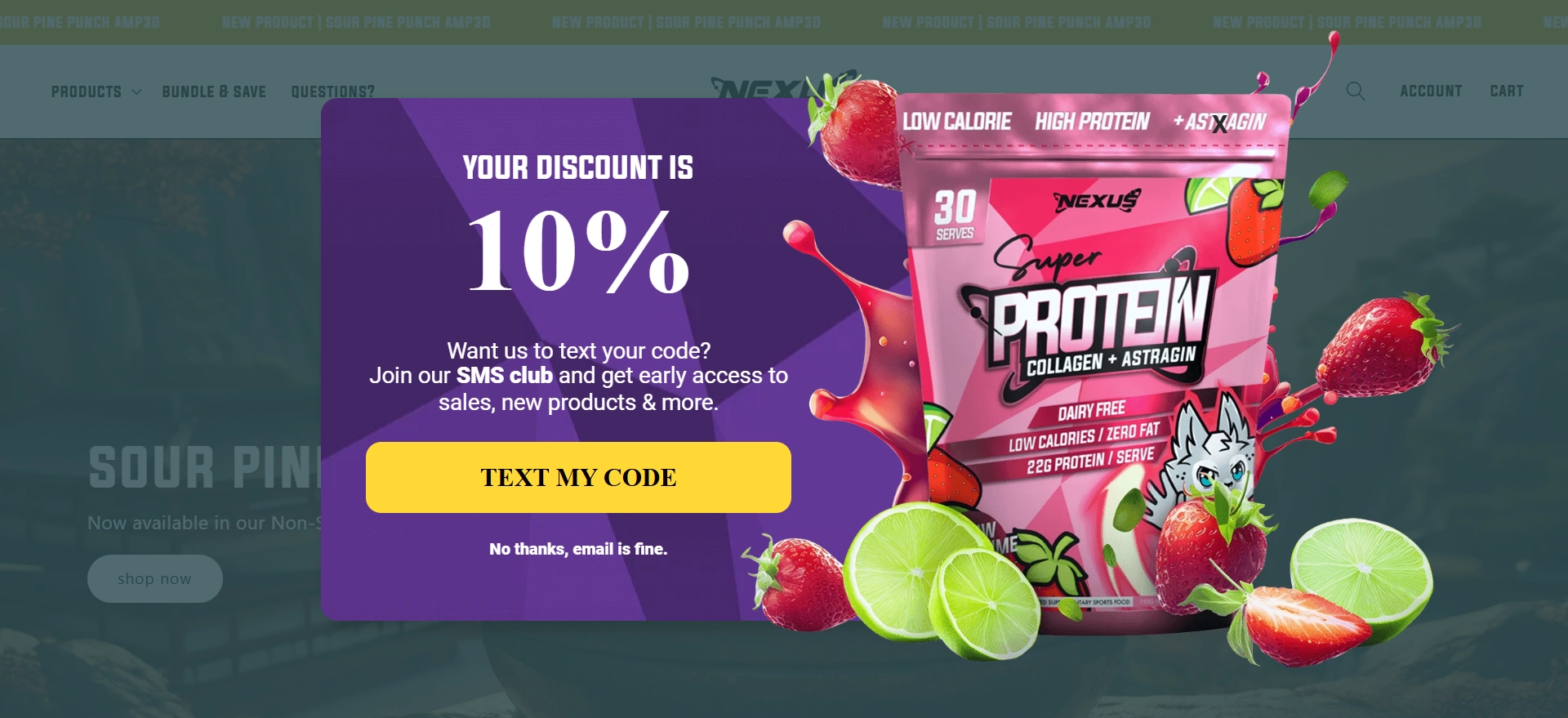
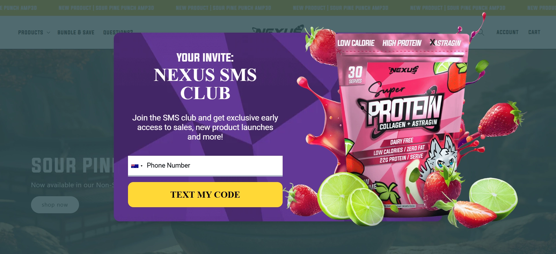
Nexus Sports
The multi-step form from Nexus Sport is hard to ignore. It’s colorful, fun, and has a well-written copy. They start with a mystery discount, asking for an email address to reveal it. Way to pique interest!
In the next step, the company aims to grow its subscribers list. The perks are clearly stated, and the step is optional — more like a nice bonus than a requirement.
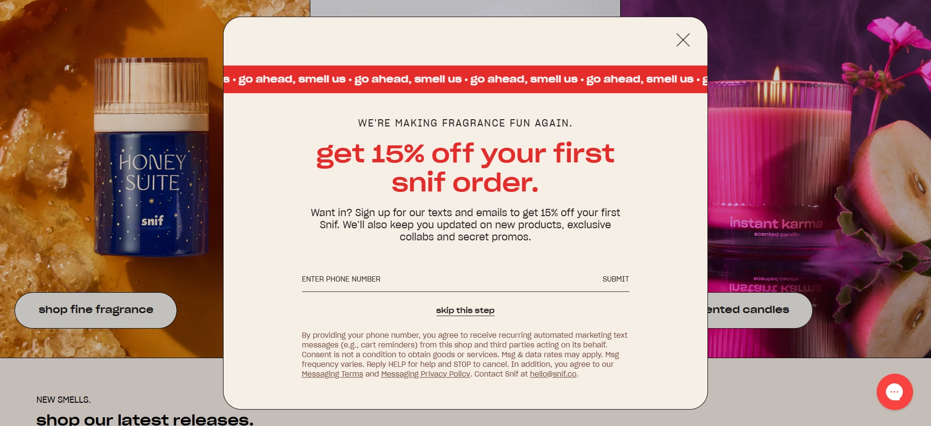
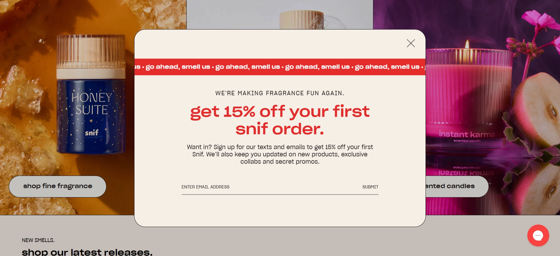
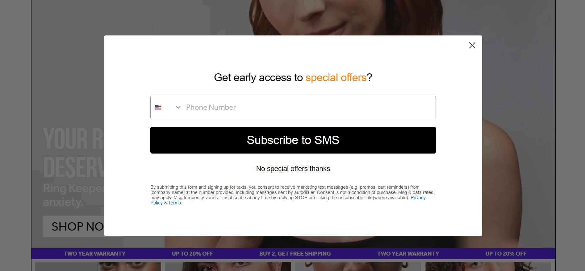
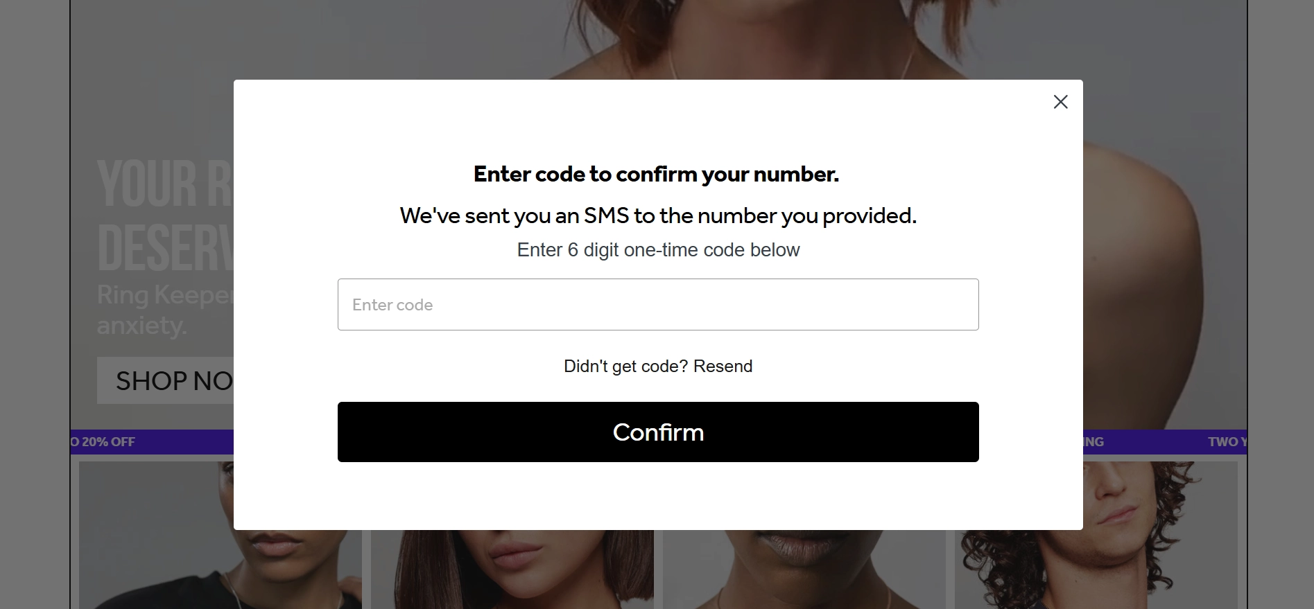
Snif
Snif uses a relatively simple widget to collect the user’s phone and email address. What we like about this widget is that the copy is very clear about the benefits of subscribing, and users are given the option not to share their phone numbers.
Obvi
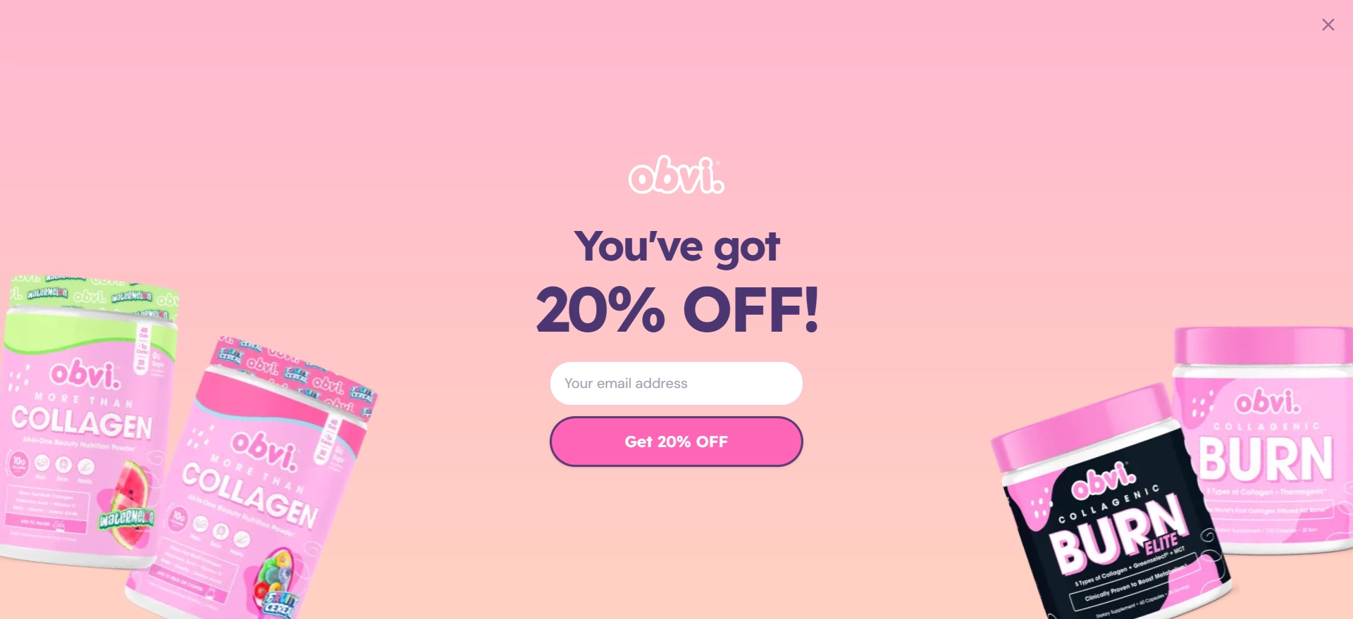
Obivi uses a welcome mat that appears within the first five seconds of users entering their site. And they’re welcome with 20% off. Nice start!
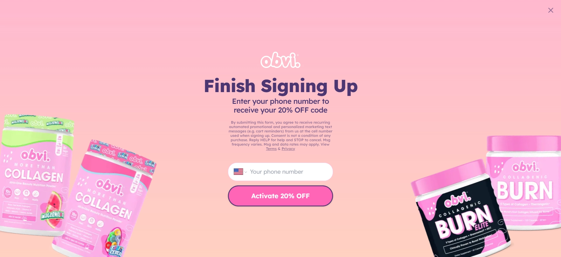
Obvi requests your phone number to activate the discount. They have added text explaining what providing a phone number means and how to opt-out.
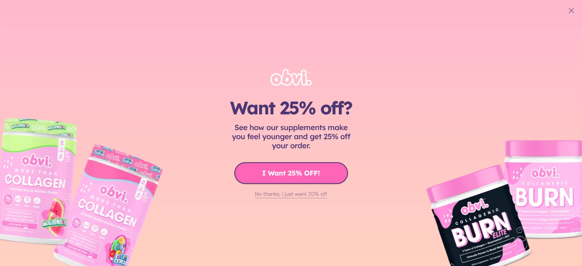
Then, Obvi offers an even sweeter deal! They enhance the incentive to collect a bit more information. The widget takes the user back to the site.
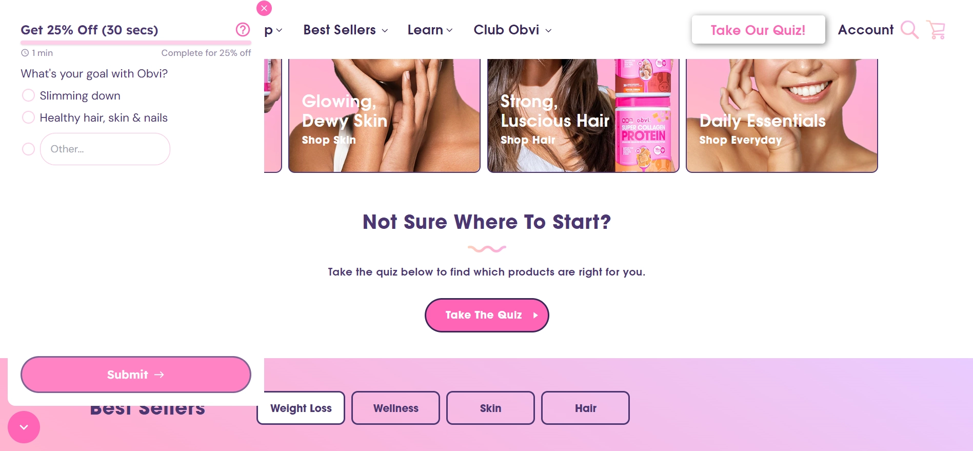
All that’s left to do is answer one question, which gives Obvi an idea of what you’re looking for.
Once you take the quiz, you can apply for the discount. However, the discount is valid for only 30 minutes, motivating you to purchase.
Pixie Ring
Pixie Ring offers a super minimalistic multi-step popup design. It’s pretty simple but has an interesting twist. Notice that under the main button, another button allows users to opt-out. It shows a less desirable option, and when the time comes to share the phone number, the button text changes to highlight the exclusivity of the offer.
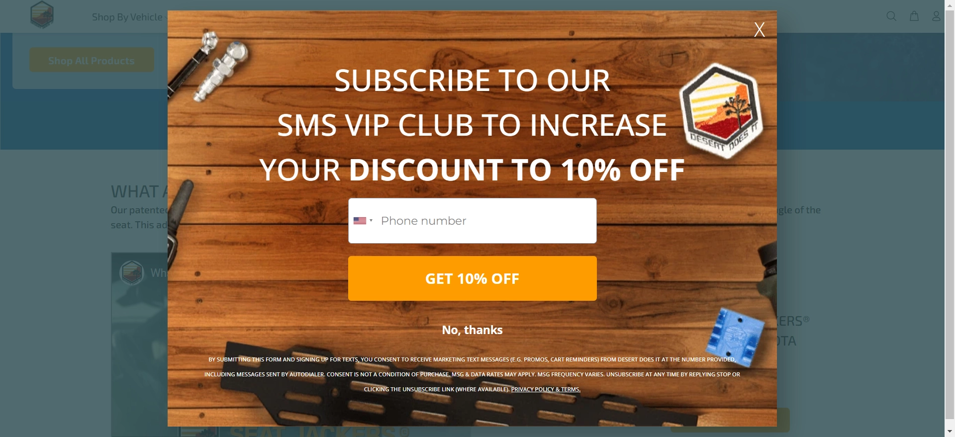
Desert Does It
The multi-step form from Desert Does It takes a different approach to capturing leads and enriching profiles. The widget is quite large, and since the background is dimmed, the focus is entirely on the form. They start by showing the incentive.
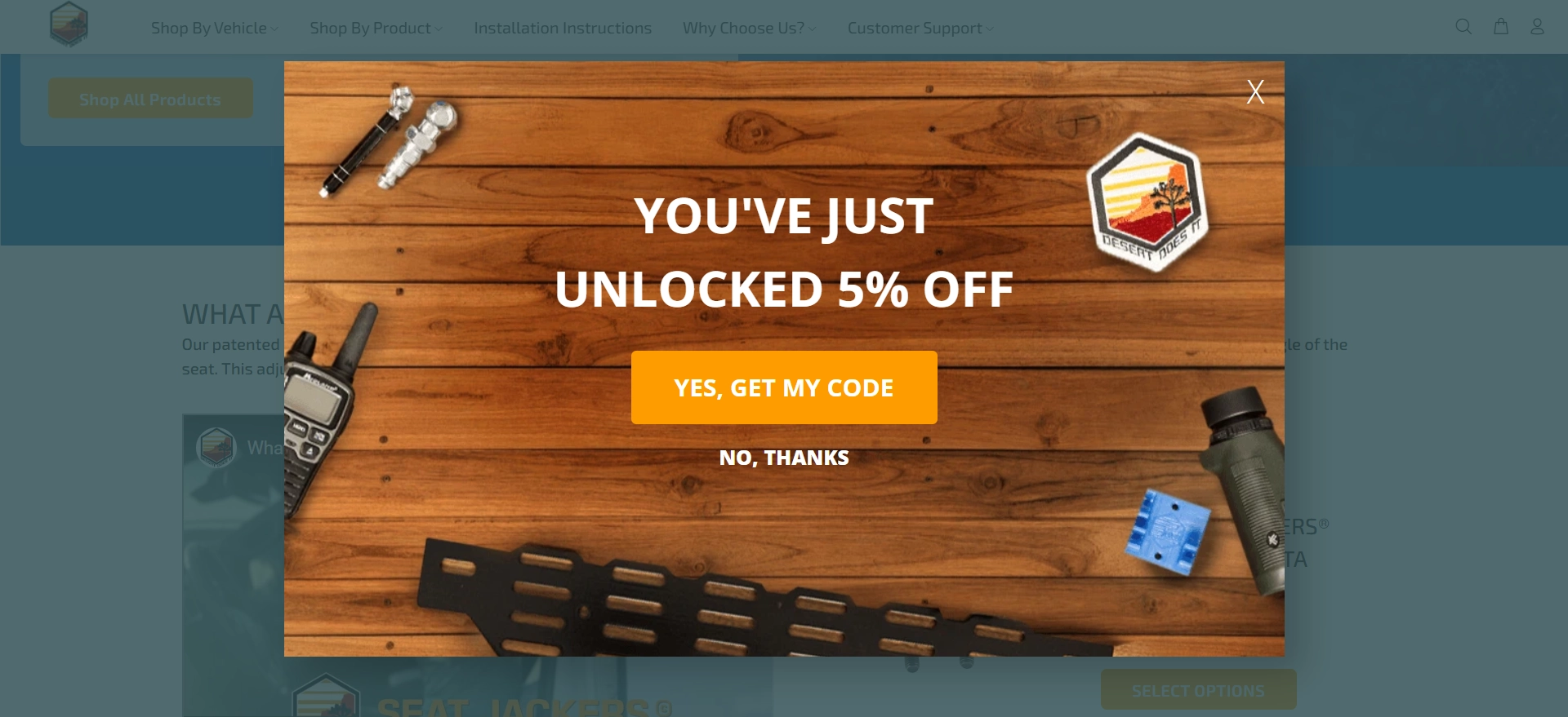
Then, the user is drawn into a quiz. The questions are short, and it’s easy to pick your answer, making this task feel like a nice walk in the park.
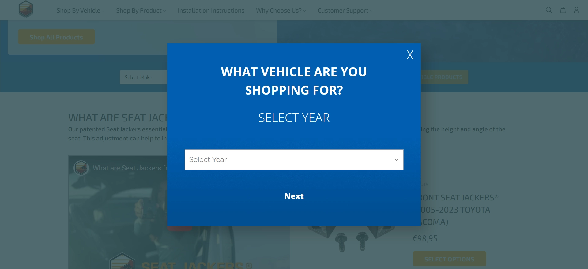
Ultimately, you get your code. But that’s not it!
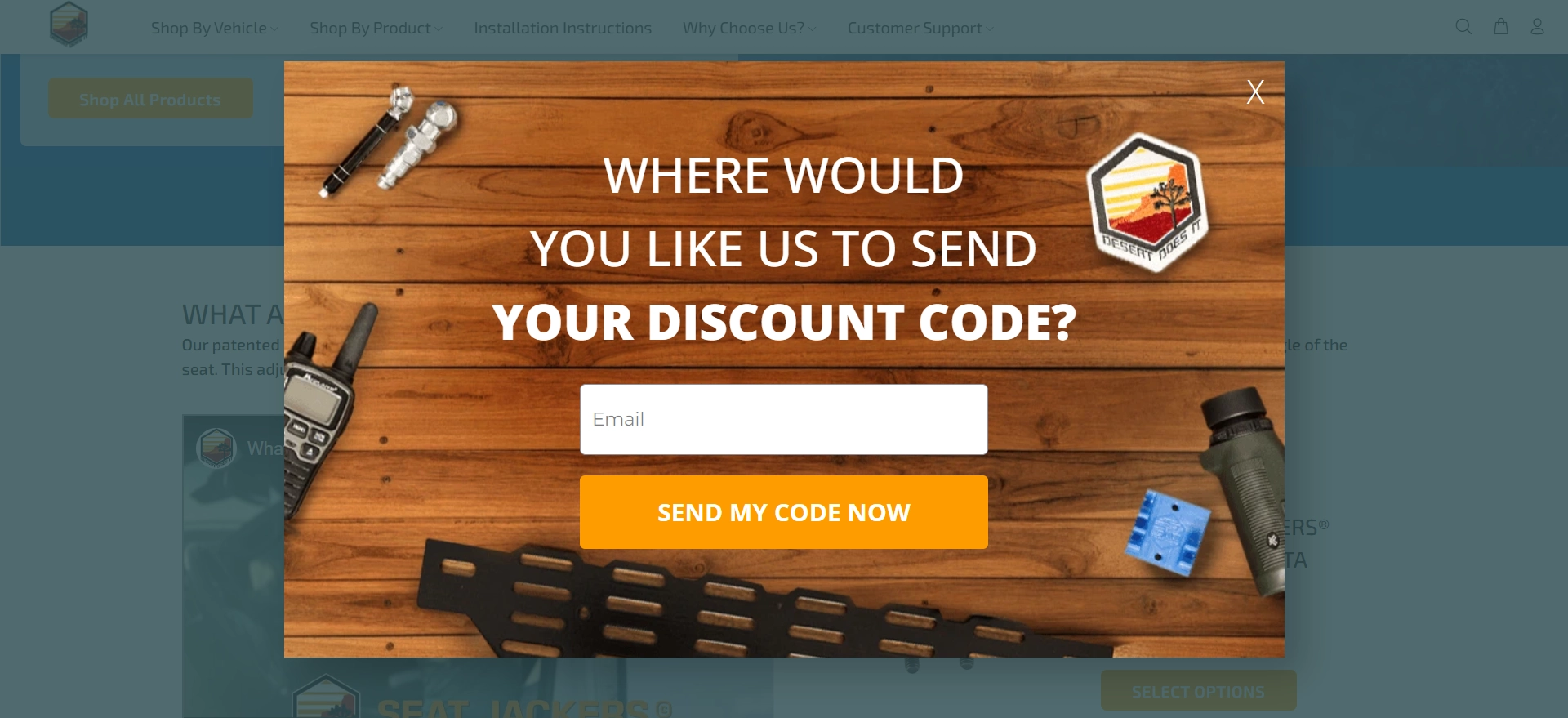
The company bumps up the discount, asking you to subscribe to SMS campaigns.
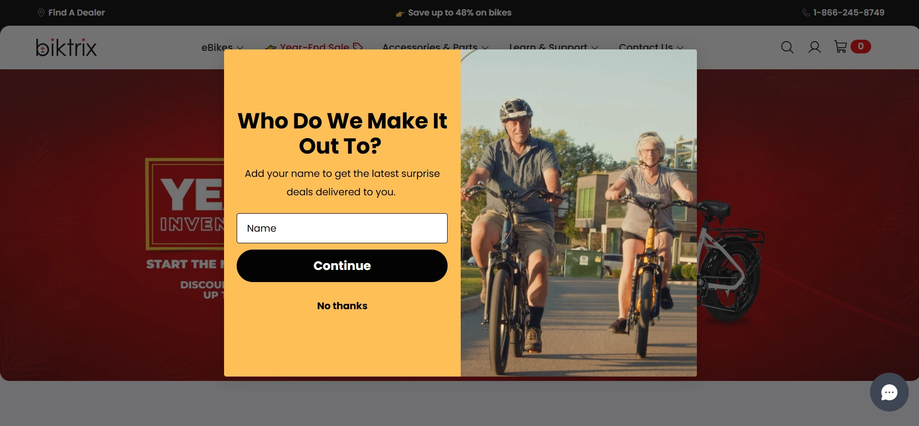
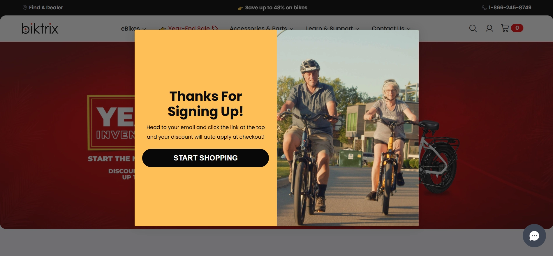
Biktrix
This next form is also quite simple yet has some interesting features. First, users are offered a fixed sum instead of a discount percentage. This move has its benefits. It’s straightforward and appeals to budget-conscious shoppers.
However, a percentage discount could be a better fit because bikes are expensive. Offering 10% off, for example, allows for scaling the discount and makes the incentive seem more attractive.
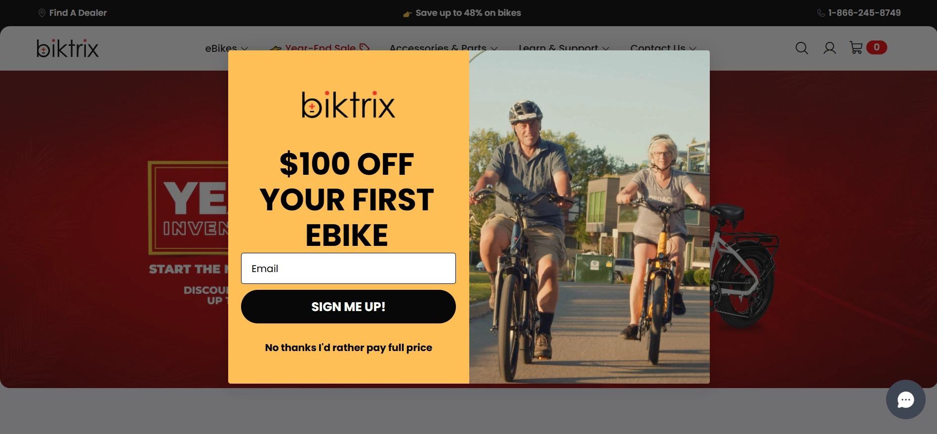
And again, there’s a button that implies a less desirable outcome if you click it.
Another interesting aspect of the form is that it collects only the name and email. This could easily be a single-step form. However, as we can see, splitting even such a simple form and supporting it with friendly copy can help reduce friction.
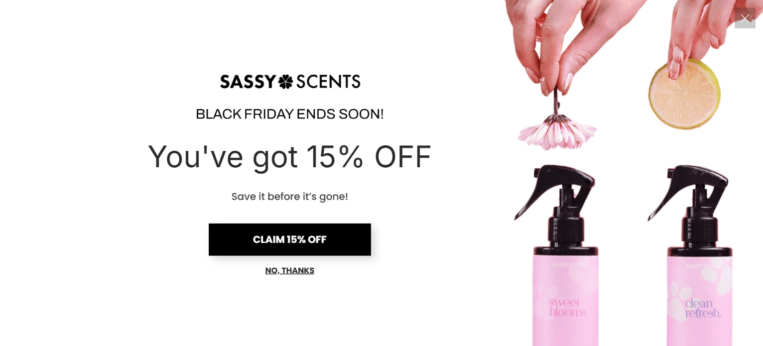
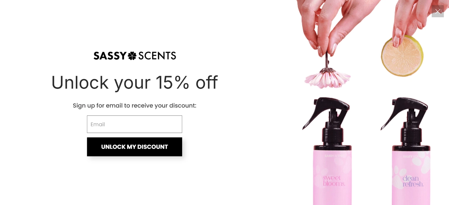
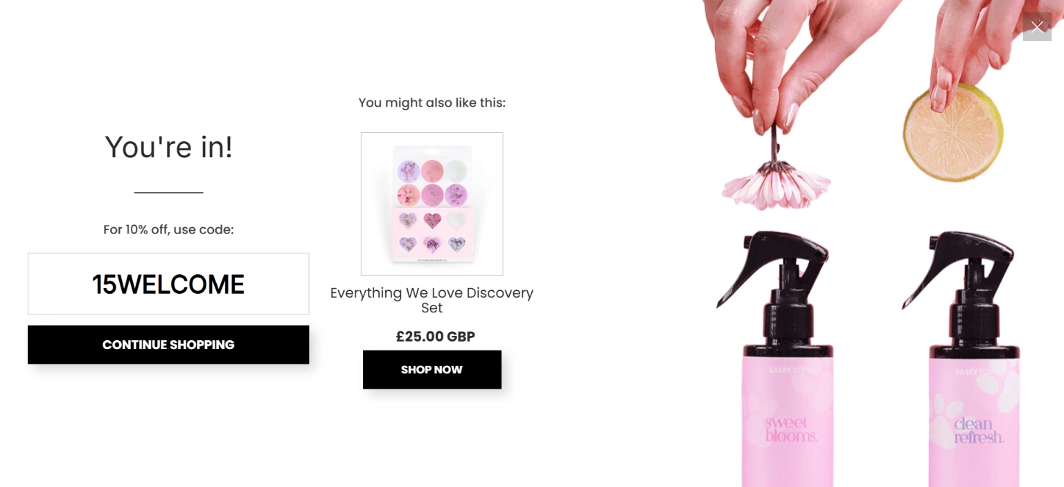
Sassy Scents
Here, we have an exit-intent, full-screen widget! It follows simple, linear logic to recover potentially lost customers. We believe the final screen is worth the attention. In addition to providing the code, the page also suggests a discovery set. It’s a simple suggestion but encourages you to buy from the business.
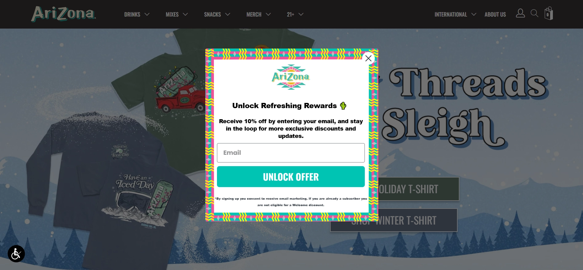
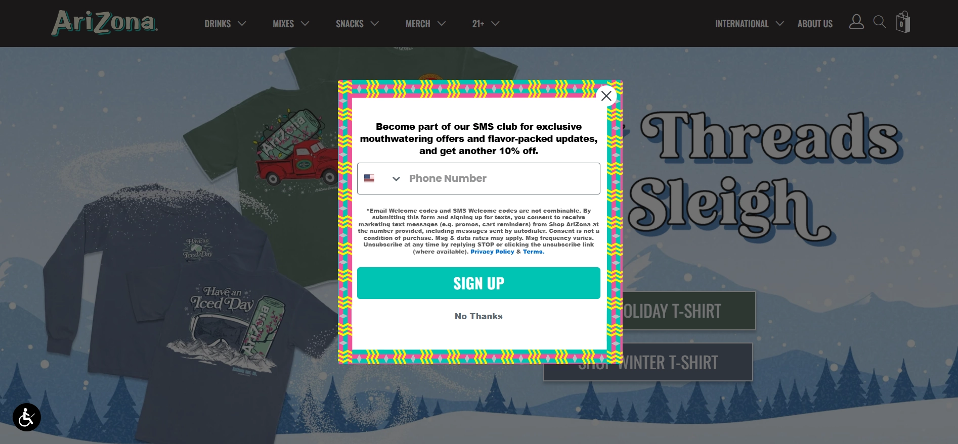
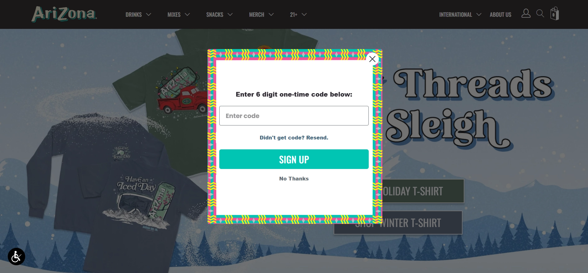
AriZona Beverages
Our final one for today is AriZona Beverages. The multi-step form perfectly complements the site’s theme and clearly outlines the benefits of sharing contact data. However, one thing could be improved.
The form doesn’t clarify that the phone field is required to complete the submission. Clicking “No thanks” simply closes the form, which might confuse visitors.
How to Create Multi-Step Form in Claspo
Claspo is a versatile and user-friendly widget maker that empowers you to create stunning multi-step forms for any device. It supports 50+ languages and seamlessly integrates with popular marketing tools — all at no cost.
With Claspo, you’re not just adding forms to your website; you’re creating a workflow that attracts potential customers and builds relationships with them. Let’s get into the multi-step form tutorial.
Step 1: Sign Up and Start Creating
Create a free Claspo account and get right into the creation process.
You’ll be introduced to our template catalog. In Use Cases, select Create Multi-Step, and you’ll see all multi-step form templates. Select the step form that fits your goals.

Step 2: Design Your Multi-Step Form
In this tutorial, we’ll be using the following template:
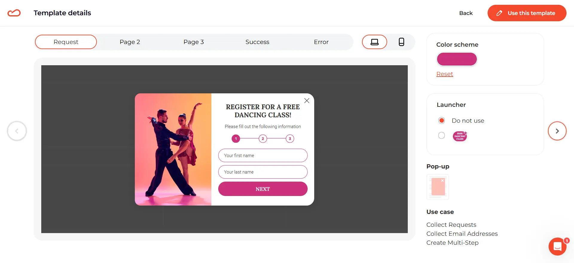
This form already has three steps:
- Step 1 collects personal information.
- Step 2 collects email and age.
- Step 3 captures contact details and the desired date of the class.
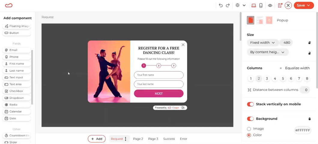
Here’s how you can customize each step of your multi-step form. Start with the main request form as your base.
IMPORTANT: If you’re using a linear form, follow along with the example in this guide. For more advanced forms, Claspo allows you to create multi-step forms with conditional fields.
Simply design the form’s logic, create the necessary pages, and link them using buttons. To set this up, go to the button settings (click the button > General > Action on click) and customize it to redirect respondents to the appropriate page.
Replace the last name field with a field for users to enter their age. This will help you better understand your audience and prepare targeted groups for your classes. Update the text under the heading to make it more engaging and add a sense of urgency to encourage action.
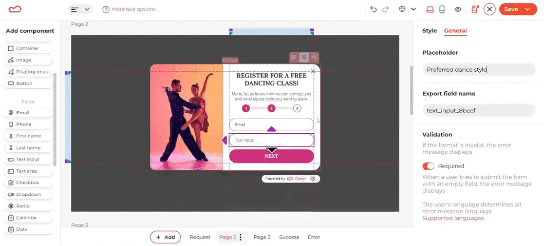
Now, let’s move to the next page. Here, you can ask for the user’s email and their preferred dance style. Just like in the first step, remove any default fields you don’t need and replace them with text input fields.
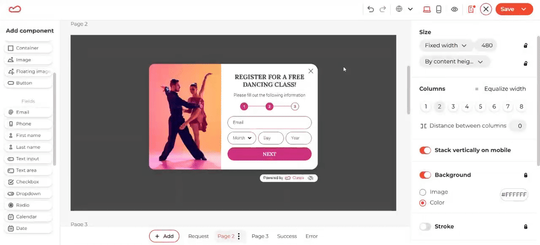
Add a short explanation under the heading to clarify why you’re collecting this information. To make the form more personal, use a merge tag to include the user’s name, which you’ve already captured. Consider swapping out the image to make the form feel more dynamic and engaging.
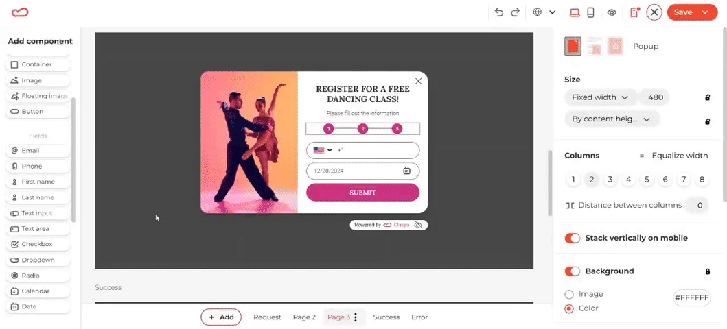
For the final page, replace the default text and image to match your brand’s style and tone. You can also make the phone field optional, giving users flexibility.
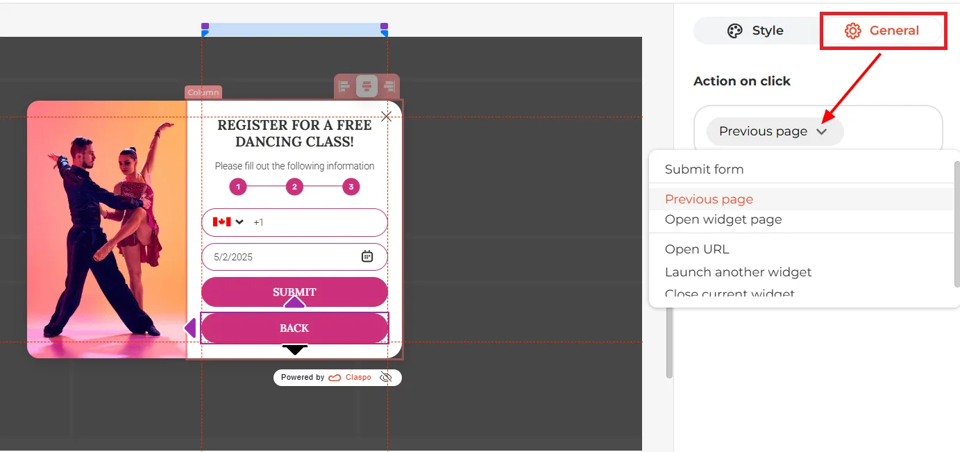
It’s a good idea to add a Back button here, just in case users want to change something they entered earlier. To set it up, add a second button to the widget, click it, go to the General tab, and choose ‘Previous page’ in the ‘Action on click’ dropdown. Done — now users can easily go back and make changes.
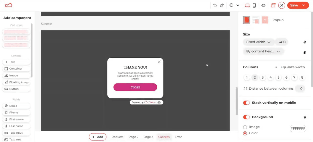
That’s it. Now, just configure the success and error pages. To customize the form, add more details about what to expect next and a merge tag with the first name.
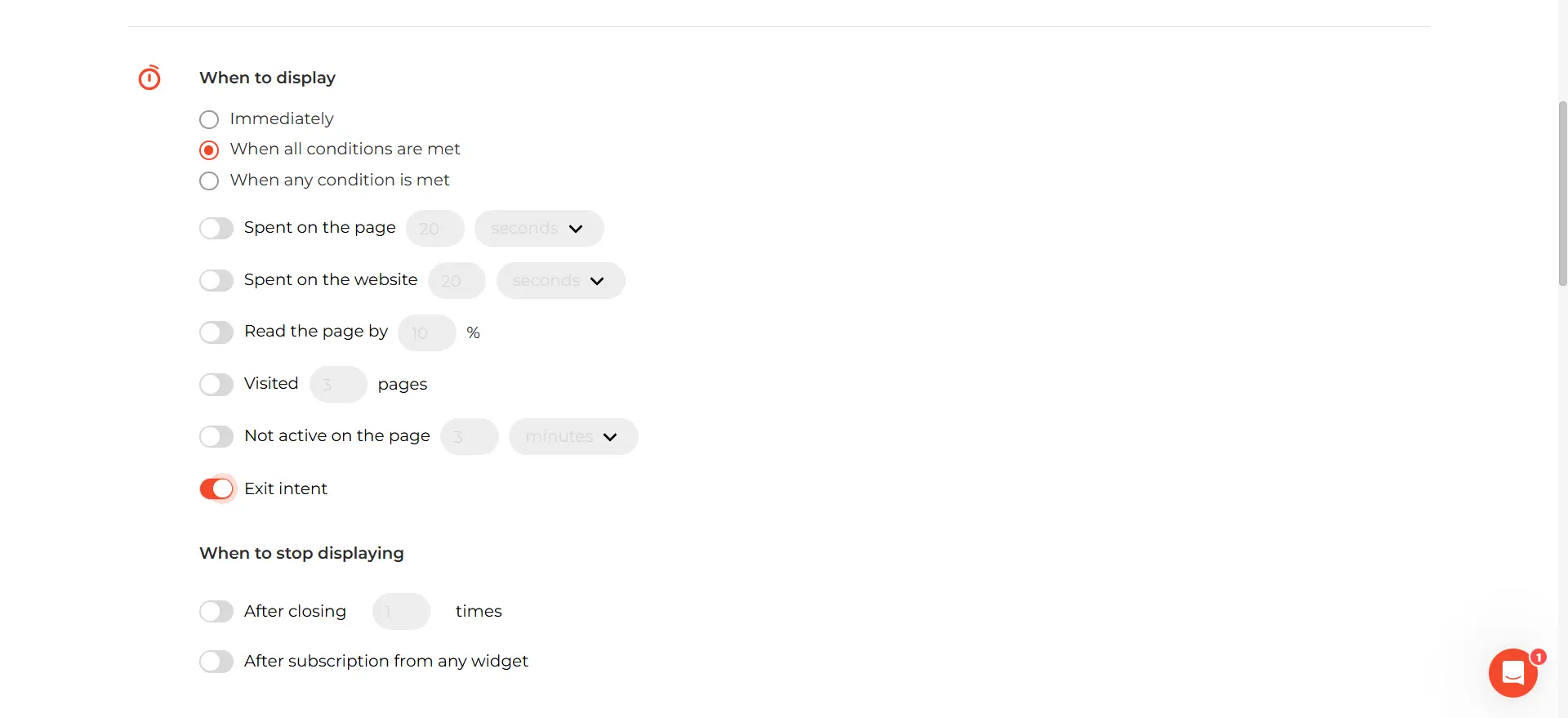
Step 3: Adjust the Display Rules
Now that the design is ready, let’s talk about display settings. This particular form is intended to be used to prevent website exit, so we’ll switch on the Exit intent toggle:
When you configure a multi-step form, you are free to change its purpose to match your goals. Claspo’s flexible rules allow you to fine-tune your targeting with precision. For example, you can choose which pages display the popup or target users based on their country or city.
Why not create tailored popups offering special rewards for specific locations? You can even incorporate UTM parameters to seamlessly align the popup with your broader campaign.
Claspo also offers three additional triggers for displaying your popups:
- Launcher Trigger: A small icon in the bottom corner of the page that users can click to open the popup anytime. You can set this up during the initial creation stage or add it later, giving users more control.
- HTML Click Trigger: Use any clickable element (like an image, button, or text link) to display the popup.
- API Trigger: This advanced option allows you to programmatically control when and how popups appear. It is perfect for integrating with other tools or customizing the user experience; however, it requires technical knowledge.
Step 4: Connect Your Marketing Tools
The final step is to connect Claspo to your other tools, such as your CRM or email service provider. This integration ensures that all the information collected through your form is automatically sent where needed, whether creating leads in your CRM or triggering email campaigns.
Claspo supports direct integration with many popular software tools. Just select the tools you use and map the fields to ensure all the data is transferred and stored correctly.
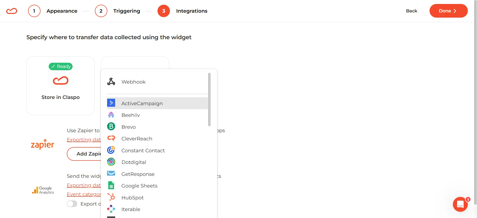
If your preferred software isn’t on the integration list, no problem. You can create a webhook to send the form data to almost any system.
Step 5: Test and Optimize
To get the best results from the step-by-step form, we suggest you test multiple versions. With just a few clicks, you can set up split tests to compare different versions of your widgets. Claspo automatically tracks performance metrics, giving you valuable insights into what works best.
For even better results, you can use tools like heatmaps to see where users click on your forms. Use that information along with Claspo’s stats to make changes and create popups that work even better.
Bonus Tips for Creating a Multi-Step Form
1. Choose the Right Layout Format
The layout of your multi-step form matters. Overlay popups and built-in widgets are generally the best options because they give you enough space.
However, you’ll notice that Claspo also offers floating box templates, which are compact and perfect for subtle placements. If you’re going to use a floating box template, keep each page digestible with no more than two or three fields per page.
2. Ask for Essential Information Only
Keep your form focused and to the point. Limit your questions to what’s absolutely necessary for your goal. When the requested information is relevant, users are more likely to share it simply because it makes sense. You’ll also enrich the customer profile with truly necessary details.
3. Incorporate Personalization
Add a personal touch with Claspo’s merge tags to address users by name or reference their previous actions. This simple move makes the experience of interacting with the form more personal, increasing trust in your business.
4. Use Approachable Language
The tone of your form can greatly impact user experience. Write field labels and instructions in a friendly, approachable style. For example, instead of “Phone,” use “What’s the best number to reach you?” This makes the form feel less transactional and more inviting.
5. Test for Readability
Ensure all text in your form is easy to read on any device. Use clear fonts with a legible size on both mobile and desktop and sufficient contrast between text and background. Avoid overly long sentences or jargon, keeping instructions and labels concise.
Collect User Data Effectively with Multi-Step Forms
Multi-step forms are a great way to connect with your audience, get more leads, and increase your website conversion. Sign up for Claspo to create your multi-step form. You’ll have access to all features — customizable templates, advanced targeting, and more — on a free forever plan. There are no commitments or hidden fees, just an opportunity to see how it can work for your business.


![Best Email List Builders to Grow Your Marketing in 2026 [Free & Paid]](https://static.claspo.io/var/www/html/public/photos/shares/Blog/новые картинки/Best_Email_List_Builders_to_Grow_Your_Marketing_2.webp "You Might Be Interested in")

