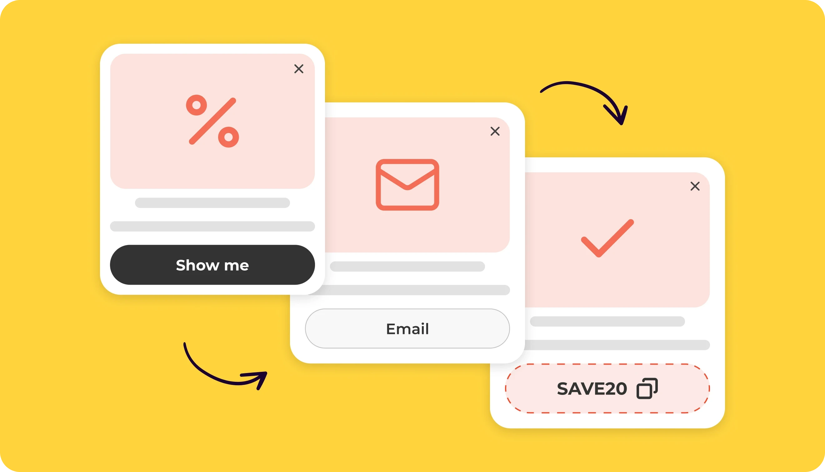
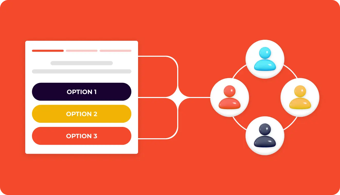
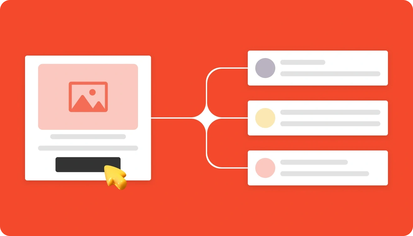
15 Email Opt-In Examples: Forms, Wording & Best Practices

![15 Email Opt-In Examples: Forms & Wording [2026]](https://framerusercontent.com/images/mLpQ9YplD82hM6xezzIBZHNRK4.webp?width=2640&height=1512)
Summarize
Are you planning an email opt-in campaign and need some inspiration? We’ve got your back. There are many ways to collect email addresses for your list, from popups and slide-ins to inline and fullscreen forms. In this article, we’ve analyzed 15 email opt-in form examples from businesses in fashion, media, finance, food, beauty, and other industries. We’ll look at the format and design of all the opt-in samples, the wording used to communicate its value, and the ideas you can adapt for your own email campaign.
TL;DR: What makes an opt-in form convert
An opt-in form collects email addresses from people who want to receive newsletters from a company.
In Claspo’s three-year study of 779+ million impressions, signup forms achieve a 3.53% conversion rate. Gamified signup forms average 9.18% CR.
95% of top signup forms use only one or two fields.
94% of the top 1% of signup forms use a single CTA.
Strong opt-in forms explain what subscribers will receive and lead to one clear action.
What is an opt-in form?
An opt-in form asks website visitors for their email and consent to receive emails from a business. Companies use these forms for newsletters, product announcements, discounts, early access, resources, and personalized recommendations.
Opt-in email marketing is permission-based, so the form should clearly explain what subscribers will receive.
Format | Best for |
Popup | Welcome offers and list growth |
Embedded form | Blogs, landing pages, and footers |
Floating form | Persistent, lower-pressure signup |
Multi-step form | Segmentation and preferences |
Gamified form | Ecommerce rewards and promotions |
Email opt-in form benchmarks for 2026
So, what is a good conversion rate for an opt-in form? There is no single benchmark that applies to every campaign. Performance depends on the industry, traffic source, offer, form format, timing, targeting, and visitor intent. Still, benchmark data gives you a useful starting point.
We analyzed popups with more than 779 million impressions across conversion-related parameters, including form structure, layout, incentives, copy, interactive elements, visual style, and UX clarity. As a result, regular signup forms averaged a 3.53% CR. Gamified signup forms averaged 9.18% — around 2.6 times higher.
Opt-in form type | Average conversion rate |
All signup forms | 3.53% |
Fullscreen forms | 7.17% |
Popups with a teaser | 6.89% |
Gamified signup forms | 9.18% |
Spin-the-wheel forms | 9.25% |
Scratch card forms | 11.29% |
Gift box forms | 7.26% |
Top 25% of gamified forms | 26.41% |
Average opt-in form conversion rates by industry
Our study of 779M impressions found substantial differences between industries:
Industry | Average conversion rate for growing an email list |
Food and drinks | 7.18% |
Ecommerce | 5.19% |
Education | 4.99% |
Travel and tourism | 2.59% |
SaaS | 1.17% |
Media and publishing | 0.24% |
Each industry must treat its visitors differently. A 3% conversion rate could be weak for a food business but strong for a media website. Visitors in these industries have different expectations and reasons to subscribe. Ecommerce audiences often respond to discounts, product drops, or early access. SaaS visitors may need a useful guide or product-related incentive. Use the closest industry and format as your initial benchmark. Then compare your campaign with its own previous results as you test the offer, language, layout, timing, and targeting.
15 Best email opt-in form examples and why they work
We divided the examples by tactic so you can see which formats work best for different goals.
PuriFire: Welcome discount opt-in form
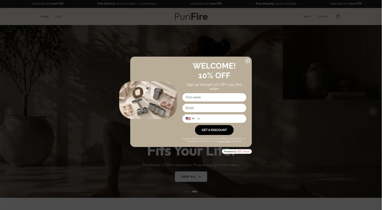
Goal: Turn first-time visitors into subscribers and encourage a first purchase.
Opt-in wording: “Welcome! 10% off” shows off the incentive straight away. The CTA, “Get a discount,” adds action and connects the signup to the reward.
Why it works: The offer is easy to understand, the product image shows what PuriFire sells, and the popup design matches the website. It also has a visible close button, a marketing email disclosure, unsubscribe information, and a privacy policy link.
What to test: The first name, email, and phone fields create more friction than an email-only form. PuriFire could test fewer fields and change the CTA to the more specific “Get 10% off.” The phone field also needs a clear purpose: if it supports SMS marketing, the form should state that separately.
Caraway: Free-shipping email opt-in form
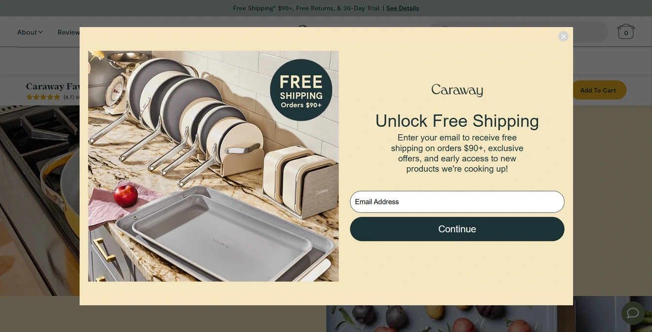
Goal: Grow the email list with free shipping.
Opt-in wording: “Unlock Free Shipping,” plus exclusive offers and early product access.
Why it works: The incentive and threshold are specific, and the product image reinforces the shopping experience. Our opt-in growth study found a 15–25% average lift when forms replaced a generic newsletter ask with a stronger incentive such as free shipping. Last but not least, the form asks only for an email, which makes it easier for visitors to take the first step.
What to test: Replace the generic “Continue” with “Unlock Free Shipping” and add clear consent text.
Robinhood: Newsletter opt-in form with a specific content promise
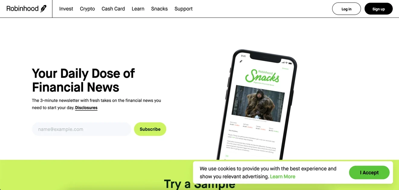
Goal: Turn visitors to Robinhood’s financial news page into daily newsletter subscribers.
Opt-in wording: Robinhood makes a simple promise: fresh financial news every day in a three-minute read.
Why it works: The form is the first thing visitors see on the landing page. The copy answers three important questions: What will I get? How often will it arrive? How long will it take to read? The phone preview also shows what the newsletter looks like. Our data shows that email-only forms get a 2.48% CR, and Robinhood keeps the signup to that single field.
What to test: Replace the generic “Subscribe” CTA with “Get the 3-minute newsletter” and add a short note about privacy or unsubscribing.
Grand Island Holidays: Early-access opt-in form
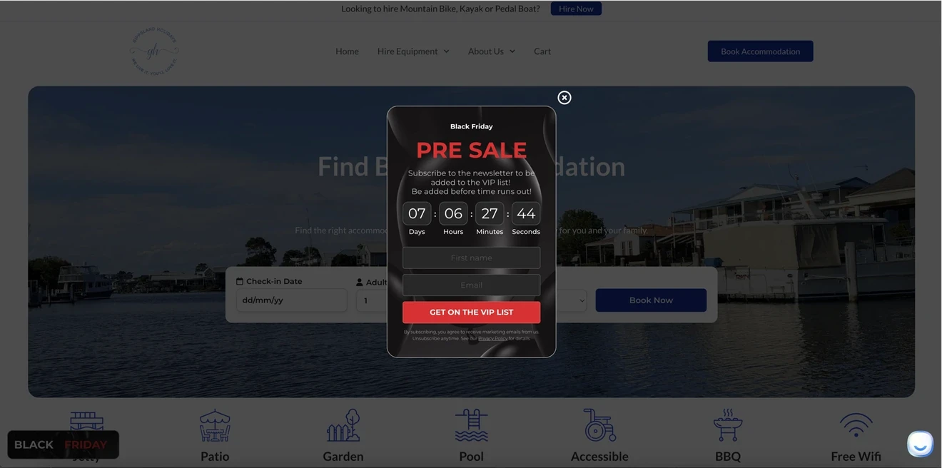
Goal: Grow a VIP list before the Black Friday presale.
Opt-in wording: “Subscribe to the newsletter to be added to the VIP list,” followed by the CTA “Get on the VIP List.”
Why it works: The benefit, deadline, countdown, and next action are easy to understand. Our benchmark shows that a combination of an email field and a countdown timer results in a 2.56% CR on average. The form also includes marketing consent, an unsubscribe note, a privacy policy link, and a visible close button.
What to test: State what VIP members get. For example: “Book our Black Friday offers 24 hours before everyone else.” This would give people a stronger reason to sign up.
Bansko Mountain Living: Product launch or waitlist opt-in form
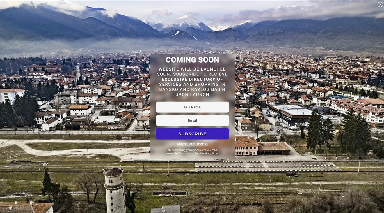
Goal: Collect emails before the website launches.
Opt-in wording: “Coming soon” sets the context. The form promises an exclusive directory of services and places to shop in Bansko and the Razlog Basin. Subscribers will receive it when the website launches.
Why it works: The offer is clear and useful. The location photo supports it. Travel signup forms average a 2.58% CR in our benchmark, with the top 10% reaching 13.98% CR. Bansko also keeps the form to two fields and includes consent and unsubscribe text.
What to test: Add an expected launch date. “Get the Directory at Launch” would also be clearer than “Subscribe.”
Charlotte’s Web: Sample opt-in form with a personalized offer
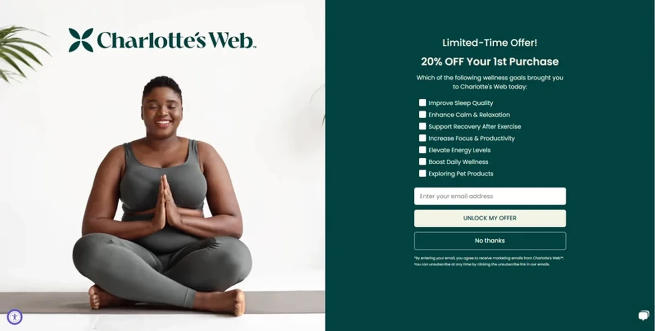
Goal: Collect an email, learn what each shopper wants, and encourage a first purchase with 20% off.
Opt-in wording: “20% off your 1st purchase.” Visitors choose their wellness goals before entering an email. The CTA is “Unlock My Offer.”
Why it works: The offer is clear, and the image fits the brand. The checklist helps Charlotte’s Web send more relevant emails. The “No thanks” button makes the form easy to dismiss and increases conversions because visitors have the choice to reject the offer.
What to test: Shorten the list or add “Choose all that apply.” Seven options may slow visitors down, and it’s unclear whether they can select more than one.
Trail Cam Rookies: Lead magnet sample opt-in form
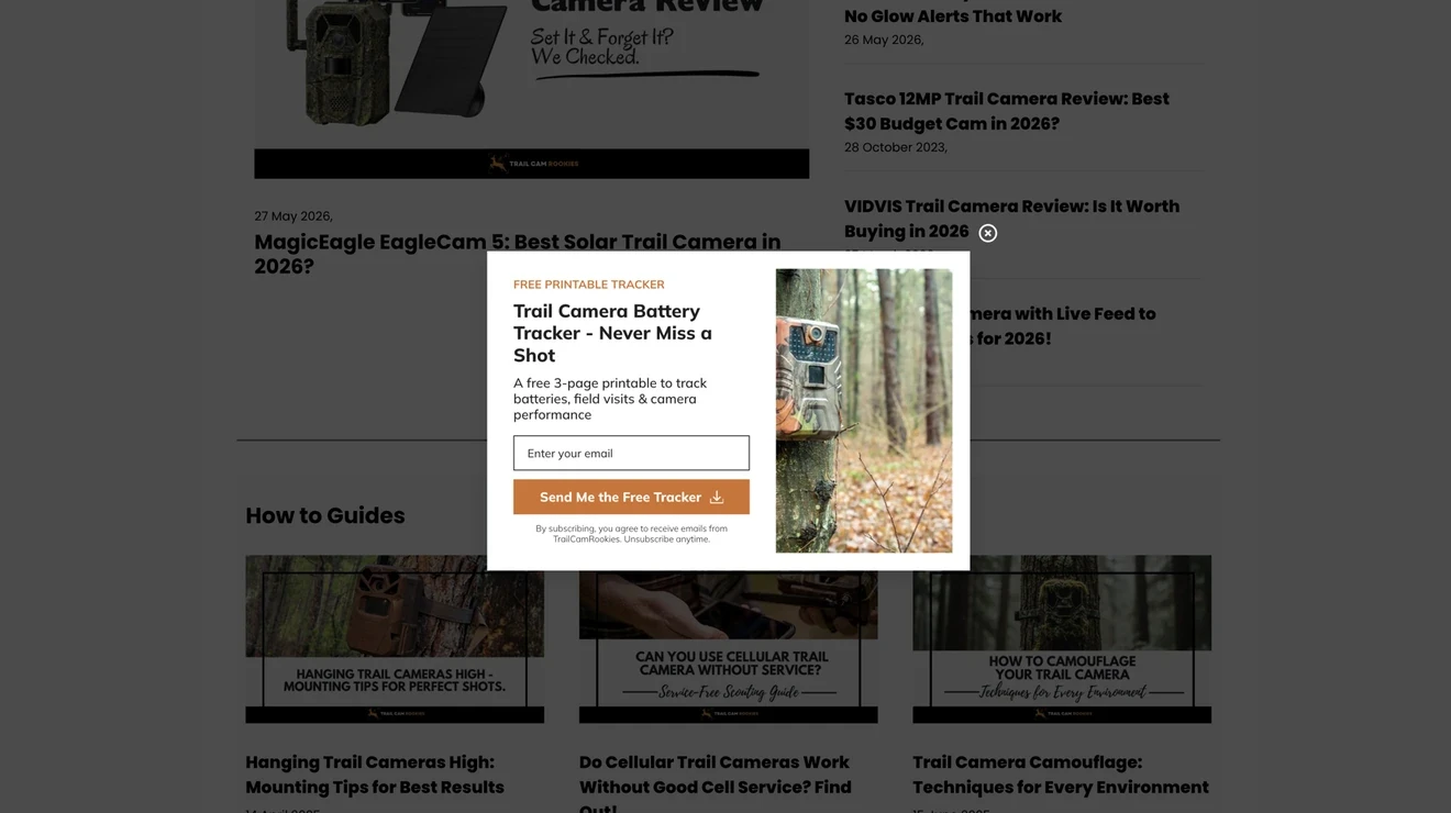
Goal: Turn blog readers into subscribers with a free three-page tracker.
Opt-in wording: The copy explains what the camera does, and the CTA “Send Me the Free Tracker” prompts action.
Why it works: The tracker solves a specific problem. Visitors know exactly what they will get. Free resources such as checklists appear in 17% of the top 1% signup forms in our benchmark. The form asks for only an email and clearly mentions future emails.
What to test: Show a preview of one page. This would make the tracker feel more useful before signup.
Bellya: Quiz example opt-in form
Goal: Learn what visitors want.
Opt-in wording: Take a short quiz and get 10% off. The final step also promises supplement tips and promotions.
Why it works: The discount is clear from the start. The next step asks what the visitor wants. The final step asks only for an email. In our benchmark, multi-step popups get a 4.94% avg CR. Standard email popups convert at 3.67%. The consent text also explains what subscribers will receive and how to unsubscribe.
What to test: Use the same discount promise on every step. The first screen says both “10% off” and “up to 10% off,” but the later steps promise a fixed 10%.
Earthbound: Preference-based newsletter opt-in example
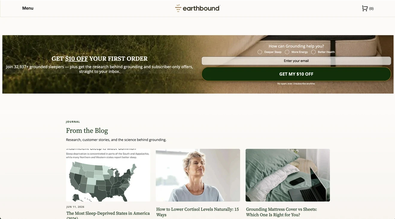
Goal: Collect emails and learn what each subscriber wants help with.
Opt-in wording: “Get $10 off your first order.” The form also promises grounding research and subscriber-only offers. Visitors choose between deeper sleep, more energy, and better health. The CTA is “Get My $10 Off.”
Why it works: The reward and future emails are clear. The preference question groups subscribers by goal, and Earthbound gets useful data. Email and preference forms get a 2.38% avg CR in our benchmark. Besides, the “32,937+ grounded sleepers” claim also adds trust.
What to test: Test the form with and without a required preference. See whether the extra data is worth any change in signup rate.
WHOSE: Gamified ecommerce opt-in form
Goal: Collect emails and turn Black Friday traffic into sales.
Opt-in wording: Visitors enter their name and email, tick the consent box, and spin for a reward. Prizes include discounts, free shipping, and gifts. The “I want my code” CTA adds a sense of agency.
Why it works: Shoppers see their promo code right after the spin. They can continue to checkout instead of checking their inbox. The different prizes give people a reason to play, and WHOSE can set the odds for each reward. In our recent benchmark on gamification, ecommerce opt-in forms with gamified elements reach an 8.08% CR, while Spin-the-wheel popups average 7.92%. The top 10% of best-performing popups reached 43.19% avg CR. The popup design also matches the WHOSE brand and includes clear consent.
Results: In this case study, the popup collected 4,450 subscriptions from 10,468 views in seven days. WHOSE reported signup rates as high as 50%, up from its usual 3–5%. Nearly 30% of participants used their codes at checkout.
What to test: Compare the name-and-email form with an email-only version. Also test different prizes and winning odds.
Organnact: Exit-intent discount opt-in form
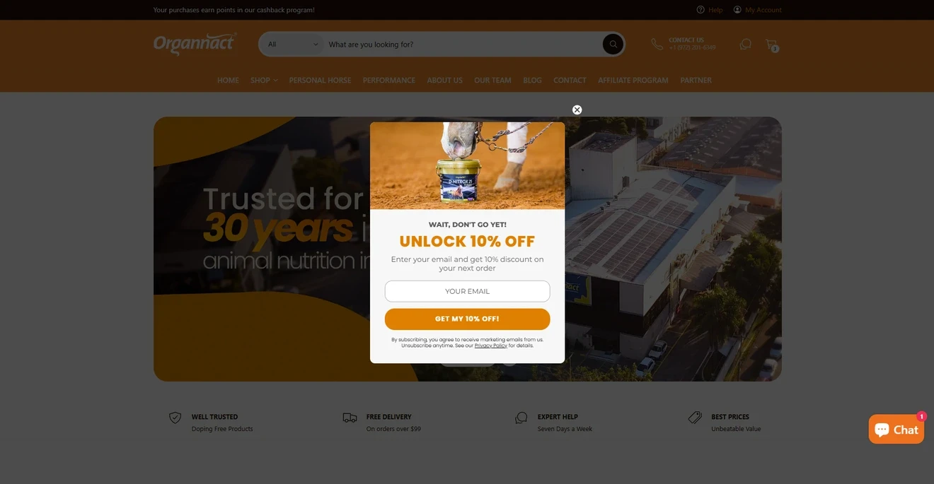
Goal: Turn leaving visitors into subscribers and encourage them to purchase goods with 10% off their next order.
Opt-in wording: “Wait, don’t go yet! Unlock 10% off.” The CTA repeats the reward: “Get my 10% off!”
Why it works: The offer is clear, and the form asks for only an email. The product image also fits the page. In our benchmark, forms with an email field + promo code + exit-intent trigger get a strong average conversion rate of 5.76%. Organnact also includes consent text, an unsubscribe note, a privacy link, and a visible close button.
What to test: Match the image and discount message to the product category each visitor viewed.
RYP: Full-screen multi-step email and SMS opt-in form
Goal: Collect email and SMS opt-ins, learn what each shopper wants, and share a 10% discount.
Opt-in wording: “You’ve got a mystery discount.” Visitors first choose why they came to RYP. The next steps ask for an email and phone number. The final screen reveals the code “WELCOME10.”
Why it works: The form asks for one thing at a time, and this keeps each screen simple. The phone step includes clear SMS terms and a consent checkbox. Fullscreen popups get visitors’ full attention and have a 7.17% avg CR in our benchmark. RYP’s popup also shows the discount code right away, so shoppers can continue to checkout.
What to test: Add a clear option to skip the phone step. Compare total signups and SMS subscriptions with the current flow.
Trinny London: No-discount ecommerce form
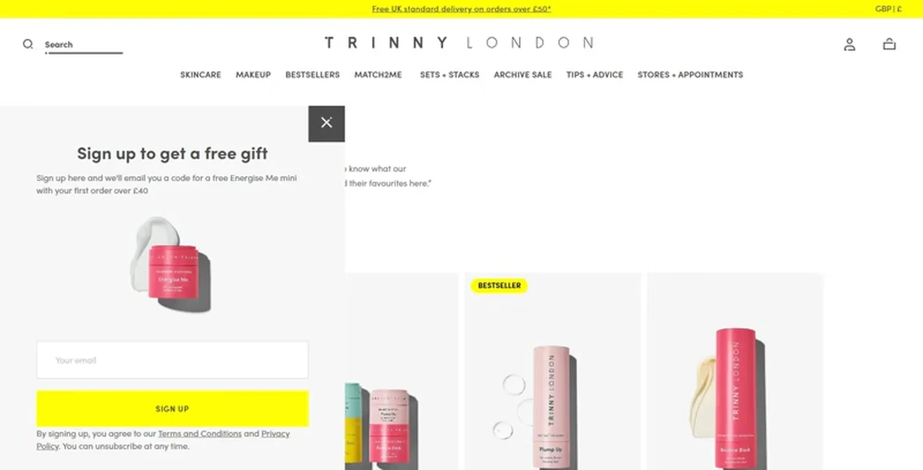
Goal: Grow the email list and encourage a first order over £40 with a free mini product.
Opt-in wording: “Sign up to get a free gift.” The supporting text names the gift and explains the £40 minimum order. The CTA is “Sign Up.”
Why it works: The gift is specific, and the product image makes it feel real. Freebies appeared in 17% of the top 1% signup forms in our benchmark. They add value and keep the product price unchanged. The form asks for only an email and includes privacy and unsubscribe information.
What to test: Compare the free gift with a fixed discount or free shipping. Track both signups and profit from first orders.
Nature: Content-site newsletter opt-in form
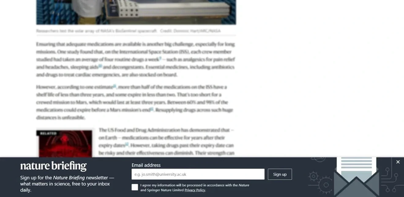
Goal: Turn article readers into subscribers to the daily Nature Briefing newsletter.
Opt-in wording: “What matters in science, free to your inbox daily.” The CTA is “Sign up.”
Why it works: The form stays at the bottom of the screen and lets people keep reading. Its blue-gray design matches the website. The envelope icon signals email, and the copy explains what subscribers will receive. Media signup forms averaged a 0.33% CR in our benchmark. Floating bars averaged 0.20%. This format protects the reading experience, but it may collect fewer emails than a more visible popup.
What to test: Show the form after readers have scrolled halfway through the article or reached the end. Visitors are more likely to subscribe after spending time with the content.
BYRDIE: Footer inline opt-in form with on-brand wording
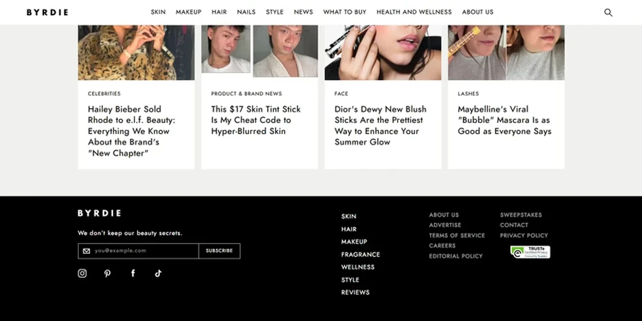
Goal: Turn readers who reach the footer into email subscribers.
Opt-in wording: “We don’t keep our beauty secrets.” The CTA is “Subscribe.”
Why it works: The headline turns a basic newsletter ask into a promise of useful beauty advice. It suits the brand and sparks curiosity. The form also has one email field and one CTA. Nearly 9 in 10 top signup forms in our benchmark use only 1 or 2 fields, and 94% use a single CTA. The clean footer placement also matches the site’s design.
What to test: Replace the generic “Subscribe” with “Get the Beauty Secrets.” This would connect the CTA directly to the promise.
Email opt-in language: what should the form say?
Good email opt-in language tells visitors what they will get, why it is useful, and what happens after signup. A simple formula is:
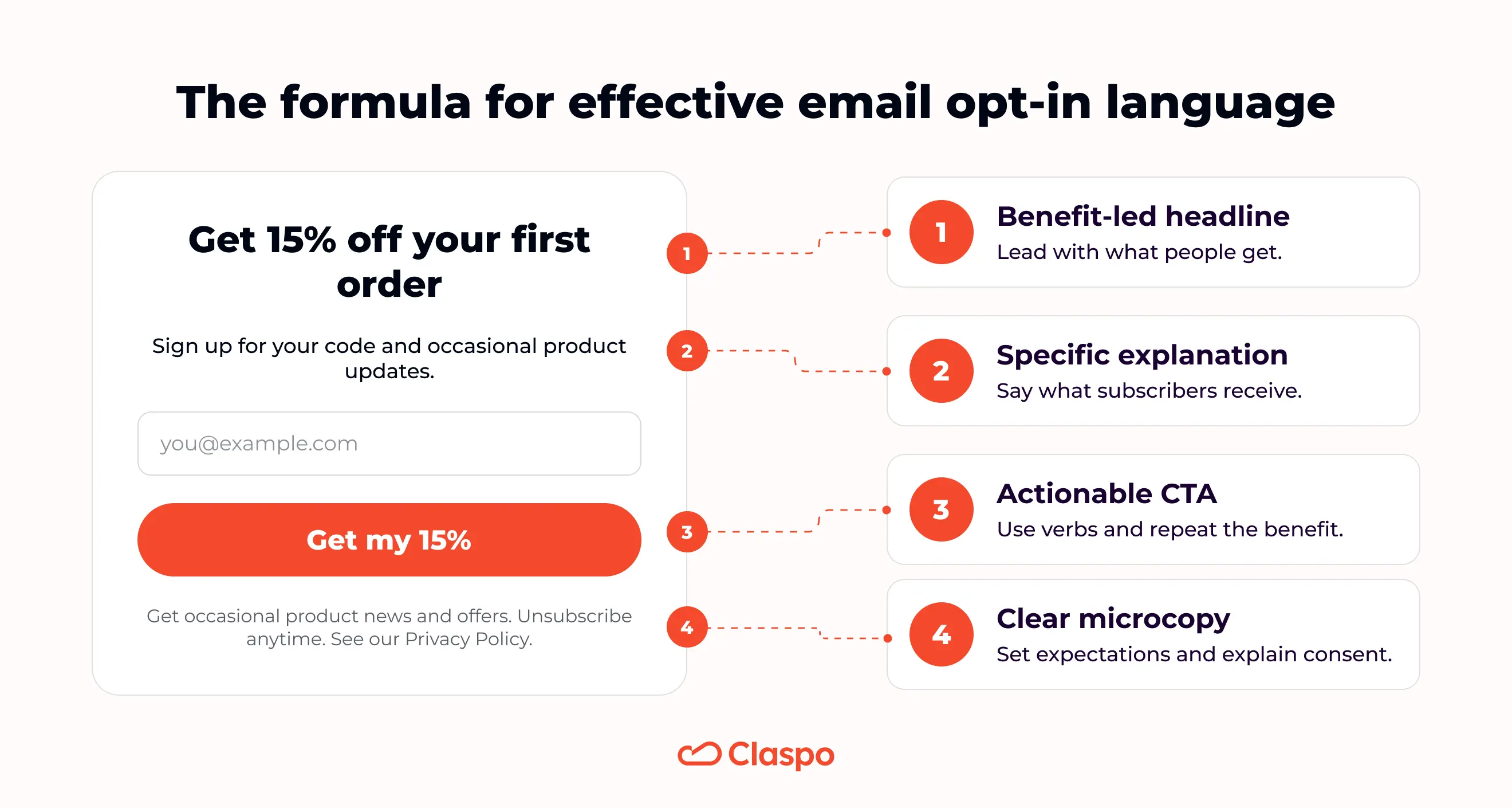
Benefit-led headline + specific explanation + actionable CTA + clear microcopy.
Lead with the benefit. Give people a clear reason to subscribe. This could be a discount, useful content, early access, or a free resource.
Explain what subscribers will receive. Name the content and how often it arrives. “Daily financial news in three minutes” is stronger than “Sign up for updates.”
Use a value-led CTA. Repeat the benefit in the button, such as “Get my 15% off” or “Send me the ideas.” Keep one main CTA. In our benchmark, 94% of top-performing signup forms used a single CTA.
Set clear expectations. Explain what messages subscribers agree to receive. Mention the option to unsubscribe and link to your privacy policy. If you collect a phone number, explain the email and SMS permissions separately.
Here are four email opt-in wording examples you can adapt:
Use case | Headline | Supporting line | CTA |
Ecommerce discount | Get 15% off your first order | Sign up for your code and occasional product updates. | Get my 15% off |
Newsletter | One useful growth idea every Friday | Get practical advice for your next campaign. No spam. | Send me the ideas |
Early access | Shop the next drop first | Subscribers get access before the launch. | Get early access |
Lead magnet | Build a better welcome campaign | Get the checklist and practical examples in your inbox. | Get the checklist |
Microcopy example: “Sign up to receive product news and offers from us. Unsubscribe anytime. See our Privacy Policy.”
Add links to every policy or set of terms mentioned in the microcopy.
What the best opt-in forms have in common
As you can see from the opt-in campaign examples above, the best opt-in forms make signup easy and show a relevant offer at the right moment. Our benchmark points to five practical principles:
Ask only for information you will use. One or two fields are enough for most campaigns. Add preferences only when they support useful segmentation.
Match the incentive to the audience. Test discounts, fixed rewards, free shipping, gifts, useful content, or early access.
Keep urgency genuine. Use countdowns only for real deadlines or limited offers.
Control timing and frequency. Choose triggers that fit the page and visitor journey. Don’t show the same form too often. With Claspo, you can A/B test up to five variants of the same popup, including timing, triggers, popup, and teaser design variations, and compare the performance with a different popup.
Make the form easy to dismiss and use. Include a visible close button, add a Teaser to keep the closed form accessible, and test each mobile opt-in form for layout, fields, and CTA.
Create your own email opt-in form
Use these examples and benchmarks as a starting point for your next campaign. With Claspo, you can choose a ready-made opt-in form template, customize the design and wording, set display rules, and publish the form on your website with no code.
Start free and test different offers, formats, and messages to find what works for your audience.
FAQ
What is an opt-in form?
An opt-in form is a signup form that asks visitors for their email address or phone number and permission to receive messages. It can appear as a popup, embedded form, slide-in, floating bar, or fullscreen offer.
What is a good opt-in form conversion rate?
Around 3.5% is a useful starting benchmark for signup forms. In the Claspo benchmark study, signup forms averaged a 3.53% conversion rate. Results vary across industries, formats, offers, and traffic sources, so compare your form against its previous performance too.
What should an email opt-in form say?
An email optin form should state the benefit, explain what subscribers will receive, use a CTA connected to the offer, and set clear expectations. It should also mention the option to unsubscribe and link to the privacy policy.
How many fields should an opt-in form have?
Most opt-in forms should start with one or two fields, usually an email address and an optional name. Nearly nine in ten top-performing signup forms in our benchmark used only one or two fields. Ask for preferences or phone numbers only when you have a clear use for them.
What is the difference between single and double opt-in?
Single opt-in activates the subscription as soon as someone submits the form. Double opt-in sends a confirmation email and activates the subscription after the recipient confirms their address. Single opt-in has fewer steps, while double opt-in verifies the address before sending messages.