Annoying Pop-Ups Cost You Sales — Here’s How Teasers Fix It
Imagine a potential customer comes to your site in search of a pair of shoes. As soon as they start scrolling, a “Subscribe now” pop-up slams the display. They click the ✕ button without reading your offer. Seconds later, another pop-up interrupts. When they try to view the product details, yet another pop-up covers the screen, asking to leave their phone number to stay “in the loop”. Frustrated, they leave.
Marketers know this feeling so well: you need pop-ups to get leads, but with every new pop-up comes the risk of annoying visitors and driving them away. Campaigns have become a walk on a tightrope between getting sign-ups and keeping users engaged. The real question is: how do you keep your offers visible without driving visitors away? The good news: there is a subtle way.
Problem: Why Are Website Popups So Annoying?
If you use pop-ups in your work, they are either your best friends or your worst nightmare; there is no third. Yes, pop-ups are built to drive sign-ups and conversions, but at the same time, they often hurt your business. Pop-ups interrupt browsing, appear too soon, and often chase visitors with poor display rules. No wonder people dismiss them by reflex, costing you budget and trust.
This is where all marketers and business owners face a dilemma: pop-ups bring conversions, but their overuse can drive visitors away. How to capture leads without annoying your audience?
Plan: How to Reduce Bounce Without Losing Leads
Good news: you don’t have to choose. The solution may sound eccentric, but hear us out: just let your visitors have some control over how and when they interact with your pop-ups. Here’s what you can do:
- Show your offer once. Stop spamming the same pop-up hoping to get that lead.
- Replace a dismissed pop-up with a teaser. A small widget will subtly reside at the edge of the screen, waiting patiently for its time to shine.
- Let visitors engage when they want to. Give them a chance to reopen the pop-up via a teaser when they are ready, not when you force it.
What’s a teaser?
A teaser is a mini-widget that stays visible after a pop-up is closed. You have definitely seen them on ecommerce websites. Teasers are those small tabs, sticky buttons, and icons that are tucked neatly at the edge of the screen.
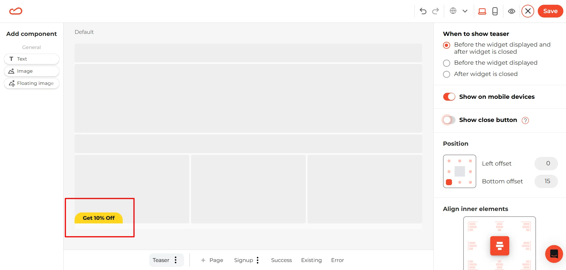
Why teasers work
Let’s get back to our shopper. They are genuinely interested in your shoes. Alas, your welcome discount pop-up shoots too early, so they dismiss it. Normally, you’d risk losing that contact forever. But not with teasers. They keep your offers visible. Our fellow shopper is very likely to reopen the pop-up and use the discount at the checkout. So let’s sum up the benefits of teasers:
- Polite persistence: Your offer stays visible, but not in the visitor’s face.
- User control: Visitors decide when to engage, reducing frustration and bounce.
- Seamless integration: Teasers are part of your pop-up setup, so no extra configuration is needed.
- Smart behavior: Teasers hide automatically when the pop-up is active and can be dismissed with their own ✕ button.
Summing up, teasers let you deliver your messages and keep them visible, but not pushy. Now, let’s see what effect they have on your audience.
What’s the value for your visitors and your business
In the end, it's not just about whether your pop-ups are seen, but rather about how they make your audience feel. When visitors sense pressure, they leave; and vice versa, when they feel respected, they stay. Teasers help tip the balance in your favor:
- Visitors don’t lose access to discounts, sign-ups, or rewards they might want later.
- You capture leads and sales without annoying users or hurting trust.
- Everyone wins: users feel respected, and conversions stay alive.
As you can see, teasers are not just a design tweak. They allow you to convert a negative experience into a positive one. Your messages become quiet reminders, not loud interruptions. The result? Your business gets more leads and grows.
Key use cases
Not every visitor is ready to act immediately when they land on your site. Teasers will keep your most important messages and offers in the user’s mind throughout the entire user journey without breaking it. This is how you can use them in your real business scenarios:
Reduce bounce rates
A visitor lands on your website, not yet committed to buy. A pop-up taking over their screen right away might make them leave. You can change this with a teaser. A teaser with a welcome offer
stays at the edge of the screen while the visitor explores your website. Once they are comfortable and curious enough, they might start looking for a discount. And here is where teasers help you keep people on your site longer, lower bounce rates, and give visitors time to warm up to your brand.
Recover lost sign-ups
Website visitors tend to dismiss newsletter pop-ups too early, because they often trigger at homepages in the first 10-20 seconds. At this moment, people aren’t ready to share their email with you yet. However, a few minutes later, after reading your blog or studying your products, they might realize that your updates could actually be useful. Without teasers, the form won’t come back, and they’ll lose this chance. With teasers, the subscription form is always one click away. This second chance can make a big difference for your business.
Keep offers accessible
Instant discounts can drive sales, but only if a visitor catches them at the right moment. Imagine your offer appears too early, the visitor is likely to close it because they are not ready to buy yet. Later, during a checkout, they’d love to get that discount, but the pop-up is gone. This can be frustrating and ruin the joy of the purchase. A teaser solves this by keeping the offer available throughout the journey: the promo code will always be there for your customers.
Product: Claspo Teasers Built Into Your Workflow
Not all teasers are equal. Usually, they come in the form of extra widgets or add-ons that require extra setup, scripts, or developer help. To make your life easier, Claspo teasers take a different route: we built teasers directly into your pop-up workflow. Thus, you don’t need to switch platforms or configure separate components — they just work.
Here’s what sets Claspo apart:
- Native integration. Teasers are part of the Claspo widgets. There is no friction between setup and launch, so you can use one product to cover all your needs.
- Flexible placement. You can place a discreet tab at the bottom corner or make a branded icon on the side — anything to fit your design and aesthetics.
- Brand personalization. Write your own copy, change colors, and add images to make a teaser look like a natural extension of your website.
- User control. Visitors can reopen a pop-up on their terms by clicking the teaser button or close it forever using the X button.
- Consistent logic. Teasers inherit display rules from your pop-ups, so they will appear only when they should. Besides, this guarantees you will not encounter any overlap on the page.
- Versatile use cases. Teasers work for many widget types. Discounts, sign-up forms, gamified pop-ups, countdown timers, and best offers — teasers keep them all accessible at any moment.
The result: a simple but versatile solution to grant your visitors freedom from intrusive pop-ups and a chance to engage without irritation.
Playbook: How to Fix Annoying Pop-ups on Your Site Today
So let’s move from theory to practice. This is how you can set up teasers to get results:
1. Identify your priority campaign.
To start with, think of the most important pop-up for your conversions. This can be a welcome discount, newsletter opt-in, gamified discount, etc.
2. Enable the teaser feature.
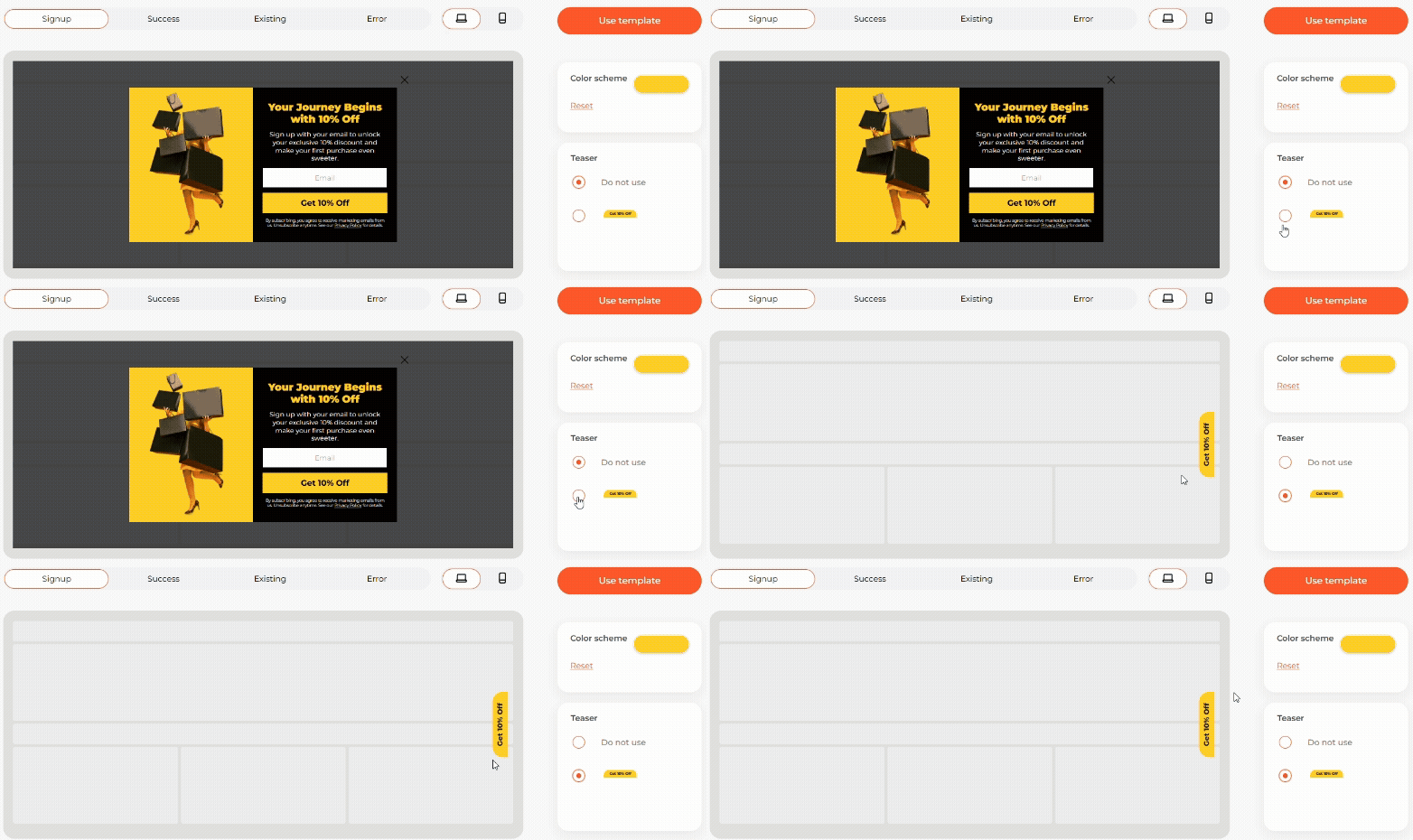
Once the pop-up is dismissed, let the teaser appear so visitors can come back on their own terms.
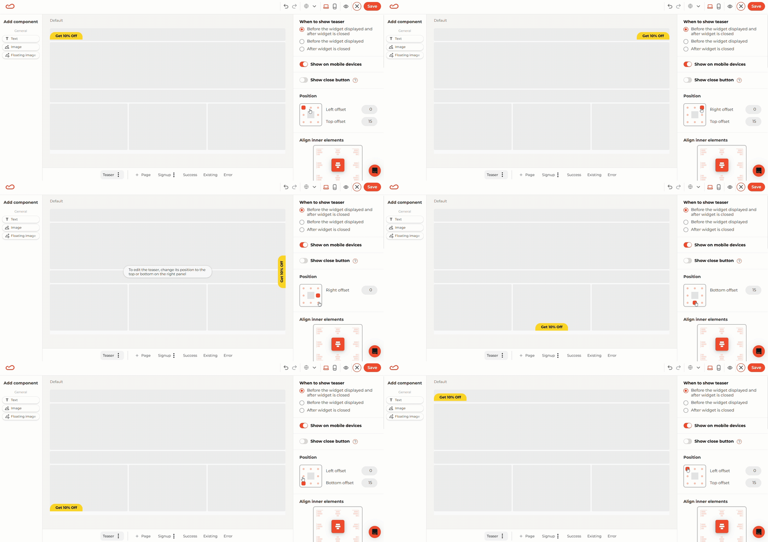
3. Choose strategic placement.
Corners and page edges are the least disruptive, but still easy to notice. Consider your website design and test different positions to find your sweet spot.
4. Work on concise messaging.
Teasers work best with short, punchy, action-oriented calls-to-action (CTAs). Depending on your widget type, think of something like “Get 10%,” “Join now,” or “Want 20% off?” Short CTAs can be tricky to create, but don’t worry. We offer pre-designed templates with copy variants you can use.
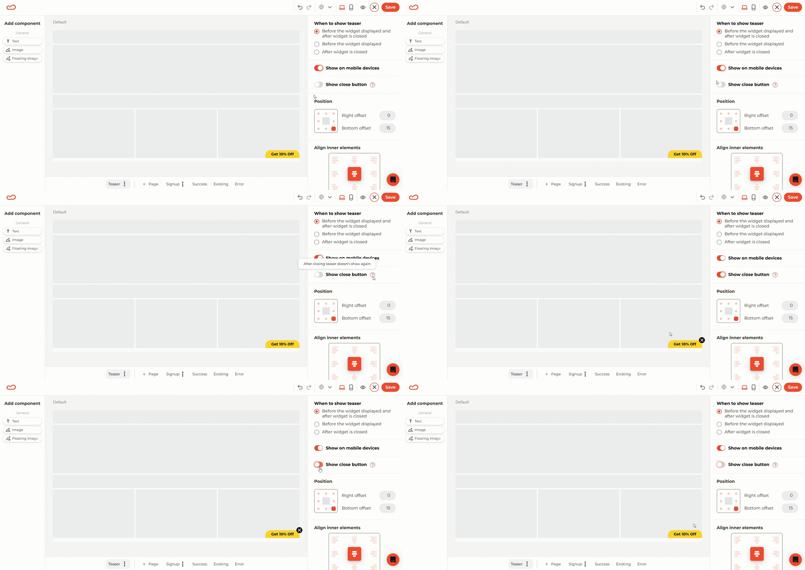
5. Always provide a way out.
Respect user choice by adding an X button. This helps build trust and prevents frustration.
6. Measure the impact.
You’re good to go! Go live, wait for the first results, and track your progress. Use Claspo’s analytics to track engagement, bounce rate, and conversions before and after. Minor tweaks can drive measurable improvements.
For a proven framework, check out our expert guide on website widget A/B testing by an eCommerce strategist, Linda Bustos. She breaks down what to test first, from layouts to offers, so that you can get results faster.
This is it. This playbook isn’t about redesigning your entire funnel from scratch, but rather about making one smart adjustment that brings more balance between engagement and user satisfaction.
Conclusion
Remember our shoe shopper? They didn’t need another interruption; they needed a reminder. That’s what teasers give your visitors: the freedom to engage when it feels right.
Don’t let dismissed pop-ups or abandoned forms cost you leads. With Claspo, your best offers always stay visible, respectful, and effective. Give your campaigns a second chance — and turn missed clicks into actual sales.


![You Might Be Interested in Best Email List Builders to Grow Your Marketing in 2026 [Free & Paid]](https://static.claspo.io/var/www/html/public/photos/shares/Blog/новые картинки/Best_Email_List_Builders_to_Grow_Your_Marketing_2.webp)


