Types of popup signup forms
The purpose of popup signup forms is always to collect data (emails or phone numbers, or both), but the format you select determines the user experience. Select your type based on whether you want to be proactive or subtle:
Lightbox popup
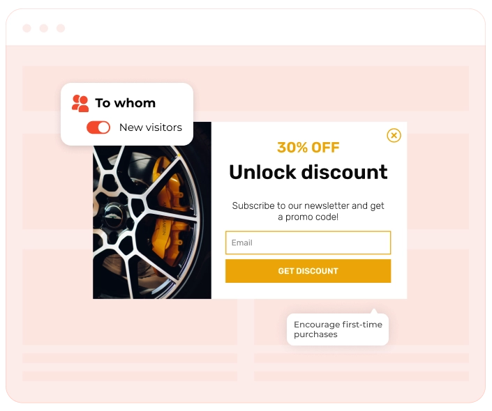
This is the classic centered overlay that dims the background content. It is the best option for high-value offers, such as first-order discounts, because it attracts the user's full attention.
Floating
When the user scrolls, a sticky bar remains at the top or bottom of the screen and never blocks content on your website. Mobile users benefit most from it. It’s also great for ongoing announcements.
Floating box
This is usually a widget that slides into the corner (bottom right/left). It uses movement to grab attention without covering the main text, offering a "polite" but effective way to ask for a signup
Content-blocking widget (fullscreen mat)
This is usually a widget that slides into the corner (bottom right/left). It uses movement to grab attention without covering the main text, offering a "polite" but effective way to ask for a signup
Gamified popup
These popup forms use interactive mechanics like "Spin-to-Win" wheels or scratch cards. They boost engagement by turning the signup process into a game.
Popup signup forms: Best practices
A well-crafted popup signup form has the following features: relevant design, smart timing, high relevance, and practical value. To increase your CR, you need to create a popup form that feels helpful, not intrusive. Here is a brief checklist with best practices to follow:
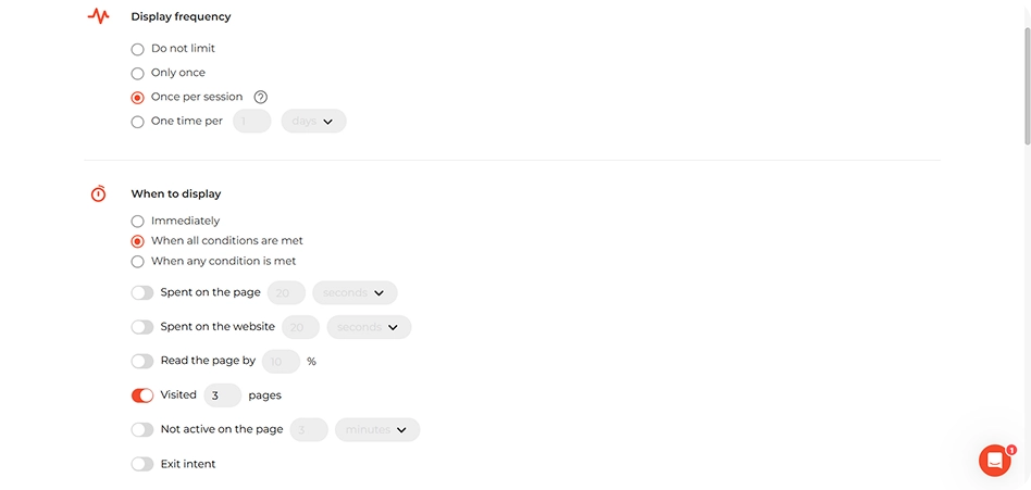
1. Time it right with smart triggers
Popup signup forms perform best when they’re timed to match visitor behavior. In most cases, guidelines suggest showing a popup signup form after someone has scrolled up to half of a page, spent 10–15 seconds on-site, or shown signs of exit intent. Treat these as starting points, analyze how users behave on your website, and adjust triggers to your needs.
2. Keep it focused & simple
Too many form fields can scare visitors off. Stick to the essentials — usually just a name and email. A minimalist design keeps the process frictionless and improves the user experience.
3. Highlight a clear value exchange
Don’t just ask visitors to subscribe — give them a reason. Offer a discount, downloadable content, or access to a newsletter, etc. Make the benefit of signing up obvious and valuable. This is what drives lead generation.
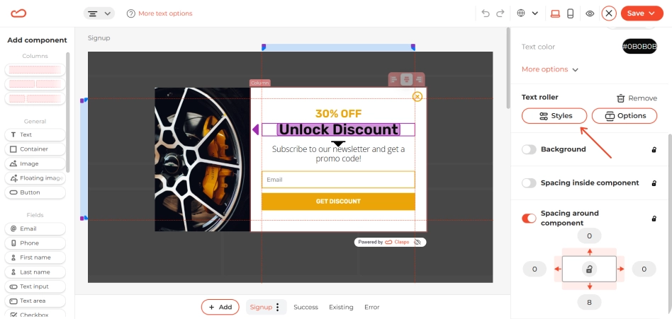
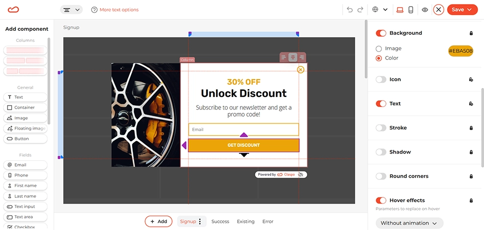
4. Use a strong CTA button
Your button copy should be clear and action-oriented. Phrases like “Get My Discount,” “Join the List,” or “Subscribe Now” work better than vague CTAs. Also, make sure the button stands out. For this, use contrasting colors that match your popup’s design.
5. Optimize for mobile
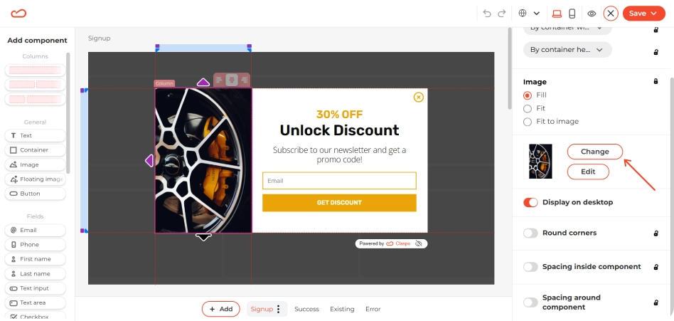
As a rule of thumb, your popup form needs to be fully responsive because the share of users browsing on mobile is always growing. Avoid intrusive layouts that disrupt navigation. For example, use a floating box instead of a popup form. Consider creating a separate campaign to target mobile visitors. Make sure the close button is clearly visible. Also, avoid using large images, or don’t use images at all.
6. Automate the follow-up
The signup is just the beginning, not the end. Connect your popup form to your Email Service Provider (ESP) to trigger an instant welcome flow. This is when you deliver the promised incentive (a discount code or PDF), introduce your brand, and begin segmentation. Tagging users based on where they signed up (e.g., “Blog reader” vs. “Cart abandoner”) allows you to send relevant content that keeps them engaged long-term.
What a popup signup form looks like
A popup form should be attention-grabbing but on-brand. The widget structure usually looks like this:
- A short, clear headline explaining the value of subscribing (e.g., "Get updates & special offers").
- One input field (just the email).
- A clear CTA button (e.g., “Subscribe now”).
Optional modal components: dropdowns for preferences, checkboxes for segmented lists, discounts for additional incentives.
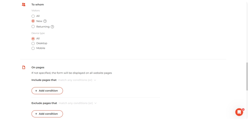
When & how to use a popup signup form
The popup signup form performs best when strategically timed based on visitor behaviors and intent. Popup signup forms are ideal for converting:
- New visitors who are exploring but haven’t committed yet.
- Returning visitors who didn’t subscribe before but are back for more.
- Content readers who are engaged with your blog posts or guides.
- Ad traffic or referral users who are expensive to acquire and worth keeping.
- Exit-intent users who are about to leave without subscribing.
Trigger your popup forms when users show engagement: scroll 50% of a page, spend 10–15 seconds on a homepage, landing, product, or blog pages, or show exit intent. A single, well-timed popup works better than several obtrusive ones, so avoid overdoing it. Provide value when the user is ready to receive it.
Common mistakes when creating popup signup forms
Our benchmarks show that even a high-value offer can fail if the delivery is wrong. Here’s what to avoid in your popup signup forms to save CR:
- Immediate display increases bounce.
- Poor mobile experience frustrates users, hurts SEO, and can trigger Google’s “intrusive interstitial” penalty.
- Generic copy like “Submit” neither motivates nor converts.
- Too many form fields create friction.
- Hiding the close button ruins trust.
- Targeting the wrong audience annoys loyal customers.
Popup signup form: summary
If you’re looking for an easy way to capture leads, reduce bounce, and grow your email list, it all starts with the right tool — and Claspo gives you everything you need. Browse the template library, choose a design that fits your brand, and start building in minutes. Start with our free plan and scale as you grow!