What a feedback button solves & why businesses use it
The feedback button on a page is a way to collect user input right where the issue or question arises. Unlike surveys or delayed email follow ups, it captures feedback in real time, based on actual user experience.
Companies use it to find usability problems, technical bugs, unclear content or missing features. It’s great for understanding user drop offs, validating new ideas and prioritising improvements. Because the button is always visible throughout the user journey, it encourages voluntary responses without interrupting the flow – often resulting in more accurate and relevant feedback.
To sum up, the feedback button solves the problem of visitors leaving your site silently when they’re frustrated, confused, or delighted. You can use it to:
- Capture spontaneous insights visitors may not share in surveys or emails.
- Find hidden usability issues that analytics can’t reveal.
- Build trust by showing customers you’re open to listening at any time.
- Reduce support load by catching minor issues before they escalate.
- Improve products, services, and content based on real user input.
When & how to use website feedback buttons
The most common way is to put a feedback button on all pages of your site. So users can share thoughts, report bugs, or ask questions at any point during their visit — without waiting for a form or popup to appear. It’s great for capturing unexpected issues or feedback that’s not tied to a specific section. In addition to site-wide use, you can also position the feedback button more strategically depending on your industry:
- SaaS & web apps — add a feedback button on high-friction flows (onboarding, billing, feature use) to catch bugs, confusion or unmet expectations.
- E-commerce — add it near products, search results or out-of-stock items to learn what customers can’t find or why they don’t buy.
- Education & content platforms — add it next to lessons, articles, or tools to learn what’s unclear or missing.
- Agencies & services — embed the feedback button on portfolio or contact pages to capture hesitations before conversion.
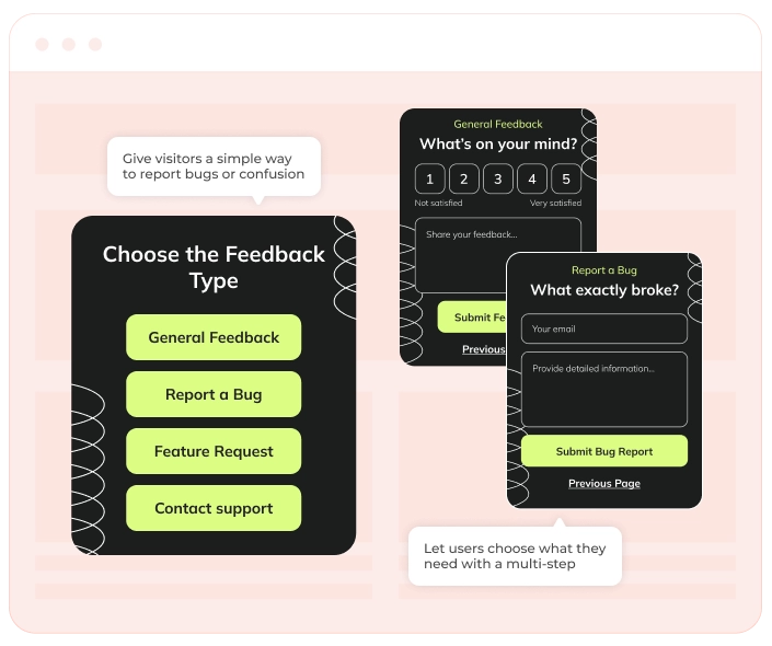
How a feedback button looks on a website
Simple, persistent, and non-intrusive:
- A floating button pinned to the side or bottom of the screen.
- Minimal design, fully brandable — match your fonts, colors, icons.
- One-click opens a small form with a short question: e.g., “How can we improve your experience?” and optional rating scales or smiley faces.
- Open-text field for detailed feedback.
- Option to ask for an email, but it’s best left optional to encourage honest, low-friction feedback.
Make sure the button is visible but not disruptive. Use tooltips like ‘Share your feedback’ to increase interaction without being pushy.
Feedback buttons pair well with
You can use the feedback button alongside other tools. For example, NPS surveys are useful for measuring overall satisfaction, while the button helps you collect quick notes about specific issues or ideas. Some teams also connect it to Slack or project trackers so they can review comments and fix things right away.