Newsletter Signup Forms: 15 Examples and Data-Backed Best Practices

Summarize
An email newsletter form turns website visitors into subscribers, but its offer, format, timing, and targeting determine how it performs.
In this guide, we analyze 15 real email newsletter form examples, compare formats using Claspo benchmark data, and explain how to create, place, and test a form on your website.
What is an email newsletter form?
An email newsletter form (newsletter signup form or newsletter subscription form) is a website form that visitors use to join an email list. It normally asks for an email address and explains what subscribers will receive, such as product updates, educational content, VIP offers, or a regular newsletter.
Newsletter forms can appear as popups, embedded forms, floating boxes, bars, teasers, or dedicated signup pages. Some collect only an email address; others ask for a name, phone number, birthday, or content preferences to enrich or build subscriber segments, or personalize marketing campaigns.
Email newsletter form conversion benchmarks
Claspo’s 2026 research includes email opt-in benchmarks from around 50 million impressions and broader popup conversion rate benchmarks collected over three years. For these email capture formats, we analyzed more than 120 parameters, including form structure, layout, incentives, copy, interactive elements, visual style, and UX. The standard email newsletter signup form averages a 3.67% conversion rate (CR), which serves as the baseline for the comparisons below.
Form structure or mechanic | Average CR | Compared with the baseline |
Standard email-capture popup | 3.67% CR | Baseline |
Gamified popup | 8.08% CR | 2.2× higher |
Popup with a teaser | 6.89% CR | 1.88× higher |
Popup with choice buttons | 5.00% CR | 1.36× higher |
Multi-step popup | 4.94% CR | 1.35× higher |
Best practices for creating high-converting newsletter forms
While your choice of types of popups is important, the offer, audience, traffic source, targeting, timing, and successful popup design can change the outcome significantly. Use them to build your first version, then validate it with your own A/B testing.
1. Make the value clear immediately
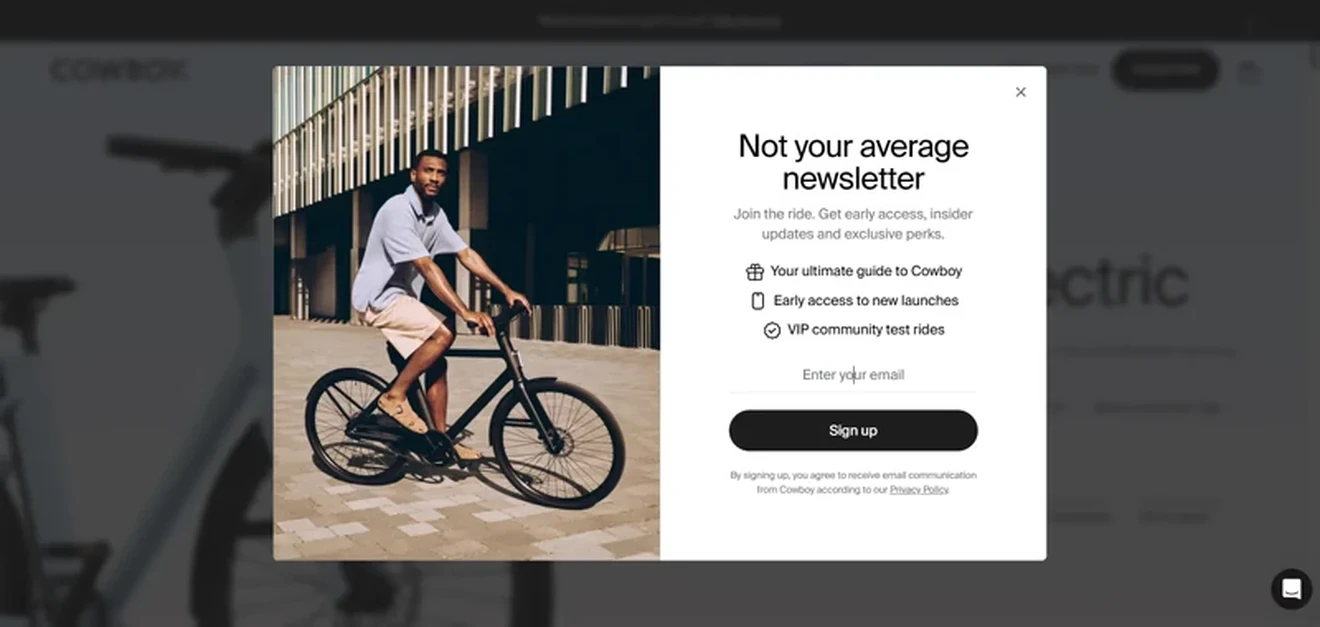
“Join our mailing list” form tells visitors what to do, but not why. A newsletter form should quickly explain:
What subscribers will receive
How it will help them
How often they can expect emails
The message can combine immediate value, such as a discount, with ongoing benefits like useful content, early access, or exclusive offers.
Keep the copy simple: a benefit-led headline, one line of supporting detail, and a CTA that names the outcome. “Get weekly CRO experiments and original benchmarks” is more specific than “Subscribe to our newsletter.”
In one Claspo A/B test, a value-oriented message generated a 300% conversion lift compared with a generic version.
2. Ask only for the data you need
Start with the minimum data required to deliver the newsletter.
Email: usually the only required field
Name: useful for personalization, but often optional
Phone, birthday, or preferences: collect only if you plan to use them
Among the top 25% of gamified sign up for newsletter forms in our 3 year benchmark, 95% used only one or two fields, and 56% asked for an email address only. The broader data shows the same pattern: email-only newsletter sign up forms have a 2.48% avg CR, compared with 1.99% avg CR for email- and phone- forms and 0.44% VG CR for phone-only forms.
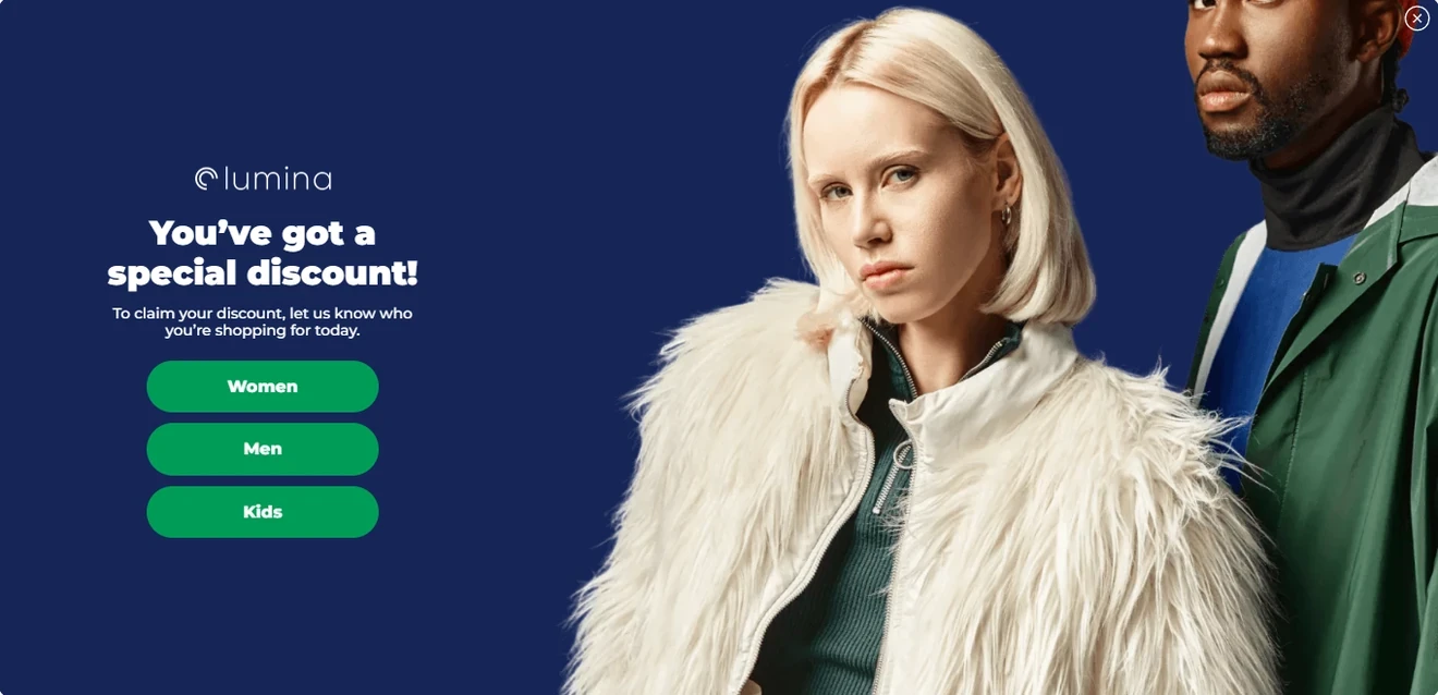
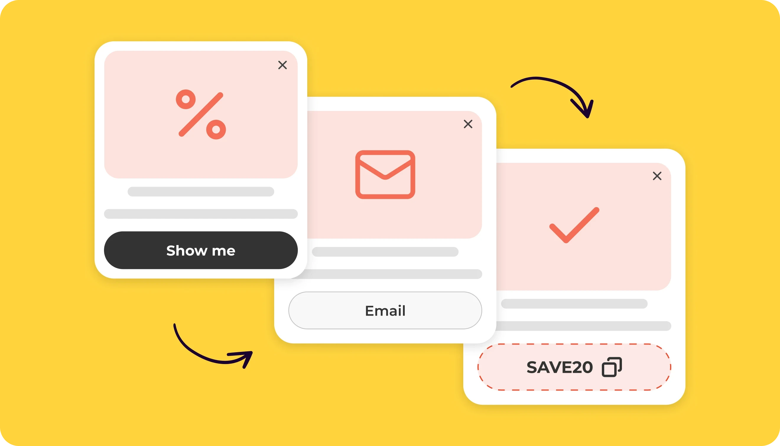
If you need more details, collect them later or split the request into steps. The extra question should support segmentation or make the next message in your sign up newsletter form more relevant. In our latest benchmark, multi-step popups average a 4.94% CR, and forms with choice buttons average 5% CR, compared with the 3.67% CR baseline for standard popups to grow your newsletter subscriber list.
If visitors start to sign up to newsletter form but do not finish it, see how partial submissions can help reduce form abandonment and identify where people leave the flow.
3. Give visitors one clear action
Multiple buttons and competing messages make the decision harder. Across the top 1% of newsletter sign up forms, 94% used one primary CTA. Among the top 25% of gamified forms, every form had one CTA, and approximately 88% placed it at the bottom.
Generic labels such as “Submit” describe the action but not its value. Use specific button copy that reflects the result:
Get the guide
Send me the tips
Get my discount
Join the newsletter
4. Match the incentive to your audience
Our data shows that email-only newsletter forms average a 2.48% CR. Forms that combined an email field with a promo code average 3.85% CR, which shows the potential value of a clear, immediate reward.
Common options include:
Ecommerce: discounts, free shipping, gifts, and early access
SaaS and B2B: research, templates, guides, and case studies
Publishers and creators: exclusive insights and curated content
Premium brands: samples, loyalty benefits, and useful content
A discount may generate the first signup, but ongoing value gives subscribers a reason to stay. If you need an alternative to a standard discount, explore these lead magnet ideas for ecommerce, SaaS, publishers, and service businesses.
5. Match timing and targeting to visitor intent
A relevant offer can still fail if it appears on the wrong page or too early. Use signals such as time on page, scroll depth, clicks, exit intent, traffic source, viewed pages, and visit history to choose the perfect moment to subscribe to newsletter form. For example:
Offer a guide after a reader engages with a related article.
Show product advice on relevant category or feature pages.
Present a discount to a high-intent or returning visitor.
Use exit intent when a visitor prepares to leave.
In our benchmark, newsletter forms combining an email field, promo code, and exit intent average a 5.76% CR, compared with 2.48% CR for email-only forms. Also limit display frequency, stop the campaign after submission, exclude known subscribers, and prevent several popups from appearing at the same time.
Closing a popup does not always mean the visitor has rejected the offer. Popups with teasers average a 6.89% CR in our selected cohort. A teaser also keeps the offer available after the main popup closes.
6. Keep the close option visible
A newsletter popup should attract attention, not trap the visitor. Among the top 25% of gamified newsletter forms, 85% had a visible close button.
Keep the close control easy to find and tap on every device. Avoid tiny icons, weak contrast, or opt-out messages that shame visitors. A teaser or launcher can preserve the opportunity after the main popup closes.
7. Optimize for mobile and accessibility
Preview every newsletter form across screen sizes before publication. On mobile:
Keep the layout compact
Remove nonessential images
Use fields and buttons that are easy to tap
Keep the close control reachable
Check that the keyboard does not cover the CTA or errors
Avoid horizontal scrolling
For accessibility, use readable contrast, visible labels, logical keyboard navigation, clear focus indicators, and text-based error messages. The newsletter signup box should also communicate successful submission to screen-reader users. Claspo supports mobile editing, keyboard navigation, ARIA attributes, and accessible form states, but the final content, colors, and structure still need review before launch.
8. Set transparent subscription expectations
Tell visitors what they are signing up for. If the email newsletter sign up form offers a guide or discount and also adds the visitor to a marketing list, make that clear before submission.
Include:
Email content
Expected frequency
Incentive conditions
A link to your privacy policy
Consent controls required for your audience and market
An easy way to unsubscribe from future emails
Consent requirements vary, so one checkbox setup does not apply to every business. Transparency also supports subscriber quality. As Michal Leszczynski explains in the Claspo Growth Myths playbook, “Your email list is a relationship asset, not a sales tool.” Send the promised incentive promptly and make sure the welcome email matches the expectations set in the newsletter registration form.
Types of newsletter signup forms: 15 examples and where to use them
An email newsletter form can use different placements, triggers, and mechanics. Keep these concepts separate:
Format: popup, fullscreen, embedded form, floating box, or bar
Trigger: time, scroll, click, exit intent, or visitor behavior
Mechanic: standard, multi-step, choice, or gamified flow
For example, one popup can combine an exit-intent trigger with a multi-step mechanic. If you are deciding where to put a newsletter signup form, start with how much attention the offer needs and how much of the page it can cover.
Format | Where to use it | Best for | Average CR |
Fullscreen | Homepage or campaign landing page | High-value offers, launches, early access | 7.17% CR |
Popup | Homepage, product pages, blog posts | Welcome offers, lead magnets, targeted campaigns | 4.96% CR |
Floating box | Product pages and longer sessions | Persistent, less disruptive offers | 2.57% CR |
Floating bar | Top or bottom of website pages | Secondary, site-wide signup prompts | 1.28% CR |
Embedded form | Hero, blog content, footer, post-purchase page | Permanent, contextual signup opportunities | 0.24% CR |
Teaser | Page edge or corner | Visitor-initiated signup or reopening a dismissed offer | 6.89% CR for popups with teasers |
Fullscreen newsletter form
Fullscreen newsletter subscription forms take over the viewport and direct attention to one offer. They have the strongest average CR at 7.17%. Among the top 10% of fullscreen campaigns in the selected cohort, the average conversion rate reached 48.15%. That visibility works best when the offer is clear enough to justify the interruption.
Nazario & God
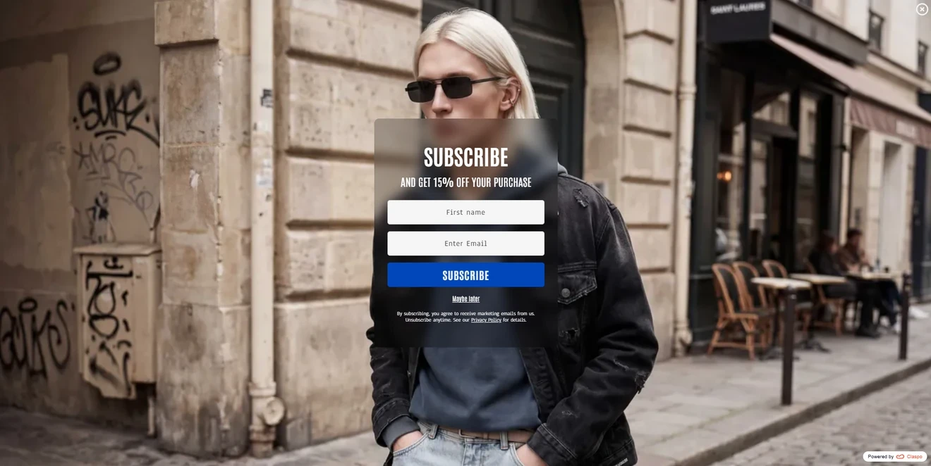
The streetwear brand uses a Claspo fullscreen newsletter form to offer 15% off a purchase.
What works:
The discount gives visitors an immediate reason to subscribe.
The fashion image and translucent panel match the website.
The close icon, “Maybe later” link, and consent copy give visitors control.
The generic “Subscribe” CTA could be more specific. “Get 15% off” would connect the action to the reward.
RYP
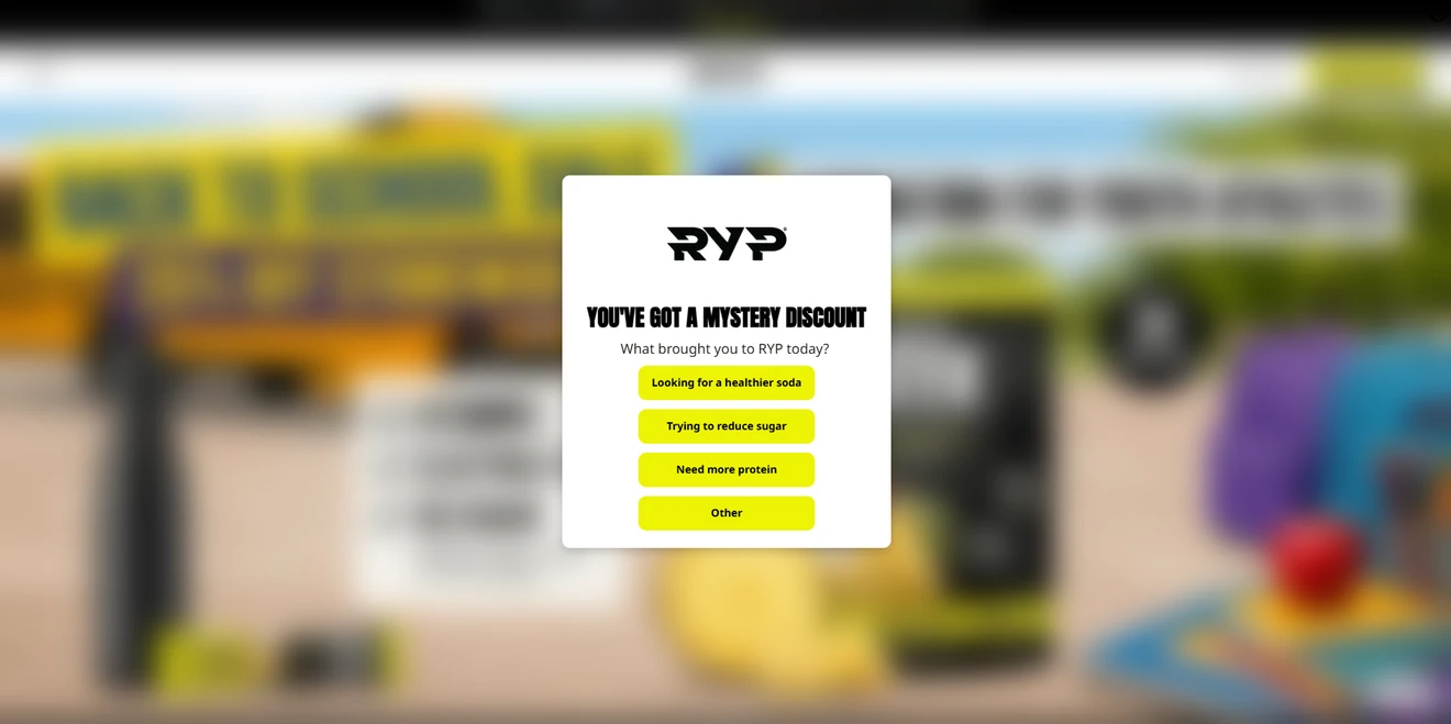
RYP opens with a mystery discount and one question: “What brought you to RYP today?” Visitors choose health, sugar, protein, or “Other” before entering their email.
What works:
The first step requires one simple click.
The answers reveal each visitor’s main motivation.
One task per screen keeps the flow easy to follow.
The selected answer should determine the welcome content or future segmentation. Otherwise, the extra step adds effort but little value.
Popup newsletter form
Popups have an avg 4.96% CR and offer the most flexibility in timing and targeting. Use them for welcome offers, contextual lead magnets, discounts, and exit-intent campaigns. Explore more email pop-up examples and see how brands adapt them to different offers and audiences.
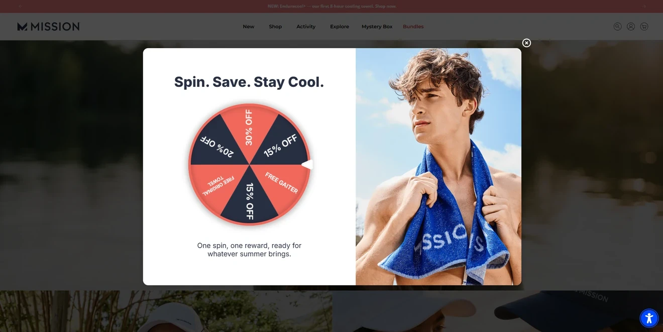
Mission
A Spin-the-Wheel popup by a performance lifestyle brand, Mission, lets visitors play first, see their prize, and then enter an email to claim it and receive exclusive offers and VIP access to new releases.
What works:
The interactive first step creates curiosity.
Visitors see the reward before sharing their email.
The final message combines an immediate prize with ongoing benefits.
Each step has its purpose: the wheel creates interest, the reveal confirms the value, and the final screen collects the email.
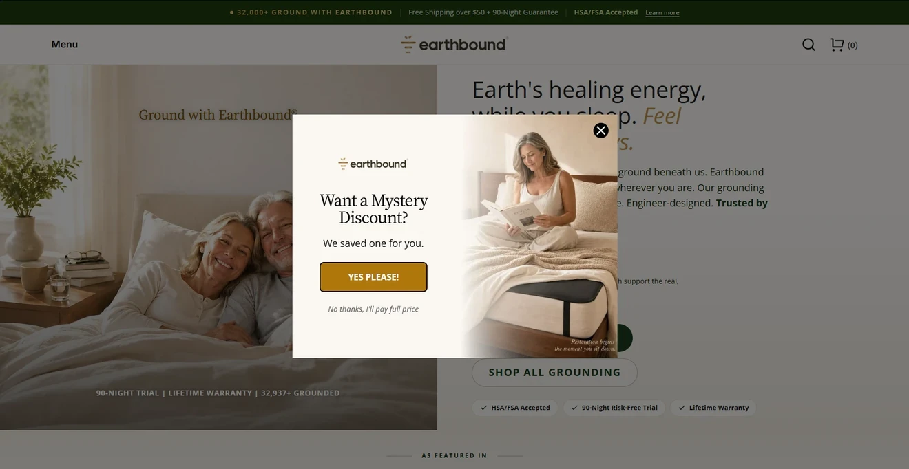
Earthbound
Earthbound uses a two-step yes/no newsletter form built around a mystery discount. The email field appears after visitors click “Yes please.”
What works:
The first step asks for one low-effort action.
Each screen presents one clear task.
“Reveal My Discount” connects the CTA to the outcome.
The opt-out copy, “No thanks, I’ll pay full price,” uses confirmshaming. A neutral “No thanks” would give visitors a clearer choice.
Averie Cooks
Averie Cooks adapts its newsletter form offer to the season. The evergreen version promotes 30 days of quick dinners, and the holiday version switches to a seasonal recipe series.
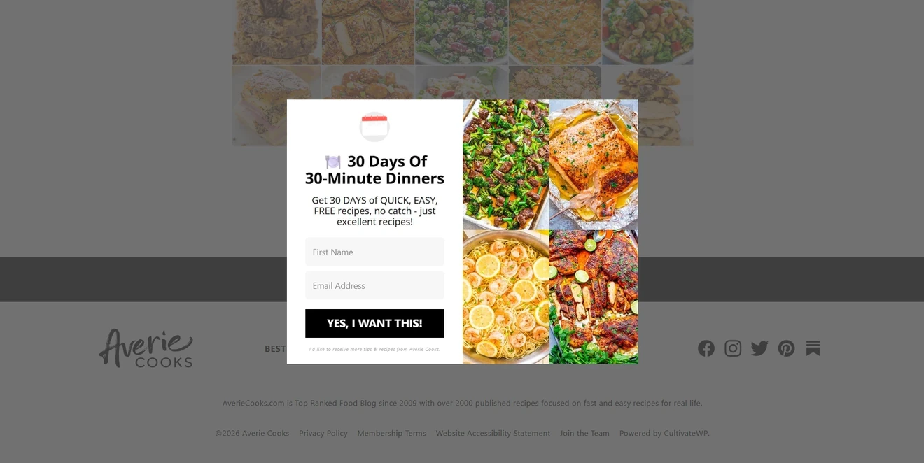
This approach keeps a reliable evergreen campaign in place and adds timely variations when relevant.
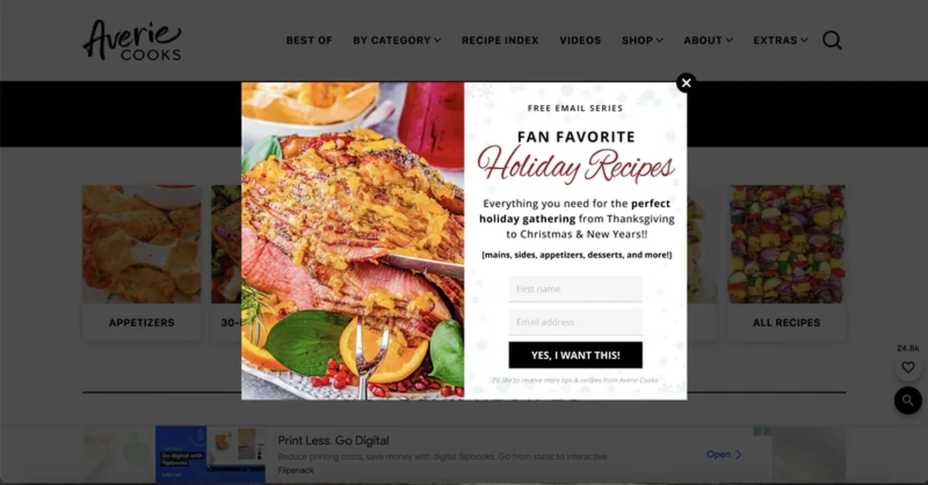
What works:
Both versions promise specific, useful content.
Seasonal campaigns reflect readers’ current interests.
The delayed display gives visitors time to assess the website first.
VogoLuxy
VogoLuxy offers a bracelet with the subscriber’s first order. The popup shows the product and asks only for an email address.
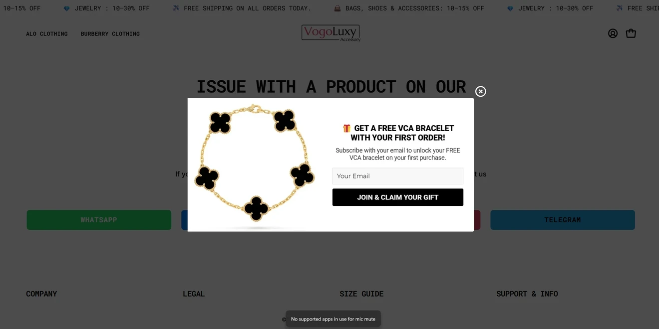
What works:
The product image makes the gift tangible.
The first-order condition appears close to the headline.
“Join & Claim Your Gift” connects the CTA to the offer.
The gift requires a purchase, so any other conditions should appear near the newsletter subscription form. The form should also include the relevant subscription and privacy information.
Floating newsletter signup box
A newsletter signup box stays anchored to a corner or side of the screen. It keeps the main page accessible but provides more room than a bar for copy, imagery, and fields.
Art with Symbols
Art with Symbols uses a lower-right floating box to promote an upcoming letter about forest symbolism.
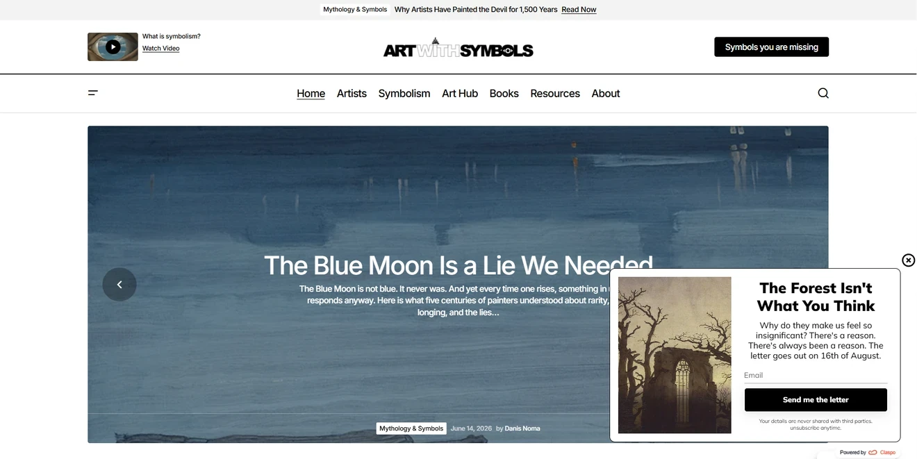
What works:
The topic matches the surrounding editorial content.
The headline creates curiosity, and the date sets an expectation.
“Send me the letter” fits the publication’s voice.
The newsletter signup box covers part of the article. Its timing and mobile layout should protect the reading experience. The publication date must also stay current.
WoodUpp
WoodUpp offers two free Akupanel samples through a floating box. During our review, it appeared about 20 seconds after entry, after visitors had time to explore the products.
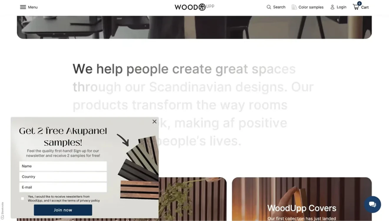
What works:
Physical samples help shoppers evaluate the colors and materials.
The delayed display makes the offer more relevant.
Product images show what visitors can request.
“Join now” is less specific than the offer; “Get my free samples” would be clearer. Any delivery costs or restrictions should also appear near the newsletter form.
TRIANGL
TRIANGL uses a clean floating newsletter signup box to promise early access to new arrivals and special offers. It relies on brand affinity instead of an immediate discount.
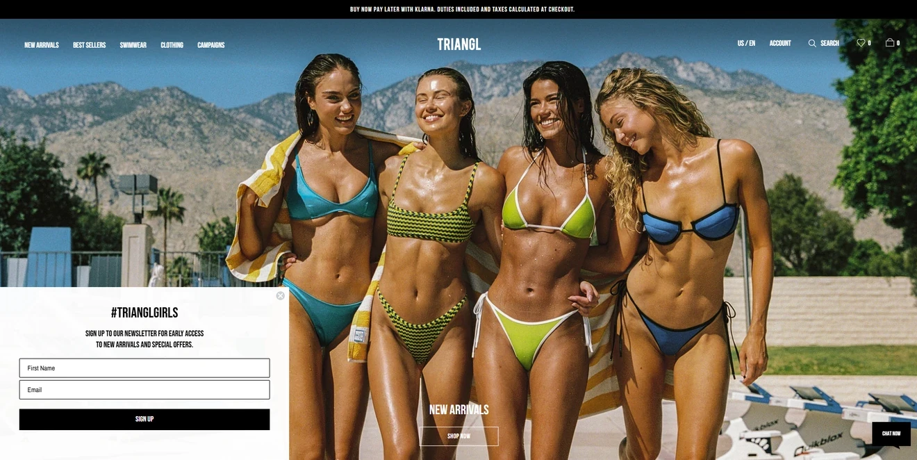
What works:
The monochrome design matches the website.
The white background keeps the form readable over the hero image.
Early access gives customers a clear reason to subscribe.
The box covers a large part of the hero, so timing and mobile adaptation matter. The first-name field should support real personalization; otherwise, an email-only form may be enough.
Floating bar
Floating bars use less space and work better as secondary signup prompts. Their lower average CR does not make them ineffective; they simply attract less attention than larger formats.
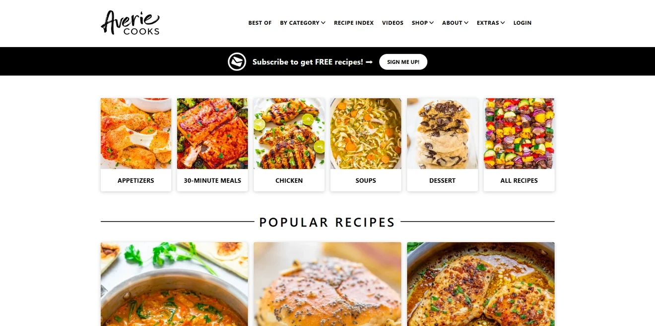
Averie Cooks
Averie Cooks places a floating bar below the navigation. Its promise is simple: subscribe for free recipes. The CTA leads to a dedicated newsletter signup page with more details.
What works:
The benefit is clear at a glance.
High contrast makes the bar easy to notice.
The linked page has more room to explain the offer and collect the email.
The bar also gives readers another route to subscribe after they dismiss a popup or decide later.
Embedded newsletter form
Embedded newsletter forms become part of the page. Place a simple newsletter signup form in a hero section, after relevant content, near a related offer, or above the footer. These forms work best when visitors already understand the context.
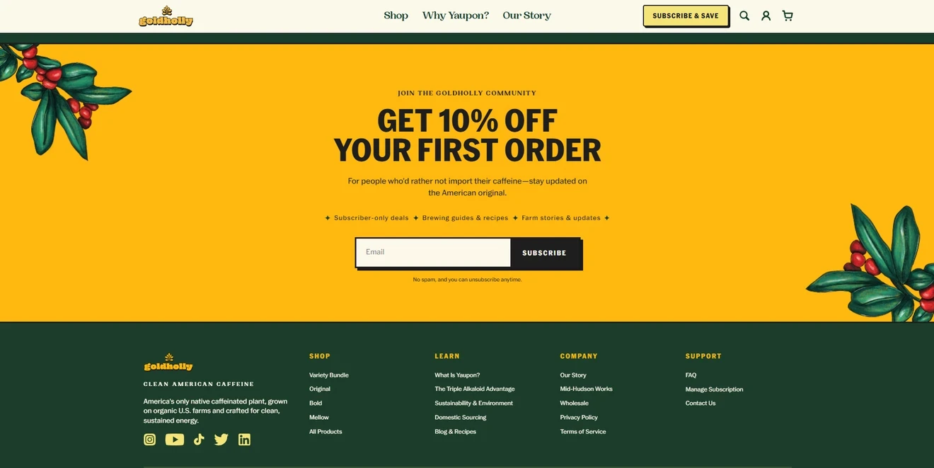
Goldholly
Goldholly turns the area above its footer into a full-width embedded newsletter form. It offers 10% off the first order and explains what subscribers will receive afterward.
What works:
The discount provides immediate value.
Deals, brewing guides, recipes, and farm stories explain the ongoing value.
“No spam” and “unsubscribe anytime” set basic expectations.
“Get 10% off” would connect the CTA to the offer more clearly than the generic “Subscribe.”
Gizmodo
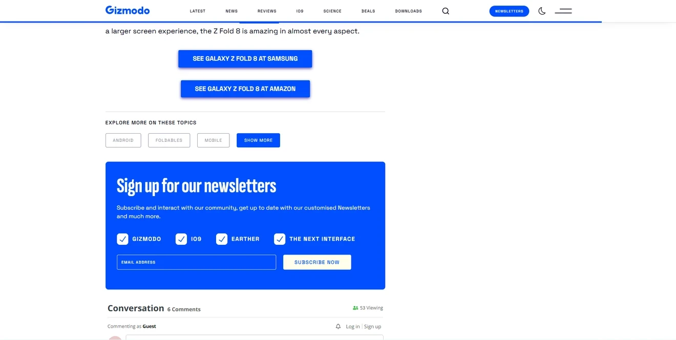
Gizmodo places an embedded newsletter form at the end of its articles, before the comments. Readers can assess the content first, then choose which newsletters they want.
What works:
The article demonstrates its value before the signup request.
Topic checkboxes support more relevant email delivery.
One form covers several newsletters.
All four newsletters appear preselected. Empty checkboxes would make the choice more deliberate. Short descriptions, frequency, and privacy information would clarify each choice.
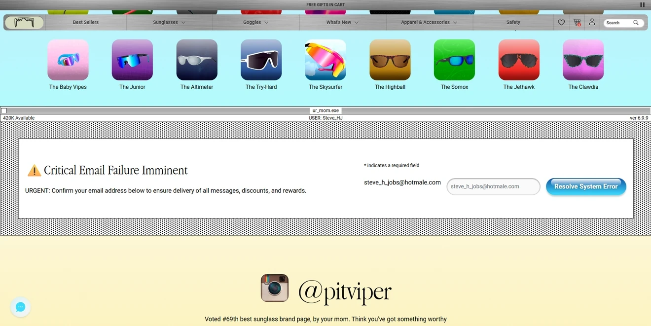
Pit Viper
Pit Viper turns its embedded newsletter form into a fake system alert. The retro interface and dramatic error message reflect the brand’s irreverent style.
What works:
The unusual concept stands out from the product content.
The design is immediately recognizable as part of the brand.
The copy mentions messages, discounts, and rewards.
Brand voice can make a simple newsletter form memorable, but the action still needs to be clear. “Critical Email Failure Imminent” and “Resolve System Error” sound like a real warning, not a newsletter signup.
Food4Pets
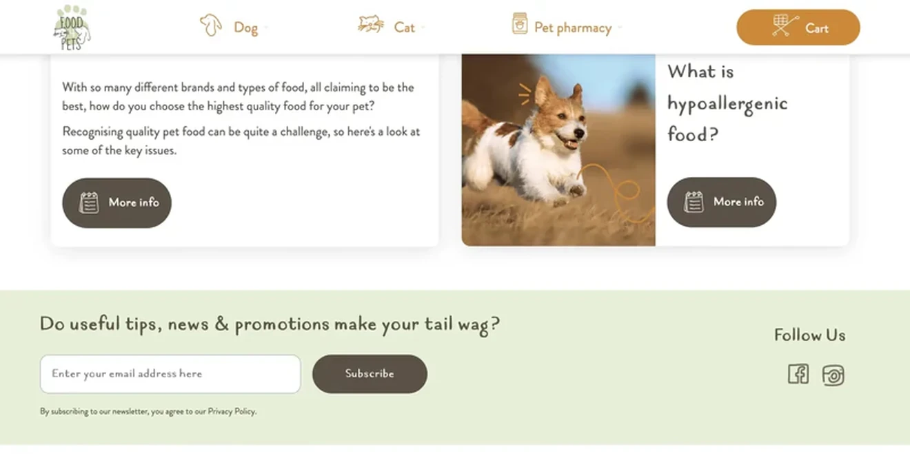
Food4Pets takes a quieter approach. Its embedded newsletter form matches the website and uses pet-themed wordplay about wagging tails. It promotes an ongoing connection instead of a discount.
What works:
The playful message reflects the brand’s personality.
The inline placement feels like part of the page.
Social links give visitors other ways to follow the brand.
The newsletter form should still explain what subscribers will receive and how often. Social icons can also compete with the main CTA, so they should remain secondary.
Teaser for newsletter form
A teaser is a small companion element that opens or restores the main newsletter form. Popups with teasers get a 6.89% CR, compared with 3.67% CR for the standard email-capture popup baseline. Teasers work well when an offer should remain available throughout the session.
CHAZZ
CHAZZ uses a product-shaped teaser for its Spin-the-Wheel popup. A snack bag sits at the edge of the page and shakes periodically to attract attention. A click opens the game.
What works:
The product image makes the teaser easy to recognize.
Its compact placement leaves the store accessible.
Visitors decide whether to open the full popup.
The purpose may not be obvious. A short label such as “Spin & win” could show that the teaser is interactive.
How to create a newsletter sign up form
With Claspo, you do not need coding or design skills to add a newsletter sign-up to your website. Choose a newsletter form template, adapt it to your offer, connect your email platform, and publish it.
Step 1: Create an email newsletter form
Log in to Claspo and click New widget. You can start from scratch or use a CRO-ready newsletter signup form template.
A template is usually the faster option. It already includes the basic layout, fields, CTA, and mobile version. You can use a free newsletter sign up form template and replace each element with your own content.
Step 2: Choose the format and template
Open the template library and select Grow Email List under use cases. Then choose the format that fits your campaign:
Popup for targeted or time-sensitive offers
Fullscreen for high-value campaigns
Floating box for persistent offers
Floating bar for a compact, site-wide prompt
Embedded form for a permanent page placement
Use the industry and layout filters to narrow the results.
Step 3: Customize the newsletter form
The drag-and-drop editor lets you change the structure, content, and design. Start with the elements that can affect the decision to subscribe:
Explain what subscribers will receive.
Add only the fields you plan to use.
Write one clear CTA.
Match the colors, fonts, and images to your website.
Add the required consent text and privacy-policy link.
Include a visible close or opt-out option for floating formats.
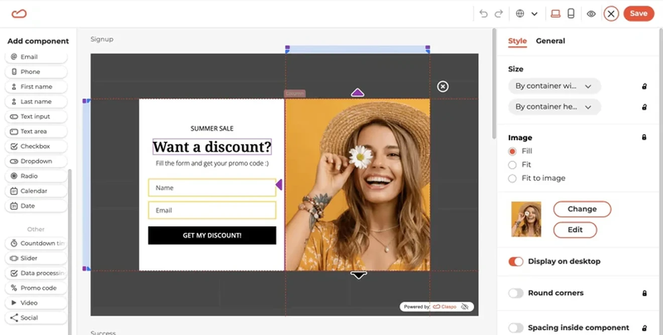
Before
After
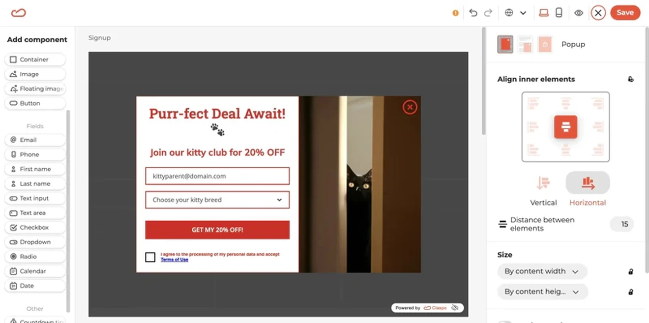
In our example, we turned a generic template into a pet-focused email newsletter form. We removed the name field, added a breed selector, rewrote the message, replaced the image, adjusted the colors, and added a consent checkbox.
Step 4: Check the desktop and mobile versions
Open Preview and check the form on desktop and mobile. A layout that works on a large screen may cover too much content on a phone.
You can adjust each version separately. For example, hide a decorative image on mobile but keep the offer, email field, CTA, and close button visible.
Also check:
Text and button contrast
Field labels and error messages
Button and close-icon size
Keyboard navigation
Spacing between form elements
Step 5: Set the display rules
Embedded newsletter forms appear as part of the page. Popups, fullscreen forms, floating boxes, and bars need display rules.
Claspo templates include preset rules that cover common UX problems. They can:
Delay the first display
Limit how often the form appears
Prevent several popups from opening together
Add an interval between displays
Stop showing the form after submission
You can customize these rules and target the newsletter form by page, device, traffic source, scroll depth, time on page, exit intent, or visitor behavior.
Choose rules that match the offer. A welcome discount may appear near the start of a visit. A related guide may work better after a reader reaches part of an article.
Step 6: Connect your email platform or CRM
Connect Claspo to the platform that will store and manage your subscribers. Then map each form field to the correct contact property.
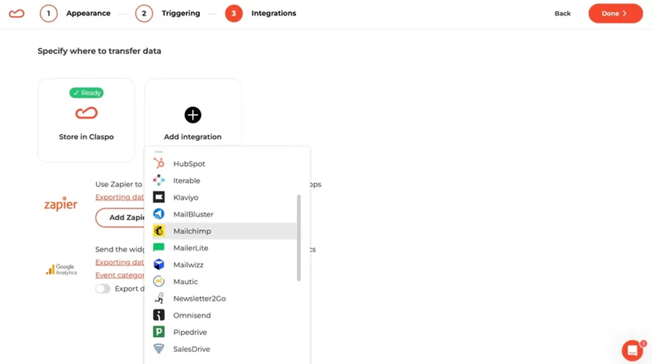
For example:
Email → email address
First name → first-name field
Product preference → custom property
Newsletter choice → list or segment
Send a test submission before launch. Check that the contact appears in the correct list and receives the intended welcome email or incentive.
Step 7: Add Claspo to your website
Install the Claspo script on your website once. You can add it directly to the site code or use Google Tag Manager. WordPress and Shopify users can install the relevant Claspo plugin or app.
After installation, you can publish and update newsletter subscription forms from the Claspo dashboard. You do not need to add a new script for every campaign.
If you need help, the Claspo customer success team can install the script for you.
Step 8: Publish and A/B test
After launch, monitor views, submissions, and conversion rate. To improve results, you can use A/B testing on autopilot. We recommend changing one variable at a time:
Email only vs. one additional field: compare conversion rates, welcome-email engagement, and downstream revenue.
One step vs. multiple steps: track completion at each step and the final submission rate.
Generic vs. benefit-led CTA: compare “Subscribe” with copy such as “Get 15% off.”
Immediate vs. delayed display: test one clear delay, such as immediate display versus 10 seconds.
Create a newsletter form that fits your audience
The best newsletter form is not always the largest or most interactive one. Choose a format based on the attention your offer needs and where visitors are in their journey. Start with one or two necessary fields, make the value clear, and match the timing to visitor intent.
Use industry benchmarks to build your first version, but let your own data guide future decisions. Test the offer, fields, CTA, and display rules, then look beyond submissions to subscriber engagement and revenue.
Choose a free Claspo newsletter signup form template, customize it for your campaign, and publish it on your website.
Newsletter signup form FAQs
Where to put newsletter signup form?
Use embedded newsletter forms after useful content, near the footer, or beside a related offer. Popups work well for targeted campaigns and lead magnets. Floating bars provide a compact site-wide prompt, and floating boxes keep an offer accessible during longer visits. Reserve fullscreen forms for offers strong enough to justify the interruption.
What is a good newsletter signup form conversion rate?
There is no universal target. In our selected 2026 cohort, standard email-capture popups average a 3.67% CR. Results varied significantly across formats and mechanics. Compare your form with a relevant benchmark, then track how changes to the offer, fields, targeting, timing, and traffic affect your own results.
Can I create a free newsletter signup form?
Yes. Claspo provides free newsletter signup form templates for popups, floating boxes, bars, fullscreen campaigns, and embedded forms. Choose a template, replace the sample content, adjust the design, and connect your email platform. You can also create a simple newsletter signup form from scratch in the drag-and-drop editor.
How do I make a newsletter subscription form compliant?
Clearly explain what visitors are subscribing to and how their information will be used. Add a privacy-policy link, the necessary consent controls, and an easy unsubscribe option. Do not preselect consent choices when affirmative consent is required. Exact requirements depend on your market, audience, and data-processing practices, so review the applicable regulations before launch.