
Our 2026 Benchmark Study: 9 Focus Areas Behind 10-30% Opt-In Growth
Most ecommerce sites are doing fine driving traffic — but not nearly enough of that traffic turns into email subscribers. For example, the average Shopify store converts just 1.5% to 3.5% of its visitors into subscribers. That means for every 100 people who land on your site, 97 leave without a trace.
If you’re spending real money on ads, SEO, or influencer campaigns, that low opt-in rate isn’t just a missed opportunity — it’s a slow leak in your entire growth strategy.
It’s not that marketers aren’t trying — they’re A/B testing button colors, tweaking headlines, switching CTAs… But the real improvements don’t come from surface-level tweaks. They come from deeper changes — the kind that affect how your forms work, when they appear, and how relevant they feel to the person seeing them.
So we decided to look at what actually moves the needle. Between Q2 2024 and Q2 2026, we analyzed over 100 million widget views across 51,000 websites using Claspo. We looked at what works and what doesn’t, and we found patterns. Big ones. The kind of setups that regularly pull in 10%–30% of visitors — not just once, but over and over.
What stood out most was that success rarely depends on a single feature. It’s a combination of smart, strategic choices across nine areas — from personalization and offer type to trigger timing and layout.
In this article, we’ll walk you through those nine key factors, show how much each can lift your opt-in rate, and give you a clear benchmark for what ‘good’ really looks like in 2026.
The opt-in growth table: what actually moves the numbers
Let’s quickly look at the nine focus areas that had the biggest impact on opt-in performance across 100M+ widget views. For each one, we’ve outlined what a ‘basic’ setup looks like — and what changes when you upgrade to a more strategic approach. They’re based on real data — and they show exactly where the biggest conversion lifts come from.
|
Focus area |
Basic setup |
Strategic approach |
Average conversion uplift |
|
Personalization |
Same for all visitors |
Tailored offers via category, UTM, or behavior |
+20-40% |
|
Gamification |
No interaction |
Spin-to-win or scratch card with instant rewards |
+10-30% |
|
Layouts (entry points) |
Single form in footer |
Multi-touch setup: popup + sticky bar + exit intent |
+10-30% |
|
Offer & incentive |
‘Subscribe to our newsletter’ |
Offers based on user interest or behavior: discount, free shipping, giveaway, FOMO countdown |
+15-25% |
|
Form complexity |
Single email field |
Multi-step quiz or onboarding flow (such as email + preferences) |
+15-25% |
|
Triggering |
Immediate on-load popup |
Behavior-based triggers (scroll, time, exit) |
+10-20% |
|
Design & UX |
Clunky or off-brand |
Mobile-friendly, brand-aligned, polished design |
+5-15% |
|
Urgency |
No urgency or generic message |
General or relative countdown tied to offer |
+5-15% |
|
Presence |
Hidden form or footer only |
Visible across touchpoints (popup, bar, embed) |
+5-10% |
Alright, now let’s break these down one by one — with real examples and simple ideas you can actually use on your own site.
1. Personalization (average uplift: +20-40%)
The biggest jumps in conversion rates came from a simple shift: stopping the one-size-fits-all approach. Generic ‘Subscribe for updates’ messages treat every visitor the same. But when you make the offer feel specific — even slightly — the difference is massive.
From generic to relevant:
- Basic: a standard form that says ‘Sign up for our newsletter’. Same for every visitor.
- Master-level: show different offers depending on the landing page, UTM tag, URL parameters, geolocation, cart value etc.
Example: dynamic category discount. You don’t need a fancy CRM or customer database to do it. For example, Shopify stores already pass category info in the URL — and Claspo lets you turn that into a personalized message with Merge tags. Here’s how it works.
Let’s say someone’s browsing dresses. Your Shopify URL looks something like this: ‘www.yoursite.com?category=dresses’. With Claspo, you can create a popup that reads: ‘Love dresses? Subscribe now and shop your favorites with a 10% discount!’ If they’re browsing jeans, the same widget will automatically say: ‘Love jeans? Subscribe now and shop your favorites with a 10% discount!’
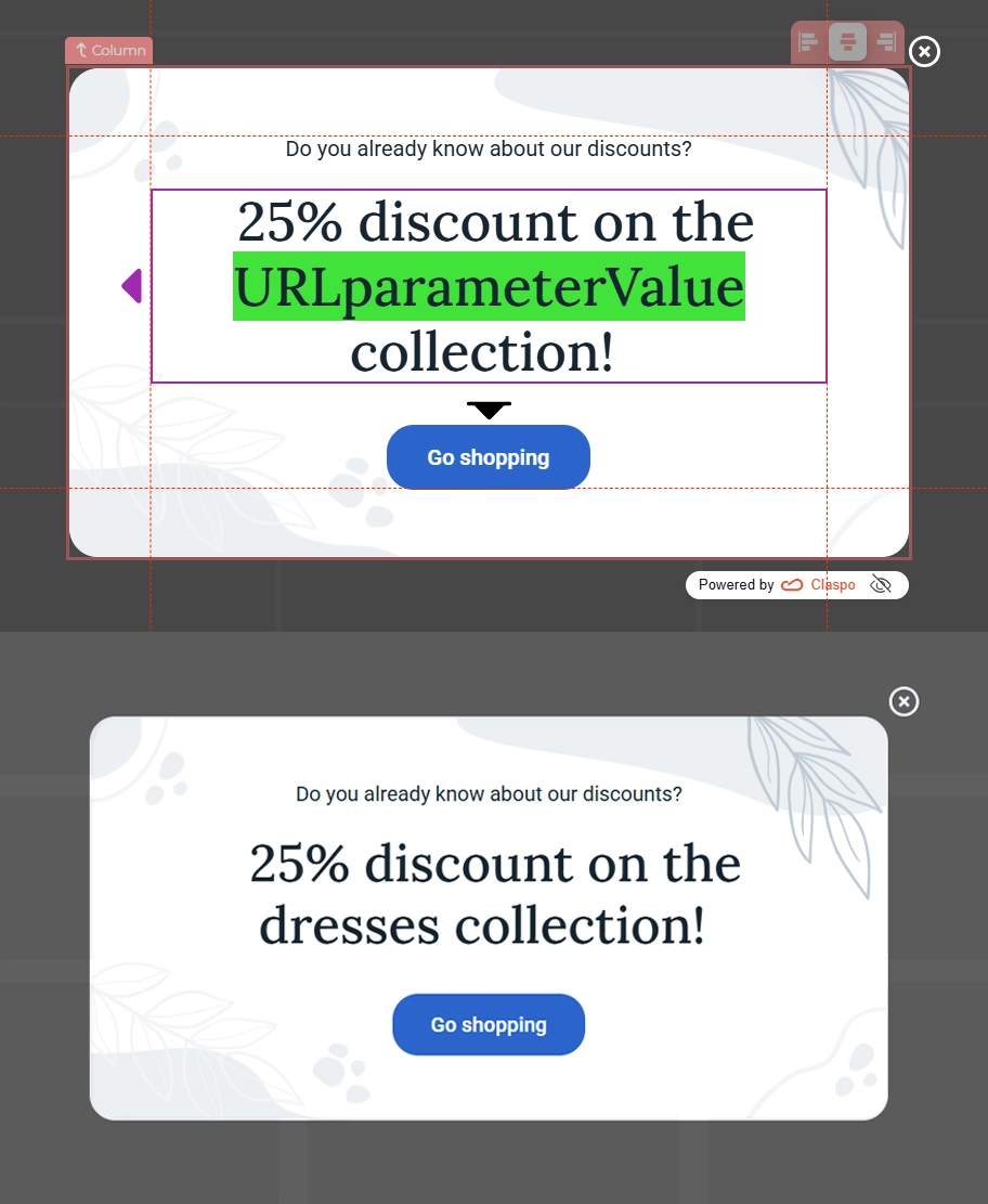
All you’re doing is pulling the category from the URL and inserting it into the text using a Merge tag. It feels personal — and that relevance leads to way more sign-ups. It works because it’s simple: no dev work or integrations required. And it’s scalable: one widget, infinite categories.
2. Gamification (average uplift: +10-30%)
If your popup feels like work, most people won’t bother with it. But if it feels like a chance to win something — a surprise, a moment of luck — they’ll lean in. That’s the power of gamification. Instead of asking for an email in exchange for a discount, you’re giving people a reason to interact. A little curiosity. A little dopamine. And a big lift in engagement.
From generic to engaging:
- Basic: a standard ‘Sign up and get 10% off’ popup — static, forgettable.
- Master-level: a gamified experience like a spin-to-win wheel or scratch card, with dynamic rewards, immediate feedback, and personalized visuals.
Real example: WHOSE’s 50% opt-in rate. For Black Friday-2024, WHOSE — a Polish fashion brand — replaced their usual static sign-up form with Claspo’s spin-the-wheel popup.

In just one week, they collected:
- 4,450 new email signups.
- 10x higher conversion rate (up to 50%).
- Nearly 30% of those signups turned into purchases.
As founder Borys Skowron put it: ‘We saw a huge improvement in sign-up rates — going from around 3-5% to as high as 50% with the gamified widgets’.
Gamification gave the brand exactly what they needed during a noisy sales season: attention, interaction, and momentum.
3. Layouts and entry points (average uplift: +10-30%)
One of the easiest ways to grow your list faster? Give people more chances to subscribe — in smarter places. A single form in your footer isn’t enough, and honestly, most visitors never scroll that far. What matters is where your forms appear, how they’re triggered, and what they say based on user behavior. You don’t need to bombard users — you need to meet them where they are, with the right message at the right moment.
From generic to relevant:
- Basic: one generic popup shown to everyone, or a lonely form in the footer.
- Master-level: a combination of welcome popups, exit-intent offers, sticky bars, and multi-step forms — all triggered based on context.
Example: smart multi-touch setup on a store. Imagine a Shopify store that sells clothing. Here's how they structure their layout for maximum impact — without overwhelming visitors:
- First visit: first-time users see a welcome popup offering 10% off in exchange for an email. It appears after they scroll 30% down the homepage.
- Returning visits: if they didn’t subscribe, a sticky bar appears on collection pages: ‘Still browsing? Don’t miss your subscriber-only offer’.
- Cart page: a slide-in form offers a gift with purchase, but only if the cart total is above $80. This creates a clear threshold that nudges users to complete their purchase and sign up to get the bonus.
- Exit intent: if someone moves to close the tab, an exit popup appears with a time-limited offer — but only if they’ve viewed 2+ products.
All of this is done with rule-based display logic — no spammy repetition, no popups fighting for attention. This setup converts at every stage of the journey — not just when the user first lands. It’s not about adding more forms. It’s about placing the right ones in the right moments.
4. Offer and incentive (average uplift: +15-25%)
Even the most beautiful popup won’t convert if what you're offering feels… meh. A vague ‘Join our newsletter’ doesn’t give people a reason to act. Visitors aren’t looking to join another list — they’re deciding whether your offer is worth their attention, time, or email address. And they’ll decide fast. What you offer — and how specific it feels — plays a huge role in whether someone signs up.
From generic to relevant:
- Basic: ‘Subscribe to stay in the loop’.
- Master-level: Offers and discounts aligned with a user’s past views or indicated preferences.
The second one isn’t just a discount. It’s a tailored, intentional nudge — aligned with what the user is browsing, how new they are, or what they’ve shown interest in.
Example: intent-based offer on a skincare store. Let’s say someone is browsing the ‘Serums’ category in a beauty store. Instead of showing a generic discount, the popup reads: ‘New here? Get 15% off our bestselling serums — just for first-time visitors’. This works because:
- It calls out their current interest (serums).
- It targets a behavior (first-time visitor).
- It adds urgency and exclusivity (just for you, right now).
Behind the scenes, this could be triggered by a URL query and a visitor segment (newcomers). No deep integration needed — just smart use of conditions and dynamic content.
Start by tailoring offers to: product category, traffic source (like a special promo for Instagram visitors), purchase intent (for example, cart value above $50). You’ll see a lift not just in signups but in sales that follow.
5. Form complexity (average uplift: +15-25%)
It might sound surprising, but asking more questions — when done right — can actually lead to more conversions. One single input field might feel ‘frictionless’, but it’s also forgettable. Multi-step forms feel more like a conversation — and that shift changes how people interact. Instead of dumping their email and bouncing, users stay engaged, make small choices, and feel like they’re getting something tailored in return.
From generic to relevant:
- Basic: ‘Enter your email to subscribe’.
- Master-level: A chat-like, progressive form that helps users complete a customized signup process.
Example: multi-step quiz. A home decor brand added a short quiz to help match visitors with interior styles. Instead of jumping straight to email, the popup asked:
- ‘Which style do you love most?’ (Modern / Boho / Scandinavian / Classic).
- ‘What’s your next home project?’ (Living room / Bedroom / Kitchen).
- ‘Want us to send decor ideas + exclusive discounts for your style?’ (Email field).
This approach did two things: qualified intent (the brand knew what users liked, making follow-up emails more relevant) and increased conversions (visitors were more willing to give their email after investing 10 seconds in the process).
Use multi-step forms when:
- You want to segment your audience before the first email.
- You sell multiple categories or styles.
- You offer personalized incentives (like style picks or product bundles).
Even one or two simple steps before the email field can increase both sign-up and post-sign-up engagement.
6. Triggering method (average uplift: +10-20%)
Even the best offer can flop if it shows up at the wrong time. You’ve probably felt it yourself — you land on a website, and before you’ve even read a word, a popup jumps in asking for your email. No context, no value, just… interruption. Smart triggers increase conversions because they match the user’s level of intent.
From generic to relevant:
- Basic: an on-load popup that appears immediately, no matter who the user is or what they’re doing.
- Master-level: a popup that’s triggered by specific behaviors — like scroll depth, time on page, exit intent — or tailored to the traffic source (like showing a special message to Instagram visitors).
Example: behavior-based popup timing on an online bookstore. Let’s say someone lands on a product page for a fantasy novel and scrolls halfway down. At that moment, a popup appears: ‘Like fantasy? Get 10% off your first magical read — just drop your email’.
Here’s what’s happening behind the scenes:
- The popup waits until the user scrolls 50% down the page (showing interest).
- It’s only shown to first-time visitors (so it doesn’t annoy repeat buyers).
- It’s tailored to the category (fantasy), using either URL or category-based targeting.
Behavior-based triggers create what UX designers call ‘moment-based relevance’ — they show up when the user is already leaning in, not when they’re trying to get oriented.
7. Design and user experience (average uplift: +5-15%)
Design isn’t just about making your widget look nice — it’s about making it feel trustworthy, easy to use, and worth engaging with. Visitors decide in seconds whether to interact or ignore, and clunky popups with awkward spacing, broken mobile layouts, or misaligned branding are easy to dismiss. The better your UX, the less mental effort it takes to convert.
From generic to relevant:
- Basic: a popup that looks like a default template — maybe misaligned on mobile, with unclear CTAs and clashing colors.
- Master-level: a widget that feels like part of your site: clean layout, brand-matched visuals, smooth animations, and mobile responsiveness.
People don’t engage with popups they don’t trust — and bad design breaks trust quickly. It’s not just about looking nice — a well-designed popup feels like it belongs on your site. Visitors don’t question it or hesitate. And on mobile, it just needs to work: easy to read, easy to tap, easy to close if they’re not interested.
8. Urgency elements (average uplift: +5-15%)
You don’t need to go overboard with timers and pressure. That stuff can feel pushy and actually turn people away. But when there’s a real reason to act now — like a deal that ends soon — it gives people a clear, simple reason to say yes.
From generic to relevant:
- Basic: no urgency at all — ‘Subscribe whenever you feel like it’.
- Master-level: a clear, time-sensitive offer, like a discount that expires in 15 minutes, reinforced with a countdown and immediate reward.
Example: countdown-based popup. An Asian event booking platform ran a campaign using Claspo's time-limited discount widget with a live countdown, bold CTA, and a promo code. The result is a 10.6% conversion rate.
You can benefit even more from FOMO with relative countdowns. They don’t just tick from a fixed date — they start fresh for every visitor. That means:
- Each user gets their own fair window (such as 15 minutes to claim the deal).
- Once their time runs out, the offer disappears just for them.
- The offer can stay live on your site, but still feel fresh to every visitor.
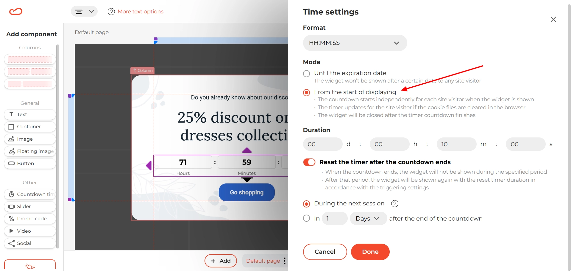
Because each person sees their own timer, it doesn’t look recycled — and it still feels like they’re getting a one-time deal.
9. Presence of email capture (average uplift: +5-10%)
Let’s keep it simple: if no one sees your form, no one signs up. Ask yourself this: do you have a single sign-up form buried in your site’s footer — hoping people scroll down and find it? If so, you’re not alone. But you’re also likely missing a steady flow of potential subscribers every single day. It’s not that the form itself is bad. It’s that it’s invisible to most users — especially on mobile, where footers often get skipped completely.
From generic to relevant:
- Basic: one static form in the footer, or hidden behind a ‘Subscribe’ link.
- Master-level: a layered strategy — a welcome popup for new users, a sticky bar on product pages, and an exit popup that catches people before they leave.
What that might look like:
- A welcome popup offering 10% off when someone lands on your site.
- A sticky bar that appears on collection pages, reminding them about your free shipping threshold.
- An exit-intent popup triggered when someone views two or more products but doesn’t convert.
- A simple embedded form at the bottom of blog posts for visitors who prefer a more passive, no-pressure option.
The best opt-in strategy doesn’t rely on one shot. It gives users multiple chances to say yes — without overwhelming them. Review your site as if you’re a first-time visitor. Where’s the first place you’d see an offer to subscribe? Where’s the second? If you can’t answer that easily — it’s time to add a few more smart touchpoints.
You’re closer than you think to 10%+ opt-in rates
If there’s one takeaway from everything above, it’s this: better opt-in rates don’t come from working harder — they come from working smarter. You don’t need dozens of tools or massive redesigns to turn your website into a subscriber magnet. You just need to focus on the right areas — the ones that actually move the numbers.
We’ve seen how small, strategic upgrades across your popups — personalization, timing, layout, offer relevance — can unlock serious results. We’re talking about going from 2% opt-in rates to 10% or even 30%, just by aligning your forms with user behavior and intent.
And the best part? You don’t have to build this from scratch. With Claspo, you get access to everything we’ve covered — from gamified widgets and behavioral triggers to multi-step forms and smart targeting — no matter which plan you’re on. Yes, even the Free Forever plan includes all the features, so you can start making real changes without opening your wallet.


![Multi-Step Form: Definition & Benefits, How to Create a Step Form [Tutorial]](https://static.claspo.io/var/www/html/public/photos/shares/Blog/новые картинки/Multi-Step_Form_Definition___Benefits_How_to_Create_a_Step_Form__Tutorial__2.webp "You Might Be Interested in")