
10 Best Multi-Step Form Examples and Why They Work
In this post, we’ll share some of the best multi step form examples broken down by use cases and explore various multi-step form designs, examining what makes them effective and identifying areas where they could be improved.
Even a simple multi-step form can make the interaction with your website easier and more enjoyable for your users while keeping them interested. At Claspo, we’ve spent months designing, testing, and optimizing multi-step forms. You may ask why is this important? A well-designed multi-step registration form can transform the user experience and significantly improve completion rates, ensuring visitors provide all the information you need.
That’s why we’re sharing ten great multi step form design ideas you can use for inspiration. Experiment with multiple multi-step form layouts, questions, and logic to see which one resonates most with your audience.
And if you’re ready to create your own multi-step form, sign up for Claspo. Drawing on our expertise and following multi step form best practices, we’ve created multi-step form templates that reflect the careful planning and attention to detail required for effective design. Curious how all this comes together? Our interactive multi-step form demo shows you exactly what to expect. Start with a free forever plan that allows you to try all the features from the get-go 😉
Missing Out on Conversions? Switch to Multi-Step Forms
The impact of multi-step forms is undeniable, some of our users see over a 100% increase in conversion rates right away, so testing a multi-step lead form is one of the most impactful CRO experiments you can run right now.
What’s more, using a multi-step format lets you ask additional questions without overwhelming users, helping you gather detailed, high-quality leads.
But how do you spot a great multi-step signup form?
At Claspo, we’ve spent months creating and analyzing these forms. Below, we’ve compiled our picks for the 10 best multistep form examples from across the web — ones that consistently drive outstanding conversion results.
10 High-Converting Multistep Form Examples for Your Website
Now, let’s analyze these multi step form examples and see how you can use these smart forms.
Application Form
A "Who's Who of Executives and Professionals" is a curated list of notable people in the professional world who have achieved significant success in their careers. You can get added to the list through a step-wise form.
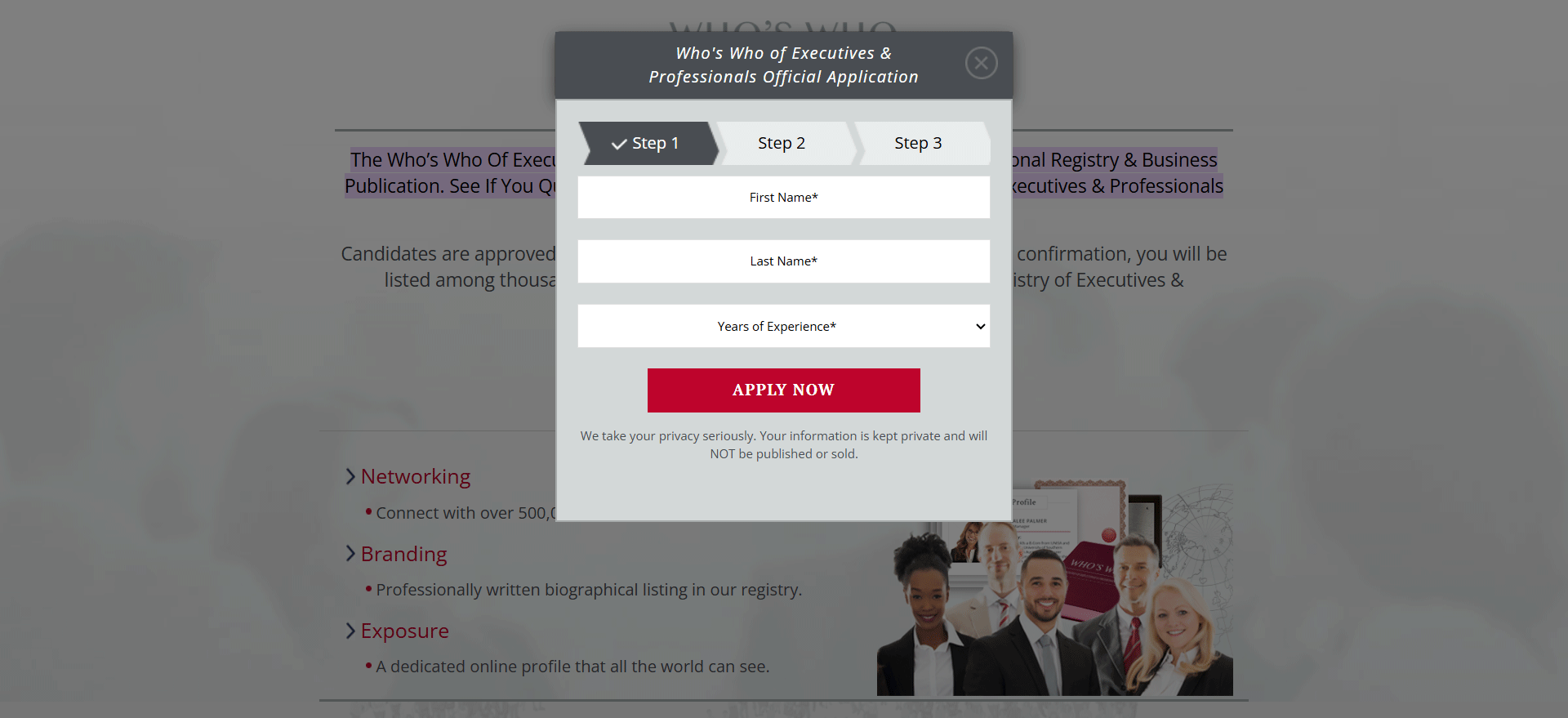
Since the website is designed for professionals and operates in the business sphere, its design is appropriately minimalistic and aligned with its purpose. The multi step registration form is elegant and seamlessly blends with the site's overall design. Its structure is clearly defined into steps, allowing users to understand how much effort is required to complete it.
Key highlights:
- Clean, professional design matches the tone of the business-focused website.
- Clear step structure that shows users how much effort is required.
- Fields are grouped logically.
- The focus is on essential info.
- A data privacy statement that builds trust with a professional audience.
- This step form design fits the website’s style seamlessly.
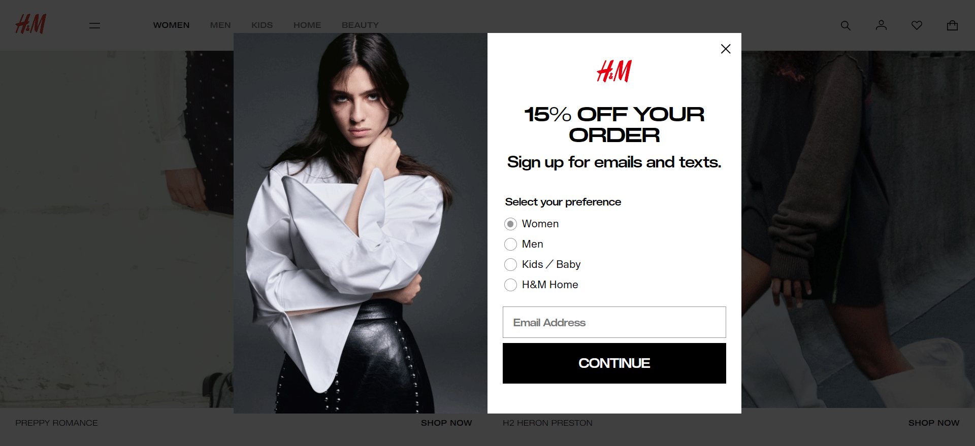
Special Offers
Obvi has created a multi-step lead form to stimulate first-time purchases. The brand chose a full-screen layout to fully focus the user’s attention on the offer. However, users still have the option to close the form if they wish.
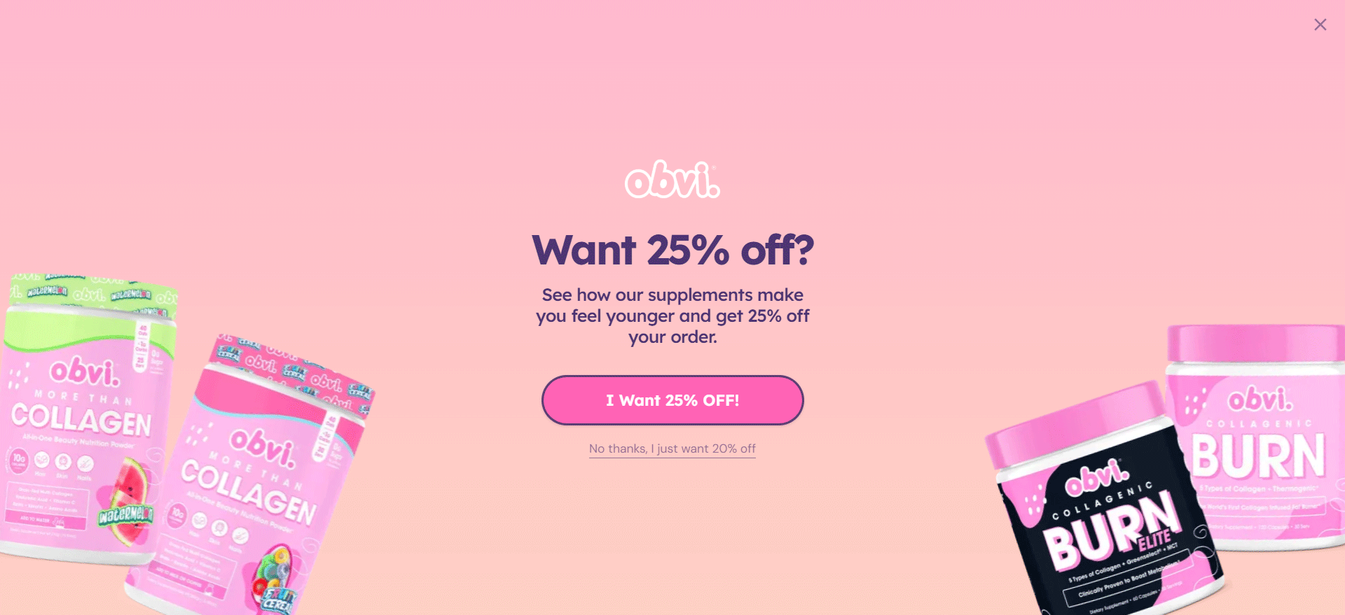
The brand uses text to highlight the positive outcomes for the customer: feeling better and enjoying a discount. This combination of benefits creates a compelling incentive while maintaining user autonomy.
Key highlights:
- Full-screen layout captures full user attention on the offer, minimizing distractions.
- The opt-out option supports user agency and control.
- Trust-building language around sharing personal data creates transparency and reduces hesitation.
- Micro-commitment strategy in collecting email first increases the chance users will continue to the next step.
Opportunities to explore:
- Phone number request is a sensitive aspect for users, a few visitors would agree to that.
- Full-screen forms might seem intimidating without additional visual cues or progress indicators.
Bookings and Reservations
At Claspo, we believe the best multistep form design should adapt to any need, so why not include our widgets in this list? Take, for example, our widget designed for seamless table reservations in your restaurant.
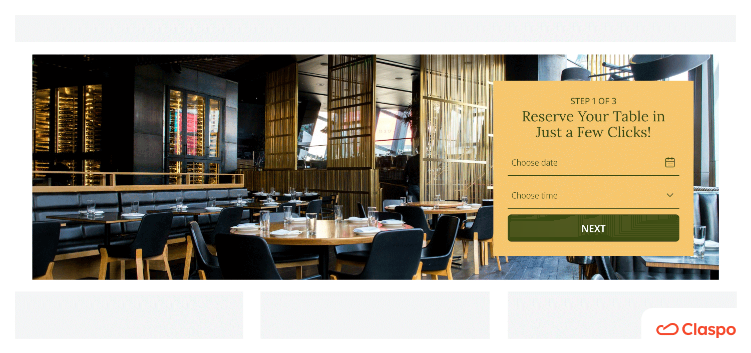
Key highlights:
- The booking process is easier since users don’t need to talk to staff.
- Each step is clearly indicated, reducing possible friction.
- Visitors receive confirmations and reminders by email or text, reducing missed appointments.
You might wonder how to process the reservation data afterward. Using webhooks, you can integrate Clapso with your reservation management system, ensuring that reservations are processed automatically.
Preferences Quiz
Desert Does It, a company specializing in truck and car accessories, has cleverly combined step-by-step form design with a questionnaire to enrich each potential customer's profile. This approach allows them to collect additional data, enabling more personalized product recommendations and targeted offers in the future.
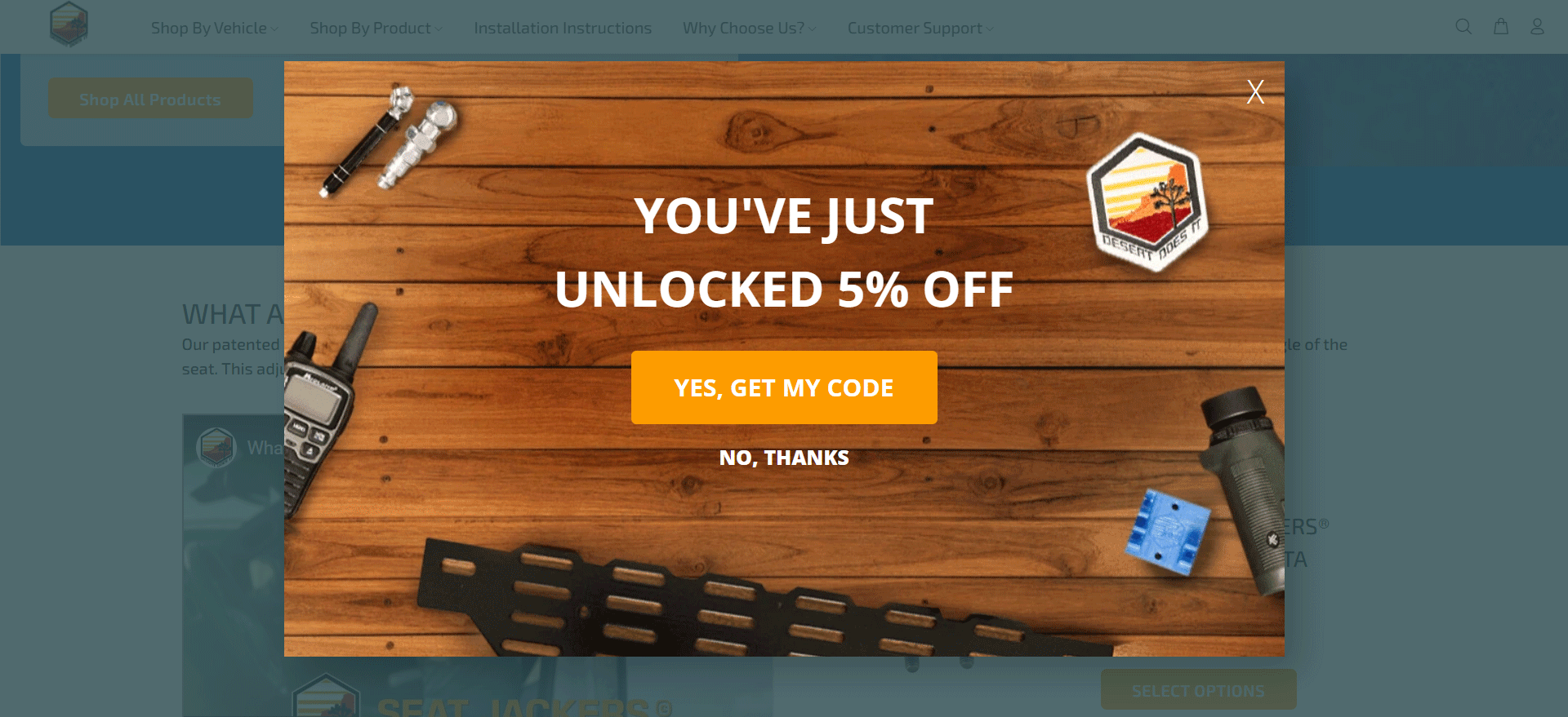
Key highlights:
- An enticing offer drives the action.
- To proceed, users don’t need to type, only select the appropriate options.
- By the final steps, users have invested effort, leveraging the Zeigarnik effect to motivate completion.
- The phone number exchange is rewarded with an extra 10% discount.
- The fine print explains the sign-up terms and opt-out options.
Opportunities to explore:
- Monitoring user drop-off on the phone number step could help optimize conversion further.
Building a Subscriber List
Here, we have a simple multi-step form from one of the largest retail brands. Although the form consists of only two steps, its simplicity does not compromise its effectiveness.
Key highlights:
- This two-step multi-step signup form is quick and easy to complete.
- A bullet-point list helps segment the audience for better targeting.
- Claspo users can replicate this setup using a similar audience segmentation component.
Opportunities to explore:
- There’s room to expand the form slightly to collect more data without hurting the user experience.
Collecting Requests
Here’s another example from us. This multi-step lead form is designed to catch and simultaneously qualify leads. It’s perfect for gathering requests for audits, demos, consultations, and more.
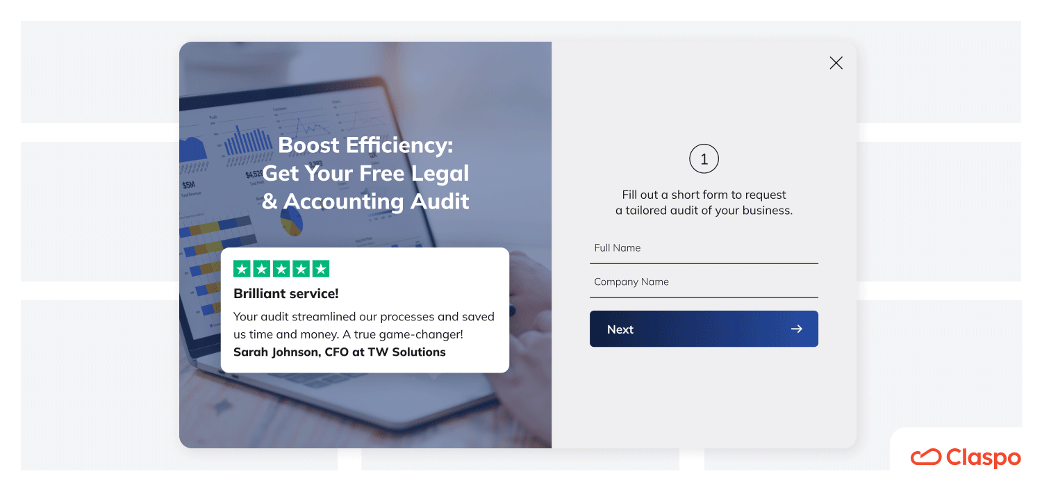
Key highlights:
- Lead capture is paired with qualification.
- Social proof (reviews/ratings) builds trust and boosts completion rates.
Opportunities to explore:
- Swap in branded testimonials or add a quick case study to reinforce value.
Lead Magnet
Almost every marketer is familiar with this multi-step form example, but we include it anyway because it perfectly demonstrates how such a form can help you qualify leads effectively.
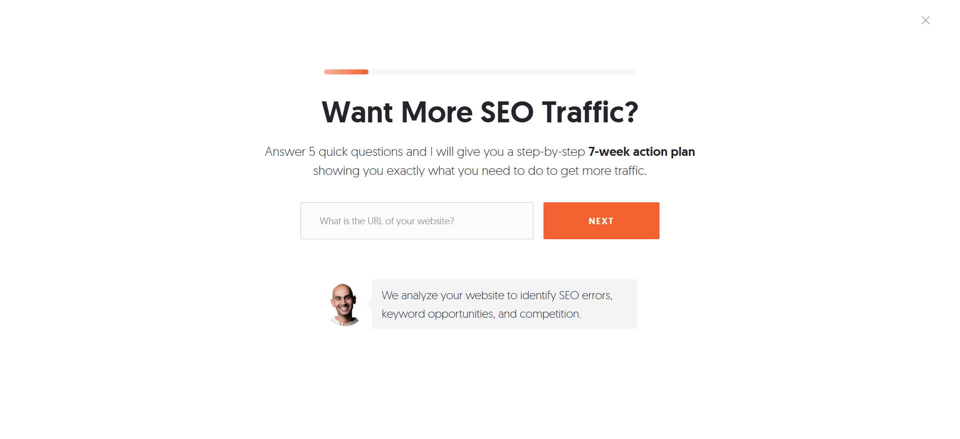
Key highlights:
- Clear and upfront offer sets expectations and lets users know what to expect from the first screen.
- Value is reinforced beneath each question, encouraging users to complete the form.
- Neil uses strong, benefit-driven copy that keeps users motivated throughout every step.
Opportunities to explore:
- Since the form is quite long, adding micro-rewards or other engagement elements could further motivate users and reduce drop-off.
Product Quiz
Multi-step forms can be seamlessly integrated into your website's design, and Kohl’s provides an excellent example. An inline widget is one of the best multi-step form designs if you want to avoid distracting users with pop-ups.
Kohl’s and Sephora have created a skincare quiz that helps users find the right products for their needs. This not only enhances the shopping experience but also increases the likelihood of a purchase. The quiz builds trust by giving users confidence that the recommended products are just perfect for their needs.
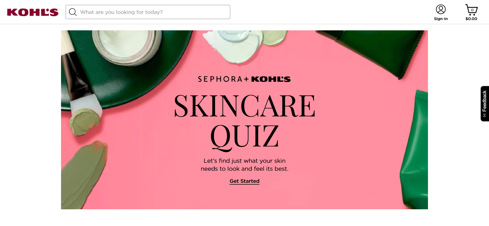
Key highlights:
- Inline widget design integrates seamlessly without disrupting the user experience.
- Skincare quiz effectively personalizes product recommendations, boosting trust and conversions.
- Conditional logic tailors the flow based on user choices, enhancing relevance.
- Collaboration with Sephora adds credibility and domain expertise.
Opportunities to explore:
- Make sure such a form is mobile-friendly to ensure smooth interaction across all devices.
With our widget maker, you can also create a multi-step form with conditional logic. Simply design the necessary pages and thoughtfully connect them to create a seamless user experience.
Surveys
You may have come across surveys from Amazon if you've ever ordered from them. If not, the survey for the Amazon Associates Program (Amazon's affiliate program that incentivizes influencers and professional affiliate marketers to drive sales to Amazon) provides a nice example.
Note that this is just a portion of the form. Given the scale of the program, it requires many pages to cover everything. However, your survey form can be more straightforward and concise.
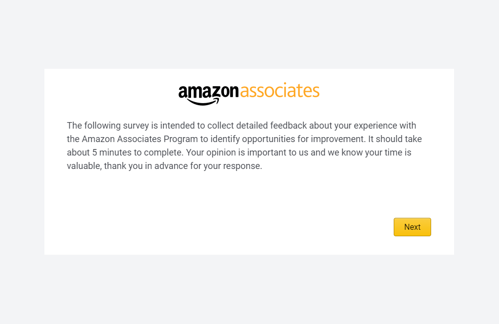
Key highlights:
- Multi-step format handles large volumes of complex questions effectively.
- Such feedback surveys let the company improve their service continuously.
- Adaptable design allows for scalability depending on survey length.
Opportunities to explore:
- For smaller surveys, simplify the number of steps to increase completion rates.
- Add progress indicators to keep users informed on their survey status.
- Use conditional logic to show relevant questions and avoid unnecessary ones.
Welcome Offers
Snif takes a fun approach to promoting its welcome offer. The pop-up seamlessly integrates Snif’s branding through playful copy, such as "Go ahead, snif us" in a running marquee and "on your first snif" within the discount offer.
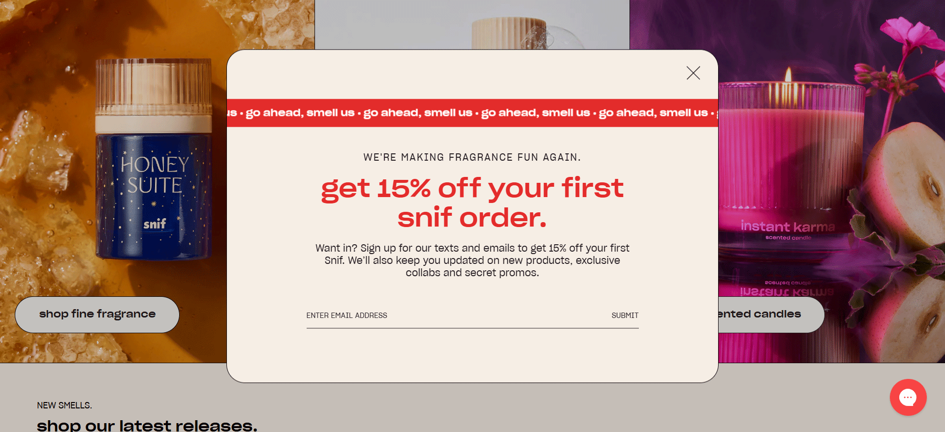
Key highlights:
- Playful, brand-aligned copy reinforces Snif’s identity.
- Minimal, two-step structure ensures a fast and smooth user experience.
- Clear and appealing incentive motivates users to complete the form.
- Seamless integration of branding elements makes the form memorable.
Opportunities to explore:
- Since the form collects both emails and phone numbers, test variations of the incentive or copy to optimize conversion rates.
Now that you’ve seen what works, it’s your turn to create something great. To help you get started, we’ve curated a list of the top multi-step form plugins for WordPress (free and paid).
Why Multi-Step Forms Work
One of the main reasons multi-step forms are so effective is that they play to basic psychological principles that influence user behavior.
#1. Simplifying the Interaction
A step-by-step form design breaks the process into smaller, digestible chunks. Users only focus on one question or section at a time, making the process more manageable.
#2. Using the Zeigarnik Effect
This is a fancy way of saying that people like to finish what they start. Completing each step gives users a small sense of accomplishment, motivating them to continue and complete the form.
#3. Building Micro-Commitments
Each step of a multi-step form is like a small “yes” pushing users to keep going. By the time they near the final step, they’ve already invested time and effort, making it harder to back out.
#4. Improving Clarity and Engagement
Instead of asking the user every question at once, multi-step forms guide them through the process. This makes it easier for users to focus on the task without feeling overwhelmed.
When you align your forms with these psychological principles, you create a more user-friendly experience. That leads to:
- Higher Conversion Rates: Users are more likely to complete your form because it feels like less work.
- Better Qualified Leads: Breaking the form into sections lets you ask more thoughtful, detailed questions to segment the audience and assess the quality of leads.
- Improved Brand Perception: A well-designed, interactive form makes your business look professional, modern, and in touch with user needs.
- Better Form Efficiency: Achieve multiple goals at once with a single multi-step-form design.
How to Improve UX with Multi-Step Form Best Practices
Now that you have some inspiration and an idea about what makes a good multi-step form, let’s put it all together. Here’s how to create multi-step forms that will guide your users, ensuring they enjoy the journey and reach their destination.
1. Use Clear Step Indicators
A clear step indicator helps users understand how far along they are in the form process. It also helps reassure them that the form is manageable, decreasing abandonment rates. You can use a progress bar, numbered steps, or labeled sections.
2. Break Forms into Logical Steps
Grouping similar questions/fields together makes the form easier to understand and complete. You reduce the amount of mental effort required to process information. On top of that, putting related fields together helps make the process feel more natural, encouraging users to move through the steps.
3. Provide a Navigation Option
Include easy-to-find ‘Back’ and ‘Next’ buttons, and allow users to review or change their answers without losing progress. This pretty simple tweak also makes the experience feel less rigid. If users know they can go back and correct mistakes, they’ll feel less anxious about completing the form.
Currently, Claspo does not support navigation, but we’re working on adding this feature to our templates. Stay tuned!
4. Optimize for Mobile Responsiveness
If your form isn’t mobile-friendly, you risk losing a significant portion of potential leads. So, take the time to adapt your widget for smaller screens. Claspo makes this process easy with a preview feature that lets you see how your form will look on different screen sizes before it goes live.
Our widget maker also automatically scales the design to fit different screens. Still, review your version and make sure it follows the following principles:
- Fonts should be easy to read (16px and above), and buttons should be large enough for finger navigation (at least 44x44 pixels).
- Make content concise and focused — use fewer words and ensure every word adds value.
- Use high-contrast colors for text and buttons to ensure they stand out against the background.
- Make the close button prominent and easy to tap.
When using images and visuals, keep them lightweight:
- Use compressed images to maintain fast load times. This is essential for mobile users.
- Avoid large visuals that dominate the screen. Instead, use smaller images to support your text and create focal points, or consider removing images altogether.
- Remove unnecessary decorative elements or extra form fields to keep the form streamlined and user-friendly.
5. Add Engaging Microcopy and Tooltips
Adding microcopy to a multi-step registration form makes it easier and more enjoyable for users. Microcopy is the small bits of text that guide and reassure users, like a note by the email field that says, “We’ll only use this for updates — no spam!”
Remember that helpful text next to the phone number field? That’s exactly what we’re talking about. Feel free to revisit the multi-step form examples above and take a closer look to see how it’s used effectively.
6. Minimize Required Fields
Only ask for information that is absolutely necessary to complete the form. Save optional or detailed questions for later stages or follow-ups.
Multi-Step Form Design Mistakes and How to Fix Them
When designing multi-step forms, avoiding common pitfalls is just as important as following best practices.
1. Too Many Steps
You can use a progress indicator and neatly group your questions, but if your form has, say, 15 pages for users to complete, it’s likely to fail. Be realistic about how many steps you truly need to get the desired result, and resist the temptation to overload your form with unnecessary pages. Keep it concise and focused to keep users invested.
2. Using Overly Complicated Language
Confusing or technical terms can frustrate users and slow down the process. If a question or instructions aren’t immediately clear, users may lose interest or input incorrect information.
Keep your language conversational and simple. Instead of “Provide credentials,” say “Enter your account details.”
3. Asking for the Same Information Twice
What would you think if you were filling out a form and had to enter the same information multiple times? Maybe something like, "Who designed this form?" Asking users to repeat information across several steps makes the form feel unnecessarily long and can frustrate them.
This is especially relevant when creating multi-step questionnaires. Before launching your form, carefully review all the questions. Use the preview mode in Claspo to review the entire form and ensure everything works smoothly.
4. Not Personalizing the Form
If you're building a multi-step form with conditional logic, the outcome of the form must be personalized. For linear forms, you can use merge tags. For example, in Claspo, you can utilize a user's name, email, or other data to personalize your multi-step form. This approach makes interaction with your form and brand more enjoyable and memorable.
5. No Confirmation or Next Steps
Your multi-step form must include system messages to notify users about errors or successful submissions. In Claspo, these pages are already set up for you. All you need to do is edit the text to ensure users understand the result of their submission or the next steps they need to take. This adds clarity and enhances the user experience.
6. Too Many Distractions
A good multi-step form design aligns with your web interface to create a consistent and intuitive user experience. For instance, if it’s a pop-up or a floating box, make sure its timing doesn’t overlap with other widgets. Use Claspo’s overlap protection to prevent widgets from appearing simultaneously. Also, ensure the placement doesn’t block important elements, like a support chat.
If it’s an inline widget, integrate it naturally into the page while still drawing attention. For example, allocate it a slightly larger space or use contrasting design elements to make it stand out without clashing with the rest of the page.
Ready to Create Your Own Multi-Step Form?
Multi-step forms are a great way to engage your visitors and get better leads, but putting one together can feel a little tricky. If you want to see how to do it right, go read our full guide on how to create WordPress multi step form. It walks you through every step and shares handy tips, especially if you’re using WordPress. Check it out to make sure your form works smoothly and looks great.
Try Multi-Step Forms to Improve UX and Get More Leads
When you’re ready to take the plunge, keep in mind that multi-step forms do more than just look nice. They actually help you learn more about your visitors, keep them engaged, and cut down on people dropping off. That means more chances to connect and turn those leads into customers.


