15 Best Website Contact Form Examples of 2026


Summarize
Website contact forms are an essential part of most websites. They provide a way for visitors to get in touch with you, and they help you collect important information from your users.
However, not all contact forms are created equal. Here are fifteen contact form examples from real websites to help you get inspired to create your best contact form design. Each example has a description where you can see the strong and weak points of such a solution.
With these tips in mind, you can create a contact form that is both effective and user-friendly.
You might want a contact form on your website for many reasons. Perhaps you want to offer customer support or take sales requests. Maybe you're hoping to establish brand partnerships or provide excellent customer service. Whatever the reason, it's important to ensure that your audience can easily reach you through various channels.
When you're designing your website, your contact form should be one of your top priorities. Make it easy for your visitors to get in touch with you, and you'll see the benefits in no time!
When it comes to designing a contact form that works well, you have many different options. The overall design of your contact form may be impacted by factors such as your brand's style guide, the theme of your website, how you plan to manage contacts, and what type of information you need to collect.
Some of the best tips for creating an effective contact form design is to look at examples from other websites and see what works well for them. This can give you some great ideas to adapt and make your own.
How to Spot a Good Contact Form?
There are many factors to consider when designing a contact form that will actually generate conversions. While there is no single formula for success, some best practices can help increase your chances of conversion. One effective strategy to increase conversions is using a lead capture pop-up. By strategically placing it on your website, you can prompt users to submit their contact details, ensuring you capture valuable leads right at the moment they're most engaged.
Some important things to keep in mind include making sure your form is clean and concise, with clear and concise questions. You'll also want to make sure you provide a strong call to action and ensure that your form is mobile-friendly.
It's a common misconception that shorter forms lead to higher conversion rates. In reality, though, this isn't always true. In fact, longer forms can sometimes be more effective in getting users to complete them.
Here's why: longer forms give you more opportunities to collect user information. This can be valuable data that you can use to improve your product or service. Additionally, longer forms can provide a better user experience by giving users more space to input their information.
So next time you're designing a form, don't automatically assume that shorter is better.
The best contact forms examples don't just give users a place to shoot off a message — they guide users into asking the right questions and sending the right types of messages. By doing this, businesses can filter out messages that aren't valuable and focus on the ones that are.
A great website contact form will positively impact your business in many ways. It can help generate leads, support existing customers, and generally create a better experience for everyone involved.
Website Contact Form Examples for Inspiration
Let's check the most interesting examples of contact forms that we have found here and there.
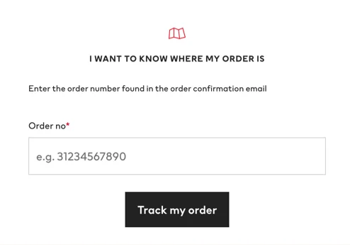
1. H&M
See how minimalistic H&M created their feedback form. To find the answers to the most popular questions, you can visit the FAQ page. And to find your order, you can enter your order number and get the desired information in seconds.
Notice how the form has only one input window: this means that the most popular request is to track the order. It stays minimalistic while helping most of the customers to find what they want to find.
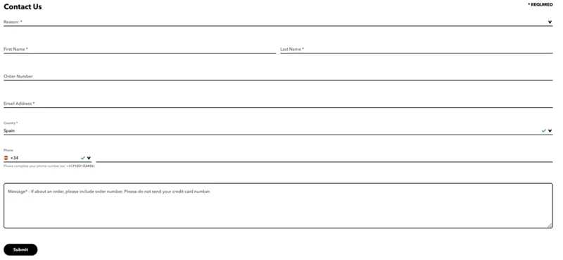
2. Patagonia
This example presents the classical contact form where customers need to indicate lots of personal information to ask a question.
This might fit many businesses, depending on their goals. You need to keep your goals in mind when asking specific questions. How exactly the questions you ask will help you solve the issue?
The good point on this Patagonia page is that it keeps a pop-up asking about what topic people are planning to ask. Such pop-up is one of many pop-up types. There might be answers to questions as many issues are the same for many customers. This is a great move to lower the workload and optimize the working process.
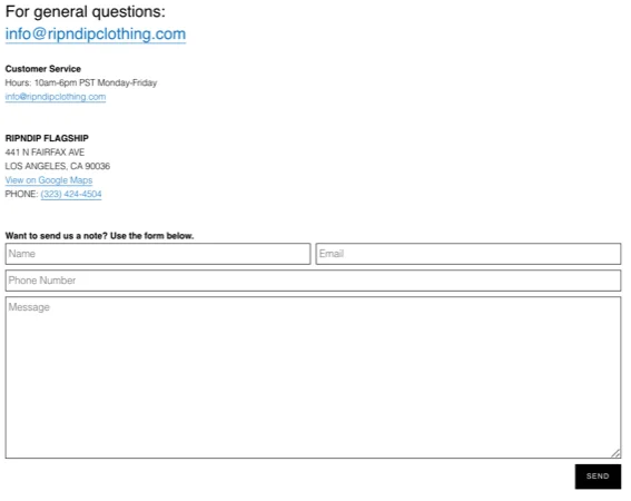
3. RipNDip
A clean solution that fulfills its purpose. Check how well this page is structured. It starts with offering clients to ask general questions via email, meaning that it doesn't include writing down lots of information.
Then you can see the working hours and physical address and phone.
And only then is there a contact us form where the brand offers its clients to write a note on any occasion. Why not say Hi and Thank you to your favorite brand? Sounds friendly.
This approach fits this brand as it represents street fashion for skateboarders primarily. And based on the target audience, the brand can adjust all the communication to fit into the community. Try to follow this example and connect with your target audience.
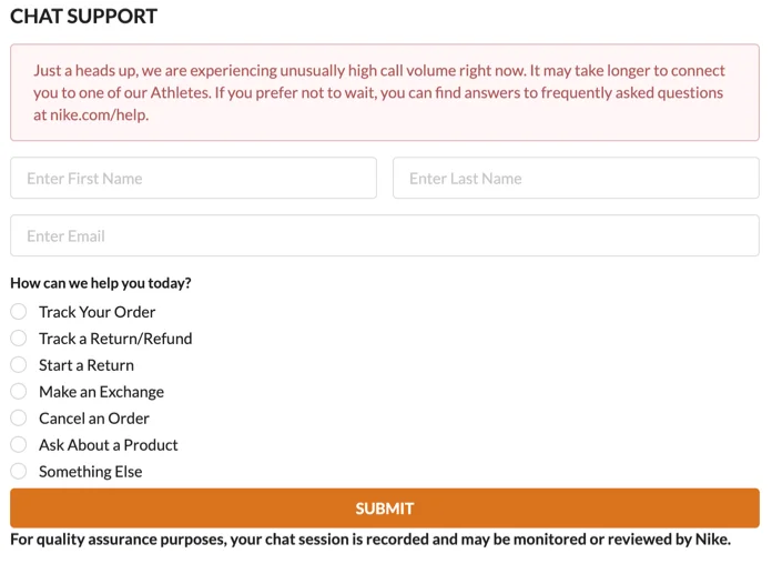
4. Nike
Nike offers to enter only the most important information to chat with you. Just write down your name and email, and pick a topic of your problem, and you are good to go.
Keep it clean and user-friendly, and your clients can understand what they have to do to talk to you. To start with such an approach, you can check out the launchers pop-ups.
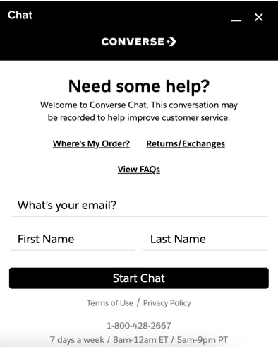
5. Converse
Many brands offer instant support like the Converse online store does. With the help of online chat solutions, customers can get help immediately without waiting for an answer via email.
It is a modern, fast, and elegant solution if you have enough employees to cover this part of your workload.
Notice how Converse offers the most popular topics that clients ask them about so they can check whether there is an existing answer to the client's question.
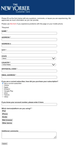
6. The New Yorker
This is an example of a contact form you used to see all over the internet. It is a classic option where clients have to enter lots of information before getting an answer.
If you understand that you need all these questions to be answered, you should put them on your form. In another case, we advise you to keep it simple, friendly, and brief.
Here you can see that The New Yorker not only gets personal information but also asks about devices and subscription status. Besides helping them solve the client's issue, such information can also be used for marketing purposes, so keep that in mind.
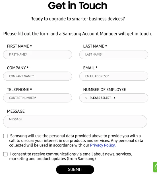
7. Samsung
Samsung has a classical website contact form with lots of information they probably won't need to help their customers with most issues. However, they still ask to name the client's company.
It's good that you can see the information near checkboxes about the security of the provided data. This is crucial to ensure people can trust you and your business. No one wants to send their data to unknown people who god knows how can use their personal information.
8. Netflix
Netflix uses modern solutions that are aimed to exclusively help their customers, not depending on their personal data. It is possible since you have to be logged in to chat with Netflix's manager.
But if you need to get specific data, make sure to add the fill-in fields to get that information. Be clear and transparent about why you need that data and how you will use it. This is a 101 of excellent marketing strategy.
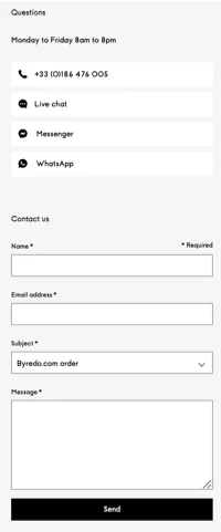
9. Byredo
A simple yet elegant solution for any customer preference. At first, Byredo provides different instant consultation options and notifies about the company's working time. And only then Byredo offers to leave the request via its page in a classical way — by email.
It's a great move to ensure that your customers and target audience can pick the most comfortable way to contact the brand.
10. Barnes & Noble
Once again — simple yet elegant and user-friendly. There is no way clients could click in some places that weren't intended for a click.
Notice how Barnes & Noble offers to add a file if there is a need. So if your business is connected with selling actual products, you could add such a feature so people can upload pictures of their goods.
On the other hand, the brand doesn't state what it will do with the data and doesn't ask for permission to use the data.
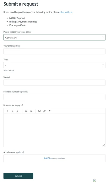
11. Grammarly
This contact us form starts with finding out the client's issue niche to be more specific with the help. As we’ve said earlier, many clients have the same issues that could be easily solved. So why spend lots of time with the workers answering the same questions, right?
Thus business owners add FAQs or similar navigation to help people solve their issues and find answers to their questions.
12. MacPaw
Simple questions, simple page — everything made to look simple and easy to fill in. What would you expect from a top-notch product? Indeed it will have the best design and writing.
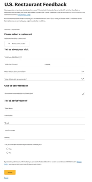
13. McDonald’s
Check how it is possible to create a contact form for a food chain restaurant. Mcdonald's even asks you to state a date and time when you were in Mcdonald's. And no wonder — it is made so their team could track down the issue and make the best of helping clients solve the problem quickly.
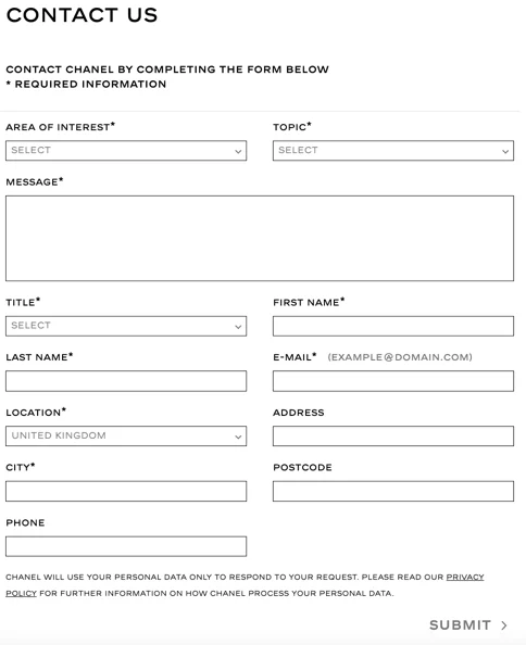
14. Chanel
Another easy and elegant solution for an elite brand that takes care of its clients as a part of its brand strategy. It may seem they ask for too much information, but it is what it is. Check if you need that much data, and if not, try to omit unnecessary questions.
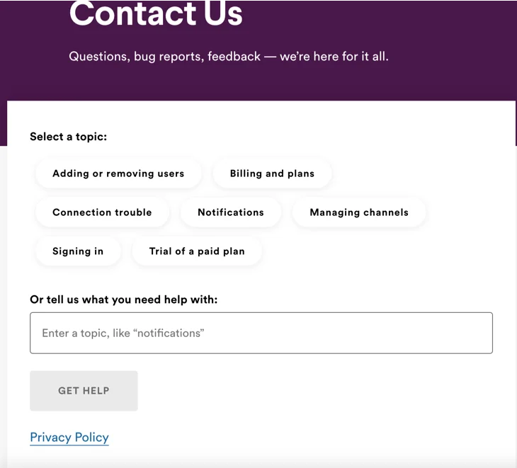
15. Slack
Check how simply this example is made. Slack offers to pick one of many topics that are popular as an issue. That helps to solve common questions faster and more efficiently.
Tips to Make Your Contact Form Design Perfect
What makes a great contact form?
There are a few things that make a great contact form. You’ve seen it among the contact form examples above. First, it should be unique. People should be able to see that your form is different from all the others out there. Second, the text in the form should be high quality. It should be free of grammar and spelling errors, and it should be easy to read. One way to ensure your forms stand out is by using service form templates. These templates can be customized to fit your brand's style and the type of service you're offering, ensuring a professional and consistent user experience. Finally, the form should use different words than what people are used to seeing.
1. Clear Communication Is the Key to the Trust between Your Client and You
You might need multiple website contact forms for different purposes with a busy business or website. For example, you might have a form for sales inquiries, another for customer support, and yet another for online orders. Or you might have an effective call back template that you used to create an efficient form for callback requests.
In addition to traditional contact forms, consider adding an opt-in form for your visitors. This form can help you collect email addresses for future marketing campaigns, allowing you to stay in touch with potential customers or send follow-ups after interactions.
Forms are an essential part of any website or application. They allow users to input data and submit it for processing. However, forms can be confusing and frustrating for users, especially when multiple forms are on a single page.
To avoid this problem, it's best to separate forms into different pages or sections. This way, users will know exactly what each form is for and won't get overwhelmed by too many fields.
Each scenario is clear to users, so it doesn't matter which exactly you pick. Just ensure it is clear and easy to use so visitors don't confuse.
2. Pay Attention to the Length of Your Form. Be Sure It’s User-Friendly
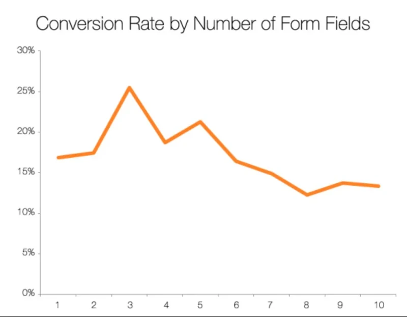
The more form fields there are, the fewer submissions you'll get. That's what the evidence shows. For example, HubSpot looked at 40,000 landing pages and saw a clear connection between conversion rates and the number of form fields. The best conversion rate was with three fields. After that, the rate dropped until there were eight fields, then it evened out.
It's important to ensure that your contact form example collects all the necessary information without making it so complicated that people will give up before completing it. Reducing the number of fields on your form can help increase submissions, but be careful not to sacrifice quality for quantity. A good rule to follow is only to remove unnecessary fields. This way, you'll still get important information while also making it easier for people to submit the form.
3. Don’t Forget about Microcopy to Explain What You Want
Your contact form is the key to maintaining communication with your customers or clients. Without it, you risk losing out on important messages or feedback. To ensure that your visitors understand your form fields, add microcopy.
Microcopy is a short explainer text that clarifies the purpose of each form field. By adding this extra information, you can avoid confusion and ensure that your visitors know exactly what to do. As a result, you'll get the necessary information while maintaining strong communication with your audience.
4. Don’t Be Afraid to Try Out Different Formats
There are many ways to display a contact form on a website. Some people may picture the traditional embedded form, while others prefer a pop-up or notification bar. Experimenting with different methods can help you find the best way to make it easy for people to get in touch with you. For more complex contact needs, consider implementing a multi step form design. This approach can break down long forms into manageable sections, improving the user experience and increasing conversion rates by guiding users through the process step-by-step.
For example, having a floating contact button on the side of your site can be very helpful for a support contact us form. Users can easily contact you if they face an issue without searching around the page. In addition to a floating contact button, you could also consider using a popup form. This can be triggered when a user shows interest or intends to leave the site, providing a simple and immediate way for them to get in touch or request support.
5. Be Clear with Your Customers about Your Intentions
After filling out a contact form, you may wonder what happens next and how long it will take to hear back. To offer a better user experience, it is important to set clear expectations for what will happen after the form is submitted. For subscription forms, it's equally important to set clear expectations. Let users know when they'll start receiving your emails, what kind of content they'll receive, and how often they can expect to hear from you, which can help improve trust and reduce unsubscribes. Here are some things to consider:
- How you will respond to inquiries (e.g., all vs. some)
- The amount of time it will take you to respond
- The method of response (e.g., email, phone call, etc.)
By setting clear expectations, visitors won't wonder what's going on and whether or not the form is working correctly.
Create the Perfect Contact Form!
We've all been there before — filling out a contact form on a website only to be given the options "sales inquiry" or "quote request." How many times have you just wanted to ask a simple question but been forced into choosing one of these two options? To avoid frustrating potential customers, you could use an email signup template to collect contact information more efficiently. This template can help streamline the process by offering users a simple way to sign up without overwhelming them with too many options, ensuring a smoother experience. Businesses are changing their contact pages and forms to make them more user-friendly. One way to make your contact form more user-friendly is by using a multi-step form. This approach divides the process into several manageable steps, allowing users to focus on one question at a time, reducing confusion and improving the completion rate. The examples in this article show how you can make your contact pages work for your business by increasing the quantity and quality of queries. So next time you feel frustrated by a business's contact page, remember that they might be using techniques to segment and qualify leads- it's not personal!
Different businesses have different ideas of what a "valuable" query is. However, any contact page or form worth its salt will be designed with specific goals and encourage users to take the desired actions.
When designing your contact page or form, keep your goals in mind and ensure that the page encourages users to help you meet them.

![How to add a Shopify newsletter signup form [+Tips & Templates]](https://framerusercontent.com/images/FavgBqCU1zgoOwEdQvBHxtOWIc.png?width=1320&height=756)
