What an online application form solves & why businesses use it
When someone’s ready to apply — whether it’s for a job, a class, a program or a contest — the last thing you want is a clunky, overwhelming form that scares them away. A well-placed application form solves that by giving people a clear, easy way to raise their hand.
Instead of collecting submissions through email or spreadsheets, teams use an online application form to stay organized, qualify responses and speed up their review process. It saves time on both sides — no formatting issues, no missing details.
Whether you’re hiring, running a training, or collecting scholarship entries, a form for application gives your process structure without making it feel cold or corporate.
When & how to use online application forms
Most companies place the application form right on the page where people are ready to act — usually just below a job post, program description, or event details. Keeping it visible without making users scroll too much is key.
You can also connect the form to a launcher — a small button pinned to the corner that opens the form when clicked. This works well if your content is long or if you want the form accessible from multiple pages without taking up space.
What you include in the form depends on your industry:
- Education programs might ask about your background, preferred schedule, or interests.
- Event forms often include availability and number of attendees — sometimes also dietary needs.
- Nonprofits usually want to know why you're applying and whether you’ve volunteered before.
Start with something simple. You don’t need a huge form to get useful answers. Just make sure it works on mobile and doesn’t take forever to fill out.
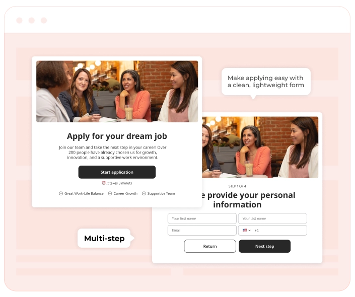
How an online application form looks
A good online application form is clean, direct and responsive across devices. Don’t overload people with too much at once — space things out, add helpful labels and use dropdowns or checkboxes when it makes sense. Most forms include:
- Name.
- Contact info (email or phone).
- A few qualifying questions (experience, availability, interests).
- Optional file upload (like a resume, portfolio, or writing sample).
- A short open-ended field for notes or motivation.
If you're using Claspo, it's easy to make application forms that look great without any dev work. You can match fonts and colors, add steps, and preview how it feels on mobile before publishing.
Online application forms pair well with
An appointment form works even better when paired with other helpful widgets. A callback widget gives people a way to ask for a call without hunting down your contact info. On mobile, a click-to-call button can make things even easier — just one tap, and they’re talking to you.
Want to increase visibility? Add social share buttons to encourage users to share your program or event after booking. It’s a simple way to turn one application into more exposure — especially for classes, webinars, or limited-time offers.