Multi-Step Pop-Ups for Your Website
If you’ve ever landed on a website and been hit with a big form asking for your name, email, phone number, and a dozen other things — you probably clicked away. That’s because asking too much, too soon can overwhelm people and hurt your conversion rate. That’s where multi step popups come in. These smarter, more focused popups break the process into smaller chunks — often just one question at a time. It’s a simple shift, but it works. Visitors are more likely to take that first small action, which makes them more likely to complete the form.
Instead of cramming all fields into one screen, a multi step popup walks people through a friendly sequence. The first screen might ask what they’re interested in. The second step gets their email address. The last step could include a bonus — like a discount code or free resource — in exchange for an email address.
This multi-step approach feels natural, and more importantly, it improves the user experience. It’s a pattern people are familiar with from good web design: one step at a time, clear progress, and nothing overwhelming. That’s why multi step form popups have become a go-to tool in modern digital marketing.
If your goal is to boost conversions, grow your email list, or improve lead generation through a cleaner, more thoughtful form design, this kind of popup strategy is one of the most effective changes you can make.
In the next section, we’ll break down what multi step popups actually are, how they’re different from traditional ones, and why they’re showing up in more and more website campaigns.
What are multi step popups and why they work better than single-step forms
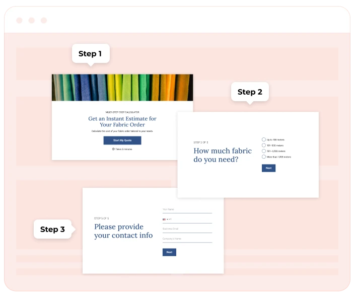
A multi-step popup is an interactive message that appears on your site and collects information in a sequence — one question or field at a time. Unlike traditional popups that throw all form fields on a single screen, multi step forms break the process into bite-sized steps.
This structure does more than just look cleaner. It changes how visitors interact with your form. People are far more likely to take the initial step — like choosing a product category or clicking a button — than they are to immediately hand over their contact info. That’s the magic of a multi step form popup: each action builds micro-commitment, making the next step easier.
Think of the widget as a mini funnel inside your website. The first popup might ask, ‘What are you looking for today?’ The second step collects an email or phone number, and the last one confirms the details or shows a thank-you message.
By gradually easing the visitor into the form, you reduce friction and make it more likely they’ll finish it. In fact, many high-converting sites now use multistep popups to get better completion rates, especially when asking for personal data.
These multistep popups can take different forms — from full-screen overlays to slide-ins or embed banners. Regardless of the style, they all share a common goal: to collect more data, increase user engagement, and drive better conversion without overwhelming your audience.
So whether you’re trying to create a multistep popup to drive conversions, grow your list, or personalize your popup campaign, understanding the difference between one-step and effective multi-step forms is key.
Why multi step form popup drives conversion rates
It’s no secret that getting website visitors to fill out forms is hard. The more fields you show, the more drop-offs you get. And that’s exactly why multi-step popups have become one of the most highly effective tools for improving conversion rate — especially on busy e-commerce sites, landing pages, or content-heavy blogs.
Here’s why this multi-step approach works so well.
1. Visitors are more likely to complete the form when it starts with a small action
The psychology behind multi step pop-up forms is simple but powerful: ask for less up front. By starting with a low-friction question (like ‘What are you shopping for today?’), you lower the psychological barrier. Once the visitor interacts, they’ve entered a micro-commitment loop. That first click makes them more likely to keep going — and much more likely to finish the entire form. This is a principle known as progressive engagement, and it’s been proven to increase conversions across industries.
For example, instead of asking for an email right away, the initial popup might ask a simple multiple-choice question. Then, once the visitor is already engaged, the second step asks for their contact details in exchange for an email offer, discount, or lead magnet.
2. Multi-step forms prevent users from feeling overwhelmed
Long forms can feel like work. But by breaking them up, multi-step popups ease the experience. Even though the total number of fields might be the same, presenting them one or two at a time feels easier and faster.
This is especially useful for mobile users — where limited screen space can make large forms feel even more frustrating. A multi step pop-up allows you to create a seamless, mobile-friendly process that feels light and fast.
3. Each step builds intent and allows for smart personalization
Every interaction in a multi-step widget gives you more context about the user. For marketers, this is gold. Let’s say in the first popup screen, a visitor selects ‘I’m shopping for women’s clothing’. You can then tailor the second step to ask for an email address and offer a discount popup offer relevant to that category. That kind of micro-personalization not only drives form completion — it also improves post-conversion engagement. With the right setup, you can use this data in your email marketing or SMS campaigns, offering even more targeted follow-ups later.
4. You can match popup steps to different funnel stages
Not all visitors are ready to convert right away. A multi-step form gives you a way to match messaging to intent:
- A first-time visitor might only give an email.
- A returning user might be shown a popup invite to claim a cart-saving coupon.
- A loyal customer might see a last step with an exclusive VIP offer.
This flexibility turns multi-step popups into more than just lead forms — they become mini customer journeys.
5. Multi step pop-up allows for smarter A/B testing and optimization
Because multi-step popups are built in phases, you can test each part of the process:
- Which initial step gets more engagement?
- Does a second step offering 10% off perform better than free shipping?
- Is a three-step popup too long, or just right?
With these insights, you’re not just guessing — you’re improving your popup campaign with every visitor.
6. Higher completion rates — better data quality
Here’s something advanced marketers know well: getting more people to fill out your form is great, but getting accurate, clean data is even better. Because multi step form popups filter out users gradually, those who reach the final screen tend to be more qualified and more invested. That means the information about your audience you collect is not only more complete — it’s more useful.
Whether you’re just starting out with popups to get your first leads or you’re running a complex widget strategy across multiple landing pages, the ability to guide users gently — without overwhelming them — is what makes multi-step popups such a smart choice.
How to use a multi step popup for lead generation and email list growth
If you’re serious about lead generation, you need more than just a generic form on your homepage. Today’s users are quick to ignore anything that feels pushy, irrelevant, or too time-consuming. That’s why smart marketers turn to multi-step popups — because they turn casual visits into real connections, and they do it in a way that feels natural.
Let’s break down how these popups help you grow your email list, improve the quality of your leads, and encourage more people to stay in touch after leaving your site.
Offer real value in exchange for an email
The days of ‘Sign up for updates’ are over. People expect something in return for their contact info — and that’s where multi step pop-ups shine. They let you offer something relevant, without asking too much upfront. Multi-step popups work especially well when paired with lead magnets — free resources, checklists, discount codes, or early access to a sale. Instead of sending users to a long landing page, you can launch a compact popup that delivers the same value with fewer clicks. Plus, since each step is short and focused, it keeps visitors engaged from start to finish.
The first popup can ask what the visitor is shopping for. The second step then collects their email or phone number, with the final screen delivering the reward — a discount code, freebie, or exclusive content. This format makes the process feel like a fair trade, not a demand. And because users feel more in control, they’re more likely to complete the form.
Use multi step form popups to segment your audience from the start
The beauty of multi-step popups is that you can collect valuable insights as part of the form process — without adding pressure. For example:
- Step 1: ‘Are you shopping for business or personal use?’
- Step 2: Ask for email.
- Step 3: Offer content or a coupon tailored to their choice.
Now you’ve not only collected contact info, but also learned something meaningful about each subscriber. This helps you personalize future email or SMS campaigns, and send offers they’ll actually care about.
Common use cases: where multi step popups shine
One of the biggest strengths of multi-step popups is their flexibility. Whether you’re in e-commerce, SaaS, blogging, or lead gen, these forms can adapt to the visitor’s intent — and guide them toward conversion, step by step. Below are some of the most effective different use cases, including what each one solves, why it works, and how to implement it without overwhelming the visitor.
Cart abandonment rescue
You’ve got a visitor with items in their cart, but they’re about to leave. A simple ‘Wait! Here’s 10% off’ pop-up might not be enough. But a multi-step widget gives you a second chance. Here’s how:
- Initial popup: ‘Leaving already? Want a quick discount?’
- Second screen: ask what’s holding them back — price, shipping, not ready yet.
- Last step: offer a relevant solution — a promo code, free shipping, or cart reminder via email or SMS.
This approach gathers insights and reduces abandonment — without being pushy. It’s an ideal format for exit-intent popups that feel helpful, not desperate.

“I've learned that multi-step form abandonment usually happens because users don't understand the value exchange at each step. Most businesses focus on reducing friction when they should be building momentum instead.
The game-changer we finded at Perfect Afternoon was implementing what I call "click-through progression" rather than traditional lead capture forms. We found these convert 300% better because each step delivers immediate value before asking for more information. For example, instead of asking for contact details upfront, we show users a preview of their website audit results after just answering 2-3 business questions.
I always recommend showing users exactly what they'll get at the completion stage right from step one. When we redesigned forms for our HubSpot implementations, we started displaying sample reports, pricing estimates, or personalized recommendations as users progress. This transforms the form from an interrogation into a consultation where users become invested in seeing their results. ”
Dwight Zähringer
Founder, Perfect Afternoon
Newsletter signups with personalization
Rather than a generic ‘Join our newsletter’ box, use a multi-step pop-up that learns about the website visitor first. This way, the emails you send later actually match their interests. For example:
- Step 1: ‘What content do you want — discounts, blog tips, or new arrivals?’
- Step 2: Ask for their email.
- Step 3: Confirm subscription and offer a welcome gift.
This mini popup-campaign can significantly improve engagement and lead generation, especially when paired with smart segmentation in your email marketing tool.
Product discovery quizzes
Multi-step popups are great for quick, on-site quizzes — especially for stores with a large catalog. Let’s say you sell skincare. Look at the multistep popup example:
- First screen: ‘Find the best product for your skin type’.
- Then guide them through 2–3 short questions (oily vs dry, sensitivity, etc.).
- Final step: ask for an email to receive personalized recommendations.
This is more than just a multi step form popup — it’s a guided experience that adds real value while helping you collect information about your subscribers. Also, it stimulates visitors to take action, turns browsing into interaction, which improves time on site and helps drive conversions later.
Giveaways and lead magnet delivery
Running a giveaway or offering a free download? Don’t just ask for a name and email on the spot — build excitement with a few short steps. Here’s a structure:
- Step 1: ‘Want to win a free 1:1 coaching session?’
- Step 2: ‘Tell us what your biggest challenge is’.
- Step 3: ‘Enter your email to join the giveaway!’
This creates a more dynamic, engaging way to collect leads — and the added questions help you qualify them for future outreach.
Post-purchase upsells or feedback
A multi-step pop-up doesn’t have to be limited to new visitors. After a customer completes a purchase, you can use a timed widget to either: ask for quick feedback on their shopping experience or invite them to join a loyalty program or exclusive list. For example:
- First step: ‘Enjoyed your purchase?’
- Second step: ‘Want early access to next month’s collection?’
- Final step: Collect their preferred channel (email or SMS).
Used well, this increases retention and builds stronger customer relationships without needing a complex follow-up funnel.
Targeted multi step popups for returning visitors
Your site analytics already tell you who’s been here before. Why not use that data in your pop-up strategy? With Claspo you can show multi-step widgets only to returning users and tailor the message based on past behavior:
- Show a pop-up with an enticing offer to returning visitors.
- Invite loyal users to access early-bird discounts or private sales.
Because you already know their behavior, you can create multi-step popups that feel personalized — increasing the chances they’ll take action this time around.
Educational or content-driven funnels
Not all visitors come to buy. Some are here to learn — and that’s an opportunity, too. A blog or educational site can use multi-step popups to:
- Recommend relevant articles.
- Collect preferences for curated content.
- Offer a free PDF or toolkit in exchange for an email.
These multi step form examples work especially well for coaches, consultants, creators, and anyone building thought leadership.
Best practices for creating high-converting multi-step forms
It’s one thing to build a multi-step popup — it’s another to make it convert.
Whether you're just starting to add multi-step popups to your site or looking to fine-tune existing ones, following these proven practices will help you build high-converting multi-step forms that feel natural, earn trust, and get results.
Let’s walk through what makes the best multi-step experiences work — from layout and copy to timing and flow.
Start with a low-friction initial step.
Instead of asking for too much upfront, start with a simple question that’s easy to answer. This makes your popups offer feel more like a conversation than a transaction. This approach reduces resistance and can increase your conversion rate by making users feel in control.
Use popup templates designed for performance.
Don’t reinvent the wheel. Tools like Claspo offer popup templates that are already optimized for behavior-based targeting, responsive design, and goal-based actions (like collecting emails or reducing cart abandonment).
Start with a layout that fits your goal — whether it’s lead generation, content delivery, or a promo code — and customize it to match your brand. Pre-tested templates help you add multi-step popups faster while staying conversion-focused.
Keep steps short, focused, and logical.
Avoid mixing too many elements in one view. A focused flow helps popups leverage gradual engagement instead of overwhelming users all at once. Create a visually clean layout for a smooth user experience. You don’t need flashy animations to impress. What you do need is clarity:
- Large buttons.
- Clear headlines.
- Minimal distractions.
Simple tweaks — like spacing, contrast, and progress indicators — help users feel at ease and more willing to continue. These small UX wins make a big impact on your multi-step popup’s success.
Add smart personalization with conditional logic.
If you ask for a user’s name in the first popup, use it in the second step. That little touch creates warmth and trust — even in automated flows. You can also adapt the offer based on earlier choices. For example, if someone selects ‘men’s shoes’ in Step 1, your popups offer in Step 2 can reference ‘exclusive men’s styles’. This is where multi step form popups really shine — especially when you want to increase relevance without making the experience feel too ‘salesy’.
Show progress and reduce friction.
Adding a small visual cue like ‘Step 1 of 3’ gives users clarity and sets expectations. It reduces form abandonment and contributes to a more seamless process. This also supports engagement and helps gather better data because people know what’s coming next — and they feel closer to completing the form.
Use exit-intent or delayed triggers — not instant popups.
Popups to increase conversions don’t have to appear immediately. Often, it’s better to wait:
- After 20-30 seconds on the page.
- After scroll activity.
- Or on exit intent.
Triggering your multi-step popup at the right time increases relevance and keeps it from interrupting the browsing flow.
Don’t guess — test and optimise.
Even the best multi-step setup can be improved. Test:
- Headline variants.
- Different incentives in your popups offer.
- Layout changes (modal vs. slide-in)
- Two-step popups vs. three steps
Review analytics, compare versions, and make small adjustments over time. That’s how the best marketers see inspiring examples turn into repeatable success.
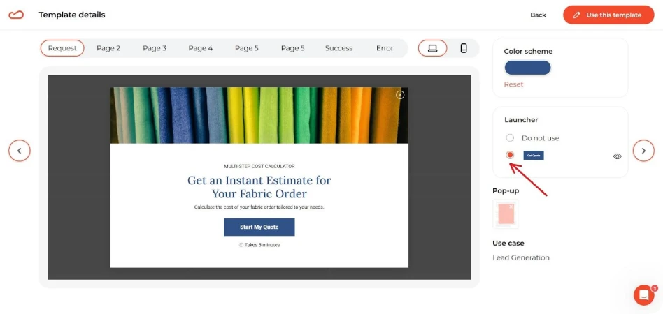
How to create a multi step pop-up with ease using Claspo
If you want to take your lead generation to the next level, but don’t want to deal with complicated tools or custom code, Claspo makes it easy. From first-timers to seasoned marketers, it’s designed for ease of use — helping you build and launch multistep popups in just a few clicks.
Whether you're targeting new subscribers, preventing cart abandonment, or promoting a sale, Claspo’s popup builder helps you make the form, control the flow, and personalize the experience — all without hiring a developer.
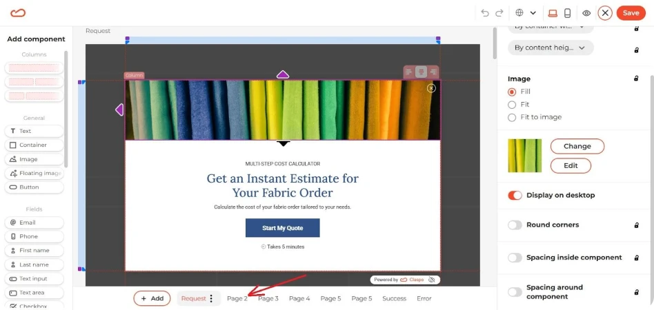
Use ready-made templates to make the process simple
You don’t need to start from scratch. Claspo offers a full library of professionally designed popup templates that cover everything from welcome flows to post-purchase upsells. Each template is:
- Fully customizable.
- Mobile-responsive.
- Built to encourage them to complete each step.
Just pick a template, adjust the design, and plug in your content. You can also add a new step at any time if you want to expand your form or segment users further.
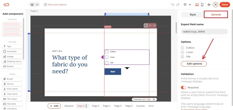
Smart logic that adapts to user behavior
Multistep popups work best when they match user intent. Claspo lets you trigger popups based on actions like:
- Scroll depth.
- Time spent on the page/website.
- Inactivity.
- Exit-intent, and more.
This targeting allows widgets to feel helpful, not random — and popups reduce friction by appearing only when a user is most likely to engage. Because visitors are guided through a series of small, low-pressure steps, they’re more likely to finish — especially if the offer is relevant and the form feels light.
Personalized and dynamic experiences
With Claspo, you can go beyond static forms. Use merge tags to insert first names, location-based content, or product interests. You can also create conditional logic to personalize each path depending on earlier choices. Personalize offers using UTM parameters, cookies, or data layer values. And because you’re using multi-step logic, each choice builds toward a more relevant offer — driving completion and improving lead quality.
Seamless integrations, zero headaches
Once a user submits your multi-step form, where does the data go? Claspo integrates seamlessly with tools like:
- Mailchimp, Klaviyo, GetResponse.
- HubSpot and other CRMs.
- Google Analytics and GTM.
- Shopify, Webflow, and WordPress multi-step form setups.
You can also use webhooks to connect virtually any system — so your leads flow exactly where you want them, with no manual work.
Multi step popups that work without overwhelm
If you’ve made it this far, one thing should be clear: multi-step popups aren’t just a trend — they’re a smarter, more human way to engage visitors, build trust, and drive results. They drive conversions by guiding users through smaller, easier steps. They improve the user experience by keeping things simple. And they help marketers collect better data — which leads to stronger campaigns down the road.
Whether you’re trying to grow your email list, rescue abandoned carts, offer targeted discounts, or improve how people interact with your brand, multi step form popups are a tool worth having in your marketing stack.
And the best part? You don’t need a developer, expensive software, or custom code to get started. With Claspo’s popup builder, you can launch your first multi-step campaign in minutes — even if you’re brand new to using popups.
If you’re on WordPress or WooCommerce, Claspo has a WordPress multi step form plugin. So whether you’re running an e-commerce store, a SaaS business, or a growing blog — the time to add multi-step popups is now. They’re simple. They’re effective. And they’re built for how people actually browse.
Ready to create your first high-converting multi-step popup? Start with a template, customize it, and watch what happens when your form finally feels right.