Multi-Step Forms and Templates: A Complete Guide for Building Better Forms
Here’s the thing about online marketing — sooner or later, it all comes down to a form. Doesn’t matter if you’re chasing lead generation, running ads for a product launch, or just trying to collect name and email for a newsletter. If the form doesn’t get filled, the funnel’s dead.
And yet, most sites still use those clunky long online forms. You know the type: 12+ fields, zero personality, and a layout that screams ‘corporate paperwork’. People see it, sigh, and bounce. That kills conversion rates before you even had a shot.
The fix a lot of us stumbled into? Multi step forms. Instead of throwing every field at once, you create the form with multiple pages or smaller form steps. Add a simple progress bar and a next button, and suddenly the whole process feels lighter. Like: ‘Oh, I can handle this’.
From a user experience perspective, it’s night and day. Same info collected, but because a user goes through the form in chunks it feels way less scary. That’s why a multi-step form template converts better, gets more qualified leads and keeps users engaged till the end.
And the tools now? Stupid simple. Any decent form builder — WordPress plugin, SaaS, whatever — lets you create a multi-step form with drag-and-drop. Add conditional logic if you want to get fancy, plug in an integration to your CRM and ESP, and you’re live. No dev team required.
Bottom line: if you’re serious about conversion rate optimization, you can’t keep using a one-page long form. Breaking it down into a step by step form isn’t just cleaner design. It’s a straight path to better CRO, better lead gen, and forms that people actually finish.
What are multi-step forms? Key features, templates, and form examples
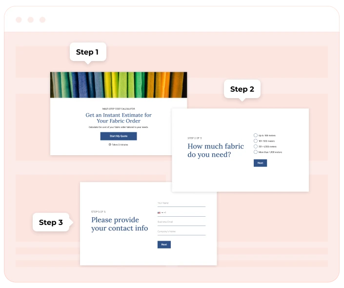
At the simplest level, a multi step form is just a big form chopped into smaller pieces. Instead of dumping 15 questions on someone in one go, you break it into multiple steps. Step 1: basic stuff like name and email. Step 2 (gather intent data): maybe preferences or product choices. Step 3: payment details, sign-up confirmation, or whatever you need for submission.
The difference compared to a standard single-page long form is all about how it feels. A one-page contact form with endless fields is intimidating. A step form with a next button feels like a conversation. Each step of the form builds on the last, so the user progresses through the form without that ‘ugh, too much work’ moment. That’s why forms that look less intimidating almost always pull better conversion rates.
Common use cases? Pretty much everywhere you need info but don’t want people to bounce:
- Sign-up flows for SaaS or newsletters.
- Lead generation on a landing page.
- Customer onboarding surveys.
And here’s a secret weapon: navigation cues. A progress bar, a clear next button, or even breadcrumb navigation makes the whole user experience smoother. People know where they are, how many form steps are left, and that alone keeps users engaged.
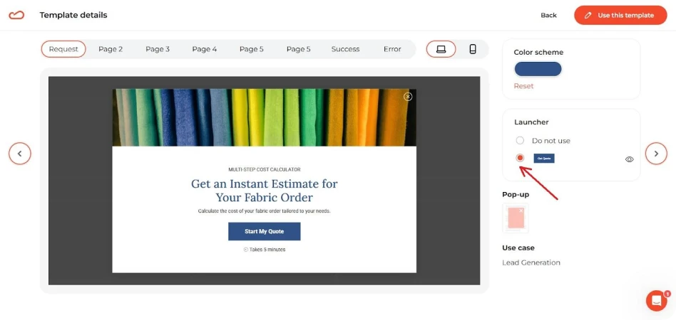
A good form editor bakes this in for you. Whether you’re using a WordPress plugin, a SaaS tool with a drag-and-drop form builder, or a free trial of some fancy multi step form builder, the logic is the same: break the form into multiple pages, keep the flow tight, and give people visual feedback so they don’t quit halfway. Many tools also provide a ready-made form template so you’re not starting from scratch when setting up your multi step form.
Benefits of using multi-step forms
So why bother splitting your web forms into chunks instead of just leaving one single-page long form? Because the results speak for themselves.
1. They actually boost conversions.
It’s simple psychology: people freak out when they see too many fields at once. A step by step form feels doable. Add a progress bar and a friendly next button, and you’ve turned ‘ugh, no thanks’ into ‘okay, I’ll finish this’. That little shift is why a well-designed multi-step form template can double your conversion rates compared to forms without breaks.
2. You get better lead quality.
A huge wall of questions scares off everyone except the most desperate. By using a stepped form, you filter naturally. Start with low-friction fields like name and email, then move to qualifying questions in later form steps. The people who make it through are way more likely to be qualified leads you actually want.
3. Personalized experience with conditional logic.
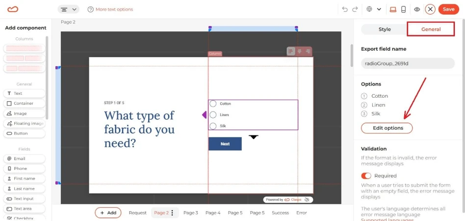
Here’s where it gets fun. Add conditional logic and your multi-step forms that collect data suddenly adapt to each user. Ask the right questions only when they’re relevant. Example: a SaaS can create a multi-step form that only shows enterprise pricing questions if the user picked ‘100+ employees’. It feels like a personalized experience, and it keeps users engaged instead of annoyed.
4. Conversational flow keeps people moving.
Done right, a step form feels less like paperwork and more like chat. Each step of the form is quick, clean, maybe even conversational. The user progresses through the form almost without noticing — which is exactly what you want for conversion rate optimization.
5. Works great with modern tools.
The barrier to entry is gone. Any drag-and-drop form builder lets you make your forms multi-step in minutes. Choose a form template, tweak the branding of the form in the editor, and boom — you’re live. Tools today make it dead easy to create multi step forms and take your forms to the next level.
Best practices for multi-step forms
So you’ve decided to ditch the old-school long form and go with a multistep form. Good call. But just slapping fields across pages won’t guarantee results. Let’s break down what separates the high converting setups from the ones that still bleed leads.
Designing a high-converting stepped form
Think of a stepped form like a conversation. Nobody wants to be interrogated with 20 questions upfront. But if you start small, people lean in.
- Make your forms conversational. The flow should feel like, ‘Hey, what’s your name?’ → ‘Cool, where should we send updates?’ → ‘Awesome, what are you interested in?’ Each step of the form should feel natural.
- Limit the number of steps. Too few, and you lose the benefits of a step form. Too many, and drop-offs skyrocket. Most high converting setups land somewhere around 3-5 form steps.
- Always show progress. A progress bar or clear breadcrumb navigation lets the user progress through the form without anxiety. If people know how far they are from submission, they’ll stick with it.
- Ease into the heavy stuff. Start with low-friction questions like name and email, then move to trickier ones like preferences, budgets, or signup details. This gradual flow keeps users engaged.
- Kill the intimidation factor. A clean multi-step form template looks way better than a huge form without breaks. It’s psychology: shorter chunks = higher conversion rates.
Writing questions in a step by step form
The quality of your leads depends on how you structure the questions.
- Mix open and closed questions. Use closed-ended for easy answers (checkboxes, dropdowns), open-ended when you really need details.
- Group logically. Each form step should cover one theme. Example: Step 1: contact info, Step 2: preferences, Step 3: purchase intent. Don’t scatter random stuff everywhere.
- Use validation rules. Nothing kills UX faster than someone typing a phone number and getting a vague error at the end. Validate inputs at each step so people can fix mistakes immediately.
- Create a seamless flow. Each step to your form should connect naturally. When users don’t hit dead ends, they’re more likely to complete the form.
Multi page form vs. single step forms: which one converts better?
Here’s the deal: not every form deserves to be split into steps. A multiple step form works best when the process is long or kind of heavy. Think job applications, onboarding surveys, etc. If you dump all of that onto one screen, people get overwhelmed. Breaking it into a multi page form makes the whole thing feel lighter. Users can see the form steps, click the next button, watch the progress bar move, and they stick around. You basically spread the effort out, and people are more likely to finish.
But sometimes simple wins. If all you’re asking for is name and email for a newsletter sign-up, a single-page form is fine — honestly, it’s usually better. Adding extra steps there just slows people down, and that’s the fastest way to kill your conversion rates. The next case is a low-commitment offer. Think free download or instant access. Here, speed > depth. If a user just wants a quick sign-up, don’t slow them down with extra form steps.
The truth is, both approaches have pros and cons. A multipage form can definitely drive conversions by making long processes less scary, but stack up too many clicks and you risk annoying people. That’s why you can’t just copy what someone else is doing. You’ve got to test it yourself. Run both versions, compare the drop-off points, and see what actually works for your audience. That’s real conversion rate optimization — not guessing.
Key features of multiple step form tools
If you’ve ever tried to create a form from scratch, you know the old-school way is painful. That’s why modern tools make such a difference. The key features in today’s multi step form builders are what turn a boring, clunky layout into the best multi step flow that’s actually likely to engage users.
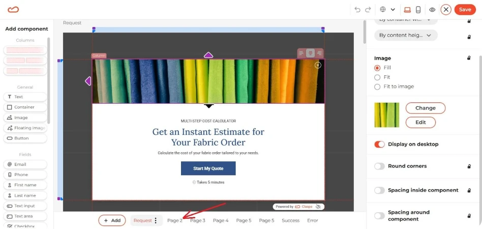
The first big one: a drag-and-drop form builder with a solid form editor. Instead of messing with code, you just drag fields where you want them, pick a form template, and tweak the form design to match your site. That means you can build a form that looks on-brand in minutes. Even better, most of these editors are responsive by default, so your multi step form mobile experience won’t break the moment someone opens it on their phone.
The second thing you’ll want: smart options like conditional logic, validation rules, and easy integration with your stack. Think CRM, ESPs, or even a WordPress plugin. This is what lets you use multi-step forms not just to collect data, but to actually qualify it. You can ask more questions when it makes sense and skip the ones that don’t, turning a basic form that collects info into a value proposition that feels like a mini tutorial for your product.
Then there are the multi step form examples. The best tools come with presets for surveys, onboarding flows, or even pages based layouts where you can create a multistep form that spreads across several screens. If you’ve ever wondered how to learn how to create something beyond a boring contact form, this is it.
Finally, don’t sleep on customization. A good multi step form builder lets you control the branding of the form, polish the UX design, and adjust colors, fonts, and field layouts until it matches your site perfectly. That polish matters. When your form design matches your site and feels natural, people trust it more. That alone can be the difference between a random visitor bailing or actually dropping their info. It’s not just about looking nice — it’s about generating leads without scaring people off halfway.
And honestly, the “secret sauce” isn’t complicated. You need tools that are dead simple to set up, let you tweak the branding of the form, and give you room to create multi step forms that do more than just sit there and collect data. The whole point is to keep people moving, keep them engaged, and push those conversion rates up without making the process feel like work.
The simple shift that improves conversions
If you’ve ever dropped a giant long form on your site, you know the pain: people see a wall of fields and bail. A multi step form fixes that. It makes the process lighter, less of a chore, and more like something people can actually finish. That alone lifts conversion rates and keeps the data you collect from being garbage.
It’s not just about numbers either. Breaking the flow into form steps means you get better lead quality. You can ask more questions without scaring people off, and you end up with contacts that are way more useful than random email with no context. Pair that with a smoother user experience and it’s obvious why more marketers use multi-step forms now.
And honestly, the tools aren’t rocket science. Grab a form builder, pick a form template, and create a multistep form. Run it, see what happens, then tweak. That’s the only way to find the best multi step setup for your own funnel.
So yeah — if you’re serious about generating leads and you care about CRO, don’t stick with the old one-page layouts. Break them up. Test. Iterate. That’s how you end up with forms that collect real data and actually move your business forward.