8 Pop-up Mistakes, or Why You Consider They're Inefficient


Summarize
Are you annoyed by pop-ups? 73% of users say they have a negative attitude toward pop-up windows. But that is not stopping marketers from continuing to use them. Why is that? The answer is pretty simple, they are functional!
Despite everything, clients continue to interact with pop-ups and this tool does not lose effectiveness. But even minor mistakes in setting up the window, such as inappropriate appearance time or data overloading, can lead to loss of customers and traffic.
Pop-up came into existence in the mid-1990s, at the behest of designer and programmer Ethan Zuckerman, who was working at Tripod at the time. He had no idea that he had developed an effective business model that allowed him to make money by displaying online ads without directly placing the message on a web page. And looking at how his brainchild is being used now, Zuckerman sincerely repents: "I apologize. We had good intentions."
Since then, pop-ups have undergone a certain path of modifications. In the late '90s and early 2000s, they opened as a separate browser window. Today, they are overlays that overlap part of the site content.
8 Mistakes in Pop-up Usage & Anti-cases
Website Overlays Usage
Data Congestion
Unsuitable Display Time
Оverloading with Pop-ups
Inappropriate Pop-up Design
Limiting User Choice
Improper Targeting
Technical Errors in Pop-up Implementation
The problem with pop-ups often lies not in the format itself, but in the fact that marketers don't know how to use them correctly. For an effective conversion, it is necessary to feel and understand your audience and try to minimize irritation. Three-quarters of visitors to the site are already aware of the resentment of pop-ups. So make their appearance as unobtrusive as possible, and their proposal is really advantageous. And do not forget to take into account the mistakes that have already been committed before you.
Website Overlays Usage
Everything around us is evolving, pop-up as well. Currently, it is a common practice to see small pop-up windows in any part of the screen which does not prevent interaction with the page at all. But still, many websites use overlays that prevent any interaction and don't allow to do anything on the website until the client reacts to the overlay.

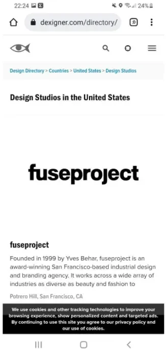
Thus, for instance, in this case, the cookies overlay completely blocks the website content, overrides the country selection block, and you can do absolutely nothing until you respond to the request.
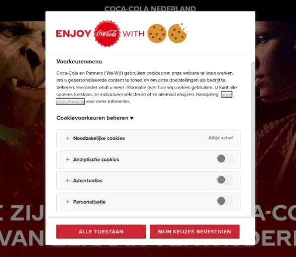
Most frequently with this format, they try to convey important information to the user about GDPR and cookies usage. But usually, it causes the opposite effect: users do not read the message and close such windows in a hurry, just to get rid of them quickly and continue reading the page.
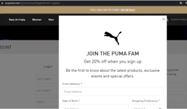
Data Congestion
Information redundancy, even useful, threatens to drive away customers and reduce conversions. Focus on the most important messages and don't ask the visitor to take multiple targeted actions at once.
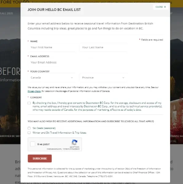
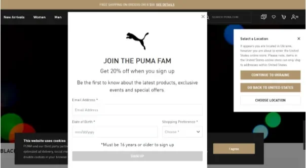
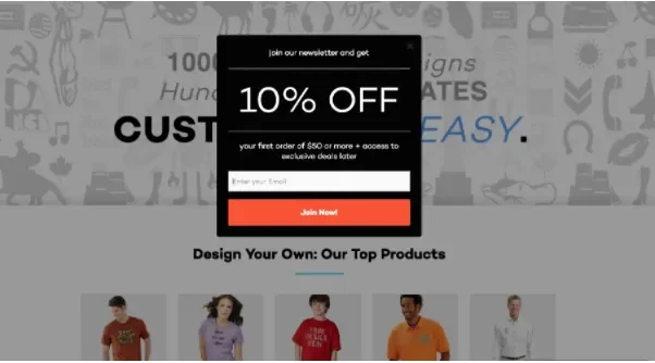
Such a website subscription form requires too much data and does not fit into one screen of a standard laptop, which makes it annoying. The most conversion-intensive pop-ups are those with 1-2 fields; an extra field can reduce the conversion rate by about 3 times. If you need more information, it's better to add the second window after the subscription. In this case, you at least won't lose contact.
Also, the general overload of information in the window can alienate a potential client. Don't try to protect yourself and spell out all the specifics of interaction with the user. Allocate a separate block on the site for this and make the pop-up as concise as possible.
Unsuitable Display Time
You haven't had a chance to read the headline yet but it's already blocked by a pop-up. Showing the pop-up before loading the headline is acceptable only if you are legally bound to ask for consent to use cookies or age verification. But even in such cases, it's better to show the pop-up as carefully as possible so that the user doesn't want to run away right away.
And if we're talking about forms for data collection, you need to take into account that at the beginning of the session the visitor may not yet realize whether he is interested in the site's services. And whether a customer will want to receive emails from you in the future.
Give the user time to get used to it. And before launching the pop-up window, analyze the average session duration. Without understanding how users interact with individual pages of the site, it's impossible to determine the ideal time to display the subscription form.
Оverloading with Pop-ups
There are several varieties of pop-ups:
privacy-related (location requests, requests to send notifications, cookies information, and other permissions);
related to marketing activities (subscriptions, advertisements, chats, etc.)
related to browser activity (e.g. password managers).
The most important thing is not to forget that for website users all these pop-ups are first of all annoying pop-ups. And imagine the power of that annoyance if they all show up at the same time and start overlapping each other. How long will users stay on your website?
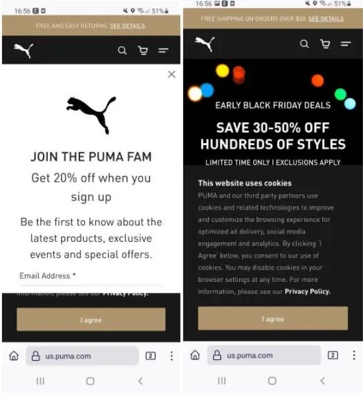
The only thing worse than multiple overlapping pop-ups is a non-adapted mobile version of such a site. To get to the website, a user has to really try harder.
Studies have found that the mobile version of pop-up converts better than the desktop version by almost a factor of 2 (5.8% vs. 3.11%). But making pop-ups on mobile user-friendly is not an easy task. Because of the small screen size, any pop-up takes up relatively more space than on the PC. Besides, mobile devices are supposed to be used "while walking" and any elements cluttering the display will only hinder this.
The conclusion is that what annoys desktop users, will make the interface as unusable as possible in the mobile version.
If your website uses many different pop-up types, test them in advance to avoid showing multiple pop-ups to users at the same time.
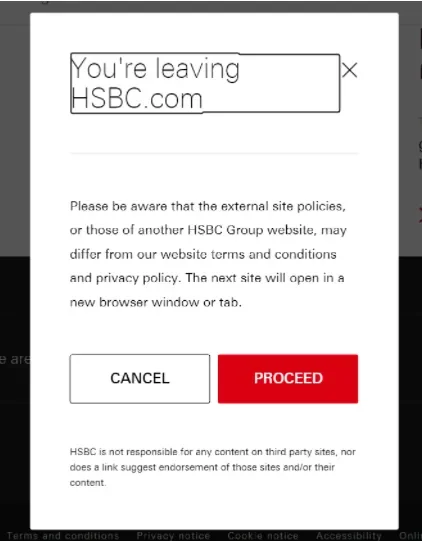
It's important to pay special attention to pop-ups when linking to another site or subdomain. Show your visitors that you trust the resources you link to on your website. For instance, hsbc.com uses additional pop-ups when linking to social networks and company jobs.
Don't make your users hate pop-ups even more. Avoid them where you can do without them. Nielsen Norman Group recommends hover tooltips usage as an alternative, but don't overload the website with pop-ups.
Inappropriate Pop-up Design
A huge mistake when setting up a pop-up can be underestimating the role of website popup design. All elements on the site should be designed in the same style, including pop-ups.

To implement pop-ups, companies often use additional services which offer template solutions. But that doesn't mean that you can't work on the design at all. Add minimal changes that help create a unified brand picture. If you adhere to a minimalism website, then you should definitely not use the standard bright forms.
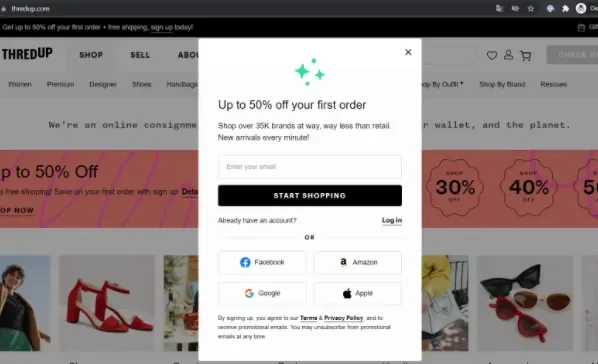
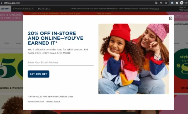
In addition, an interesting finding after analyzing pop-ups was shared by Sleeknote, pop-ups with pictures convert much better than those without pictures (3.8% vs. 2.07%). Users are becoming more and more spoiled with beautiful and high-quality content. Don't underestimate the visuals and unity of style on your site.
Limiting User Choice
No one likes to be forced into something, especially if they do it too explicitly. The same thing works with pop-ups. А user should always have a choice: close the window or interact with it. Using tricks like a smaller font or a transparent button that blends in with the background is extremely detrimental to the perception of your site by both users and search engines.
Even a small pop-up can provoke a negative response from the audience if it's not clear how to close it.
It's possible to finish it off with a faint cross or very small font, following the instance below from sumo.com
Improper Targeting
Another problem with pop-ups is unfit targeting. Who to show, and how often, all this needs to be scrutinized, especially if you use several pop-ups on one site.
Exclude the registration and checkout pages from showing customer sign-up forms. А user has already agreed to take a conversion action, so don't make him change his mind.
Do not call the pop-up repeatedly when navigating to a new page of the site. The user has already seen it and is not yet interested. It's better to place a separate button to call the form, but don't annoy it.
And also make sure that the form of subscription is shown only to those who are not on your list of contacts. Always exclude displays for conversions from the e-mail channel, such a form has no value to either users or businesses.
It is possible to finalize the variant where the label in the link is shown.
Technical Errors in Pop-up Implementation
Speaking specifically about the forms for collecting contact information, it's not always the case that pop-up usage errors result only from inconvenience for а user. Technical misprints can also occur. Avoid incorrect user data input when it can be achieved via real-time data validation.
For instance, prompt the customer if they make a mistake when filling out an email field. All e-mails must match certain standards and should be taken into account during validation and highlight the error to a user (presence of @, valid characters on valid positions usage, etc.).
For a mobile number field, validation is also necessary, both by the content of only digits without extra characters and letters and by the number of digits. For a phone, it's better to use an input mask and a cue for users in the background of the field, in what format the number should be entered.
Conclusion
It is doubtful that we can make users like pop-ups but we can at least avoid the mistakes already made and reduce the negative response to pop-up notifications. And if you take a comprehensive approach to design and implement them, makes it possible to get a much deeper insight into your visitors' needs and boost the website's conversion rates.
Give care to your customers and make their experience with you as pleasant as possible.


